Our Future
My book is 46 pages long and is a combination of single page images and double spreads. The layout is consistent through the book in which it begins with a small image and some text then a double spread, then a single image with text and it continues in this layout through the book. My quotes about pollution are from the WHO website which i have referenced and here are the links to the websites and another one which i have used to gather a statistics image from. My book is all black and white and they all have a standard black and white font which i made using filters and adjustments.
Who : http://www.who.int/mediacentre/factsheets/fs313/en/
Who: http://www.who.int/mediacentre/factsheets/fs292/en/
European Environment Agency: http://www.who.int/mediacentre/factsheets/fs292/en/
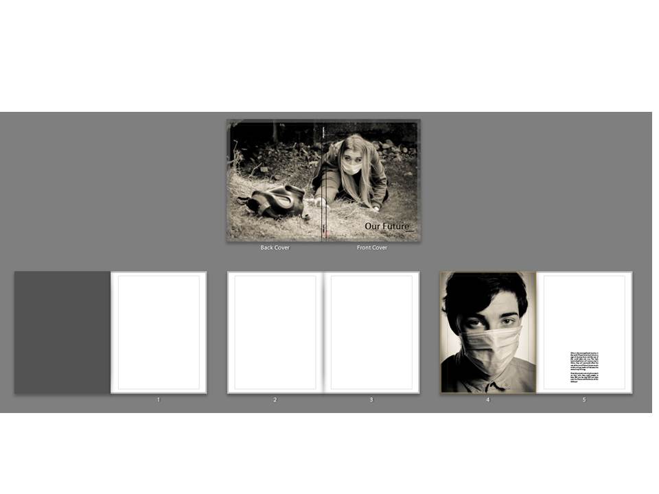
My front and cover photo are both one image and it is one of my favourites as it is of my female model reaching out for a gas mask. Even though my project is on pollution, this image may be misinterpreted for a project on war. My title is Our Future which is situated in the lower right hand corner, the font i used is Calibri, it is a very simple font but it works well as i do not want to take away the attention from the images. My title is 60pt which is large but it needs to be as the title is very important. I have left two blank pages at the beginning of my book so that it starts of slowly and the book does not look clustered and full. The first page is a studio picture of my male model, it is a close up of his face which is very clear and sharp, he has the mouth mask and his eyes are full of emotion which makes it a very powerful image to start the book off with. The text next to the image was written by me and is not quoted from any sources, it says: “China is the most polluted country in the world. The pollution levels show no sign of slowing down and the rest of the world does not care. The high levels of pollution will not just stay in China, they will eventually affect the rest of the world. This will mean mouth masks and gas masks will become the normal way of living. Clean Air projects can only do so much on their own, they need people to help. Will you be one? Will you help save Our Future and The Future of Our Children? ”
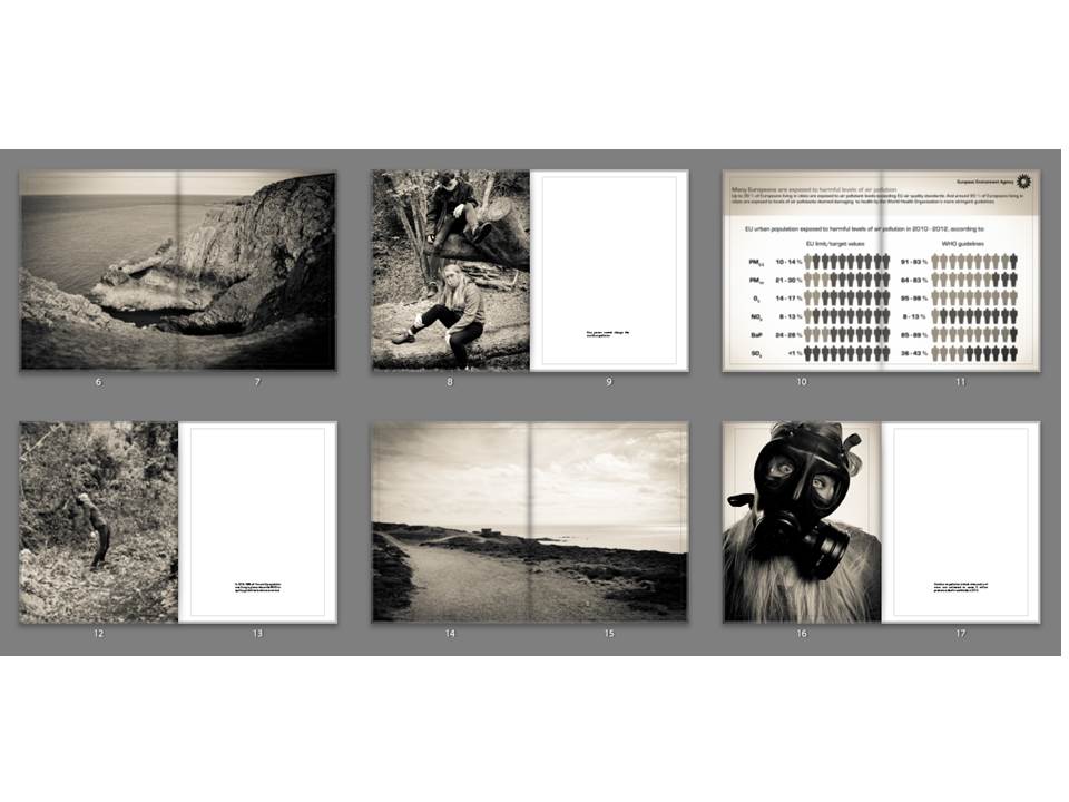
The landscape image is used as a break between the images so that the book is not filled with portraits and so it does not look clustered. This image works really well as it is a very simple landscape but the black and white makes it really strong and it works well with all the images in my book. The landscape was taken at Gronez and it did not look very interesting to begin with but it fits in perfectly with my work now. The image of my two models is used to represent that one person cannot change the world but more people together can such as communities recycling more and organisations working together to clean the air. The next image is of a landscape which i took at Gronez, it is very natural and bare landscape because it is untouched by new buildings apart from the old bunkers which is why it is so beautiful. These double page spreads are similar to the work of Jon Cazenave who used double page spread to create an abstract looking book which is dark but much darker than my images as they have a slight vintage ting to them. The last image is a studio portrait which i did of my female model with a gas mask on, the quote next to her was taken from the official website of WHO.
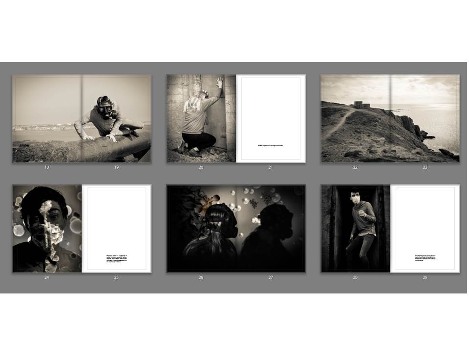
The first image is of my male model struggling to get off the gun and it is another double page spread to separate the portraits so that the book does not look too clustered. It has a vintage look like all the photos. The second image is a portrait of my female model banging on the door to try be let in to escape from the air but it will not be able to save her, next to that image is a quote from WHO saying Outdoor air pollution is carcinogenic to humans. After that there is another landscape to split up the portraits and make the book look neater. After this the book starts to look into my photoshop work which i did using air pollution particles and merging them with studio portraits. I did this to add variety to my work. Next to this photo there is a quote which says: Particulate matter is composed of sulfate, nitrates, ammonia, sodium chloride, black carbon, mineral dust and water. It is closely associate with increased cancer incidence. The second of my edited images is on a double page spread and this work is very similar to the work of Jon Cazenave who used very dark images and very ambiguous ones to investigate his homeland with the Basque people. The next portrait is of my male model who is stood in the door way of an bunker armory with a mouth mask on. Next to this image is a quote which links directly to the image, it says: Over 4 million people die of premature deaths from illness attributable to the household air pollution from cooking with solid fuels
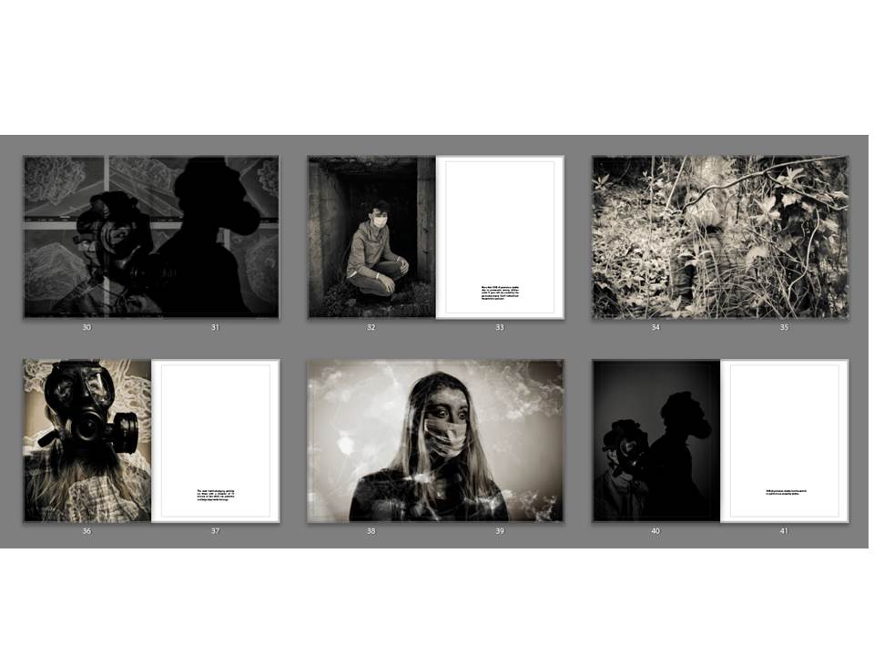
The next double page spread is of my third edited portrait which appears to be projection of particles onto an image but they are actually merged together. Again this relates to the work of Jon Cazenave as it is a very dark image with very dark shadows just like what he did with his book called Ama Lur. The next portrait is of my male model crouching in an entrance to a small cavern like area. Next to him is a quote which directly links, it says: More than 50% of premature deaths due to pneumonia among children under 5 years old are caused by the particulate matter (soot) inhaled from household air pollution. After this is a double page spread of my model integrating with the environment which symbolizes how pollution fades into the background and we do not notice until we look closer. The fourth one of my edited portraits has a slightly vintage tinge more than the rest of them which makes it stand out but without this the particles would not be as visible, next to this image is a quote which says:The most health-damaging particles are those with a diameter of 10 microns or less which can penetrate and lodge deep inside the lungs . A double page spread of my fifth edited portrait splits up the portrait orientated images and it is very strong as she has very big eyes portraying lots of emotion. The next portrait was done in the studio with a spotlight and it is very dark with dark shadows and my models face isn’t very visible. Next to his is a quote which says: 34% of premature deaths from household air pollution are caused by strokes.
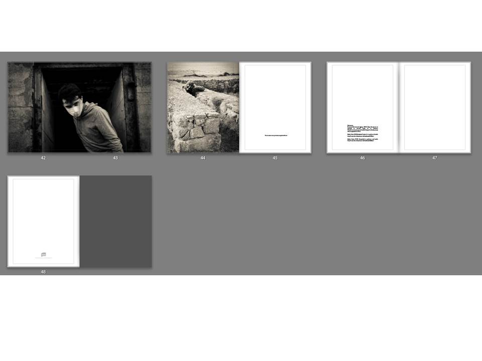
A double page spread of my male model looking directly into the camera splits up the last two portrait orientated images. It is very dark and his eyes show a lot of emotion. The final portrait is of my female model who is sitting between two walls which have been destroyed are Gronez. The quote next to her says: No structure can protect us against the air. Finally there are 3 references in my book from the official website of WHO and The European Environment Agency.
