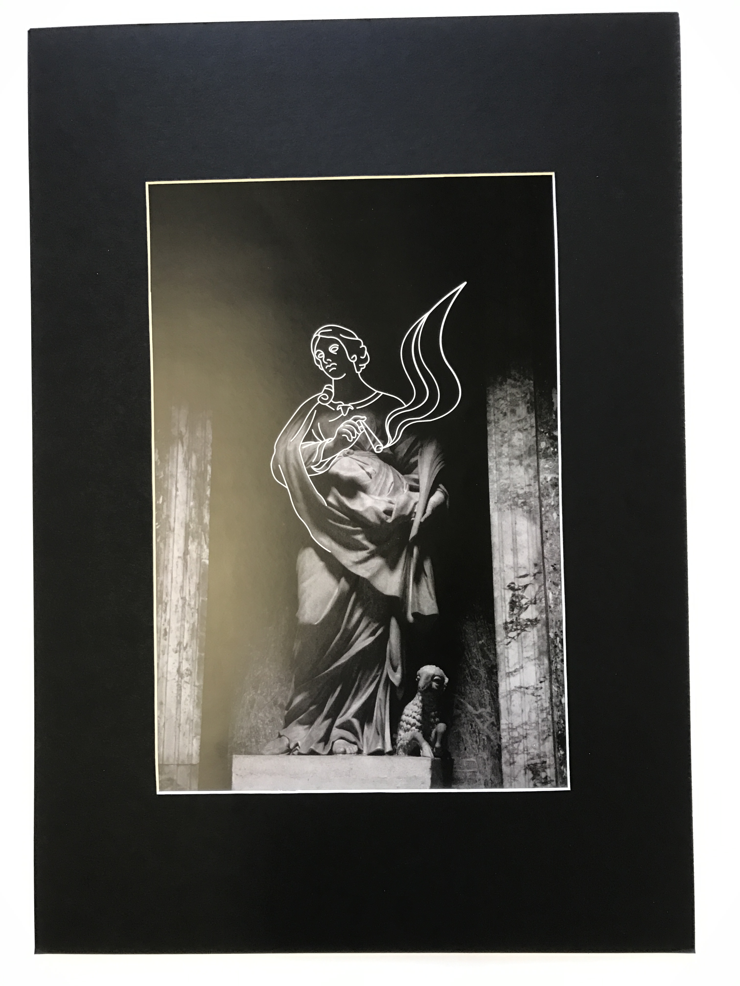
In this post, I will be highlighting how I have presented my final outcomes for this project. I started by window mounting my favorite piece from the project. This Black frame works effectively due to the high contrast present in the image. The black frame ensures that the highlights and illustration really pop into the foreground. The shadows that engulf a large majority of the composition, merge nicely with the black border, maintaining an organic visual style.

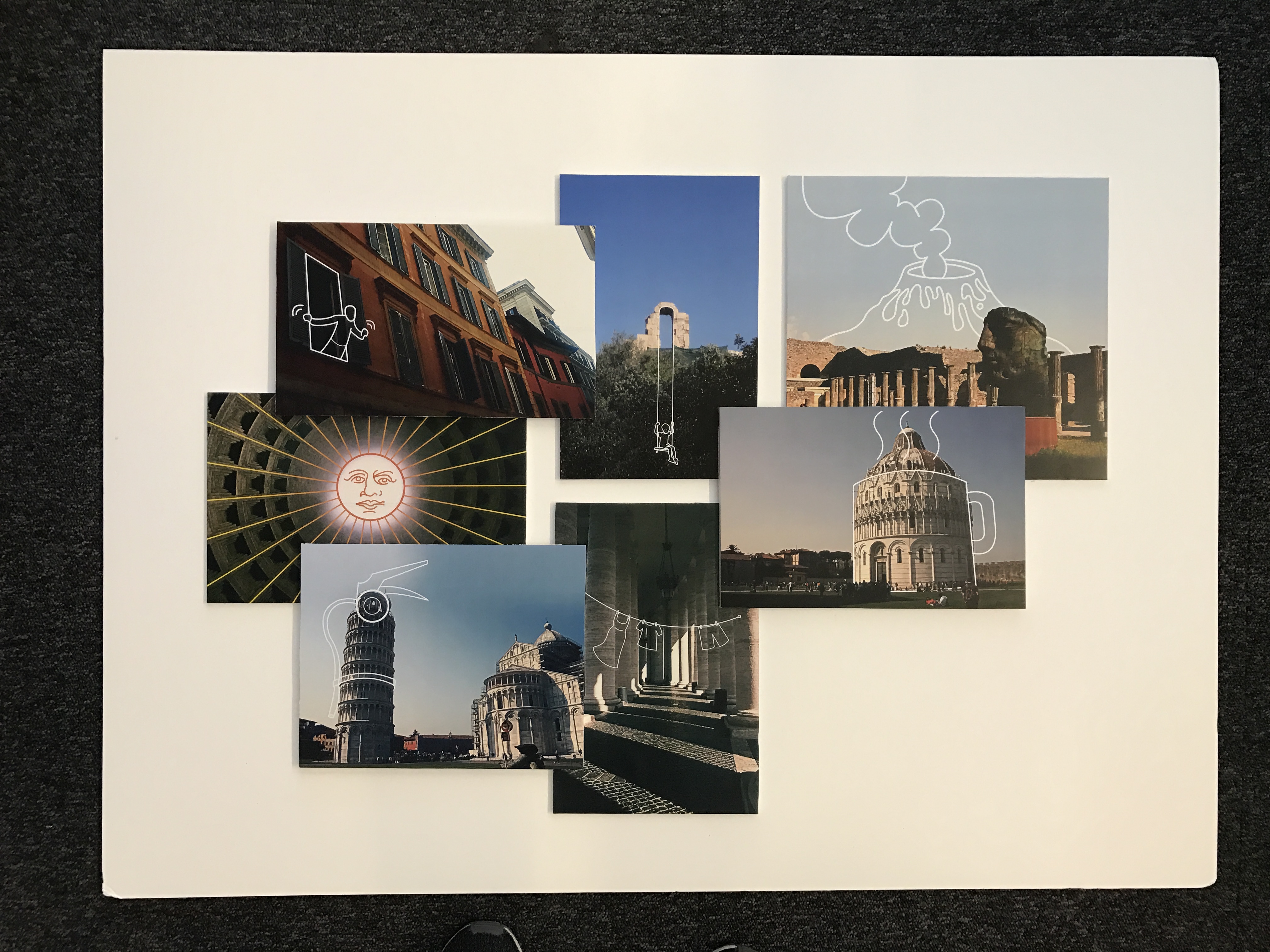
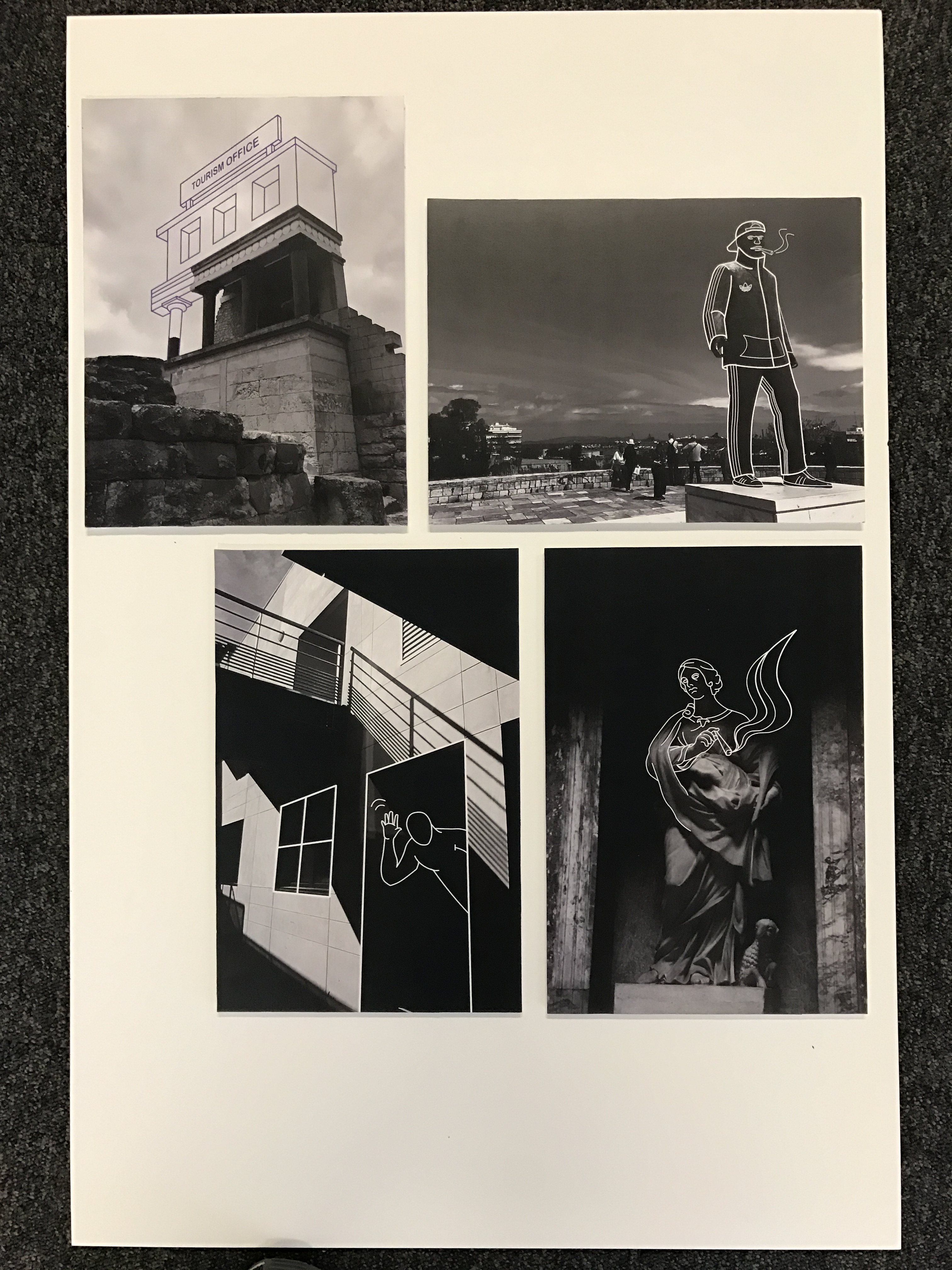
For the main body of my work, I decided to make a three-dimensional collage, as seen below. Here, I selected my favorite images created during the exam and positioned them ontop and around one another upon a white foam board. Each image was previously mounted upon foam board beforehand, ensuring a sense of depth and dimension. I like the final presentation for these images, as the blocky organisation supports the cartoonish, satirical aesthetic that I have been trying to employ. This completed board, feels like a summary of my travels which I like. The white background enables the colors and tones within these images to truly feel vivid, drawing the attention of the viewer. Additionally, I created one more collage that features a set of black and white photographs. This presentation works effectively as all 4 images feel natural in co-operation with another, due to their striking visual similarities. This board focuses a lot on the juxtaposition between old and new and has a direct observation on youth culture and history.


