
Making Final Display
Because of the different parts of my final project there was a lot of work that I needed to do to make them. The first element that I started working on was the slides. I knew that I would need to have some way to keep them flat but still be able to see them clearly.

The photo above shows me testing using two pieces of acrylic to look through, one either side of the negatives. The back piece is tinted slightly brown, this was because I knew what It would look like with just clear acrylic or glass there so I wanted t test to see if this was any better. As it turned out it wasn’t, the main problem was that you could see shapes and things from behind the negatives, this made it difficult to see the images properly.
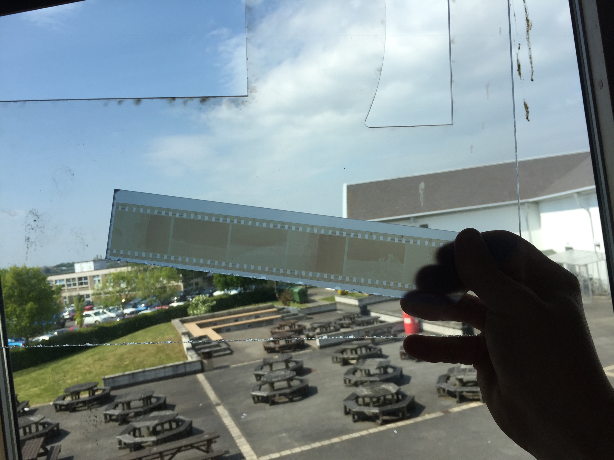
To try and beat this I tried using a piece of frosted acrylic instead of the clear one. Ths as it turned out worked really well for what I wanted as seen in the above photo. It just helped to soften and distribute the light while the light colour of the acrylic helped to let as much light through as possible.


The next step was to make a frame for the negatives. I decided to use a window mount for each of the strips, the first tester one that I did had to have a white background but I made some different variations to test and see which one I liked the most (these can be seen below). The different versions are different colours and some have beveled window mounts and some are just simple cuts. In the end I decided to go with the bottom one as the final version, the contrasting white against the black worked really well and helped to lead from the dark into the light of the negatives (the second last one is the template that I used to mark out the final ones.

Once I had cut all of the frames out I needed to cut the acrylic. The pieces that I used for the backs in the end were not the same colour as the part that I tested, this was because the school workshop where I got the acrylic from did not have any more of that colour. As it turns out though the lighter turquoise colour worked better for what I wanted and made it easier for the negatives to be seen. I cut the acrylic to the same size as the outside of the frames so that it would fit flush with the card.

Then the negatives needed securing to the frames. The side of the negatives that holds the image on faces away from the outside of the frame and touches the acrylic, this protects the images a little and makes sure that the viewer is not looking at an inverted image when they hold it up to the light.

Securing the negatives was done with just some small pieces of masking tape, this was so that if I wanted to I could remove the negatives at some point or reposition them without damaging the film. After this I just placed some double sided tape on the card and used this to hold the acrylic in place and secure the images.

All of the final mounted negatives. This was just keeping them still so that there would be no issue with the tape sticking, i was not taking any risks at this point.
The next thing to do was to make the big boards, although a lot less fiddly and delicate this was the part that took the longest to do and was the most challenging.

The first step was to mark out all of the sections that I would need to cut out. This entailed working out the size for the frames and then marking out this on the two large boards. This marking process took a very long time to make sure that I had got every measurement correct. I completely did one board first before I did the other Incase I decided that i had done something wrong on the first I would not have to remark and cut both boards.

Cutting out the boards took the longest (I did use a window mount cutter it’s just not in this photo) out of all the different parts to this because it was the most important that I got right. I had several scares that I had messed some things up but in the end they all were cut just fine.
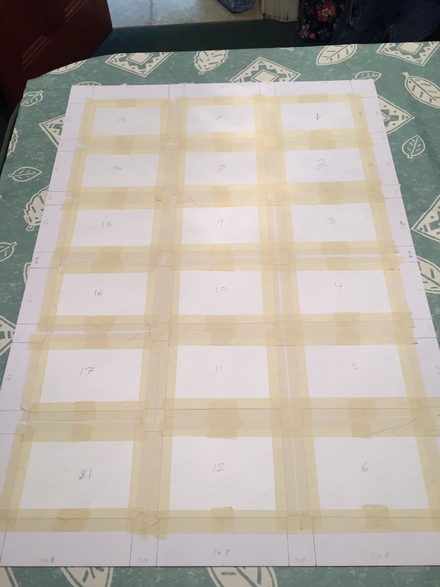
The next challenge was to decide how to order the images on the boards. The image below shows how I originally laid them out,meant to be viewed from the left side of this image I decided against this because most of the images are landscapes so most would be at an incorrect angle.


The image above here is the next layout that I tried. This one was better because the majority of the images were orientated the correct way but then I thought about the contact sheets that I had based this on and thought how it was just too different from them. The issue also arose of how the two boards would work together, in blocks of six images they did not work as well.

This layout was the one that I went with in the end, It works in columns in the order that the images were taken. this way your eyes can follow one column and then go onto the next, seeing the effects of different water damage in each one.
Once laid out they were then taped onto the back of the boards inside their window mounts, again I used masking tape so that I could remove the images without damaging them if I needed to. The tape held strong enough to keep the images in place permanently unless they were intentionally removed.
Making the other board was exactly the same aside from the missing frame. for this I used some art paper that lets light through quite well in lieu of an image.
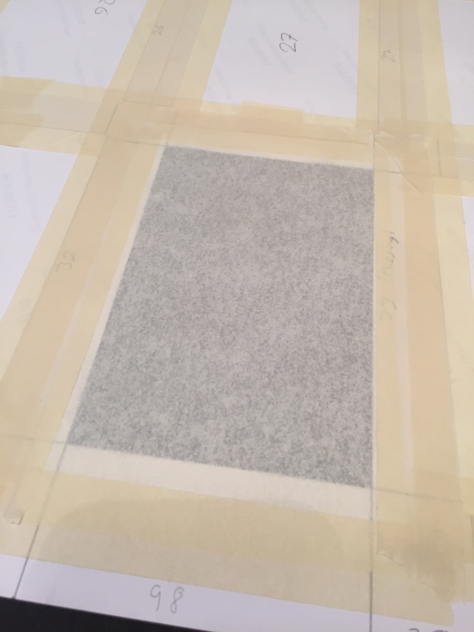
To finish the boards I mounted them with solid backing pieces of card to help protect them and keep the a little stronger, for the missing frame (33) I cut a corresponding hole in the backing for this so that light could still pass through.

I bought some chalk pens for writing on the images and boards. I tested them on some spare photographic paper and on the off cuts of card. I tested if they rubbed off, and tested out some brush strokes and just generally got used to using the pens.

Then I wrote on the numbers of each of the frames, this i felt was necessary because it gave the boards more of a feel of the traditional contact sheets while still being my own interpretation of them.

The final works with the drawings with coloured pens on can be seen on the final evaluation and display post. I am happy with how the boards and slides turned out and I feel that the time that I put for them was worth it.