Presentation of Final Work

For my final pieces I ended up making two big boards, each with 18 window mounts so that the 36 images could be presented in the style of a contact sheet. These boards were then drawn on with chalk pens to give them the look of marked contact sheets. I really like this part of my final project. The boards are very large and the images being 6X4s are plenty large enough to be able to see in very good detail. I like the spacing of the colours, I feel like the spread of the different colours works well with the range of different images that there are on the boards. I tried to get the colours of the pens to work with the colours of the images as well as with the other pens. Frame 22 shows the red very well against the dark and the contrast between the yellow and green on frame 15 is really positive too. The placement of the different pen colours or strokes are not based on liking or disliking the images, they are an art piece and not a real contact sheet and so this is not important. I would have liked the pens to be more vibrant and a bit brighter so that they could stand out even more against the black board and the images. the board looks much better in person than in these photographs. I left the 33rd frame blank because the image was so destroyed that it could not be printed, to try and make this feel like it was a missing section of film I decided to use some slightly thin art paper and have a hole cut in the back of the backing piece to allow the light to still pass through. It was difficult to draw over the window cuts without jumping the pen, the effect would probably have looked more like the real contact sheets if it was, smoother pen strokes would definitely have helped with this. I decided to move away from the traditional style of contact sheets by laying the images in order vertically rather than horizontally which is the traditional way, this was done in part because the boards were not big enough to be able to fit the images lek this and I did not want to split one set of 6 images over 2 boards, and now the two boards can be viewed individually rather than as a whole unit at the same time.

The next component of my final project is the “slides” that I made. These can be used on a light box or they can be held up to a light or window. They really help to frame the images with all of the different types of distortion shown on them, the last 6 frames in the bottom sides show the complete breakdown of the emulsion layer in some places leaving only the plastic base of the film. The first 6 also show the real difference from the others. These ones were completely bleached and so the emulsion layer is a light beige colour instead of the dark brown of the rest of the negatives. These are my favourite part of the final results, they add something really tactile and get the viewer to interact with the images and therefore the environment. Originally they were simply going to be placed on the light box flat [1/4] but I decided that this was not the best way to display them so I made a frame for the light box to make it look nice and hide the unattractive edges of the light box [2/4]. After this i decided that it was a little difficult to lean over the light box to see the images face down so using three small pieces of foam board for each slide I propped them up so that they could all be viewed at one angle [3/4] [4/4]. This really helped them to be easier to view and makes the presentation of them a lot nicer to look at, the foam board pieces do not look good but even when viewing the slides from the side they are difficult to see and so should stay hidden. The element of them that I like the least is the first slide, it is so faded that it is difficult to see against the bright background. If I was going to do this again then I would try and use something to make these easier to see. I would also try and create a viewer that the slides could be placed int to be viewed, acting like a mini light box the slides could be exchanged for one another to be viewed one at a time.

Overall I am very pleased with the final outcomes of this project, it took a lot of time and effort to do because it involved using film but it was definitely worth it because the results would not have been achievable without using film. The different colours and effects that came from them is fantastic and turned out much better than expected.

Process of Making Final Pieces

Making Final Display


Because of the different parts of my final project there was a lot of work that I needed to do to make them. The first element that I started working on was the slides. I knew that I would need to have some way to keep them flat but still be able to see them clearly.

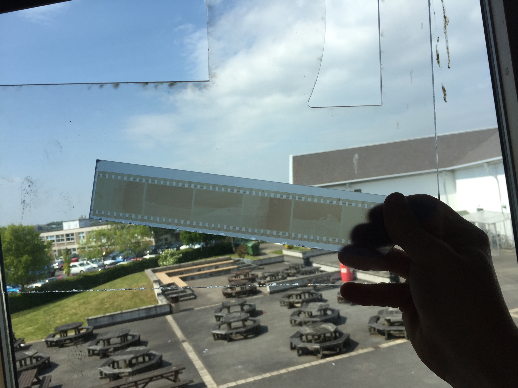
The photo above shows me testing using two pieces of acrylic to look through, one either side of the negatives. The back piece is tinted slightly brown, this was because I knew what It would look like with just clear acrylic or glass there so I wanted t test to see if this was any better. As it turned out it wasn’t, the main problem was that you could see shapes and things from behind the negatives, this made it difficult to see the images properly.

To try and beat this I tried using a piece of frosted acrylic instead of the clear one. Ths as it turned out worked really well for what I wanted as seen in the above photo. It just helped to soften and distribute the light while the light colour of the acrylic helped to let as much light through as possible.

The next step was to make a frame for the negatives. I decided to use a window mount for each of the strips, the first tester one that I did had to have a white background but I made some different variations to test and see which one I liked the most (these can be seen below). The different versions are different colours and some have beveled window mounts and some are just simple cuts. In the end I decided to go with the bottom one as the final version, the contrasting white against the black worked really well and helped to lead from the dark into the light of the negatives (the second last one is the template that I used to mark out the final ones.

Once I had cut all of the frames out I needed to cut the acrylic. The pieces that I used for the backs in the end were not the same colour as the part that I tested, this was because the school workshop where I got the acrylic from did not have any more of that colour. As it turns out though the lighter turquoise colour worked better for what I wanted and made it easier for the negatives to be seen. I cut the acrylic to the same size as the outside of the frames so that it would fit flush with the card.

Then the negatives needed securing to the frames. The side of the negatives that holds the image on faces away from the outside of the frame and touches the acrylic, this protects the images a little and makes sure that the viewer is not looking at an inverted image when they hold it up to the light.

Securing the negatives was done with just some small pieces of masking tape, this was so that if I wanted to I could remove the negatives at some point or reposition them without damaging the film. After this I just placed some double sided tape on the card and used this to hold the acrylic in place and secure the images.

All of the final mounted negatives. This was just keeping them still so that there would be no issue with the tape sticking, i was not taking any risks at this point.

The next thing to do was to make the big boards, although a lot less fiddly and delicate this was the part that took the longest to do and was the most challenging.

The first step was to mark out all of the sections that I would need to cut out. This entailed working out the size for the frames and then marking out this on the two large boards. This marking process took a very long time to make sure that I had got every measurement correct. I completely did one board first before I did the other Incase I decided that i had done something wrong on the first I would not have to remark and cut both boards.

Cutting out the boards took the longest (I did use a window mount cutter it’s just not in this photo) out of all the different parts to this because it was the most important that I got right. I had several scares that I had messed some things up but in the end they all were cut just fine.

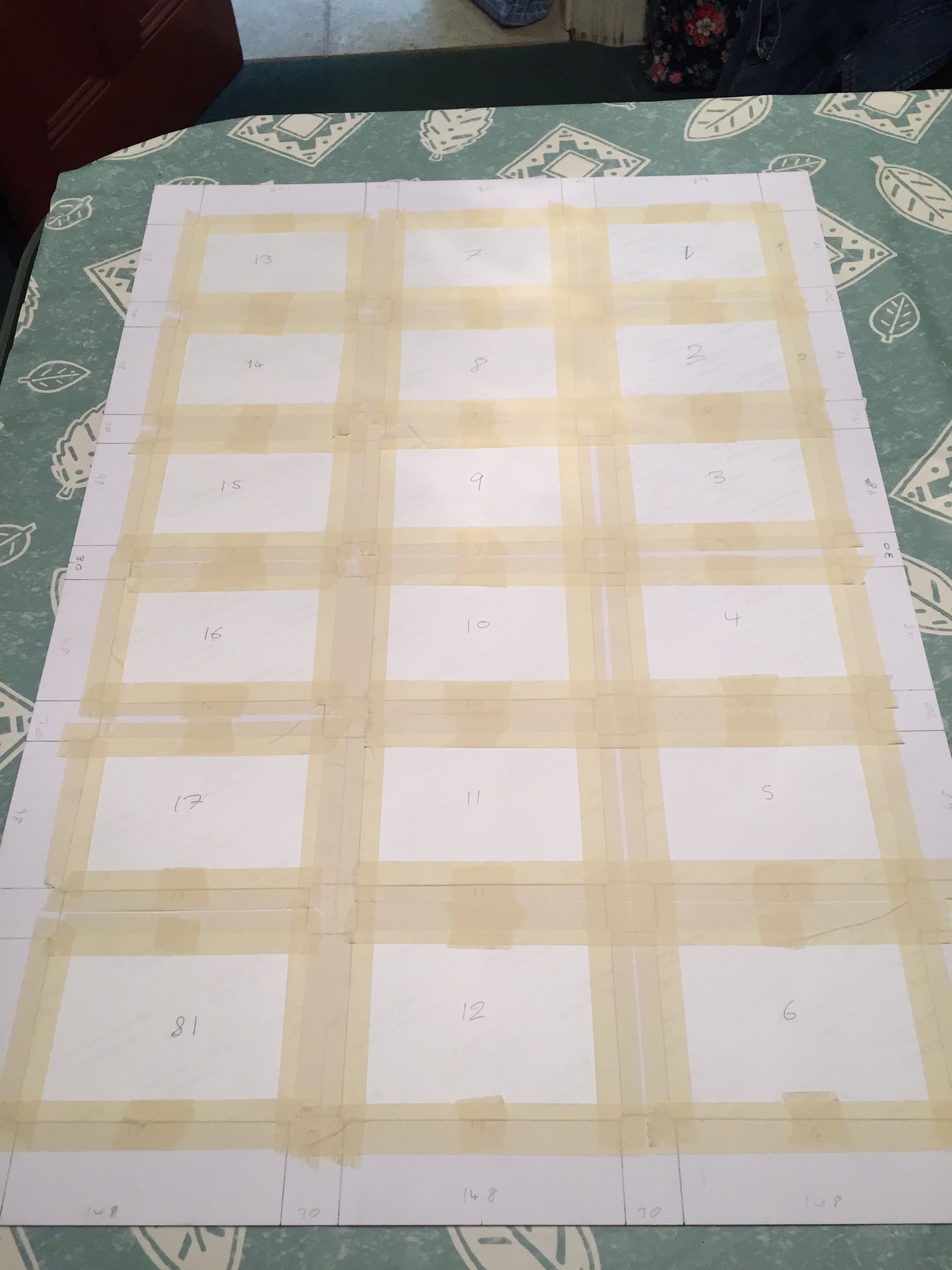
The next challenge was to decide how to order the images on the boards. The image below shows how I originally laid them out,meant to be viewed from the left side of this image I decided against this because most of the images are landscapes so most would be at an incorrect angle.


The image above here is the next layout that I tried. This one was better because the majority of the images were orientated the correct way but then I thought about the contact sheets that I had based this on and thought how it was just too different from them. The issue also arose of how the two boards would work together, in blocks of six images they did not work as well.

This layout was the  one that I went with in the end, It works in columns in the order that the images were taken. this way your eyes can follow one column and then go onto the next, seeing the effects of different water damage in each one.

Once laid out they were then taped onto the back of the boards inside their window mounts, again I used masking tape so that I could remove the images without damaging them if I needed to. The tape held strong enough to keep the images in place permanently unless they were intentionally removed.

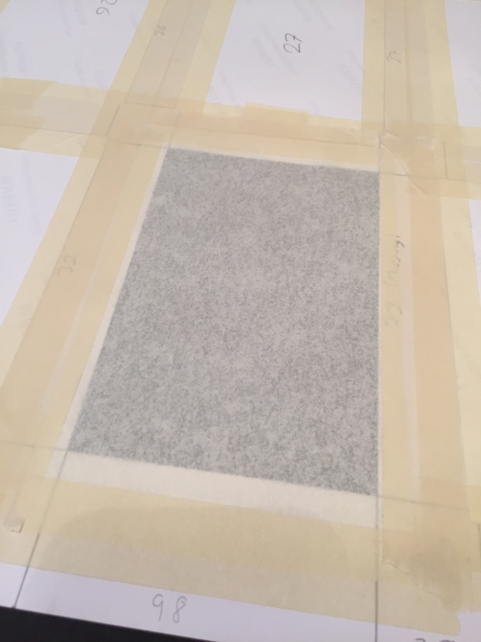
Making the  other board was exactly the same aside from the missing frame. for this I used some art paper that lets light through quite well in lieu of an image.

To finish the boards I mounted them with solid backing pieces of card to help protect them and keep the a little stronger, for the missing frame (33) I cut a corresponding hole in the backing for this so that light could still pass through.

I bought some chalk pens for writing on the images and boards. I tested them on some spare photographic paper and on the off cuts of card. I tested if they rubbed off, and tested out some brush strokes and just generally got used to using the pens.

Then I wrote on the numbers of each of the frames, this i felt was necessary because it gave the boards more of a feel of the traditional contact sheets while still being my own interpretation of them.

The final works with the drawings with coloured pens on can be seen on the final evaluation and display post. I am happy with how the boards and slides turned out and I feel that the time that I put for them was worth it.

Artist Reference – William Klein

Artist Reference – William Klein


William Klein is a photographer whose work has spanned decades. He has worked with many different subjects and has captured all different kinds of scenes from photojournalism to fashion and even some street photography. Due to the time that he was working in he shot almost all black and white and on film. Recently he has taken a look back at some of his most famous images and the contact sheets that go with them, he has then painted over the image, similarly to how people would mark contact sheets to identify good images and poor images, there is not much reasoning behind way he has done this further than:

“The idea for the colour and graphics comes from the red lines
photographers put around their choices on a contact sheet.”

The massive size of these images once blow up makes them really impressive and striking, the contrasting colours really help to accentuate and frame the images and makes them really standout. I really like this idea and I think that I am going to employ this for the presentation of my final project.

William Klein : “Painted Contact Sheets” Series

https://petapixel.com/2011/08/31/the-stories-behind-photographer-william-kleins-contact-sheets/

Don’t just take, make

‘Environment’ – finished project evaluation

For my final outcomes from this project I have managed to produce 8 presentations of my favourite photographs along with a carefully designed photo book. To begin my project I started with the idea of spreading environmental awareness through photography. This type of conversational photography has been used to advocate environmental issues since the 1860’s and is a powerful medium for influencing positive change. When I started I used the rough headline of ‘environmental awareness’ but as my work has progressed over the exam it has been changed to the preferred title of ‘Pollution in the Channel islands’.

As the world’s pollution issues are already vastly documented and recorded there was a large amount of artistic and written research done around this topic which helped to inform and inspire my shoots. The main inspirations I have had for my project are photographers who have looked at pollution from an artistic and symbolic view-point. These include Gregg Segal and his ‘7 days of garbage’ project, Steven Hirsch with his work; ‘Off The Water’s Surface’, and Goussin and Hortense’s beautiful examples of ocean pollution. By researching these photographers I was influenced to make many of my final results a beautiful mixture of symbolic and abstract representations. The specification for this years exam was to create a sustained exploration of our given word, ‘environment’, resulting in multiple final presentations. Over the time we were given I have created beautiful symbolic, abstract and documentary images portraying environmental issues as well as inspiring messages and visual encouragements for positive change. By demonstrating a mixture of photography techniques I have really expanded my skill set and provided my viewer with an engaging and interesting project. This exam project, in my opinion, has been very successful, one because I have found my chosen subject so inspiring and informative, and two because I made sure I used careful planning and organisational skills for each one of my shoots. Overall I am really happy with my photo book result as well as the final layout of my 22 favourite images, paired and presented as 8 designs.

Above I have added a few images depicting my finished final presentations of my favourite outcomes from this project. I love my use of window mounts, story boards, triptychs and diptychs to present my work and feel as my outcomes really extenuate the meaning behind my project. What I think makes this collection so successful is that each set of images displays a different message and is presented using a different type of photographic practice. This variety has produced a really interesting and intriguing project, with something that hopefully every one can emotionally respond to. My favourite outcomes above are my large collection of waste to energy images because of the precise way I managed to fit each one together in a story board. As well as this I also really like my documentary plastic pollution outcomes on the bottom left as the double window mount technique has produced very professional and clean looking outcomes.

Online Book Preview: http://www.blurb.co.uk/books/7926770-pollution-in-the-channel-islands

Lastly I have presented my final photo book layout as an online link and contact sheet above whilst I wait for the physical copy to come down in the post. The reason I decided to create a book as well as many final prints is because I think it is a really nice way to bring all my outcomes together, showing my journey as well as thoroughly getting across some environmental awareness. I love the layout I have created above as I have really showed how each shoot works together, getting across the same message in different ways. The facts that I have gathered from my previous research throughout this project give some amazing context to my images as well as emphsising there meaning and the harsh truth of our environmental impact.

Final Results: Photo-book – Front Cover

Now that my photo books is completed and arranged with text and images, I next need to decide what the front cover will be. After doing this I will be ready to print out my book and present my finished project along with my evaluation. Although I have the option of choosing a fabric cover I think that, for my project, an image wrap will be much better. To do this for my Blurb published book I will simply have it printed straight onto the hard cover, giving my book a professional look. As the front cover gives the viewer an initial impression of the book before even opening it, I am wanting to show something eye-catching and in keeping of my environmental theme. This image will represent my project and set the tone for the rest of the book….

After experimenting with the four front cover examples above I have decided that the textured abstract image of agricultural plastic will be best for representing my book. This is because of its intense beauty as well as it very dark and worrying subject matter. To make  this double page spread work perfectly I have rotated it 180 degrees so that the cross over of plastic is featured on the front page rather than the back.  The reason I think this image is so much better than my other choices presented above is because it is not a straight forward symbolic message and its abstract style will hopefully intrigue my potential viewers.

Final Outcomes

These are three images I selected out of the original, only slightly retouched images (without any heavy photoshop of the addition of text) I decided to present these image as a sort of triptych. I plan to separately mount these images on white window mounts but display them in a row of three as above. I chose these three because the two more feminine images with the pink back drop act as the bread in my angry feminist (image with the blue backdrop) sandwich. The colour of the images work well together because the images with the pink backgrounds have a large are of blue to tie them with the image in the centre, the beauty queen photograph has the blue of the dress which is mirrored quite nicely a similar blue of the fluffy backpack in the art student photo. I also decided to place the feminine images on the outside because I am more outwardly feminine than I am masculine, but that does in no way diminish the fact that I am a feminist, which is why the dramatic angry feminist portrait is placed in the middle. These images were mainly inspired by studio self-portraits of Yasumasa Morimura.

I selected these images to be presented together as a triptych in a white window mount. I chose these images to act as part of a triptych because they all had blue backgrounds and the text included in the images stems from the theme of feminism and stereotypes. Similarly to the three images above at the top of the post, I placed my two more masculine stereotypes on the outsides of the triptych and my more feminine stereotype in the centre. My single feminine figure in this triptych is also supported by the phrase “feminine is not anti-feminist” breaking the stereotype that feminist cannot present themselves as stereotypically feminine or conform to traditional gender roles. My art student image features the phrase “Her work critic, and yet her best advocate” which is a phrase that is personal to me as I can be both overly confident and overly critical about my own work. The text also ties in with the stereotype of a pretentious art student who is constantly at war with whether their work is worthless or genius. The text in my angry feminist image, “We tried being polite, but men only respond to violence” is a phrase that combats the negative connotations of the angry feminist stereotype. As, historically speaking, asking nicely to be freed or given equal rights as a oppressed group of people doesn’t work. These images were inspired by Gillian Wearing photographic project “Signs that Say What You Want Them To Say and Not Signs that Say What Someone Else Wants You To Say” as I feel that these are often phrases that are unspoken and the phrase included in the art student portrait is something that I have struggled to put into words. If Wearing had included me as one of her subjects in the project, I’m sure that my sign would have said something of that nature.


I chose to present these high contrast images as a triptych because I felt that they were more powerful when presented as a group. I plan to mount these on black window mount to create even more contrast between the black of the window mount and the white of the print. I chose to place the images in the order that I have shown above because the centre image has a strip of lighter hair and has a nice curve in terms of its overall pose and composition. With these images I wanted to create a sense of drama and intensity, so the viewer feels as if the figures could jump out of the window mount and attack at any moment. These images were inspired by Pieter Hugo photographic series, “There’s a place in hell for me and my friends” I found the concept of hyper pigmentation in all skin tones and within many races and ethnicities very intriguing. However, I simply took inspiration from the aesthetic nature rather than the political undertones of Hugo’s work.

I selected this image as a final because I feel that my continuation with an analog approach was very successful. I plan to mount this print on black sugar paper, leaving a small border of white from the original print. I will then  see how the image looks but I think I will mount it in a black window mount to give the piece a polished and finished look. I included this image even though there are some others that are similar because I feel that the colour relationship between the pink and blue and black and white is very apparent and successful with this composition. The word “beauty” which has positive connotations is presented in black text with a dominant white background and the word “bitch” which has negative connotations is presented in white text with a dominant black background. There is also a very strong sense of divide between the two stereotypes due to them being separate bodies also separated by the rip between the prints. This image was inspired by the research I did on ripped movie posters such as “The Shining”, the burn book from “Mean Girls” and the typical Hollywood ransom notes.

I selected this image as a final, although it is rather similar to the final above because in this image the two figure have become one, the physical prints are combined. I think that there is a greater sense of integrity in this image because everything has been done manually and by hand. The text in this image alternates between white letters with black background and black letters with white backgrounds. This image has already been mounted on to black sugar paper but I also plan to place it in a black window mount. This image was also inspired by film posters, ransom notes and the burn book from “Mean Girls” I feel that this image displays all of my inspirations in a stylized and sophisticated way.

I selected this image as a final outcome, although similar to the previous two because I think that the digital combination of the two images and text is more polished. I the digital combination of the images I was able to edit out the fingers of the second hand in the blonde photograph, which looked strange in the very centre of the image. I was also able to match up the faces more accurately and adjust the brightness, contrast and colour channels to make the skin tones more similar for a more seamless split. For the text in this image I took inspiration from the work of Barbara Kruger and kept the full words intact rather than separating them into individual letters. I placed the text onto label like backgrounds of the opposite colour, white on black and vice versa. I also placed the words at jaunty angles, which is a common feature of Kruger’s work. I also decided to keep the word Feminism on my “Art and Feminism” book between the additional “and” and “the” as a not so subtle subtext. I originally planned to edit the word out, but after consideration I decided to keep it.

I selected this image as a final because I feel that it comments of the beauty standards in western society that women are held to. The text also comments on how beautiful who appear outwardly confident are often just as insecure as everyone else on the inside. When I was blonde I also felt that I was held to higher standards in terms of appearance because when one has blonde hair and wears  no make up and comfy clothes they often look very unpolished. If I had worn the same wig with the outfit I wore in my art student portrait with no makeup I would have looked very odd. I plan to present this image individually in a black window mount as I feel that it is strong enough to stand alone. This image was inspired by the work of Barbara Kruger, I adopted her monochrome colour palette with her signature cherry red as a pop of colour. I was particularly inspired by her collection of images that featured various pop icons such as Marilyn Monroe and Andy Warhol with the phrase “not —– enough” with an different adjective for each person.

Final Results: Photo-book – Extra Material

In order to properly introduce and give context to each pollution issue that I am visually portraying, I will be adding in multiple facts, as well as a few inspiring quotes. The facts I will be adding will be straightforward statements, taken from my previous research on the blog, and will be put beside the images to give context to each topic. Instead of adding a preface to explain what my book is about, I have decided to use a title page and really powerful quote from legendary explorer Robert Swan. By doing this I hope to introduce my book without giving too much away about the context as well as get across the inspiring message about our environment. Below is a list of each fact and quote in the order I intend to present them throughout my photo book…

  • Second title page –  Pollution In the Channel Islands
  • Introductory quote “The greatest threat to our planet is the belief that someone else will save it.” – Robert Swan
  • ‘Cigarette waste’ context – Every year over 4.5 trillion cigarettes are littered worldwide, each one taking anywhere from two to twenty-five years to biodegrade.’
  • ‘As well as leaching cadmium, lead and arsenic into our environment, discarded cigarette butts pose a significant threat to our environment in terms of fire. Every year, forest fires ravage vast areas, killing off wildlife and vegetation that take years to return.’
  • ‘Plastic pollution’ context – ‘Modern life is unthinkable without plastic and the pure fact it is low-cost, light weight and durable makes it very hard to dispose of.’
  • ‘The term plasticulture refers to the practice of using plastic materials in agricultural applications. Unfortunately this method is used for Jersey’s famous potatoes, 99% of which are exported to the UK.’
  • ‘Agricultural films are one of the largest contributors to the billions of pounds of plastics that are improperly discarded by farming industries across the globe each year. ‘
  • ‘With the exception of the small amount that has been incinerated, every piece of plastic that was ever made still exists in some shape or form.’
  • ‘Ocean pollution’ context – ‘The litter that is swamping our oceans kills wildlife, looks disgusting and is a hazard to our health. – Fishing ropes and netting are a huge problem for our eco-system as, not only does it take at least 600 years for them to degrade, more than 260 animal species worldwide have suffered and died from being entangled in or consuming the material.’
  • ‘Each year, National Geographic estimated that we dump over eight million metric tons of plastic waste into the oceans.’
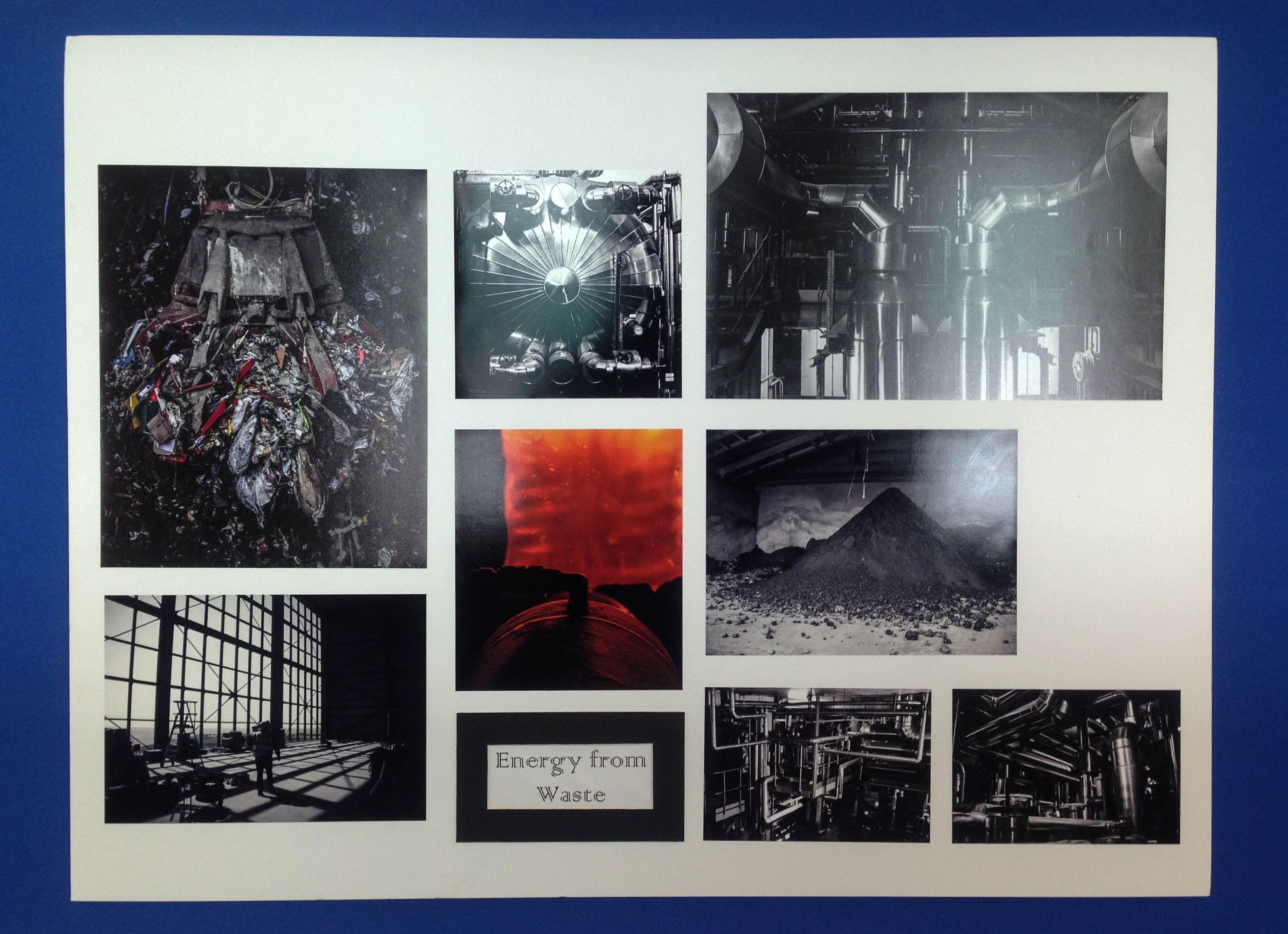
  • ‘Energy from waste’ context –‘All common household waste in Jersey that is not recycled is sent to the La Collette Energy from Waste Facility. This facility provides the Channel Island with a reliable means of waste disposal for the next 25 years as well as being able to produce 10MW of power, equivalent to 7 – 8% of the island’s electricity usage.’
  • ‘To create energy at the same time as disposing of our waste, the facility burns rubbish and uses the heat from the fire to generate steam which is then used to drive a turbine, generating electricity.’
  • ‘The plant is constantly monitored to ensure it operates in accordance with the licence and EU air quality standards.’
  • Ending quote – “It is the greatest of all mistakes to do nothing because you can only do little – do what you can.” – Sydney Smith

Above is a contact sheet depicting how I am going to arrange my title, quotes and facts with in my photo book. I love the idea of having two blank pages with a straight forward fact between each topic as this really adds to the structure of my journey and leaves a clean space between the different issues. When placing my text I decided to keep it small and towards the bottom of the page as to not take away the emphases of my photographs. As well as this, the reason I have decided to add in two quotes, one as an introduction and one as an ending, is because they really bring to light the meaning and message of my project.

Further Reading – Helena Reckitt and Peggy Phelan – Art and Feminism

Art and photography are creative mediums that I have always been passionate about and feminism is a topic that I am incredibly interested in as a self identified feminist. As a result of these interests I received a number of books for Christmas last year, including “The Art of Reflection” which is about how female artist have presented their bodies in self portraiture and “Art and Feminism” which is an incredibly interesting book that encompasses many topics surrounding the link between feminism and art, with many honourable mentions of influential feminist artist and different critics insights on how their work, often particular pieces link in with feminism.

The book includes essays, quotations and various texts from a number of female  artists, art critics and feminist scholars. The preface and editing of the book was completed by Helena Reckitt, a feminist curator and researcher and the survey was written by the incredibly influential feminist scholar and former chair of New York University’s Department of Performance Studies.

The pre-face of the book was written by Helena Reckitt, even in those first initial pages some very interesting and thought provoking thoughts are made. Reckitt writes that “the trap of heroine worship,” is that “the achievements of women are uncritically celebrated in an understandable but counterproductive effort to compensate for year of neglect.” I think that this statement in certain circumstances is correct. A lot of women who are in male dominated professions such as doctors or scientists are often celebrated for simply choosing to take their chosen career path. I think that such achievements are commendable as girls and young women are often discouraged from choosing to study certain subjects or take certain jobs. However, when this celebration, or “worship” as Reckitt suggests, takes away from their actually achievements within their field (when compared to men as well as women) this  “worship” can be harmful. For example if a public speaker who made an  well planned, well presented, thought provoking speech on a serious topic was not a native English speaker and all anybody could talk was how well they spoke English, it devalues the content of the speech. On the other hand, however, this statement is untrue, in the art world self identified feminist artist’s (or occasionally simply female artists’) work is looked at incredibly critically. Critics and viewers alike automatically search for some kind of feminist reading or political subtext within artworks.

Peggy Phelan (left), Helena Reckitt (right)

Reckitt also goes on to say later in the pre-face that stems from the same idea that some female artist find “the feminist label restrictive, threatening to overshadow other elements of their work.” Louise Bourgeois, one of the most influential feminist artist of  the 20th Century has in the past denied being a feminist, this may be because she feels that if she labels herself and thus, her work as feminist it may diminish the many other strong themes in her work. Other female artist of colour, have in the past and present denied being “feminist artist” because they feel that the feminism movement for the greater part of history has been about the rights and freedom of middle class white women with a complete disregard for the rights of women of colour. I think that this is a fair point, if you feel that your rights have been ignored and you relate this discrimination to a particular label, you are completely within your right to not identify with the movement. However, I feel that within the current movement of third wave feminism, the importance of inclusion for all women, including women of the LGBT community and women from all races and cultural backgrounds is growing.

Peggy Phelan states later in the survey that “Writing about art has traditionally been concerned with that which is interior to the frame, whereas feminism has focused primarily on what lies outside he frame of patriarchal logic, representation, history and justice.” I believe that this is a very intriguing analogy as it raises questions as to whether or not feminist art is appreciated enough for its aesthetic nature and perhaps too much for its social and political allegory. At the same time, it suggests that the social and political nature of artworks that are not typically considered feminist have traditionally not been looked at as critically as maybe they should have been at the time of production. Many non- feminist artworks from history are now looked at through a critical lens, although critics views are now in retrospective and cannot reflect on current events of the time. The critical viewpoint that Phelan describes suggests taking a step when critically analyzing art, viewing it within it’s social, political and historical context.

I found this book very interesting, but at times difficult to read, I often had to take a break and allow myself to process the essays and make connections before continuing. I also found myself having to read over things again to understand them better. I was very glad that I was gifted this book as opposed to borrowing from a library as I was able to highlight certain quotes and passages that I found interesting or didn’t completely understand as well as marking pages that contained artwork that I was inspired by or found particularly intriguing.