Final Results: Photo-book – Layout & First Design

After arranging how I want to present my final prints and deciding which photographs are the most important for the message of my project, I am ready to begin working on the layout of my photo-book. To start with, I have decided to have my book as a standard portrait size of 20cm by 25cm. This is because, as with my last photo-book, I have multiple portrait images that will fit nicely on a single full-page, as well as quite a few landscape shots that will work beautifully as double page spreads. For this ‘environment’ project, we were informed that our final results must be presented in a thoughtful, careful and professional manner demonstrating skills in presenting with either window mounts, picture frames, foam-board, etc. As well as doing this, however, I think my photo-book will be a really nice finish to bring all my outcomes together, showing my journey as well as thoroughly getting across some environmental awareness.

When putting together my first layout in Lightroom I spent a long time tampering with the order and sizing of all my final outcomes. Whilst doing this I found that a few of my shoots did not fit in with the dramatic theme. These excluded results include the ones from my beach clean ups, my second plastic portraiture shoot, and my results from the La Collette recycling centre. Although I feel like these are still an important part of my project, they do not really contribute to the strong messages shown throughout my book and therefore will just remain a part of my supporting studies. Below is my first design laid out in the order I wish to present it (apart from a few final changes). When putting this together I thought about how many blank pages I wanted to leave, sequencing, the way it shows the narrative and the juxtaposition of certain images. The blank pages left between each subject (cigarette waste, plastic pollution, ocean pollution and Jersey waste disposal), as well as a few others, will later be filled with subheadings, messages and facts. The contact sheet below shows my initial design presented as a contact sheet of screen shots…

Initial Photo-Book Design:

The design above shows all of the pages I plan to have featured in my end result. The only definite change I will be making to this layout is to remove my single beach clean-up image, bringing my book down from 60 pages to 58. As well as this, I will be adding in subheadings, messages and facts to the blanks pages and at the start of the book; a second title page and a preface/quote. Although I have mixed up and joined together a lot of my shoots, my book will still be presenting four different sections looking at cigarette waste, plastic pollution, ocean pollution and Jersey’s waste disposal. My first decision for the design of my book was to make all the pages black, emphasising my more symbolic photographs and giving the book an overall dramatic tone. For the layout I have decided to show my journey through exploring the Islands pollution by presenting my themes in the order I completed them. The first and shortest section introduces the dark tone that is displayed throughout my book whilst only showing one style of studio photography. The next two plastic and ocean pollution sections, however, depict an array of symbolic, documentary and abstract images that, together, really do emphasise their meanings. Lastly is my Jersey waste disposal shoot which, like the first section, only shows one type of photography to tell the story. I love the variety of double page spreads, full bleeds, and mirroring techniques I have used throughout this layout and feel as if this book will be an informative and inspiring part of my final pieces.

Symbolism: Final Prints – Layouts & Designs

After creating, experimenting with, and evaluating my final presentation plans for my documentary outcomes, I next moved on to deciding how to portray my chosen symbolism results. Below I have taken all the outcomes I had decided to use in my previous ‘selections post’ and organised them as well as slightly narrowing them down. These designs are mock-up versions and experimentations of my favourite symbolism outcomes and how I want the final printed versions to appear when presenting my project. From my knowledge of printing final images in previous projects, I will be asking for my A4 and A5 prints to be on gloss paper and my A3 on matt. The red cross’ below indicate that I will definitely not be using this version of the display to physically recreate and the question mark means I am still unsure. To create these I simply used layering tools in Photoshop to make black and white backgrounds give off the illusion of window mounts, triptychs, and diptychs…

Symbolism – Final Prints – Presentations :

My first symbolism presentation above depicts the problem of cigarette waste and represents the message of ‘man vs nature’. These computer generated displays depict how I am intending to display my results in a classic black diptych window mount. Because of the dramatic black background of these pieces, I will be requesting they are printed off size A4 so that they can appear on gloss paper. Although I am fond of my symbolism piece using a human hand as the subject matter, I have found that the more simple mirroring effect of the two flower images looks much more dramatic and stylish. To create this display above I actually had to go back and re-edit these two images in order for both to appear in colour with the same tone and lighting effect. To make the window mount simulation above I used a very thin frame of white background before the black to create the illusion of the black frame having a bevelled edge.

For my next pieces presenting my creative ocean pollution symbolism finals, I will be presenting two sets of diptych images backed onto large white foam boards. Because these will all be A3 prints I originally thought about backing them onto foam board and simply displaying them as four separate pieces. However, because the images are quite similar in colour and subject matter I decided that they are best off displayed together in the hopes that they will compliment one other. I particularly like the two examples on the left together because they are a simple/abstract version of the same jellyfish-like creature. As well as this the fish and wave outcomes also work well together as it is an obvious symbol of ‘under the sea’. To re-create the Photoshop examples I have displayed above I will be first backing them onto black foam board separately (giving them more visual weight) to then arrange them side by side.

Lastly, for my surreal and abstract outcomes above, taken during my documentary ocean pollution shoot, I have decided to put together my most complicated window mount so far. This presentation will be paired up with my black and white documentary outcomes depicting the pollution I used to create these images. As with those outcomes, these were taken on an iPhone and therefore will also have to be printed off on A5 and A4 gloss paper. The reason I am unsure whether I will be using the five image window mount on the left or the smaller one with four is because I first want to judge the quality of the top abstract piece to see if its good enough to display. When recreating one of these examples I will most likely crop the A5 pieces to the same size in order for them to appear more professional. To create this complicated window mount will take a lot of planning, however, when finished, the end result will accentuate my photographs and present a visually stimulating collection.

Shoot 3 finals:

My third shoot is based on the same thing as the second shoot, however it will be shot in a different location. The third shoot will take place in St Brelade’s in the woodland area on the left side of the bay. I have decided to take images in this location to create more variety of images for my London connection photographer, this way it is easier to respond to the images that I have taken. The inspiration for the use of my props including cards, blue brothers hat, blacked out glasses, bow tie, tuxedo and casino chips, all came from watching a movie before the start of my project. The movie James Bond – Casino Royale, is of course a successful spy movie based around a single character, however I was more captivated by the stereotypes of what is worn in a casino. During the spy  film, a casino scene becomes the main climax of the movie. The casino scene is what inspired me more than anything else, to create something using this idea of stereotypical gamblers. The props I have used all relate to this scene in the movie, with a few extra additions.

Editing this image I decided that the full composition needed a lower exposure to light to ensure that the subject can be easily seen in the background of the image, I have also used a low exposure to allow the trees and the ground to stand out through the light circles that hit the ground. From the shoot the light is totally natural, the image was taken on an overcast day. When the weather is overcast in my opinion it gives the best light since it will not over rule the rest of the details in the image.

This image used the same composition as the previous image however after experimenting on the shoot I decided to take a closer image of the subject. Nothing has changed otherwise in this particular frame. Putting the subject in the middle of the path was set up in a particular way, as you can see the subject is standing in the only light part of the path. This ensures that he is not absorbed by the other areas of darkness, and he can stand out more. During the shoot I took one image from a further distance and followed up with the same image in a closer shot. 

Walking back through the woodland area to leave, I got lucky with an image of the subject casually walking away from the camera. The shot gives a sense of motion since the subject is clearly walking. Also this image combines nature with natural behavior. giving extra meaning to the shoot. The sky is not visible in this composition again so the frame is completely filled with the surrounding nature.

Other finals: 

This is one of my favorite images from shoot 3. This is because the composition was made using a wide angle lens which allows me to show a more vast area of the woodland. The subject is standing on the edge of an inbuilt bunker from the world war which has been left to grow into the environment. Having the bunker in this image creates the sense of how man has built into the environment and just left the creation as a stain in the natural woodland.


Post as a performance?

// P E R F O R M A N C E   A R T  |  F L U X U S //

Fluxus is an international group of musicians, artists, designers, poets and creators who shaped themselves in the 1960s and 70s. Describer by art critic Harry Ruhé as “the most radical and experimental art movement of the sixties”, it is known for its experimental nature and ability to expand and evolve. Generating a variety of new art forms that were created by Fluxus artists such as intermedia, concept art and video art this movement gave way to a whole wave of new art forms. Three main continents were involved in this dramatic and historic movement; Asia, Europe and North America. “Performance events” were a large part of this artistic movement and lead on to a series of pieces created world wide which eventually became time-based design. The main notion is that one should embark on an artwork without a conception of its final form. There must always be a relationship between the audience and artist ad the finished product is only a snapshot of the entire process of creation. This process of creation was valued highly over the finished product itself. It was actually George Maciunas, a co-founder of this fluid movement, who eventually coined the name Fluxus in 1961 to title a proposed magazine. Meanwhile Marcel Duchamp, a french artist, was a large influence for this movement focusing mainly on the ‘readymades’ he created.

These ‘readymades’ created by Marcel Duchamp were ordinarily manufactured objects that were selected and then modified by the artist. He self-labeled the process “retinal art”. By choosing a object, or selection of such pieces, repositioning, titling and signing the piece; it became art.

Above: Ray Johnson setting up a moticos installation, autumn 1955 and Suzi Gablik surrounded by the same pieces.

Ray Johnson’s early performance art was created through interactive installations which could then be represented through photography. Above is one of these first performances which took place in the autumn of 1955 and featured a variety of his moticos pieces in a street installation.

Many experimental artists of the 60s took part in the Fluxus movement either through the creation of their own art or through their participation in other’s performance pieces. Examples of artists who joined into with these Fluxus activities inclue: Joseph Beuys, George Brecht, Robert Filliou, Al Hansen, Dick Higgins, Bengt af Klintberg, Alison Knowles, Addi Køpcke, Yoko Ono, Nam June Paik, Daniel Spoerri, and Wolf Vostell.

The varied nature of the Fluxus movement involved a community of friends who would work and create together and maintain the movement as an idea. There were many different ideas about art and its role within society however which caused some debate. One co-founder actually proposed a manifesto for the way Fluxus was defined but none of the other artists agreed with it leaving the part in a varied and undefined state. Many artists didn’t even consider Fluxus to be a movement at all so instead it became a loose but robust community which earned  a name for itself through experimentation.

Mail Art

// R A Y   J O H N S O N //

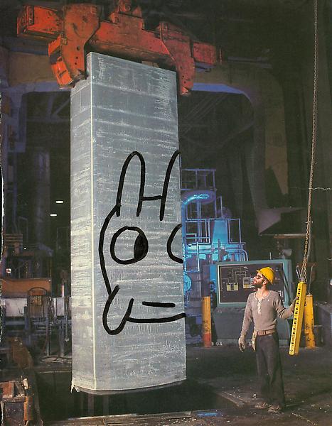
Looking into the theme of ‘Mail Art’ and its place in historic and modern creative movements, the name Ray Johnson was a quick one to appear. the twentieth century artist was popular following his activity as part of the downtown art scene in New York in the early 1950s. Johnson painted geometric and abstract images heavily influenced by his previous professor, Josef Albers. The crucial thing about Johnson’s work was not just how he created it but later his destruction of the same pieces. Most of his pieces were destroyed in his personal process of creating collages which resued this original artwork. In 1954, these small-scale collages were labeled as “moticos” and featured irregular shapes and images from popular culture. Some of these celebrity influences included Elvis Presley and Shirley Temple as well as regular department store models. Much of Johnson’s work in this area anticipated Andy Warhol’s pop imagery which started to appear in 1960. Despite artistic similarities, Johnson’s approach to work and fame was drastically opposed to Warhol’s and he was known for dodging it being labeled as “the most famous unkown artist” by Grace Glueck in the New York Times (1965). His deliberate elusiveness was a popular debate and added to the interest of his character. 

Much of Johnson’s work started a modern understanding of performance art such as his tendency to share his moticos around New York with strangers in the streets, train stations and cafes. These performances were even sometimes self recorded in order to collect public reactions to his work and each intricate creation. Much of the work used in these sessions of self publication were later supposedly burned.

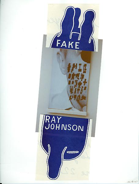
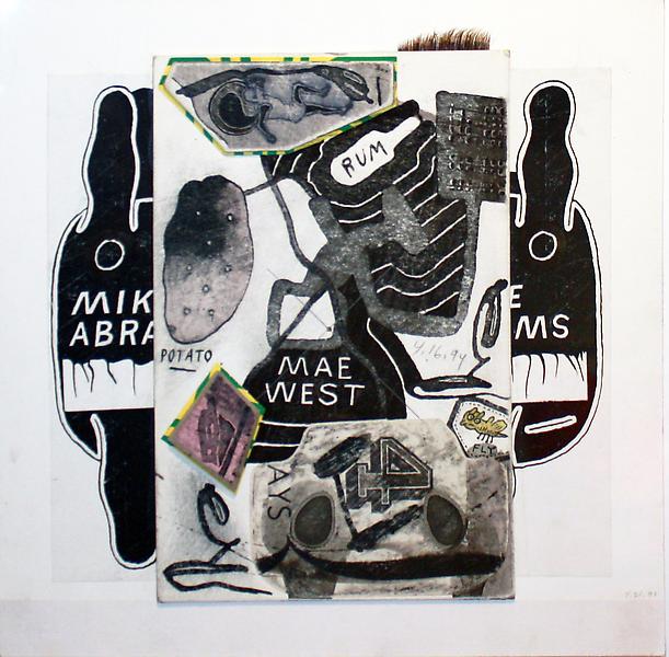
Jonson reused his moticos by cutting them up and creating new tiny compositions with them which could then be inked on, painted and sanded to create new pieces of work. These new collages were extremely complex and had an underlying emphasis on structure repetition and semi-geometric forms and shapes. Johnson can easily be seen as an early instigator of performance art acting in other’s pieces and creating his own such as the staging, “Funeral Music for Elvis Presley”. 

“In his typically self-deprecating way, Johnson would say that he did not make Pop Art, he made “Chop Art”.”

In 1995, Johnson was witness dressed in black as he dived off a bridge in sag Harbour, Long Island before backstroking out to see. This suicide was heavily speculated and many aspects of his death seemed calculated such as the repetition of the number 13. The date of his death, the 13th January; his age at the time (67, 6+7=13) and the number of the motel he had checked into earlier that day, 247 (2+4+7+13).

“There was much speculation amongst critics, scholars, admirers, and law-enforcement officials about a “last performance” aspect of Johnson’s drowning. After his death, hundreds of collages were found carefully arranged in his Long Island home.”

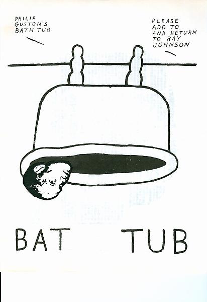
Ray Johnson is still considered one of the major artistic innovators of the second-half of the 20th century within the critical community but his work remains mainly unknown and heavily under-appreciated by the general public. Some of his relevant pieces are selected below and will be used as starting points for further experimentation with my postcard images.

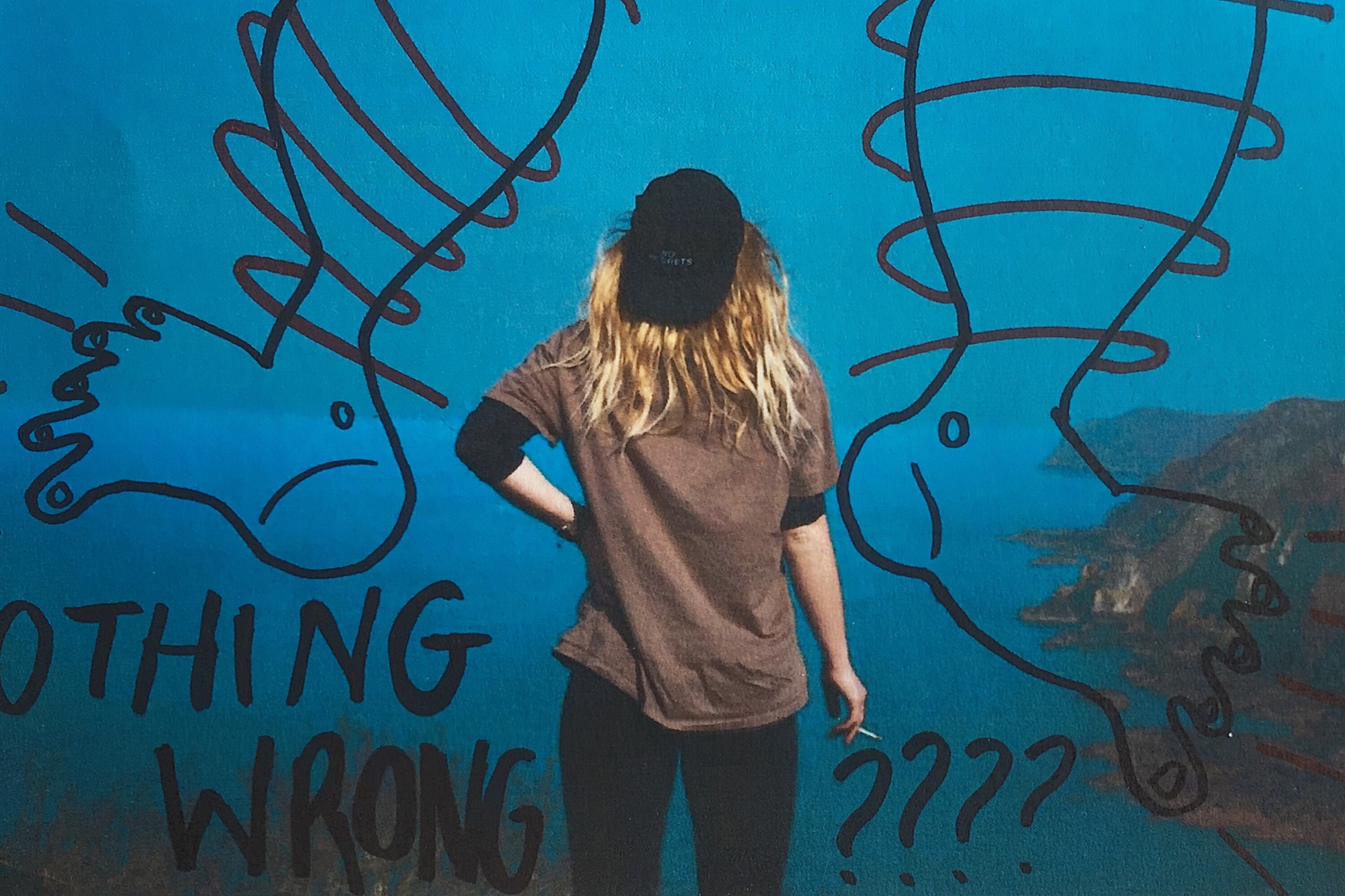
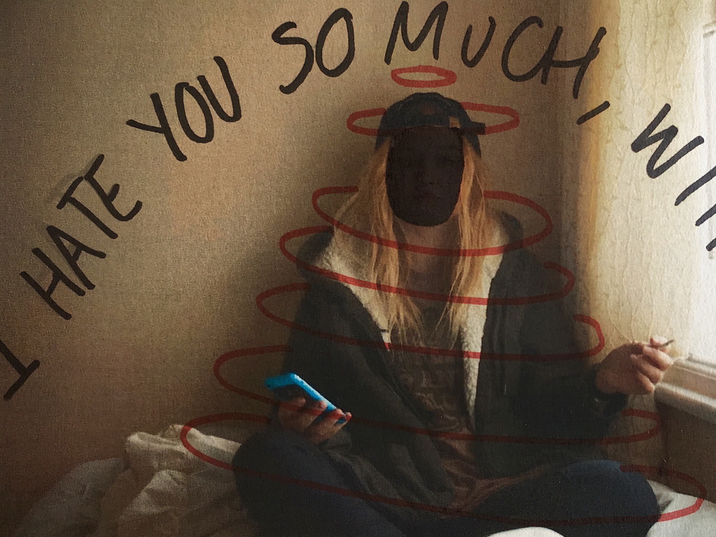
Working from these ideas, I intend to print a selection of my post card images and effectively graffiti them with block colours and shapes in a similar style to Ray Johnson’s work above. To do this, I will print them on standard 80gsm paper and use ink pens to illustrate them with words and text. I printed four of the postcard images onto sheets of paper with a white border which allowed me to work slightly around the image as well as directly onto it. I also printed all eight of my stamp experience to work with as a test influenced by this artist. I started by drawing rough doodle-like images directly from Ray Johnson’s work onto a plain sheet of paper before starting on the images. The sayings, words and illustrations used are all heavily influenced – if not directly lifted (such as the legs below) from Ray’s own postcard projects as part of his Mail Art series.Below are a series of small tests on my own images. They were printed out on a normal copy printer so are not a high quality and were manually deformed with pens and ink markers. 

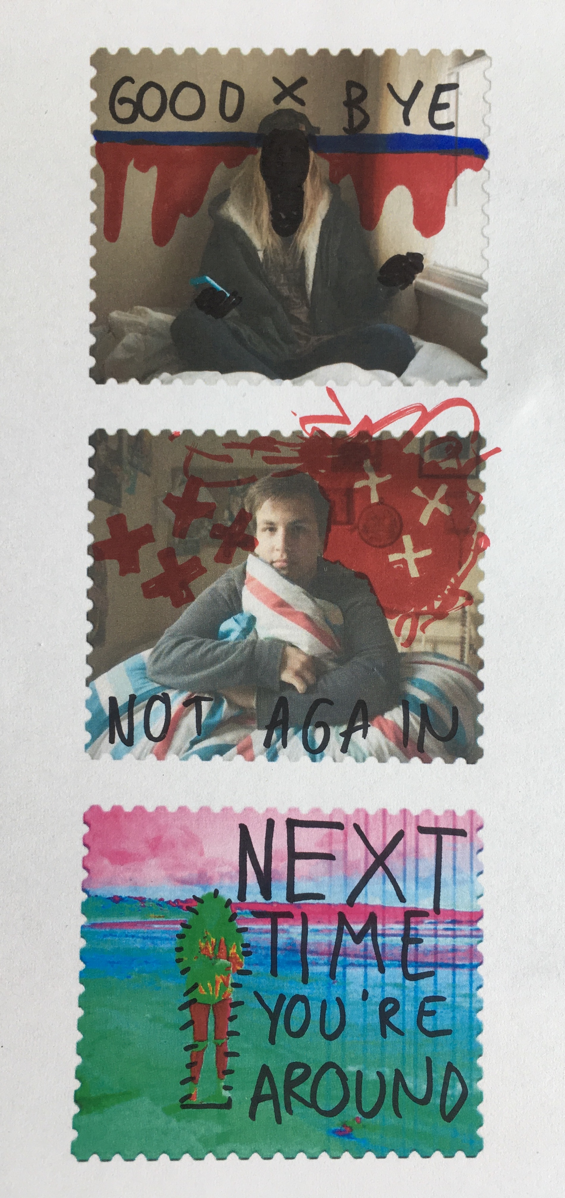
I also used this experimentation technique on some of the stamps I created in photoshop after they were printed out. Again, they have been manually manipulated rather than digitally and feature a mixture of original ideas and influenced doodles for Johnson’s own project work.


Shoot 2 experimenting:

All of my images were shot in standard non-filter fashion. To make the strongest image I experimented with the images that I have taken to see what looks the best. From the shoot as a whole it is clear to see that the black and white filter on the images makes it much stronger and tells more of a story to it’s audience. In my opinion the topic of environment is very black and white as a conceptual idea, this is because environment can be seen in 2 different ways, man made or natural. In this case man represents black and the nature represents white. This is because the white shows hope in the image but the black dominates and absorbs the focus of the image. Below are comparisons of the best images from the shoot compared to that of the standard colour version. Standard below, best top.

EXAMPLE 1:

In my opinion the black and white version of the images in the shoot stand out much more in general, besides how they present more conceptual meaning than the colour version. Apart from the image in colour being more vibrant the b&w creates a stronger environmental portrait. I also chose the black and white images since the focuses on my chosen environmental artist references use the black and white, so I have created my own version of someone who has inspired me to do so. Lastly the subject stands out in the image a lot more in the black and white version since the contrast between the blacks of the suit and the white flowers is strong.

EXAMPLE 2:

The theme between the images is continued through both comparisons in the ssame way, below will be more examples of the standard version and the edited version of the images.

EXAMPLE 3:

EXAMPLE 4:

In the case of example 4 it is clear that in the top image, before editing there was an interruption to the frame from a dog. However once the image is put into black and white the dog head is not visible and the image becomes much stronger, with the center focus of the subject in the middle of the gates.


Shoot Two

This shoot was much more successful than the last as i am able to draw finals from this shoot however i did not adjust the ISO which means that nearly all of the images will be pixelated but not to the extent of the images before. This shoot was done in St Catherine’s with two models. My first model was wearing a bright purple jumper with black jeans and my second mode was wearing a red checkered shirt with black jeans. However, after this shoot i decided that all my images from this point will be put into a consistent black and white filter which is very bright and reduced the pixelation in the images.

My male model was very good with body language and produced very powerful images which made my project much more dramatic which has worked really well. The first few images i took were very normal but i used an opening in the trees which created a frame for these photos. I wanted to experiment with this shoot to make it more interesting than the last and give me something to use in my photobook.

This photo is really interesting as it looks like he is suffering which is create symbolism for the levels of pollution which are rising. Pollution can cause many different breathing problems as this could symbolize the suffering asthmatics go through because of pollution as they are the worst affected. The trees have create a frame for my model which draws your attention to him and the fact that his pose is unusual means that it sticks out from the forest. The black and white works really well for this image as it makes it very dramatic and interesting, this is why i have chosen to make this the consistent filter on all the images i am going to take as it will make the layout of my book much more consistent and using black and white makes it much more serious than in colour.

This pose is very sinister as it almost seems possessed which is why i like this image because it is interesting and even though he partially blends into the background, he is still very obvious and your eyes are drawn onto him. This image does not have any hidden symbols but it is a very dramatic but simple images and it works. His hands are the one part of him which stick out the most and i think this is what first draws your eyes to him but then the focus moves towards the gas mask then the image as a whole.

This image is very interesting because the model chose to crouch down and it’s a very anonymous photo as we cannot really see his eyes so the image has tension as the viewer cannot tell who is underneath. The crouching pose could symbolize a child having to wear the gas mask, it symbolizes vulnerability. Many humans think they are invincible until something so “small” as pollution damages them. We will never see pollution as a problem until it becomes a law that a child has to carry a gas mask to protect them from the toxins in the air. Children have the ability to influence adults and soon as they are affected the world will change.

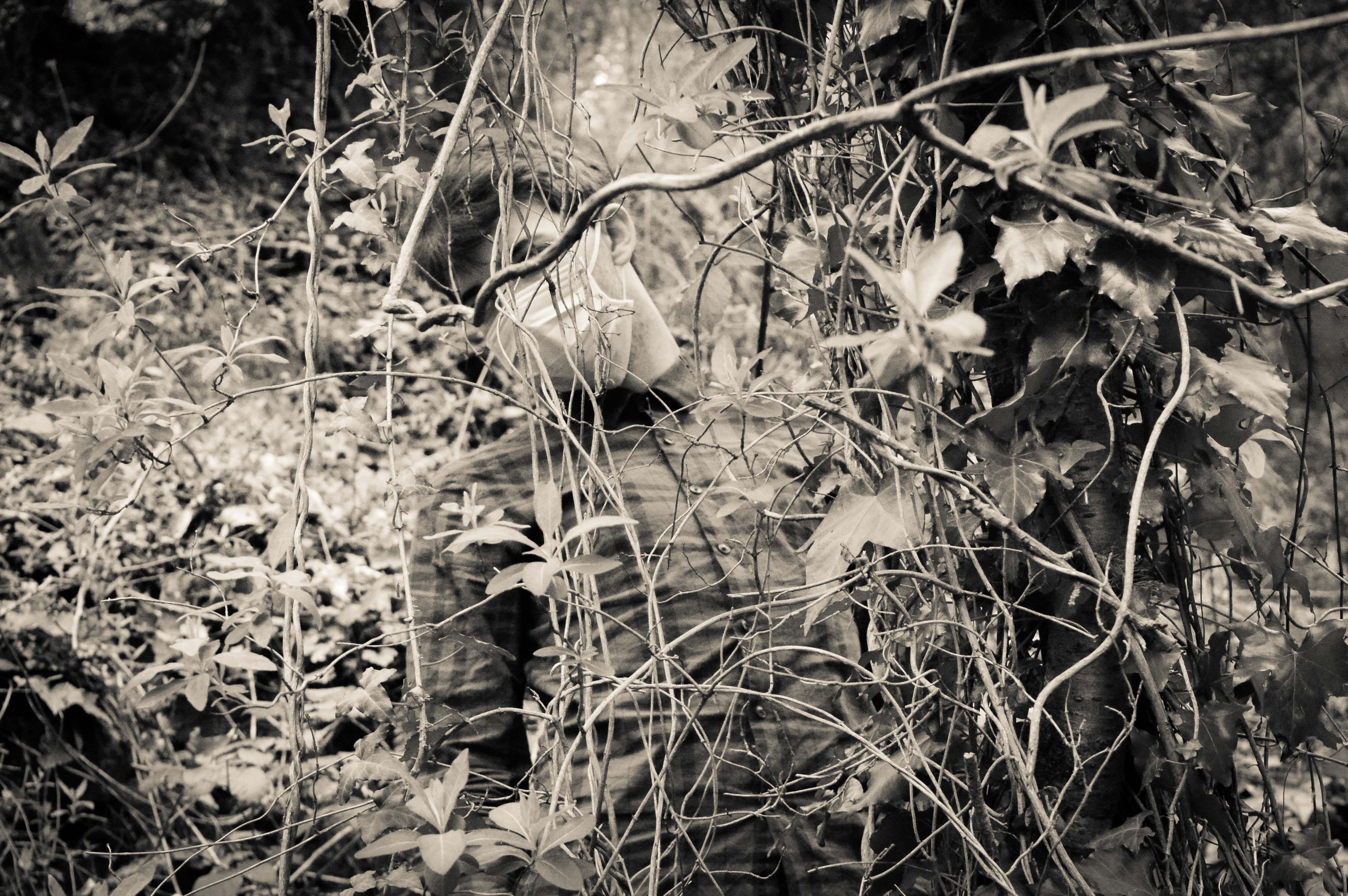
One image which i took which i like very much, is of my male model behind a tree which a branch covering his eyes. It creates a lot of tension in the image and makes it interesting as the viewers do not know what kind of emotion he is feeling as we can often tell by our eyes.

My model blends in with the background yet you can still very much distinguish him. The fact that his face is covered by the mask and that the branch hides his identity creating tension as the viewer will create an image of the model in their head of what he looks like which makes the photo much more interesting. This image represents that we are part of nature and that we are entangled in our ways and we cannot get out of them so we just keep destroying the world to make way for new people. This photo is one of my favorites because it is a form of abstract photography, within tableaux photography within nature photography. The black and white makes the image very strong and powerful and it represents my project of Our Future really well.

This is my female model who has very strong eyes which is why i have used her for this project as in the gas mask, the eyes are the only think visible which is why they need to be powerful. I used the hanging vines to create a frame for my model. This image has no hidden symbolism but it is an interesting image. Her eyes are very powerful as the white of her eyes  stands out due to the black and white filter, it is not one of my favourites but her crouching could represent trying to hide away from the pollution problems but because she is wearing a mask it means she can’t escape.

As i had two models available i wanted to try create some double images of them both in mouth masks as i though they would be powerful and interesting and a different form of portraiture.

In this image, you can clearly see the strong points of each model such as the male is good at body language as he is drooping down and look very drained whereas the female model is very stiff but her eyes are much more dramatic and show a lot of emotion, she looks scared. This image has no symbol but it is very powerful is showing how two types of people will cope with the rise of pollution. It represents togetherness and that this is something that we can change together. One person cannot change the pollution levels of the world but many people can. The composition of this image is fairly good as the focus is very much on the two models as they are in the center of the image which is where the eyes focus. This is a combination of Tableaux and portraiture, it combines both more than the others as i directed the models wear to sit and whether to face me or not. The poses they did i left up to them to make the photo seem less forced and it worked really well as the male model is much more dramatic compared to the female one which allows for an equal balance of both bold eyes and dramatic body language.

I attempted to photograph my male model in a semi cave to create dramatic photos, it worked very well as when you first look at the photo you can only see his head which adds for a lot of tension and drama.

This photo is a lot different from the others as it is very dramatic and the background isn’t visible which adds a lot of tension as the viewer will not know what is behind him. This allows imagination to take hold and makes the photo ambiguous. His pose also makes the photo really interesting as his body language isn’t stiff and he looks drained almost posed which works well for my project. The toxins of the pollution are hurting him, the darkness behind him represents the end. The light on him represents hope but the darkness is taking over, the hope is diminishing. The fact that the light is primarily on his skin draws the eyes towards him which is what i wanted from my images as my models are the main focus of this project. They represent Humanity. They represent Our Future. They represent Our Children’s Future. They represent the Loss Of Hope. This is one of my favourite images of this shoot and i will most likely use it in my book.

As i was in a forest, i wanted to use the branches and trees as much as possible to create frames around my models so that the viewer would focus on the model. I think this image has the best frame as the trees joined together to make a complete frame and it worked really well.

This image is very sinister as he looks possessed and looks like he is stalking someone. That someone is us, he is a reminded of what we are doing, he is warning people of what could happen if they do not protect the planet. Soldiers did not die to protect this earth and us for us to destroy it again. The trees worked really well to frame my model and it really makes the eye focus on him and what he could represent. Many of these images are ambiguous as they could mean lots of different things to different people but the main point of it is pollution as that is not ambiguous. One thing which is very powerful about this image is that we cannot see his eyes. this is very powerful as it hides his identity and makes the viewer create an idea of what he could look like. Some people would see him with scars all over his faces and others may see him as smiling.

Overall, this was a successful shoot as i am planning on using many of the images i have created from this shoot in my book as they have lots of hidden means and they are interesting images to look at. I tried very hard to think of composition and i think i did really well with framing my models using trees and it has allowed for some interesting and unique images to be made. I think the only thing i would improve is that the ISO was still set on 6400 maximum sensitivity which has made them pixelated but it is not majorly noticeable like the images from the first shoot but the black and white helps to reduce this as well. Another thing which i would of changed is command my female model more as her body language was quite poor is many photos and i think it let some of them down like this image:

As you can see, my female model did not pose very well which partially ruined the photo and i wished i had told her what to stand instead of let her choose as it really did not work for these sets of images. This image is not in black and white as i do not intend of using it for my book because of the poor composition and it is also more pixelated than the others.

Shoot 2: Finals

In reference to my blog post “shoot 2 ideas”, I have stuck to the focus of one of my AS level shoots. In my previous year in AS level photography we were given the task to present images based on 100 years of history in Jersey through a teenagers eyes. My focus on this topic was to create a scenario of  a young gambler. This is something that I would like to continue in my A level photography, however this time the images will be taken in the outside environment showing the islands natural beauty. The use of wearing typical gambling suits and black and white attire is to present the concept that our gambling has an effect on the nature around us. This links to larger problems of global warming and how we are causing this problem as man. My plan was to take the images for my second shoot around the lanes of St Lawrence, a relatively un photographed area of natural beauty in the island. St Lawrence is filled with small country lanes and fields that present the opportunity for me to place my subject into the environment. I will be using black and white filter to present the images to make the subject stand out in the environment, also it follows the images created by artist I have made references to previously.

The images that I captured from the shoot use the natural beauty of the fields. Looking around St Lawrence for a suitable location I decided that one field stood out a lot more than any of the other fields. This was because the entire field was filled with daffodils from top to bottom. This made the images more sublime in natural beauty. However the use of the man makes the image more mysterious and interesting since a plain field of flowers does not catch my attention. I think the use of the props in the image, such as the hat and suit make the image create the feeling of wonder. The images have the concept of gambling with our environment as we develop on our land as said above.

The field was filled with daffodils from top to bottom, all white on the head. This gave a great contrast between the colours of the suit that the subject was wearing and the flowers below him. I have set the subject looking up to the sun to create the effect of him looking at what the world has to offer and how the natural beauty should not be changed. I have set up the subject in the middle of the image to ensure that he is the focus of the image with his surroundings filling the rest of the frame.   This is my favorite image from the shoot. I think this because I like how the image is dead pan with the subject looking directly at the camera. Again the contrast of the flowers to the subjects suit and props makes the image stronger with the black and white filter. I have decided to place the subject further away from the camera to show the size of the field and how he is only a small part of the nature in this moment of time. The second reason I like this image is that the use of landscape shows the separation of the rule of three in a better way. The rule includes the ground, the tree line in the middle of the image and the sky. The subject’s head is just above the tree line which makes the frame more sublime.

Similar to the image above this image gives the same effect but from a lower angel on the flower height. I have blurred the flower to gain more focus on the subject which is the main component of the image. 

The images above and below are the same image at a different level. After experimenting on both of the images I have decided that the top image is of better quality as more of the landscape can be seen. I think this image is a strong environmental portrait because it is a close up of the subject which allows us as viewers of the image to again interpret the scale of the nature.

To give more meaning to the shoot I have used an image of the subject on a large driveway entrance. This image has the concept of how the subject has built upon the natural beauty to create something so unnecessary, destroying the countryside.  

Photoshop Skills

// S T AM P   D E S I G N //

To finish my post card creations I wanted to create a series of stamps using the home shoot images which can be added to the back of the outdoor images after they’re printed as the card sets. To do this, I worked in Adobe Photoshop to create a series of stamps based around a free template I found online. The original image of a blank postage stamp is shown below and comes from ‘backgroundsy’ which is a shutter-stock style site where vector images can be downloaded. I filtered through a number of these template blanks to find a design which would be suitable for what I was looking to create. I selected the image on the right hand side below as i was happiest with the edging format. Loading this into photoshop, I added my own images as a second layer on top of the original template. These were scaled to size and adjusted to fit the frame. The next step was to create a clipping mask and mask the images to the shape layer forming the stamp image.

The stamps I created using the process above in photoshop had sections of pure white which didn’t show up clearly against the background on this blog. To add clarity, I added an artificial drop shadow – again in Photoshop – which will not be printed with the final image and is purely for presentation purposes. The plan for these stamps is to have them printed on sticky-back paper (likely 85gsm) and attach them manually to the back of my cards rather than having them printed as part of the designs. This manual method will produce a hand-made finish to the final piece which should still look professional if printed correctly. I will have the stamp series printed privately as I need full control over the weight and finish of the paper and prints. Below are the first two stamps I designed which feature full frame images taken from the home shoots. Though plain, they are effective but overall very basic. To expand and develop on this idea, I intend to experiment with a series of images from across all shoots to create a selection of alternative ideas which may focus more on abstraction.

Working with images from the shoots that explored subjects further than a typical front-facing portrait, the next step was to experiment with a series of stamps that utilised my knowledge of both photoshop and graphic design. The first of these experiments was a simple double exposure image featuring photos from both the home and external environments. I focused on a closer portrait for the base image and overlaid a photo of the landscape the model chose which happened to feature a vertically focused display of trees with some elements of water in the background. Rather than using a dodge tool, I used a simple eraser and blending sliders to have complete control over the format of the images and the way they connected together. This process used fewer layers and resulted in a double-exposed final stamp image. Below is also a slide showing my photoshop layout complete with the layers used in this section of the project. 

Linking to some of the more abstract orientated stamps I researched as part of the inspiration for this project section, the stamp below was created by layering several images over each other in a block-colour format. The image in the background needed to be relatively calm with a central focus which in this case is Maya. On the left and right of her are two more abstract photos which feature small sections of landscapes we crossed through on the journey to create the final images. The plants were taken outside her house which she identified as not being a physical home for her in any sense other than the place she sleeps. On the right of the image is a small section of sky which fades out towards the bottom of the stamp. This image actually shows Maya too up at St Ouens bay but for this experiment I cropped it to show just the blues of the sky.The next experiment was a simple image rotation technique which runs back to the work we completed earlier in the year on Idris Khan and the double exposure methods which rely on multiplying images. Further research on this experimentation can be found here in a previous post, “Multiply“. The method is simple but worked well with the relatively plain portraits I shot of Jack against a natural, green background. The second layer image is actually a different photo but is almost identical other than slight changes in the facial expression. Though still relatively simplistic, this image is arguably one of the more successful as the uncluttered design draws the eye but won’t distract from the rest of the piece.Going a bit mad with design ideas now, I created a bizzare and colourful stamp using a base image from Emily’s shoot on the beach. The slide below shows the original image, though adjusted and faded slightly, clipped to the stamp design but otherwise natural.
Using a variety of photoshop options such as posterise, colourise, colour burn, dodge, full saturation and other editing methods – I created  the alien looking landscape below. The image features rich colours that draw out tiny details with the mad colourings (such as seaweed in the bottom right). Though odd looking, there is something pleasing about the unnatural edits of this image and the way they are presented here. Taking this further, I blended a selection of stock images and patters to create further distortions in the image. Below are a selection of slides from photoshop showing the layers used for this part of the project as well as the blended stock images used . 

The final outcome has an off-world feel and is more science fiction than anything natural or human. The colours are unsettling and focus heavily on saturation, hue and contrast to form the final image. The next step of experimentation here will focus on possible additions to the postcard backs such as letter stamps, wording and placements. Another possible addition could be layering the stamps as if each image had ben posted more than once? Just something to think about and possibly explore later on in the project.

First Shoot

This shoot was conducted in St Helier, in the area of Le Frigate and People’s Park. This shoot was unsuccessful as the ISO Sensitivity was on 6400 which meant all the photos which i took, which was over 200 turned out to be pixelated.

This shoot was done in direct sunlight as it was a clear sunny day which made it very difficult to get the photos to be quite dark which is what i was aiming for. The sun also made it difficult to find areas to photograph in without strange light patterns, this was very frustrating as it was my first shoot and i wanted to get it right for the next shoots. As you can see, these photos are pixelated and the light on the grass ruins the composition of the image:

The light is the background created a split in the image and the composition of the image is completely wrong. My idea for these images was to use the trees on either side of my model which you cannot see as a frame. However when i started photographing, the trees were to far apart and the light behind my model ruined each image as well as the fact that they are pixelated. I was very cautious to not photograph with the light behind my model but this did not work in this situation as the light was coming from the side. Also these images in general are bland and boring, they aren’t adventurous or interesting. I wanted to create images which are ordinary but with a hint of unusual to them as that will make my project much more interesting. However, i discovered that i wanted to do this after this shoot as i realized how boring they were.

The outfit of my model was completely wrong as she was wearing green and there was green is many of my photos which meant she blended in a lot. For this shoot, i did not think about my model’s appearance because i have never had to but i realized when doing this shoot that it is really important even down to the finest details of makeup.

The first images i took on this shoot were in between some bushes which created a fairly nice light pattern, however the light was far too bright which meant i played with the settings and got them completely wrong and i did not notice. These photos are very dull as i wanted to try reduce the brightness but that also reduced the colour, it also did not help that my model was wearing a green jumper.

These images are very dull and the pose of my model is very poor as she is hunched over which makes the photos very poor. These are my least favourite images as i think they were rushed as i did not want to take to long. The bush was not high enough so it cut off half way which meant that the image was split which ruined the composition of the image. The light patterned which the bushes created was only visible on half of her body which also ruined the image. The images may not seem pixelated from afar but when zoomed in, it is very clear that they are which isn’t good for printing the images which is why i won’t be using any of the images from this shoot in my book.

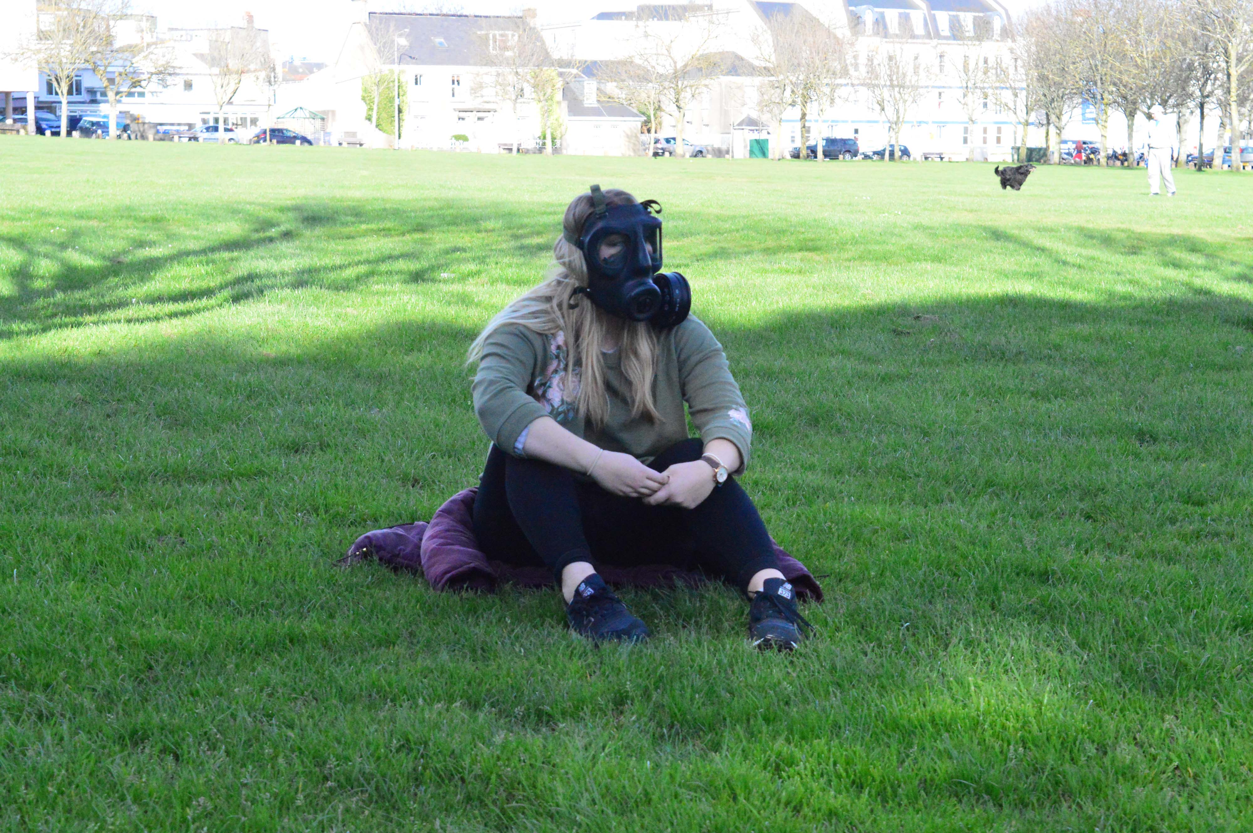
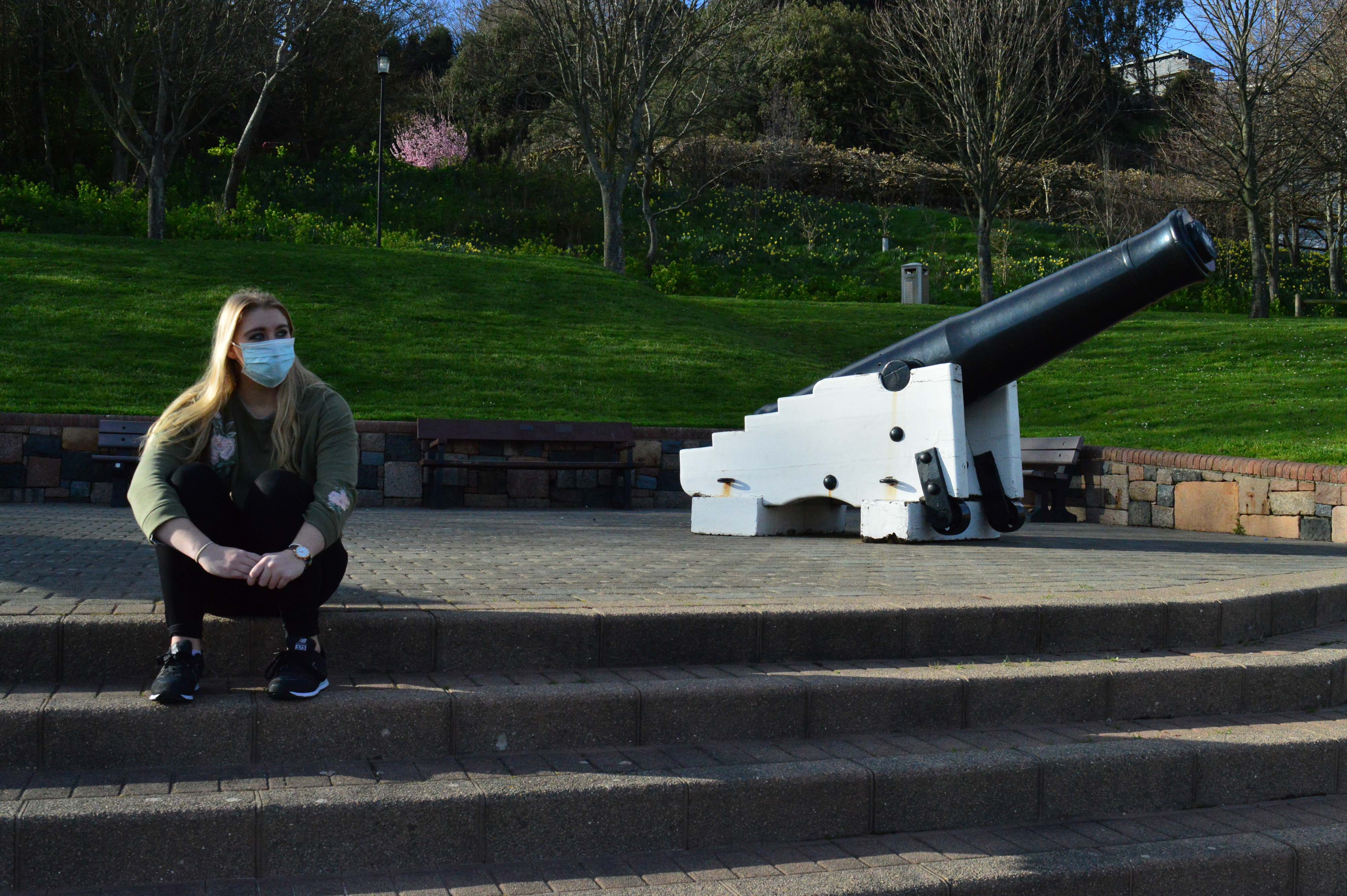
The images i do like and wish that weren’t pixelated were taken near the guns of People’s Park, i think this had create symbolism of war and the fight against pollution. The soldiers fought a completely different war to the one we are fighting today, yet somehow, this fight could end up being much more deadly than WW1/2.

The only problem i have with these images is that there is a bush which is pink in the background which is really frustrating as it ruins the composition and consistency of the images. It draws your attention away from the main focus of the image which is my model in either a mouth mask or full face gas mask. These images symbolize a hidden war which normal people wouldn’t see unless they read the pollution levels of the world and how E-waste and lots of rubbish is building up over the world and we cannot get rid of it quickly enough. The ocean floors are lined with rubbish but only the fish and deep sea divers know as the news wouldn’t cover this sort of “boring” news. The steps up to the guns represent the climb of pollution, my model is sat at the top because the pollution is at it’s highest and it’s a losing battle as not enough people are fighting this war as their lives are “too busy”.

This image represents a combination of nature and man made structures. It represents how humanity is over taking the earth’s natural environment and contaminating it with pollution.

My model sitting on a high rock and me shooting from a lower angle represents the power humans have over nature and how we can control what happens to it but yet we are destroying it with our cars and buildings and we do not care. Yet we will adopt a leopard for 3 pounds a month but won’t cycle or take the bus to work to reduce their carbon footprint. We humans sit on our high horse, thinking we’ve concurred the world and we are at the peak of technology but animals are disappearing, so are trees and so it our oxygen, yet we can’t tell cause we are sat so high on our horse that we can’t even see the ground, mostly because it’s covered in tarmac to make roads for NEW CARS! Even though this images represents a lot, the composition of it is very poor mostly because of the pixelation. I think if this image was not pixelated, i may of used it in my photobook as it has high symbolism and could represent a lot to many people.

I did a set of images on Victoria Avenue and they were very poor mostly because my model partially blends into the sea wall and also her pose does not work well, i should of told her to do a certain pose but i let her choose which i think ruined the images as the pose does not represent the severity and seriousness of pollution and how high the risk of wearing a gas mask is for parts of the world like China.

These photos are just so boring and dull, they have no symbolism and i am not sure why i photographed on the beach, mostly because people think that it is a beautiful place but it was not. The sand was dull, the sun was too bright for my model, her clothes were dull and do not stand out and the rocks are scattered everywhere ruining the composition. These are the worst composed out of all my photos, i tried different angles and i used different distances away from the model and i also used a tripod, yet the images are poor. I would never use these images in my book and in some of them it is very clear that they are pixelated. I could of seen the pixelation working for my project to represent the blurred vision of most of the people in the world but the images would of have to have met up to the standard and meaning of that symbol. None of these photos do.

Overall, this shoot was very poor mostly because i did not notice that my ISO sensitivity was on 6400 which caused the pixelation and also that my model wearing the completely wrong clothing and her makeup was all wrong but i did not consider this before i did the shoot. However, some of the images like the ones with the guns and the one on the rocks have high symbolism but i would prefer them to be clear as they would work better for my project as i do not like any photos being blurry. Next time i do a shoot, i will make sure that my model is wearing appropriate clothing such as a bright jumper and i also want her to have dark makeup to bring out her blue eyes as they are very powerful.

I am also planning on using a second model as she is not very good with posing but her eyes are so bold and they could add a lot of drama and tension to the images. My second model, will be much better at posing and will add much needed body language to the images to create a variety of different perspective and ideas to my project. However, i am going to pay attention to my ISO settings and male sure that my models are wearing appropriate clothing.