Documentary: Final Prints – Layouts & Designs

Before designing my photo book I first wanted to plan out how I will be presenting my final outcomes that I have chosen in my previous ‘selections’ post. To do this I have first split my results into documentary and symbolism presentations and separated them into two posts. Below are mock-up versions and experimentations of my documentary outcomes and how I want the final printed versions to appear by the end of the exam. To create these displays I will be using a mixture of gloss paper A4 and A5 images as well as A3 matt pieces and the materials provided by the school. The red cross shown over the top of my designs below indicates that I will definitely not be using this version to physically recreate in the exam whereas the question mark means I am still unsure. To create these examples I simply used layering techniques in Photoshop to make black and white backgrounds give off the illusion of window mounts and storyboards…

Documentary – Final Prints – Presentations :

This collection of computer generated displays above depicts how I am intending to display my results on the problem of ‘plasticulture’ in Jersey. For these pieces, I am planning on creating my most difficult presentations to emphasise my A3 images using a double window mounting and diptych technique. To do this I will first be creating a white window mount for all three of my pieces and then a larger black window-mount to go on top. The reason I have separated my outcomes into two pieces is because the black and white abstract image is very dark and dramatic compared and looks much better as a single display. As well as this I have chosen to create a diptych because the two colour images work together to tell a frightening story about where this plastic ends up. Because the two documentary images are not the same size, after testing it out, I have decided they look much better as a vertical display with one on top of the other.

The next design above shows how I am planning to lay out and put together my many final outcomes taken to explore the methods of Jersey’s common waste disposal. To do this I will be using my previously researched picture story technique, my 6 – 8 professionally printed photographs, and two pieces of large white foam board. The reason I will need two pieces of foam board is to separately mount each photograph, giving them a lot more visual weight and emphasis,  before sticking them all down together as a final collection. As I am unsure how big of a board I will be able to use I will be printing two extra A5 images as well as an A3 and A4 version of the same piece. This is so that when it comes to actually laying these out, in the set sizes that they are produced, I will be able to make my best judgments on the day. This piece will be my largest presentation for my project as I love the overall tone of the shoot and the fact it is an insider’s view on where all of Jersey’s pollution ends up.Lastly, for my documentary final outcome presentations, I will be showing a much smaller display of A5 images that will later pair up with the abstract finals from the same shoot. These two photographs depicting ocean pollution will be made as a simple black window mount presenting a diptych technique. Although I could possibly crop them down (using the frame) to exactly the same dimensions, I feel as though they would work better as a vertical presentation rather than as the crossed out horizontal one I have displayed above. This is mainly because of the lengthy way I have presented the surreal versions from this shoot in my next post as well as it mirroring my plastic documentary diptych above.  The reason I am printing these images so small is because they were originally taken using an iPhone and an underwater phone case and therefore are not the highest of quality.

Methods of Presentation – Research

For my next step in moving towards finalising this exam project, I have researched a few of the ways I am planning to display my work. As I have explained and presented in my last post, I will be using a large number of my favourite outcomes from this project to enlarge and exhibit as well as include in a potential photo-book. Below is an introductory look at some techniques that I have previously attempted in my past projects as well as a few new styles I intend to experiment with. The first contact sheet below depicts a look at different styles of window mounts as well as photo collections and picture stories…

By mounting my chosen photographs and framing them with the available materials l am able to explore many different display options to enhance the overall look of the project. Using a well-designed combination of frames, mounting, and card mats I can form an important part of the visual expression displayed throughout my images, separating them from their surroundings and giving them more visual weight. One of the main mounting and framing techniques I will be using for my display will be window mounting; cutting out the centre of my material and using the frame that’s left to stick over the top of my uncropped photographs. This type of mountings is usually cut with a bevelled edge and because it covers the edges of each piece, window mounts can also be useful for cropping or levelling images. As well as this I will also be using this technique to explore the idea of combining my final images using triptych/ diptych displays. Diptychs and triptychs are a brilliant tool for photographic storytelling, by presenting two or three images from the same session or completely different scenes they are amazing for showing opposition as well as contrasting ideas.  The top row of the contact sheet below displays some examples of window mounting and the various techniques and styles in which it can be done…Apart from window mounting I will also be potentially creating a Picture Storyboard to present some of my larger collections such as my shoot from the La Collette ‘Energy from Waste’ facility. The definition of a picture story put simply is a visual representation of something produced on one surface in a creative medium. What I like most about this method is no picture story can ever be the same, even if the subject and photographs are identical. The way you deign your story and lay it out can give the overall outcome a very different look, showing individual styles in each version. On the bottom row of the contact sheet above I have added some examples of varied picture story layouts including one I made in Photoshop.
To get more ideas about the different compositions of photo books my next step was to find three personal inspirations that are presented on the publishing website I will be using, Blurb. Below are three very different examples presented and captioned in a contact sheet to clearly view their layouts. On the top row is an example that was put together by Mark Roberts, called ‘PDML Photo Annual 2017’, which presents a simple and classic photo book style.  The book is a Standard 10×8 inch landscape size and consists of 108 Pages. The layout is a common arrangement of each photograph taking up a single page with a white border and a blank page left between. Although I like this classic technique I am sure I will be wanting to do something a more creative for my end result to emphasise my images as well as my message.The next photo book, displayed in the middle row, is an interesting piece called ‘We The People’ by Daniel Levin which explores protests taking place in America. This book is only 50 pages long and is a nice 13×11 inch landscape size. I like the variety of layouts in this example including, however, I am mostly researching it for its straightforward set out of the title, second title, and then preface. Lastly is my favourite inspiration for my own photo book displayed out of the three below. This book by Michael Farnworth, simply named ‘Photographs by Michael Farnworth’ is a standard 10×8 inches landscape size and consists of a short 30 pages. The book portrays the author’s “first book of photographs” depicting the beautiful landscapes of Hampstead Heath. The inspiration I can take from this book is the beautiful way he presents multiple images on the same page, combines contrasting/complimenting images, and presents full-page bleeds…

The Addition of Text

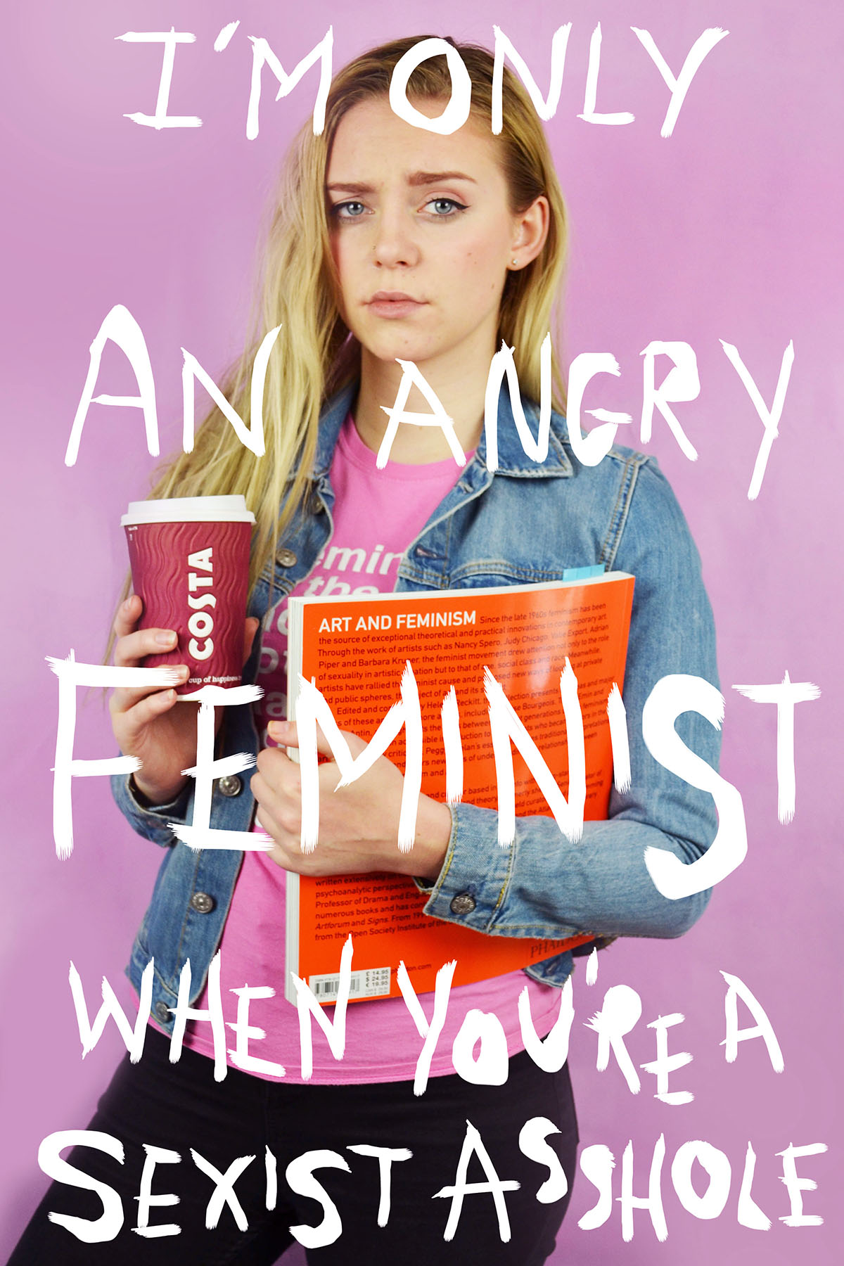
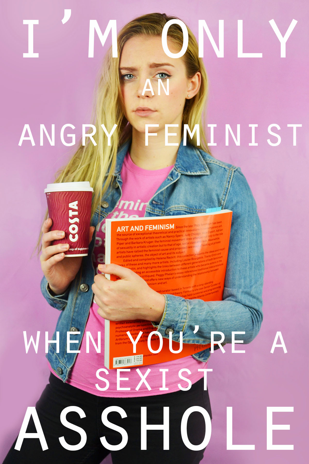
I experimented with handwritten and typed text for this image. To get the uneven lines of the handwritten text I used the 48 brush tool which has long angled bristles that are sensitive to how much pressure is applied and adjusts the thickness of the brush stroke as appropriate. For the typed text I selected simple font which I added over the top of the image in varying sizes. I chose to use the phrade “I’m only an angry feminist when you’re a sexist asshole” because it appeared on a poster on my initial angry feminist mood board. I also though that the phrase was sassy and fit with pose ad expression of the figure in the image.

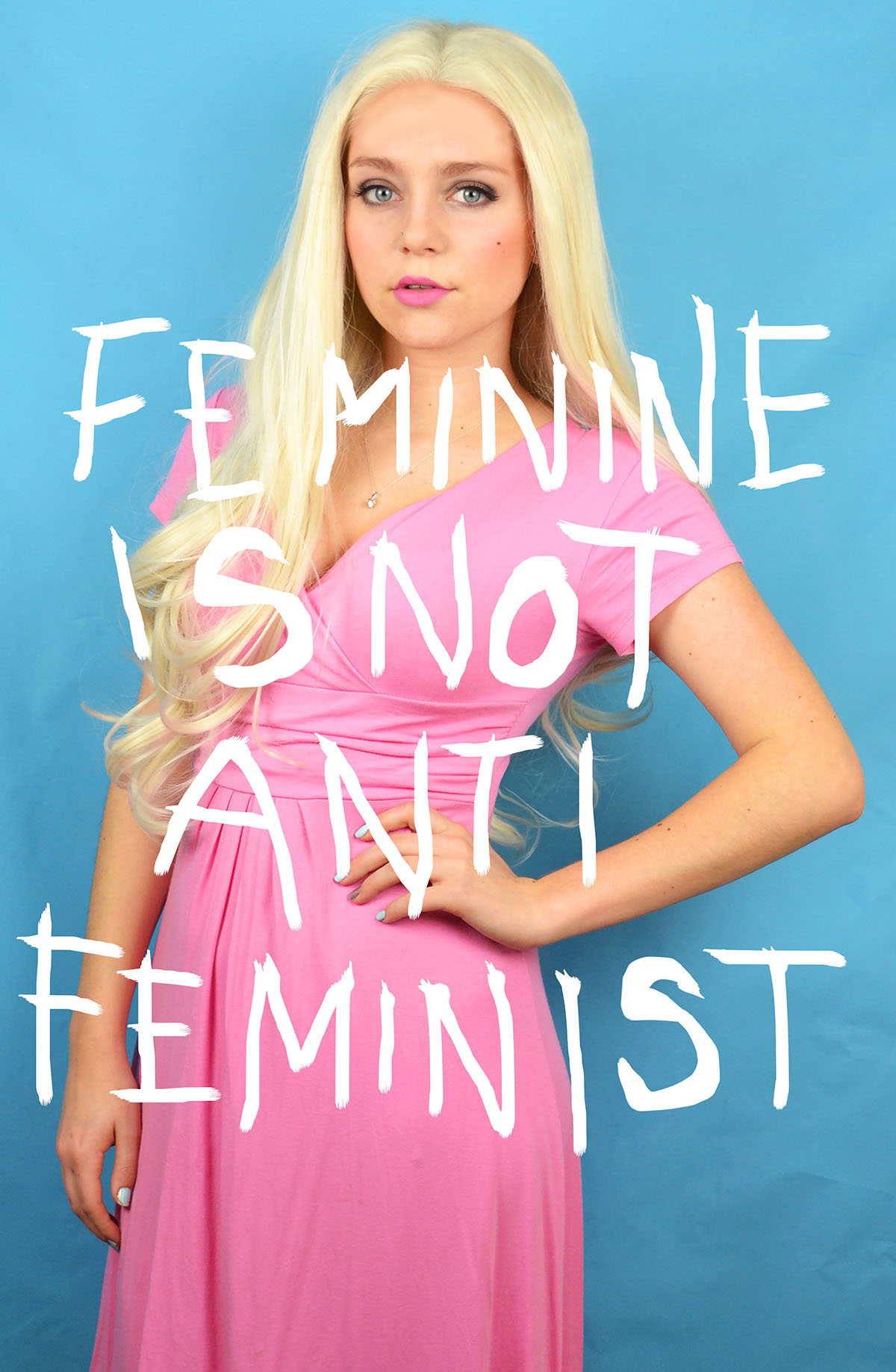
For this image I also experimented with handwritten and typed text. As previously stated for the handwritten text I used the 48 brush tool, when using the computer mouse to write the letter I chose to write in block capitals as they are mainly composed of straight lines, these were more effective and easier to write. This can be seen by the strange appearance of the more rounded letters such as o and s. I think that the typed text works better for this image, the somewhat balanced nature of the word “feminine” and “feminist” at the top and bottom of the image makes the overall image visually pleasing. I chose the phrase “Feminine is not anti-feminist” because it is something that I feel very strongly about. Just because a woman dress in a traditionally feminine way and subscribes to particular female gender roles does not make her any less of a feminist or an empowered and free woman.

I also wanted to reference the idea of a 00’s high school it girl so I decided to include a sassy, bitchy comment. I chose the phrase “At least it’s only my hair that’s fake, bogus bitch” because of the snappy alliteration of the phrase “bogus bitch” but also because the fact that a woman decides to colour her hair does not reflect her personality or whether or not she is a genuine person.

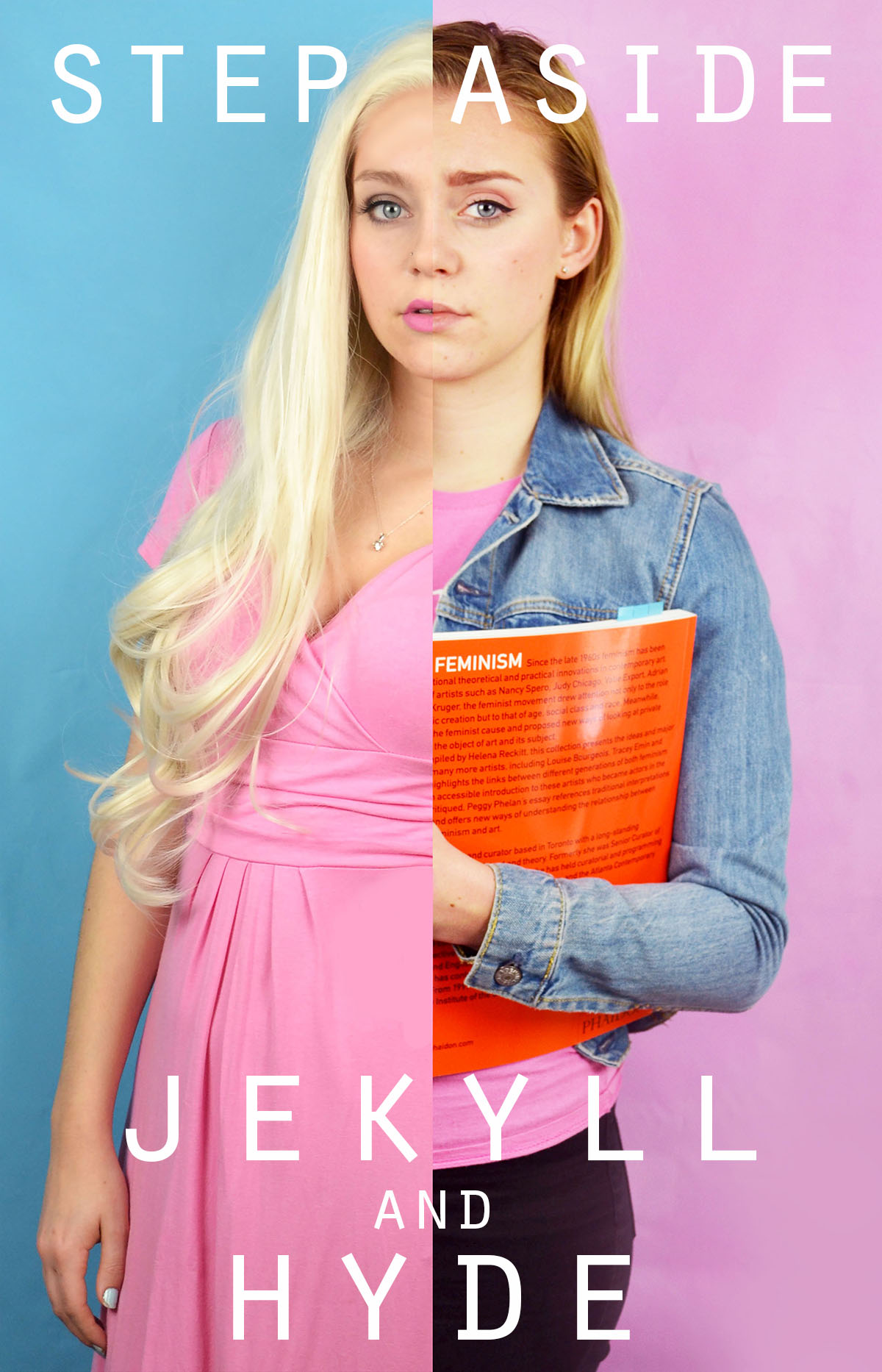
I had fun experimenting with different words to place on top of this image. Before adding words to this image I edited out the finger of the blonde image because In felt that they were distracting as they were right in the centre of the image. I removed them by using the colour picker tool and the airbrush brush tool to paint over the top, I achieved a crisp edge at the divide by using the flat edge brush tool and holding down shift in order to paint a completely straight line. I knew that when choosing a phrase to accompany the image in wanted to draw attention to the split personality feel of the image. I experimented with the phrase “Step aside Jekyll and Hyde” as a reference to the book and film “Strange Case of Dr Jekyll and Mr Hyde” which is about a man with a alter ego. I also tried the phrase “Beauty and the Bitch” as an obvious reference to the fairy tale “Beauty and the Beast” with the word “beauty” having positive connotation and “beast” having negative connotations which is replaced with the word “bitch” which has similar connotations. Another interesting thing about this phrase is that the viewer is able to decide which side of the image is the “beauty” and which is the “beast” as both sides of the image could arguably be both.

I also experimented with coloured images and white text as well as monochrome images with coloured text. I struggles with the balancing of the text within the first image but I knew that I wanted the words “polite” and “violence” to be in the largest font size and I felt that these were the most significant. I managed to balance the text more successfully in the second without having to obstruct the face. I also made the decision to edit out the painted words on the torso in the second colour image because I felt that they would distract from the over layed text. I edited out the original words by using the spot healing tool and then the blur tool to try and smooth out the skin.

In this image I experimented with two different phrases “Vegetarian martyr with the leather Doc Martens” and “Her worst critic and yet her best advocate” I chose the first phrase because I felt that it tied in well with the art student stereotype but also a satirical stab at myself and my own values as I am both a strict vegetarian and an owner of leather shoes. I chose the second phrase because, again, it ties in with the art student stereotypes but it is also very personal to me and I can be both overly critical and overly confident about my own work.

I tried adding words to this image and although I like the words I selected i don’t feel that the aesthetic nature of the texts adds anything to the image. I actually feel that the texts causes the image to lose some of its intensity and drama. My thinking behind the words is an extension of the phrase used on one of the previous images. It is a little satirical and in my personal opinion, humorous. However, I don’t think that the text works visually with the image.


Shoot 3 Contact sheet:

Similar to the contact sheets of shoot 2 I have decided on which images are the best outcomes of the shoot. Once experimenting with the editing of the images it was clear that again the black and white images were the strongest. This factor has led me to flagging the black and white to being the best images.

Shoot 2 Contact sheet:

These two contact sheets from light room show the images that I selected to edit on from the shoot taken in St Lawrence. I have decided that the images will be in black and white to follow suit upon the images I have taken in AS. I have flagged the images that I like most to ensure that it is easy to tell the best images apart.

Project Evaluation

Overview of my work:

  • Archival/new images – Jersey Archives
  • Industrial – Rue De Pres and La Collette – Stephen Shore, Lee Friedlander, Robert Adams
  • Pollution – Lu Guang
  • Contrasting – Ansel Adams, Romanticism – J.M.W Turner
  • Night social landscapes – Todd Hido
  • Final outcomes – Photobook, topographic frame, 3 window mounts (night social landscapes).

My initial idea for this project based on ‘environment’ was to explore to changing landscapes of Jersey due to social and industrial development, I wanted to explore human’s effect on the environment. After exploring this I then wanted to emphasise the impact of these factors on the environment by taking contrasting landscape images which would show to extreme difference between the two outcomes. My key ideas were; Jersey archival photos (then and now), industrial and social landscapes, pollution and contrasting landscape images.

My first shoot consisted of exploring archival images of Jersey’s landscape through research which I then replicated by taking similar images in the same locations today – to create a ‘then’ and ‘now’ style of work. This idea was some small background research to start off my project and explore Jersey’s landscapes and environmental change over time.

Archival Image:

My Outcome:

Archival Image:

My Outcome:

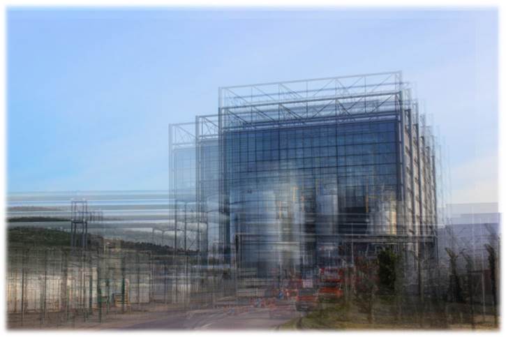
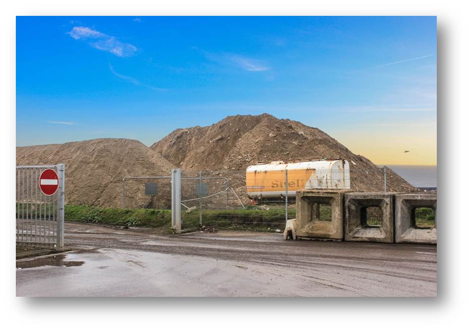
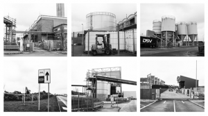
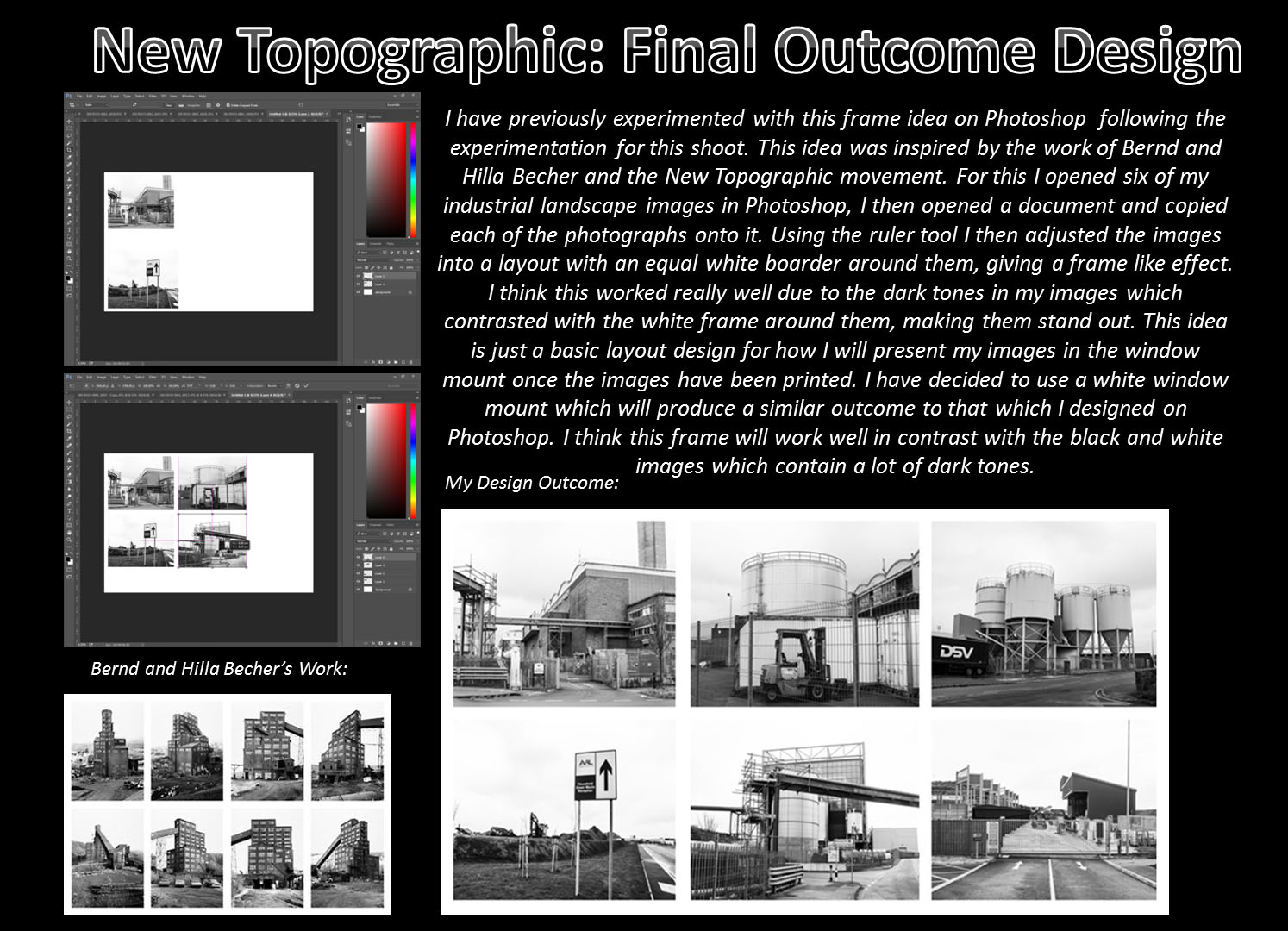
Following this shoot, I then wanted to explore social and industrial landscapes in more depth. For these two shoots I went to Rue De Pres trading estates and La Collette, these locations were successful for the type of images that I wanted to create and many of the outcomes were similar to the work of my artist inspirations (Lee Friedlander and Robert Adams). Using these images, I experimented with layering my images (inspiration from Idris Kahn) as well as looking at the work of Hilla and Bernd Becher and experimenting with arranging my images in Photoshop to create a similar style of work to their outcomes in this area (new topographic frame). I also experimented with layering and cropping these images together to create a range of outcomes from this shoot.

Lee Friedlander’s Work:

Robert Adam’s Work:

My Outcomes:

Idris Kahn Inspired Idea:

My forth shoot was based around exploring another area of human’s impact on the environment. After looking at the work of Lu Guang in my initial research for this project I decided to look at the area of pollution and its impact. After researching some statistics into Jersey’s pollution levels I decided to base my images around beach/water pollution. I found this shoot quite difficult as I was not able to photograph my intended outcomes due to the fact that Jersey generally does not have a lot of visual displays of high levels of pollution. I decided to focus on the area of litter as this is still looking at Human’s impact on our environment and I was able to photograph this on the beach/in the water which created interesting and abstract style outcomes.

Lu Guang’s Work:

My Outcomes:

After looking at industrial and social landscapes closely and the effects of it on our environment, I then wanted to explore the idea of contrasting landscapes and how drastically these outcomes would differ from my previous shoots. To inform this shoot I looked at the contextual background of romanticism style photography and J.M.W Turner’s work. As a more recent artist reference for this shoot I also looked at the work of Ansel Adams and his use of the zone system. Following this, I visited many locations including: St Brelade’s bay, St Ouen’s beach, Sand dunes and Corberie to produce my outcomes. Overall, I am happy with these outcomes as I took these photographs as the sun was setting so I was able to capture very warm tones in these images which allowed me to follow the style of work which I was inspired by for these images due to the lighting available. This also gave the images a calm and relaxed feel which work well in contrast to the overcast, serious industrial images. With these images I experimented on Photoshop with combining these outcomes with my other images to emphasise the contrast between the two.

My Outcomes:

Combined Image:

My final shoot for this project was inspired by the work of Todd Hido. He took many social landscapes using night lighting, I thought these outcomes looked very effective and thought it would be interesting for me to explore something similar to this in my own work. I re-visited the previous locations from my other shoots (Trading Estates and La Collette) and used a tripod and cable release to take these images. Although the technical side of this shoot was relatively difficult, I am pleased with some of the outcomes I was able to create and if I was to have more time on this project I would have liked to explore this area further.

Todd Hido’s Work:

My Outcomes:

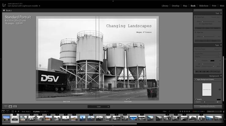
To present my work from this project I have designed a photo-book called ‘Changing Landscapes’ which displays a range of my social landscapes from the different locations I visited. I looked at the work of Robert Adams and Gerry Johansson as inspired for the layout and style of my book. I decided to use a simple and visual layout and uses a range of double page spreads, two images per page and single image layout designs. As my second final outcome I have chosen six black and white industrial images which I will mount up together in a window mount – following the style of work of Bernd and Hilla Becher. I am also printing  three of my night time social landscapes which I will be mounting up on either foam board or putting into a single window mount (depending on which one looks more effective).

New Topographic Frame Design:

Overall, I am pleased with the outcomes of my project and think they have successfully captured the intended meaning behind my idea. To improve, I would have explored each idea in more depth and visited more locations for my shoots to give me a wider range of final outcomes to choose from.


Environment – Artist Reference 3 – Caroline Grohs

Illustrator and designer Caroline Grohs was born in Düsseldorf, Germany. She grew up in a small town near Düsseldorf where her parents still live today. At the age of 19, she began her studies in Düsseldorf but a year later she moved out of her parents’ home and spent a year studying in Hamburg. Her mother is a graphic designer, so was introduced to graphic design, art and photography at an early age. I have selected Grohs as inspiration for my further work, her illustrative line work being being synonymous with the visuals I am creating. Her drawing work is largely geometric and polygonal, creating a contemporary and modern design that works effectively for the commercial nature of the art.  Grohs talks about this, stating that her favorite subjects and priorities were Corporate Design, Editorial and Illustration. This is evident through her corporate design project for a ballet/theater.This project is named Motion Theater. Grohs talks about the process of this project below: 

“After defining the brief for myself, I searched for inspiring photos and was fascinated by a photos from John Davis and other similar photographers. Their photos of dancers were just focused on the dancer with a clear background. I loved them. They were perfect to show how my concept should work. Then I tried to create a logo for the Motion Theater. A symbol combining the features of this theater – especially the focus on the main dancer – and the movement of dance. I drew many sketches and finally created this kind of “screening”, which has been adapted in different ways to represent the different figures and moves. The logo resulted from these sketches. The posters intertwine the dancers movements and their connections to the theater, so that it appears to be “in motion” at all times. The “floating” typography also expresses dance as movement in space. I love this kind of typography because it is a strong and clear statement, especially for this modern part of my theater.”


Grohs’s work on Motion Theatres can be seen above. She has essentially created these advertising posters for a ballet event, employing both her photographic and illustrative skills in order to generate a professional, corporate piece. We can identify the significant use of typography, as discussed by Grohs previously. She has employed a narrow, sans-serif, bold font for the important text that must be seen by the viewer. In addition to this, a collection of colours have been used to segregate components of text. We see the inclusion of a pale orange and turquoise that successfully organise the text without overpowering the primary image or main headline. These photographs themselves are very minimalist and simple. Taken within a studio environment, all emphasis is on the dancer. With a complex background, these images would be way too crowded. There would be too many clashing components such as the text, illustration background and subject. This is something to remember when I produce my work. The illustrations themselves are thin, white-line drawings. Polygonal shapes are being created to replicate the form and silhouette of the dancer. These geometric lines all originate from the word ‘Motion Theatre’ almost like they are being projected upon the dancer. It creates an interesting visual effect, looking as if the subjects are being consumed or protected by these transparent shells. I really like this project and it provides me with a number of different ideas that I can employ going into my exam. The work of Grohs has enlightened me regarding the use of typography and how this can assist in conveying a message within my work. Furthermore, Grohs work demonstrates the effectiveness of subtle line work. Her mark making is thin and reclusive. It is not in your face or dominating the composition. It shows how sometimes simplicity, and allowing the image to breathe and show its positive visuals can be a successful decision.