I am very happy with these edits as they show an array of experimentation, focusing on motion and light influenced by the idea of travelling around in cars with friends.
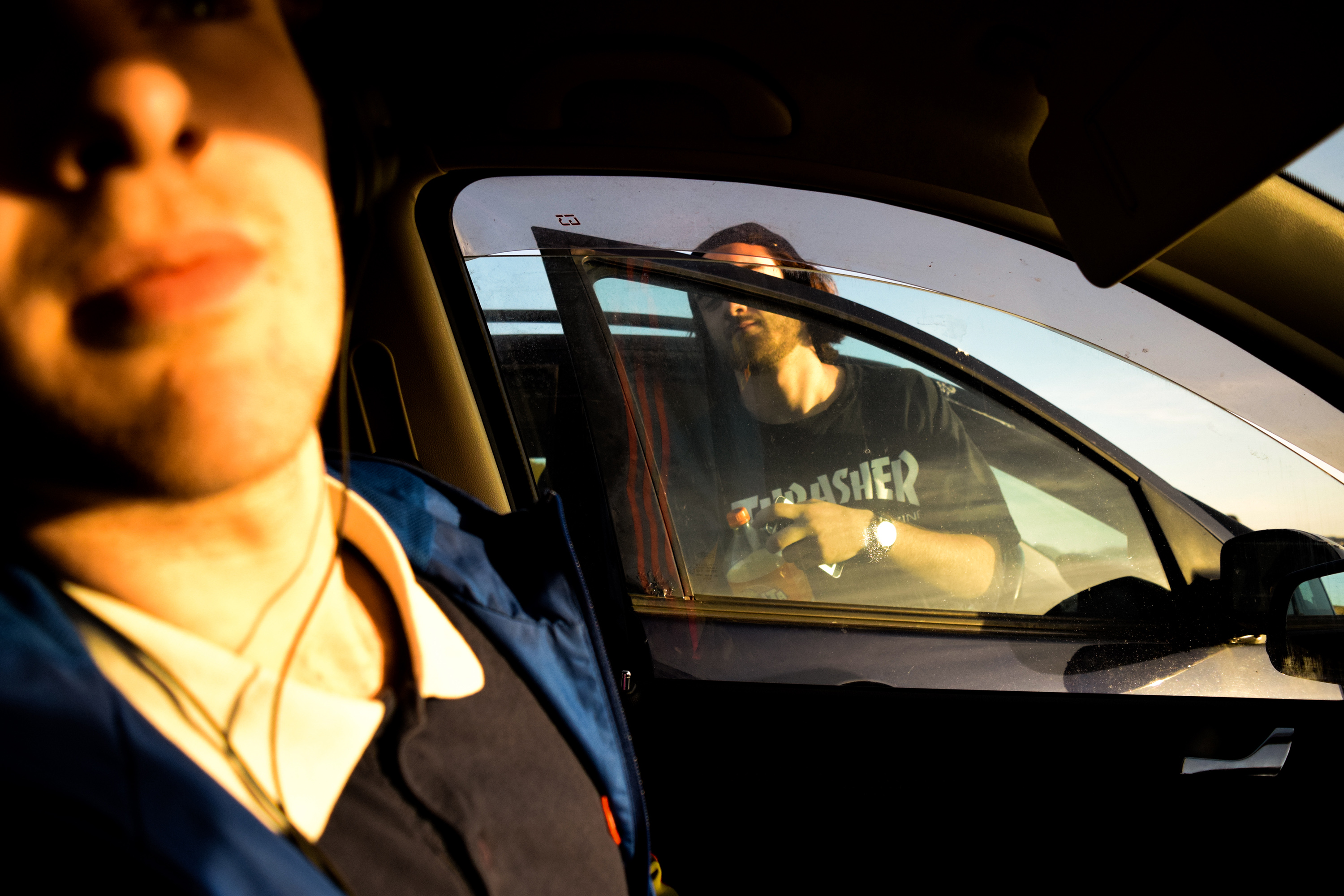
The first couple of images are straight shot, but I edited them to make them brighter, warmer and just overall slightly more cinematic. I also tried to use parts of the car to compose the image, for example in the first photo I used to window of my car to fit around Lucas and the door of the other car, creative corresponding shapes and a nice focus point.

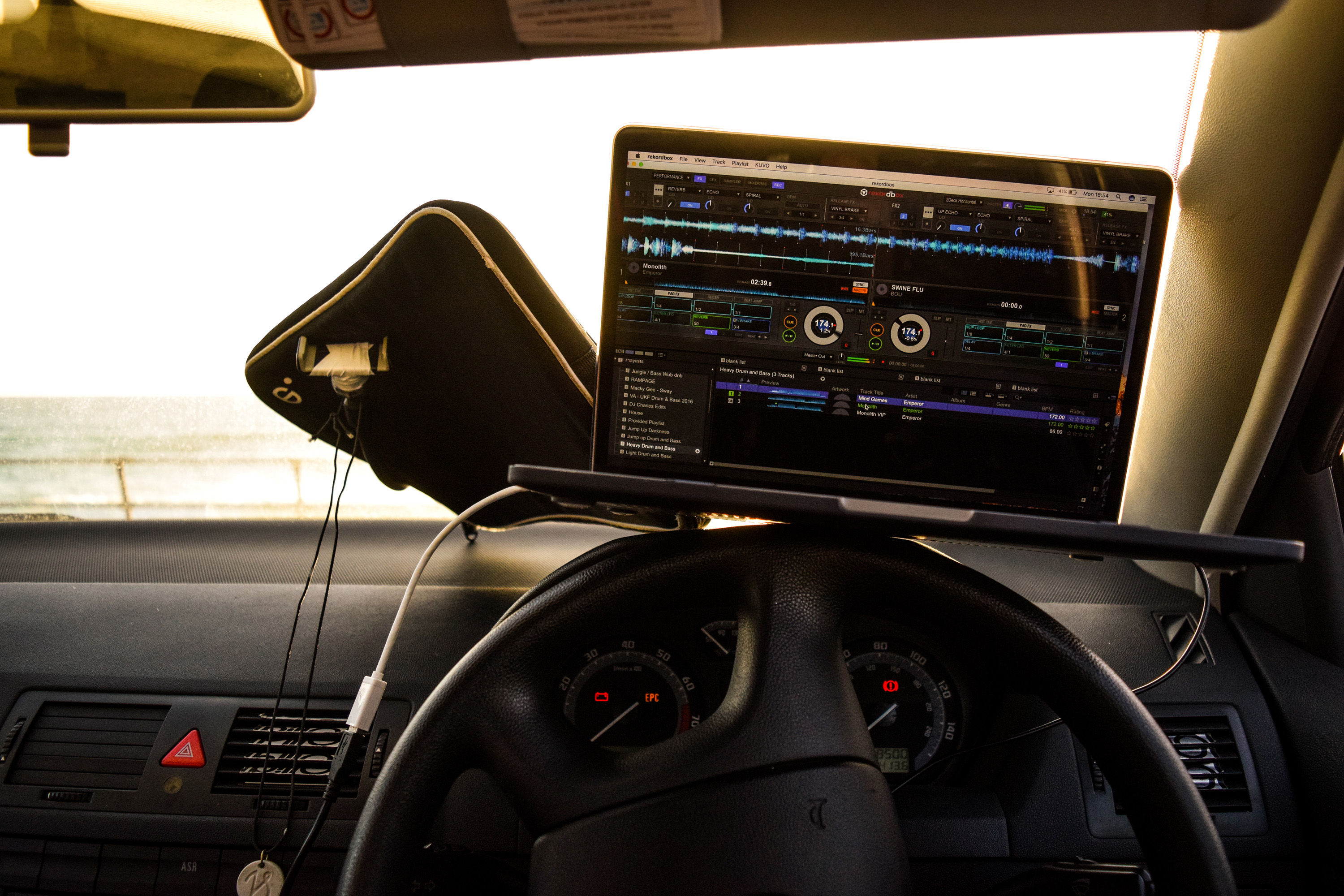
I took the image below to show the environment of my car and how I used it to mix music often. I also edited it to look cinematic in the same way as the previous images.
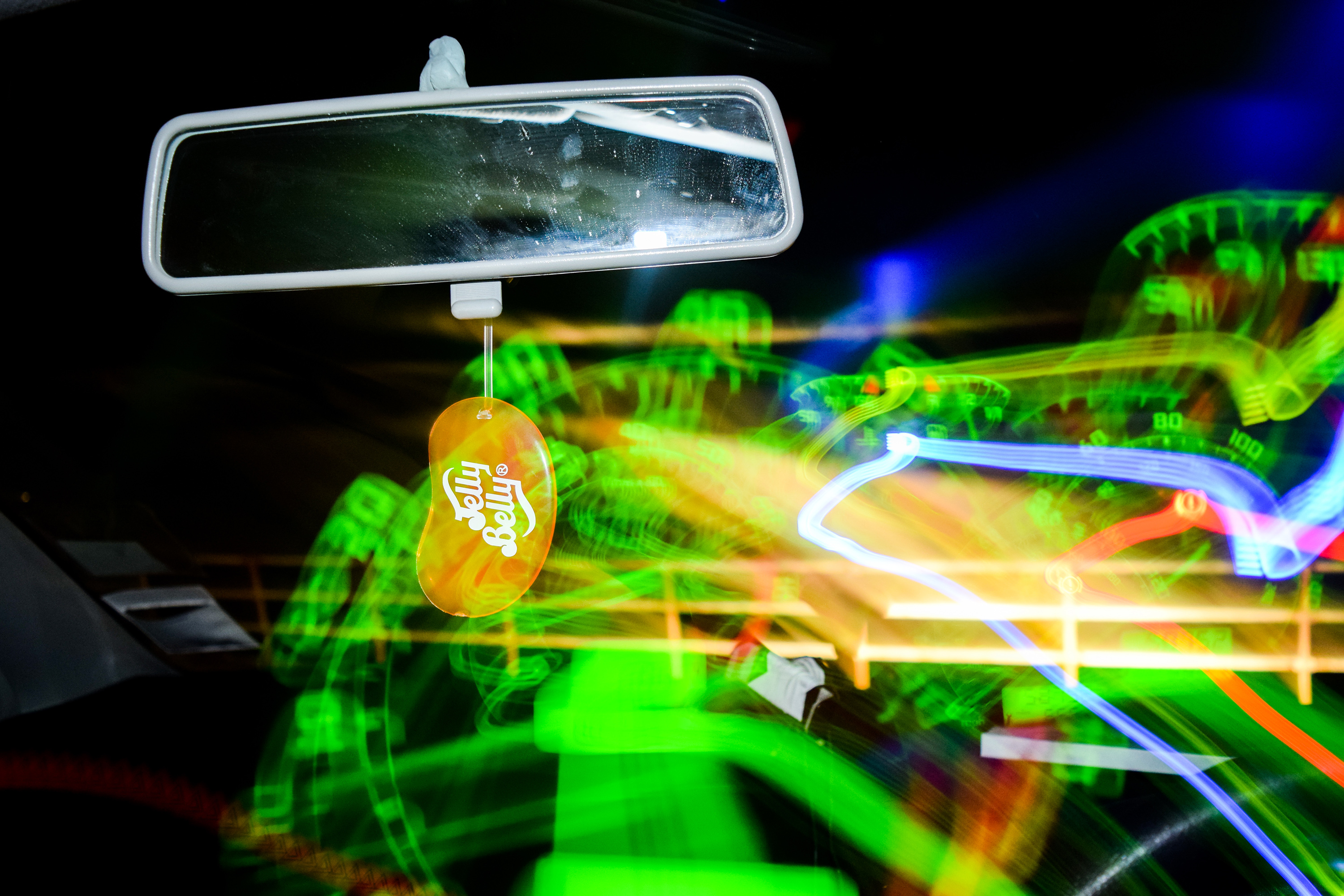
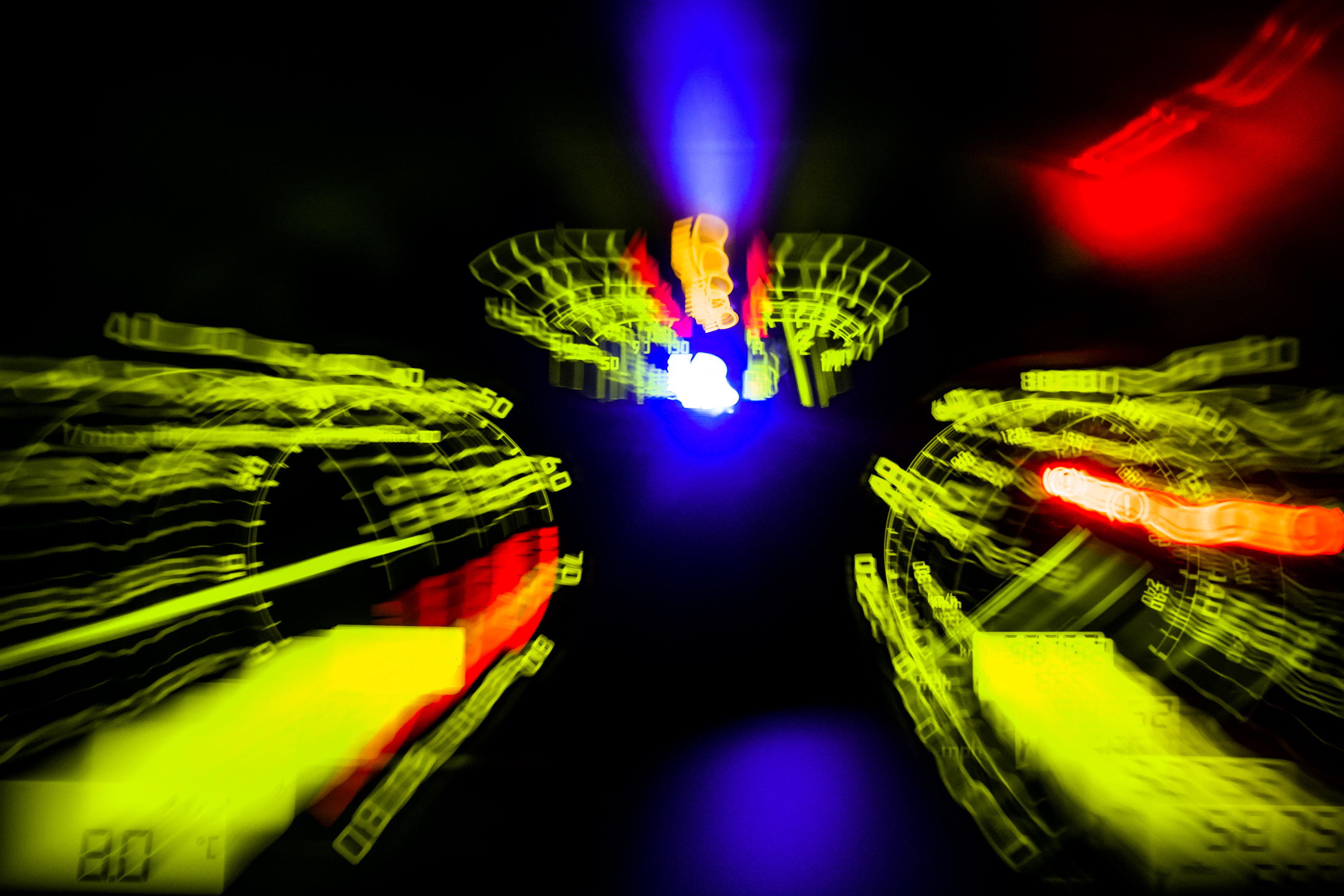
The next two images are my first examples of light painting from the shoot. I like them as they resemble a soft, abstract painting which is really interesting to look at. The sunset in the background created a nice smear of colour, and the sharp shapes made by the movement of my camera over the dashboard create an interesting contrast to the general blurriness.


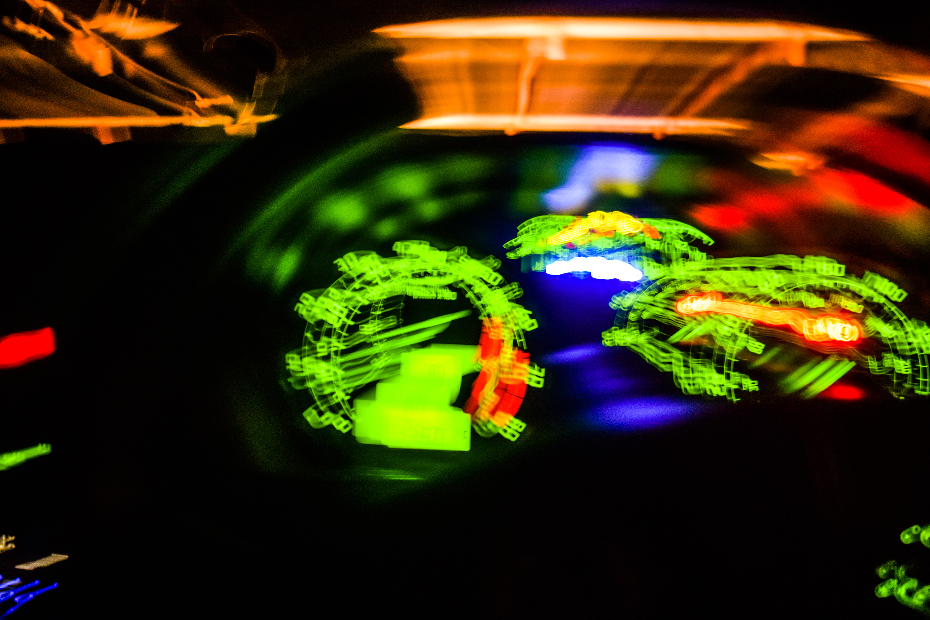
As it got dark I began experimenting with flash along with a slow shutter speed, and found that I could manipulate this to have the following effect. I was able to capture a sharp image with the flash, but due to the lack of light outside I could move my camera over the dashboard in the same shutter opening and draw over the image the flash captured. I began to play around with this a lot from here. I really like the craziness of the next image, and I was able to capture and draw with the speedometer fitting in nicely with the theme of motion and driving around in my car.

I was able to create an almost exploding effect by experimenting with zoom and slow shutter speed. I began the shutter zoomed in on Zacs phone, and whilst the shutter stayed open I zoomed out, expanding the phone outwards.


With the next few images, I experimented with the flash and shutter speed again, but this time drawing over Zac. I tried to think about the composition of the images, thinking about where the lights would be on the photos as I was moving my camera, I was able to make some interesting images drawing over and around Zac.


I really like the image below as I was able to draw the light around the curve of Zacs head, almost like a translucent bandanna, whilst keeping the portrait in sharpness.


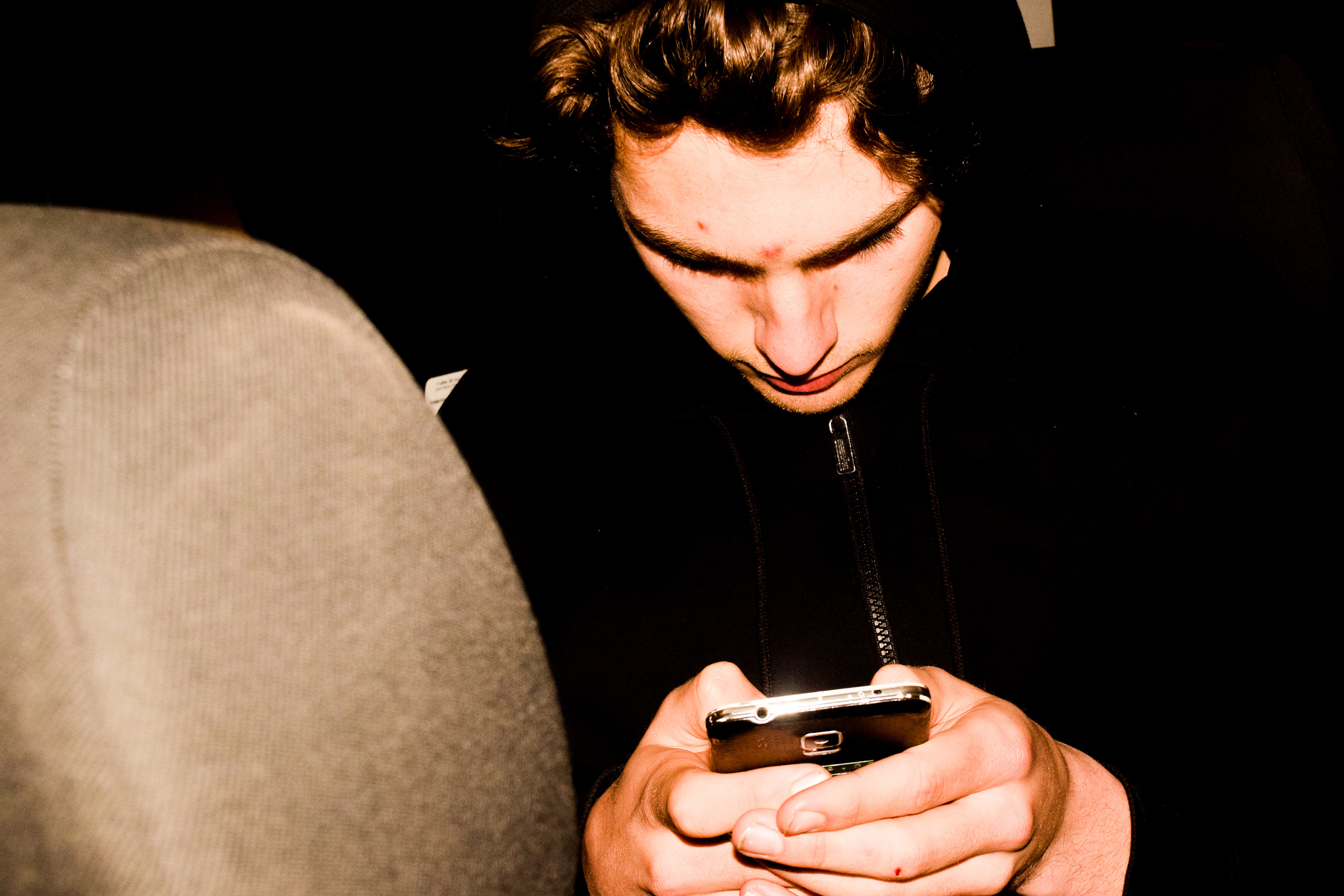
The following images are some portraits, edited slightly warmer with a higher clarity. This is again to look slightly cinematic, which I furthered with the next image by experimenting with cropping sizes. The bottom of his head was originally cut out of the frame and so I cut down the top to make a more panoramic view of this scene of my friend in his car.



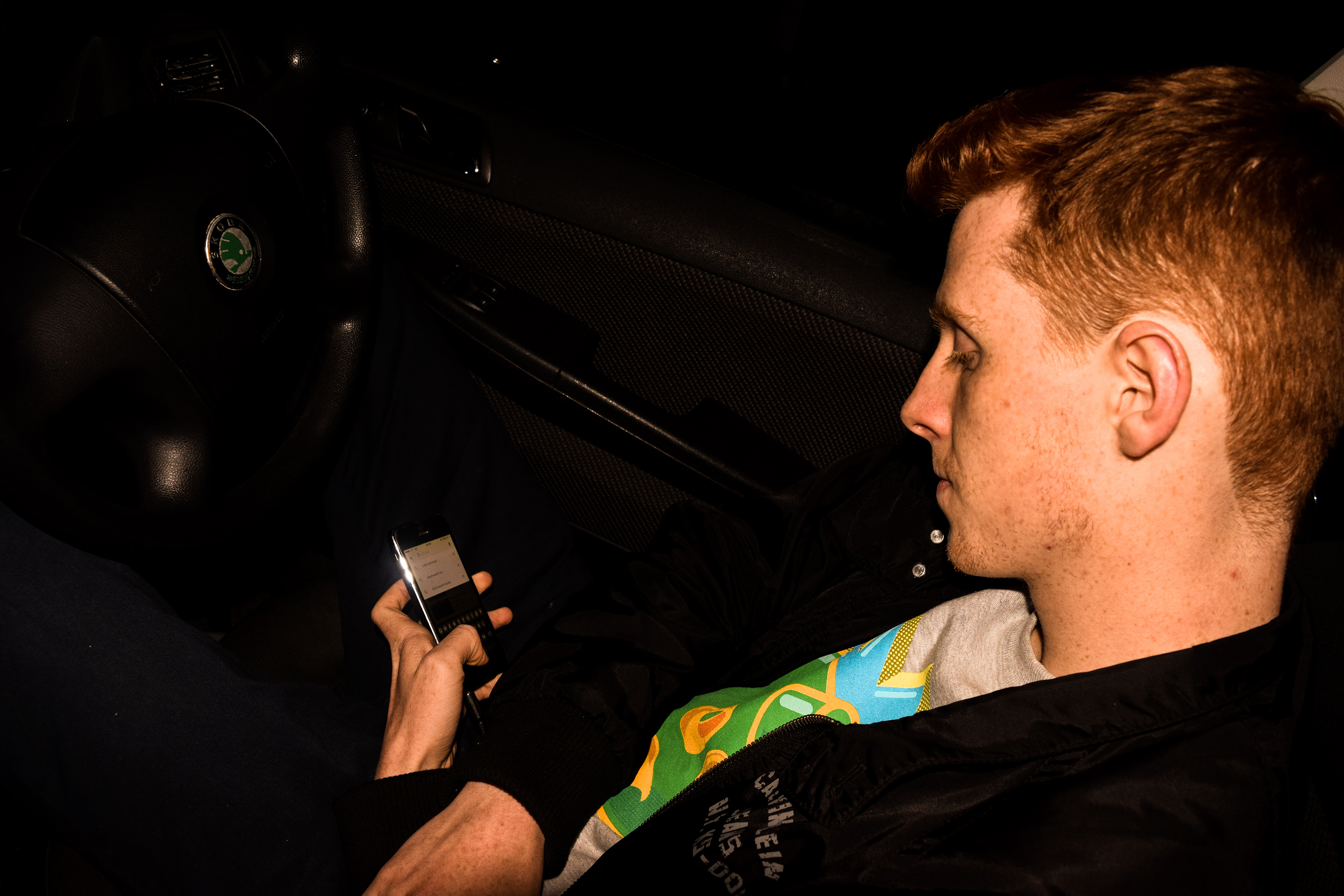
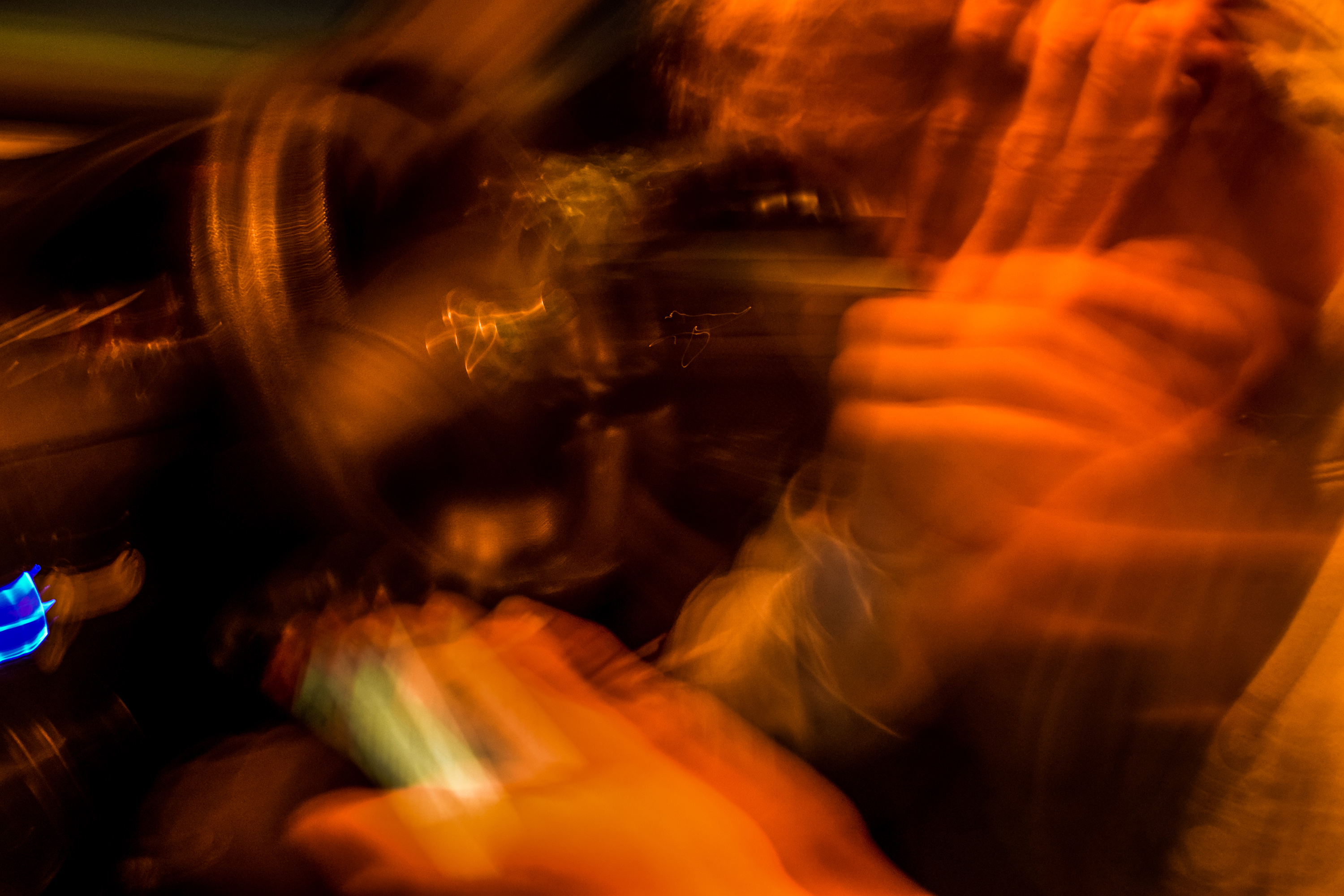
The following photos were made and edited to get really extreme, far more abstract images, more similar to paintings that capture a great amount of motion. The image below is actually a portrait that I have edited heavily. I used a slow shutter and shook my camera diagonally to create this effect. I then edited to colours to make it look a lot warmer, getting different hues of red and orange.

These two images were edited even more heavily, to create more interesting hues. I took the photos of lights in my car, and moved my camera, making repeated shapes from each light, just with different colours. This made a very interesting effect of repetition of these shapes in an extremely abstract way.


The next image is one of my favorites in this painted, mysterious abstract style. It is an image of my radio I made with again, a slow shutter speed and sharp small movements of the camera. The amount of lights on the radio meant that there would be lots and lots of small repetitions with each light, and the overall effect is this amazing flowing cylindrical light shape made up of lots of fading lines with many different blue hues.

These next three images are slightly more clear, but again still very blurry. I focused more on the movements of the person in these pictures rather then shaking my camera too much (although I still did slightly). The outcome of this was an abstract painting-esque image portraying movements of his head and arms all in the singe frame.


These following images show more tradition light painting. Using a phone torch, I got Jasmine to wave it about attempting to draw around the shape of the window in different ways. The outcomes were interesting.


