

Daily Archives: May 2, 2017
Filters
3rd Shoot (Results)
3rd Shoot (Results)
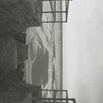
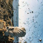
This is the results of the final images exactly as I got them back from the developers. There is an amazing range of different colours that came out from the images. The first 6 are bleached from the pool water, then next are mostly unaltered with some discolouration except for frame 7 that suffered the effects of the sea water a little, I found out that the salt water solutions caused the different coloured layers of the emulsion to separate from each other giving these big blocks of colour. Frames 13-18 were kept in the water from the desalination plant, the layer separation here was much more pronounced and produced the incredible colour blocks on frame 18. 19-24 were from St. Catherine’s Woods, this water was fresh and relatively clean but in the first two frames of this set the emulsion begins to crack and break apart, the results of this if it had been left can be seen in the last set of six images. 25-30 are the results of the water damage from Queen’s Valley reservoir, these are the least damaged but they do have some discolouration and frame 25 is just beginning to crack. The final set of frames are easily the most damaged, this surprised me because they were suspended in the tap water, I assumed that this one would damage the negatives the least and I was very wrong, the cracking produced some incredible results, the remaining parts of the image are just visible and are framed by the broken areas. I am so happy with how these final few images turned out.
The way that the environment was able to affect the image in these different ways is fantastic. The results are better than I expected and I am really happy with them.
The other experiment that I tried was to submerge 6 prints in the same types of water, this was mostly an insurance incase the negatives were not damaged by the water. These look really interesting and I have mounted them as an experiment. I only mounted 4 because the other two were not very interesting, I used foam board pieces to keep them off the back piece so that the crumpled, water damaged nature of them still exists. The also still have a tactile nature to them, this tactility gives the viewer a connection to the environment and will make them think about the process over the image itself.


Dawn Final Photoshoot

I wanted to capture the warm lighting that protrudes through a window in Ryan’s room. I had to work very quickly as the light moved fast and the light was constantly changing, meaning I was constantly adapting the exposure and experimenting with the white balance. Although Ryan’s room was ideal for capturing Ryan’s personality, it was very cluttered in comparison to my room which was used in the previous shoot, for example the lights that hung from the hall stuck down with dark duck tape, in some photographs i used the spot remover tool to remove the duck tape. I wanted to evoke the warm colours from the sun light but also the blue tones from the shadows, I also had to work with the tones in the window in the background. This will also add narrative to my book and raise enigmas such as how maybe the mysterious character was dreaming and has just woken up.
I asked him to wear a white outfit that would give the impression of youth and vulnerability which was very different to the black outfits he’d worn in previous shoots. I plan on using the above photo in my book, this is also an indication to the audience of dawn and the sun rising, especially with the striking warm lighting.
I covered the light from the window, leaving this cool light from the back window. I liked these photographs together as a diptych as it captures the confusion on his expression. I wanted to create portraits and experiment with composition. I like the ominous dark lighting with soft shadows. I like how the white walls contrast the dark shadows in his face. This lighting is very natural and gives the photographs a very everyday effect.
I plan on using the second photograph for its use of gold light and strong dynamic shadows. When I was editing I wanted to bring down the light from the window in the background but it came out unnatural as it was slightly too overexposed, so I have left it as it was. I like how the dynamic lighting reflects off the wardrobe and the shadows in the background contrast with the light on his face. Below are two closeup portraits featuring a softer use of light, giving him a softer less intimidating expression.
Cyril Costilhes – Grand Circle Diego Book Research
Cyril Costilhes has a very unique relationship to Diego Suarez, the location where he shot his dark photoseries, ‘Grand Circle Diego’. A little over 10 years ago, his father moved there to run a casino, but was returned to France after a tragic motorcycle accident that caused him front lobe dementia, placing him in a coma. Costilhes saw his father’s move as an attempt to start fresh, lured by the beauty of the young women and environment. To Costilhes, his father’s aspirations were an illusion, and one shared by many white western men in a similar position. The reality of Diego Suarez is one of desperation, where people of privilege go to seek asylum in a false paradise, and the inhabitants seek salvation through the refugees of reality.
Since the book is about him revisiting an old environment of his I thought it would be an interesting link to my project based on my personal environments. I want to focus on how Cyril had put these images together in a way that creates a narrative.
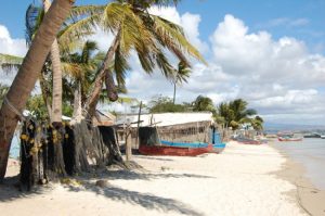
When I search for images of Diego Suarez on google, I come across an idyllic seaside town.
This is a strong contrast to the images produced by Costilhes. His experience of the town is of his father, and he travelled there to resolve the ghosts that still hang over him as his father remains in a coma. The story of his father is of somewhat a dark irony; he left France after a failed marriage to look for a new life in what was seemingly a paradise of freedom. This elusive idea of a new perfect life in this paradise was supported by how free and beautiful the place looked, however it sadly ended up in a helmet-less motorbike accident due to a hole in the road.
The photoseries is compiled as a book, and Costilhes writes about his time spent in Diego Suarez. He imagines the moments leading up to his father’s crash:
“What was his last clear, clean thought right before the crash?! Was he daydreaming about the girl he was going to f^*k next, `daydreaming about his new house on the beach of Ramena, or about the money he was going to make by reselling that ambitious hotel in construction, about what he was going to do next, living in a paradise until the grandiose ending.”
His writing at the end of the book is very striking, describing the moments around his fathers crash, as well as the moment arriving back at the village in Madagascar since he left 11 years prior. He talks about the false paradise that Diego is, luring men in who want ‘fresh starts’ from their possibly miserable lives. Despite the beautiful women and beaches, Cyril saw through it as a Dystopia rather then a Utopia. He describes how people are losing their minds over the availability of power and freedom, and how their is a dense sense of colonialism spread by the western men looking for a paradise.
These are some other quotes from the book, written on the day he arrived back in Diego Suarez.
He describes how the place has not changed at all from what he remembers… Describing himself as a walking piece of meat ready to be salvaged upon by the local people.
“same bars, recycled bodies. I’m a walking piece of fresh meat. Nothing has changed.”
“I sometimes fantasize about ending it for my father. It would be a relief for everybody. I have this crazy idea of transforming this suffocating situation into something positive, something that would give sense to all this. Turn the ugly into beautiful.
First night in Diego, having a drink at La Vahinee bar, a beautiful girl sits at my table, looks straight in the eyes.
“J’aime la bite.” “
This is particularly striking as he is talking about killing his own father, however we can tell it has been said out of desperation and sympathy as he is wanting to end his suffering. This makes it such a powerful part of the text as it proves the reality of the pain his father, his family and himself have all been going through watching the man completely locked up in his body, resulting in this incredible set of dark, disturbing and mysterious images.
Here are some reviews I have found whilst researching that in my opinion reflect the atmosphere and emotion of the book strongly:
- “Grand Circle Diego is a dark exploration of the photographer’s ghosts, and it powerfully captures Costilhes’ quest to reconnect with his father. Through its lavish printing, elemental design, and careful editing, the book creates the ambiance of very personal catharsis, leaving most of its mysteries unrevealed.” – Olga Yatskevich on Collectors’ daily
- “Cyril confronted the demons, the grudges and probably the rage that town brought into his life. Nothing remains of the idyllic allure of Diego Suarez in his suffocating photographs – the images are extremely dark, baffling and often times even repulsive. Despite Cyril’s initial intention was to make a project of documentary nature, the work soon changed into a deeply subjective, visceral experience, a descent into the photographer’s innermost feelings, a coming to terms with a ten year-long trauma.” – Fotografia magazine
- “Buried beneath its wild undergrowth and savage natural beauty, the Madagascan town of Diego Suarez hides many secrets. In 2003, whilst riding his motorbike home from Le Grand Circle Diego casino one evening, Cyril Costilhes’ father was involved in an accident that left him crippled with front lobe dementia. As a result, just over 10 years later, Costilhes has returned to shoot the mysteries of the land that snared his father’s sanity. The French photographer recorded his findings in his new book the Grand Circle Diego – and the results are dark, twisted and startling.” – Dominique Sisley on DAZED
Cyril has taken the paradise-esque vision and flipped it upside down as an evocative result of the haunting memories of his fathers life ruining accident. As a result he created a striking representation of the place focusing on the more features of life there such as the mysterious looking people looking fearful and isolated, abandoned buildings, abstract images of flesh and vegetation along with the many other disturbingly interesting photographs within. Below you can see a selection of images that I have made, all of some of my personal environments (places I feel safe, comfortable, familiar with) that I feel link with Cyril’s work. I have more frequently tried making my images contrast’ stronger to produce darker blacks and lighter highlights, similar to Cyril’s style of images.
Shoot 3 Edits
I am very happy with these edits as they show an array of experimentation, focusing on motion and light influenced by the idea of travelling around in cars with friends.
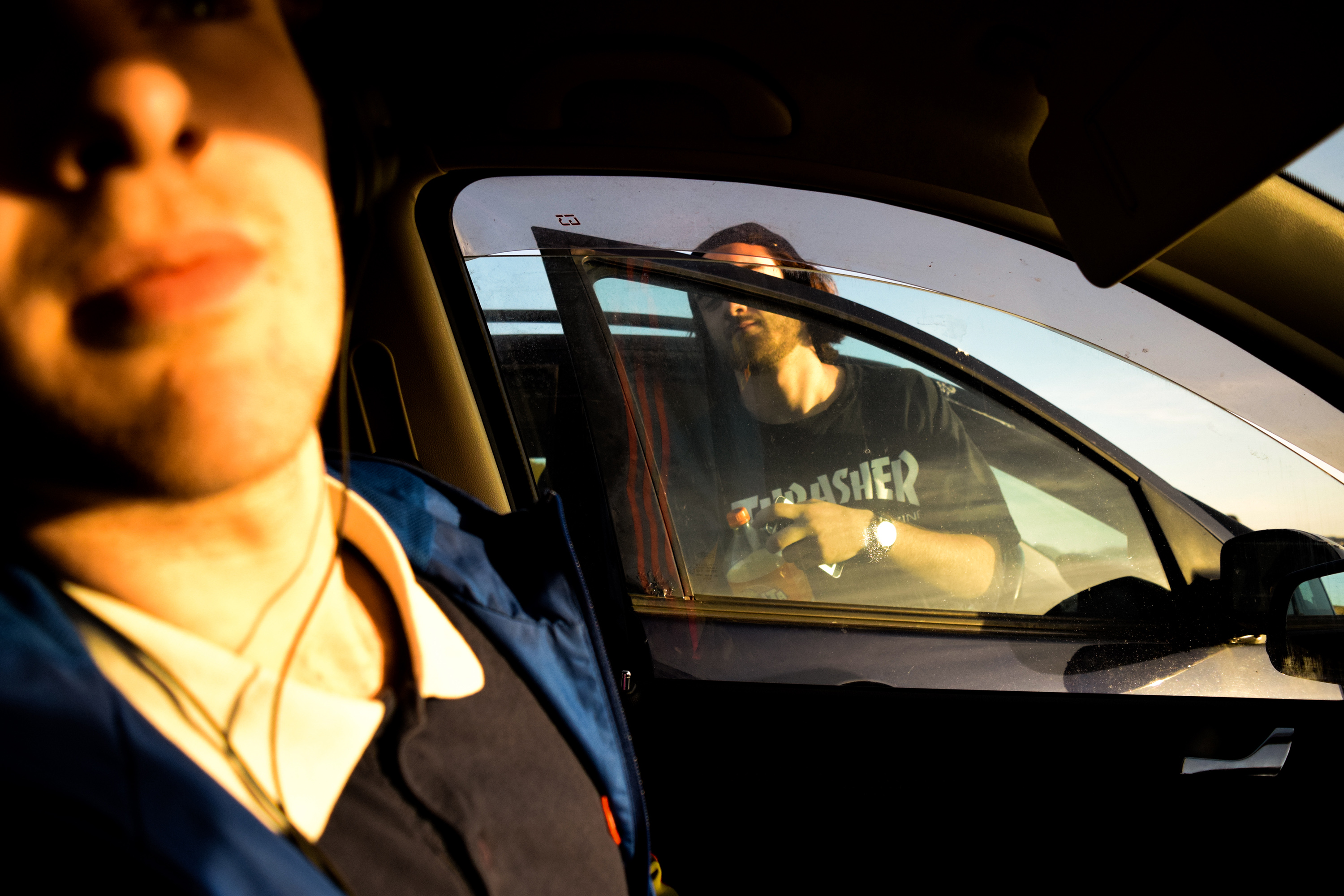
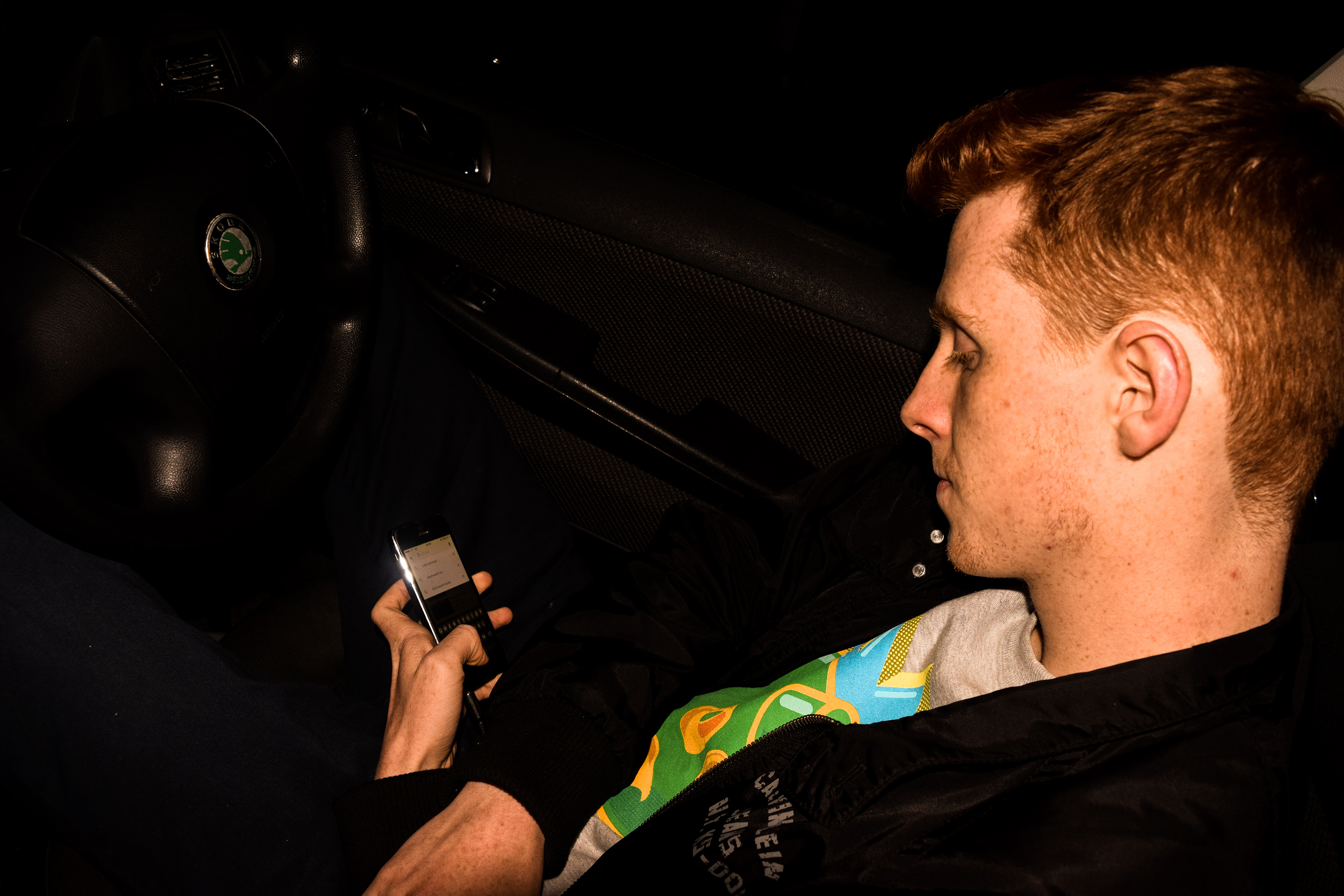
The first couple of images are straight shot, but I edited them to make them brighter, warmer and just overall slightly more cinematic. I also tried to use parts of the car to compose the image, for example in the first photo I used to window of my car to fit around Lucas and the door of the other car, creative corresponding shapes and a nice focus point.

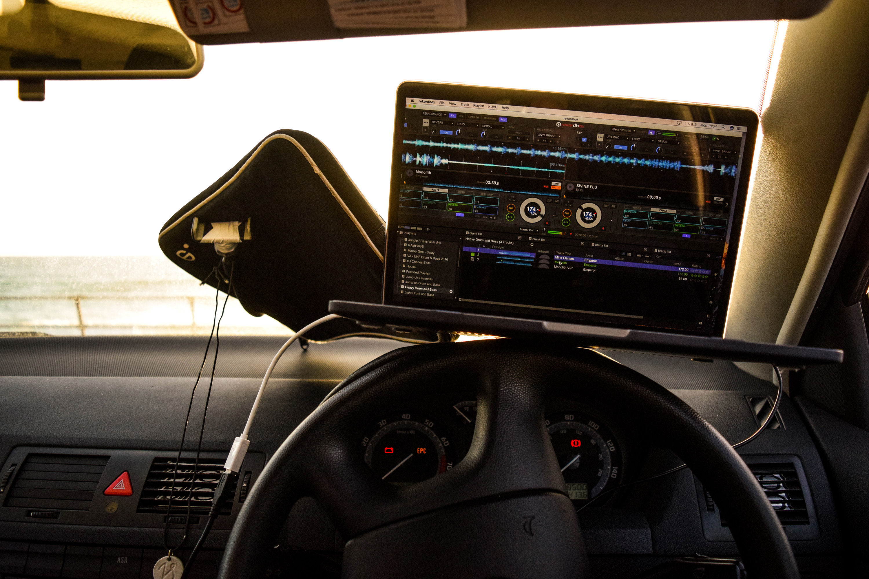
I took the image below to show the environment of my car and how I used it to mix music often. I also edited it to look cinematic in the same way as the previous images.
The next two images are my first examples of light painting from the shoot. I like them as they resemble a soft, abstract painting which is really interesting to look at. The sunset in the background created a nice smear of colour, and the sharp shapes made by the movement of my camera over the dashboard create an interesting contrast to the general blurriness.


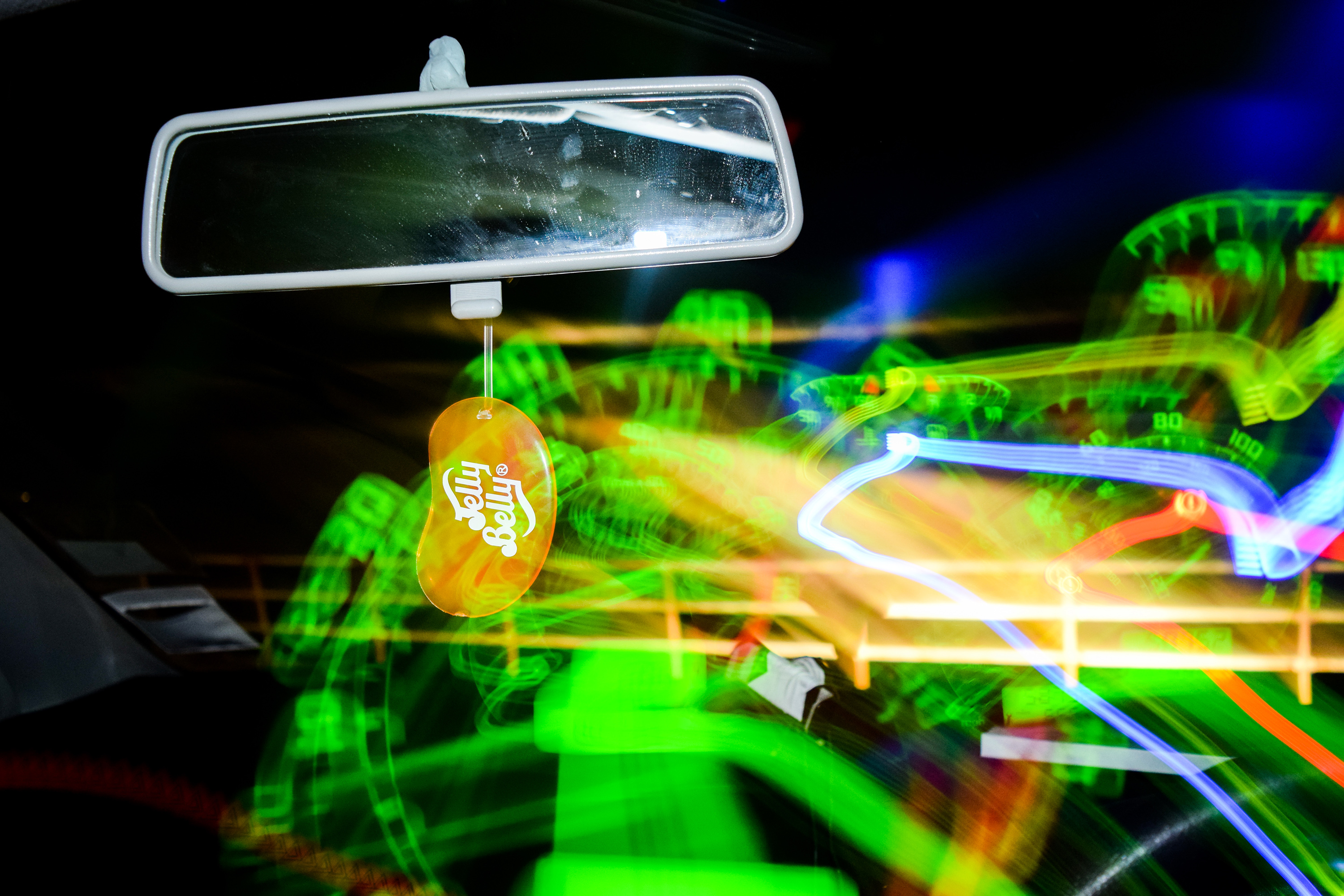
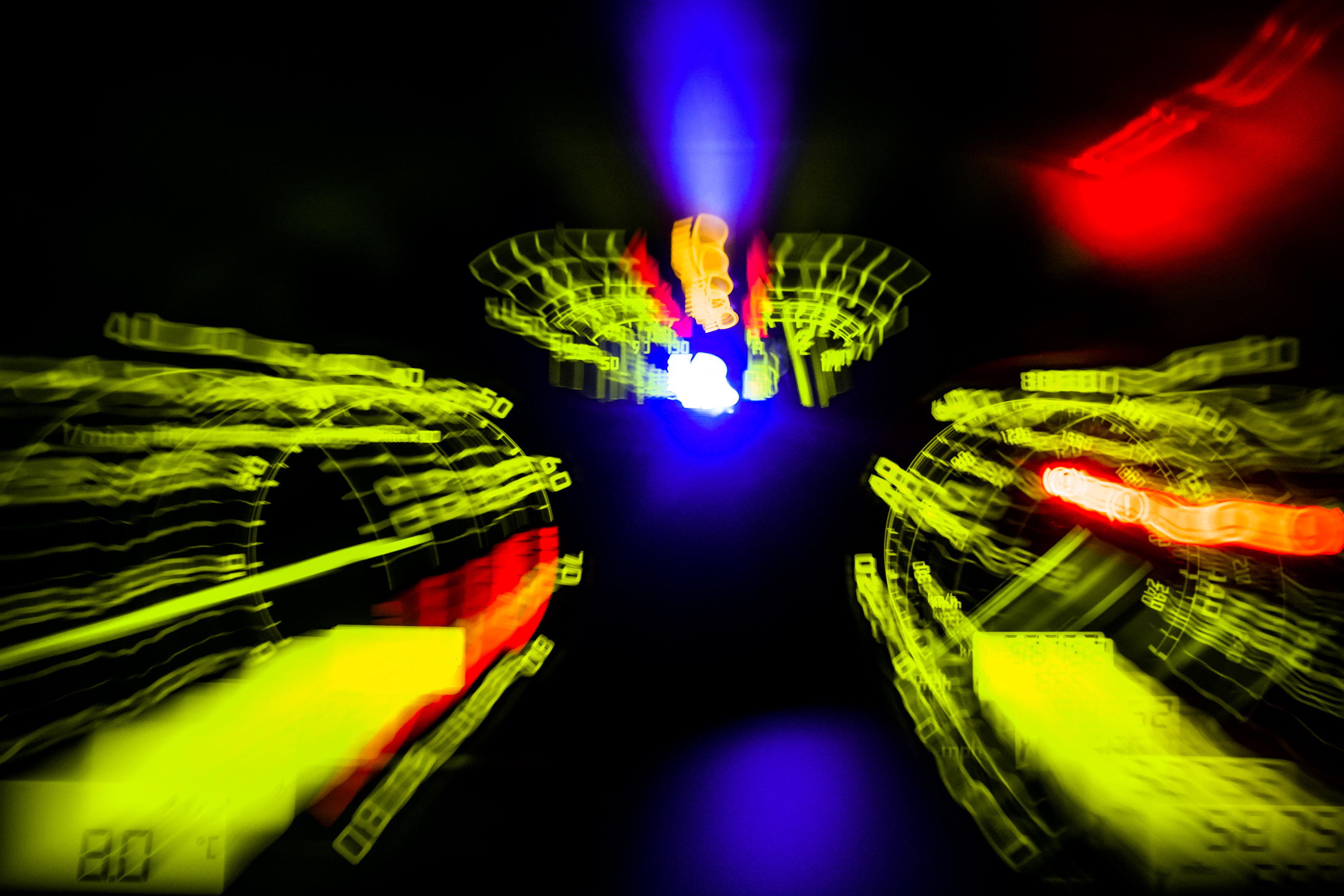
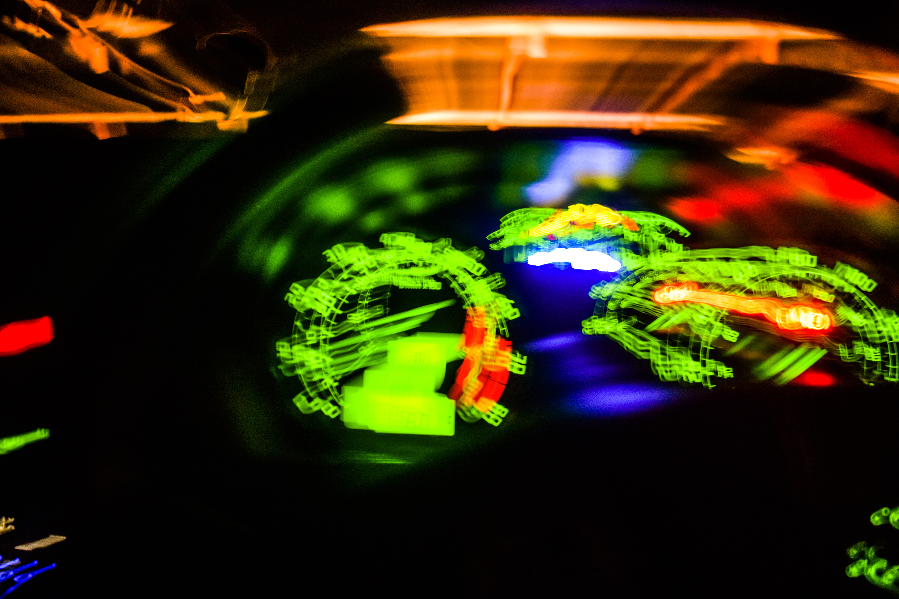
As it got dark I began experimenting with flash along with a slow shutter speed, and found that I could manipulate this to have the following effect. I was able to capture a sharp image with the flash, but due to the lack of light outside I could move my camera over the dashboard in the same shutter opening and draw over the image the flash captured. I began to play around with this a lot from here. I really like the craziness of the next image, and I was able to capture and draw with the speedometer fitting in nicely with the theme of motion and driving around in my car.

I was able to create an almost exploding effect by experimenting with zoom and slow shutter speed. I began the shutter zoomed in on Zacs phone, and whilst the shutter stayed open I zoomed out, expanding the phone outwards.


With the next few images, I experimented with the flash and shutter speed again, but this time drawing over Zac. I tried to think about the composition of the images, thinking about where the lights would be on the photos as I was moving my camera, I was able to make some interesting images drawing over and around Zac.


I really like the image below as I was able to draw the light around the curve of Zacs head, almost like a translucent bandanna, whilst keeping the portrait in sharpness.


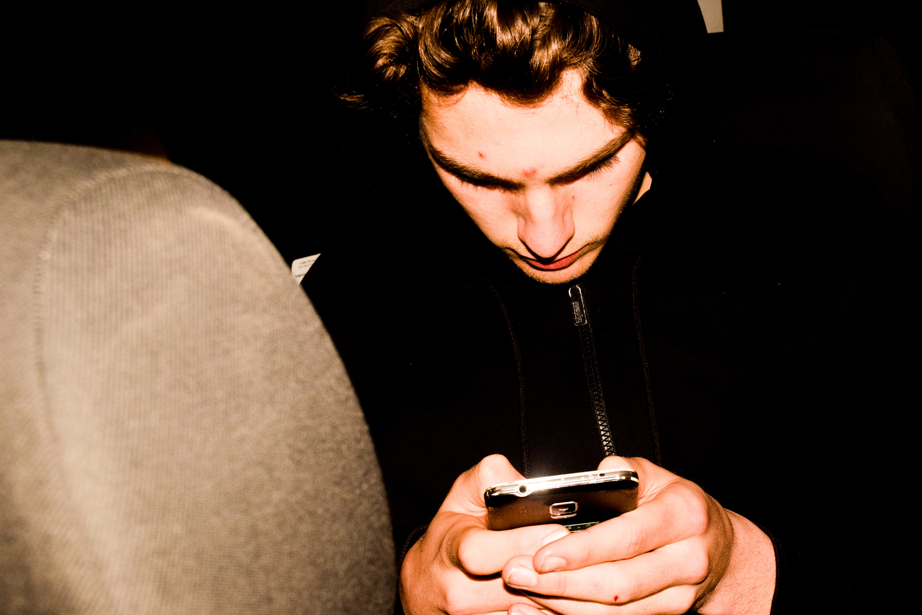
The following images are some portraits, edited slightly warmer with a higher clarity. This is again to look slightly cinematic, which I furthered with the next image by experimenting with cropping sizes. The bottom of his head was originally cut out of the frame and so I cut down the top to make a more panoramic view of this scene of my friend in his car.



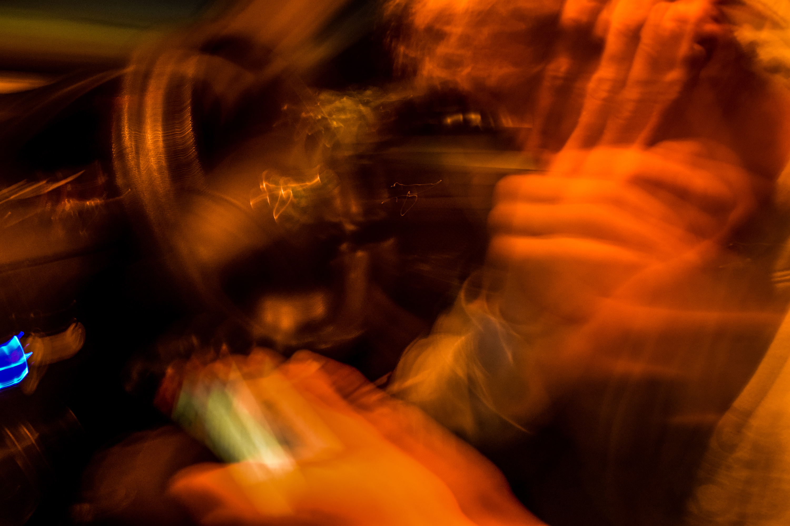
The following photos were made and edited to get really extreme, far more abstract images, more similar to paintings that capture a great amount of motion. The image below is actually a portrait that I have edited heavily. I used a slow shutter and shook my camera diagonally to create this effect. I then edited to colours to make it look a lot warmer, getting different hues of red and orange.

These two images were edited even more heavily, to create more interesting hues. I took the photos of lights in my car, and moved my camera, making repeated shapes from each light, just with different colours. This made a very interesting effect of repetition of these shapes in an extremely abstract way.


The next image is one of my favorites in this painted, mysterious abstract style. It is an image of my radio I made with again, a slow shutter speed and sharp small movements of the camera. The amount of lights on the radio meant that there would be lots and lots of small repetitions with each light, and the overall effect is this amazing flowing cylindrical light shape made up of lots of fading lines with many different blue hues.

These next three images are slightly more clear, but again still very blurry. I focused more on the movements of the person in these pictures rather then shaking my camera too much (although I still did slightly). The outcome of this was an abstract painting-esque image portraying movements of his head and arms all in the singe frame.


These following images show more tradition light painting. Using a phone torch, I got Jasmine to wave it about attempting to draw around the shape of the window in different ways. The outcomes were interesting.


Shoot 3 Contact Sheet

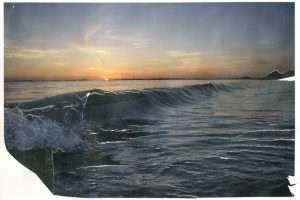
This contact sheet shows the images I made whilst out on a shoot in my car. I went to the beach with some friends for this shoot, as there was an amazing sun set that I thought might be nice to capture briefly. I began experimenting by putting down my shutter speed greatly to be able to capture the limited light left, as well as try some light painting with the available LED’s in my car. Some images turned out very abstract yet very interesting, some images were more documentary style, and others turned out like paintings due to the loose forms created by movement of the camera with a slow shutter speed.
My Final Photographs
As the exam brief was “Environment” i feel like i fulfilled it well. My project revolves around making a home in the environment, reminiscent of childhood dens. When beginning this project i immediately had this idea in my initial brain storm and therefore i feel as if this has allowed me to fully explore this concept. I begin with photographing my dens during the day, then adding in a sinister notion by photographing them at night. I was also able to create a couple of portraits of the people i imagined lived in the dens as i child and explore the impact of slow shutter speed photography suggesting the presence of a person. I feel as if the final consideration of archival diary entries i made about dens adds the final element to my project as it ties it all together to suggest the intentions of building these structures. They link the dens directly to childhood dens, without overtly stating it. My final book contains images from the very beginning of my project and the very end as my ideas progressed. A real turning point was to consider Yury Toroptsov to lead me to create the photographs at night, which was undeniably my best photographs of the project.
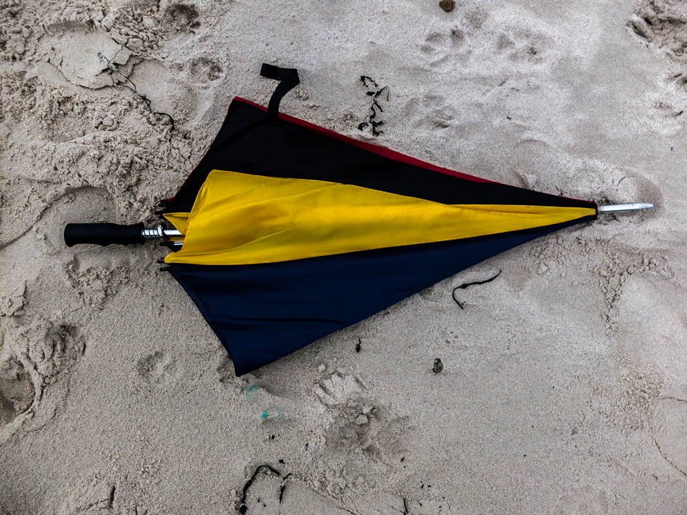
After my experimentation of projecting onto the den i also wanted to print up some of my images like normal to display in window mounts. I choose three main central images to print to have as single images. All of these images are from the night dens as when i photographed my dens the night time version had a lot more of an impact. They work quite well all together as the blackness of the night creates a link between all the images. I choose images from all different dens so as to show the range of materials i used. I choose the woodland den, umbrella den and the garden one with material as each one being made of different material created a more interesting final set of images. 
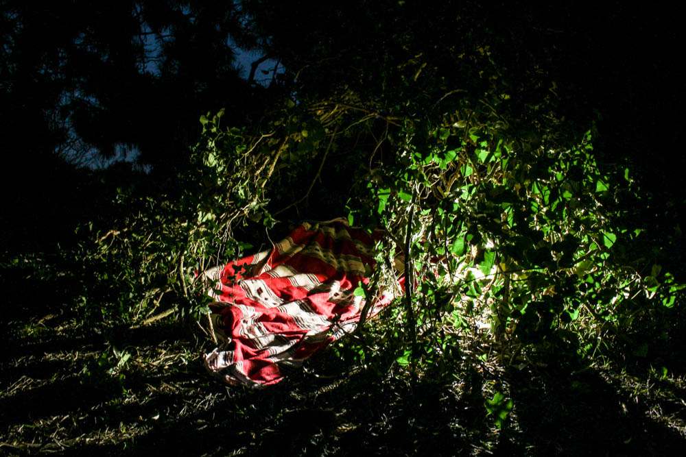
Above is the best photograph that i took of the wood den as a whole radiating light. This image was taken in the blue hours after the sun has set which you can slightly see by the sky in patches through the leaves in the background. With this photo shoot as the photographs were taken underneath the trees, the den being built in the woods, the background is made up of the dark shadows of the trees rather then the sky like my previous shoot. I composed this photograph according to the rule of thirds with the den itself more over to the right side of the frame. I also positioned the light inside the den more to the right side of the frame and so the image is fairly weighted on that side of the composition. This contrasts quite well with having the bright blinding light of the den to the right and then in the sky the patches of light from the blue sky are on the opposite side of the frame, balancing the image. I took the photograph from a slight angle, not photographing the den straight on so you can see directly into the den but more from the side so the inside of the den remains more mysterious. By putting the light within the den you are able to see clearly how the structure of the den is made up of branches and leaves intertwined together and the light then shines through these gaps. The light quite literally radiates out from the points at which it escapes the inside of the den to create an interesting pattern of lines from the center of the den outwards. I think the effect is further emphasized by the light making the leaves it shines through a more vivid green, these bright green then contrasting with the red of the blanket.

The above image plays with the blur of the blankets in the wind. The impression of the photographs is that as the light is behind the blurred blanket, that it is rushing forward towards the camera and has a presence as the light suggests life. The light is intense and shines from directly behind the blanket in a circle. The rest of the image is slightly illuminated, the tree and some plants but the background is an intense black which only exaggerates the whiteness of the blanket further. The blanket is also just blurred enough to suggest a fast pace of movement but without being too fast to become transparent. The image is composed to consider angles, the blanket covering most of the frame but its straight lines being complimented by the straight lines of the tree also. The tree flanked on both sides by different blankets. The image is illuminated so that it included the light shinning onto the plants and also the light shines onto both blankets.
I then choose these two images below as a pair as they are a bit more abstract and i wanted to show the abstraction of the material and how it was layered over each other. These two images also show the imperfections of the den, with gaps in between the material.
The above photographs are more abstract compositions which focus on the point at which material is over-layed. The two colours being various shades of blue complimenting each other. The light in the photographs comes from the top left hand corner to shine directly onto the material. The points at which the light shines onto the material is washed out with colour which shows the harsh intensity of the light. These bright sections of light then contrast with the dark shadows in sections where the blanket has slipped and therefore leads into the inside of the den. Both these contrasting lights and dark’s then make the colours themselves more intense. I quite like the contrasting angles in these photographs alongside the vivid lights and darks as the material runs alongside each other but then has different folds and patterns on them which adds a dynamic to the photographs. They also show the process of the den breaking and then being rebuilt. When considering Goldsworthy’s work this was a key part of his process, to rebuild and continue to re-build until the structure becomes sound. This is as much about the den being created as having a final product as the den comes undone because of the environment, be it wind or the un-ablity to get a blanket to balance. The above photographs focus in on the tiny points of the den which have become to come apart, where holes have developed in the structure. I quite like these photographs in showing the layering of material and the tiny holes giving an insight into the inside of the den. The photographs are composed so that the break in the den is right in the center of the frame. The light in both photographs is intensely bright.
The next two sets of images show more of the process and how the dens are constructed. The set directly below is held together by pegs which shows how the images are put together.
The above photographs are all small details which held together the den. I quite like them as detail shots to go alongside the photographs of the main dens. So often with dens people look at the final structure and don’t consider the process. As these photographs in this section of my project are all about process and how the structure comes together, as much as the final product i think these photographs work really well as part of the series. In particular i like the photograph which suggests the movement and tensions of the material in creating the den. I composed the photograph according to the rule of thirds, the peg which joins the material positioned to the left top corner of the frame. From this point the material billows out at an angle which suggests it is being blown from behind. I quite like how the background is over exposed as the light outside is so bright as it causes the material in the foreground to be more prominent. You can also see to an extent the light shinning through the blanket which adds another dimension to the photograph.
This image below then shows the process of each element of the den coming together to create the structure. It shows how each individual umbrella is an individual which comes together to make a den.
My Book Layout
Finally, after doing artist research and choosing my favorite selection from my shoots, I was able to produce my own book for my project ‘Environments’. After designing my book I definitely knew it was the right way to present my shoots, as it allowed all of my photographs to flow.
Here is a link to my photobook: Nomadic Soul
Thumbnail of book layout;
The reason for print-screening the book in a thumbnail version was because its more visually easy to see why I choose my certain layout. When designing the book I had to think about spreading out the double spread pages, the black and white images, and certain layouts. I had to make sure all images on the page next to each other worked well together. Another important thing when editing is if a page has a similar layout to another one, they have to have the same padding etc, so it looks organised and neat.
Digital version of my book;
I believe the title of the book is very important aspect. Titles should convey not only a sense of the book’s subject, but also a feeling. The title you choose for your photo book sets the tone, hints at the genre or style of book, and draws the reader in. It’s your very first opportunity to “market” your book and make someone want to read it. I finally came up with the name ‘Nomadic Soul’ this was due to the word nomadic meaning living the life of a nomad; wandering, and a soul is an emotional or intellectual energy or intensity, especially as revealed in a work of art or an artistic performance. I found this title was perfect for what I was trying to represent as I wanted to represent a lot of energy and intensity of a traveler.

Unlike the artists such as Juergen Teller, Corinne Day and Theo Gosselin, who’s photo books I decided to analyse I decided to put the title and my name on the first page. This is due to me wanting my first image to be a double page spread, and this wasn’t possible without having a first blank page, so I thought I would just make the most of this page, and immediately tell the reader what I was going to show them in my book. This was due to the title being on the first page working well with the rest of the layout.

It is crucial to use the perfect first image, as it makes or breaks whether the reader is going to carry on reading it or not. The reason for the choice of this image is because the book is representing a journey, and there is no better way to represent this than by a photograph inside a car, which isn’t stationary.


Every 4-6 pages I choose to have a double page spread, as it would break up the smaller images, and is almost like having different chapters in written books. It gives it a stronger structure and shows principal images. The images I’ve chosen for double page spreads also tend to be some of my favorite images, as they have so much detail and interesting aspects to them. The difficult thing about selecting my double page spreads was the fact most of my images had someone featuring in them, and usually tended to be central of the image, which made it difficult for designing the book, as I didn’t want the people to end up being split by the binding of the book.

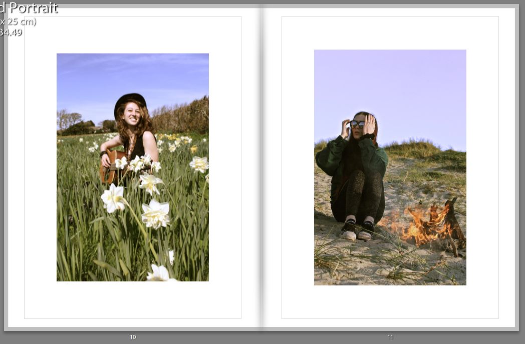
When selecting two images from different shoots on opposite pages, I would make the images link in a certain way, for example below one can see that the girl on the right page looks as if she’s looking up at the girl on the left page, this is shown again two images below. Therefore I had to think about the composition of the images before putting them in a certain layout.


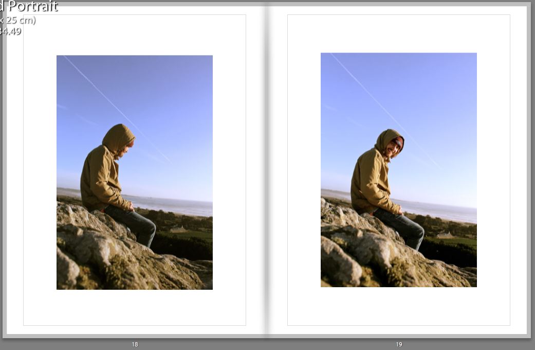

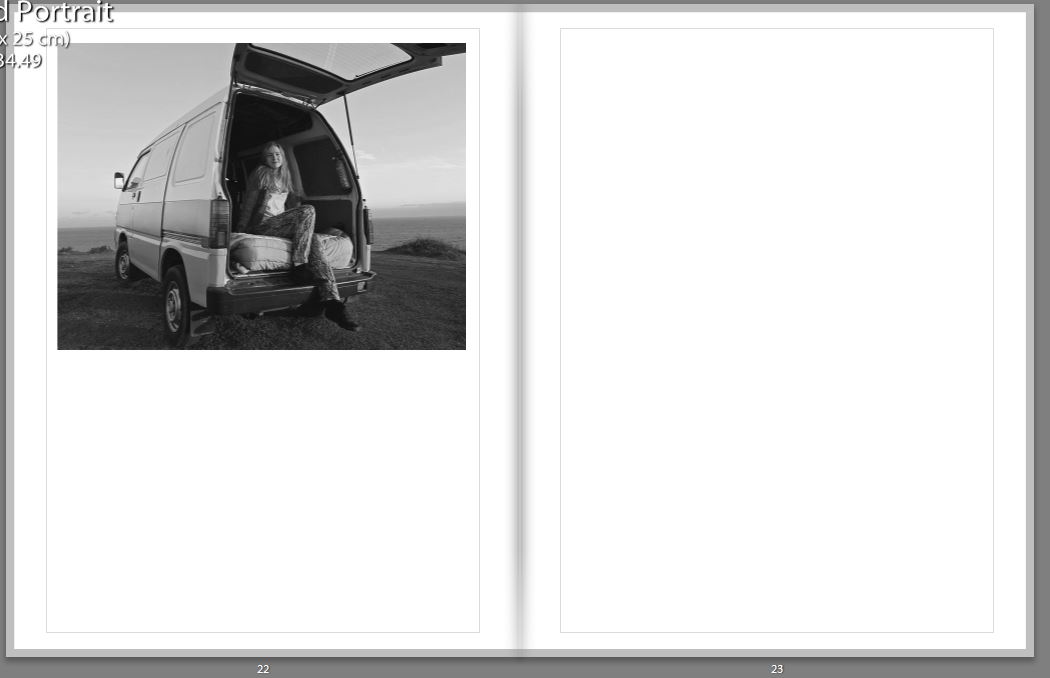
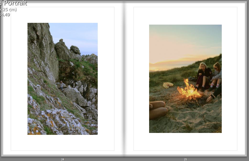


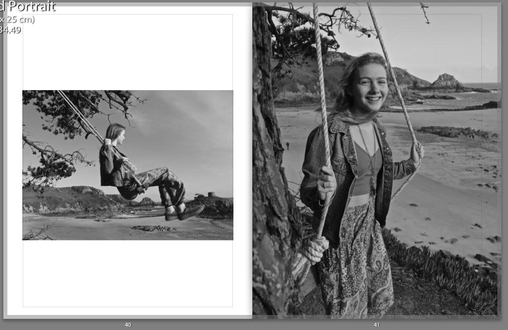

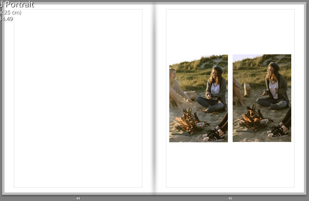
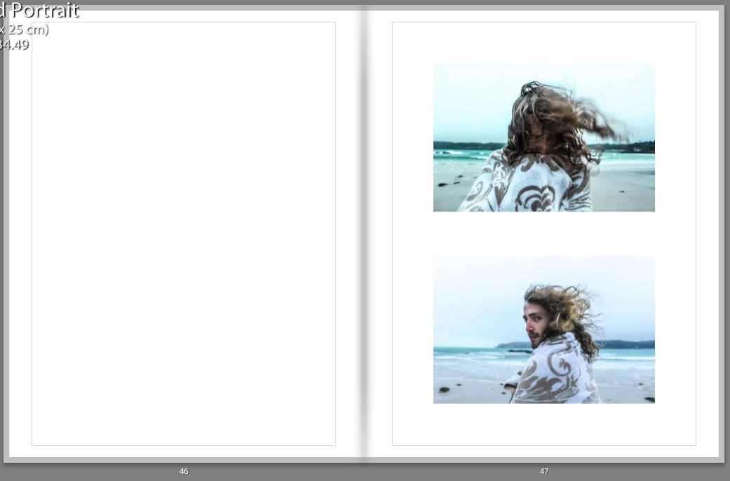


For my final image shown in my book, I choose a similar one to the first image as they both represent the journey. By having this as the last image, it looks as if even though the journey for the reader has finished, the journey for the people featuring in the book hasn’t finished.

Shoot 3 Specification – Car
I spend a lot of time travelling around jersey in my car. Despite the island’s small size me and my friends still manage to do a lot of miles, and so I want to represent this by using motion in my photos. I have wanted to experiment with more creative photography and due to the topic of the shoot I thought that this would be a fitting choice to try. Capturing motion can be achieved by experimenting with different, slower shutter speeds to capture whole movements. I could also capture motion with lights in or outside my car, by moving either lights of my camera whilst the frame is over my car.
Environment – New Idea – Digital Illustration Experimentation
Now that I have completed my travels and have collected my images, I am tasked with creating some original final images. On this post, I am going to be documenting and experimenting with an idea I had whilst on my travels. As discussed in a previous post, I felt the urge to incorporate some external art within my photography, in order to avoid generic tourist responses.The genre of Travel Photography is now very crowded due to its accessibility and ease of involvement and there is little originality in documenting the landscapes and atmospheres of foreign locations as it can essentially be done by anyone. I left on my vacation having looked at Carlos Spottorno, planting concepts in my head surrounding illustration, but no solid ideas that could be experimented with. Nevertheless, I began investigating contemporary illustration given that this is my chosen course at my future university. I looked at the work of Michael Craig Martin, studying crisp, clean line work and if I could perhaps implement this within my work. After experimenting in Photoshop, I finally found an idea that has the potential to produce distinctive results. Here, I will be outlining the process of creation and my thoughts on the prospects of the concept.

I start by selecting an image that is very open for further adjustment and reconstruction. I wanted something basic and simple in order to avoid complex compositions that will crowd the photographs. This photograph that I took in Knossos, Greece seemed appropriate. A large portion of the image is cloudy sky, which provides a blank canvas for digital drawing. In addition to this, I was attracted to the way in which that the building is partially destroyed, which will enable me to reconstruct the structure that is missing. I am essentially re-building this ancient temple in the way that I please. Its important to note the way this all links back to the exam brief of ‘environment’. In this case, I am manually manipulating this landscape, adapting and changing the environment into something different. The first thing I do, is import the image into Photoshop and make it black and white. For the piece I am planning, the linework created is going to be colourful. With a desaturated background, these colours will be perceived a lot more vividly, popping into the foreground. With a blue-grey sky, the tones begin to combine and merge together which ruins the crisp, clean aesthetic I am searching for. I turn the contrast up a bit, ensuring some dark shadows that will serve as effective backdrop.

With the image prepped, I now select the Pen tool. The Pen is an excellent tool that allows me to draw lines in a very controlled and manual manner. The key feature of the Pen is its adaptability. Click once to add a single point and create an angle to the next, or alternatively click, hold and drag to create a curve. It enables me to create any shape I want, straight or rounded. In addition to this, every point is completely editable after you’ve finished the shape, and you can add new points if you want to add an extra curve into the shape. This means I can come back to my illustrations at any point and make further adjustments to improve the piece. In the image above, you can see that I have started reconstructing the base of the building, drawing in the collapsed pillar and first floor. On the top tool bar, you can also spot an array of options that are available regarding the visuals of the lines being created. For example, I can change the weight of the line for thicker strokes and manually select a colour of my choice. For this piece, I have selected a mid-tonal purple. It works effectively due to its ability to stand out upon both shadows and highlights.
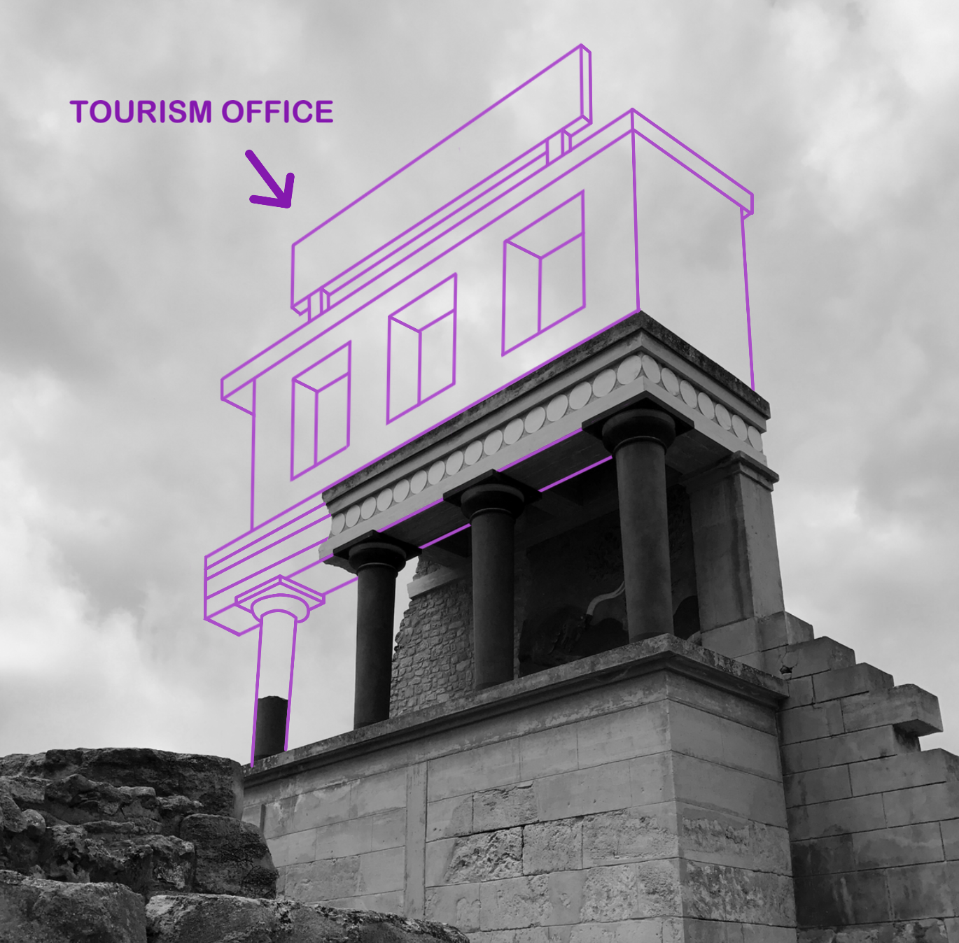

With the building complete, I decided to implement a large sign upon the roof. Currently, the illustration lacks personality and individuality. I would like to incorporate a sense of fun within the piece in order to rectify the bland visuals. As you can see above, I wanted to create a sign that labels the building as ‘ Tourism Office’. I thought this was a witty way of enforcing a theme of visual satire, almost mocking this ancient city and essentially labelling it as just a tourist attraction. It forces the audience to think which creates discussion. Nonetheless, I cannot simply rotate the text and slot it within the sign margins. The piece sustains a sense of perspective, as the construction gets smaller as it moves further away from the audience. Consequently, the text must share the same qualities. I select a font that enforces this fun, satirical attitude as suggested by the rounded edges and capital letters. In order to make proportional adjustments to this piece of text, I must convert it into a pixels as oppose to a text layer. With this complete, all I have to do is Transform the layer and select ‘Perspective’. This option permits me to manually adjust the positioning and perspective of the text, meaning I can make it larger in the foreground and smaller in the back. The final result can be seen below.
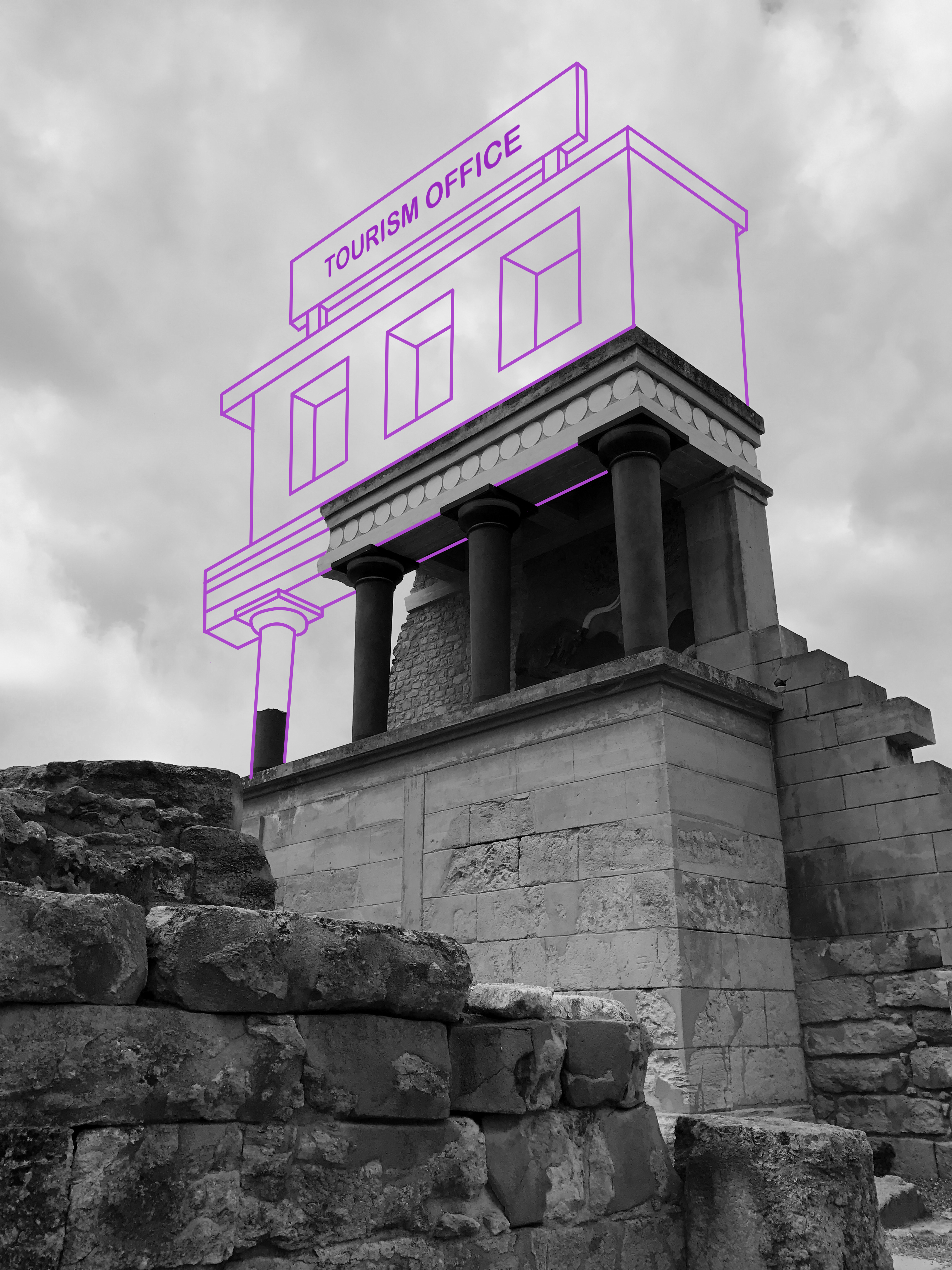
I think this is an idea worth pursuing as it demonstrates a form of originality that is currently missing from my work. Illustration is something that I am passionate about, and I think I possess the keen eye required to impose imaginative ideas upon standard environmental photographs. With this experimentation complete, I will continue to produce more responses.

