The following images are edited influenced by Theo Gosselin’s cinematic style, as well as traditional skateboard documentation. I experimented with shutter speed, shooting angle, and I tried to capture motion full images of skateboarding, as well as sharp portraits with interesting compositions. I am fairly happy with the outcome of the shoot, however
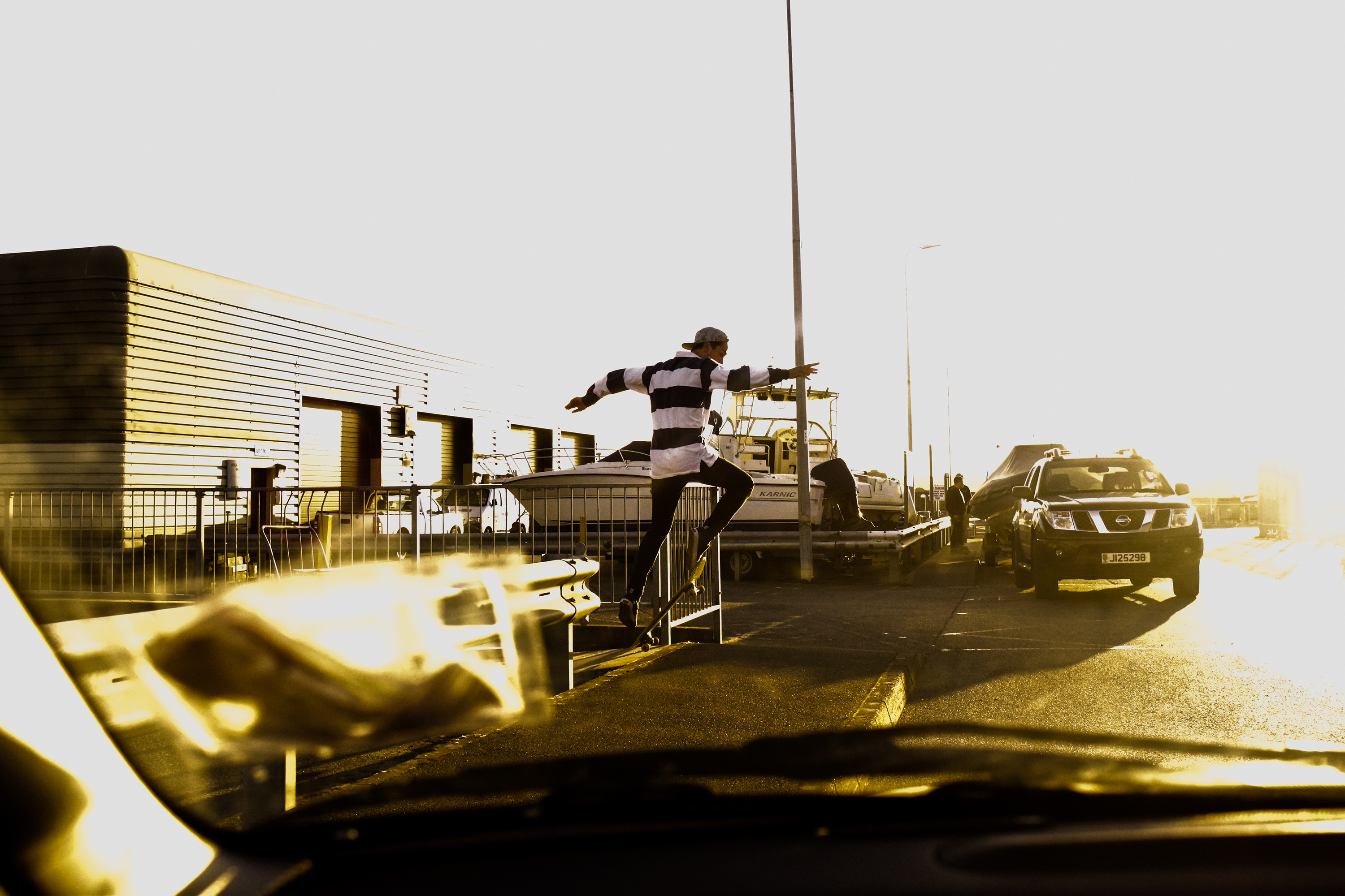
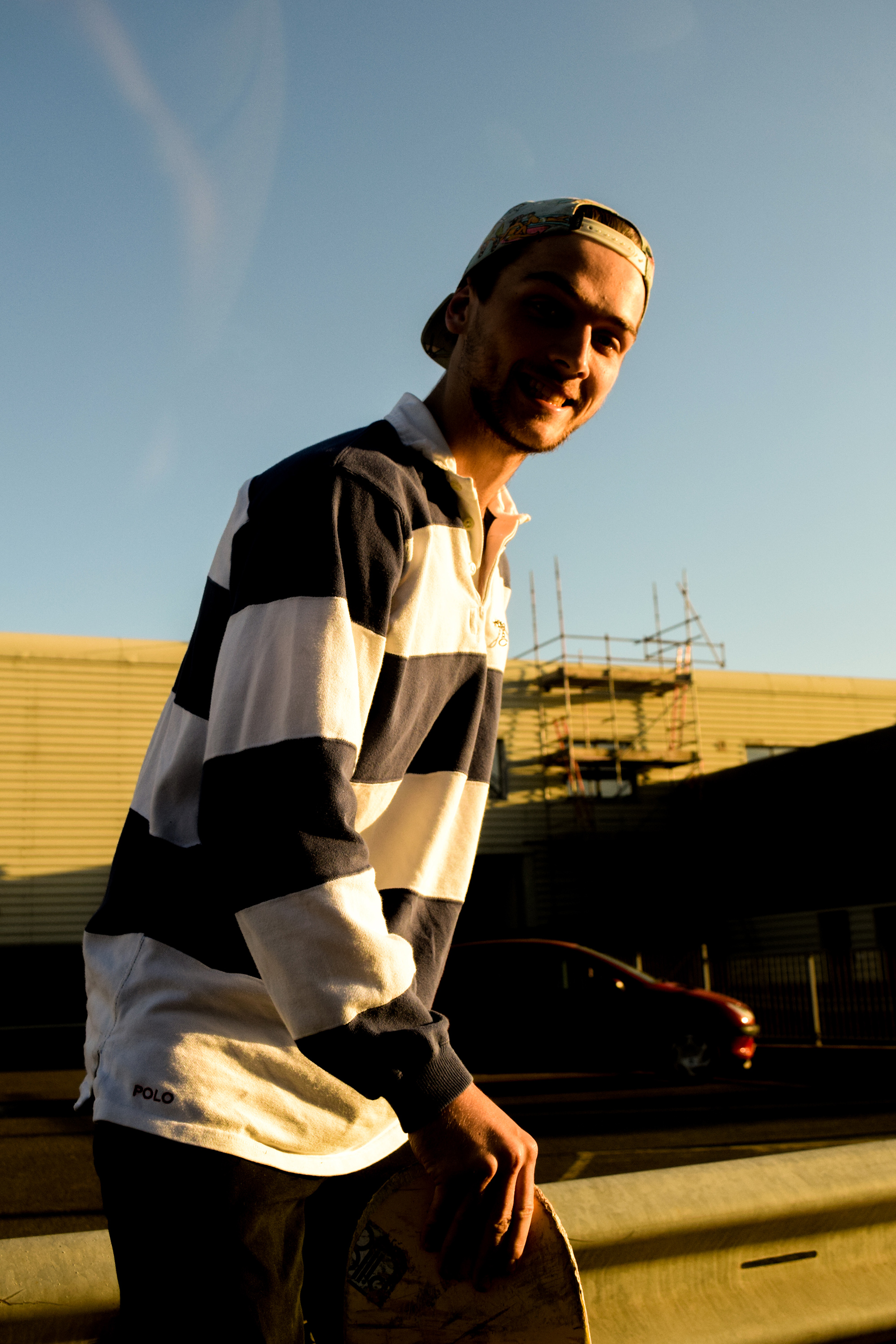
I edited this image to look fairly cinematic. I increased the whites in particular with this photograph to create a very bright, sky has become hard to make out from other areas of the image, forcing us to focus more on Zac. I tried to use the windscreen of the car to compose the image interestingly. Whilst using a larger aperture and shorter shutter speed I managed to blur the windscreen again focusing us on Zac far more.
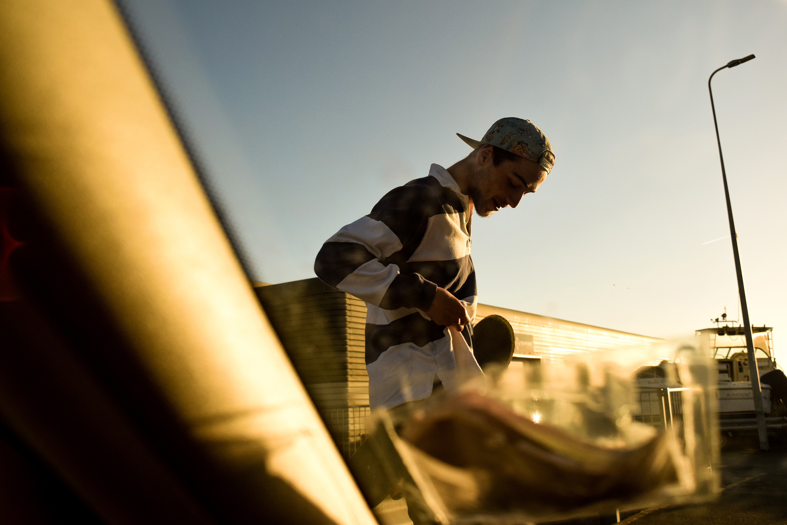
Similar to the first, I used a short depth of field to blur the windscreen I purposefully added into the frame for interesting composition. This time, the image is a portrait of Zac looking at something, but the space of interest to him is covered by my blurry insurance disc and windscreen frame. I really like this composition as the way my insurance disk and windscreen frame cover from the top left down and round to the right side works very well against Zacs torso and the open space in the top right.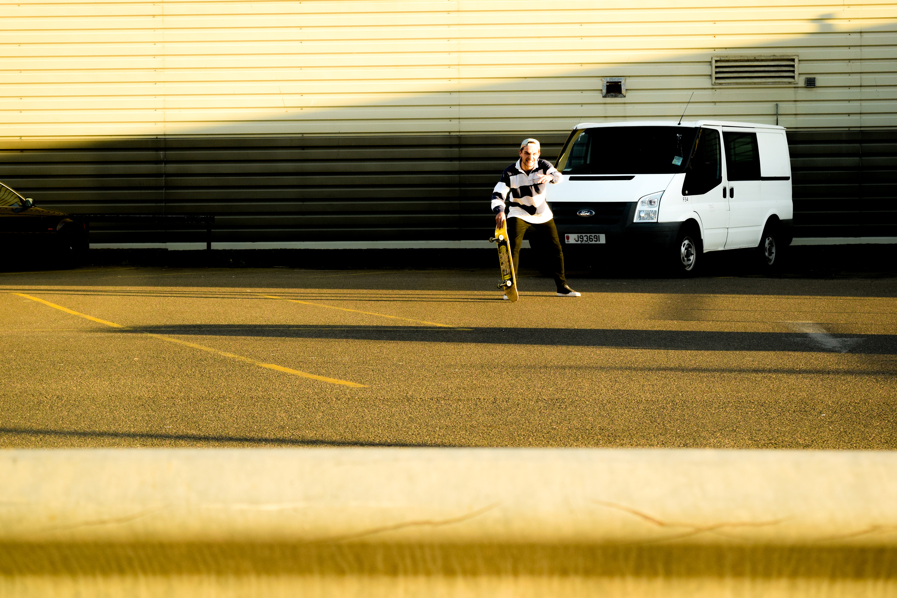

With this image I wanted to create a heavy contrast to attemot the cinematic look again. I raised the whites and brought down the black, and also but down the shadow toggle the have a large contrast of light and dark. This made the image look more ‘epic’ due to the strong sunlight, the shadow cast behind Zac running towards the sunlight away from the dark.
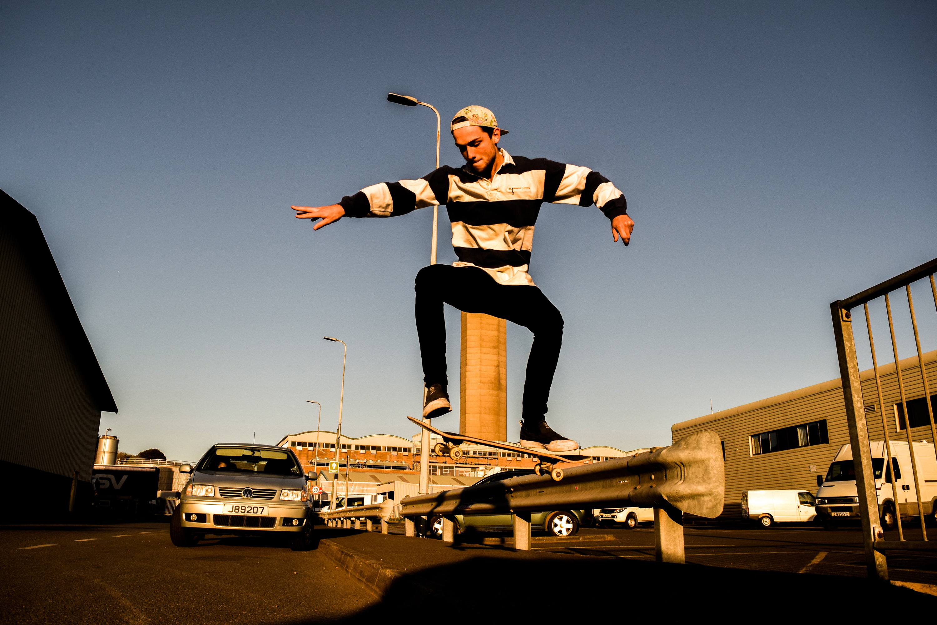
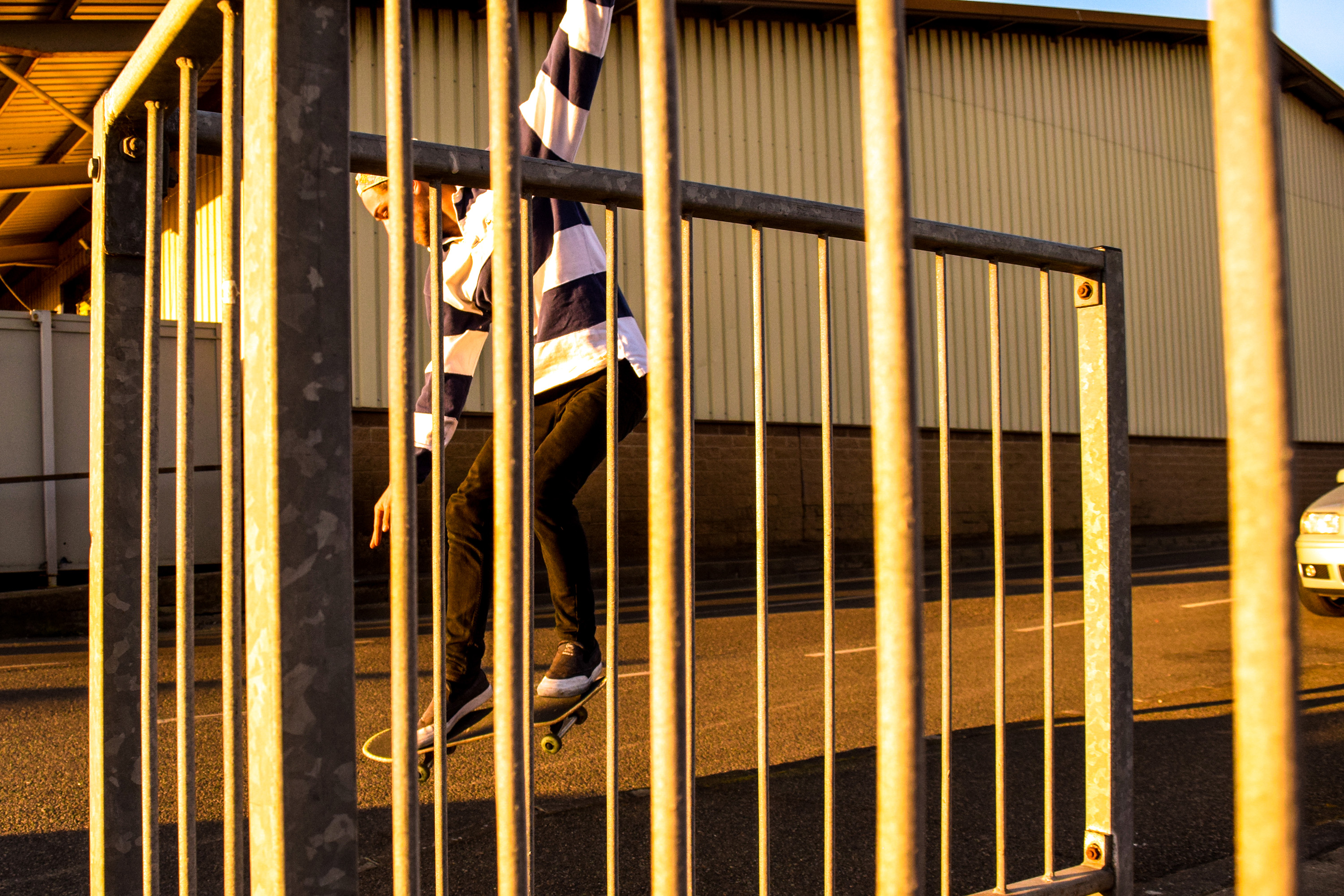
This image shows an example of my angle experimentation. Zac repeatedly did a trick over a pavement until I got a good angled photograph. I wanted to get really low to further capture the height of Zac on his skateboard, so I lay down as close to the ground as possible and angled my camera up. I also turned my shutter speed up slightly, and turned my aperture down to give a larger depth of field so I was able to definitely capture Zac moving in the air sharply.

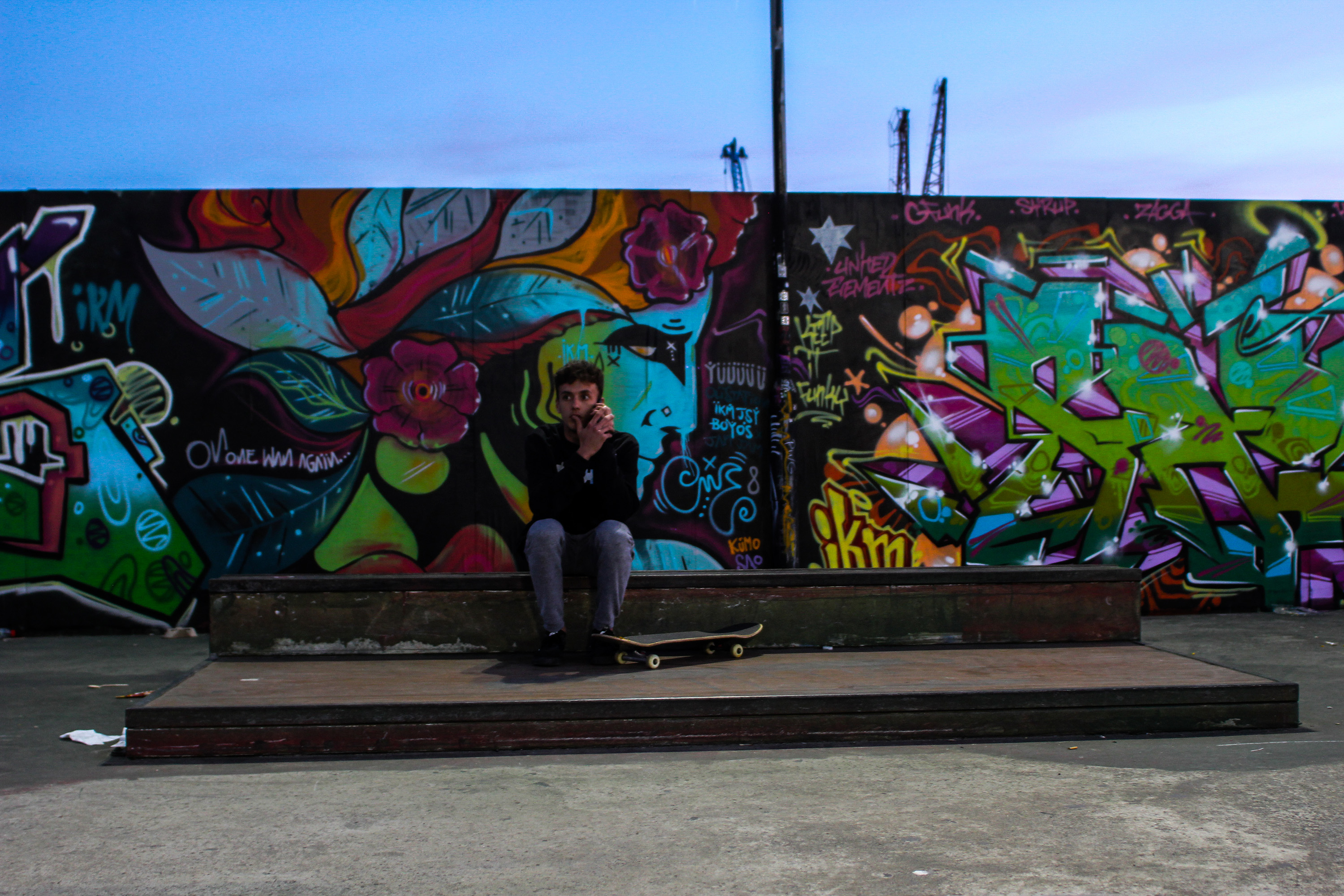
This image is an example of my portrait experimentation. I saw Zac standinghere and thought it may be interesting to capture an image of this wall with him at the very center. The size and repetition of the wall is very interesting against Zac breaking this pattern up in the centre. His horizontal striped shirt makes a hard break from the background, and the colour difference also makes him stand out so greatly. Overall I really like this image due how the background and model work off eachother. 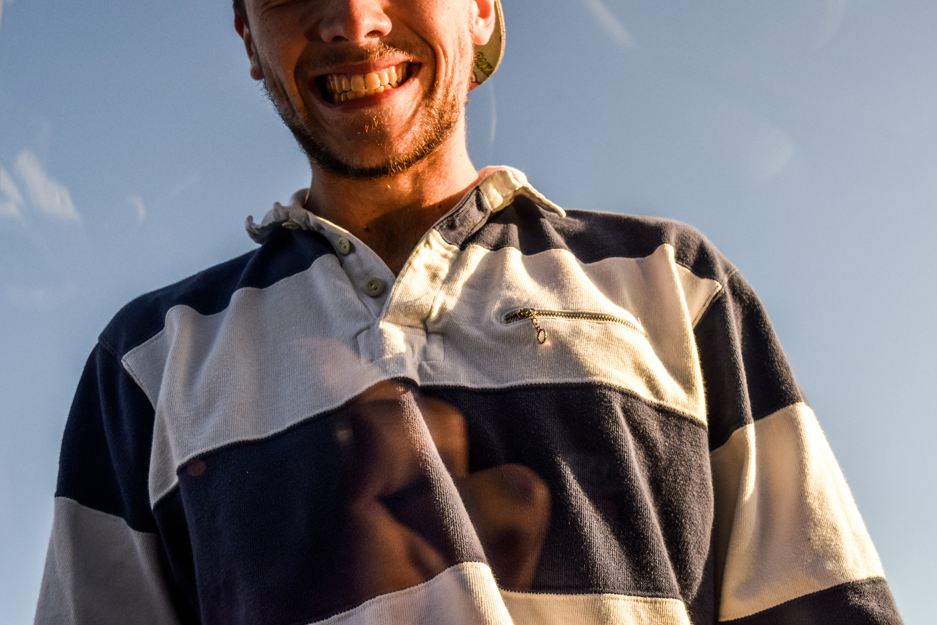


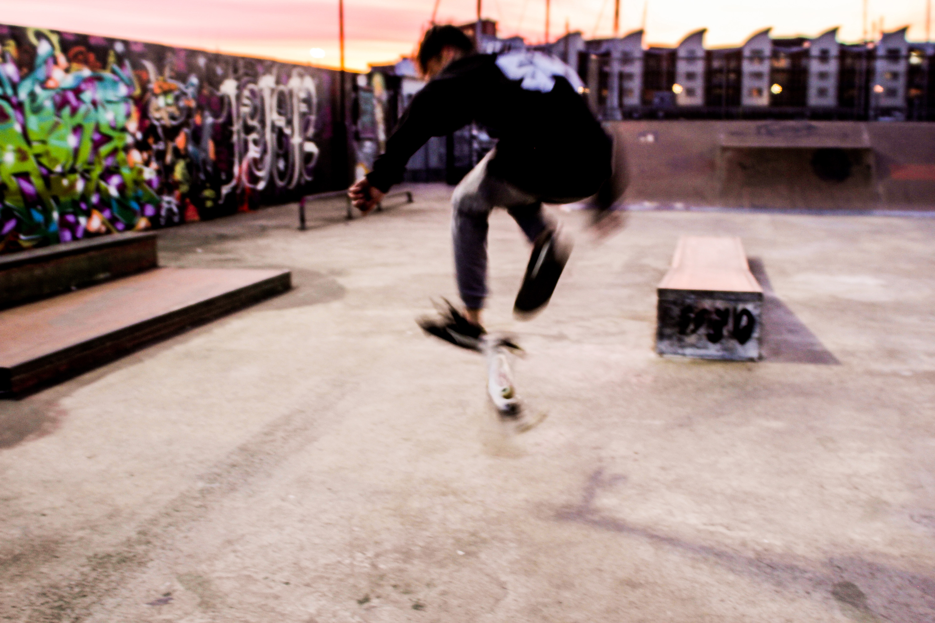
This image shows an example of shutter speed experimentation. I set my camera up on a low shutter speed and took an image of a skateboarder doing a trick. The result was an interesting blur of motion that I feel works nicely, and represents qualities almost similar to a painting. I wanted to experiment with some layering, almost similar to the way Idris Khan brings images of similar subjects from different moments in time together into one photo. However, I only wanted to blend two images together. in which I used the last photo and an image I took of some grafiti at the skatepark. The outcome looks even moreso like an urban influenced painting.

