For all my artist reference, I based my shoots on some of my favorite photographs taken by the photographers. Therefore, In this blog post I have wrote and represented visually the similarities and difference, of my work to the artists I researched.
Response to Theo Gosselin;
I personally feel as if Theo was the main artist I was inspired by for this project of ‘Environments’ as I loved his style, locations and adventures I went on to capture photographs like his.
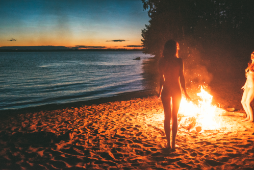
With most of Gosselins shoots I would take the principal idea and then just alter them into my own style. As seen below, the top image is Gosselins and the bottom image is mine, the difference are fairly blatant, as the time of the day we took the photos differs, he took his just after sunset and mine was taken just before, therefore creating different lighting effects on the models. Gosselins photograph also features to girls completely nude, whereas all four of my models are are fully dressed this was due to school restrictions not allowing full nudity in my images. The similarities are there are more vertical objects on the right side of his image and the girl standing up in my image is on the right. Then obviously there’s the fact it’s only females who surround the fire in both images, and both of the fires are on a sandy location, nearby to the sea.


The image above which is taken by Theo Gosselin is similar to mine below because both are featuring blue vans, and both have their door open, allowing the viewer to briefly see the inside. Also, both images are taken in a car park which is located next to an area with a large mass of water, for example in my photograph one can see the sea, and in his it’s either the sea or a lake. The difference between the two images is that he’s made the van be in the mid-ground of the image, whereas mine is located in the foreground of the image.


Response to Juergen Teller;
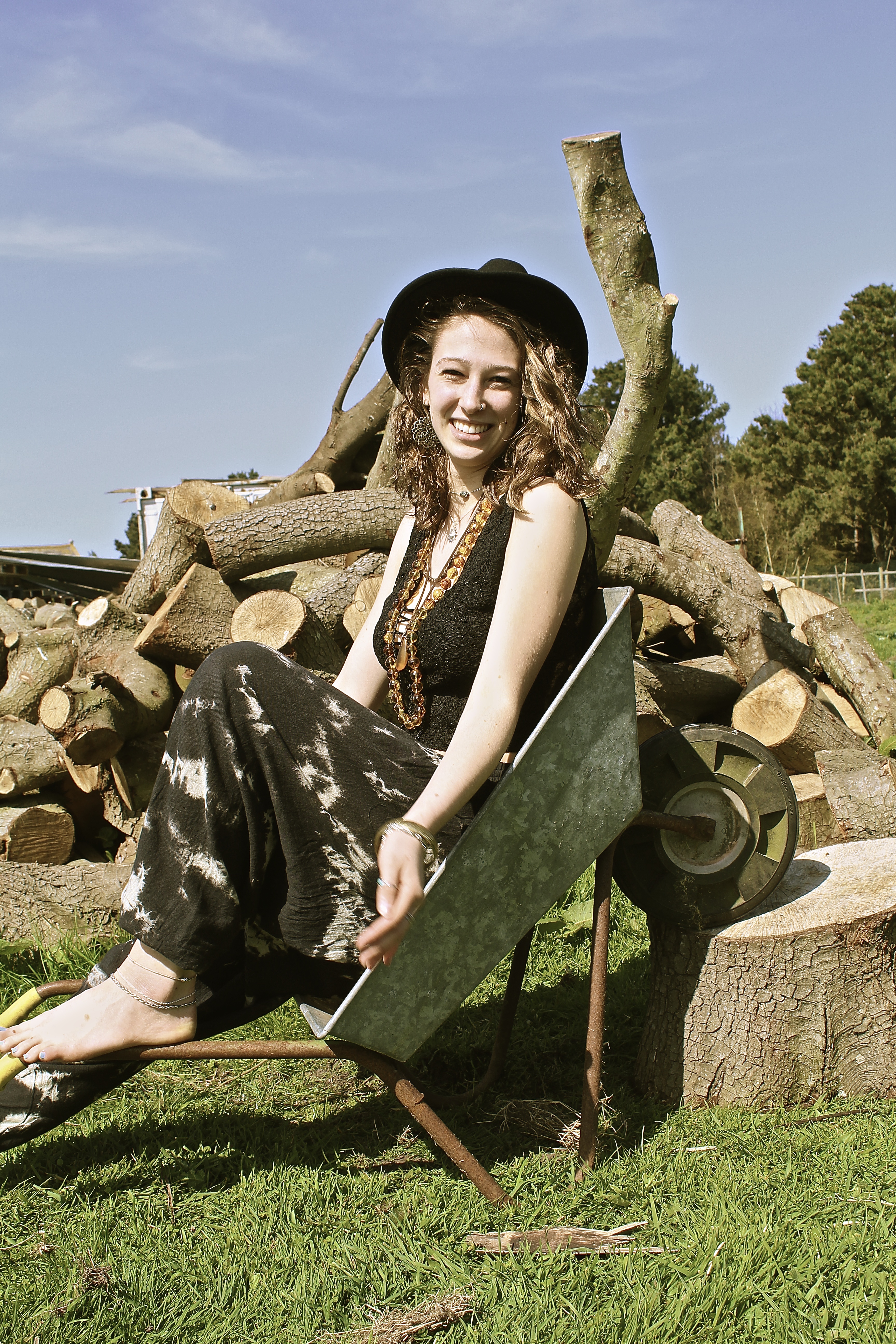
The main difference between the two images below is the persona of the model, Juergen Teller has shot Kate Moss looking moody in the photograph below. Whereas I have captured my model looking happy and smiling. The other significant difference is the fact that his image is horizontal whereas mine is portrait, due to the way the model is posing, Kate Moss is lying in the wheelbarrow whereas my model is sat inside. The similarities are the rustic wheelbarrow used as a prop in the two images, and due to the background of both images one can see that they’re both in natural environments. In both images similar color schemes are used, both using a lot of brown, blue and green, all very natural and pure colors. However Teller creates more vibrant colors in hers by the use of jewelry and the container in the background.


Response to Corinne Day;
The main difference to these photographs is Corinne Day(below) has more negative space in her image than I do, this is due to me contrasting my images more and making there be more definition, therefore creating more detail in the background than Days photograph. Whereas the way she’s taken the image has a high exposure and more sharpness in her image, than to mine. The main similarity is the way the model is positioned, for example they both look a bit shy with their body and are smiling nervously infront of the camera, they’re both titling their heads facing to the left of the image, and use their shoulders both shrugged with a bent left arm. Both of the models are very slim as well, with messy hair, blowing in the wind.


Response to Jacob Sobol;
These two images I find our very similar, as both models are trying to kiss the photographer, therefore conveying the same message and emotions behind the image. Both images are out of focus and taken in black and white and are slightly over exposed, the models both have their eyes slightly closed and hair scrapped back. The main difference is the photograph above by Sobol is taken of a women, whereas mine is taken of a man. Also Sabine, the model for Sobol is looking up at the camera. Whereas in my photograph he’s looking down at the camera. Therefore creating a slightly different composition. In my photograph I feel the model isn’t being as serious as Sabine as he looks like he’s jokingly try to kiss me, whereas Sabine looks more serious. This is perhaps because of the location both images were taken at, Sabine is in a bedroom so it’s more personal whereas me and the man in the photograph were on the beach, where it’s a public place.


Response to Ivan Troyanovsk;
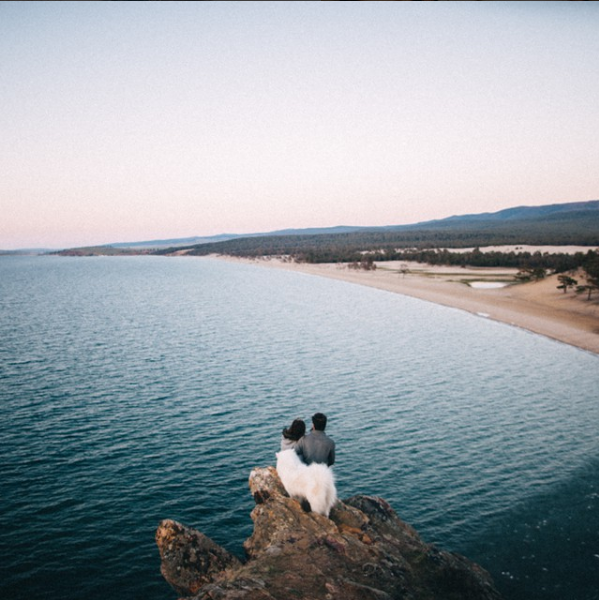
Mine and Troyanovsk photograph are similar yet very different. They are similar in the perspective that the photographer is looking down at the model, and are above the sea, with the coati coming from the right across to the left hand-side. Therefore, they both have a similar composition, they both also have V shape in the rock, almost like the top of a heart on the left of the photograph. The differences are, there are two models in the image of Troyanovsks, with their backs facing the viewer. Whereas in my photograph the modelling is turning facing the camera, and is alone. Another huge difference is the fact the models, in the above image taken by Troyanovsk, are standing on a rock which isn’t as visible as the one my model is standing on. The environments are also different, for example my environment had a lot more rock and the waves were a lot more choppy than the image by Ivan Troyanovsk.


In conclusion, I feel I have responded well to my artist references, as every single shot was somehow influenced by a photographer. Although, no shoots were directly copied, I would take an idea and then alter it to make it my own.
