– ̗̀ H E L P F U L L I N K S ̖́-
For the Personal Investigation [X]
For the Externally Set Assignment [X]
For a preview of the finished book as part of the externally set assignment, “Untitled.” which can be viewed digitally through Blurb here [X]

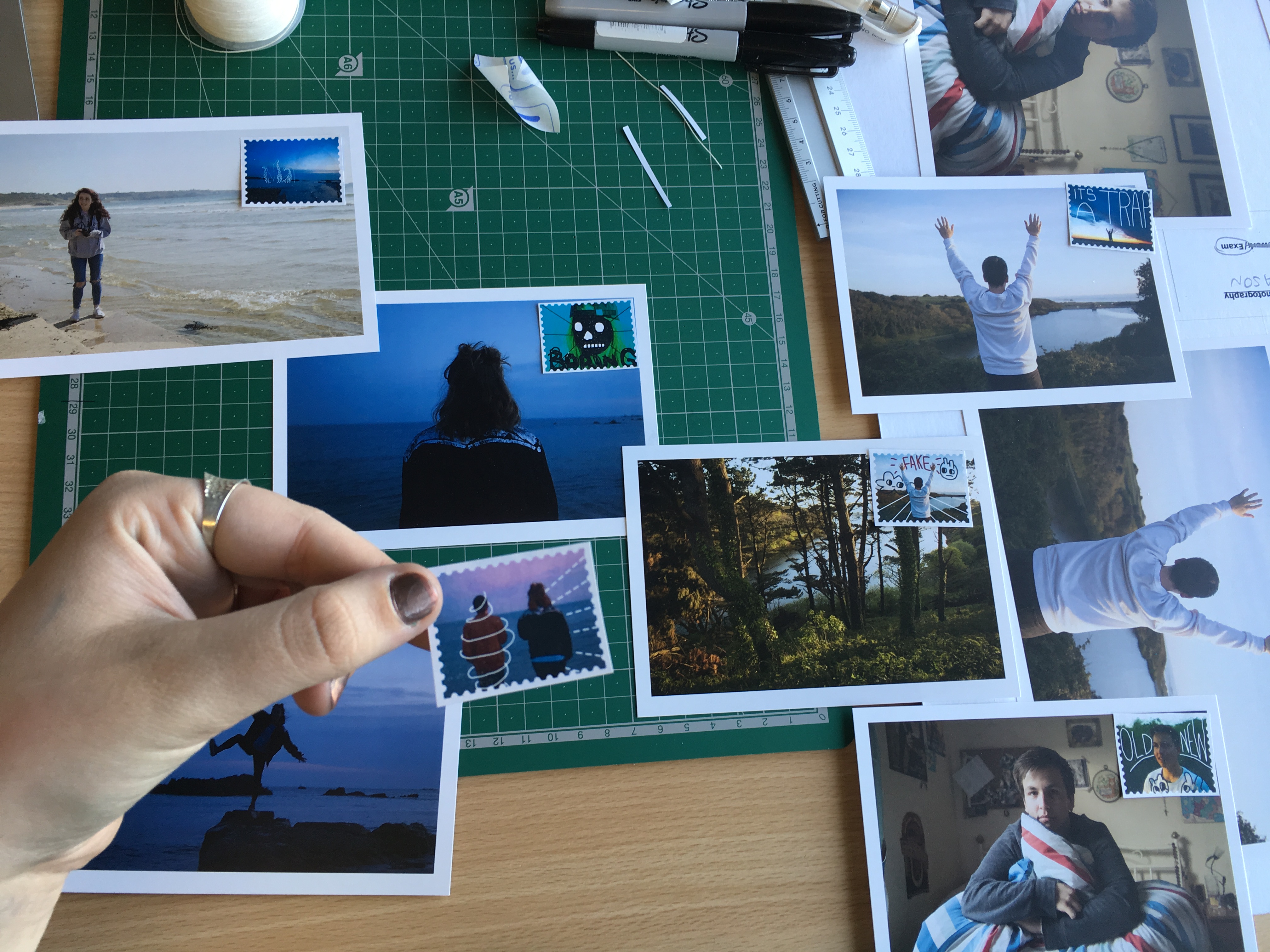
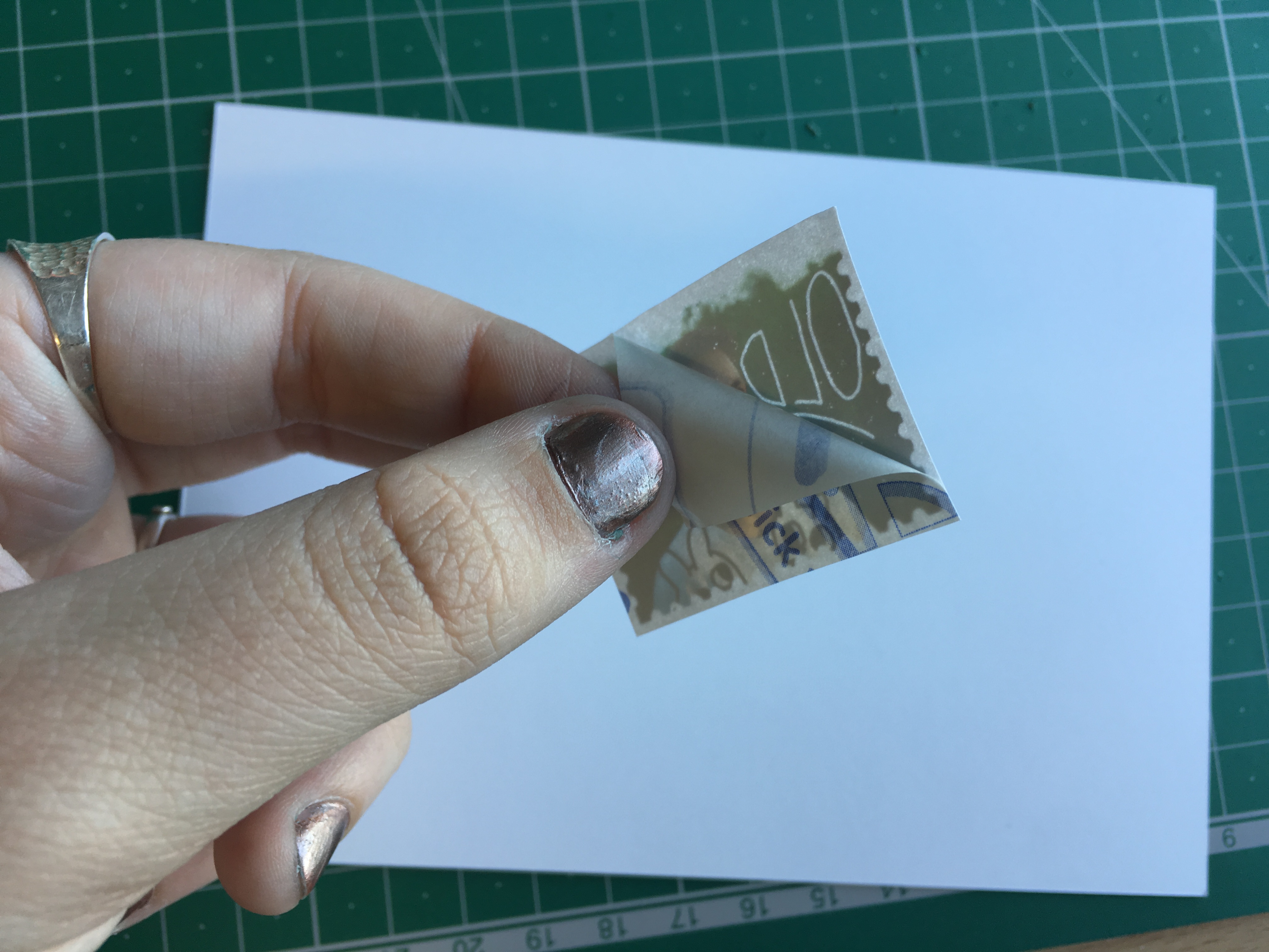
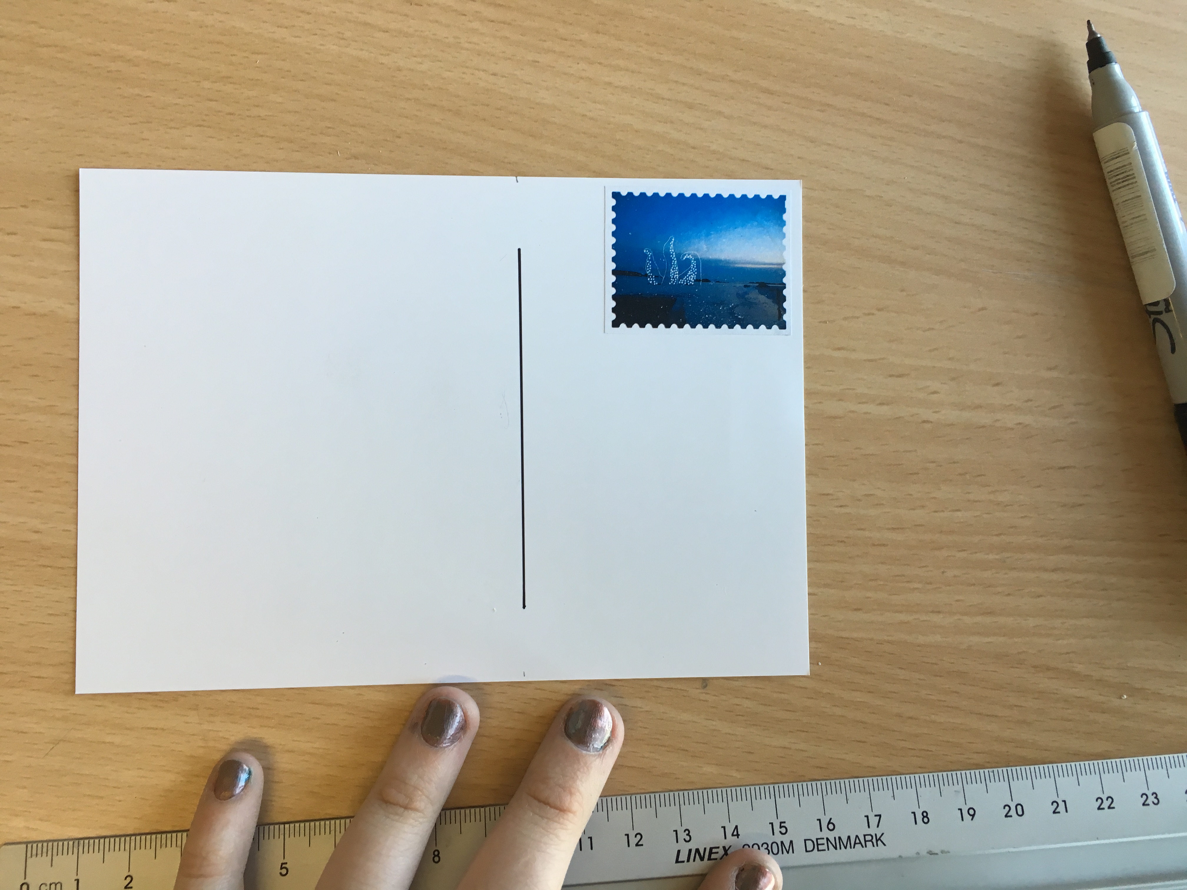
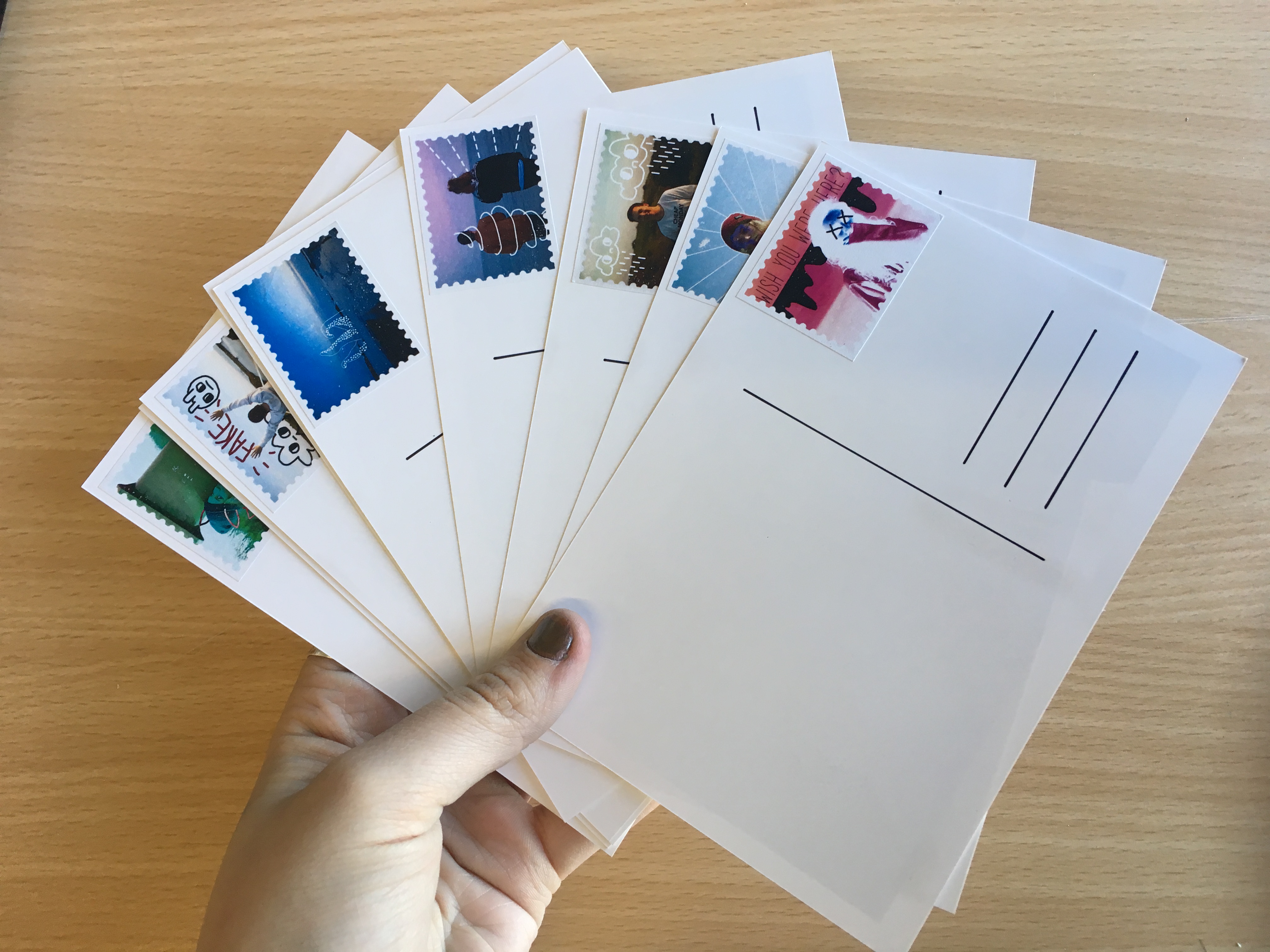
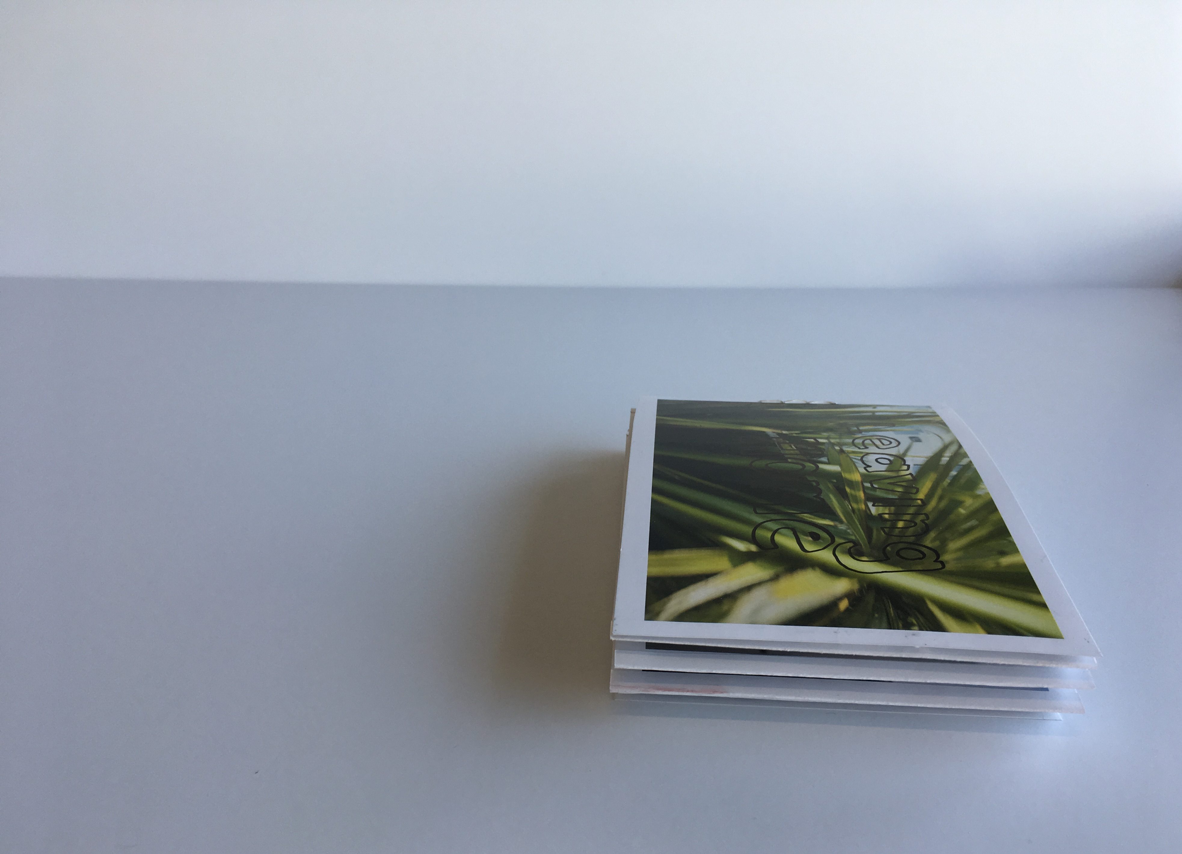
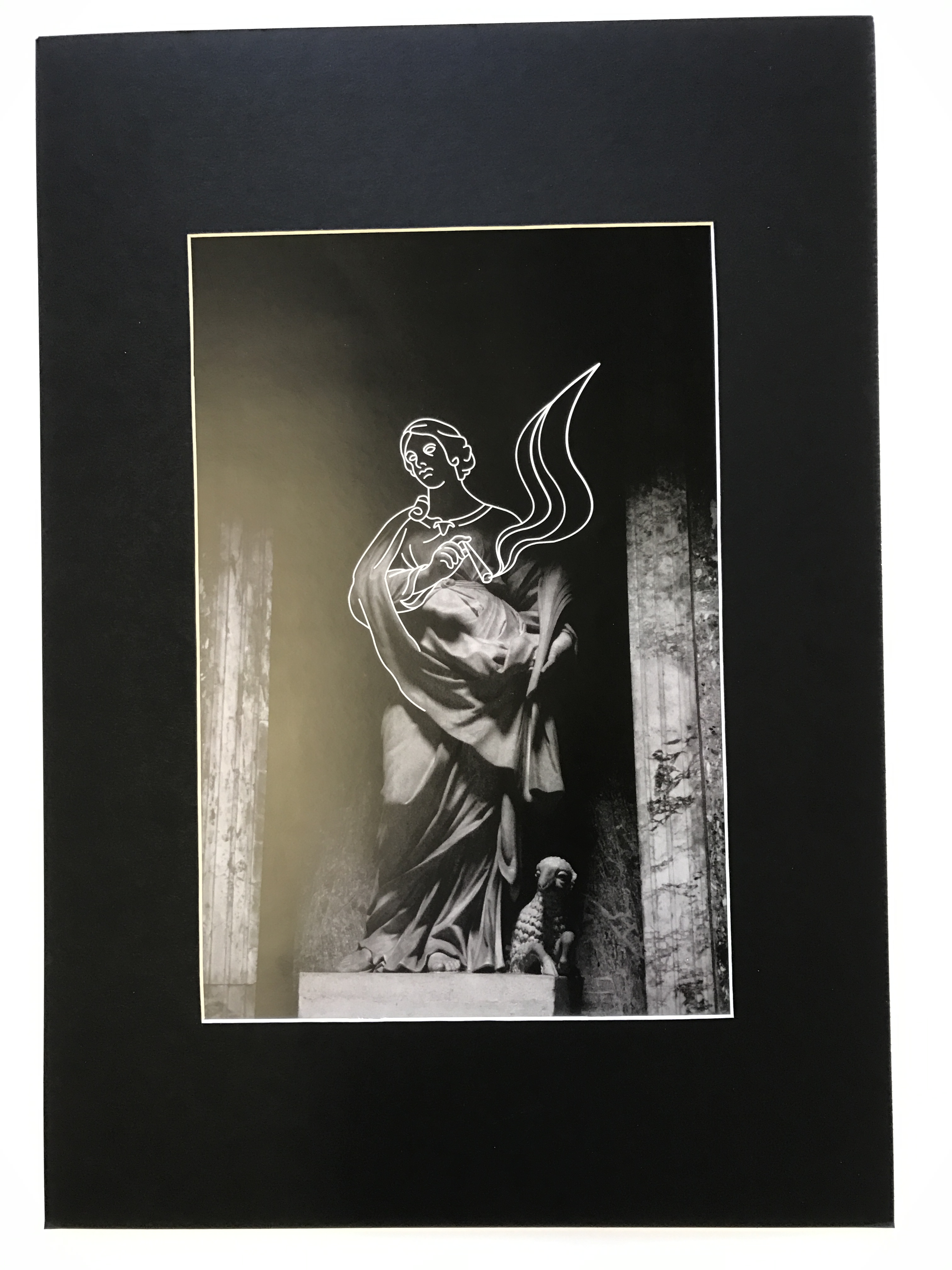
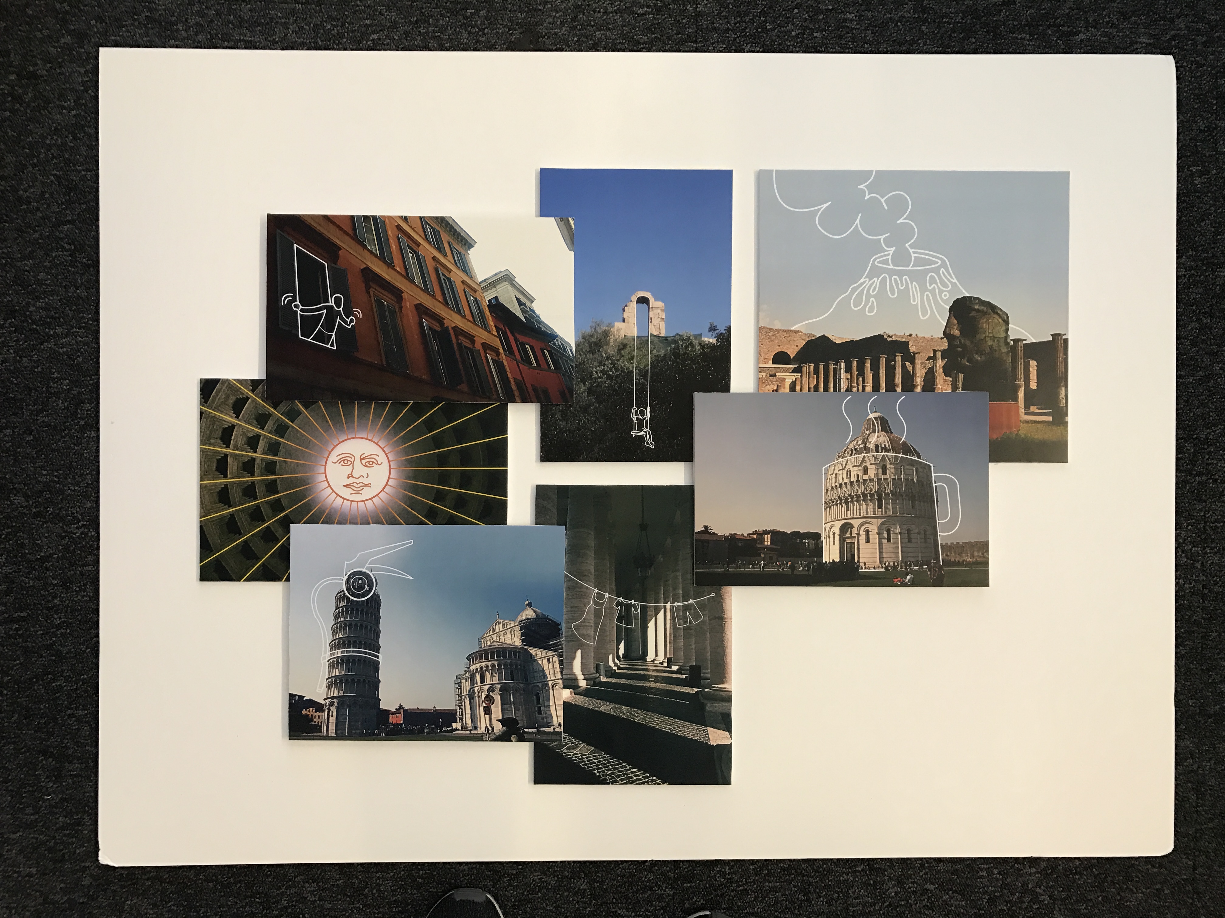
Using inspiration from Harriet Plaskitt’s post card illustrations (two of which are shown below), I handmade the backings for my final postcards. These were printed as A6 images onto high quality photo paper. The backings were drawn with permanent ink pens and the stamps applied by hand after being printed onto high quality sticker paper. All together, I have 12 final postcards and a set of 12 matching stamps. On top of this, I have also created a set of four images which have been printed at A5 size and framed in a white window mount. Below are captioned process shots for the manufacture process and final pieces.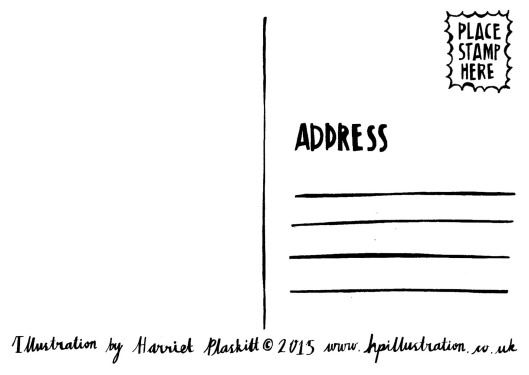
P O S T C A R D S
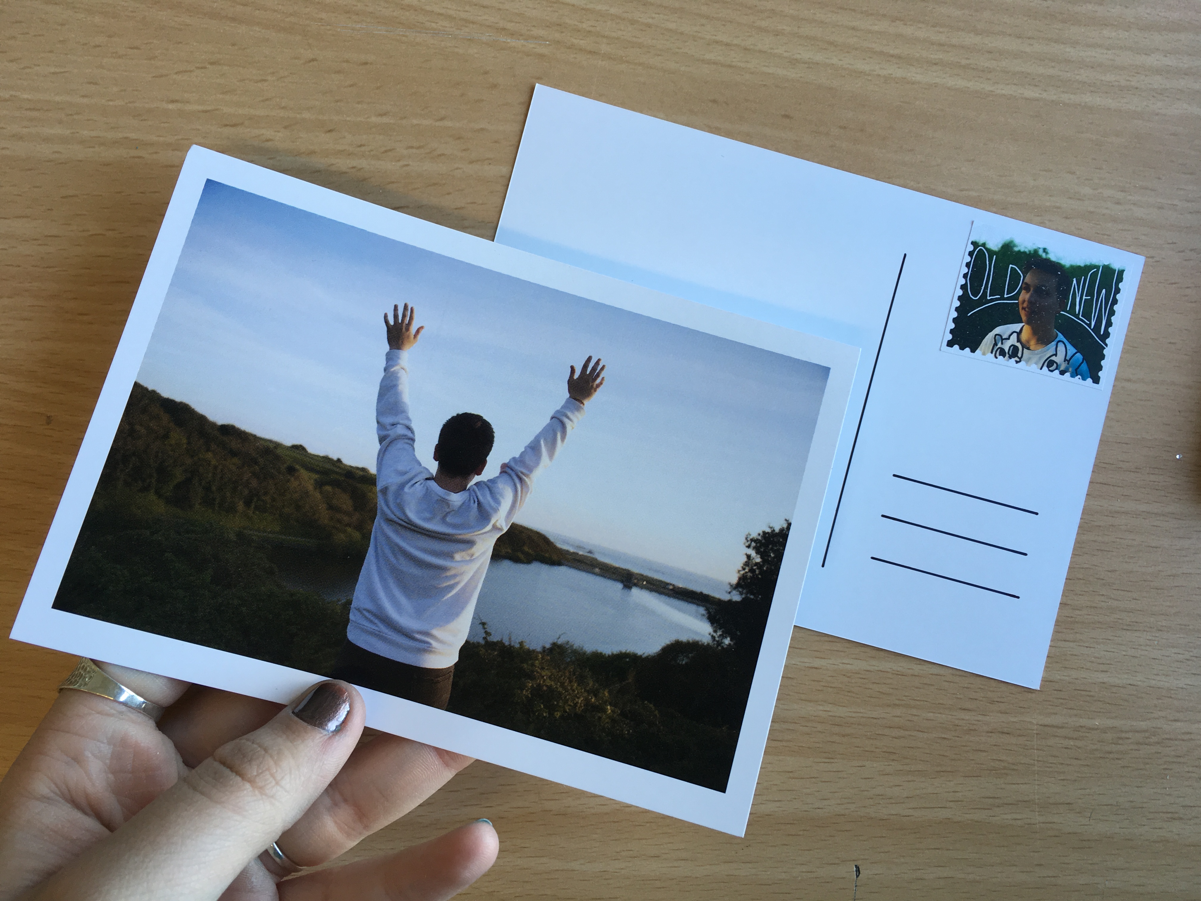
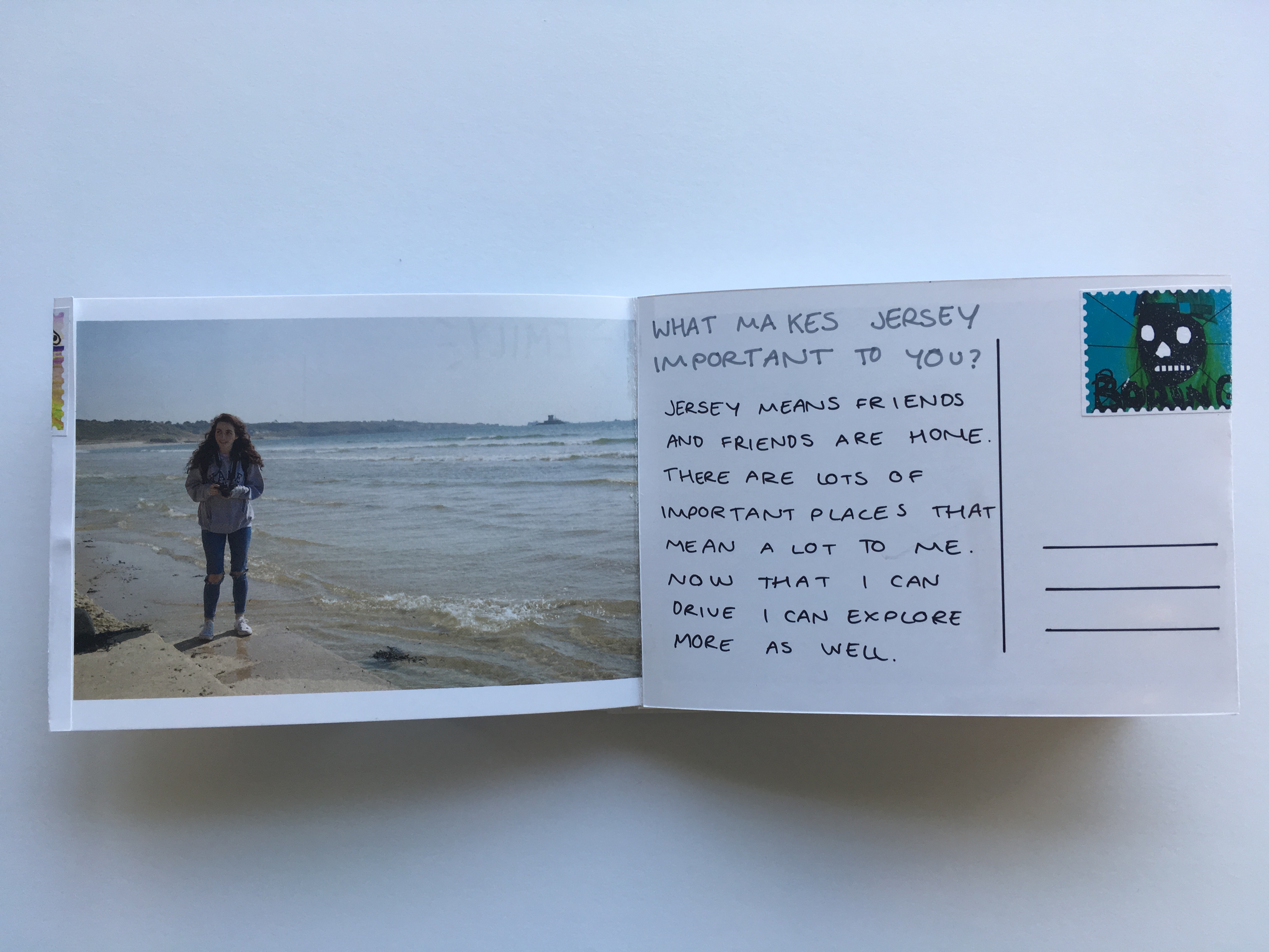
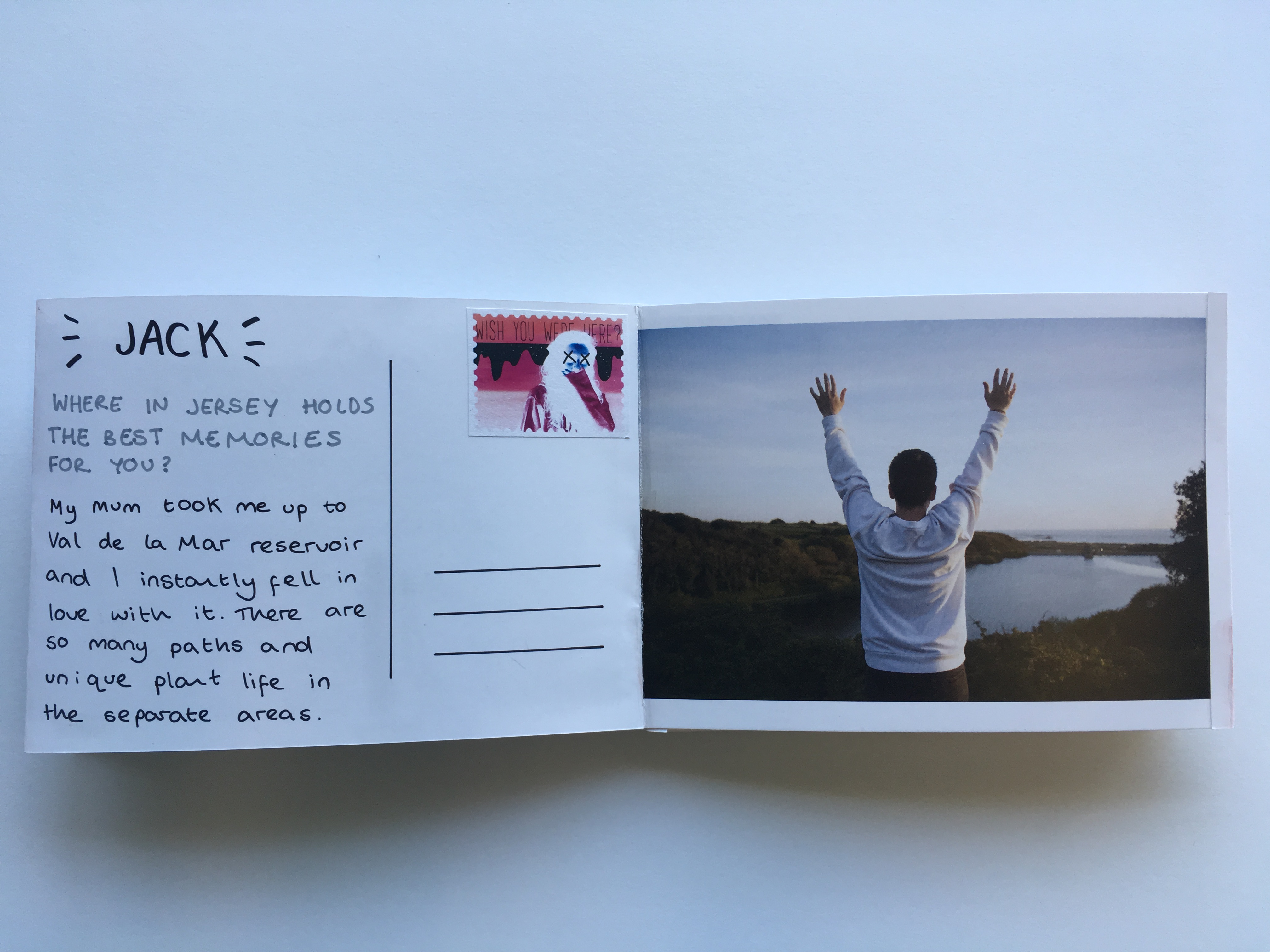
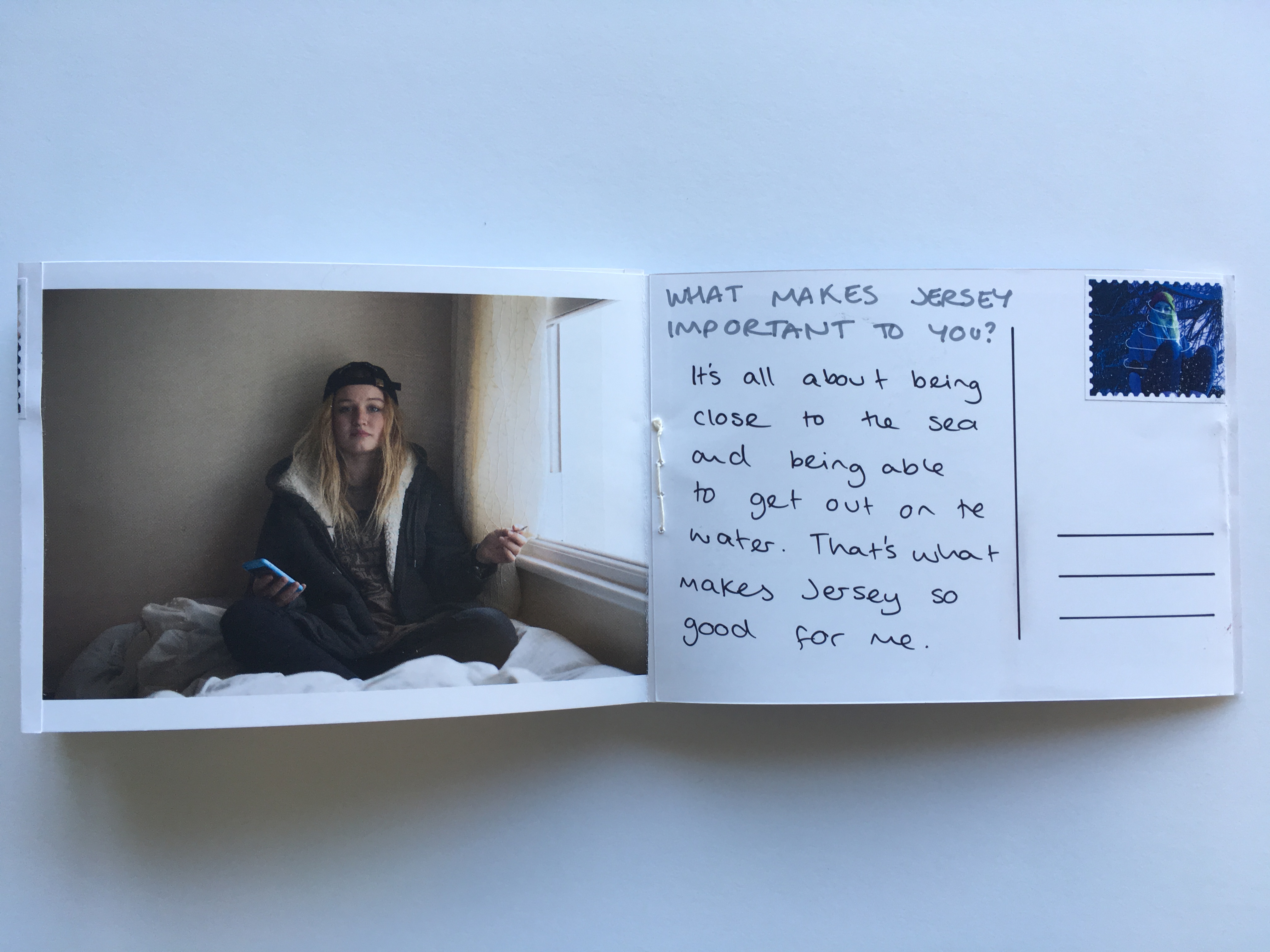
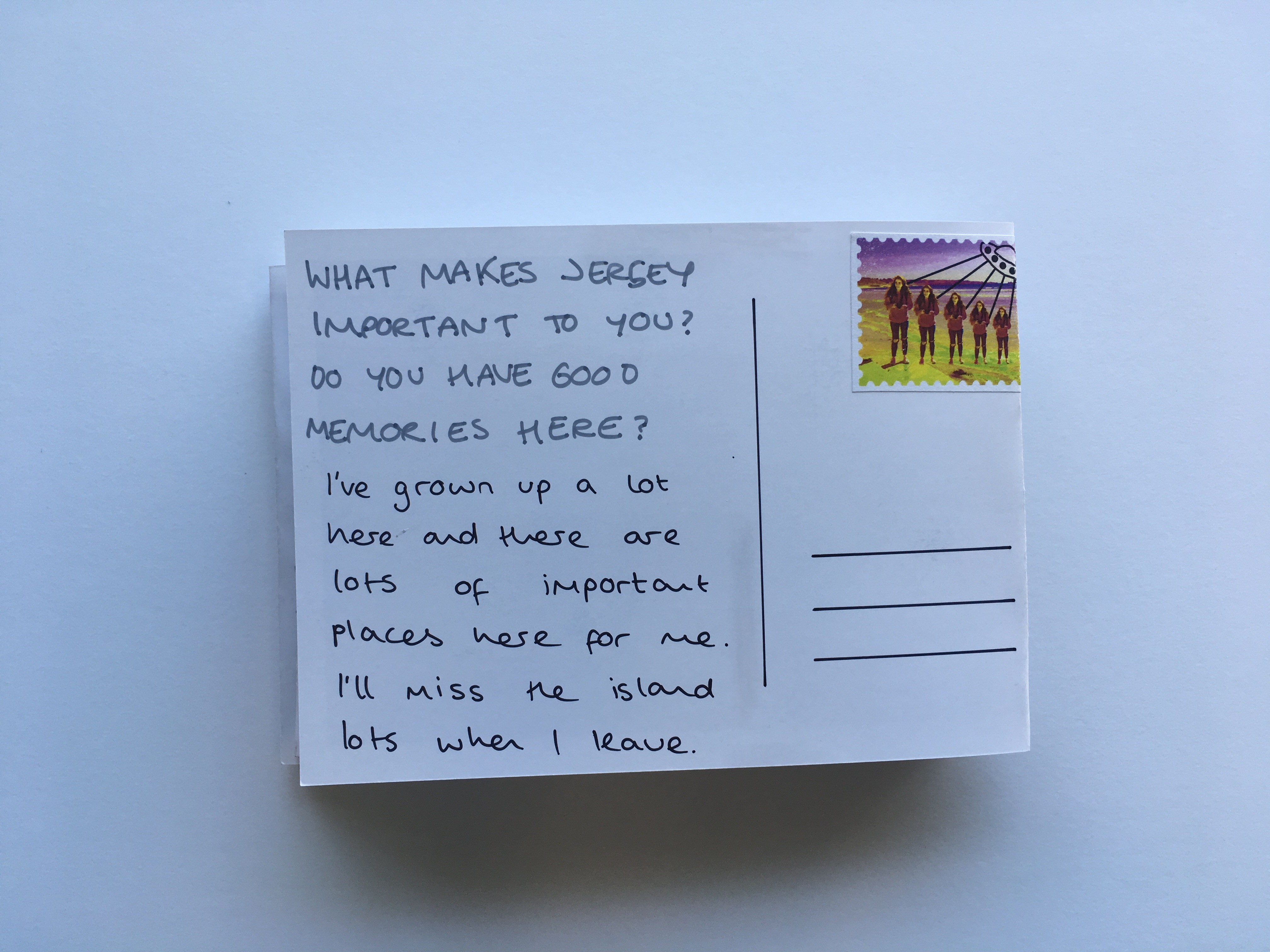
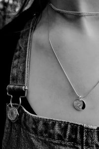
The post cards in this project made up the main body of work for the series. The set includes 12 images showing four characters and their relationship with the island of Jersey. The central focus for this work was to form a body of work that would reflect people’s love for the island and the way people interact with landscapes and environments of significance to them as individuals. Below are a series of images showing how the post cards were made once they had been printed – in particular with reference to the back design of the post cards and the addition of the graphic stamps.
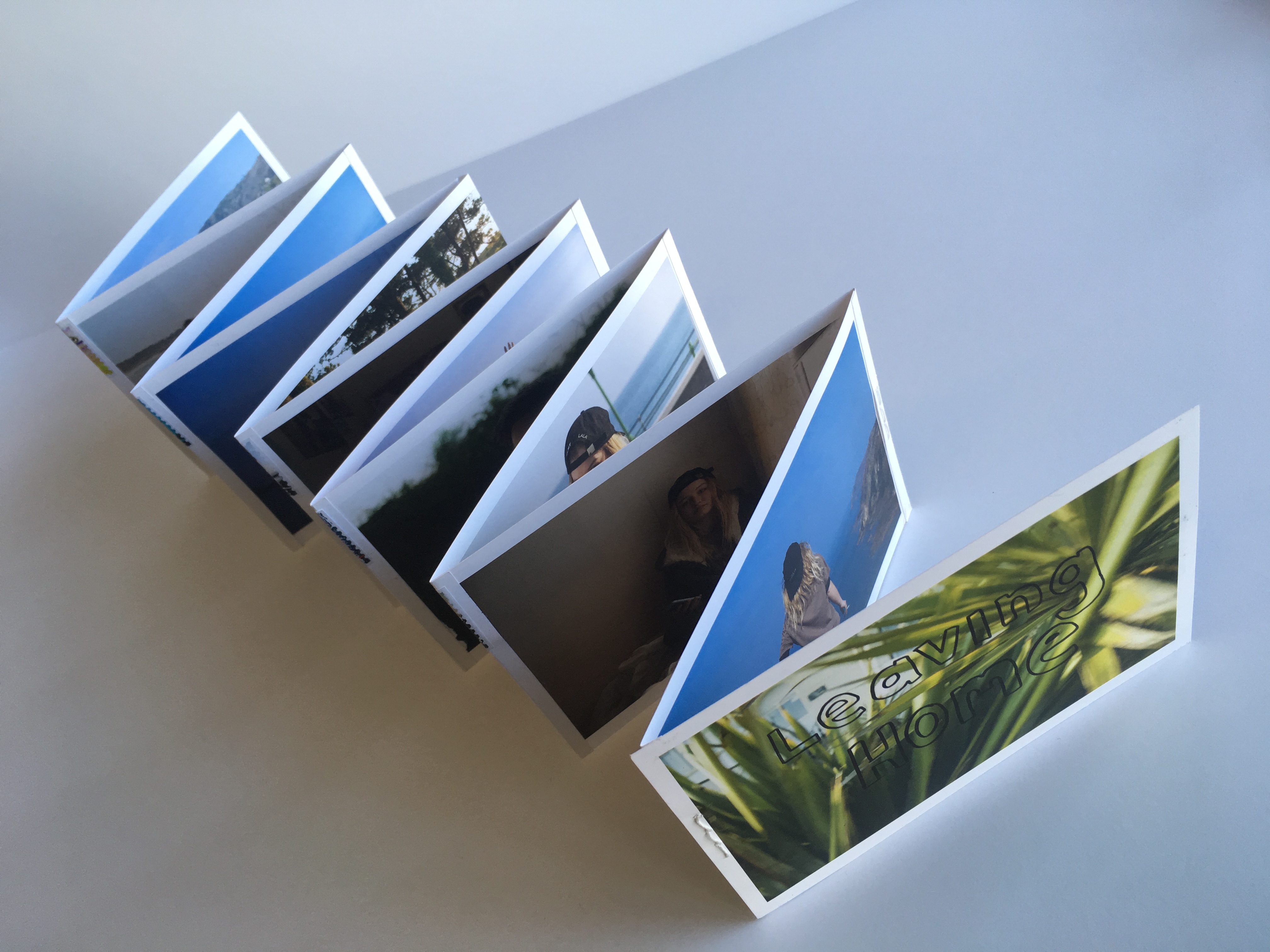
L E P O R E L L O
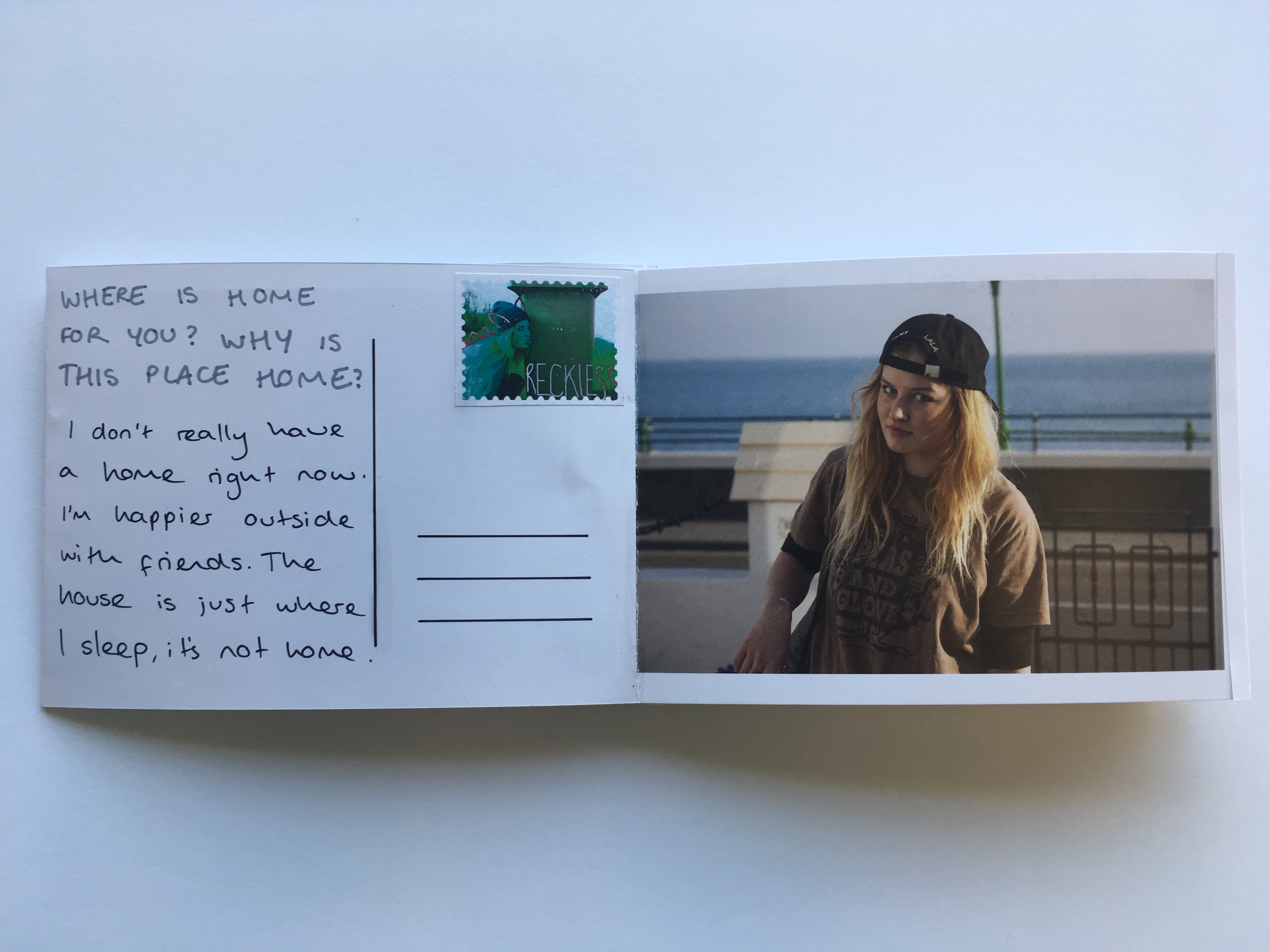
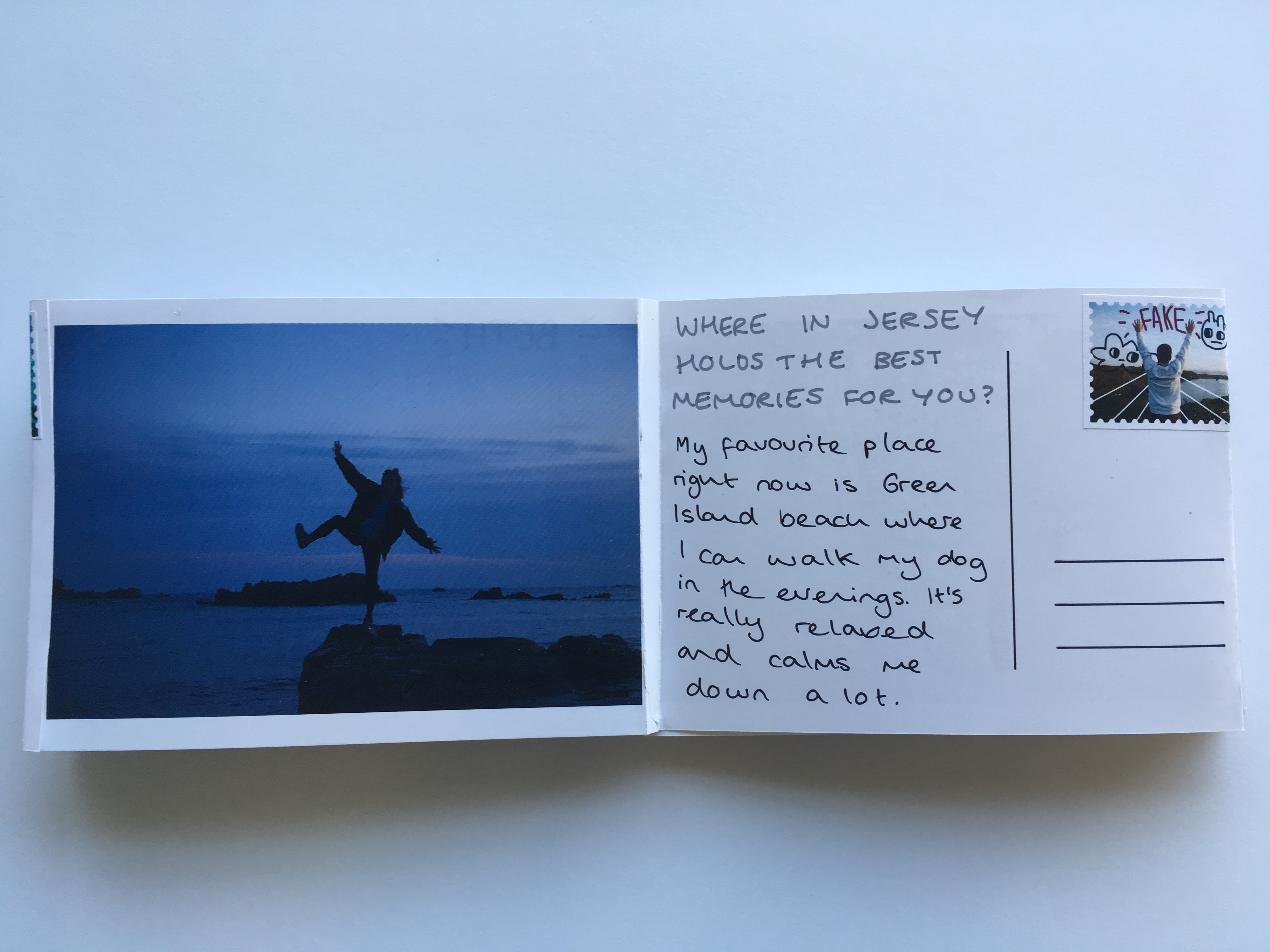
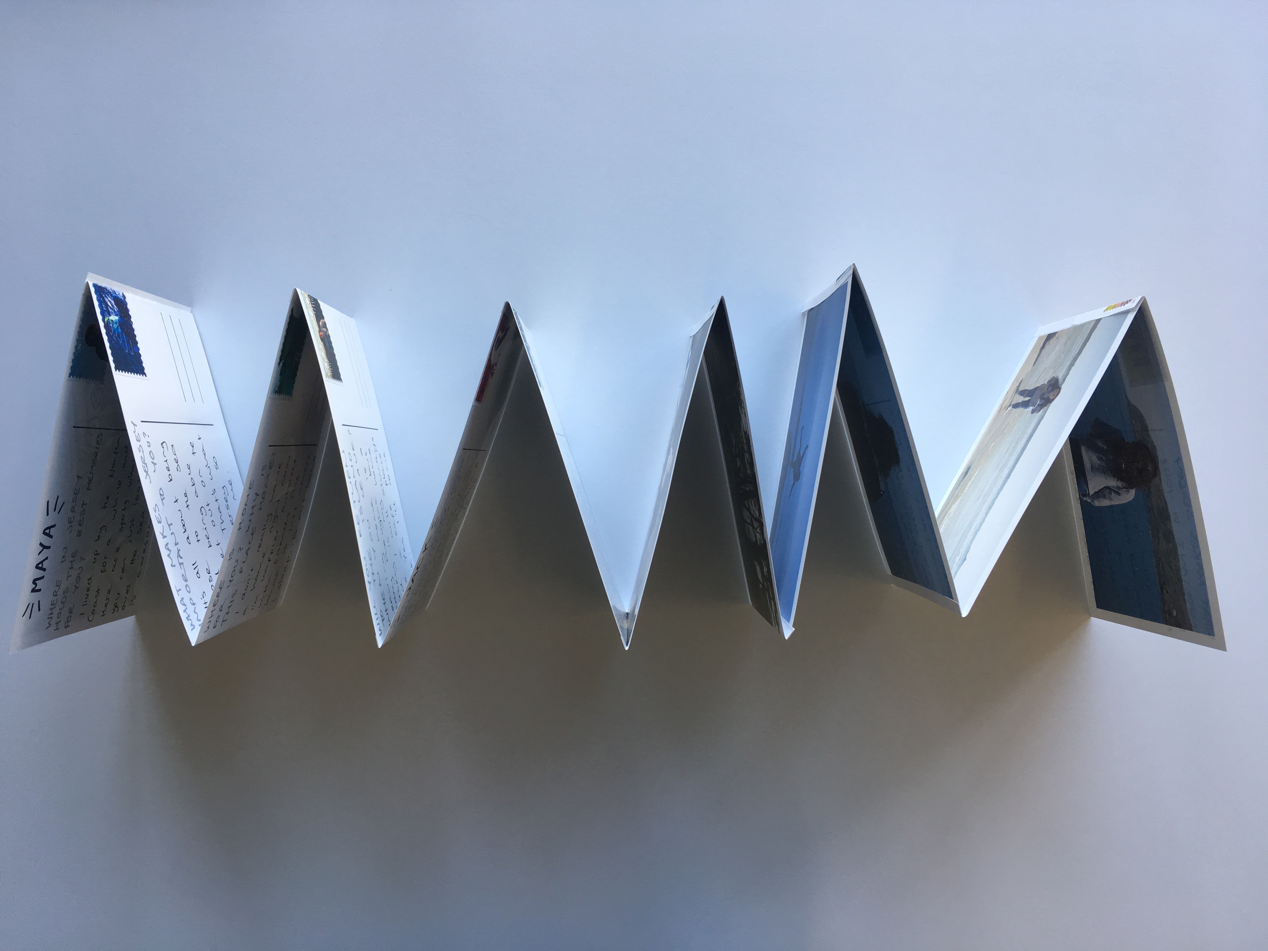
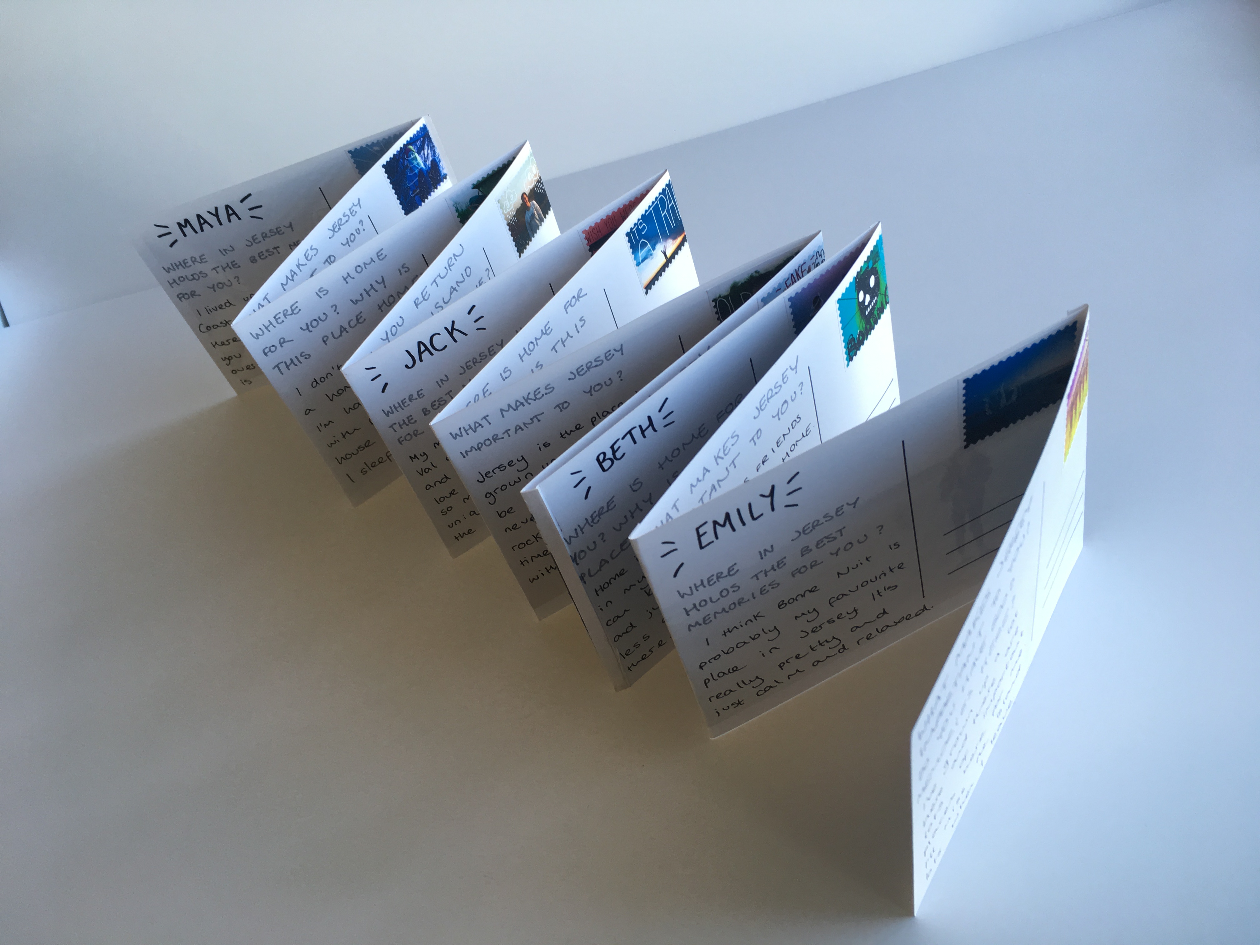
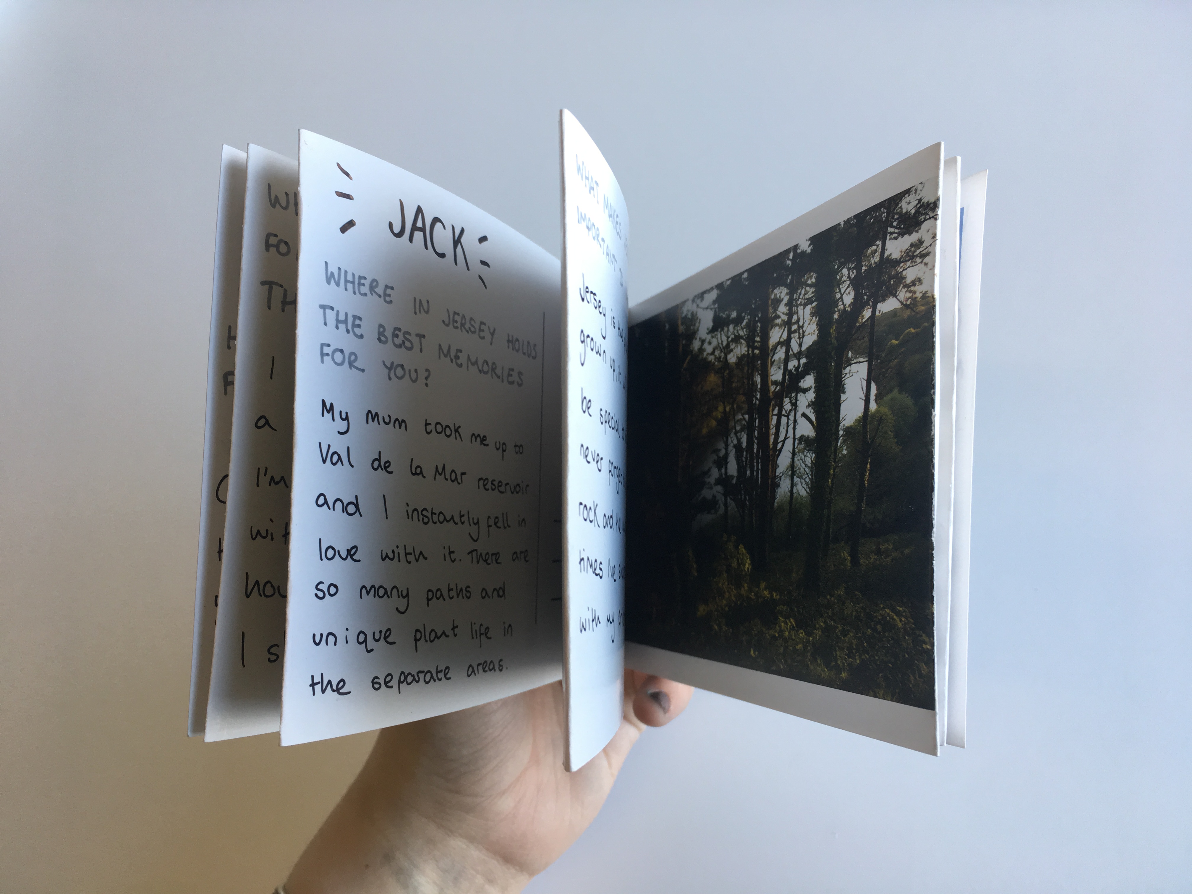
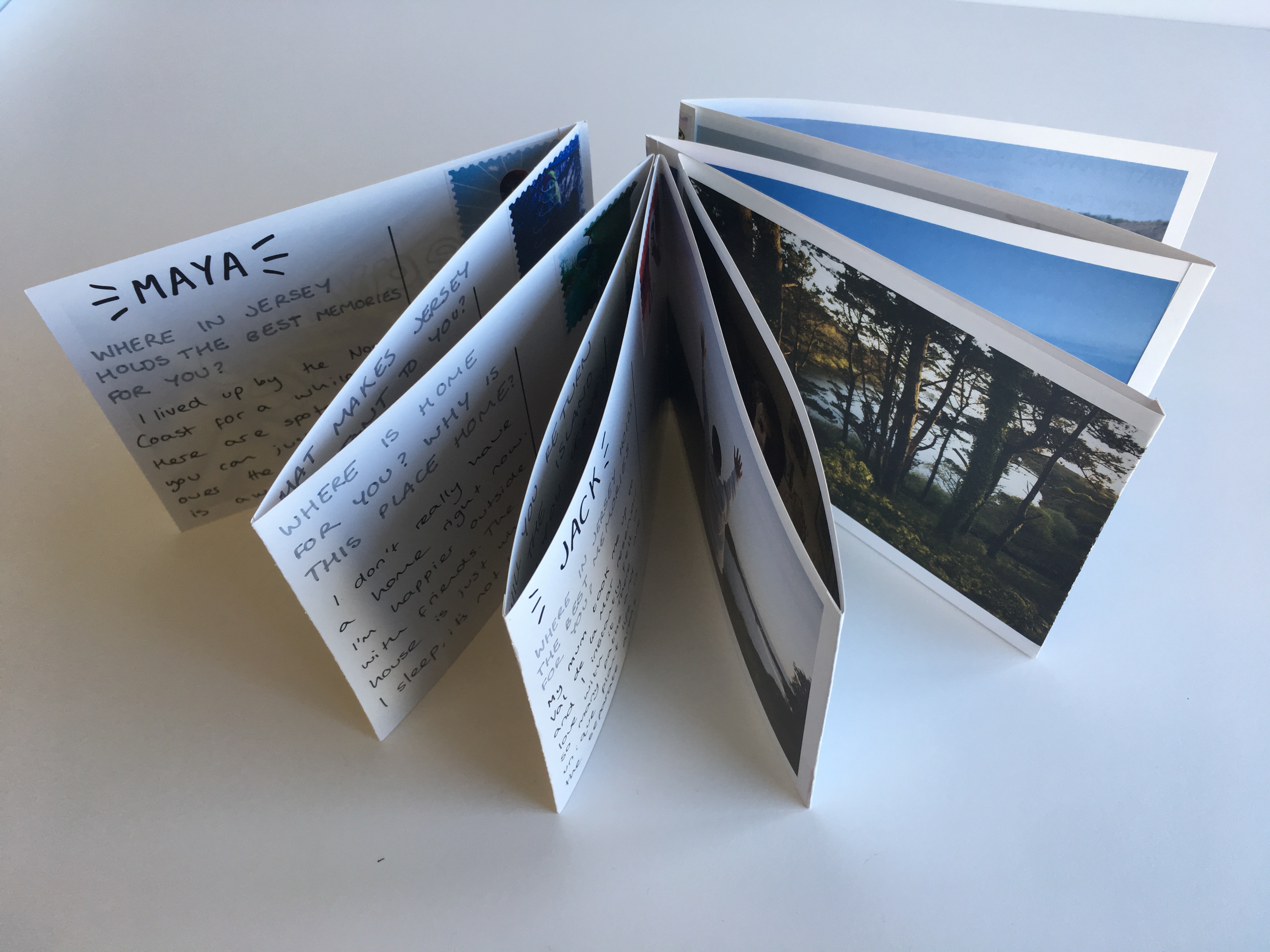
The main presentation of my final images was as a post-card themed leporello design which is shown below. The leporello can be manipulated in the hand and moved into a variety of positions and shapes displaying different sections of informations. This piece is A6 in size and is made up of postcards stitched together to form a fold-out book. On the reverse of each post card there is a stamp, a question and a corresponding answer given by the character on the front of the card. These questions were from my original survey about leaving home, homesickness and Jersey as a place of significance in different people’s lives.
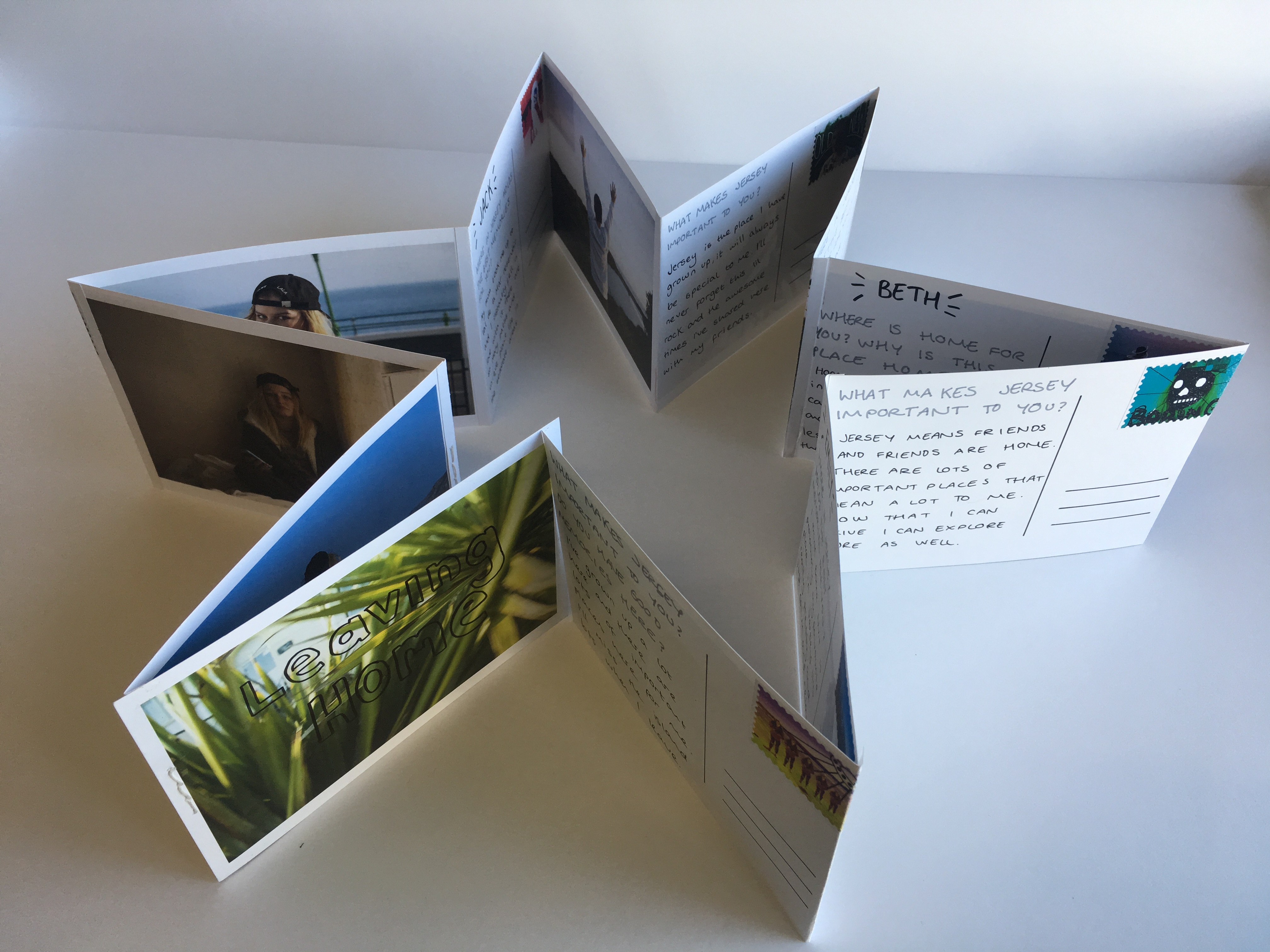
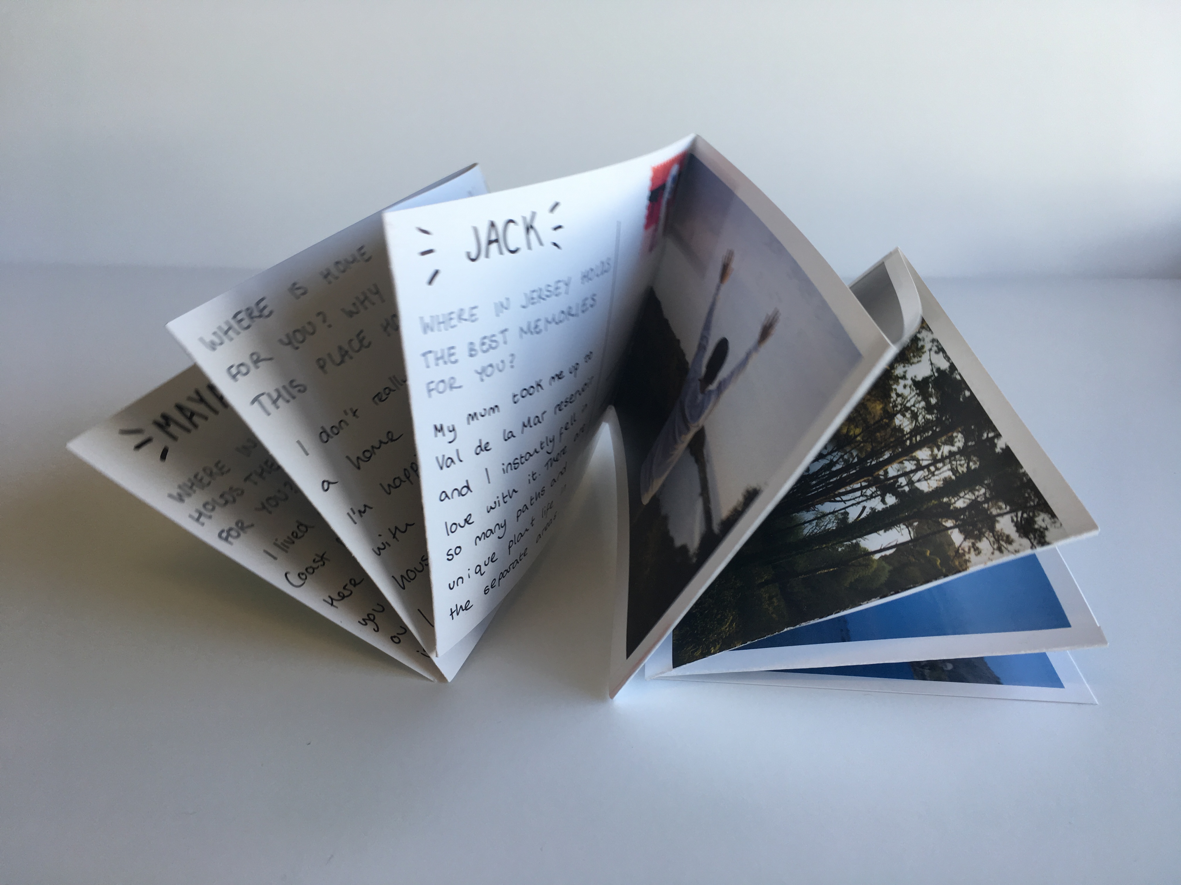
Below are a series of images showing the Leporello laid out in a book format. there are twelve pages on each side making twenty four all together including the cover page. This series is made up of 12 post cards, 12 images and 12 stamps. The significance of the letters and their matching to each image shows a journey and a connection between each character and their own experience with the island. The leporello design allowed this journey to be shown as a time-line and display different shapes as part of its final presentation, much like the changeable nature of the island and people’s opinions of it.
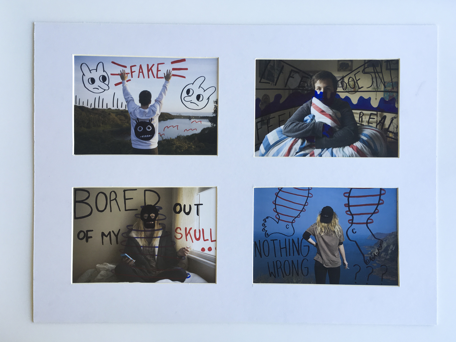
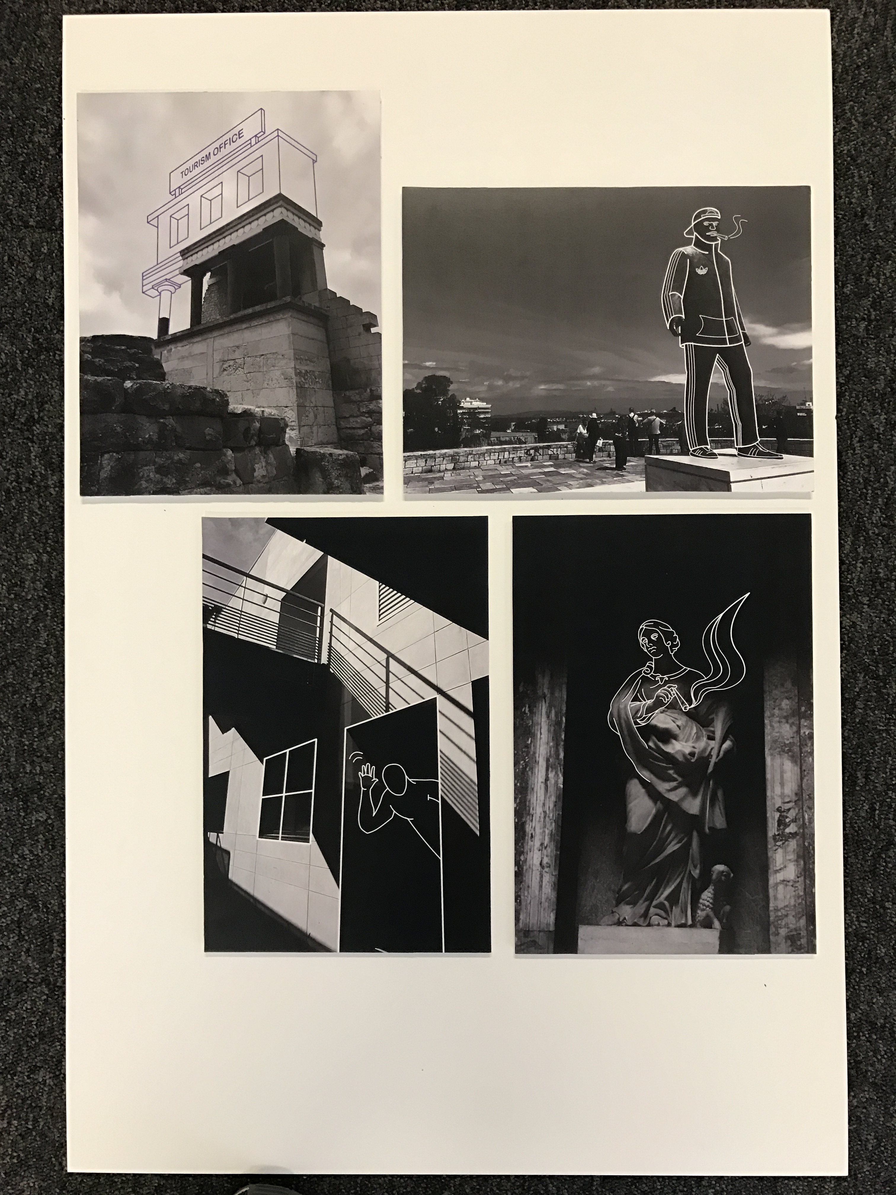
W I N D O W M O U N T
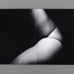
The window mount was created to hold four of my final images printed to an A5 size. These images were of two main characters who featured in this project and were all manually manipulated with ink pens post printing. The layout shows each character in their home environment contrasted with their chosen external environment on the island. The main point of this part of my final piece was to return back to the idea of home and the contrasts between people’s interpretations of the island. For many, Jersey is a small and isolated place however for some this can be seen as a direct opposite. The characters chosen for this project are all leaving their island homes soon and were selected to talk and be photographed around the idea of moving away and in particular home sickness. I was keen to capture memories for them interacting with the places that they would miss the most which is a big part of these final outcomes below.
E V A L U A T I O N
The aim for this project was to create a series of images that would help people leaving the island relate and remember the environments that meant the most to them while they lived here. I have explored the concept of home and family as well as expanding this mindset to look at homes outside of the physical house. The leporello design is arguably my most successful outcome and shows a narrative timeline that follows a journey around the island. The window mount displays a series of experiments and manual manipulation with my images and the way – in a similar style to the stamps – that illustration can be used to enhance an image.
Overall, I think my project has been successful as i have successfully contact 3 shoots which perfectly clear and sharp photos. However the first two shoots were of extremely poor quality because of the ISO and i could not tell what was wrong in the images. I have 11 finals which i have mounted on foam board, i wanted to create two window mounts, one with two images in and the other with three. However i did not have enough time which is why that have all been mounted on foam. This is a let down for my project as i think that the images would of looked very nice in window mounts and it would of rounded it off nicely.
I Have created a 48 page book which is called Our Future, it has a combination of abstract, landscape and portraiture and tableaux in it. I have 5 edited photos which i did on photoshop which was very successful and they turned out really well after being edited in lightroom.
After each portrait image, there was a quote from the official website of WHO and The European Environment Agency.
I have referenced Jon Cazenave who made a book called Ama Lur in which he investigated his homeland in Uruguay with the Basque people. He created a book with abstract images with dark shadows to allow for the viewer to image what the photo may be of. It is a very personal book very similar to mine.
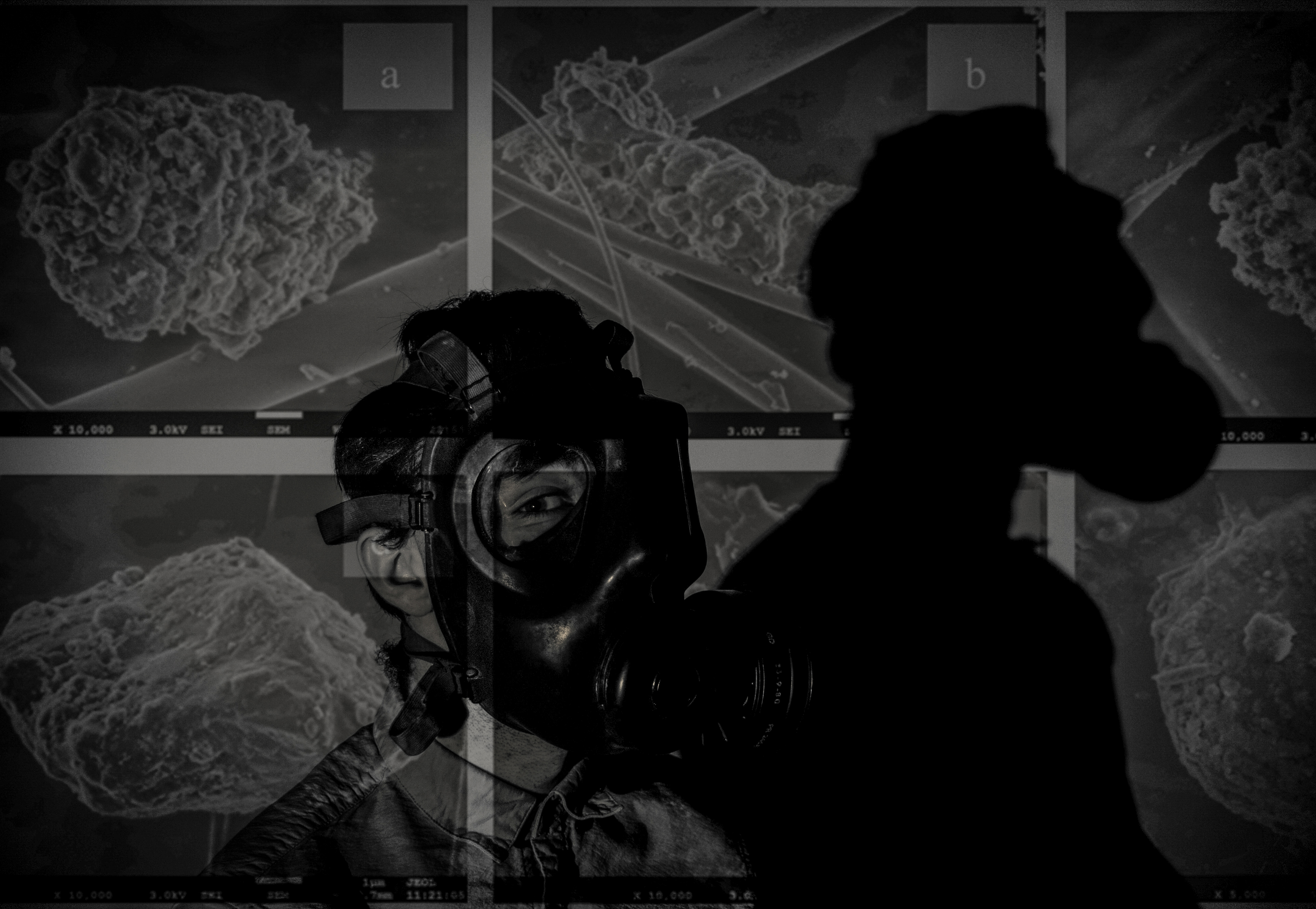
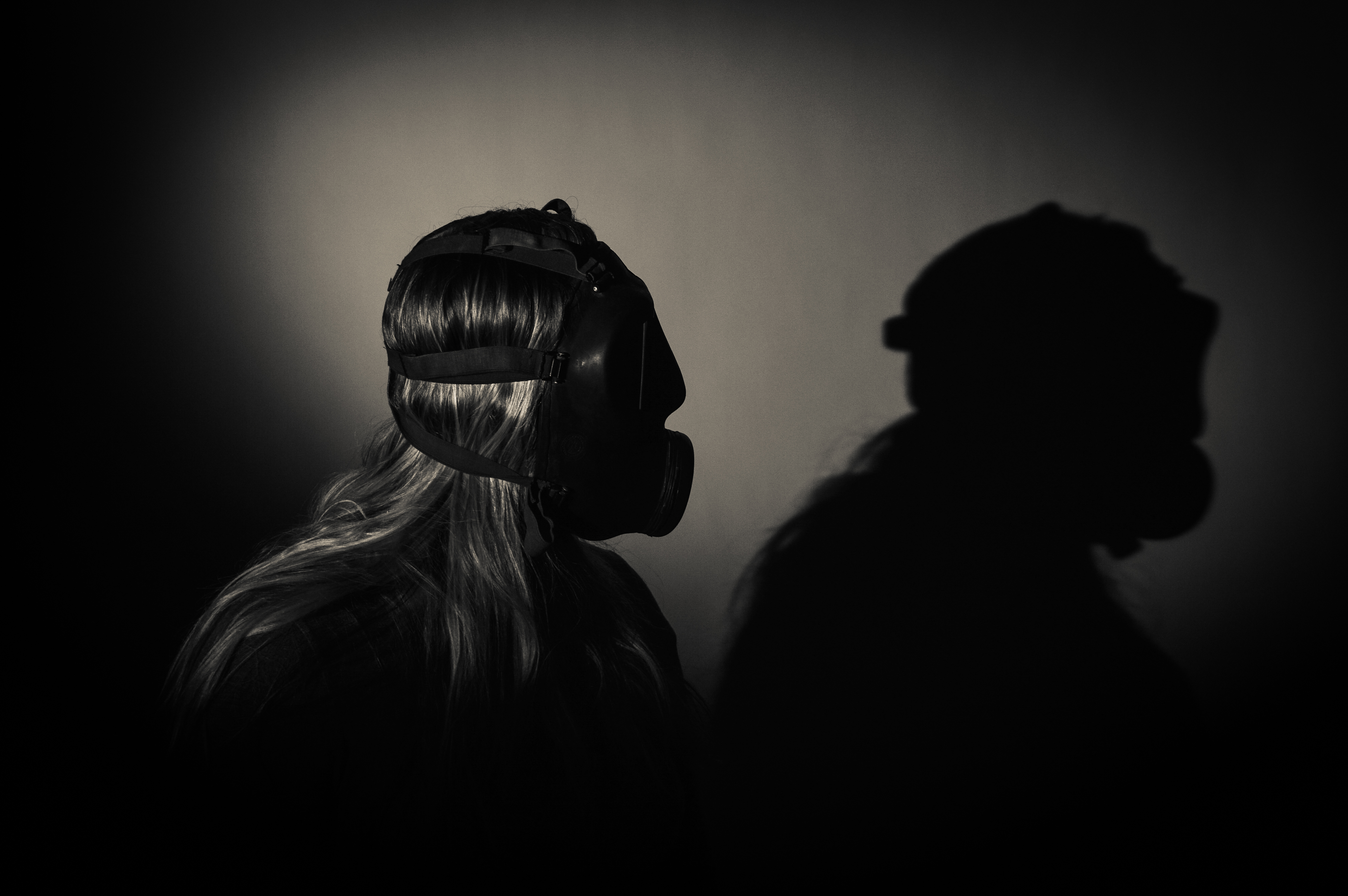
I have also done many different artist references from Lu Guang to Christian Rodriguez. Not many of my artists are professionals but not many would link to my work if i used professionals. All my artists had a link to pollution whether it was E-waste or air pollution with gas mask which is almost identical to my work.
I have also researched the history of the gas mask and air pollution statistics and have added them to my book and onto my blog. My book and project is based on Symbolism, how the gas mask symbolizes war and how it will symbolize future fights and the invisible ones which we will fight such as Air pollution.
Link to my book: http://www.blurb.co.uk/b/7920634-our-future
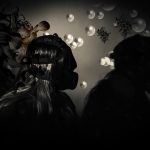
In this post, I will be highlighting how I have presented my final outcomes for this project. I started by window mounting my favorite piece from the project. This Black frame works effectively due to the high contrast present in the image. The black frame ensures that the highlights and illustration really pop into the foreground. The shadows that engulf a large majority of the composition, merge nicely with the black border, maintaining an organic visual style.
For the main body of my work, I decided to make a three-dimensional collage, as seen below. Here, I selected my favorite images created during the exam and positioned them ontop and around one another upon a white foam board. Each image was previously mounted upon foam board beforehand, ensuring a sense of depth and dimension. I like the final presentation for these images, as the blocky organisation supports the cartoonish, satirical aesthetic that I have been trying to employ. This completed board, feels like a summary of my travels which I like. The white background enables the colors and tones within these images to truly feel vivid, drawing the attention of the viewer. Additionally, I created one more collage that features a set of black and white photographs. This presentation works effectively as all 4 images feel natural in co-operation with another, due to their striking visual similarities. This board focuses a lot on the juxtaposition between old and new and has a direct observation on youth culture and history.
I have now finished my photography exam and below will be the finished outcomes from the shoots that I have completed, using images based around the theme of environment. In evaluation I believe that the story being told by the images is an interesting concept that relates to everyone in the world today. The idea of the subject was to make the images seem mysterious which is a goal that I believe was achieved. To present the images I have used a display of black window mounts, using high quality photographic paper. This is a different way of presenting the images than I first imagined. The reason this happened was because the initial idea broke down after the second photographer needed in London, could not complete the shoots required to make a comparative book between Jersey Images and London.
However I believe the images were of a high quality once printed and I am happy with the presentation, including the window mounts that I completed. I have decided to print 1 image from shoot one, and 2 images from shoots 2 and 3. Here are the images:
Shoot 1 image:

This image was printed on A3 photographic paper. In my opinion this image is of high quality and presents a mysterious but friendly concept. As you can see the image is surrounded by a black window mount. This is my favorite image from the shoot (1). The reason I believe this is the strongest image is because the environmental portrait has a strong composition. The natural light causes a blurred reflection of the subject in the water which created the effect of him blending in with the reflections of the trees around him. In the photo the subject is taking an image of the environment around him because he believes it is a particularly sublime location to be in. In a way this image follows the idea of tableaux photography.
Shoot 2:

This is my favorite image from shoot 2. I think this because I like how the image is dead pan with the subject looking directly at the camera. Again the contrast of the flowers to the subjects suit and props makes the image stronger with the black and white filter. I have decided to place the subject further away from the camera to show the size of the field and how he is only a small part of the nature in this moment of time. The second reason I like this image is that the use of landscape shows the separation of the rule of three in a better way. The rule includes the ground, the tree line in the middle of the image and the sky. The subject’s head is just above the tree line which makes the frame more sublime.

This image above shows the window mount that shows both an image from shoot 2 and shoot 3, shoot 2 top and shoot 3 bottom. I have decided to do this to contrast the differences between the two shoots, and how they are similar but with a completely different location and environment. Also these two compositions are very strong images that work well together in the same window mount. Top image: After experimenting on images I have decided that the top image is a great composition as more of the landscape can be seen. I think this image is a strong environmental portrait because it is a close up of the subject which allows us as viewers of the image to again interpret the scale of the nature. Also the image has beautiful natural lighting which allows the contrast of the image and the exposure to work well together. I decided to place this image on the top because of these reasons, it also worked better on the presentation front. Bottom: I have included this image in the same presentation layout because it cross references to one of my artist references being ‘Katrin Koenning & Sarker Protick. The two artists use two images created by one another to present their work and compare the differences and similarities between their outcomes. After experimenting on the shoot I decided to take a closer image of the subject. Putting the subject in the middle of the path was set up in a particular way, as you can see the subject is standing in the only light part of the path. This ensures that he is not absorbed by the other areas of darkness, and he can stand out more. During the shoot I took one image from a further distance and followed up with the same image in a closer shot, this being the closer.
Shoot 3:

In my opinion this was not the best outcome after the print was created. The image is too dark and shows the subject to be slightly lost in the composition. However this is another one of the better images produced in the exam project so I have decided to continue mounting the image for the examiner to look at in person rather than just digital form.
With more time I would like to of completed a artist reference around photographer Alec Soth, who was also a factor I used towards creating my project.
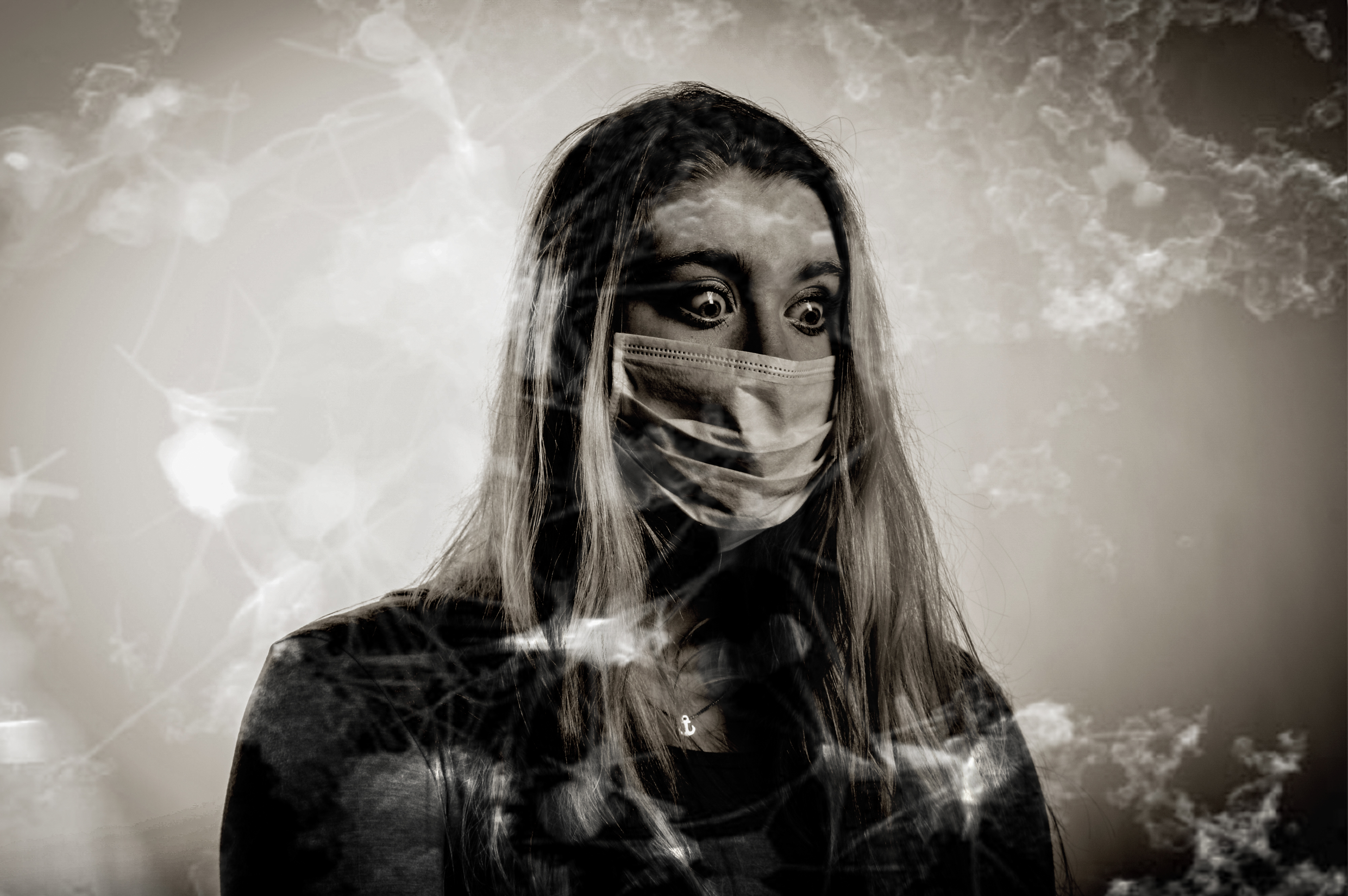
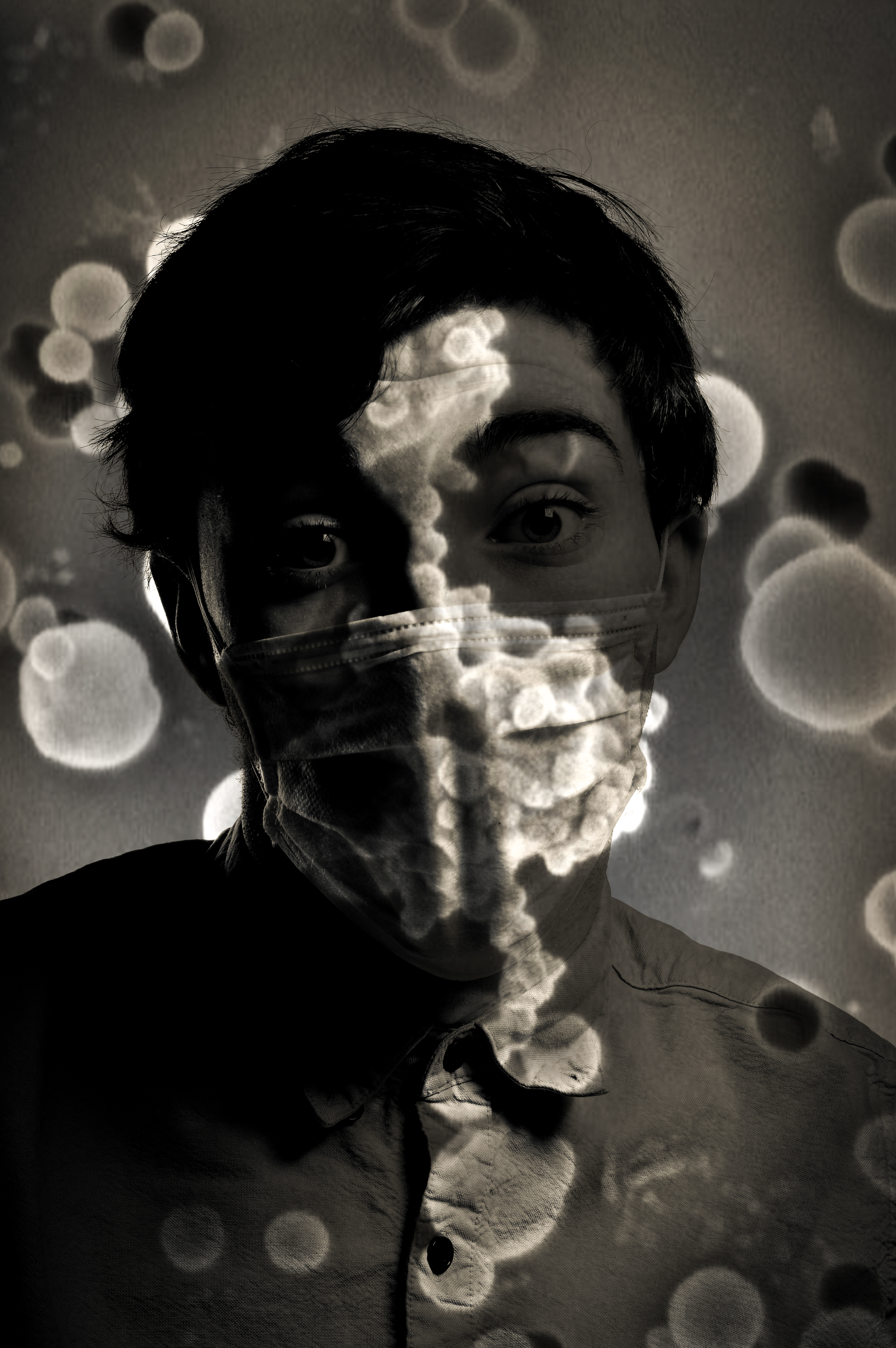
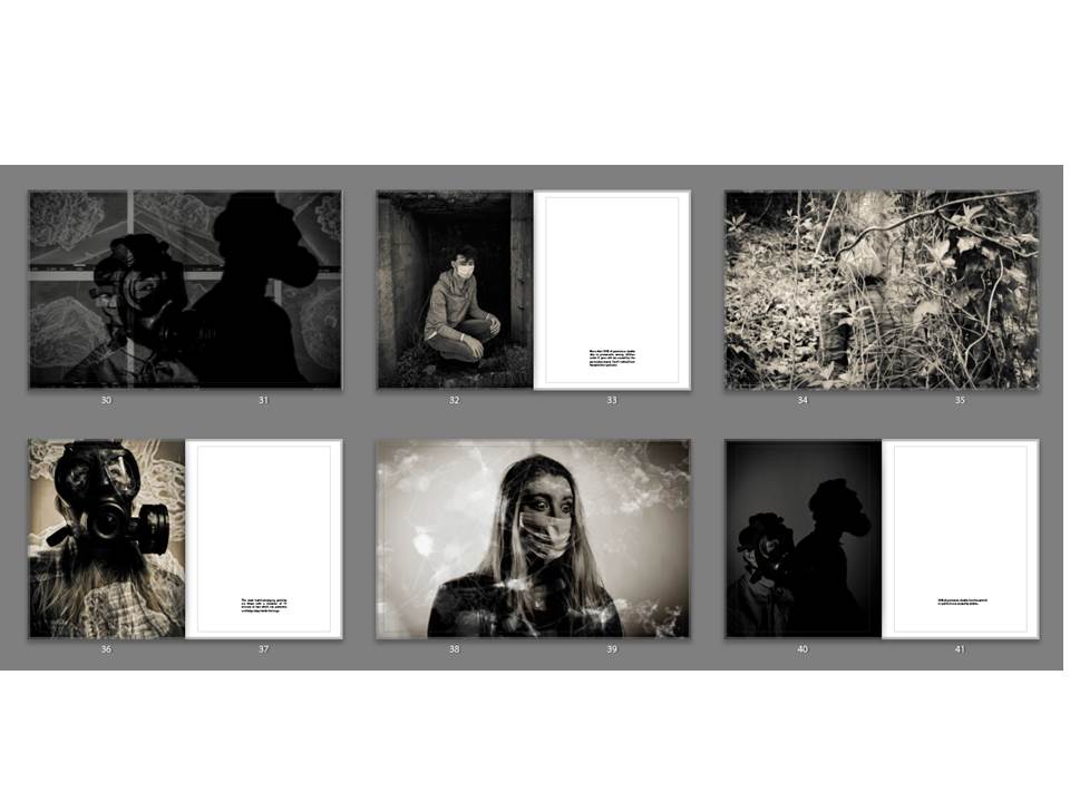
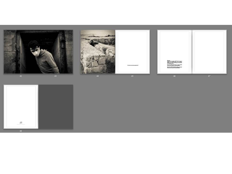
I have chosen 11 finals to print out as well as my book. I have chosen these because i think they represent my project well and represent my skills as a photographer as well. The first set of finals are my experimentation finals which i created on photoshop using a combination of my studio portraits and photos which i got from google of pollution particles to merge them together. I have chosen 5 of the merges to be my finals as they are a strong point in my project as they show a hidden part of pollution which we cannot see, they show a sinister hidden danger which we do not think about every time we step outside. Overall my images have turned out really well and are very dramatic but they could of been improved by finding better quality images from google as it may make the images pixelated when printed which is something that i hate but it could add something different to my project which i have mentioned before of humanities blurred vision about pollution. Each image has a different meaning and each image of particles is a symbol of something different.
This image was taken in the studio with my model facing slightly to the right as before this i was using a flash setup. The spotlight was angled so that it only lit her shoulders and her head. I asked my model to turn to the right and partially look at her shadow to represent her acknowledging that she needs to change. Before this image was merged with the particles, it was edited in lightroom with the same filter which i have used for all my photos. Next was merging the image of the particles, i did this by flipped the image horizontally and zooming into to make it like the large particle is looming behind my model and she does not know it. This image of particles symbolizes the looming danger which is in the air which no one notices because it is apparently small but under a microscope they seem very large.
The original photo of my model was taken in the studio using a flash setup in which a flash was facing a white background and another flash was to the right of the model, This created a bright background which lit up the features of my models hair and face. The image of particles which i used on this photo made it a vintage tone but the particles weren’t as visible if it was put into more black and white colour.
This image is very strong mostly because of her eyes as she is showing lots of emotion which is why this image stands out in my book. I put it as a double spread because i think it is worth that and because this image is in landscape. This image has more of a vintage colour than the rest but it i had changed it to the standard black and white filter, the particles would not be as visible.
This image looks like it is being projected with particles but it is actually merged. This image worked really well as a double page spread in my book. However, i slightly wish that the image was not so dark because it does not match the brightness of the other images.
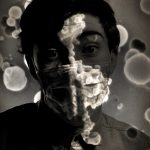
This image is the best because it shows how invisible pollution particles are everywhere. How scary it is that it attaches to our mouth and faces. I like also how the particles are much brighter than the rest of the images which makes everything stand out but the sharpness of the image behind has stayed.
My book is 46 pages long and is a combination of single page images and double spreads. The layout is consistent through the book in which it begins with a small image and some text then a double spread, then a single image with text and it continues in this layout through the book. My quotes about pollution are from the WHO website which i have referenced and here are the links to the websites and another one which i have used to gather a statistics image from. My book is all black and white and they all have a standard black and white font which i made using filters and adjustments.
Who : http://www.who.int/mediacentre/factsheets/fs313/en/
Who: http://www.who.int/mediacentre/factsheets/fs292/en/
European Environment Agency: http://www.who.int/mediacentre/factsheets/fs292/en/
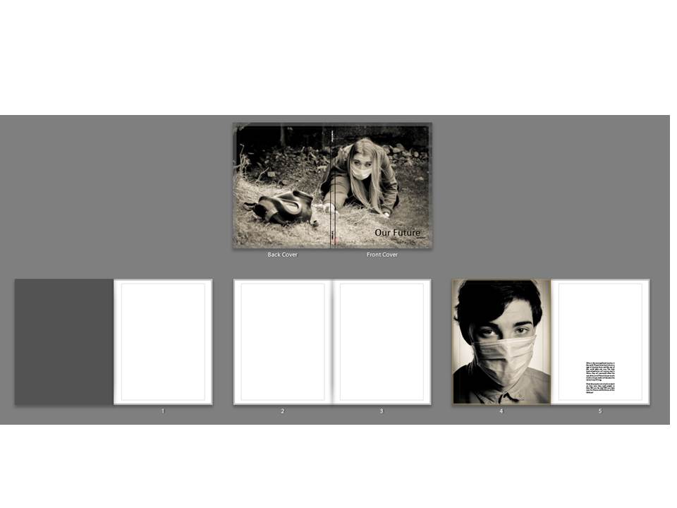
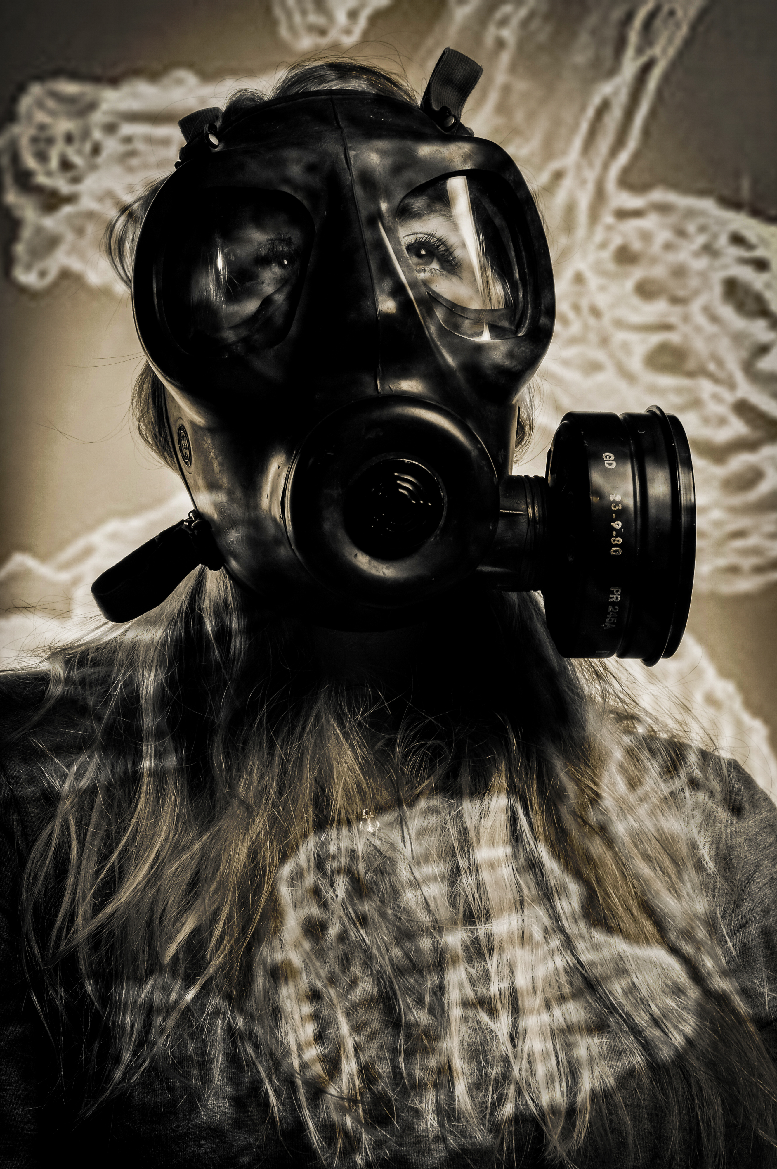
My front and cover photo are both one image and it is one of my favourites as it is of my female model reaching out for a gas mask. Even though my project is on pollution, this image may be misinterpreted for a project on war. My title is Our Future which is situated in the lower right hand corner, the font i used is Calibri, it is a very simple font but it works well as i do not want to take away the attention from the images. My title is 60pt which is large but it needs to be as the title is very important. I have left two blank pages at the beginning of my book so that it starts of slowly and the book does not look clustered and full. The first page is a studio picture of my male model, it is a close up of his face which is very clear and sharp, he has the mouth mask and his eyes are full of emotion which makes it a very powerful image to start the book off with. The text next to the image was written by me and is not quoted from any sources, it says: “China is the most polluted country in the world. The pollution levels show no sign of slowing down and the rest of the world does not care. The high levels of pollution will not just stay in China, they will eventually affect the rest of the world. This will mean mouth masks and gas masks will become the normal way of living. Clean Air projects can only do so much on their own, they need people to help. Will you be one? Will you help save Our Future and The Future of Our Children? ”
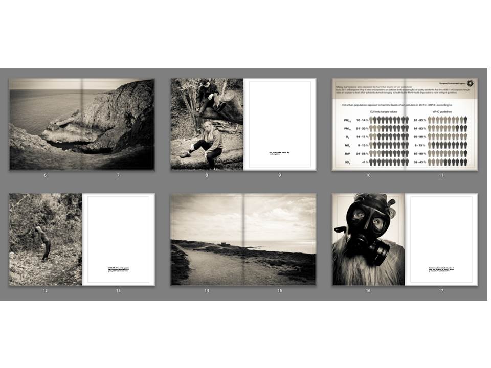
The landscape image is used as a break between the images so that the book is not filled with portraits and so it does not look clustered. This image works really well as it is a very simple landscape but the black and white makes it really strong and it works well with all the images in my book. The landscape was taken at Gronez and it did not look very interesting to begin with but it fits in perfectly with my work now. The image of my two models is used to represent that one person cannot change the world but more people together can such as communities recycling more and organisations working together to clean the air. The next image is of a landscape which i took at Gronez, it is very natural and bare landscape because it is untouched by new buildings apart from the old bunkers which is why it is so beautiful. These double page spreads are similar to the work of Jon Cazenave who used double page spread to create an abstract looking book which is dark but much darker than my images as they have a slight vintage ting to them. The last image is a studio portrait which i did of my female model with a gas mask on, the quote next to her was taken from the official website of WHO.
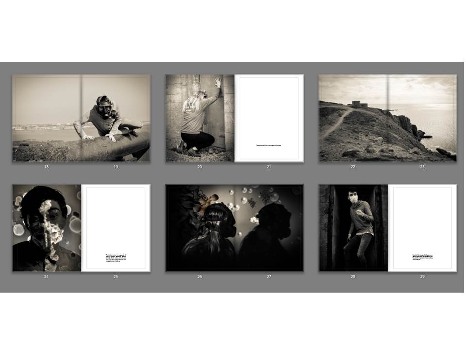
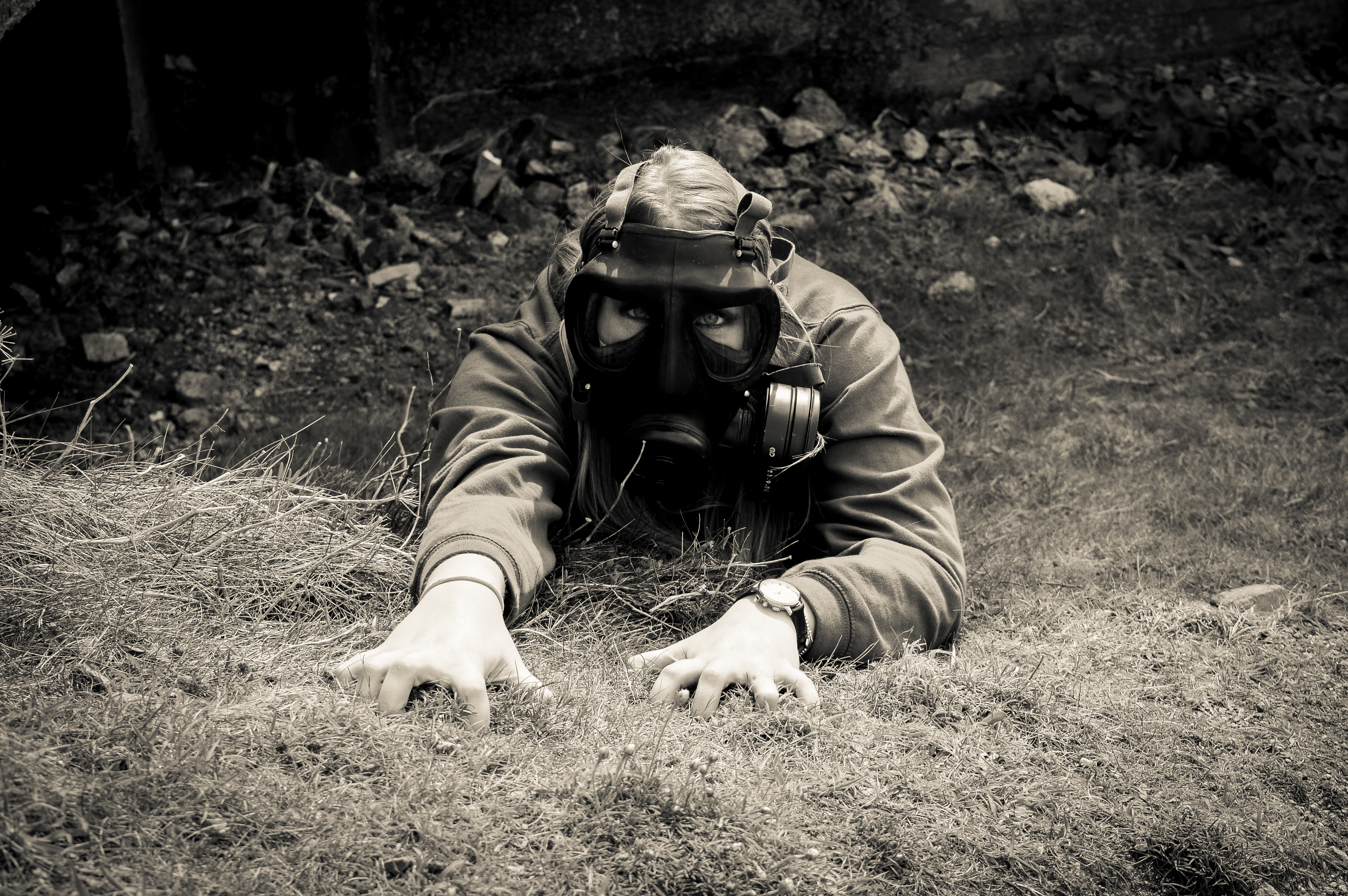
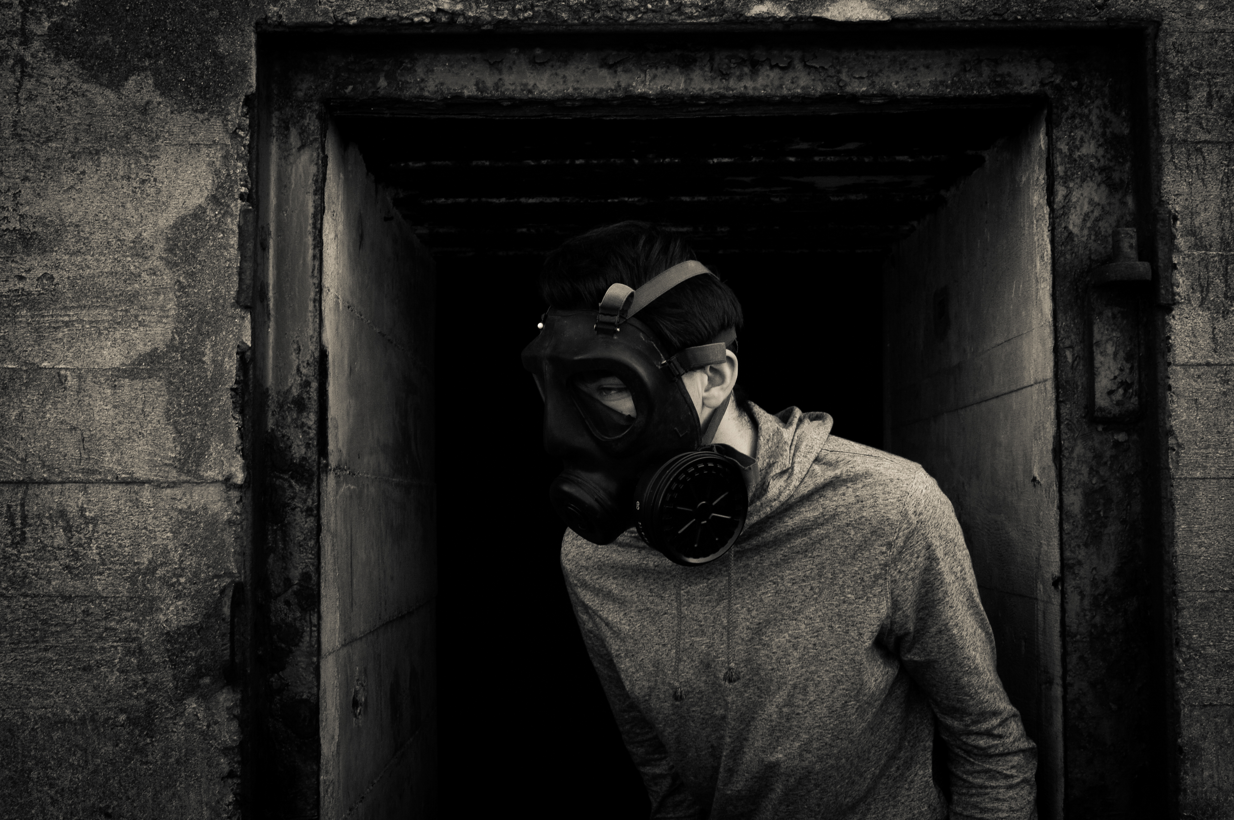
The first image is of my male model struggling to get off the gun and it is another double page spread to separate the portraits so that the book does not look too clustered. It has a vintage look like all the photos. The second image is a portrait of my female model banging on the door to try be let in to escape from the air but it will not be able to save her, next to that image is a quote from WHO saying Outdoor air pollution is carcinogenic to humans. After that there is another landscape to split up the portraits and make the book look neater. After this the book starts to look into my photoshop work which i did using air pollution particles and merging them with studio portraits. I did this to add variety to my work. Next to this photo there is a quote which says: Particulate matter is composed of sulfate, nitrates, ammonia, sodium chloride, black carbon, mineral dust and water. It is closely associate with increased cancer incidence. The second of my edited images is on a double page spread and this work is very similar to the work of Jon Cazenave who used very dark images and very ambiguous ones to investigate his homeland with the Basque people. The next portrait is of my male model who is stood in the door way of an bunker armory with a mouth mask on. Next to this image is a quote which links directly to the image, it says: Over 4 million people die of premature deaths from illness attributable to the household air pollution from cooking with solid fuels
The next double page spread is of my third edited portrait which appears to be projection of particles onto an image but they are actually merged together. Again this relates to the work of Jon Cazenave as it is a very dark image with very dark shadows just like what he did with his book called Ama Lur. The next portrait is of my male model crouching in an entrance to a small cavern like area. Next to him is a quote which directly links, it says: More than 50% of premature deaths due to pneumonia among children under 5 years old are caused by the particulate matter (soot) inhaled from household air pollution. After this is a double page spread of my model integrating with the environment which symbolizes how pollution fades into the background and we do not notice until we look closer. The fourth one of my edited portraits has a slightly vintage tinge more than the rest of them which makes it stand out but without this the particles would not be as visible, next to this image is a quote which says:The most health-damaging particles are those with a diameter of 10 microns or less which can penetrate and lodge deep inside the lungs . A double page spread of my fifth edited portrait splits up the portrait orientated images and it is very strong as she has very big eyes portraying lots of emotion. The next portrait was done in the studio with a spotlight and it is very dark with dark shadows and my models face isn’t very visible. Next to his is a quote which says: 34% of premature deaths from household air pollution are caused by strokes.
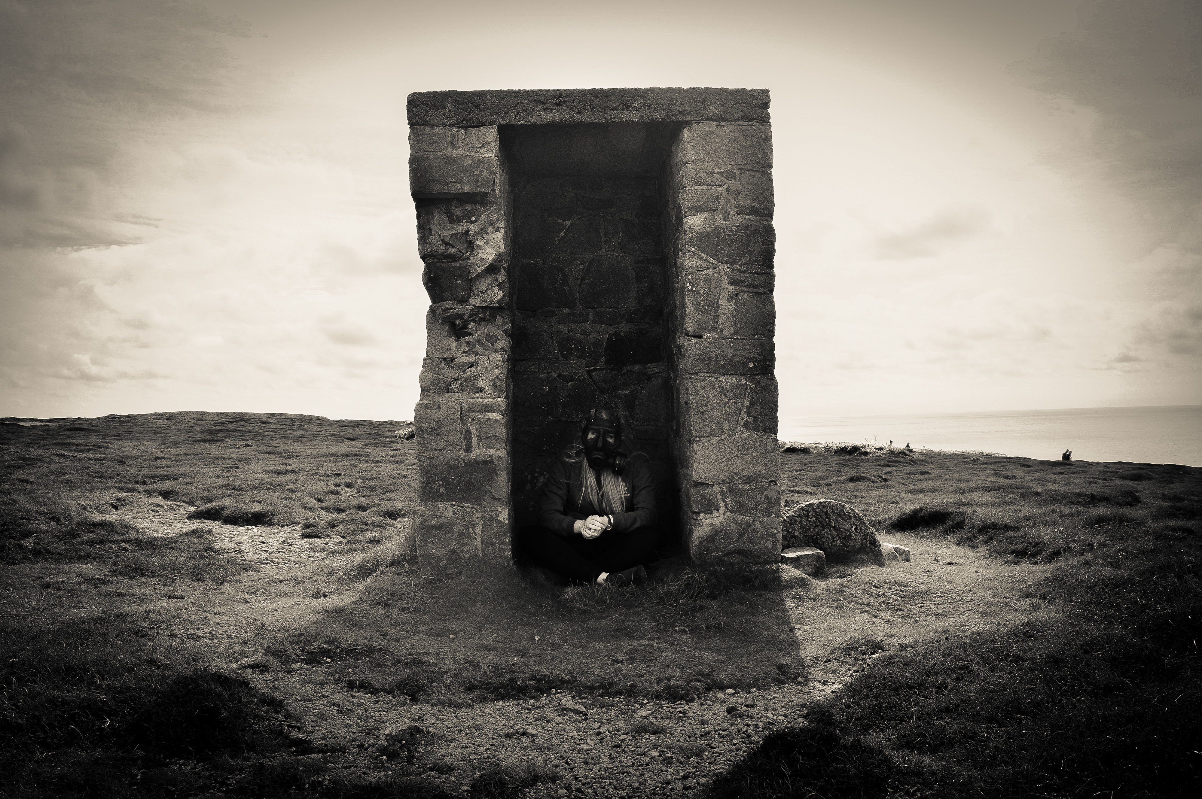
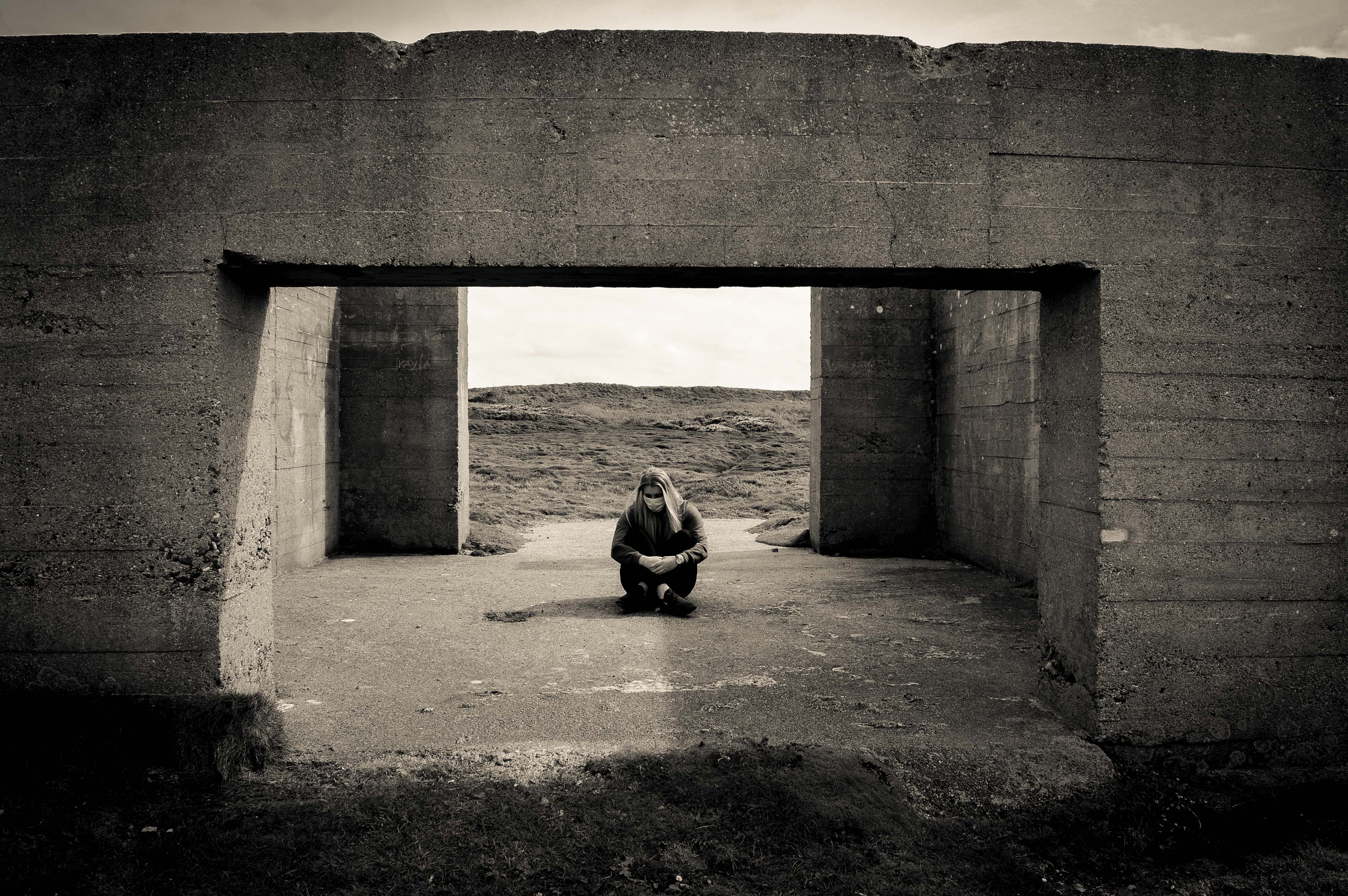
A double page spread of my male model looking directly into the camera splits up the last two portrait orientated images. It is very dark and his eyes show a lot of emotion. The final portrait is of my female model who is sitting between two walls which have been destroyed are Gronez. The quote next to her says: No structure can protect us against the air. Finally there are 3 references in my book from the official website of WHO and The European Environment Agency.
Website: http://www.dalpine.com/en/book/ama-lur
In 2001, He received a B.A. in Economic Sciences from the University of Deusto. In 2006, after working for 5 years in the finance world, he decided to move to Barcelona to study photography.
He began working in documentary photography so that he could capture and depict the contemporary world and completed his studies with Pep Bonet, Christopher Anderson and Paolo Pellegrin, after having been selected to participate in the first Magnum Workshop taking place in Oslo.
Since then, he has been working on a long-term research project called GALERNA. This work focuses on the idiosyncrasy and aesthetics of the Basque Country with an anthropological perspective.
This book is the closing chapter of an 8 year project by Jon Cazenave, he has compiled a book of the Basque people’s idiosyncrasy and their aesthetics, to unravel his home’s political intricacy from an anthropological perspective.
I have chosen this book as part of my inspiration for my book because i like the very dark black and whites in the book which i partially want to recreate in my book as all my images have a standard black and white filter as i think it is very dramatic and my project is very important and dramatic.
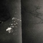
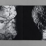
His work is very unusual and i would consider it abstract photography but his work is very ambiguous if you have not read the description of the book which is similar to mine as my project could be mistaken for a project on war. His book is in a portrait orientation which is completely covered with images/black paper. The edges of the book are a grey colour and the seem of the book appears to be covered with glue. It is a soft cover book as the cover is an image. Every single image is a double page spread.
The whole book is on black paper with the images on top, all the images are double spread and go from edge to edge. In my book i will have double page spreads splitting up the portrait orientated images as otherwise it will look too clustered. The double page spread will be black and white and many will have high contrast and dark shadows to make the images look much darker to show how worrying and dramatic my project is.
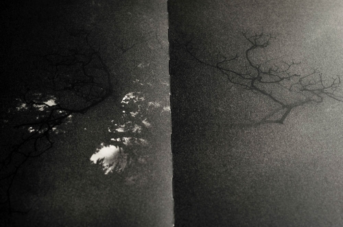
His work only shows parts of an image which leaves it up to the mind of the viewer to make up the rest or what could the image be apart of. Some of his work is much clearer than this one which is very ambiguous.
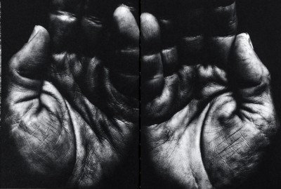
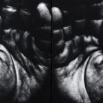
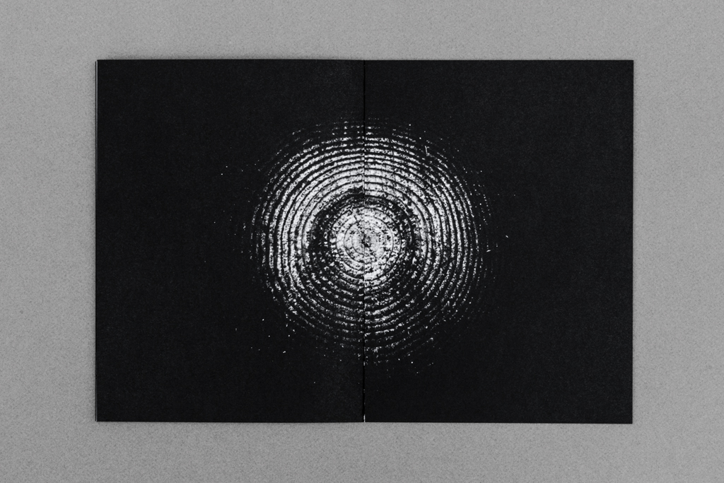
This image which is back of his book is much less ambiguous than just simply the patterns which are on some of the pages. However each image has a symbolic meaning to him personally as his work is exploring his homeland which is why all the images are symbolizing his home land. The hands could represent those of his family members or just people from the community. His work is very intimate and he has some up close images of body parts which can be ambiguous as the viewer does not always know what they are of.
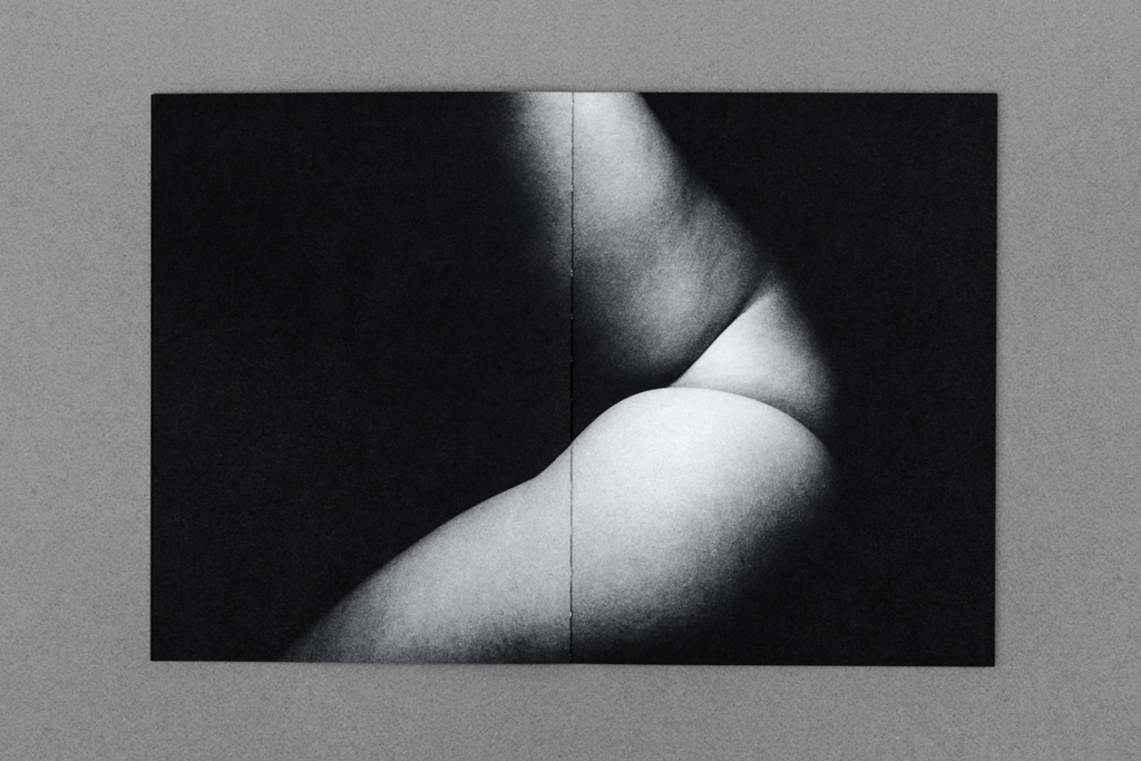
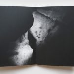
I think this image is of an arm but i am not quite sure, i do not like images which i cannot clearly make out what they are. For many photographers it will add tension into their work but i do not like this as i do not like the uncertainty.
Personally i find this book not very good because you do not understand what it is about without reading the description. There is no explanation about why the book was made or what it is about within the book. Also there is no name or date on it and the cover does not give any clue to what the book might be about. I like books which have a title which gives you a clue of what it may be about or if not the images will tell the viewer what it is about.
For my book, i will make sure that the meaning and concept behind it is clear through the use of quotes from external sources, i will make sure my book has my name and title very clearly written on it.
To conclude my project, I will discuss how well I believe I have fulfilled exam criteria, as well as realising my initial intentions for the project.
Initially, in regards to my exam brief I believe that I sufficiently addressed the task at hand to a respectable standard and to one that I am proud of. Environment is of course a broad topic, but I feel I had narrowed down my thoughts well enough to pinpoint an idea small enough that it became personal to me.
I feel like my photography has vastly improved in comparison to my previous works throughout the course. Not only in technical qualities but also through the art of story telling, being more conceptual and as well conveying more of a message through my imagery in such a way that I haven’t quite been able to in previous projects.
In addition, the initial ideas I set out to explore within my project, I feel I successfully explored in sufficient depth. My intentions were to explore significant aspects within my own personal life, which in turn almost create my environment. Through exploring this theme of environment I have realised that the friends within my life predominantly make up my environment, as no matter where I am, being with them creates and becomes my ideal setting.
The images I have taken and presented show the relationship I share with these individuals in such a way that is almost poetic. They are of course not saying anything verbally, or even specifically acting in an irrational or noticeable way. Yet through their comfort and equally their shyness or awkwardness, a sense of relationship is shown that is almost hard to describe through words. I think the images speak for themselves.
In terms of my artist references and inspirations, my final body of work was heavily influenced by this. All artists that I chose to explore, featured a strong sense of environment within their work, as they all explored their own personal ones. Which is of course what I went on to do myself, fitting into my exam theme. Overall, studying these artists led me to take my exam title ‘environment’ and make it personal.
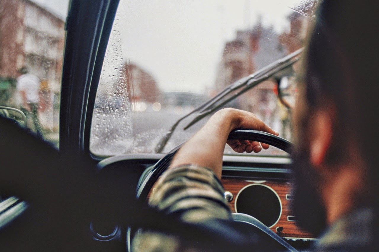
The styles of each artists has in some way become incorporated within the photographs I have taken. Examples are shown below, where I have attempted to create my own response to certain photographs by each artist, containing similar composition and aesthetic, in my own style.
Ben Gore
Jacob Sobol

Theo Gosselin
My work is summarised and presented most confidently through my final images, where I display a portrait of each character I photographed alongside an image that is juxtaposed. This in many ways creates a more personal image, as firstly the use of a portrait implies a sense of relationship as only a certain type of person would be allowed to photograph a subject so closely or intimately. As well the inclusion of a juxtaposed image suggests understanding of the subject.
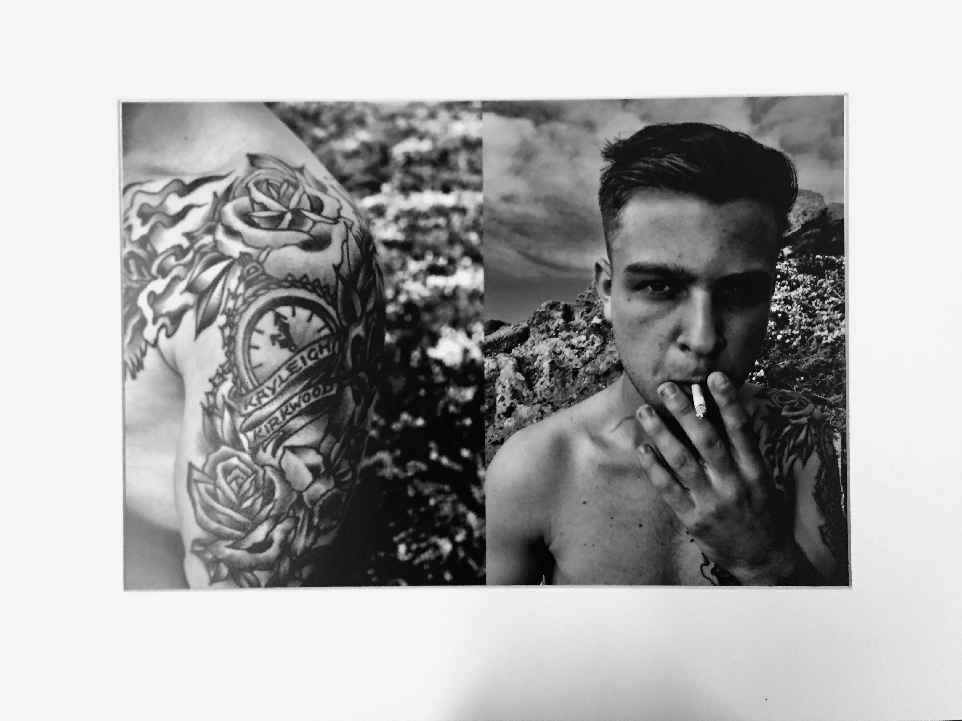
An example of one of my final images, mounted and presented as an A3 photograph, is featured above. Firstly, I chose to print my final images as A3, as I was combining two images into one and felt that they needed to be on a large scale in order to fully see the image and my intentions for combining two. Secondly, my choice of a white window mount was to allow for the high contrast within my images to really stand out and become a focal point, I felt that black almost drained my images of this quality.
In terms of the compositions of my final outcomes, each was created with the same intension, which was to present a portrait with a juxtaposing image that would suggested something about the character.
This would then help to add meaning to the photograph. The concept was ultimately to to present a personal relationship between myself and the subject, which was achieved in the way I photographed these characters so intimately. Symbolising friendship and closeness.
All of the images that I have decided to print will be printed on high quality photographic paper and presented using a black window mount technique.
Below are the images that I decided to print, as you can see I did not print every final outcome as time it limited, although with more time I would of liked to do so.
A4:

A3:

A4:

A3:

A4:

A3:
