Shoot 4 – Pisa

My next shoot, was located in Pisa, Italy. Pisa is a city in Tuscany, Central Italy, straddling the Arno river. Although Pisa is known worldwide for its leaning tower, the city of over 90,834 residents contains more than 20 other historic churches, several medieval palaces and various bridges across the Arno. Pisa is a very popular tourist attraction, but I was excited to see the site for myself and compare how the location conflicted with my expectations. The leaning tower is constantly talked about and remains as one the most special architectural wonders in the world. I had an expectation that perhaps the tilt was exaggerated or enhanced in photographs and was consequently keen to investigate with the naked eye.  Below is a contact sheet that presents all the photographs taken on the shoot. 
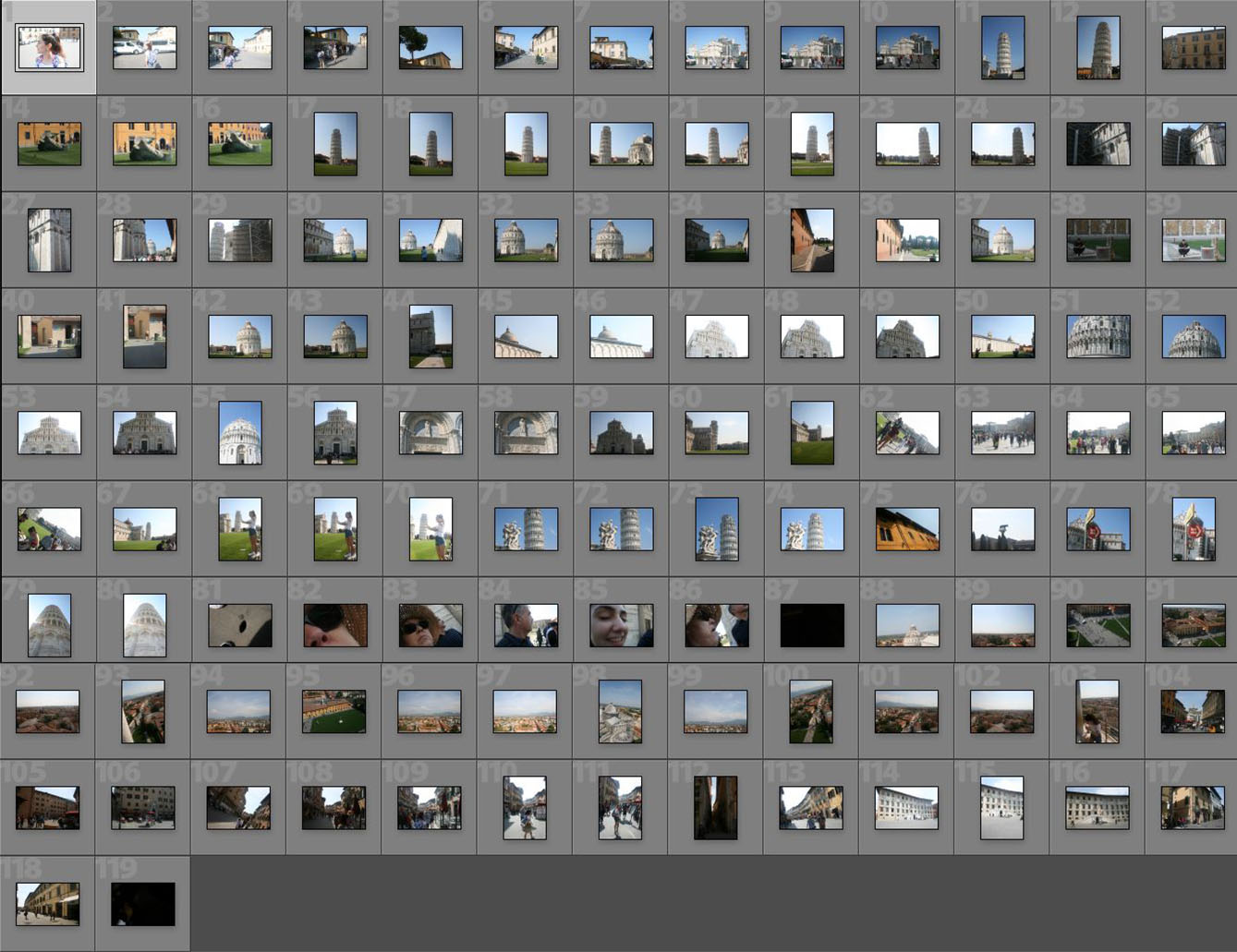
Pisa was a very small town and I was surprised by its casual and mundane appearance. Besides the Tower and main cathedral, the town is largely narrow and regular streets equipped with shops and houses. Nevertheless, in summary I really liked the town. It felt cosy and clean but filled with history and culture. There were almost no modern or out of place buildings, securing a consistent Tuscan, countryside atmosphere.

— Its important to note that these images have been selectedwith the intention to develop with illustrations. They are not individually the best photographs from the shoot, but provide the best opportunities for overlaid drawings. —
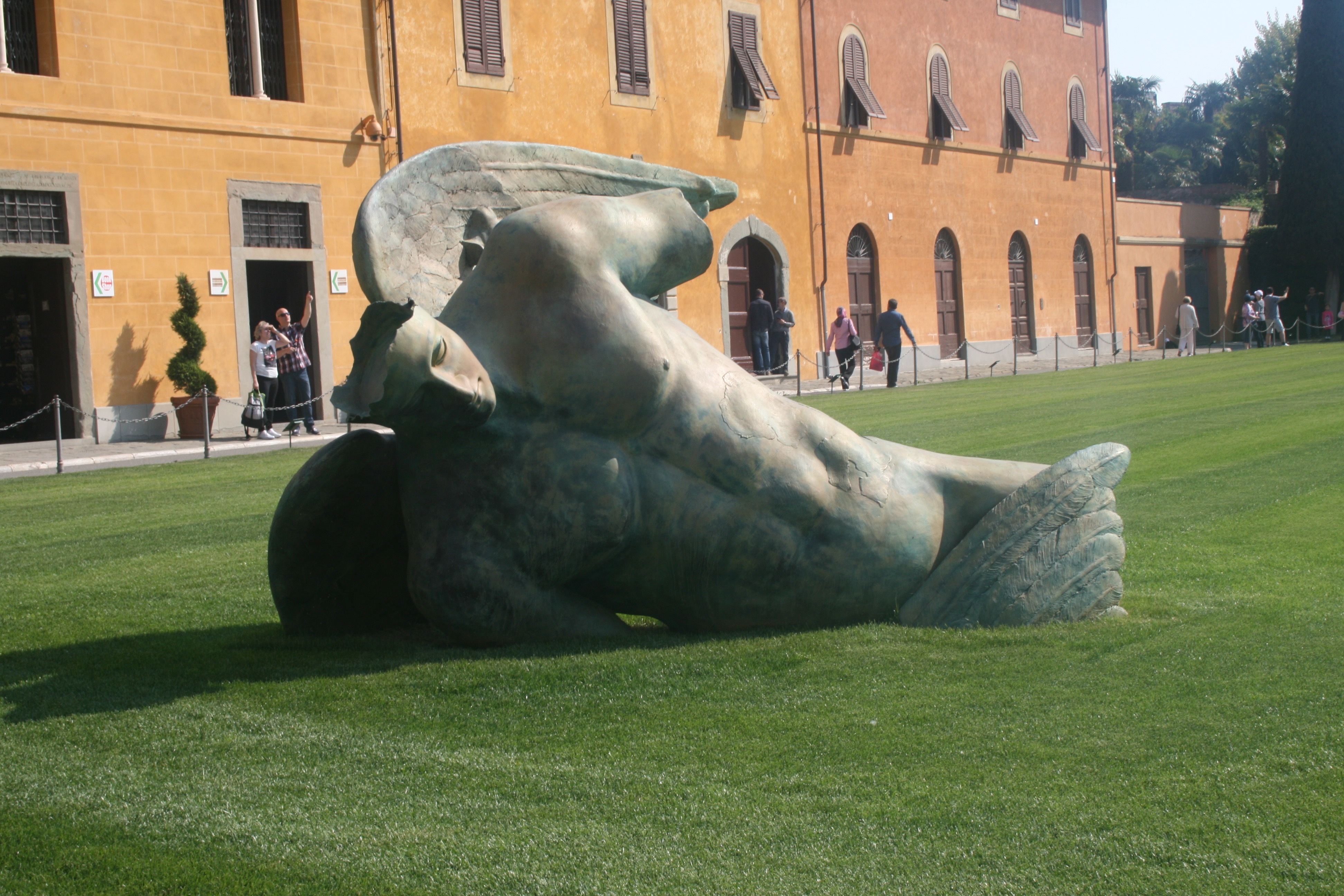
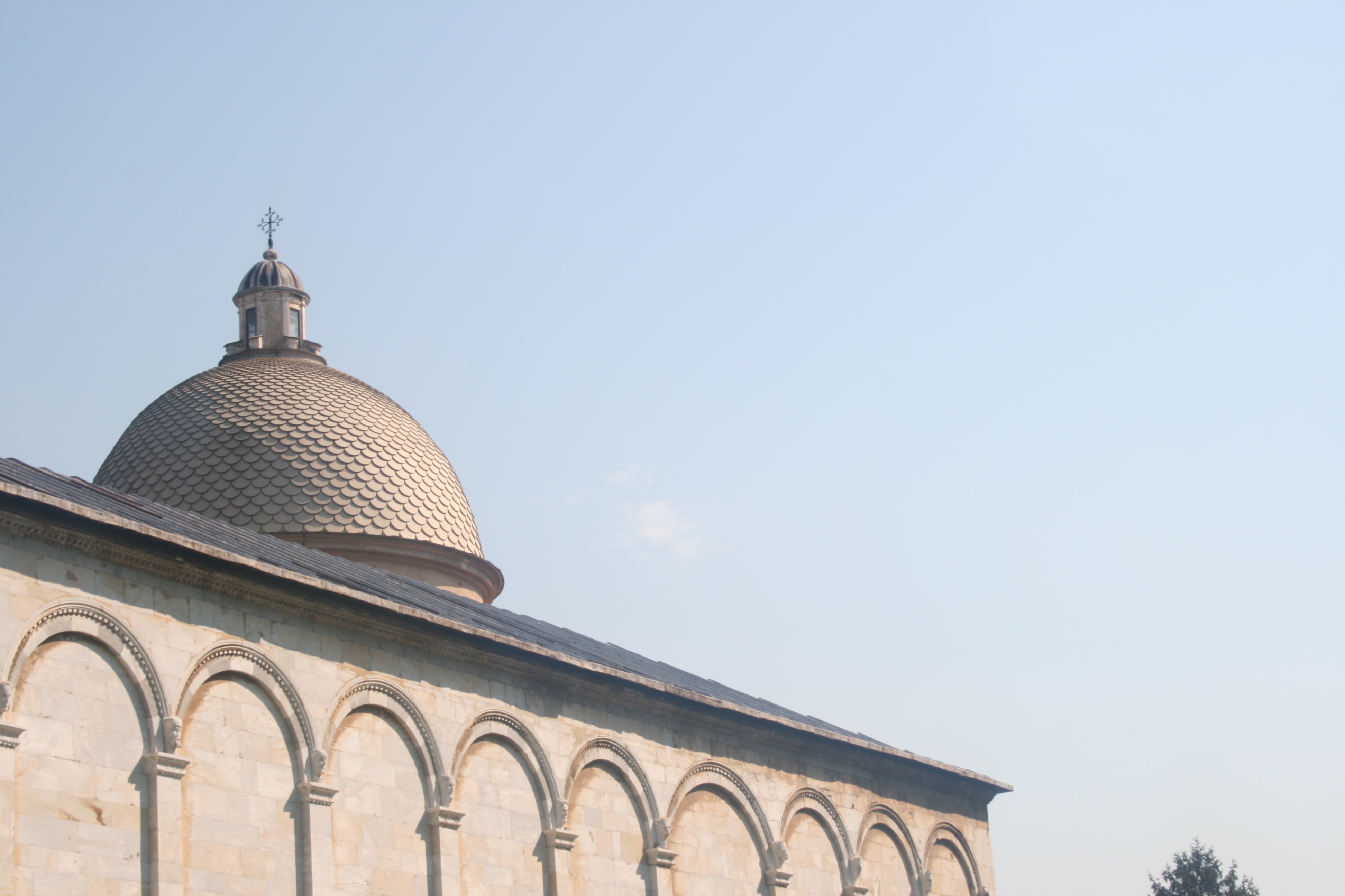
In these three photographs I have tried to capture the attractions and sites surrounding the notorious leaning tower. All these sites are located within The Square or Miracles. The Pisa tower is one of the four buildings that make up the cathedral complex in Pisa, Italy, called Campo dei Miracoli, which means Square of Miracles. The square is not located in the center of the city as you might imagine but to the north-west of the fortified wall, almost out of the town. The square is surrounded by a beautiful green lawn where tourists and university students can lie down and relax in this setting. The square is recognized as an important center of European medieval art and one of the finest architectural complexes in the world. In the first photo I have captured a statue lying beside the leaning tower. This is a fallen angel, created by the Polish artist Igor Mitoraj. Though the statue is part of a temporary exhibit, it demonstrates the square’s abilities to showpiece art work from contemporary artists across the world. The reason I have selected this image is because I believe it will be perfect for illustration and drawing. Due to the fact that the fallen angels limbs and other body components are missing, I am provided with the opportunity to implement new ones. I can draw my own arms or perhaps implement some religious imagery throughout the background.  In the second photo, I have captured a tiled dome peaking over the top of the square walls. I discovered that this dome is situated within the square graveyard, otherwise known as the Camposanto. The graveyard is an ancient monumental cemetery set on the north side of the Square of Miracles. Begun in 1277 by the architect Giovanni de Simone, it is a rectangular structure with an inner cloister with Gothic arcades. As ancient tradition would have it, the graveyard was built on dirt carried back from the Holy Land, in particular from the place where Jesus was crucified. Within the cloister you’ll find many sarcophaguses and Roman graves, used exclusively for the burial of prestigious men, while beneath the floor are graves of the nobles of Pisa. I really like this photo, and I think its simplicity works to an advantage.  Nevertheless, I do think the exposure could be reduced a little in the editing stage and this will be executed if I decide to utilise this image in further stages of the project. The photo has a very minimalistic aesthetic as the clean and crisp sky dominates the composition. This will be ideal as it provides a blank canvas for me to illustrate upon. I really like the way that the graveyard dome is only just peaking over the square walls. Its almost a reminder that death is always a part of life and that it cannot be ignored nor forgotten. Despite the beauty and life symbolised through the inner square, death lingers within the background, watching. 

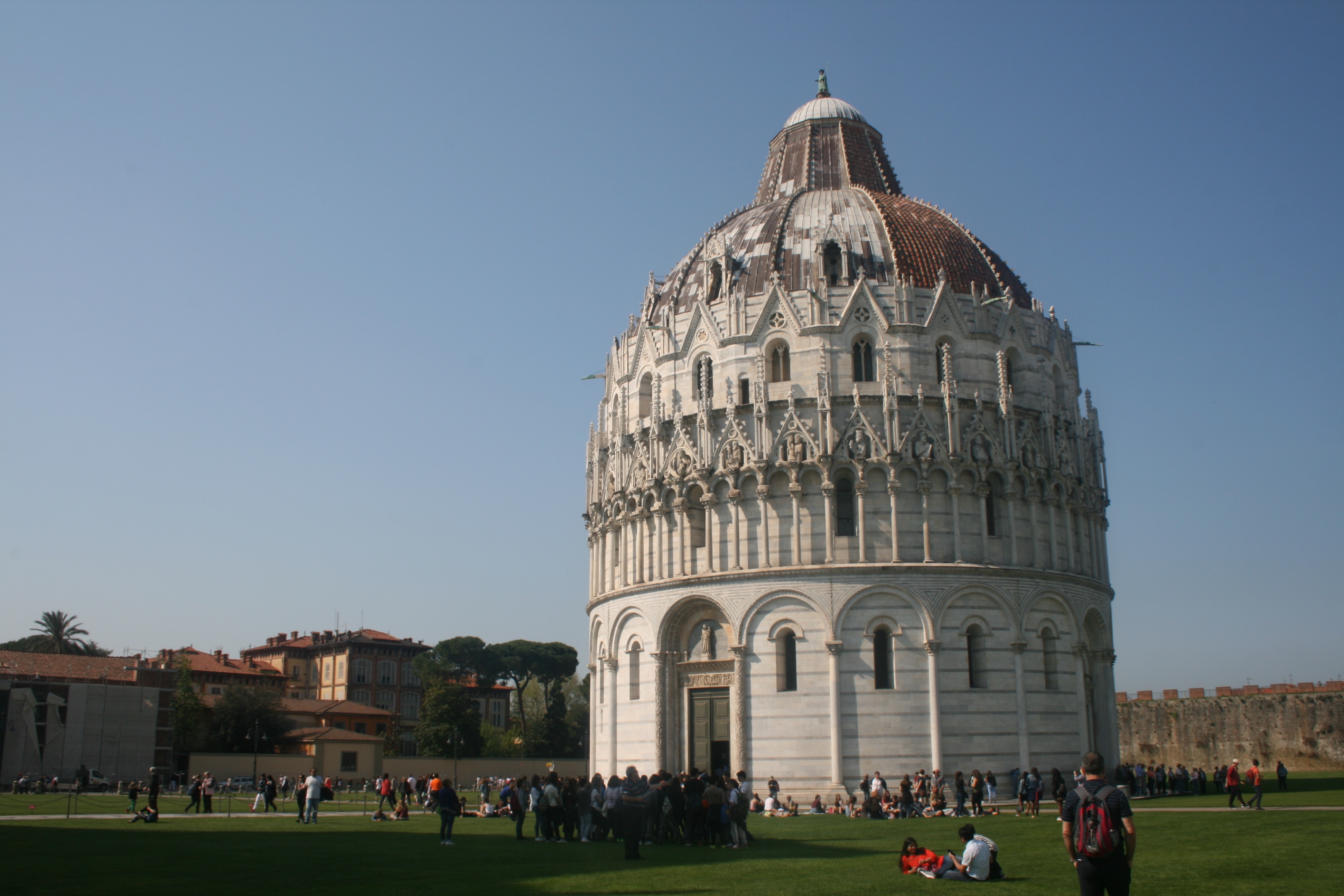
In the final photo of the set, I have captured The Baptistery of St. John. Construction started in 1152 to replace an older baptistery, and when it was completed in 1363, it became the second building, in chronological order, in the Square of Miracles. The building is the largest baptistery in Italy and an example of the transition from the Romanesque style to the Gothic style.  The lower section is in the Romanesque style, with rounded arches, while the upper sections are in the Gothic style, with pointed arches. The Baptistery is constructed of marble, as is common in Italian architecture. As it shares the same unstable ground as the tower, the baptistery also has a slight lean of 0.6 degrees towards the cathedral. I found this baptistery really beautiful and am happy with the photo I have taken of it. There is an attractive sense of light and dark as we the find  details of the architecture pop into the foreground. I really like how the light source is coming from the left side and it consequently casts one side of the baptistery in light and the other in darkness. The sky works in cooperation with the image here as an absence of clouds and colourful blue tone makes the building more prominent within the landscape. 

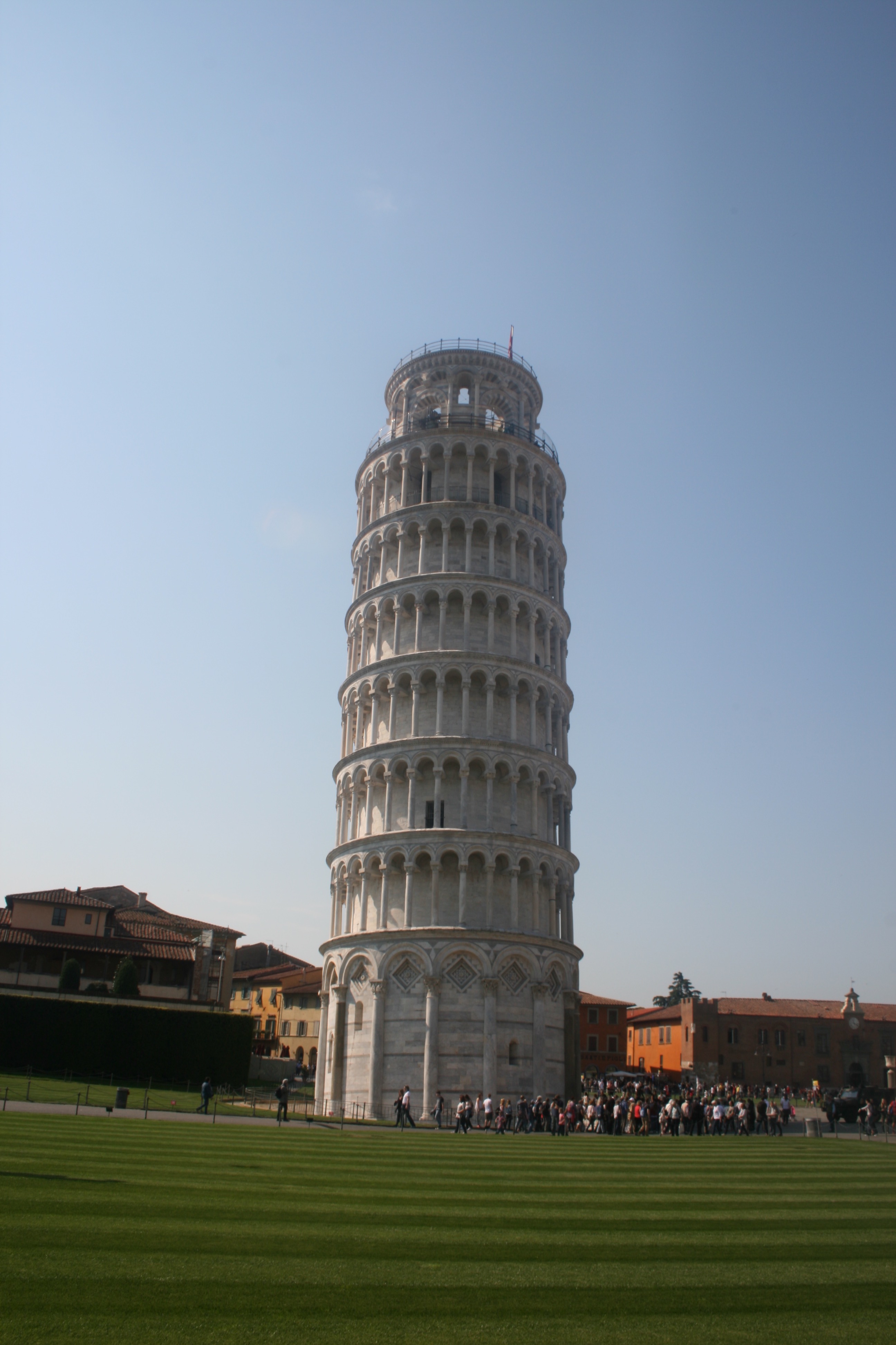
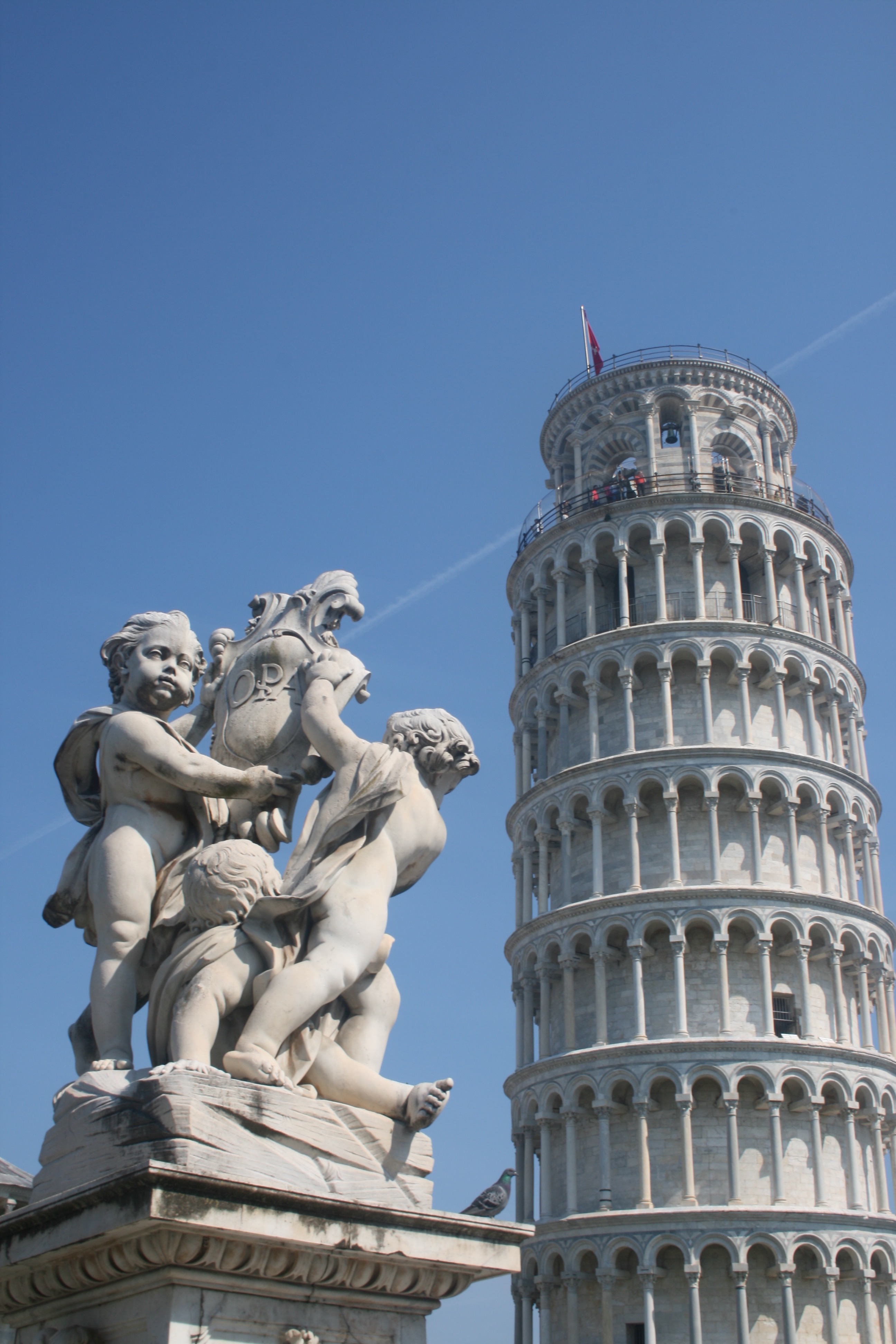
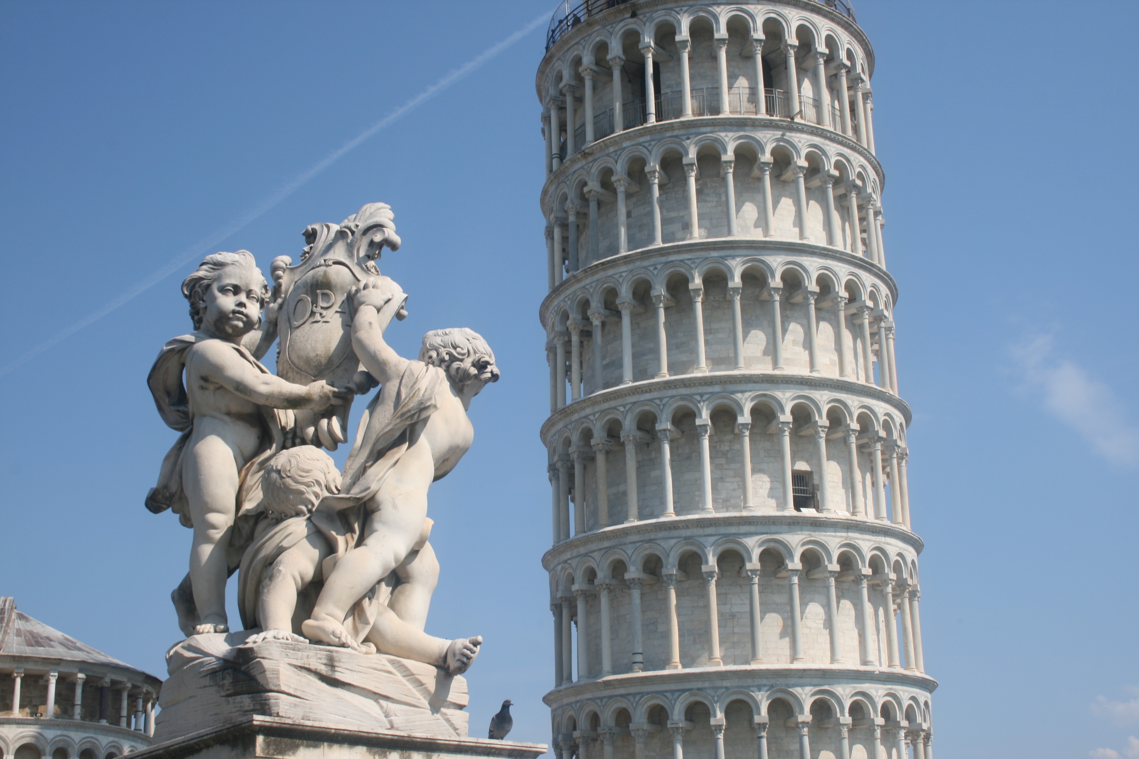
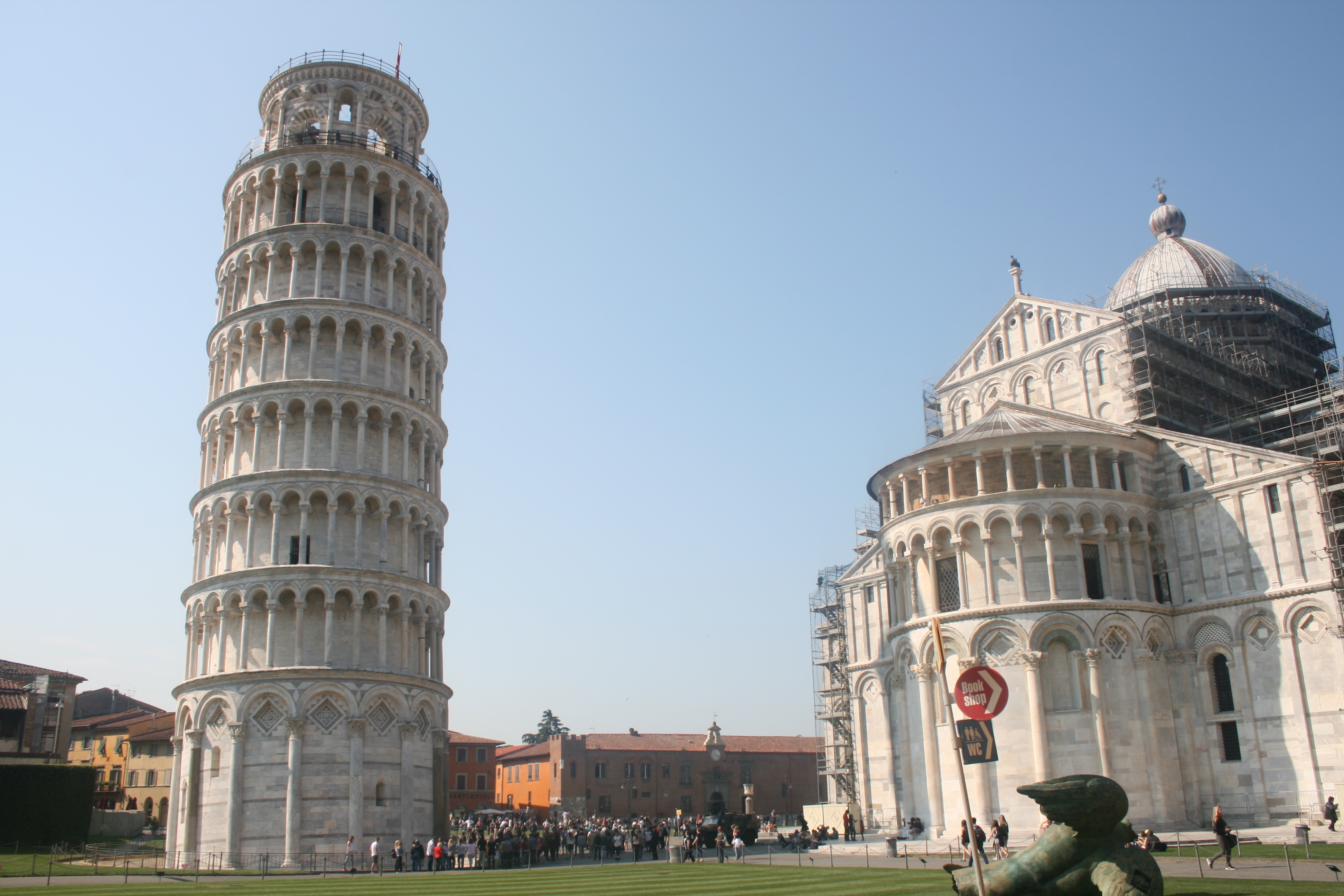
Next, we have the images that focus primarily and almost entirely on the famous Leaning Tower. Tower of Pisa is more accurately referred to simply as the bell tower, or campanile. The Leaning Tower of Pisa is the piazza’s crowning glory. Although only a third as high as the Washington Monument, it was a miracle of medieval engineering, probably the tallest bell towers in Europe. With the spiralling exterior columns ranged around eight stories, I found that the tower of Pisa looks like a massive wedding cake. The construction of Tower of Pisa began in August 1173 and continued for about 200 years due to the onset of a series of wars.The top of the leaning tower of Pisa is about 17 feet off the vertical and the tower is also slightly curved from the attempts by various architects to keep it from leaning more or falling over.Many ideas have been suggested to straighten the Tower of Pisa, including taking it apart stone by stone and rebuilding it at a different location. In the 1920s the foundations of the tower were injected with cement grouting that has stabilized the tower to some extent. In the first image, I have tried to capture the tower individually. Although the horizon line needs to be straightened, I like the image and think it would be suitable for illustration. The tower holds a cylindrical shape that exists frequently in everyday life and ordinary objects. This will make it easy to transform the tower into something mundane. The next two photos share a nice sense of depth and perspective. There is a clear perception of dimension with immerses the viewer. Both photos are essentially the same, except one is landscape in orientation and the other is portrait. The benefit of the portrait is that we can get a complete spectacle of the tower, allowing us to see its peak. As a result, I prefer this version of the image. In addition to this, there is also a small pigeon sat upon the statue that is more identifiable within the first photo. In the final photograph, I have tried to capture both the Tower and the Cathedral. Pisa Cathedral is a medieval Roman Catholic cathedral dedicated to the Assumption of the Virgin Mary, in the Square of Miracles in Pisa.  It is a notable example of Romanesque architecture. Construction on the cathedral began in 1063 by the architect Buscheto, and expenses were paid using the spoils received fighting against the Muslims in Sicily in 1063. The church was erected outside Pisa’s high middle age-era walls, to show that Pisa that was so powerful, it had no fear of being attacked. I like this photo and feel like it a complete overview of the square and what to expect from Pisa. The marble of both buildings beautifully reflects the natural sunlight rendering both sites as bright and powerful in lighting.

Shoot 3 – Rome

On the next day of my travels, I visited the capital of Italy, Rome. Rome was once the cradle of one of the globes greatest civilizations ever, and is a historic centre of power, culture and religion. The city has exerted a huge influence over the world in its roughly 2800 years of existence. With wonderful palaces, churches, grand romantic ruins, monuments, ornate statues and fountains, Rome has an immensely rich historical heritage and cosmopolitan atmosphere, making it one of Europe’s and the world’s most visited, famous, influential and beautiful capitals. I was incredibly excited to visit Rome as I am fascinated by history and have read and consumed so much material about this famous city. I had desperately wanted to the visit Rome for many years and was excited to take some photographs upon my visit. I had to remember and consider my project idea, which was to produce work that could be utilised as a backdrop for external illustrations. This would involve focusing on elements such as lighting whilst maintaining a direct focus on the city itself and trying to capture the atmosphere and style. Below, I have included a contact sheet of all photographs taken on the shoot . 

Rome is traditionally said to have been founded by the mythical twins Romulus and Remus on 21 April 753 BC. The twins were abandoned as infants in the Tiber river and raised by a wolf before being found by a shepherd, who raised them as his own sons. The settlement developed into the capital of the Roman Kingdom, led by a series of Etruscan kings, before becoming the seat of the Roman Republic and then the centre of the Roman Empire. For almost a thousand years, Rome was the largest, wealthiest, most powerful city in the Western world, with dominance over most of Europe and the Mediterranean Sea.  Even after the fall of the Western Roman Empire in 476AD, Rome maintained considerable importance and wealth. Beginning with the reign of Constantine I, the Bishop of Rome gained political and religious importance, establishing the city as the centre of the Catholic Church. Throughout the Middle Ages, most of the city’s ancient monuments fell in disrepair and were gradually stripped of their precious statues, ornaments and materials; these were either recycled in other constructions or, as in the case of marble, baked in order to obtain mortar for new buildings. With the Italian Renaissance fully under way in the 15th century, Rome changed dramatically. Extravagant churches, bridges, and public spaces, including a new Saint Peter’s Basilica and the Sistine Chapel, were constructed by the Papacy so that Rome would equal the grandeur of other Italian cities of the period. The city became the centre of Baroque architecture, renowned artists such as Michelangelo, Bernini and Caravaggio worked there. 

To summarise my experience, Rome exceeded my expectations and I was amazed by the appearance and design of the city. Rome is essentially a giant piece of art, the architecture and street design is articulate and decorative drawing emotion just like a painting would. You are forced to look in all directions just due to the sheer amount of history and culture that constantly surrounds you. On every street corner you are confronted by another church or monument with its own individual story and history. It felt like a city where life was built around the history, monuments and ruins rather than on top of it. There is a beautiful combination of old and new which creates a vivid contrast. Nevertheless this juxtaposition feels natural as the aesthetic of the city is maintained throughout and no building looks out of place. Architecturally and culturally, these contrasts are shown through areas with pompously huge majestic palaces, avenues and basilicas which are then surrounded by tiny alleyways, little churches and old houses.  You may also find yourself walking from a grand palace into a small and cramped Medieval-like street. Hopefully I captured this within some of my favourite images below.

— Its important to note that these images have been selectedwith the intention to develop with illustrations. They are not individually the best photographs from the shoot, but provide the best opportunities for overlaid drawings. —
These two photographs display the Arch of Constantine. This is a triumphal arch in Rome, situated between the Colosseum and the Palatine Hill. It was erected by the Roman Senate to commemorate Constantine I’s victory at the Battle of Milvian Bridge in 312. Dedicated in 315, it is the largest Roman triumphal arch. The statues at the top were taken from the Forum of Trajan. They depict Dacian captured soldiers, defeated by the Trajan army. The relief panels between the statues were created for Marcus Aurelius while the roundels are from Emperor Hadrian’s time. Some figures in the roundels were modified to resemble Constantine. The decorations on the central and lower part were created specifically for this triumphal arch. I really like these two images, despite their basic compositions. The blank emptiness of the sky really compliments the complexity of the arch design, enabling the engraving and sculptures to truly stand out. The lighting works effectively, casting delicate shadows from the details of the monument. The main reason why I selected these two photographs is because I believe they will be highly suitable for draw on top of. As mentioned before hand, the blank sky can be taken advantage of, as it provides a blank canvas for my illustrations. Perhaps some Roman history can be incorporated within the artwork.

These 4 Photographs are very different from the remaining shoot, as they are portraits. Here, you can see some images that I captured of my sister as we travelled throughout the city. I think that its always a positive to obtain variety within a portfolio and implementing a few images that break the trend of landscapes can be effective. The portraits incorporate more of a personal feel to the project as I begin to integrate my life, friends and interests within the work. It provides the photography with personality as it becomes unique to me. If my travels through Europe are being presented as a story, the audience is now supplied with characters within the narrative. This assists significantly with story-telling. In the first two photographs, we see closeups of my sister, one outside the Colosseum and one outside the Vatican. Both these photographs retain a fun and youthful aesthetic, as portrayed through facial expressions. The happiness upon the subjects face can reflect upon the viewer consequently evoking cheerful emotions. I really like the reflective imagery within the subjects sunglass lenses as we see the surrounding environments duplicated and presented back to us through these small, distorted viewing-holes. For example, within the first photo we can identify the Arch of Constantine inside the left frame and myself in the right. A full perspective of the scene is shown. A similar effect is replicated in the next photograph, where you can see the statues within St Peters Square and myself reflected on the glass. The 3rd photograph features a slightly different composition, where we get a more enhanced look at the surrounding environment as well as a portrait. Whilst my sister is in the foreground, the background is occupied by St.Peters Square and the Saint Statues. St. Peter’s Square is one of the largest and most beautiful squares in the world. It is located in Vatican City, at the feet of St. Peter’s Basilica. The final photo is very different from the rest, as I attempted something peculiar and new. In this image, I have photographed my sisters phone capturing my reflection in the front-camera. The image itself is not very interesting, but I think I could create something unusual with additional illustrations. The phone surface presents me with a canvas that is in direct view of the audience.

These 4 photographs are more casual, displaying less grand sites. Moving away from monuments, churches and ruins, for the first two photographs I have directed my attention towards ordinary streets and alleys. I wanted to capture average Roman lifestyle as oppose to the landmarks and tourist attractions that we are accustomed to viewing. Both photographs are simple, but as explained previously, this is perfect from digital manipulation and editing, which is why they have been selected. Both images share an appealing colour palette, the oranges and cream-painted walls evoking a warm and European ambience. We get a summery feel from these images which I like. In the first photo, the uniform, organised layout of windows creates a sense of satisfaction, as we see the blinders, open and closed, line the walls of the street. I like the texture of the wall, the paint beginning to fade and crack suggesting a sense of imperfection that is also present in the second image. I thought that the first photo would provide a fantastic opportunity to draw something within the open window in the foreground. Perhaps a resident within the room or a romantic balcony interaction.

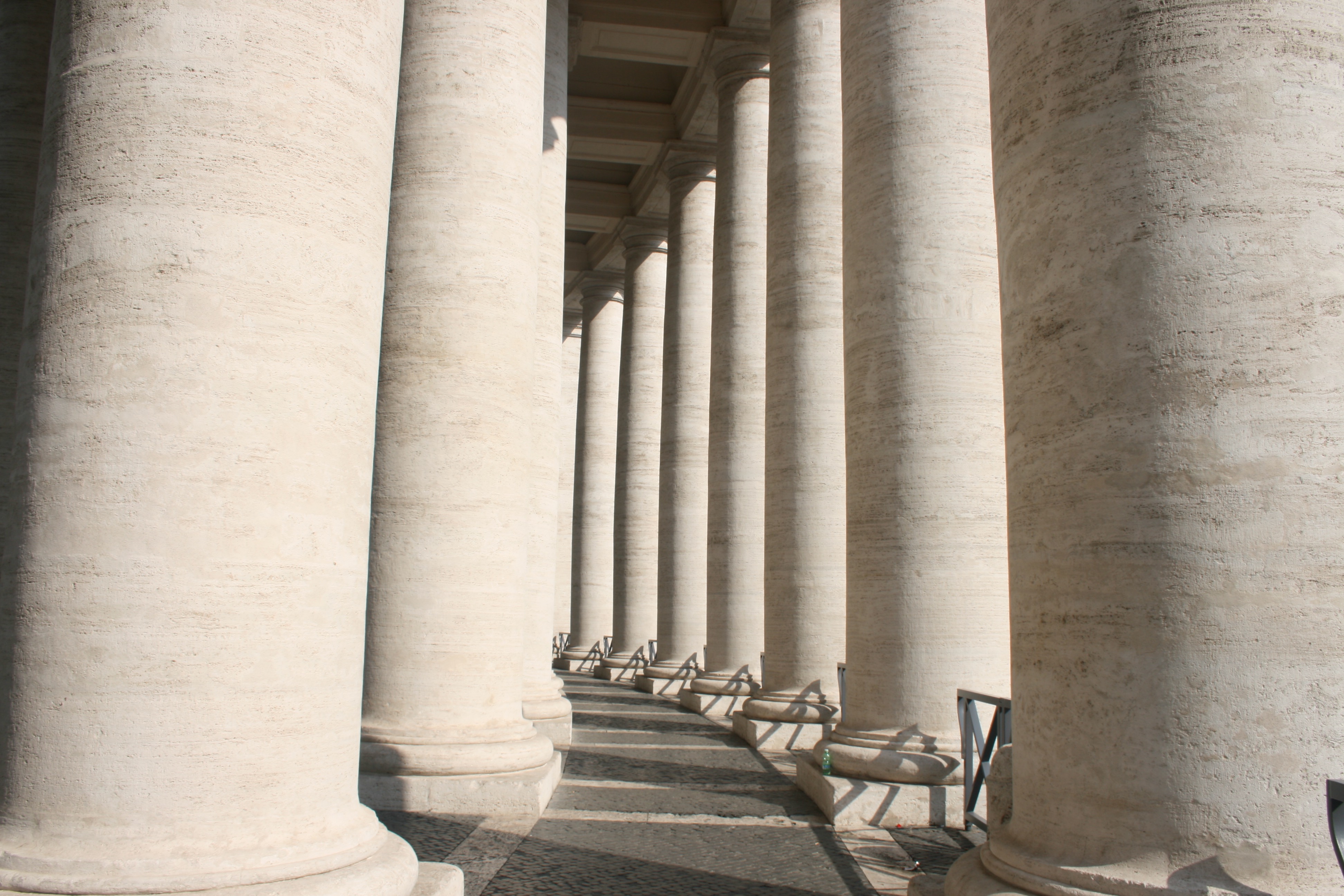
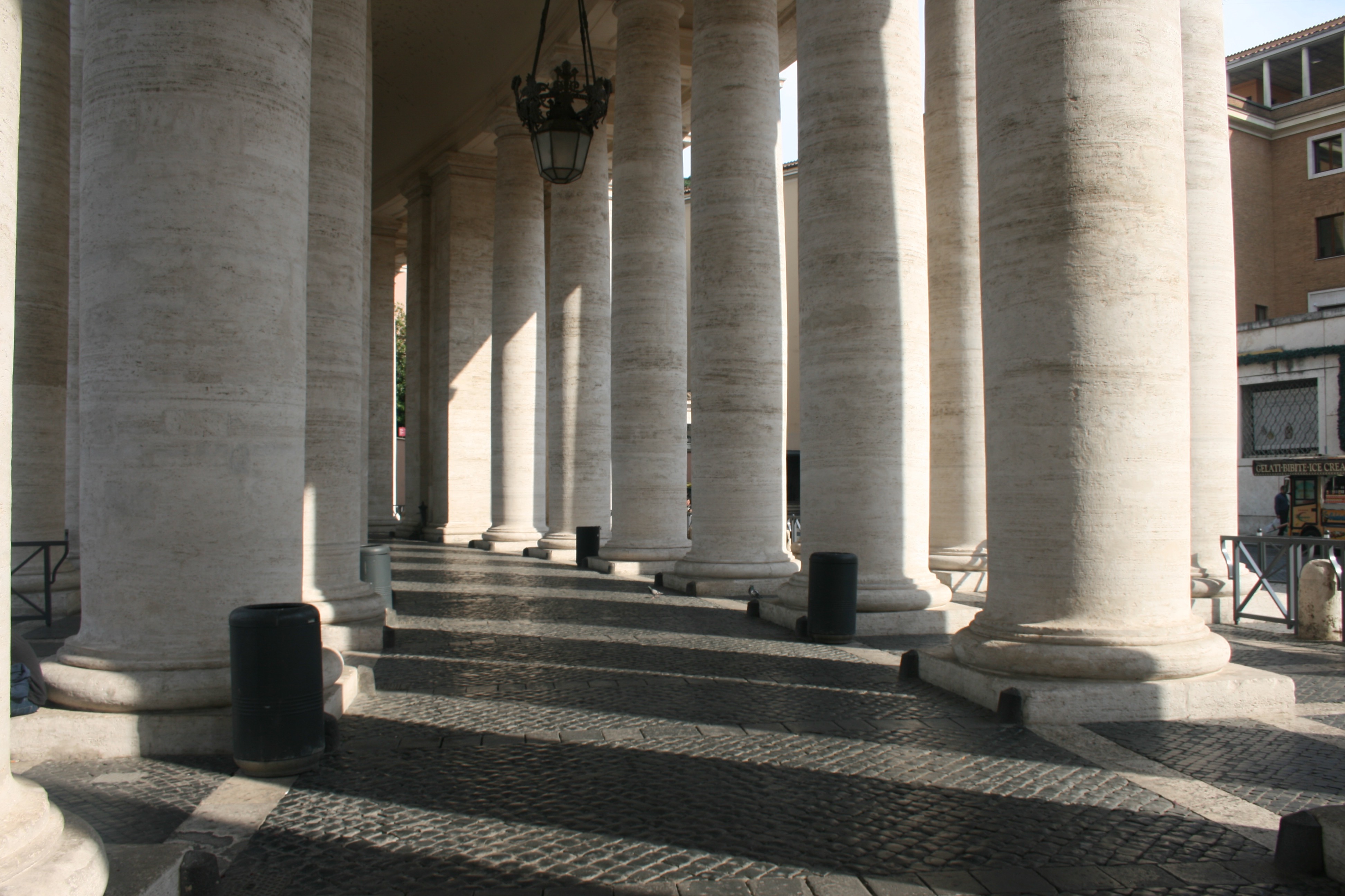
In the next two, I have captured the Colonnades that enclose St. Peters Square. The colonnades define the piazza. I really like these two photographs, the lighting working very effectively to create a domino-like effect. We see the large, marble columns spiral around the corner out of sight which leads the eye throughout the composition of the photo. There is a great balance of light and dark here, splitting the image into separate segments. Furthermore, another beautiful lighting display is presented on the clean brick floor as a zebra-crossing effect is created. The shadow of each pillar generates a striped pattern which is quite intriguing. 

In these 3 photographs, I have tried my best to experiment with lighting, focusing on light and dark rather than direct content. The first photograph, again, depicts the Saints Statues within St. Peters Square. These Statues that lay ontop of the Collonades were directly infront of the sun, and consequently created some beautiful, angelic silhouettes. The way in which we are looking up to the Saints from a Low angle, almost creates some religious imagery as they appear to be above us in heaven. This is supported the the bright sunlight behind them that shines into the camera suggesting an opening in the sky. This photograph came out really well and I think it is one of the most successful pieces from the shoot. The following two photographs were taken within the Pantheon. The Roman Pantheon is the most preserved and influential building of ancient Rome. It is a Roman temple dedicated to all the gods of pagan Rome. As the brick stamps on the side of the building reveal it was built and dedicated between A.D 118 and 125.The original use of the Pantheon is somewhat unknown, except that is was classified as a temple. However, it is unknown as to how the people worshipped in the building, because the structure of the temple is so different from other traditional Roman temples.Probably one of the most fascinating features of the Pantheon is the Architecture. The dome would have been built to look like the heavenly sphere of all the gods that the name Pantheon evokes. The highlight of the site is the hole in the center of the domed ceiling, otherwise known as an oculus. This was an engineering gem of the Roman world. No oculus had even dared come close in size to the one in the Pantheon. It is still lined with the original Roman bronze and is the main source of light for the whole building. This was one of my favourite sites within the city and I wanted to include this magnificent oculus within my project. Consequently you can see it present within the second photograph which is quite abstract. I have stood directly below the hole in the ceiling and pointed my camera upwards, capturing the leaking light. This photo provides me with many illustrative opportunities to experiment with when I start drawing due to its abstract visuals. The final photo of this set is a statue of St Agnes. I like the way the lighting submerges the statues top half in shadow and the way in which a smooth texture has been included over the subjects clothing.

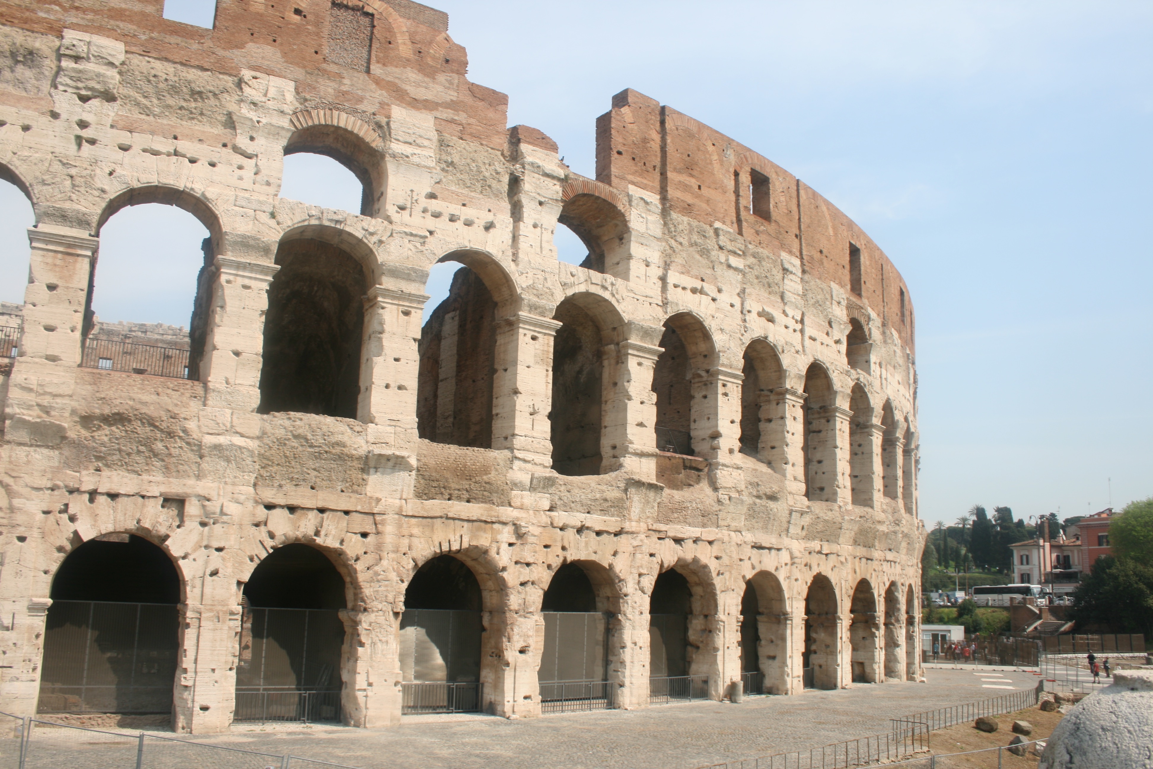
Finally, I have my photographs taken from my visit to the famous Colosseum. Located just east of the Roman Forum, the massive stone amphitheater known as the Colosseum was commissioned around A.D. 70-72 by Emperor Vespasian of the Flavian dynasty as a gift to the Roman people. In A.D. 80, Vespasian’s son Titus opened the Colosseum–officially known as the Flavian Amphitheater–with 100 days of games, including gladiatorial combats and wild animal fights. After four centuries of active use, the magnificent arena fell into neglect, and up until the 18th century it was used as a source of building materials. Though two-thirds of the original Colosseum has been destroyed over time, the amphitheater remains a popular tourist destination, as well as an iconic symbol of Rome and its long, tumultuous history. The Colosseum could hold, it is estimated, between 50,000 and 80,000 spectators. It was used for gladiatorial contests and public spectacles such as mock sea battles, animal hunts, executions, re-enactments of famous battles, and dramas based on Classical mythology. The building ceased to be used for entertainment in the early medieval era.

I think it is integral that I include the Colosseum within my project and study on Rome. This is due to my belief that it is the most famous building within the city and therefore Representative of its history and culture. I have tried to include a nice variety of responses for this landmark as seen above. The first image would be ideal for the drawing stage due to its simplicity and basic composition that would provide me with more freedom when drawing. Some kind of artwork could easily be implemented within the blank sky or upper quarter of the architecture due to its lack of texture or detail.  The photo is not fascinating but will serve effectively in its complete purpose. The second image is more generic and what we would typically expect from Colosseum photography. The picture features a full survey of the scene and we can admire the arena in its full beauty. Given that the site is so recognizable and identifiable within this photo, I think it would be ideal to consider it for further development. And then finally, I have taken a slightly different photograph that moves away from the grand, imposing scale of the stadium and focuses more on the mundane interior details. We see an archway entrance that reveals the colosseum interior like a window. The main focal point of this image is the lighting which works effectively due the way in which light is seeping through the archway and generating crisp silhouettes.

Shoot 2 – Pompeii

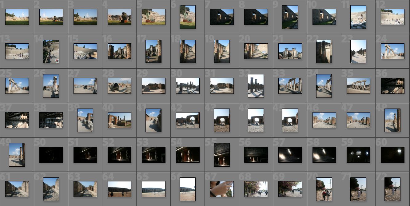
For my second day travelling, I visited Pompeii, an ancient-roman city near modern day Naples. Pompeii, along with Herculaneum and many villas in the surrounding area, was mostly destroyed and buried under volcanic ash in the eruption of Mount Vesuvius in 79 AD. Pompeii is one of the most significant proofs of Roman civilisation and, like a book, provides outstanding information on the art, customs, trades and everyday life of the past. The city has remained intact until the present day, not only as far as its buildings are concerned, but also as regards the contents inside the houses and shops, providing a fascinating picture of daily life.

This was a fantastic location to visit, and provided me with lots of photographic opportunities that I did not expect. I was extremely surprised by the scale of the ancient city, as I had previously believed that it was just a couple dozen ruins and small houses. Nevertheless, I was blown away by the site, confronted by intact theatres, roads, mansions and shops. This truly enables you to visualise what this city would have looked and functioned like before the disaster. The sky was clear and the sun was high in the sky, generating some beautiful shadows across the town that made excellent photograph opportunities. The goal on this shoot was to capture interesting backdrops and environments for my digital illustrations. This would involve trying to take pictures with basic compositions that are not too crowded nor hectic. Its incredibly important that the lines and marks i overlay upon these images stand out to the audience, and they must therefore not clash with the details of the photograph. In addition to this, I focused a lot on shadows and lighting. Some excellent silhouettes were being casted from the peculiar and rustic shapes of the ruins, and this is something special that I wanted to draw attention to. I believe this is evident through the images seen within the contact sheet below, which presents the photographs taken on the shoot.

Next, I will be going through a few of the best images from this shoot. These are photographs that are essentially on the shortlist for the next stage in the process, which is the drawing part. Its worth noting that these photographs are not edited and therefore do not meet their complete visual potential. I have not done this yet, as the editing should be dependant upon the nature of the overlaid artwork. I will complete this part during the illustration part.

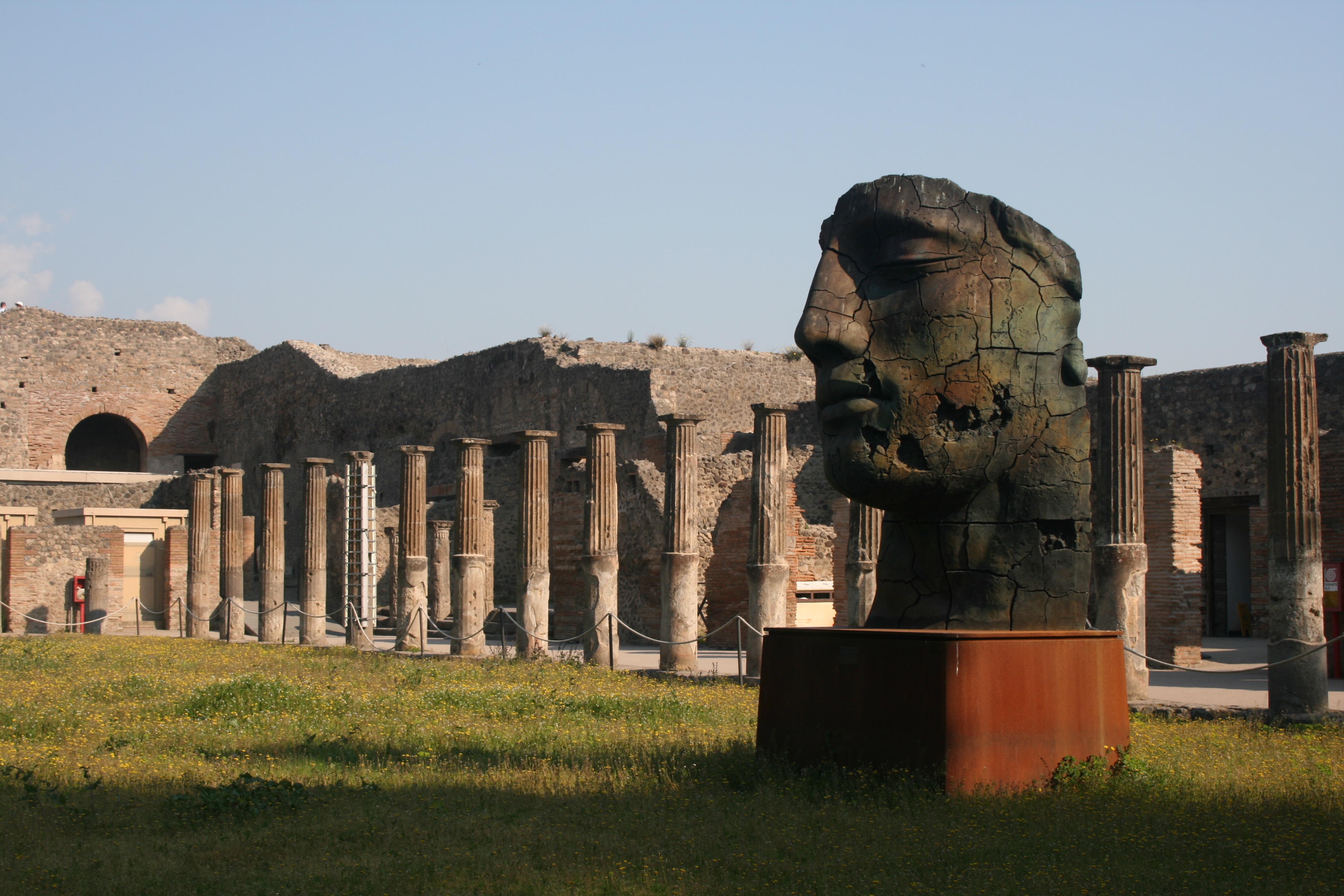
This photograph was taken within the Quadriportico dei Teatri, also known as the Barracks of the Gladiators. This part of the city was initially used for the audience to stroll and converse during intervals between acts and later as a barracks for gladiators. The portico of the Theater was built in the early first century BC, as a recreational area or shelter from the rain for the  spectators within the Great and small theatres. Nevertheless, after an Earthquake, it was completely renovated and expanded,  changing its function into a school for gladiators. I like the shot I have taken here as there is an appealing palette of colours and interesting lighting composition. The photograph features a warm set of colours, the greens and oranges of the field and blue of the sky creating a summery, positive atmosphere. The large head statue within the foreground, incorporates some interesting textures, as generating from the rusty, cracked metal. I like how we only see one side of the statues face as this produces a sense of mystery and intrigue.  In addition to this, some vivid shadows are being casted from the sunlight as we see one surface of the ruin in the background masked in darkness. Nevertheless, a contrast is made as the highlight of the sky and pillars work nicely in juxtaposition with the shadows. These pillars are a pivotal component of the photograph working extremely effectively to generate a sense of perspective. The pillars start in the foreground and as they follow the natural flow of the courtyard they lead the eye of the viewer towards to the background. Instinctively, our eyes follow the positioning of the pillars and directing us towards the arch in the background and eventually the sky. This would be a perfect place to include an illustration. 

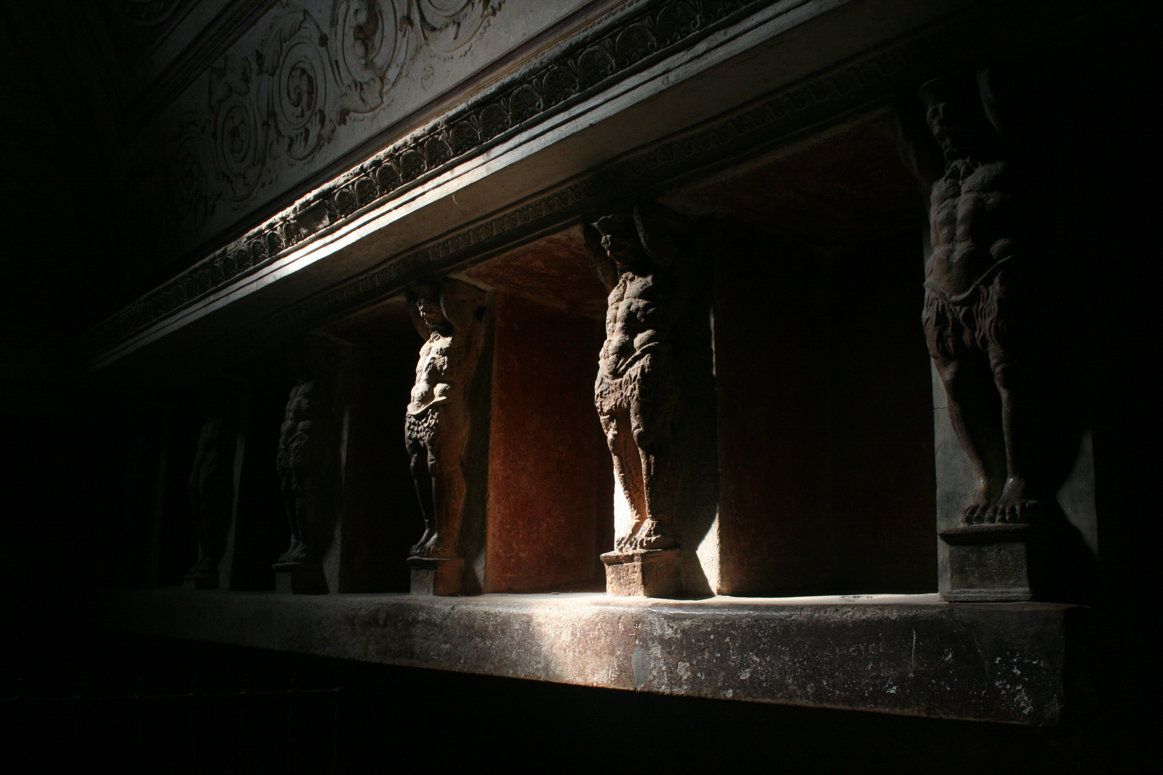
In this photograph, I have tried to capture some of the wall art within the Forum Baths. There were two separate bathing areas, one for men and one for women and there were two separate entrances. After the earthquake in 62 AD, the baths were restored and were being used again when Mount Vesuvius erupted in 79 AD. This picture shows the tepidarium or warm room of the Forum baths. The warm room was heated with hot air provided by a brazier which is at the back of the room. The walls are covered with a series of alcoves which would have been used for storing oils and other bathing accessories. These alcoves are decorated with terracotta giants holding up the architrave. You can see these sculpted figures within the photograph, lining the walls of the room. The focal point of this image is the lighting, which is dynamic and atmospheric. The room is casted in darkness, but a small leak of light that shines from the ceiling illuminates this segment of the wall, revealing the Terracotta figures. This ray of light glows upon the surface of the sculptures, highlighting the intricacies in texture as we see the powerful, carved torsos of the giants. There is an intense and compelling contrast created from this as the golden highlights clash violently with the surrounding blacks. It almost produces a heightened sense of scale as these tiny wall sculptures look like gigantic, powerful men. The fact that a lot of the content of image is shrouded in darkness, constructs a sense of mystery and fear. We see the strong muscular figures fade into the darkness as the escape the vision of the audience and camera. We are left wondering how many more live within the shadows. I really like this photograph and although it may be quite difficult, I would love to try and impose some form of illustration upon it.

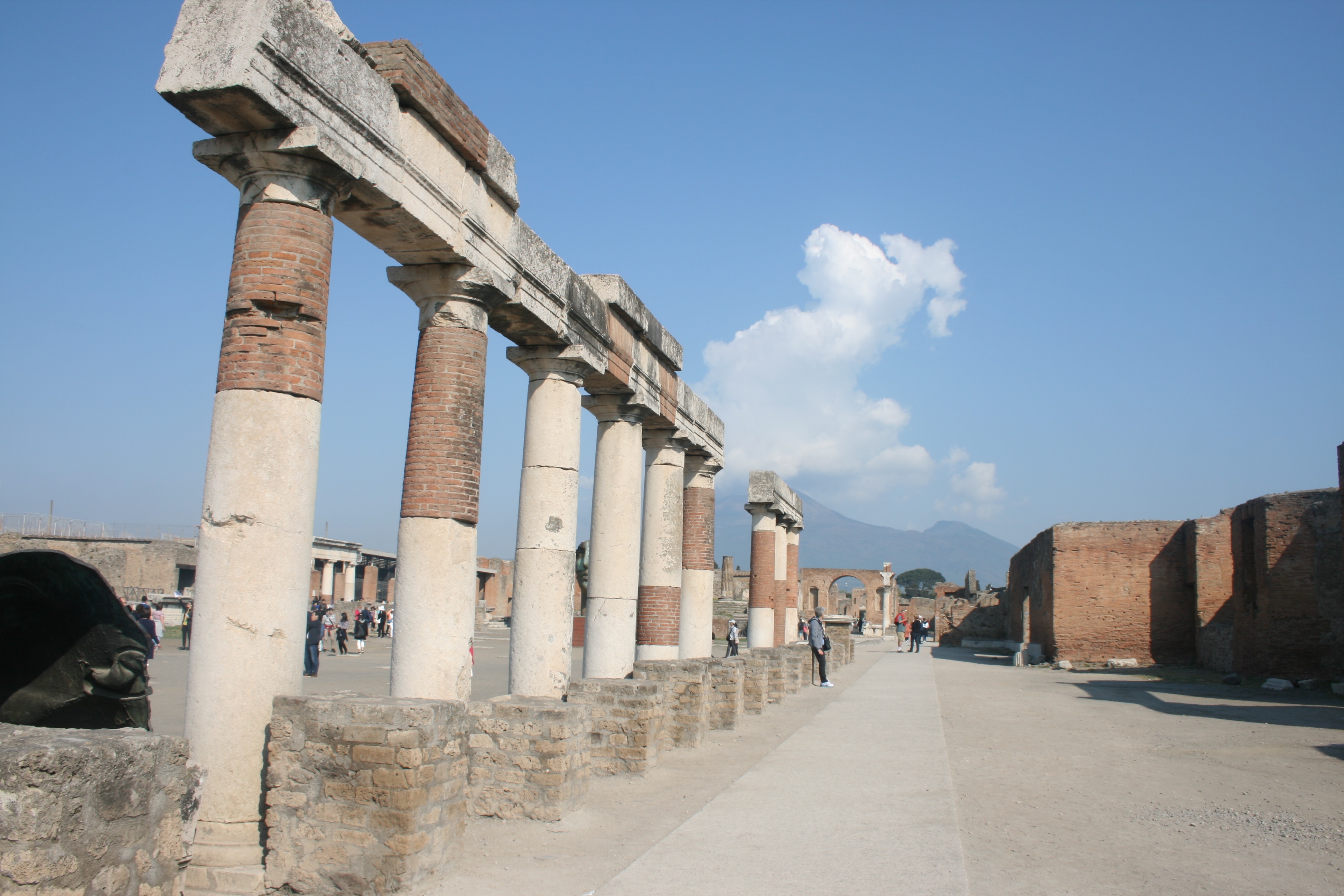
This final photograph is quite basic, but I do really like it. It is very successful in providing a response to my primary intentions, which was to capture simple and minimal environments to draw on. This part of the city is called the Forum. A huge grassy rectangle flanked by limestone columns, the Forum was ancient Pompeii’s main piazza, as well as the site of gladiatoral battles before the Anfiteatro was constructed. The buildings surrounding the forum are testament to its role as the city’s hub of civic, commercial, political and religious activity. One thing I really like about this photograph is that you can see Mount Vesuvius in the background. This was of course the volcano that erupted and destroyed the ancient city. The large cloud that is present within the photograph almost makes it look as if the volcano is erupting as it is positioned directly above the volcano peak. This creates a really though-provoking background. In the foreground we again see a clever use of pillars, as these columns lead our eye throughout the composition of the image. There is a lot of empty space for me to work with here, which is why I its a perfect photograph for my idea.

Angry Feminist – Presenting

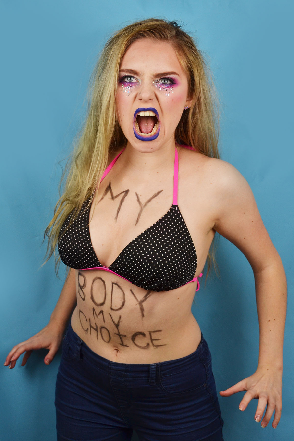
Here are my two final contrasting images displaying the stereotype of the angry new wave feminist that I supposedly conform to. The image on the right was inspired by the topless protests of the radical feminist group FEMEN and was intended to depict a snapshot of a similar protest. I selected the words “my body my choice”  to paint onto my torso because I felt that it was a slight nod to the shock factor associated with the nudity of the original FEMEN protests. I decided to use the blue backdrop for this image because of the masculine connotations of the colour blue, this side of the stereotype goes against what most people would consider to be “lady-like” as exposing your breast in public is not socially acceptable in western culture. I feel that the image captures a sense of anger, desperation, power and beauty.

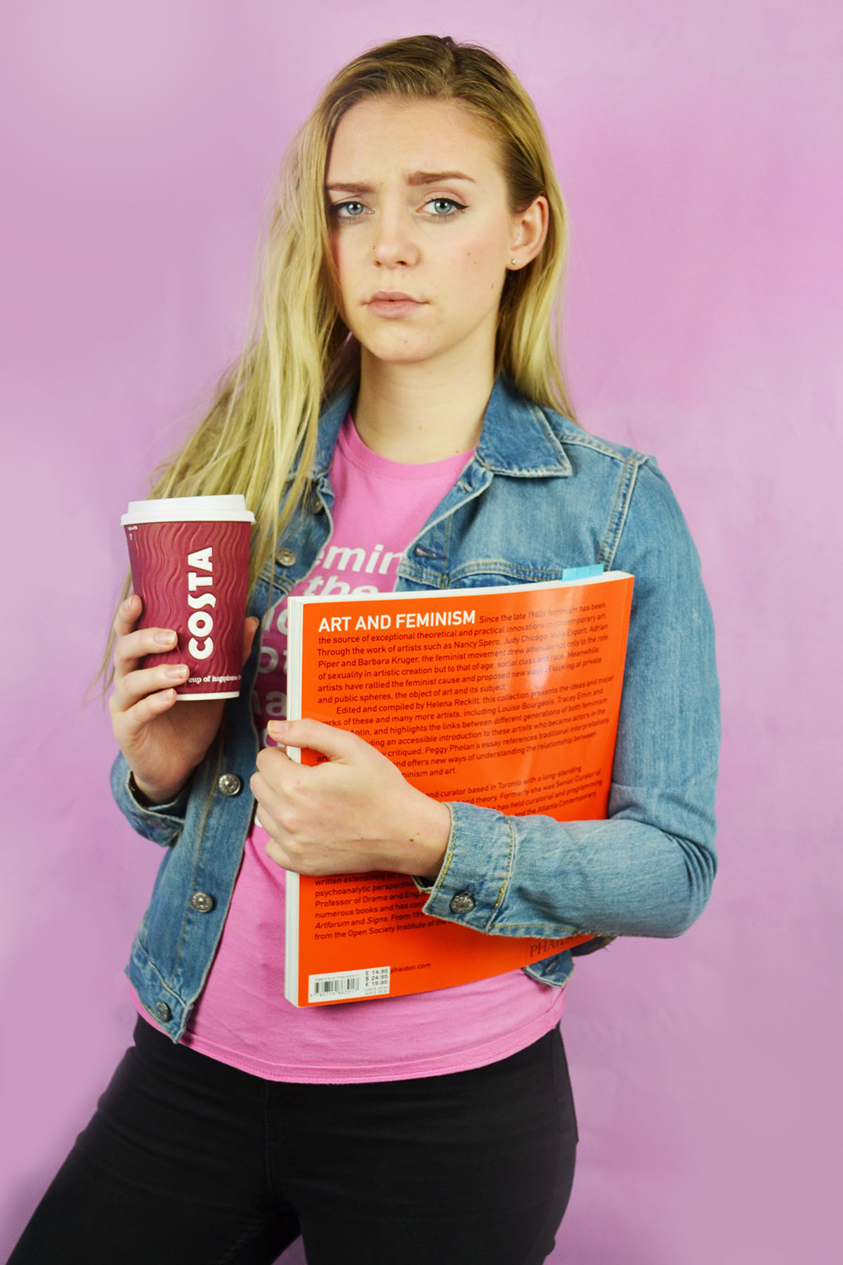
The image on the left depicts a more socially acceptable side of the stereotype. A white, middle class female student who has read a few books on feminism and feels the need to lecture anyone who conform or reinforce gender stereotypes or denies the existence of the wage gap. I created a sense of self importance by the disapproving expression and the casual inclusion of a coffee cup as a prop to give a more “young student” vibe. I decided to a pink backdrop for this image to contrast the one on the left with the blue background. Pink also has feminine connotations and this side of the stereotype is certainly more social acceptable and “lady-like” than the previous.

Reflection shoot outcomes

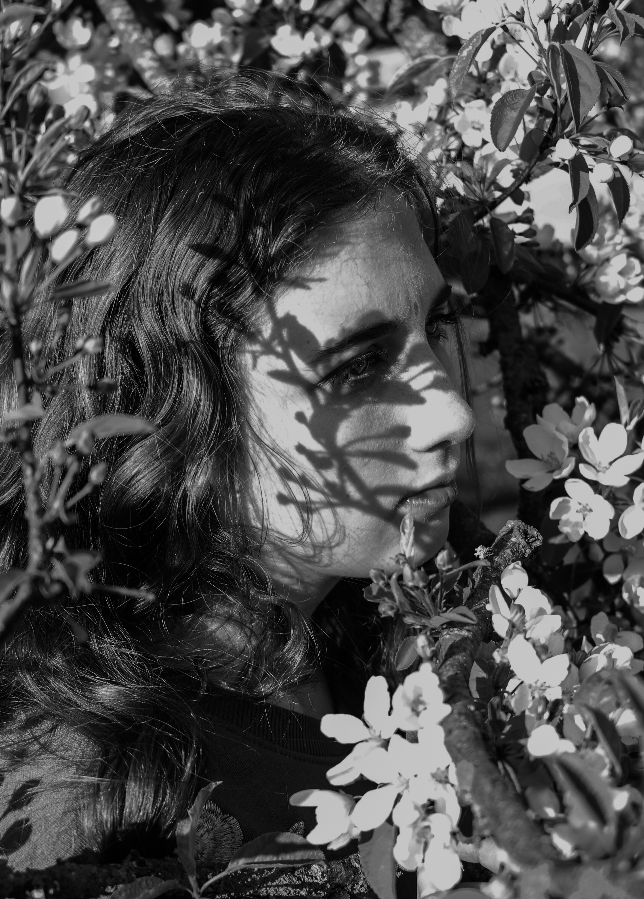
In my previous shoots exploring performance and mirrors I used myself as the subject . These images however are selected from a series of shoots I did with my sister as the model.  I think this idea could be interesting to explore further in reference to artists such as Claude Cahun and the creative collaboration with her half sister. I found these shoots easier than using myself because I was able to focus more on composing the shots especially when using the mirror because It was difficult to position  myself and the camera in order to get the reflections and angles that I wanted as well as ensuring everything was in focus. In some images I considered previous studies I have done with my sister based around classical painting and pre-raphaelite compositions. I also experimented with using a mirror on its own to reveal different sections of environments and I also photographed my sister alone interacting with the landscape for example blending in with the trees. I employed similar basic editing techniques such as cropping, black and white, colour correction and vignetting when adjusting this set of edits.


Jack Goes Outside

// J A C K PART 2 //

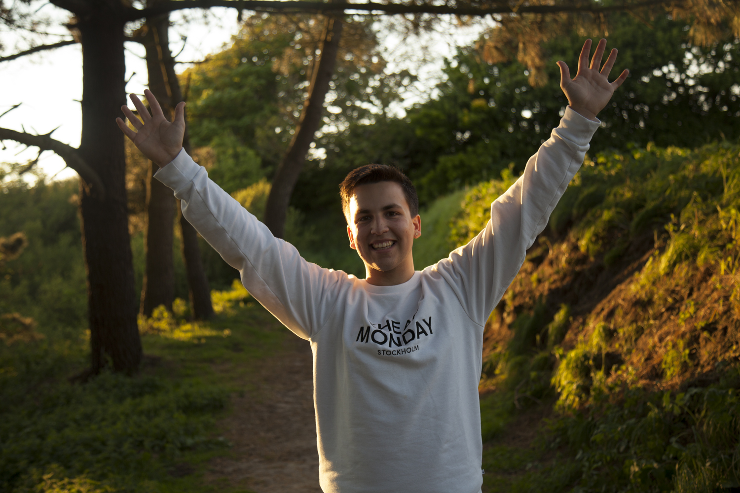
The second shoot with Jack was the external environment which was selected by the model, Jack. I asked each participant three questions before I planned out the shoots which are shown below.

Where is home for you? Why is this place home? Are your family there? Do you feel safe here? What is it that makes this particular place home?

Home is wherever my family is and a place that I feel comfortable. It normally tales me a while to settle in somewhere, but I always have family and friends and try to stay positive and surround myself with positive people. Anywhere can be home as long as I’m happy. 

What makes Jersey important to you? Do you have good memories here?

Jersey is the place I have grown up, it will always he special to me. It hasn’t always been easy, but then again it isn’t going to be easy anywhere. I have made so many amazing friends and happy memories here. I’ll never forget this lil rock and the awesome times I’ve shared here with my friends and the little adventures I took to find quiet places to relax and unwind. 

Where in Jersey holds the best memories for you? Why is it positive for you?

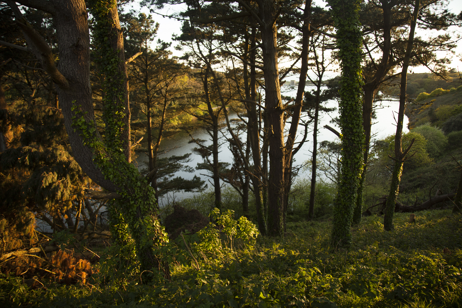
My favourite place is actually a newly discovered area. It was previously the top of the hill in St. Brelades (just beyond the wayside cafè). My mum took me up to Val de la mar reservoir and I immediately fell in love with it. There are so many paths and unique plant life in the separate areas. Parts I like most are the Australian and Japanese sections. But my absolute favourite part is just above the Japanese section where there is an incredible view over the reservoir and St. Ouen’s bay.

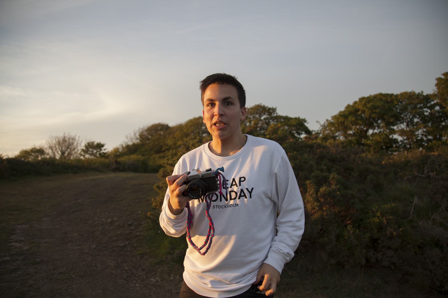
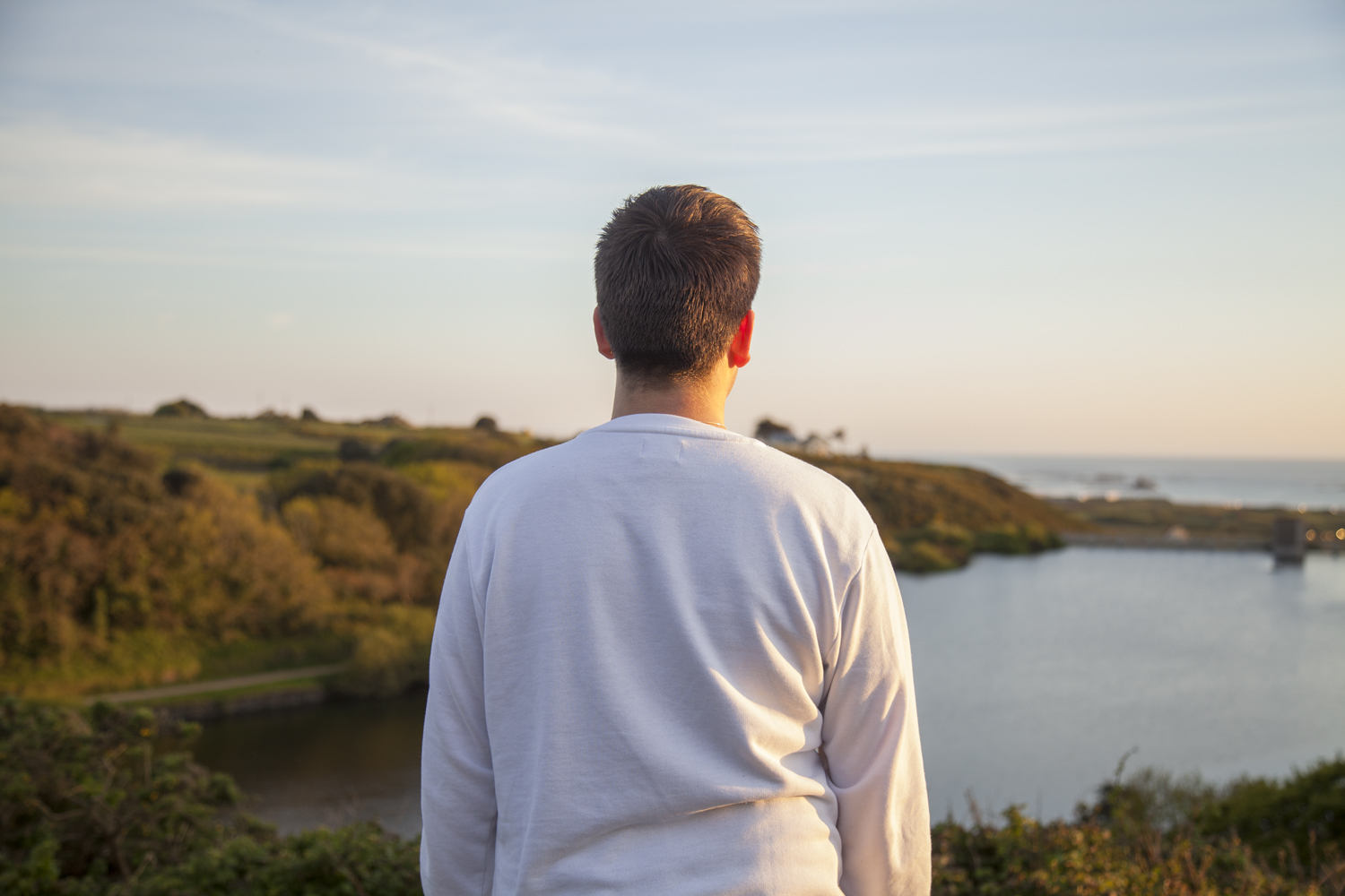
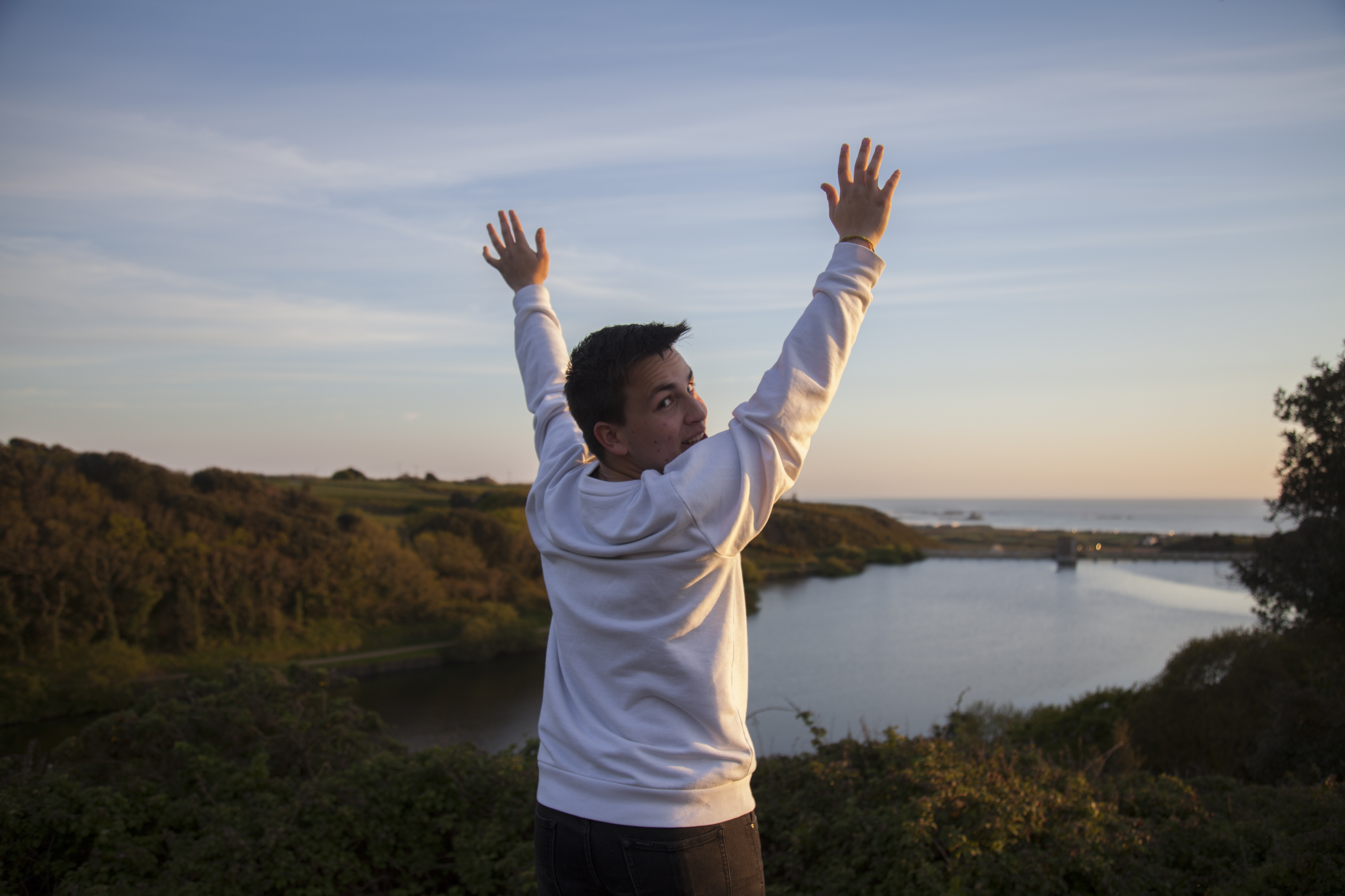
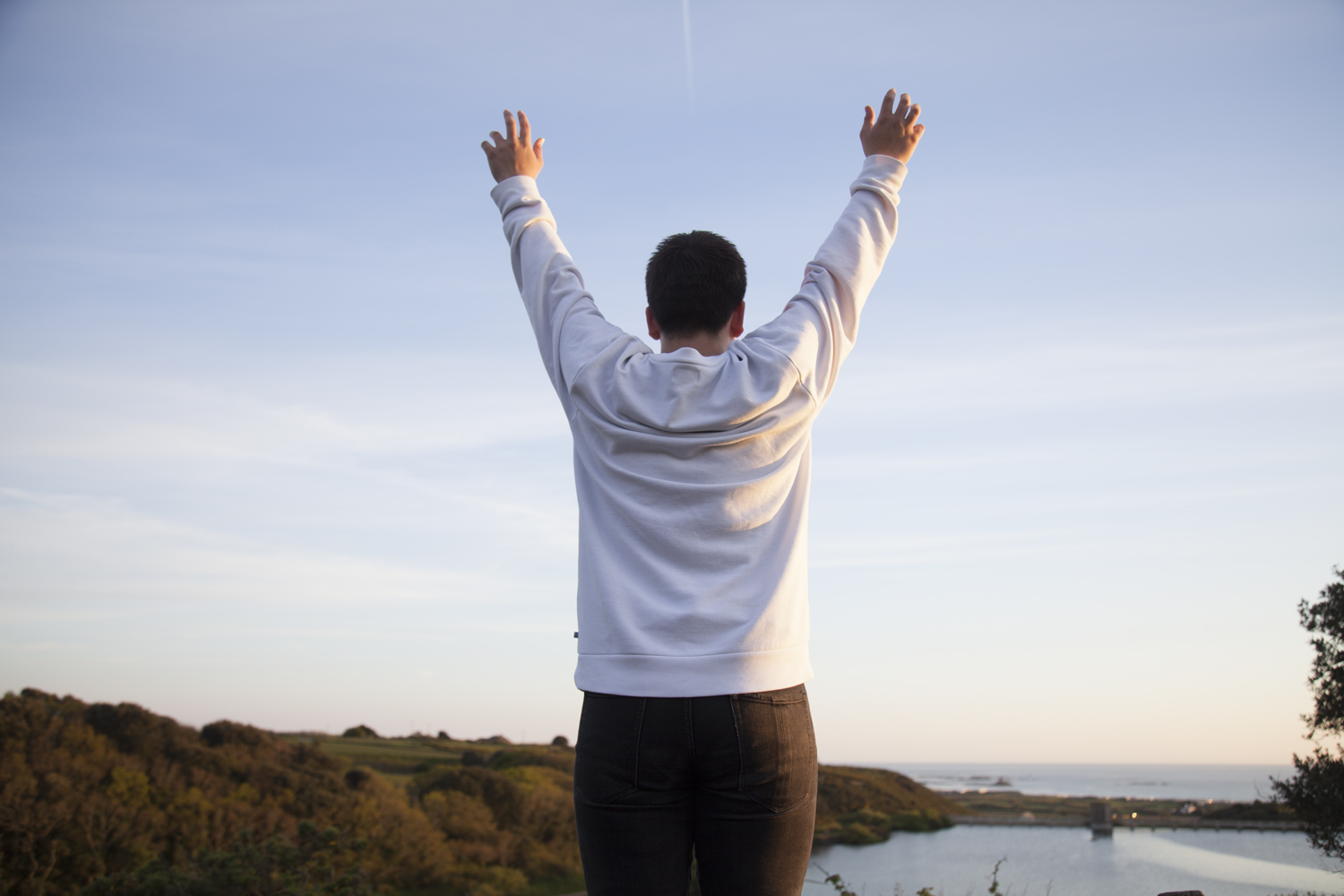
With this response from Jack to work with, we went up to explore around the area and shoot in each of the places previously mentioned. Below is a small selection from the session.

The images above are from the walk we took and show a more varied selection of photos facing different angles with changeable lighting. Below are a selection of images which might be suitable for the final picture of this project section. The portraits are stylized and feature people looking at a particular landscape from the back. details on the body are limited – so no facial features are visible – and there is a much higher emphasis on the area itself. Contrasting this with the inside portraits which feature characters looking strait on, there is a bigger focus on the environment rather than the person here.


J A C K 

The two images I have ultimately selected for this project share a continued line of similarity across their compositions and photographic structure. The first from the home shoot is exactly what I was looking for. A blank expression that shows the figure in their home environment around the things they have grown up with. For many of my models they are still in rooms which they have had since they were very young which is visible in the images. There is something surreal about the contrast between the figure and the backdrop. It is more than typical to surround yourself – and in particular your room – with things that mean the most to you. In a way these portraits are reflective not only in the character shown but also in their room which is ultimately a self portrait of their attitude and emotions.

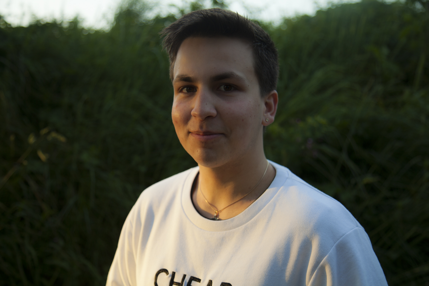
The internal shoot produced this outcome below which shows the character, Jack, sat in his bedroom at his mum’s house. There is a lot happening in the image so to highlight the central figure I adjusted – mainly through trial and error – the lighting and curtains in order to alter the natural highlights produced across  the face. The duvet and blankets mirror several of the colours featured in the background a

Theo Gosselin

Born near Le Havre in Normandy in 1990, Théo Gosselin grew up in the deserted streets of this grey city from the north of France. Passionate about drawing, music, and cinema, he chose a path through the art school, and graduated in 2012 as a graphic designer in Amiens. He started photography around 2007, and it Became his reason to live. He loves to capture the simple life, love, good and bad moments, his friends and his adventures. Eternal traveler, Europe and USA and share his way of life with the people He loves ; because the truth is in wide open spaces and in the heart of the characters that meet  along the way.

Gosselin’s photography reveals friends in the act of escaping from their regular lives into newly enticing and perilous modes of existence, ever in search of the persistent though elusive idea of freedom. His interest in cinema is reflected throughout his work with the cinematic style photographs he creates.

Painting by Titan

At times, Gosselin´s work approaches something similar
to poésie bucolique; his photographs representing modern day pastoral landscapes that resemble 21st century equivalents of Poussin’s Et in Arcadia ego, Manet’s Déjeuner sur L’herbe or Cézanne’s Les Grandes Baigneuses. At other times, his images capture moments more similar to, Rubens or Levêque.

The triumph of the Pan – Nicolas Poussin

The subjects in Théo Gosselin’s images are friends rather than models, and the situations are not mythic constructions but glimpses of an underground lifestyle in a post-9/11 and post-AIDS world in
which social media has blurred the boundaries between public and private, and between being documented and just being.

In august 2012, he made his first motion picture, “Goodbye Horses”, a road movie in which he is an actor with 4 friends. They bought a van and departed from New York in a van traversing the United States by 20 000 km from East to West to deliver a package in Los Angeles. An unprecedented adventure that changed the way they saw life and helped them explore themselves by discovering the beauty the American land has to offer. They were living the life of nomads in their van, they documented every moment on the road and shared many memorable moments, which created their special bond on a journey that they never expected.

Exploring various aspects of the American lifestyle, the youth, and the excitement of life on the road are some themes he covers in his work. The youthful style in which he entices his photographs towards representing an instagram-esque filter style, using warm temperatures and snapshot style straight shooting.


Angry Feminst Shoot 2 – Editing

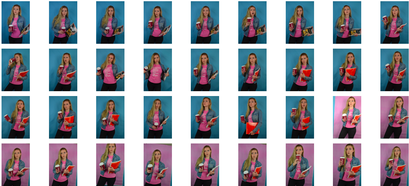
Above is the contact sheet from my second angry feminist shoot. As you can see, similarly to the previous shoot I experimented with both blue and pink backdrops. And again, similarly to the previous shoot I decided to use the pink backdrop because this element of the feminist stereotype is slightly more “lady-like” and socially acceptable than the previous and the pink background connotes this. I used two of my favourite books on feminism, “Art and Feminism” and “The Art of Reflection” I also wore my graphic tee which has the quote “Feminism is the radical notion that women are people.” printed on it. I also used a empty costa cup to achieve a sort of college student hipster vibe.
I experimented with different facial expression and poses to give an sense of “being done with your misogynistic bull” vibe. I tried many over the top, “in the middle of a heated debate” looks but I felt that some of the more subtle aloof eyeballs or disapproving side glances were more effective and less pantomimic.  Bellow are the two image I shortlisted for final from this shoot. I selected the image on the right because I felt that the raised eyebrow and 3/4 angle of the face gave a sense of being knowledgable and aloof. I selected the image on the right because the expression paired with the titled head gives a reasonable air of being annoyed and frustrated without being over the top.

I edited these photo by cropping them as appropriate, at the top of the thigh to match with my previous outcomes. I increased the brightness and contrast as well as the colour saturation. I used the brush tool on photoshop to get rid of some distracting blemishes as my skin was not very clear on the day of the shoot. I slightly smoothed out the background, similarly to the editing process of the first feminist shoot.

Symbolism: Beach & Ocean Pollution – Results

The symbolic photographs below are the results of planning this next studio shoot, inspired by many different examples of ‘art to spread awareness’. Although I particularly love the huge 3D marine sculptures created by ‘Washed Ashore Project’, instead of using the sheer amount of physical pollution to emphasise my point, I will be using photography techniques and eye-catching compositions. The symbolism I am hoping to show using pollution I have collected from Jersey’s shore is the bleak future of all marine life and pollution’s effect on the Eco-system.

My 2D arrangements below are created using two particular kinds of pollution that I have collected from all around Jersey’s coasts.  The reasons I have chosen fishing rope and bottle caps are one because I didn’t want to over-complicate my outcomes and two because these items can cause a copious amount of damage to marine life and the environment. To complete this shoot I set up a makeshift studio in my bedroom by laying down a black sheet on the floor and using a mixture of the lighting from a desk lamp and the light from outside. As you can see below in my contact sheet of original photographs, I have experimented with four different designs using the recycled materials. When capturing each subject, I took inspiration from many dramatic and surreal studio photographs and tried to use interesting angles to bring the pollution to life. My goal for this shoot is to spread awareness about ocean pollution and hopefully spark positive change in my viewer’s consumer habits. Below are a select few of the original images from this home-studio shoot presented as a contact sheet …When selecting my final outcomes out of the images above I wanted to make sure that I included a varied selection of each subject I have created. Below I have chosen five photographs (out of the 12 original images) that each show its subject matter either from a different viewpoint or in a different light. When it came to editing these photographs the first thing I did to all of them was make them more dramatic and eye-catching by playing with the exposure, shadows and contrast. After this, I judged each photograph individually and went through my normal editing routine of changing things like colour, temperature, clarity, saturation, highlights and blacks. The reason I have decided to keep all these outcomes in full colour is because they are aimed to catch my viewer’s attention and really stand out.

The final outcome above is my favourite result from this creative symbolism shoot. To create this subject matter I used a black sheet of fabric I had at home as well as a Nutella jar lid, some old fishing rope and loads of plastic bottle caps that I found on a few of Jersey’s beaches; ultimately arranging them into the shape of a fish. Although abstract and eye-catching the context of this image is to spread awareness about something very bleak. The reason I have created a fish is because it is a good symbol for the ocean and its ecosystem and can give the viewer an idea about the wider message I am trying to get across. I love how I have captured the composition of this subject matter and enhanced its dramatic intensity by manipulating colours, contrast and highlights.

The next final outcome displayed above depicts a jellyfish made with blue rope creating movement in the background, bottle caps forming the shape of its head, and separated strands rope as the tentacles. Although I was not really planning on creating this subject matter, as jellyfish are not really symbols of the whole underwater eco-system, I have found that this idea has, in fact, worked very well. The meaning of this subject is to show a futuristic world where all marine life has been replaced by our waste. This is futuristic tone is emphasised by the neon colours I have created and the black dark ocean background. Overall I think this abstract piece has a really strong centred composition and I have managed to create a really intriguing yet ominous tone.
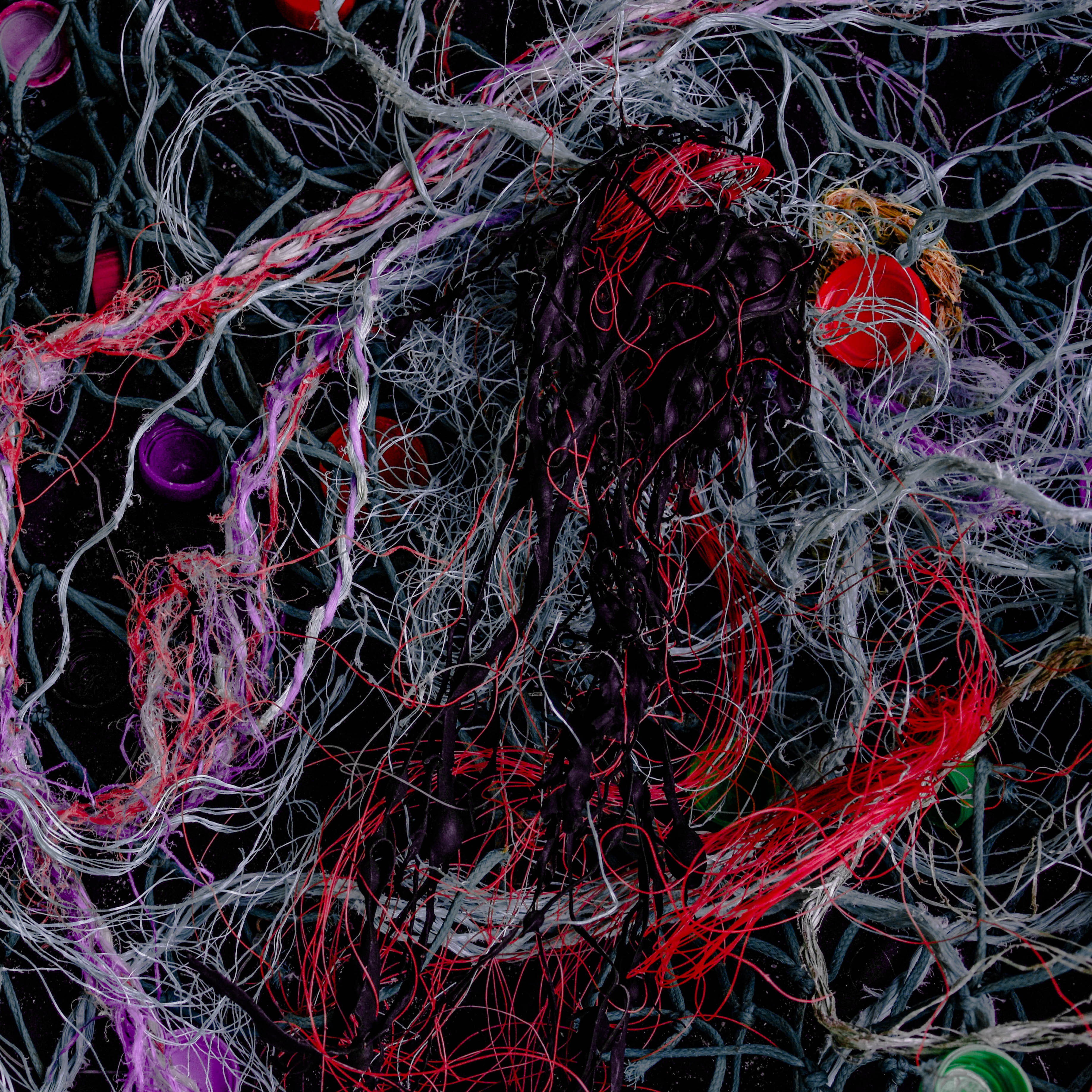
Next is an abstract image that has a very different subject matter to all my other final outcomes from shoot. This photograph depicts a massive amount of material and plastic fishing ropes/lines along with bottle caps and an oddly shaped piece of seaweed in the middle. The shocking thing about this, for me, is the how easily I managed to source these discarded materials washed up on a few of Jersey’s famous beaches. The symbolic message behind this image is pretty much a realistic version of the final above, where a jellyfish-shaped creature is being engulfed and tangled in pollution. The reason I chose this as final outcomes is because of the intriguing way I have managed to digitally manipulated the colours of certain ropes/lines and toned down all the rest.

Lastly are two more images that are aimed to give an insight into the problem of ocean pollution and hopefully make the viewer think twice about how they discard their waste. The meaning behind these two photographs is quite similar in that they both show a futuristic ocean scene that has been completely taken over by synthetic substances. The first piece on the left is simply a differently captured and edited version of the larger final outcome above. I have chosen to add this to my results blog post as well because I love the dramatic effect the subject has it fades into an ominous black border. The last image is of my fourth subject matter that I had previously planned out to depict a wave created by pollution. I love this outcome as I think the message is really clear as well as the composition of materials showing movement and intricate textures.

Angry Feminist Shoot 1 – Editing

Above are the contact sheets from my first angry feminist shoot. In this shoot I took inspiration from the topless protests by the radical feminist group, Femen. I did some dramatic makeup, back combed my hair and painted the words “My body, my choice over my chest and torso. I experimented with using both pink and blue backgrounds, I made the decision to use the images with the blue background because of the masculine connotations of blue and to protest in such a way is not considered particularly lady-like.

I experimented with using the jacket but I felt that did not work with the “shocking” sense of “nudity” (I made the decision to wear a bikini top as an authentic recreation of the Femen protests may not be appropriate for a school project) I also experimented with various poses including fight or flight like stances and the typical fisted hand above the head. I most of the images I included an angry screaming or shouting expression as this is seen in most of the press photos from Femen demonstrations and protests.

I selected these images as my shortlist because I felt that the battle stance captured the sense of desperation and not too over the top warrior feel. I edited these photos by cropping them to frame the figure around the tops of the thighs. I also increased the brightness and contrast, adjusted the levels and slightly smoothed out the backdrop as their were still some creases that I could not fix with iron without melting the vinyl.