I have been experimenting with the use of a mirror in relation to environment and performance. I have also seen how they have been used by artists such as Francesca Woodman, Claude Cahun and Clare Rae as well as many others who have utilised reflections. Psychologically mirrors attract viewers attention because they reflect the “another us” and gives the impression of having a “perfect” twin. I have done some more research about the symbolism of mirrors in culture focusing on art, literature and mythology.
Physically mirrors reflect light and the surrounding environment which has connotations of illumination and truth. Mirrors have often been compared to the human mind with the Greek root for Plato’s word idea ‘eidos’ literally meaning not just ‘image’ or ‘likeness’ but an image reflected in water or mirror. Mirrors in art suggest that the viewers should turn inwards to gain self-knowledge rather than outwards to the natural world.
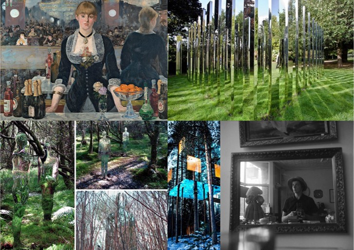
Reflections are central devices in some of the great European paintings. A famous example is Jan van Eyck’s Wedding Portrait of Giovanni Arnolfini from 1434. Here, the mirror is situated centrally in the painting, directly above the clasped hands of the wedding couple. The mirror has a slightly curved form that not only reflects the objects in the room, but things happening beyond the picture’s frame, as well. The mirror shows a clear view of the couple’s back and two witnesses standing in an open door frame. It presents something that would be occurring where the viewer is ‘standing’ and therefore they assume the position of witnesses. The mirror removes the gap between the pictorial space and the viewers space and makes them appear part of the story. 

This painting is likely to have influenced Las Meninas by Diego Velázquez from the year 1656. This shows a large room in the Royal Alcazar of Madrid during the reign of King Philip IV of Spain. The Infanta Margarita is in the middle of the picture surrounded by her entourage. Above her head on the back wall of the room, is a mirror, although opinions vary on this and some people think it could actually be another painting . The artist himself is standing on the left side of the painting at his canvas and the painted surface is facing away from the viewer. The mirror could be reflecting two figures standing outside the picture’s borders. This would be King Philip V. and his wife Marianne, at whose court Velázquez was employed as a painter. If the royal couple are standing in front of the mirror, then they must be standing where the viewer is so that the viewer becomes part of the painting in a similar way to in that of Jan van Eyck’s Wedding Portrait. The interplay between observation and ”being observed” is caused. The king and queen are supposedly “outside” the painting, yet their reflection in the back wall mirror also places them “inside” the pictorial space. 

The Rokeby Venus by Diego Velázquez depicts the goddess Venus lying on a bed and looking into a mirror. She is often thought to be looking at herself in the mirror however this is physically impossible since viewers can see her face reflected in their direction. This is known as the ‘Venus effect’ which is also seen in film when an actor will be shown apparently looking at themselves in the mirror. What viewers see is different from what the actor sees, because the camera is not right behind the actor, but the position of the person is normally chosen so that their image is correctly framed in the mirror for the camera.

Mirrors were significant for the development of self-portraiture in painting and were also used for this purpose in the early days of photography . For example the photograph below is from the Edwardian period and shows an unidentified women using her dresser mirror and a box camera to take a self-portrait.
Vivian Mainer is also well-known for her street photography from the 20th century and many of her photographs are self-portraits which were taken on the street using the reflections of windows in buildings.

I also came across the use of mirrors when researching Earth Art as an approach to the theme of ‘Environment’ for example by Robert Smithson. He critiqued art history’s ability to create static objects and remove them from the real world context to museums or galleries. His project ‘Yucatan Mirror Displacements’involved arranging mirrors in various landscapes. The mirrors reflected and refracted the surrounding environs, displacing the solidity of the landscape and shattering its forms’. The purpose was to contemplate the moment with the mirror recording the passage of time and the photograph suspending time.

Smithson also created sculptures using mirrors such as the example below. He thought that taking natural materials out of their original contexts abstracted them and in this example coral has been arranged with mirrors so that it is multiplied and fragmented in the reflections. These reflections change in relation to the position of the viewer, so no two people experience it in precisely the same way.

Mirrors have also been significant symbols in literature. For example “The Lady of Shalott”, by Alfred, Lord Tennyson was a poem that inspired many artists. I came across this when studying the Pre-Raphaelite movement for an earlier project featuring some contemporary responses to this style of art. The poem is about a woman who is condemned to watch the world indirectly through a mirror that shows to her the changing scenes of Camelot. The reflected images are described as “shadows of the world”. If she does look at the world directly she will be cursed. One day the Lady sees the reflection of a man Sir Lancelot and breaks the rule and looks out of the window. The mirror cracks and she realises the curse has come true and she escapes the tower she has been living in and gets in a boat but dies before reaching the town. This representation of women has been viewed by some in the context of changing women’s roles in the 1880s and 1890s and it has been suggested that this served as a warning of imminent death to women who stepped from their restricted roles and explored their desires. William Holman Hunt has depicted the moment when the Lady turns to see Lancelot in his painting and some of Waterhouse’s most famous paintings were based on scenes from this poem. I think it is interesting to consider these connections between art and literature because in my own work I am considering combining by images with writing for the final presentations.


The Picture of Dorian Gray, by Oscar Wilde is another famous example of literature with the theme of a mirror. The character Dorian takes a mirror up to the locked room containing his portrait and compares his reflection with his painted portrait which ages instead of himself. When he realises the person he has become, he smashed the mirror “He loathed his own beauty, and flinging the mirror on the floor, crushed it into silver splinters beneath his heel”.
In the poem “Mirror”, by Sylvia Plath the object is described as uncanny. “I am silver and exact. I have no preconceptions. / Whatever I see I swallow immediately / Just as it is, unmisted by love or dislike”. The poem describes the life of a young woman growing older as she looks into her mirror. The poem could span years or alternatively the women could be seeing a reflection of her future self. It appears that she wants to discover who she is by looking into it.
Stories about mirrors are also common in mythology and folklore with the well-known example being that if you break a mirror you will have seven years bad luck. This superstition dates back to the Romans, who believed that life renewed itself every seven years, and that breaking a mirror would damage the soul it was reflecting at the time for that duration. Many cultures believed mirrors reflected the ‘shadow soul,’ and could show the true nature of the person being reflected. This contributed to the legends about vampires having no reflections as they are said to have no souls to reflect. Ancient Chinese believed that mirrors frightened away evil spirits who were scared by their own appearance. In Greek mythology there is a man named Narcissus who falls in love with his own reflection in a pool of water and unable to leave the beauty of his reflection loses the will to live. Narcissus is the origin of the term narcissism (a fixation with oneself and one’s physical appearance and/or public perception).This myth has inspired several artists as well with the most well known example by Caravaggio who painted a young man admiring his reflection in the water. Other artists who have explored this myth include Dali and Waterhouse.





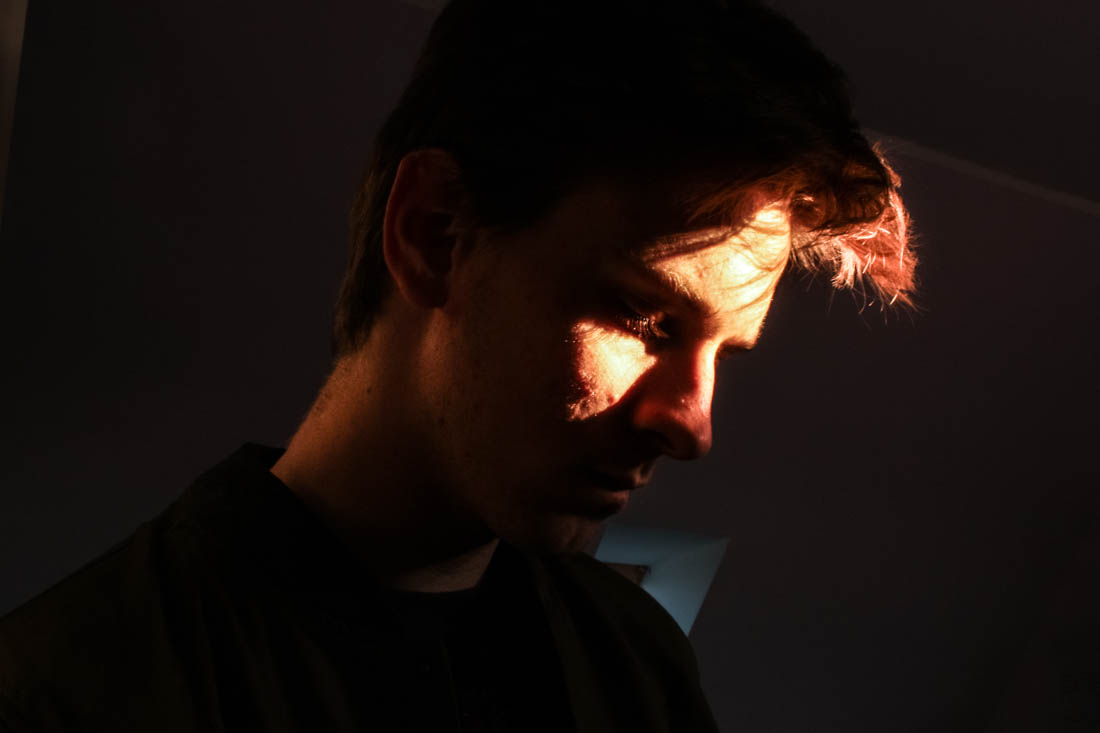
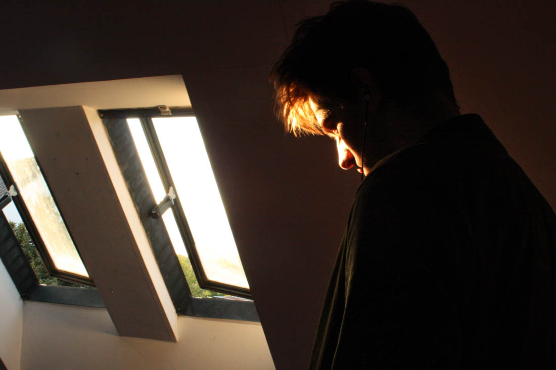
 In response to Bill Henson and Todd Hido’s portraits, I wanted to explore the use of interior scenes and the use of natural lighting to build narrative and add emotion and feeling. In relation to my starting point, the natural light contrasts the dark spaces created by the walls and small light sources. I took over 50 photographs, each experimenting with different ISO’s and exposures and I also left it on auto focus, this evoked a sense of depth without creating overly blurry photographs, I also tested long exposures to give the photos a ghostly effect. I did not use a tripod and in hindsight this would have been more beneficial for creating a sharper image especially when working with longer exposures. I decided to not use multiple exposures or HDR techniques unlike many of my previous landscape photographs as I wanted to keep the strong contrasts of dark space with the warm light. The composition of the photographs features closeups as well as shots that feature more of the open space which reflects a bigger sense of environment. I have also made the compositions to work with a book layout so they could possibly work with a double page spread but also just on a single page, complimented with a text on the opposite side.








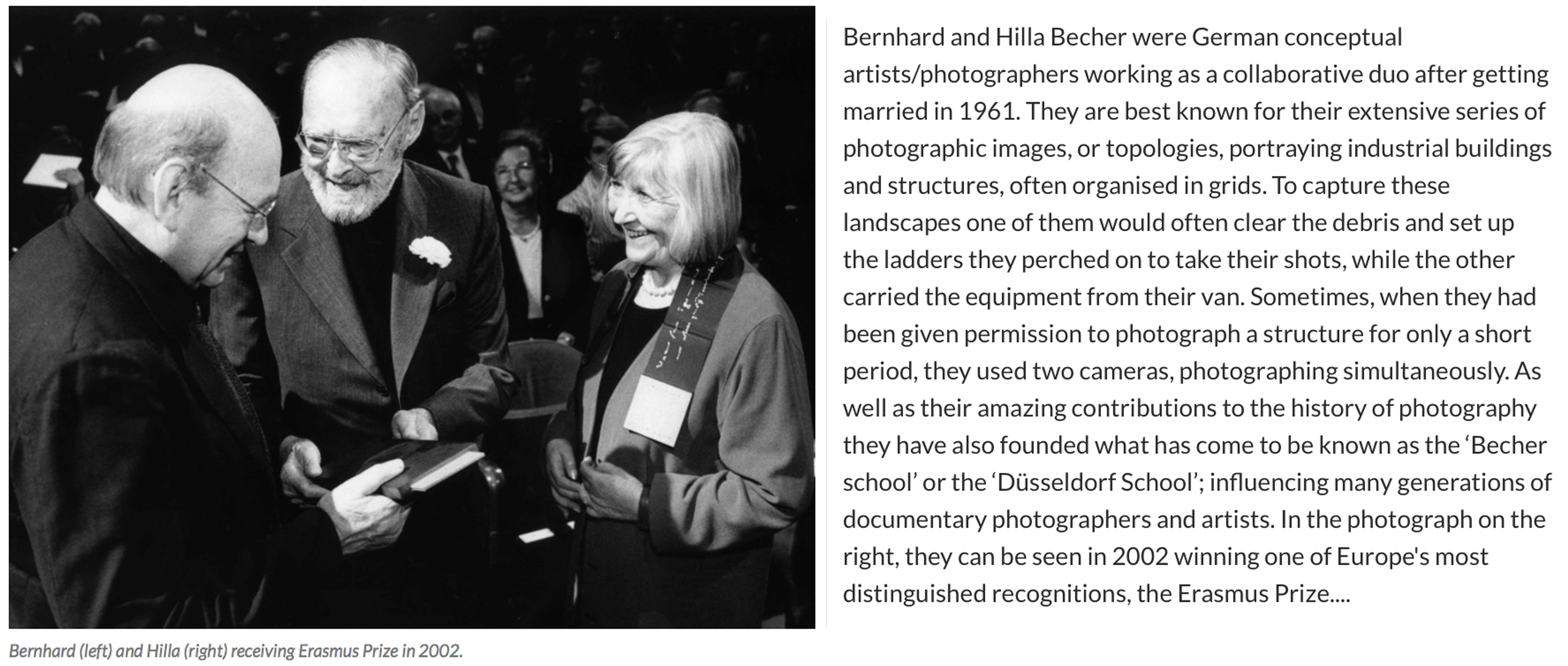 For over 40 years the pair used an 8×10 large-format camera to capture the architecture of industrialisation: water towers, coal bunkers, blast furnaces, gas tanks and factory facades. They did so in an obsessively formalist way that defined their own unique style and made them one of the most dominant influences in contemporary European photography and art. In the early years, with a young son in tow, they travelled across Europe and later the US for weeks at a time in a Volkswagen camper van, cooking and eating by the roadside. When asked in a recent interview why they only photographed industrial structures, Hilla replied: “Because they are honest. They are functional, and they reflect what they do – that is what we liked. A person always is what he or she wants to be, never what he or she is.” For Bernhard, the process of photographing and therefore fixing these brutalist structures forever was rooted in his love of the landscape he grew up in as a child. The huge buildings that dominated and defined his childhood in the Ruhr began to disappear rapidly in Germany’s postwar economic period, and he rightly sensed they would disappear elsewhere – across Europe, Britain and America. I have chosen this amazing couple as an inspiration for my next shoot at the ‘Energy from Waste’ facility because I absolutely love the simple yet fascinating way they have captured these artificial contraptions…
 The Bechers were, first and foremost, formalists. “We want to offer the audience a point of view to understand and compare the different structures,” they once said. “Through photography, we try to arrange these shapes and render them comparable. To do so, the objects must be isolated from their context and freed from all association.” Much like the majority of the Becher’s work, this collection above depicts many different blast furnaces in different compositions, all printed in black and white and arranged in grids that emphasised their resemblance – what Hilla once called their “universality”. The meaning behind these images is to create straightforward historical documents of these vanishing industrial structures as well as beautiful topographic images. Although I will not be seeing this type of arrangement when visiting La Collette, I will be taking inspiration from the intricate way they have captured the angles and compositions from in between the pipes and framework.
 As well as looking at the Bechers grid style outcomes I will also be taking a lot of inspiration from some of their more simple, close up work. The two photographs on the top row of the contact sheet above show detail captured from a Petrochemical Plant in 1983, Wesseling, Germany. These images depict some of the scenes I expect to find for my next shoot in the ‘Energy from Waste’ facility and I love their dynamic and structural composition. Below them, I have added three more industrial landscapes captured by the famous couple that was originally part of a much larger grid. These images depict old Stonework and Lime Kilns strategically captured against their environments. Alongside her late husband, Hilla saw structures that others might have dismissed as ugly, even threatening, and made them unforgettable.