For my final outcome for the project ‘Environments’, I’m producing a book, this is because all my photographs can finally come together and tell a story. Therefore when designing my layout I compared Theo Gosselins Book ‘Sans limites’ to Corinne Day’s ‘Photo Diary’. The reason for selecting these two photographers is because they were both big influences to my photographs, and there photo books have a lot of similarities and differences which are good for comparing when it comes to designing my book.
Theo Gosselin – Sans Limites;
Theo Gosselin has been my main source of inspiration throughout this project, therefore I have looked at his book ‘Sans Limites’ to get ideas and inspiration for the layout of my book.
The video below shows a flick-through of Theo Gosselins work in his book Sans Limites;
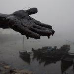
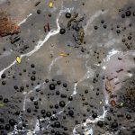
Gosselin has purposely chose not to put the title on the front cover. Also, he’s intentionally chosen a cover which is an oil spill, which is linked with the fact he’s on a road trip. Therefore using an image which makes you think, because before opening the book one doesn’t know he’s on a road trip, and therefore capturing the readers attention before even opening the book.

When reading the book ‘Sans Limites’ there is 3 double spread pages before the page which states the title, and Theo Gosselin, the photographers name. I believe this makes it more interesting as normally that’s the immediate page you see when opening a photo-book. Alternatively, Gosselin captures the readers attention and allows them to think for themselves what the book is going to be about, rather than just reading the title.
After analyzing Theos book I have noticed the vast majority of his pages are double-spreads. I think this is because there’s so many aspects to his photographs which he doesn’t wants the reader to miss, which the viewer may have done if he put them on a smaller scale.

On the other hand, when he doesn’t do double page spreads he tends to have pictures which have white borders around them, and tend to have a completely blank page opposite. This is probably because he doesn’t want the viewer to get distracted and not completely focused on one.

When I saw this double page spread in Gosselins book, I was quite surprised, as he’s put the models face directly in the binding of the book. Personally I wouldn’t do this in my own layout, as it takes away from one of the main aspects of the photograph, just because of the way he’s presented the photo. In my opinion, I would still do a double page spread but with a white border as that way you can still take in the photograph but the binding isn’t as distracting. Although, this doesn’t work with Gosselins work as he has the theme of using the full double page spread or having it very plain, there’s no in-between. I think that this image has to many aspects which are aesthetically pleasing to put it onto a smaller layout.

After scrutinizing Theo Gosselins book ‘Sans Limites’, I have noticed my photo-book should have some sort of layout and pattern, which how I present double page spreads against my smaller scale images. I’ve also thought about how I don’t necessarily have to have my title on the front cover or immediately when opening the page, which may be interesting when reading my book. Another important aspect I noticed is when reading his book, there’s no text among the images. I think for my personal project I won’t add text either, as I want the photographs to tell a story in themselves.
Corinne Day – Photo Diary
The reason for comparing Gosselins work to Days is because I analysed both artists work, and their work has both differences and similarities.
The video below shows a flick-through of Corinne Days work in her book Photo Diary;
Her autobiographical book, “Diary” was published by Krus Verlag in 2000, and contained frank and at times shocking images of Day and her friends. The images in “Diary” featured young people hanging out, taking drugs and having sex, and have been compared to the documentary realism of Nan Goldin, another artist who’s work I’ve analysed for this project. Coinciding with the publication of “Diary”, Day had two large scale exhibitions in London in 2000.
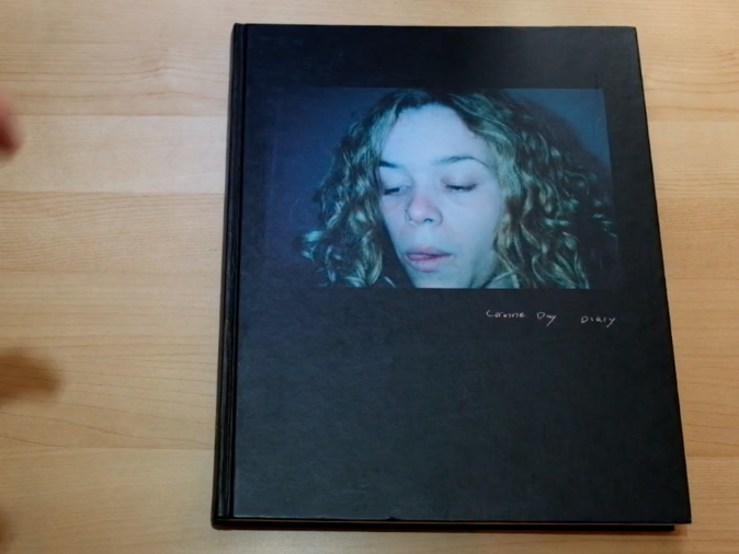
The front cover of Days book is black, with a photograph of her friend on the front cover, with ‘Corinne Day Diary’ written underneath the photograph, looking like a caption but actually being the title for the book. This is opposite to Gosselins as he has no writing on it, and nobody featuring on it. Day has used a very explicit image for the front cover, as it looks as if the girl has just snorted some sort of drug as she has blue around and inside her nostril.
Similarly, to Gosselins book she opens immediately with an image and not her name or title. Capturing your attention straight away. However, she uses text in the way she captions the photographs, giving the viewer a bit more of an insight to the image, whereas Gosselin never uses text with his images.

Corinne Day tends to shoot images in colour, except for a few, which are presented next to one another in the book. Gosselin is similar in the way he tends to shoot in colour, however he has no images in his book which are in black and white.

The main difference I personally noticed between Day and Gosselin, is that the majority of Gosselins book is double spread pages, whereas Day has no double page spreads featuring in her book. Also, when Gosselin doesn’t do a double page spread he tends to have one next to a blank page bordered, however Day uses book next to one another for most of her book, as shown below;

In both books nudity is shown, however Gosselins nudity seems to be not as sexualised as Days. As one can see in the below image, hers are very explicit. However, the image below shows a similar layout to what Theo Gosselin uses when he doesn’t do double page spreads.

In conclusion, I have been influenced by both photographers books as they both have a certain style which I find aesthetically pleasing. Therefore, when designing my photo book I will take ideas from both of their books and alter it slightly to make it my own, combining both of their ideas.




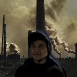
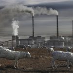






























 Because of my original plan to take as many photographs as possible of every aspect I was shown, the contact sheet above only shows 47 out of the 500+ images I took during my visit. To narrow down my outcomes from this selection above was quite difficult as I really liked many of the angles and compositions that I managed to capture. Below are the 14 images I have chosen as my final outcomes, although I won’t be using every image in my end result, I wanted to include them in this post for future reference to my efforts. As well as this, as requested by the manager of the energy from waste facility, Ian Williams, I have edited and saved about 16 more images to send to the department for unknown reasons. This shoot, much like my previous documentary shoots, shows a mixture of colour and black and white photographs depending on their style. Below I have displayed my final 14 outcomes along with four other images presented at the bottom that helps me to tell this documentary narrative…
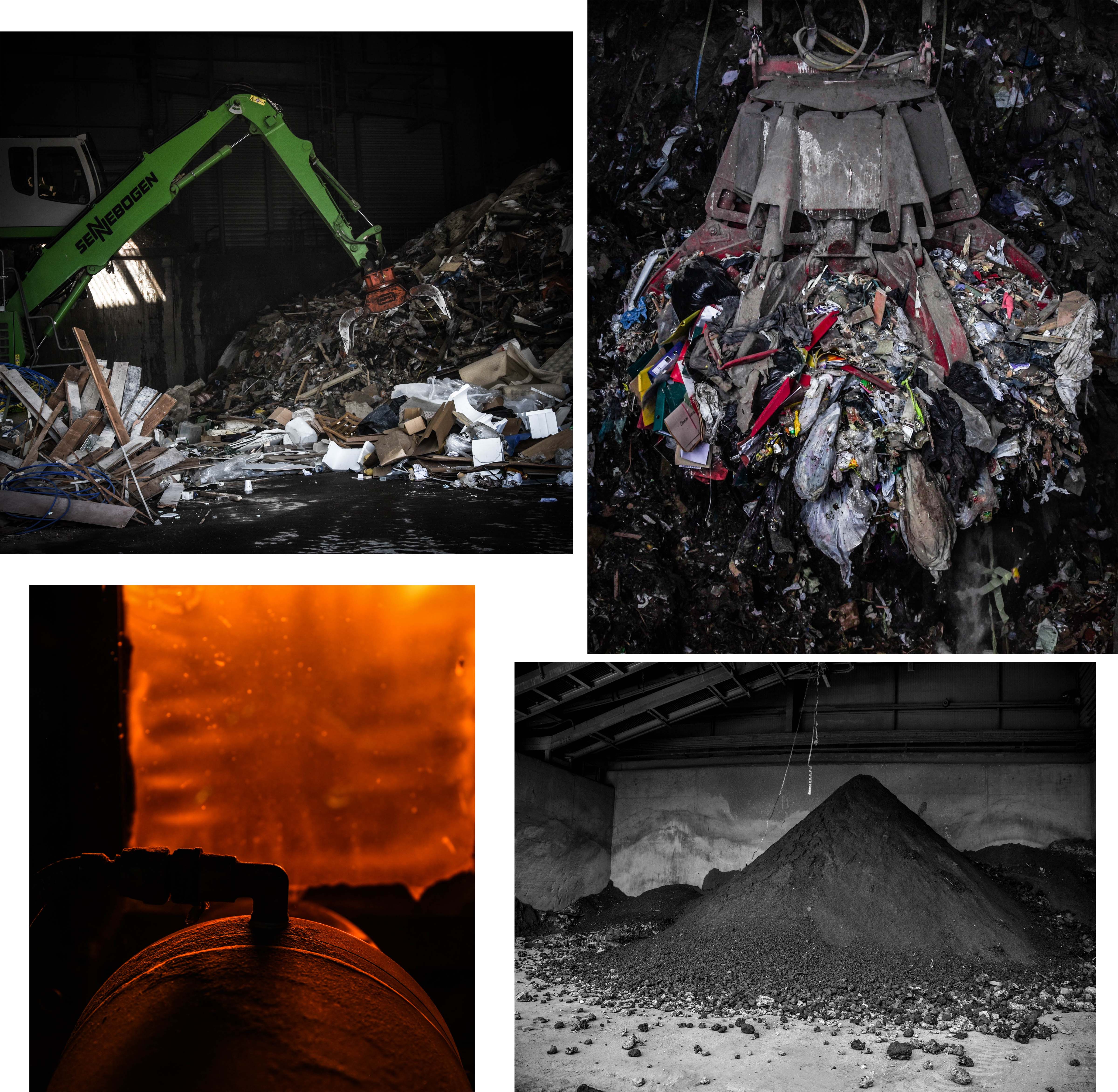 This first group of my final outcomes above depicts the waste before transformation, the burning of the waste, and the ashy result of the process. The first two images on the top row depict the difference between the amount of household and commercial waste produced on our Island. The image on the left presents an average sized machine transporting commercial rubbish from one spot to another whereas the image on the right shows a gigantic claw machine, capable of moving up to 3 tonnes of household waste. For use in my project, I love the photograph on the right because of it dramatic intensity as well as its ability to give my viewers an idea of how much we produce. This image is one of my favourites overall and was taken through one of the ‘rubbish shoots’ after the operator kindly positioned the claw for me. The two pieces on the bottom row can show what could be seen of the burning process alongside with the final outcome of this waste. I love the orange glow and intriguing composition/aperture of the image on the right whereas the one on the left shows an important part of what happens to Jersey’s un-recycled waste. – this ash is actually re-purposed to be used in Jersey and England to create buildings and roads.
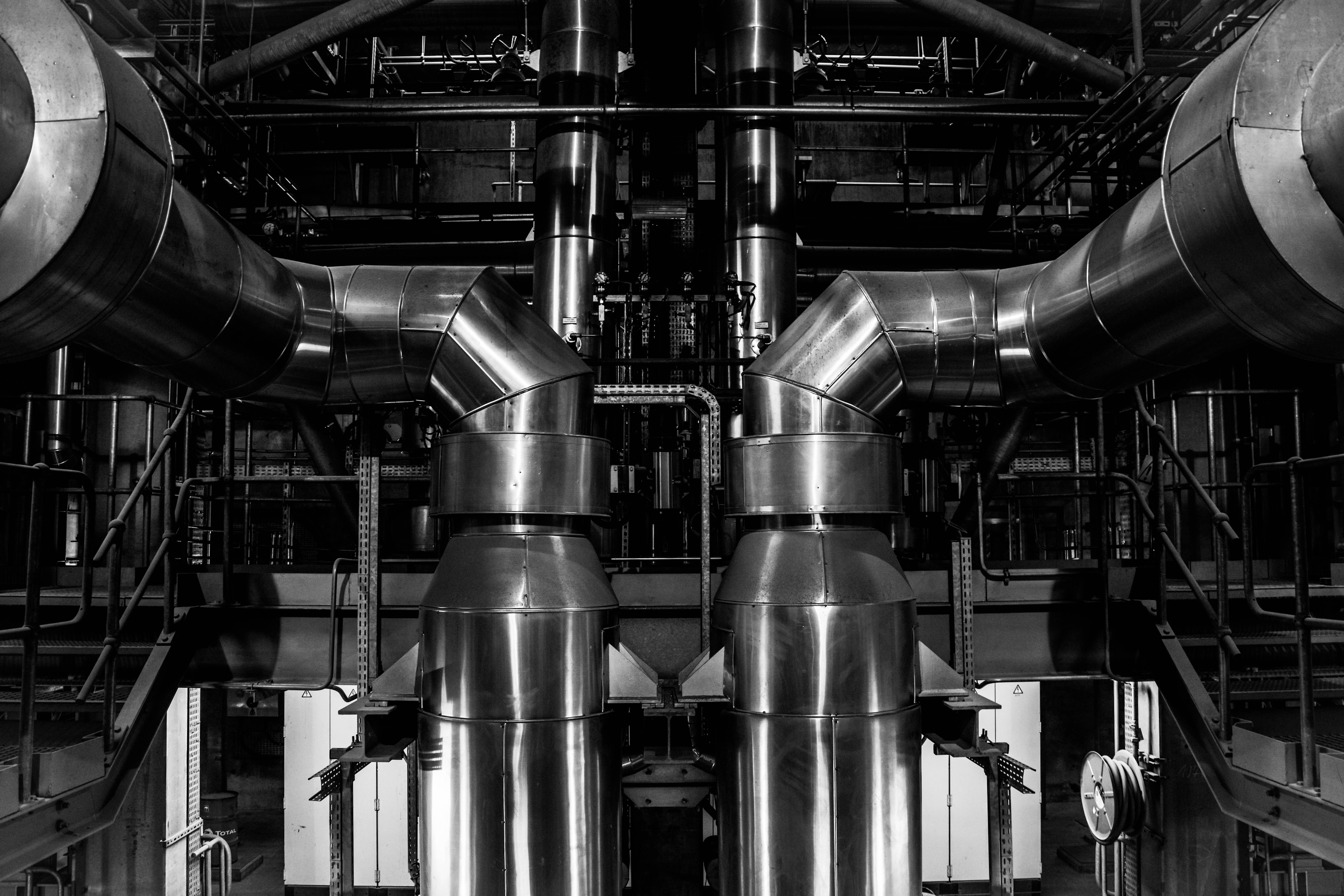 This next image is one of my favourite topographic style outcomes which was taken from inside the ‘Energy from Waste’ facility during my tour. This image depicts two massive pipes coming up from a lower floor and curling around the edge of my composition. I love the perfect symmetry I have captured in this piece and the topographic/straightforward style it was taken in. The reason I have decided to edit this image in black and white is to emphasise it dynamic features as well as resemble the many blast furnaces captured by my inspirations Bernhard and Hilla Becher. The meaning behind this image is to show a specific section of the massive machinery that combined, works to process the safe disposal of our island’s waste and turn it to clean energy.
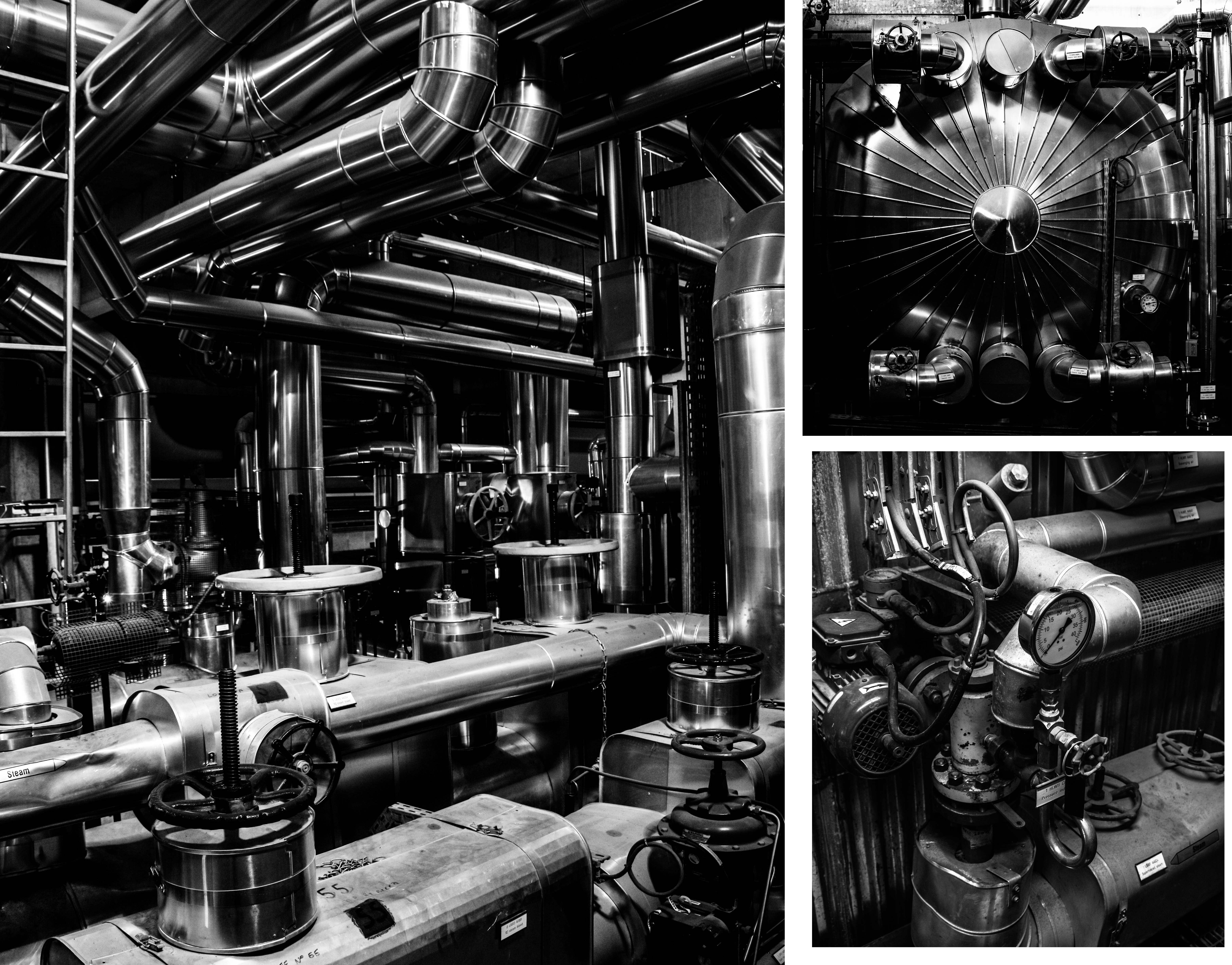
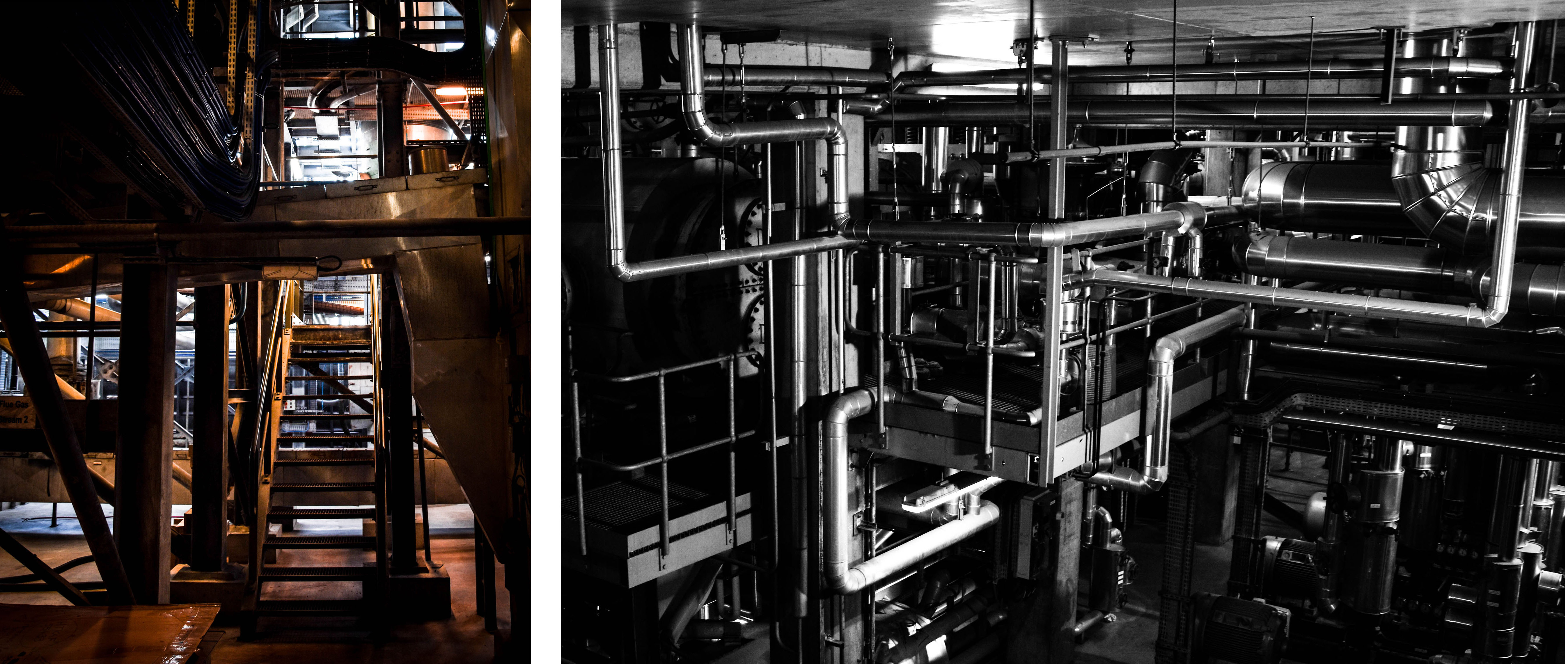 These next group of final outcomes from my shoot show more specific details from inside the ‘Energy from Waste’ facility. The meaning behind these images, along with the final outcome above, is to show exactly how much work and complicated technology goes into this process. These images can give an idea of just how difficult it is to cleanly produce only 7% of our island’s energy at the same time as disposing of our waste. The first and largest image on the top left is my favourite from this and depicts a scene through the building completely filled with pipes and machinery. I love the high contrast and dramatic overtones of this image and I think the intricacy of the pipe work really helps prove my point. The next two images on the right of this piece depict a few close-up detailed shots of specific parts of this extensive setup. I love the simplicity of these images as I feel they share a very strong topographic style. Lastly, the two photographs on the bottom row depict some amazing shadows and angels looking through the facility as well as more intricate pipe work hanging down from the ceiling.
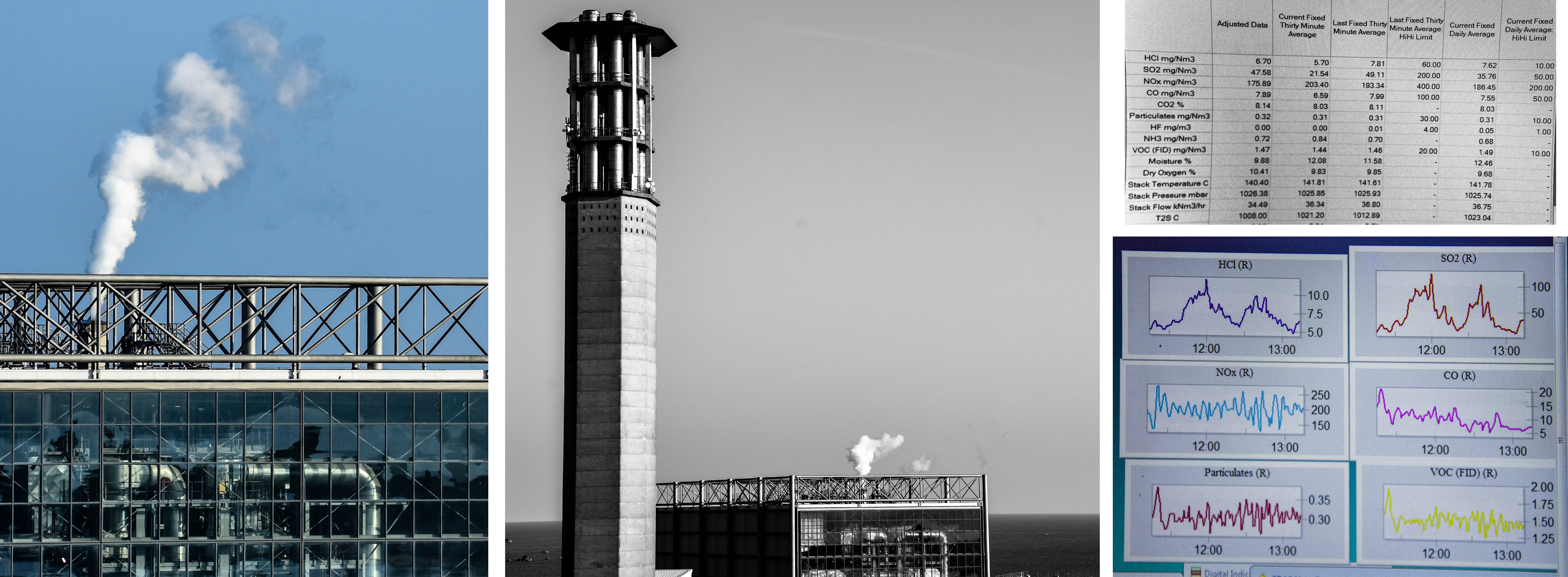
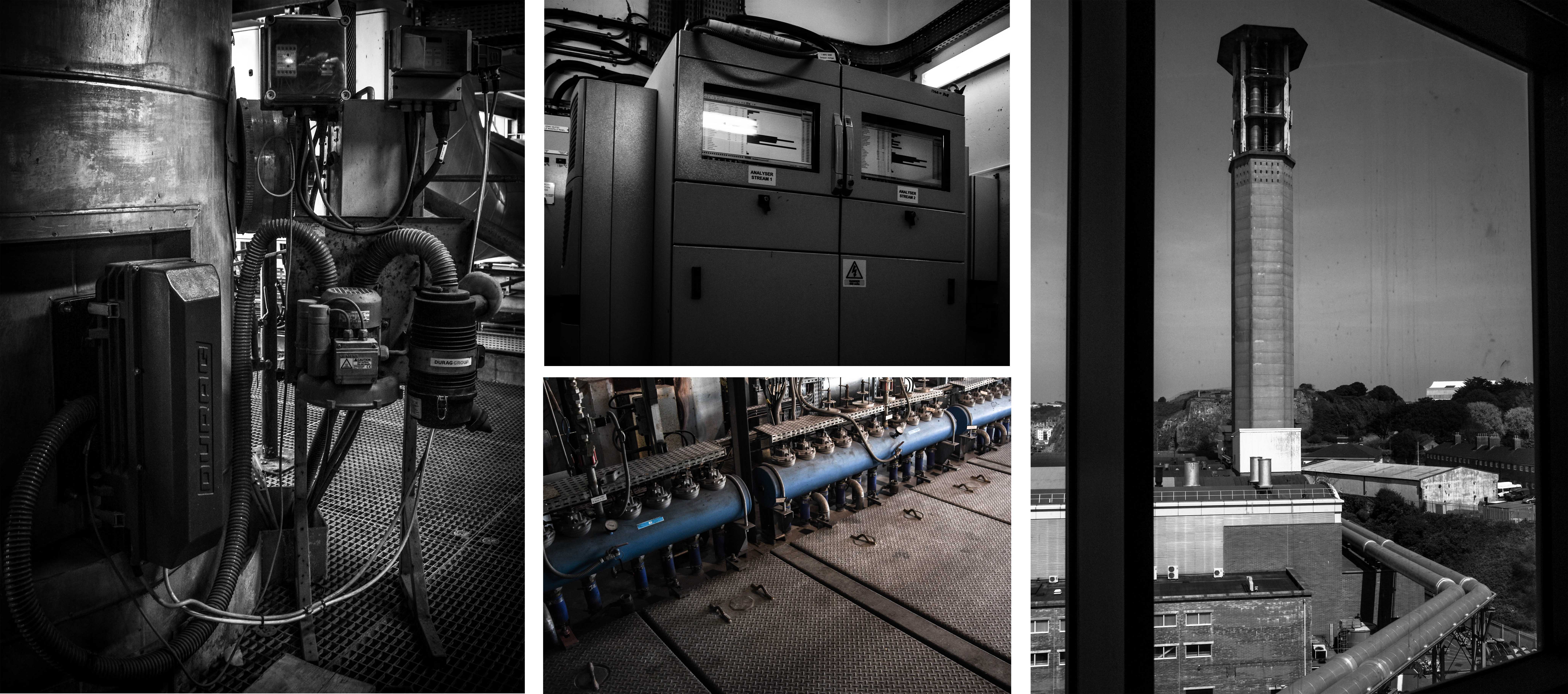 Next are some important outcomes depicting a few of the elements that go into the purification of the smoke produced from burning the rubbish. According to CSBC, the La Colette ‘Energy to Waste’ facility meets the highest air quality standards in the whole of Europe. If their emission levels are outside of the licensed limits the plant is shut down and any underlying problem is rectified before the plant is started up again. The fist three images on the left depict some features that help keep track and purify the smoke before it is released. First is the point where samples are taken for testing, next on the top is a monitor for viewing the levels of each element and finally, the bottom image shows a very small part of the machine that acts as a filter. Lastly, on the right of this contact sheet is the view from outside the window looking up at the JEC chimney and the pipes that connect the two facilities.