More Shoots

// JOE + BETH //

The next shoot was with two characters, Beth was the subject I had intended to shoot with but the addition of a second figure (Joe) worked very well in the images. Below, as before, is a set of images showing a variety of shots from the shoot which took place at Beth’s location of choice – Green Island. These photos were taken just after golden hour making use of the eery blue lighting and it’s soft, pastel effects. With enough light to shoot but limited colours and shadows there is certainly something beautiful in the muted colour palette. I selected two external images, one which just showed Beth overlooking the bay and a  second image featuring both Joe and Beth which provided a varied alternative to this themed project. Ultimately, it was the single figure image I was after so that one came out on top.

As with all these shoots, I asked the model [Beth] to answer a series of questions about the location [Green Island] she choose.

Where is home for you? Why is this place home? Are your family there? Do you feel safe here? What is it that makes this particular place home?

Home is at my house in my room where I can be with friends and just chill. Stuff is less complicated there and I can block out school and shitty people and relax a bit. 

What makes Jersey important to you? Do you have good memories here?

Jersey means friends and friends are home. There are lots of important places here which mean a lot to me. Because I can drive now there’s lots of places I can get to which I didn’t know about before. It also means I can walk my dog in new places which means i get to see a lot more of the island and don’t have to rely on other people to drive me.

Where in Jersey holds the best memories for you? Why is it positive for you?

My favourite on island place right now is Green Island beach where I can walk my dog in the evenings. The sky is normally lighter around there and the sunsets can be really nice. If it’s high tide you can walk along the path at the top of the beach and sit on the benches which overlook the sea. It’s a good place to be on stormy days when the sea is high aswell.

Environment – My Book Layout

Here is a link to my Blurb photo book:

http://www.blurb.co.uk/b/7937421-are-you-even-cool

After the refinement of each of my photo shoots, I came to the realization that I had a large amount of strong images, in which I would have been happy to present as finals. With this in mind, I therefore decided to create a photo book in blurb to present these images more intimately.

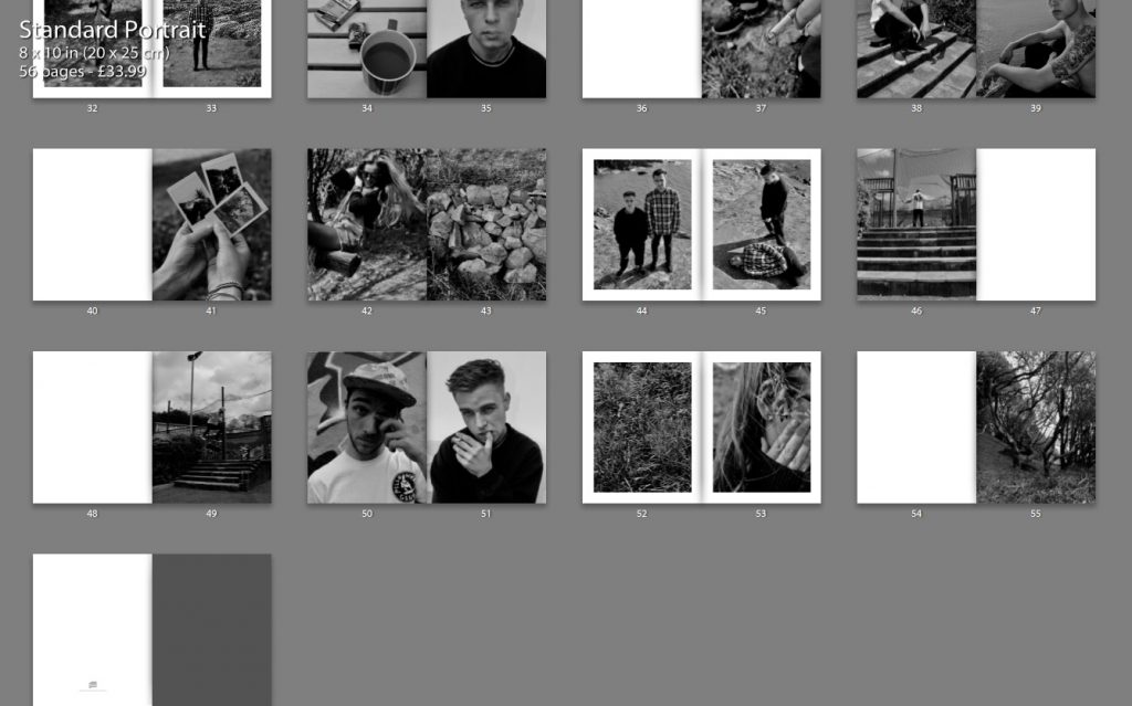
Below shows a thumbnail view of my final book layout. I feel that this thumbnail view gives a stronger perspective of the layout as a whole, in comparison to the individual pages, as it is much clearer to see the overall aesthetic of the book and why I made certain choices with the layout.
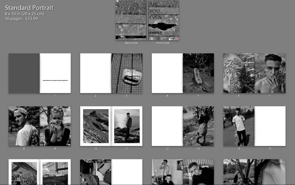
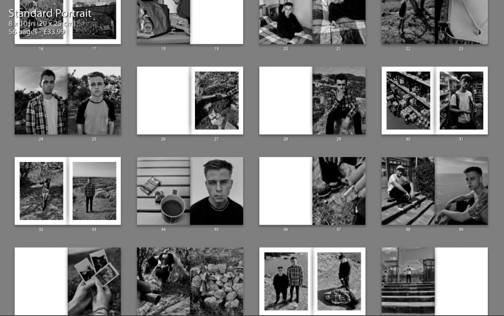
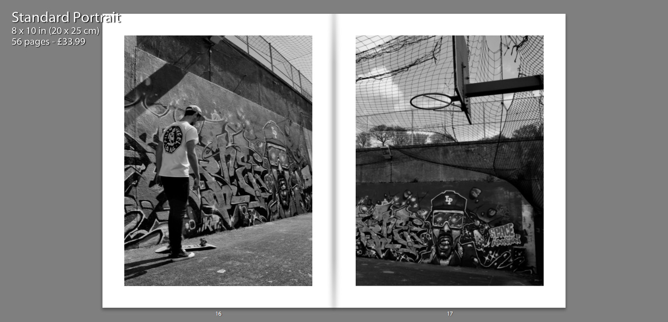
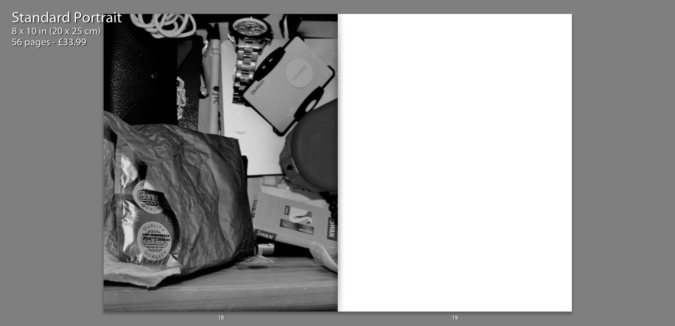
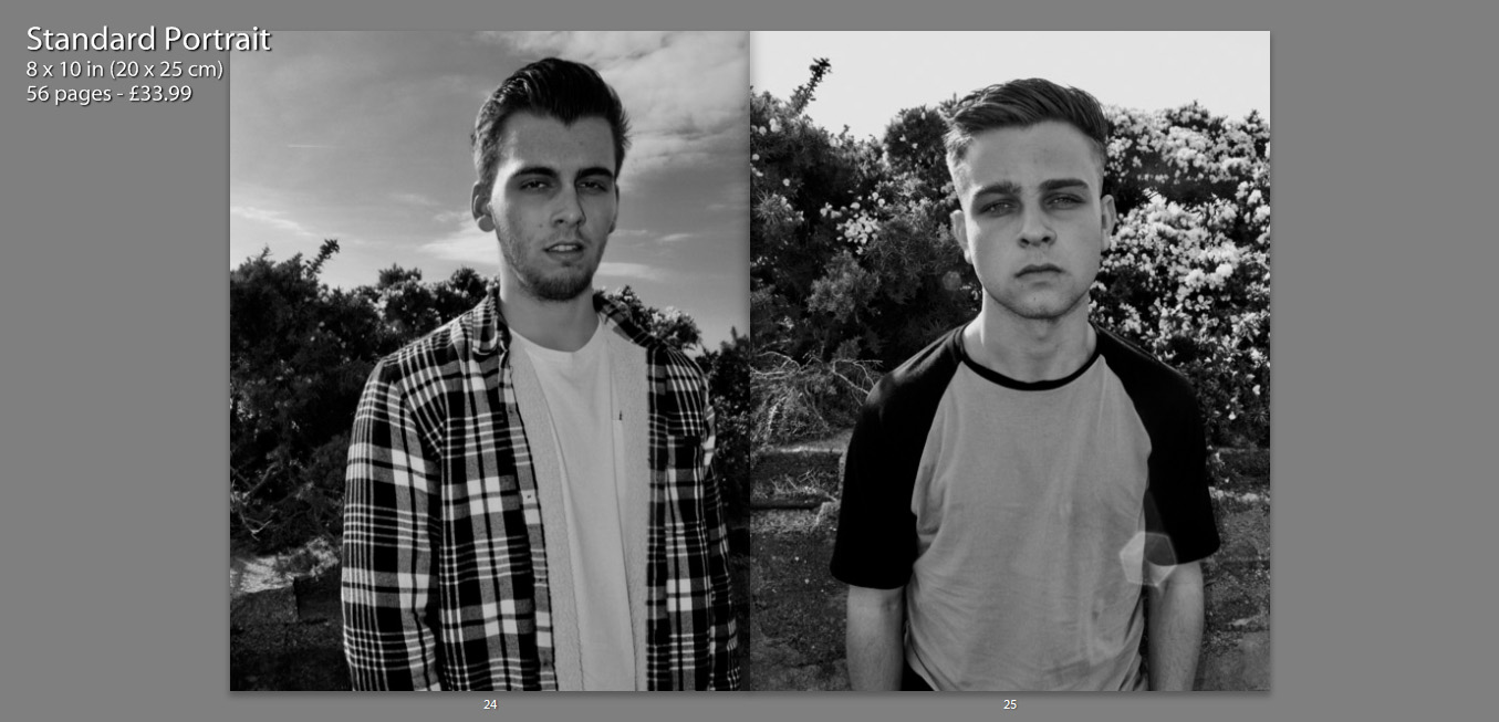
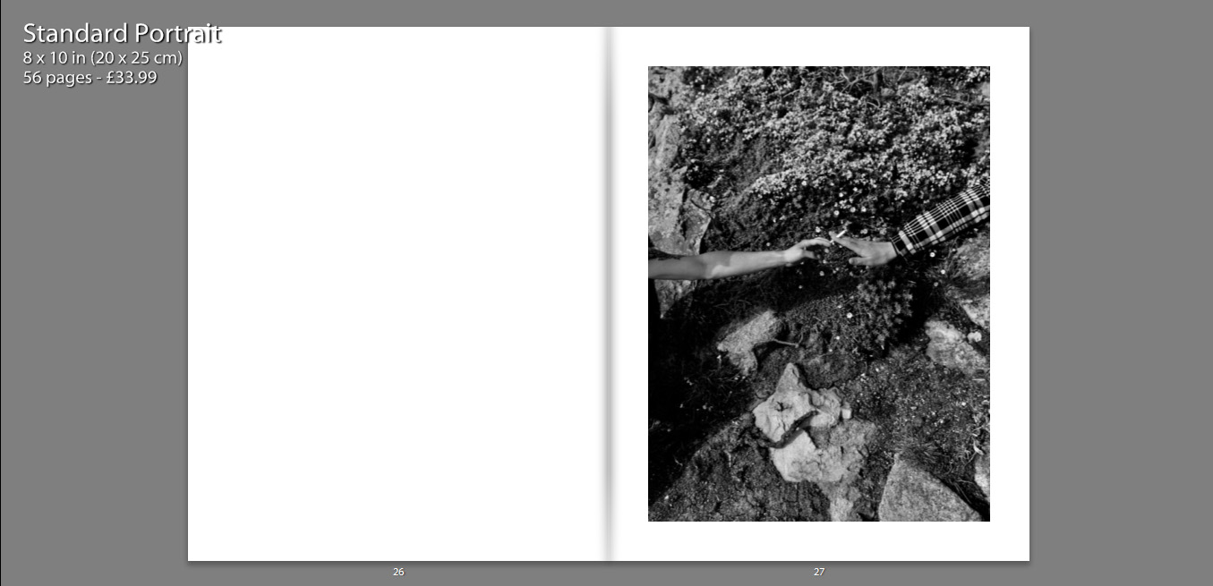
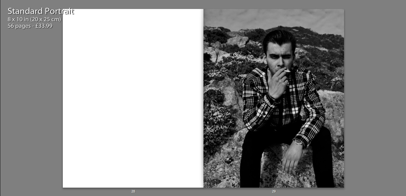
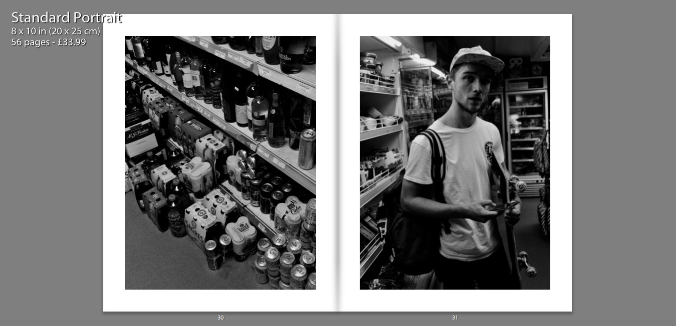
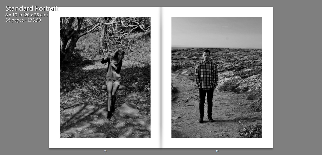
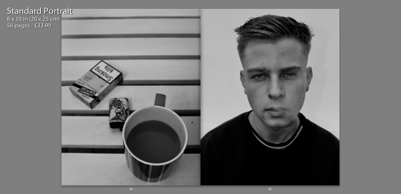
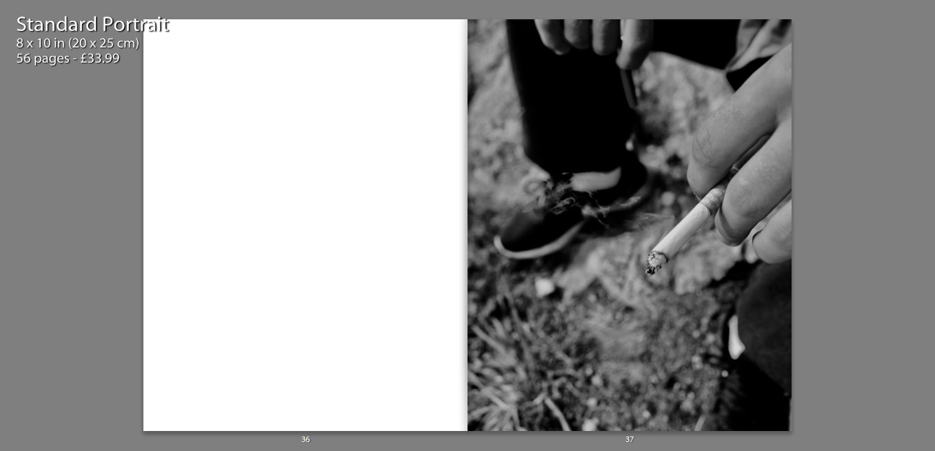
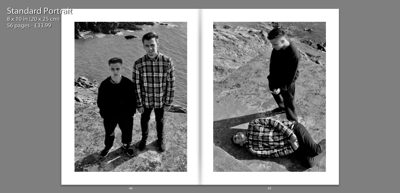
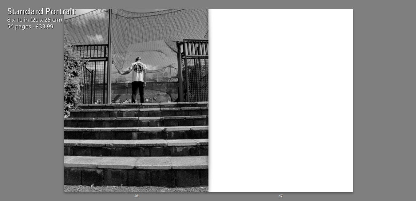
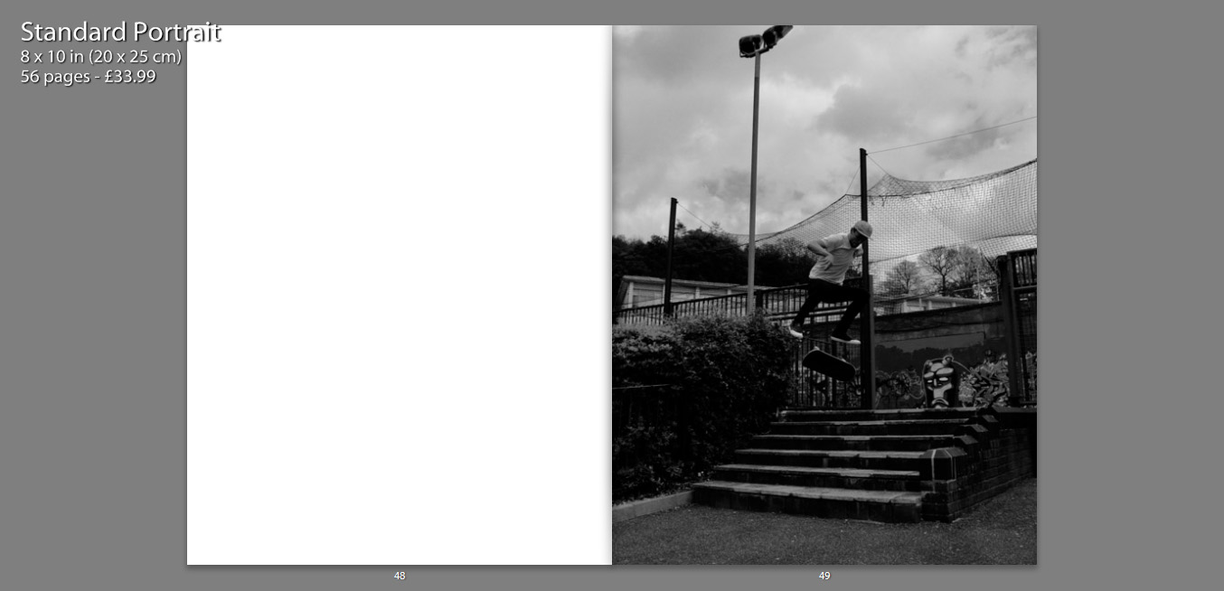
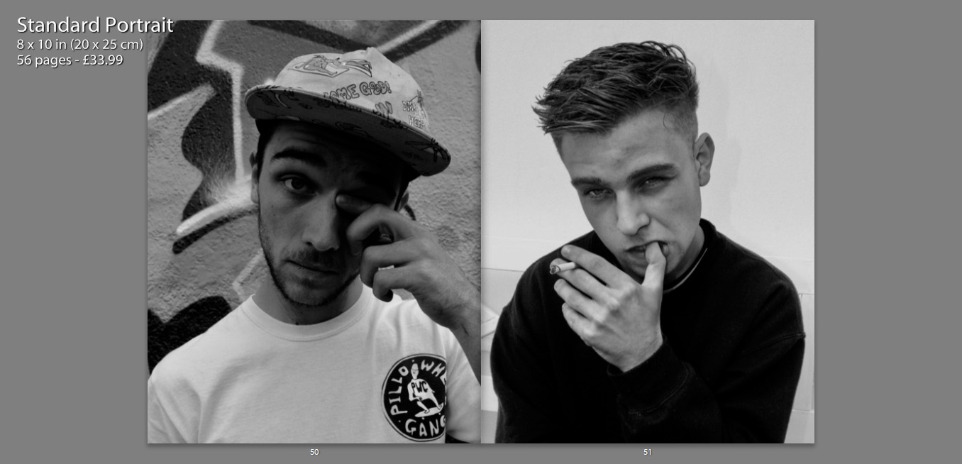
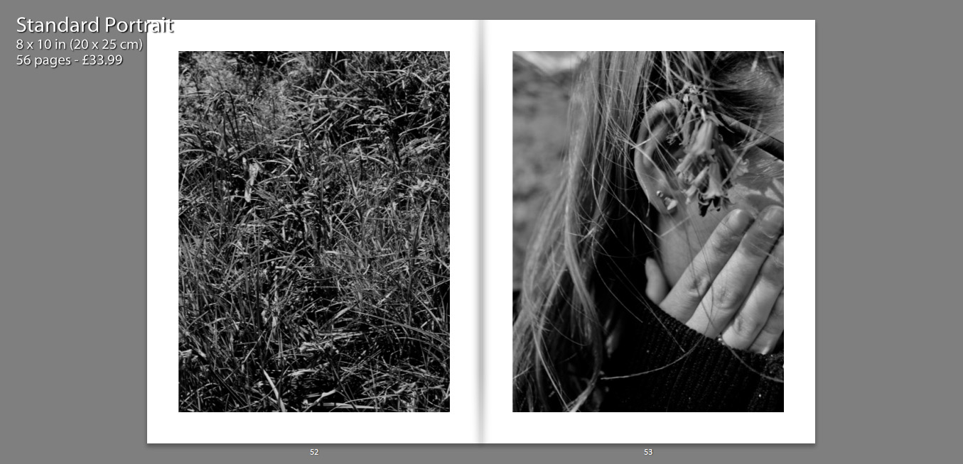
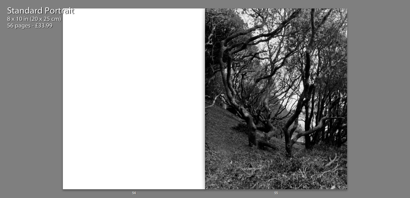
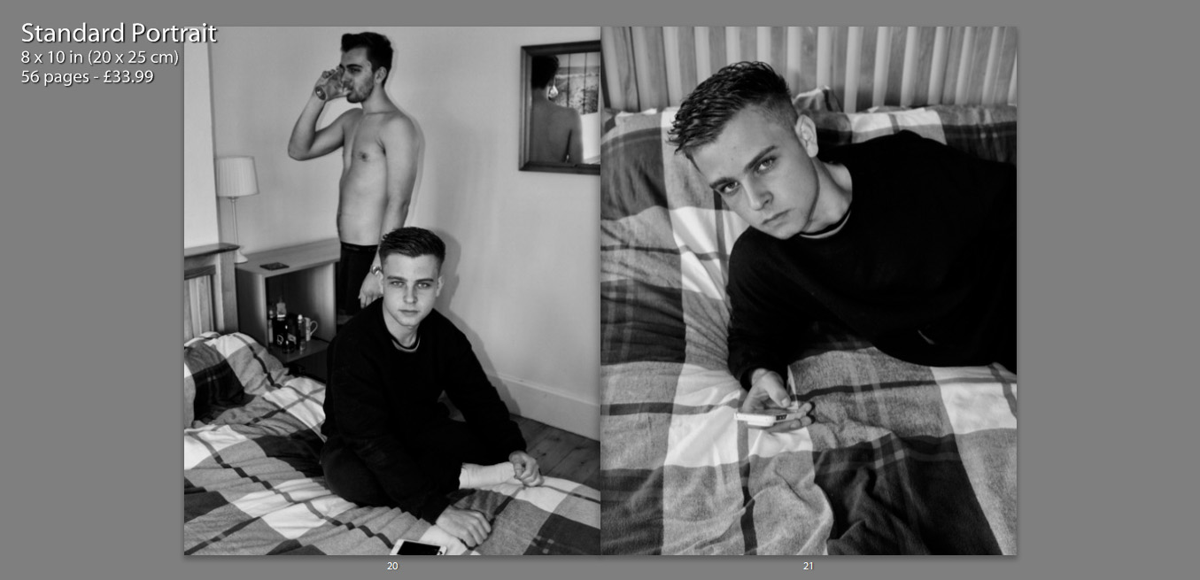
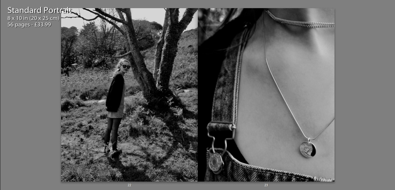
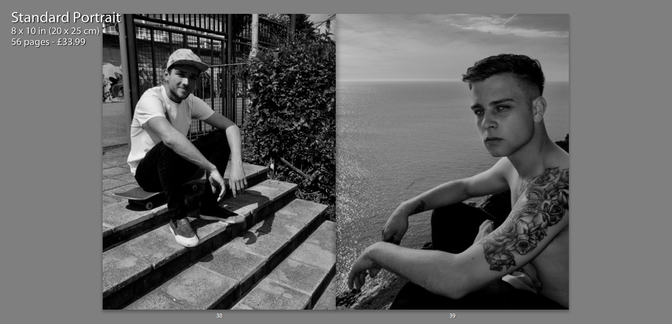
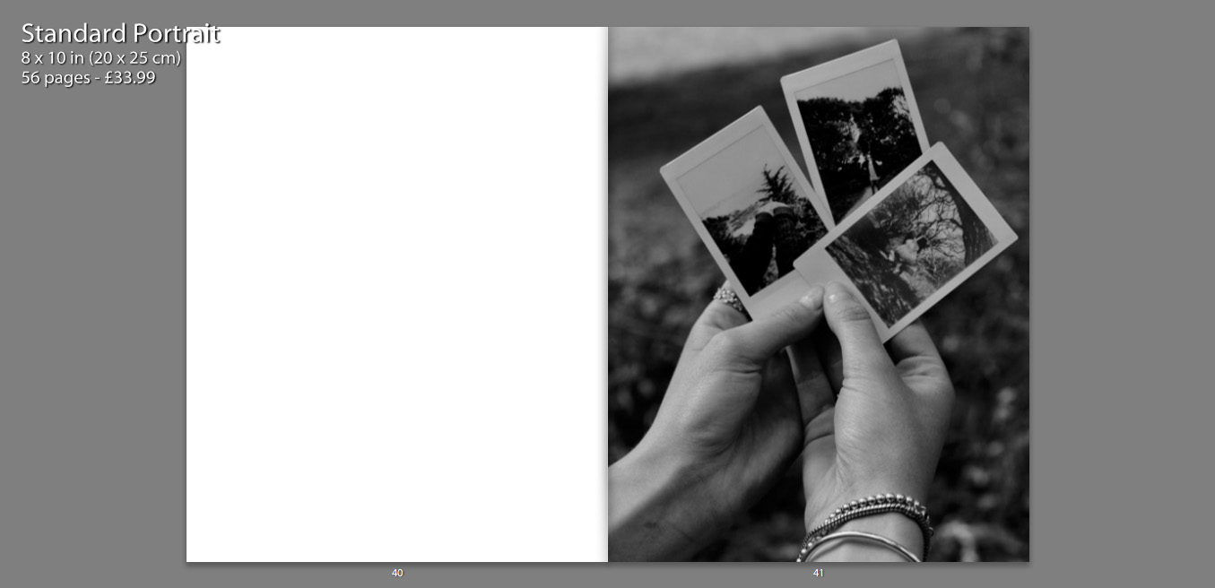
The following print screens, show my book layout as double page spreads, this way we can see images and the specificity layout more closely, as well as how images have been presented effectively.


I decided to title my book ‘Are You Even Cool’?’. I titled the book this, as I feel that in a modern day society, especially within the age confinements of an older teen, there are many expectations as to what we should be doing, or looking like in order to fit this idealization of ‘cool’. I feel that my book contains many of these aspects, such as smoking, skating, having a boyfriend/girlfriend, sex, alcohol, drinking coffee and tattoos. I think that this title enables the reader question the book as well as themselves, making them want to open the book and see what is contained. It also creates a more personal title as I am asking the reader a question, it is also as if I am asking the characters in the book the same question.
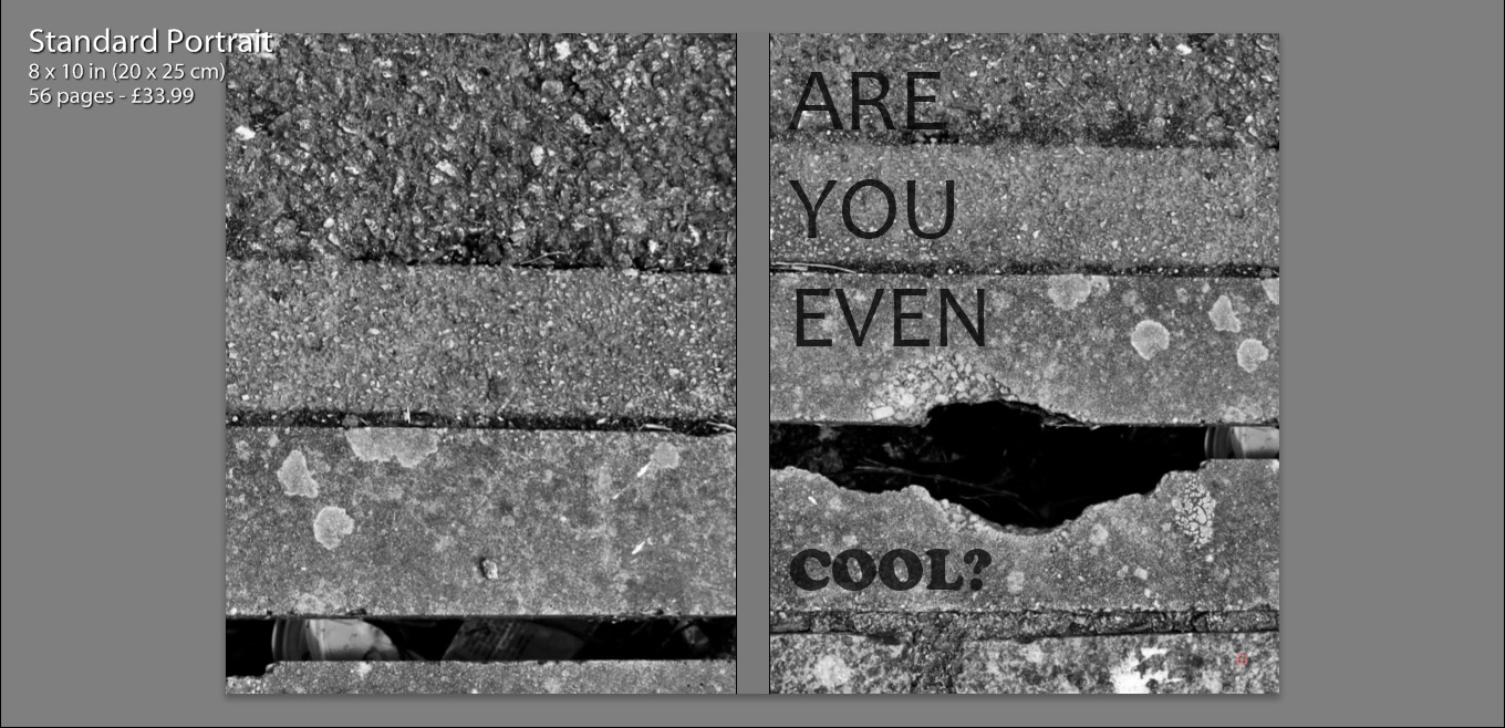
Initially we see my front and back cover, as well as the book title. I chose to use the same image for both the front and back cover, zooming in and aligning them differently, so that they appeared to be two separate photographs. I felt that use of this image was almost a summary of my book. Very gritty and in many ways unpleasant, but as well see a very interesting texture alongside well positioned lines which in some sense convey beauty. So more simply put, my book is a contrast of beauty and ugliness, making it rather controversial.
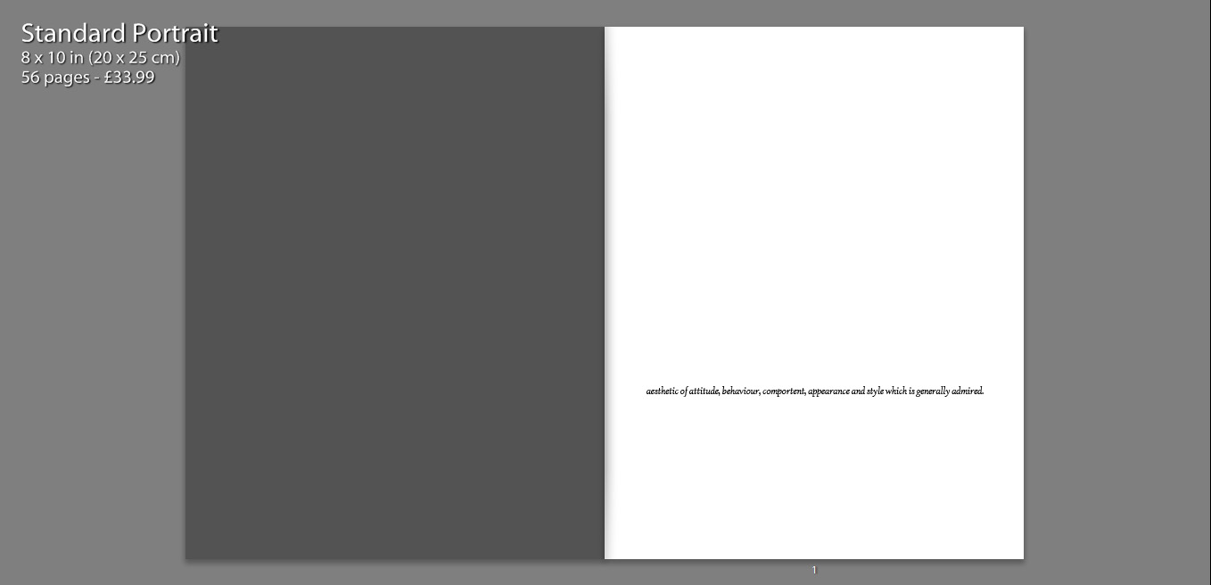
I also include a quote on the first page, how the Urban Dictionary defines the word ‘cool’. I felt that this was relevant as I wanted to include a sense of what the world defined the word as, a ‘style which is generally admired’ is a common theme running through a modern day Jersey. So many children are concerned with living up to social expectations and imitating others and their styles.
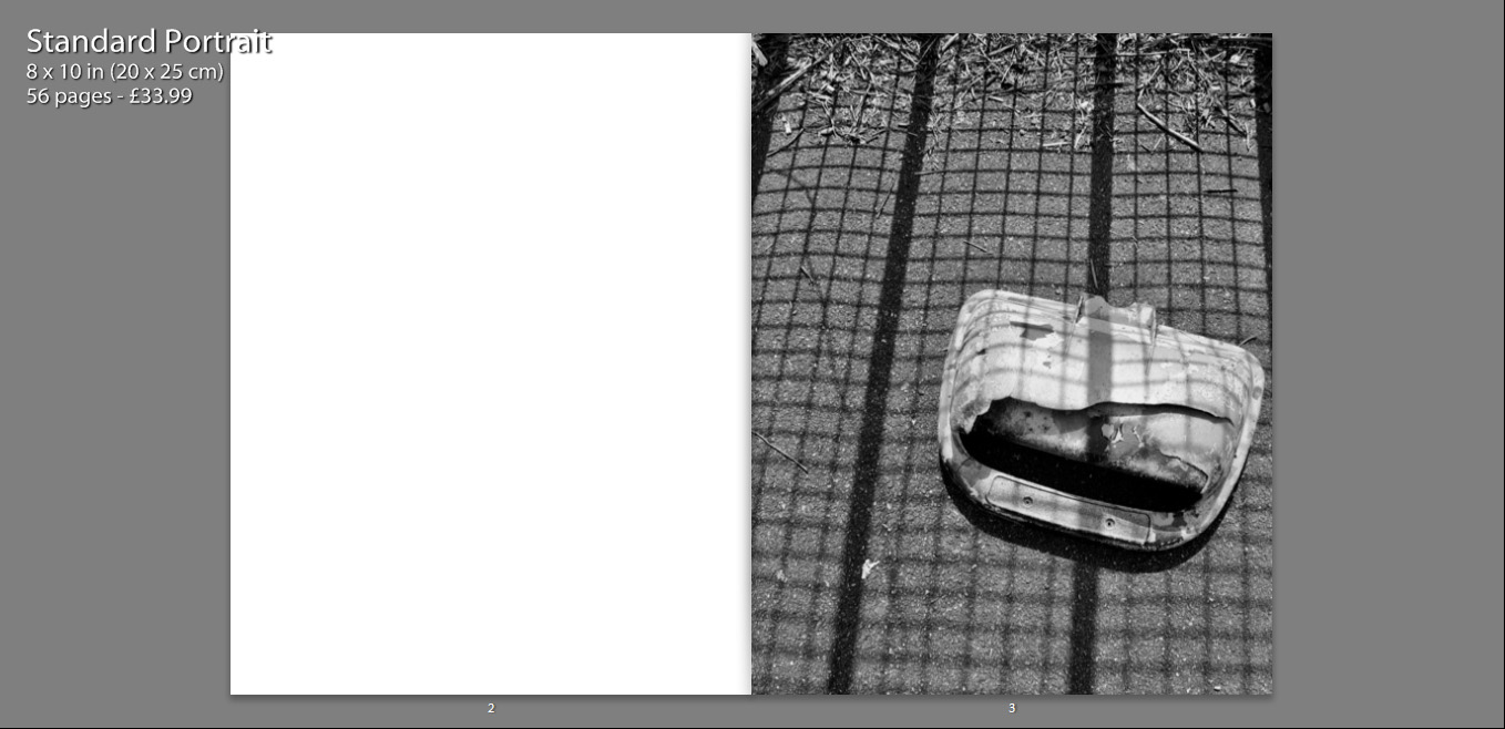
In terms of imagery, within the book we firstly see an image standing alone on a single page. My intentions with this are largely to provoke thought, what is this? What does this mean? Why is this the first photograph?

As well, I feel that an image which appears alone becomes more poetic, as we only focus and analyse this one photograph and it is not particularly related to anything else at the time we view it.
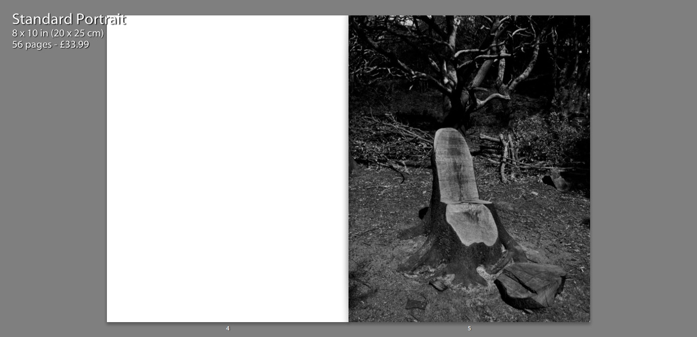
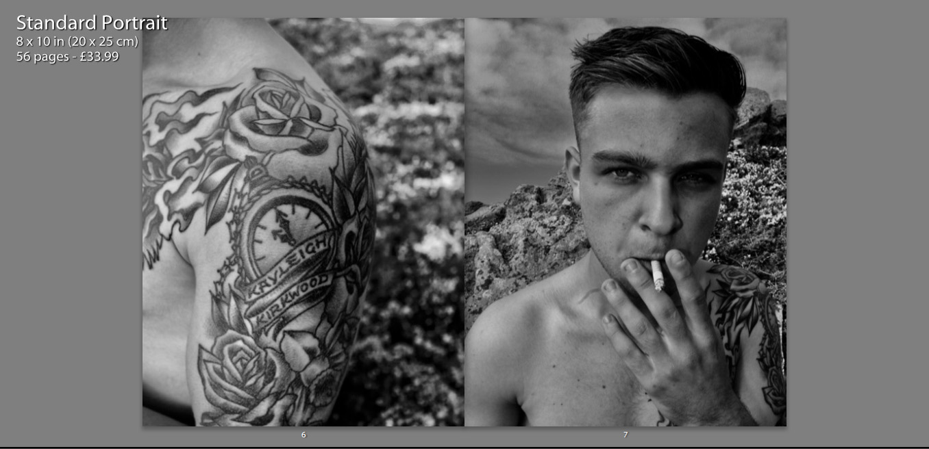
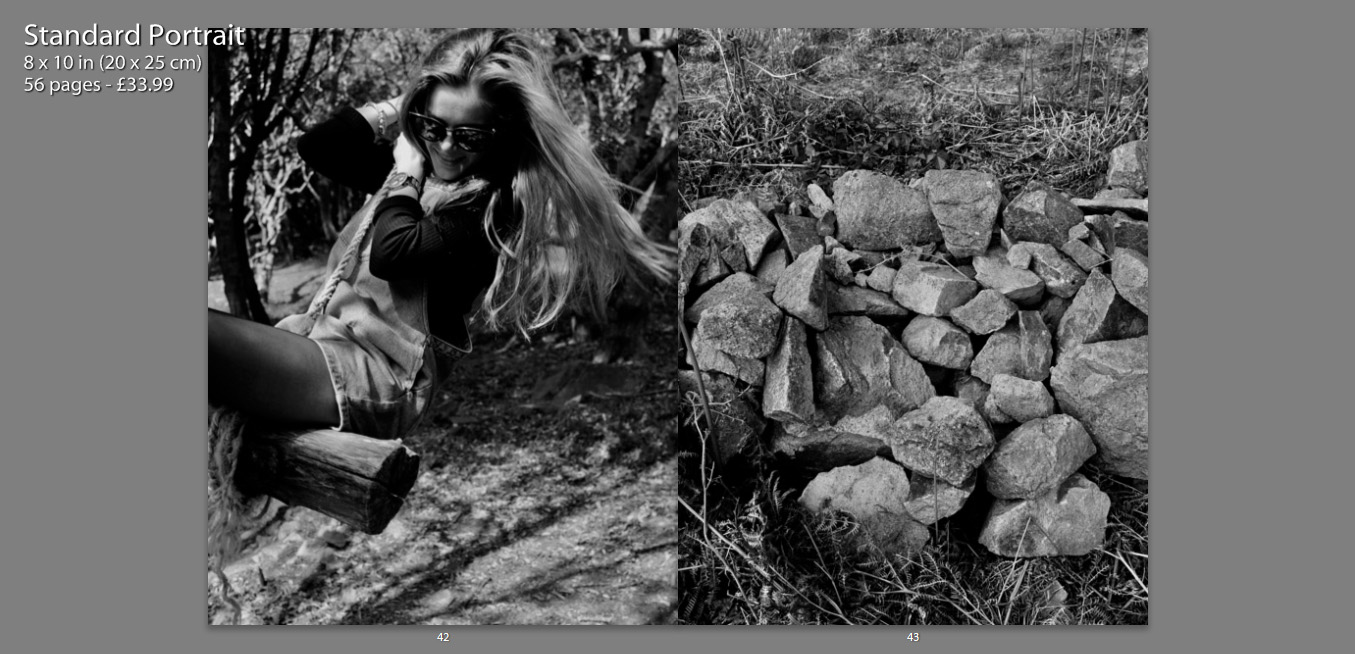
On a large amount of my pages I feature two full page photos on a double spread. These images often juxtapose one another and create meaning, as well as contrast. I chose photos of similar form and aesthetic, which means they fit well together and almost appear to be one photograph.
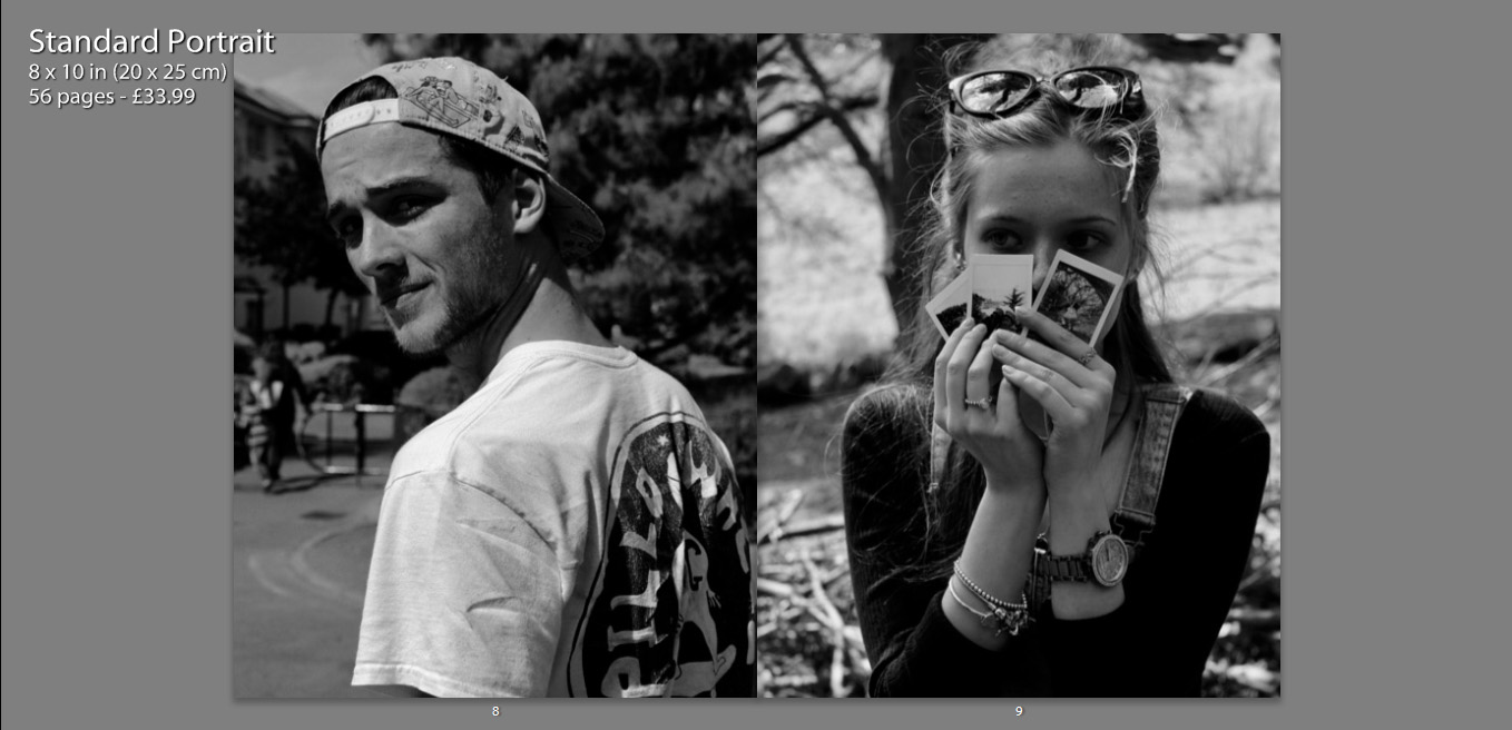
Another way in which I have presented my images, is contrasting other charters within the book on opposing pages. I placed images of similar composition and pose next to one another, which I feel creates a relationship between the two characters as they are shown in a similar perspective.
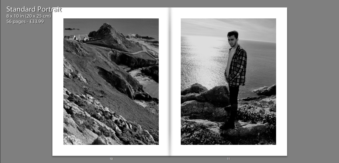
Some images have also been resized, so that they are not full size, as I felt that having a boarder allowed the details of the image to be more dominant. It also condenses the photograph which helps to bring focus to the subject also.
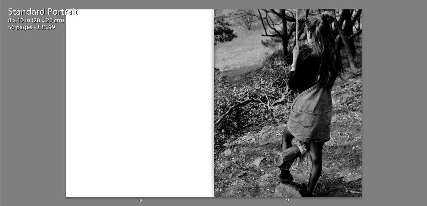
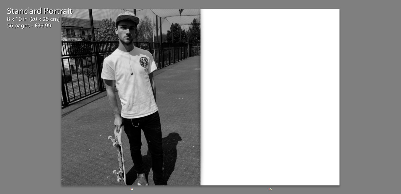
The inclusion of various still life photographs, that appear on their own in the boo, as well as alongside other images, allow the book to become more personal. We are also able to gather a better understanding of the characters and their interests.
My layout of my book is in simple terms attempting to present images in such a way that they tell a story. Some images stand alongside others, juxtaposing one another, whereas others stand alone so that the viewer can gather some sense of emotion of relationship with the image. This book is a personal insight into the relationships I share with my close friends, as well as a representation of what my life and environment is and once was.

Pieter Hugo Inspired Photo Manipulation


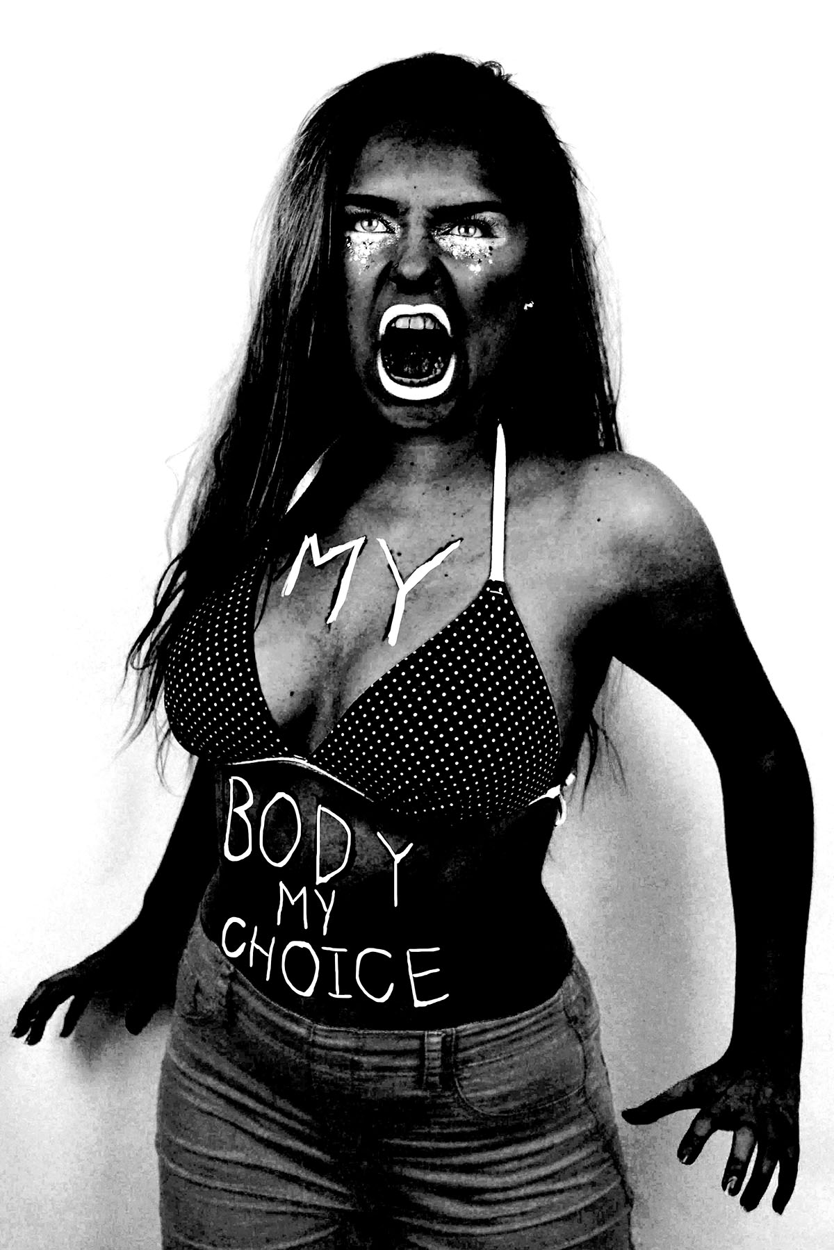
Here are three images (and their originals) from my angry feminist activist photo shoot that I manipulated in way that was inspired by the photo series “There’s a place in hell for me and my friends” by Pieter Hugo. I created these images  by placing a black and white filter over the images and adjusted the colour channels. I made the reds much darker, which made the red tones in my skin appear darker and more intense. I slightly adjusted the yellows to be darker to make the yellow tones in my skin darker, I didn’t make them as dark as the reds because i still wanted the high points of my face to be light to get a sense of depth and contrast. I didn’t adjust the greens because it didn’t make any different to the image due to the lack of green tones in the raw images. I made the cyan’s much lighter to make the background of the image white, which created a dramatic outline and sense of contrast to the figure. I also increased the brightness of the blues and magentas to make the pink makeup under the eyes, the straps of the bikini top and the lipstick white to make the eyes and the mouth, thus the facial expression more intense. The white straps of the bikini top also draw the eye up towards the face.

I also experimented with painting over the writing on the raw photo with white, as most of the text was lost when the yellow and red tones of the skin were darkened. I initially used the regular brush tool to write over the top of the text but for some reason, the airbrush edges didn’t look right. I then used the brush tool with the solid edges but I couldn’t get the flow of the accuracy needed to make the text look right. I then tired using the 48 brush which is an angled brush with long flexible bristles that are sensitive to how much pressure is applied in the stroke. This tool helped me get the rough, uneven lines I was aiming for. 

I then experimented with combining the images together, to create a small group of angry feminists. I think these images are strong as when the images are displayed together there is a primal sense of anger and intensity. The combination of the different stances and expressions make it appear as it they are ready to attack. I combined these images by using the lasso tool and dragging each figure onto the same canvas, I used the lasso tool as opposed to the quick selection tool as I wanted to make the figures relatively close together and I didn’t want the white edges of the original images to overlap. I made two version of all three images together, I also experimented with cropping the images to focus on the faces, I had to move the images closer together so that their bodies overlapped to create the intensity needed for the cropped image.

I then used the same 48 angled brush tool that I used to paint over the text in white in one of the images over to add some text to the cropped image of just the faces. I tried to make the writing both raw and rough, as if written with a sense of anger as well as legible, which is why I decided to use block capitals like the text written on the torso of the original photographs. I then used the lasso tool to more the words and sometimes individual letters into place as the white background allowed me to do this easily. I then decided to try adding some texture to the image to give it a different effect that connoted ideas of violence and anger. I experimented with a scratched texture that I blended with the image on photo shop.

Contact Sheets

Contact Sheets


Sometimes called “contact prints” contact sheets were used much more frequently in the past world of photography than they are today. A contact sheet is a single piece of paper that is used to show all of the images from a roll of film or for single large format images. For 35mm and 120 film the developed negatives are placed on photographic paper and are then exposed onto the paper. This leaves a trace on the paper of the whole of the negatives, chraceristicaly leaving the sprocket holes and film data on the image also.

Contact sheets were a way for a photographer to be able to view all of his/her images in one place and be able to make easier comparisons between individual frames. Often using pens they would annotate, circle and frame certain images to denote if they are still useful or not, this is similar to how photographers do this today with digital images. When using Adobe Bridge or Lightroom you can go through your images and separate out the ones that you do want and don’t want using colours or numbers, by colour coding using different pens on a contact sheet the images you can do this also. Each photographer had their own method of doing this, come used an X to mark out images, others would put borders around images in different colours to denote different meanings, and some would circle specific frames.

This contact sheet above is of Marilyn Monroe, the flow of the images shows the method of the photo shoot. After processing and creating a contact sheet Marilyn herself has gone through the images, presumably with the photographer Bert Stern, and she herself has crossed out the images which she does not like. There are several contact sheets similar to this with her starring in them that she has also marked. The contact sheet below is another of these. This one is composed of a series of medium format negatives of the star, probably wanting to protect her personal image she has crossed out all of the 11 images, the publication of this image defeats the purpose of her crossing out the frames in the first place but that is beside the point, the fact that the contact sheet gives you a view into the mind of the photographer (or in this case the model) is very interesting. Normally the only image we see from a photoshoot is the one final image, but with this we really get to see the process of the photographer, we get to understand why they chose that one specific image to share over the others that they had available.

One of the most interesting things about a contact sheet is often why a particular image is chosen and why others were rejected. In the youtube video above Elliot Erwitt talks about his feelings towards contact sheets. He starts off by stating that a photographer should never show the world his contact sheets. This is not something that I agree with, I feel that sometimes the context behind why a photographer took certain photos to be one of the most interesting parts of the image. An example of this is “The Magnificent 11” by Robert Capa.

This set of 9 images from the D-Day landings were taken by Capa when he landed with the second wave of assaulters on Omaha Beach. There were meant to be three rolls of images that he sent back but instead these are the only images to exist (frame 9 is published in many different places but the negative itself is missing). There are different theories as to how these other images were destroyed but that is not particularly important, however they were lost it is a great shame that they were. This contact sheet shows the surviving negatives and although small shows a really incredible insight into his short time on the beach. This is why having contact sheets is so important, if only the published images were shown then we would not see some of the other frames, the smokey, shaky, out of focus images that show Capa’s own fear.

This video above is similar to the first one but shows the works of William Klein instead. One of the specific points in the video (6:03) he talks about taking photos of a shop window, a person approaches the window and stands there “it’s a photograph” then the person starts pulling faces and it’s ruined. This ability to capture “the decisive moment” is often not thought about enough, because today we can snap away at crazy speeds we capture every moment and look back later, with film this was harder and so seeing how this perfect moment was captured is often very important. Klein also talks about the amount of time of a photographer’s work that is seen.

“The picture is taken at 1/125 of a second. What do you know of a photographer’s work? A hundred pictures? Let’s say 125. That comes out to one second. Let’s say, more like 250 photographs? That would be a rather large body of work. And that would come out to two seconds. The life of a photographer — even of a great photographer, as they say — two seconds.”

he mentions this because although the work of photographers takes a lot of time to set up in the end often is is only a second or so of their work that we really see. This makes being able to expand upon these single images so important, understanding an image takes more than simply seeing it. Thought has to be given to the background of the image and why we are seeing it over the other images that were likely taken at the same time.

This link was really useful for me in looking at how photographers mark their contact sheets. the hand written nature of the marks on the images really lends a touch of personality to the images. Not only has the photographer taken the image they are leaving this personal mark on them. The different colours work really well against the black and white images, they highlight different elements of the sheet to be looked at closer. Sometimes even making notes on the image or highlighting areas of the images for post processing.

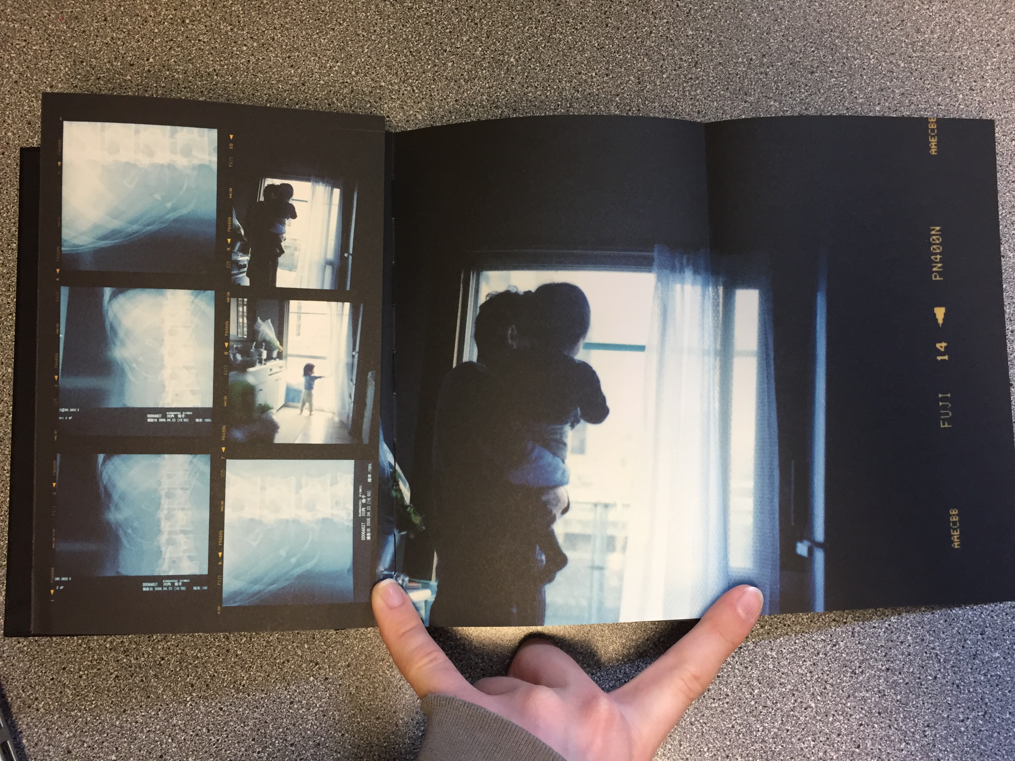
The book Sheets by Rinko Kawauchi is another example of this artistic use of contact sheets. Although the images  are not in the traditional contact sheet style they do show the progression of work that has happened throughout the life and work of Kawauchi. With folding out pages with larger images it is almost the same kind of thing as writing on the images. Attention is drawn to the photographer’s favourite images, and the other images are still there to give context to the best images. The book is fantastic because it not only shows the work of her for one project but it shows most of her work over her lifetime. Although more of an artistic book it is still a fantastic thing to behold. This link goes to the page for her book and this one to another page that shows some more of the pages.

Because I am using film for my project I could possibly look at making a contact sheet from the negatives and blowing it up or I could use larger printed images and make a background for them. By drawing on the images using different coloured pens I can create different effects, drawing attention to the different images and annotating them. Alternatively I could look at using the colours to complement the colours of the images, I have looked at the work of Klein briefly and will do in more depth but specifically his contact sheets project. He uses coloured paint on blown up negatives to create art pieces, the paint is not usually denouncing images but just to act almost as a frame for the real images.

This link also shows some other examples of famous contact sheets.

Environment – My Book Idea

As an idea for a photo book, I decided to combine the styles of two artists I had researched, Jacob Sobol and Theo Gosselin. Two books of theirs particularly inspired my own ideas, these were ‘Sabine: A Love Story’ by Sobol and ‘Sans Limites’ by Gosselin.

Sobol’s book,  which documents his experiences living within his Greenlandic girlfriend Sabine and her family in 1999, was taken over the course of three years. Sobol’s book records both in photographs and in narratives, his encounters with Sabine and their life on the east coast.

Many of the photographs are very intimate and personal and would may only really contain relevance to the couple themselves. Which is ultimately the aspect of this book that I want to focus on within my own, the personal qualities, that will only be sentimental to myself and the subject.

The photographs from Gosselin’s book, were taken on various road trips in the US, Scotland, France and Spain. His images are full of youthful energy which captivate the viewer with stories of freedom love and friendship.

The book reveals his attempt to communicate the actual visual conditions seen at the time of the photographing. This is similar to how I wish to portray the images within my own book. I am showing the viewer a scenario of raw emotion, which is real as it’s exactly how it was at the time.

I am venturing with my closest friends to locations that are full of life and freedom and capturing them as they act in their youthful ways.

My Final Prints

How I will present my Final Prints; 

I have chosen 5 photographs for my final prints. I’m going to mount them onto foam board separately, as I’ve designed a book which already puts them together as a story, so for my prints I want them to represent their own journey. The reason for presenting them on foam board is because I feel the images are too contemporary to have a border around them. I have experimented by choosing both landscape and portrait layouts for my final prints.

Final Prints; 

Image 1 – 

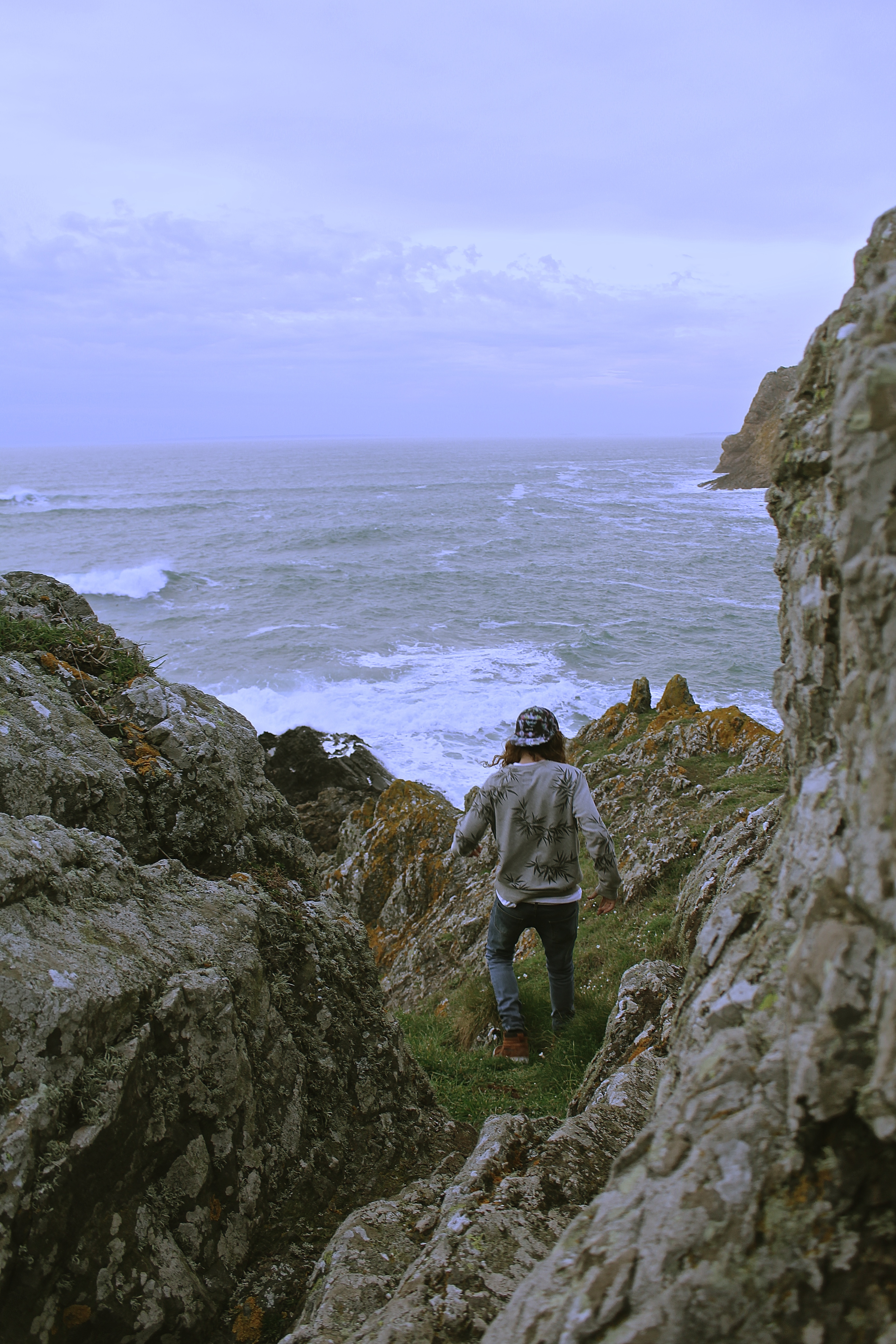
I love the image below, because the colour scheme works perfectly, his grey jumper with the grey stones and the brown shoes and hair combined with the brown seaweed. I also like how the image is shot from a birds eye view.

Image 2 –

The reason I selected the image below for printing, is because it’s very similar to one of the images I’ve selected for my book, except this has a portrait layout. This one is also framed by the rocks within the image, unlike the one chosen for my book. I would have put this one in my book although they were too similar for them both to be chosen. All my other prints I have selected have also been selected for my book as well, so I wanted something different.

Image 3 – 

I chosen the image below for my final print as it has a lot of energy and movement in it, which I wanted to represent in my photographs. I also like the surrounding the model is in and how it has a cinematic effect.

Image 4 –

The reason for choosing this image, is because I didn’t just want my prints to be just of individual models, I wanted to show the group journey. I love the natural lighting of this image, and the facial expressions of the model.

Image 5 – 

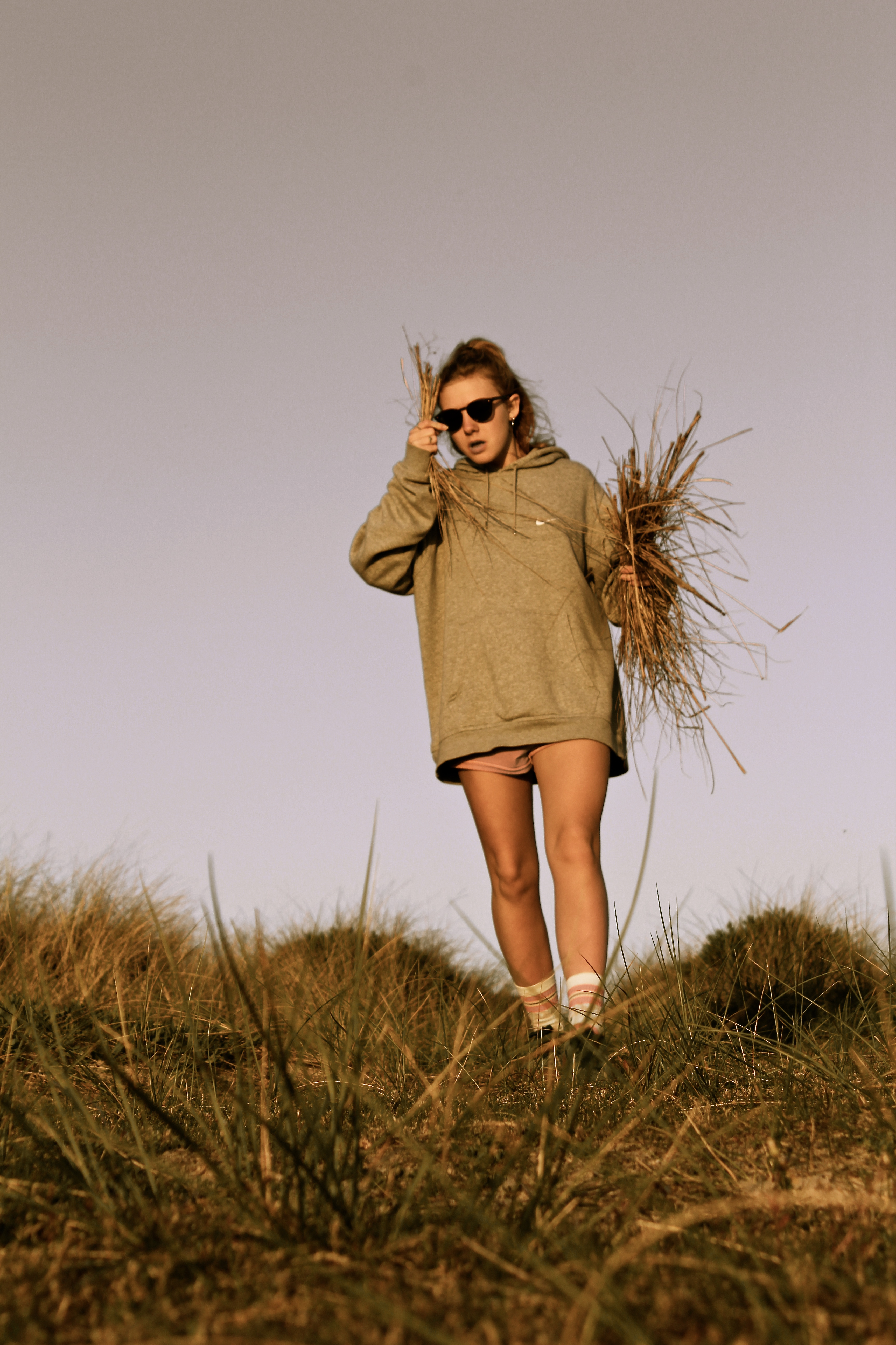
I chose the image below as I like how it looks like its been taken in a fashion photography style. Also, the image shows my use of experimentation with focal point, as the girls legs are more in focus than her face, which actually works well. When printed this is more obvious than on the screen of the computer.

Pieter Hugo – Artist Reference

Pieter Hugo is a white Johannesburg born South African photographer. One of his first bodies of work entitled “Looking Aside” Produced in 2006 consisted of a series of studio portraits of people with striking appearance that cause people to avert their gaze for various reasons. This often included people with albinism, birthmarks or visible signs of blindness.  Hugo described his subjects as people who  “whose appearance makes us look aside” these portraits are conducted in a formal studio setting, they are simply composed, similar to a passport photo. The lighting (in the first three images below) is not particularly harsh or soft, but somewhere in between. I think these images have been seen as controversial because there is a question as to whether or not Hugo exploited these people who may be self conscious about their conditions for the purpose of producing intriguing photographs. His photographs could also however, be considered empowering because he photographs his subjects in a way that makes them appear unconventionally beautiful as well as bringing light to people who have conditions that affect their outward appearance.


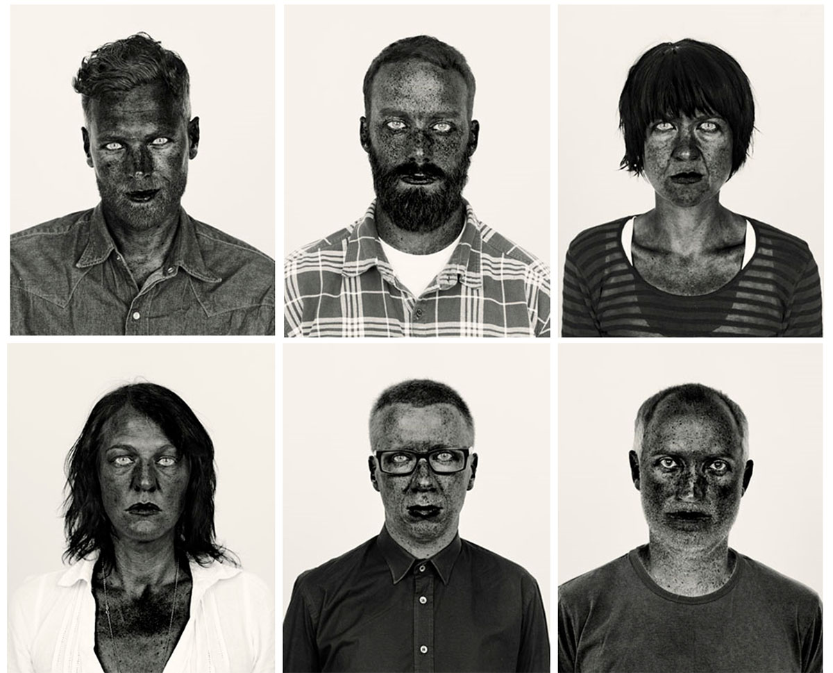
The collection of photos of Hugo’s was his image series which was made into a photo book entitled “There’s a place in hell for me and my friends” (images from which are pictured in a 2×3 grid below) This photo series of black and white photos are highly contrasted and the colour channels within the black and white filters have been digitally altered. This exaggerates the melanin  in the complexion of his subjects, making their freckles and imperfections more visible and act as a stylistic feature of the portrait. Many critics have described this form of photo manipulation as opposing response to their heavily airbrushed images of people in the media. The subjects within this project are of a variety of different races and ethnicities although the colour of their skin does not seem to vary too much when the same manipulation process is applied to the portraits, perhaps suggesting that the colour of human’s skin is really not that different in terms of the biological makeup. Aaron Schuman stated in response to this photo series that “although at first glance we may look ‘black’ or ‘white’, the components that remain ‘active’ beneath the surface consist of a much broader spectrum. What superficially appears to divide us is in fact something that we all share, and like these photographs, we are not merely black and white – we are red, yellow, brown, and so on; we are all, in fact, coloured.”

The image above is Pieter Hugo’s self portrait which was included as part of his “There’s a place in hell for me and my friends” collection. This photograph is incredibly striking due to it’s high contrast and despite its very simple composition. All of the portraits from the previously stated collection were cropped in the same way, a simple head and shoulder shot, similar to a passport photo. I feel that this was a creative decision to draw attention to the face of the sitter, this is also supported by the incredibly plain background. In the image above the background is a very light grey colour, the whites of the eyes and the white of the shirt are much brighter than the background and this helps to bring the figure forward. The most striking element of the image is the contrast between the eyes (both the white and the very pale irises) and the skin. The skin is given a very interesting texture as the way that the photo is manipulated brings all the ares of pigmentation to attention. The texture of the beard is also very interesting as the fewer lighter coloured (perhaps grey) hairs stand out against the rest of the darker hairs.

I was drawn to Hugo’s work because of the dramatic, intense and captivating nature of his portraits in his “There’s a place in hell for me and my friends”. I also liked the fact that Hugo does not worry about flattering his sitters in this series and he also includes himself in his work. I want to take inspiration from his high contrast portraits as I feel that my angry feminist photos would work well with the intensity of this style of photo manipulation.

combining prints – digital and physical


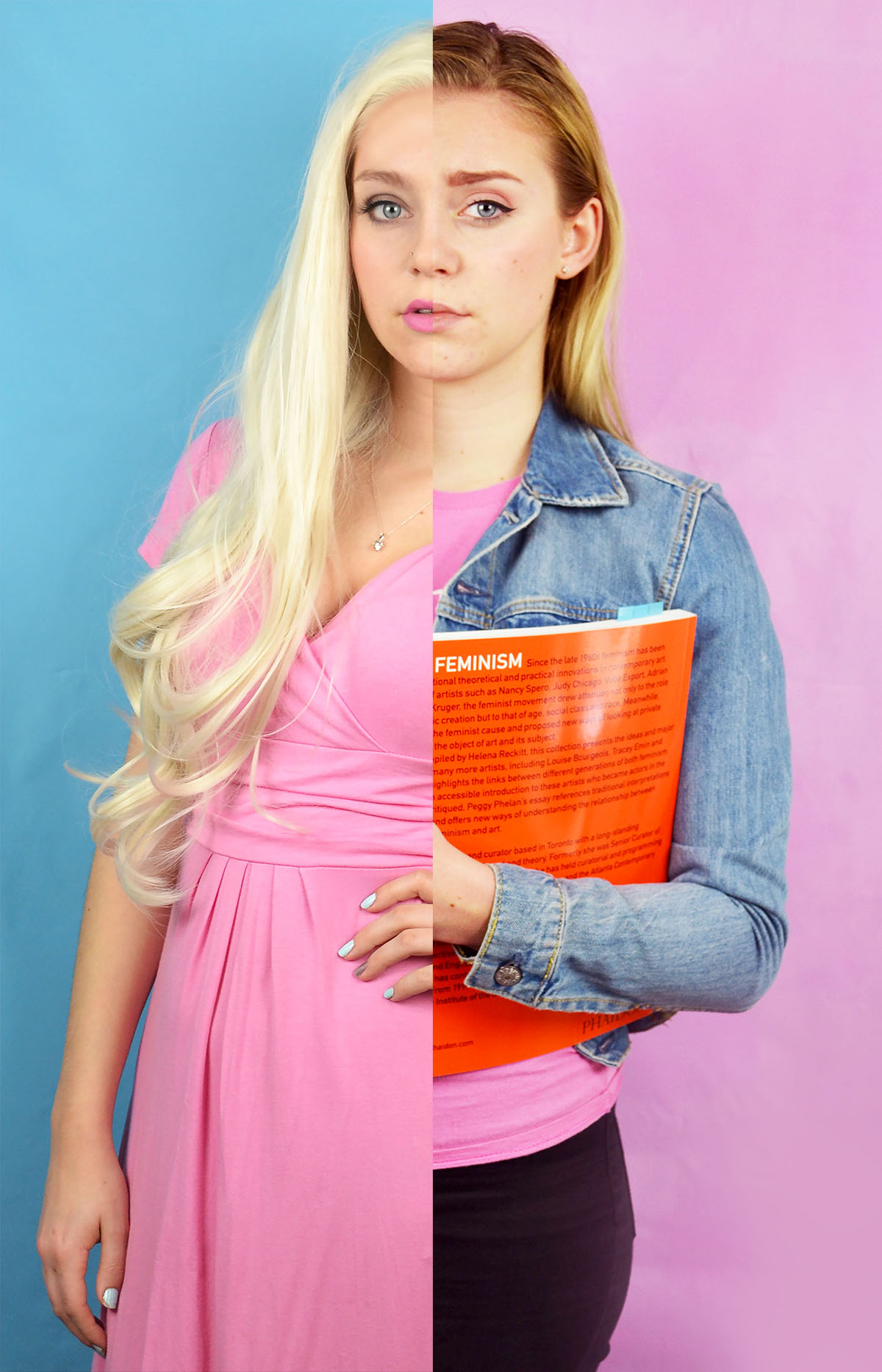
Here are my first attempts of combining my feminist and blonde stereotypes, I felt that these images would work well when combined because the different hair colours would make the split more obvious than other combinations of images. I also felt that these would work together because the blonde image features a blue background and a pink dress and the feminist image features a oink background and a blue jacket. A digitally combined these by using the quick selection selection tool and simply selected half of the corresponding image and layered it on top of the other. As you can see from the two potential images above, the image on the right worked better than the one of the left. Once the images were combined but not flattened into the same layer I altered the colour balance on the feminist side to try and make the skin tone match the other side so that the split was less jarring. I also moved the images as appropriate to make the hair lines meet as I it looked quite odd if they didn’t.

I also experimented with combining the photos in a more diptych fashion. I created this image by flipping the feminist horizontally creating a canvas in Photoshop that was long enough to take both images placed next to each other. I then selected the images in turn and placed them onto the same canvas. I then arranged them and cropped the as appropriate. Although I do like how this image looks I do think that the text that appears in the feminist image and on reflection it may have been a better idea to flip the blonde image instead.
I then experimented with combining physical prints of the the images in order to get the white ripped paper effect between the images. I actually found ripping the printed image quite tricky, I knew that I wasn’t going to get a perfectly straight line but I did find it challenging to control the direction of the tear. Despite the fact that the faces in the first manually combined image don’t match up exactly I feel that this one is the most successful. I want to experiment with these combined images further, perhaps with the addition of text.


Brett Cole

Website: http://www.brettcolephotography.com/?search=air+pollution

Brett Cole is an American Photographer who does Social work in India and focuses on Social and Environmental issues in India.

He is dedicated to helping people, nature and animals by raising awareness through his work in photography. He has made of 15,000 photographs during his time working in India and has completed many projects on Snow, Air Pollution and on Conservation.

Brett Cole’s project on Air Pollution focuses on Smog primarily as it is something that damages the health of many people in India and China as well. It has caused problems with breathing and can cause fatal asthma attacks. His photos are not the most interesting and well composed but they do put across an important message to the world and show the reality of living in India which in some places is as polluted as China. The media often ignores pollution when it comes to India and China because  they know they are the worst affected and do not want to make the world aware of the problems that the developed world is causing. India and China are the worlds dumping grounds yet they made us products which we could not live without such as spices, food and technology. Photographer wouldn’t have a job if it wasn’t for the Japanese and Chinese inventing new cameras and Apple is based in China yet we still decide to not help them and let them swim in polluted waters, have E-waste pilled as high as mountains and let smog take over the sky and make it difficult to breathe. Personally, i find Brett Cole’s work interesting but it does live up to the standards of a professional photographer which i think he is not well known and he focuses more on raising awareness rather than the composition of his images.

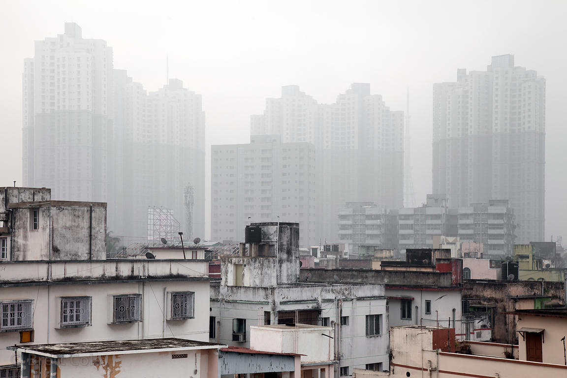
Air pollution over the tallest buildings in Kolkata, India – the 35-story apartment complex near South City Malls.

This is one of my favourite photos because it shows how smog can completely take over a city and make it vanish into thin air. The lower houses aren’t as affected by it but the high rise buildings are completely surrounded by Smog. People usually have to keep windows shut down Smog periods for their own health and this makes it difficult to live due to the high temperatures soaring during summer. This photo almost seems like an image which has been superimposed as they do not look like that are part of the same village because there is a juxtaposition between poverty and riches, poor housing to tall 35 story buildings. With this image, your eyes are first drawn to the buildings which are clear of the smog as they stand out but then your eyes drift towards the buildings which are partially hidden by the smog. It is a very interesting images with two different lives and weather split in half.

Environment – Final Image Layout

When contemplating an idea for the presentation of my final photographs, I was initially unsure of what to do. Though after some thought I decided upon an idea which I felt would justify my images the best and my importantly my project. Below documents the process of this.

This collection of images feature my final photographs that will be presented for my exam project. These images alone, are not all necessarily my favourites or even my strongest in my opinion, but I wish to present them in such a way that they do become my strongest set of images.

My intentions are to present images in sets of two, I have a collection of 10 images, which will be made into 5 by pairing the photographs in Photoshop. Images of similar aesthetic qualities have been chosen to be paired together, a standard portrait is always featured, alongside a more metaphorical image, that conveys a more poetic feel. Ultimately, I am attempting to juxtapose my images, with others that may make the viewer question the character.

Examples of my final works are displayed below. These images will be printed into A3, where they will then be mounted onto white card, which will help to highlight the heavy contrast within the images.