Water – Mystery and Mythology

Water – Mystery & Mythology


Since the beginning of human civilization we  have always had an innate sense of fear surrounding the sea and what it contains. 71% of the earth’s surface is covered in water and so it is has the potential to home so much life, much of which we still do not know about. With a maximum depth of 11km finding all of the different species that call it home is not something that is possible, even with today’s technology we cannot catalogue all of the different species as we would like to. There are species that exist in the oceans that we will likely never come into contact with, there is simply so much space that we would never be able to see it all. If this is true today it understandable why our ancestors had tales of the Kraken taking down ships and giant sharks swallowing people whole.

This sense of mystery and the unknown really lends itself to the subject of environment because even with this fear of the unknown people still made the sea and water their environments. Fishermen and women as well as merchants and explorers use the water to travel around and made a living out of traveling on the water. This often leads to stories about the disappearance of ships under relatively regular circumstances being labelled as mysterious or linked to higher powers or mythical creatures. Even from the days of the Ancient Roman Empire through to more recent times these stories have existed, and have only been exaggerated by sightings of giant squid and unexplained disappearances. These kind of disappearances capture the imagination of the public and artists alike.

Often artists will try and show these events and the mystery and fear that surrounds them, found on old maps these images are not very descriptive but still give a sense of mystery that these creatures can just appear out of nowhere and will attack ships. The water and the sea are their environment and we are intruders in their homes and they do not like it. This sense of the unknown is something that I could look into for my project, I have always been fascinated by mysterious disappearances of ships and people at sea. One of my favourite stories as a child was that of the Mary Celeste, possibly the most famous example of disappearances at sea. It captured my imagination and started my love and fear of disappearances at sea (although I love the sea one of my greatest fears is being stranded at sea out of the sight of land).

The main story can be read about the ship here but as it is an insanely well known story only some of the details may be new. The fact that the ship disappeared along with its crew in the first place is not that remarkable in the first place, although unexpected it was not an impossibility, but what is so confusing is that the ship was found intact without a soul aboard, looking as if the crew and Captain’s family had just got up one morning and had all just jumped overboard leaving everything behind aside from a single lifeboat. Many different theories exist as to what happened to cause this but no one will ever truly know so theories will stay as just that, theories.
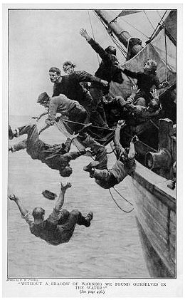
“Without a shadow of warning we found ourselves in the water.”

This hasn’t stopped people from creating art based on what they think could have happened. The sketch above shows one of these theories, it is based on a theory that all of the people on board the ship were on a part of the deck that then collapsed (this website talks about this particular event). There is no real evidence to support this theory but it was popular at the time, the image captures the suddenness and fear with which the crew must have left the ship. Ether through an accident like what the image above depicts but alternatively if they voluntarily left the ship through their own devices but without physically being forced.
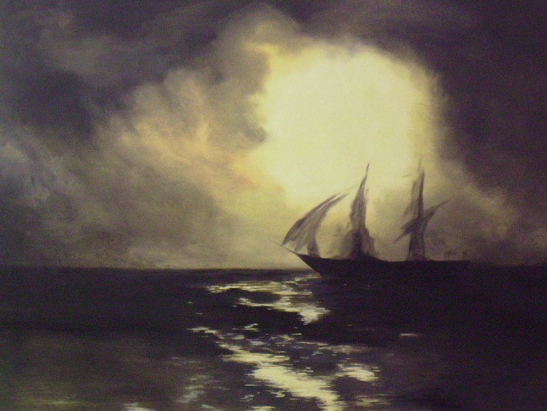
Click on this image to go to the artist’s page

This idea of it being a ghost ship is a romantic notion that has gained a lot of association with the ship. The modern painting above really associate this with the ship. The ship is seen just as a silhouette on the water, non-solid it seems to shift in front of your eyes making this seem like a real, ghostly apparition.

Ultimately all of these different pieces of artwork (not just about the Mary Celeste) are driven by a fear of death. Humans are built and coded to survive. The header image shows this very well, the chaos of this attack shows the human resolve to survive that drives us all every day. The man lifting his axe to this creature really shows the heroism of these people and ultimately that the people who work on the sea are often the ones who will have to work the hardest just to stay alive when things go wrong. Out at sea there is no help other than yourself or if you’re lucky enough your fleet, this has even transferred over to the modern day. In the middle of a long ocean voyage for members of the merchant navy on cargo container ships there are often only very basic medical facilities. this can mean that in a major medical emergency like heart attack or ruptured spleen there is often nothing that can be done. The isolation of the sea like this is not something that I could easily represent but I could try. Without being in one of these environments I could not truly represent this kind of mystery of isolation but I could look at doing something surrounding unexplained sea creatures and other mythological creatures and experiences.

In the end it may be scary to imagine what still lies out there in the oceans, undiscovered and undisturbed. But even the creatures that we know about can be pretty terrifying too.

Idris Khan and Stephanie Jung – Photoshop Experimentation

Idris Khan is a London-based artist that was born in the UK in 1978. After completing his Master’s Degree at the Royal College of Art in London in 2004, he has received international recognition for his minimal, yet emotionally powerful photographs, videos and sculptures. His work has been featured in many exhibitions at international venues including the ‘Museum of Contemporary Canadian Art’ , Canada; the ‘Hayward Gallery’, London;and ‘Espace Culturel Louis Vuitton’, Paris. As well as this his work is in the permanent collections of many institutions worldwide such as ‘The Saatchi Collection’ in London and the ‘San Francisco Museum of Modern Art’.

Whilst Khan practices more as an artist than a photographer, he often employs the tools of photo-mechanical reproduction to create his work. In particular we have been asked to explore some of the digitally remastered and powerful photographs he has created, such as the ones presented below. To create these intense abstract pieces he builds up layers of his images digitally, allowing him to meticulously control minute variances in contrast, brightness and opacity. The outcomes of this technique is often a large-scale print with a surface that has a remarkable optical intensity. Below are a few of my favourites from his work on this subject. I chose these portrait photographs over some of his more busy landscape pieces because I love how he has transformed subject matters that are so plain into beautiful and emotive images.


Stephanie Jung is a freelance photographer based in Berlin, Germany. Her interest in this field began at a young age as her father was a very passionate hobby photographer. During her studies in Visual Communications she discovered her passion for experimental photography, finding inspiration in a photographer she met and worked closely with named Sabine Wenzel. Since graduating in 2010 she has been focussing on fine art and portrait photography, travelling to big cities to capture perfectly the vibrant and hectic scene. This fascination with urban life stems back to her small town upbringing, her work shows the beauty in both the calm and busy moments of everyday life in populated areas.

However,  Jung’s work is not just about city life, it’s about time and transitioning, about capturing special moments and getting lost in time. Like Khan’s work above her pieces are very technical and emotive scenes that have been transformed and edited into beautiful works of art during their post production. In an interview about her work Jung quotes  that the “layering is something which became important and almost self-evident to me, as it represents best what I want to show with my work”. Below are some of my favourite examples of her bright and intricate work that truly capture the busyness of the city life. I chose these photographs as examples as I feel they show a good variety of scenes, colours, and emotive qualities. 


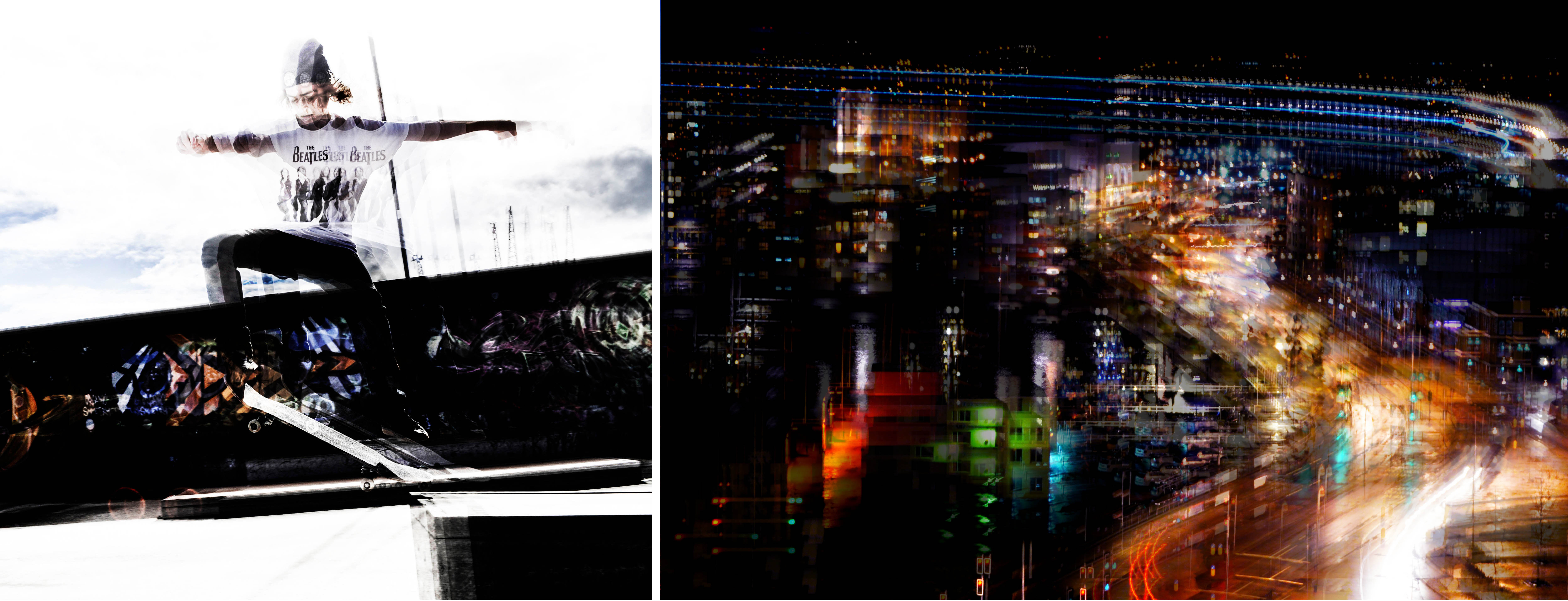
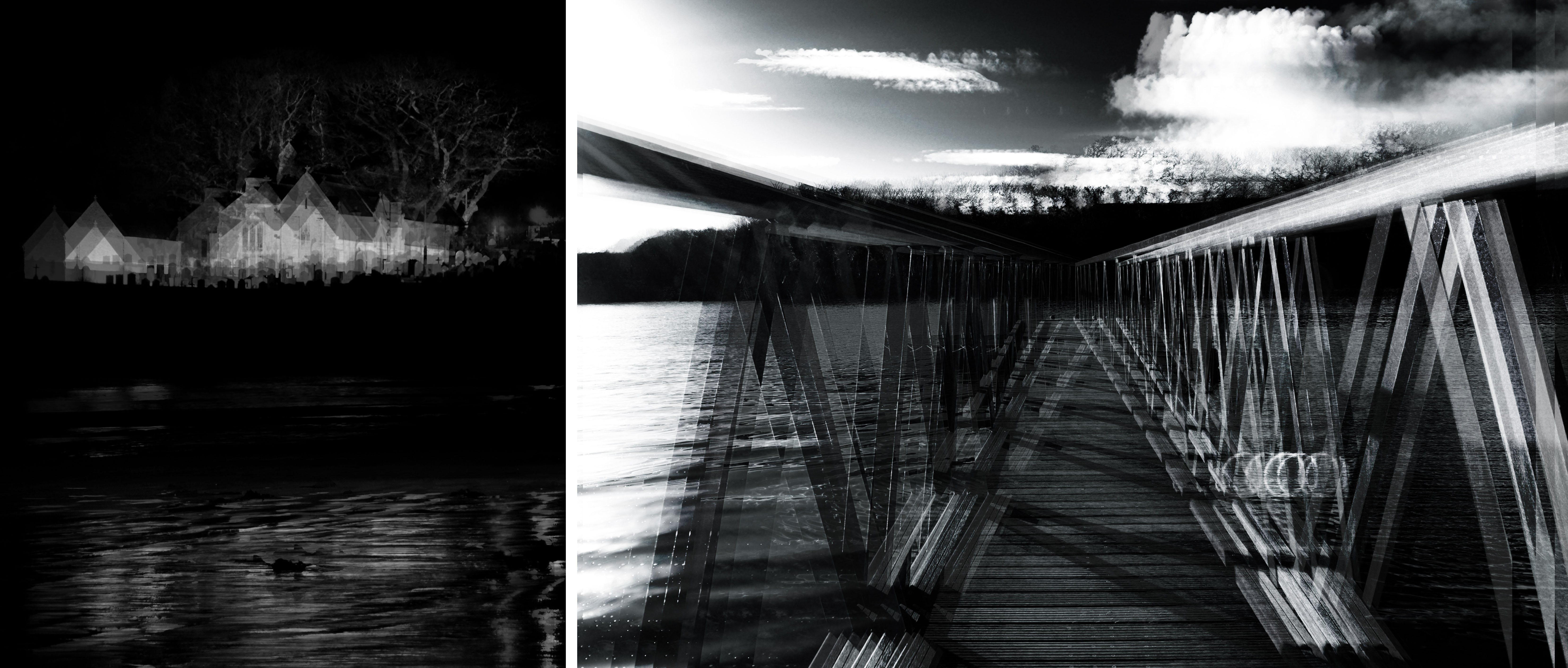
To help us experiment with new techniques and make our individual projects more diverse we were asked to do our own quick responses to this style of fine art photography. Our objectives are to show that we can copy, adjust, blur, and blend layers using Adobe Photoshop;  creating a set of images inspired by the artists I have researched briefly above. My results of this ‘in class experiment’ shows newly created versions of a few of my AS final pieces that I thought would work well transformed using this technique. The first two images on the top row are inspired by Stephanie Jung and show movement and time through an everyday town landscape and an environmental portrait. The bottom two resemble the abstract work of Idris Khan depicting a sense of fragmentation and dark contrasted tones…

Documentary: Conservation Photography – Research

Before continuing with my documentary approach to this project, I first wanted to find out more about the applications of this type of photography. ‘Conservation photography’ is defined as the use of the photographic process, within the parameters of photojournalism, to advocate for conservation outcomes. By combining nature photography with a proactive, issue-oriented, approach to documentary photography it can be used for protecting nature and improving the natural environment. Conservation Photography furthers environmental conservation, wildlife conservation, habitat conservation or cultural conservation by expanding public awareness of issues and stimulating positive action.

Throughout its history photography has developed as a powerful medium to empower conservation. Although it was not as widely acknowledged, photography has served this role since the 1860’s. For example, the powerful images of Carleton Watkins were successfully used to stimulate the establishment of Yosemite National Park in 1864. Since then renewed emphasis on photography for conservation arose at the beginning of the 21st century. This was primarily in response to the human-caused environmental crisis, recognising that the global pattern of abolished ecosystems was not sustainable. The modern field of conservation photography was formalised in October 2005 with the founding of the International League of Conservation Photographers by photographer Cristina Mittermeier. Many people agree, conservation photography falls into two broad categories, both of which are equally as valuable:

  1. The snapshot: a quickly framed image of a naturally occurring scene, taken by chance with not too much time or effort. Images will not contain any manipulation or staging and are strongly connected to documentary photography and photojournalism.
  2. The carefully crafted image: a series of skillfully crafted, high-quality images that tell the story in a more powerful way. Images will most likely be at least a little bit staged, as dramatic framing can often increase the photograph’s power and meaning.

Throughout my project, I hope to demonstrate both of these categories of conservation photography and use my images to spread awareness. Below are some stunning images depicting many different types of provocative conservation photography….

Artist Reference – Andrew Mcconnell:

Irish photographer, Andrew McConnell, started his amazing career in 2003 when he decided to concentrate on documentary work, driven by a desire to tell the stories of people and places that remain under-reported in the international media. Among numerous honours, McConnell has won two 1st place prizes at the World Press Photo Awards, 4 National Press Photographers Association awards. His work is widely recognised and has been featured in many publications such as ‘National Geographic‘ and ‘The New York Times‘.

I have chosen to explore him as an artist reference for looking and conservation photography, mainly because of his amazing project, entitled ‘Rubbish Dump 2.0’. Although this project explores many humanitarian issues it also says a lot about modern society and our ever-growing impact on the environment. In this series, Mcconnell uses the second category, mentioned above, to portray a dumping ground for computers and electronic waste from Europe and the US located in Ghana’s capital, Accra. Every month hundreds of tonnes of e-waste end up here as countries in the West attempt to unload their ever-increasing stockpiles of toxic junk. Of the 20 to 50 million tonnes of electronics discarded each year 70% will end up in poor nations, and in the EU alone 6.6 million tonnes of e-waste are unaccounted for every year. The disposal of electronic goods in the West is a costly affair and must be done in an environmentally responsible manner, however in places like Ghana there are no such regulations and as such toxic metals like lead, beryllium, cadmium and mercury are continuously being released causing untold damage to human health and the environment…

2nd Photo Shoot (Planning)

Planning 2nd Photo Shoot


The second photoshoot that I’m planning for this project is still based around water but instead of looking at environmental portraits like last time I am going to be looking at some abstraction and specifically colour. Based on my blog post about colour palettes I am going to be looking at blue/green for several reasons:

  1. The sea water at the moment is way too murky to be able to use it for underwater photography. I have been trying each weekend to see if the water is clear but every time it is the same thing. No visibility at more than ~1m can be found at the moment.
  2. It is too cold to be able to stay in the water for a long time even with a wetsuit on. And after about 2 hours my ability to operate my cameras is severely limited, often photos will be blurry because of me shaking and water movement.
  3. The pool that I have access to is a light blue colour on the inside, this will mean that without placing something into the water for a new background this colour will have to be included.
  4. The final and simplest reason is that water is blue. To represent this underwater environment I cannot completely ignore the colour of the substance when colour is the focus of the shoot.

After using and seeing the results of my first shoot I decided that, although a lot of fun to use, it will not always be practical to use for this project, time constraints and constraints on the number of photos that I could take drove me to look for a waterproof case for my Nikon D5200. I had already been considering buying one but this need for one just gave me the justification to do so.

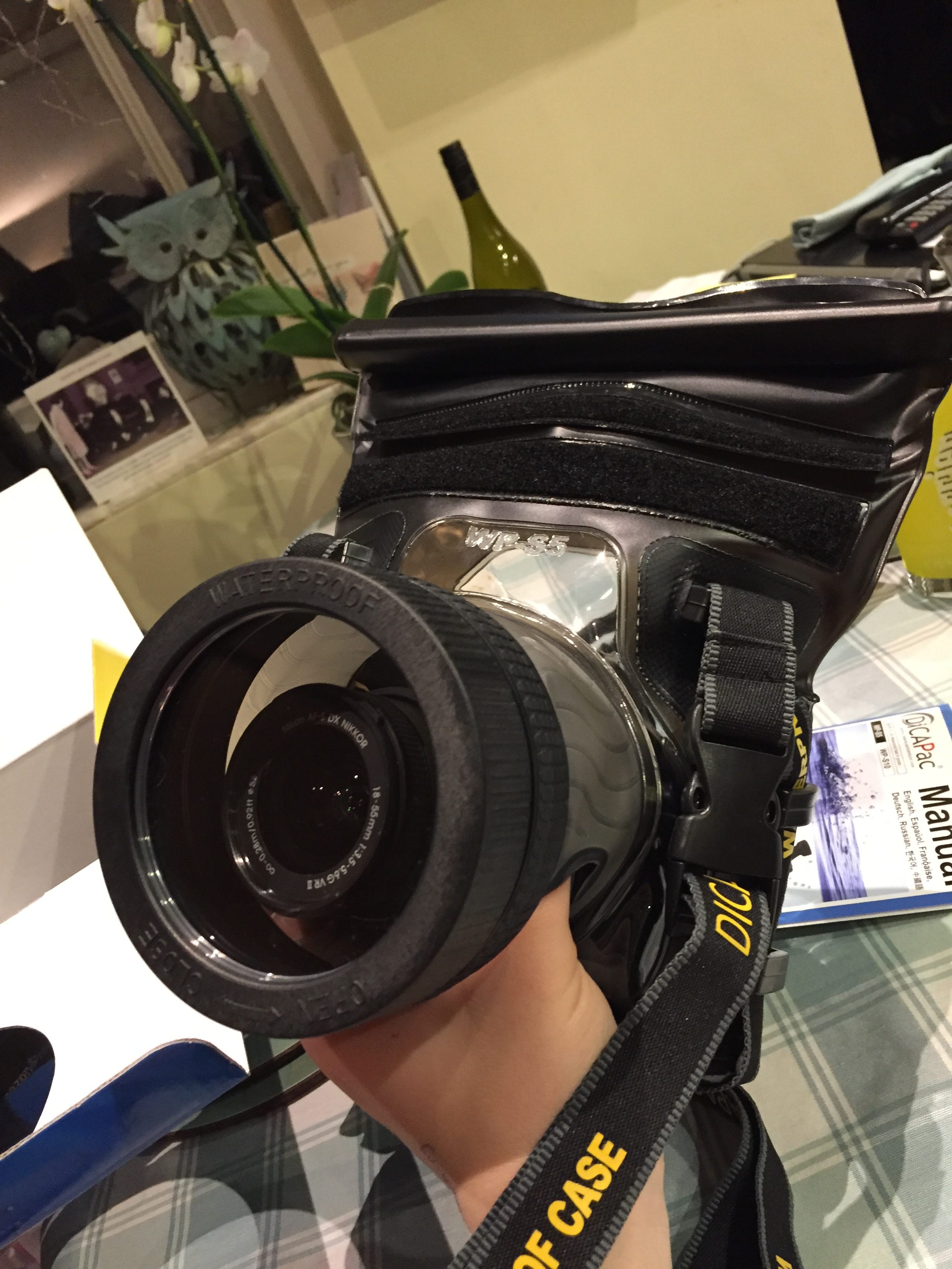
This is the case with my camera inside. I purchased it from DICAPAC through their Amazon site. It is nothing special, just a zip-lock seal which is rolled down to seal and held with velcro. It allows be to use a camera which is much more versatile underwater or in conditions where the camera may become very wet. I plan on using this for the shoot but if the conditions permit I might try using my underwater film camera.

The main idea for this shoot is to have a model wearing make up be under the water or interacting with the water. to make the images even more surreal I am going to be using my male friend as the model, I will be borrowing the makeup and makeup skill of some of my female friends. I will be aiming to use blue/green coloured make up to go with the background and hopefully have a slightly matching color pallette. I am not sure what the images will turn out like but I am excited to see and try.

Inspirations (Colour)

Colour


While spending some time just browsing YouTube I came across a video that caught my attention and I thought that it would be very helpful to my photography work. It is by a photographer called Ted Forbes, he produces lots of very informative YouTube videos about photography and watching this video really made me look back on my own work and think about what worked, what didn’t and why.

In my previous photography work something that I have neglected to give enough thought to is the colours of my photography, this is not so much based on ignoring the bright, vibrancy of the colours that I have taken photos of but instead the matching of the colours in the image and how they work with/against each other to make it. I’m slightly ashamed to admit it but as I now look back on my previous work this is not something that I have even properly considered before. As I do look back to some of my favourite work of mine I do start to notice this connection of colours that I did not plan most of the time but which did, for the most part, work.

This is one of my favourite images that I produced from my AS work. Although now, with a more critical eye I can pick out a lot of issues and negatives to it, it still works well to elaborate my point. The colour pallet used in this image is a very simple one; black, whites and reds. But as was touched on in the video sometimes the best photos do not have the brightest, or most vibrant colours. The image above works because of this, there is an almost monochrome effect to the image with the colours of the red from the guitar just bringing interest to the image. The reds are not even bright or vibrant, they are relatively plain but complemented with the rest of the colours in the image this works very well.

Using the Colour tool that he suggested I decided to look at the colour pallet of one of the images that I took when I went out diving. More specifically I looked at the water (and sky) in the image. I selected the 5 main colours that make up the water in this image and how they flowed between one another. Being relatively dull colours they do not leap out at you on their own let alone inside the image with each other. They do however mix very well together, by looking just at the water in the image you can see this well. The reflections and shadows of the rocks and the reflection of the blank white sky (that’s how it looked to the naked eye too) are all mixed together by the waves in this image giving a real mix of these very similar colours that the film (Kodak Ultra Max 400) captured very well.

Photographer: Brooks Sterling

The way that waves have the ability to mix colours so well, blending with reflections and waves really makes it an interesting subject to shoot. Even when shot in black and white there is still a great degree of interest shown to the images. The way that the light bounces off the water in all different directions due to the smallest, most unpredictable ripples and from random positions means that water is something that always has some higher degree of interest to it than a plain sky or uninteresting background, sometimes making the water in an image more impressive than the intended subject.

Photographer: Roni Horn [1999]
For some like Roni Horn the water is the subject and the colors are very important. The at first seemingly dull images just need to be looked at for longer. When each square inch of the image is looked over with care as intended more springs out than expected. The outline of something being reflected in the image above is apparent but what the object is, is cast into doubt. This particular piece of reflection stands out because it is not following on the trend of the colour palette of the rest of the image.  The colour palette that I have done below for the image shows the regular colour palette of the very dark blues and black being contrasted by this very bright white with a tinge of blue to it. It really stands out and draws attention to the specific part of the reflection. This can also be seen in the right of the image but as it is a much darker shade of with (grey) it fits in with the image much better than the very bright white.

These techniques have inspired me to do a shoot based around this and incorporating water into it. I will detail the plan for this shoot in another blog post.

Hamish Fulton Experimentation

Hamish Fulton uses a combination of text and imagery to evoke meaning and a deeper narrative from his long travels through various countries. I wanted to experiment with my own photographs using text to create a more compelling photograph as well as give more context and understanding to the message behind the photos.

I picked the above image because the composition enabled a lot of open space to place borders and text. The image also didn’t have a main focus point enabling to leave more focus for the text over the top. The tones of the image were also fairly dark so white text would stand out more. I tried a selection of colours but found white worked best. I started by placing a white-border what was a similar thickness to the font I panned on using. I used the font Segoe UI Bold Italic to create a simple effect that still evoked impact. I found the photograph was already fairly busy with the texture selection of small details to didn’t want to add too much that would make the image too busy.

I picked a selection of words that linked into what was happening in the photograph as well as the message I want to show the viewer. The first set of words in the top corner of the first image represent the more serene elements of nature whilst the words below evoke the industrial, man made side. I used these words to represent the combination of nature and man made.

For the above images I removed one of the words and put them into order of length. I then became more experimental with the layer types. For the first image I selected the layer of the text and the border and changed them to exclusion, which inverted the white, making it contrast from the background image. For the second I again used the exclusion feature by creating a second layer of orange and blue then changed it to exclusion. This gave the image a new more abstract style.

I then moved onto a second image featuring a huge amount of warm tones. I wanted to include the phrase ‘The juxtaposition of nature and man made’. I picked a cream colour that was present in the image and found it worked better then white.

I used the same colour and font for the text in the two images above from the previous image. Similar to the previous, I think the cream worked better as was softer then white and could contrast the blue tones in the unlit areas. I sued extracts by the poem ‘As I walked out one evening’ by the English poet W.H Auden. The poem discusses important themes such as love and time, mixing in references and imagery of urban and rural settings. I picked lines that referred more closely to the transition of time. I found the text worked well in this image was it wasn’t too overpowering, making the image not too overly busy. I also found a border wouldn’t have worked with the composition as crucial features of the image such as the window in the lower left corner would have been covered.

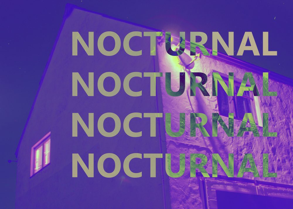
I used the same cream text for this image but changed the font to regular as opposed to italic like the rest. I picked a word that related to what the focus of the image was, the work nocturnal refers to the idea of being active and awake during the night, which relates to the light coming from the window. I used the exclusion feature similar to my previous pieces.

I used the colour filters and the exclusion filter to create the above images using different coloured layers. I find they work well as a series.

Water Research (Non-Artistic)

Water – Non-Artistic Properties


Water is the building block of life, it is essential to the survival of all life on earth. All living organisms are made up of water in their cells, this water allows them to hold shape, allows chemical reactions to occur and in the makes up about 70% of mammal’s and 80% of fish’s body mass. Because of its importance it is something that has been intensely studied. Much of the information on this page is not that relevant to artistic work but I will list off some specific points about water and its properties and will look at a few in-depth.

  • Modern measurements are based on water: 1 cubic meter of water weighs 1 tonne, 1 liter of water weighs one kilogram, 1cm³ of water weighs 1 gram, the boiling point of water is 100°C, its melting point 0°C and it takes 1 calorie being burnt to raise the temperature of a liter of water by 1°C.
  • 71% of the earth’s surface is water and 95.5% of that is salt water.
  • It is the largest single environment on earth and contains all of the top 10 largest animals alive today.
  • Each molecule is made up of three atoms. Hydrogen is the most abundant atom in the universe and the third is Oxygen.
  • “Light entering or exiting a water surface is bent by refraction. The index of refraction for water is 4/3, implying that light travels 3/4 as fast in water as it does in vacuum.”[1]
  • Water takes a lot of energy to go from a liquid state into a gaseous state. This is called having a high latent heat of vaporization. This keeps water at much the same temperature all of the time and means that it is a stable habitat for organisms like fish, plankton and some mammals.
  • For all animals that have lungs it is important for them to have moisture on the inside of their lungs otherwise they would not be able to take in Oxygen. Oxygen from the air has to be dissolved into a very thin layer of water coating the inside of lungs so that the Oxygen can get into the bloodstream.
  • Excess water intake can kill someone. About 6 liters taken in quickly can kill an adult male. Water intoxication as it is known causes cells in the brain to swell and burst, often being fatal if it has got this bad.
  • Drowning is incredibly easy and needs a terrifyingly small amount of water. As a lifeguard my self this is something that I am incredibly aware of, we need water to survive but it can also kill us so easily.

Refraction is something that could be very useful for my project. There are an immense number of different ways that you can use refraction of water artistically. The image above shows one of these examples, refraction of the light that is reflected of the background has passed through the water and because of the double curve of the glasses and the water the images have been flipped and all three are different due to the relative angle of the viewer to the background and the glass. This is really interesting and something that I could look at in more detail.

One of the typical uses of refraction in photography is to show a clear image that cannot be seen in the background. The example above shows this really well. The background cannot be seen clearly, it is simply a yellow blob. But when you look at the droplet of water that is in focus the background is now visible. Brought forward and flipped the spherical shape has created this new version of the flower, almost trapping inside this droplet of water and seemingly preserving it. The bonds that hold water together are called hydrogen bonds and from between the hydrogen atoms, these bonds are not very strong but when in a body of water so many of these bonds form that they become a relatively strong bond, this is what creates surface tension and holds water molecules together to form droplets like the ones above. This allows for these kind of photographs to be taken.

One other use of refraction is in this kind of photography. Half-and-half photographs in water show this effect very clearly, the distorted effect of the light entering at  different speed and angle  make the two halves of this duck look like they are separated, alternatively the bottom half of the image looks like it is bigger or closer than the other part, I see quite a few different artistic uses of this, it can give some really surreal effects.

Bibliography:
  1. http://hyperphysics.phy-astr.gsu.edu/hbase/geoopt/refr2.html

Photoshoot 3 Todd Hido and Bill Henson response/experimentation

I wanted to explore and respond to the dark portraits of Bill Henson as well as how Todd Hido used lighting to evoke a sense of ambiance and human presence as well as how both these artists used this as a way to build meaning and narrative.

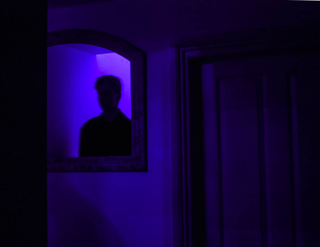
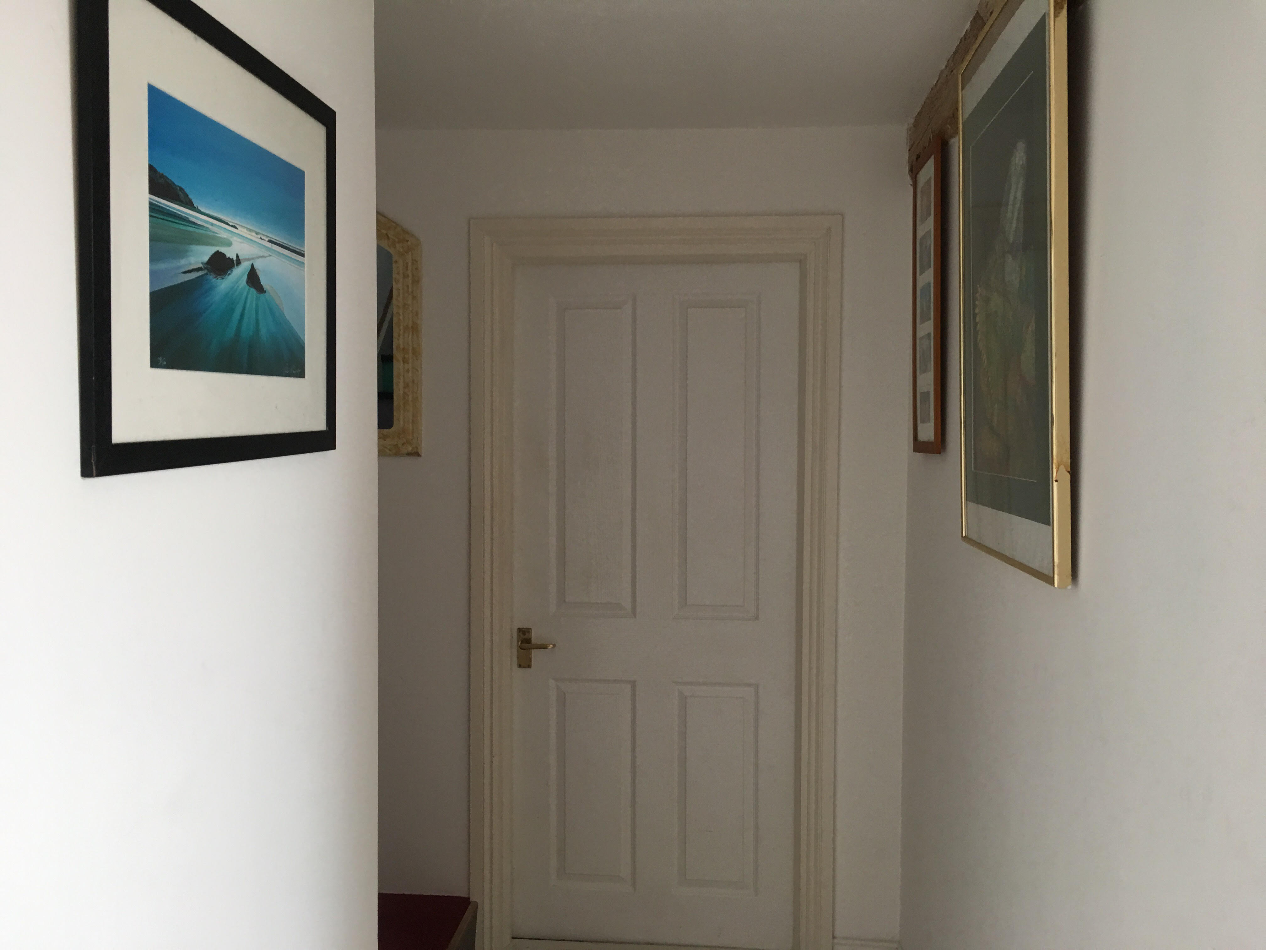
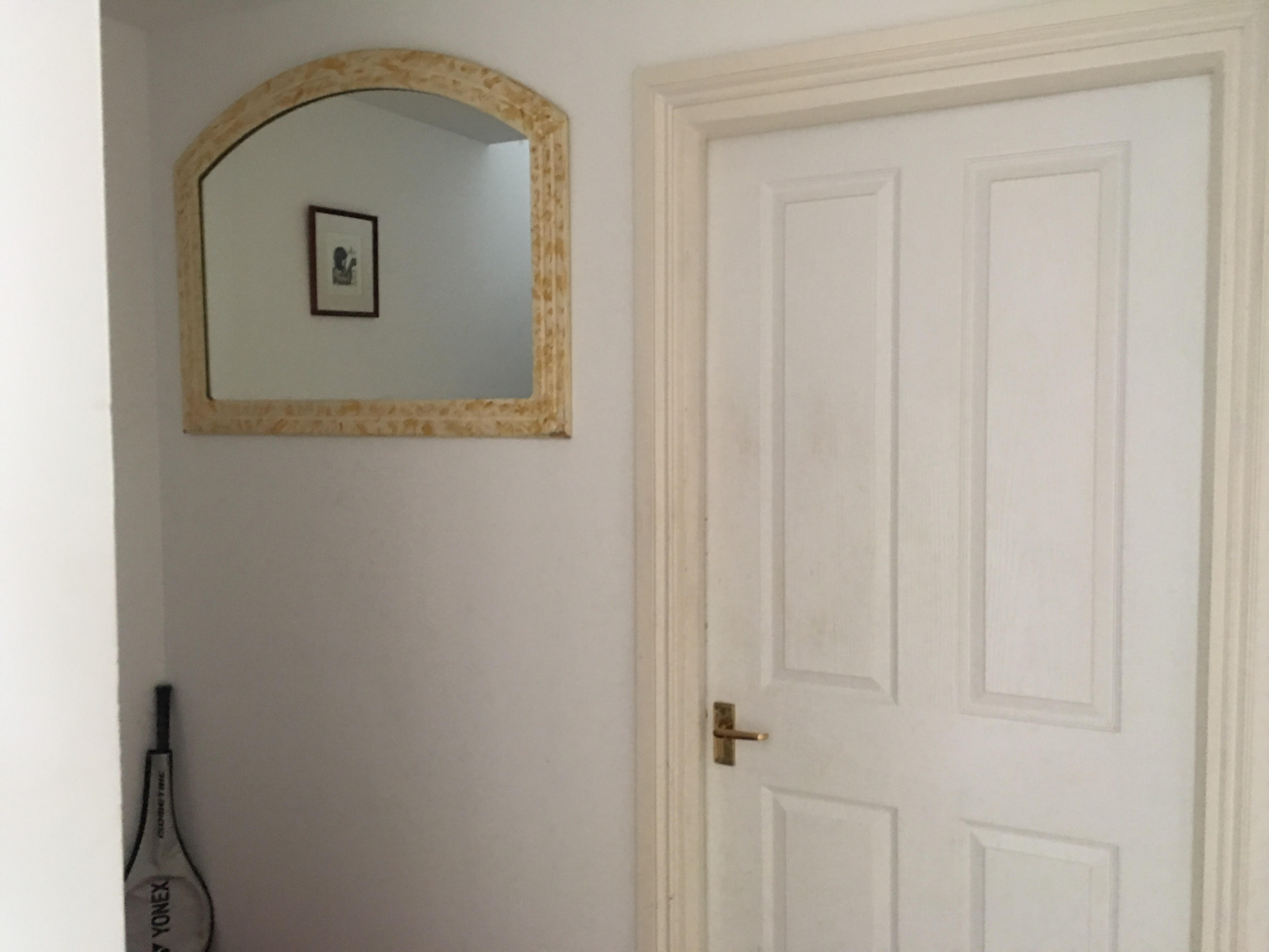
After looking at Todd Hido I wanted to use low light as a way to add drama and narrative to something that would have otherwise appeared mundane. I noticed how the mirror in my house allowed for someone to be seen looking in, but only show the reflection of a person, I wanted to test this use of reflection and how this could evoke an eerie form of narrative but with the lighting style of Todd Hido. The blue lighting comes from Christmas lights whilst the lighting in the second photo below comes from regular house lights.

Due to the very little light and single light source, the photographs are made with a long exposure of about 8 seconds with an ISO of 200. This long exposure creates a ghostly effect from when Ryan moves slightly, although this was not intentional, I think it works really well. For the photographs above I made them both have a ratio of  8.5×11, I wanted it to be a smaller ratio to give more isolation to both the figure, the mirror and the door. For the below photograph I made a longer landscape photograph.

Bill Henson, Untitled # 115, 2000-03

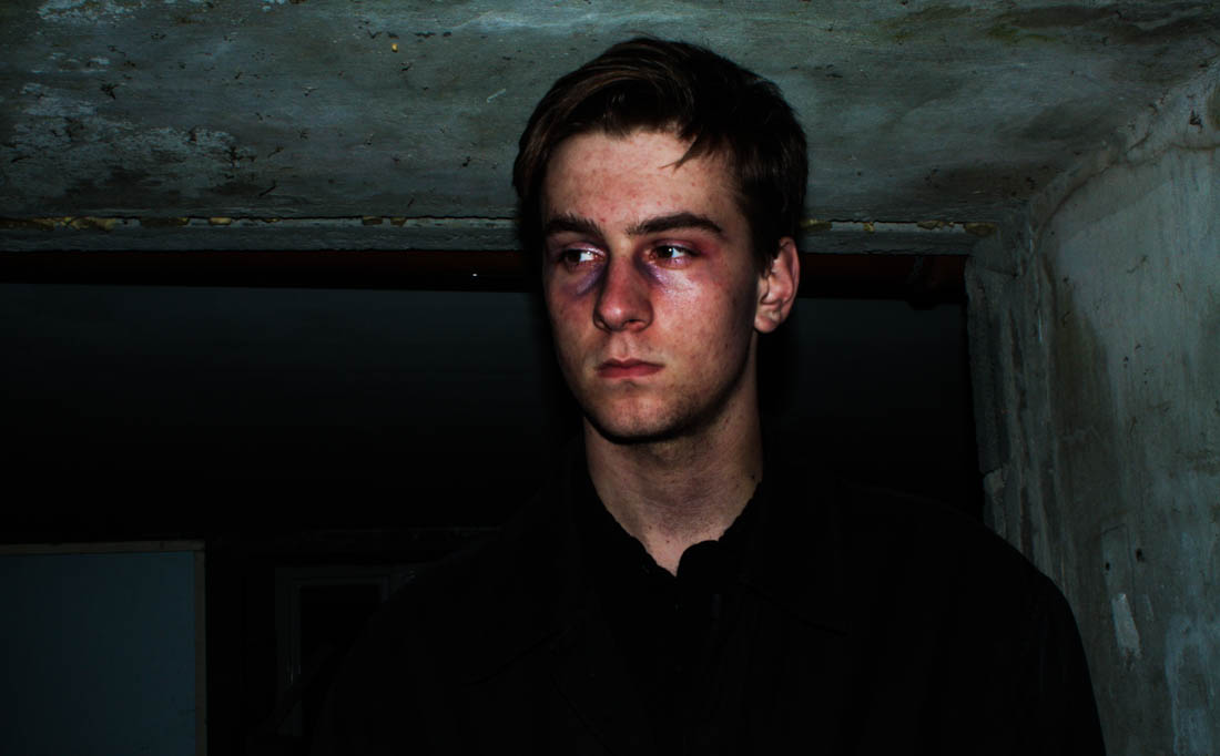
The above photographs is the photograph I have based the below photographs on. I planned on including a lot of dark tones and black space to leave focus on the figure in the photograph. I wanted to evoke the murky cool tones that Henson had shown in his work as well as evoke a dark, melancholy tone as well as the fearful expression on the girl face. Before the shoot I used blue and red eye-shadows on Ryan’s face to evoke a more eerie effect, the red was a cream consistency which added a glossy effect, I also used these on his cheekbones to give a more dramatic effect.

The above photograph came from using a too long exposure with lighting from an iPhone. I found the blurriness added to the eerie ambiance I wanted to reflect in Henson’s work. I was very reluctant to use the flash from my camera at first because I was concerned it would make the images too bright or flat. All these photographs were taken outside in almost complete darkness, even with the camera set to manual, the camera often wouldn’t take the picture due to there being not enough light, to override this I used the iPhone lighting to trick the camera into taking the photograph. I went back to locations I had previously taken pictures of such as the house and garage from my HDR photographs. When editing the above photograph I changed the levels to add more contrast to add more depth.

All photograph are of a different ratio that suits the individual photograph. I preferred how they looked in a longer landscape ratio as it gave them a more cinematic effect, as if they were a still image from a film. Whilst editing in Light room I upped the contrast as well as decreased the shadows whilst increasing the highlight levels, making Ryan stand out more but also defining his features more, this also brought out the tones in his skin, making him look sick, evoking an uncomfortable narrative to the audience. The dark, grungy backgrounds added with the rugged threatening look of the character gives the photographs a harrowing effect, similar to that of a horror film.

The above photograph is a good example of how I could use media techniques use in films to evoke a narrative to the viewer and add more context to what I am trying to show. The low angle of the camera looking up at Ryan makes him look larger and more frightening. The dark low lighting also makes him look more uninviting, the low key lighting with harsh shadows creates a chiaroscuro effect, which evokes tension that would typically be used in a horror film. His body language makes it appear as if he has just turned to face the viewer, the use of eye contact directly at the camera also creates a connection with the subject and the viewer, the resentful expression adds to the melancholy effect created in this photograph.

I wanted to evoke this in these portraits as I wanted to explore how low, night lighting could completely change the ambiance of a photograph and add narrative to something that would have otherwise been very mundane. This use of low light has also been used in the work Henson to evoke meaning and ambiance. For this shoot I would have preferred to use natural lighting such as moonlight as well as surrounding street lights but found this was unreliable and there was still not enough light available to create a good image.

The above image is probably the most jarring of the selection I have taken. The use of chiaroscuro is very present in this image, giving it the eerie effect. Using the flash gave the background a very textured, grungy effect as well as adding to the mise-en-scene of the image, giving more context to what might be happening within the image, adding narrative. His troubled expression and his complexion suggests a troubling narrative. Again I have used a long landscape ratio to create a more cinematic effect. The juxtaposition of natural and landscape is also subtly shown in this image, such as the weeds and moss that have grown through the wall.

The relevancy of this shoot to the rest of my exam coursework is not exactly obvious, but it could be argued that the juxtaposition of nature and urban is shown from the human present within the image, considering that people are in fact living, natural things. It could also be said that the raw and jarring expression evoked in the photographs is created by human emotion, which is innate within everyone. The unnatural aspect comes from what we have created around us such as the buildings and walls, the images themselves are also not natural from how I have added in lighting that was not present in the surroundings, for subject I have also used makeup to add more emotion and character. These also share a lot of similarities to the artists I have looked at such as the tone and composition as well as how they have used these to evoke narrative and ambiance to the viewer.

Theme 2: Through the Same Lens

Through The Same Lens


This idea is something that came to me from a video that I saw on youtube. In the video a group leave a disposable camera in public areas with a note that says to take a photograph with it. The video is from 2011 but still has the same connotations as it did then.

Although it is not the specific intention of the people who did this they are giving an unusual look at the environment. The camera that the people are using is the same. The location that the photos are taken in is the same. The only real difference is the person who frames up and takes the photograph, it shows how different people all see the world differently. This concept is something that I am keen to investigate further. I would not need to copy the project but I likely would end up doing that for one of the shoots. Other than that I could give people in the same family a camera and have them take a set number of exposures each. This would give an interesting insight into the different way that family members would see their family and home environment. Similarly, looking at different people in certain clubs and social groups could be interesting, I could use the rowing club members for this, using my own photographs and images that they would take could give an impression of the club from many different angles and personalities. Again looking at how individual personalities interpret the same environment.

An interesting possible development on this same vein would be to compare photographs taken by someone who is considered an “insider” of a certain group and someone who is an “outsider” of that same group. This would probably work best by using ether two photography students to compare or two non-photographers so that the images do not differ too much in quality of framing, lighting ect…

TODD HIDO/HAMISH FULTON INSPIRED EXPERIMENTATION SPECIFICATION/PLANNING

I wanted to move onto portrait photographs after looking at ones created by Bill Henson and Todd Hido. Who both used portraiture as a way to build on the narrative of the photograph, often their work is psychologically charged and designed to connect the viewer to their own experiences. I plan on using my brother Ryan as a model, in the past he has proven very good for taking photographs and his slightly mysterious persona and ambiguous expression is perfect for the role.

There is a particular mirror in my house which allows you to see the reflection of someone without actually seeing them. With the correct lighting I plan on creating eerie photographs evoking a sense of human presence which both Henson and especially Hido’s work convey. I also plan on using this shoot to convey a feeling of enigma, engaging the audience to think about the character in the photo and what might be happening within the photograph.

I plan on using a tripod and creating a long exposure shot as I will be using a very low light source. I have found blue Christmas lights which I will place above the staircase, meaning light will come and reflect our of the mirror. Using this type of lighting means i will have a lot of control over the amount of light in the frame, unlike when i have worked with natural lighting. I plan on removing distracting features from the frame such as paintings to leave the viewer more focus on the figure, lighting and the mirror.

I also plan on responding to Bill Henson’s dark and jarring portrait photographs. I plan on taking these outside using the built in flash on my camera and a very quick exposure time with a low ISO to replicate the dark and high contrast tones in Ryan’s complexion, this will also mean I don’t haft to worry about over shaky images that come from using a slow exposure. I plan on using makeup such as red and blue powder to exaggerate the fleshy tones in his skin.