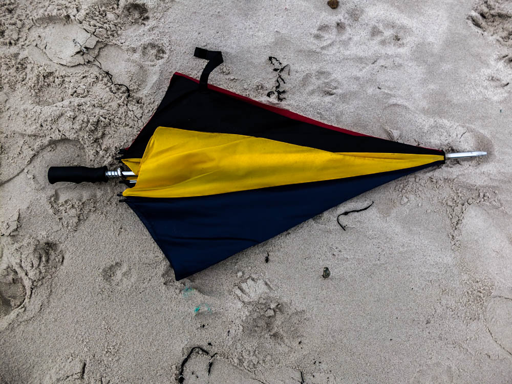
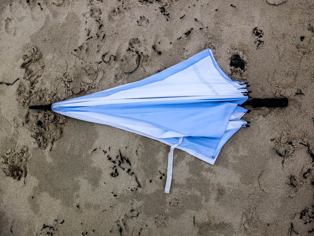
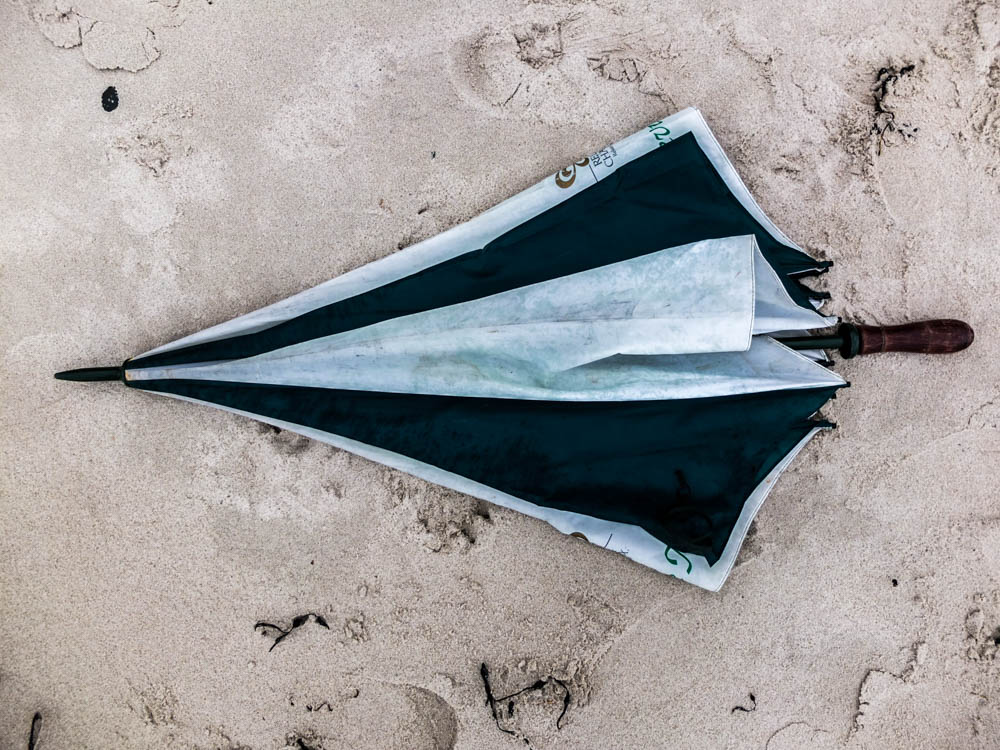
Umbrella den

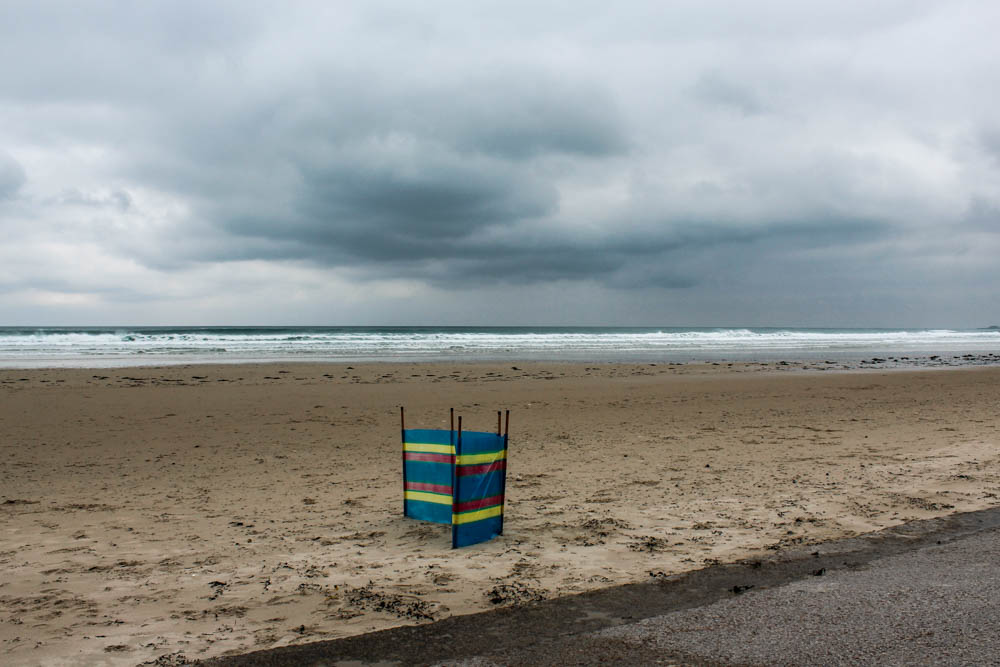
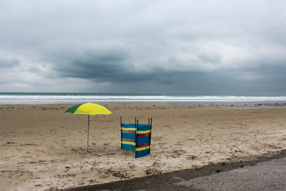
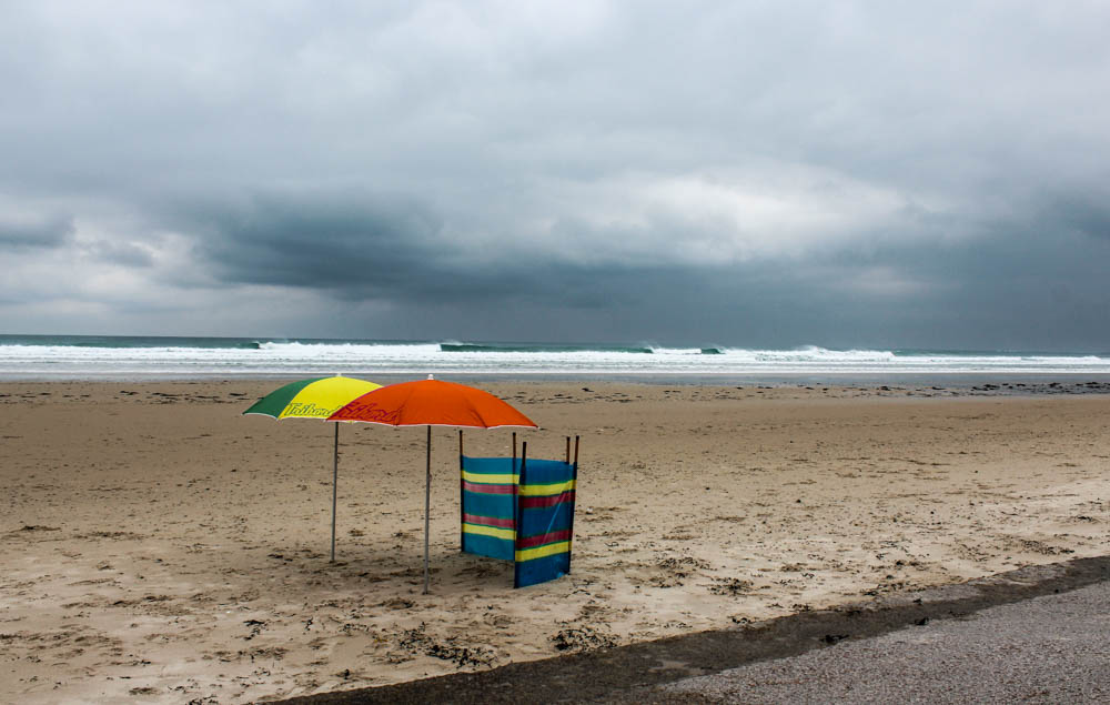
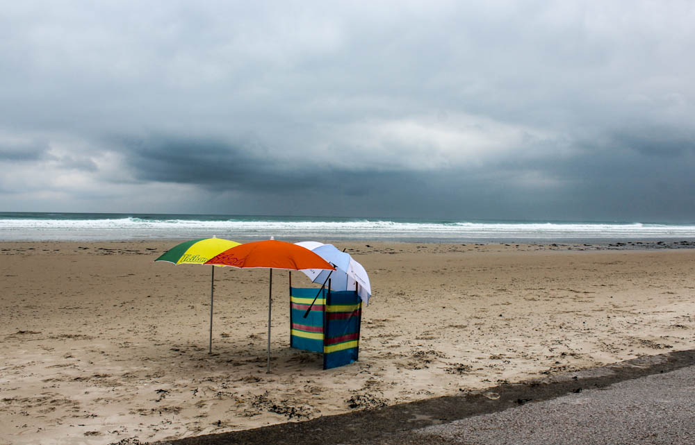
This shoot turned out a lot better than i thought it would considering how specific the weather condidtons had to be to get good photographs. I managed to take the photgraphs on the perfect day when the sky was very cloudy and angry looking, when the sea was fairly high and had waves and there was very minimal wind to keep blowing the umbrellas away.

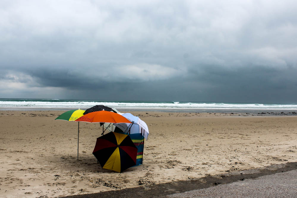
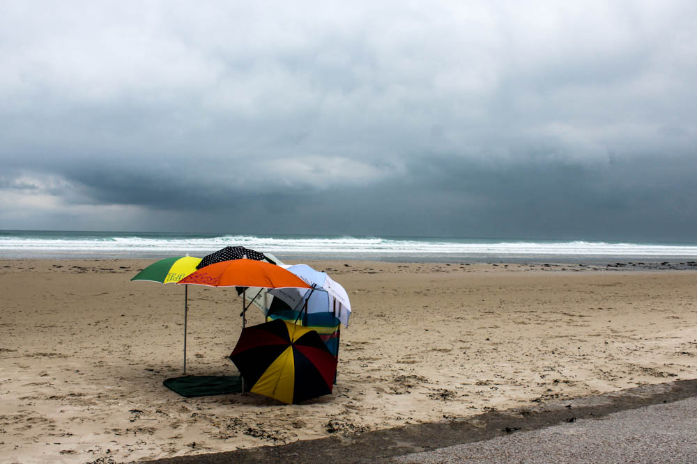
I composed my den to be in a position where i could capture it against the background of the sea and sky without any other man made objects. I also didn’t really want any stereotypical landmarks of areas of land in my photographs and for the majority of photographs i avoided this. I think my process photographs turned out to be the best ones so far. I think this is partly to do with how obvious it was once each  umbrellas was added but also the landscape. For this den when you added every new element it was really clear exactly what umbrellas had been added and where. This is because they were all such bright colours and also the angle i photographed the den from meant that some umbrellas didn’t obstruct others which was the main problem i had in some of my other progress photographs. The environment itself also didn’t obstruct any elements of the den and actually really enhanced the clarity of the umbrellas. The environment was very minimal making the growing structure more obvious. There are also clear lines in the composition which makes a contrast between the curved forms of the umbrellas clearer. The colours are also very bleak and bland, with no bright light or colours to distract. Overall i really like the final images. I composed the photographs so that the umbrellas were to the left hand side of the frame using the rule of thirds. I also quite like how the dark clouds in the sky move from photograph to photograph so that you get more of an impression that time is passing as each umbrella is added.

I think what i have learnt from this shoot is how effective it is to have a minimal background to make the colours and structures of the den stand out. Also taking photographs from a lower angle works quite well as a perspective.
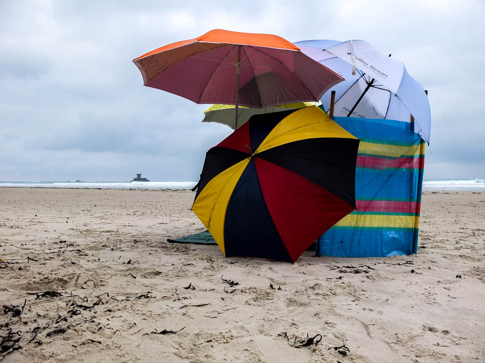
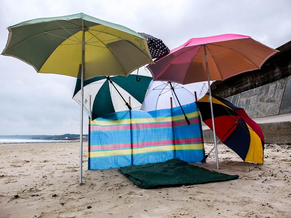
The above photograph is a closer up version of the den. I remembered how well it worked in my previous beach den to take some of the photographs from below as it reflected a childlike perspective and so i wanted to recreate that here. The light source in this image is in the top right hand corner as the brightest point of the image and this leads your eyes into the structure of the den as the den is composed slightly to the right of the frame. The light also shines directly onto the whitest coloured umbrella which causes it to stand out and also lead you into the other umbrellas. In this image there is a real contrast between the straight line of the horizon and the curves of the umbrellas. The wind break is also made up of straight lines but the umbrellas seem to envelop this within their curves and therefore it doesn’t create a very distinct contrast. The image as a whole isn’t particularly bright, the colours being the most vibrant part of the photograph.

The below image works quite well because of perspective. The angle i have composed the photograph from causes both the lines of the wall and also the lines the the sea to lead backwards into the den which is composed in the center of the frame. These leading lines make your eyes travel to the center point to see where they meet. This perspective of the den also gives an impression of the inside of the den and the shelter that it offers. Although the picture as a whole is fairly dark due to the clouds and therefore lack of bright light source you cans till see the shadows cast by the den which implies the shelter it offers. A problem with this image however is that with this composition it was impossible to include the angry looking sky. The sky which was so dynamic was mainly over the sea and to use the leading lines for this composition i couldn’t include it as well. I also while i do like the impression the leading lines gives, prefer the image with minimal other man made objects. I want the focus to be on the dead itself and while it still is i think the images work best when the environment is more minimal.

The below photograph once again reflects the process of den building. Some of the umbrellas would fall down or move slightly and another one would fall. Like with Goldsworthy’s practice the den building process involved a lot of rebuilding and re arranging as even though there was little wind there was enough to blow over the occasional umbrella. I composed the below image to have the den right in the center and therefore to emphasis the dens structure. This then emphasizes the imperfection of the umbrella which has rolled away. I should have though more about the composition of the den from this angle as at this angle you can see the most of the distracting elements in the background. There is La Rocco tower and the wall curving off into the background and once again no dynamic looking sky.  The image does still work but i think it would have been more effective to once again have a more minimal background.

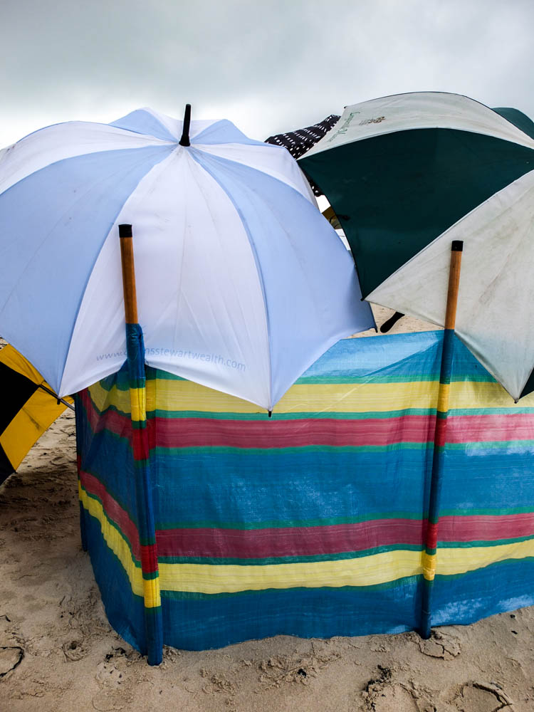
The above and below photographs are more abstract compositions of the dens in order to convey an impression of the process and structure. With the other dens i have taken some close up photographs which show exactly how the den stays together such as the blankets being tied ect. With this structure all the umbrellas were simply balanced on top of each other and so i needed to take some pictures which convey this. The above photograph shows how the umbrellas are leaning on the windbreak which is supporting them.  The umbrellas themselves are then also slightly overlapped which shows how the umbrellas are also leaning on each other to stay up. This image once again also plays with curves and straight lines contrasting, The straight lines of the windbreak and the pattern on it contrasting with the curves of the umbrellas structure and pattern. The lines are composed to be in the center of the frame, the whole image fairly balanced with having one umbrella to each side of the pole. The rest of the environment is fairly minimal which works well, the sky could be slightly more dynamic as in having more other colours rather than just a smokey white but it doesn’t take away from the composition in being too distracting.

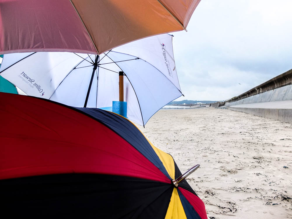
The below photograph plays on having the curves of the umbrellas and also the straight lines of the wall. Perspective also plays a big part in this image once again as the line of the wall receding into the distance shows the depth of the image. This image is fairly bright as the sky is very white, as is the wall and the brightest of all the umbrellas is included in the composition. The focus within the image is in the background, the front foreground being blurry slightly. I quite like the abstract composition of having the den only covering the left half of the frame and then being able to see the environment in the rest of the composition.
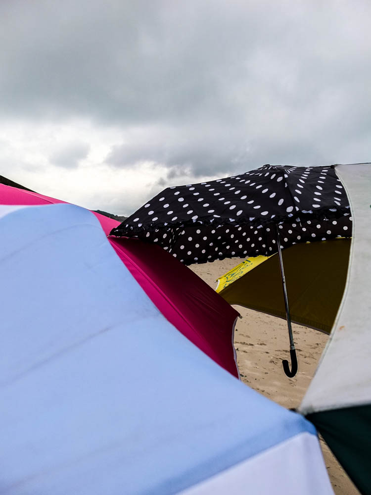
These photographs are also really abstract and convey even further how all the umbrellas are balanced on one another. The sky is fairly angry and i quite like the impression that the umbrellas of the den convey their own landscape. Like in some of the other photographs where the material becomes a part of the landscape i feel like that happens in these images too. The umbrellas come to look like hills of water in creating undulating forms. The different levels and different colours and shapes and sizes suggest that the object are not man made because there appears to be no pattern to them. You can however see the handle of the smallest umbrella which does convey exactly what the material is. In the above image the focus is in the background and actually on the smallest umbrellas, the foreground being blurred to an extent which conveys further how the umbrellas look as it they are apart of the landscape. The composition of the image below conveys even further this idea of the umbrellas becoming the landscape by having the umbrellas taking up the foreground and extending out into the background in various colours.
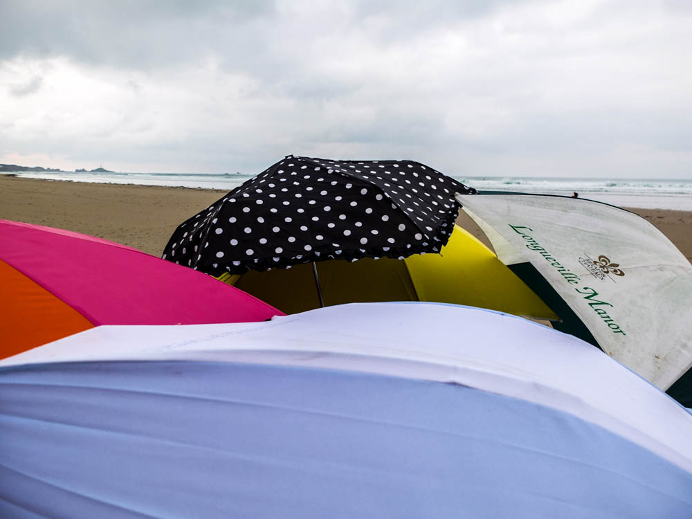
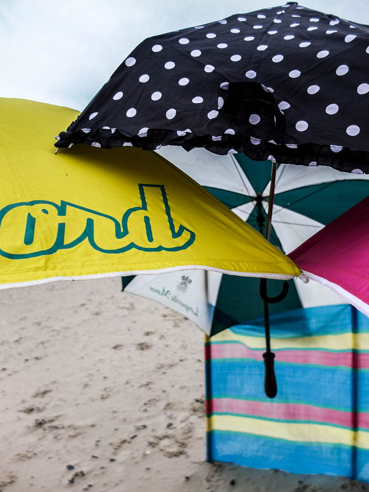
The above photograph i composed so that there was a narrow depth of field so the foreground was filled with clear umbrellas while the background was a blur. Only the immediate foreground of the umbrellas is in focus and then the windbreak and landscape of the beach is a blur. The minimal landscape can be seen in these photographs and works really well in conveying the contrasting colours of the umbrellas. This photograph probably shows the bright colours of the umbrellas best out of the photographs as i was photographing close enough to the umbrellas themselves to be able to show the colours without the lack of light from the environment effecting the colours and making them appear darker then they actually are. I quite like how in this composition the umbrellas fill the entire frame and almost slice right across the frame. There arrangement creates a triangle to the right hand side of the frame which acts like the rule of thirds to have the point at which all the umbrellas meet as a focal point.
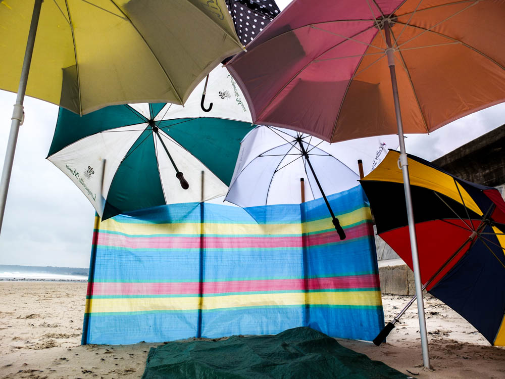
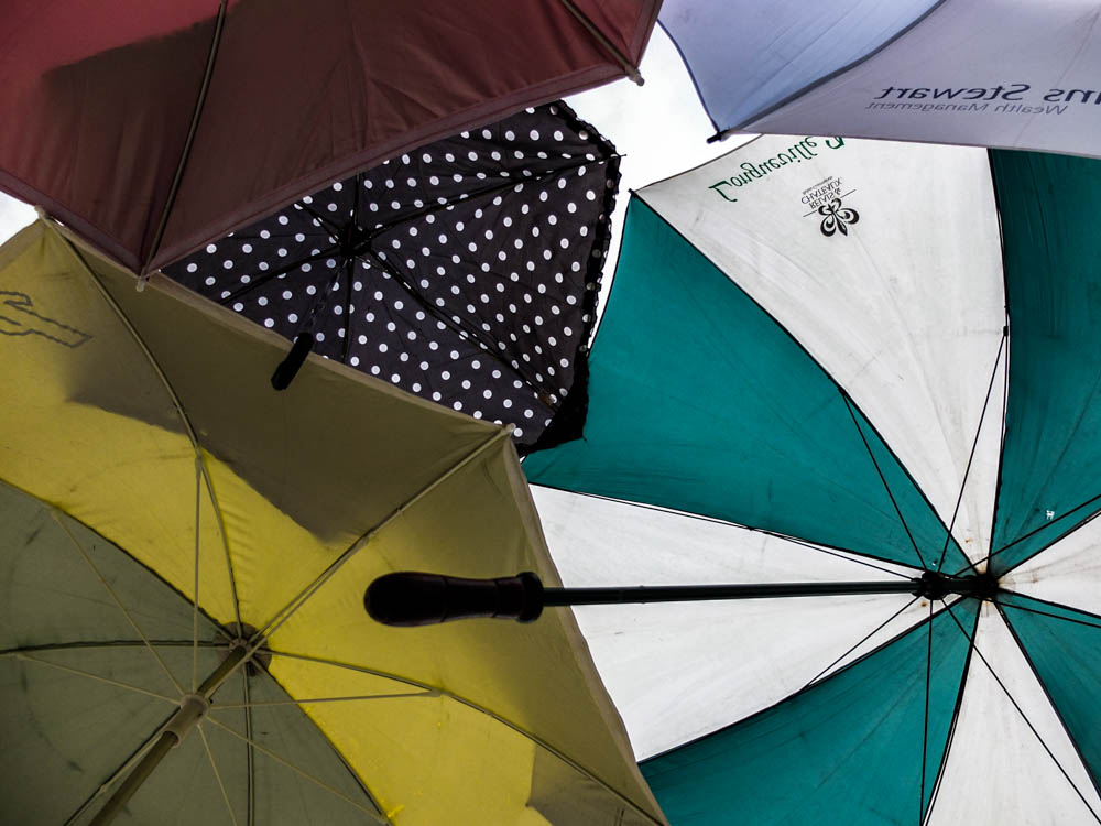
The above photograph is another one which conveys a child like perspective but this time focusing more on the inside of the den and more of a sense of crawling inside it. This photograph more than any of the others shows how the umbrellas become brighter and more transparent when you add light shining through them. The windbreak too had the light source behind it which causes the colours to become a lot brighter. This photograph defiantly has a contrast between the curves and straight lines of the image. From this angle you can see all the spurs of the umbrellas as well as the handles which are all straight lines and also the windbreaks straight lines. The umbrellas then act as curves which bring together the whole structure as they unite all the different elements . I really like the perspective of these images, having them taken from below looking up. When inside the den you are constantly looking up at the roof of the den when its raining to check for leaks in the structure and watch the rain hitting the top of the den.

Below are some more abstract images which explore the concept of looking up.

Umbrella Den plan

This shoot has probably been the hardest to plan for because weather wise i needed a day where there was a really dynamic, angry looking sky as if its just about to rain but without it actually raining and with no wind what so ever. This is because in building dens out of umbrellas with even the smallest amount of wind all the umbrellas would fly away in opposite directions and i would then spend most of my time chasing them across the beach. In constructing the den we always used to simply balance the umbrellas on each other and therefore a lack of wind was an absolute necessity in building my den. The sky was also really important otherwise my beach den wouldn’t look at effective against a white cloudless sky and white sand. This den therefore took a lot of planning just because i needed to be ready to build it at very sort notice when the weather was perfect. I also want a day in which the tide is fairly high so that there isn’t a vast expanse of empty beach and the sea could create an angry/rainy atmosphere as well.
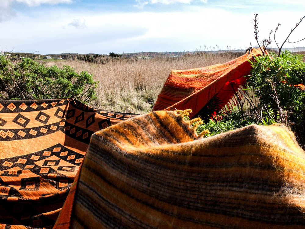
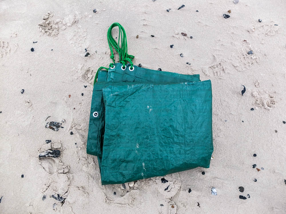
In building this den i am going to use only umbrellas and a windbreak. The wind break is pretty essential because the umbrellas need a strong sturdy structure to be able to lean on so they can then lean on each other. I am planning on using two main umbrellas and then loads of other smaller umbrellas. I have chosen the brightest and most vibrant coloured umbrellas to use in order to have my den stand out vividly in the surroundings. The tarpolan is what we would have had on the floor to sit on in our dens as the sand is wet from both the sea and the rain.  The umbrellas are a variety of sizes to be able to build the den with no gaps, filling all the spaces.

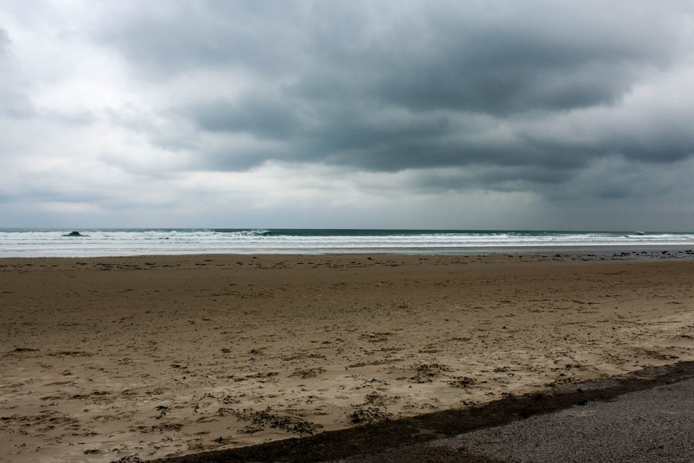
Below is the perfect sky that i need to take my photographs. I have decided to do this shoot down St Ouens beach as we would commonly build dens in this environment. It is also a large expanse of beach which will make the den stand out in the space and also provide an interesting landscape if there is a dynamic sky as the sky takes up most of the frame.

Field den shoot

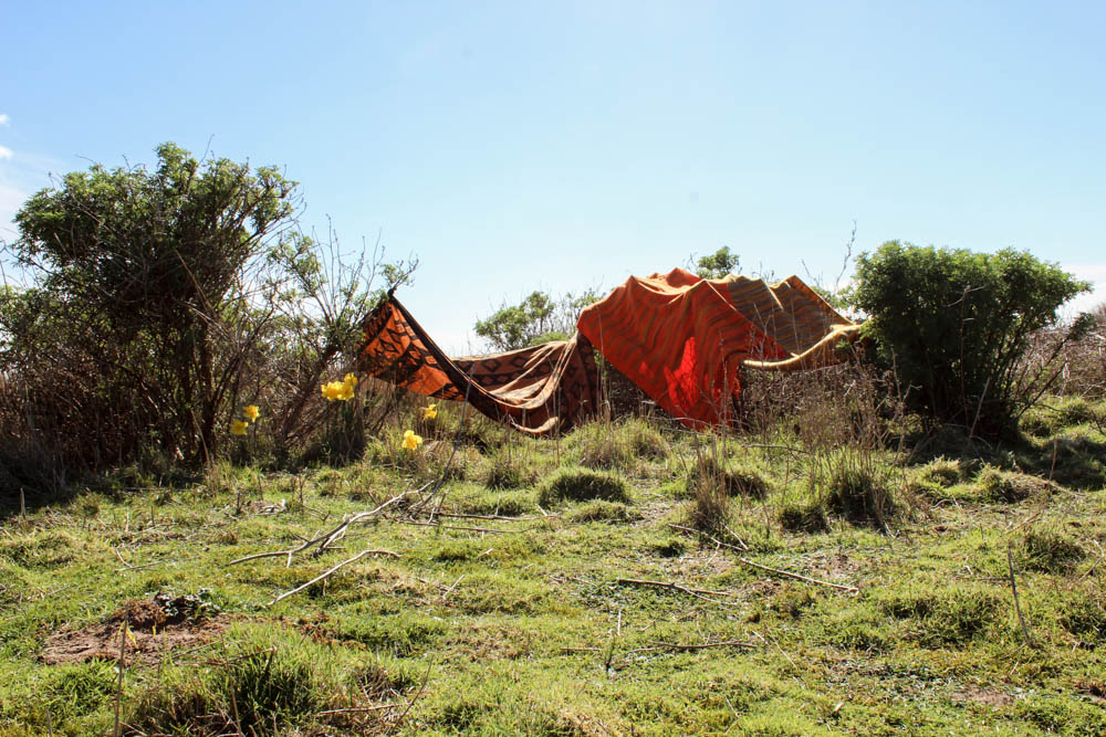
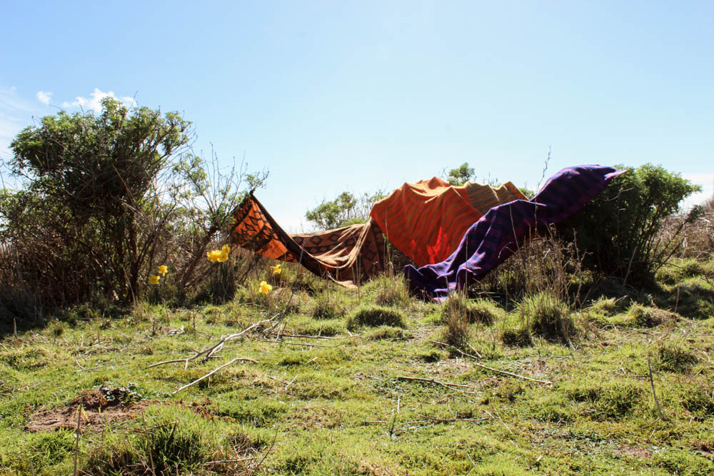
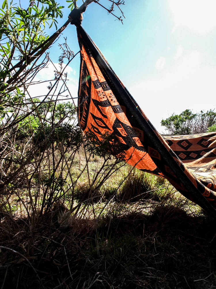
I managed to get the perfect weather to build my den in, i only wish there had been more clouds in the sky. The sunshine was bright and intense in shinning onto the environment and while this structure is very limited compared to the others i have built, that was the intention of it. It was even harder than i first thought to create a den in this location as the bushes were very far apart and the blankets only just big enough to expand across the distance. This created a major problem of creating one large structure which was connected in the middle and therefore i resorted to creating tiny pockets of covered areas. I actually think though on reflection this reflects quite well the types of dens i built in early childhood as these dens were more about the concept of having any kind of small space and then this being imagined into a great castle ect. I think this den works well in conveying how limited a structure can be and yet still a child can take it and transform it into the perfect home for their game in their imagination.

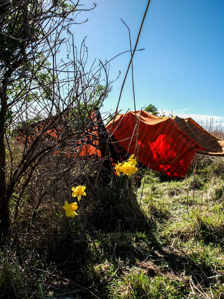
This time i only took one set of process photographs as there was only really one angle to take the pictures from. I wanted to include the vast expanse of the sky and the whole area of the bushes clumped together. I centered the den right in the middle of the composition. I think another advantage to this kind of den is that in the process photographs you can clearly see when each blanket is added into the structure as none of them shield other blankets from view. I did actually as you can see below edit the environment within these photographs. Everywhere, all over the field, except in the small area where i decided to do my photoshoot there were loads and loads of daffodils. I thought they would compliment the colours of the den to have little patches of yellow that were a similar colour to the blankets and therefore i picked some daffodils and staged them within the photograph as if they were growing. Overall the finished structure as a whole doesn’t look really incredible but i think some of the  more abstract photographs i’ve taken of the den work quite well. The process photographs while they do work because you can see all the individual blankets being added aren’t as dynamic as some of the other process photographs juts because the den itself as a final structure isn’t as impressive.

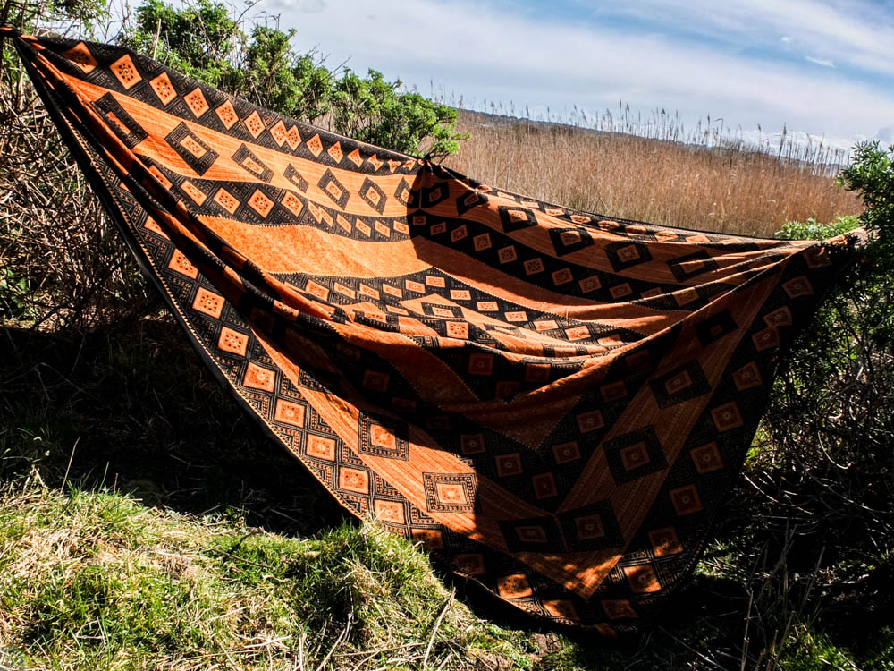
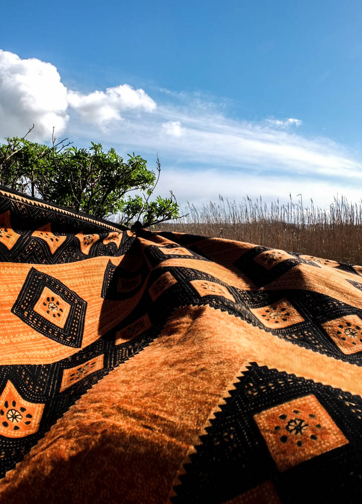
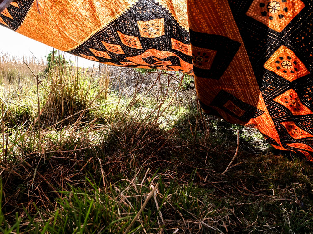
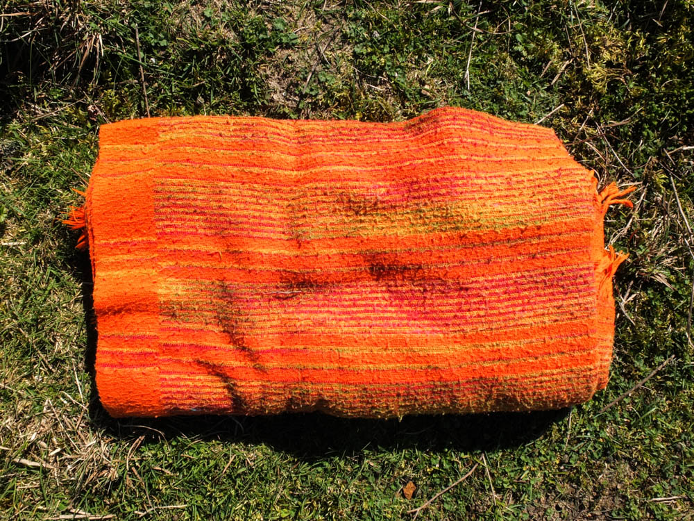
This blanket really went a long way in conveying the African vibe of my den structure. The bright vibrant orange and then the patterns in black just have connotations of being very tribal to me. I really like the composition of these photographs as well. I feel like the contrast between the bright blue sky with fluffy white clouds and then the green and orange is very suggestive of the African plains. When photographing this den i thought very carefully about about making the landscape seem vast through my compositions. The below two images convey this best.

The above two photographs are composed very similarly and give the same effect of the landscape. I composed the photographs so that the blanket created depth in the image by receding off to the point that it is tied onto the tree. In each image i used the rule of thirds to compose this point off to the side, different sides in each image. I personally prefer the first of the two photographs, though the cloud in the second photograph looks more dynamic. In the first image i was able to to capture the movement of the blanket in the wind, this texture adding a sense of life to the photograph which isn’t seen in the second image where the blanket is pulled taught. It is interesting that the texture of the blanket being moved in the wind almost reminds me of the rolling of water. I composed the photograph so that the horizon went straight across the background of the frame. The frame is almost divided so that the photograph  is half sky and half fields. The colours in the photograph are very complimentary with the golden yellows and greens conveying a real sense of an African plain. I quite like how the green is very sparse in the corner rather than in the second image where there is perhaps too much green. The clouds in the sky are incredibly flurry looking and the white streaks of them across the sky suggest both movement and also make the sky appear more intriguing. I think these photographs work so well because of how the material fills almost the whole landscape of the frame.

I quite like the above photograph for conveying the expanses of the spaces created by the blankets. This photograph really gives a sense of the spaces the dens create which you can go inside. I think it also conveys why the dens are needed as this photograph gives a real impression of the beating sun. The bright light source comes from the top right hand corner of the frame and is an intense harsh light that shines directly onto the stricture of the den. This photograph is interesting in having such a massive contrast between the light of the sun in the sky and the dark shadows cast by the shade of the den. The sky is almost completely washed of colour the light is so bright and it also washes out some of the colour of the dens material. I think the composition of this photograph also works quite well as the branch the blanket is tied to cuts across the top left hand corner of the frame and the blanket itself then cuts another line across the frame. I quite like how the light has effected the material of the blanket, to have elements of the material see-through as the light shines through it but also elements which are dense and a darker colour. The colour scheme in this image is the same as the others, the greens and the oranges complimenting each other really well. The sky in this images is less interesting as the bright light washes out all the colour and there are a lack of clouds but this bright light also does highlight some other colours.

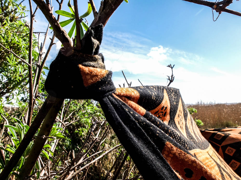
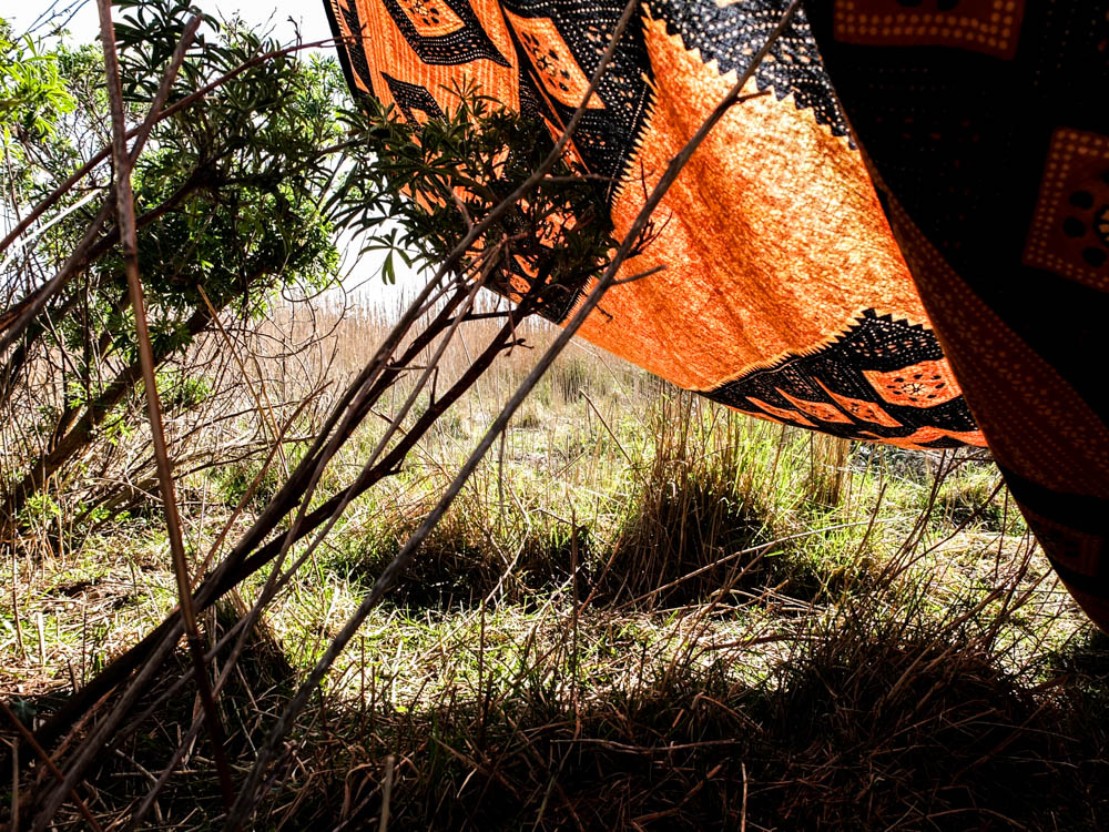
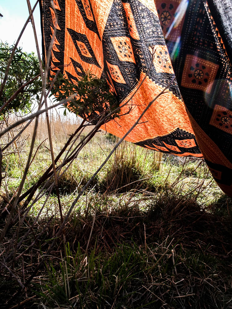
Once again i decided to take some close up shots of how the den was constructed. This den was made up of balancing blankets and also tying them to various branches in order to create my little spaces. I used a narrow depth of field to emphasis the tied material to the branches rather than the surroundings. The second photograph i composed similar to my photographs of the orange and black blanket as a whole as i wanted to convey the horizon of the sky and expanse of the fields. I composed the photograph using the rule of thirds and the angle of the blanket leads into the background of the frame and therefore the background of the image.

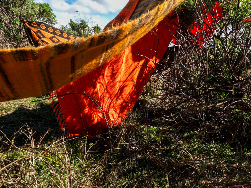
I quite like the above two images as a pair to convey how the material moves and changes. This image is all about angles, the changing angles of the blankets in relation to one another to create an interesting structure. The structure is composed to be in the top left hand corner of the frame, the main light source hitting the blankets in the background rather than the foreground. The angles of the blankets all compliment each other, going off in different directions and all the different shades of yellow and orange also work well together. Once again we have the contrast between the oranges and the greens, this time the contrast being even more evident as the sky only takes up a small portion of the frame. I quite like the dynamic of these photographs.

I quite like the above photograph as another close up photograph to show how the den is constructed. Most of the blankets in this den were simply laid over the various bushes and trees and due to the very minimal wind stayed where they were put. This photograph conveys this and also conveys how, the tread stuck on the branches conveying how the material becomes caught. The light in this photograph comes from the top left hand corner and its harsh light illuminates the individual threads caught on the branch, highlighting them against the blue sky. This is why i composed the photograph slightly from below as it allowed me to have the thread standing out against the sky and therefore not getting lost in the busy texture of the leaves. The brightest point of the image is the sun shining out from behind the leaves. The light also shines directly onto the blanket in the foreground. The areas of shade are those below the blanket and therefore where the blanket casts its shade.

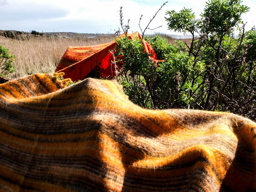
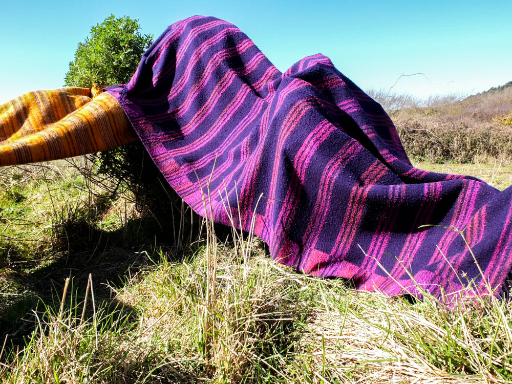
The above and below photographs convey the same impression as  some of the earlier photographs. The blankets themselves almost look as if they are a part of the landscape. In these images they give the impression of rolling hills and mountains of various orange colours. Unfortunately the sky is once again fairly boring as it is made up of blinding white light and very little clouds. The light comes directly from above in these images which casts shadows on the structure which create more depth to the blankets structure. 

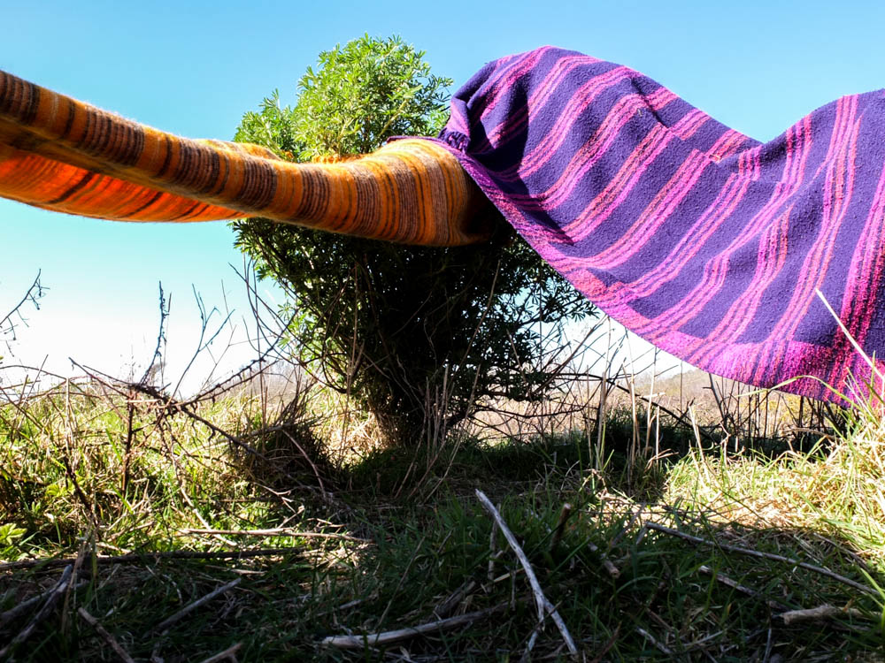
For some reason i really really love the photograph above. It is so simple and yet i think its one of my most effective images. It conveys the spaces created underneath the blankets as very simplistic and yet effective as they offer shade and do create a sense of being enclosed. This photograph is composed so that the little tree is almost in the dead center of the frame. The photograph is then taken from a really low angle which gives the impression that you are just about to enter into the spaces underneath the blankets. The angles of the two blankets go outwards in two different directions, the shadows in the image cast in the foreground. The background is really bright with the brightest point being a line along the horizon of almost blinding white light. The sky is then fairly bright blue. I think the contrast between colours is what works quite well in this image, with the intense blue colour, green, orange and purple all clashing but then also complimenting each other. 

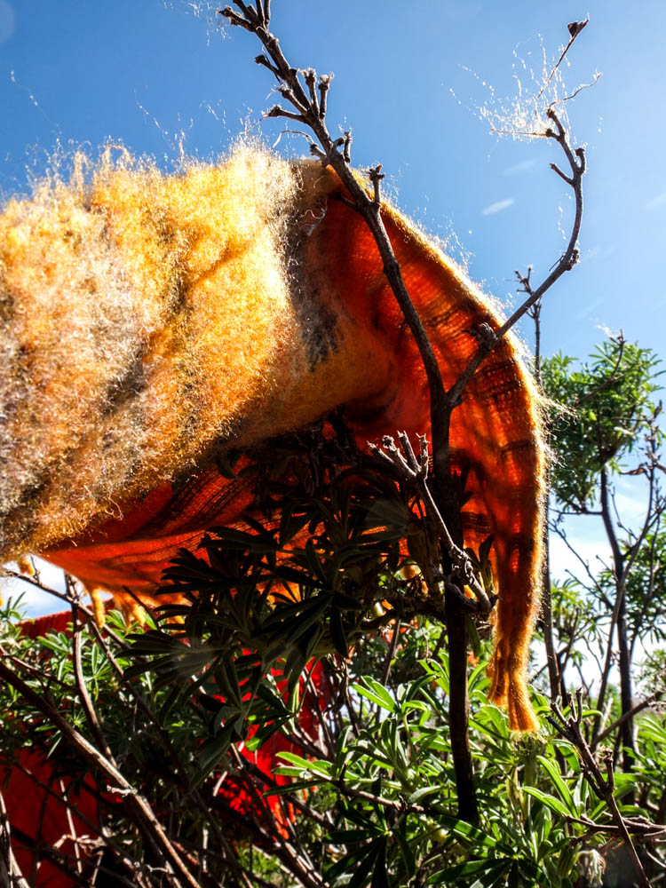
These photographs are like my other photographs that i took of my dens with light shinning through the material. The orange and black blanket worked best in conveying the differing tones of the colour depending on where the light was shinning through the material.


Planning for the Field den

As my den building skills and the complexity of the dens structures changed at the different ages i was when building the dens i wanted to try and make a much simpler version of a den. Looking back through my archive photographs the den i built when i was youngest was literally just a blanket over the trees. When i was really young even this really simple bit of shelter seemed like an entirely new world to play in.

I decided to build the really simple den in my next shoot down La Mielle as i was aware that it is mainly fields and therefore a hard location to create a den in. The areas of La Mielle that we used to play in are the fields filled with blackberries and in these locations there are very few starting points in which you can consider building the den structure off of. I therefore decided that this den design was going to be very different to my other structures, the whole point of the den being just to consider creating a roof and some shade. I wasn’t sure exactly how this was going to translate into the environment until i got there but i just wanted the den to be a lot more simplistic.

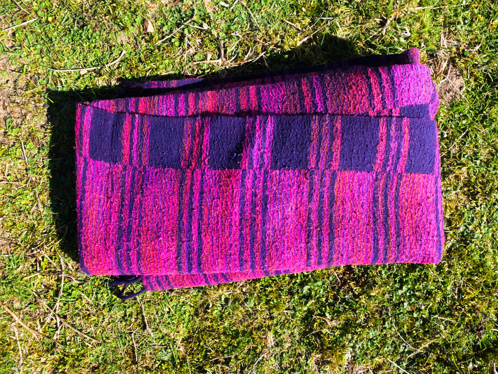
Remembering the environment of the location is very sparse and expansive i decided to theme this den around an African expanse of land. I therefore in my colour scheme chose to use bright orange blankets and a purple blanket. These colours for me are very reflective of an intensely sunny environment and also they all compliment each other. I learnt from my last den that bright colours work really well in making the den stand out in the environment and therefore all these colours are very bright but they also this time compliment the environment as well. The fields at La Mielle contain a lot of golden and green colours, orange and purple both clashing and complimenting these colours. As my colours were so bright i also decided i wanted the weather to reflect this sunny atmosphere that i was creating with my den and therefore i have decided to do this shoot on a really sunny day. I also think that i want the really washed out with light sky, to add to the feeling of being in the african heat. I will therefore plan to take the pictures at 12.00 ish when the sun is highest and their is the most intense amount of light. Hopefully there will be a few clouds the day i choose to go out, just to break up the expanse of the sky a bit but otherwise i am aiming for a washed out. sunny landscape to build my den in. 

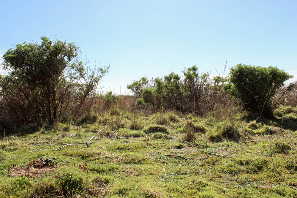
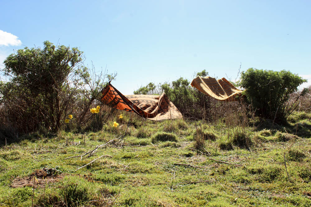
In actually deciding where to build my den i had quite a struggle to find somewhere when i went to scout out the area. La Meille is made up of vast expanses of land and blackberry bushes which are obviously prickly and therefore we wouldn’t have built dens there in the past. There were quite a few locations that i really liked as a background but there was no way that i would be able to build a structure there, even a very simple one. I eventually found a spot in which some bush like trees were fairly closely clumped together and decided this was the location to build my den in. The first picture below gives an impression of the environment as a whole and the second picture is where i have decided to build my den. 

Beach den Shoot

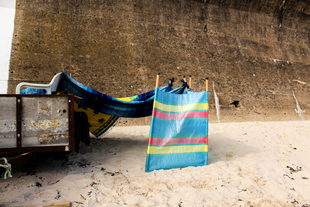
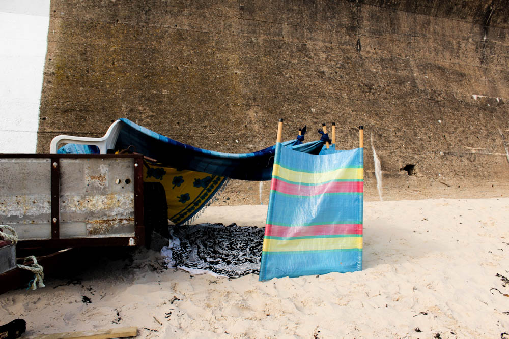
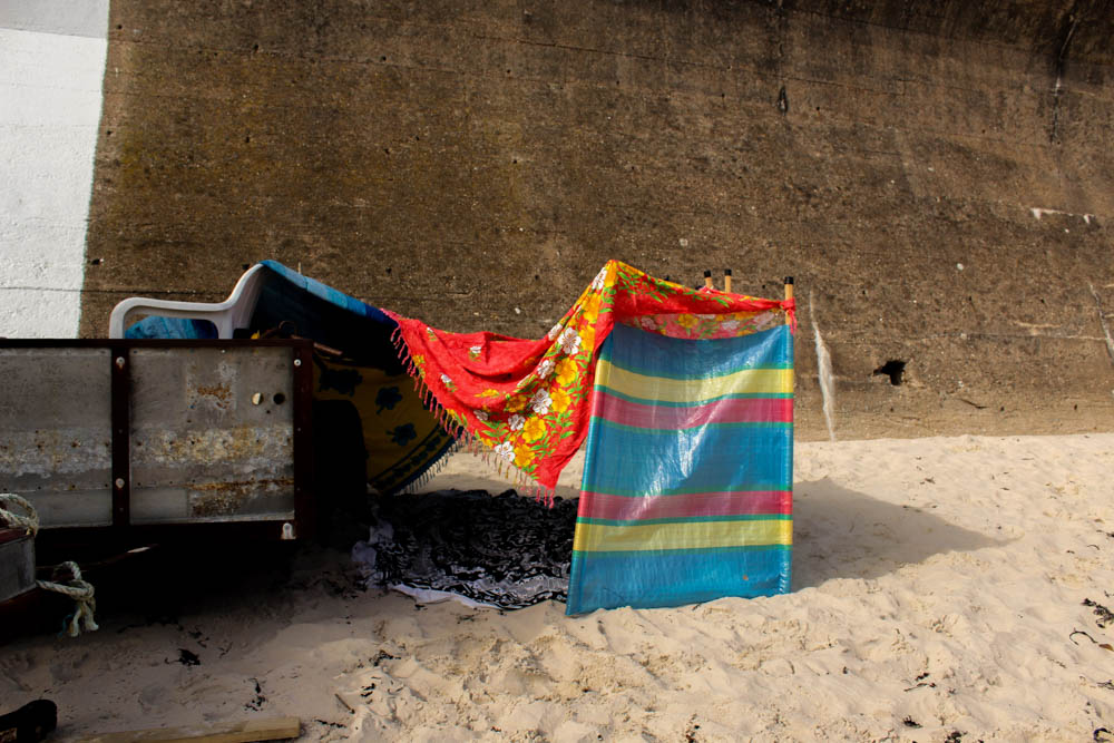
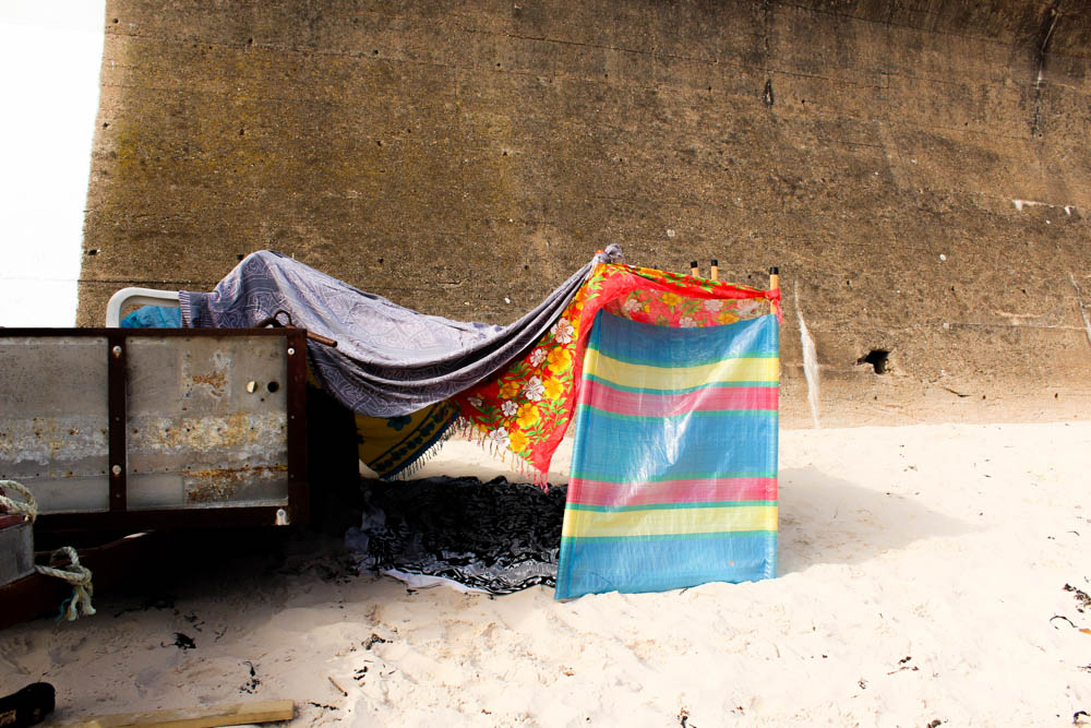
Once again i decided to photograph my process of den building from two different angles. It is quite interesting how when you build a den normally i wouldn’t really think about where the entrance of the den is gonna appear, it would just happen naturally depending on how the den structure comes along. When taking these photographs however it became important to consider that in order to convey as much of the den as possible, having the entrance in the frame conveyed more of a sense that the structure is a den. I also as i have already spoken about choose really bright primary colours to build this den which i think worked really well in standing out against the environment. I think this is something i’m defiantly going to carry on into my next photo shoot, the using of these bright intense colours. I think it works better than trying to get the colours to blend into the environment and it also more suggestive of the bright nature of children. 

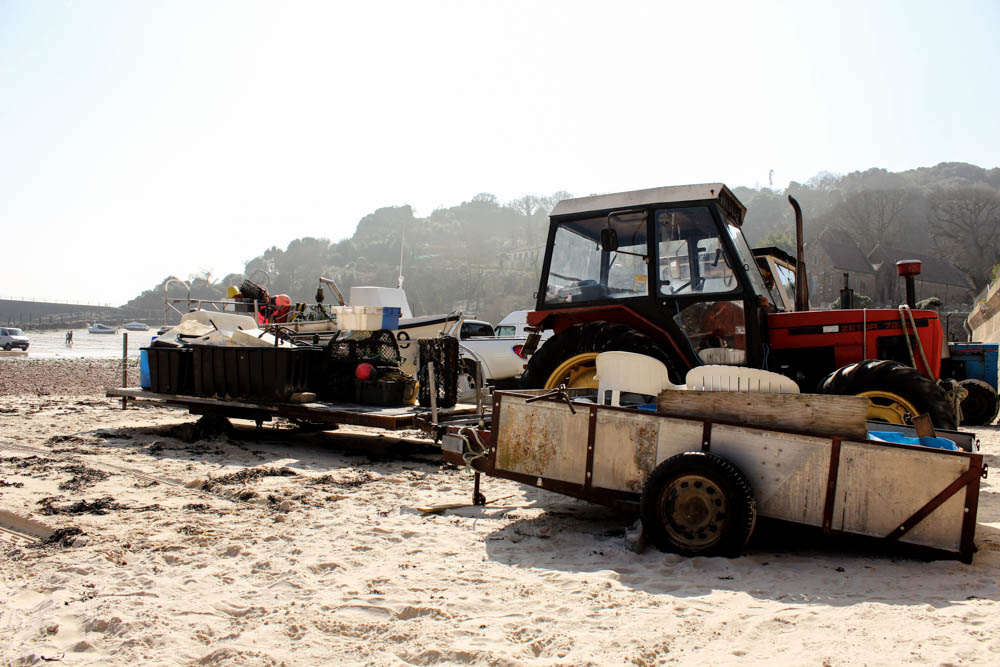
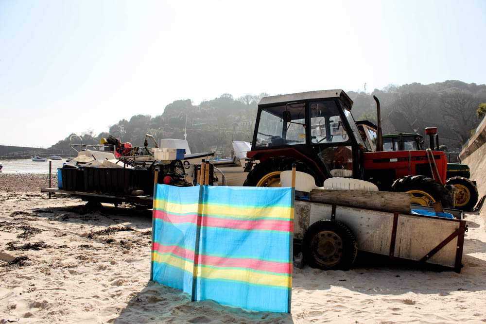
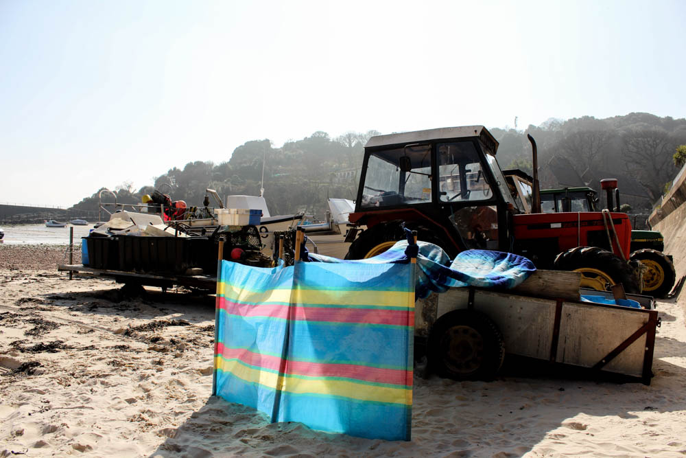
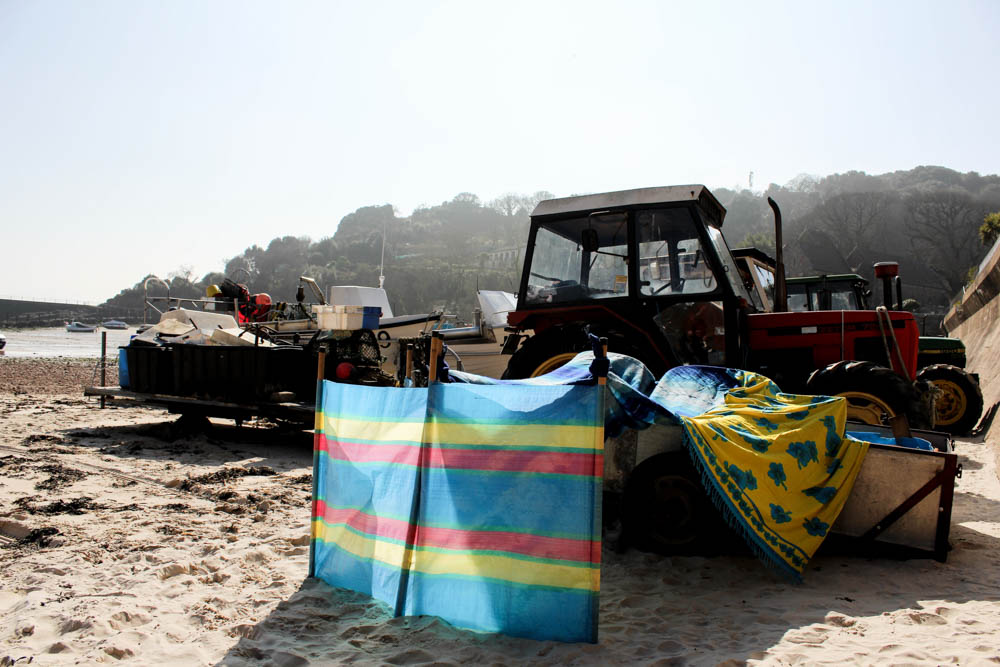
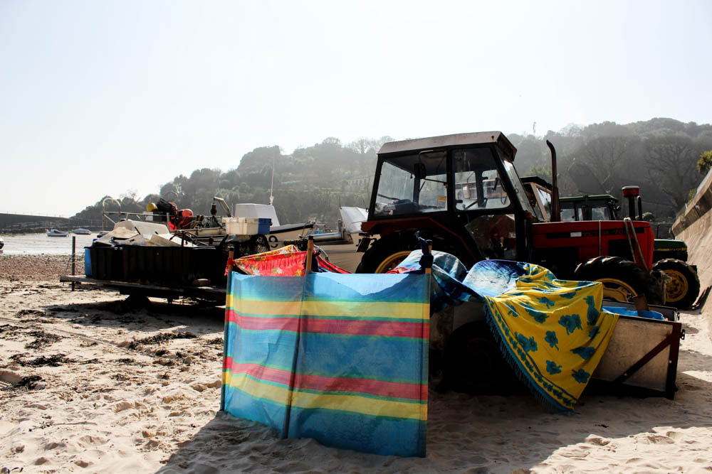
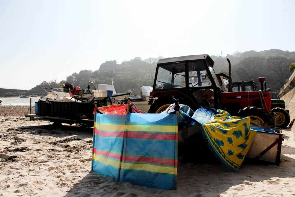
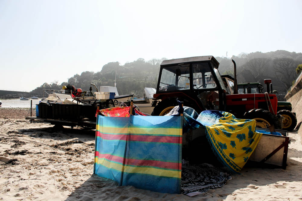
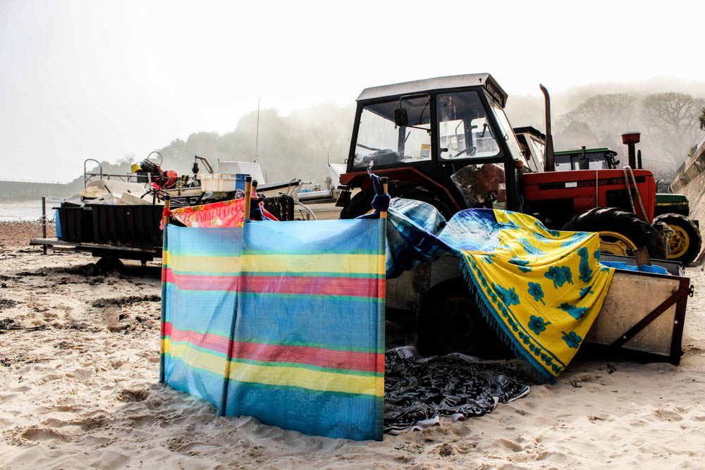
I composed the first set of process photographs so as to include all of the tractor and boats within the composition. This allowed enough of the beach to be seen to convey that it is a beach. You can see in the far background the line of rocks across the beach as well as the pier and far rock structures. I really like this composition as it shows the diversity of the beach by having the beach itself but then also having the lines of trees on the hills. I also quite liked how this composition really shows the impact of the weather on the environment. The foreground is clear and sunny but the background is foggy as the mist is descending down onto the beach. The lack of any bright colours in the environment also works well, with only the red of the tractor. This lack of other bright and distracting colours works well in emphasizing the den against the environment. The beach dens we created were all about being bright and vibrant as those are the colours you associate with summer and sunshine so i really liked how this composition allowed this to be recognized.

I therefore really liked the first set of process photographs. I think they work better then my first garden shoot in conveying how each blanket is added as you can see more clearly the different each element of the den makes. The lighting also stayed the same throughout the photographs which worked really well in creating a sense of unity for the photographs.

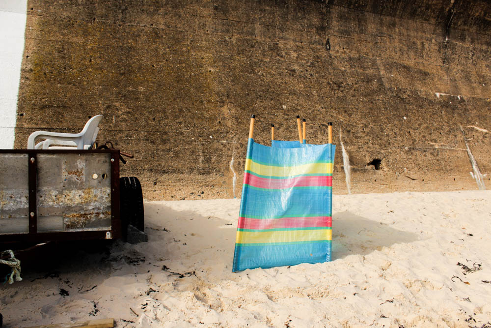
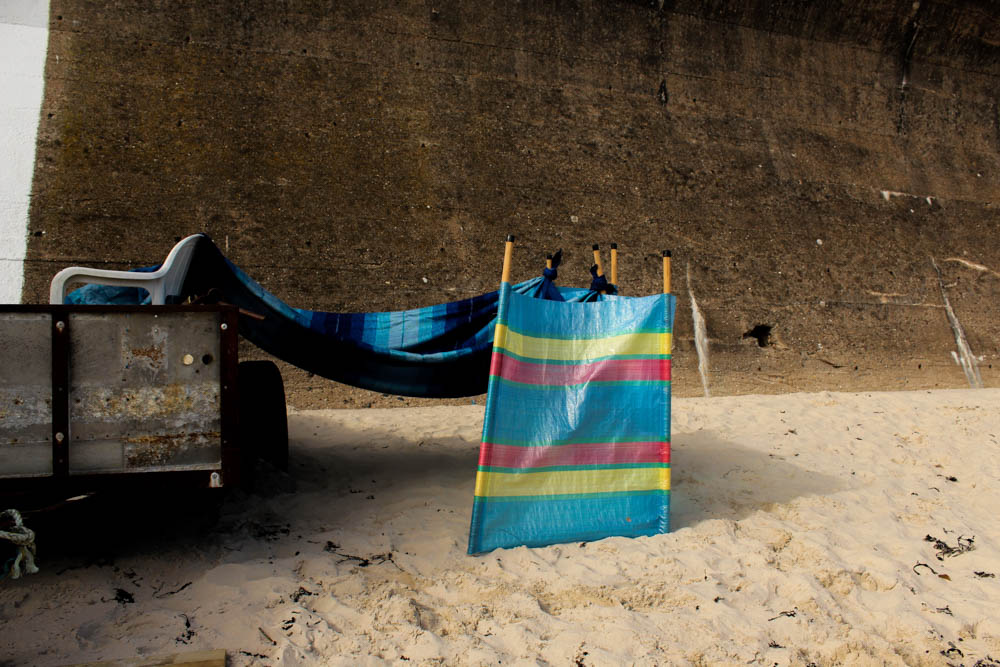
I also quite like the second set of process photographs though they have none of the impact that the first set of images has. The problem with my den building in this location was having this wall in the background that conveys quite a sad impression of the den and almost takes away from the bright colours of the den. I think it just goes to show how the right environment to photograph these dens is really significant as it can completely change the impact that they have.


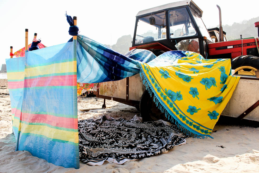
Above and below are the two best photographs that i took of my beach den and they defiantly work so well because of the weather of the environment. Both photographs are very well lit using natural lighting. The lighting however is not intensely bright, harsh lighting. It is instead fairly soft lighting which works really well in illuminating the colours of the den against the environment. In both photographs the rest of the environment, both the fog in the sky and white of the sand causes the dens to stand out vividly within the frame.

The top photograph is composed very similarly to my process photographs, only slightly closer to the den so that you can see inside. In this composition the den is in the center of the frame and the photograph is taken from the same level that the den is built at. The brightest point of the photograph is the sky in which there is the sun behind the fog shining down onto the den. As the sun is directly above the den your eyes begin with this really bright light and then go immediately to the den as the part of the photograph most influenced by the light.

I really like the composition of the below photograph as well to convey more of a childlike sense to the den. This photograph is focused more exclusively on the den itself rather than portraying the whole environment that the den is in. The composition is framed from a lot lower down than the other photograph to be suggestive of a child entering the den at a lower level. The angle of the photograph is also different to give more of a sense of being about to go into the den through the entrance. You are able to look straight through the den at the entrance which gives an impression of the space inside the den which isn’t something you maybe consider as much from the other photographs. The light in this photograph is a lot brighter than the one above, the sky a white blur of fog and light. As the photograph is taken from lower down this causes the bright colours of the den to stand out further against the environment. The light in this image seems to come from above and also the right hand side of the frame as the light is so intense that it reflects directly off the windbreak. This bright intense light shining on the outside of the den then contrasts with the shadows the den itself casts onto the surroundings and shade inside the den. I quite like with this composition how being able to see into the den causes you to be able to see the blanket inside the den.

I cant decide which of these two photographs i prefer as both convey a different impression of the den due to their different compositions.

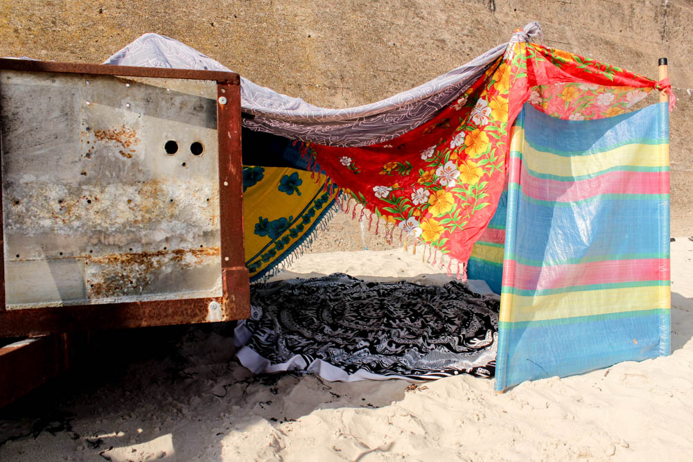
Above is a different angle to the den, a closer up version of my process photographs. It is really interesting to consider this composition of the den in relation to the other composition as they convey completely different impressions. This photograph is composed to look through the other entrance of the den. The same bright colours are used in the material and yet this angle of the den lacks a dynamic that the other photographs composition has. I think it is partly to do with the environment surrounding the den in this composition. In this image the orangy colour of the concrete wall doesn’t really add anything to the photograph or highlight the dens colours like the whiteness of the foggy sky. I feel like in this composition the colours become lost within the space. This composition does show a completely different side to the den but i just don’t think it has any where near the same impact as the other compositions.

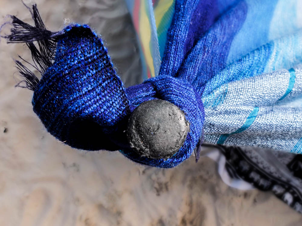
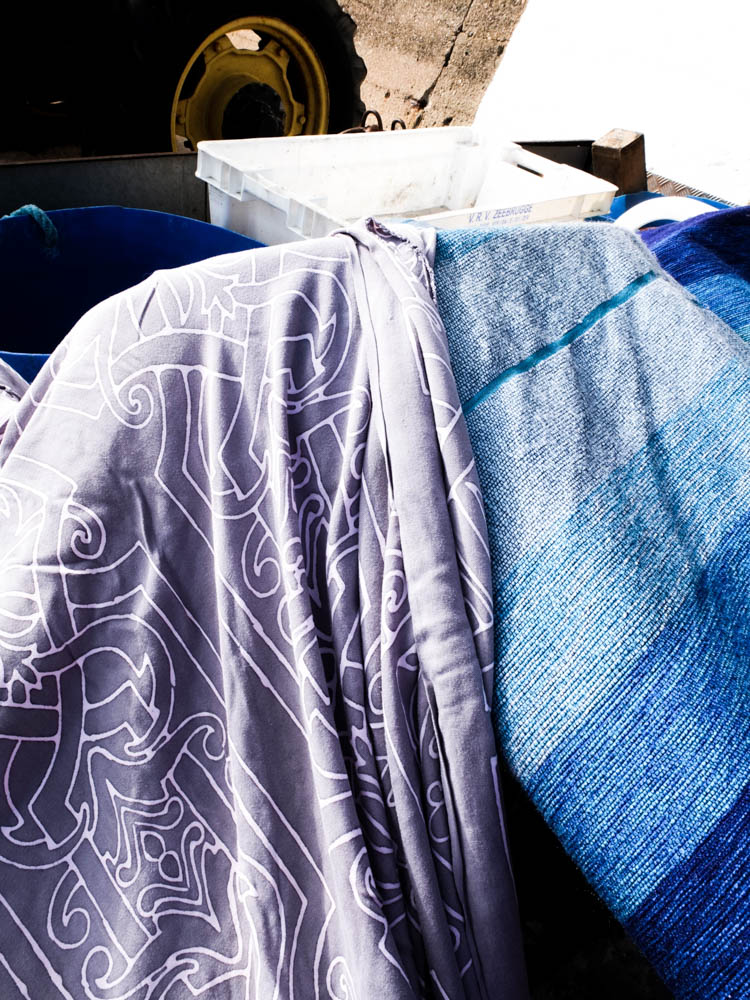
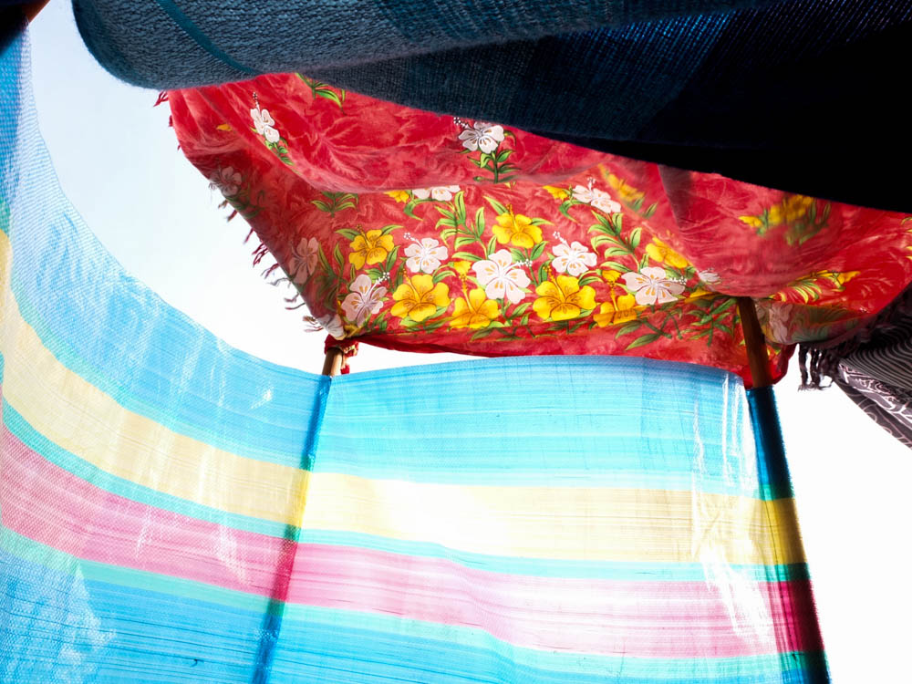
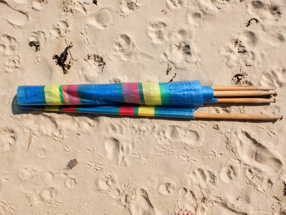
The above and below photographs are some close up photographs to go alongside my process photographs. Like with my previous garden den i wanted some photographs which convey how the den itself is put together and structured. With the beach den there was a lot more tying of material and balancing of blankets as down the beach i wouldn’t have brought in my childhood pegs or any rope. The main structure of the den all revolved around the windbreak acting as a wall to have all the blankets coming off.

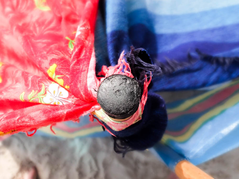
The above photographs were taken looking down on the windbreak as a supporting pole with the blankets and material tied around it and therefore coming off in bright swirls. I composed the photograph to have the pole in the center and the black top of the pole in focus while the rest of the image out of focus. This created quite an interesting impression of the material as a blur of folds going off from the center at different angles. I quite like how in both photographs you can still see the sand and therefore get an impression of the beach . The light source is fairly soft in the first photograph but in the second one the lighting is fairly harsh and comes from the left hand side. I think this could be because red reflects more light as a colour than blue which is what makes the real difference between the  two images

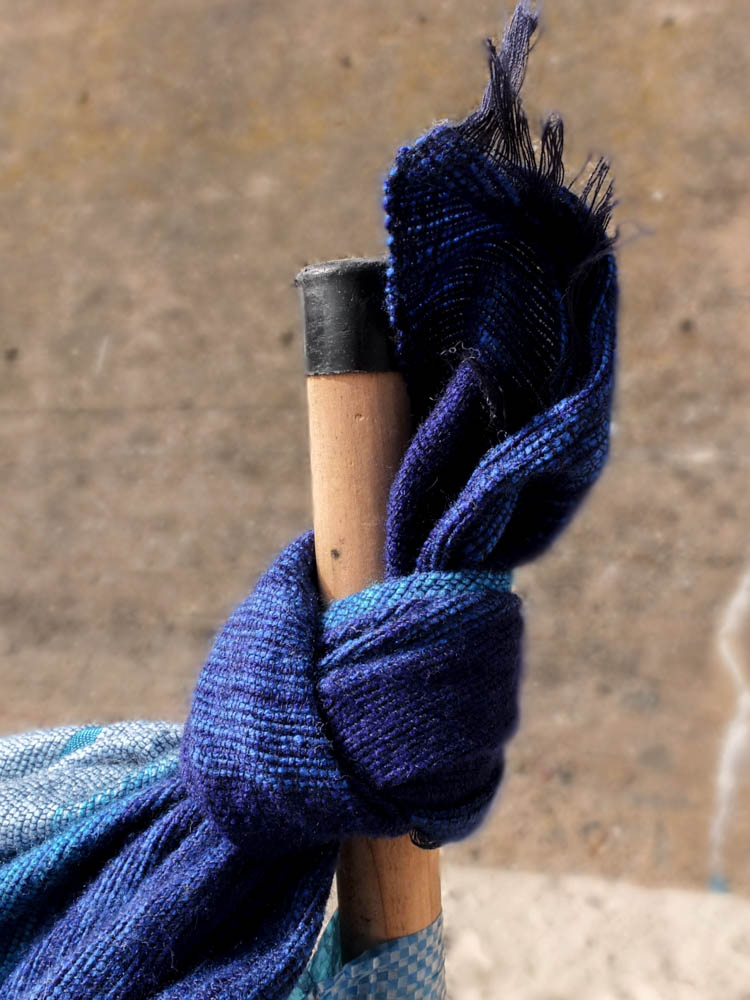
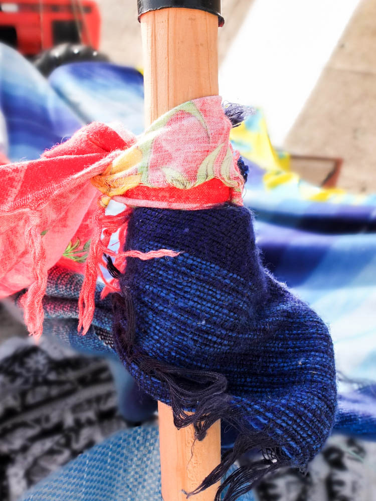
The below images are exactly the same two poles only photographed in a different composition. I composed these images to have the line of the pole in the center of the frame so you can see in these images more clearly how the material is tied to the pole. In both photographs i used a short depth of field so as to blur the background and have the emphasis on the pole and tied material rather then the den structure in the background. In both i  centered the pole right in the center of the frame. Again the first photograph has less light then the second as in the second photograph the light is reflecting off other colours in the background of the frame and also the white in the foreground. I think the first photograph works better as  conveying the material as being tied, as it is a perfectly tied piece of material but the second photograph conveys better the mixture of all the materials and colours of the den.

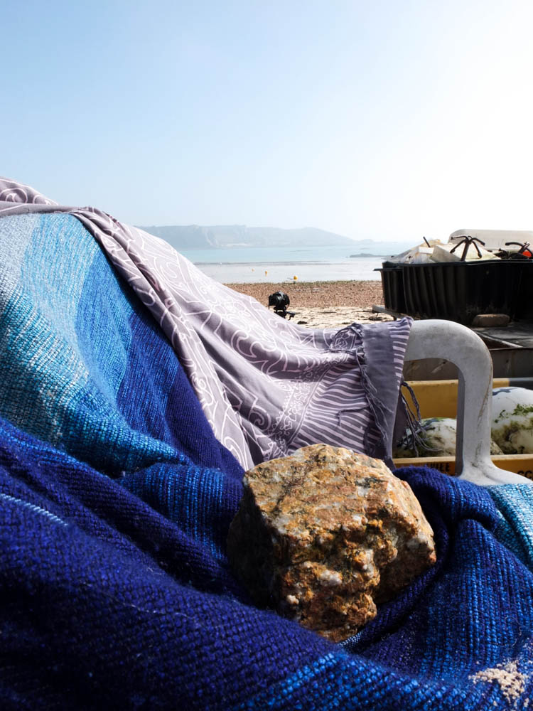
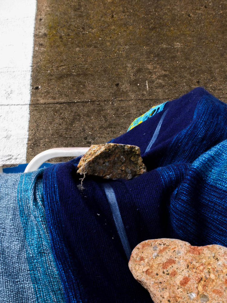
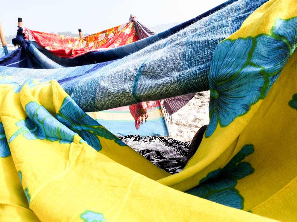
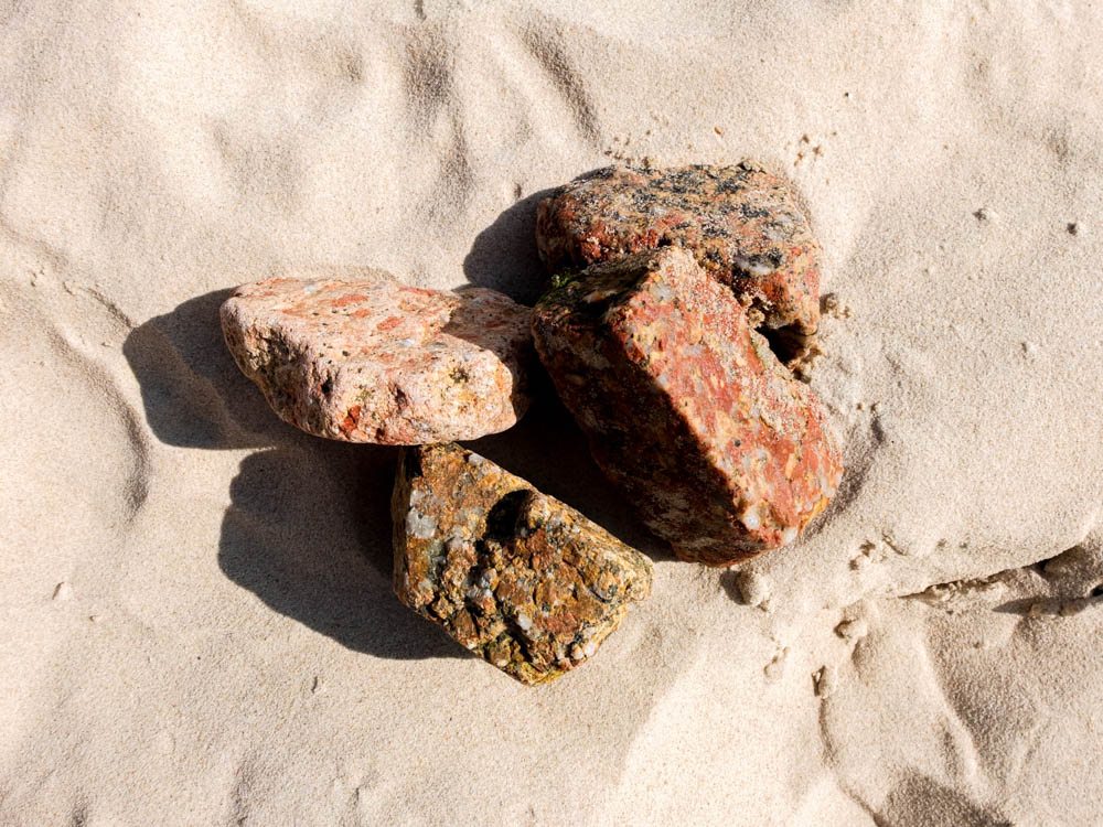
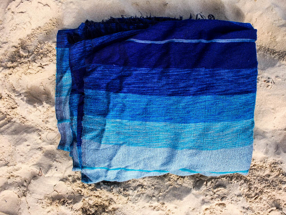
I really like the above and below photographs compostionally. As well as tying material i also used rocks to weight the material down to keep the various walls of the den in place.  The first photograph i think works the best as like the very first picture i took of the entire den, the background of the photograph is intriguing and better emphasizes the den.  The light in the first photograph comes from the right hand side of the frame and is a bright and harsh light. This light directly shines onto the dens furthest point within the frame, washing out the colour from the point of the den that it reaches. I think its quite interesting in this composition how the material of the den in the foreground reflects the sea. The dens materials almost looks like its trying to imitate water with the various shades of blue and the different folds of the material. The background of the den being such an intense white colour/pale blue also contrasts with the blues of the den and makes them stand out more vividly. The entire colour scheme of the photograph seems to revolve around different shades of blue which creates a calming asthetic. The exception is the rock which i composed using the rule of thirds to be in the bottom right hand corner of the frame. By composting the photograph in this way it weights the frame with having this heavy object both weighting the den and weight the material to have a solid presence. I also really like how in the background the curves of the materials and hills compliment each other with the lines of the rocks and sands breaking up all these curves.

The second photograph follows a similar composition but it less interesting because once again it features the concrete wall rather than the beach in the background. This image is also composed to have one of the rocks in the right hand bottom corner, almost pointing you into the rest of the frame. The brightest point of the image is the white line on the wall which actually takes away from the den. I like the composition of the material but the background doesn’t really work.

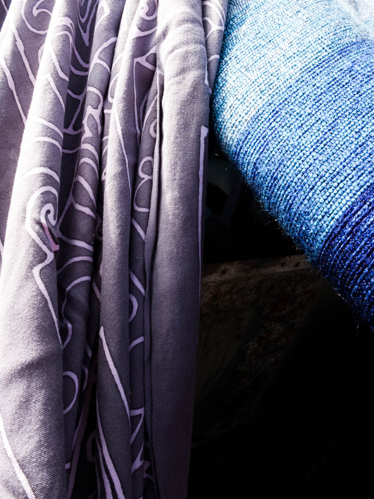
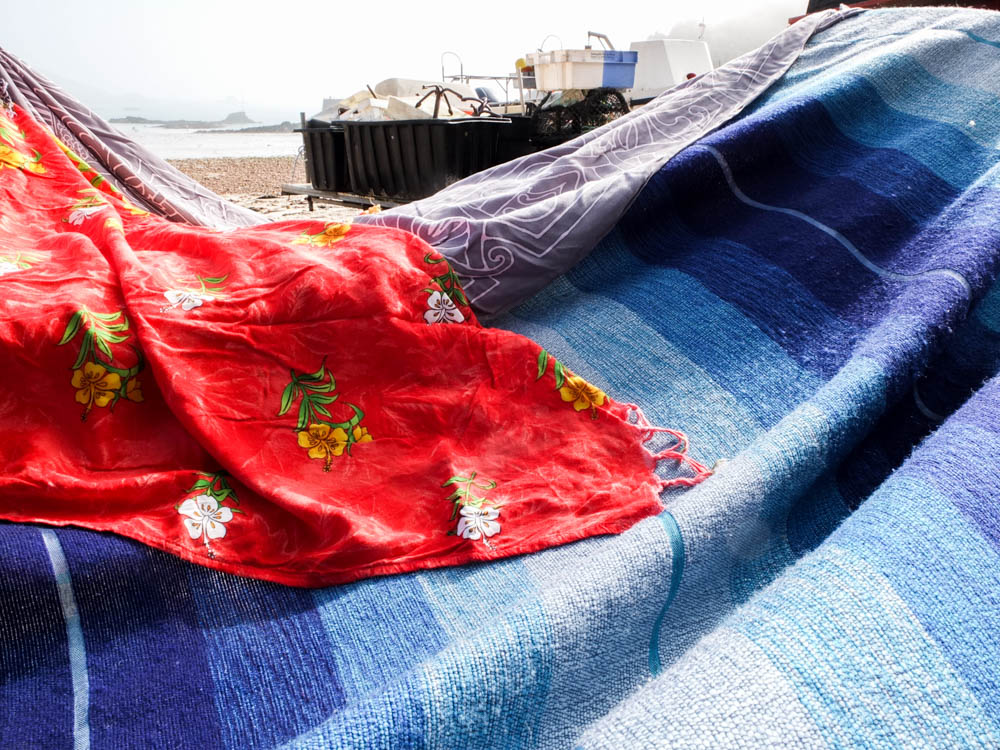
The above photographs are more abstract compositions which focus on the point at which material is over-layed. The two colours being various shades of blue complimenting each other. The light in the photographs comes from the top left hand corner to shine directly onto the material. The points at which the light shines onto the material is washed out with colour which shows the harsh intensity of the light. These bright sections of light then contrast with the dark shadows in sections where the blanket has slipped and therefore leads into the inside of the den. Both these contrasting lights and dark’s then make the colours themselves more intense. I quite like the contrasting angles in these photographs alongside the vivid lights and darks as the material runs alongside each other but then has different folds and patterns on them which adds a dynamic to the photographs.

The below photograph works the same with having these intense lights and darks which bring out the bright colours of the den.

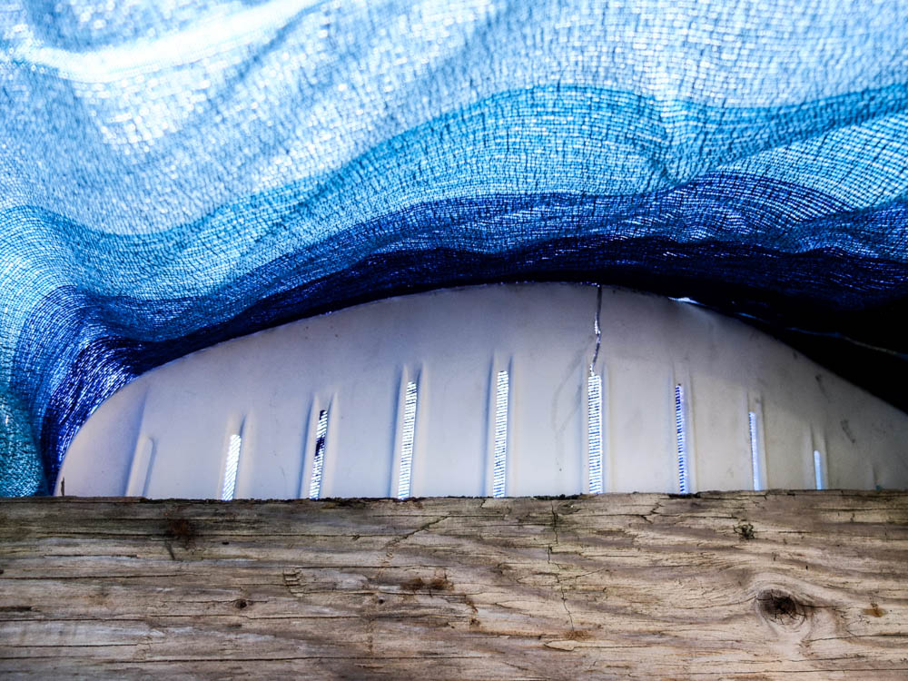
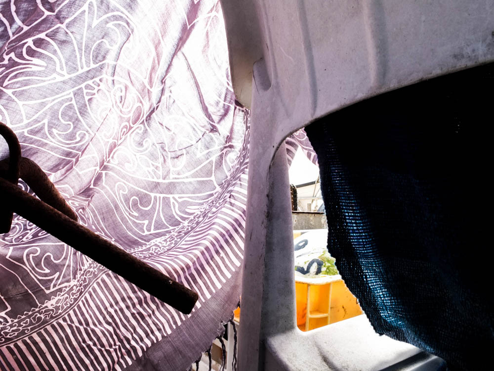
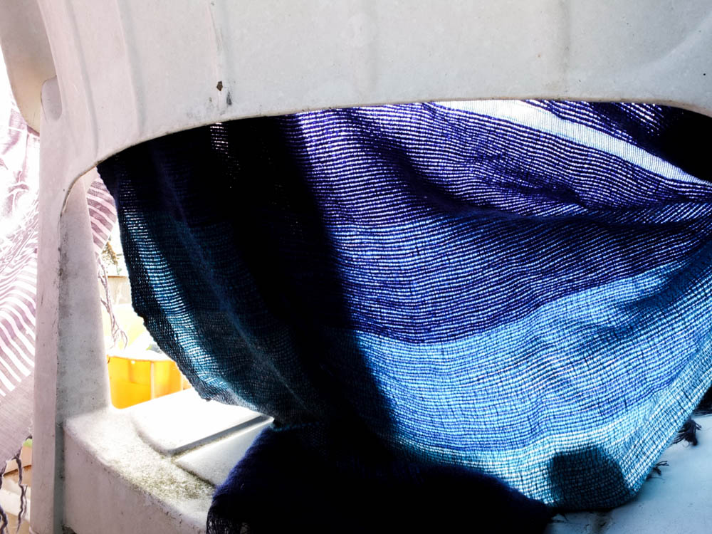
I took a couple of photographs from inside the den as well, wanting to again consider the material as the light shone through it. As the thinnest material the windbreak was the main source of light within the frame. In this photograph the light source is on the other side of the windbreak shinning directly through . The sky is a really bright and intense white from the light which washes out all the colour. I think it is the angles of the above photograph which makes it so interesting as the windbreak curves round in one direction, your eyes beginning with the brightest point behind the windbreak and then moving round, following the curve to then let your eyes travel along the material at the top of the frame. There also appears to be a tension in the photographs in which the material is pulled taught from the windbreak. I think the main thing thing that makes this image work however is the light as it makes the colours appear more intense and vibrant in the environment.

The above and below photographs show the process of the den breaking and then being rebuilt. When considering Goldsworthy’s work this was a key part of his process, to rebuild and continue to re-build until the structure becomes sound. This is as much about the den being created as having a final product as the den comes undone because of the environment, be it wind or the un-ablity to get a blanket to balance. The above photographs focus in on the tiny points of the den which have become to come apart, where holes have developed in the structure. I quite like these photographs in showing the layering of material and the tiny holes giving an insight into the inside of the den. The photographs are composed so that the break in the den is right in the center of the frame. The light in both photographs is intensely bright. 

The below photograph was just a quick set of photographs i decided to take to show how parts of the den could fall down and then be rebuilt. 

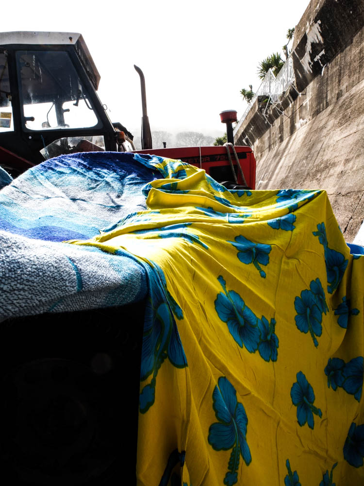
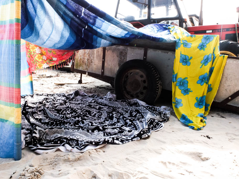
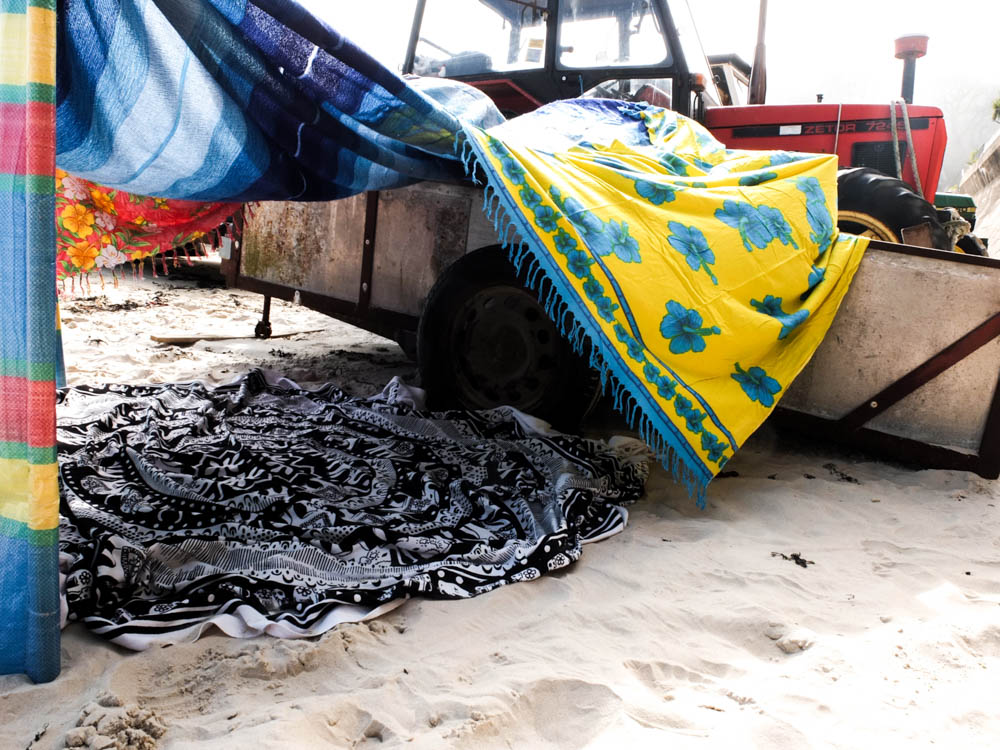
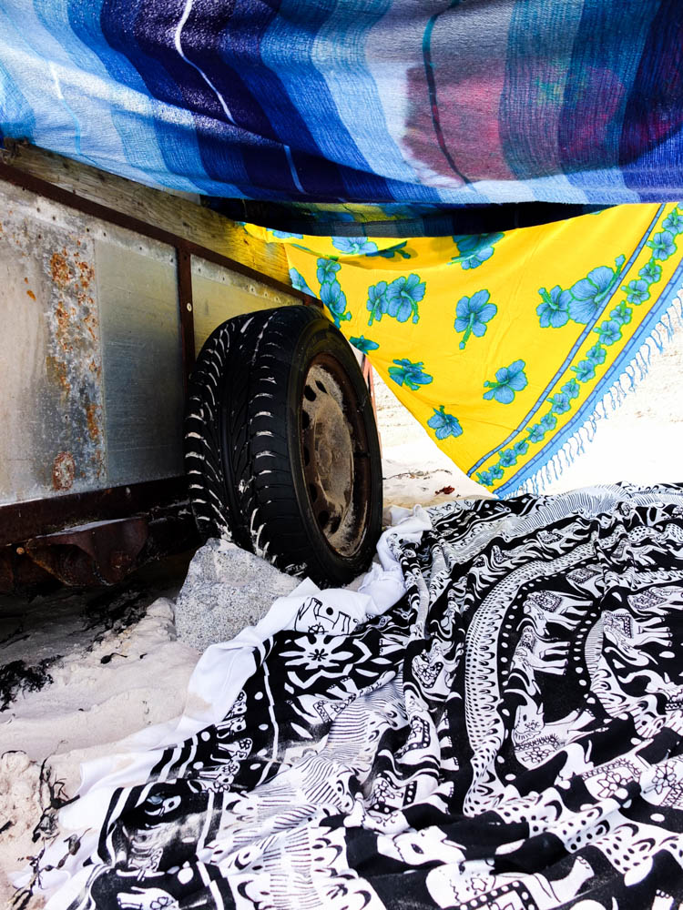
I quite like this last photograph because of the way the colours compliment each other. The bold bright yellows and blues then contrast with the blacks and whites, including the tire and the white of the sand. The image is also composed to use abstract angles, the wheel of the cart at an abstract angle and the blankets as well at jaunty angles. The brightest part of the photograph is the light in the background which is a bright intense light. The whole image is made up of very bright colours, the light shinning directly through the material and intensifying the colours. 


Planing – beach den shoot

My next shoot i decided to create was a beach den as this was the most common den i made as a child. I spent pretty much my entire childhood down the beach building dens so it was really important that i included a beach den within my project. I decided to use St Brelade’s beach as we had a spot up by where the boats are parked that we would always go to. This was key in inspiring our beach dens. The boats and tractor trailers provided a basic structure to began to build our dens coming off the sides of them. Otherwise down other beaches such as St Ouen’s we struggled to have a starting point to build the dens off. I have mentioned previously how important it was in den building to consider the  environment and to find the perfect part of the location where you had a starting point. I thought it was therefore really important to build a den in this location. 

For my beach shoot i didn’t really want to take my photographs on a sterotypical sunny day. I wanted to get a different atmosphere to the photographs rather then just sunshine. The most memorable dens on the beach where the ones when there was weird weather or i used something slightly different to build the dens. As we have been having so much fog recently i thought it could be quite interesting to create a den on a day which was really foggy. It actually turned out that i got the best of both worlds as the day i choose to take the photographs was a sunny day and also very foggy as it rolled in as i was taking the photographs.

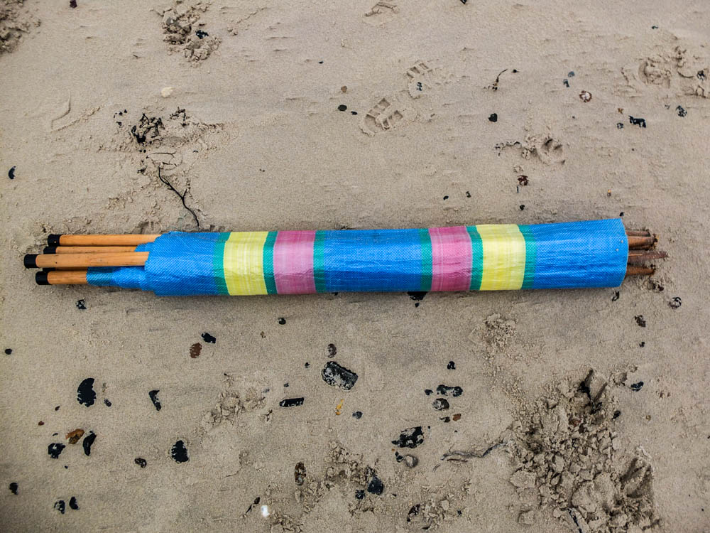
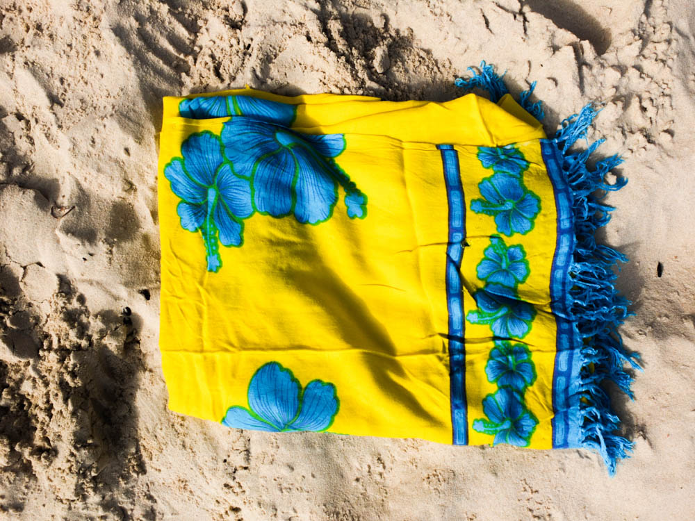
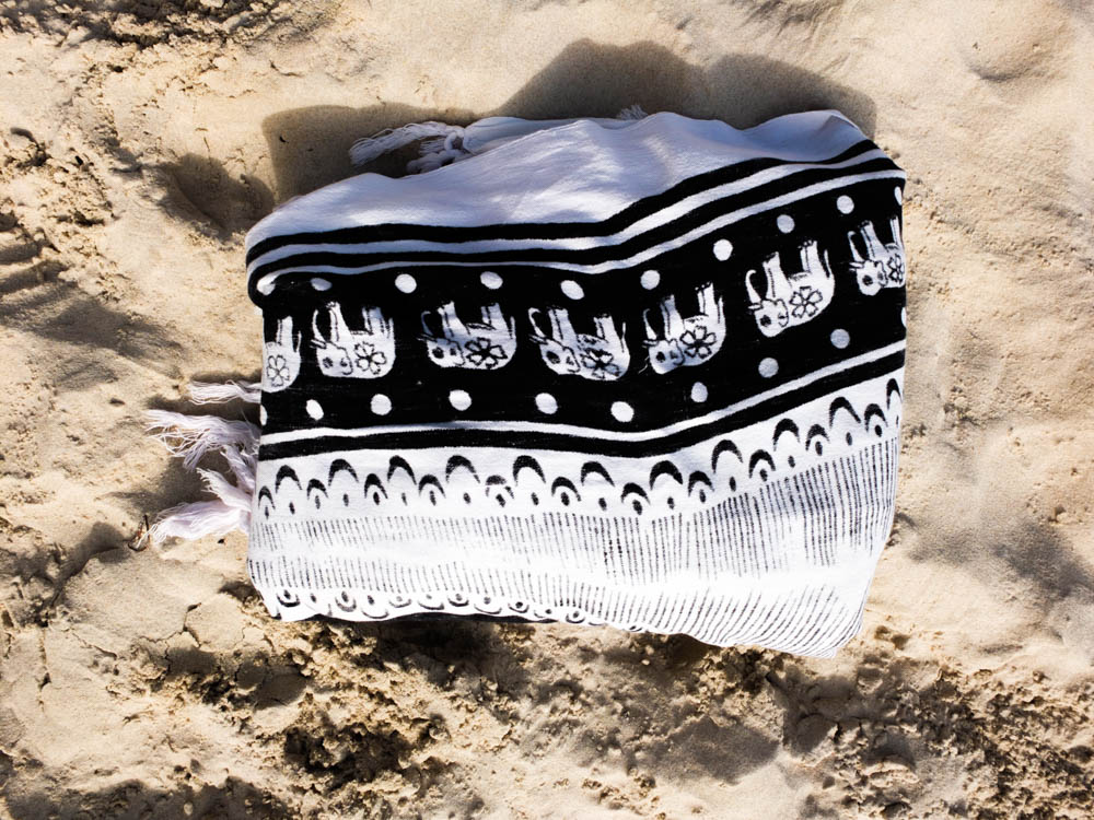
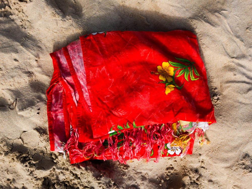
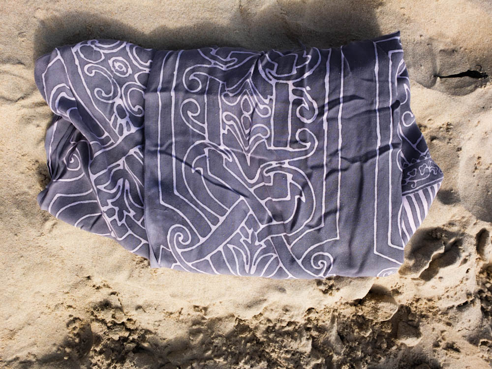
When choosing what materials to use to build my den i wanted to use those that i would have used at the time to build dens. I therefore thinking about the basics of the structure decided to bring a wind brake to act as a wall. Down beaches where we had very limited places to build dens as there was no beginning point to the structure we would always use wind brakes to create walls and then drap material off them. The material i decided to use were sarongs as these were the things i used down the beach as a child to lye on and to dry ourselves after swimming. They were the best blankets to use as they are very light weight and can be folded up small so many could be taken with us down the beach and then used for various things. I have also decided instead of pegs like i used in my garden den i will use rocks to weight down the blankets as they are a material that is readily available down the beach. 

Below is the location in which i have decided to build my den. I wanted to choose a part of the location which conveyed that the den was built down the beach but without the photographs appearing like a sterotypical beach photograph. I therefore decided to take the photograph looking back towards the less extensive side of the beach. I had to take the photograph at the end of the line of tractors and boats in order to have enough room to take the photographs from far enough away from the den. 


2nd Shoot (Results)

2nd Shot Results


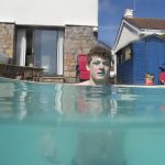
This shoot did not turn out like I wanted it to or how I expected it to. The results are interesting and although they do show the colours that I was expecting the makeup/facepaint that I used on the model could not be seen very well and so that aspect of the shoot did not turn out too well. The images are also not all of a fantastic quality, I had hoped that the water would be clear but the pool cover had been left off for a long time so there was a lot of drt in the water. I also encountered the issue that the water was way too cold for me or the model to be able to stay in the water for more that a few minutes even though it was incredibly sunny.

I would have preferred to have organised this shoot at a different time of day as well as midday but due to time constraints for the pool owner and my model this could not be helped. This did help however because although the light was not fantastic for shooting above the water I really needed the very bright and direct sunshine for the underwater photographs. Because this was one of the first attempts to use the case for my digital camera under water I was not very experienced in using it, I needed to borrow some small dumbbells to weigh the case down so it could sink with me, because of this it was difficult to handle under the water and even more difficult to handle above the water and some of the settings were difficult to use in addition to keeping the lens cover from creating dark corners.

The colours that make up the images are quite nice, they really help to create the kind of effect that I was looking for but I would have prefered for them to have more structure to them. The all felt kind of flat and uninteresting. I tried to get a variation of different shots due to the low quality of the images but all it did was confuse the results of the shoot, there was no linear storyline to the images, again partly due to not being able to stay in the water for too long. despite my dissatisfaction with the shoot I still took the images in the contact sheet above and edited them all to see if I could get some better results from them.

This is the result of the editing. I only passed them through Lightroom quicky with some small exposure changes, clarity adjustments and on a few I changed specific areas. There was not much that I could do with these images other than this in Lightroom, but I have attempted editing them in Photoshop to see if I can get any different results from some more abstract editing. This experimentation is going to be shown in the next blog post.

Environment – Artist Reference 1 – Carlos Spottorno

Carlos Spottorno


Having confirmed a plan in producing photographic responses to my travels throughout the Mediterranean, I wanted to investigate some methods in making this kind of photography more original unique. As discovered in my previous blog post, the genre of Travel Photography is now very crowded due to its accessibility and ease of involvement. There is little originality in documenting the landscapes and atmospheres of foreign locations as it can essentially be done by anyone. Consequently, I may have to indulge in some peculiar methods in order to make my work more personal and distinctive. With this plan in mind, I began looking at the work of Carlos Spottorno. Carlos Spottorno is a Spanish documentary and Travel photographer with an artistic background who has focused his main personal projects on subjects related to power shifts, economy, and social issues that shape the real world. Born in Budapest in 1971, Spottorno has travelled all across the globe, generating editorial, commercial and personal projects that possess some fork of message or deeper meaning.

One of his projects called “The PIGS” bears some visual resemblance to the work I am producing due the synonymous European environments explored. For this project, Spottorno intended to capture Portugal, Italy, Greece and Spain through the eyes of the economists. PIGS is a term coined by the business and financial press as a way to refer to Portugal, Italy, Greece and Spain during their current financial plight. These countries are all united in facing vast loss in historical prominence and are hence grouped together under this banner. What started as a pejorative label used by neoconservatives, mainly from English speaking countries, was eventually taken up for some time without any qualms by the media. Excessively high levels of public and private debt, government deficits, a property bubble and very disappointing political and economic policies, have put the PIGS in the crosshairs. It is alleged that the PIGS won’t be able to bear the pressure of sharing a common currency with their stronger European brethren. Spottorno states:

“I have often asked myself how, after so many centuries of splendor, could these countries have come to their current destitute state. What happened to Greece, the cradle of Western Civilization? What became of Italy, heir to the Roman Empire and endowed with one of the richest artistic heritages in the world? What went wrong with Portugal, the first global naval power in history? At what point did Spain and its empire, on which the sun never set, see the onset of their decline? I believe the root-cause of our countries’ current sorry state of affairs is to be found in the distant past. Issues that for many centuries piled up on our doorsteps are now rearing their heads and plain to see.”

Spottorno continues, arguing that the PIGS view themselves, rightly, as the architects, and as the stem cells from which the idea of Europe developed. Southern Europe resists admitting its loss of political stature in the global political arena, seeing itself as the wellspring of Western Civilization. Spottorno sees The PIGS as old, cynical and individualistic countries. I think this is a really interesting concept, and I something that I have frequently thought about in the past. Its quite staggering how these countries were formerly, some of the most powerful and dominant forces on the planet and now are simple, weak shadows of these former identities. I think that Spottorno had an excellent lead for a photographic project here, due to the passion he had behind the project. He attempts to illustrate the stereotypes brought up by the term PIGS. In other words, what we would see if we were to translate into images the articles we read in the financial press. He intends to present how he imagines economists perceiving these countries. The result is a collection of clichés, some true and incomplete. The same way a travel guide carefully avoids anything seemingly unattractive, this book shows much of what we find embarrassing, oftentimes rightly, and at times unfairly.  What stands out the most is the glaring absence in these images of all that is positive, beautiful and promising in these countries.

In this photograph, we see a young gipsy holding his horse after cleaning it. In some parts of Portugal, like in other european countries it is still possible to see working horses in urban context. Nomad gipsies settlements are in the middle of town, generating sometimes troubles between them and the other people living in the areas. They are accused of being dirty and chaotic, besides dealing with drugs and crime. This is a clear highlight of the plight endured by Portugal and he transformation experienced through history. I like this photograph a lot, a powerful composition evoking a lot of emotion. The boy and the horse are stood central dominating the frame and drawing the attention of the viewer. Nevertheless, in the background, we see the urban landscape, a  white blocky building providing the context and message. The building features an interesting lighting setup as certain faces are shrouded in complete shadows and others in complete light. A nice contrast is created that doesn’t distract from the subject and his horse but ensures our eyes naturally meet this component.
Carboneras, Almería: hotel “El Algarrobico” was built in a protected Natural Park with the complicity of local authorities. Popular activism and the pressure made by Greenpeace stopped the project, although after a decade of legal activity it has not yet been demolished. Nevertheless, It’s interesting, though, that many locals would like the hotel to start operating, and revitalize the poor local economy. This photograph is really interesting as we see a lot of opposition and clashing of certain messages. Typically we associate tourism with lush landscapes, clean architecture  and bright, vivid colours. However, within this photograph this idea of tourism which is ushered in by the family sat upon the beach, is conflicted by the surrounding landscape. This abandoned hotel that still remains to be demolished is just sitting there, whilst the dingy colours of the surrounding environment produces quite a depressing tone. We truly see the repercussions of this failing economy and stereotypes surrounding Spain have been challenged.

The photographs within the PIGS project represent, visually, my initial intentions for this study. The photographs concentrate primarily on the landscape and significance of the local environment which is what I wished to do as well. They occasionally feature a subject within the foreground who can provide context and intrigue surrounding the narrative. Nevertheless, my travels around the Mediterranean do not possess the same kind of depth and meaning that Spottorno has here. The reason why the PIGS project is so successful is due to the direct, concentrated proposition organised by Spottorno. He has discovered something that he is passionate about and ensured absolute focus upon this for his photographs. On the other hand, this kind of depth or internal meaning is absence from my work, meaning minimal focus would be achieved on my shoots. This is why I would like to find something more unusual for my work, and fortunately Spottorno has another project that I would like to reference.

LA GRIETA / THE CRACK


In December 2013 reporter Guillermo Abril and Spottorno received from the assignment of preparing a series of stories about the European Union’s external borders. THE CRACK is Spottorno’s field journal as he followed the border from Africa to the Arctic with the aim of identifying the causes and consequences of Europe’s identity crisis. Halfway between a photobook book and a graphic novel, in as much as it uses narrative elements of the latter, the end result is not a story based on actual events: these are actual events. At the time the media’s coverage was focused on the migration flows in Melilla and the Southern Mediterranean. The great migrant exodus in the Balkans, and the attacks in Paris and Nice were still a long ways in the future. The war in Ukraine seemed to have stabilized, and the United Kingdom hadn’t yet voted to leave European Union. These and many other events would take place over the course of time it took them to cover their assignment, which took them all the way from Melilla to the Arctic. After three years working on the story, several covers, dozens of pages in magazines, and a World Press Photo, the authors set out to convey, with the 25,000 photographs and 15 notebooks they had compiled, the story of what is happening on the European Union’s borders, making use of an innovative narrative form.

This project is a perfect example of how to present Travel Photography in an innovative and original way in order to separate it from the crowded genre and boring photographs. Spottorno has borrowed the aesthetic of comic-book art presenting his images upon paneled pages with a typical comic-book filter employed onto the images. The pages feature speech bubbles and narration boxes, just like a comic book would, enabling a narrative to be told. The idea is very imaginative and a good representative of the originality I intend to capture for my travel photography. By presenting the images in this way, Spottorno is provided his travels around the globe with a story and sense of progression. The portfolio becomes more than just images, and Spottorno has created a professional and sophisticated final product. This is something that I would like to replicate for my Environmental project, essentially utilizing the travel photograph as a backdrop for something greater and more creative. Whilst the visuals of the PIGS project can still be echoed, I would like to incorporate an individual style through the editing stage, perhaps taking advantage of my artistic abilities as I have done in the past. The next stage is to try and think of an concept i  manipulating my shoots that is original and individually relevant. 

Power of the Sea

Power of the Sea


The sea is an incredibly powerful force. It is often taken for granted that we can co-exist safely with it but this is far from the case. I have already looked at the mysteries and mythology that people think of when it comes to the sea but now I am going to look at the true destructive power of the sea. The sea is one of the most powerful forces on earth, it takes life like it is nothing. Countless lives have been lost to the sea over the years, even with masses of technological advancements in recent years we still cannot protect ourselves from its awesome power sometimes. Although dated one of the best example of this is the Titanic, supposed to be unsinkable the massive loss of life from the tragedy proved that the sea is and always will be king.

Final Farewell

This painting was created after the sinking to commemorate the loss of life. Titled “Final Farewell” is gives a very melancholy notion of the ship sailing off into the sunset, towards better things that would not come, and that in the end the Titanic’s journey would end with 1,503 people perishing on its maiden voyage.  There are not any artistic, photographic works based on the Titanic due to the final resting place of the ship being 3.8km under the water but there are plenty of paintings. Many do not focus on the sea but instead the humanity and the loss of life, as well a fear. Fear is something that I could definitely tap into with my project being based around water.

Another element that ties in with this fear is the sense of randomness of the sea. On the land things can generally be anticipated much better, roads do not usually just breakdown, buildings will not suddenly collapse and for the most part even some of the worst weather can be hidden and protected from. most of the deaths due to bad weather on land are based around water too, floods and tsunamis caused by natural disasters kill more than the rest of the natural disaster itself usually. On the open water this does not apply, the randomness of waves and the sea conditions makes it an incredibly difficult thing to predict. The image above shows some of this, although over dramaticized the different direction of the waves really lend to the notion of randomness and chaos that is going on. The splashes of white from the cresting waves contrasting with the deep, dark water of the troughs makes the painting a very interesting one to look at. This kind of thing can also be captured in photography, a much smaller example of this can be seen in my work from my first shoot.

Today we have the advantage of satellite mapping and forecasts to inform us of the dangers of the sea and what there is lying ahead of us but this is not always enough and cannot always capture and be aware of everything. The photograph above is of a “rogue wave” that crashed over the MS Stolt Surf on  the 4th October 1977. Estimated to have reached a height of at least 22m before crashing over the ship and subsequently causing a mass of damage to the ship that left one of the sailors hospitalised. furniture, port holes, electric cables and lights were damaged with the boat beginning to flood. The ship’s engines were at risk from being broken, but thankfully they managed to keep them running, if not then they would have ended up lateral to the waves and if this had happened then the ship could have easily been split in two and it is unlikely that the crew would have survived. These rogue waves were originally considered mythical n nature but recently have managed to be properly studied, this had confirmed that they do exist, occurring in open water, usually at very substantial depths there is no way to predict when these waves will occur because we have no other knowledge about them. Often linked to disappearances of many ships with unknown reasons for disappearance they are terrifying, for many reasons but mainly for the reason that they are truly random.

Even on land people cannot always be safe from the awesome power of the sea Tsunamis are a real danger to many people who live in these disaster prone areas. One of the countries that is often hit by Tsunamis is Japan, in 2011 the country was it by a Tsunami that caused massive destruction to the county’s coastline. Destroying homes, causing the leak of radioactive material from a nuclear power reactor and killing almost 20,000 people this disaster made headlines around the world for a long time. Again being incredibly difficult to predict there was little warning and because of the devastation caused people did not know how to react. The photographer Paolo Pellegrin was one of the first on site to record the devastation and destruction.

His photographs are a very real look at what happened to the country in the wake of this disaster. His shots are all composed the same way, using a wide angle panoramic style the images show an incredible amount of detail due to a very high contrast. This incredibly high contrast further emphasises the destruction of the area by giving the viewer lots of information to take in, this causes them to look for longer and notice even more details. The apocalyptic levels of destruction being caused by a simple wave is immense, the sea is not something to become complacent of. It has the ability to create the kind of destruction that is seen in these photos, at random and without warning. One of the most powerful elements of these images for me is the boats being beached so far inland, these are boats weighing hundreds of tonnes and they have been ripped from moorings and anchors designed to hold them against everything that nature can throw at them and they have simply been plucked with the ease of plucking a hair and dragged inland by the storm surge. Pellegrin’s images lend themselves to this idea of randomness that the water produces, items are strewn everywhere with no order or care. And yet these people called this place their home, it was their environment and now it is a completely different environment that people can no longer live in.


Artists referance-Francesca Woodman

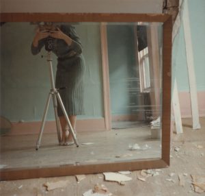
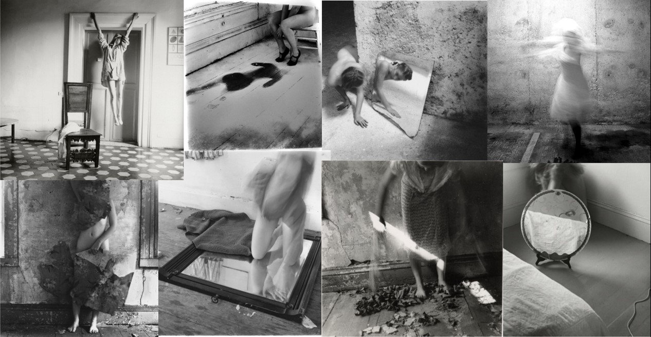
Francesca Woodman was an American photographer who created black and white images often using herself or other young, female models as the subjects.  During her life time her art was not well-known and it was only after her death (she committed suicide at 22) that her work received attention.  She is considered to be a progressive feminine voice in photography and her work explores themes of isolation and self-displacement. Woodman explained to her parents (who were also artists) that she used herself as a model as a matter of “convenience” because she was always available and knew exactly the effect she wanted to produce with an image. The main subject of her work was broadly an exploration of her own body in relation to space.  Her photographs test the boundaries of the body but she rarely revealed her whole body with her face often blurred or masked and parts of her body are hidden behind elements of the environment. This creates an interesting relationship between observation, self-display and mystery. Some critics have interpreted this as an attempt to resist the male gaze with the tendency to camouflage herself. In some images Woodman also most becomes one with her surroundings by blending into the wallpaper or floor so that it becomes difficult to distinguish between the two. By fragmenting her body in this way, hiding behind furniture or using reflective surfaces such as mirrors to conceal herself she dissects the human figure and emphasises isolated body parts. This creates the idea that she is simultaneously there whilst also absent and relates to the idea of disappearance.

Woodman often used long exposure techniques to capture movement within her images and create surrealist compositions . The concealed figures have a mysterious, ghost-like quality . There are also no modern buildings in her work which the critic Elizabeth Gumport describes in this article as crumbling ruins “whose disintegrating forms evoke the wrecks admired by the eighteenth- and nineteenth-century Gothic revivalists often cited as [some of Woodman’s] major influences”. Woodman often photographed herself nude or wearing old-fashioned clothes  such as white petticoats and is typically sited in empty dilapidated rooms containing old furniture. Her photographs look as though they belong in a much earlier time with her choice of costume meaning it is impossible to date the images and the use of old buildings and absence of modern objects create a Gothic appearance.  Woodman was apparently an avid reader of Victorian Gothic fiction such as novels by the Brontes which could be said to be reflected in her work with the idea of spectral female figures, confined to attics. The soft focus and black and white nature of her images is also similar to the style of earlier generations of photography which further emphasises the timelessness of her work. The soft greys that shade her images add to the mysterious tone and show her eye for light, shadow and form.

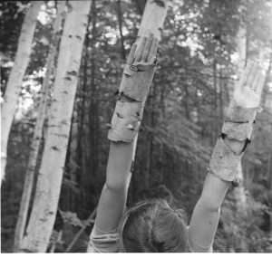
Critics have disagreed about the meaning and purpose of her art with some comparing her to surrealist photographers (with her use of Surrealist motifs such as mirrors, gloves, birds, and bowls) and others hail her as a feminist hero.  Her images are also very personal, lending them an autobiographical quality and therefore interpretation of her work is often based on psychoanalysis in light of her suicide. However her images are also often subtly amusing and contain playful visual jokes such as the example below with her arms covered in bark and mimicking the form of the trees. Family and friends have argued that while many think her work was about death and disappearance, Woodman’s light-heated sense of humour and energy is also apparent in her work. They say that  “Her life wasn’t a series of miseries” and she was fun to be with.

I have researched the work of  Francesca Woodman because her art has inspired many contemporary photographers within the area of performance and self-portraiture. In my own work I am also going to be considering the relationship between myself and different environments and I am going to experiment with a surrealist approach, using long-shutter speeds. I am also intrigued by Woodman’s use of props such as mirrors and this is something I am going to use, potentially within the context of old buildings.