Hortense Le Calvez & Mathieu Goussin:
Goussin and Hortense are a french duo working together to create their own freelance photography business known as the ‘Forlane 6 Studio’. Hortense Le Calvez was born in 1988, she studied at the Rietveld Academy, Amsterdam and graduated in 2010 from Wimbledon College of Art in London. Mathieu Goussin was born in 1985, he studied at the National School of Merchant Navy in Marseille and often works on large ships as a mechanical engineer. Together their practice explores themes of ‘environmental dystopia’, ‘eco-anxiety’ and terrible human influences. Their water-based works depict irrational aquatic fictions in the form of sculptural installations. Currently, the pair live in Greece and work on their sailing boat turned home studio, Forlane 6. They have been exhibited in France and abroad, were shortlisted for the Coal prize Art and Environment and participated to several artist residencies with a strong link to the sea.
I chose to explore scuba diving artists, Goussin and Hortense, as inspiration for my own underwater shoot because of one of their collections in particular. This series concentrates on using underwater sculptors to perfectly portray our oceanic trash problem. These resultant images address this issue beautifully, using plastic streamers, garden furniture, old clothing, and bottles as well as highly controlled lighting. Submerged, the objects lose their lifeless plastic appearance and make a transformation into what look like living organic creatures. As they put it, “this weightless and slow aesthetic contradicts the usual way objects are consumed and disposed of in an inconsiderate speed.” Finding that strange space between reality and fantasy is very much part of the work, says Le Calvez. “We want to have an ambiguous image that maybe doesn’t read as underwater at first glance,” she explains. “We do find a lot of inspiration in existing sea creatures, from the bioluminescent plankton to the small fish mastering the art of camouflage.” Although each is unique, the duo says they’re always going for the same “post-catastrophic” aesthetic, “imagining the future of objects wandering in the sea, trapped in the plastic soup.” Below I have chosen two of my favourite images from this collection to analysis…
 The meaning behind these images is to portray our oceanic trash problem by creating sculptures that look like living organic creatures. This, therefore, creates the sense of a bleak future for oceans and represents how we are ‘replacing’ marine life with deadly pollution. These pieces are clearly influenced by humanities modern consumer culture, and although beautiful, illustrate a very ominous subject. The first image on the left depicts a metal sculpture portraying a ‘jellyfish-like’ creature captured from just below the ocean’s surface. I chose this piece as an example as the reflections of light bouncing from the strands of metal create an amazing sense of movement. I also love the deep ocean blue tone of this image and the ripples on the surface really bring the scene to life. The next photograph on the right is a much lighter and softer version of the same kind of creature, this time made from thin strands of blue plastic without the surface of the water in sight. I love the soft tones and colours of this photograph along with the calming rays of sunlight streaming through the composition.
Kim Preston:
Kim Preston is an Australian based photographer with a background in fine art and experience in the working life of a digital art director. Preston covers a range of subjects with her work from small illustrations to help engage children, to a high-quality photographic series on the perils of plastics accumulation in our ocean. Regardless of the medium or the platform, her aim is always the same; to create unique content which clearly and effectively communicates with the viewer, educating and inspiring them. Kim Preston’s current work is a variety of fashion, beauty and commercial Photography, using high contrast and unsaturated colours. She enjoys capturing honest emotions and tries to avoid true centring when framing her images. Growing up in Pasadena, CA Preston attended Cal State Northridge where she received her BA in Photography. In 2009 she was published in Cosmo Hong Kong and Sure magazine Korea. In 2010 through 2012 she has been in 5 shows in Los Angeles, San Bernadino, and New York.
The reason I have chosen to use her as an inspiration for my next shoot is because of her beautiful and appropriately named photography project, ‘Plastic Pacific’. This series explores the devastating impact of plastics accumulation in our oceans by transforming everyday household objects into the sea creatures choking to death in the ‘Great Pacific Garbage Patch’. Surprisingly this collection was actually made by Preston as part of a school assignment that expressed her concern about the ‘trash vortex’ of the North Pacific Ocean. In 2012 it won the ACMP Student Photographer of the Year (Advertising) award and was immediately picked up by several online publications, both of photographic and environmental interest. Because her images are so eerie and strangely beautiful, she states that her hope “that they will engage viewers who would otherwise be turned off, or even somewhat immune, to the more obviously depressing reality.” Preston feels that art is the perfect medium by which to inspire independent thought and give the viewer pause to reflect and question what they think they already know. Below are two of my favourites from this amazing collection…
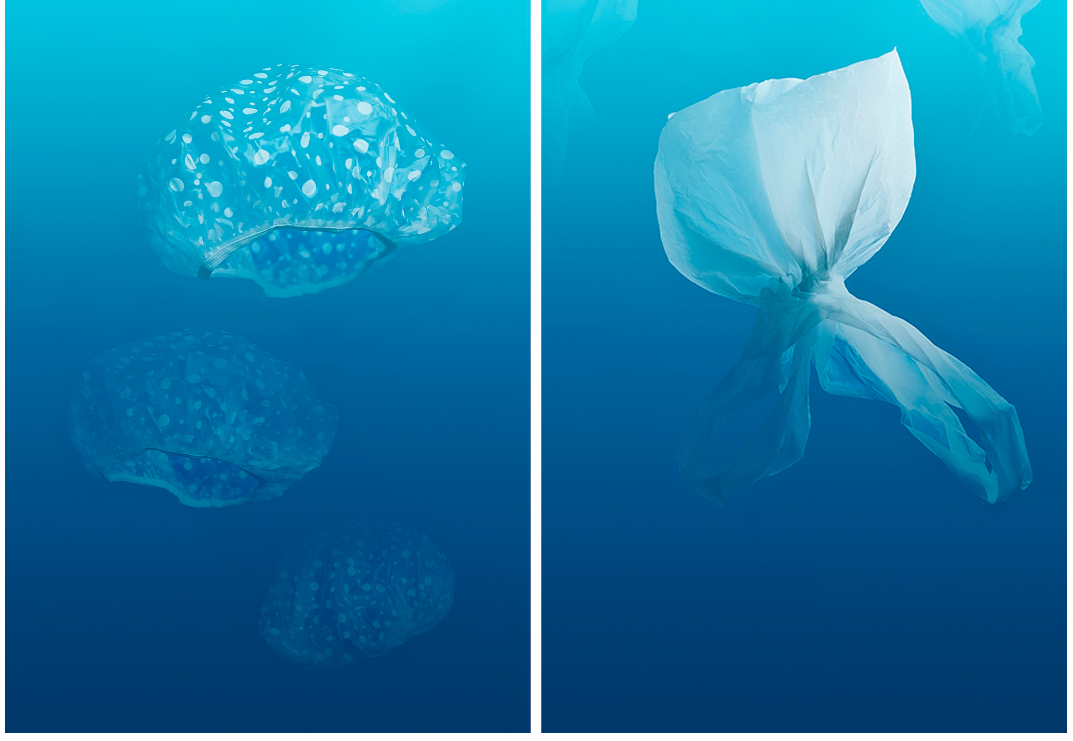 Much like with the work of Goussin and Hortense these images represent a bleak future for our oceans by creating seemingly living organic creatures from common household pollution. Again these pieces were influenced by humanities modern consumer culture, as well as being particularly inspired by the catastrophe of the ‘trash vortex’ in the North Pacific Ocean. The first image on the left shows basic shower caps floating together like a perfectly framed swarm of jellyfish in the vast blue ocean. I love the simplicity of the subject matter in this as, although it is obvious what they are, the shower caps are brought to life by their perspective, depth, and shape. The next image is of a plastic bag tied at the bottom to create the shape of a fish. I love the perspective of ‘the fish’ swimming away and the gradient of dark to light blue in the background, much like you would see in the ocean. I believe these types of photographs will be great pieces of historical evidence in the future, either to state our acknowledgement of the changing world or how we managed to save it before it’s too late.
Other Inspirations – Steven Hirsch:
As well as these amazing artists above, I will also be looking back at the work of a previously researched photographer, Steven Hirsch, for inspiration in my next shoot. This is because of his influential project, “Gowanus: Off The Water’s Surface”, and its perfect representation of depicting interesting and alluring water pollution through photography.
I love the way Hirsch has taken something so horrible and turned it into something beautiful, thus subtly informing the public of their society’s environmental problems. I hope to use this technique for my next shoot, representing pollution in our oceans as something intriguing and beautiful that will catch the viewer’s attention. Although I know I will not see any toxic waste (like there is in Brooklyn’s Canals) in Jersey’s seas, I hope to create these same kinds of beautifully abstracted pieces, of this very unpleasant ocean pollution subject. Below I have chosen to present again, four of Steven Hirsch’s images as a reminder and inspiration for my next underwater shoot.


 The meaning behind these images is to portray our oceanic trash problem by creating sculptures that look like living organic creatures. This, therefore, creates the sense of a bleak future for oceans and represents how we are ‘replacing’ marine life with deadly pollution. These pieces are clearly influenced by humanities modern consumer culture, and although beautiful, illustrate a very ominous subject. The first image on the left depicts a metal sculpture portraying a ‘jellyfish-like’ creature captured from just below the ocean’s surface. I chose this piece as an example as the reflections of light bouncing from the strands of metal create an amazing sense of movement. I also love the deep ocean blue tone of this image and the ripples on the surface really bring the scene to life. The next photograph on the right is a much lighter and softer version of the same kind of creature, this time made from thin strands of blue plastic without the surface of the water in sight. I love the soft tones and colours of this photograph along with the calming rays of sunlight streaming through the composition.
 Much like with the work of Goussin and Hortense these images represent a bleak future for our oceans by creating seemingly living organic creatures from common household pollution. Again these pieces were influenced by humanities modern consumer culture, as well as being particularly inspired by the catastrophe of the ‘trash vortex’ in the North Pacific Ocean. The first image on the left shows basic shower caps floating together like a perfectly framed swarm of jellyfish in the vast blue ocean. I love the simplicity of the subject matter in this as, although it is obvious what they are, the shower caps are brought to life by their perspective, depth, and shape. The next image is of a plastic bag tied at the bottom to create the shape of a fish. I love the perspective of ‘the fish’ swimming away and the gradient of dark to light blue in the background, much like you would see in the ocean. I believe these types of photographs will be great pieces of historical evidence in the future, either to state our acknowledgement of the changing world or how we managed to save it before it’s too late.
 To chose between these photographs, and produce a final collection, I was looking for a few certain aspects. To cut my shoot of around 50 images from each beach to these 7 originals above I was mainly concentrating on the quality of light and the perspective of my subject matter. My final results below show the photographs that most highlighted the subject matter, making it appear bigger against the location, and in result making my message more obvious. When editing these photographs the first things I did was crop them to make the pollution the first thing you notice. After that, I decided to keep all my results in colour because of the high contrast between the man-made objects against the colours of the natural locations…
 The first two finals above are depictions of the result of my beach clean ups on two separate beaches. The image on the left depicts a mixture public waste and fishing pollution with rocks and the sea in the background at a small quiet beach near Faldoeut. To create this image, as with the other outcomes as well, I simply walked to the length of my chosen beach and clustered together everything I could find. The meaning behind this image is mostly based on the huge green fishing net trapping everything it comes in contact with. This is a perfect example of the problem of fishing waste on marine life and the amount of it that is found in the sea. I like the dark overtones of this image along with the interesting composition and arrangement of items. The next photograph on the right is my least favourite outcome from this shoot, however, I still chose to include it in my blog as it clearly shows what was found on a well-known and recognisable beach, Gorey. I will not be featuring it in my final outcomes for this project as the subject matter of what I found is not very interesting.
 These next two photographs are more abstracted examples of the pollution found on two separate beaches. The first image on the left was inspired by the amazing layering techniques used by Idris Khan and Stephanie Jung. Although their work usually revolves around much bigger landscapes I like the effect this technique has on my close up shot, and it abstracts the image and hopefully intrigues the viewer. By doing this, I hope this photograph may help spread awareness in a more light-hearted and artistic way. The next image on the right shows a straightforward closeup of the many strands of discarded rope found at Bouley Bay. I chose this photograph as a second final, as although it is similar to the one on the right, it can emphasise the problem of fishing waste in much more un-manipulated and realistic way. I like the dark contrasts between the many colours of the rope and the shadows in between as it really makes the subject matter stand out and look very dramatic.
 These last two photographs are from, what I consider to be, my most successful beach clean, completed at Bouley Bay. When putting together everything that I found I decided to loosely arrange it in categories of waste. By giving this rubbish pile some structure it allows the viewer to really easy to see and pick out nearly every single object that was there. The first image on the left is the classic scene of Bouley Bay with the interesting rock formation and tree behind my subject matter. I like the meaning behind this image as it is very clear to see, from this low angle perspective, the massive amount of waste on such a tiny little beach. I also love the composition of this subject matter, making it seem larger and emphasising its dramatic effect. The last photograph one the right is the same arrangement but taken from the other side. I like the context the Pier in the background gives this image, as it can tell us why this beach is often used and why it may have so much pollution. Overall I think these are the best images from this shoot because of the location, arranged subject matter and quality of light.
