Blonde Shoot 2 – Editing

Above is the contact sheet from my second blonde shoot. This shoot was heavily inspired by the character of Regina George from the 2002 film “Mean Girls” I was inspired by a scene where they perform a raunchy dance routine(completely inappropriate for a school situation) to the popular Christmas song “jingle bell rock”. Surprisingly I already had this Christmas costume from the Christmas of 2015. Due to the off the shoulder nature of the dress and the strange fit i found it hard to pose in a way that was flattering. Similarly to the previous blonde shoot I was rather uncomfortable posing for this shoot as I felt that the character I was trying to create was not me at all. I made the creative decision to use a blue background for these photos as the red of the dress clashed with the pink background.

These are the shortlisted images from the shoot that I decided to edit. I selected these images because they captured the playful flirty nature of Regina George’s character as well as the stereotype of the “dumb blonde”. to edit thee images I increased the brightness, contrast and colour saturation to make the red of the dress slightly more vibrant. I smoothed out the complexion by removing any distracting blemishes, I also cinched in the waist slightly in the centre photo, although it does look a little strange. Similarly to the previous shoot I had to edit out the lace of the wig by using a combination of the spot healing tool and the airbrush, selecting various toned from else where on the forehead. Although I am happy with how the images came out I don’t think that i will be using these photos as final outcomes because I feel that the stereotype is very reliant on people having seen the film “Mean Girls”. However the shoot was fun to conduct and it was a good from of experimentation.


Blonde shoot 1 – Editing

Above is the contact shoot from my first blonde shoot. This character was based on the stereotypical all american high school “it” girl as well as public figures such as Paris Hilton and Nicole Richie. I experimented with different poses that exuded confidence, sass and glamour. I actually struggled with the posing for this shoot as I felt so far removed from this stereotype as I felt that I did not conform to the personality connoted through my appearance. This outfit was something that I wore frequently to work and once to a garden party when I had blonde hair, however I felt very strange re-visiting a look that I only distanced myself from a few months ago. Before conducting the shoot I decided that I wanted to use a clue background despite the masculine connotations because my pink dress was lost against the pink backdrop.

Above are the 3 shortlisted images from this shoot. I selected these because they have a sense of glamour to them, some of the more exaggerated poses looked a little pantomimic and ridiculous. The editing process for these images was slightly more extensive than previous shoots because (as you may be able to see from the raw photos in the contact sheet above) I did not glue the lace of the wig onto my forehead, which would be the proper way to wear this theatrical wig. I decided against gluing the lace of the wig down because during my research online, spirit gum was the best option, however I only had liquid latex to hand and I knew that I would only be wearing the wig fro a couple of hours and wouldn’t be taking part in any vigorous motion that would case the wig to slip off. I had to edit out the unsightly lace using a combination of the spot healing tool as well as the airbrush. I also increased the brightness, contrast, levels and colour saturation. I used the liquefy filter to smooth out the crinkles of the dress around the waist and cinch it in to create a more pleasing hourglass shape. I also slightly smoothed out the background and used the spot healing tool to get rid of any distracting blemishes.


Blonde – Planning

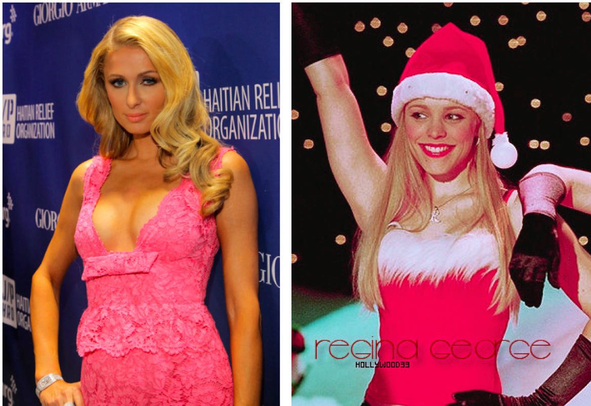
As I am exploring different stereotypes within western society that I conform to or have conformed to in the past, I thought it appropriate   to explore the well known “dumb blonde” stereotypes. Above is a mood board that I compiled, including images of fictional sassy and strong blonde characters, Regina George and Elle Woods as well as blonde celebrities, Pop singer, Christina Aguilera and reality tv pioneer, Paris Hilton. Regina George is the perfect example of the 00’s it-girl, she is the queen of her high school and is both loved and envied by her peers. Regina is also presented as bitchy, mean and unloyalw, however by the end of the film, Regina as well as the other female protagonist mature and are able to make peace and unite as women. Elle woods, in my opinion is a excellent on screen and on stage role model for women everywhere. In the film “Legally Blonde” which she stars in she is initially presented as a typically dumb blonde airhead. Her character develops throughout the film where she decides to become a lawyer, breaking stereotypes, empowering women and staying true to herself. Christina Aguilera is a famous pop star who has been celebrated for her unique voice and impressive pitch range. Aguilera has experienced bad press in the past due to the media being focused on her outward appearance (her makeup, hair and weight) instead of focusing on her amazing ability to be incredibly singer, dancer and actress. Paris Hilton is great granddaughter to Conrad Hilton, the founder of the chain of luxury Hilton hotels. She is stereotypes as a dumb, superficial, blonde trust fund kid who parties, sleeps around ad spends her families’ money. However she mist be commended for her entrepreneurial skills to star in several reality TV shows, create a line of clothing and be a public figure as well as a household name.

Above is the confirmation for a lace front wig that I ordered from amazon in order to create my blonde character. As I no longer have blonde hair I had to find a good quality wig that would allow me to create a realistic and polished appearance of blonde hair. As previously stated in my initial mood boards I made the decision to dye my previously bleached blonde hair back to my natural light brown colour. I made this decision for two main reasons, the first being that I wanted my hair to remain long and healthy and be done with the constant upkeep of root and the second that I had a number of bad experiences being a young blonde woman. I experienced cat calling much more frequently than when I had pink or brown hair, the most popular being “Hey, Blondie”. I also experienced multiple scenarios on the one time I went clubbing with blonde hair, two different men in different clubs thought that they had the right to touch me without asking or even talking to me.  I hate that men associate blonde hair with someone who is “easy” because I believe this is why those men thought that they could do whatever they wanted. I have experienced much less catcalling since being a brunette again, only two instances in two months and I have had no bad experiences out clubbing either which reinforces my reasons to believe that it was my hair colour that was sending the wrong message. As a feminist I want to live in a world where women should be able to have whatever hair colour they want without being judged, but unfortunately that is not the world we live in and my safety comes first.


Above are the outfits that I plan to wear for the blonde stereotype photo shoots. I want to create two images that display the character in different way. In one image I plan to wear sunglasses and a pink v-neck dress, inspired by the LA valley girl look that paris hilton is so well known for. In the second image I plan to wear a Mariah Carey style christmas dress, inspired by the iconic cinematic Jingle Bell Rock scene in “Mean Girls”. I also plan to use the above blue backdrop as I feel that using a pink one may look strange with a dress of a similar shade as well as clash with the red of the christmas dress.


Shoot 1 – Monaco

For the first shoot of my travels, I visited Monaco. Monaco is a sovereign city-state and microstate, located on the French Riviera in Western Europe. France borders the country on three sides while the other side borders the Mediterranean Sea. A magnet for high-rollers and hedonists since the early 20th century, it’s also one of the world’s most notorious tax havens as residents pay no income tax. It’s also famous for its annual Formula 1 Grand Prix, held every year in May since 1929. Visually, Monaco is almost entirely concrete and glass, dominated by high-rise hotels and apartment blocks that rise into the hills like ranks of dominoes. This is the second smallest independent state in the world  and is almost entirely urban.

I think Monaco was a very interesting place and I thoroughly enjoyed visiting. Visually the city center is incredibly clean and crisp and everything is precisely organised. The city is very light, almost all buildings painted white or bright creamy tones. As a result, all the sunlight is reflected generating a positive atmosphere. You can identify the wealth and money existing in this country just through the people and environment present. Buildings are made from shiny marble and car dealerships and expensive jewelry shops are on almost every corner. Decorative elements including balconies, multi-coloured ceramics and courtyards create a picturesque fantasy of pleasure and luxury, and an alluring expression of how Monaco sought, and still seeks, to portray itself. Not to mention that, from my perspective, the population consisted almost entirely of adults and elders. I did not see any children nor teenagers. The city was very much mature and civilized, almost completely quiet at some moments. My goal on this shoot was to try and capture the brightness and cleanliness of the environment. I wanted to focus on lighting, capturing shadows in order to emphasize the brightness and crisp, geometric aesthetic of the architecture. Nevertheless, I still had to maintain my overall goal, which is to additionally incorporate digital illustrations. With this in mind, I had to avoid complex and detailed compositions as these would be too crowded paired with drawings. The photographs must be somewhat basic in content. I tried to keep an eye out for shapes that can be transformed with ease into every-day objects. Below I have included my favorite photographs from the shoot.

— Its important to note that these images have been selected with the intention to develop with illustrations. They are not individually the best photographs from the shoot, but provide the best opportunities for overlaid drawings. —
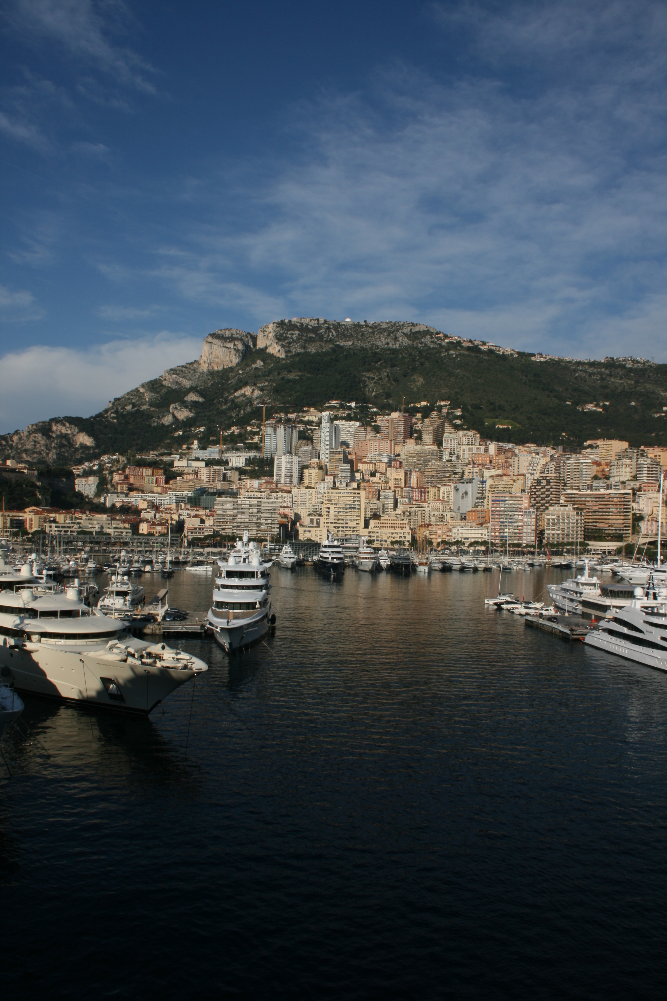
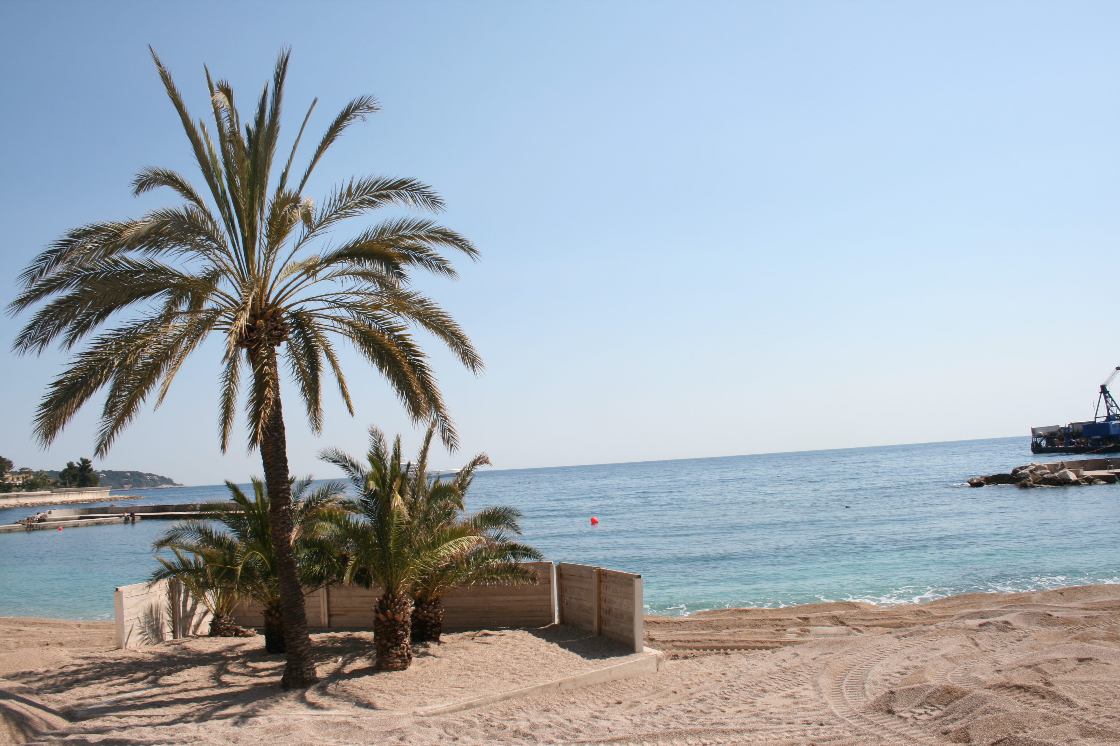
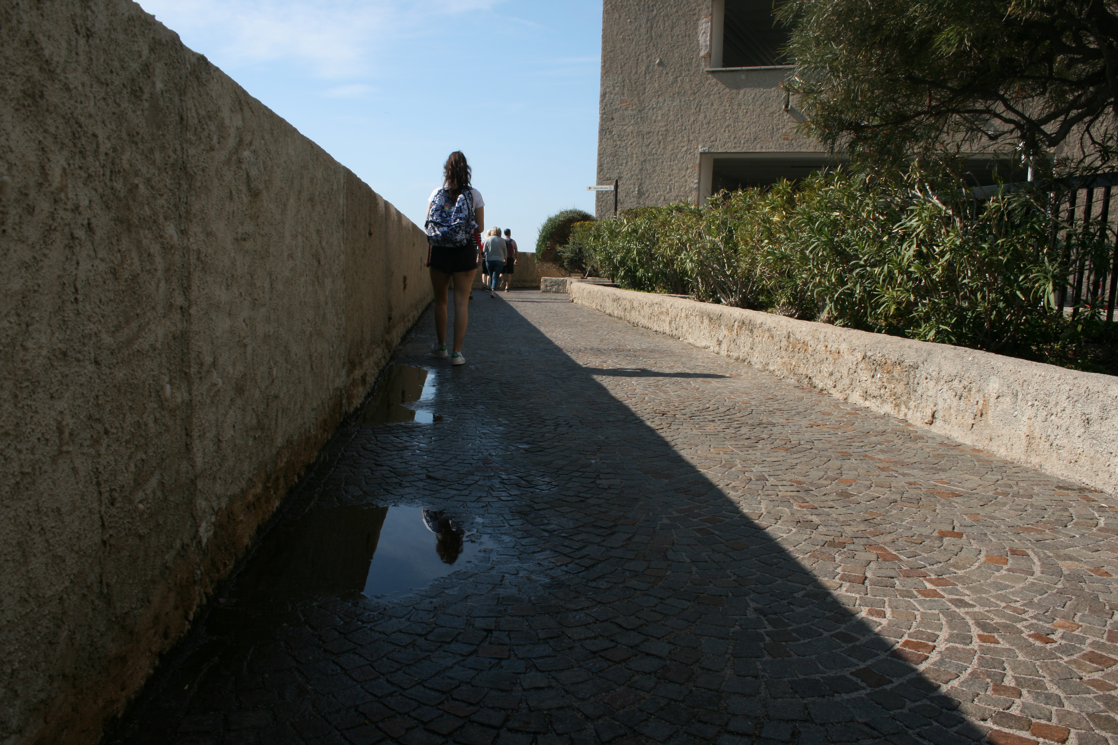
These three photos work effectively as a set because they all provide a overview of the scene. We are supplied with a wide- perspective of the environment and specific areas of the city. The first photograph was taken from the balcony of my cruise and features a full view of the city, hills and port. This photograph is simple but I think it works very effectively. It enables the audience to see the whole location and gather a general concept of the aesthetic it possesses. I like the way that the photograph is split into four segments. In the lower quarter you have the ocean and harbor which holds a hugely significant role in Monaco lifestyle and culture.There are two ports in Monaco, Hercules and Port Fontvieille. The one I have captured within this photograph is Port Hercules. The port has been in use since ancient times. It was used as a trading port by the Greeks and Romans but had the disadvantage of being poorly sheltered from the easterly winds. This prompted the erection of two piers in the early twentieth century which went some way to providing better protection.The modern port was completed in 1926, and underwent substantial improvements in the 1970s. In the central quarters of the photo you have the landscape and urban city. And then finally, the upper third features a rich blue sky, a typical representation of Southern France. I like how each segment imposes a different colour palette, almost creating layers to the photo composition, like the inside of a cake. In the bottom layer, you can identify the deep blues and green of the ocean that serve as the darkest part of the image. This is juxtaposed with the creams and pale oranges of the city landscape which also introduces a sporadic, blocky texture. The next layer is a fresh combination of rich greens and browns. This segment consists of cliffs and vegetation that towers above the city. And then finally, the top quarter of sky and clouds features a lighter shade of blue. As a complete image, this presents a ultimate colour palette for the country of Monaco, summarizing the way it looks visually. In the second photograph, I have directed my camera out to sea, capturing the sandy shore and some palm trees. This photo evokes a very tropical, summery feel due to the connotations attached to these kind of components. I like this image as it is very different from the urban landscapes recorded in the remaining shoot. Nevertheless, this photo requires some adjusting in the editing stage in order to make it more professional. The horizon line must be straightened and I think the pier towards the right side of the frame should be cropped out for a cleaner image. The final photograph is very simple, but takes advantage of the powerful lighting present. The puddles sat upon the cobbled pathway reflect the light nicely, and our eye if lead through the photograph utilizing perspective.
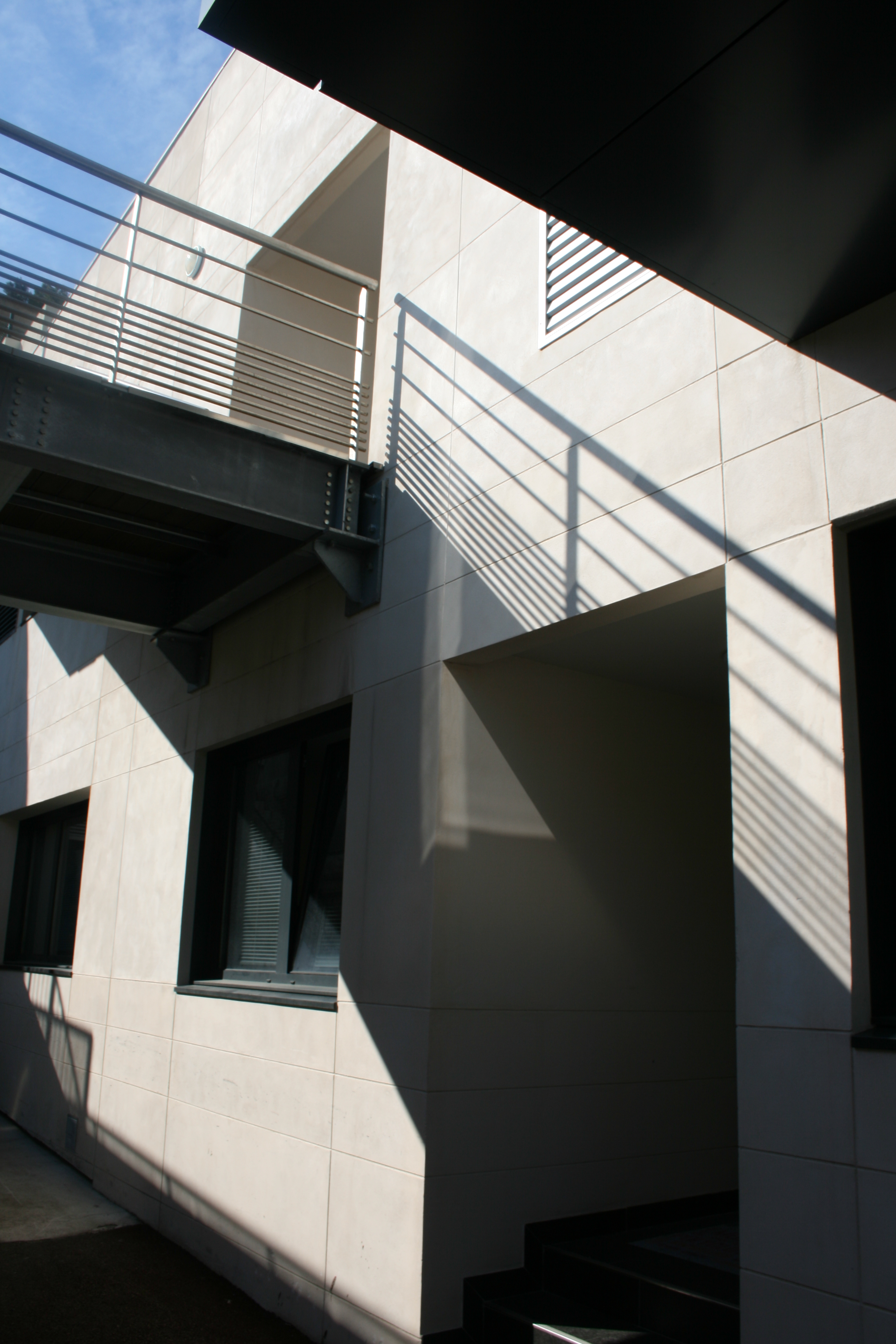
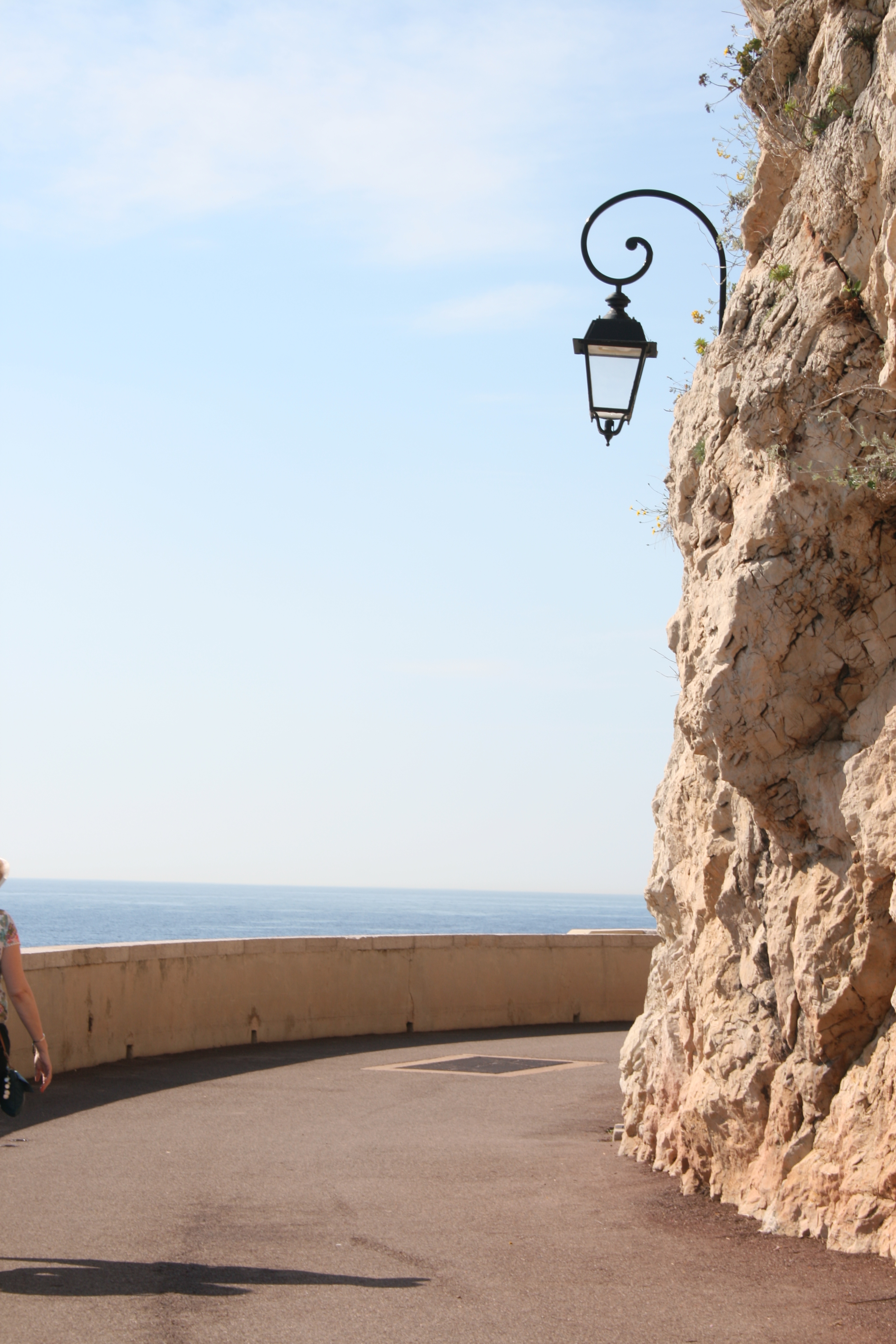
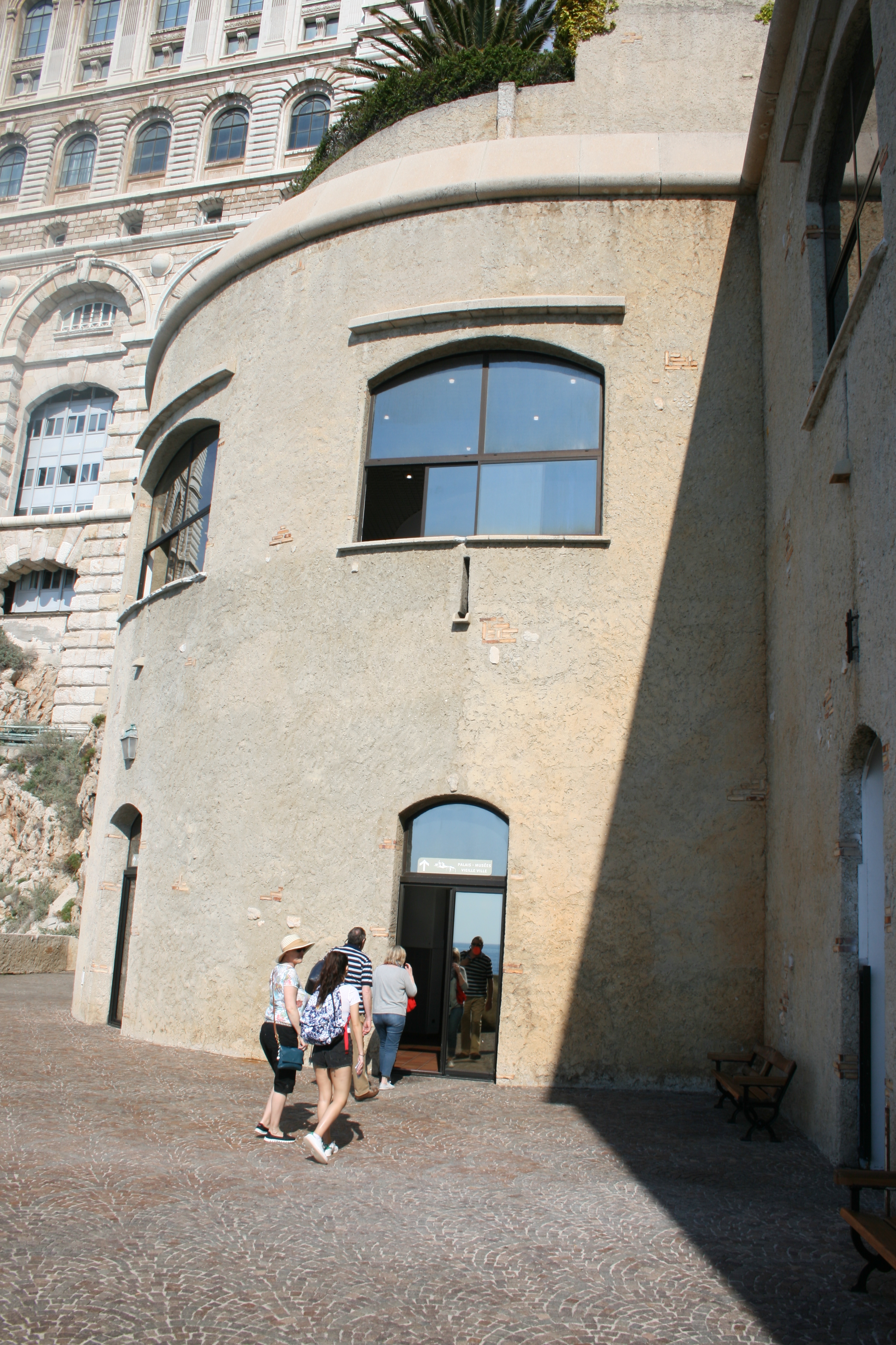
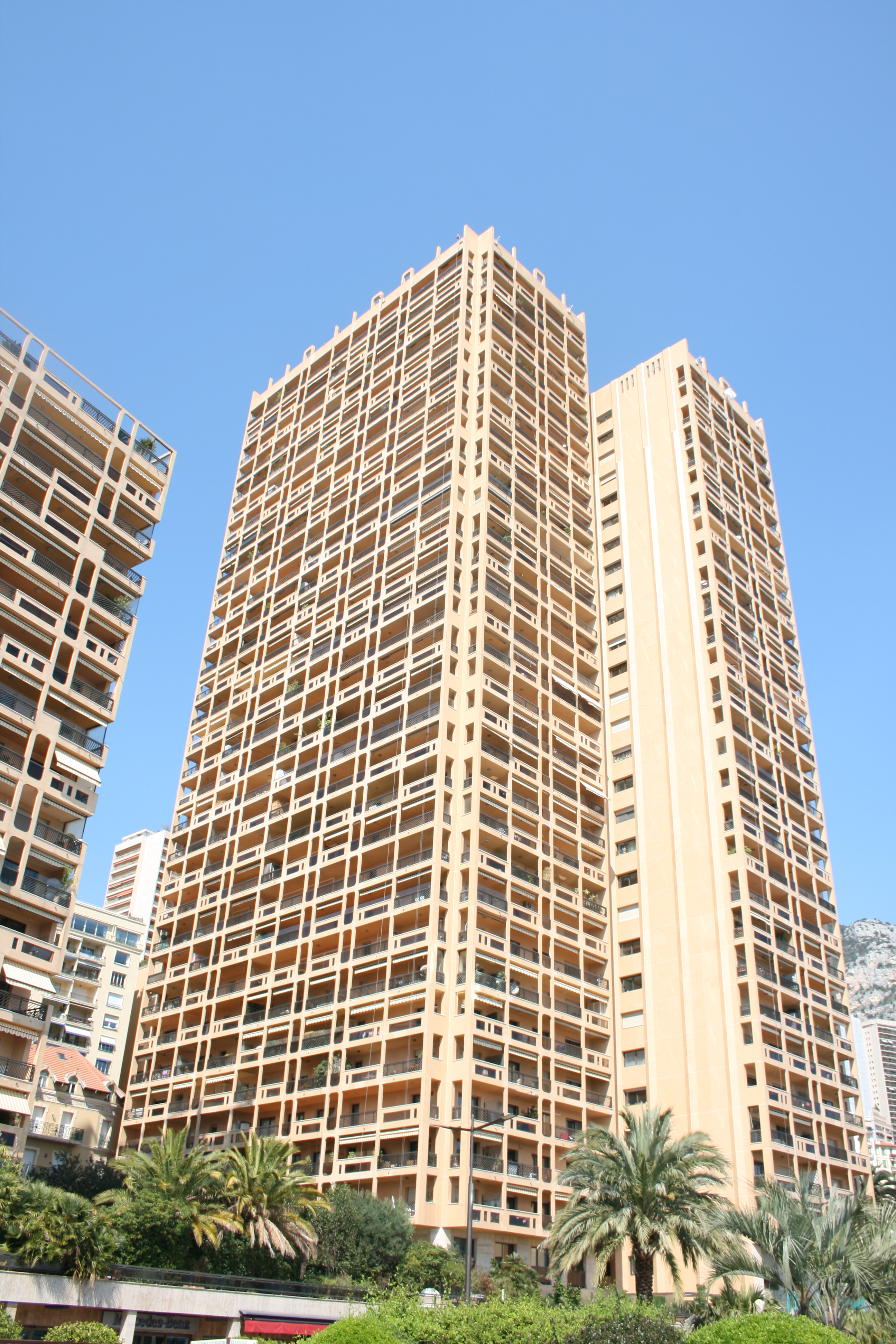
These four photographs were all taken right next to the coast of Monaco. I think all  these photographs are somewhat more abstract, attention being payed to lighting, shape and form rather than content. The first photograph is probably my favorite from the collection due to the lighting. The shadows being casted are uniform and organised as correlated with the architecture of the building. The railing at the top of the image creates a crisp, lined shadow that disperses down to the bottom of the composition. I like the blocky, box form of the photograph as almost all shapes are made from sharp connecting lines. For this image, I will perhaps transform it into black and white in order to ensure focus on lighting rather than colour. Additionally, I would like to draw someone peeping out of the door in the foreground. The second and third photos were taken along a coastal pathway, adjacent to the Monaco cliffs. These rocky surfaces can be seen within the second photo as they intercept the pathway. In this image, I have tried to draw attention to the lamp attached to the cliff face. I thought this was an interesting contrast, a juxtaposition between man-made and the natural environment. The photo also requires some cropping as the arm of the woman on the left side ruins the minimalism of the composition. The following image, is basic and not particularly special but I do like the shape of the shadow that diagonally intersects the entrance to the circular building. The window above reflects the light nicely and I think the image possesses potential for further illustrations. The final photograph displays a tall flat building on the coast. The greenery and vegetation at the bottom of the photo illustrates a contrast in colour and environment. The reason behind selecting this photo was the tall, rectangular shape of the flat building. I immediately visualized transforming this building into a half-opened chocolate bar through drawing on top.  This is something I would like to experiment with and therefore decided to select this photo.

Performance Shoot outcomes

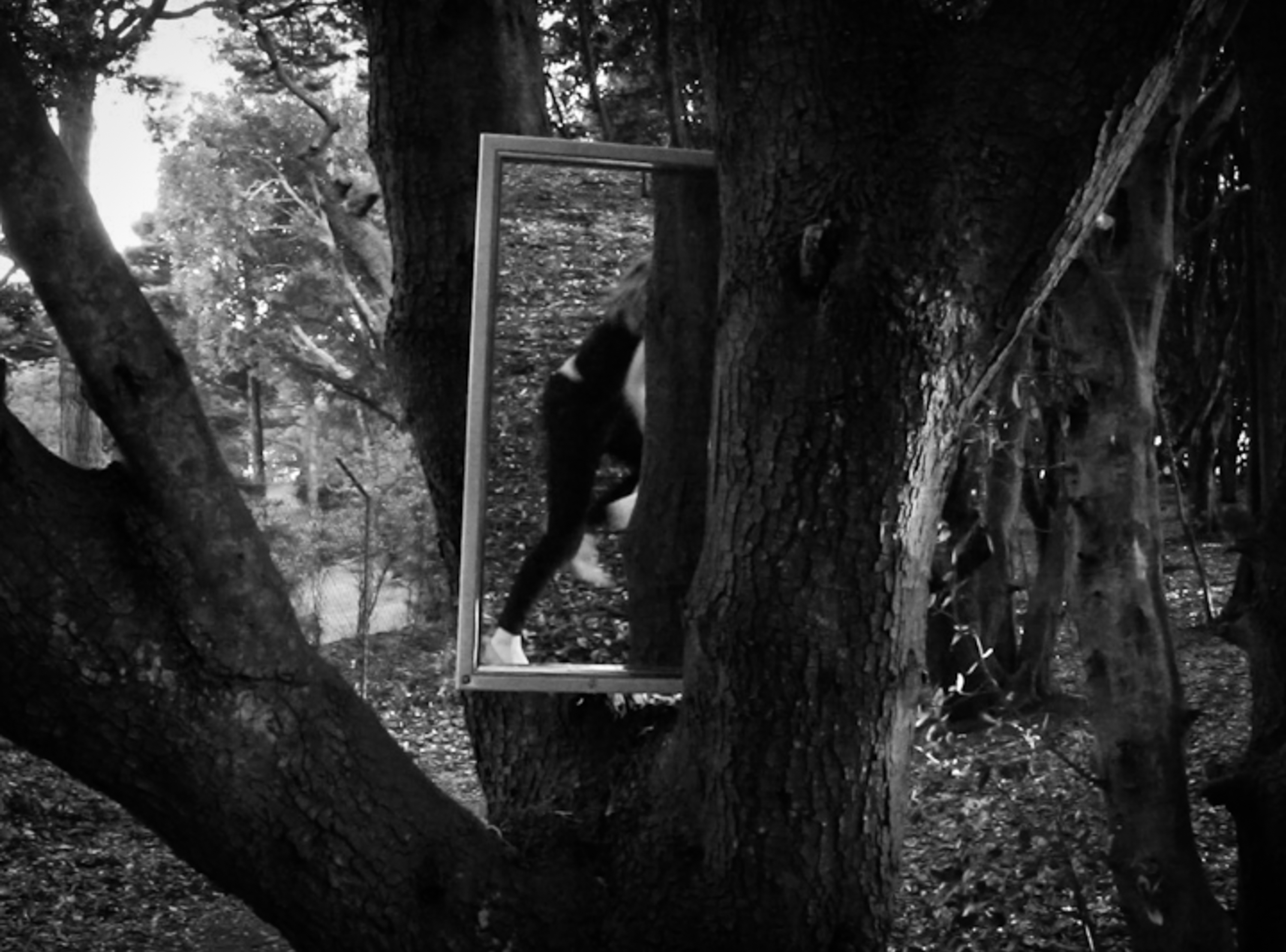
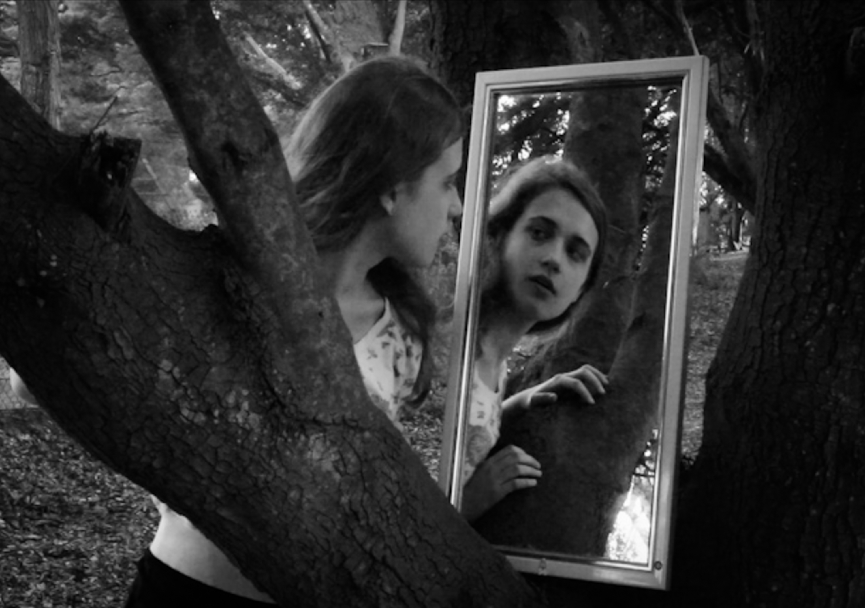
Below is a set of outcomes from some initial experiments I have done based around portraiture and performance. I tried a number of different approaches to this and I tried to incorporate a mirror into these to explore how it might work as a prop. I  used myself as the subject in the images in reference to the artists that have inspired and influenced this part of my project. Overall I took around 1,500 images and in Light-room I edited them down to this selection and made adjustments to the contrast, brightness and saturation. I cropped the images and experimented with black and white and sometimes added a slight vignette. The aim of these shoots was to explore the relationship of the human body to the environment with a focus on natural, outdoor locations. In order to develop this idea further I am considering exploring similar ideas in relation to interior spaces. The process was fairly spontaneous and unplanned although I had some ideas for the use of mirrors and reflections but I wanted to capture this exploratory nature to some of the images by photographing in locations that I was unfamiliar with.

These images were my first attempt at using myself as the subject and I initially approached this by setting up the camera and filming while I interacted with the space and experimented with different compositions. This allowed for more freedom and I didn’t have do keep returning to the camera because film involves around thirty frames a second. I then saved still images from the video after importing the footage into Adobe Premier in order to have the stills in a high resolution (rather than taking screen shots) . From here I imported them into Light-room and edited them. The problem with this is that the motion blur is captured in each frame which means if you view these images enlarged the movement is very obvious and while I think this can be quite effective i’m not sure if it was the desired effect. I now know that if I adjusted the frame rate I could probably have more control over this.

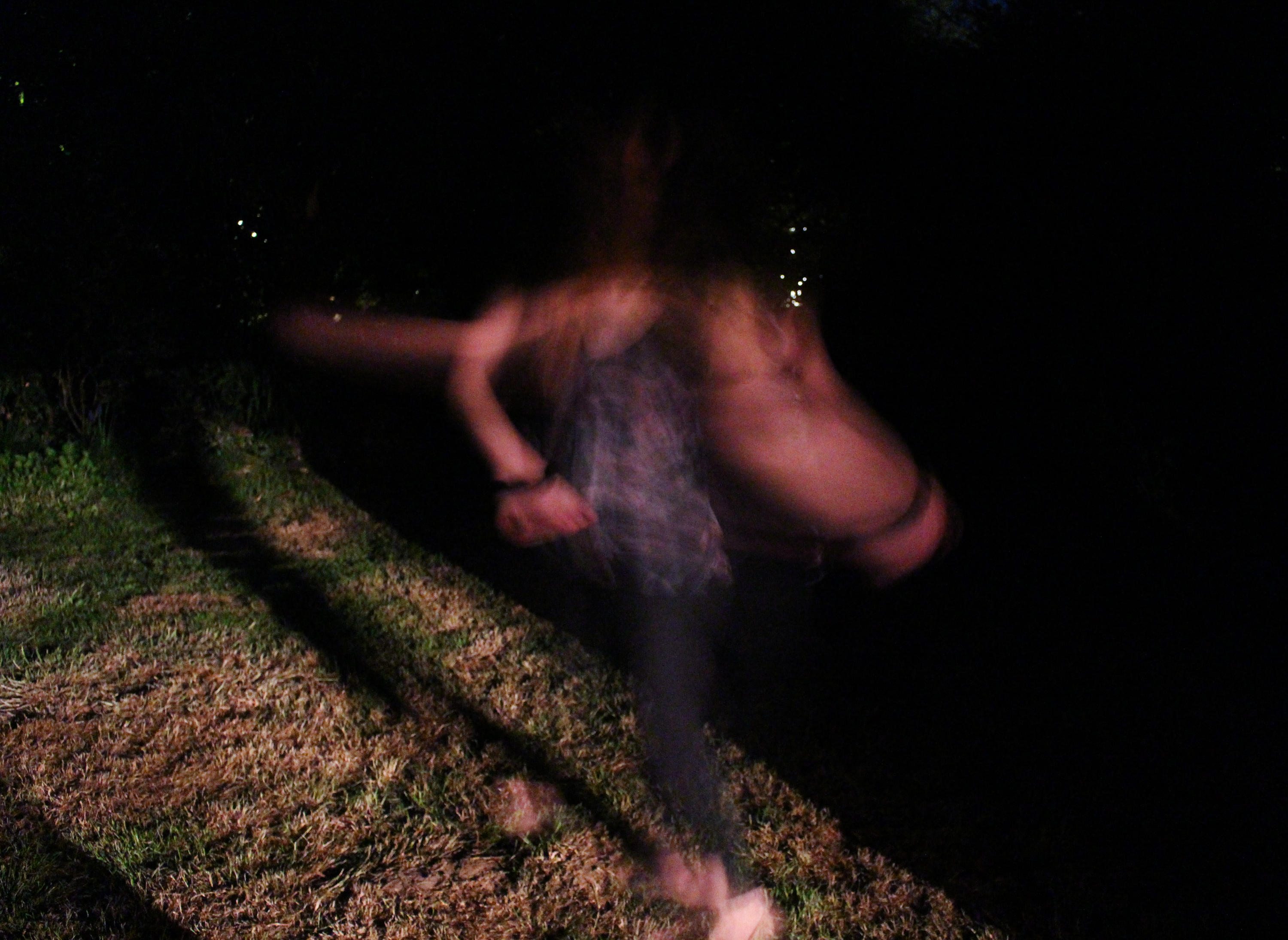
I also did a brief experiment photographing at night based around the idea of exploring movement through long-shutter speeds. I have seen this can be quite effective and it is something I have not tried before but I wasn’t especially pleased with the outcomes. I think they could have been better if I had introduced more artificial light and executed them in a technically more accurate way. The idea was to have a shadowy, mysterious tone to the images  with the human figure (myself) standing out against the black background.

In these images I photographed myself using a tripod and set timers. I explored the use of slow-shutter speeds as well as the use of a mirror and shadows. I think the use of shadows is something I could potentially explore further.

I have several ideas about how to develop this concept of performance and environment. This work was influenced largely by my research into performance photographers but could also have some connections to other areas I have researched such as Earth art in that it considers the human connection to natural landscapes and is ephemeral. I think that I am going to focus my project around this idea more specifically than in my initial planning where I specified some more varied approaches such as s focusing on objects left by humans within environments to show their presence. I think it will be more effective to focus on one area and explore this in more depth.

TODD HIDO/HAMISH FULTON INSPIRED EXPERIMENTATION

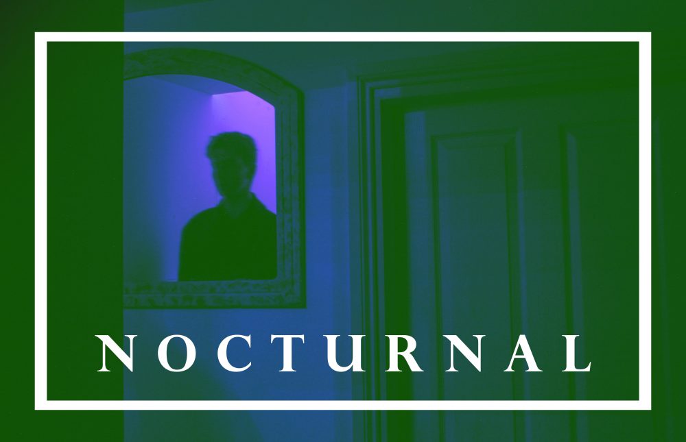
I created more images with the second photo shoot featuring Ryan. I found the composition and minimal features would be useful to use with text. The dark tones would also make the font stand out more. I used the font Perpetua Titling MT Bold because of its classic style. I started by using a small text over the image to create a more subtle impression. I liked the classical style it evoked. I picked a simple phrase with small words that evoked the notion of being nocturnal and night life. I wanted it to be simple yet full of impact.

I then tried using a larger font that would take up a large amount of space on the image. I positioned it so the mirror and reflection was still visible. I made two, the first where the text was in the centre and the second where the image is placed to the right.

I then returned to the word nocturnal which I had used in previous images. I then used borders to add with the text. I then moved onto using filters using the colour layer feature. The second one was not just a single colour but a mix of pinks and oranges, creating a warm, dreamy ambiance.

The above image was created with the bright green layer set to luminosity creating the grey tones. I also used the previous pink layer from before to give it the warm tones. I wanted to pick words that would evoke the sense of ambiguity but still create a feeling of narrative. I plan on exploring more images using text and other graphic design features in my work.


Film

Why Use Film?


Recently I have begun to use film to take photographs with. I did not use it in my coursework but I do plan to use it for my exam to a degree. Film does not have a huge number of advantages over digital for the purposes of an A-Level course but I feel that it is important to understand where photography has come from if we are to use it properly today. Film also increases the challenges with photography, not being able to see the image straight after it has been taken makes it hard to be sure that your focus is set correctly or that the image is not under/overexposed. One of the biggest hurdles that I have encountered is the set ISO of the roll, this effect makes it difficult to use a roll for more than one shoot, and the ISO needed must be assumed before it is loaded into the camera. The set number of exposures that can be taken on a roll can also be a challenge, often it would be alright if one roll is completely used to load another roll of the same film and continue shooting but with my project being about water and one of cameras being an underwater camera this roll cannot be changed while still around the water. This factor limits me to 24-36 exposures per in water shoot. In doing so I am forced to think a lot more about each image, the framing and composition of each image is much more important because I cannot simply delete the image and take another, what you have taken is what you get. Another major drawback is the price, buying film is expensive (£5-£8 for a roll) and getting it developed, scanned and/or printed is even more expensive unless you learn to do it yourself (the cost really makes you value each exposure that you take). All of these reasons combined make film a difficult thing to shoot with and it makes me glad that I have access to excellent digital photography equipment for relatively low prices.

Even with all of the downsides of film it is still  a lot of fun to shoot. The grain of film is sometimes seen as a downside of film over digital but I like the effect that it gives to the images. They have a certain softness present that can be achieved in after editing of digital photos but will never be quite right. The way that the individual crystals will change under the different light is recognised as an organic process, they do not change to specific values. This is something that favours film over digital, with digital the information for each pixel is defined, there is a certain point that a colour can reach before it becomes another colour, this change is a gradual change and not a one-or-the-other change. The smoother transition through colour ranges or from black to white is the biggest visual advantage of film over digital.

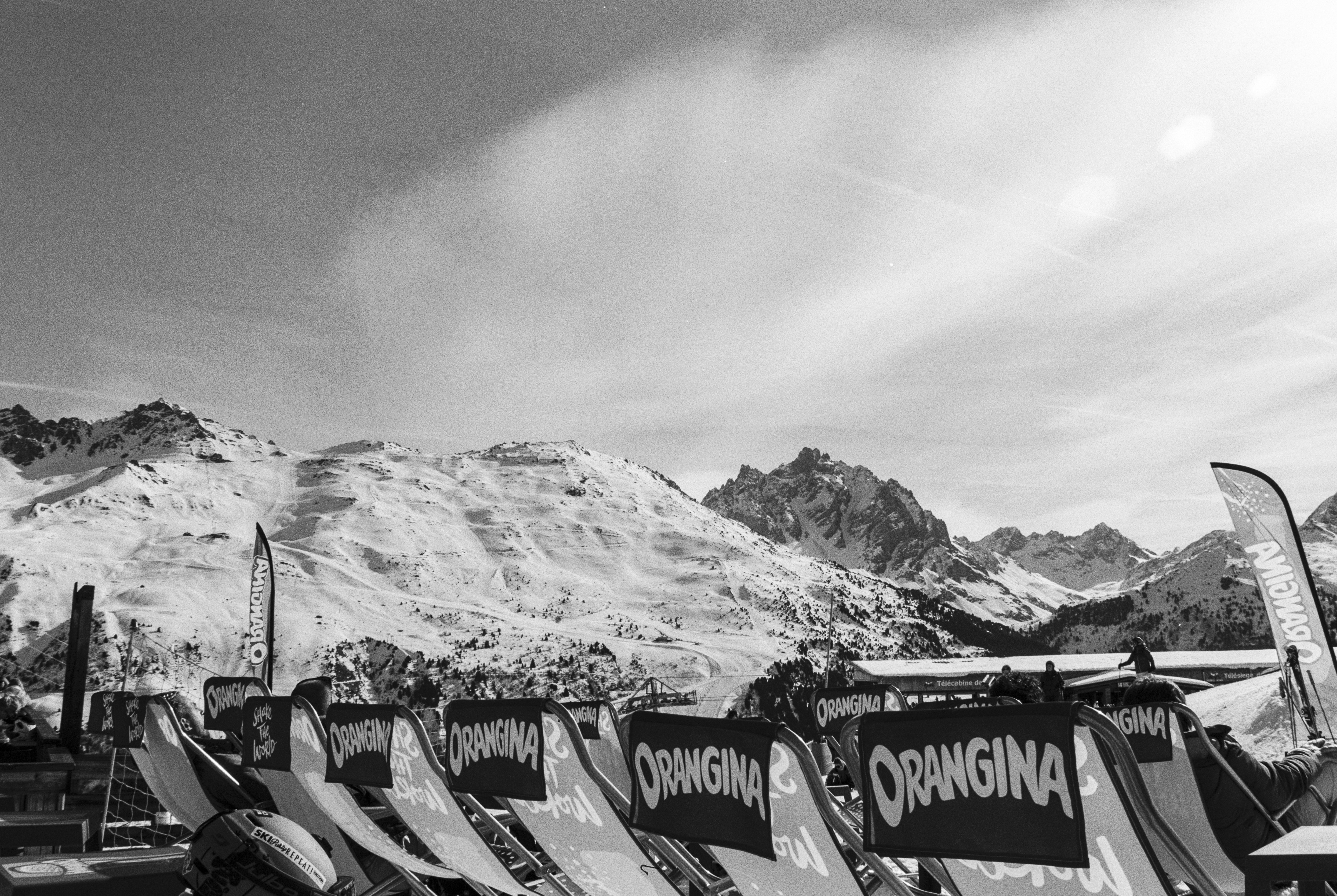
Orangina – Ilford FP4 Plus 125

The image above is one that I took on a recent skiing trip. The gradient of light in the clouds at the top of the image is fantastic, to get this kind of flow of from black to white would be harder to achieve with a digital camera.

I also recently bought a fully manual 35mm film camera from a local charity shop. Only costing me £10 including the lens this camera only needed a little fixing and a clean up before it was ready to use. The camera is fully manual, the only aid on it is a light meter and the focusing meter. All of the individual settings (aperture, shutter speed,  focus  and ISO) have to be set separately for the images. Although doing this for each photo can be tedious at times the result is that I have spent more time learning about what settings all of the different scenes will need, getting used to balancing the aperture and shutter speed to fit the ISO has really helped me when I am using my digital Nikon for different shoots.

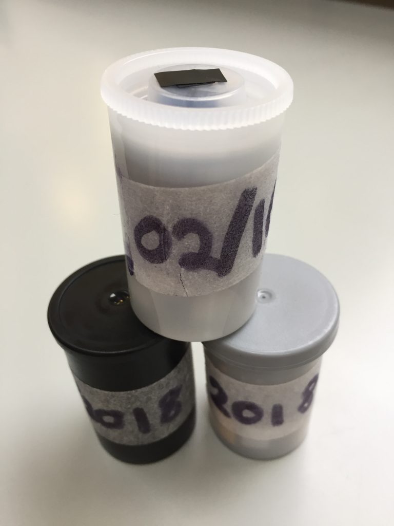
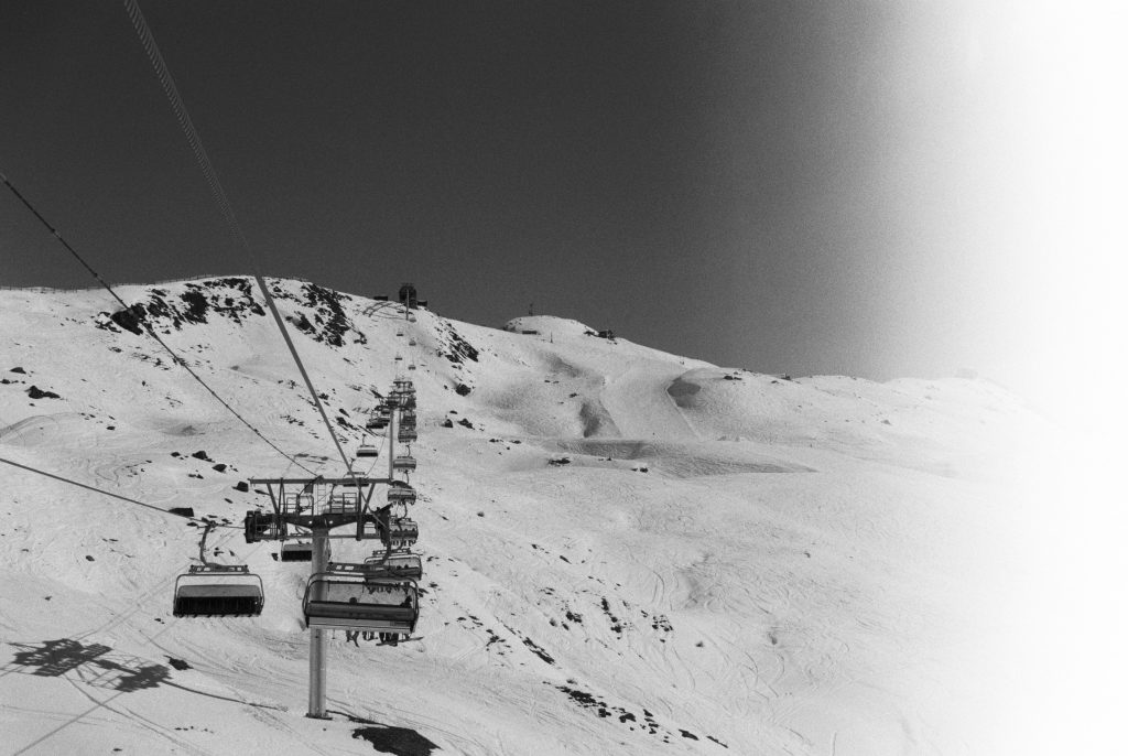
One of the other aspects of shooting film is the chance for it to become corrupted in different ways. The four images a bove were from the same roll as the other black and white image above but have suffered a light-leak (someone opened the back of my camera), this is where unintended light somehow or other gets onto the film and exposes it. This causes the film to become discoloured if it is colour film or to become completely white like the images above for example. Although technically ruining the image, the effect of this can sometimes make the images much more interesting than they already were. Film can also be corrupted by going out of date, the image below is one that had been sitting in a camera of my mum’s for about 15 years, this has changed the film’s colours quite a lot giving the image the super funky blues and the heavy grain. Again while technically ruined I really love the image, the colours again making the image more interesting that if it was just as it was means to be. it is not something that would be used for a documentary style of image but using exposed film for artistic purposes is perfectly legitimate.

All of these things have convinced me to pursue film photography as an aid for this project. Mainly I will be using my digital camera but there is definitely still a place for film in my project.

Garden den – Night

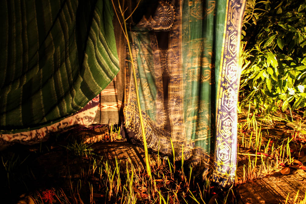
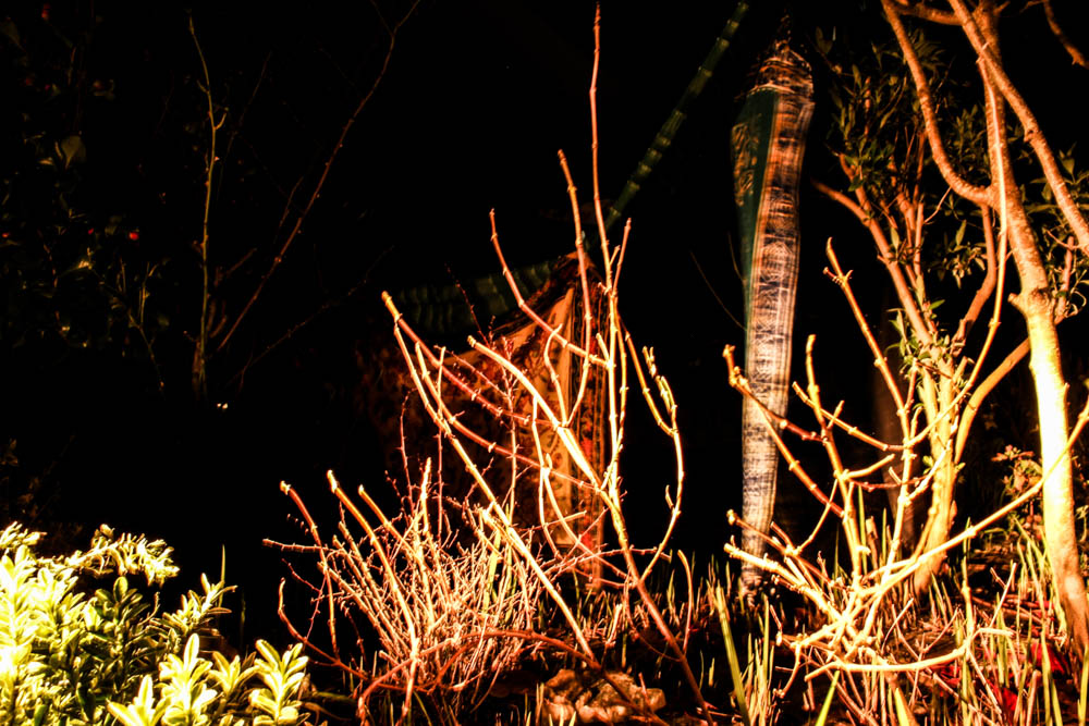
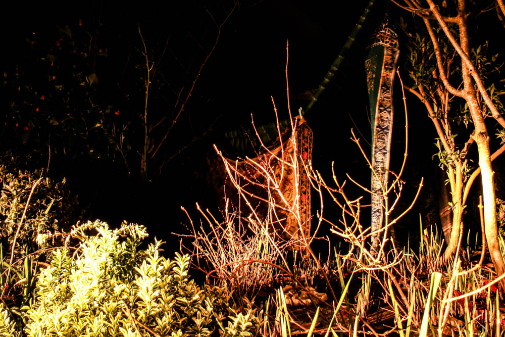
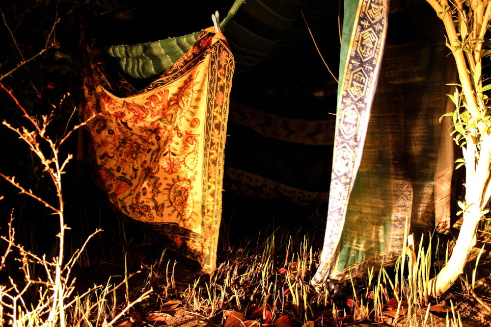
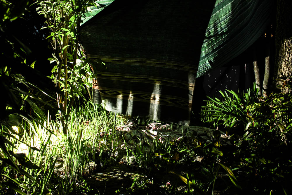
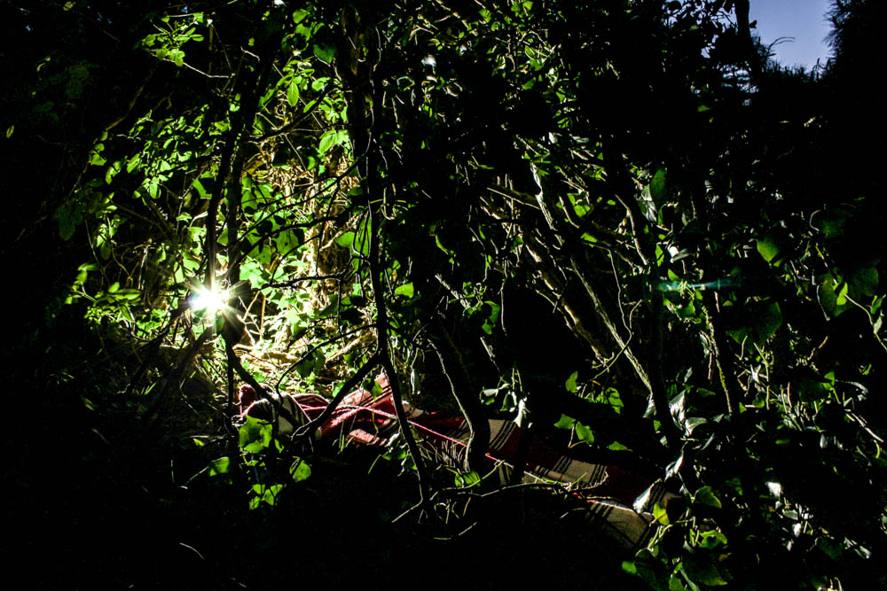
This photo shoot was actually the first night one which i did. I had to however repeat the shoot and learn from trial and error. The first time i used a car’s headlight. As you can see below the light was very yellow and i also wasn’t able to move the light around much to position it where i wanted it. I did manage to get some interesting photographs but i then repeated the shoot with my portable light as the light in these images is a white light and therefore looks less artificial. 

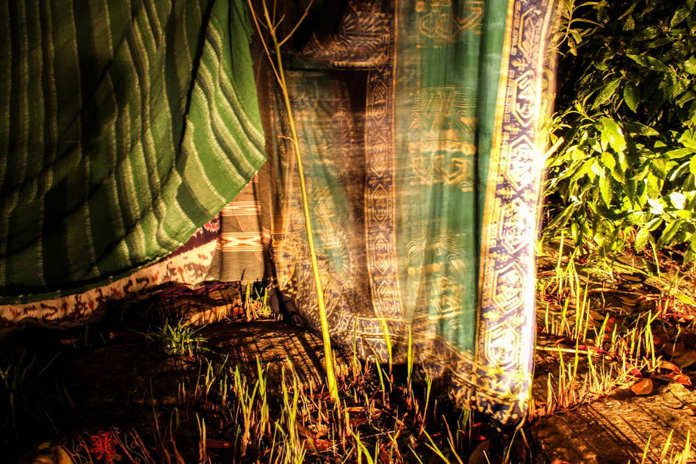
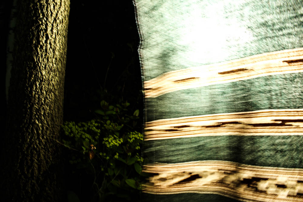
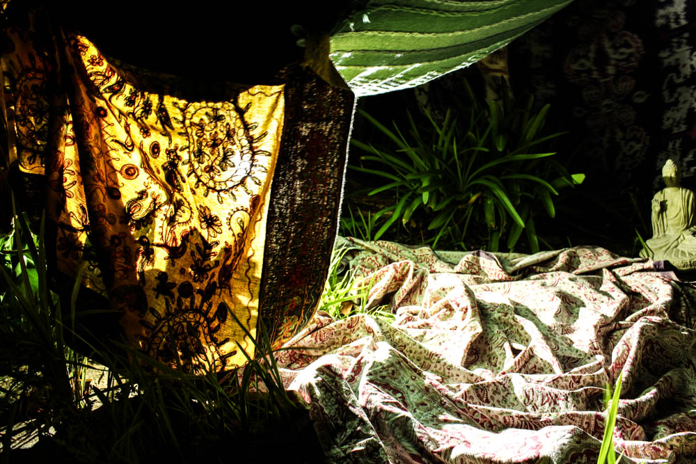
In these images as i had to use such a low shutter speed to capture the images many of them have the blurr of the movement of blankets. The dens i had photographed before this were sturdy and didn’t have hanging material which could move in the wind. For some of the photographs this movement works really well in conveying an eerie impression of the den but i would have liked to have been able to take some photographs in which  there was no blurr. This was pretty much impossible however as the slightest movement caused a blurr. 

Overall i think my other night time den shoots have gone better, i think this den is defiantly the least impressive of all my others in both photo shoots.

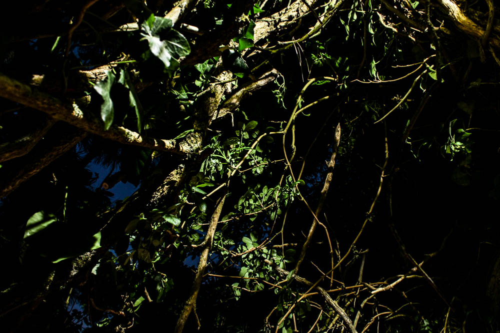
I do quite like this images even though the light is fairly yellow. I particularly like the images above and below which focus on the branches and trees in front of the den which become like silhouettes with the light shinning directly onto them. The yellowness of the light in these images actually make the images appear more creepy as they contrast better with the darkness of the background. 


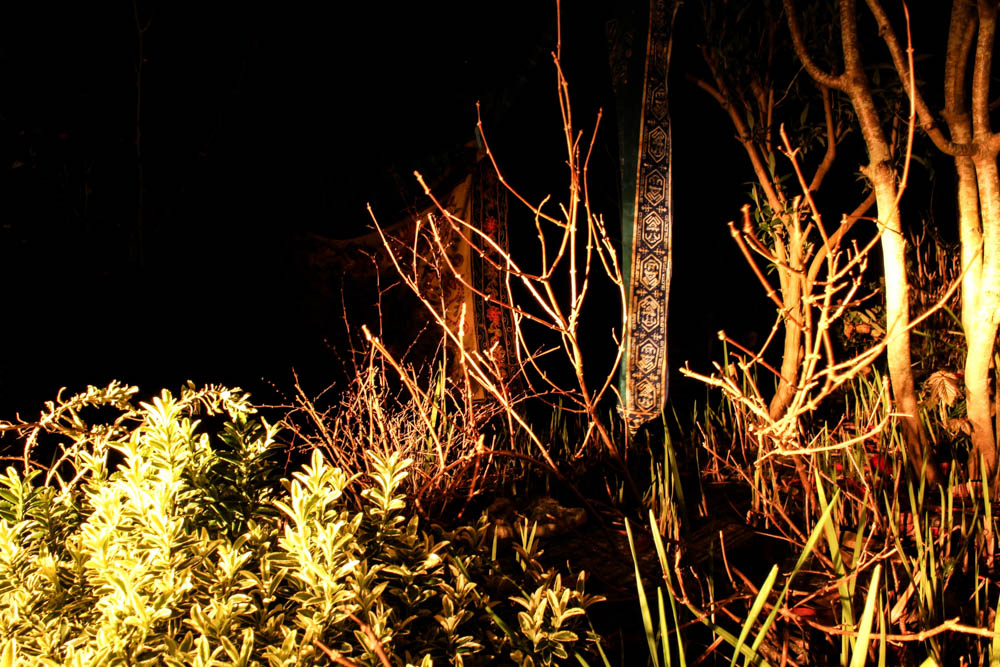
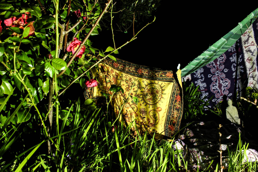
The below images are the second shoot i did in which i used the white light. The difference in the images is instantly noticeable as the lights are such different colours. The white light also appears more powerful and far reaching and so more of the den is illuminated in the below images. I do like certain images from both shoots, even though they are completely contrasting due to the light. 

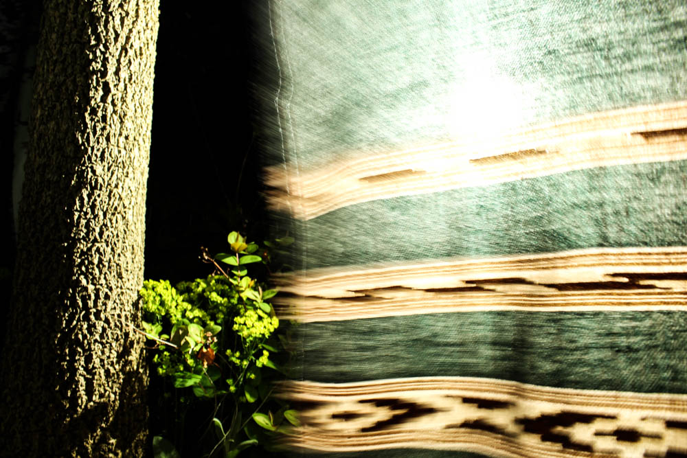
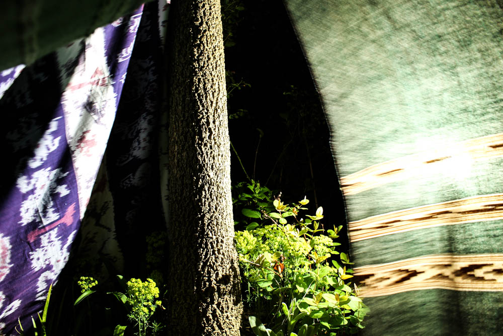
The above images and below images very interestingly play with the blur of the blankets in the wind. The impression of the photographs is that as the light is behind the blurred blanket, that it is rushing forward towards the camera and has a presence as the light suggests life. The light in both photographs is intense and shines from directly behind the blanket  in a circle. The rest of the image is slightly illuminated, the tree and some plants but the background is an intense black which only exaggerates the whiteness of the blanket further. The blanket is also just blurred enough to suggest a fast pace of movement but without being too fast to become transparent. The image is composed to consider angles, the blanket covering most of the frame but its straight lines being complimented by the straight lines of the tree also. 

The below image is slightly different as it shows more of the den, having the tree flanked on both sides by different blankets. The image is also illuminated slightly differently so that it included the light shinning onto the plants and also the light shines onto both blankets. 

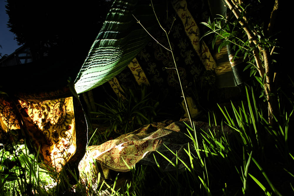
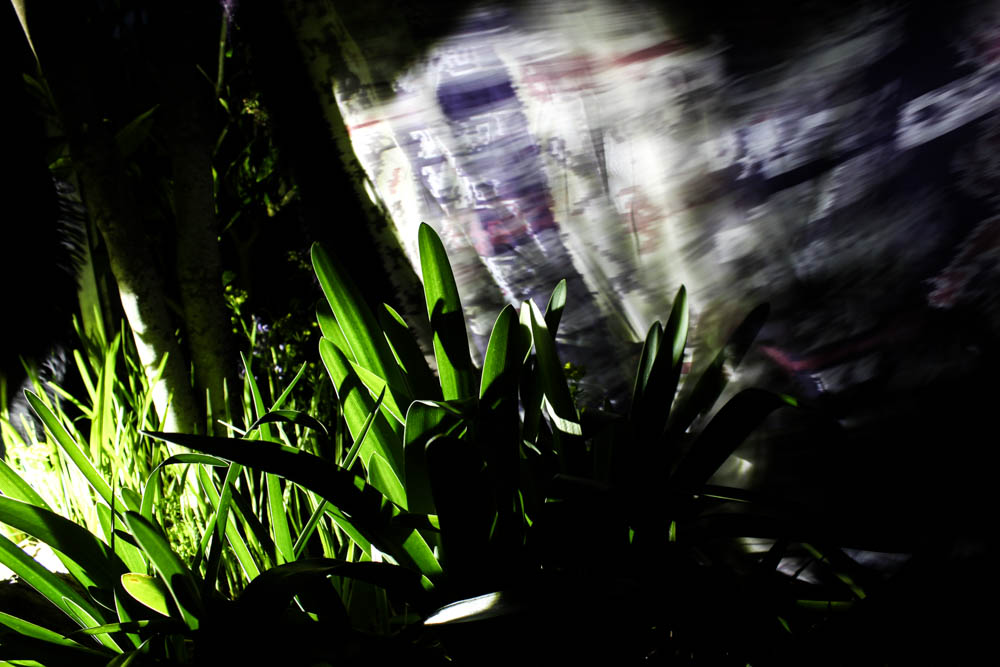
The above image interestingly plays with having elements of the frame in black darkness and then having other elements of the frame in bright light. The light source in this image comes from the left hand side of the frame, an intense bright white light that illuminates the plants closest too it and casts enough light to also illuminate the blanket. The blanket in this image is a complete blur, the pattern just about distinguishable.  The direction of the blur suggests that it is blowing away from the  light source. The whole image is taken at a slight angle . The darkest part of the image is actually the foreground where the plant becomes a shadow from the lack of light. 

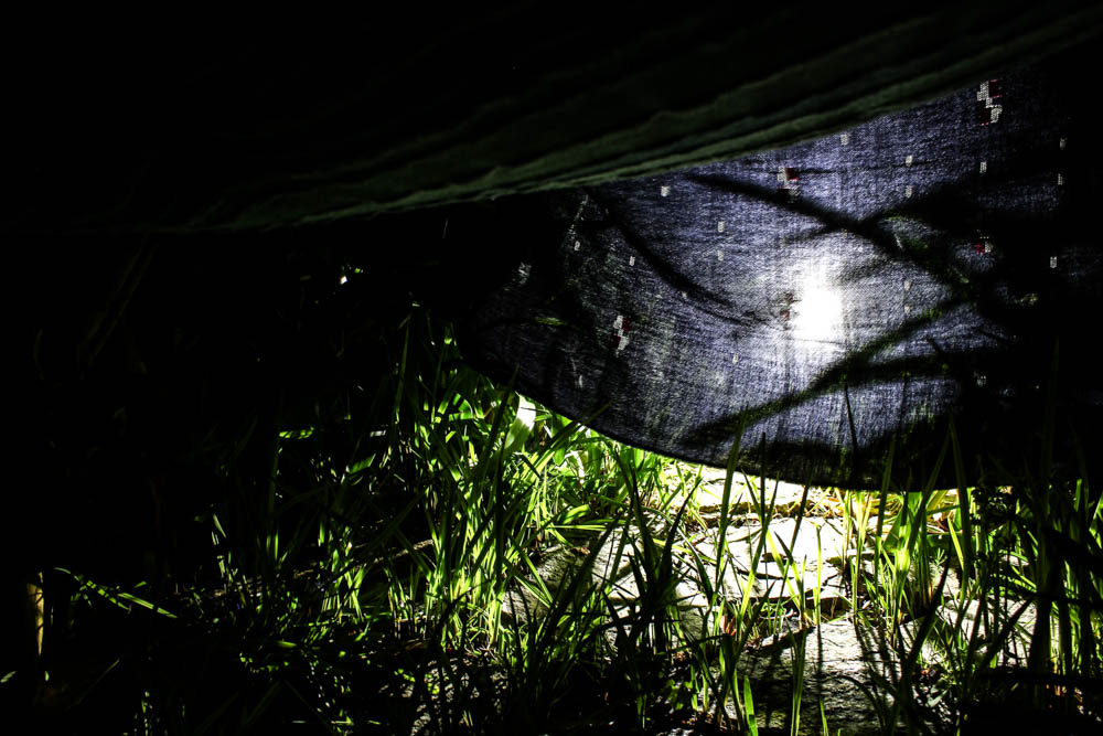
The above image plays with the light casting shadows. I placed the light behind the blanket like in so many of my other shoots and in this image it worked really well as it cast shadows. The light leaks out from underneath the blanket, spilling into the foreground. The image is composed according to the rule of thirds, the light to the right hand side of the frame, the left hand side of the frame almost in complete black darkness from the lack of light. I quite like how only a very small portion of the image is lit up and the rest is in darkness. The plants become silhouetted against the bright white light. 


Wood den -Night

Of all my dens as this was my favourite day time den i really wanted to capture this den looking beautiful and eerie at nigh too. I already found some of the day pictures to suggest the den as quite a creepy location with a lack of people but i find that these night time photographs have actually turned the den into more of a magical looking place. For the majority of the photographs i put the light inside the den and the way the light radiates out from inside the structure is very suggestive of life inside the den. We often associate light with life and i find in these photographs it is suggestive of a presence inside the den. 

Above is the best photograph that i took of the den as a whole radiating light. This image was taken in the blue hours after the sun has set which you can slightly see by the sky in patches through the leaves in the background. With this photo shoot as the photographs were taken underneath the trees, the den being built in the woods, the background is made up of the dark shadows of the trees rather then the sky like my previous shoot. I composed this photograph according to the rule of thirds with the den itself more over to the right side of the frame. I also positioned the light inside the den more to the right side of the frame and so the image is fairly weighted on that side of the composition.  This contrasts quite well with having the bright blinding light of the den to the right and then in the sky the patches of light from the blue sky are on the opposite side of the frame, balancing the image.  I took the photograph from a slight angle, not photographing the den straight on so you can see directly into the den but more from the side so the inside of the den remains more mysterious. By putting the light within the den you are able to see clearly how the structure of the den is made up of branches and leaves intertwined together and the light then shines through these gaps.  The light quite literally radiates out from the points at which it escapes the inside of the den to create an interesting pattern of lines from the center of the den outwards. I think the effect is further emphasized by the light making the leaves it shines through a more vivid green, these bright green then contrasting with the red of the blanket.

The above image is taken in a completely different style, this image showing the light shinnign directly onto the structure of the den. I don’t dislike the images i took in this style, it just appears as if i have turned on the flash and taken the image with a bright flash. There is still an element of mystery to the den by having the background where the light cant reach as fairly dark but overall the image doesn’t have the same effect. The image i guess does have more of an impression of being abandoned as there is no light source inside the den which suggests a form of life. The red blanket in this image helps to draw out the dens structure as it becomes slightly lost like the day den images.

The above pictures i took trying to create soem creepy images which focused on branches like the day time pictures i took. By shinning the light upwards inside the den i could create a really eerie impression of the den as the branches were only illuminated in certain places so acted as silhouettes. This is further enhanced by having areas which were lit by the blue sky and having areas which were darker black colours from other branches blocking the light.

The above and below pictures are more images which play on the idea of having light shinning through the dens structure. I like the image below in particular as i used the rule of thirds to have the red blanket from the den across the right hand side of the image, one of the branches sweeping across the frame. The image works quite well in having the darkness of the night sky and lack of light being on the left hand side of the frame, this then becoming lighter as you move across the frame to the right. The light is right in the center of the image but mainly spreads out to the right due to the white patches of the blanket reflecting the light. The light greens again compliment the reds of the blanket.

These pictures are again taken with the light shinning onto the den rather then through it. I really like this effect in the above photograph as it allows the winding nature of all the branches weaved together to be really noticeable. The branches are a bright white which stand out vividly and the background is filled with shadows and darkness that again create a skeletal nature to the branches.

Documentary: Ocean Pollution: results

After researching and finding inspiration from the brilliant artists Goussin and Hortense, Kim Preston and Steven Hirsch I was ready to complete my ocean pollution shoot. Originally this idea was simply inspired by the massive problem of waste disposal in our ocean’s ecosystem. My aim for this shoot was to use a number of different documentary and abstract techniques to truly capture this issue as well as intrigue my viewers. These finals below will most likely be split up into my documentary and symbolism categories that I am using to fully explore each environmental subject throughout my project.

When finding the sources of pollution to capture from the water, I found that it was all washed up on the beach, to be later swept out to sea again at high tide. Because of this, I decided to use the category of conservation photography known as ‘The carefully crafted image’. By doing this I was able to pick up evidence of ocean pollution from the beach and capture it in a dramatic and powerful way floating on the water’s surface. The message I am hoping to portray with my final results is the reality of this issue, and how it affects every corner of the world.  Because of the pollution I found and used in this shoot, the results below will go really nicely with my plastic pollution symbolism shots as well as my connected beach clean ups. The location I decided to use was one of my favourite small beaches near Faldouet because of is interesting and diverse background/surrounds. To complete this shoot was not as easy as I had planned and I ended up running into some equipment problems, having to improvise with what I had. Unfortunately, just before I went out, my iPhone broke down, this meant my underwater phone case could not be used. Luckily for me, I was able to borrow my mother’s iPhone 7 and her waterproof case, but unfortunately, I could not actually capture anything when the phone was fully submerged. However, I still went forward with my plan of using the rubbish accumulated at the location to create interesting photographs using natural light and my phone above the surface. Below is a visual description of what I was planning to use to complete this shoot compared to what I ended up with…This contact sheet above shows all of my favourite clear and interesting above water shots. As you can see I did manage to take a few photographs underwater although it would only work 1/10 times and the quality is very poor. When editing these images I cropped them down massively to only include the most important and interesting features. Below are my 8 documentary/abstract finals for looking at ocean pollution…

This first final is a documentary style photograph depicting the waste I found on Faldouet beach that would later be washed into the sea at high tide. To capture this image I carefully gathered the biggest examples of pollution together and let them float on the surface as an example of public pollution reaching the sea. I chose this as a final outcome for this shoot because of the images high-quality (for and iPhone), interesting subject composition and amazing natural colours. With this photograph, I hope to get across the message that this problem is real, effects all areas, and is rapidly getting worse. I like the calm sense you get from the flat and clear sea as it strongly contradicts the travesty of the plastic floating on top. Compared to other historical evidence of ocean pollution this image is very tame, however, because of is centred subject and beautiful scenery I think it can get across a very clear warning that we are destroying this ecosystem.
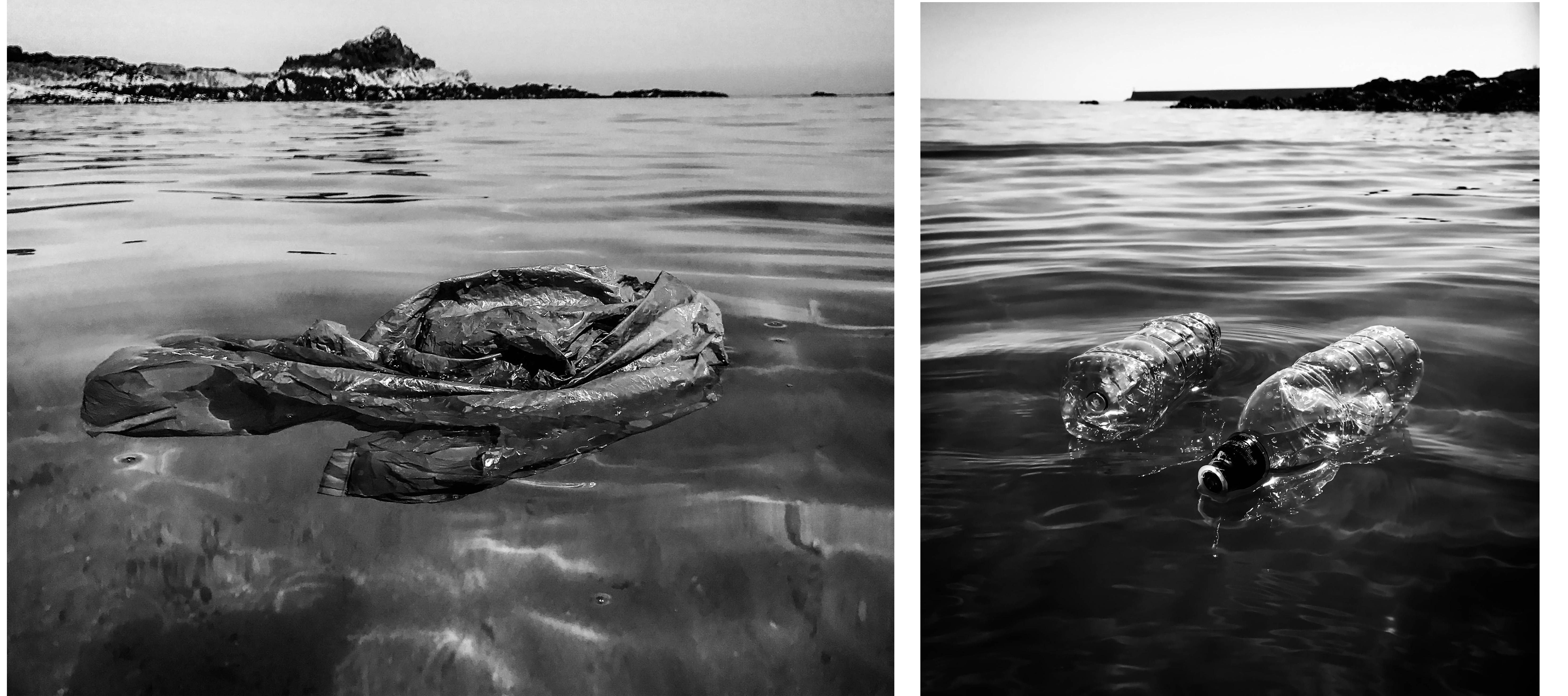
These next two finals are my other documentary style edits that I believe can clearly get across my message. By using straight photography techniques I have created a sense of this harsh reality and given my viewer a way to clearly analyse the subject matter and better understand this collection. The first image on the left depicts a plastic bag spread out and floating on top of/underneath the surface. I love the effect making this image black and white has, as it creates this sense of dread and makes the subject appear more ominous. I chose this image out of my 300 or so originals because of the way the bag is spread out at this one specific moment, making it unmistakable for anything else. The next photograph on the right shows to plastic bottles floating in front of a pier. I really like the symmetry and parallel composition of the subjects and the way they have reflected the natural light. Again I think this image is much more effective in black and white as it gives it a very dark and gloomy overtone, perfect for getting across the depressing meaning behind the photograph.
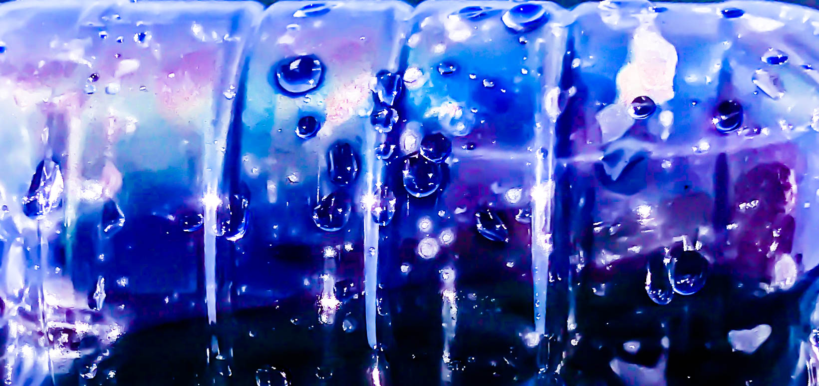
For my first abstract final of ocean pollution presented above, I have captured a close-up image of a plastic bottle floating on top of the water. This final, as well as the ones below, are all inspired by the beautiful work of Steven Hirsch and his take on capturing the surface and pollution of water. I decided to take this image when noticing the inside of the bottle start to steam up and create an array of interesting colours. This effect, mixed with my adjustments made in post production is what has created this vibrant and intriguing piece. The meaning behind this image is to draw the viewer’s attention with its surreal beauty.  I think this is an important technique to include in my pollution project as not everyone reacts well to straightforward portrayals of the truth. I also like the subtle definition of this piece as I believe it is possible to work out what the subject is from the indents of the rings around the bottle as well as the many emphasised water droplets on the side.

These three finals above are a mixture of colour and black and white abstract pieces intended to capture the viewer’s interest and make them think about the context themselves. The meaning behind the photographs is to show something that has devastating repercussions in a beautiful way, thus subtly informing the public of one of modern society’s biggest environmental problems. In this context the pictures may be considered as fine art photography, meaning that my message may be able to get across to people who would have no interest in conservation photography. The first colour final on the left is a low angle shot of a plastic bottle and its reflection on the ripples of the water’s surface. I like the confusing and abstract look of the bottle that was created by using a very shallow depth of field. The next outcome in the middle shows the bottom of the bottle, seemingly melting down onto the calm black ocean surface. Lastly, the photograph on the right is a cropped close-up of all three pollution subjects I used in the shoot. I like these items together and their proximity along with the water in between says a lot about this issue.

My last final displayed above is an abstract piece that was heavily inspired by one of Steven Hirsch’s beautiful examples of water pollution.  The smaller image on the right shows the piece from his project capturing the pollution in Brooklyn’s canal that I used as an inspiration when planning this shoot. My final is a recreation of this image created with a plastic bag placed just beneath the ocean’s surface. These types of photographs are also very much influenced by today’s modern consumer culture and the ever-growing problem of human waste. Like with Hirsch’s project and my previous abstracted outcomes, the meaning behind this image is to intrigue all types of viewers and subtly remind/inform them of this issue. I love the way I have captured the same kinds of ‘surface ripple’ effects as my inspiration but have done so in my own abstracted style. I also love how the natural light is intensified and distorted through the water’s surface,  as well as the blue writing on the plastic bag creating a very interesting and twisted pattern.