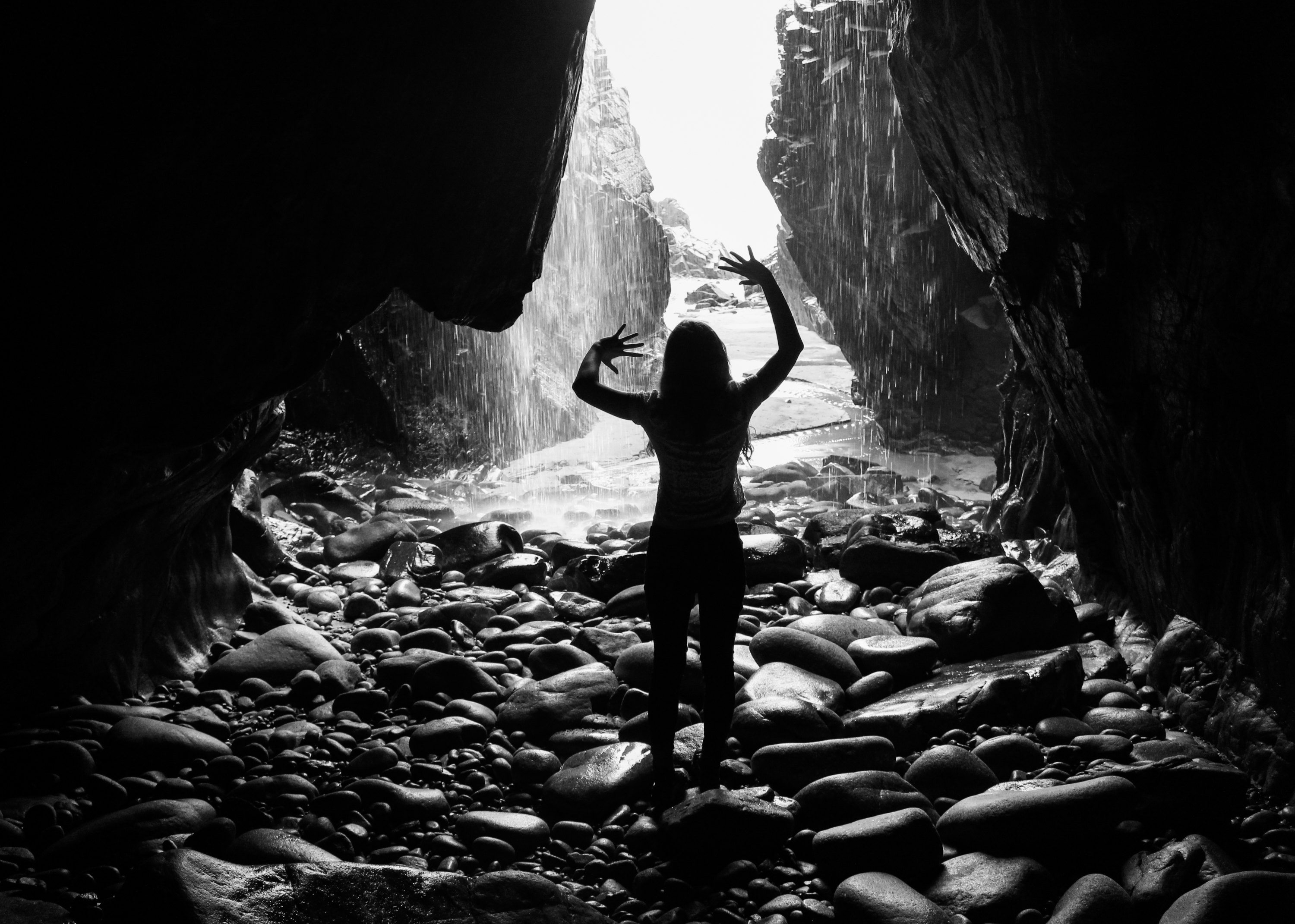
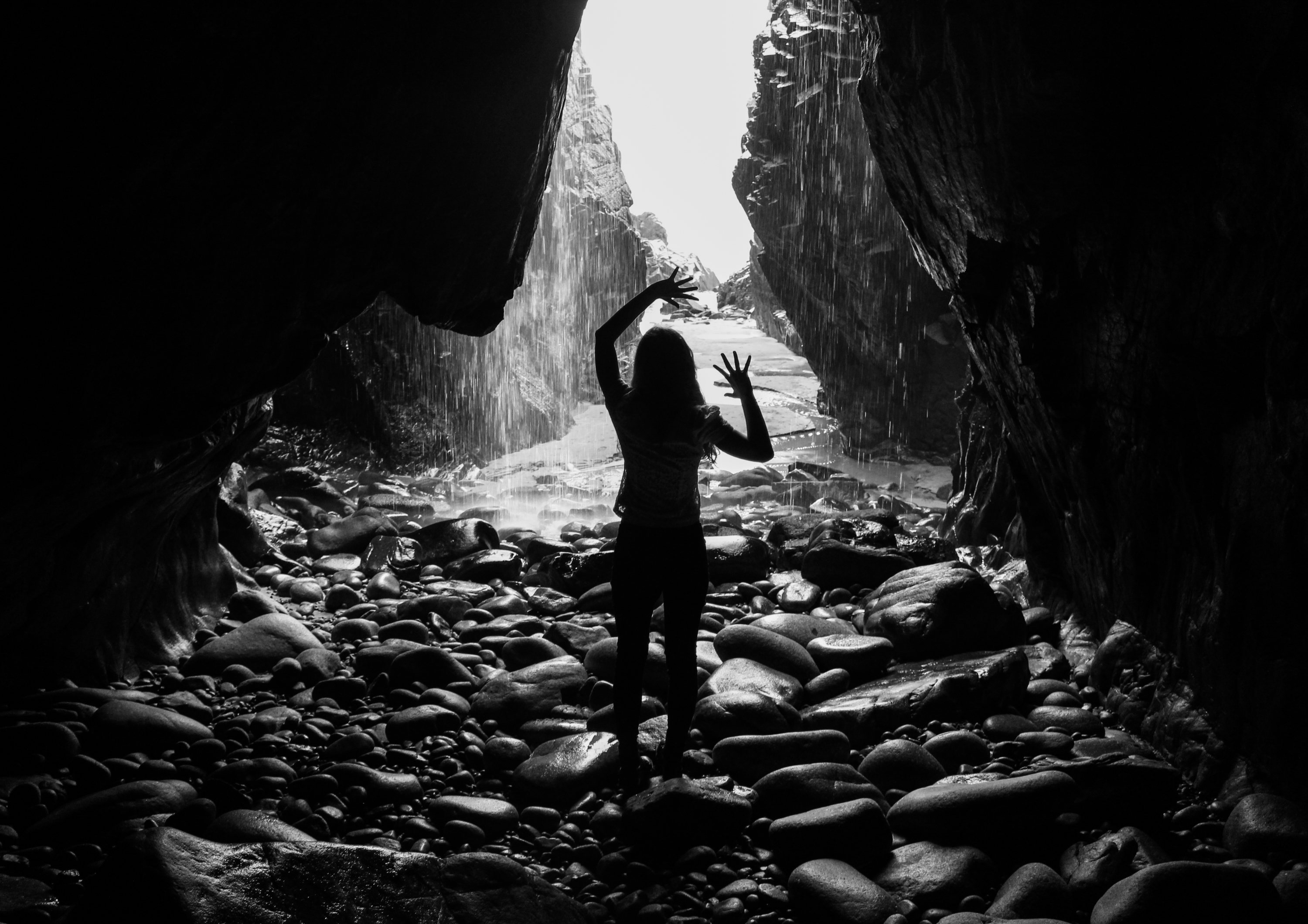
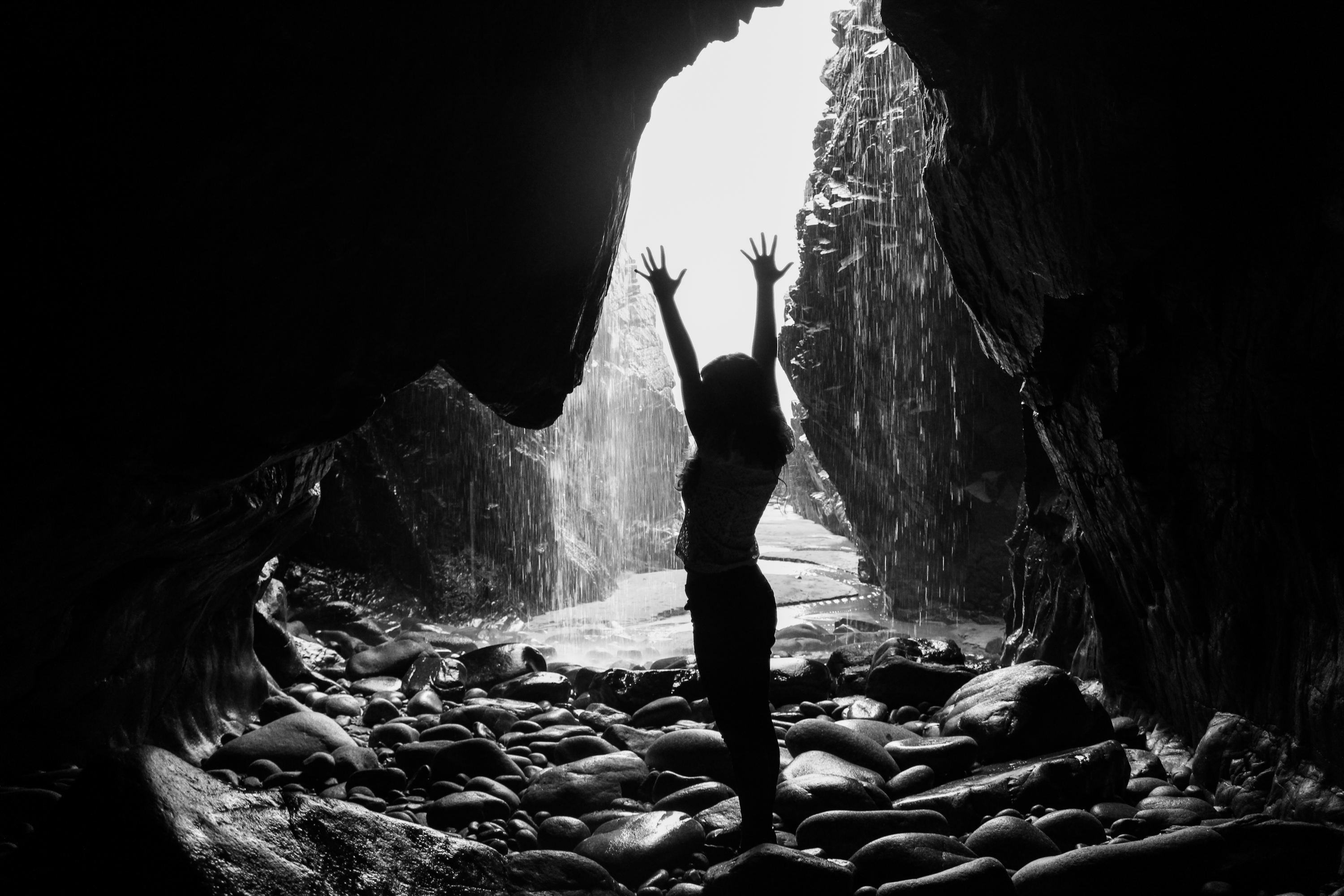
After comparing all of my final outcomes that I have produced during this project, I next wanted to look closely at each theme, analyse images relevance to the project and decide how I will narrow them down. By doing this I am making the next step of selecting my final few photographs much easier and showing exactly how I reached that point. Below are four contact sheets depicting symbolic smoking waste and plastic pollution; documentary plastic and beach pollution; symbolic and abstract ocean pollution; and the different methods of disposing of waste in Jersey…
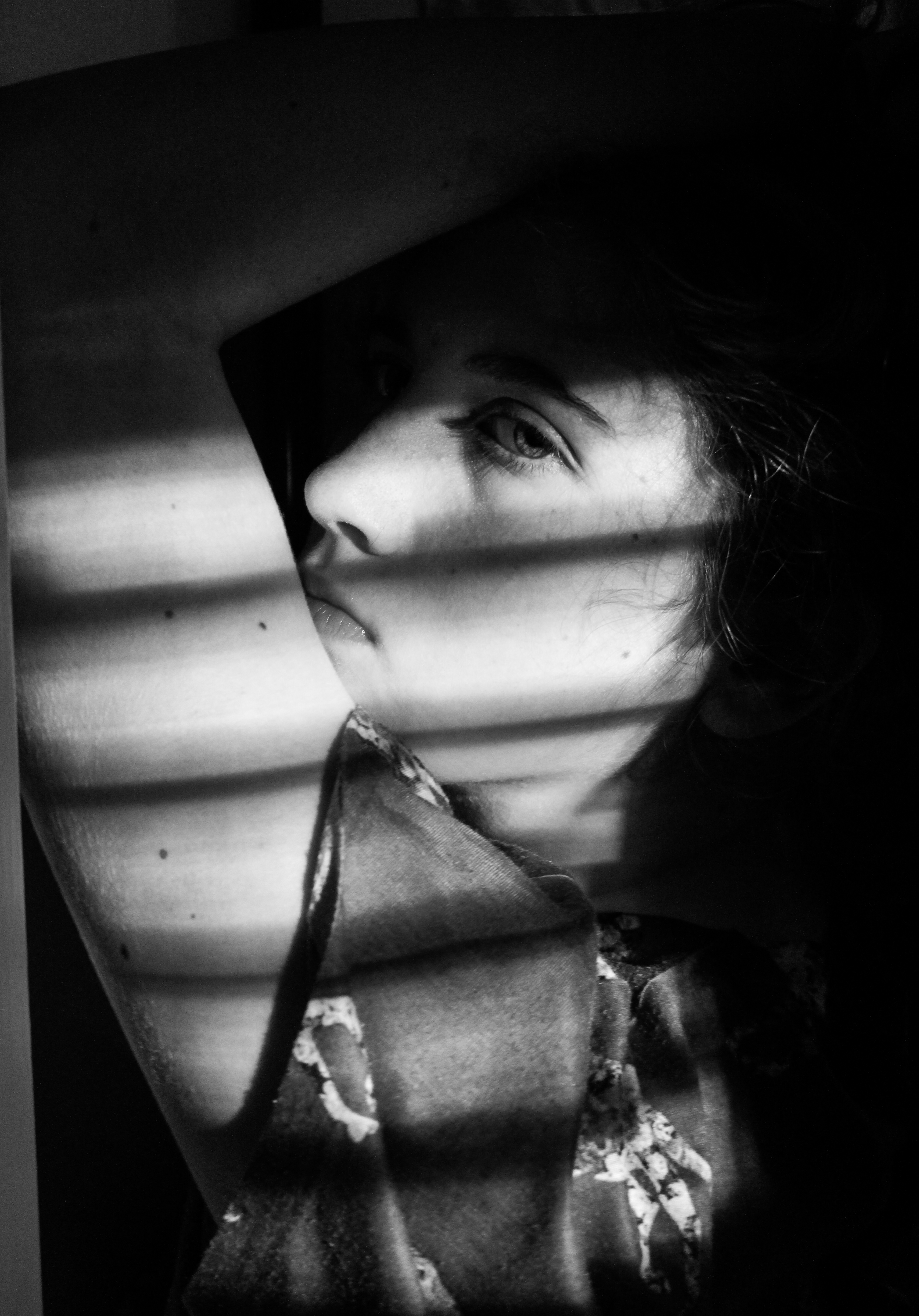
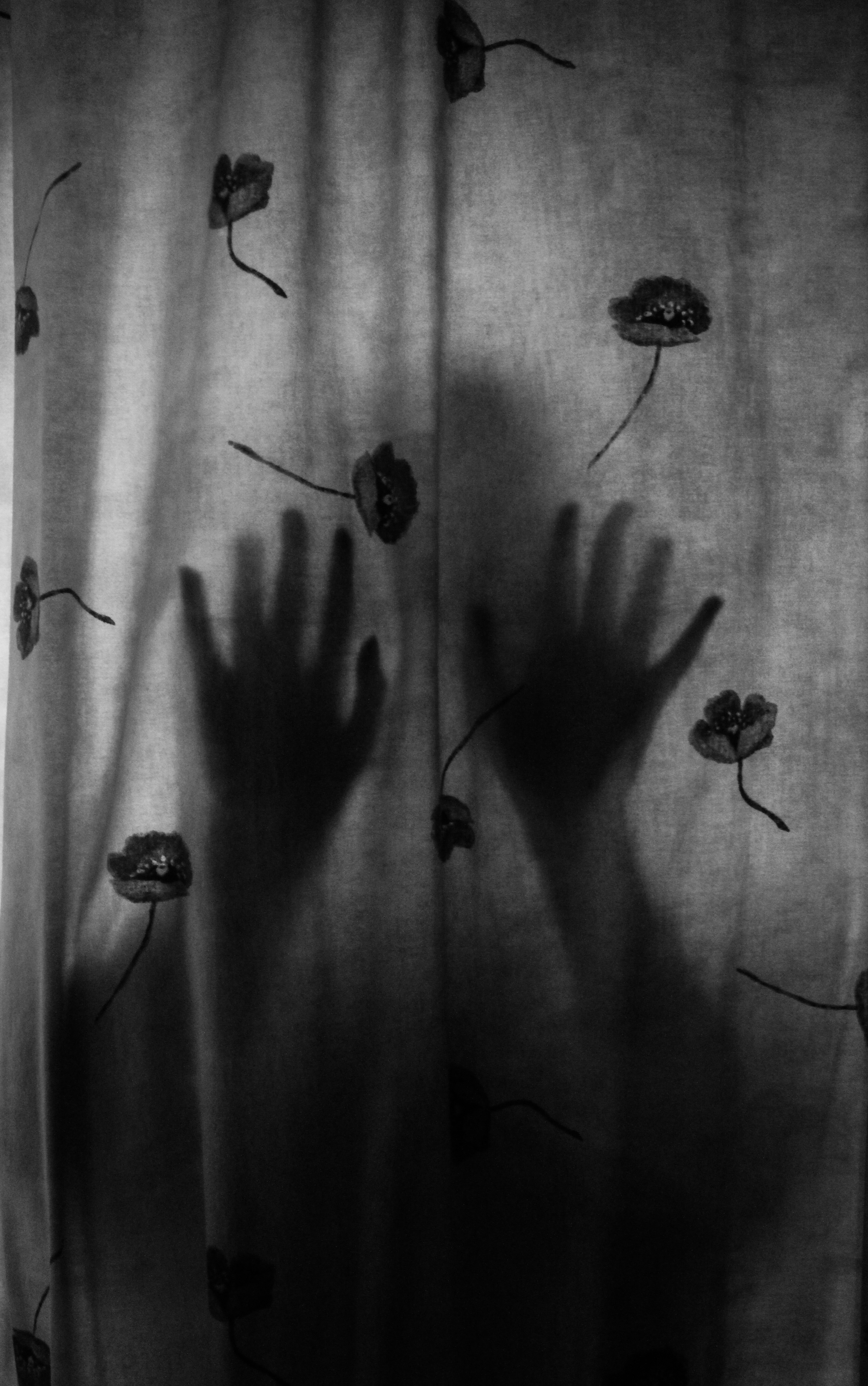
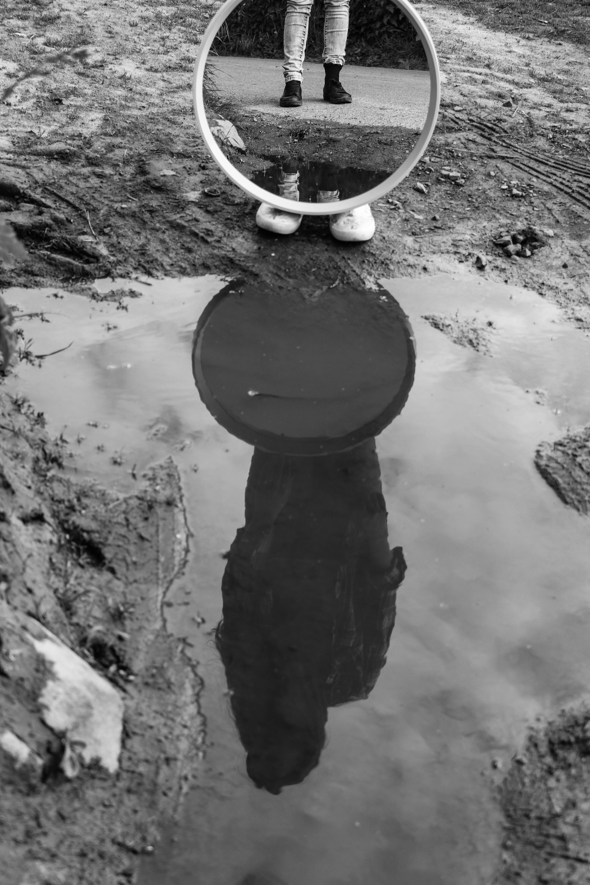
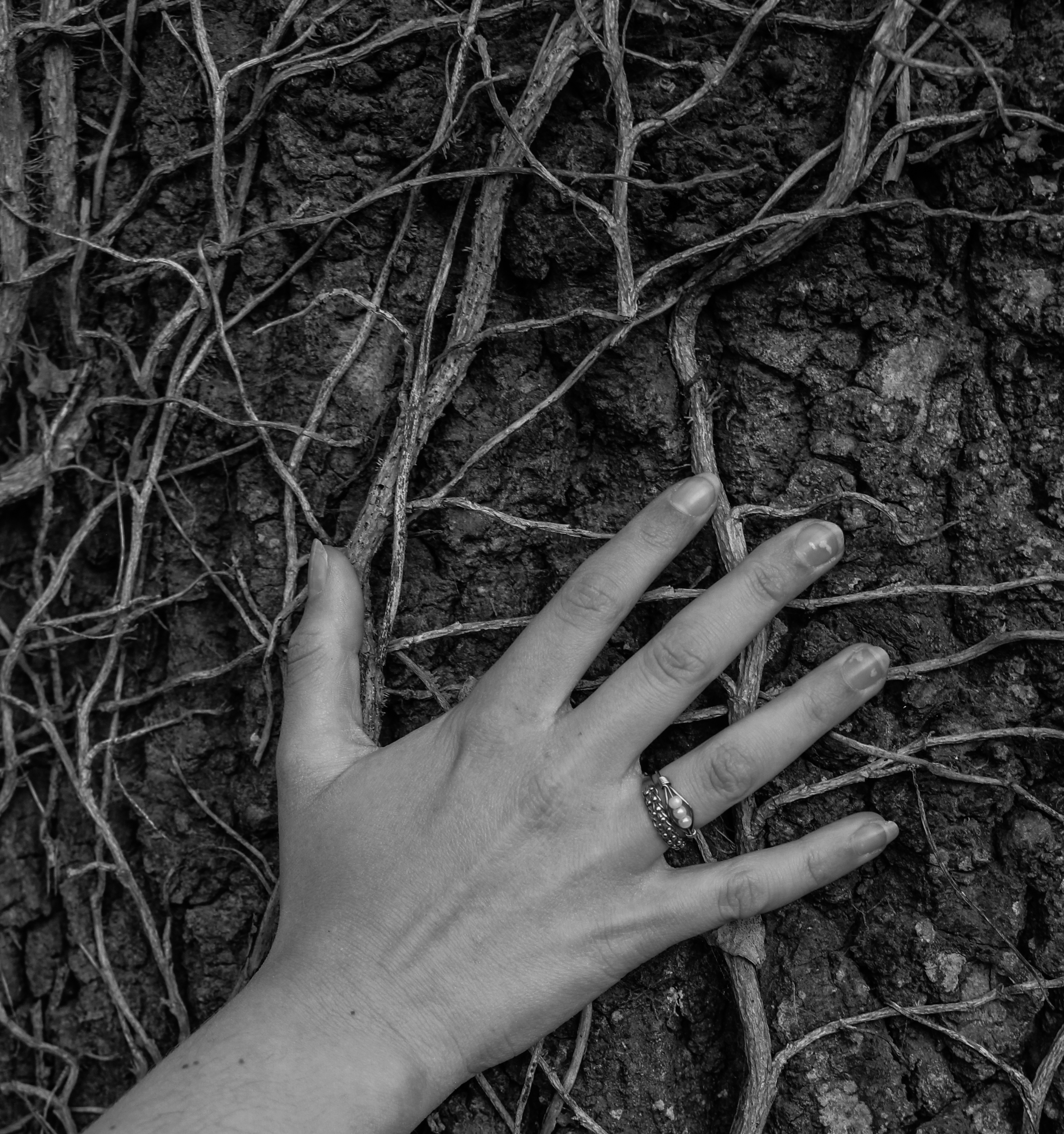
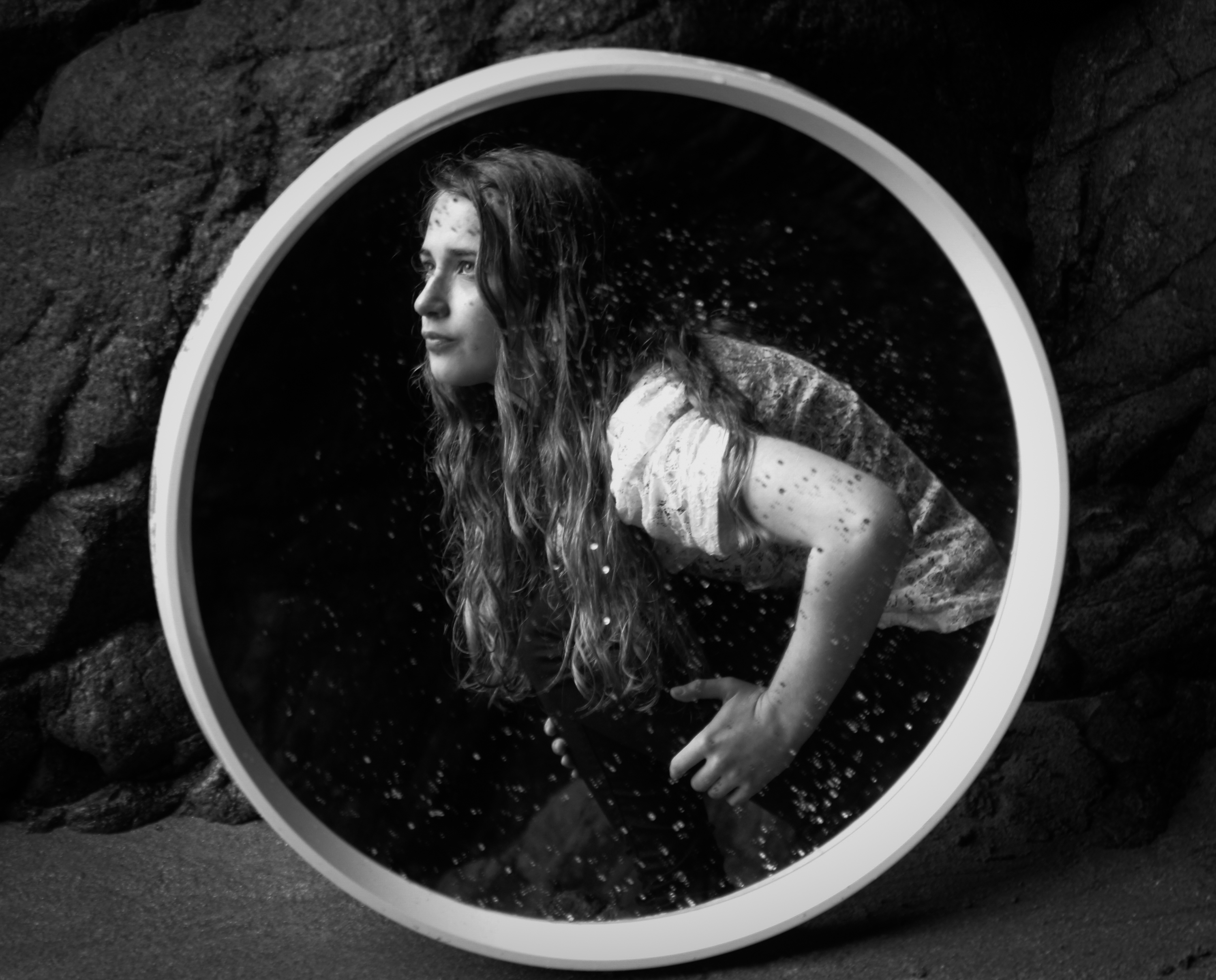
The first 2 rows of the contact sheet below are images from my 2 symbolic portrayals of smoking waste and plastic pollution. The meaning behind the first 6 images on the top row is to symbolise the vastness of this pollution issue and how it is caused by us, affecting and poisoning everything natural. The next 7 images depict the problem of plastic being used for everything (filling our surroundings), the effect it has on animals and marine life, as well as our connections to this issue. Because in both of these shoots, each image is depicting a different way to symbolise a similar message, I will narrow them down simply by judging their symbolic strength and visual appeal. If selected for printing I will most likely change certain aspects of each image to ensure its quality when enlarged and presented…
 Next in the two rows above are my outcomes from my documentary style shoots depicting plastic pollution and beach pollution. The meaning behind my plastic agricultural shoot is to represent the darker side of Jersey’s most famous product as well as a pollution issue that is directly related to where we live. For the second shoot on beach pollution, my aim was to show the scale of common beach pollution using what I found collected together in one powerful photograph. Although very educational, because of the not so appealing subject matter, I will most likely not be using the photographs for final prints. Apart from a few of the more dynamic scenes I have presented above, I will be choosing from these documentary images mainly based on their relevance to the message.
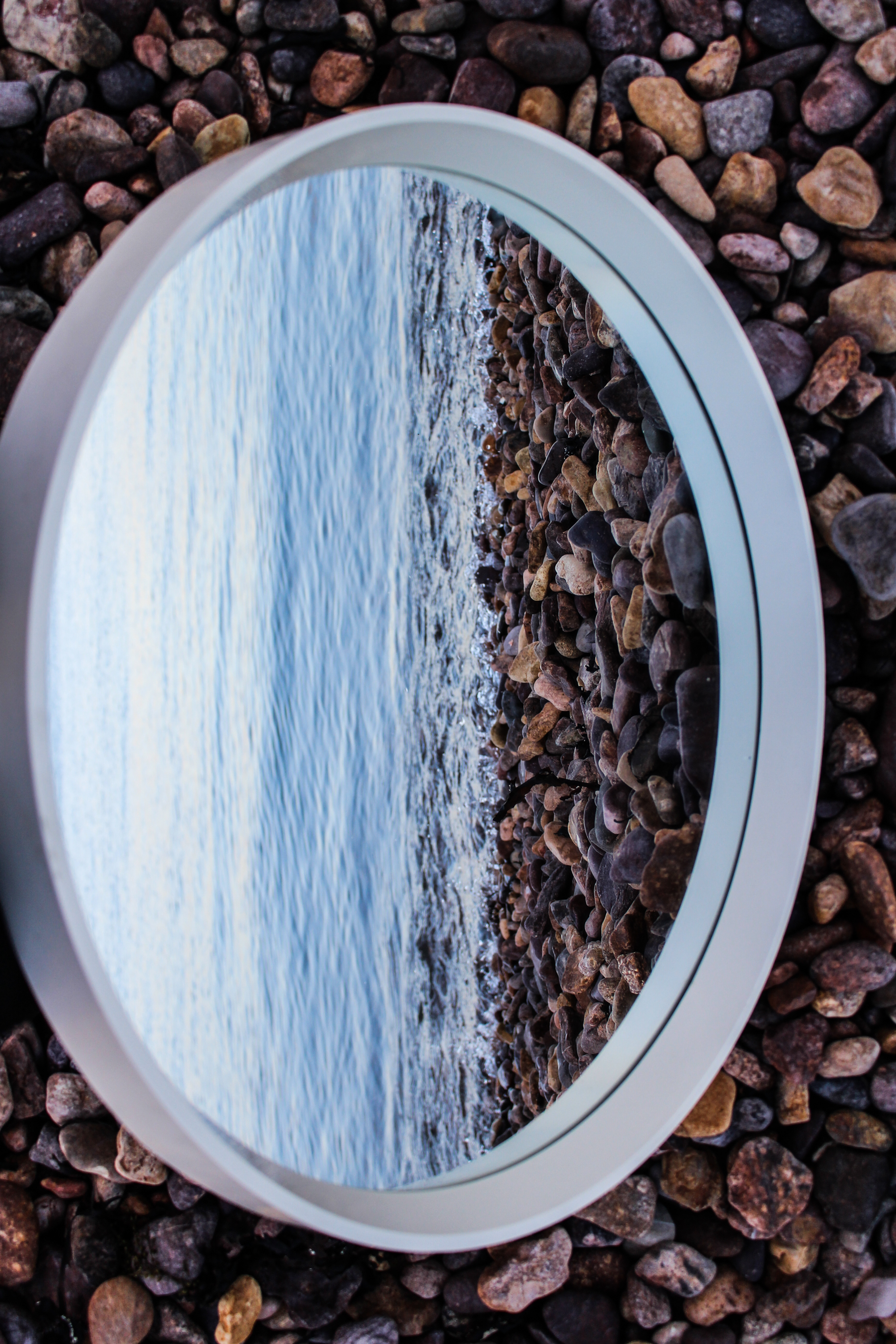
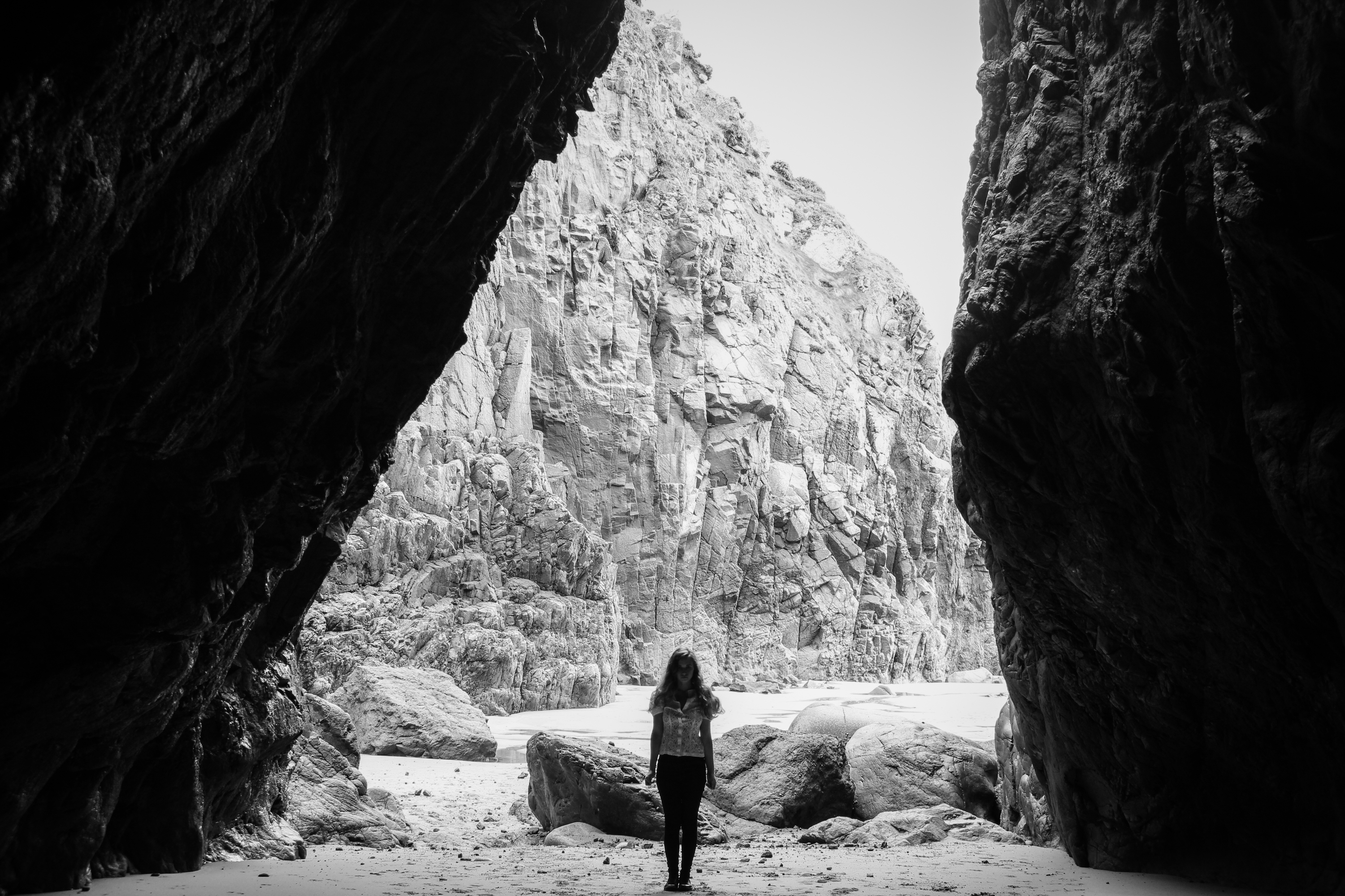
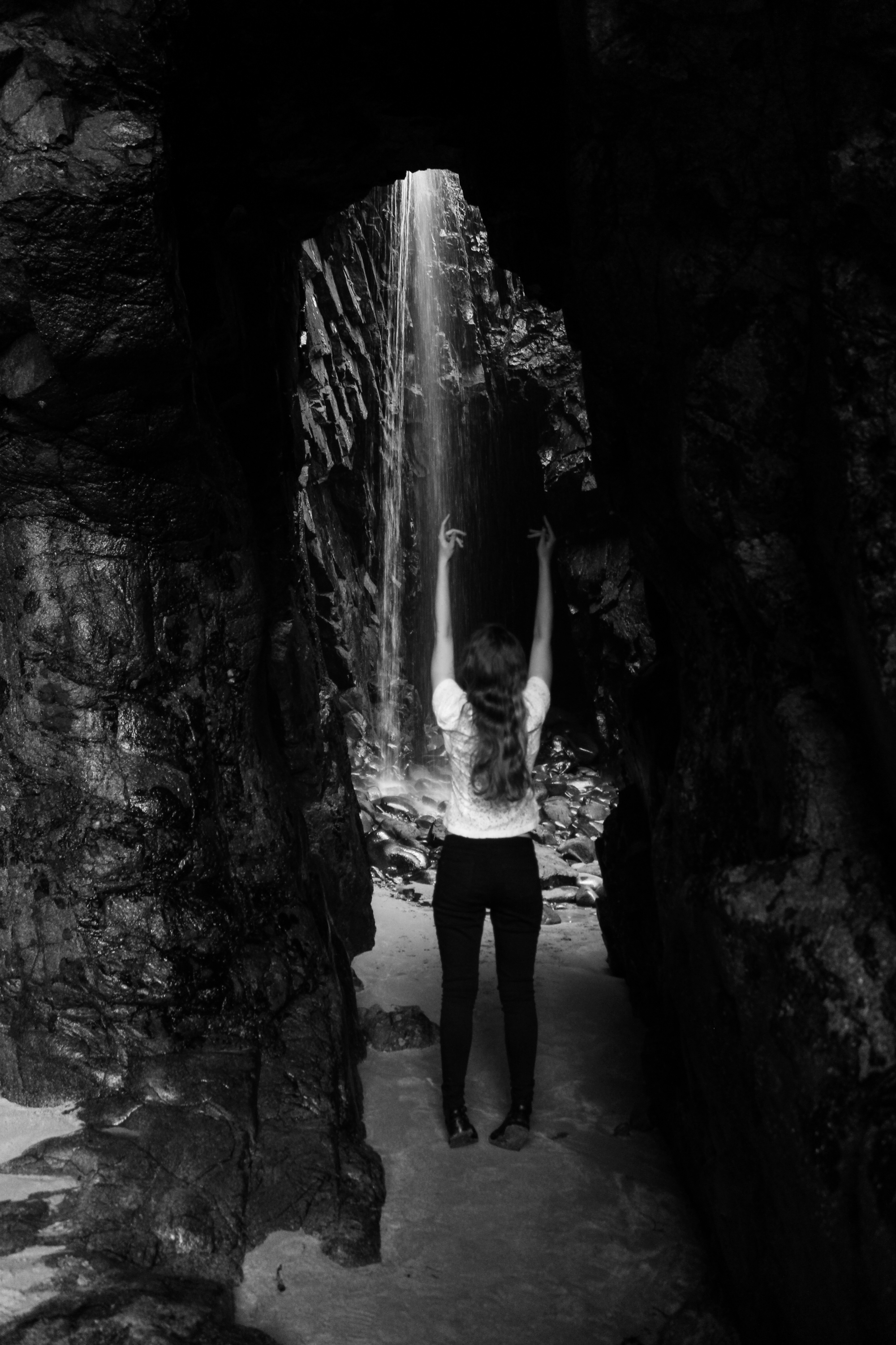
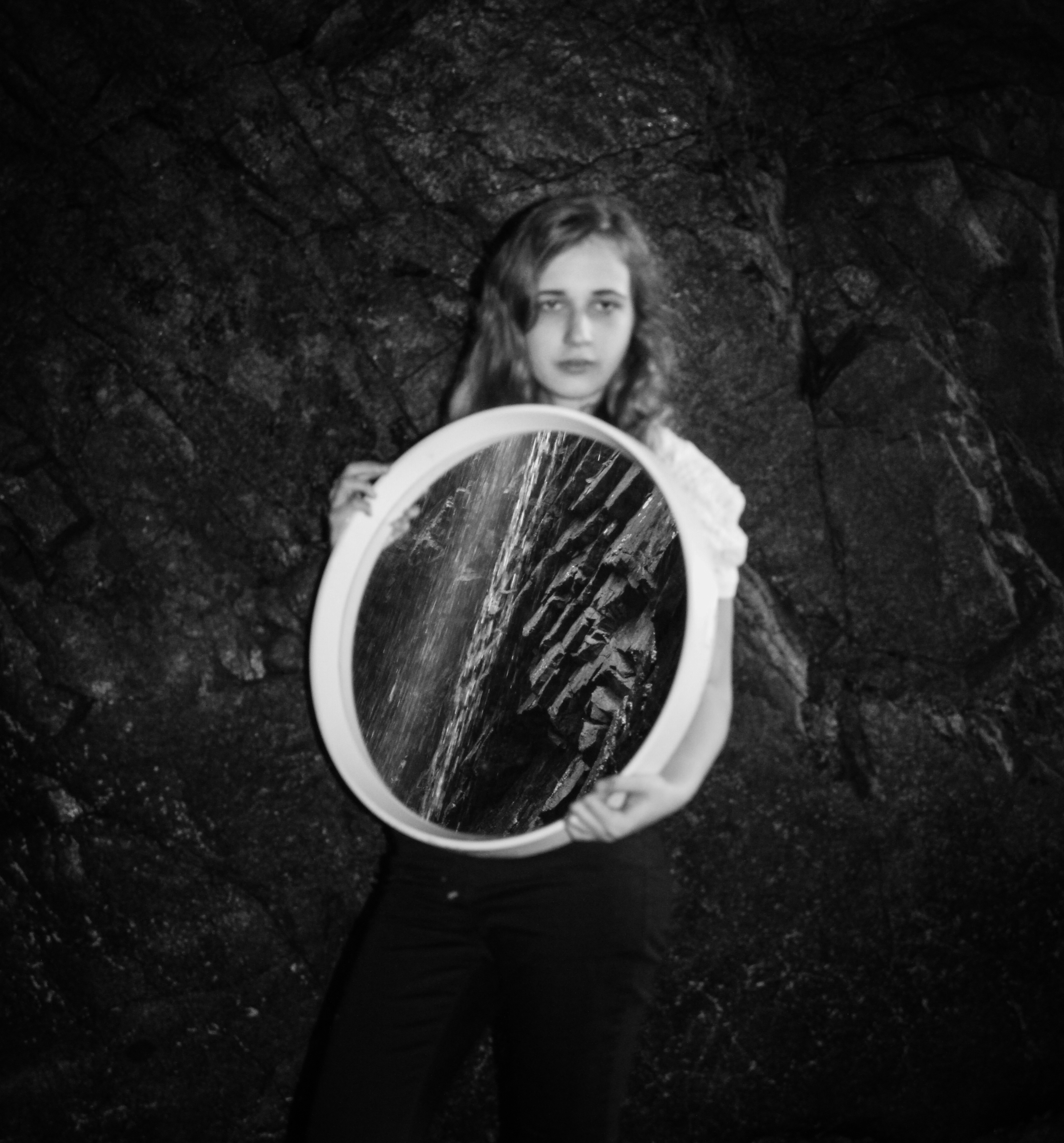
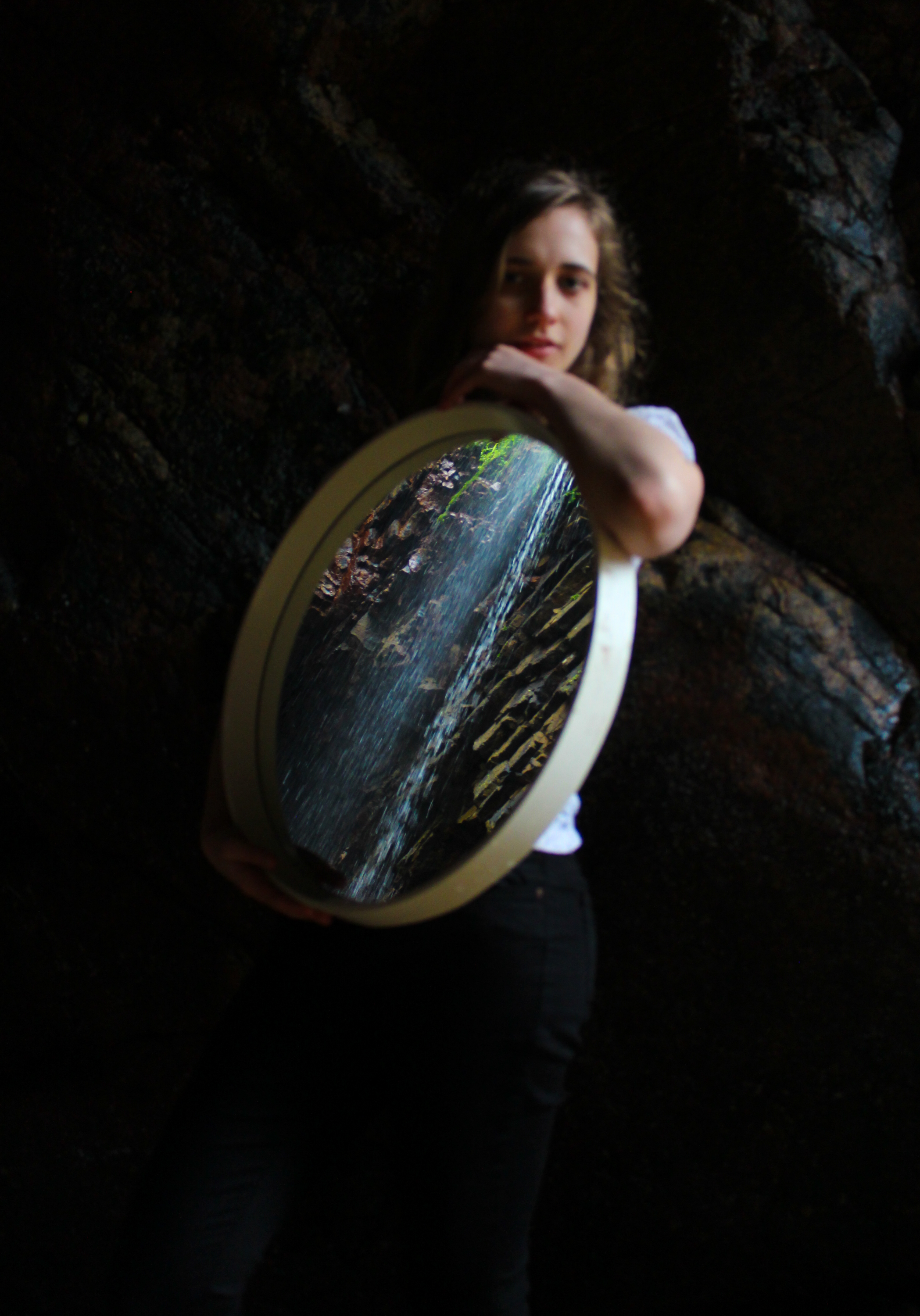
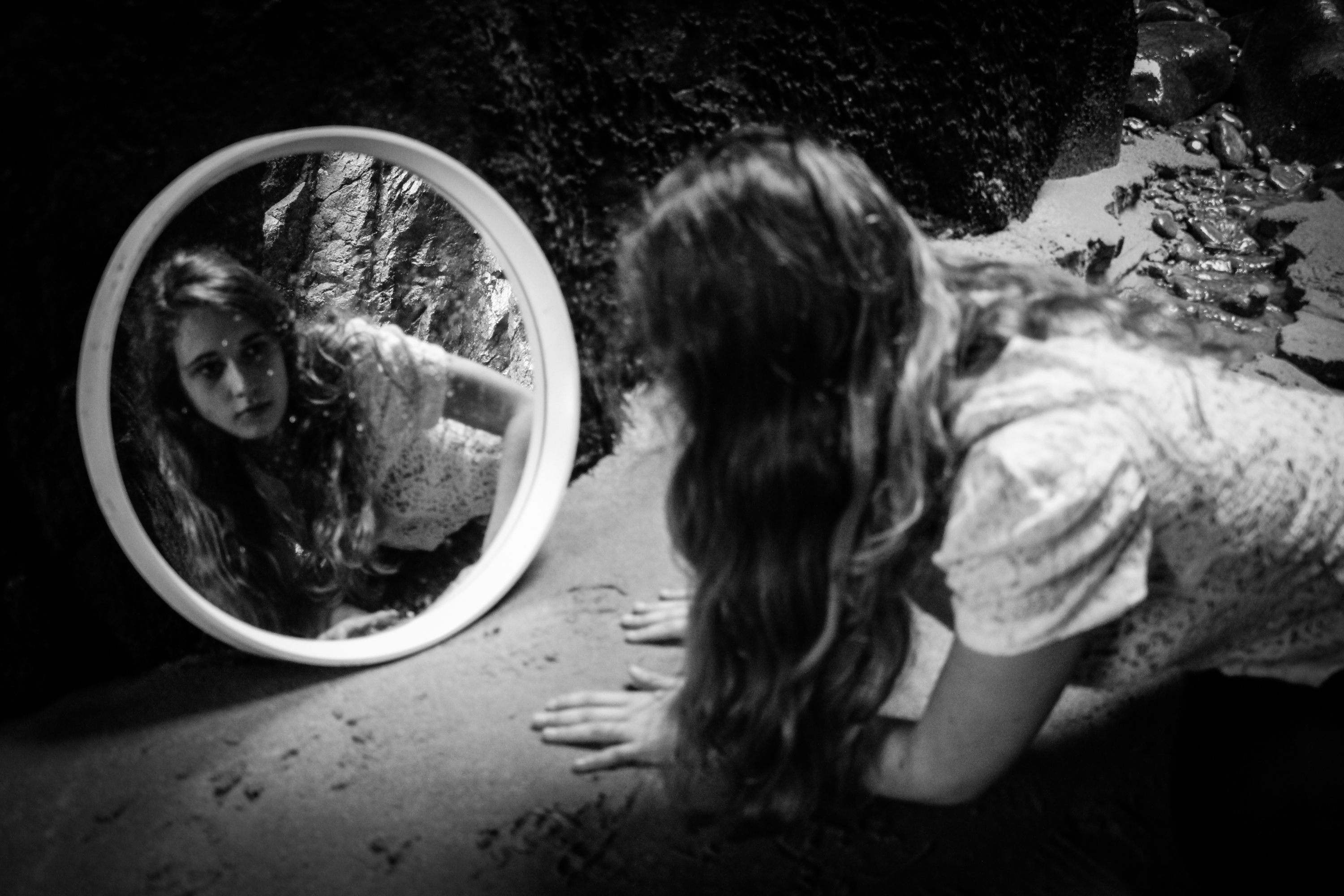
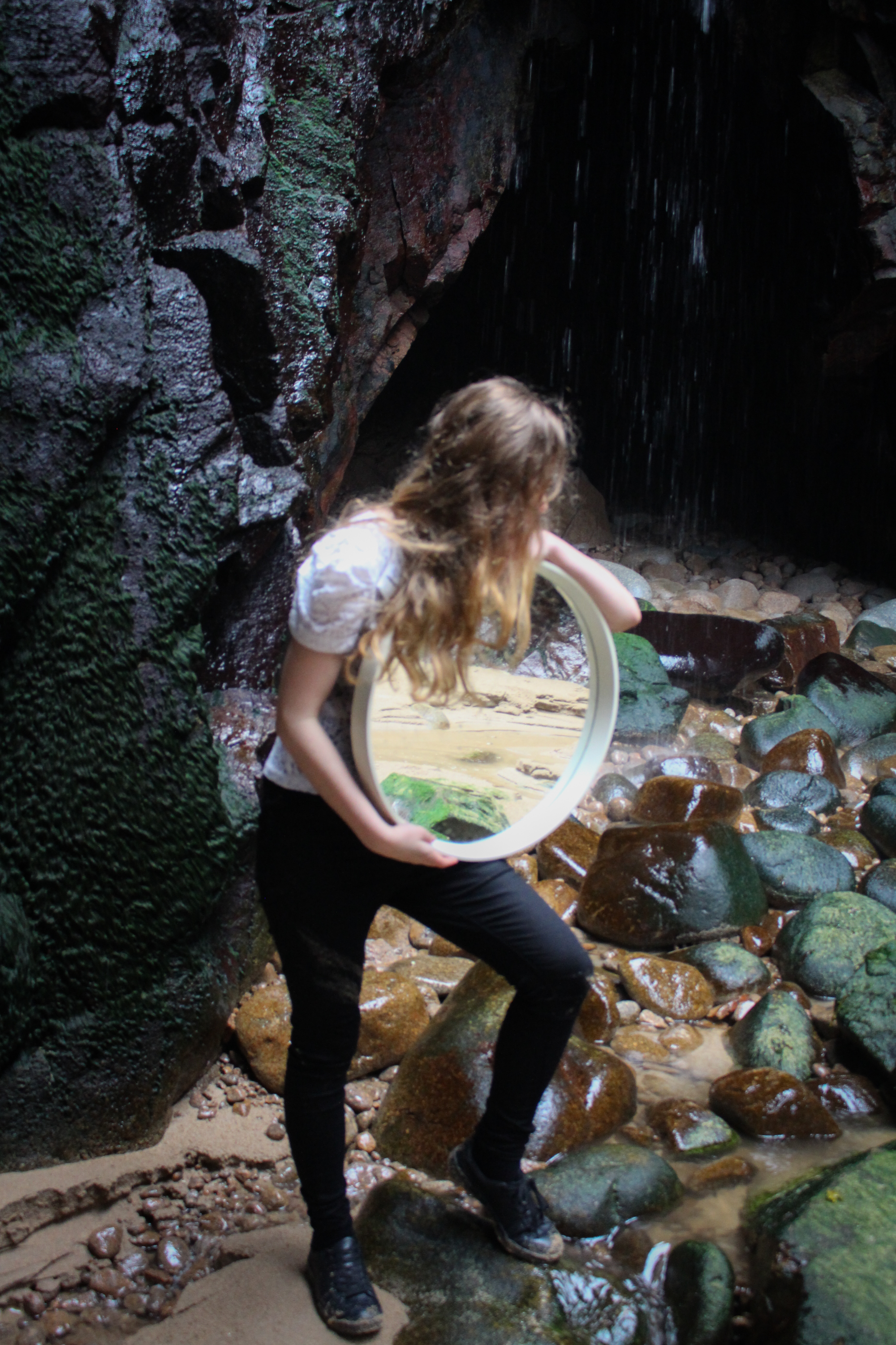
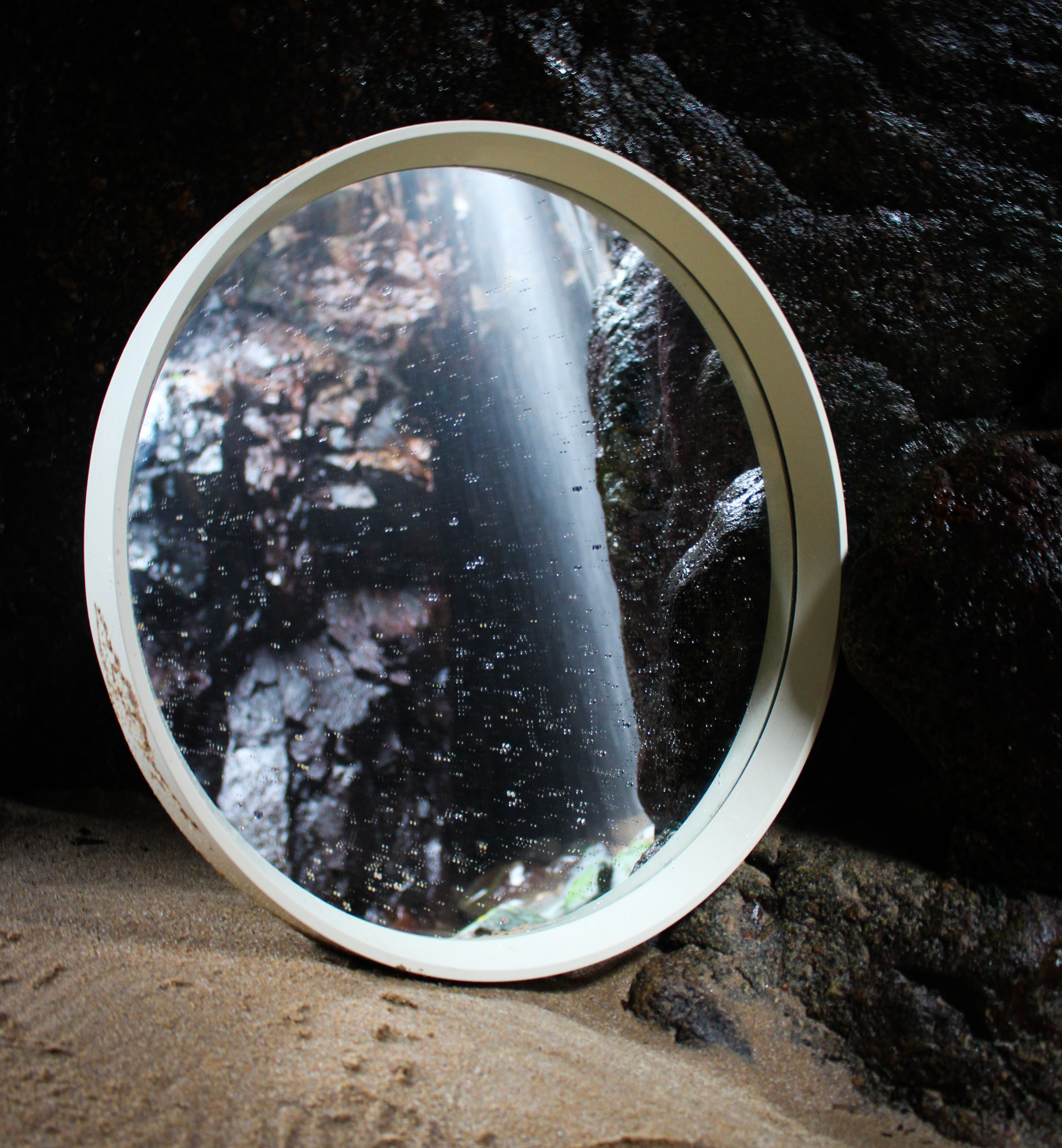
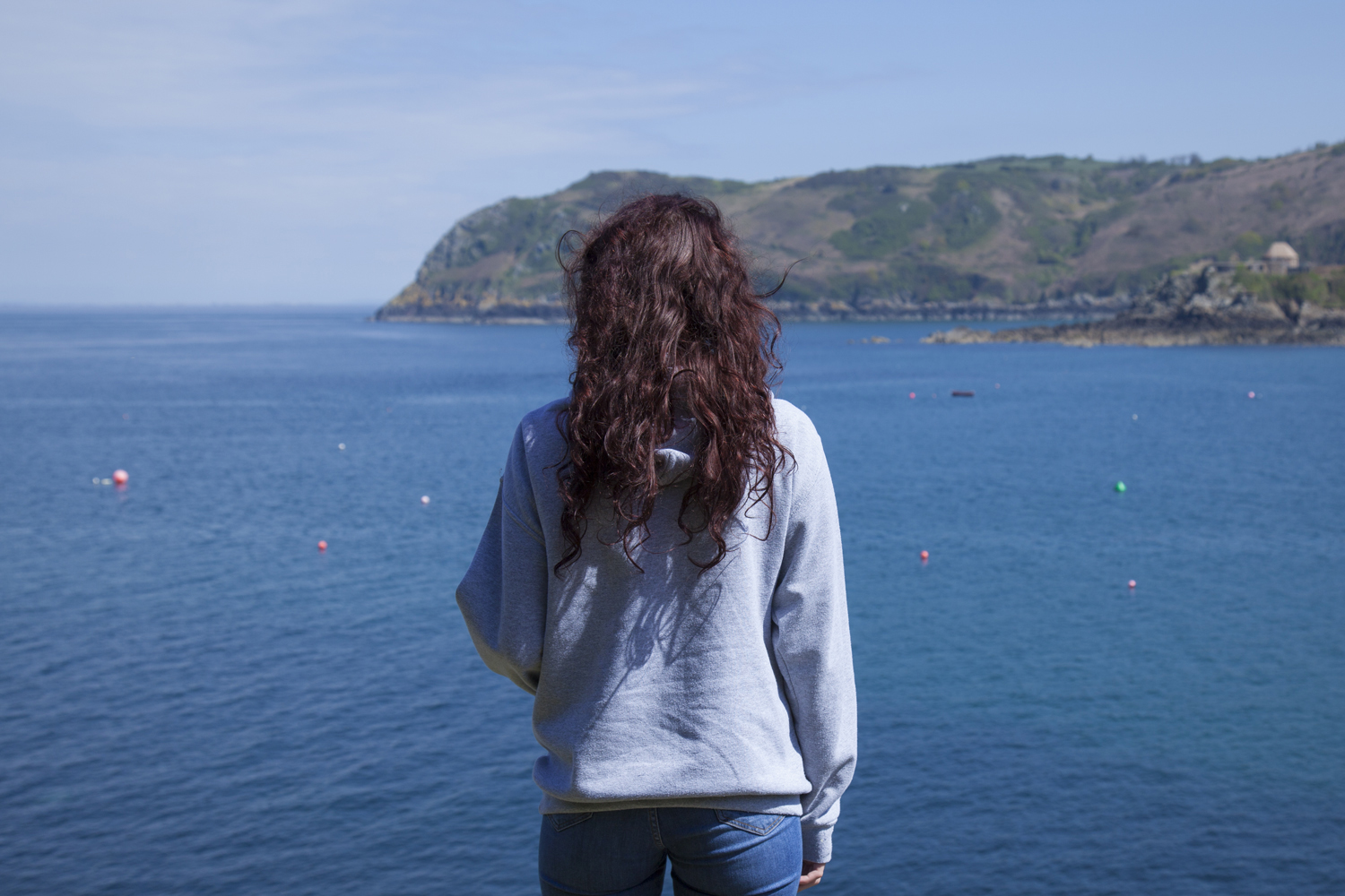
The next collection below consists of my different styles and techniques used to look at the growing problem of ocean pollution. The first 9 images in this contact sheet depict a mixture of documentary and abstracted pieces taken of pollution in Jersey seas. The aim of this shoot was to portray the reality of this issue, and how it affects even the cleanest seeming waters. The next 5 outcomes show my symbolic take on this subject using real pollution I collected from a few of our Island’s beaches. As these are all very vibrant and interesting portrayals of this pollution issue I will most likely be using quite a few in my final presentation. However, because the documentary/abstract shoot was taken using a mobile phone, I will have to be careful about how large I display the chosen images…
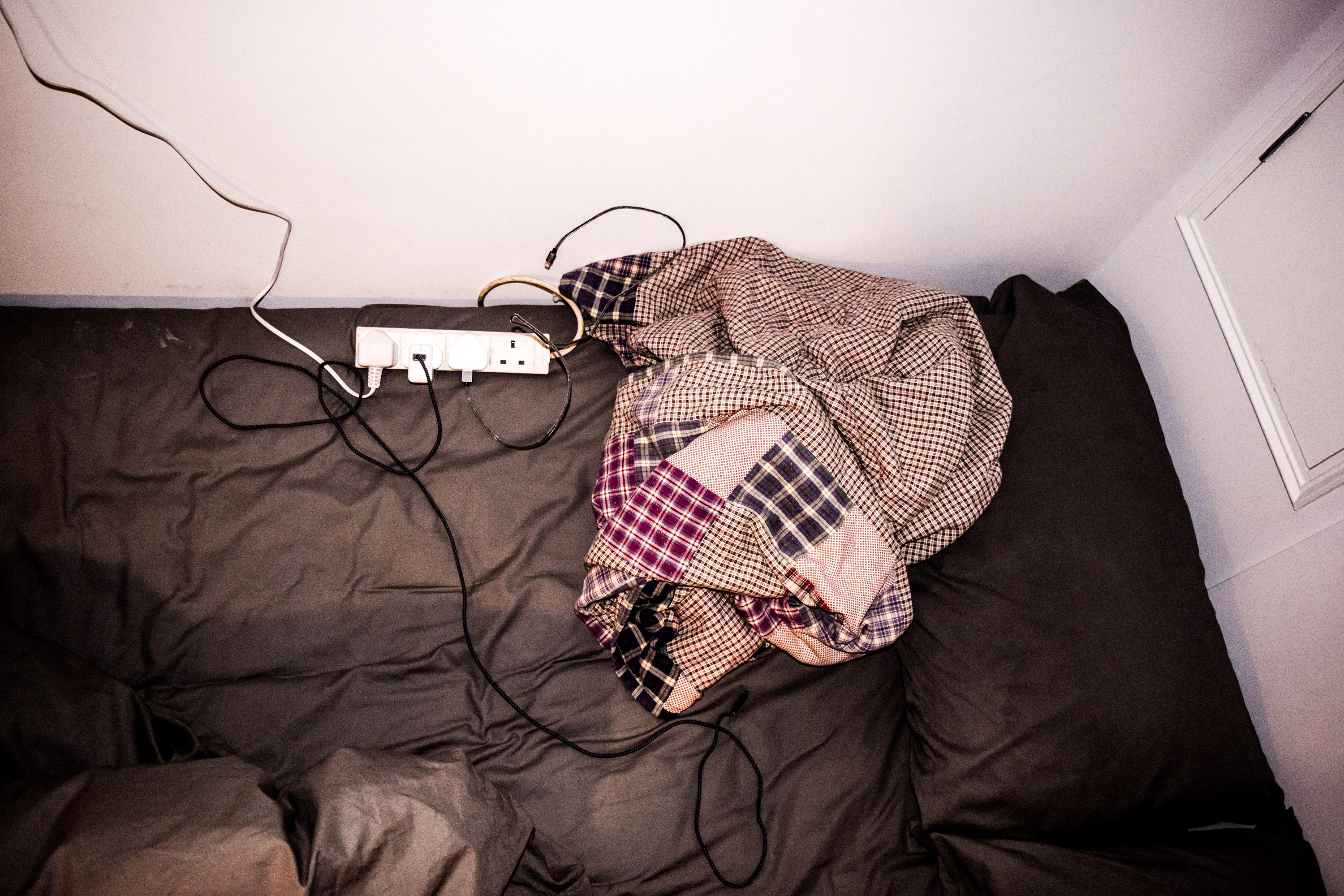
 Lastly, the final sections of my project above portray the different methods of disposing of common household waste in Jersey. The first and most extensive shoot in my project, featured on the top 2 rows, depicts my visit to our ‘Energy from Waste’ facility that deals with all common un-separated waste. I will most likely be featuring many of these photographs as this insider’s view of the plant produced a lot of intriguing and educational images. The bottom row however, depicts the new La Collette Recycling Centre and is aimed to inform my viewers on its importance and how easy is has now been made for us. As both shoots are very relevant to the of this project (because they show exactly what happens to the waste we don’t recycle and how easy it is) I have decided many of these abstract/documentary images will be used in my final presentation.
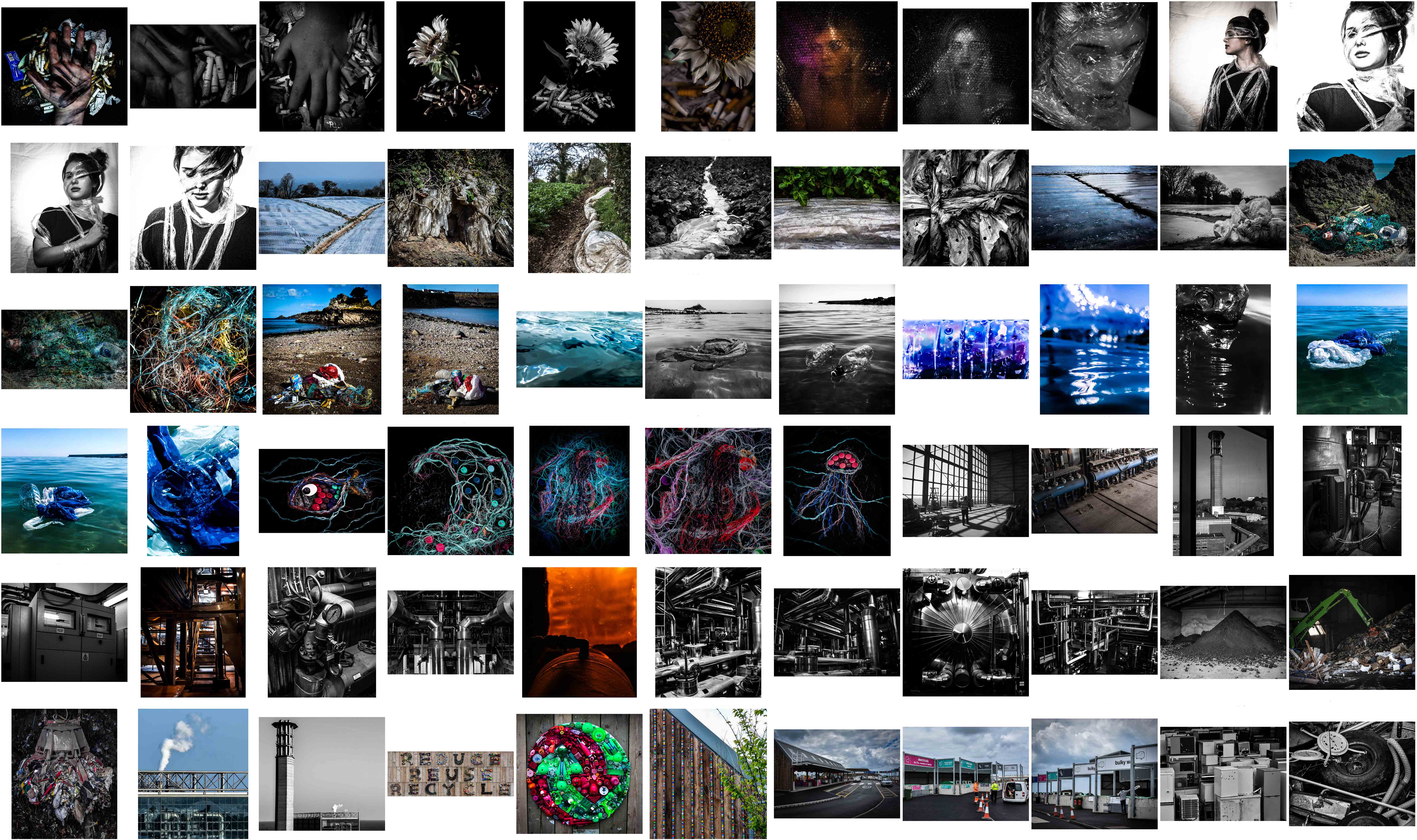 By viewing them in this composition I have realised that I have mostly touched down on three major themes; plastic pollution, beach/ocean pollution, and Jersey’s waste disposal systems. When comparing all my work above with my initial ideas mind map for this project, I found that I did not manage to bring to life some of the original plans I had. If given more time I would definitely include some of these ideas such as depicting rural landscapes vs urban landscapes, melting ice symbolism, air pollution and exploration of the smaller factors. However, In the amount of time we were actually given to complete this exam, I am quite pleased that I managed to show my original goal: portraying environmental awareness using a mixture of symbolism, abstraction, documentary photography and topographic photography.


 To chose between these photographs and produce my final outcomes, I was particularly interested in having a mixture of dynamic straight photography as well as abstract photography to intrigue my viewers. When editing the landscape documentary photographs I experimented with the highlighting to really emphasise the dramatic sky. With the more abstract pieces, however, I concentrated on really bringing out the vibrant colours and brilliant texture. Unlike with most of my previous shoots, I have decided to keep all of my finals in colour. This is because, unlike my previous shoots, these images attempt to show something good and hopeful towards the environment. Below are my final chosen and edited 6 outcomes for this last shoot in my environmental project…
 This first piece above was created by stitching three separate photographs together to make one easy to read piece. I have put them together because the ‘reduce, reuse, recycle’ sign featured at the Recycling centre is situated all in one long, hard to capture horizontal line. I love the effect of this sign that has been created using recycled items and kids toys to create a textured, colourful and inspiring outcome. The meaning behind this photograph is obvious as I am simply getting across this clear message from a straight forward perspective. The final result of this, I believe, emphasises the written message and brings out the beautiful and striking details.
 These next two outcomes are my more abstracted results featuring some beautiful and inspiring artwork I captured when visiting the location. The meaning behind these two photographs is to intrigue the viewer about the recycling centre itself as well as spread the message of its importance. The first outcome on the left depicts a beautifully crafted recycling symbol made from a vast amount of green and red discarded children’s toys. I love the depth and contrast between the tiny objects as well as the vibrancy and texture of the whole piece. Next is a more abstract piece featuring the side and rooftop of the decorated facility building along with part of a growing tree. I love the strange symbolism in this piece and I like how, without context, the audience is forced to come to their own conclusions.
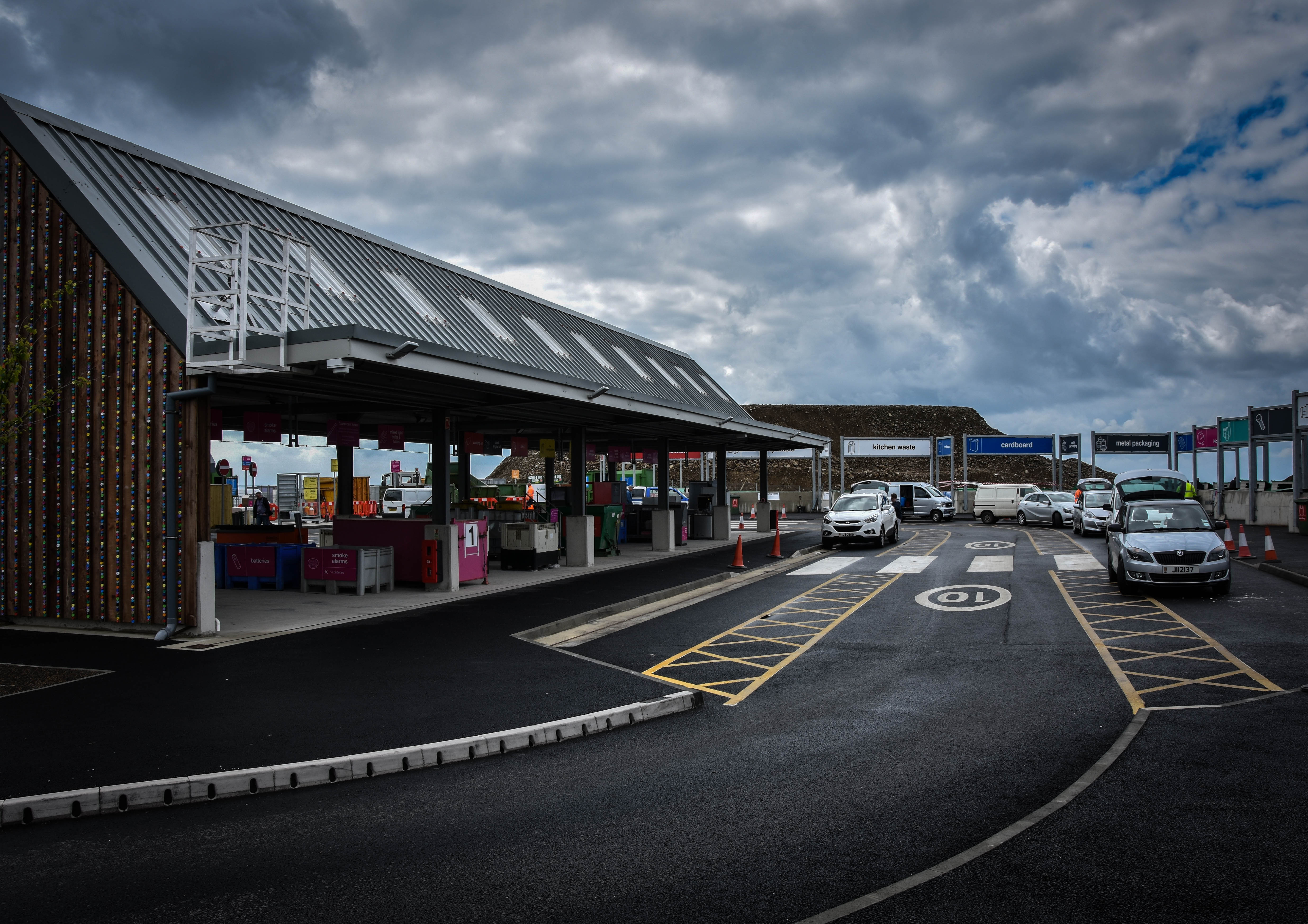 For this next documentary look at Jersey’s new and improved recycling facility, I have attempted to capture the location featuring as many important aspects as possible. My outcome above portrays the main recycling building on the left, the elegant car system running around the facility and a few of the many many drop-off points for waste that continues all the way around. The meaning behind this image is to show how the recycling centre now works and how effortless it is to drive around and dispose of our pollution safely. I have chosen this image as a final as I love the angled perspective of the facility and the dramatic overtones created with the contrast of the sky.