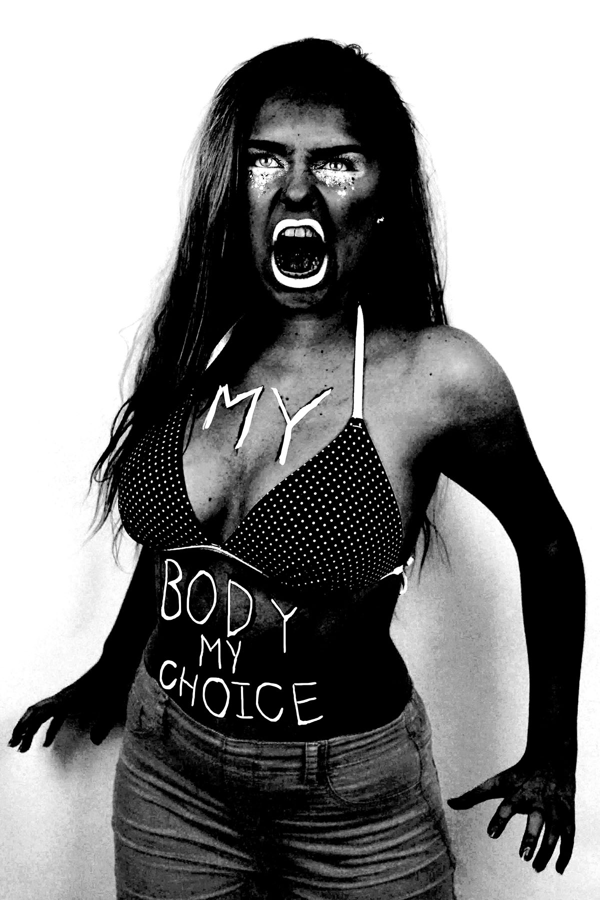
Here are three images (and their originals) from my angry feminist activist photo shoot that I manipulated in way that was inspired by the photo series “There’s a place in hell for me and my friends” by Pieter Hugo. I created these images by placing a black and white filter over the images and adjusted the colour channels. I made the reds much darker, which made the red tones in my skin appear darker and more intense. I slightly adjusted the yellows to be darker to make the yellow tones in my skin darker, I didn’t make them as dark as the reds because i still wanted the high points of my face to be light to get a sense of depth and contrast. I didn’t adjust the greens because it didn’t make any different to the image due to the lack of green tones in the raw images. I made the cyan’s much lighter to make the background of the image white, which created a dramatic outline and sense of contrast to the figure. I also increased the brightness of the blues and magentas to make the pink makeup under the eyes, the straps of the bikini top and the lipstick white to make the eyes and the mouth, thus the facial expression more intense. The white straps of the bikini top also draw the eye up towards the face.

I also experimented with painting over the writing on the raw photo with white, as most of the text was lost when the yellow and red tones of the skin were darkened. I initially used the regular brush tool to write over the top of the text but for some reason, the airbrush edges didn’t look right. I then used the brush tool with the solid edges but I couldn’t get the flow of the accuracy needed to make the text look right. I then tired using the 48 brush which is an angled brush with long flexible bristles that are sensitive to how much pressure is applied in the stroke. This tool helped me get the rough, uneven lines I was aiming for. 

I then experimented with combining the images together, to create a small group of angry feminists. I think these images are strong as when the images are displayed together there is a primal sense of anger and intensity. The combination of the different stances and expressions make it appear as it they are ready to attack. I combined these images by using the lasso tool and dragging each figure onto the same canvas, I used the lasso tool as opposed to the quick selection tool as I wanted to make the figures relatively close together and I didn’t want the white edges of the original images to overlap. I made two version of all three images together, I also experimented with cropping the images to focus on the faces, I had to move the images closer together so that their bodies overlapped to create the intensity needed for the cropped image.


I then used the same 48 angled brush tool that I used to paint over the text in white in one of the images over to add some text to the cropped image of just the faces. I tried to make the writing both raw and rough, as if written with a sense of anger as well as legible, which is why I decided to use block capitals like the text written on the torso of the original photographs. I then used the lasso tool to more the words and sometimes individual letters into place as the white background allowed me to do this easily. I then decided to try adding some texture to the image to give it a different effect that connoted ideas of violence and anger. I experimented with a scratched texture that I blended with the image on photo shop.


