Artist reference-Duane Michals

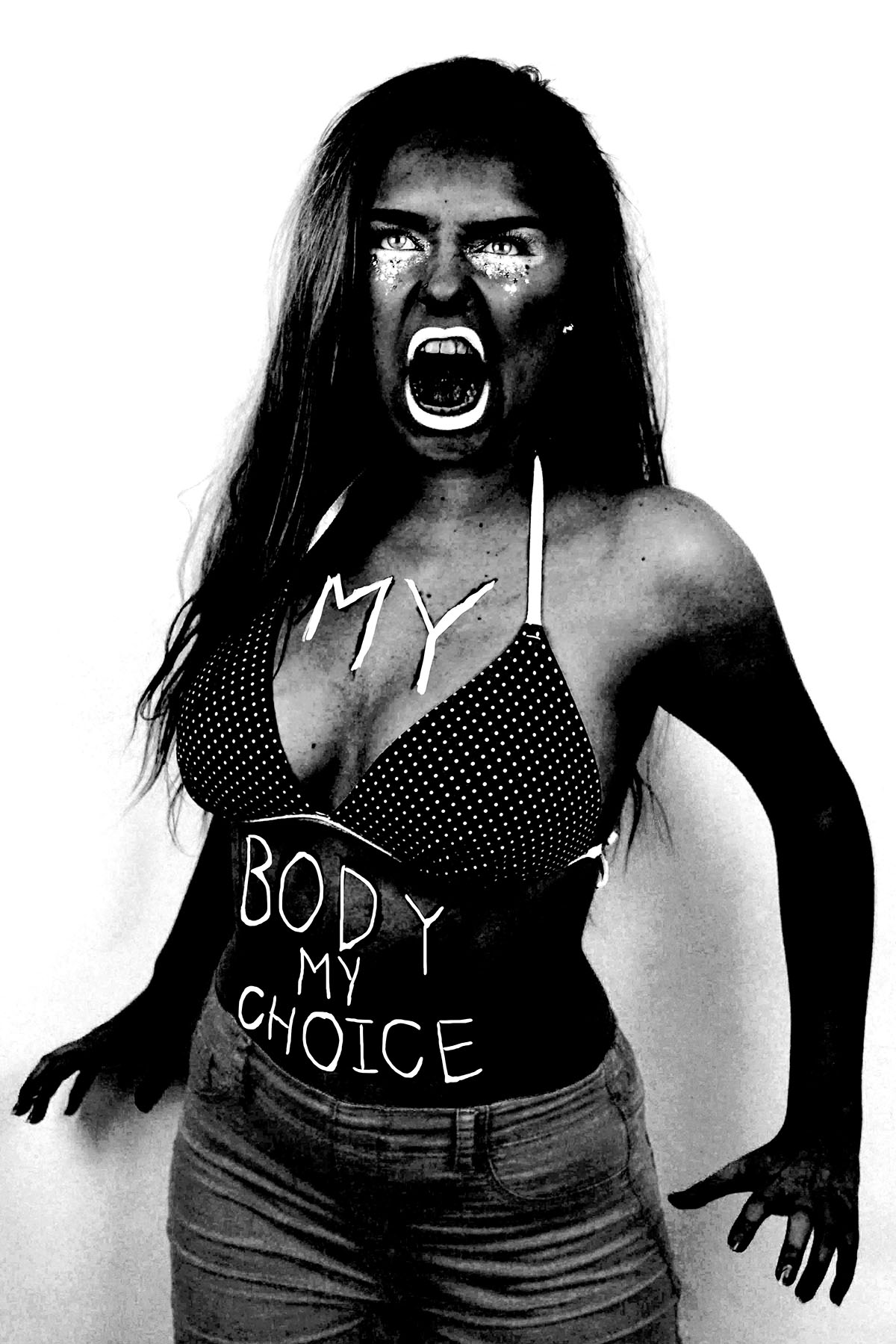
“I think photographs should be provocative and not tell you what you already know. It takes no great powers or magic to reproduce somebody’s face in a photograph. The magic is in seeing people in new ways.”

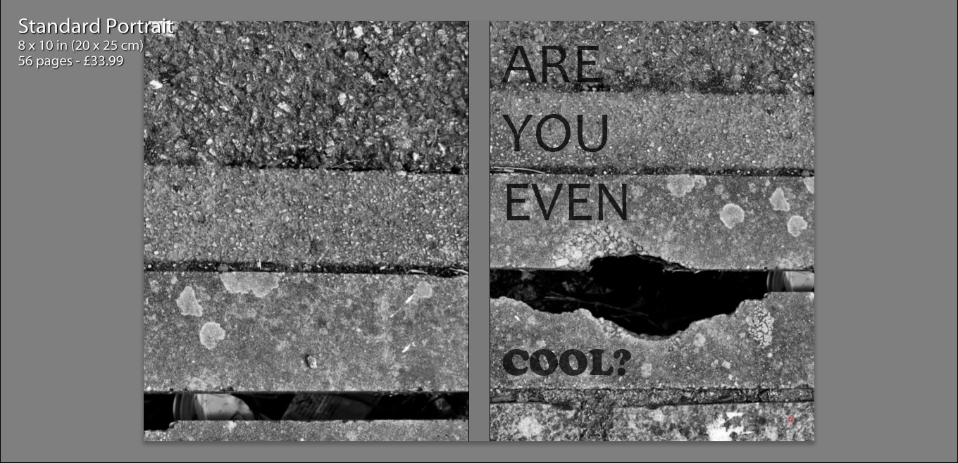
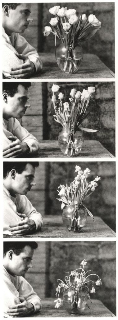
Duane Michals  is considered to be one of the great photographic innovators of the last century and is well known for his work with series, multiple exposures, and text. I have decided to consider him as an artist reference because I am thinking of taking inspiration from his methods of presenting images in series combined with handwritten notes to add a new layer of meaning to the images.

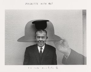
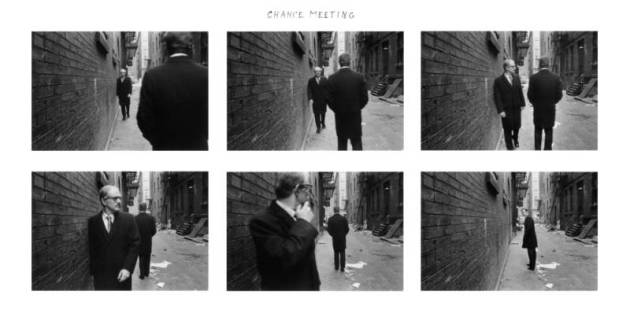
On this website it explains that he “was a pioneer in the 1960s when he broke away from established traditions of documentary and fine art photography”. Rather than following the recognised methods of presenting images by focusing on them individually he created sequences of multiple images to convey visual stories using a cinema frame-by-frame format. He also incorporated text into his work with handwritten messages and poems on the paper’s surface. He said that rather than serving an explanatory function the written text adds another dimension to the images. These messages are often poetic, tragic or humorous and he has said  “My pictures are more about question, not about answers.” He has also said that William Blake, Lewis Carroll, and René Magritte are influences on his work which would suggest a more surreal approach to his art.

His staged photography, often includes elements of other genres, including film, theatre, and literature. He utilises cinematic language but his images also contain blurred figures which implies movement in each frame.  Unlike film his images are open to individual interpretation and don’t have an overarching story-line. Initially critics were confused by his work because they reject the notion of the  “decisive movement” and the popular glorification of single images.  Nowadays his work is praised for this because he is considered an expressionist constructing images of the mind and exploring unseeable themes. His work is often of a personal nature, and Michals relies on his own history as subject material. They are also fantasies with a sense of absurd humour. Michals has said, “No one can reproduce my handwriting, but someone else can always make a new print” which shows his deliberate attempt to create one-off pieces which restricts the value of reproductions. This makes each piece unique, and increases the rarity of the work.

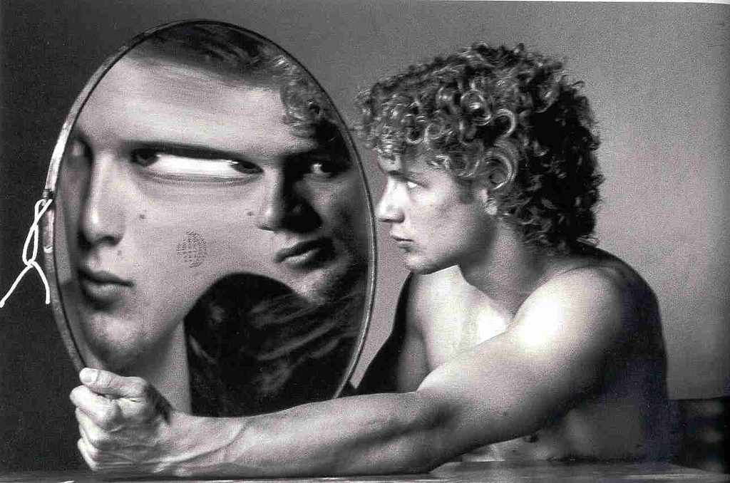
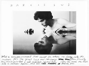
I was also drawn to Michal’s work because of the ways in which he has used reflections. He has explored the idea of mistrusting appearances and the truths that lie beyond the surface. Like mirrors cameras recreate a chosen subject ‘truthfully’ onto a flat surface by redirecting beams of light. Michals has stressed his suspicion of the purely visual to the extent of even abandoning the lens-based image in favour of purely verbal description. He has said ” I am a reflection photographing other reflections within a reflection” which suggests an unease with the process of trying to trap appearances. His work focuses on exploring invisible and internal themes and his use of mirrors could relate to the introspective nature of his work. He also connects his work on this to things such as mythology and literacy such as the example below which references the Greek myth of Narcissus.

The famous example of his work shown below was created for French Vogue and was intended to illustrate a feature on quantum physics. The series is based on Werner Heisenberg’s uncertainty principle which basically said you can’t predict with certainty the position/velocity of a particle but they instead interact in chaos.  Michals has said ” I’ve always been interested in physics and I like trying to photograph things that seem un-photographable – rather than looking at reality, I aim to get deep inside it and explore”. He explains that he bought the convex mirror in an antique shop in Bath and was intrigued by the distortions it created. He used this to illustrate Heisenberg’s principle because it transforms everything in front of it. When the model moves the image changes completely which creates a powerful energy to the series. Displaying them together this way effectively presents this and in the last image, when the model is looking at the camera and her cheek appears in the mirror so that there is no face at all it demonstrates a  “blank slate” of pure white energy. Technically the individual photographs are also well captured with what appears to be natural light from the window and the black and white emphasising the contrasts and forms. 

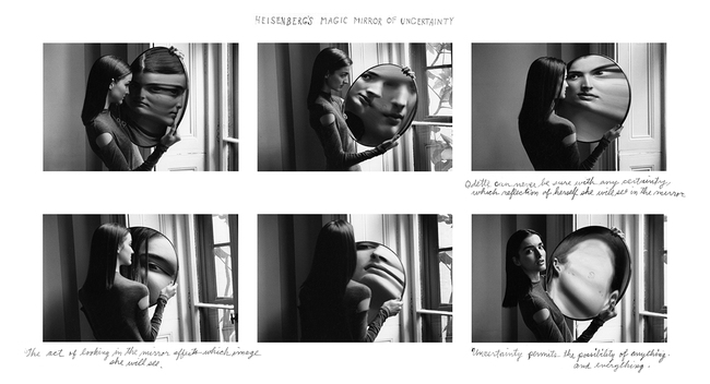
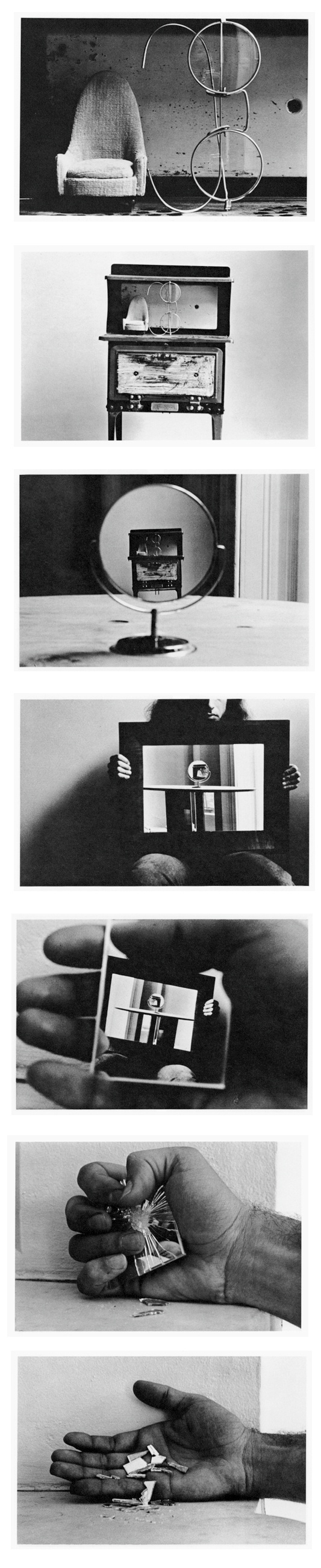
The series below called ‘Alice’s Mirror’ is presumably based on ‘Through the Looking-Glass’, the sequel to Alice in Wonderland. In the novel she considers what the world is like on the other side of a mirror’s reflection and steps through the mirror into another world. I like Michal’s use of miniatures in this series to distort the viewer’s perceptions and create a surreal piece and I would be interested in exploring something similar in my own work.  

More Shoots

// JOE + BETH //

The next shoot was with two characters, Beth was the subject I had intended to shoot with but the addition of a second figure (Joe) worked very well in the images. Below, as before, is a set of images showing a variety of shots from the shoot which took place at Beth’s location of choice – Green Island. These photos were taken just after golden hour making use of the eery blue lighting and it’s soft, pastel effects. With enough light to shoot but limited colours and shadows there is certainly something beautiful in the muted colour palette. I selected two external images, one which just showed Beth overlooking the bay and a  second image featuring both Joe and Beth which provided a varied alternative to this themed project. Ultimately, it was the single figure image I was after so that one came out on top.

As with all these shoots, I asked the model [Beth] to answer a series of questions about the location [Green Island] she choose.

Where is home for you? Why is this place home? Are your family there? Do you feel safe here? What is it that makes this particular place home?

Home is at my house in my room where I can be with friends and just chill. Stuff is less complicated there and I can block out school and shitty people and relax a bit. 

What makes Jersey important to you? Do you have good memories here?

Jersey means friends and friends are home. There are lots of important places here which mean a lot to me. Because I can drive now there’s lots of places I can get to which I didn’t know about before. It also means I can walk my dog in new places which means i get to see a lot more of the island and don’t have to rely on other people to drive me.

Where in Jersey holds the best memories for you? Why is it positive for you?

My favourite on island place right now is Green Island beach where I can walk my dog in the evenings. The sky is normally lighter around there and the sunsets can be really nice. If it’s high tide you can walk along the path at the top of the beach and sit on the benches which overlook the sea. It’s a good place to be on stormy days when the sea is high aswell.

Environment – My Book Layout

Here is a link to my Blurb photo book:

http://www.blurb.co.uk/b/7937421-are-you-even-cool

After the refinement of each of my photo shoots, I came to the realization that I had a large amount of strong images, in which I would have been happy to present as finals. With this in mind, I therefore decided to create a photo book in blurb to present these images more intimately.

Below shows a thumbnail view of my final book layout. I feel that this thumbnail view gives a stronger perspective of the layout as a whole, in comparison to the individual pages, as it is much clearer to see the overall aesthetic of the book and why I made certain choices with the layout.

The following print screens, show my book layout as double page spreads, this way we can see images and the specificity layout more closely, as well as how images have been presented effectively.


I decided to title my book ‘Are You Even Cool’?’. I titled the book this, as I feel that in a modern day society, especially within the age confinements of an older teen, there are many expectations as to what we should be doing, or looking like in order to fit this idealization of ‘cool’. I feel that my book contains many of these aspects, such as smoking, skating, having a boyfriend/girlfriend, sex, alcohol, drinking coffee and tattoos. I think that this title enables the reader question the book as well as themselves, making them want to open the book and see what is contained. It also creates a more personal title as I am asking the reader a question, it is also as if I am asking the characters in the book the same question.

Initially we see my front and back cover, as well as the book title. I chose to use the same image for both the front and back cover, zooming in and aligning them differently, so that they appeared to be two separate photographs. I felt that use of this image was almost a summary of my book. Very gritty and in many ways unpleasant, but as well see a very interesting texture alongside well positioned lines which in some sense convey beauty. So more simply put, my book is a contrast of beauty and ugliness, making it rather controversial.

I also include a quote on the first page, how the Urban Dictionary defines the word ‘cool’. I felt that this was relevant as I wanted to include a sense of what the world defined the word as, a ‘style which is generally admired’ is a common theme running through a modern day Jersey. So many children are concerned with living up to social expectations and imitating others and their styles.

In terms of imagery, within the book we firstly see an image standing alone on a single page. My intentions with this are largely to provoke thought, what is this? What does this mean? Why is this the first photograph?

As well, I feel that an image which appears alone becomes more poetic, as we only focus and analyse this one photograph and it is not particularly related to anything else at the time we view it.

On a large amount of my pages I feature two full page photos on a double spread. These images often juxtapose one another and create meaning, as well as contrast. I chose photos of similar form and aesthetic, which means they fit well together and almost appear to be one photograph.

Another way in which I have presented my images, is contrasting other charters within the book on opposing pages. I placed images of similar composition and pose next to one another, which I feel creates a relationship between the two characters as they are shown in a similar perspective.

Some images have also been resized, so that they are not full size, as I felt that having a boarder allowed the details of the image to be more dominant. It also condenses the photograph which helps to bring focus to the subject also.

The inclusion of various still life photographs, that appear on their own in the boo, as well as alongside other images, allow the book to become more personal. We are also able to gather a better understanding of the characters and their interests.

My layout of my book is in simple terms attempting to present images in such a way that they tell a story. Some images stand alongside others, juxtaposing one another, whereas others stand alone so that the viewer can gather some sense of emotion of relationship with the image. This book is a personal insight into the relationships I share with my close friends, as well as a representation of what my life and environment is and once was.

Pieter Hugo Inspired Photo Manipulation


Here are three images (and their originals) from my angry feminist activist photo shoot that I manipulated in way that was inspired by the photo series “There’s a place in hell for me and my friends” by Pieter Hugo. I created these images  by placing a black and white filter over the images and adjusted the colour channels. I made the reds much darker, which made the red tones in my skin appear darker and more intense. I slightly adjusted the yellows to be darker to make the yellow tones in my skin darker, I didn’t make them as dark as the reds because i still wanted the high points of my face to be light to get a sense of depth and contrast. I didn’t adjust the greens because it didn’t make any different to the image due to the lack of green tones in the raw images. I made the cyan’s much lighter to make the background of the image white, which created a dramatic outline and sense of contrast to the figure. I also increased the brightness of the blues and magentas to make the pink makeup under the eyes, the straps of the bikini top and the lipstick white to make the eyes and the mouth, thus the facial expression more intense. The white straps of the bikini top also draw the eye up towards the face.

I also experimented with painting over the writing on the raw photo with white, as most of the text was lost when the yellow and red tones of the skin were darkened. I initially used the regular brush tool to write over the top of the text but for some reason, the airbrush edges didn’t look right. I then used the brush tool with the solid edges but I couldn’t get the flow of the accuracy needed to make the text look right. I then tired using the 48 brush which is an angled brush with long flexible bristles that are sensitive to how much pressure is applied in the stroke. This tool helped me get the rough, uneven lines I was aiming for. 

I then experimented with combining the images together, to create a small group of angry feminists. I think these images are strong as when the images are displayed together there is a primal sense of anger and intensity. The combination of the different stances and expressions make it appear as it they are ready to attack. I combined these images by using the lasso tool and dragging each figure onto the same canvas, I used the lasso tool as opposed to the quick selection tool as I wanted to make the figures relatively close together and I didn’t want the white edges of the original images to overlap. I made two version of all three images together, I also experimented with cropping the images to focus on the faces, I had to move the images closer together so that their bodies overlapped to create the intensity needed for the cropped image.

I then used the same 48 angled brush tool that I used to paint over the text in white in one of the images over to add some text to the cropped image of just the faces. I tried to make the writing both raw and rough, as if written with a sense of anger as well as legible, which is why I decided to use block capitals like the text written on the torso of the original photographs. I then used the lasso tool to more the words and sometimes individual letters into place as the white background allowed me to do this easily. I then decided to try adding some texture to the image to give it a different effect that connoted ideas of violence and anger. I experimented with a scratched texture that I blended with the image on photo shop.