How I will present my Final Prints;
I have chosen 5 photographs for my final prints. I’m going to mount them onto foam board separately, as I’ve designed a book which already puts them together as a story, so for my prints I want them to represent their own journey. The reason for presenting them on foam board is because I feel the images are too contemporary to have a border around them. I have experimented by choosing both landscape and portrait layouts for my final prints.
Final Prints;
Image 1 –
I love the image below, because the colour scheme works perfectly, his grey jumper with the grey stones and the brown shoes and hair combined with the brown seaweed. I also like how the image is shot from a birds eye view.

Image 2 –
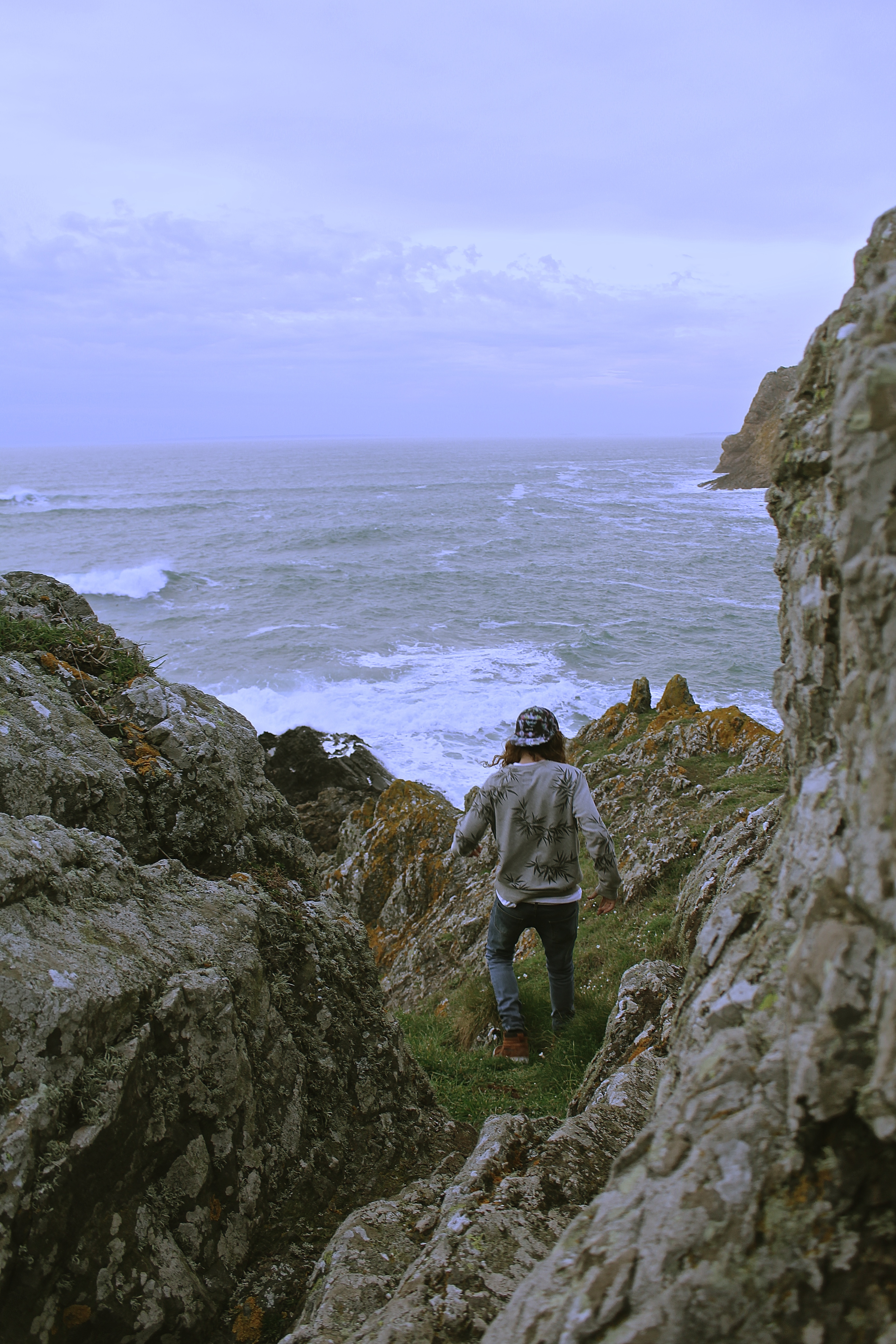
The reason I selected the image below for printing, is because it’s very similar to one of the images I’ve selected for my book, except this has a portrait layout. This one is also framed by the rocks within the image, unlike the one chosen for my book. I would have put this one in my book although they were too similar for them both to be chosen. All my other prints I have selected have also been selected for my book as well, so I wanted something different.

Image 3 –
I chosen the image below for my final print as it has a lot of energy and movement in it, which I wanted to represent in my photographs. I also like the surrounding the model is in and how it has a cinematic effect.

Image 4 –
The reason for choosing this image, is because I didn’t just want my prints to be just of individual models, I wanted to show the group journey. I love the natural lighting of this image, and the facial expressions of the model.

Image 5 –
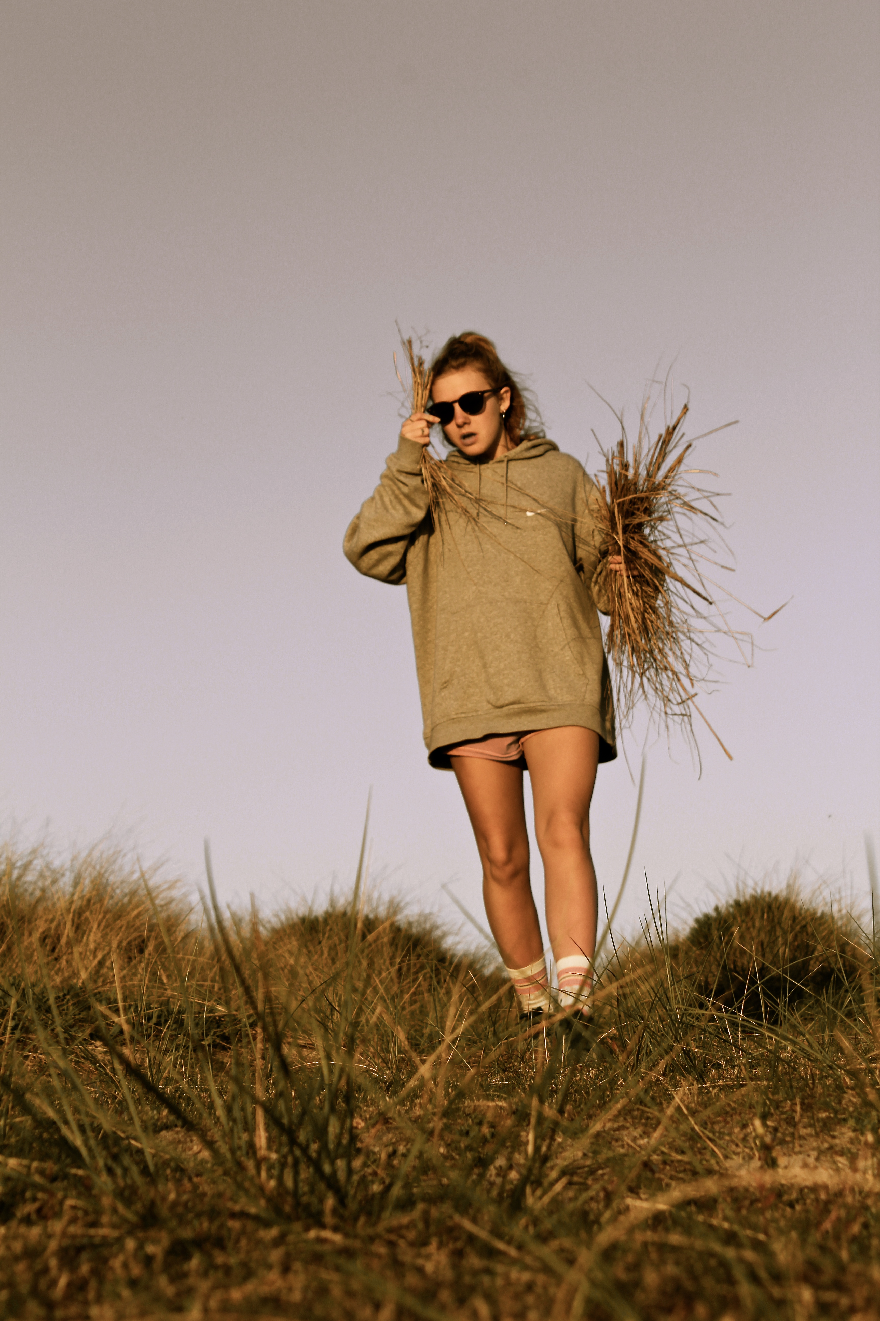
I chose the image below as I like how it looks like its been taken in a fashion photography style. Also, the image shows my use of experimentation with focal point, as the girls legs are more in focus than her face, which actually works well. When printed this is more obvious than on the screen of the computer.

