Contact Sheets

Contact Sheets


Sometimes called “contact prints” contact sheets were used much more frequently in the past world of photography than they are today. A contact sheet is a single piece of paper that is used to show all of the images from a roll of film or for single large format images. For 35mm and 120 film the developed negatives are placed on photographic paper and are then exposed onto the paper. This leaves a trace on the paper of the whole of the negatives, chraceristicaly leaving the sprocket holes and film data on the image also.

Contact sheets were a way for a photographer to be able to view all of his/her images in one place and be able to make easier comparisons between individual frames. Often using pens they would annotate, circle and frame certain images to denote if they are still useful or not, this is similar to how photographers do this today with digital images. When using Adobe Bridge or Lightroom you can go through your images and separate out the ones that you do want and don’t want using colours or numbers, by colour coding using different pens on a contact sheet the images you can do this also. Each photographer had their own method of doing this, come used an X to mark out images, others would put borders around images in different colours to denote different meanings, and some would circle specific frames.

This contact sheet above is of Marilyn Monroe, the flow of the images shows the method of the photo shoot. After processing and creating a contact sheet Marilyn herself has gone through the images, presumably with the photographer Bert Stern, and she herself has crossed out the images which she does not like. There are several contact sheets similar to this with her starring in them that she has also marked. The contact sheet below is another of these. This one is composed of a series of medium format negatives of the star, probably wanting to protect her personal image she has crossed out all of the 11 images, the publication of this image defeats the purpose of her crossing out the frames in the first place but that is beside the point, the fact that the contact sheet gives you a view into the mind of the photographer (or in this case the model) is very interesting. Normally the only image we see from a photoshoot is the one final image, but with this we really get to see the process of the photographer, we get to understand why they chose that one specific image to share over the others that they had available.

One of the most interesting things about a contact sheet is often why a particular image is chosen and why others were rejected. In the youtube video above Elliot Erwitt talks about his feelings towards contact sheets. He starts off by stating that a photographer should never show the world his contact sheets. This is not something that I agree with, I feel that sometimes the context behind why a photographer took certain photos to be one of the most interesting parts of the image. An example of this is “The Magnificent 11” by Robert Capa.

This set of 9 images from the D-Day landings were taken by Capa when he landed with the second wave of assaulters on Omaha Beach. There were meant to be three rolls of images that he sent back but instead these are the only images to exist (frame 9 is published in many different places but the negative itself is missing). There are different theories as to how these other images were destroyed but that is not particularly important, however they were lost it is a great shame that they were. This contact sheet shows the surviving negatives and although small shows a really incredible insight into his short time on the beach. This is why having contact sheets is so important, if only the published images were shown then we would not see some of the other frames, the smokey, shaky, out of focus images that show Capa’s own fear.

This video above is similar to the first one but shows the works of William Klein instead. One of the specific points in the video (6:03) he talks about taking photos of a shop window, a person approaches the window and stands there “it’s a photograph” then the person starts pulling faces and it’s ruined. This ability to capture “the decisive moment” is often not thought about enough, because today we can snap away at crazy speeds we capture every moment and look back later, with film this was harder and so seeing how this perfect moment was captured is often very important. Klein also talks about the amount of time of a photographer’s work that is seen.

“The picture is taken at 1/125 of a second. What do you know of a photographer’s work? A hundred pictures? Let’s say 125. That comes out to one second. Let’s say, more like 250 photographs? That would be a rather large body of work. And that would come out to two seconds. The life of a photographer — even of a great photographer, as they say — two seconds.”

he mentions this because although the work of photographers takes a lot of time to set up in the end often is is only a second or so of their work that we really see. This makes being able to expand upon these single images so important, understanding an image takes more than simply seeing it. Thought has to be given to the background of the image and why we are seeing it over the other images that were likely taken at the same time.

This link was really useful for me in looking at how photographers mark their contact sheets. the hand written nature of the marks on the images really lends a touch of personality to the images. Not only has the photographer taken the image they are leaving this personal mark on them. The different colours work really well against the black and white images, they highlight different elements of the sheet to be looked at closer. Sometimes even making notes on the image or highlighting areas of the images for post processing.

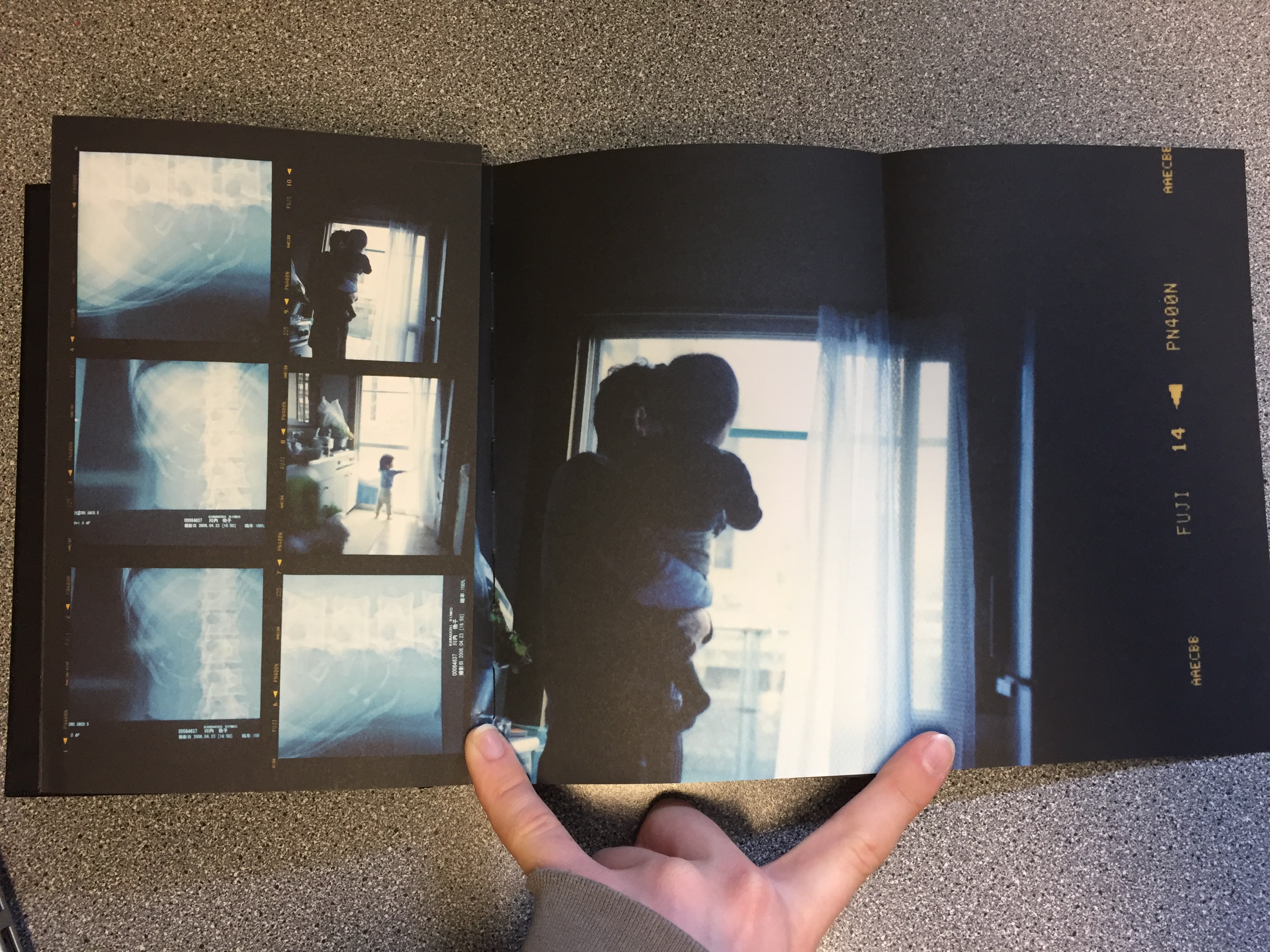
The book Sheets by Rinko Kawauchi is another example of this artistic use of contact sheets. Although the images  are not in the traditional contact sheet style they do show the progression of work that has happened throughout the life and work of Kawauchi. With folding out pages with larger images it is almost the same kind of thing as writing on the images. Attention is drawn to the photographer’s favourite images, and the other images are still there to give context to the best images. The book is fantastic because it not only shows the work of her for one project but it shows most of her work over her lifetime. Although more of an artistic book it is still a fantastic thing to behold. This link goes to the page for her book and this one to another page that shows some more of the pages.
Because I am using film for my project I could possibly look at making a contact sheet from the negatives and blowing it up or I could use larger printed images and make a background for them. By drawing on the images using different coloured pens I can create different effects, drawing attention to the different images and annotating them. Alternatively I could look at using the colours to complement the colours of the images, I have looked at the work of Klein briefly and will do in more depth but specifically his contact sheets project. He uses coloured paint on blown up negatives to create art pieces, the paint is not usually denouncing images but just to act almost as a frame for the real images.

This link also shows some other examples of famous contact sheets.

Environment – My Book Idea

As an idea for a photo book, I decided to combine the styles of two artists I had researched, Jacob Sobol and Theo Gosselin. Two books of theirs particularly inspired my own ideas, these were ‘Sabine: A Love Story’ by Sobol and ‘Sans Limites’ by Gosselin.

Sobol’s book,  which documents his experiences living within his Greenlandic girlfriend Sabine and her family in 1999, was taken over the course of three years. Sobol’s book records both in photographs and in narratives, his encounters with Sabine and their life on the east coast.

Many of the photographs are very intimate and personal and would may only really contain relevance to the couple themselves. Which is ultimately the aspect of this book that I want to focus on within my own, the personal qualities, that will only be sentimental to myself and the subject.

The photographs from Gosselin’s book, were taken on various road trips in the US, Scotland, France and Spain. His images are full of youthful energy which captivate the viewer with stories of freedom love and friendship.

The book reveals his attempt to communicate the actual visual conditions seen at the time of the photographing. This is similar to how I wish to portray the images within my own book. I am showing the viewer a scenario of raw emotion, which is real as it’s exactly how it was at the time.

I am venturing with my closest friends to locations that are full of life and freedom and capturing them as they act in their youthful ways.

My Final Prints

How I will present my Final Prints; 

I have chosen 5 photographs for my final prints. I’m going to mount them onto foam board separately, as I’ve designed a book which already puts them together as a story, so for my prints I want them to represent their own journey. The reason for presenting them on foam board is because I feel the images are too contemporary to have a border around them. I have experimented by choosing both landscape and portrait layouts for my final prints.

Final Prints; 

Image 1 – 

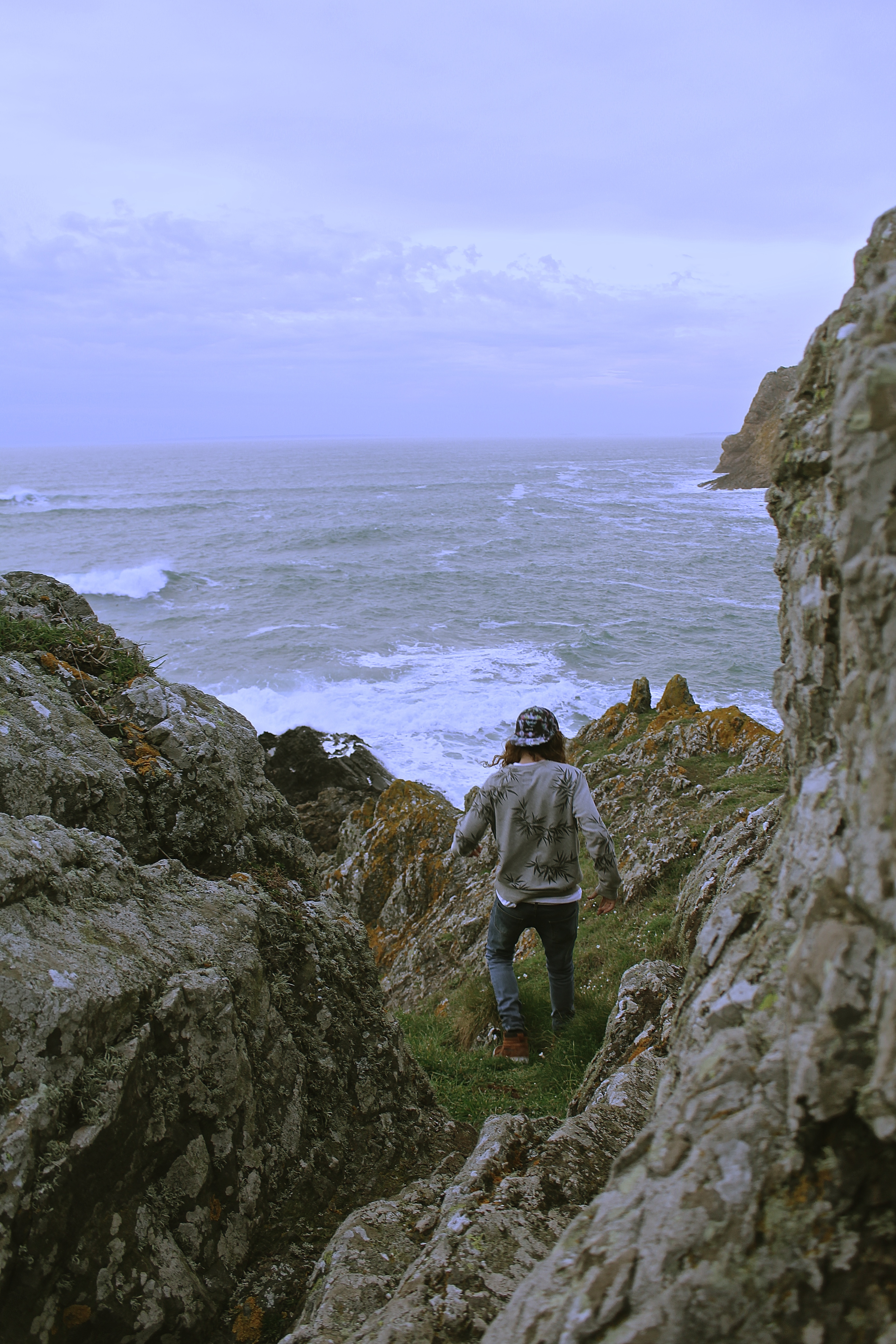
I love the image below, because the colour scheme works perfectly, his grey jumper with the grey stones and the brown shoes and hair combined with the brown seaweed. I also like how the image is shot from a birds eye view.

Image 2 –

The reason I selected the image below for printing, is because it’s very similar to one of the images I’ve selected for my book, except this has a portrait layout. This one is also framed by the rocks within the image, unlike the one chosen for my book. I would have put this one in my book although they were too similar for them both to be chosen. All my other prints I have selected have also been selected for my book as well, so I wanted something different.

Image 3 – 

I chosen the image below for my final print as it has a lot of energy and movement in it, which I wanted to represent in my photographs. I also like the surrounding the model is in and how it has a cinematic effect.

Image 4 –

The reason for choosing this image, is because I didn’t just want my prints to be just of individual models, I wanted to show the group journey. I love the natural lighting of this image, and the facial expressions of the model.

Image 5 – 

I chose the image below as I like how it looks like its been taken in a fashion photography style. Also, the image shows my use of experimentation with focal point, as the girls legs are more in focus than her face, which actually works well. When printed this is more obvious than on the screen of the computer.

Pieter Hugo – Artist Reference

Pieter Hugo is a white Johannesburg born South African photographer. One of his first bodies of work entitled “Looking Aside” Produced in 2006 consisted of a series of studio portraits of people with striking appearance that cause people to avert their gaze for various reasons. This often included people with albinism, birthmarks or visible signs of blindness.  Hugo described his subjects as people who  “whose appearance makes us look aside” these portraits are conducted in a formal studio setting, they are simply composed, similar to a passport photo. The lighting (in the first three images below) is not particularly harsh or soft, but somewhere in between. I think these images have been seen as controversial because there is a question as to whether or not Hugo exploited these people who may be self conscious about their conditions for the purpose of producing intriguing photographs. His photographs could also however, be considered empowering because he photographs his subjects in a way that makes them appear unconventionally beautiful as well as bringing light to people who have conditions that affect their outward appearance.


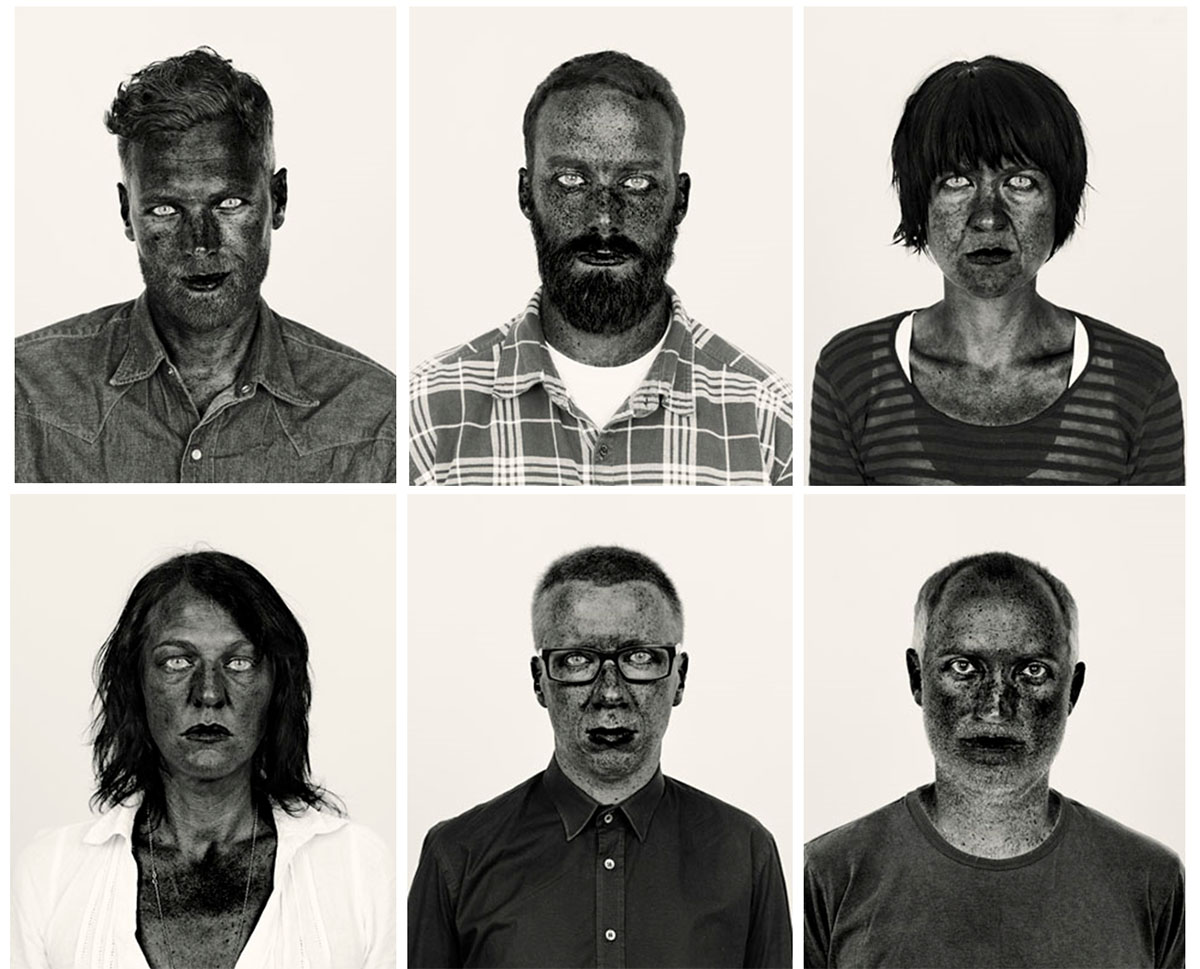
The collection of photos of Hugo’s was his image series which was made into a photo book entitled “There’s a place in hell for me and my friends” (images from which are pictured in a 2×3 grid below) This photo series of black and white photos are highly contrasted and the colour channels within the black and white filters have been digitally altered. This exaggerates the melanin  in the complexion of his subjects, making their freckles and imperfections more visible and act as a stylistic feature of the portrait. Many critics have described this form of photo manipulation as opposing response to their heavily airbrushed images of people in the media. The subjects within this project are of a variety of different races and ethnicities although the colour of their skin does not seem to vary too much when the same manipulation process is applied to the portraits, perhaps suggesting that the colour of human’s skin is really not that different in terms of the biological makeup. Aaron Schuman stated in response to this photo series that “although at first glance we may look ‘black’ or ‘white’, the components that remain ‘active’ beneath the surface consist of a much broader spectrum. What superficially appears to divide us is in fact something that we all share, and like these photographs, we are not merely black and white – we are red, yellow, brown, and so on; we are all, in fact, coloured.”

The image above is Pieter Hugo’s self portrait which was included as part of his “There’s a place in hell for me and my friends” collection. This photograph is incredibly striking due to it’s high contrast and despite its very simple composition. All of the portraits from the previously stated collection were cropped in the same way, a simple head and shoulder shot, similar to a passport photo. I feel that this was a creative decision to draw attention to the face of the sitter, this is also supported by the incredibly plain background. In the image above the background is a very light grey colour, the whites of the eyes and the white of the shirt are much brighter than the background and this helps to bring the figure forward. The most striking element of the image is the contrast between the eyes (both the white and the very pale irises) and the skin. The skin is given a very interesting texture as the way that the photo is manipulated brings all the ares of pigmentation to attention. The texture of the beard is also very interesting as the fewer lighter coloured (perhaps grey) hairs stand out against the rest of the darker hairs.

I was drawn to Hugo’s work because of the dramatic, intense and captivating nature of his portraits in his “There’s a place in hell for me and my friends”. I also liked the fact that Hugo does not worry about flattering his sitters in this series and he also includes himself in his work. I want to take inspiration from his high contrast portraits as I feel that my angry feminist photos would work well with the intensity of this style of photo manipulation.