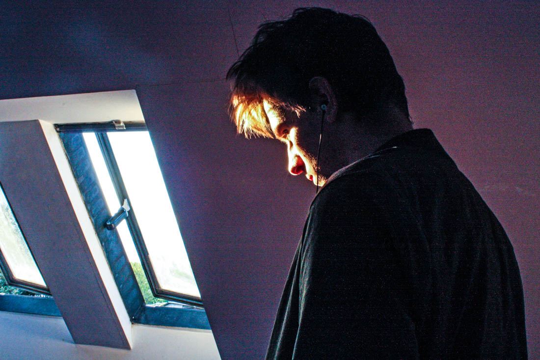
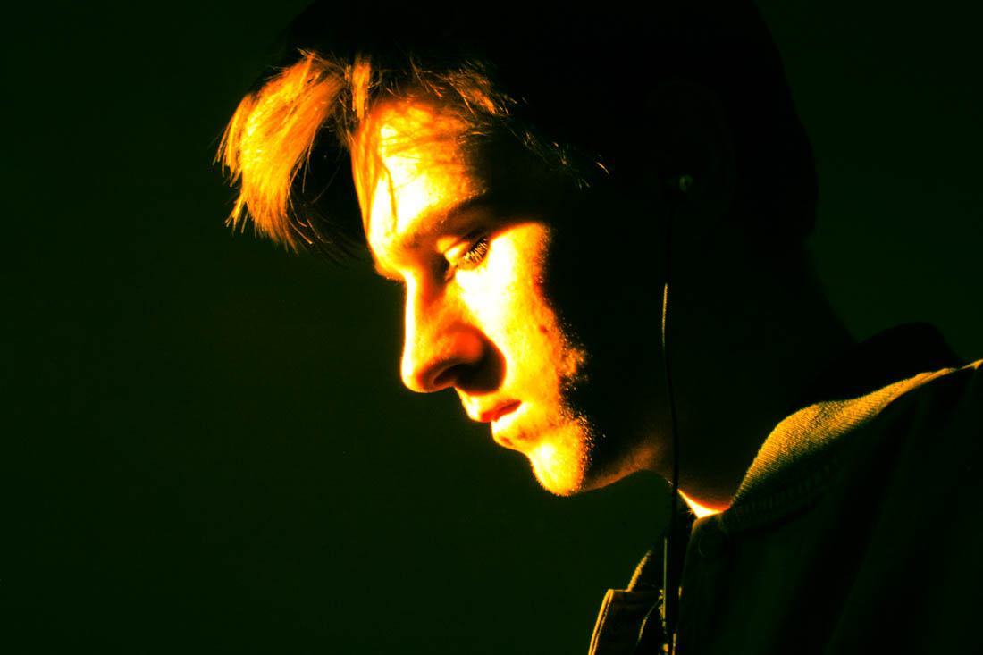
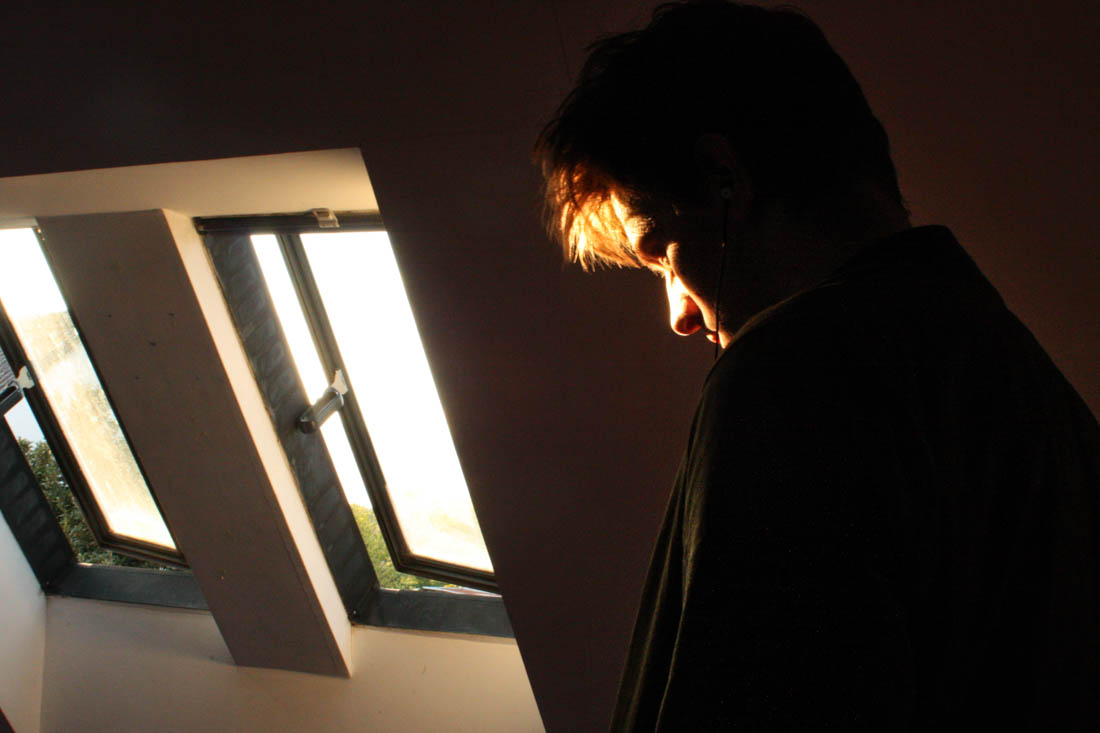
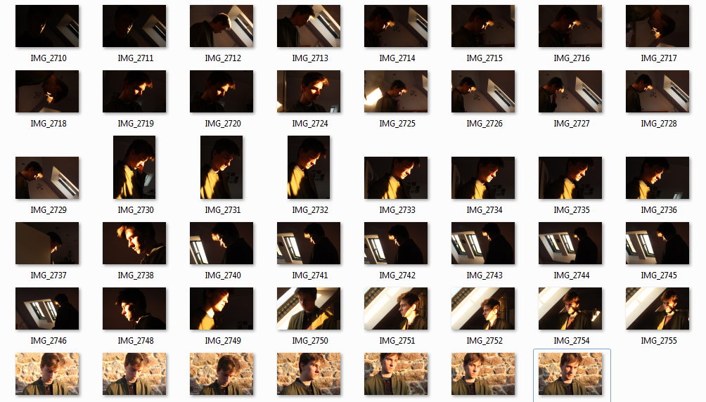
 In response to Bill Henson and Todd Hido’s portraits, I wanted to explore the use of interior scenes and the use of natural lighting to build narrative and add emotion and feeling. In relation to my starting point, the natural light contrasts the dark spaces created by the walls and small light sources. I took over 50 photographs, each experimenting with different ISO’s and exposures and I also left it on auto focus, this evoked a sense of depth without creating overly blurry photographs, I also tested long exposures to give the photos a ghostly effect. I did not use a tripod and in hindsight this would have been more beneficial for creating a sharper image especially when working with longer exposures. I decided to not use multiple exposures or HDR techniques unlike many of my previous landscape photographs as I wanted to keep the strong contrasts of dark space with the warm light. The composition of the photographs features closeups as well as shots that feature more of the open space which reflects a bigger sense of environment. I have also made the compositions to work with a book layout so they could possibly work with a double page spread but also just on a single page, complimented with a text on the opposite side.
I first edited the photograph in Photoshop by using the spot healing brush tool to remove lights and posters that cluttered the image.This would also enable more room for accompanying text. I then used the adjustments> Shadows/Highlights to add more light into the image without the lighter points being overexposed.
The strong contrasts reflect Bill Henson’s work with his use of chiaroscuoro. I wanted to keep most of them in colour as I wanted to reference how Todd Hido had created warm tones photographs with natural light, I adjusted the original images only slightly to give a slightly more even, cooler effect. I like how the light bounces off white surface which gives the photographs a softer effect.
I wanted to capture the light reflecting off Ryan’s face with Ryan facing the window, so each would be opposite each other. In the first photograph I like how the white wardrobe has reflected light into his neck, adding a sense of depth to the image. I set the image to a slower shutter speed for the second above image, creating this ghostly movement effect, I found this photograph worked best in black and white to bring out the tones and shades more. For the third image I used a quick exposure time to capture just the light that hits his face, also evoking a sharper image, the huge amount of black space creates similarities between Henson’s dark chiaroscuro style portraits.
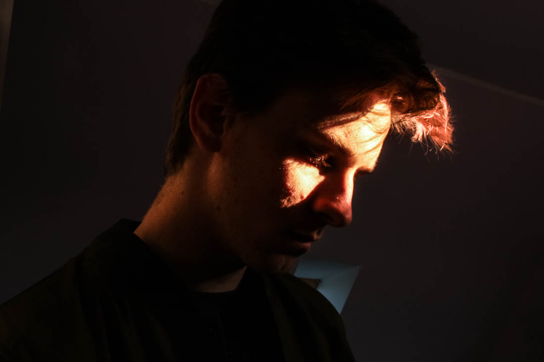
I really like the above image for its use of Rembrandt lighting and how the lighting evokes an interesting glowing texture. I also like the contrast between the warm tones in the highlights and the cool shades in the background such as from the window. I decided to keep the window as I found it added a sense of depth to the image.
I decided to create a closeup portrait featuring only the light from he window and a plain background. I used the preset features to show experimentation, the last two images are two different cross process settings with add an interesting tint to the images inspired by how Bill Henson will often change the image white balance.
Below is an experimentation image inspired by Bill Henson. I added lots of contrast and clarity to give the photograph a grainy texture. I also added vibrancy to bring out the colours as well as changing the white balance to an overly cool tone.
