On the next day of my travels, I visited the capital of Italy, Rome. Rome was once the cradle of one of the globes greatest civilizations ever, and is a historic centre of power, culture and religion. The city has exerted a huge influence over the world in its roughly 2800 years of existence. With wonderful palaces, churches, grand romantic ruins, monuments, ornate statues and fountains, Rome has an immensely rich historical heritage and cosmopolitan atmosphere, making it one of Europe’s and the world’s most visited, famous, influential and beautiful capitals. I was incredibly excited to visit Rome as I am fascinated by history and have read and consumed so much material about this famous city. I had desperately wanted to the visit Rome for many years and was excited to take some photographs upon my visit. I had to remember and consider my project idea, which was to produce work that could be utilised as a backdrop for external illustrations. This would involve focusing on elements such as lighting whilst maintaining a direct focus on the city itself and trying to capture the atmosphere and style. Below, I have included a contact sheet of all photographs taken on the shoot .

Rome is traditionally said to have been founded by the mythical twins Romulus and Remus on 21 April 753 BC. The twins were abandoned as infants in the Tiber river and raised by a wolf before being found by a shepherd, who raised them as his own sons. The settlement developed into the capital of the Roman Kingdom, led by a series of Etruscan kings, before becoming the seat of the Roman Republic and then the centre of the Roman Empire. For almost a thousand years, Rome was the largest, wealthiest, most powerful city in the Western world, with dominance over most of Europe and the Mediterranean Sea. Even after the fall of the Western Roman Empire in 476AD, Rome maintained considerable importance and wealth. Beginning with the reign of Constantine I, the Bishop of Rome gained political and religious importance, establishing the city as the centre of the Catholic Church. Throughout the Middle Ages, most of the city’s ancient monuments fell in disrepair and were gradually stripped of their precious statues, ornaments and materials; these were either recycled in other constructions or, as in the case of marble, baked in order to obtain mortar for new buildings. With the Italian Renaissance fully under way in the 15th century, Rome changed dramatically. Extravagant churches, bridges, and public spaces, including a new Saint Peter’s Basilica and the Sistine Chapel, were constructed by the Papacy so that Rome would equal the grandeur of other Italian cities of the period. The city became the centre of Baroque architecture, renowned artists such as Michelangelo, Bernini and Caravaggio worked there.
To summarise my experience, Rome exceeded my expectations and I was amazed by the appearance and design of the city. Rome is essentially a giant piece of art, the architecture and street design is articulate and decorative drawing emotion just like a painting would. You are forced to look in all directions just due to the sheer amount of history and culture that constantly surrounds you. On every street corner you are confronted by another church or monument with its own individual story and history. It felt like a city where life was built around the history, monuments and ruins rather than on top of it. There is a beautiful combination of old and new which creates a vivid contrast. Nevertheless this juxtaposition feels natural as the aesthetic of the city is maintained throughout and no building looks out of place. Architecturally and culturally, these contrasts are shown through areas with pompously huge majestic palaces, avenues and basilicas which are then surrounded by tiny alleyways, little churches and old houses. You may also find yourself walking from a grand palace into a small and cramped Medieval-like street. Hopefully I captured this within some of my favourite images below.
— Its important to note that these images have been selectedwith the intention to develop with illustrations. They are not individually the best photographs from the shoot, but provide the best opportunities for overlaid drawings. —


These two photographs display the Arch of Constantine. This is a triumphal arch in Rome, situated between the Colosseum and the Palatine Hill. It was erected by the Roman Senate to commemorate Constantine I’s victory at the Battle of Milvian Bridge in 312. Dedicated in 315, it is the largest Roman triumphal arch. The statues at the top were taken from the Forum of Trajan. They depict Dacian captured soldiers, defeated by the Trajan army. The relief panels between the statues were created for Marcus Aurelius while the roundels are from Emperor Hadrian’s time. Some figures in the roundels were modified to resemble Constantine. The decorations on the central and lower part were created specifically for this triumphal arch. I really like these two images, despite their basic compositions. The blank emptiness of the sky really compliments the complexity of the arch design, enabling the engraving and sculptures to truly stand out. The lighting works effectively, casting delicate shadows from the details of the monument. The main reason why I selected these two photographs is because I believe they will be highly suitable for draw on top of. As mentioned before hand, the blank sky can be taken advantage of, as it provides a blank canvas for my illustrations. Perhaps some Roman history can be incorporated within the artwork.


These 4 Photographs are very different from the remaining shoot, as they are portraits. Here, you can see some images that I captured of my sister as we travelled throughout the city. I think that its always a positive to obtain variety within a portfolio and implementing a few images that break the trend of landscapes can be effective. The portraits incorporate more of a personal feel to the project as I begin to integrate my life, friends and interests within the work. It provides the photography with personality as it becomes unique to me. If my travels through Europe are being presented as a story, the audience is now supplied with characters within the narrative. This assists significantly with story-telling. In the first two photographs, we see closeups of my sister, one outside the Colosseum and one outside the Vatican. Both these photographs retain a fun and youthful aesthetic, as portrayed through facial expressions. The happiness upon the subjects face can reflect upon the viewer consequently evoking cheerful emotions. I really like the reflective imagery within the subjects sunglass lenses as we see the surrounding environments duplicated and presented back to us through these small, distorted viewing-holes. For example, within the first photo we can identify the Arch of Constantine inside the left frame and myself in the right. A full perspective of the scene is shown. A similar effect is replicated in the next photograph, where you can see the statues within St Peters Square and myself reflected on the glass. The 3rd photograph features a slightly different composition, where we get a more enhanced look at the surrounding environment as well as a portrait. Whilst my sister is in the foreground, the background is occupied by St.Peters Square and the Saint Statues. St. Peter’s Square is one of the largest and most beautiful squares in the world. It is located in Vatican City, at the feet of St. Peter’s Basilica. The final photo is very different from the rest, as I attempted something peculiar and new. In this image, I have photographed my sisters phone capturing my reflection in the front-camera. The image itself is not very interesting, but I think I could create something unusual with additional illustrations. The phone surface presents me with a canvas that is in direct view of the audience.


These 4 photographs are more casual, displaying less grand sites. Moving away from monuments, churches and ruins, for the first two photographs I have directed my attention towards ordinary streets and alleys. I wanted to capture average Roman lifestyle as oppose to the landmarks and tourist attractions that we are accustomed to viewing. Both photographs are simple, but as explained previously, this is perfect from digital manipulation and editing, which is why they have been selected. Both images share an appealing colour palette, the oranges and cream-painted walls evoking a warm and European ambience. We get a summery feel from these images which I like. In the first photo, the uniform, organised layout of windows creates a sense of satisfaction, as we see the blinders, open and closed, line the walls of the street. I like the texture of the wall, the paint beginning to fade and crack suggesting a sense of imperfection that is also present in the second image. I thought that the first photo would provide a fantastic opportunity to draw something within the open window in the foreground. Perhaps a resident within the room or a romantic balcony interaction.
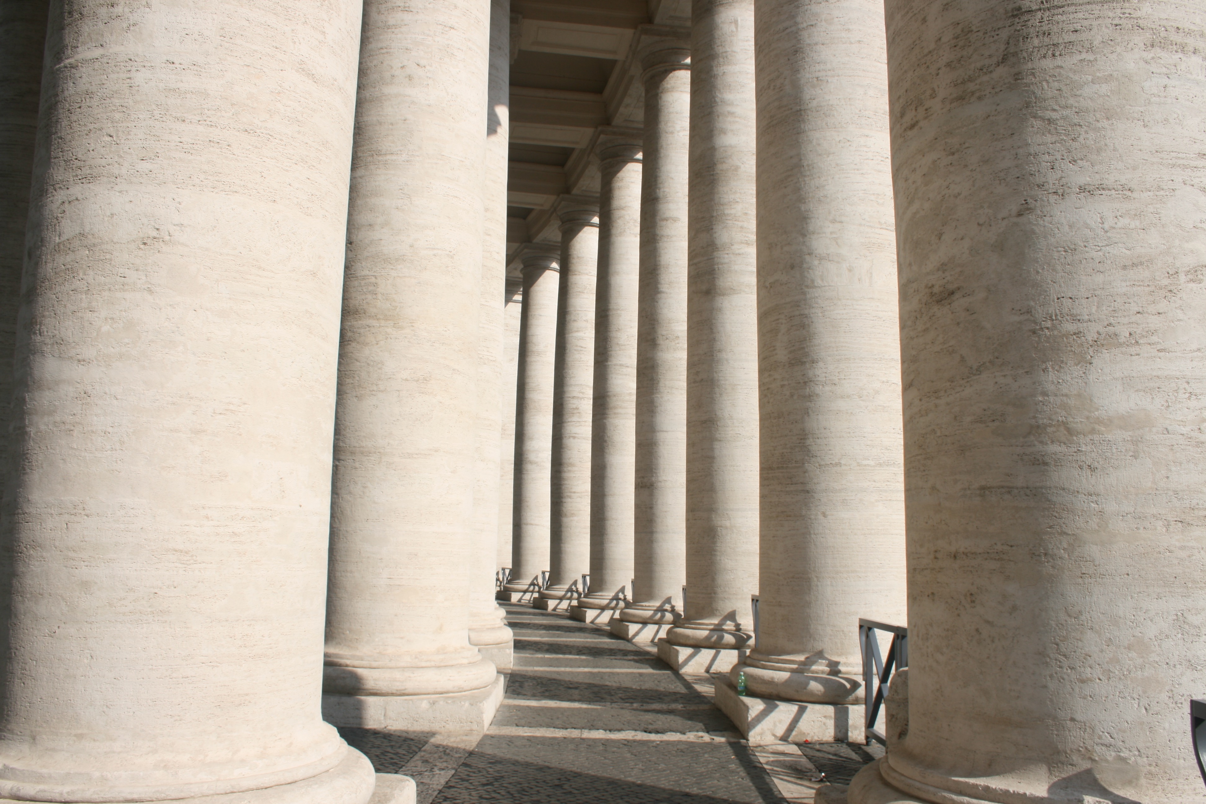
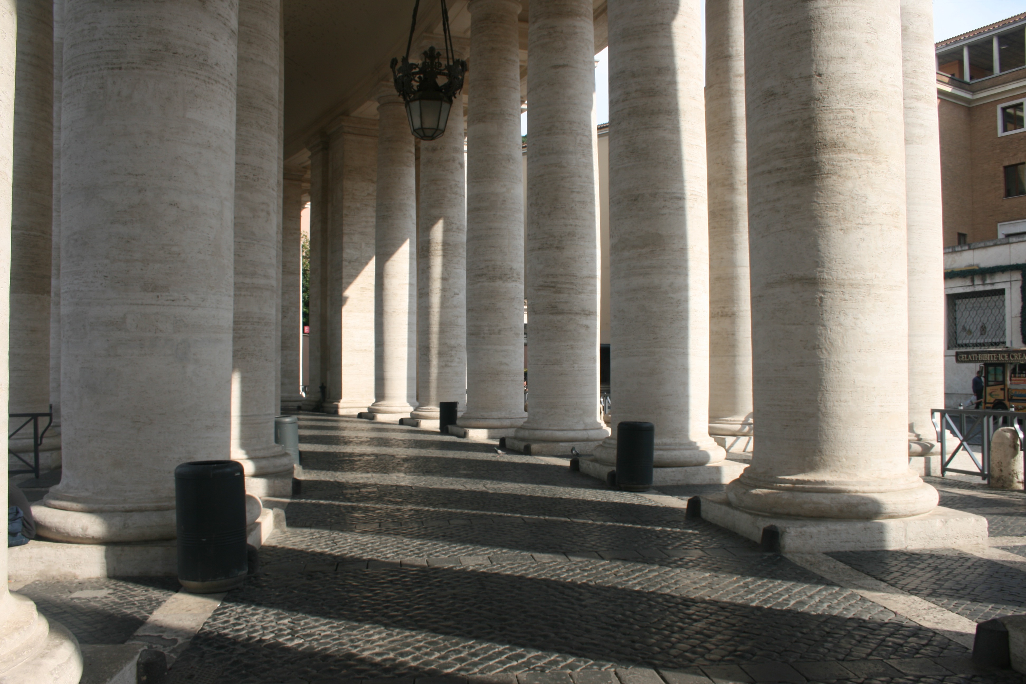
In the next two, I have captured the Colonnades that enclose St. Peters Square. The colonnades define the piazza. I really like these two photographs, the lighting working very effectively to create a domino-like effect. We see the large, marble columns spiral around the corner out of sight which leads the eye throughout the composition of the photo. There is a great balance of light and dark here, splitting the image into separate segments. Furthermore, another beautiful lighting display is presented on the clean brick floor as a zebra-crossing effect is created. The shadow of each pillar generates a striped pattern which is quite intriguing.


In these 3 photographs, I have tried my best to experiment with lighting, focusing on light and dark rather than direct content. The first photograph, again, depicts the Saints Statues within St. Peters Square. These Statues that lay ontop of the Collonades were directly infront of the sun, and consequently created some beautiful, angelic silhouettes. The way in which we are looking up to the Saints from a Low angle, almost creates some religious imagery as they appear to be above us in heaven. This is supported the the bright sunlight behind them that shines into the camera suggesting an opening in the sky. This photograph came out really well and I think it is one of the most successful pieces from the shoot. The following two photographs were taken within the Pantheon. The Roman Pantheon is the most preserved and influential building of ancient Rome. It is a Roman temple dedicated to all the gods of pagan Rome. As the brick stamps on the side of the building reveal it was built and dedicated between A.D 118 and 125.The original use of the Pantheon is somewhat unknown, except that is was classified as a temple. However, it is unknown as to how the people worshipped in the building, because the structure of the temple is so different from other traditional Roman temples.Probably one of the most fascinating features of the Pantheon is the Architecture. The dome would have been built to look like the heavenly sphere of all the gods that the name Pantheon evokes. The highlight of the site is the hole in the center of the domed ceiling, otherwise known as an oculus. This was an engineering gem of the Roman world. No oculus had even dared come close in size to the one in the Pantheon. It is still lined with the original Roman bronze and is the main source of light for the whole building. This was one of my favourite sites within the city and I wanted to include this magnificent oculus within my project. Consequently you can see it present within the second photograph which is quite abstract. I have stood directly below the hole in the ceiling and pointed my camera upwards, capturing the leaking light. This photo provides me with many illustrative opportunities to experiment with when I start drawing due to its abstract visuals. The final photo of this set is a statue of St Agnes. I like the way the lighting submerges the statues top half in shadow and the way in which a smooth texture has been included over the subjects clothing.


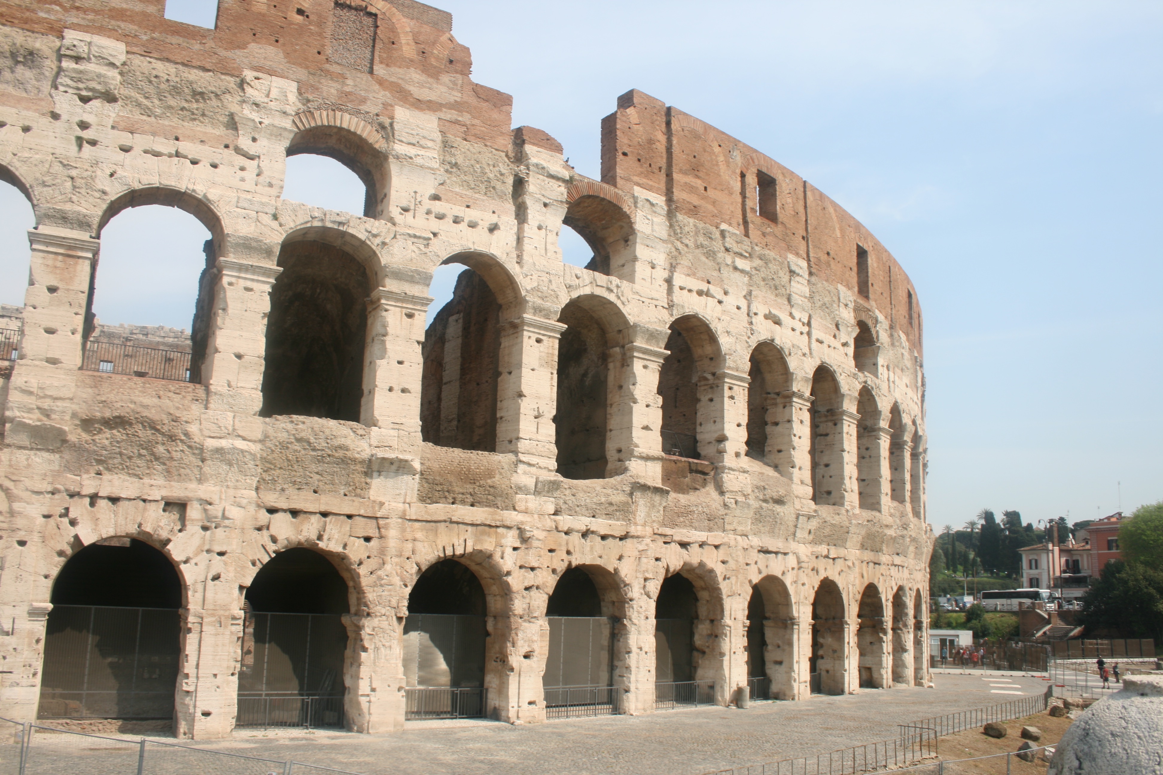
Finally, I have my photographs taken from my visit to the famous Colosseum. Located just east of the Roman Forum, the massive stone amphitheater known as the Colosseum was commissioned around A.D. 70-72 by Emperor Vespasian of the Flavian dynasty as a gift to the Roman people. In A.D. 80, Vespasian’s son Titus opened the Colosseum–officially known as the Flavian Amphitheater–with 100 days of games, including gladiatorial combats and wild animal fights. After four centuries of active use, the magnificent arena fell into neglect, and up until the 18th century it was used as a source of building materials. Though two-thirds of the original Colosseum has been destroyed over time, the amphitheater remains a popular tourist destination, as well as an iconic symbol of Rome and its long, tumultuous history. The Colosseum could hold, it is estimated, between 50,000 and 80,000 spectators. It was used for gladiatorial contests and public spectacles such as mock sea battles, animal hunts, executions, re-enactments of famous battles, and dramas based on Classical mythology. The building ceased to be used for entertainment in the early medieval era.
I think it is integral that I include the Colosseum within my project and study on Rome. This is due to my belief that it is the most famous building within the city and therefore Representative of its history and culture. I have tried to include a nice variety of responses for this landmark as seen above. The first image would be ideal for the drawing stage due to its simplicity and basic composition that would provide me with more freedom when drawing. Some kind of artwork could easily be implemented within the blank sky or upper quarter of the architecture due to its lack of texture or detail. The photo is not fascinating but will serve effectively in its complete purpose. The second image is more generic and what we would typically expect from Colosseum photography. The picture features a full survey of the scene and we can admire the arena in its full beauty. Given that the site is so recognizable and identifiable within this photo, I think it would be ideal to consider it for further development. And then finally, I have taken a slightly different photograph that moves away from the grand, imposing scale of the stadium and focuses more on the mundane interior details. We see an archway entrance that reveals the colosseum interior like a window. The main focal point of this image is the lighting which works effectively due the way in which light is seeping through the archway and generating crisp silhouettes.

I can see that you have a few drafts, but overall you need to show evidence of a lot more work – another 12-15 blog posts.
Make sure you follow steps from action plan we did last week and that you reference all artists discussed.
What’s your thoughts on final outcomes and presentation?
Have also a look at these AS students responding to another way of drawing onto images – It would be good if you could develop extend your experimentation that you have begun as I;m concerned that one approach is not enough to achieve higher marks.
https://hautlieucreative.co.uk/photo17ase/author/zpannenborg07/
https://hautlieucreative.co.uk/photo17ase/2017/04/24/my-favorite-final-image-structure/
https://hautlieucreative.co.uk/photo17ase/2017/04/27/final-evaluation-of-stitching/
Painting/ drawing onto photos https://hautlieucreative.co.uk/photo17ase/2017/04/28/structure-the-process-timeline/
See als this wirk here on collaging images and found images
https://hautlieucreative.co.uk/photo17ase/2017/04/28/final-collage/