Born near Le Havre in Normandy in 1990, Théo Gosselin grew up in the deserted streets of this grey city from the north of France. Passionate about drawing, music, and cinema, he chose a path through the art school, and graduated in 2012 as a graphic designer in Amiens. He started photography around 2007, and it Became his reason to live. He loves to capture the simple life, love, good and bad moments, his friends and his adventures. Eternal traveler, Europe and USA and share his way of life with the people He loves ; because the truth is in wide open spaces and in the heart of the characters that meet along the way.

Gosselin’s photography reveals friends in the act of escaping from their regular lives into newly enticing and perilous modes of existence, ever in search of the persistent though elusive idea of freedom. His interest in cinema is reflected throughout his work with the cinematic style photographs he creates.

At times, Gosselin´s work approaches something similar
to poésie bucolique; his photographs representing modern day pastoral landscapes that resemble 21st century equivalents of Poussin’s Et in Arcadia ego, Manet’s Déjeuner sur L’herbe or Cézanne’s Les Grandes Baigneuses. At other times, his images capture moments more similar to, Rubens or Levêque.

The subjects in Théo Gosselin’s images are friends rather than models, and the situations are not mythic constructions but glimpses of an underground lifestyle in a post-9/11 and post-AIDS world in
which social media has blurred the boundaries between public and private, and between being documented and just being.
In august 2012, he made his first motion picture, “Goodbye Horses”, a road movie in which he is an actor with 4 friends. They bought a van and departed from New York in a van traversing the United States by 20 000 km from East to West to deliver a package in Los Angeles. An unprecedented adventure that changed the way they saw life and helped them explore themselves by discovering the beauty the American land has to offer. They were living the life of nomads in their van, they documented every moment on the road and shared many memorable moments, which created their special bond on a journey that they never expected.
Exploring various aspects of the American lifestyle, the youth, and the excitement of life on the road are some themes he covers in his work. The youthful style in which he entices his photographs towards representing an instagram-esque filter style, using warm temperatures and snapshot style straight shooting.

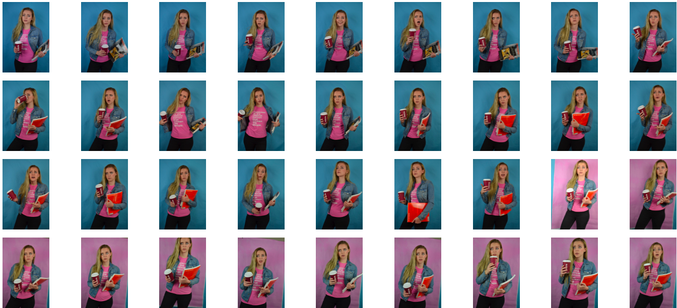


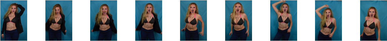
 When selecting my final outcomes out of the images above I wanted to make sure that I included a varied selection of each subject I have created. Below I have chosen five photographs (out of the 12 original images) that each show its subject matter either from a different viewpoint or in a different light. When it came to editing these photographs the first thing I did to all of them was make them more dramatic and eye-catching by playing with the exposure, shadows and contrast. After this, I judged each photograph individually and went through my normal editing routine of changing things like colour, temperature, clarity, saturation, highlights and blacks. The reason I have decided to keep all these outcomes in full colour is because they are aimed to catch my viewer’s attention and really stand out.
 The final outcome above is my favourite result from this creative symbolism shoot. To create this subject matter I used a black sheet of fabric I had at home as well as a Nutella jar lid, some old fishing rope and loads of plastic bottle caps that I found on a few of Jersey’s beaches; ultimately arranging them into the shape of a fish. Although abstract and eye-catching the context of this image is to spread awareness about something very bleak. The reason I have created a fish is because it is a good symbol for the ocean and its ecosystem and can give the viewer an idea about the wider message I am trying to get across. I love how I have captured the composition of this subject matter and enhanced its dramatic intensity by manipulating colours, contrast and highlights.
 The next final outcome displayed above depicts a jellyfish made with blue rope creating movement in the background, bottle caps forming the shape of its head, and separated strands rope as the tentacles. Although I was not really planning on creating this subject matter, as jellyfish are not really symbols of the whole underwater eco-system, I have found that this idea has, in fact, worked very well. The meaning of this subject is to show a futuristic world where all marine life has been replaced by our waste. This is futuristic tone is emphasised by the neon colours I have created and the black dark ocean background. Overall I think this abstract piece has a really strong centred composition and I have managed to create a really intriguing yet ominous tone.
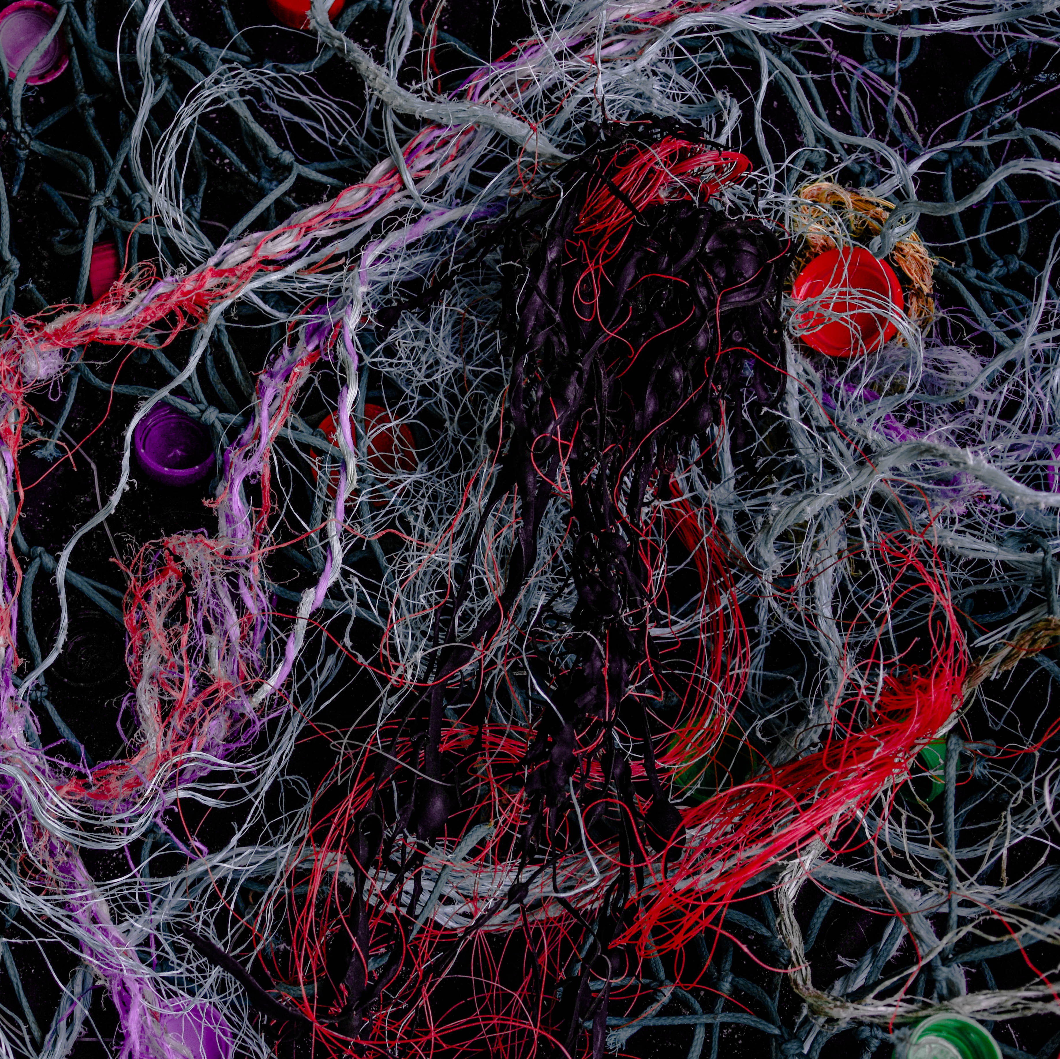 Next is an abstract image that has a very different subject matter to all my other final outcomes from shoot. This photograph depicts a massive amount of material and plastic fishing ropes/lines along with bottle caps and an oddly shaped piece of seaweed in the middle. The shocking thing about this, for me, is the how easily I managed to source these discarded materials washed up on a few of Jersey’s famous beaches. The symbolic message behind this image is pretty much a realistic version of the final above, where a jellyfish-shaped creature is being engulfed and tangled in pollution. The reason I chose this as final outcomes is because of the intriguing way I have managed to digitally manipulated the colours of certain ropes/lines and toned down all the rest.
 Lastly are two more images that are aimed to give an insight into the problem of ocean pollution and hopefully make the viewer think twice about how they discard their waste. The meaning behind these two photographs is quite similar in that they both show a futuristic ocean scene that has been completely taken over by synthetic substances. The first piece on the left is simply a differently captured and edited version of the larger final outcome above. I have chosen to add this to my results blog post as well because I love the dramatic effect the subject has it fades into an ominous black border. The last image is of my fourth subject matter that I had previously planned out to depict a wave created by pollution. I love this outcome as I think the message is really clear as well as the composition of materials showing movement and intricate textures.