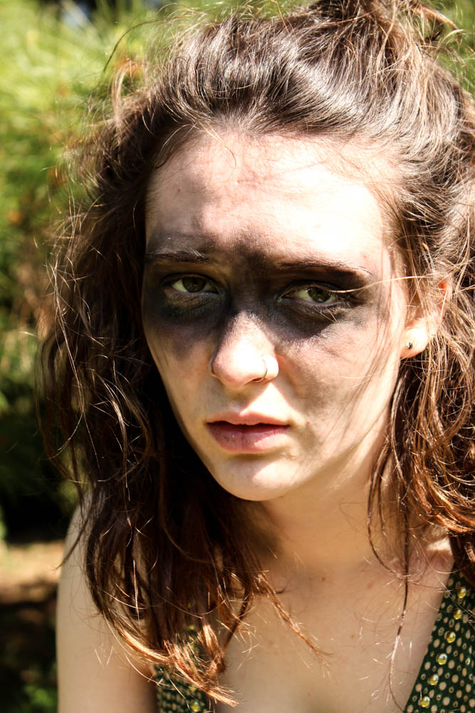
This was my second photo shoot in which i created a potential character which lives within the den. This one was to correspond with my wood den and therefore i decided to make my subjects face look muddy and dirty as if she has been living among the woods. I got her to dress up in a a green dress as i wanted to continue on the idea of camouflage which this den revolves around so much. Overall i think the images work really well. For this particular shoot i decided to use my sister as my model as she has green eyes and i thought that this would correspond further with my den. I defiantly think i have got some images from this shoot which i can use. 
The above and below images i took in a portrait framing, the light in both images coming fromt he right hand side of the frame. Both images are very similarly composed, it is simply the slight angle of the subjects head and the expression which differs. The angles of the subjects face in the image below appear a lot sharper and therefore cause the subject to have a tougher impression. The top image is a lot softer as the subjects face is facing towards the camera directly. The light in both images is quite a harsh light which contrasts which the dark marks on the subjects skin and also the subjects skin being very pale. The skin almost becomes washed out to a bright vibrant white by the light. The subjects hair in both images is very wild and therefore frames the face well as it blows in and around the face in a natural way. I used a narrow depth of field in the images so as to blur the background behind the subject. I quite like however how you can still tell clearly that the background is filled with pine leaves. This then links the location directly to the den images and creates a link between them. Something which i had a problem with was that i couldn’t take a picture in which my subjects eyes had the sunlight illuminating them without washing out the entire of the subjects face and creating terrible images. I therefore opted that for these images i would focus on the lightning of the face rather then the eyes. Overall i think i prefer the below image for a photograph which shows the whole of the subjects face in a more formal portrait.

I also took some more abstract images as you can see from the images above and below. Above i experimented a bit with focus, having the focus in the background rather then the foreground to add mystery. I think the outcome of the images turned out okay. I like the below image best because of the contrast between the sharp lines of the light and the dark shadows of the rest of the face. The brightest point of the image is where the light from the right hand side cuts lines across the face. The subjects hair which then blows across their face creates a wild impression and also adds flicks of light as the stands capture the light. The image is composed so that one of the subjects eyes is directly in the center of the frame. I quite like the abstract nature of the image.


The above image is one i managed to capture which had light in the subjects eyes. I really struggled to get my subject at an angle in which i could easily show the light colour of my subjects green eyes. I think this image only really works because the background is such a light green colour that it brings out the lighter green colour of the eyes. I used a really narrow depth of field in this image to blur the background but keep the foreground in focus. This blur causes the subjects hair to look straggly which was the impression i was going for with the whole wild look. Only the immediate foreground of the eye was in clear focus, the black mud on the face contrasting with the white skin of the subject. I quite like how the blur of the rest of the images means the little details of the hair of the eye brow and the eye really stand out.


