Shoot Ideas

The idea that appeals to me the most is looking at my personal environments. A personal environment could be very different from one person to another. For example, someone may think it is your mental state, whereas others may think it

Using mainly documentary photography and portraiture I want to explore the differences between peoples ‘Personal Environment’, as exploring some of my own personal environments.

I D E A S –

  • Shoot documenting girlfriend // photographing in a more intimate way to portray the environment of our relationship, using close ups and possibly shoot in monochrome – inspired more by Jacob Sobol.
  • Documentary shoot of my home // focus on what makes my home my personal environment – feels safe, the personal elements of it.
  • Abstract shoot in car // I am always travelling around in my car with friends, so I could portray this environment in a more motion-full way experimenting with low shutter speeds, flash and zoom.
  • Friends // portraying my social environment made up by connections between people – theo gosselin style photography  – could also look at the social environment of skateboarding, and photography in both the style of tradiotional skatboard documentation as well as more modern cinematic skateboard documenting styles – looking at the sport and culture around it itself.

– this video above gives some information on the uprising popularity of skateboarding in southern england, and how the culture of the sport has had to fight to stay alive. This video helps portray the social and cultural environment that skateboarding has become today through motivation to keep the sport alive, and the fast spreading popularity of it.

  • Landscape and documentary shoot in North Yorkshire // when I go to Yorkshire at the end of this month it will be a great chance to experiment with cinematic-esque landscape  and portrait photography. The North Yorkshire Moores are meant to have some of the most breathtaking landscapes in England.


The Journey

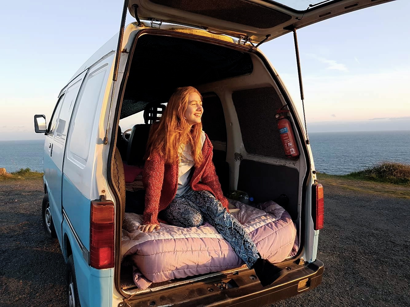
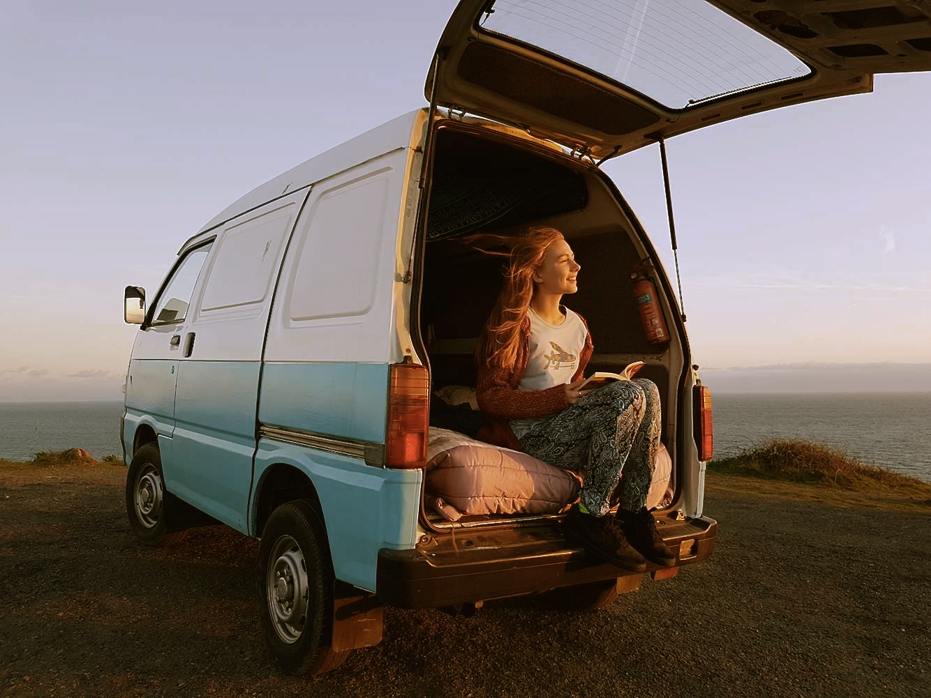
The reason behind this shoot was because it makes all of my photographs come together, as what I wanted to represent was some young adults on journey, exploring, taking in beautiful landscapes etc. Showing what they would do when away from home and away from the worries of typical every day life. Therefore I wanted to show a carefree youth. The van represents the literal movement between each place I’ve photographed, and show’s how relaxed they are on their journey as all they need is a bed, some books, and a camera to capture their moments. For my final outcome, i’m going to present it as a book, with all my favourite photographs to show the journey their vans have taken them on.

I choose this location as I wanted to show that the people I photographed would just pull up in a beautiful area and stay there for the night. Even though this is a fairly remote location, there were still other cars and people in the background, therefore we had to park the car so they wouldn’t be in the image. I also parked the car in the position which used the natural lighting to my advantage, as I originally was going to park it the other way so I could capture the sunset and the more scenic background, however because of the lighting I wouldn’t be able to get the natural lighting on the models face and show the little details which were important to the shoot.

The photographs below taken in black&white remind me of documentary photography, as they’re self explanatory and documentary photography generally relates to longer term projects which mine is meant to represent a group of my friends travelling.

I think these two photographs work really well together as it shows the movement of the model, and the composition is exactly the same, so it works nicely as a couple. The weather was perfect for the day as the wind made her hair blow and it made the photographs have more character.

The photograph below is shows the models surrounding and shows her looking directly at the camera. Therefore, because she’s looking at the camera it makes it feel as if she’s interacting with the person taking the photograph, and this makes the person who views the image feel as if they’re in that moment.
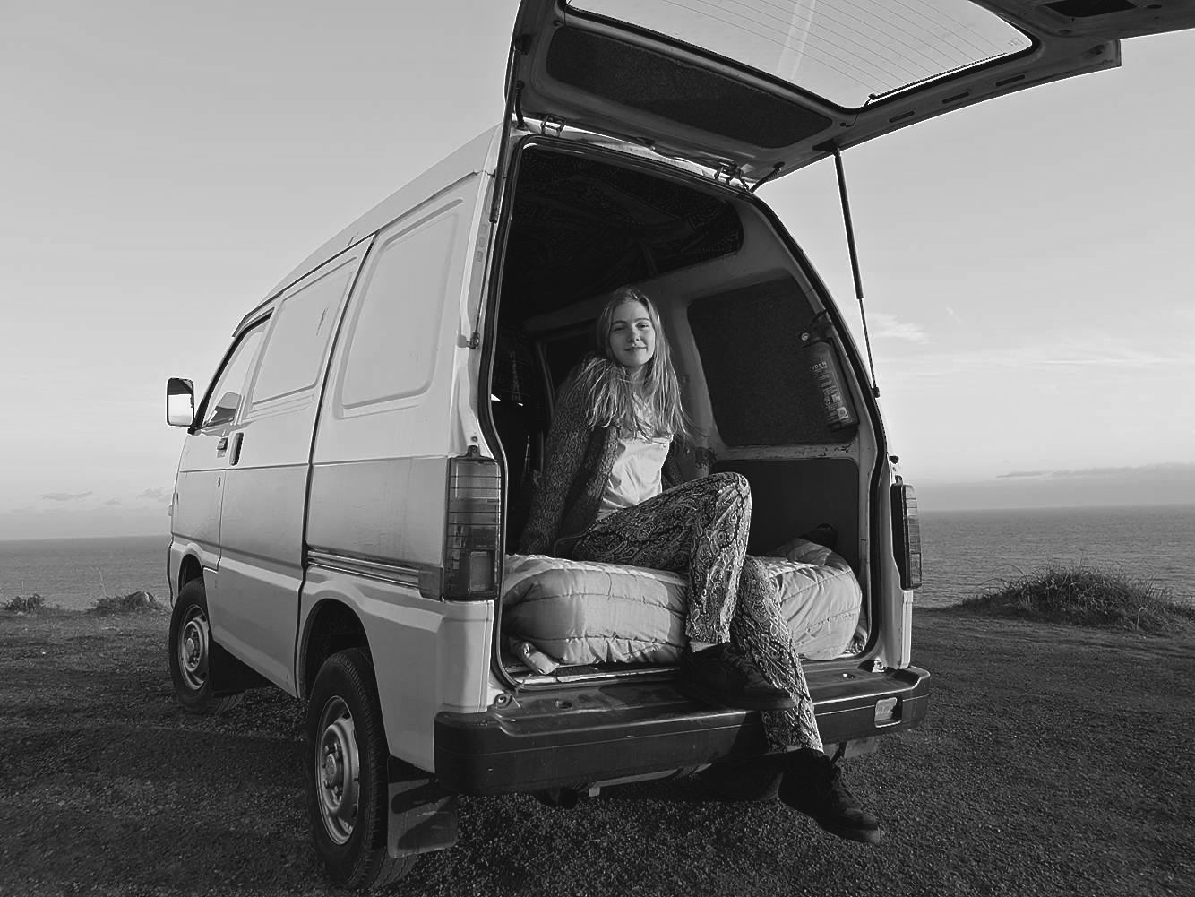
Referring back to the quote by Ted Grant, which I’ve analysed in my previous shoots; “When you photograph in colour you photograph their clothes. But when you photograph in B&W, you photograph their souls.” I think this quote is very true and important for the type of photographs I’m trying to capture, as I want my images to portray the basic life of a free soul.

For this photograph I was originally going to get the model to lie down surrounded by the pillows on the bed, however I noticed the lighting lying down wasn’t the best and there was a bit of natural lighting coming through the window so I made the model sit up against the back of the van, so i could capture the concentration on her face whilst reading the book.

I then left some of the images in colour, as the sun lit up the models her beautifully and made the images very colourful and therefore look playful.

Frequently in my shoots, I’ve captured the models hair blowing in the wind, an example is given below. This is due to the wind creating a carefree image. The natural lighting also captures the hair blowing and lights up half of her face and making her features stand out. I like the fact the model is not smiling in this photograph as it shows the images are purposely meant to look as if they’re not posed;

“photography is about capturing souls and not smiles.” Dragan Tapshanov.

The reason I believe this photograph works well is due to the composition of the photograph, because where the line of paint stops on the van it starts on the other side yet the line of the horizon.
For the images below I tried to capture it from a different perspective, and I took it up-close to create a more personal effect between the model and the viewer.

In the image below, one can see that it has had a filter added to it, like many of my photographs. This is done to add a certain feeling or aesthetic to the images;

“A lot of people in the art world hate to use the word Photoshop like it’s cheating or easy or something. I say bollocks to that. For me, it’s my tool, my paintbrush if you like, and lets me create my own visual language.” Idris Khan 

Symbolism: Beach & Ocean Pollution – planning

After researching the amazing collective work done by Angela Haseltine Pozzi, her team and the local community, I am ready to plan my own symbolic response to this pollution issue. I love this idea using art, made of recycled pollution, to spread awareness and how it is already being used as a successful proactive tool. However, instead of 3D sculptures, like the ones put together by the ‘Washed Ashore Project’ above, I will be creating 2D art pieces laid out and brought to life through my use of composition, angles and lighting. Because I already had the loose original plan to do this whilst still completing some of my previous shoots (when completing my beach cleans) I kept all the pieces of fishing rope and bottle caps I could find to later transform into emotive art.

I have decided to use these two specific materials one, because of their effect on the environment and marine life, and two, because I didn’t want to over-complicate my images and make the message too difficult to see. The reason fishing rope and netting are such a huge problem for our eco-system is, not only does it take at least 600 years to degrade, more than 260 animal species worldwide have suffered and died from being entangled in or consuming the material. The bottle caps, however, will be symbols of every plastic bottle that were discarded with them. Bottles used to package water take between 400 and 1,000 years to bio-degrade and if incinerated, they produce toxic fumes. It is estimated that over 80% of all single-use water bottles used in the U.S. simply become ‘litter’. As well as this it is estimated that 14% of all litter comes from beverage containers when caps and labels are considered, the number is considerably higher. In the contact sheets below I have depicted a few of my initial designs on how to put these materials together along with some other artist inspirations…My plan of action for this next shoot is to use the designs I have drawn out above, a ‘home studio’ and interesting compositions to capture this pollution issue in a colourful, eye-catching and insightful way. To complete this shoot I will be using the materials I have already collected during my previous beach clean ups, black fabric as the background and a mixture of artificial and natural light. My goal is to produce emotive outcomes portraying marine life and ocean scenes by only using the pollution we cover it in. I have decided to use a fish as the subject for this shoot because, much like with the sculptures from ‘Washed Ashore’, I want to put across that it’s the sea life that is most affected by pollution. The fish is the most common creature found in the sea, hence why I will be using to symbolise my message about marine life. To create fine details and make the subject stand out more I will also be using salt as an ocean themed artistic material. For the waves design, I am aiming to show that this problem is very condensed and will eventually effect ‘every wave in the sea’. I love the examples I have managed to find and present for inspiration on how to create this kind of inspiring art. When the element of photography is added to capture the subject properly, I think this idea will produce some really nice emotive outcomes.
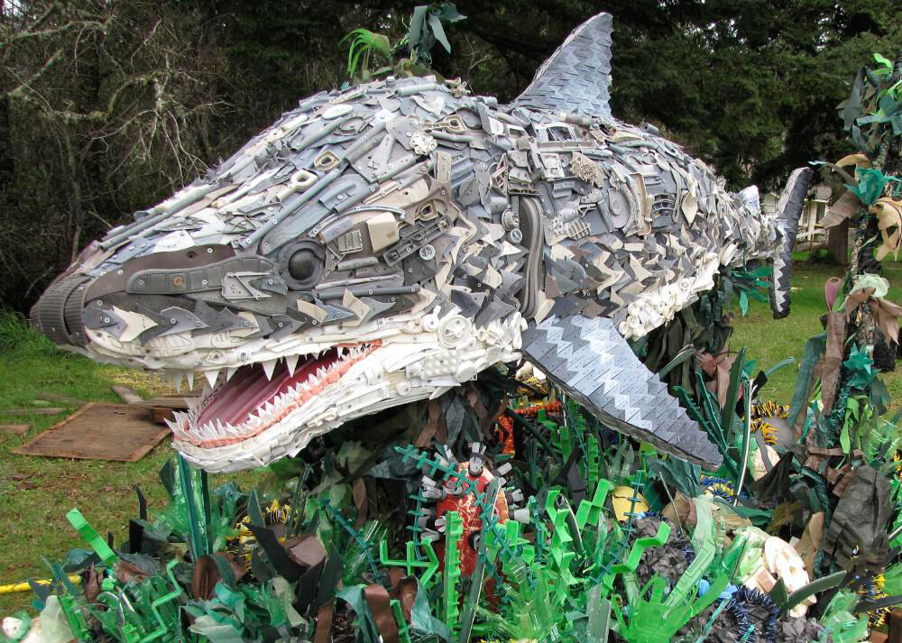
The ‘Washed Ashore Project’ – Beach & Ocean Pollution Inspiration

Since completing my previous shoots, emphasising the issue of beach and ocean pollution, I next wanted to explore this problem from a symbolistic viewpoint. Using this same kind of stage photography that I have presented before in my project, I hope to capture meaningful and striking images wich will aim is to spark positive change in consumer habits. When deciding how to portray common beach/ocean pollution in an insightful way, my first instinct was to create pieces of art that tells the story whilst subtly putting to use the discarded materials. Before deciding on my designs, I found inspiration for this shoot from an amazing organisation dedicated to informing and influencing the public of this same pollution issue. The ‘Washed Ashore Project‘ is a non-profit community art project that brings pollution to life, awakening the hearts and minds of viewers to the global marine debris crisis.

Founder and artistic director, Angela Haseltine Pozzi, is a successful internationally exhibited artist whose expertise has led her to community involvement in multiple areas. Angela’s evolution as an artist shifted when she noticed immense amounts of plastic pollution on pristine southern Oregon beaches. As she learned more about ocean pollution from plastics and marine debris she became motivated to do something about it. Thus, the Washed Ashore Project was born. Angela decided to enlist the help of hundreds of local volunteers to clean up the beaches and use all the debris to construct massive sculptures of the sea animals most affected by the pollution. These sculptures now tour as the ‘Washed Ashore Project’ travelling exhibit, educating and inspiring countless people from diverse backgrounds to take action in their own lives to prevent contributing to this global problem. Her work continues as Lead Artist, designing and creating a multitude of sea creatures from the ongoing tonnes of marine debris with the goal to have a global impact. As the leader of a team of dedicated employees and hundreds of volunteers, Angela has vowed that this effort is her calling and “until we run out of plastic on the beach, we will keep doing our work”. Below are a few photographs taken as examples of these breathtaking sculptures that represent the sea life affected by plastic pollution…

Above is a huge sculpture depicting what looks like a great white shark created using an array of different discarded materials. To put these masterpieces together the ‘Washed Ashore Project‘ volunteers collect rubbish that has been removed from beaches through community cleanups. This pollution is then washed, sorted and prepared for the creation process. Each sculpture is designed and directed by a professional artist and then formed through a collaboration of Washed Ashore team members, volunteers and students. The meaning behind these sculptures is to symbolically present our ocean pollution crisis and inspire change in our modern consumer culture. I love the use of small plastic items to collectively display such a textured and detailed masterpiece. The size of the shark and its surroundings, plus the sheer amount small and dangerous pieces of plastic collected from the beach, really make this piece something to think about.
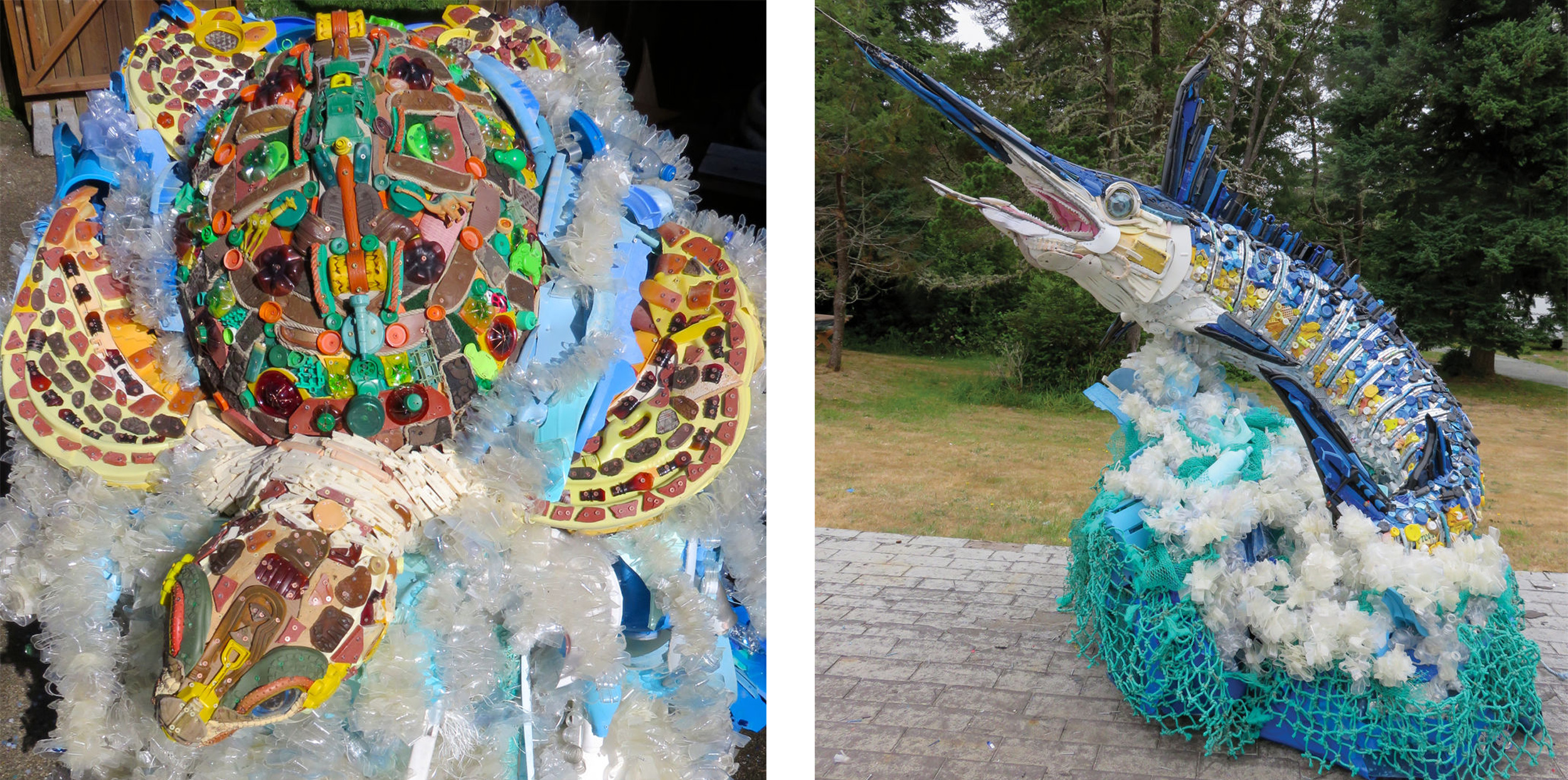
The next two photographs depict other transportable and inspiring pieces of art that portray a few creatures who are most affected by ocean pollution. The first sculpture on the right shows a carefully crafted sea turtle put together using discarded materials found on the beach such as water bottles, boots, shotgun shells, detergent bottles etc. The sculpture on the left depicts a Marlin fish created using things like sunglasses, toothbrushes, fishing lures and a toilet seat. I love the textured effect these creatures are given by being made up of such tiny pollution elements as well as the array of colours that can be presented. The size of these sculptures, along with their beautifully thought out structure, can definitely emphasise this pollution crisis and give the public a good idea of just how massive it is. All artists, volunteers and designers involved in the creation of these pieces will have been influenced by our current consumer culture. The sculptures’ construction is truly a community effort, with volunteers collecting, cleaning, sorting, and building the sculptures together.
Side by Side

This shoot is really important, as the other shoots are more focused on a certain individual from the friendship group, and therefore this shoot show’s all the previous models together, except for the guy I took photo’s of and this is to make it feel as if he perhaps took the photos of the girls, and vise versa, they took the pics of him. Therefore that’s why there’s always someone missing in the adventures photographed, because it’s as if they were taking the photos. The girls from the swing, the girl playing the guitar, and the girl who went paddle boarding, altogether.

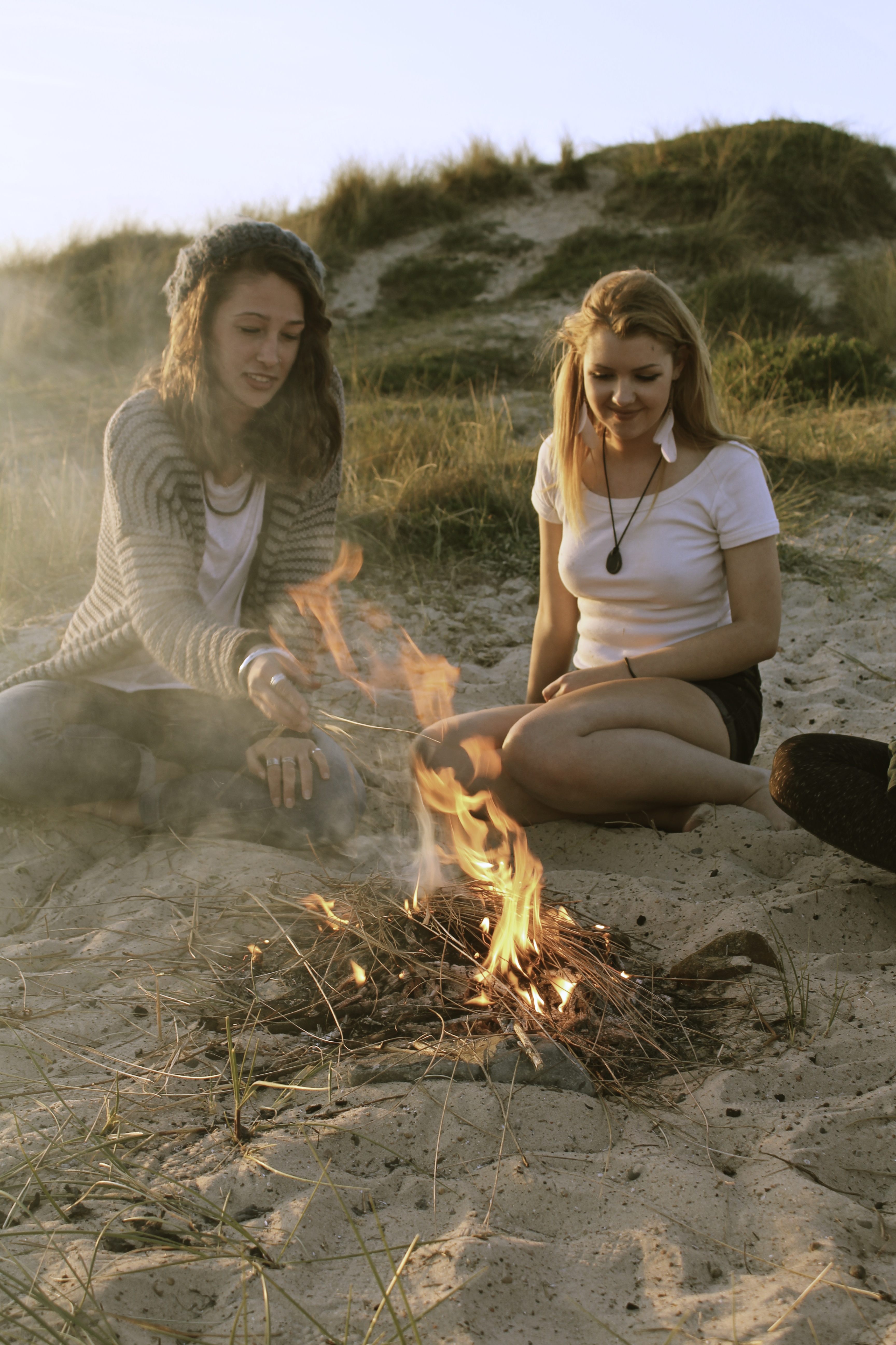
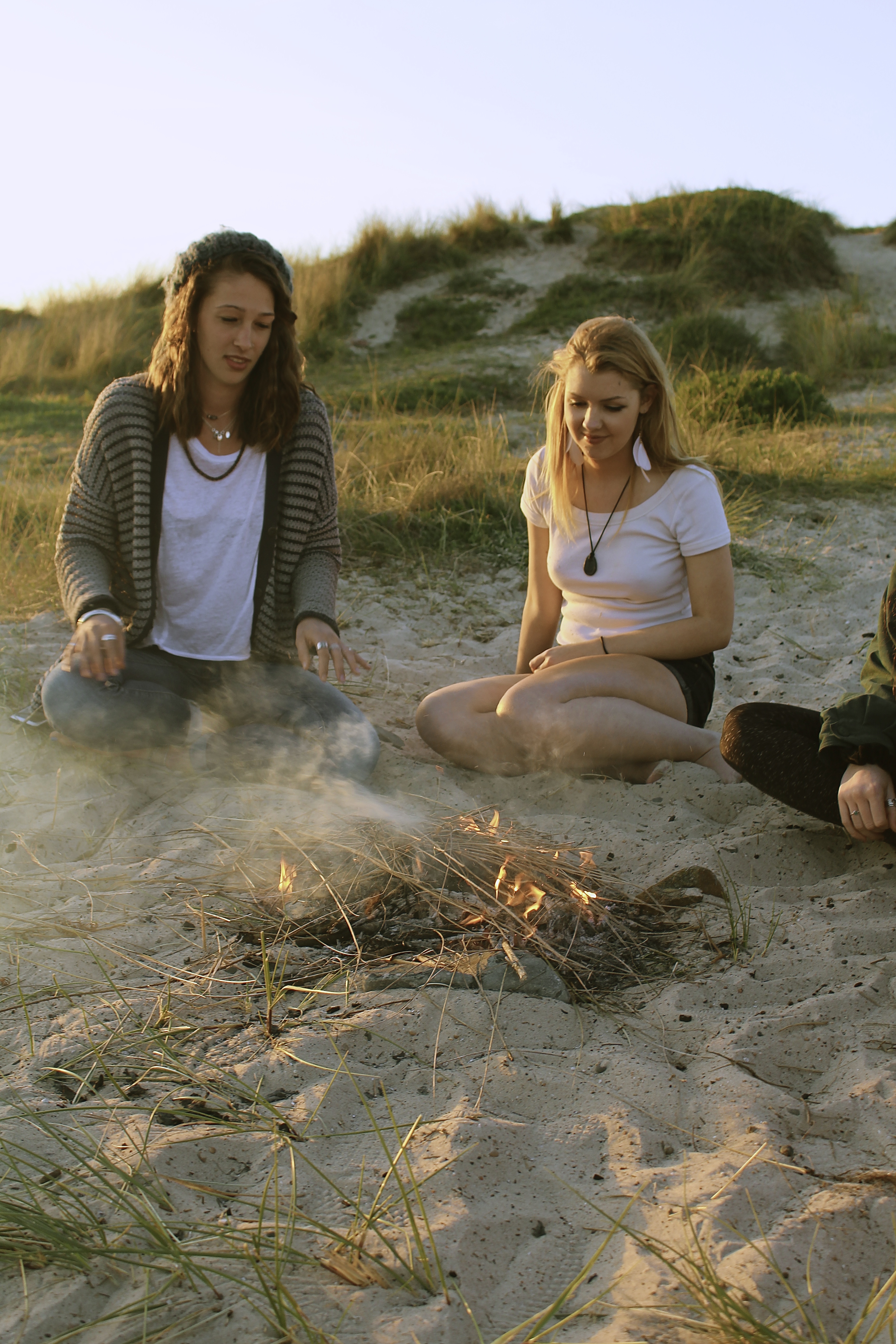
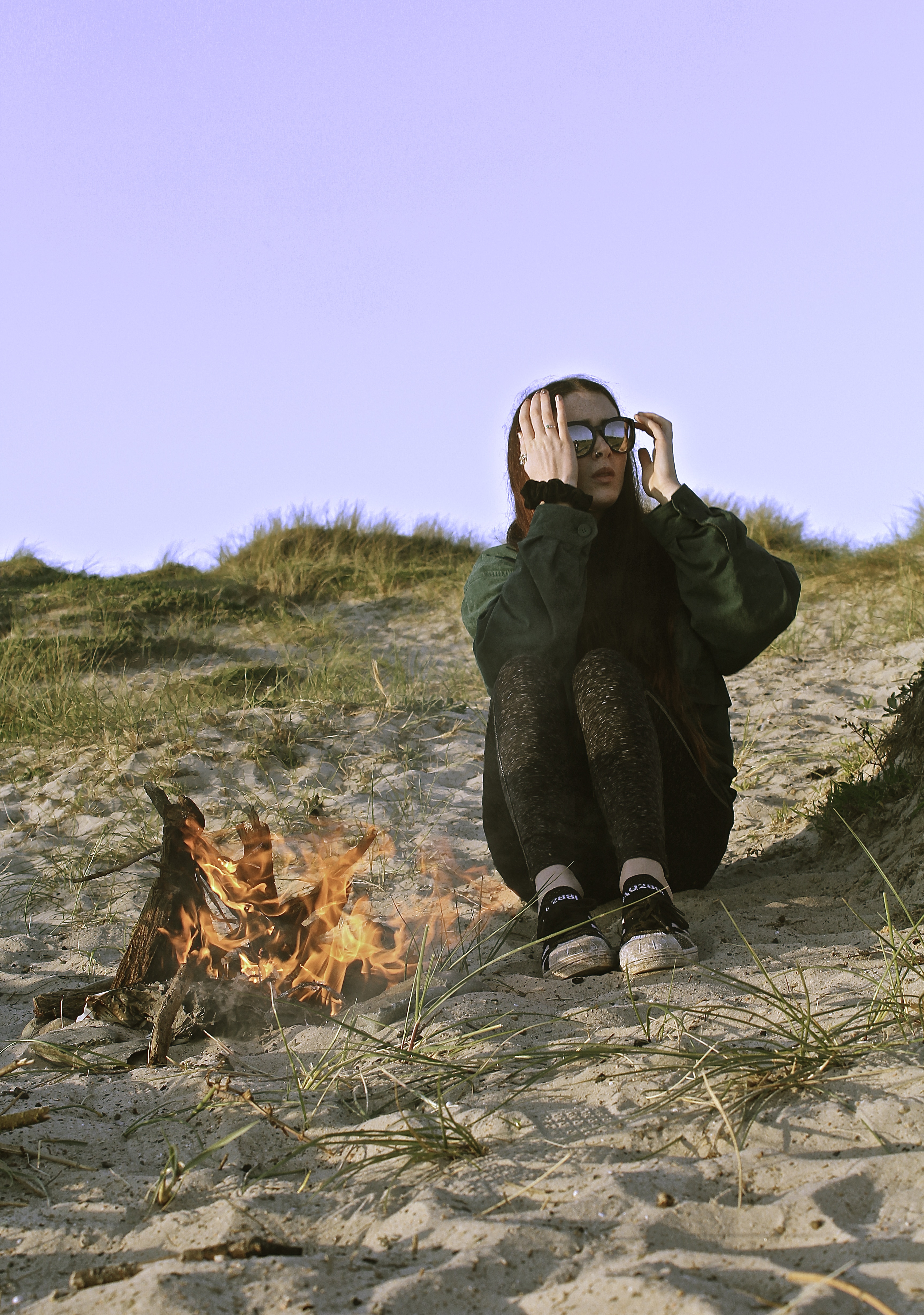
For this shoot, I choose this location as it’s one of the same places I shot the girl with the guitar, and it’s also remote and close to the sea. Which is similar to most of my shoots. Originally I was going to photograph them around the fire with the sunset in the background, however this didn’t work with the lighting because it would tend to make the photograph over exposed or underexposed, turning the people into silhouettes. Therefore I was pleased I shot images during this lighting.

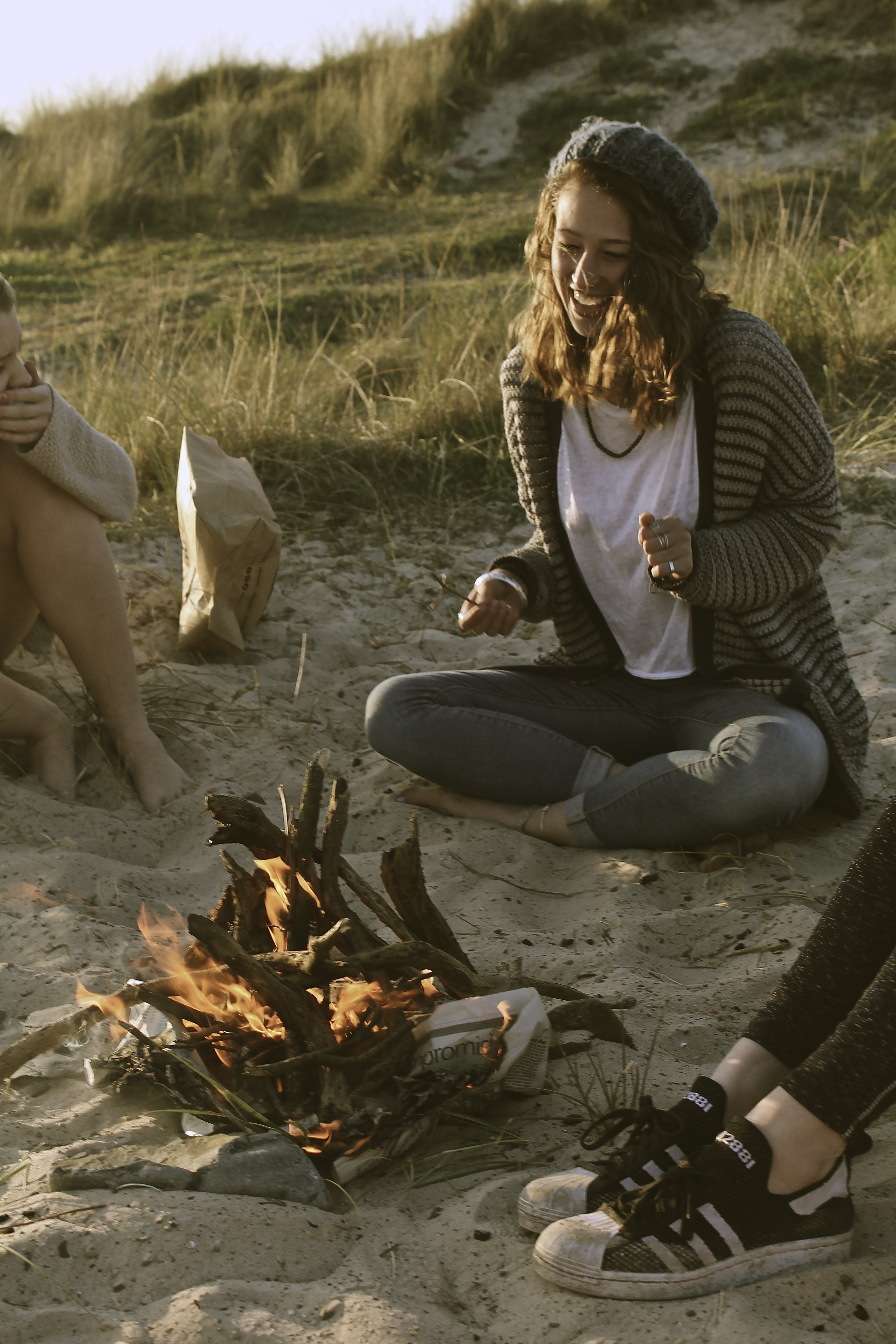
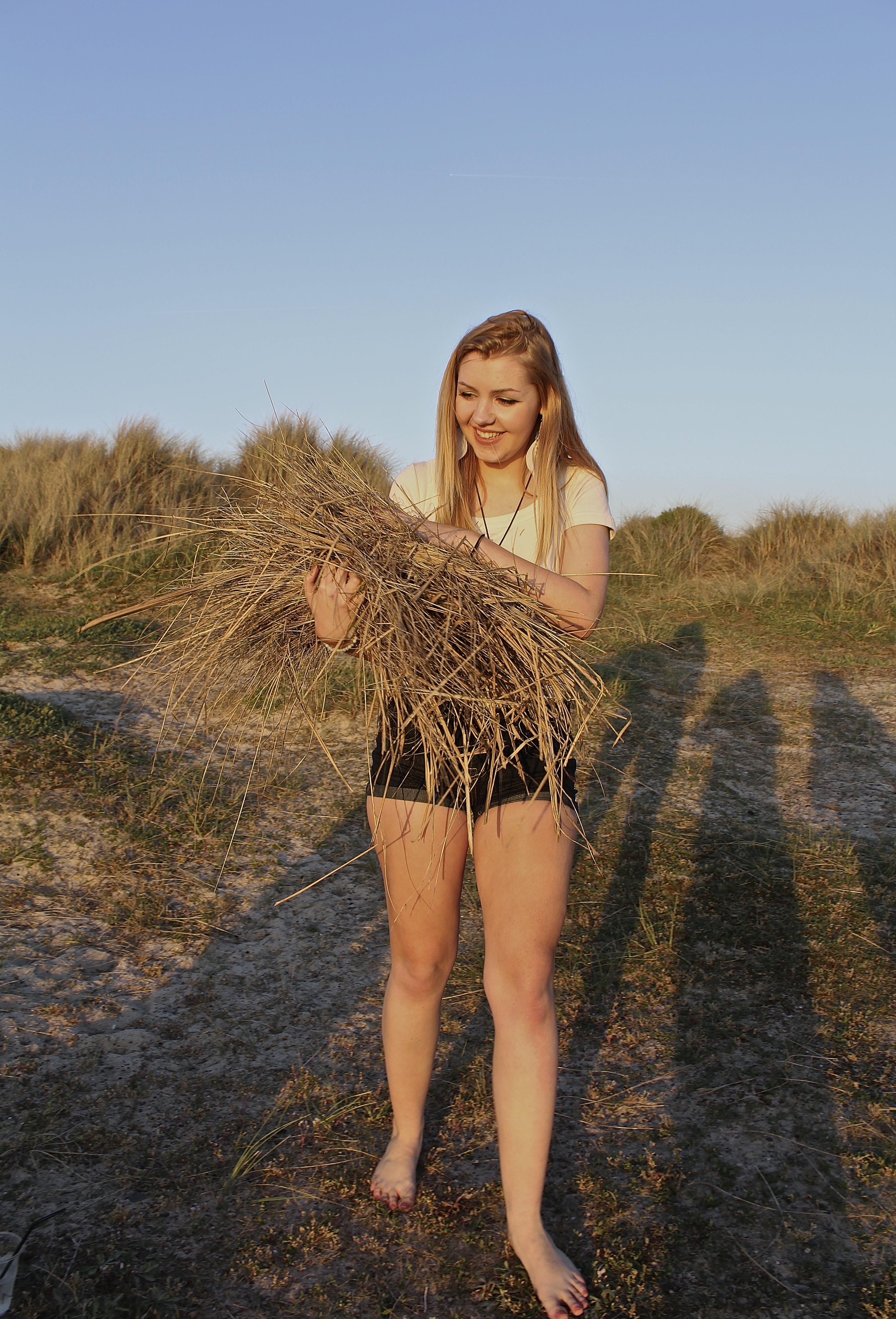
The propping for this shoot was more difficult then expected, as the area which we did the bonfire was on the sand dunes so there was no wood for the fire. Therefore, before the shoot I had to collect the wood for it, however there wasn’t enough so we had to work with the dead marram grass, which would make the fire really big for a minute and then it would die down. In addition, we had to keep collecting lots of grass for the photographs to look good, the collecting of grass is shown in some of the images below.

The use of the models sunglasses makes the image more interesting, as one can see the fire reflected in the models lenses. Also the way the sun lights up the models hair makes it a very bright amber color, which works well with the fire in the foreground that looks as if it’s touching the models hair, who’s in the middle-ground. Therefore making the composition interesting.

In the image below, I tried to get the image to have the sunset in the background, but without allowing the people to become silhouettes. This was difficult as the sunset is over exposed, however i find it actually works in this image, as it creates an ambiance.

The image below relates to the quote;

“I always thought [my models] looked best when they were sitting in their pajamas smoking pot and getting pissed on a bottle of wine. So that’s what I documented. I liked the girls looking how they were naturally… ” Corinne Day 

The reason this quote links to the image, is because I’ve captured my models sitting around a bonfire and smoking, showing them in a natural manner and not posed. Also, these images documented the moment and not a posed image.


In the two images below I took them in a documentary style, the model not knowing they were being taken and capturing a moment/event, however they’ve ended up looking like fashion photography images, therefore making me think of the quote by Corinne Day;

“The best thing I did for fashion was bringing it down to earth, bringing a documentary quality to it.” Corinne Day 

I believe this is an important image from the shoot, as it’s very simple, and doesn’t have anybody’s faces giving away the emotions behind the scene. Therefore the viewer interprets the ambiance of the moment themselves.


Book Specification

After looking at the books, monographs and other published work of my chosen artists and photographers, I have been inspired to create a book with a compilation of my photographs from this project.

The book will explore the way the environment can change and how lighting ant atmosphere evokes narrative and emotion as well as the use of natural and man-made components especially natural and man-made light and the contrast between these. It will also feature the juxtaposition of a natural human being and how they are influenced and affected by their environment as well as how they interact.

I started looking at the work of Todd Hido and his 2001 monograph House Hunting which explored America from a very candid perspective as well as the suburbs and homes which people lived in, this took a selection of photograph from his portfolio Homes at Night. I then looked at the photo book Twilight: Photography in the Magic Hour which was based on the 2006 London exhibition featuring artists such as Bill Henson and Philip Lorca Dicorcia. Exploring this nocturnal theme is also something I plan on referencing in book as with how it evokes atmosphere and narrative into the environment. I then looked at Bill Hensons alluring nocturnal book Lux Et Nox. His book explored the notion of nature and civilization and how they effect each other, which is a key theme in my work, his work also looks at negative spaces and transitions in the atmosphere.

I then looked at text and graphic design based artists Hamish Fulton and Ed Ruscha who used text to elevate the meaning as well as add new context. I have experimented a lot through my coursework with testing different fonts, colours and compositions but plan on recreating new designs with my photographs for my book to create a more consistent theme for the book. I also plan on having a variation of two page spreads and single spreads with complementary text opposite the image.

I plan on using Lightroom to upload and compose my photographs into a book format and will add text over the images using Photoshop, to publish my book  will use the publishing website Blurb.com. This will be done during my exam.


Wild child – ruby

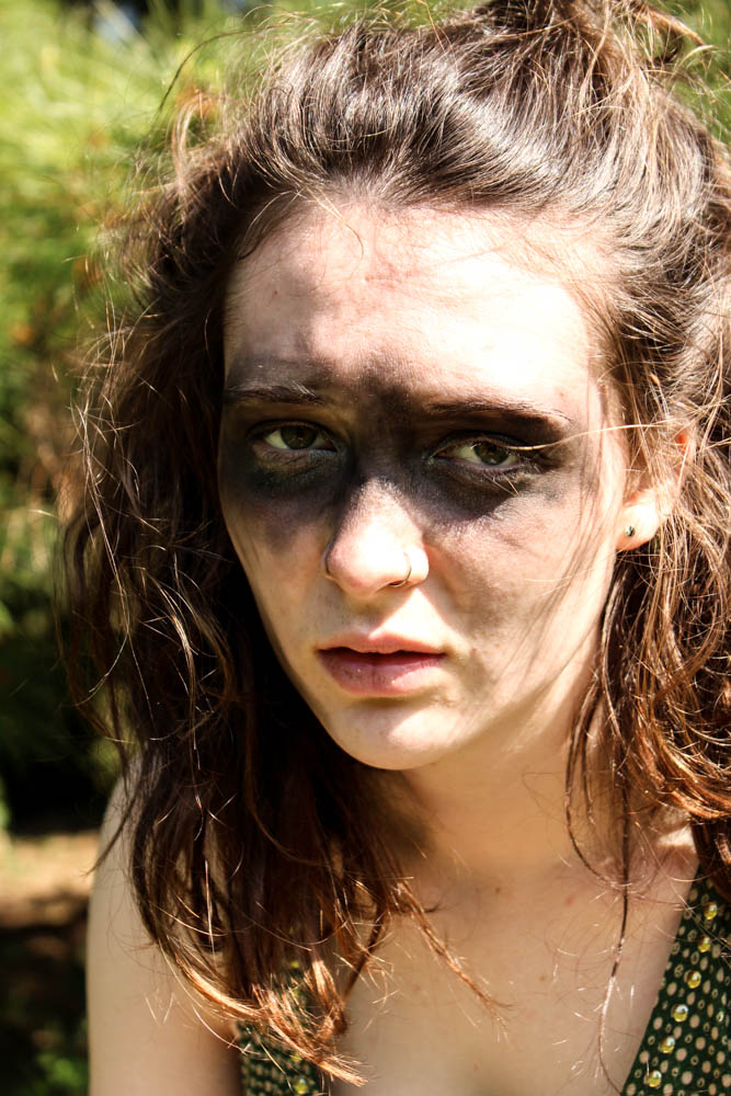
This was my second photo shoot in which i created a potential character which lives within the den. This one was to correspond with my wood den and therefore i decided to make my subjects face look muddy and dirty as if she has been living among the woods. I got her to dress up in a a green dress as i wanted to continue on the idea of camouflage which this den revolves around so much. Overall i think the images work really well. For this particular shoot i decided to use my sister as my model as she has green eyes and i thought that this would correspond further with my den.  I defiantly think i have got some images from this shoot which i can use. 

The above and below images i took in a portrait framing, the light in both images coming fromt he right hand side of the frame. Both images are very similarly composed, it is simply the slight angle of the subjects head and the expression which differs. The angles of the subjects face in the image below appear a lot sharper and therefore cause the subject to have a tougher impression. The top image is a lot softer as the subjects face is facing towards the camera directly. The light in both images is quite a harsh light which contrasts which the dark marks on the subjects skin and also the subjects skin being very pale. The skin almost becomes washed out to a bright vibrant white by the light. The subjects hair in both images is very wild and therefore frames the face well as it blows in and around the face in a natural way. I used a narrow depth of field in the images so as to blur the background behind the subject. I quite like however how you can still tell clearly that the background is filled with pine leaves. This then links the location directly to the den images and creates a link between them.  Something which i had a problem with was that i couldn’t take a picture in which my subjects eyes had the sunlight illuminating them without washing out the entire of the subjects face and creating terrible images. I therefore opted that for these images i would focus on the lightning of the face rather then the eyes. Overall i think i prefer the below image for a photograph which shows the whole of the subjects face in a more formal portrait.

I also took some more abstract images as you can see from the images above and below. Above i experimented a bit with focus, having the focus in the background rather then the foreground to add mystery. I think the outcome of the images turned out okay. I like the below image best because of the contrast between the sharp lines of the light and the dark shadows of the rest of the face. The brightest point of the image is where the light from the right hand side cuts lines across the face. The subjects hair which then blows across their face creates a wild impression and also adds flicks of light as the stands capture the light. The image is composed so that one of the subjects eyes is directly in the center of the frame. I quite like the abstract nature of the image.


The above image is one i managed to capture which had light in the subjects eyes. I really struggled to get my subject at an angle in which i could easily show the light colour of my subjects green eyes. I think this image only really works because the background is such a light green colour that it brings out the lighter green colour of the eyes. I used a really narrow depth of field in this image to blur the background but keep the foreground in focus. This blur causes the subjects hair to look straggly which was the impression i was going for with the whole wild look. Only the immediate foreground of the eye was in clear focus, the black mud on the face contrasting with the white skin of the subject. I quite like how the blur of the rest of the images means the little details of the hair of the eye brow and the eye really stand out.

Tribal wild child – jess

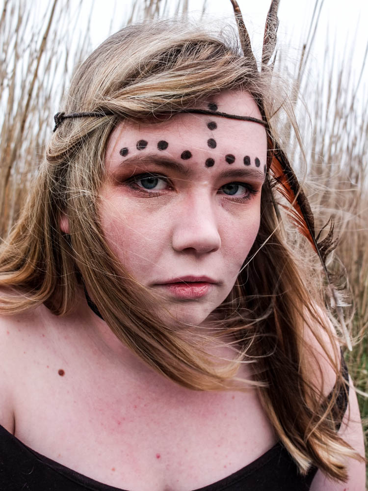
The below photographs are my first attempt at portraits which link to my dens. When i was doing my den shoots there was defiantly a theme to some of the dens and i want to be able to incorporate that into my portraits. This first set of portraits is for my field den. When i took those photographs there was a distinct African vibe to the den, both in the landscape i took the photographs in and also the materials i used for the dens. I therefore translated this into my photographs.

I decided to photograph my subject on a fairly overcast day because i want these portraits to almost act as a link in between the day dens and the night dens i am going to photograph. The day photographs are intensely bright and i didn’t want to have too much glare on the faces in my portrait so that was also another major factor in why i decided to photograph my subjects on an overcast day.  I also chose my location carefully considering how it linked directly to my den. I decided to use tall yellow grass as i felt like that linked directly to my theme. You can also see in the photographs of my den this grass within the background. The photographs were taken in the same location just not exactly the same area in which i took the den images.

Over all i composed the majority of my photographs fairly close to the face of my subject on landscape mode. This is because i wanted to take the pictures fairly close to my subjects face in order to capture an intensity in her gaze. In all of the photographs i used a narrow depth of field so the background is always out of focus to emphasis the subjects face. Overall i think i have two outcomes from this shoot that i am really happy with. For each set of portraits i do only need one photograph for how i am intending on displaying my photographs so overall the shoot was a success. 

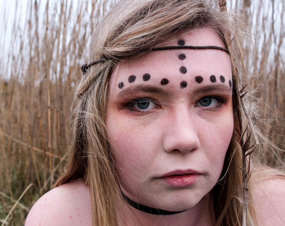
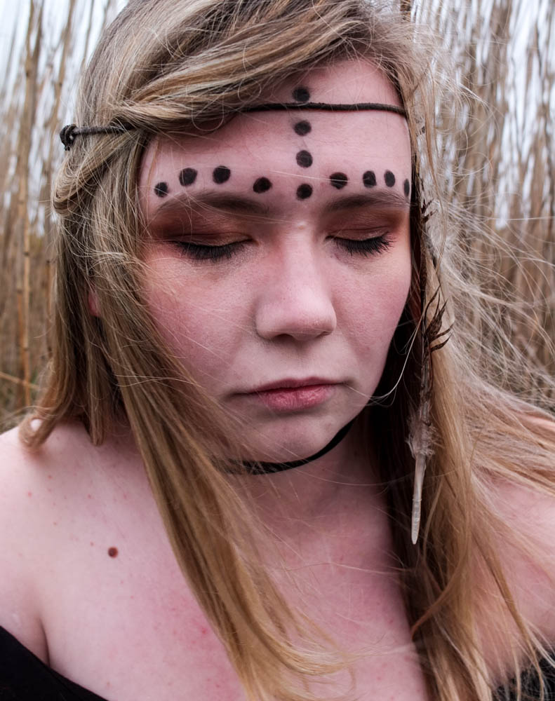
In the above and below photographs i decided to use a landscape composition to include more of the background of the grass in the frame. I really like the similarities between the subjects hair and the grass as they are both very similar colours and they are both fairly straight. This creates a link between the subject in the environment, another connection within my images. The feathers in these images also blend quite well into the hair but then also add another texture, particularly in the below. I quite like both the above and below photographs but for different reasons. The hair in the top image adds a lot of movement and creates a more dynamic image blowing across her face. Her eyes are also more narrowed in staring at the camera, as if questioning or challenging rather than gazing passively. In the photograph below the eyes have the opposite effect, they look more haunted. Her eyes are a lot wider and while she is once again staring directly at the camera i feel as if this whole image is a lot more passive and the face has a lot less character in it. I therefore prefer the above photographs of the two as it conveys a better sense of a wild child behind the face.

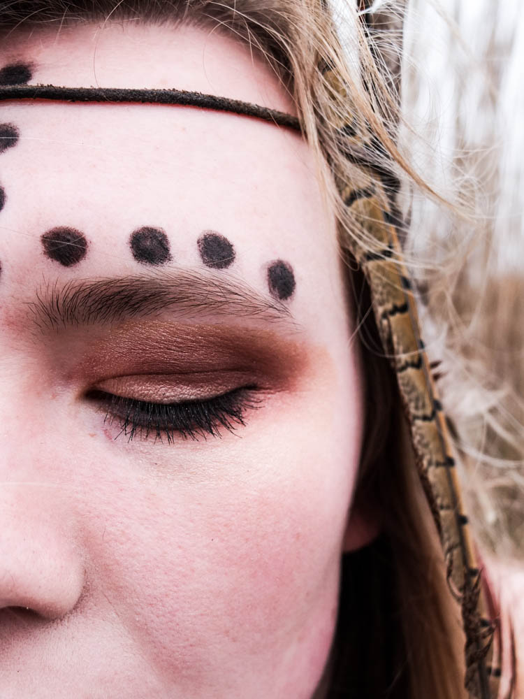
I wanted to try a couple of portrait compositions as well as landscape to see which ones worked best. I also directed my model to close her eyes to see what impression it would create. While it does work i think i defiantly prefer having the eyes open as eyes and expressions of people faces add a lot of character to an image. I think you lose this a lot in this photograph because her eyes are shut .


The above photograph is the best photograph from my shoot and i think that it has defiantly incorporated all the elements of the other photographs which i like so much. This photograph is composed to be portrait and therefore it includes less of the environment then some of my other images. The main light source comes from the top right hand corner and shines directly onto the left side of the subjects face. This photograph is better lit then the rest of the images, i think this is because of the portrait composition including more of the sky and therefore the image appears brighter through the white sky. In this image like in the others the subjects hair matches the colour of the environment behind. This creates more of a sense of unity between the subject and the environment but the subject doesn’t become lost in the environment as i used a narrow depth of field so as to separate the two out. In this image the subjects hair is blowing over her face to the perfect extent. In the other photograph her hair covers her face perhaps too much. In this photograph however her hair blows not obstructing any element of her face and the small wisps which do blow over her face actually add to the wild impression of her. The fact that all her hair is blowing in the same direction works quite well as it almost leads you around the image. You start with the bright white light of her hair which then leads you into following the direction of her hair which leads you around her face.  Her hair ends up framing her face really well. The movement of the feather along with her hair is also very suggestive of being wild and adds to the loose feel to the image. The photograph feels less rigid and staged as the feather is also following the direction of the hair. The expression on the subjects face also works really well in this photograph as the angle of the subjects face turning towards the camera is suggestive of challenging and being confrontational. The eyes do gaze more passively then the first photograph but the overall impression of the image is still a wild child. Overall i think this photograph works the best because the lighting is brighter and the composition of her hair and face is very effective in conveying the impression i was intending.

These last two images were experimentation’s with using one of the blankets from the den i built within the composition of the portrait. I decided to simply wrap the blanket around the subjects shoulders and i think the final outcome actually works really well. I composed the images as landscape as it allowed me to convey how the blanket was wrapped around the subject better. These photographs are also very well lit as the sun had broken through the clouds a bit. The compositions and angles of the subjects face towards the camera is slightly different in both photographs. In the first image the top of the subjects head is cut off just above the subjects hairline which includes more of the blanket itself within the frame. The subjects face is then turned almost directly towards the camera. The position of the subjects head within the frame is also a lot closer to the edge of the frame. The second composition includes more of the top of the head, the head being center more towards the middle of the image and including less blanket. In both pictures once again the wind blows the subjects hair slightly across her face . This composition also allows for the background of the grass to be seen clearly. I think i prefer the first image, even through the second includes more of the head. 

Tribal Portrait plan

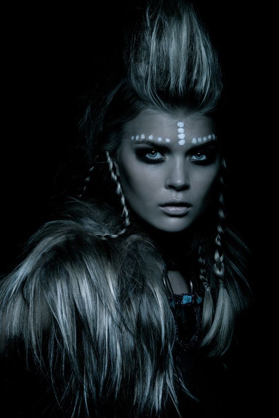
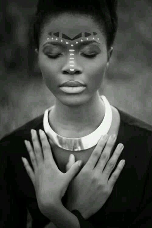
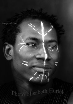
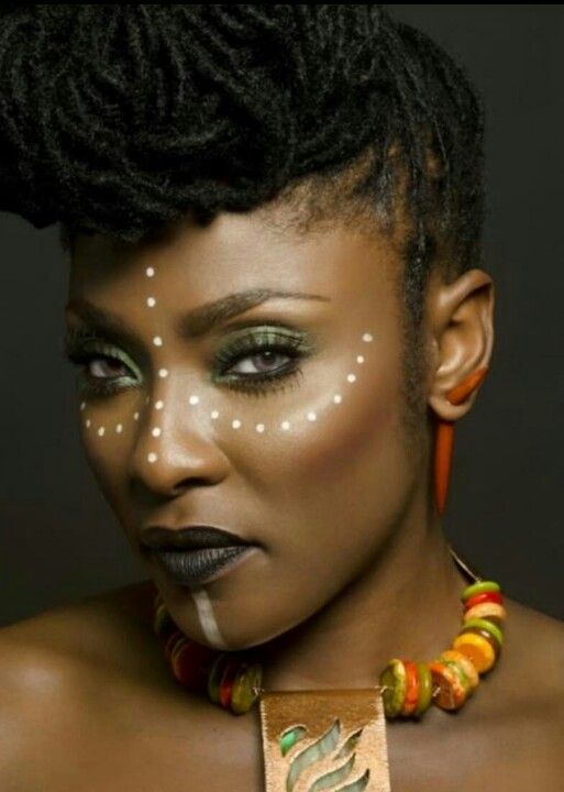
Before taking my portrait photographs i need to plan exactly how my subject is going to look. The whole point of these portrait’s is to recreate my childhood friends looking like the characters we used to pretend to be while playing in the dens. I have started to see a pattern of each den having its own identity and character to it, which is what i want to reflect in the appearance of my portraits. The first portrait i am going to take is the ones which correspond to the den in the field down St Ouens. This den had a distinctly tribal feel to it so i began looking for inspiration of exactly what look i wanted my friend to have.

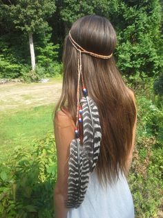
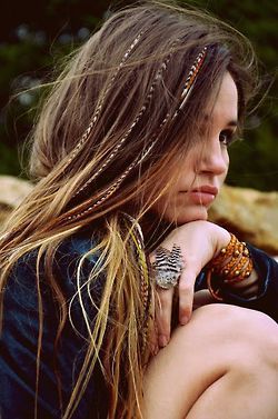
As i have spoken about i wanted to create a clear correlation between the den and the portrait’s so as this den was made up of oranges i decided that Orange was going to be the main colour colour used. I am therefore going to direct my subject to wear orange eye shadow shades to establish a link between the den and herself. The overall character of the den was also distinctly very tribal and African. I don’t want my subject to look too artificial and almost dressed up by using loads of face paint or anything but i do want to also create a tribal look to her appearance. I therefore looked at tribal face designs which you can see above for inspiration of adding some little touches that would convey a tribal atmosphere. I think i am going to go with the dots because they look somewhat understated and enhance the tribal feel to the image without going over the top. Lastly i wanted to make the hair appear a bit more dynamic so as you can see below i took inspiration from stereotypical feathers. Tribal is normally quite suggestive of being animalistic and close with animals and nature so i though that by adding a feather to my subjects hair would tie together this impression further.

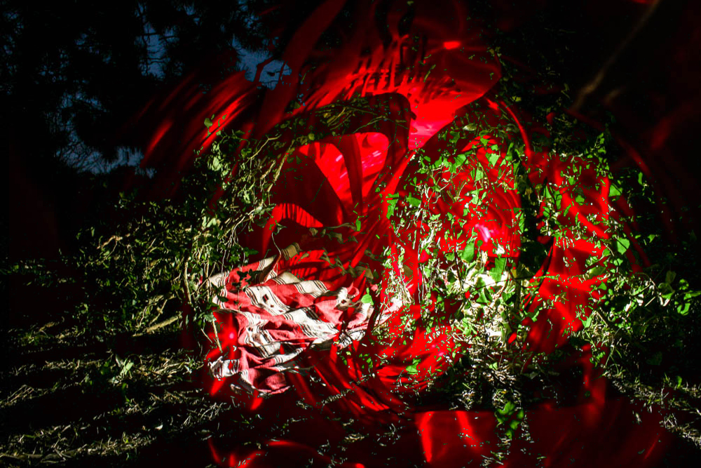
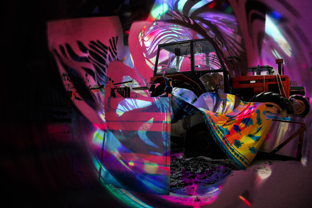
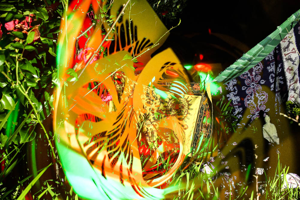
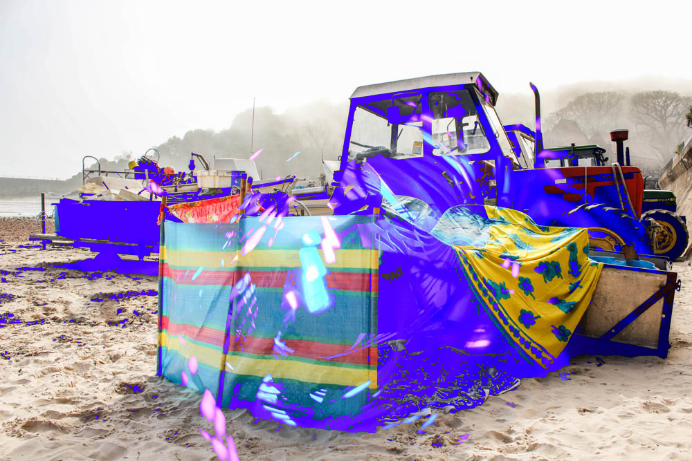
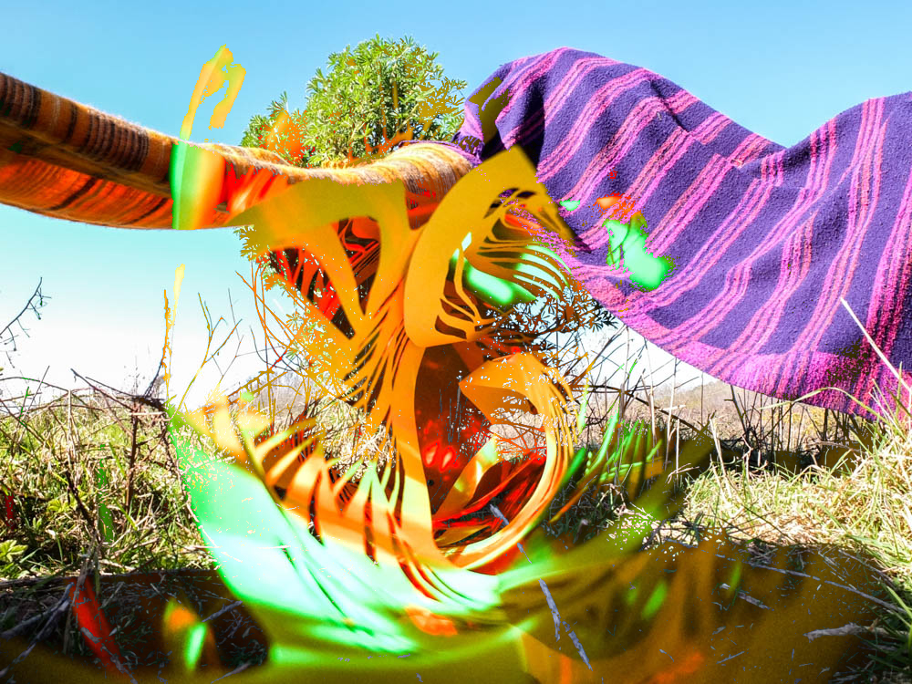
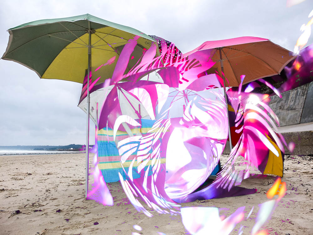
Layering paper and dens

These layering images have defiantly worked the best of all my experimentation’s. After taking the photographs of my paper sculpture i decided to experiment with layering them over my den images as they were so abstract i thought it could create some interesting patterns. The concept of those images was all about the transitioning between the game world and reality through falling asleep and so these abstract images which combine den and abstract spirals aim to convey this transition. As the images i combined are so completely different the combining of the images actually worked really well rather then just being a bit of a mess like some of the other images. The spirals being composed at the center of the image is suggestive of the den coming out of the spirals. Overall i really quite like these images and i’m glad i did the abstract shoot of images to explore the idea of falling asleep.