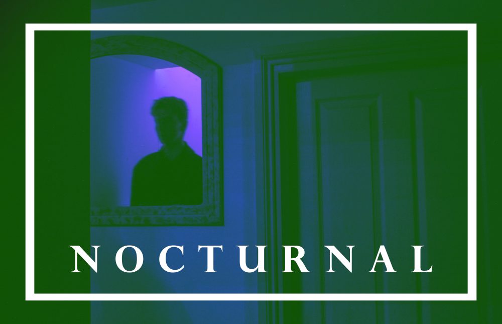
I created more images with the second photo shoot featuring Ryan. I found the composition and minimal features would be useful to use with text. The dark tones would also make the font stand out more. I used the font Perpetua Titling MT Bold because of its classic style. I started by using a small text over the image to create a more subtle impression. I liked the classical style it evoked. I picked a simple phrase with small words that evoked the notion of being nocturnal and night life. I wanted it to be simple yet full of impact.
I then tried using a larger font that would take up a large amount of space on the image. I positioned it so the mirror and reflection was still visible. I made two, the first where the text was in the centre and the second where the image is placed to the right.
I then returned to the word nocturnal which I had used in previous images. I then used borders to add with the text. I then moved onto using filters using the colour layer feature. The second one was not just a single colour but a mix of pinks and oranges, creating a warm, dreamy ambiance.
 The above image was created with the bright green layer set to luminosity creating the grey tones. I also used the previous pink layer from before to give it the warm tones. I wanted to pick words that would evoke the sense of ambiguity but still create a feeling of narrative. I plan on exploring more images using text and other graphic design features in my work.


