Of all my dens as this was my favourite day time den i really wanted to capture this den looking beautiful and eerie at nigh too. I already found some of the day pictures to suggest the den as quite a creepy location with a lack of people but i find that these night time photographs have actually turned the den into more of a magical looking place. For the majority of the photographs i put the light inside the den and the way the light radiates out from inside the structure is very suggestive of life inside the den. We often associate light with life and i find in these photographs it is suggestive of a presence inside the den. 
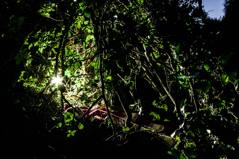
Above is the best photograph that i took of the den as a whole radiating light. This image was taken in the blue hours after the sun has set which you can slightly see by the sky in patches through the leaves in the background. With this photo shoot as the photographs were taken underneath the trees, the den being built in the woods, the background is made up of the dark shadows of the trees rather then the sky like my previous shoot. I composed this photograph according to the rule of thirds with the den itself more over to the right side of the frame. I also positioned the light inside the den more to the right side of the frame and so the image is fairly weighted on that side of the composition. This contrasts quite well with having the bright blinding light of the den to the right and then in the sky the patches of light from the blue sky are on the opposite side of the frame, balancing the image. I took the photograph from a slight angle, not photographing the den straight on so you can see directly into the den but more from the side so the inside of the den remains more mysterious. By putting the light within the den you are able to see clearly how the structure of the den is made up of branches and leaves intertwined together and the light then shines through these gaps. The light quite literally radiates out from the points at which it escapes the inside of the den to create an interesting pattern of lines from the center of the den outwards. I think the effect is further emphasized by the light making the leaves it shines through a more vivid green, these bright green then contrasting with the red of the blanket.

The above image is taken in a completely different style, this image showing the light shinnign directly onto the structure of the den. I don’t dislike the images i took in this style, it just appears as if i have turned on the flash and taken the image with a bright flash. There is still an element of mystery to the den by having the background where the light cant reach as fairly dark but overall the image doesn’t have the same effect. The image i guess does have more of an impression of being abandoned as there is no light source inside the den which suggests a form of life. The red blanket in this image helps to draw out the dens structure as it becomes slightly lost like the day den images.

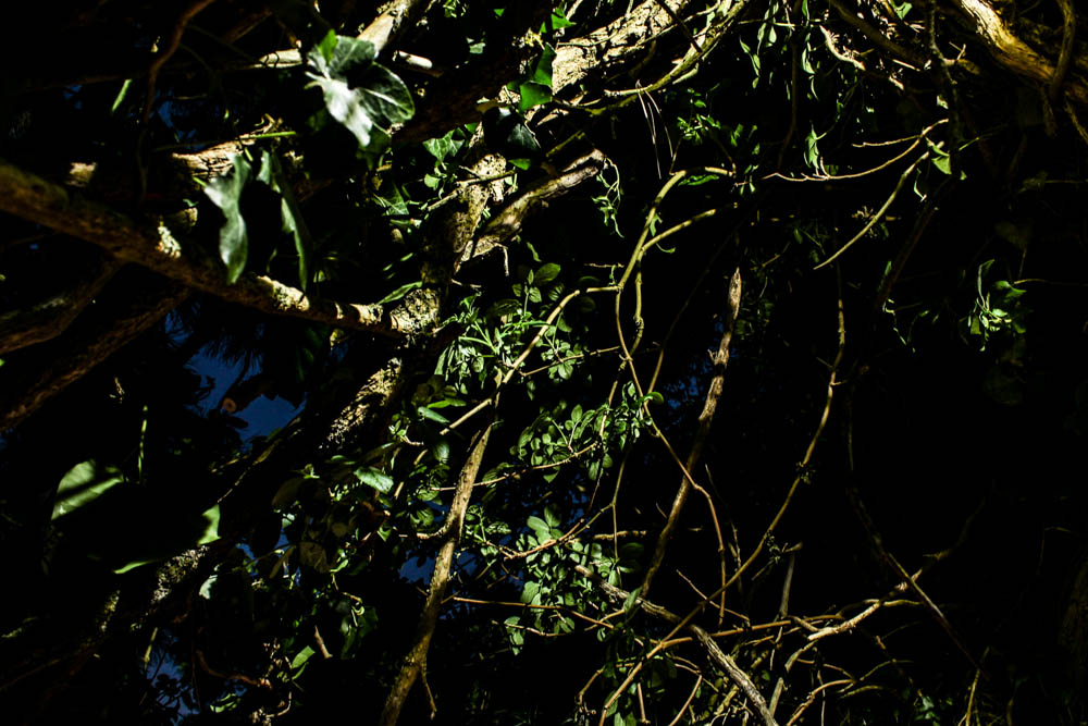
The above pictures i took trying to create soem creepy images which focused on branches like the day time pictures i took. By shinning the light upwards inside the den i could create a really eerie impression of the den as the branches were only illuminated in certain places so acted as silhouettes. This is further enhanced by having areas which were lit by the blue sky and having areas which were darker black colours from other branches blocking the light.


The above and below pictures are more images which play on the idea of having light shinning through the dens structure. I like the image below in particular as i used the rule of thirds to have the red blanket from the den across the right hand side of the image, one of the branches sweeping across the frame. The image works quite well in having the darkness of the night sky and lack of light being on the left hand side of the frame, this then becoming lighter as you move across the frame to the right. The light is right in the center of the image but mainly spreads out to the right due to the white patches of the blanket reflecting the light. The light greens again compliment the reds of the blanket.


These pictures are again taken with the light shinning onto the den rather then through it. I really like this effect in the above photograph as it allows the winding nature of all the branches weaved together to be really noticeable. The branches are a bright white which stand out vividly and the background is filled with shadows and darkness that again create a skeletal nature to the branches.


 This contact sheet above shows all of my favourite clear and interesting above water shots. As you can see I did manage to take a few photographs underwater although it would only work 1/10 times and the quality is very poor. When editing these images I cropped them down massively to only include the most important and interesting features. Below are my 8 documentary/abstract finals for looking at ocean pollution…
 This first final is a documentary style photograph depicting the waste I found on Faldouet beach that would later be washed into the sea at high tide. To capture this image I carefully gathered the biggest examples of pollution together and let them float on the surface as an example of public pollution reaching the sea. I chose this as a final outcome for this shoot because of the images high-quality (for and iPhone), interesting subject composition and amazing natural colours. With this photograph, I hope to get across the message that this problem is real, effects all areas, and is rapidly getting worse. I like the calm sense you get from the flat and clear sea as it strongly contradicts the travesty of the plastic floating on top. Compared to other historical evidence of ocean pollution this image is very tame, however, because of is centred subject and beautiful scenery I think it can get across a very clear warning that we are destroying this ecosystem.
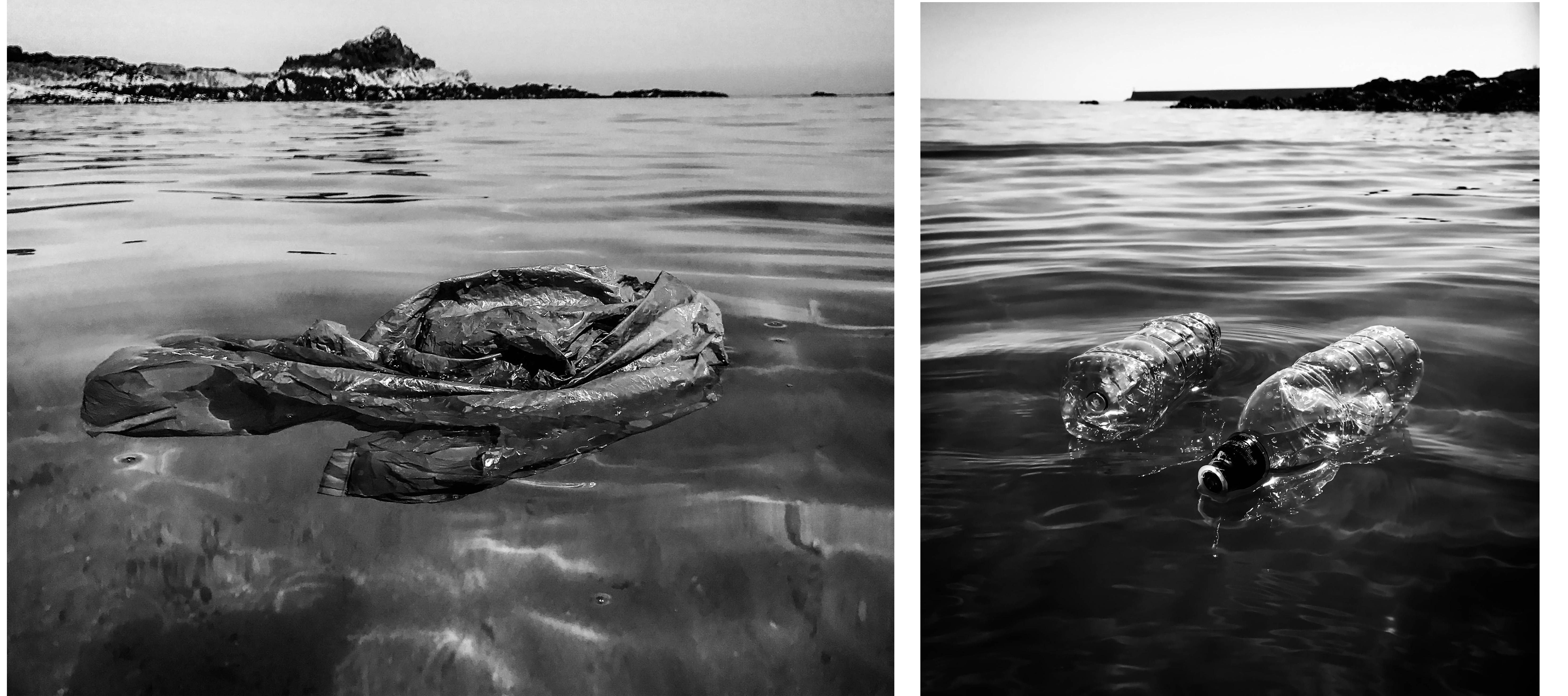 These next two finals are my other documentary style edits that I believe can clearly get across my message. By using straight photography techniques I have created a sense of this harsh reality and given my viewer a way to clearly analyse the subject matter and better understand this collection. The first image on the left depicts a plastic bag spread out and floating on top of/underneath the surface. I love the effect making this image black and white has, as it creates this sense of dread and makes the subject appear more ominous. I chose this image out of my 300 or so originals because of the way the bag is spread out at this one specific moment, making it unmistakable for anything else. The next photograph on the right shows to plastic bottles floating in front of a pier. I really like the symmetry and parallel composition of the subjects and the way they have reflected the natural light. Again I think this image is much more effective in black and white as it gives it a very dark and gloomy overtone, perfect for getting across the depressing meaning behind the photograph.
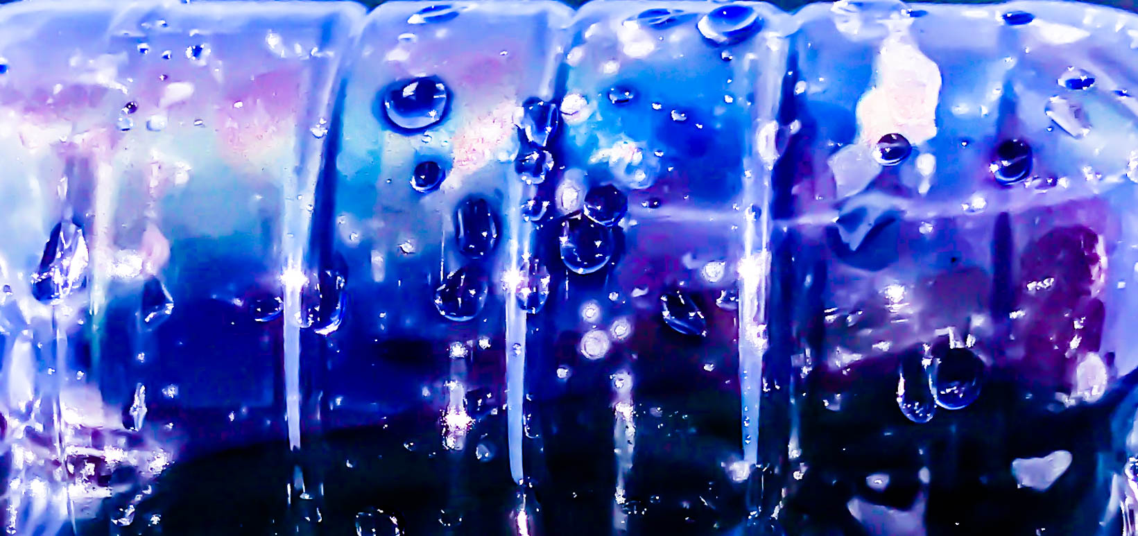 For my first abstract final of ocean pollution presented above, I have captured a close-up image of a plastic bottle floating on top of the water. This final, as well as the ones below, are all inspired by the beautiful work of Steven Hirsch and his take on capturing the surface and pollution of water. I decided to take this image when noticing the inside of the bottle start to steam up and create an array of interesting colours. This effect, mixed with my adjustments made in post production is what has created this vibrant and intriguing piece. The meaning behind this image is to draw the viewer’s attention with its surreal beauty. I think this is an important technique to include in my pollution project as not everyone reacts well to straightforward portrayals of the truth. I also like the subtle definition of this piece as I believe it is possible to work out what the subject is from the indents of the rings around the bottle as well as the many emphasised water droplets on the side.
 These three finals above are a mixture of colour and black and white abstract pieces intended to capture the viewer’s interest and make them think about the context themselves. The meaning behind the photographs is to show something that has devastating repercussions in a beautiful way, thus subtly informing the public of one of modern society’s biggest environmental problems. In this context the pictures may be considered as fine art photography, meaning that my message may be able to get across to people who would have no interest in conservation photography. The first colour final on the left is a low angle shot of a plastic bottle and its reflection on the ripples of the water’s surface. I like the confusing and abstract look of the bottle that was created by using a very shallow depth of field. The next outcome in the middle shows the bottom of the bottle, seemingly melting down onto the calm black ocean surface. Lastly, the photograph on the right is a cropped close-up of all three pollution subjects I used in the shoot. I like these items together and their proximity along with the water in between says a lot about this issue.
 My last final displayed above is an abstract piece that was heavily inspired by one of Steven Hirsch’s beautiful examples of water pollution. The smaller image on the right shows the piece from his project capturing the pollution in Brooklyn’s canal that I used as an inspiration when planning this shoot. My final is a recreation of this image created with a plastic bag placed just beneath the ocean’s surface. These types of photographs are also very much influenced by today’s modern consumer culture and the ever-growing problem of human waste. Like with Hirsch’s project and my previous abstracted outcomes, the meaning behind this image is to intrigue all types of viewers and subtly remind/inform them of this issue. I love the way I have captured the same kinds of ‘surface ripple’ effects as my inspiration but have done so in my own abstracted style. I also love how the natural light is intensified and distorted through the water’s surface, as well as the blue writing on the plastic bag creating a very interesting and twisted pattern.