// W R I T I N G H O M E //
Continuing to explore options for the presentation of my final images in this project, I would like to explore the process of creating post cards as a way to link to my theme of leaving home. The images I have made come in two different forms. I have the ‘home images’ which feature a single figure in their home environments in a relaxed but stylised portrait. I also have a set of external environmental photos which show the same set of people in a landscape of their choice. There are questions asked to each participant which link the two places together and the choice of location was ultimately their choice. By presenting these images as postcards, I could explore the contextual themes of writing home, family and connections to the island. To start the process of deconstructing a postcard in order to make my own designs.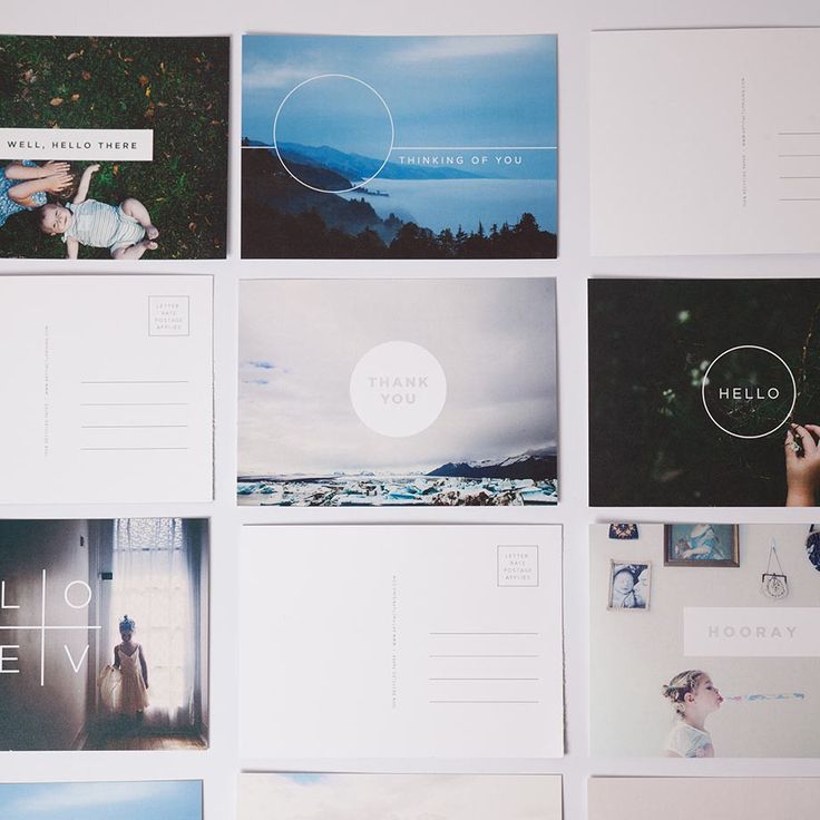
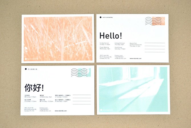
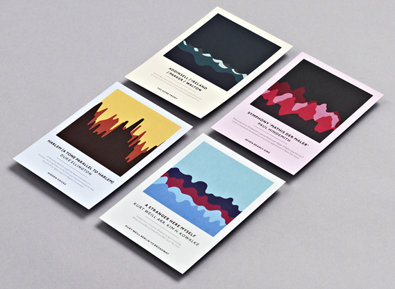
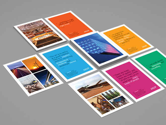
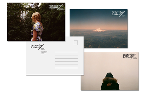
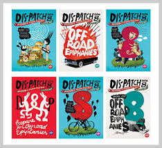
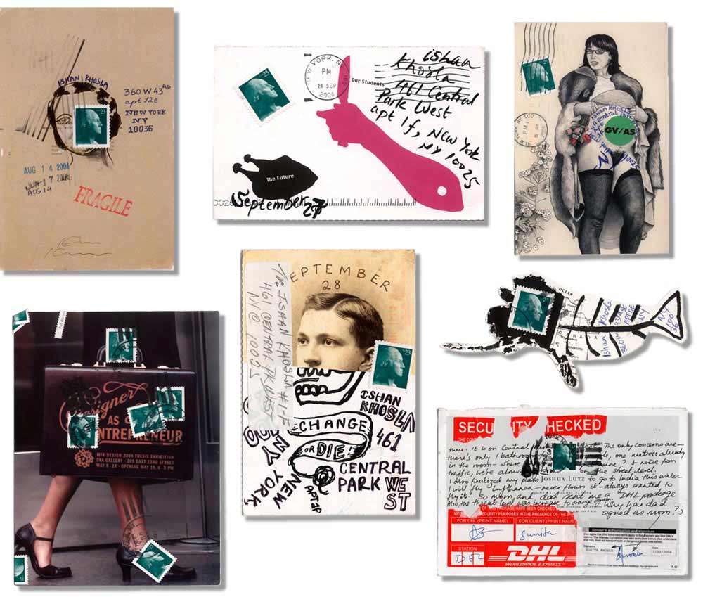
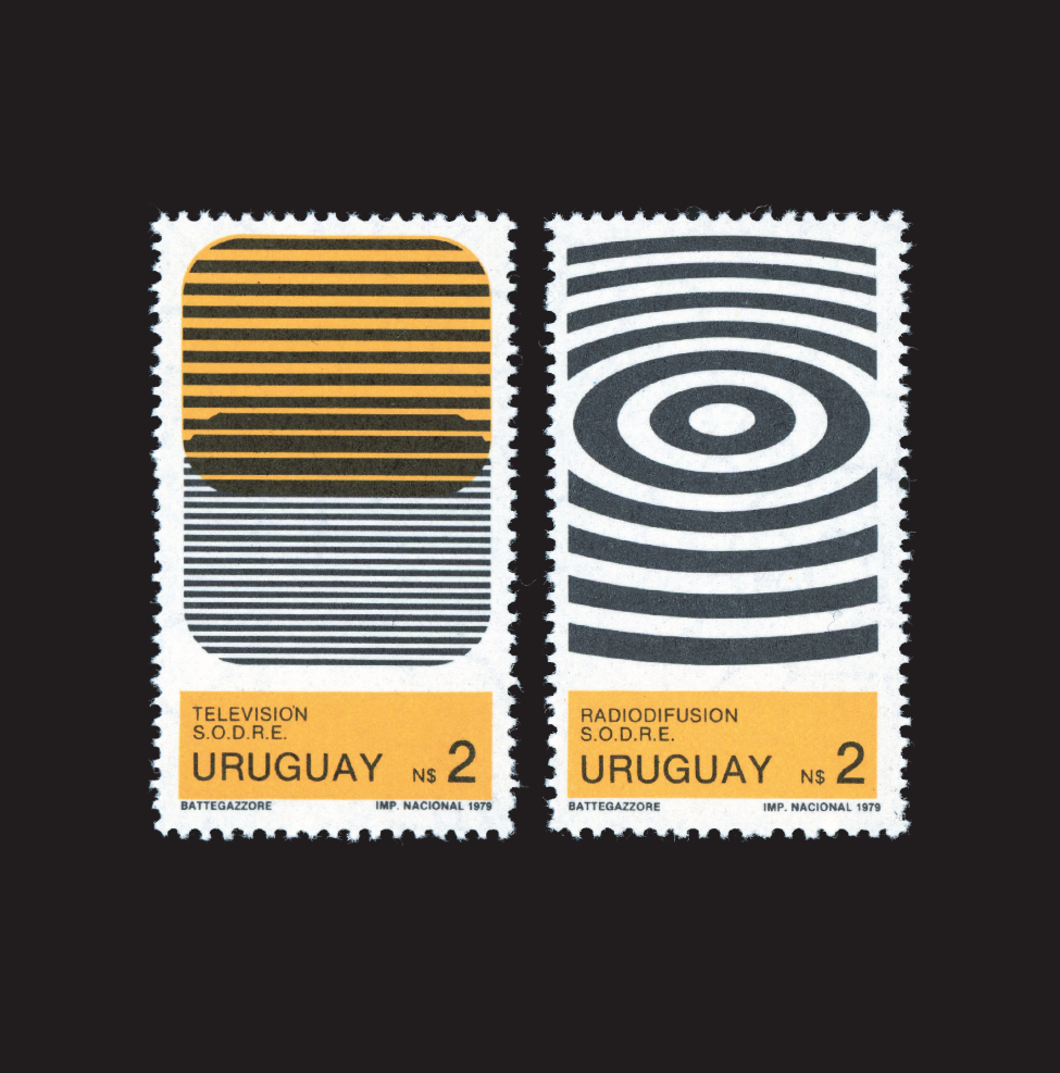
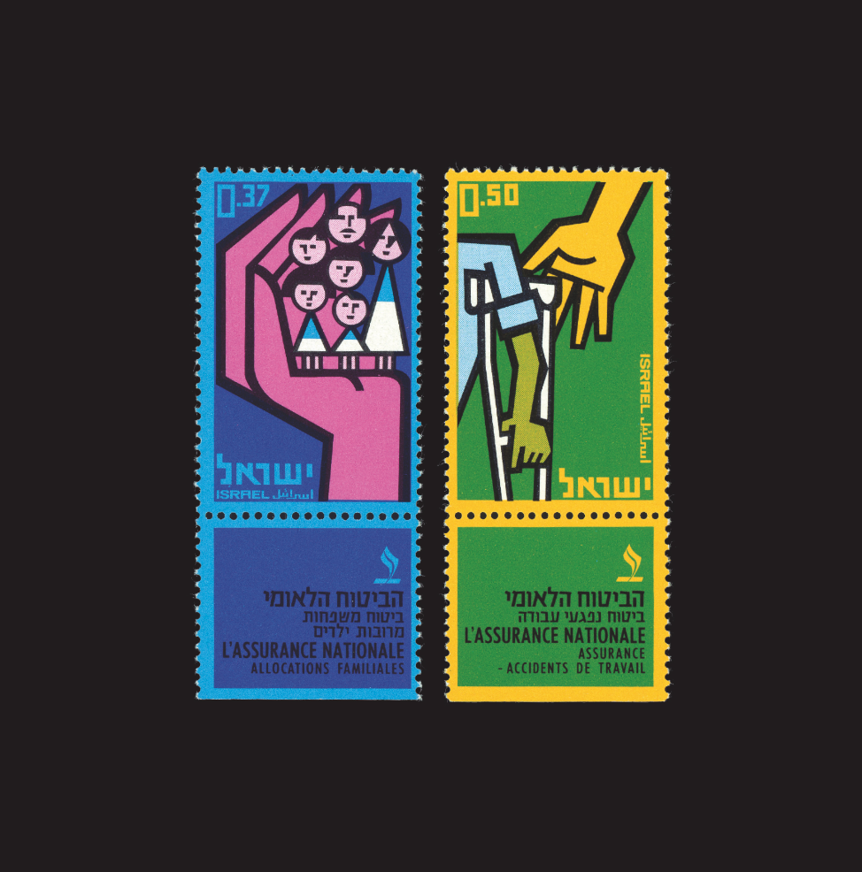
There is an extensive variety of postcard designs available worldwide fitting into a range of genres and themes. The example images I have selected here are all minimalistic graphic designs which make use of negative space and heightened simplicity.
To create my own postcards, I will need to form a template for the front and back of each card separately and have them printed together – or manually attach them by hand. For the front of the images, I intend to use the images I have shot in the external environments featuring a character facing the landscape of their choice. This might be a full image, or one with a white boarder depending on the experiments I carry out. The back section of the postcards will likely be a minimalistic design with an address space – probably with light lines – and a large blank area for either typed or handwritten responses to the survey questions given to each of my models.
To start this process of graphics and development off, I made a rough mockup of my own using Adobe Photoshop. This involved creating the postcard shapes, guidelines, adding backgrounds, adjusting my own images to fit my templates and finally applying effects such as filters and shadows. I used an image of my first model, Maya, for this postcard and used a white boarder to frame the photo. Yes the mug and background are pretentious but I like how to shadows came out across the image on the postcard. The point of this mock up is to show a minimalistic layout which could ultimately be printed as a final piece. I would aim for a minimalistic backing which could be printed or handwritten with the responses given from the survey I set out before each shoot. 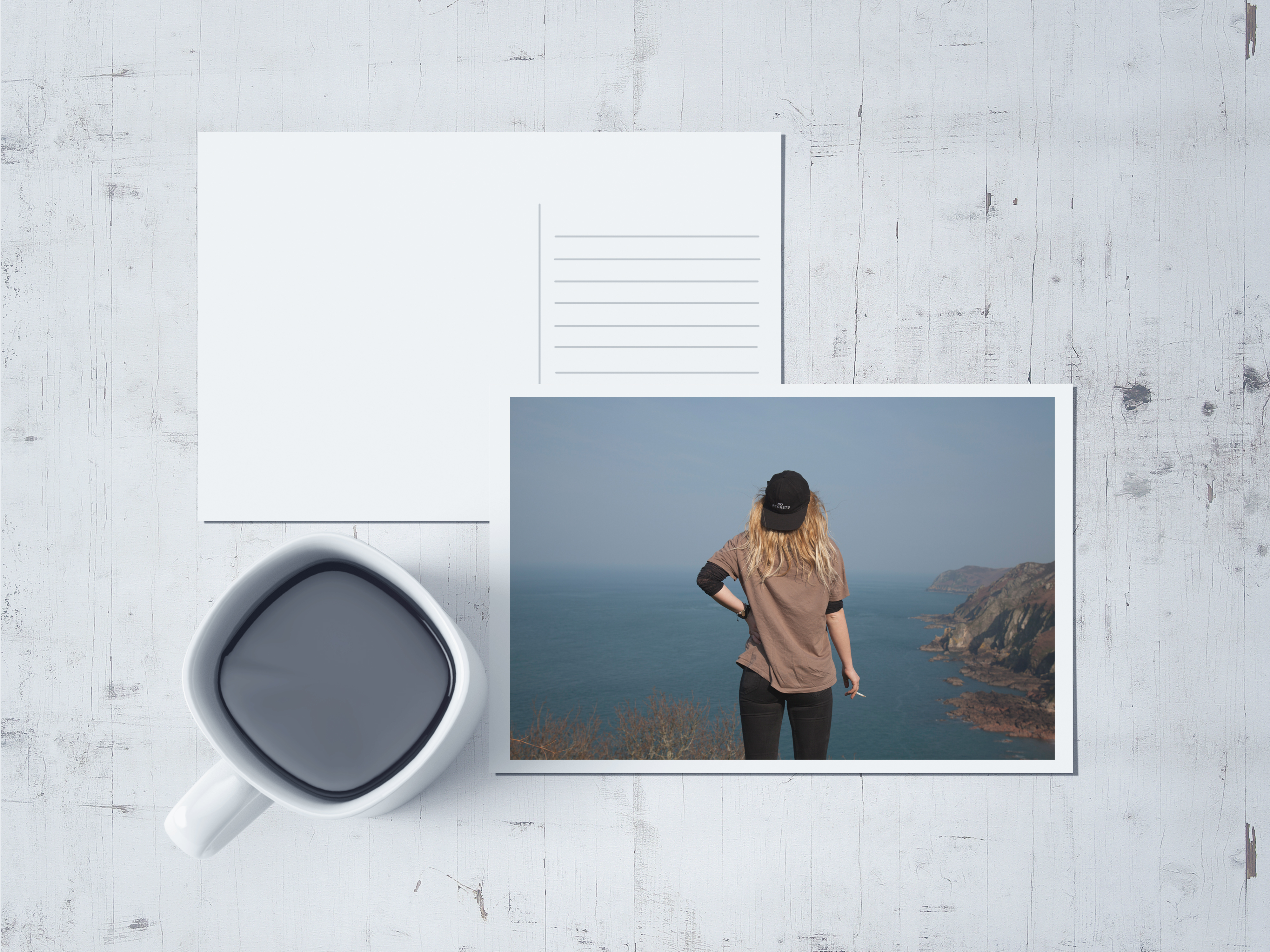
I could create a small series of stamps using other images which could reflect the home environments of each character. These could follow a more graphic layout with block colours and maybe feature colour block editing to contrast with the slightly washed images on the front of the post cards. To do this, I would edit the images in photoshop and print them onto thick sticker paper. They could then be cut or pressed with a cutter to create the stamp-like edges and applied to the postcards in place of a traditional postage stamp.



Overall there is not enough work posted on the blog yet!!
I want to see more images and ideas of your portraits/ postcards with experimentation, annotation and evaluation
follow our action plan devised in school last week.
To achieve and A or A* we need to see a coherent progression of work from start to finish following these steps:
RESEARCH > ANALYSIS > PLANNING > RECORDING > DEVELOPING > EXPERIMENTING > PRESENTING > EVALUATING