Documentary: Beach & Ocean Pollution – planning

My next topic of documenting our islands pollution will be focusing on our beautiful, yet tainted beaches and seas. With 45 miles of coastline, Jersey beaches are considered to be some of the best and most varied throughout the British Isles. However, we are no exception to the growing worldwide issue of beach pollution produced by the gross amount of waste dumped into the ocean each year. These next few shoots documenting this problem will be a straight photography style approach to expressing and representing our islands beach pollution.

Beach pollution is a persistent problem, in 1995 alone nearly 4000 beach closings and advisories were issued by the state and local governments. The litter that is swamping our oceans and washing up on beaches kills wildlife, looks disgusting and is a hazard to our health. It is estimated that there are nearly 2,500 items of rubbish for every kilometre of a beach. These items mostly consist of plastic waste which has increased in amount 140% since 1994. This is especially hazardous since plastic will never biodegrade and will eventually break down into tiny microplastic particles investing the water. The main types of beach pollution include wet weather discharges, the public, discarded fishing equipment, and sewage runoffs. The biggest source of pollution in the ocean (and therefore on beaches) however, is directly from land-based sources, such as oil, dirt, septic tanks, farms, ranches and motor vehicles. Even though much of the trash and waste dumped into the ocean is released hundreds of miles away from land, it still washes up on beaches and coastal areas and affects everything in between. Every marine animal is affected by man-made chemicals released into the water. — Below are some examples of my previously taken photographs showing beach pollution, and below that is a contact sheet of the kind of images I am hoping to create in my first section….

Although I do like a few of my images shown in this small collection above, I do not feel they show beach pollution ‘on a whole’ as well as they could. This shoot was not planned and was simply aimed to experiment with what kinds of objects I can expect to find, and how to get across my message by photographing them. The results have taught me that in order to show the scale of common beach pollution I must come at this from a different angle. Since then I have been inspired to complete my own beach clean-ups, showing what I find, collected together in one powerful photograph. When looking at ocean pollution I will visite one of these same beaches a few weeks later, using the trash accumulated there to create interesting underwater photographs.

Although the fact I am tampering with the subjects, compromises this next shoot as a part of documentary photography, the truth of how much pollution is on just one beach will be evidently clear. To complete this first beach pollution section I will begin by simply visiting some of Jersey’s popular beaches to determine wich will be the best to get across my message. Although I am unsure of which beaches will be featured, I plan to look at smaller beaches to emphasise how such a confined area can demonstrate so much pollution. All I will need to do this shoot is my camera, some trash bags, gloves and natural light from the sun. It will be interesting to see how much of this waste I can find to support my point of this being a massive and overlooked pollution issue. For the ocean pollution section, I will be trying to create meaningful photographs of rubbish found in our beautiful seas from an underwater perspective.  This will hopefully emphasise the issue of beach pollution and how it affects marine life and the environment. To do this I will simply be using real props found on location and my iPhone with and underwater phone case. Below is a contact sheet of the kind of images I am hoping to create for the first section of these shoots (minus the people). For the underwater photography, looking at ocean pollution, I will be exploring my inspirations with a couple of artist researches before I complete the shoot. 

The Daughter of Nature

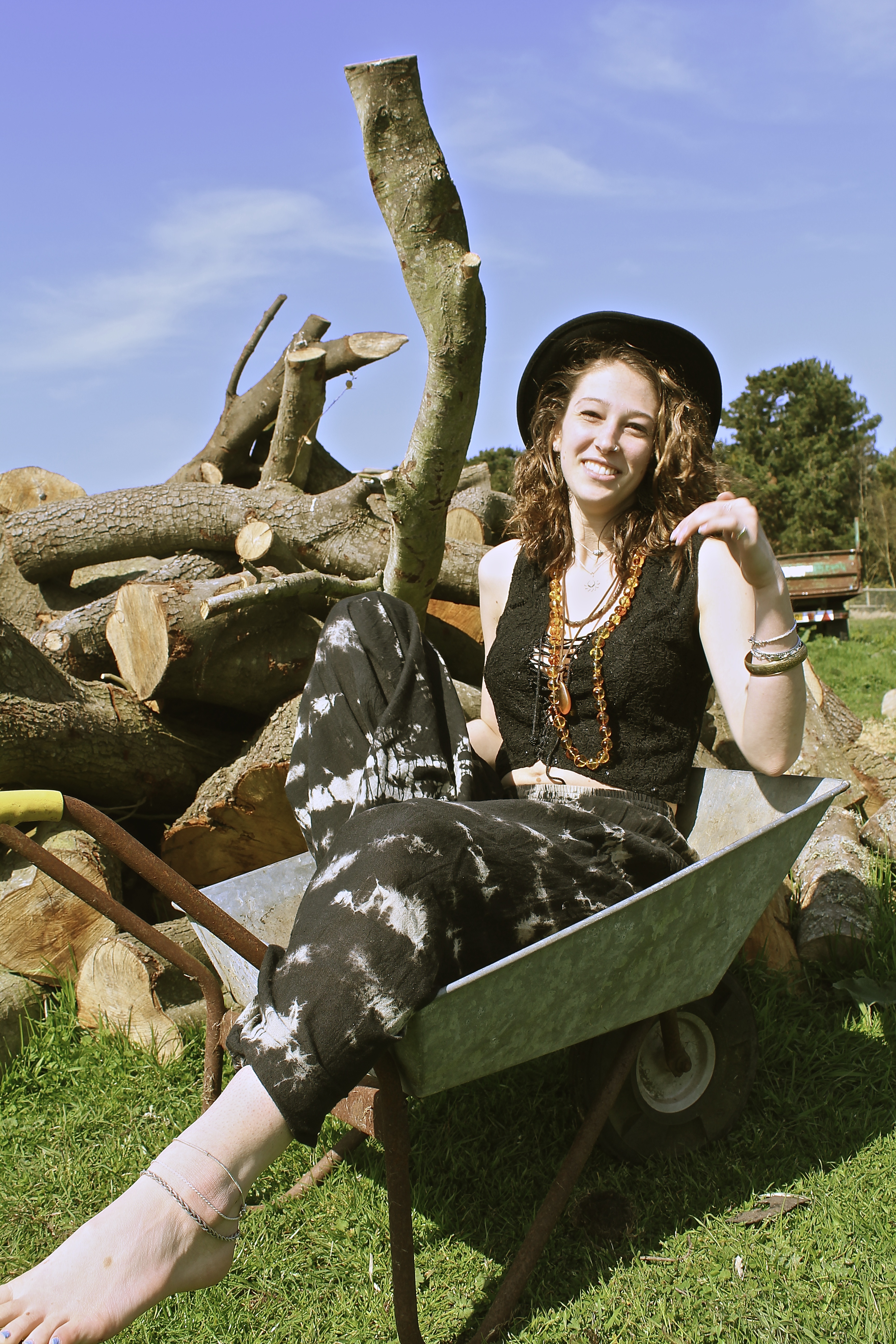
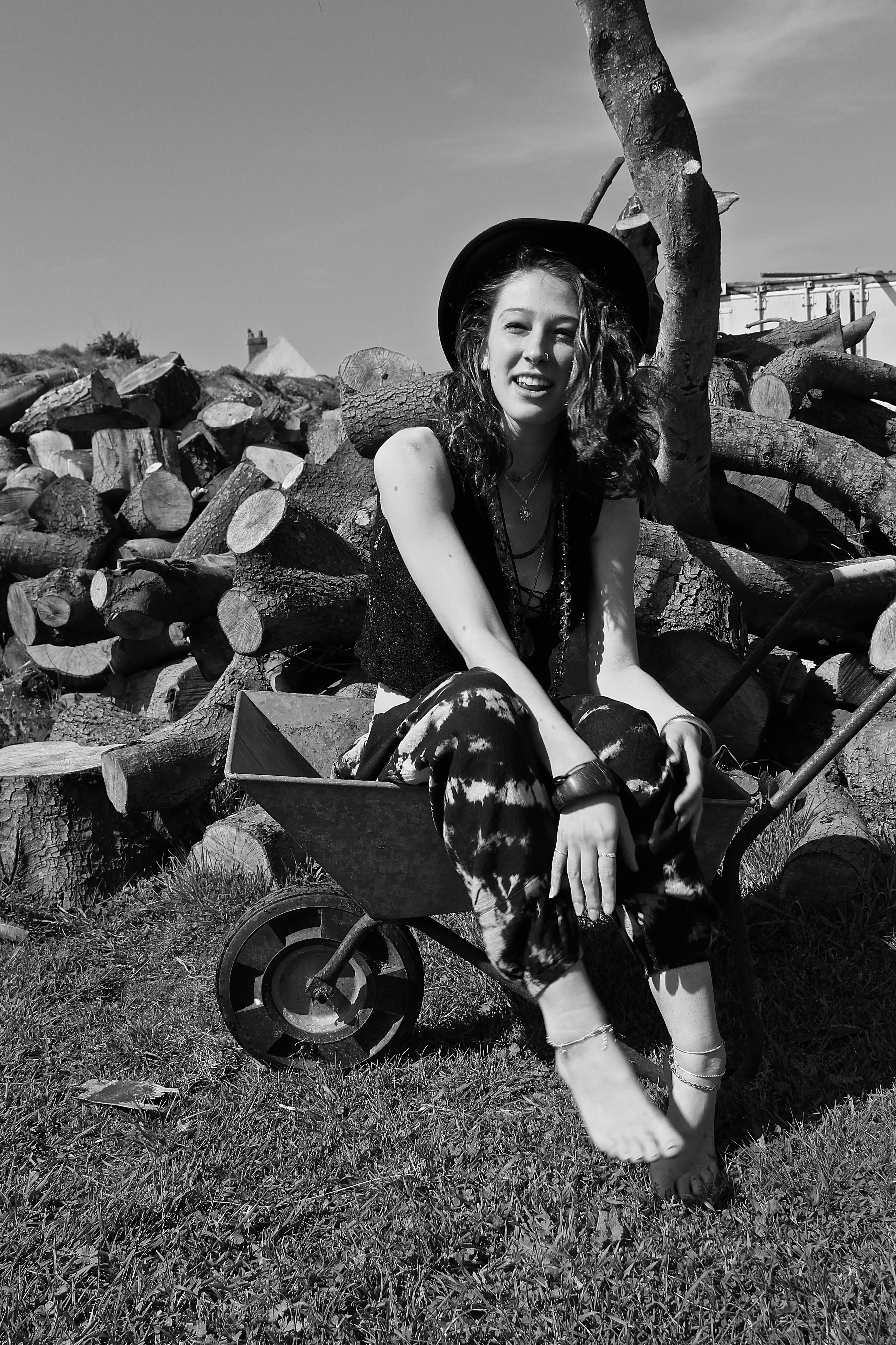
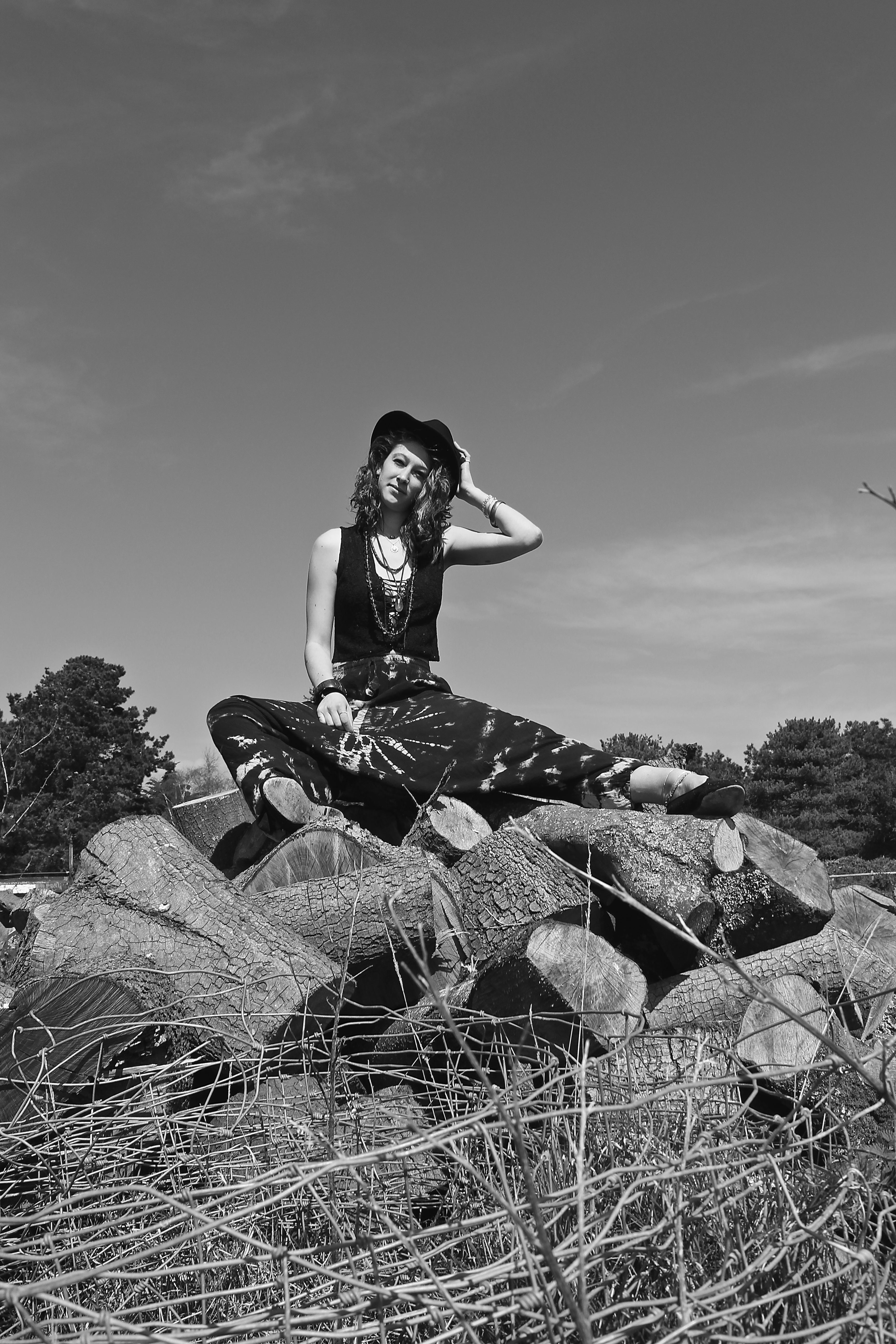
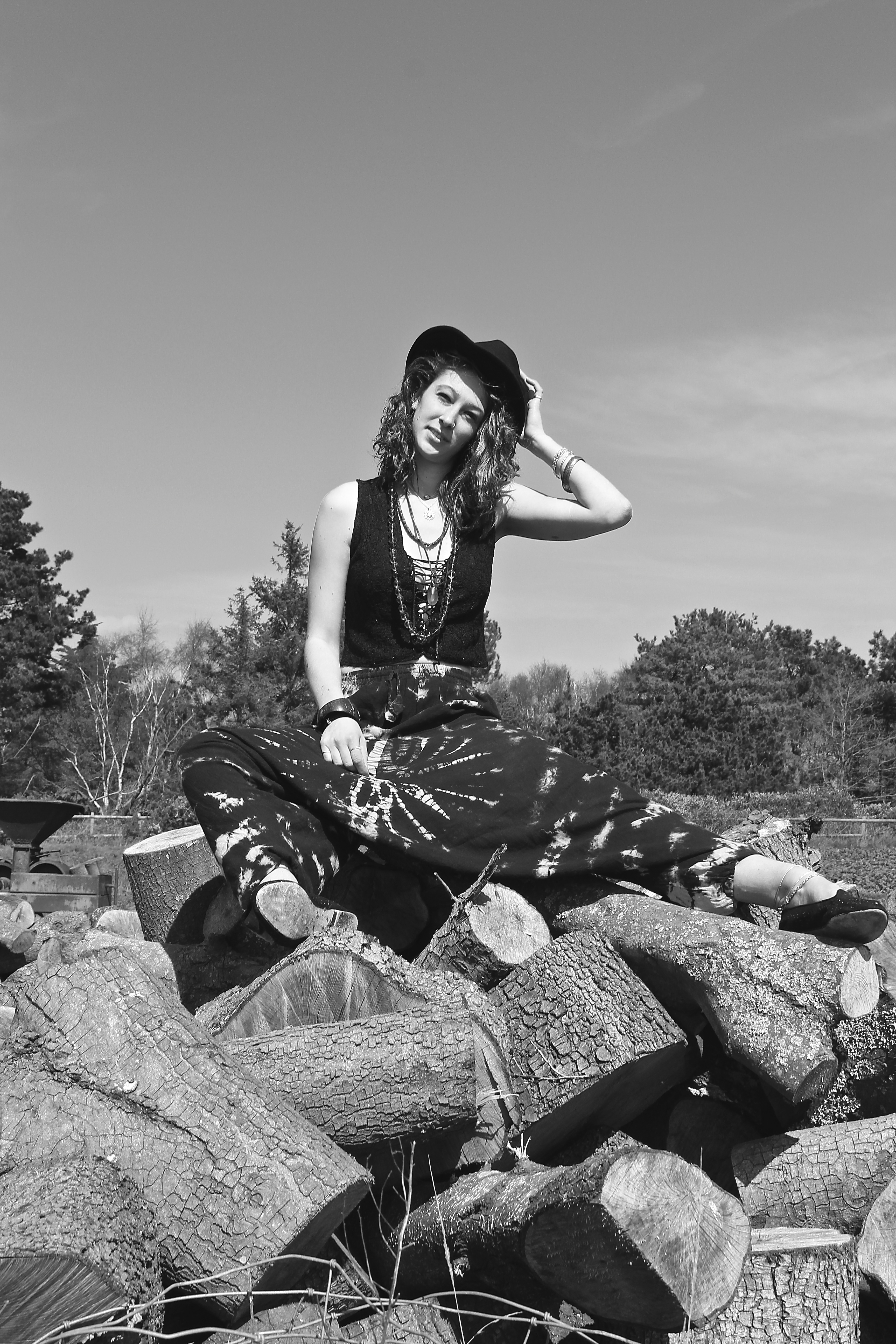
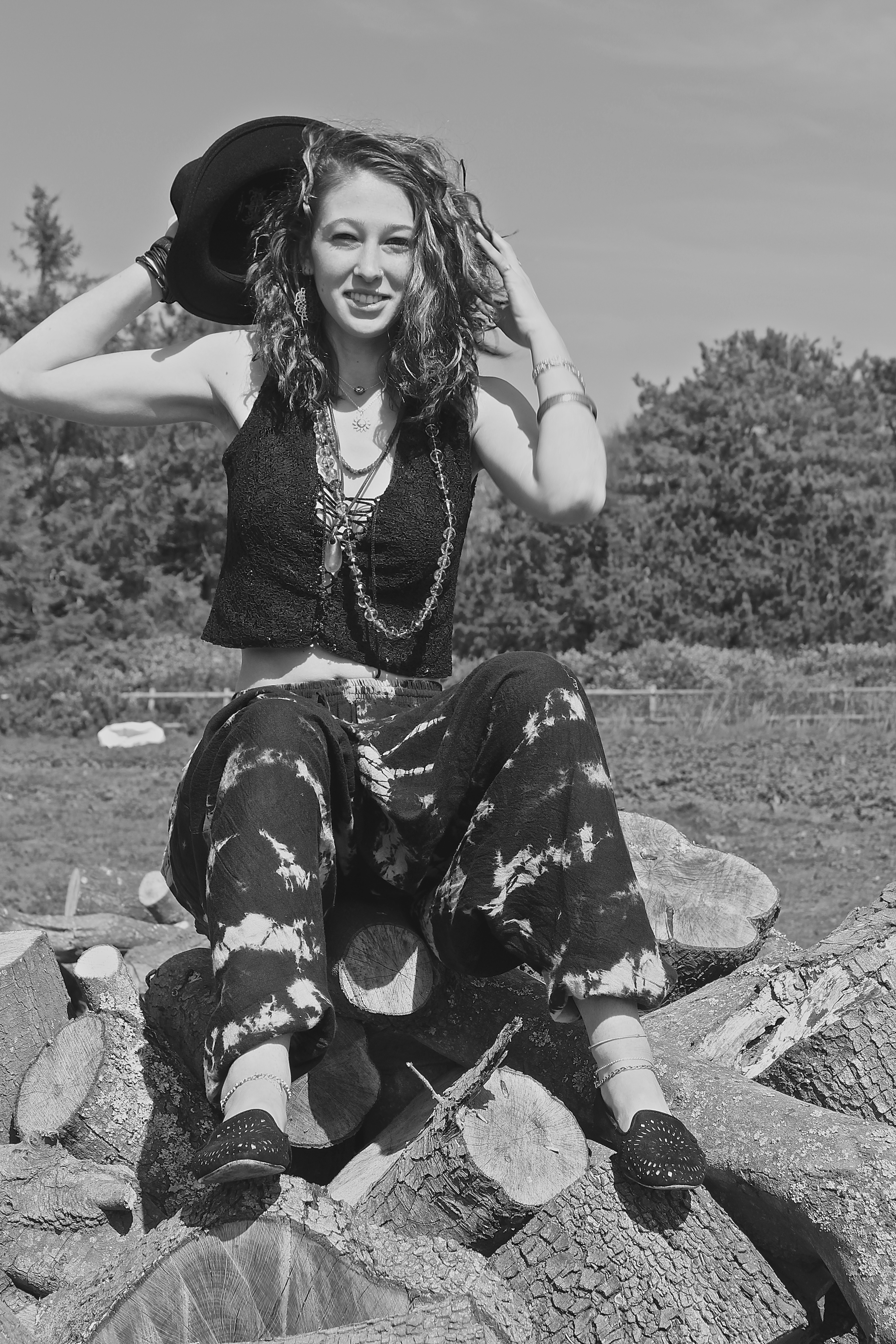
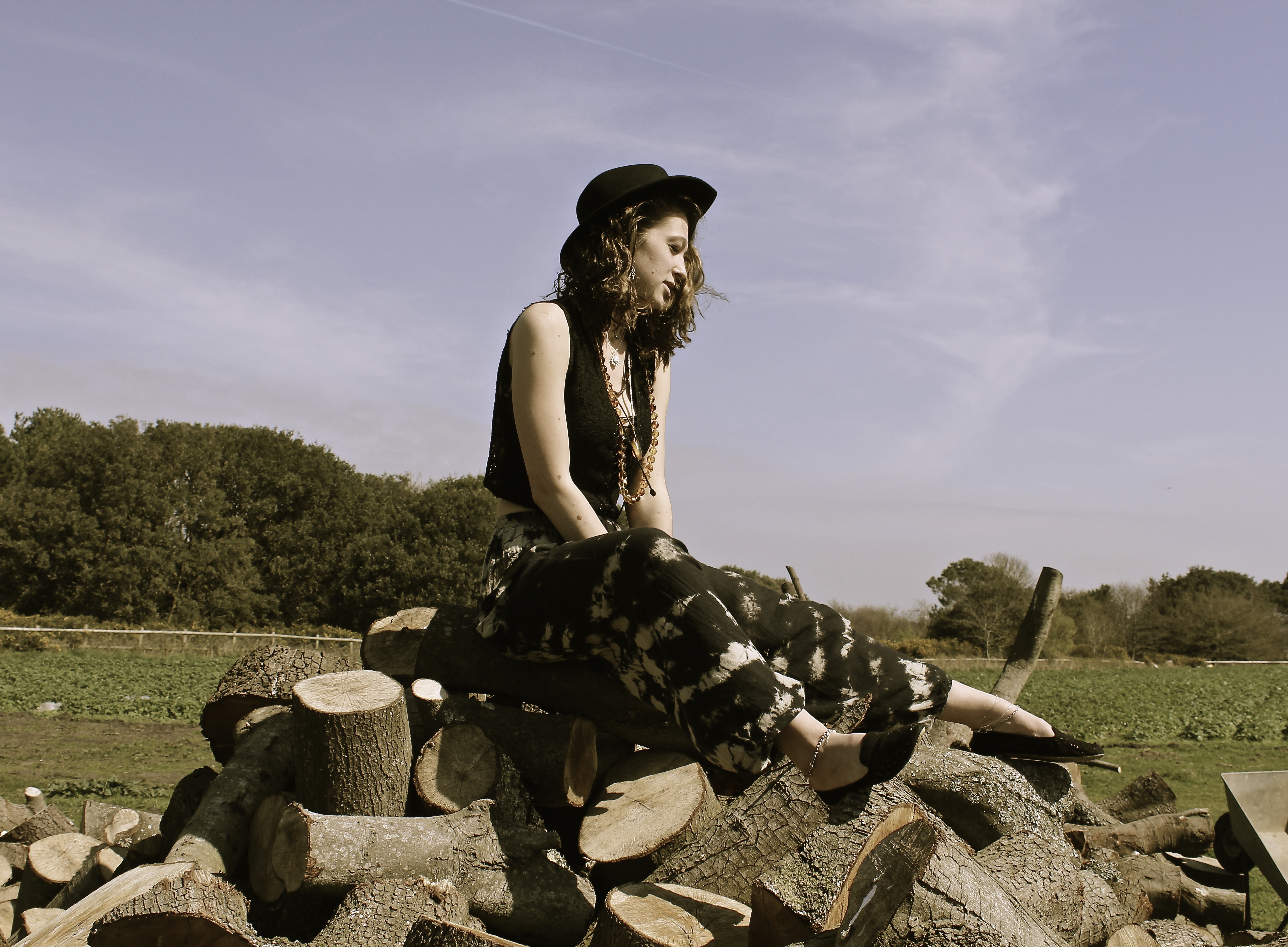
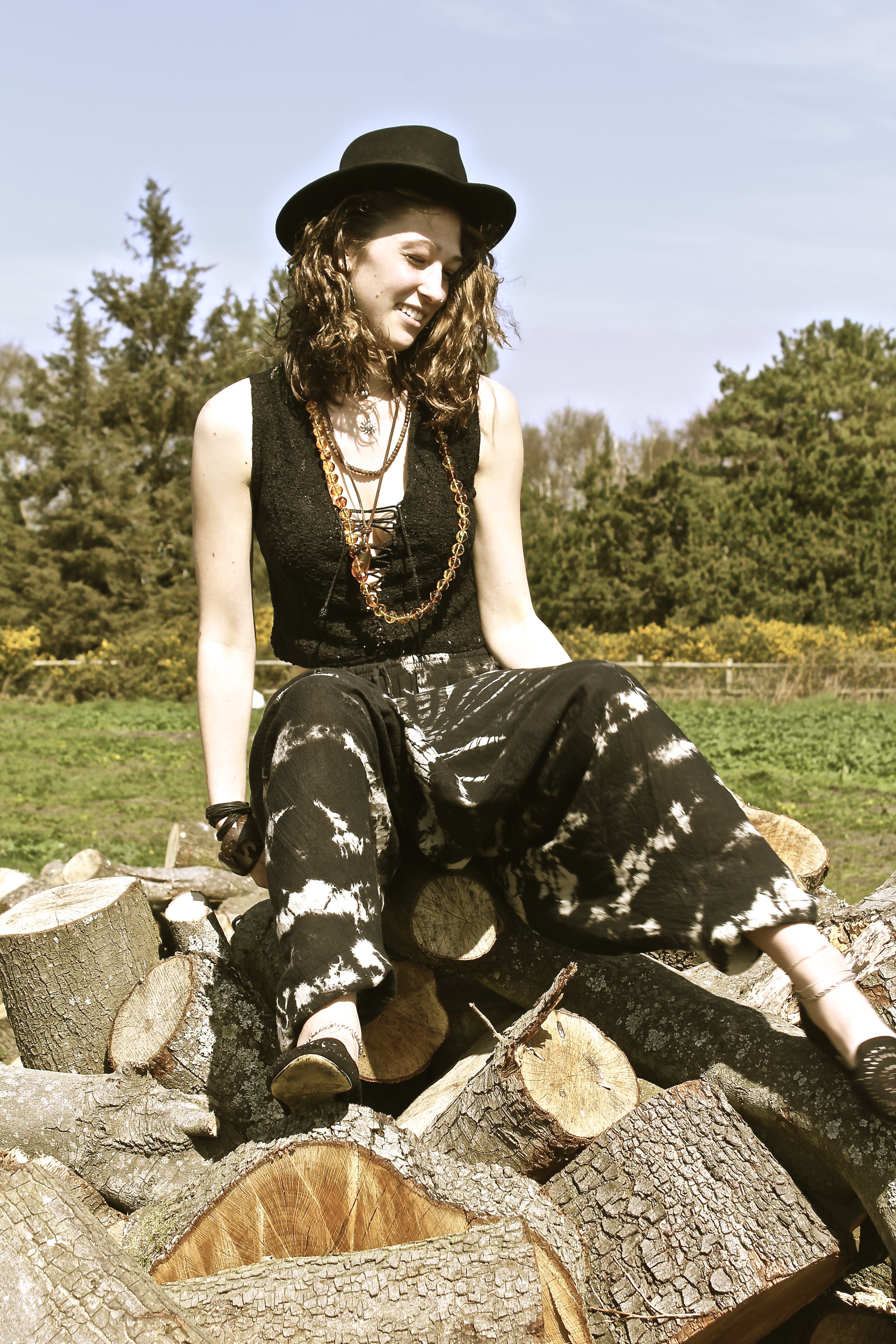
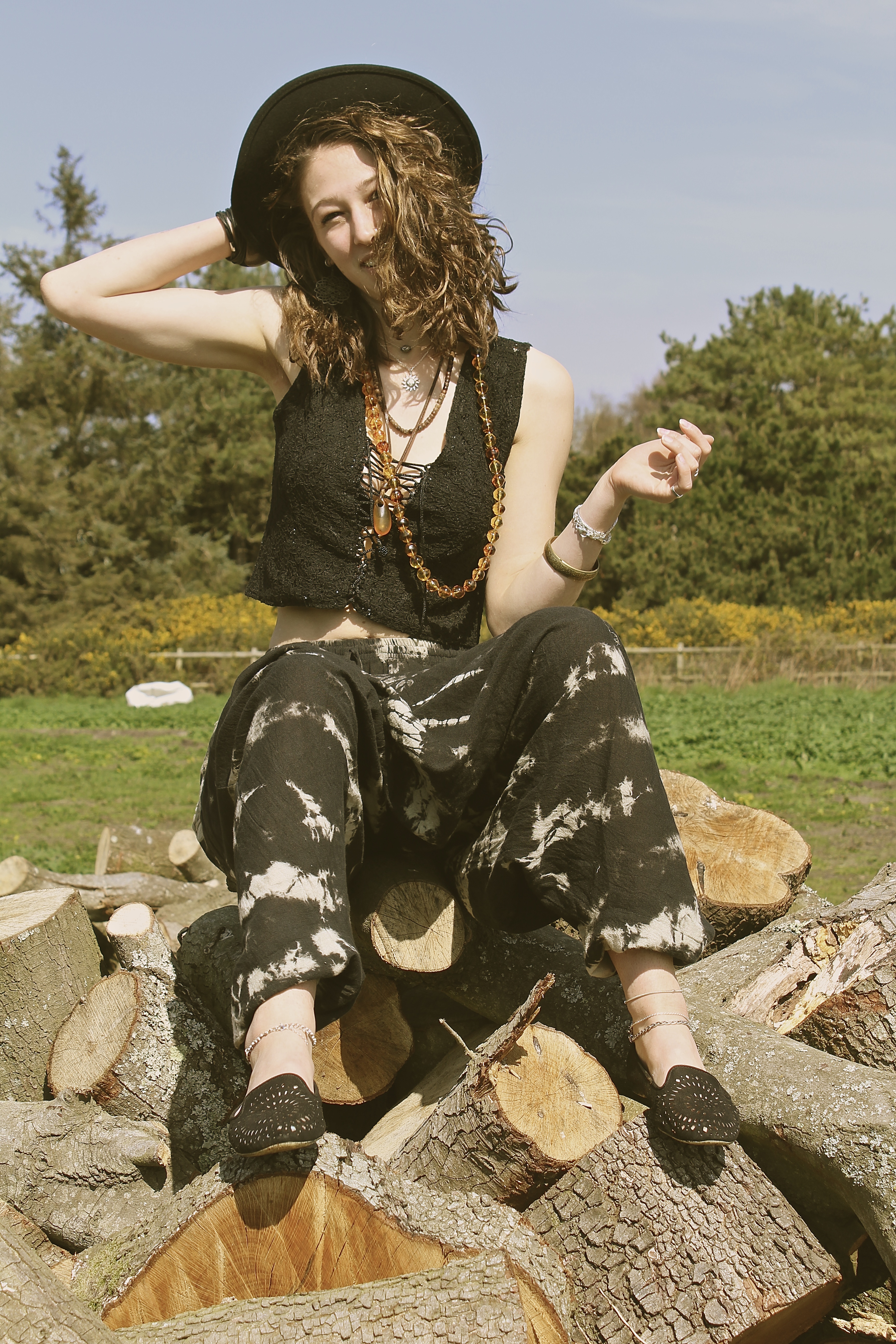
This shoot was inspired by the photograph taken by Juergen Teller of Kate Moss in the wheelbarrow. However, we got to the location with the wheelbarrow, and I ended up being more intrigued by the log pile behind it. The reason for this is because I was trying to represent with these photographs how humans are such consumers, as one can see the trees in the background which perhaps will soon be knocked down and made into this piles of logs – like the ones the model is sat on – this is us ( the consumers) can use them to our advantage, therefore destroying the beautiful land around us. This is why the trees are slightly out of focus in the background as we put ourselves before the world we live in and believe we’re more important than nature, which isn’t true as we need trees to breathe. This is what I wanted to represent through the use of the model, as one can see she’s dressed in a ‘hippy’ style, and hippies are referred to as tree huggers  which is kind of a metaphor as she’s sat on a pile of logs, the message I was trying to get across is we’re destroyed the world that we live in.

“I’m not a political artist in any way, but if an idea takes me somewhere or something is emotionally impactful, I find a way to make a painting that encapsulates it.” Idris Khan 

Even though I preferred the log idea, I still managed to caption some photographs of the model in the wheelbarrow, inspired by Juergen Teller. As shown below;

I love this image below, because the way the models looking directly at the camera, smiling but showing a bit of tongue making it look a bit provocative, also by the way she’s bending over in a low cut top. It makes it look slightly suggestive without intentionally doing this. The way the foot on the left is slightly blurred actually gives it more of an effect, as it looks as if the photograph was taken on a old film camera, which is the same style as Juergen Teller.

The composition of the image below works well as I have taken it from below angle, therefore creative negative space behind the models head and therefore not having anything in the background which is distracting. The model and the log pile appear clearer than the background of trees, this works well as they are the main subject and what I want the viewer to look at more.


Derelict Dreams

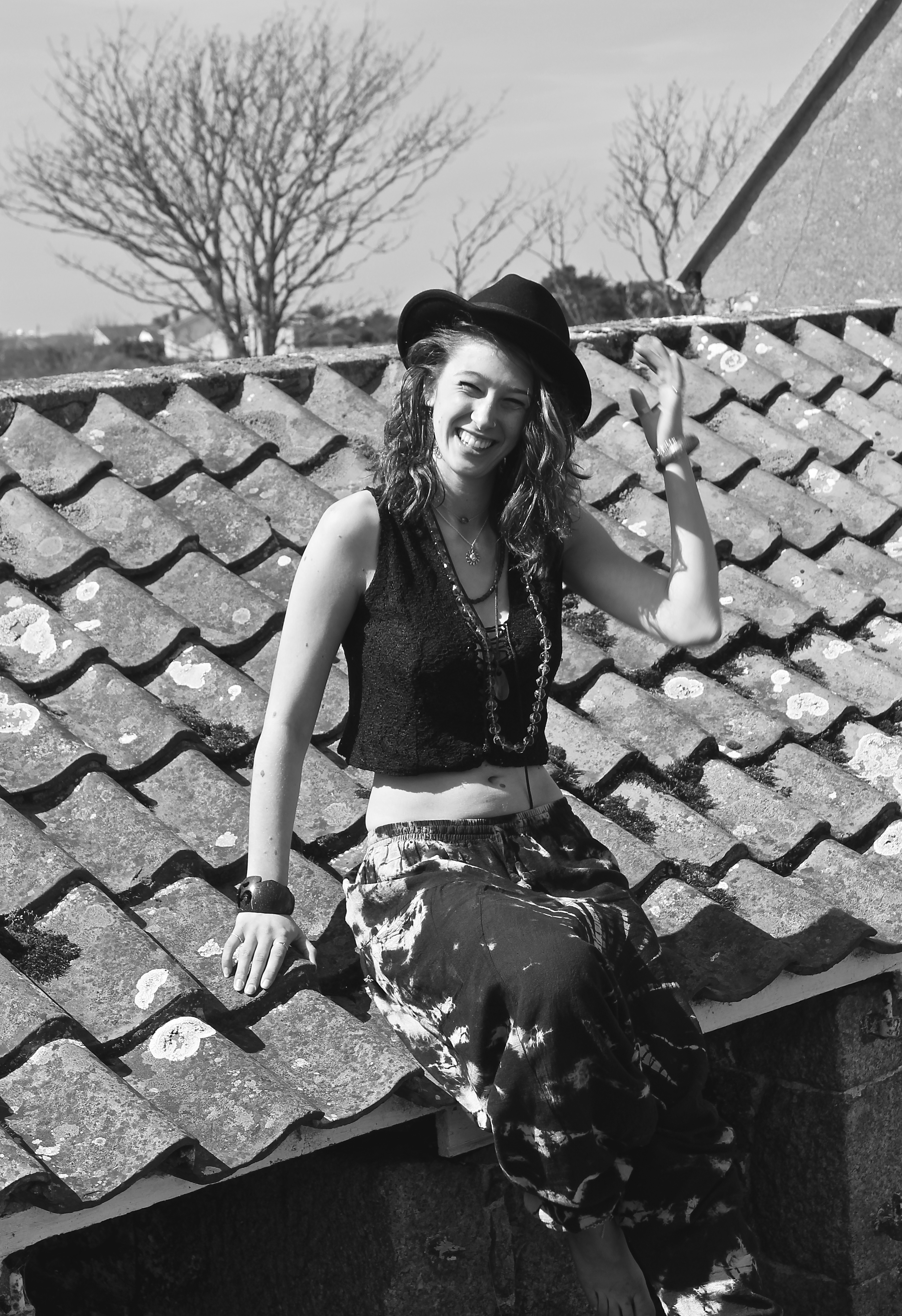
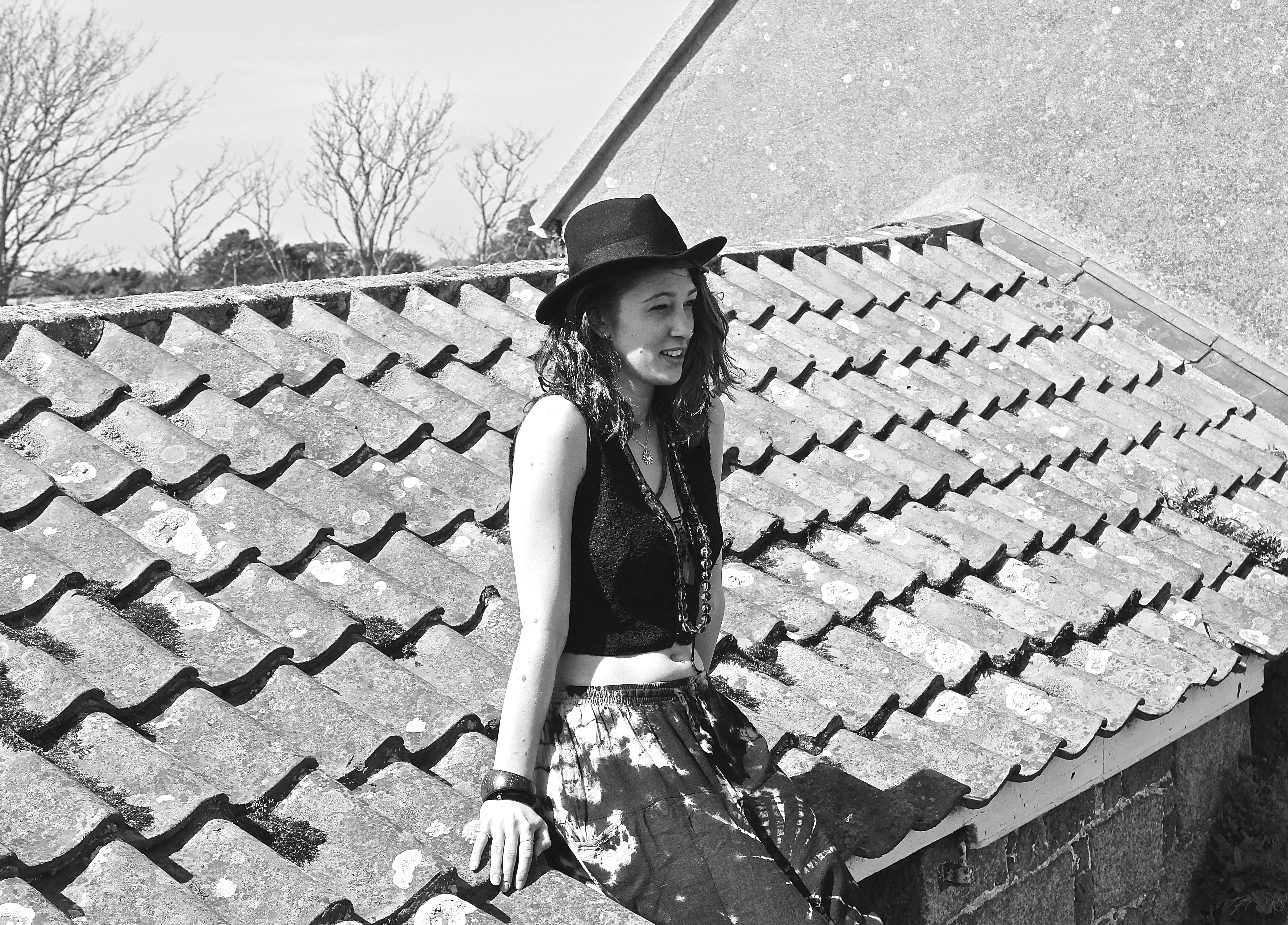
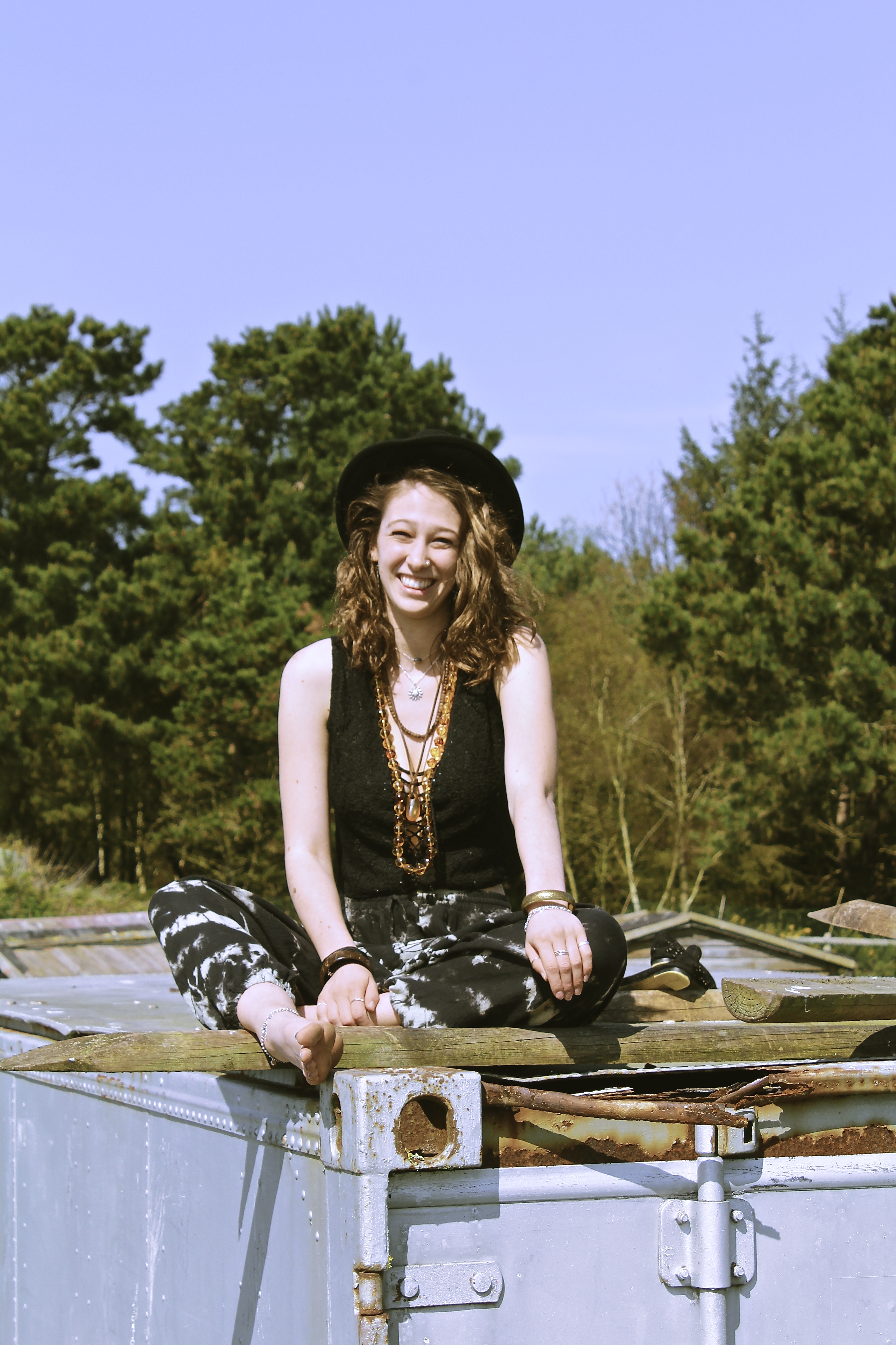
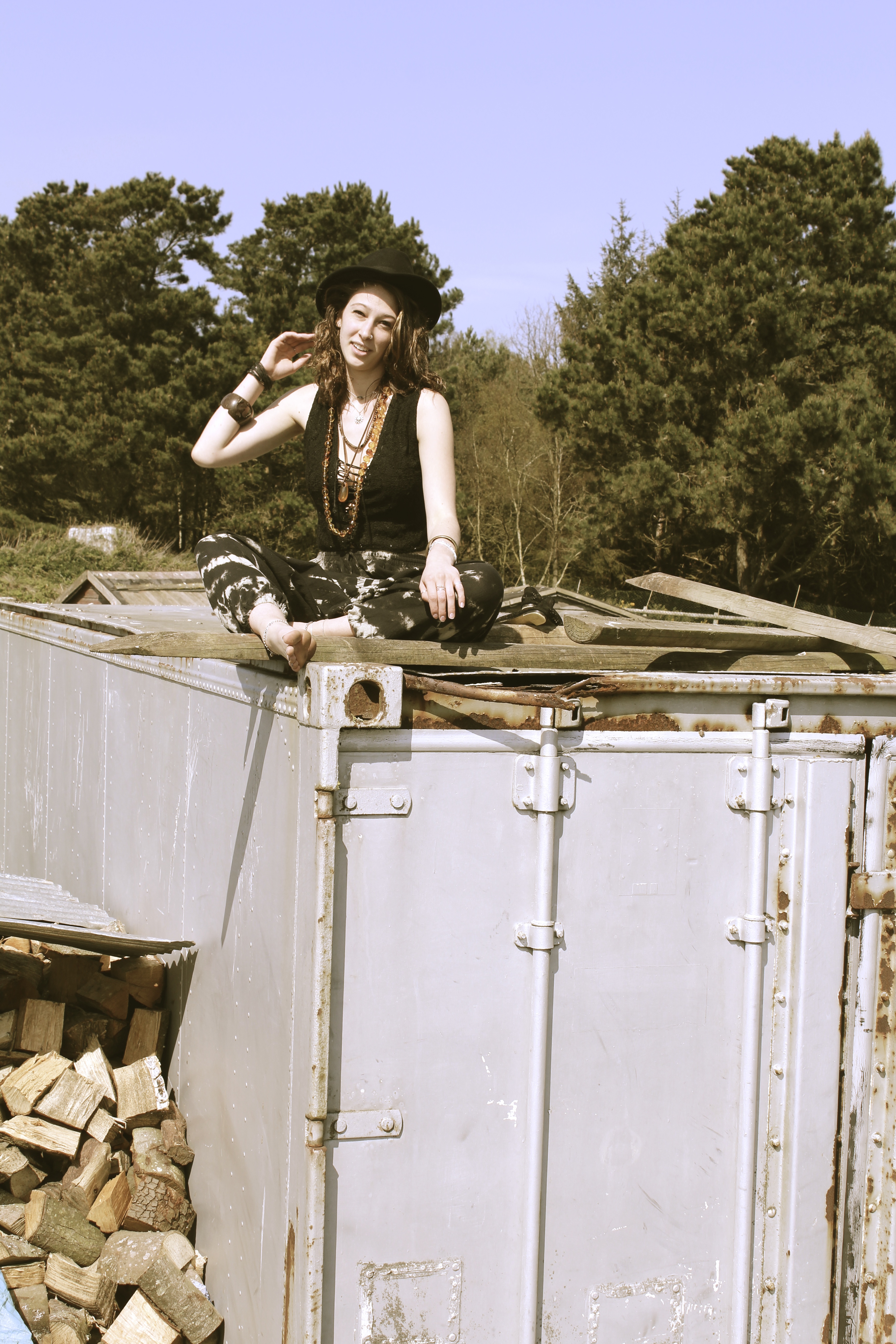
This shoot was initiated because it was to represent how the travelers would go on adventures and would end up doing something peculiar like climbing up old derelict buildings. Their adventurous exploring sides would come out, and they’d get the best views and sights because they were high up on the roof of somewhere remote.

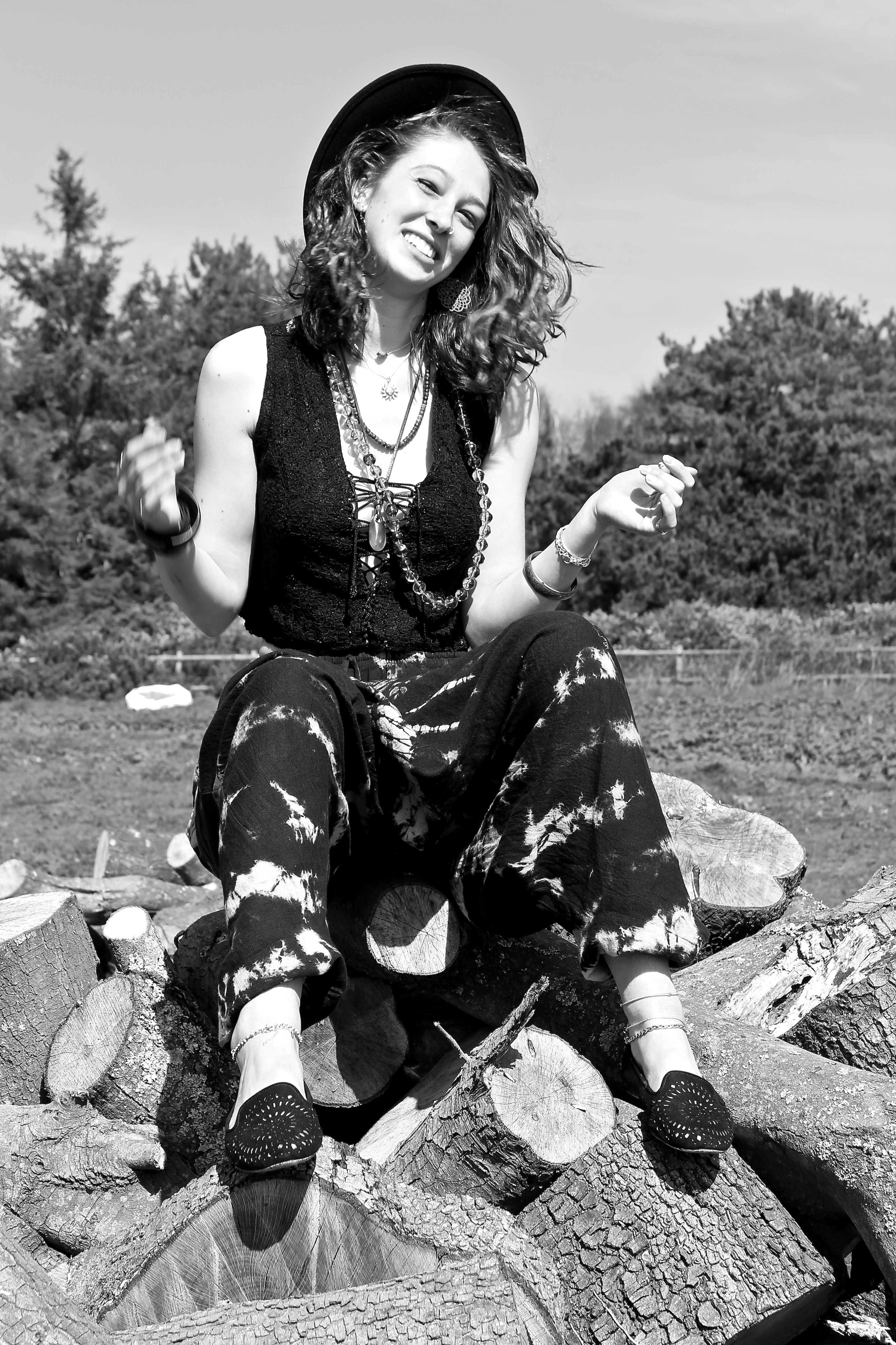
The image below reminds me of the series of Kate Moss  by Corinne Day, ‘The Third Summer of Love’. This is due to the model being smiley and squinting her eyes, very similar to how Kate Moss posed before becoming a Super-Model with Day. It also reminds me of that shoot by the use of accessory’s such as the hat and the necklaces. It is also taken in black and white like Days.

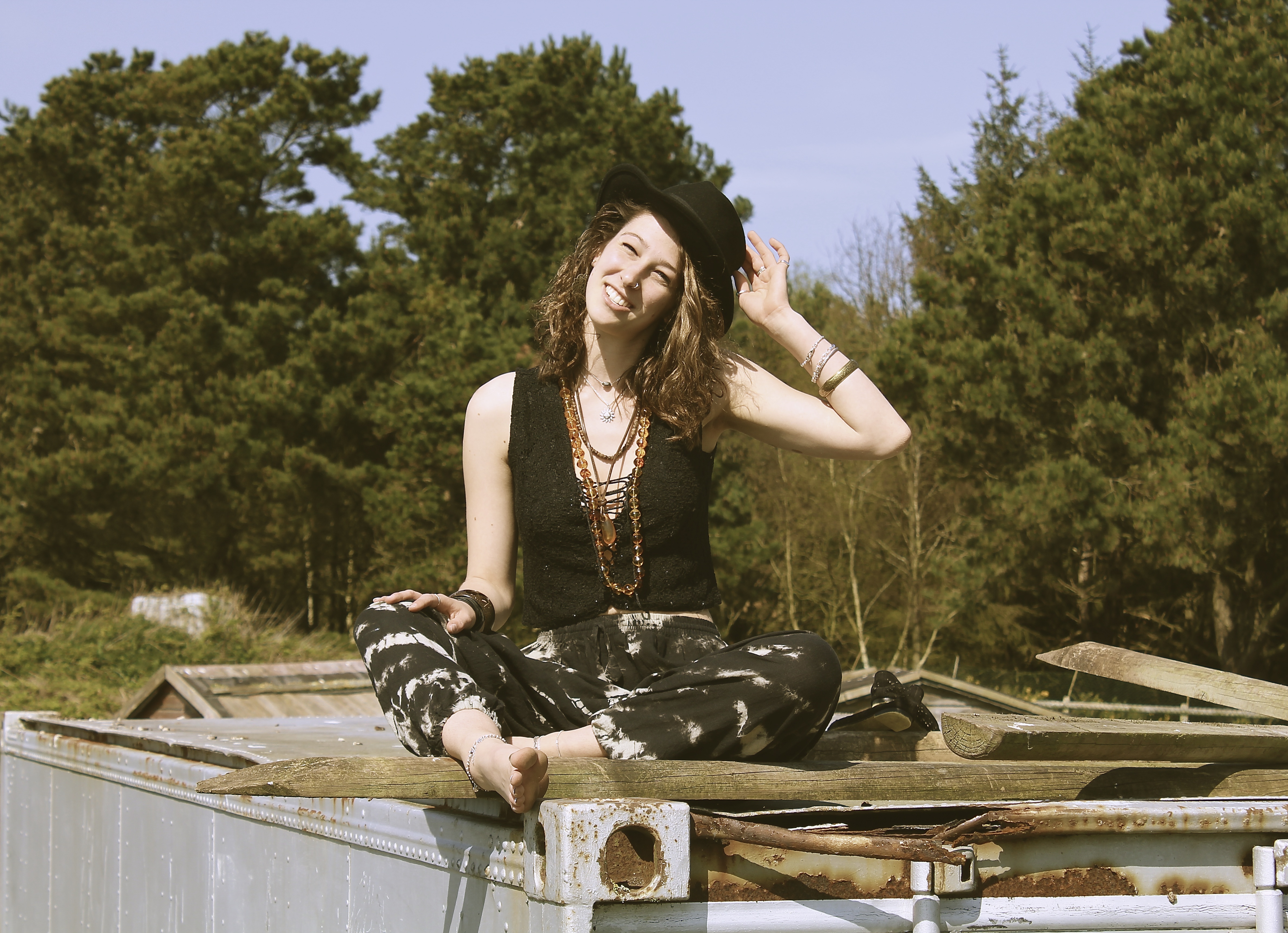
I like the image below due to the compositon, as the camera is looking up at the model, which usually tends to be an unflattering angle. However this technique works well here, as it creates negative space in the background, making the model be the main focus of the image. The color tones for this image also work well, as all the colors are a blue or brown, for example the rust on the container brings out the necklace and highlights in the models hair. The use of the natural lighting also creates and interesting shadow on the models neck, which makes the image look more fascinating.


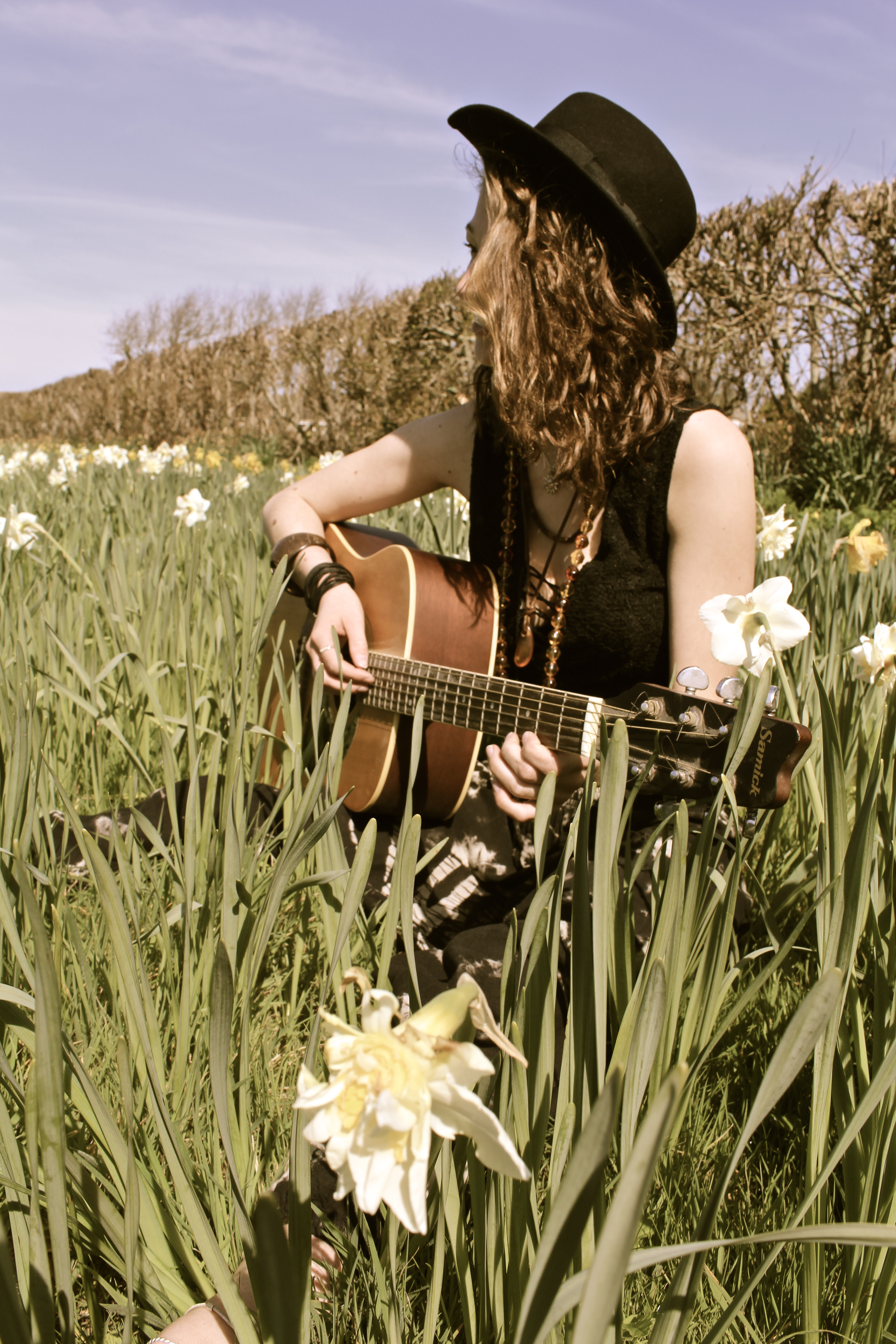
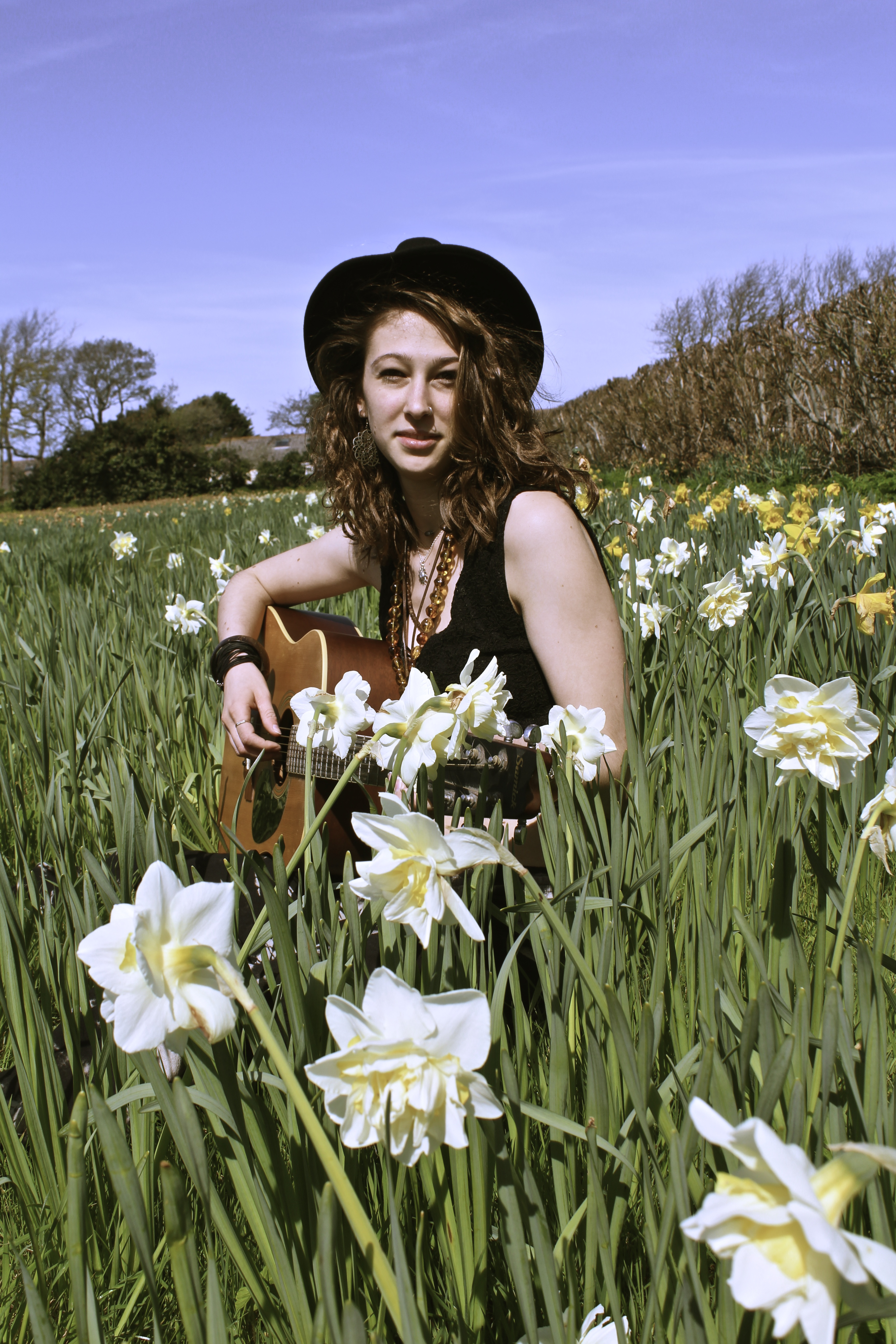
Fields of Melody

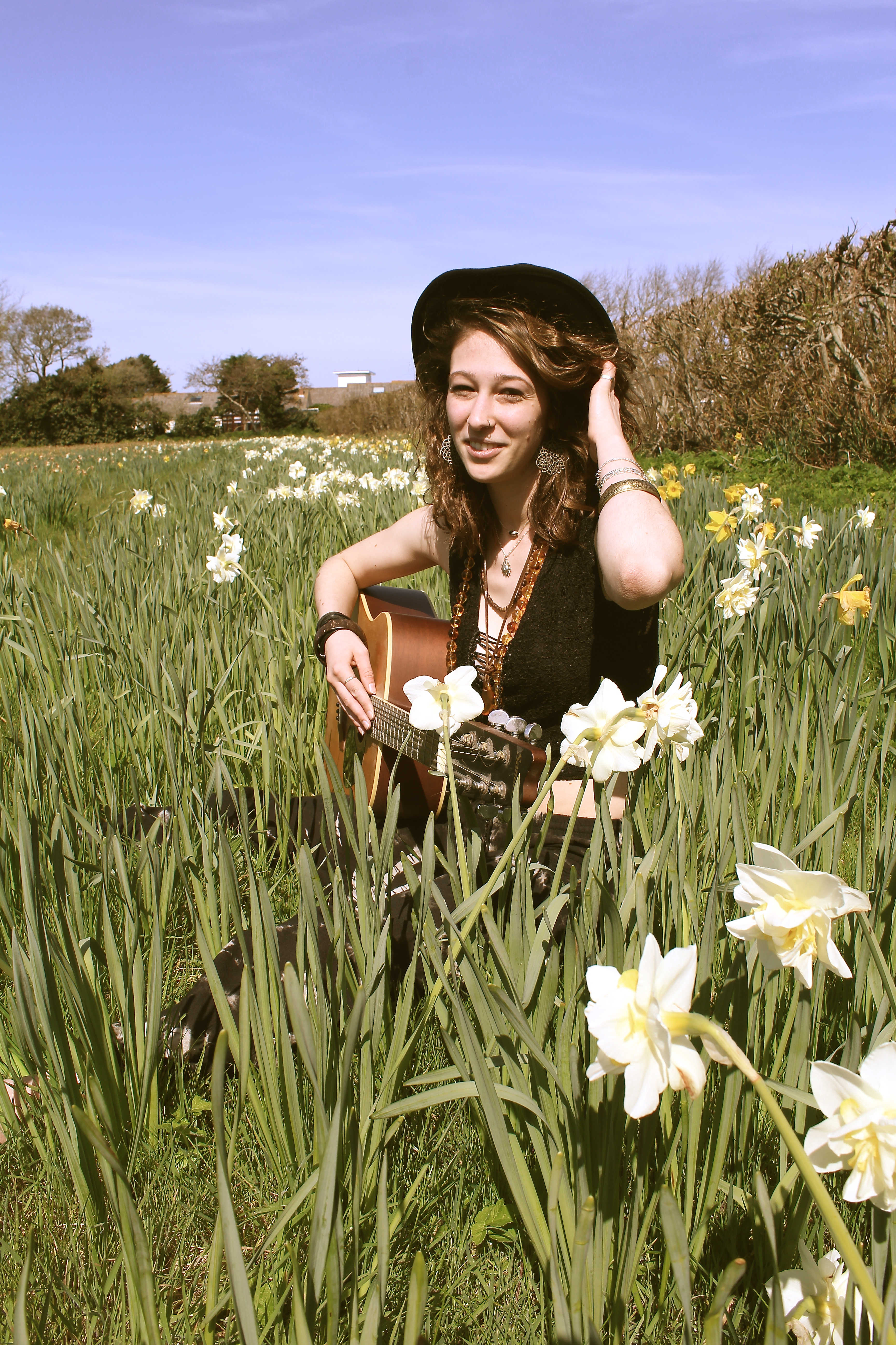
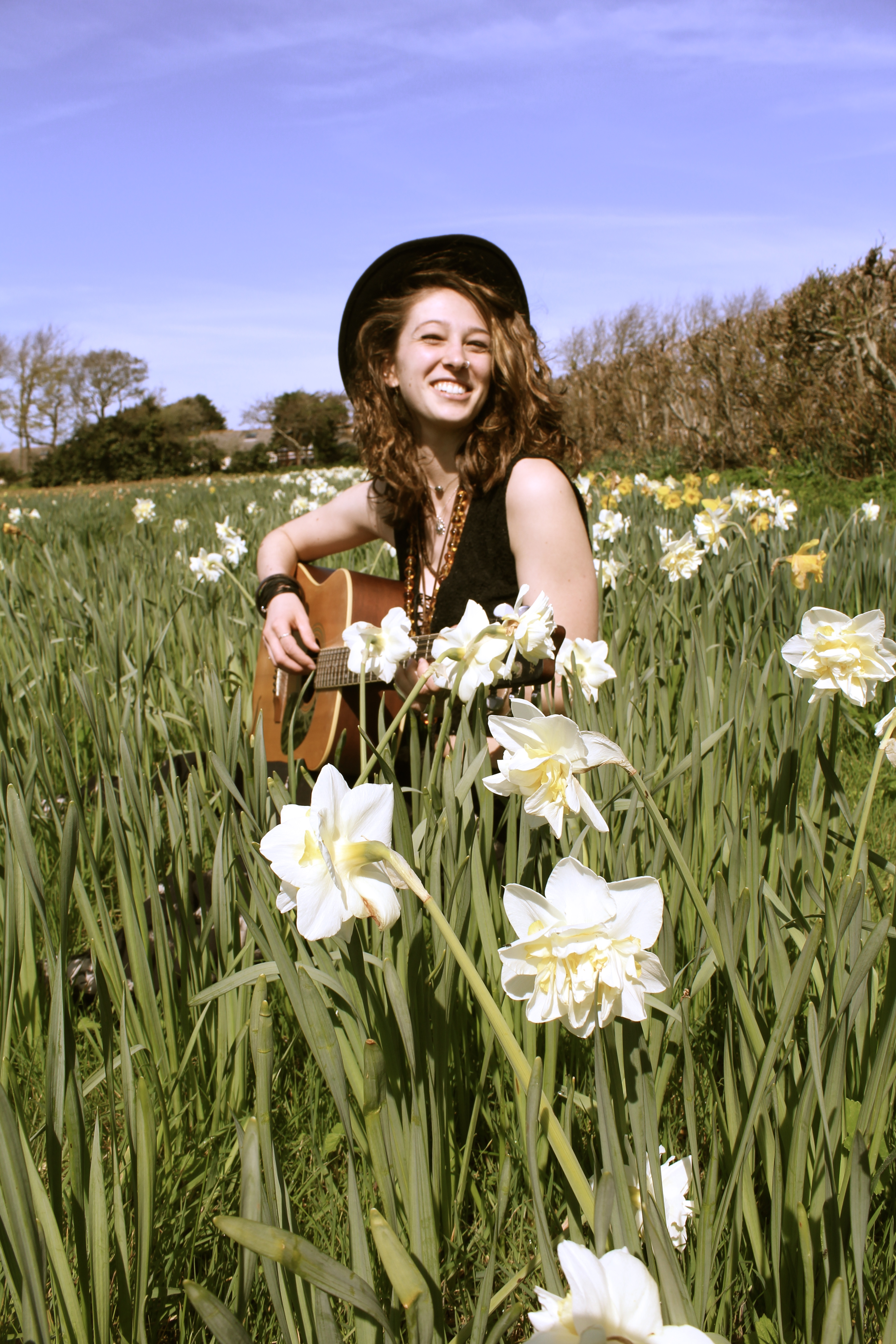
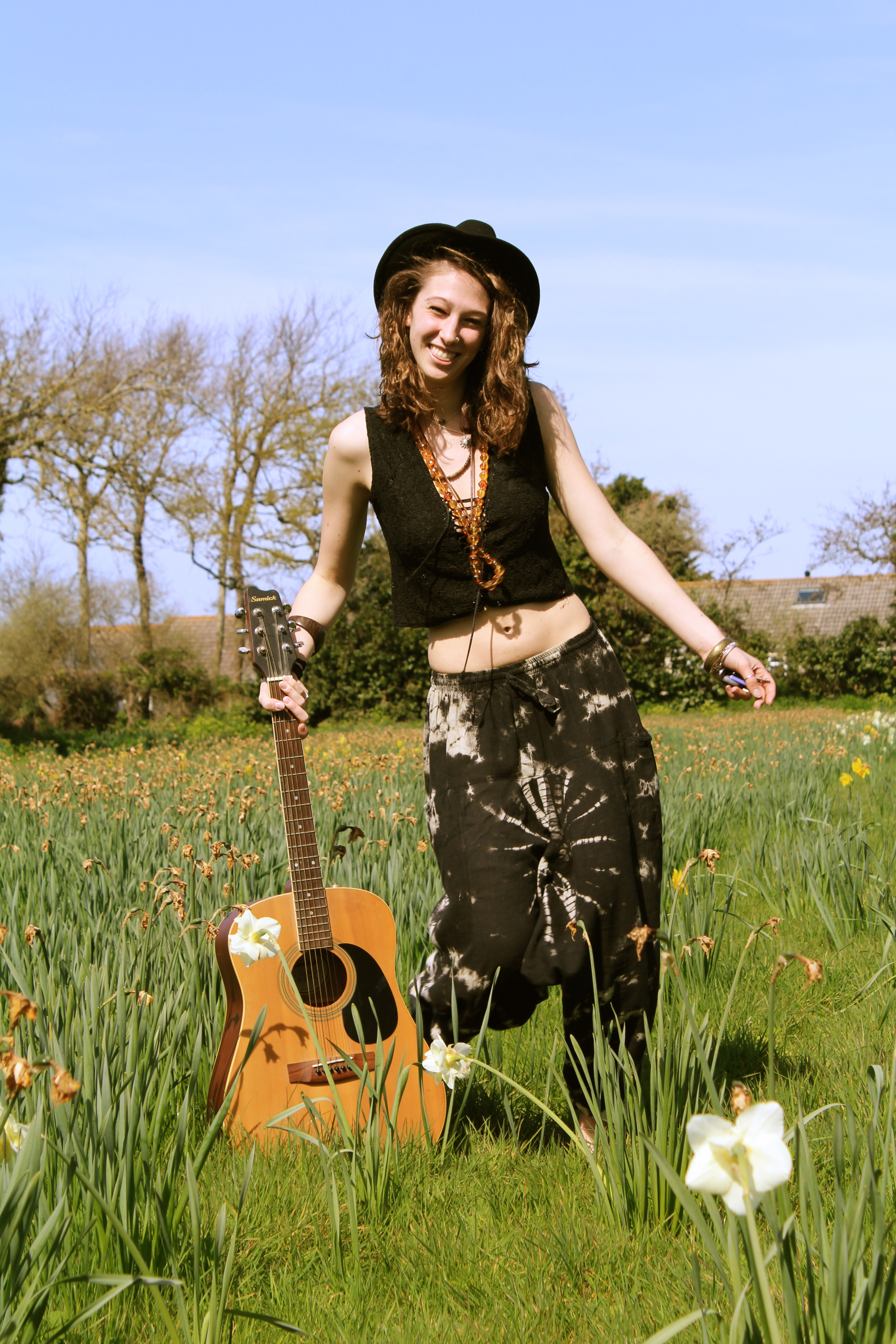
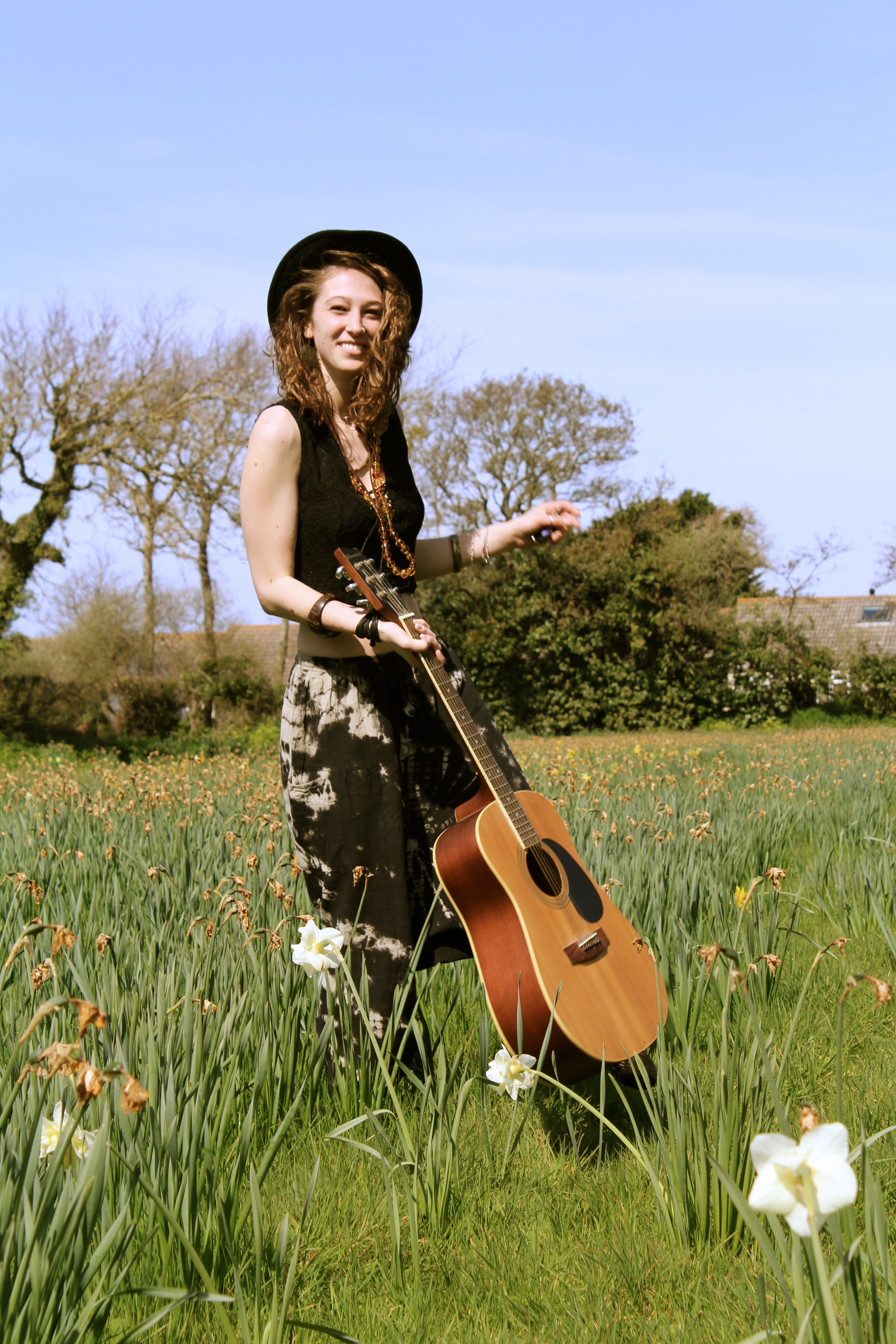
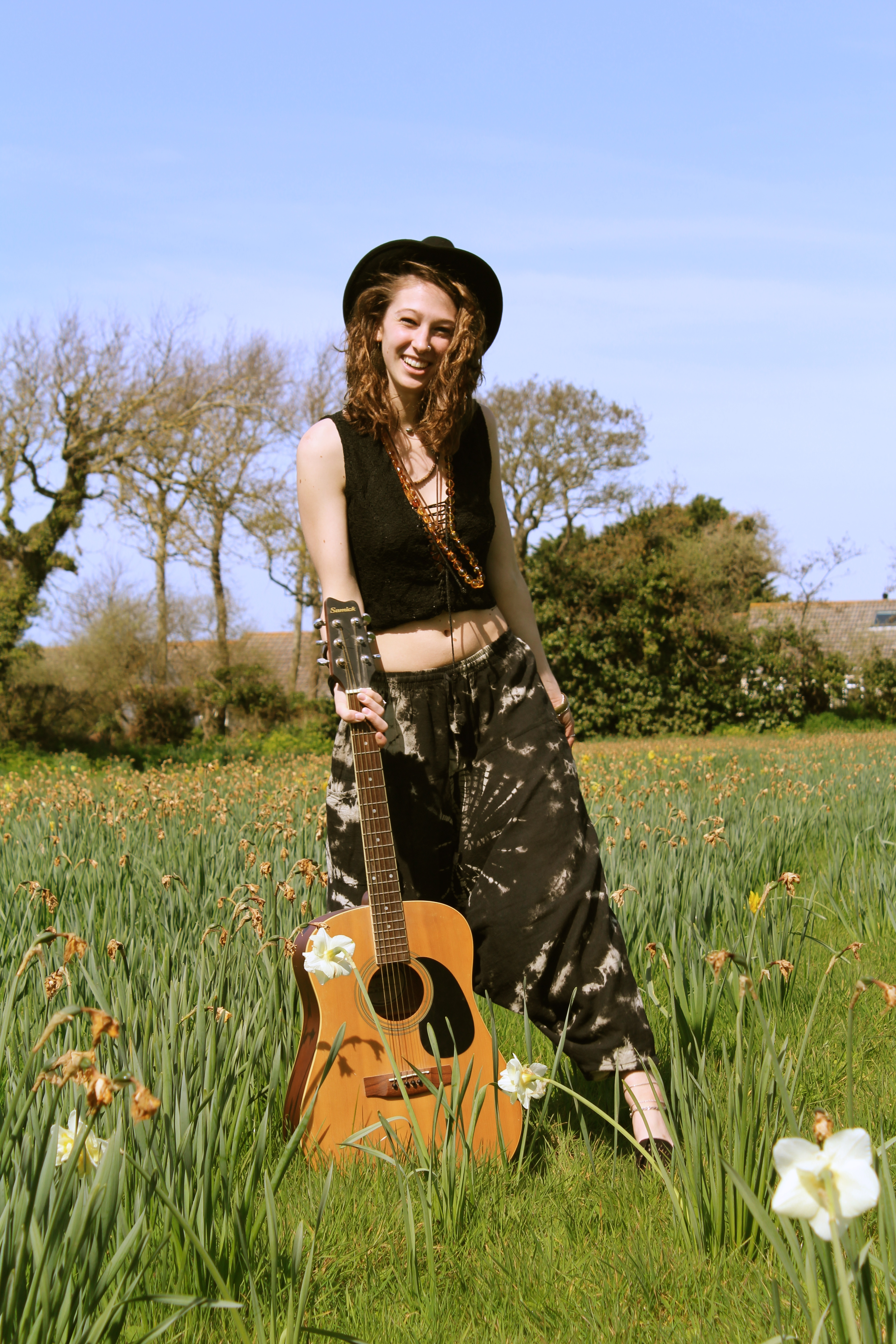
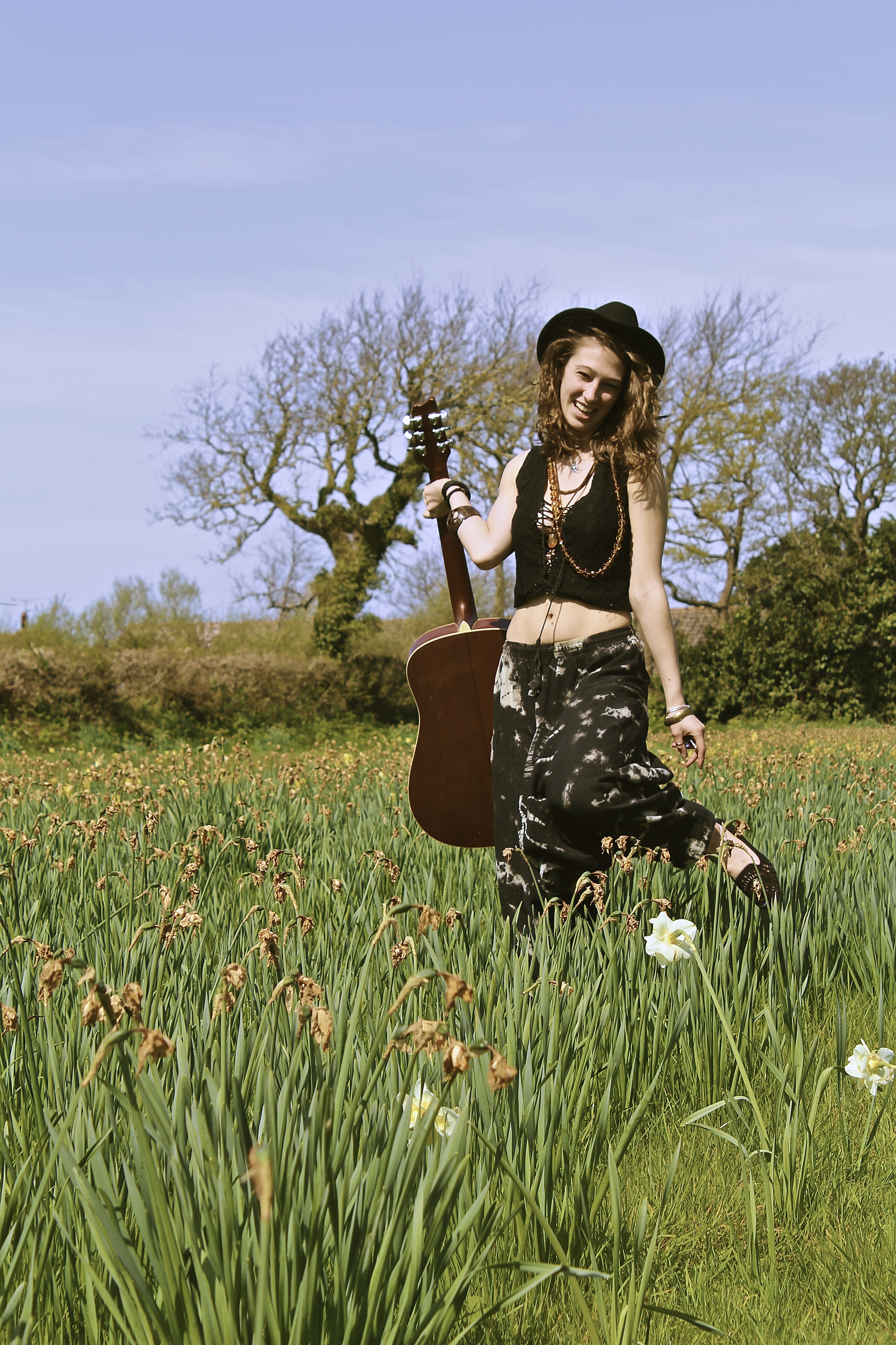
The reason for this shoot is because genuinely people associate spring with positivity,  because it’s going from the end of the bad weather to the start of the good weather. Therefore I thought I’d use the season to help bring positive vibes to my photographs, another prop I used was the daffodils in my shoots, these are an important aspect as they are one of the most typical spring flowers, and therefore what represents spring in my photographs.

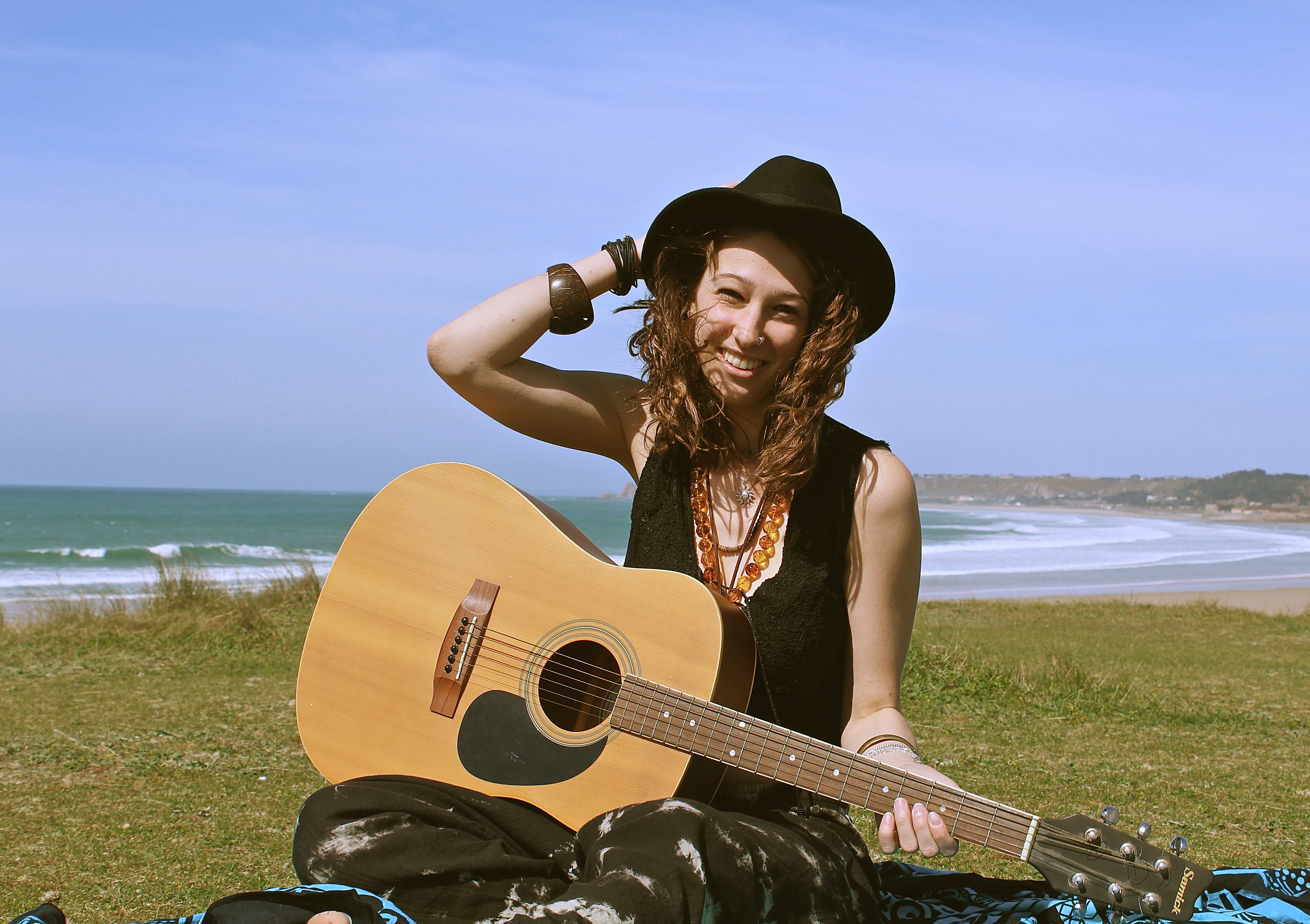
The image below works well as it looks like an image which may have been taken in the 60s when it was the decade of hippies, it looks like this by the use of the outfit the model is wearing, the use of the guitar and also the field of flowers, it also looks like its taken on an old film camera and looks like its been developed. This works well as with this shoot I was trying to represent peace and happiness and thats exactly what hippies are about, also it tends to be ‘free spirits’ / ‘hippies’ who tend to do a lot of travelling. Which works well as my photographs are all about a journey.

I love the photographs below, as they are capturing movement of the model, giving the photographs energy. The focus is on the model and the guitar, even though they’re both in the midground they are the focus and the foreground such as the daffodil is even slightly out of focus. The composition works well as the white daffodil is what your eyes are immediately drawn to therefore you look at that which shows you the season, making it positive before you even see the main subject, one then looks up to the model holding the guitar. The use of facial expression on the models face also creates a positive atmosphere and feeling to the photographs.


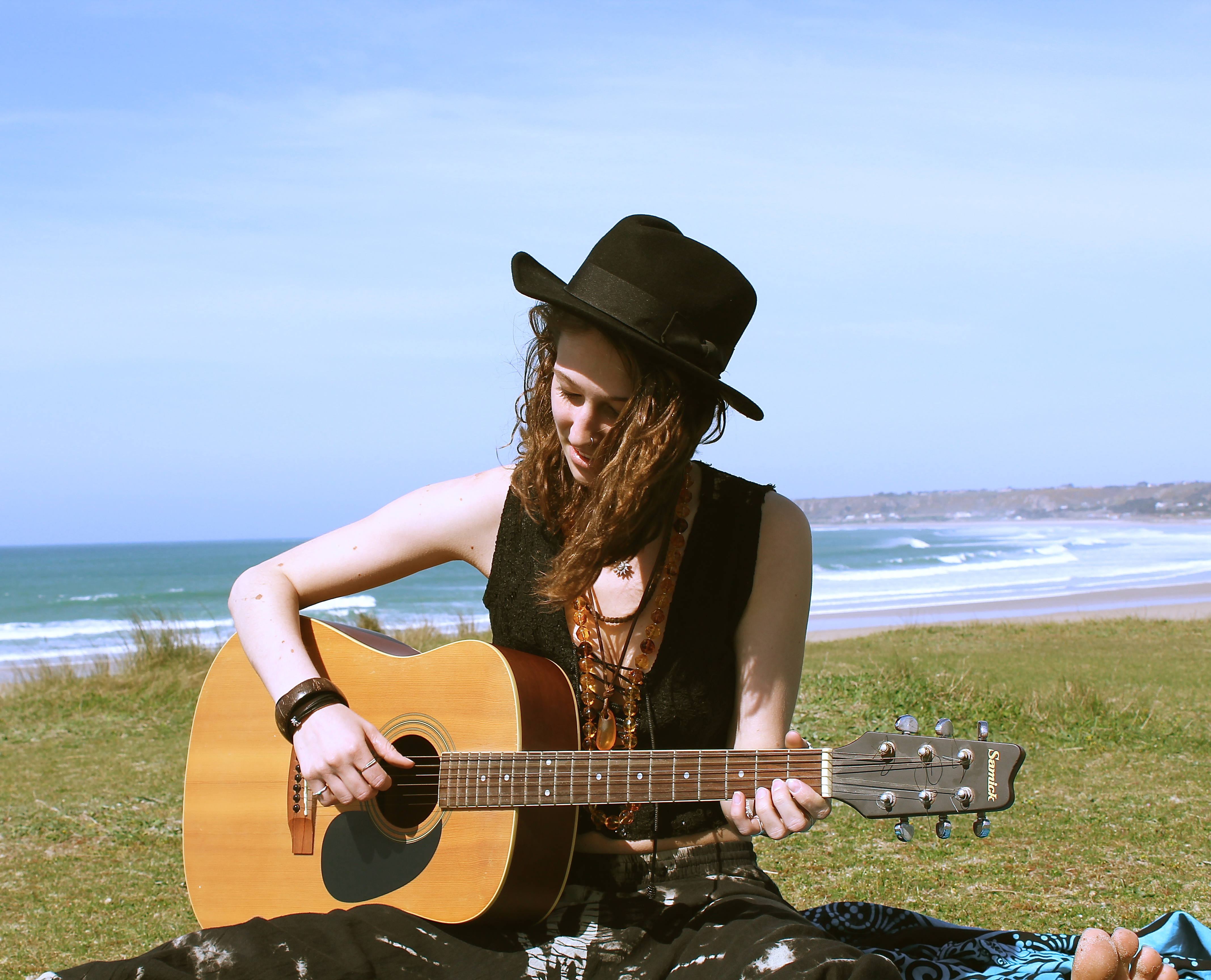
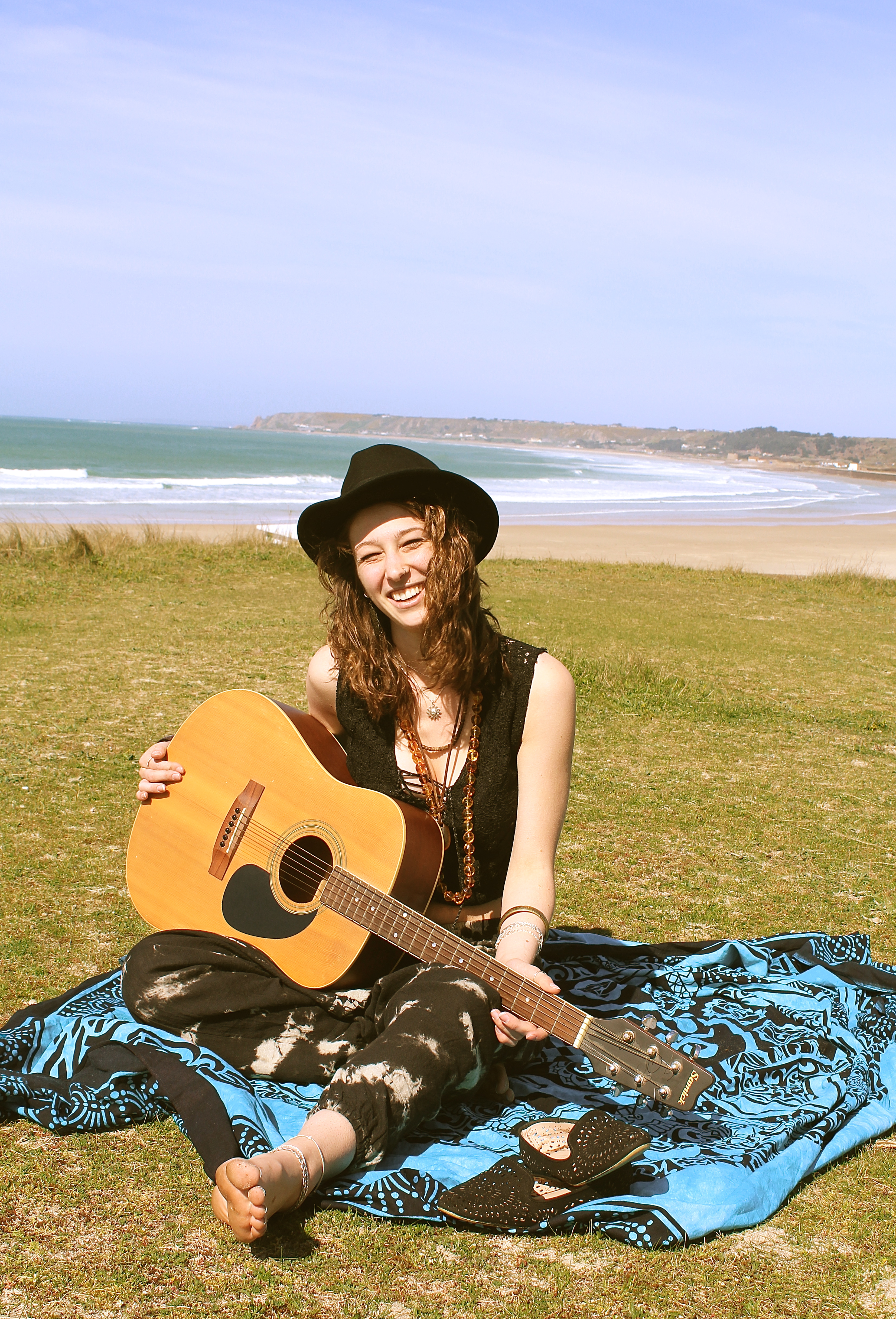
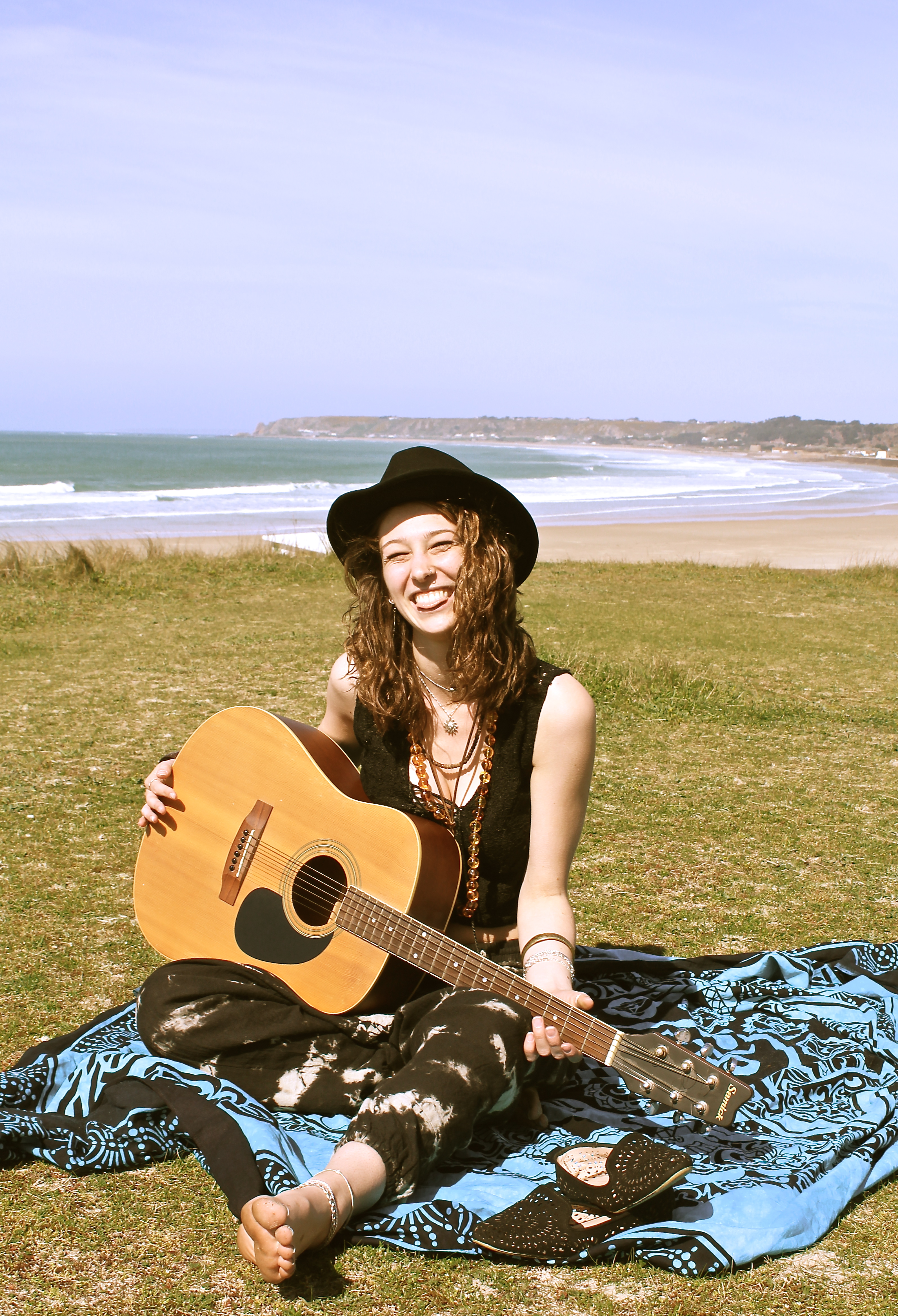
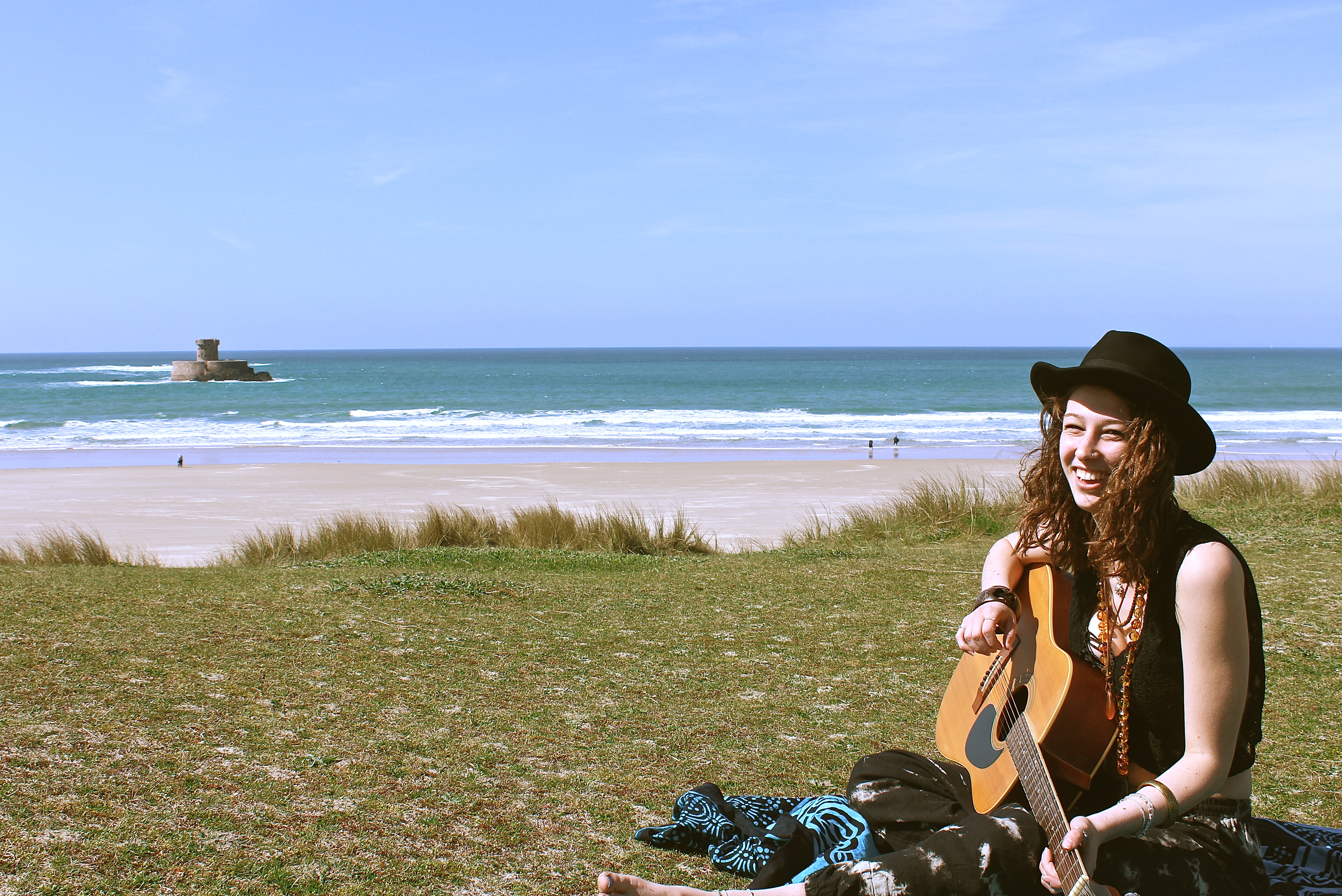
Nomadic Soul

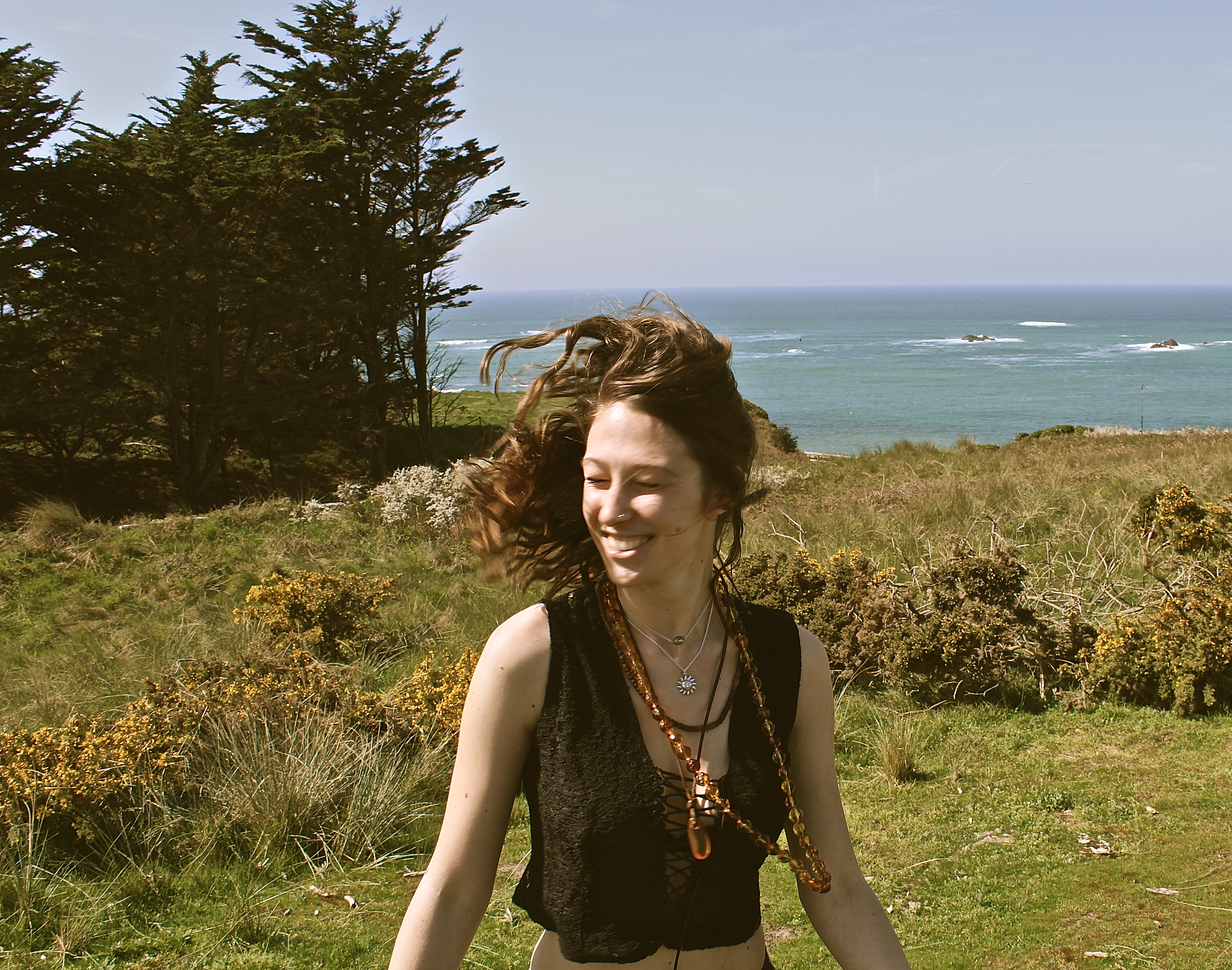
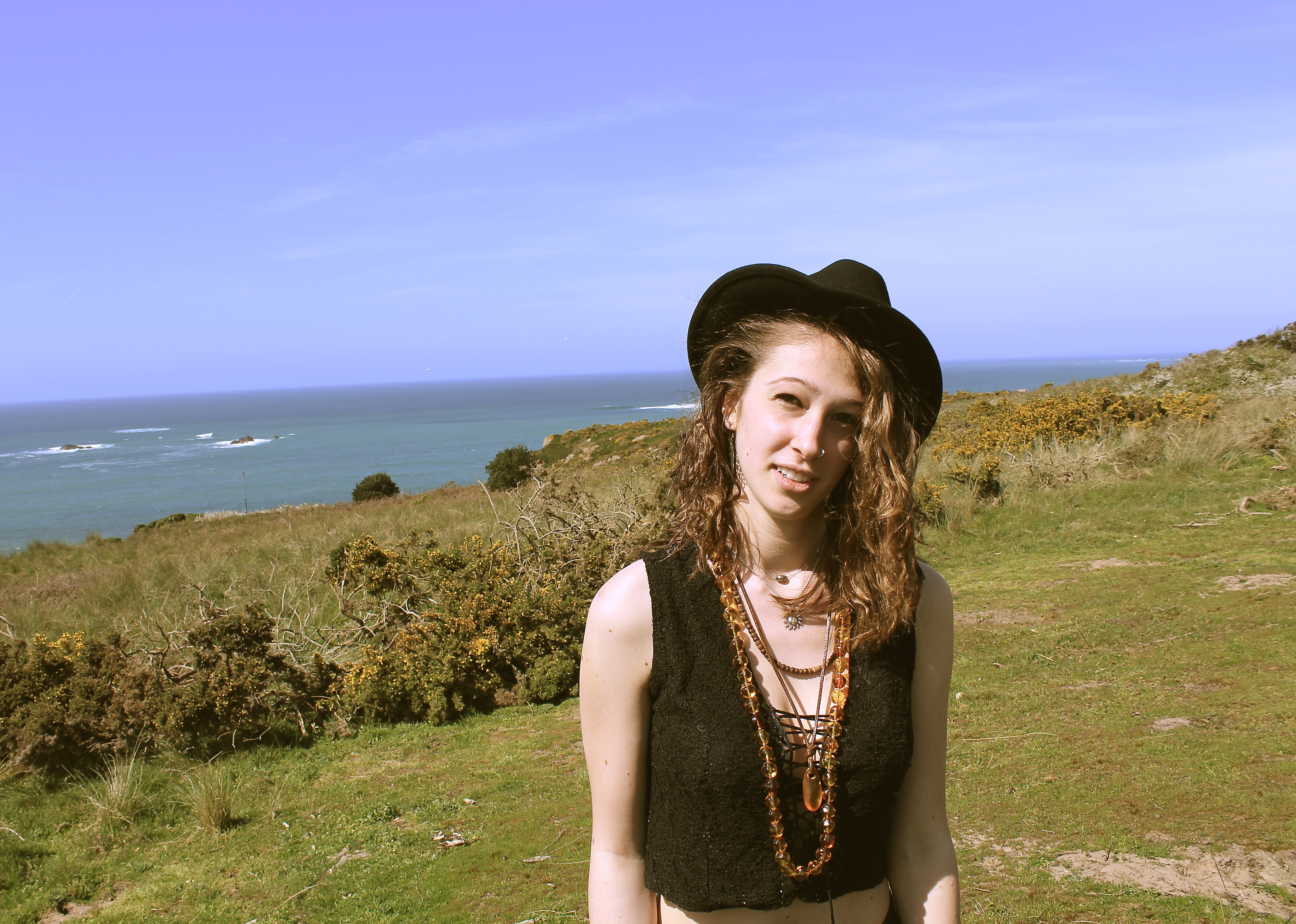
For this shoot, I wanted to represent a musical journey combined with a travelling journey. I wanted to represent a girl who was on the move, but would take her music with her everywhere, but not someone who would just use their IPod and headphones to listen to music, but someone who makes their own.

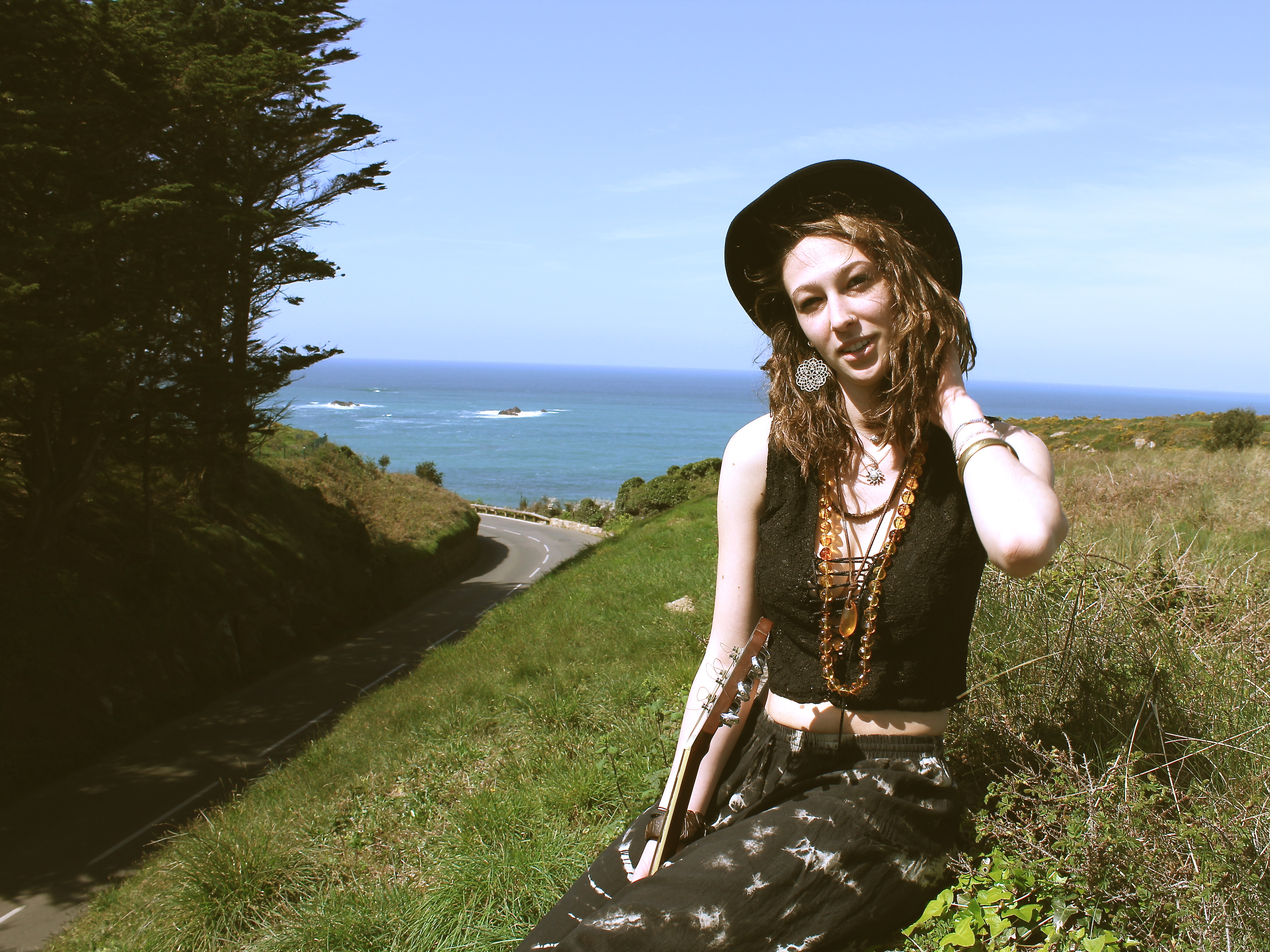
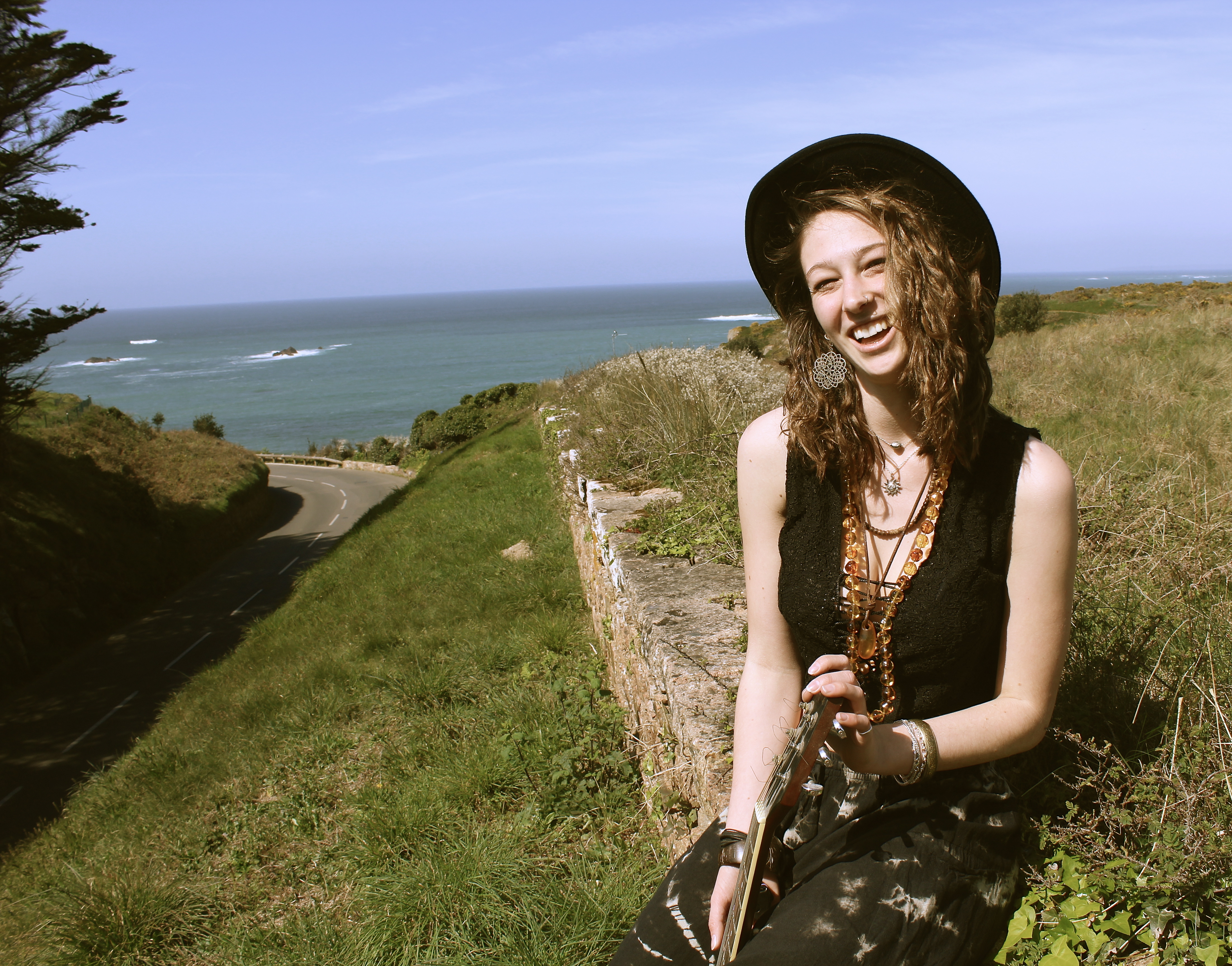
The reason for the location at the start of the shoot was because it shows a beautiful environment with the sea and trees in the background, but it also shows a road which represents movement and travelling. It’s as if the girl is following the road to the sea. This is why she ends up sat in front of the sea, because its representing her journey.

For this image below, I made her face away from the camera, and then I would count down to free and she’d turn her face around and I’d capture the moment. This technique is done to capture a moment which doesn’t look as posed and make it not feel as posed for the model so they don’t feel as awkward in front of the camera, and also to create movement in the photographs. In the image below, due to the position and natural lighting there is a loop lighting technique created on the models face. The thing I would change about this portrait is I should of waited a few more minutes for the cars to pass in the background, because I find they take away from the portrait, and I should have positioned the model slightly different so she wouldn’t be blinded by the sun and her eyes would be more open. However, I think the use of focal point worked well in this image, as I wanted the model to be the main subject, yet showing the important aspects like the sea and the road.

In the image below, there is a split lighting on the models face produced by natural lighting. The model is slightly positioned to the right however she is what immediately look at, due to her skin colour being pale. The composition works nicely as one can see the road which looks like it takes you directly to the sea. The way the model is higher up than the level of the road, makes her look adventurous and takes risks to appreciate natural beauty, and views like this inspires her to write new music. In this image there is a lot of depth, except in the background behind her upped body, where there is negative space, i think this works well as you focus on the mode more and aren’t distracted by a busy background. When editing this photograph I referred back to Theo Gosselin, as he tends to have a cinematic/vintage effect which I chose to use on this image.


I love this image, as it looks so natural and in the moment, as if I just picked up my camera at the perfect time. When in reality it was staged to look the way it does, for example I wanted her to sit in this position so I could get the trees, on the right, and the wall on the left to frame her and the sea in the background. For this image I also used the technique where I would get her to turn around so it wasn’t looking posed.

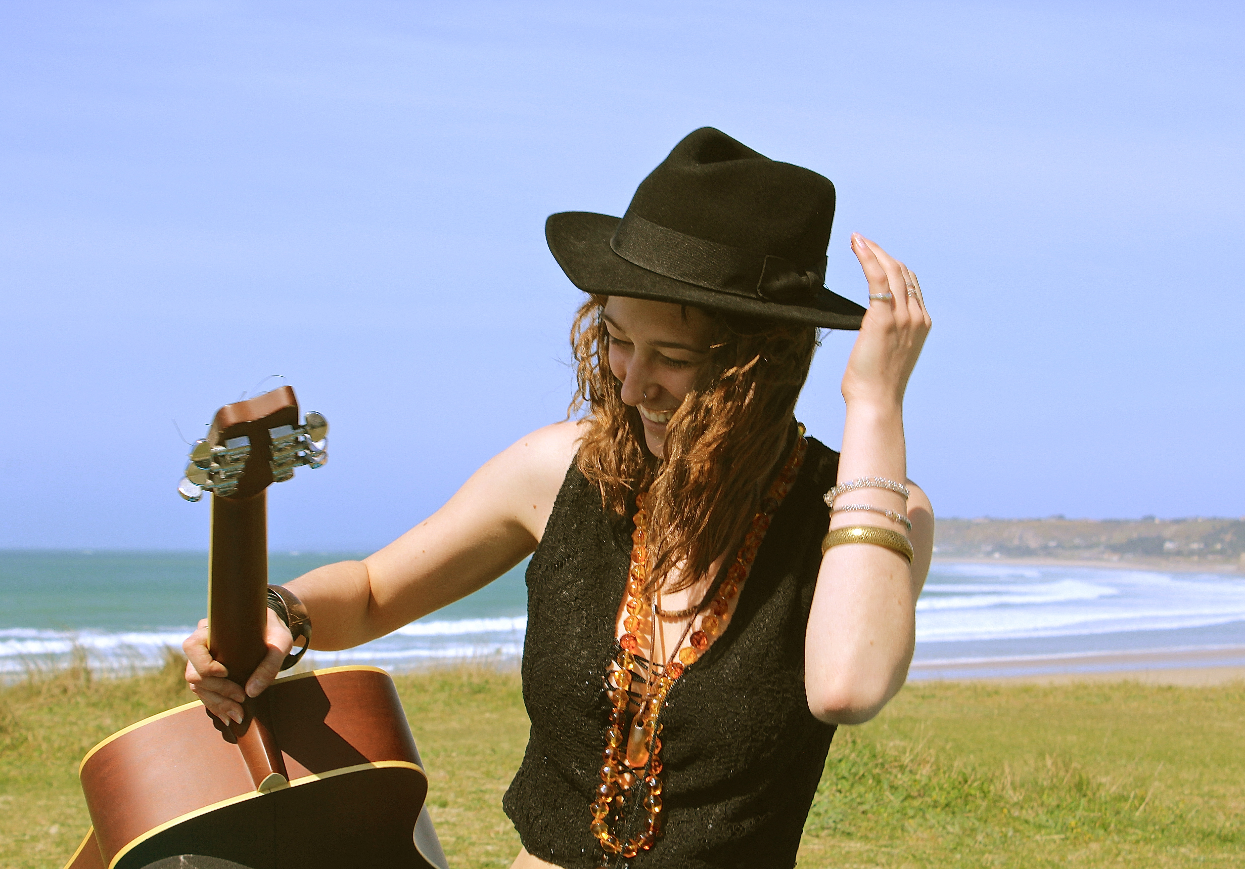
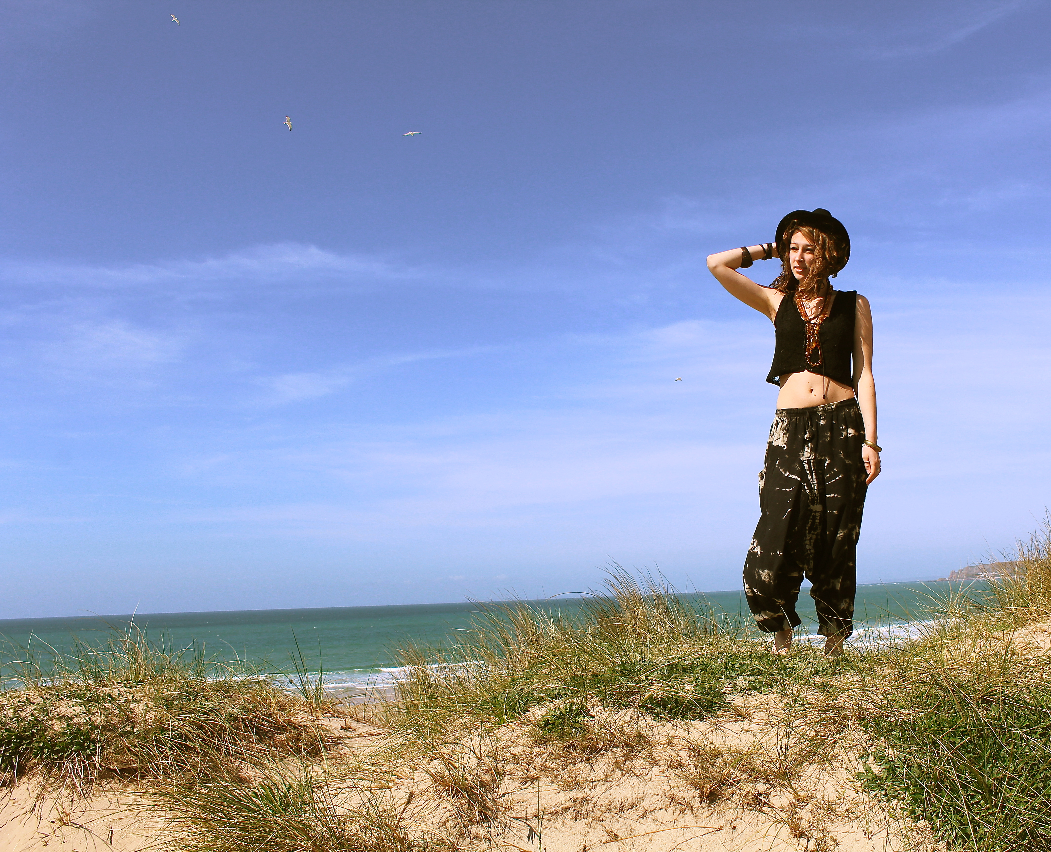
This image works well due to all the different elements, such as the birds in the background. The way the models got her arm bent, holding onto her hat, the carve of her elbow almost works as an arrow therefore your eyes follow the direction the elbows pointing in, which makes your eyes focus on the birds in the background. Normally one associates birds with peace and freedom, which is what i wanted to represent in this shoot. When i think of birds, i think of fleeing the nest, which is what these young people have done, they’ve taken their vans and have gone travelling away from home. I also like the fact one quite often hears the term ‘a songbird’ which is a bird with a musical song, like what the girl in this shoot has, as she’s got her guitar with her in most photographs.

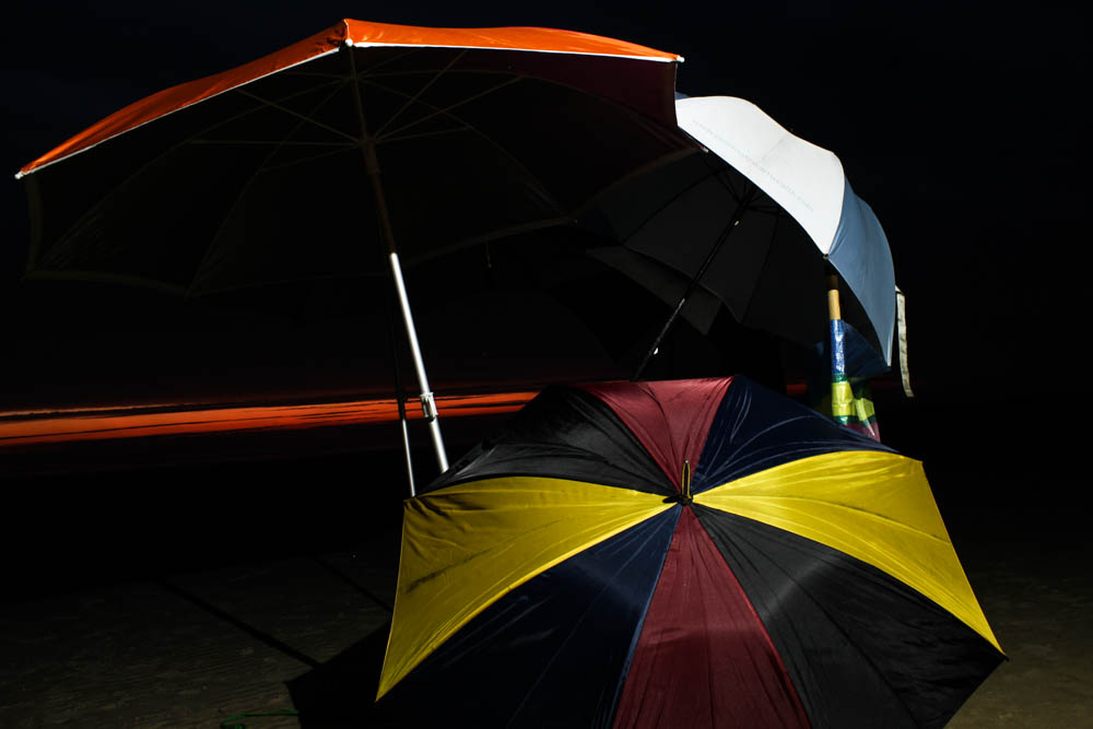
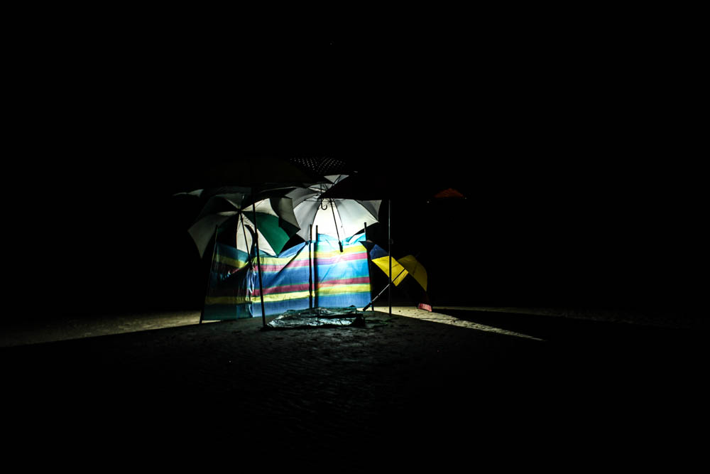
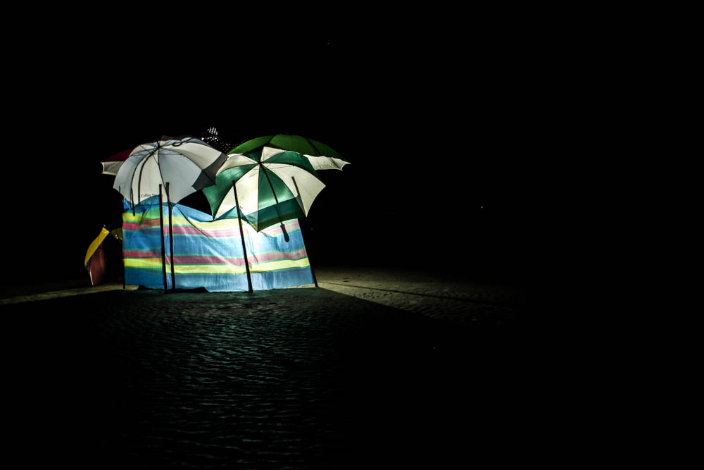
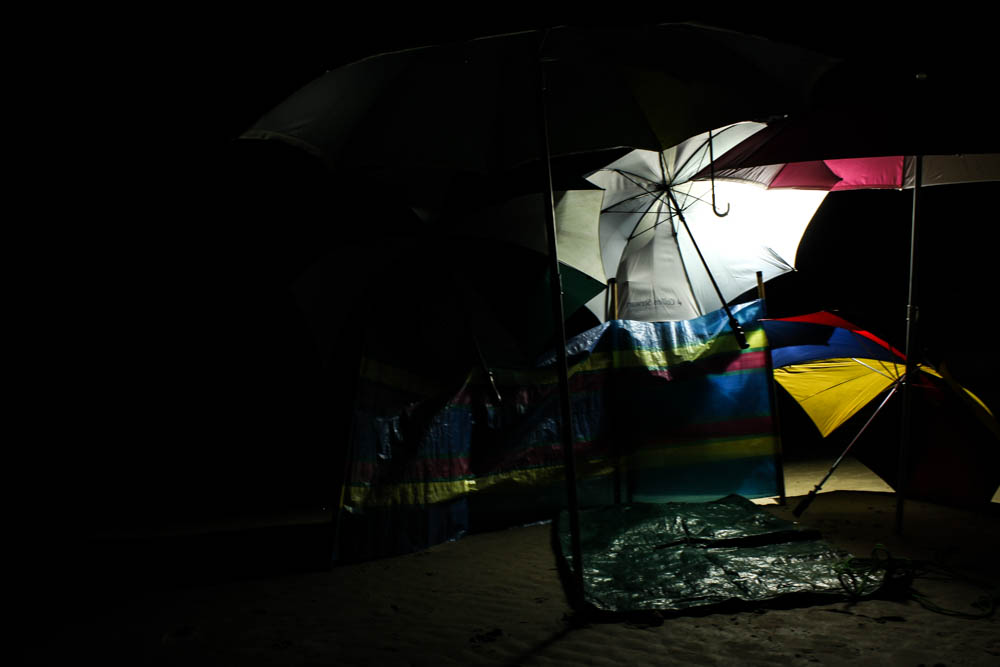
St Ouen umbrella den – Night

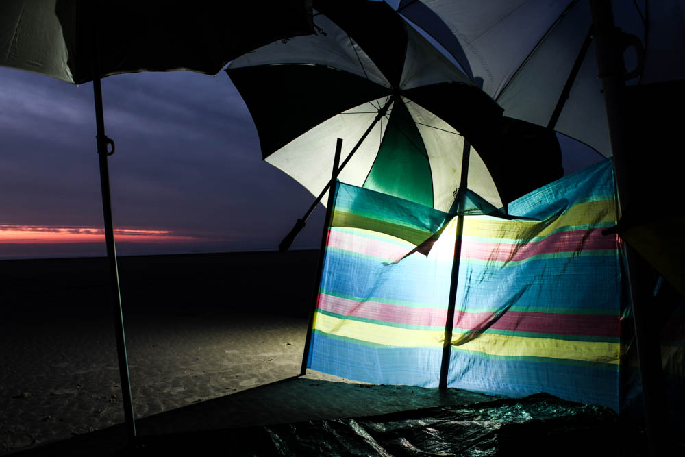
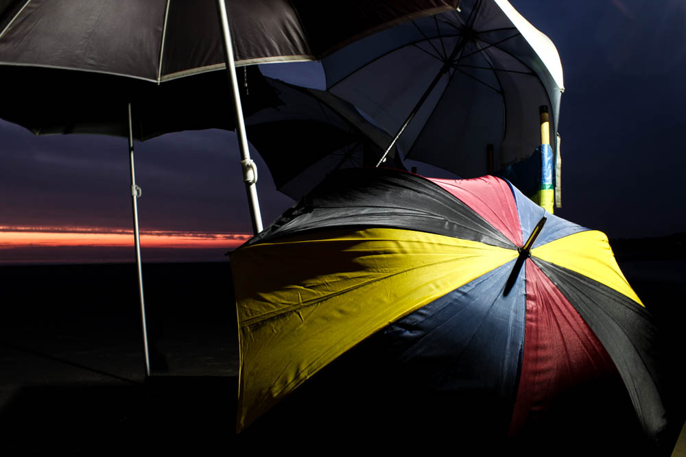
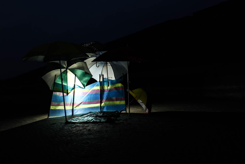
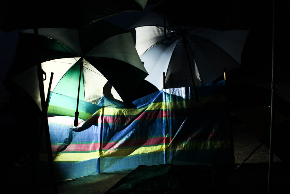
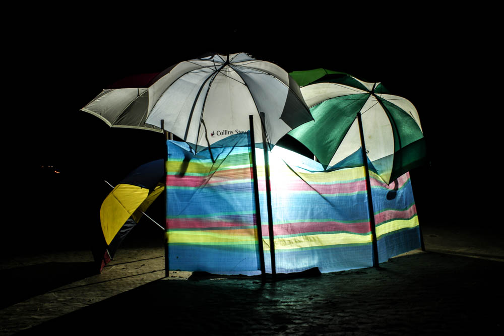
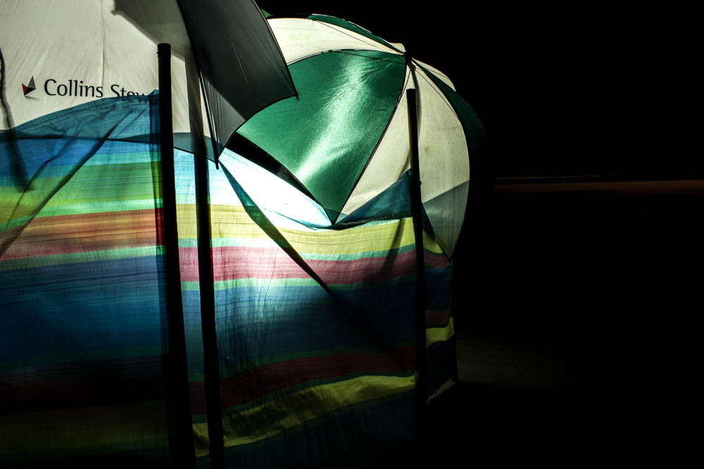
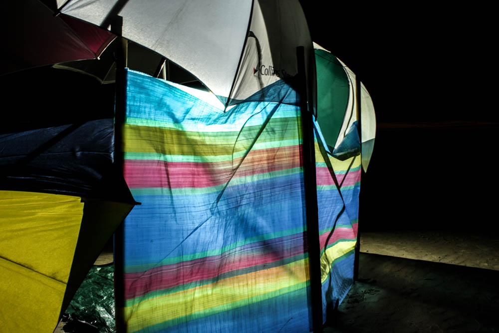
I wasn’t entirely sure how these pictures were going to turn out when i headed to the beach with an industrial light. Overall they actually went so much better then i expected them to! I really loved in Toroptsov’s photographs how the light had a very eerie quality to it and i wasn’t entirely sure i would be able to create the same effect myself in my images. I decided to start with the umbrella den as the easiest and quickest to create in case the idea of photographing the dens at night wasn’t going to come together and really work. I think overall these images achieve exactly the same effect as Toroptsov’s work. The best images are the ones in which the light is behind the material which creates a soft glow to the light which makes it look a lot less industrial.  I photographed the den just as the sun was setting and then as the sky turned from blue to black. I think these images work really well overall.

To capture these images i had to use a very low shutter speed of 2 seconds and a tripod to avoid camera shake.

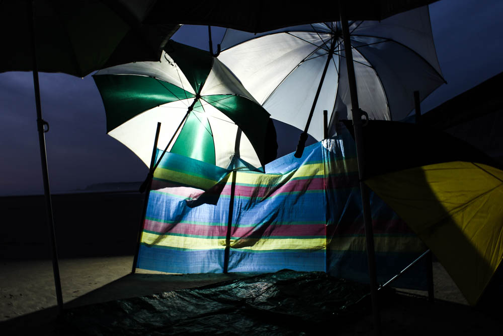
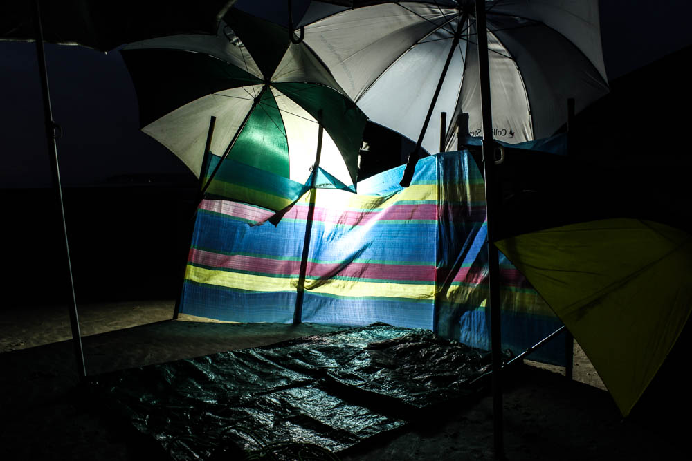
The above and below photographs are both very similar compositions just taken at different times of the night when the light was different. This difference in light interestingly creates completely different impressions of the photographs. I think i prefer the above image as the bluish sky highlights the colours in the umbrellas more. I composed the photographs so as to take the photograph of the den almost straight on. The den fills the entire frame as i was close enough to the den that the front umbrellas are out of the frame as it appears as if i am just walking into the den. I then composed the light to the left of the den so as to use to rule of thirds with the light. The light is the brightest point of the images and therefore your eyes begin at this point and then travel around the rest of the den. I quite like how by having the light source as it is it casts the outer areas of the den in shadow and only illuminates certain elements. This causes like in  Toroptsov’s photographs for your eyes to try and decipher the outer areas of the dens and adds mystery and intrigue. This works even better in the below image as the sky is so dark that the den could be anywhere. The lack of light in the background also causes the light to create straight lines, beams of light outwards from behind the den. I think i also prefer the composition of the above image as it is from slightly further away then the below image.

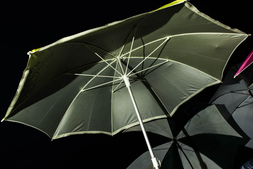
The above image is really interesting as it is one of the few images which i actually liked which had the light shinning directly onto the umbrellas rather then behind them. In most of the pictures the light from behind was softer and therefore more eerie but in this images the reflection of light on the umbrella in the foreground works really well. The light shines directly onto the umbrella in the foreground which is composed according to the rule of thirds to the right hand side of the frame. The light from this harsh bright point right in the center of the umbrella then spread outwards to the rest of the den so you can see the shadows and silhouettes of the rest of the composition. The sky in this image is also fairly early on in the night and so it is a blueish colour and this light in the background i think helps to soften the light in the foreground. I think the angles of the umbrella in the foreground also helps to guide your eyes around the frame as your eyes travel off the umbrella and into the rest of the frame. The beach and sand itself is fairly dark and therefore the umbrellas do stand out vividly against it.

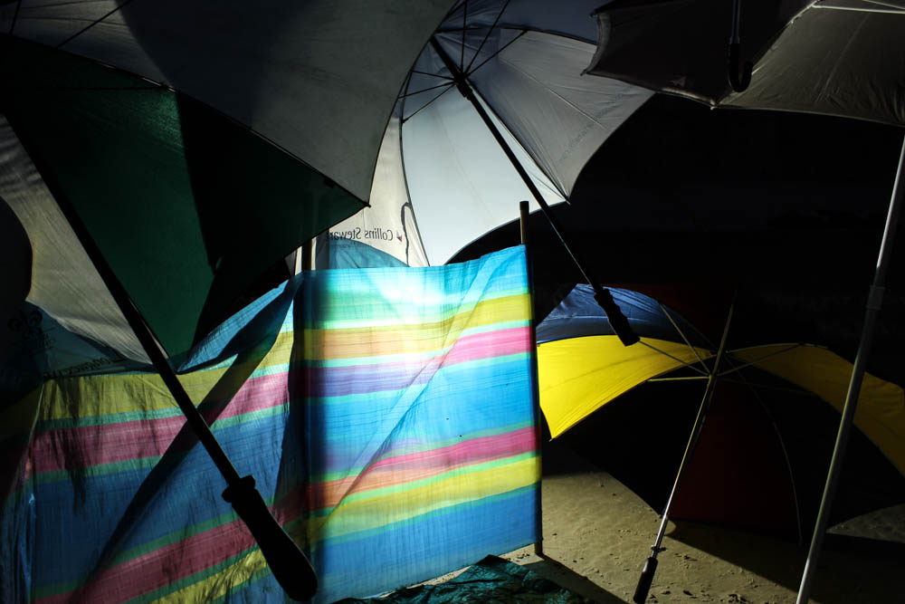
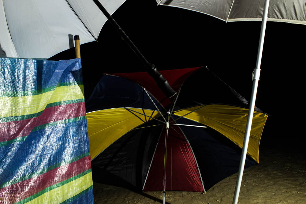
The above photograph is a more abstract composition of the den, with the umbrellas composed to all be at odd angles pointing inwards within the frame. I composed the light source to be dead in the center of the frame shinning right through the windbreak rather then an umbrella. The light source looked brighter in shinning through the windbreak as the material was thinner then the umbrellas. I then haven’t included the entirety of any of the umbrellas, instead including elements of most of them in an abstract manner. I did however think about having my composition so that the handles of all the umbrellas pointed inwards at odd angles to create an interesting arrangement. This was one of the photographs that i took later on so the sky around the umbrellas is really dark and therefore conveys contrasts more between the intense colour of the light and the darkness around it.

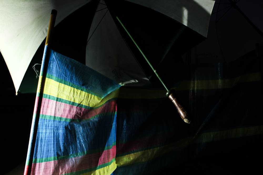
The above photograph has exactly the same contrast, it may even be more intense as the light source in this image isn’t directly behind the umbrella.


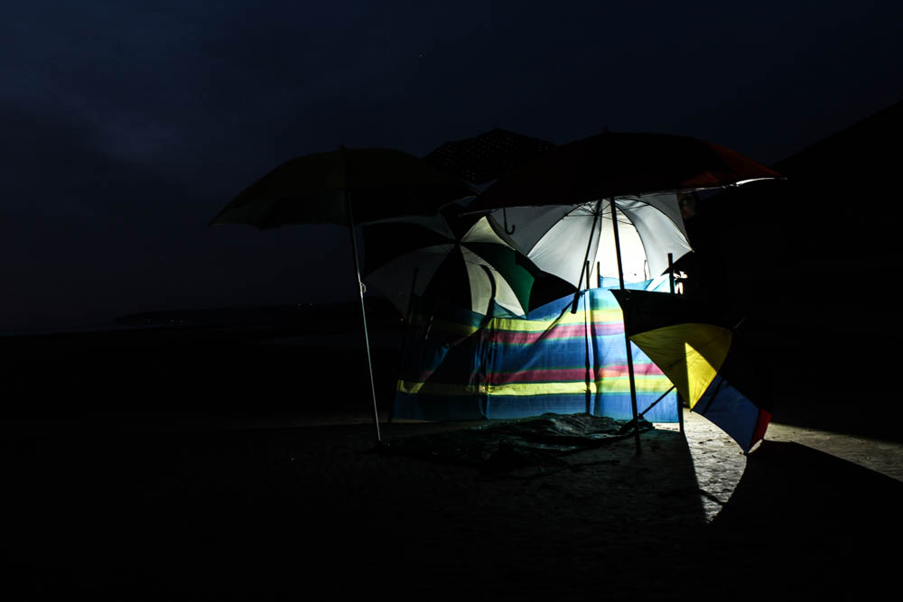
The above and below photographs are then some of the images i took from further away from the dens so as to capture the whole structure. These ones worked really well the darker it got to have such a vivid contrast between the light behind the dens and the darkness surrounding them. Both images i used the rule of thirds to composed the dens at an angle within the frame. I really like in these mages how your eyes are drawn to the brightest point on the image in the center and then your eyes travel around the composition trying to work out the rest of the structure which is in partial darkness.

The above and below images are ones which were taken with the light shinning directly onto the structure rather then behind. Overall i defiantly prefer the other images for generating images with a softer and more eerie light.

These images are then more photographs which explore taking pictures of the dens at different angles and from a distance. I like how as the night got darker the beams of the light across the sand became more and more prominent, so that in these images the den is radiating light out into its surrounding.

Postcards

// W R I T I N G   H O M E //

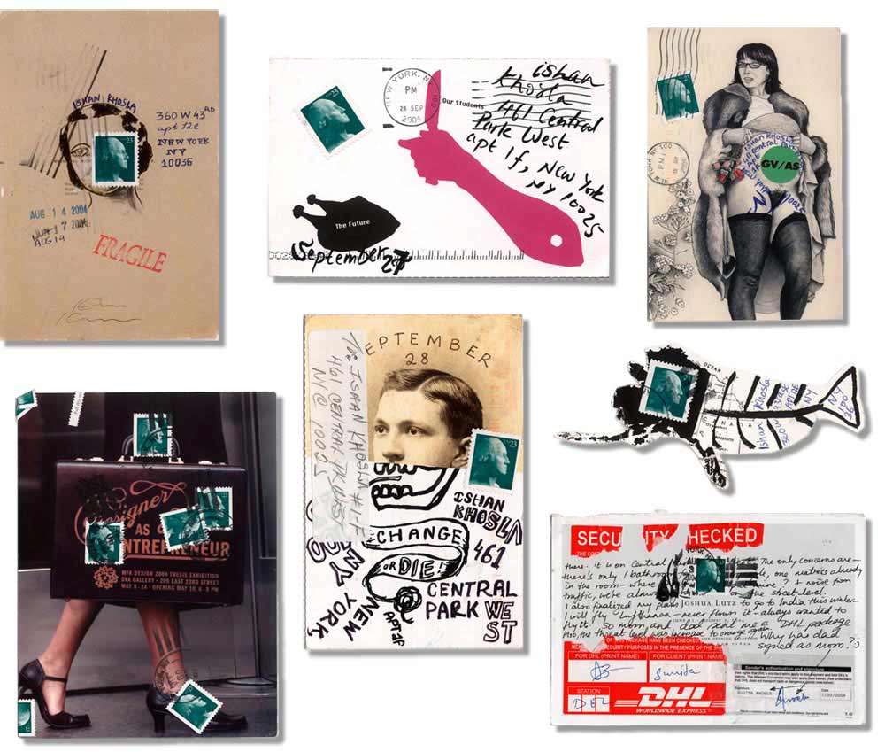
Continuing to explore options for the presentation of my final images in this project, I would like to explore the process of creating post cards as a way to link to my theme of leaving home. The images I have made come in two different forms. I have the ‘home images’ which feature a single figure in their home environments in a relaxed but stylised portrait. I also have a set of external environmental photos which show the same set of people in a landscape of their choice. There are questions asked to each participant which link the two places together and the choice of location was ultimately their choice. By presenting these images as postcards, I could explore the contextual themes of writing home, family and connections to the island. To start the process of deconstructing a postcard in order to make my own designs.

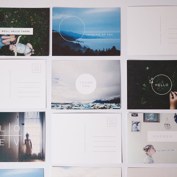
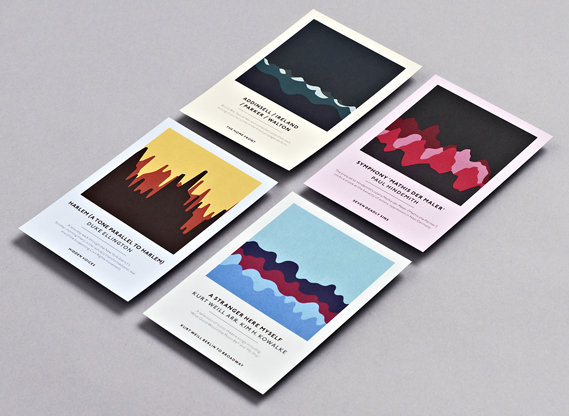
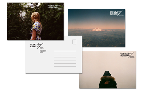
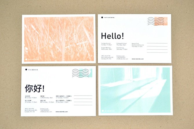
There is an extensive variety of postcard designs available worldwide fitting into a range of genres and themes. The example images I have selected here are all minimalistic graphic designs which make use of negative space and heightened simplicity. 

To create my own postcards, I will need to form a template for the front and back of each card separately and have them printed together – or manually attach them by hand. For the front of the images, I intend to use the images I have shot in the external environments featuring a character facing the landscape of their choice. This might be a full image, or one with a white boarder depending on the experiments I carry out. The back section of the postcards will likely be a minimalistic design with an address space – probably with light lines – and a large blank area for either typed or handwritten responses to the survey questions given to each of my models.

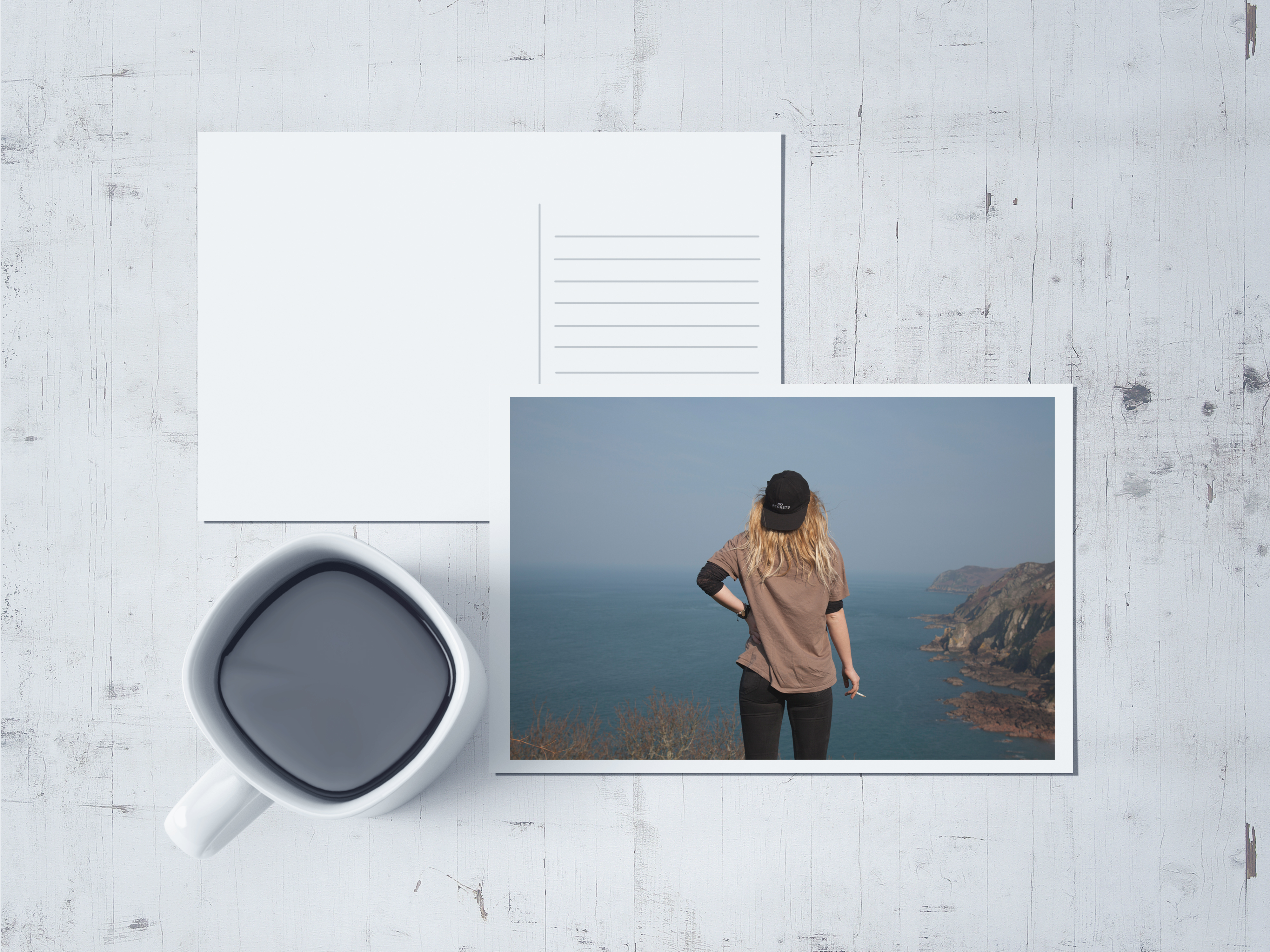
To start this process of graphics and development off, I made a rough mockup of my own using Adobe Photoshop. This involved creating the postcard shapes, guidelines, adding backgrounds, adjusting my own images to fit my templates and finally applying effects such as filters and shadows. I used an image of my first model, Maya, for this postcard and used a white boarder to frame the photo. Yes the mug and background are pretentious but I like how to shadows came out across the image on the postcard. The point of this mock up is to show a minimalistic layout which could ultimately be printed as a final piece. I would aim for a minimalistic backing which could be printed or handwritten with the responses given from the survey I set out before each shoot. 

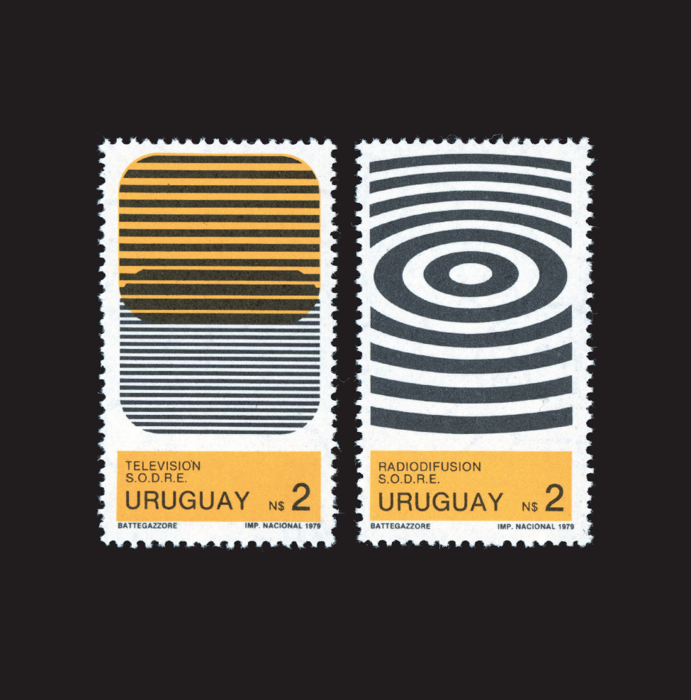
I could create a small series of stamps using other images which could reflect the home environments of each character. These could follow a more graphic layout with block colours and maybe feature colour block editing to contrast with the slightly washed images on the front of the post cards. To do this, I would edit the images in photoshop and print them onto thick sticker paper. They could then be cut or pressed with a cutter to create the stamp-like edges and applied to the postcards in place of a traditional postage stamp.