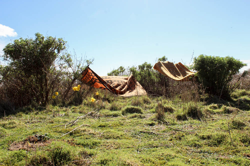
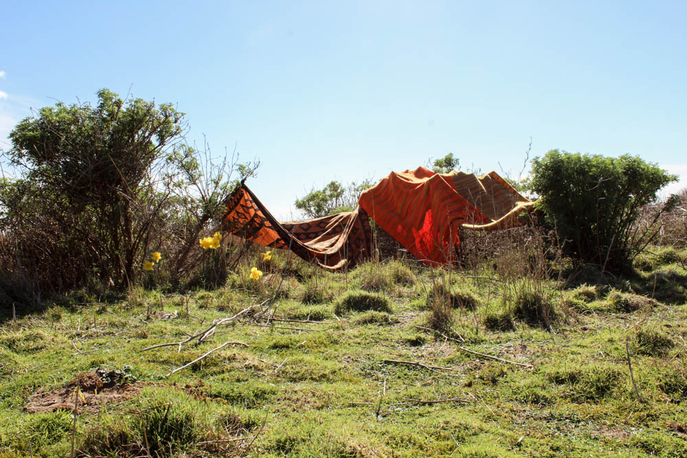
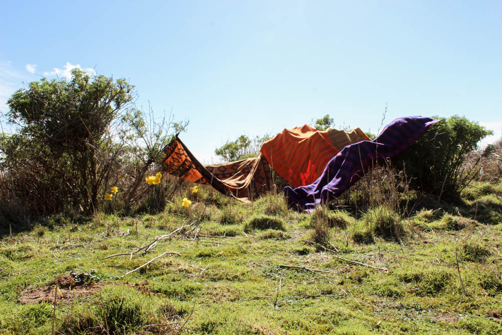
I managed to get the perfect weather to build my den in, i only wish there had been more clouds in the sky. The sunshine was bright and intense in shinning onto the environment and while this structure is very limited compared to the others i have built, that was the intention of it. It was even harder than i first thought to create a den in this location as the bushes were very far apart and the blankets only just big enough to expand across the distance. This created a major problem of creating one large structure which was connected in the middle and therefore i resorted to creating tiny pockets of covered areas. I actually think though on reflection this reflects quite well the types of dens i built in early childhood as these dens were more about the concept of having any kind of small space and then this being imagined into a great castle ect. I think this den works well in conveying how limited a structure can be and yet still a child can take it and transform it into the perfect home for their game in their imagination.
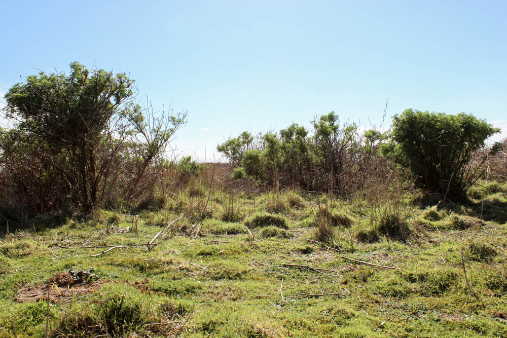
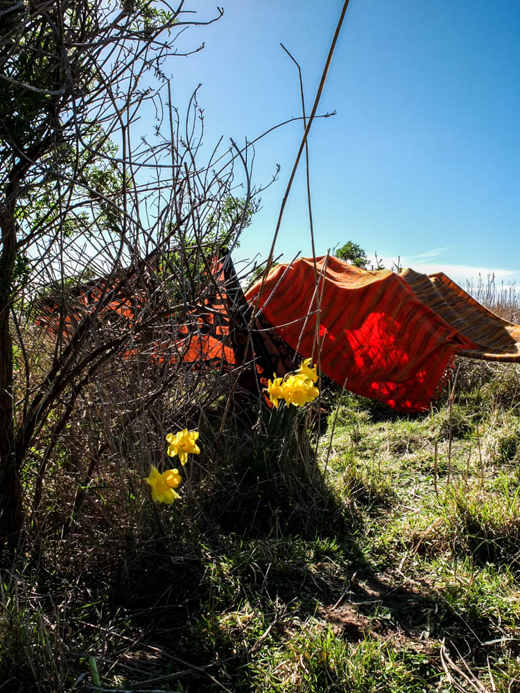
This time i only took one set of process photographs as there was only really one angle to take the pictures from. I wanted to include the vast expanse of the sky and the whole area of the bushes clumped together. I centered the den right in the middle of the composition. I think another advantage to this kind of den is that in the process photographs you can clearly see when each blanket is added into the structure as none of them shield other blankets from view. I did actually as you can see below edit the environment within these photographs. Everywhere, all over the field, except in the small area where i decided to do my photoshoot there were loads and loads of daffodils. I thought they would compliment the colours of the den to have little patches of yellow that were a similar colour to the blankets and therefore i picked some daffodils and staged them within the photograph as if they were growing. Overall the finished structure as a whole doesn’t look really incredible but i think some of the more abstract photographs i’ve taken of the den work quite well. The process photographs while they do work because you can see all the individual blankets being added aren’t as dynamic as some of the other process photographs juts because the den itself as a final structure isn’t as impressive.
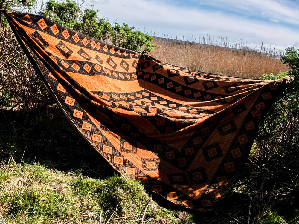
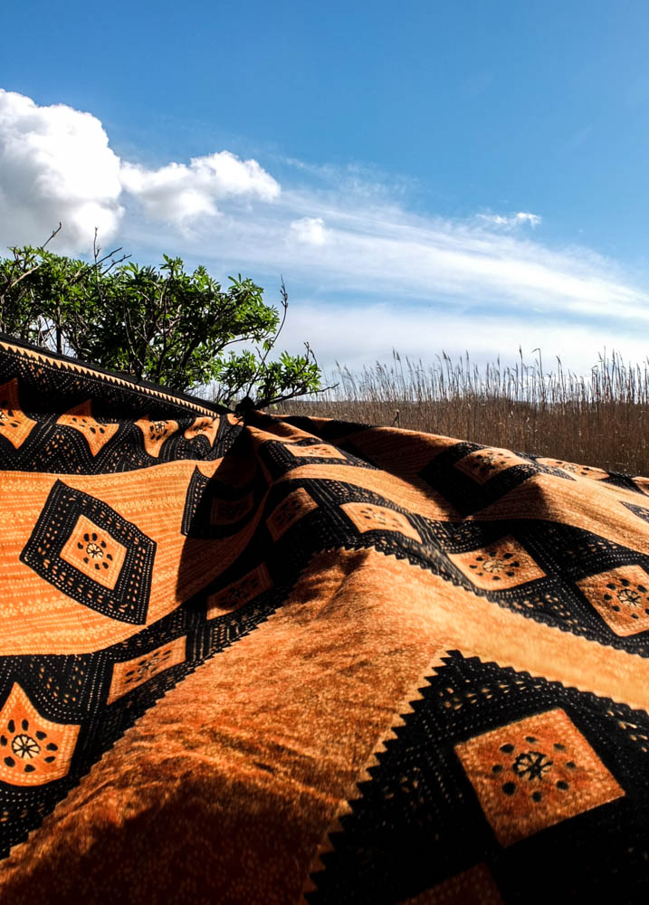
This blanket really went a long way in conveying the African vibe of my den structure. The bright vibrant orange and then the patterns in black just have connotations of being very tribal to me. I really like the composition of these photographs as well. I feel like the contrast between the bright blue sky with fluffy white clouds and then the green and orange is very suggestive of the African plains. When photographing this den i thought very carefully about about making the landscape seem vast through my compositions. The below two images convey this best.
The above two photographs are composed very similarly and give the same effect of the landscape. I composed the photographs so that the blanket created depth in the image by receding off to the point that it is tied onto the tree. In each image i used the rule of thirds to compose this point off to the side, different sides in each image. I personally prefer the first of the two photographs, though the cloud in the second photograph looks more dynamic. In the first image i was able to to capture the movement of the blanket in the wind, this texture adding a sense of life to the photograph which isn’t seen in the second image where the blanket is pulled taught. It is interesting that the texture of the blanket being moved in the wind almost reminds me of the rolling of water. I composed the photograph so that the horizon went straight across the background of the frame. The frame is almost divided so that the photograph is half sky and half fields. The colours in the photograph are very complimentary with the golden yellows and greens conveying a real sense of an African plain. I quite like how the green is very sparse in the corner rather than in the second image where there is perhaps too much green. The clouds in the sky are incredibly flurry looking and the white streaks of them across the sky suggest both movement and also make the sky appear more intriguing. I think these photographs work so well because of how the material fills almost the whole landscape of the frame.

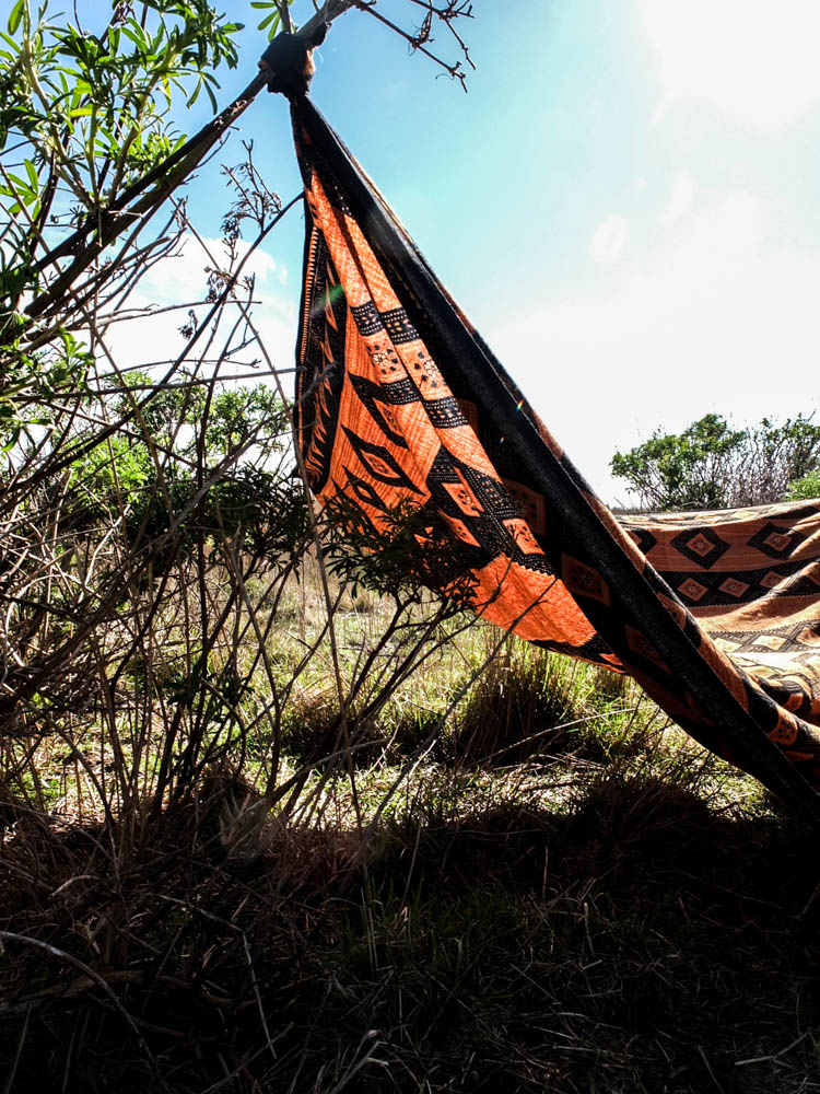
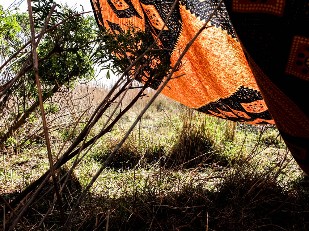
I quite like the above photograph for conveying the expanses of the spaces created by the blankets. This photograph really gives a sense of the spaces the dens create which you can go inside. I think it also conveys why the dens are needed as this photograph gives a real impression of the beating sun. The bright light source comes from the top right hand corner of the frame and is an intense harsh light that shines directly onto the stricture of the den. This photograph is interesting in having such a massive contrast between the light of the sun in the sky and the dark shadows cast by the shade of the den. The sky is almost completely washed of colour the light is so bright and it also washes out some of the colour of the dens material. I think the composition of this photograph also works quite well as the branch the blanket is tied to cuts across the top left hand corner of the frame and the blanket itself then cuts another line across the frame. I quite like how the light has effected the material of the blanket, to have elements of the material see-through as the light shines through it but also elements which are dense and a darker colour. The colour scheme in this image is the same as the others, the greens and the oranges complimenting each other really well. The sky in this images is less interesting as the bright light washes out all the colour and there are a lack of clouds but this bright light also does highlight some other colours.
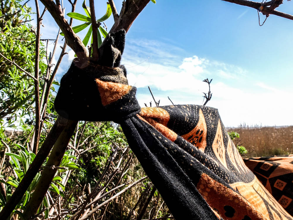
Once again i decided to take some close up shots of how the den was constructed. This den was made up of balancing blankets and also tying them to various branches in order to create my little spaces. I used a narrow depth of field to emphasis the tied material to the branches rather than the surroundings. The second photograph i composed similar to my photographs of the orange and black blanket as a whole as i wanted to convey the horizon of the sky and expanse of the fields. I composed the photograph using the rule of thirds and the angle of the blanket leads into the background of the frame and therefore the background of the image.
I quite like the above two images as a pair to convey how the material moves and changes. This image is all about angles, the changing angles of the blankets in relation to one another to create an interesting structure. The structure is composed to be in the top left hand corner of the frame, the main light source hitting the blankets in the background rather than the foreground. The angles of the blankets all compliment each other, going off in different directions and all the different shades of yellow and orange also work well together. Once again we have the contrast between the oranges and the greens, this time the contrast being even more evident as the sky only takes up a small portion of the frame. I quite like the dynamic of these photographs.
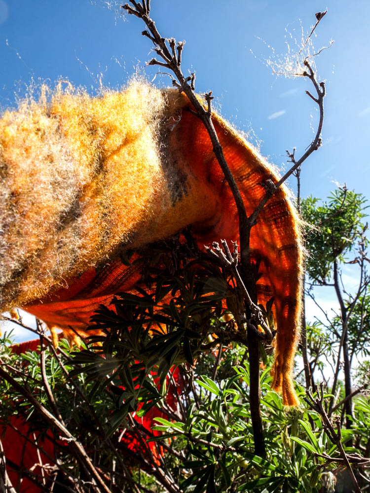
I quite like the above photograph as another close up photograph to show how the den is constructed. Most of the blankets in this den were simply laid over the various bushes and trees and due to the very minimal wind stayed where they were put. This photograph conveys this and also conveys how, the tread stuck on the branches conveying how the material becomes caught. The light in this photograph comes from the top left hand corner and its harsh light illuminates the individual threads caught on the branch, highlighting them against the blue sky. This is why i composed the photograph slightly from below as it allowed me to have the thread standing out against the sky and therefore not getting lost in the busy texture of the leaves. The brightest point of the image is the sun shining out from behind the leaves. The light also shines directly onto the blanket in the foreground. The areas of shade are those below the blanket and therefore where the blanket casts its shade.
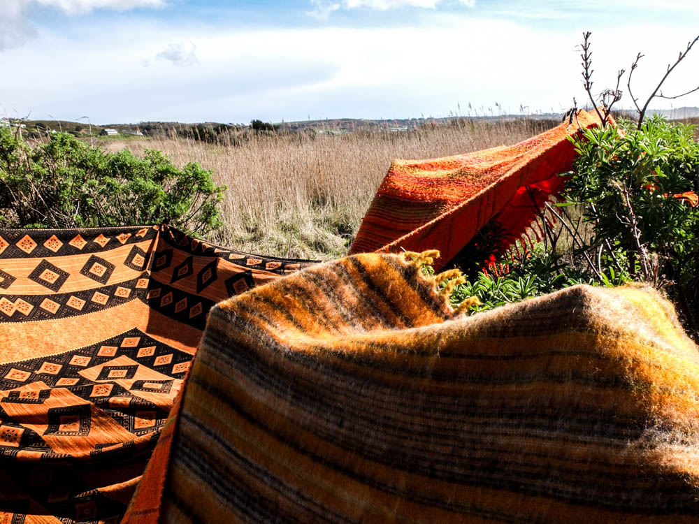
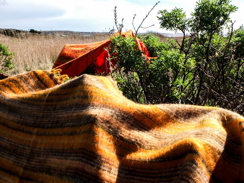
The above and below photographs convey the same impression as some of the earlier photographs. The blankets themselves almost look as if they are a part of the landscape. In these images they give the impression of rolling hills and mountains of various orange colours. Unfortunately the sky is once again fairly boring as it is made up of blinding white light and very little clouds. The light comes directly from above in these images which casts shadows on the structure which create more depth to the blankets structure.
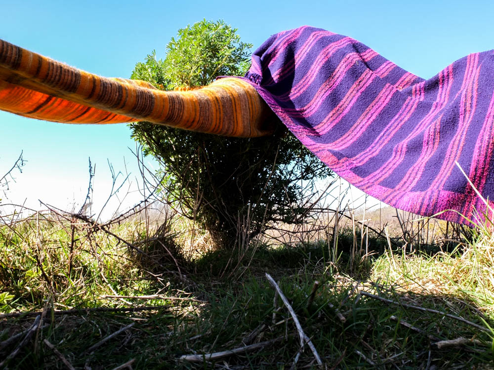
For some reason i really really love the photograph above. It is so simple and yet i think its one of my most effective images. It conveys the spaces created underneath the blankets as very simplistic and yet effective as they offer shade and do create a sense of being enclosed. This photograph is composed so that the little tree is almost in the dead center of the frame. The photograph is then taken from a really low angle which gives the impression that you are just about to enter into the spaces underneath the blankets. The angles of the two blankets go outwards in two different directions, the shadows in the image cast in the foreground. The background is really bright with the brightest point being a line along the horizon of almost blinding white light. The sky is then fairly bright blue. I think the contrast between colours is what works quite well in this image, with the intense blue colour, green, orange and purple all clashing but then also complimenting each other.
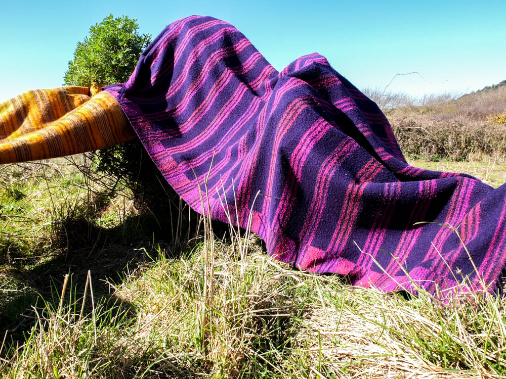
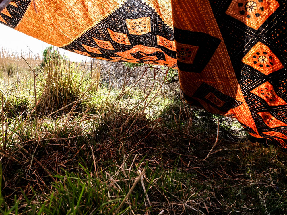
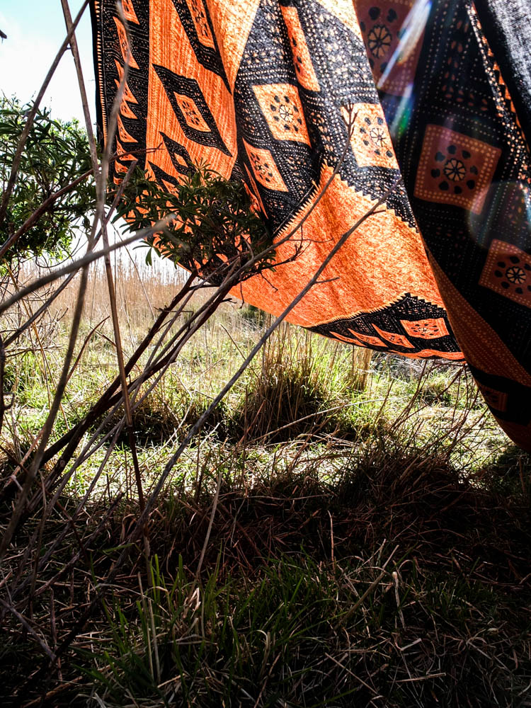
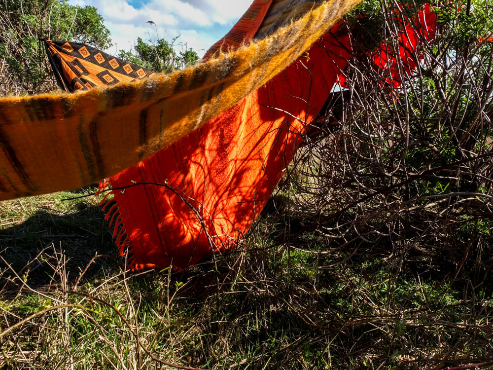
These photographs are like my other photographs that i took of my dens with light shinning through the material. The orange and black blanket worked best in conveying the differing tones of the colour depending on where the light was shinning through the material.
