Hamish Fulton uses a combination of text and imagery to evoke meaning and a deeper narrative from his long travels through various countries. I wanted to experiment with my own photographs using text to create a more compelling photograph as well as give more context and understanding to the message behind the photos.
I picked the above image because the composition enabled a lot of open space to place borders and text. The image also didn’t have a main focus point enabling to leave more focus for the text over the top. The tones of the image were also fairly dark so white text would stand out more. I tried a selection of colours but found white worked best. I started by placing a white-border what was a similar thickness to the font I panned on using. I used the font Segoe UI Bold Italic to create a simple effect that still evoked impact. I found the photograph was already fairly busy with the texture selection of small details to didn’t want to add too much that would make the image too busy.
I picked a selection of words that linked into what was happening in the photograph as well as the message I want to show the viewer. The first set of words in the top corner of the first image represent the more serene elements of nature whilst the words below evoke the industrial, man made side. I used these words to represent the combination of nature and man made.
For the above images I removed one of the words and put them into order of length. I then became more experimental with the layer types. For the first image I selected the layer of the text and the border and changed them to exclusion, which inverted the white, making it contrast from the background image. For the second I again used the exclusion feature by creating a second layer of orange and blue then changed it to exclusion. This gave the image a new more abstract style.
 I then moved onto a second image featuring a huge amount of warm tones. I wanted to include the phrase ‘The juxtaposition of nature and man made’. I picked a cream colour that was present in the image and found it worked better then white.
I used the same colour and font for the text in the two images above from the previous image. Similar to the previous, I think the cream worked better as was softer then white and could contrast the blue tones in the unlit areas. I sued extracts by the poem ‘As I walked out one evening’ by the English poet W.H Auden. The poem discusses important themes such as love and time, mixing in references and imagery of urban and rural settings. I picked lines that referred more closely to the transition of time. I found the text worked well in this image was it wasn’t too overpowering, making the image not too overly busy. I also found a border wouldn’t have worked with the composition as crucial features of the image such as the window in the lower left corner would have been covered.

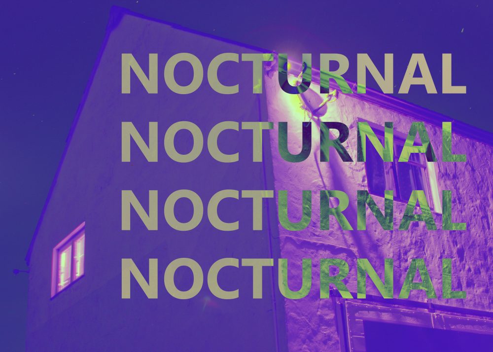
I used the same cream text for this image but changed the font to regular as opposed to italic like the rest. I picked a word that related to what the focus of the image was, the work nocturnal refers to the idea of being active and awake during the night, which relates to the light coming from the window. I used the exclusion feature similar to my previous pieces.
I used the colour filters and the exclusion filter to create the above images using different coloured layers. I find they work well as a series.


I like these image/text experiments – keep experimenting with other images