1st Photo Shoot (Planning)

Planning First Photo Shoot


My first photoshoot will be a simple one to start off with, based simply on environmental portraits. On Saturday I am planning to meet my friend Jacob Smith, an accomplished surfer and free diver, at the beach so that I can take photos of him in his environment. I was originally planning on taking photos of him in the water as he is surfing but this weekend the winds will be too high for him to be able to surf. We may instead be able to try some free diving but I am not sure how this will turn out in underwater photographs because I am not confident with underwater photography. For on land photographs I will be using my Nikon D5200 but as this is not waterproof so I will not be taking it into the water with me. Instead I will be taking my MotorMarine II EX by Sea&Sea.
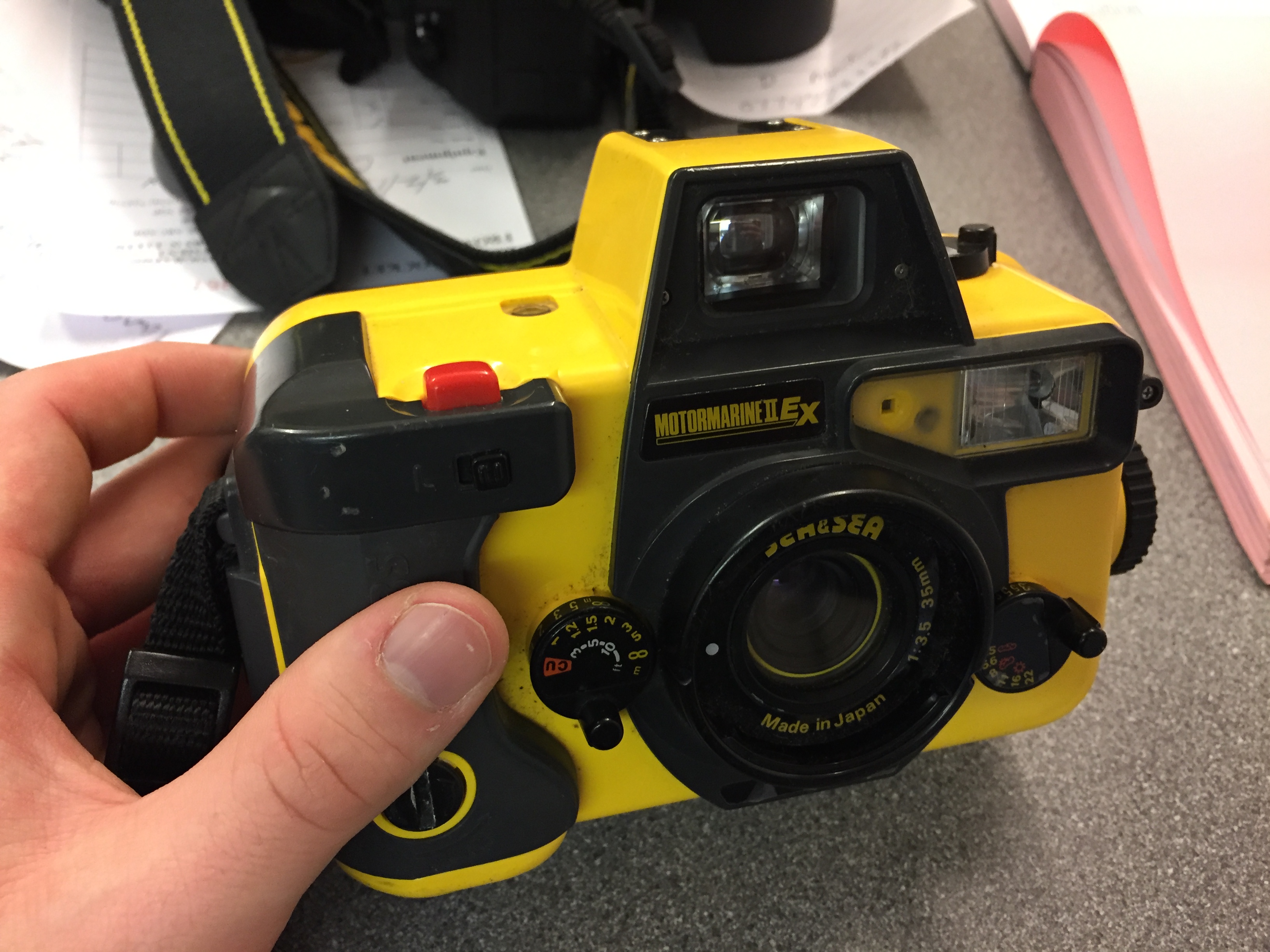
This is a 35mm film camera that I got for free and had repaired. I have had very little experience with using this camera but I have shot film before so I know what to expect from the limitations of film. Even if all of the photographs that I take with this camera turn out bady I should still have photographs that I will take back on land with my digital camera to use. In the water I am planning to be using ISO 400 film or ISO 200 depending on the lighting that day. If it is overcast or there is not direct sunlight then I will use the 400 but if there is direct sunlight then I will use the 200. For the photos above the water/on dry land I will be trying to emulate the work of Anthony Kurtz that I looked at for my environmental portraiture moodboard. His photographs are not overly set up like Bielaski and Sander’s work, the more natural feel to them is a method that I prefer. However for the photographs just above the water’s surface then I will be trying to emulate the work of Brooks Sterling. He  is a lifestyle photographer and art director living in southern California. His work is mostly centered around surfer/skater culture in Southern California and he uses a mix of film and digital. I spoke to him recently and he gave me some tips for shooting in the surf like this so hopefully I will be able to get some nice photos. Link to his website and Instagram.

As a backup for this, I am also planning to go out with some of my other friends into some environments that they are not used to. This will give me a chance to photograph people discovering new environments which is often hard to do in Jersey because it is so small. But we have previously found somewhere that we did not know existed and are going to be going back there to have a proper look around. It is in St. Aubins and is near to the beach, on the south coast like this the lighting should be very good and as I have no idea what the place looks like myself the photos will be a reaction of me experiencing this new environment too.

Photoshop Experiment and Response to Idris Kahn amd Stephanie Jung

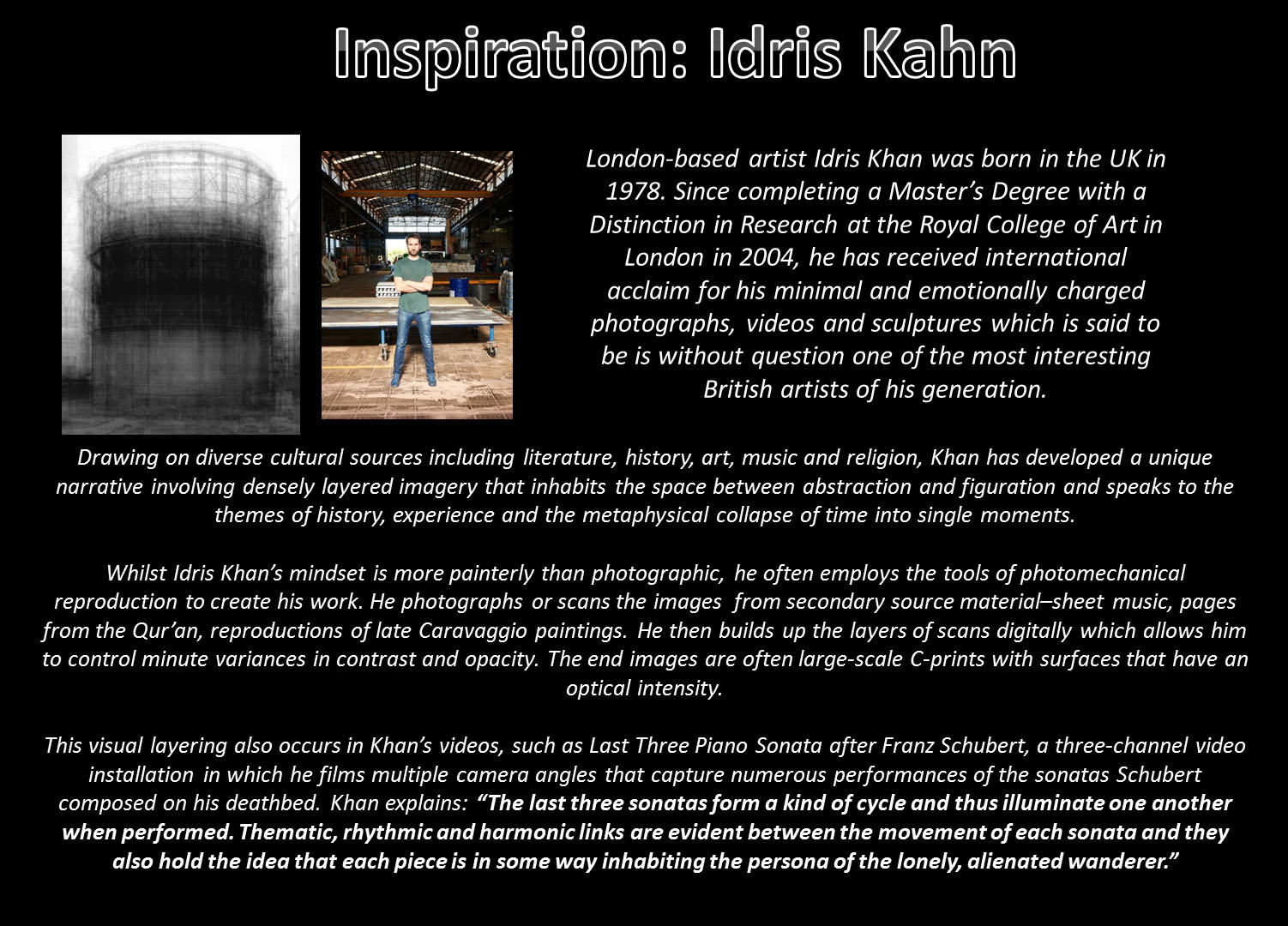
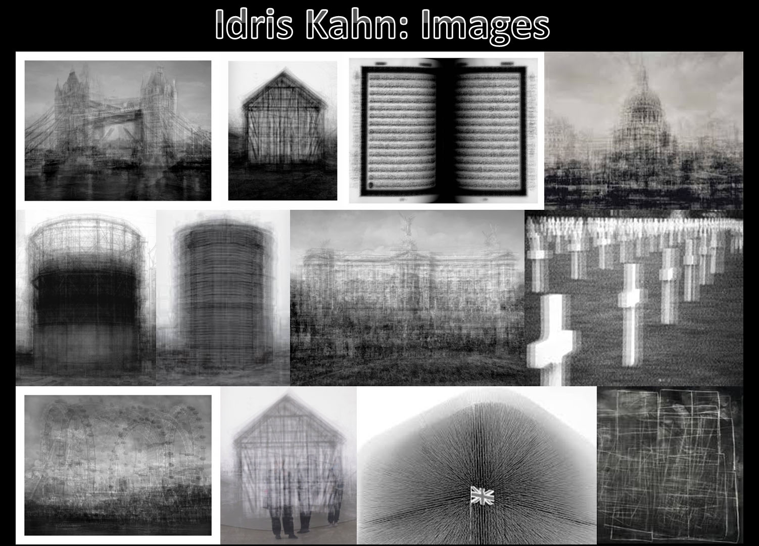
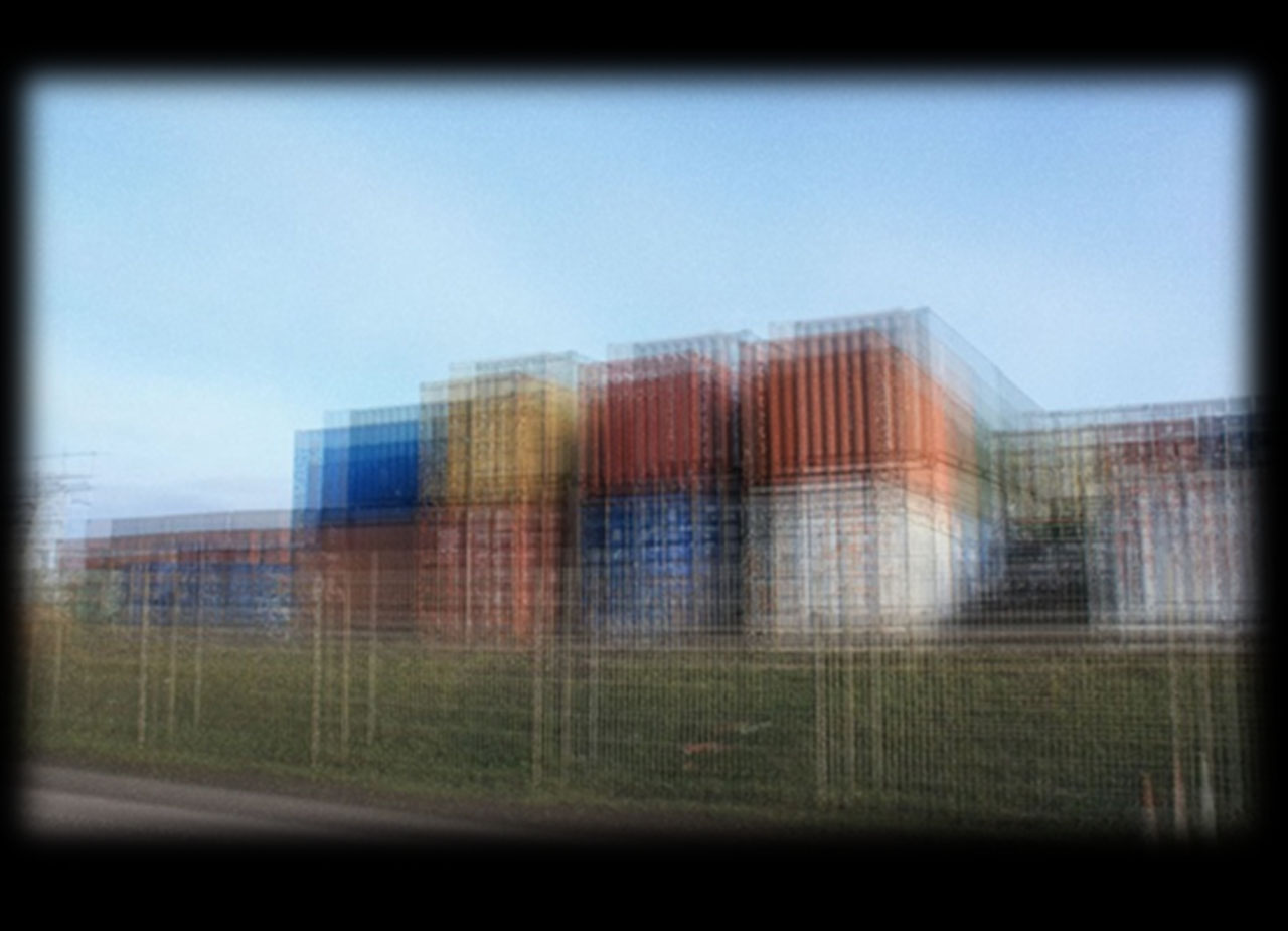
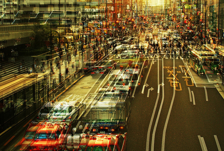
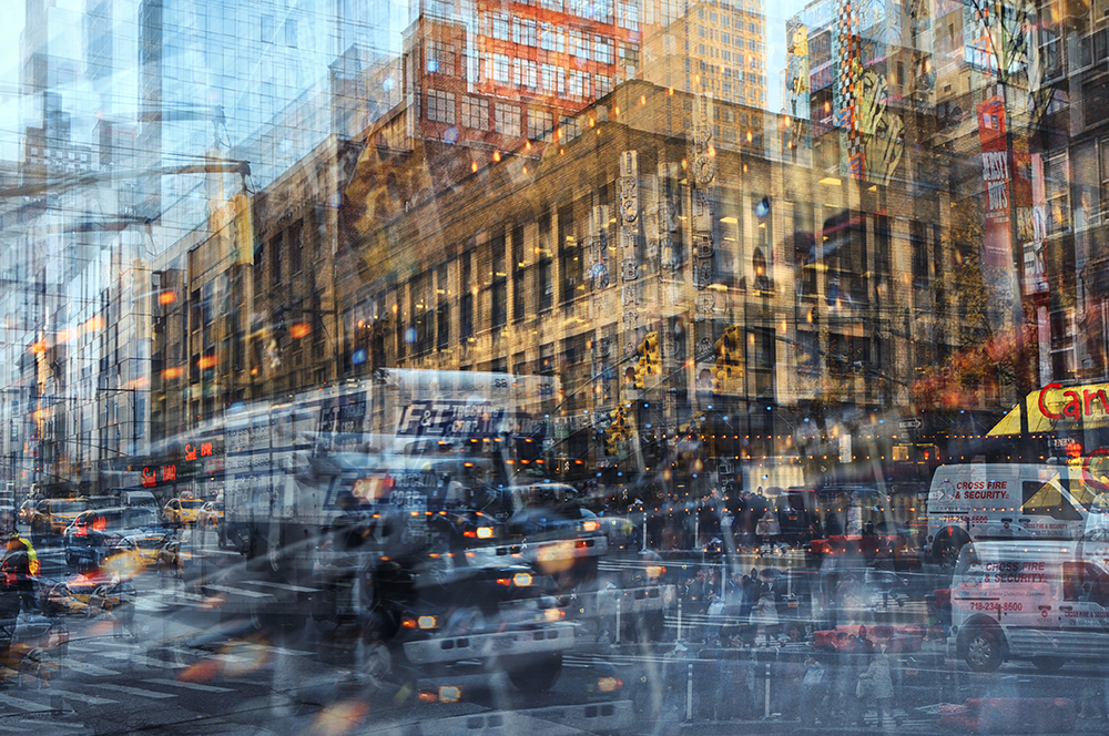
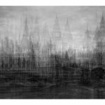
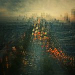
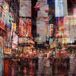
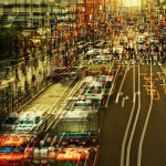
I was given a task to create manipulate and image using Photoshop while taking inspiration from the work of Idris Kahn (Image above on left) and Stephanie Jung (Image above on right) These images are created using Photoshop or a similar photo editing software where the same image is duplicated an layered on top of its self multiple times to create a dream like sense of movement and fluidity.

ORIGINAL IMAGES 

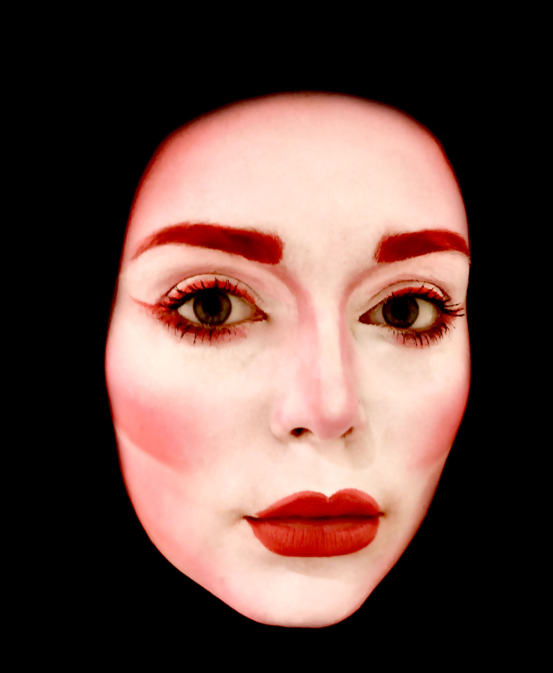
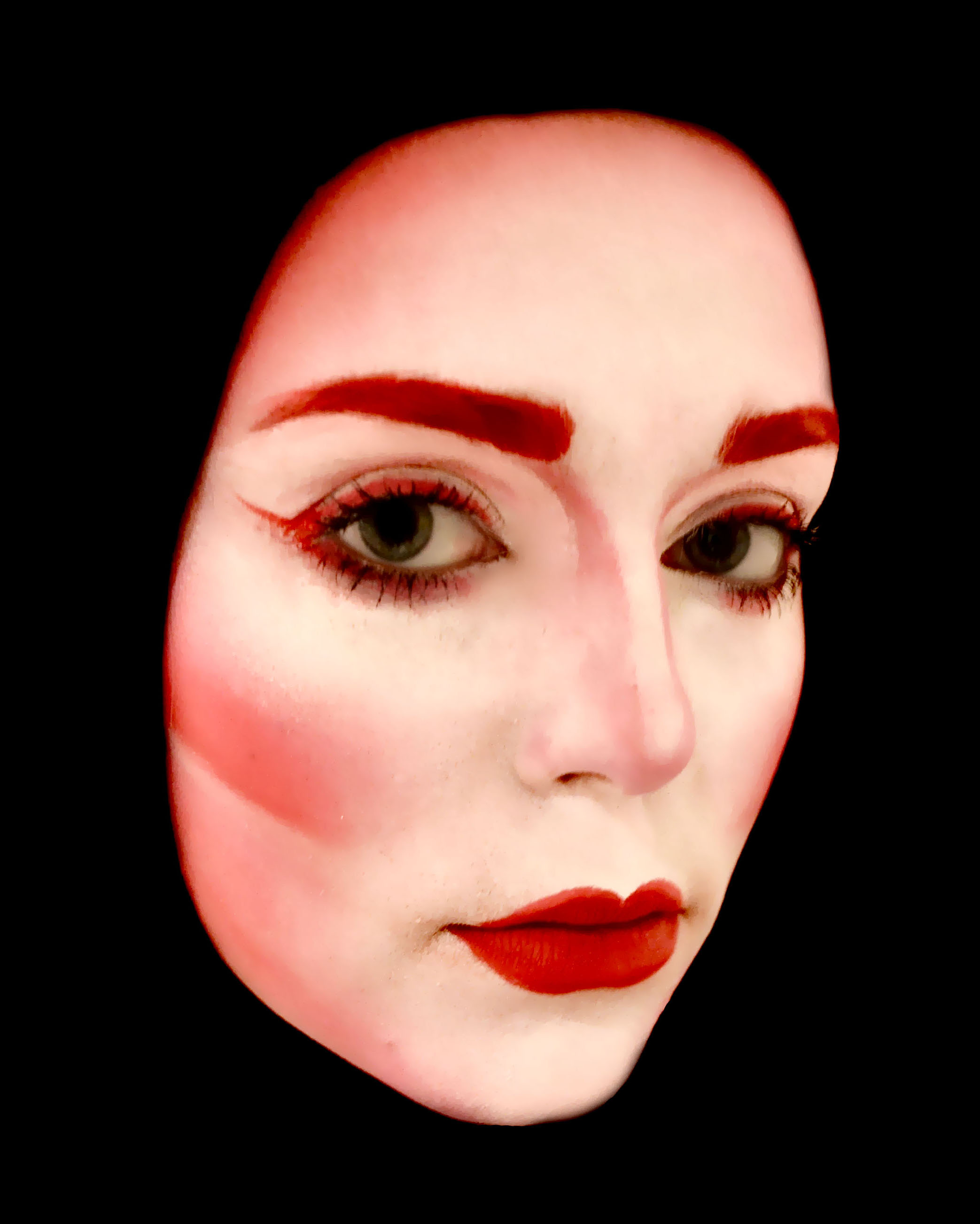
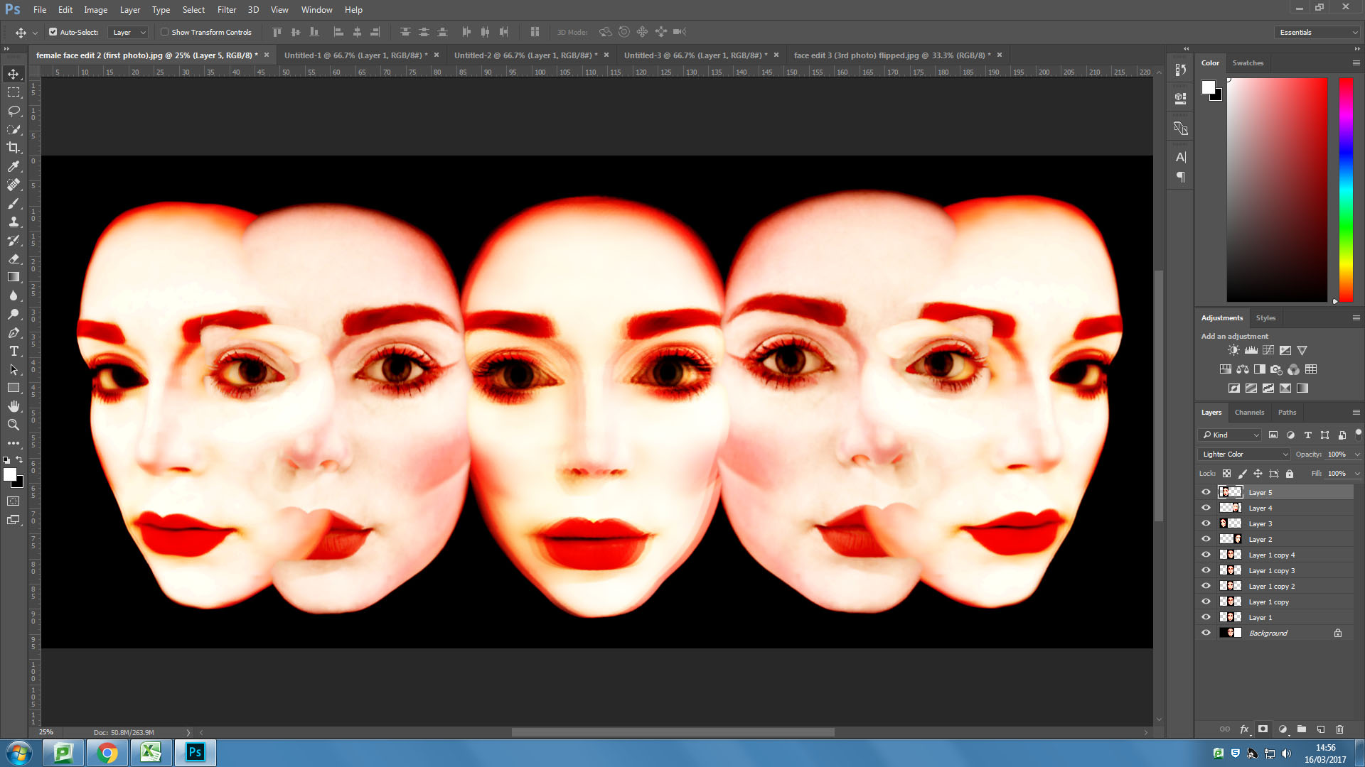
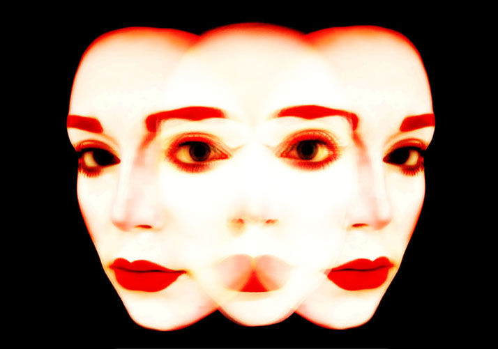
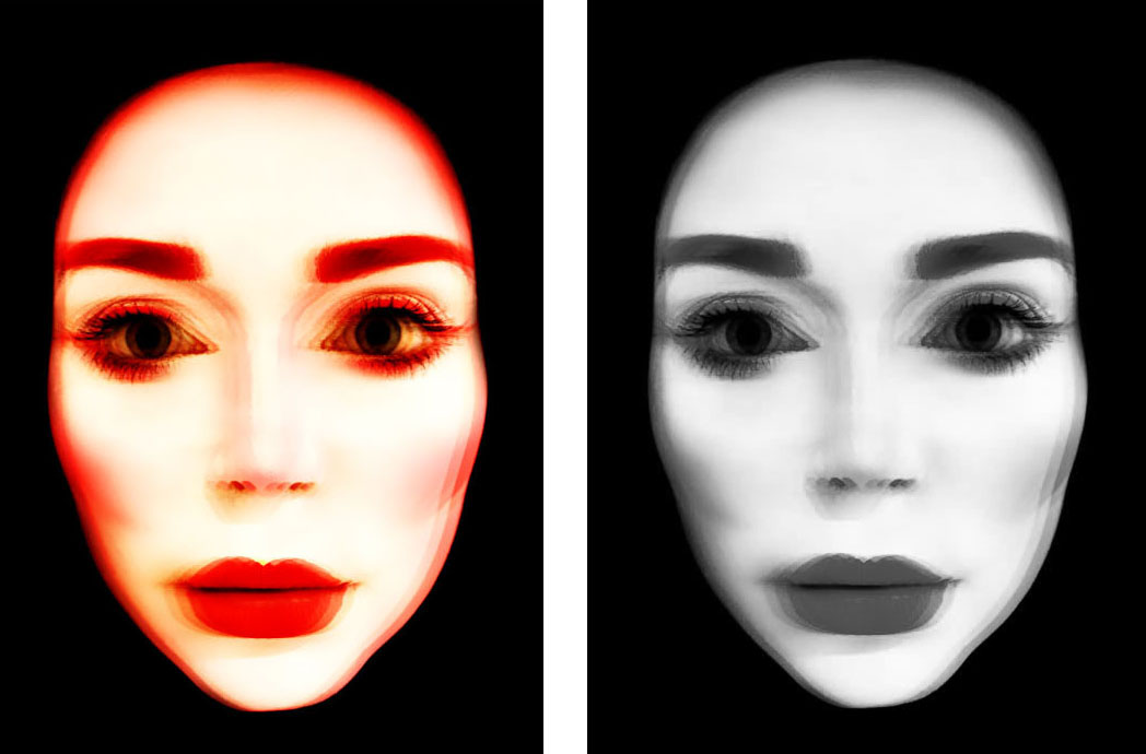
Above are the original images that I used during this experiment. These were final images for my AS exam last year and were previously presented as as series of 5 images with the second 2 image flipped on the other side to create a turning effect. For the outcomes of this experiment I used the first image several times to create a single blurred face and the turned heads both in the format above and flipped to created a more developed feel of turning motion.

PROCESSES 

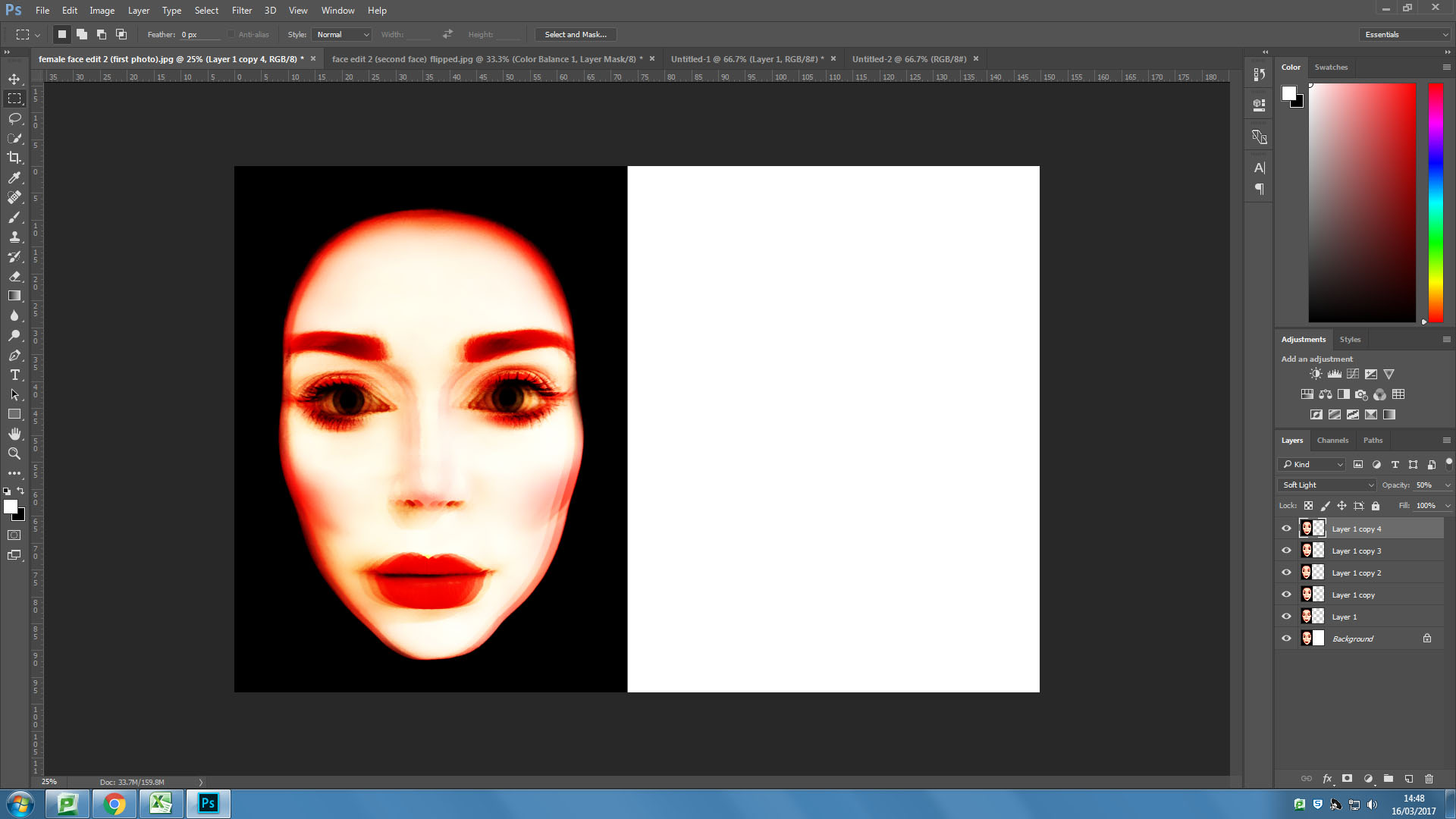
I first overlayed my front facing image six times using the “overlaying” blending filter on Photoshop.

I then tried a similar process with one of the angled faces, this one I overlayed five times, also using the “overlay” blending filter on Photoshop.

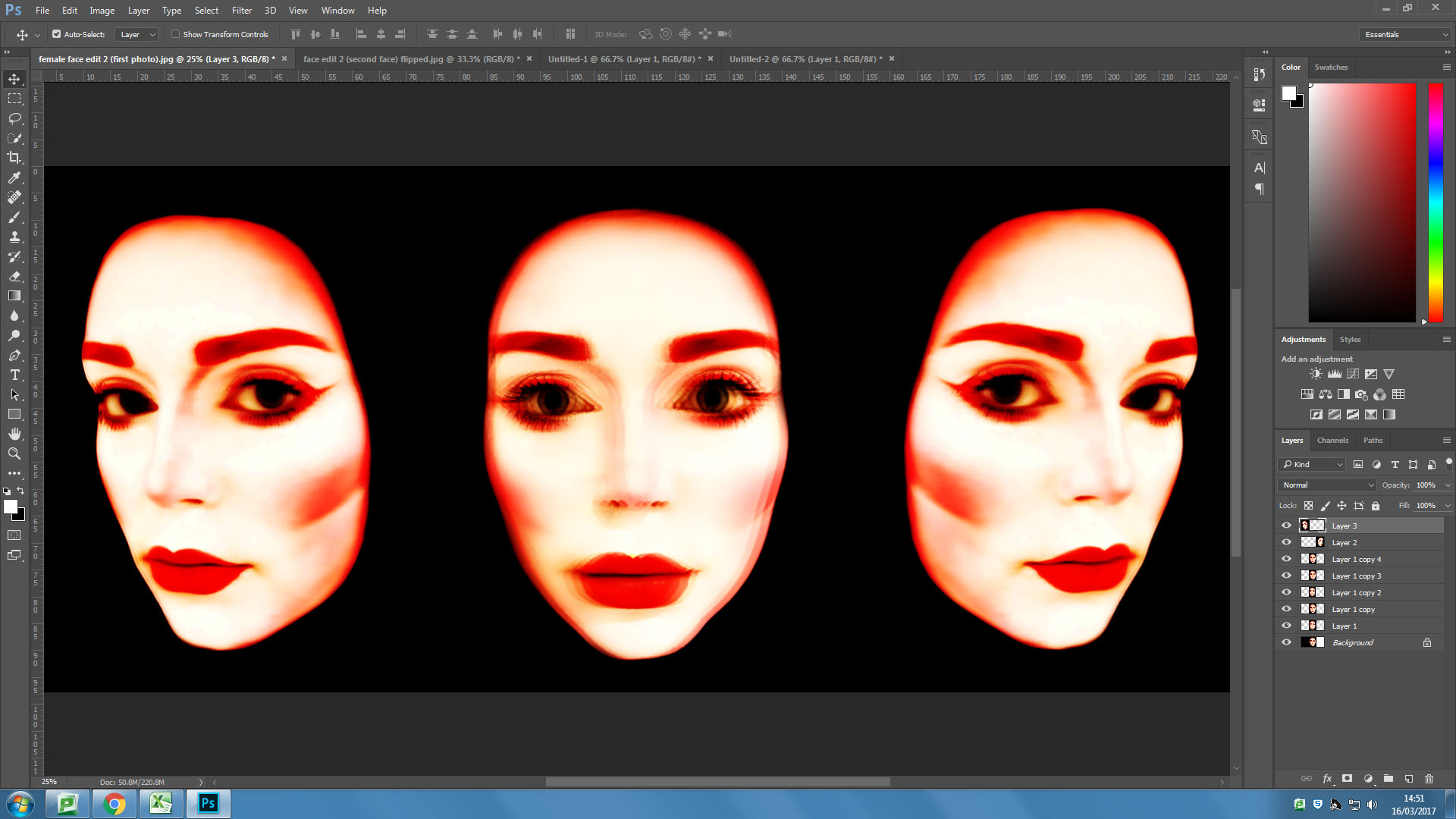
I then pasted the overlayed angled face onto the same background as the front facing face. I then flipped the image and pasted another on the other side of the forward facing face.


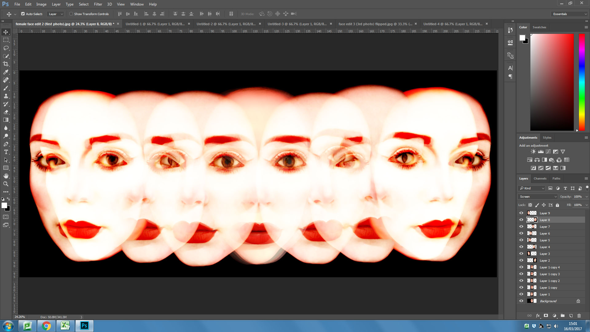
I then took the mid angle face and pasted it in it’s original format and flipped either side of the forward facing face in the centre and blending the additional faces into the image using the “screen” blending filter.

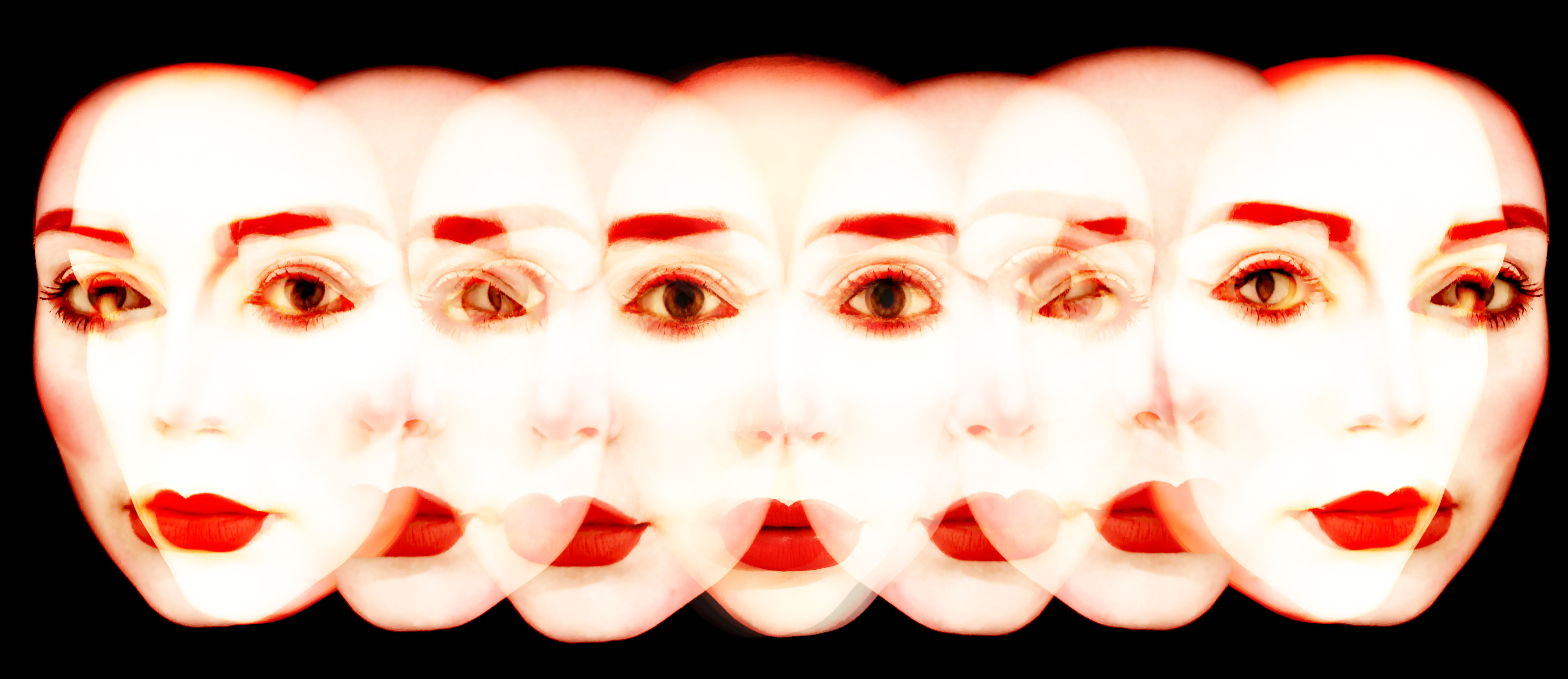
I then added some more faces over the top of the image using the “screen” blending filter and experimenting with the opacity.

OUTCOMES 

An Experiment

// M U L T I P L Y //

As part of a class photoshop recap session we were asked to create a series of test images to prove our photoshop skills and abilities using original photos from our previous projects and shoots. The point of this was to ensure we were confident using basic abstract editing techniques such as duplicating layers, adjusting opacity settings etc. For my images I also pre edited the images in camera RAW – in particular using the colour curve graphs – to create some more exaggerated results. These link to my previous post, ‘STEREOSCOPIC’, where I mention a potential project looking at stylized portraits which include a 3D editing technique making use of multiple layers and duplication.

The though process behind this was to engage our own projects with abstract artists such as Idris Khan and Stephanie Jung who use layering techniques in their own work. Jung as an example creates ‘double exposure’ style pieces using layered images of cityscapes – mainly New York  – which works well to capture and visualise the sense of pace and movement from the environment.

Now for my own experiments.

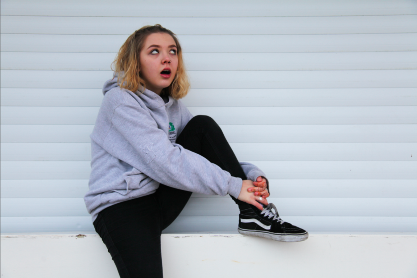
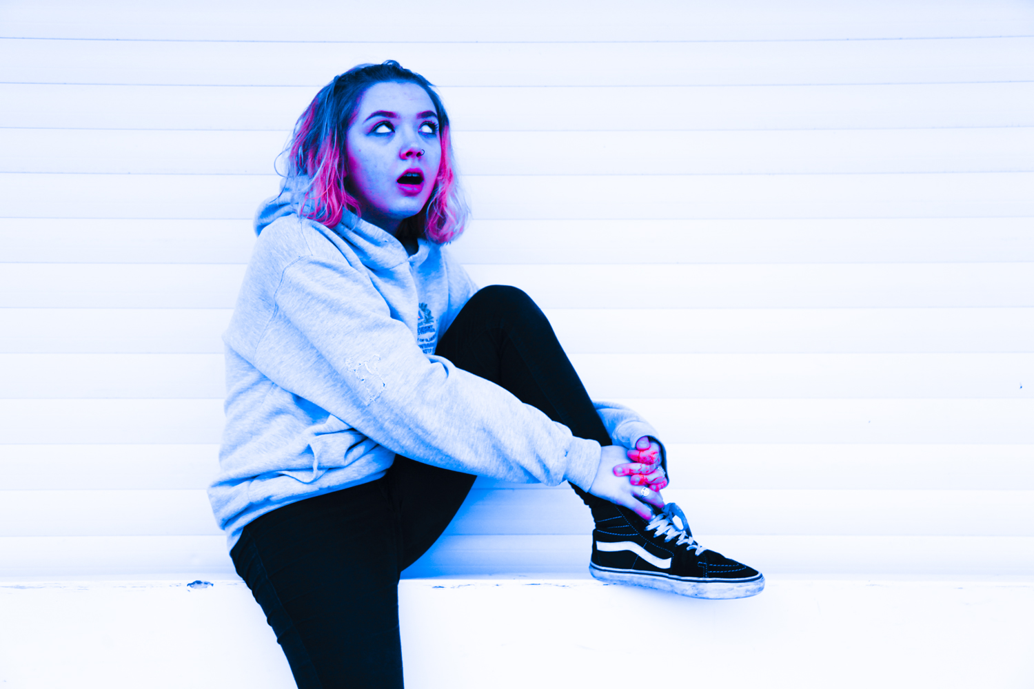
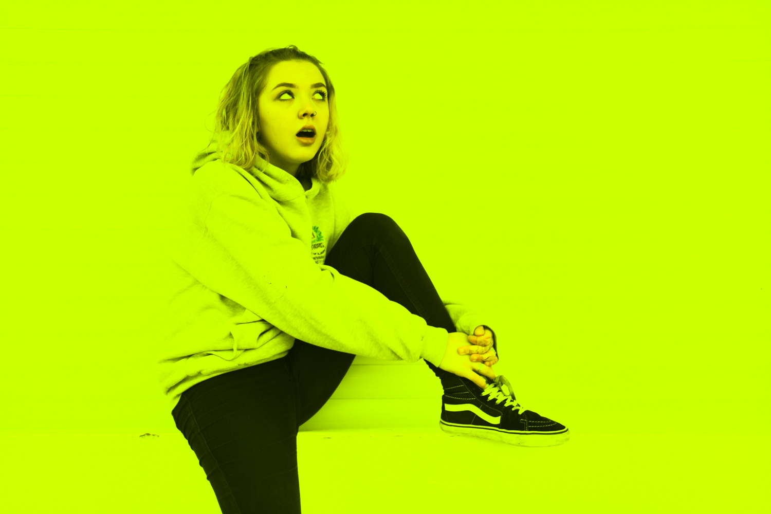
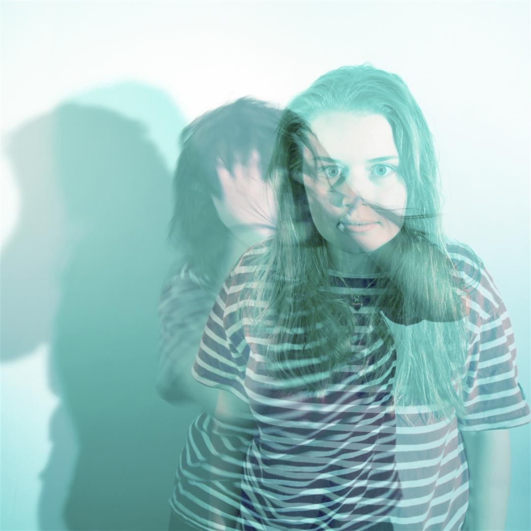
The original image features my friend Hope who tends to pop up in a lot of my previous project work. Here she is looking sarcastic on a wall wearing clothes that probably aren’t hers.

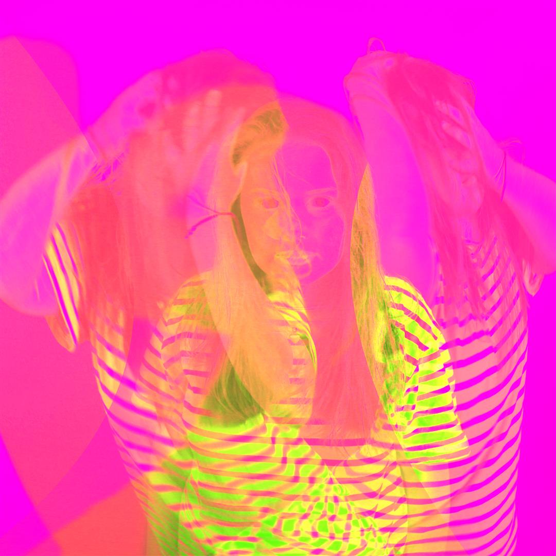
I duplicated this image three times in camera raw and edited each of them as individual pieces to ensure totally different contrast levels and colour compositions.

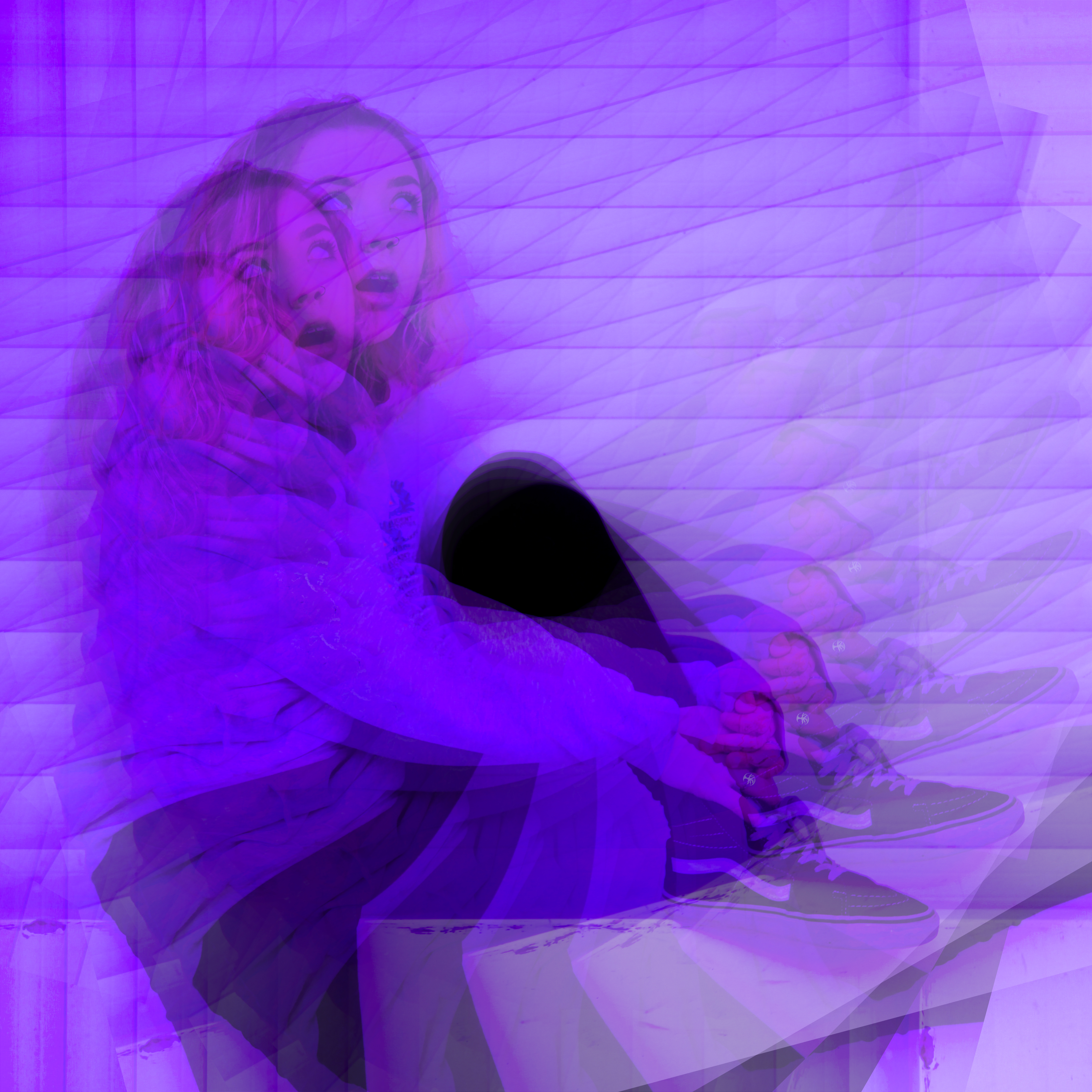
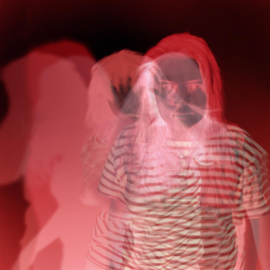
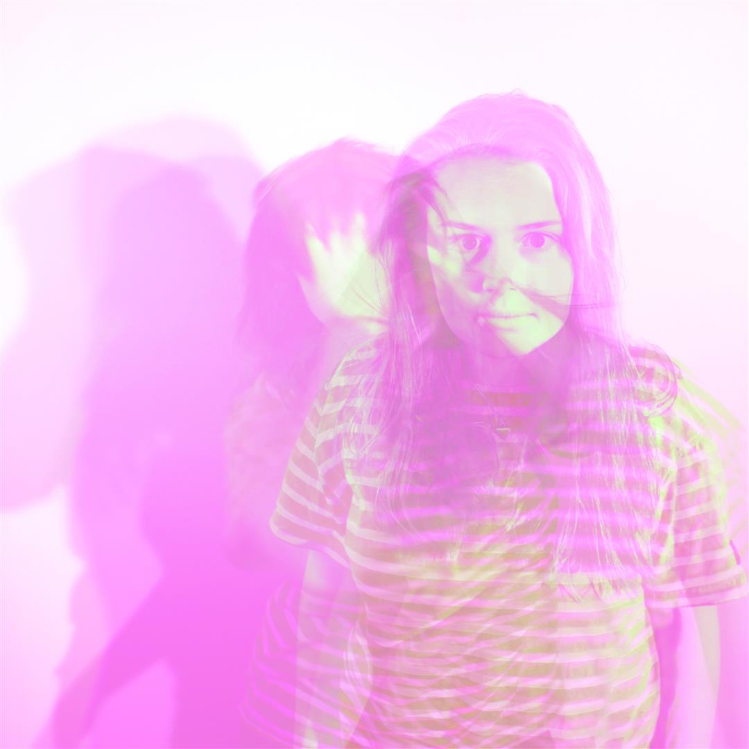
From these photos, I opened photoshop and created three different experiments. This first one is the same image, duplicated on itself using the layering technique with a 35% transparency level. Each photo is rotated by 15% to mirror her own spiralling journey into the purple world of depression.

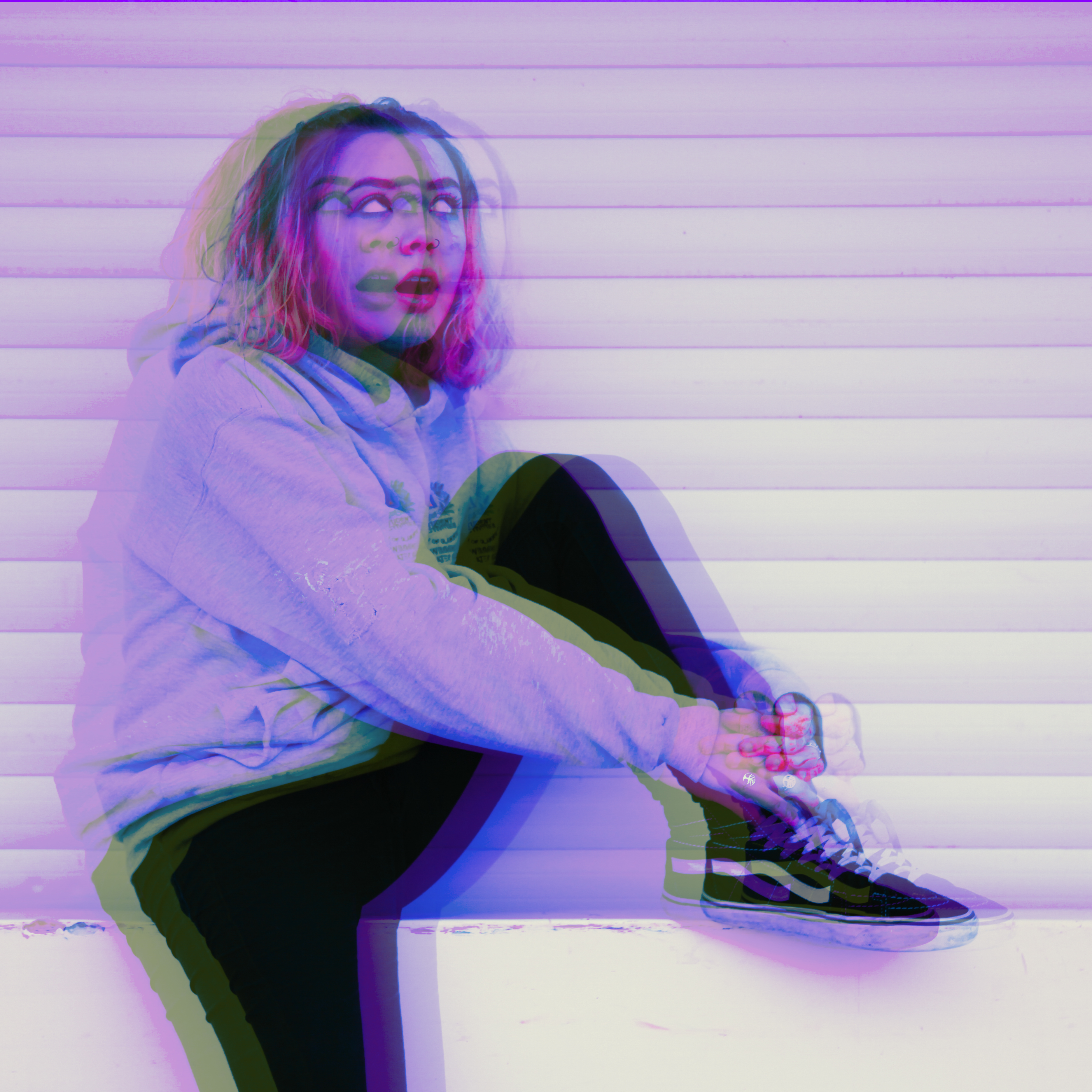
The next is a double duplication with the image mirrored so she can be sarcastic at herself for a change.

This one is all the images together and also has a darken effect on the bottom layer. Blurring techniques were used to alter the method of blending. This image is messy and chaotic; much like Hope.

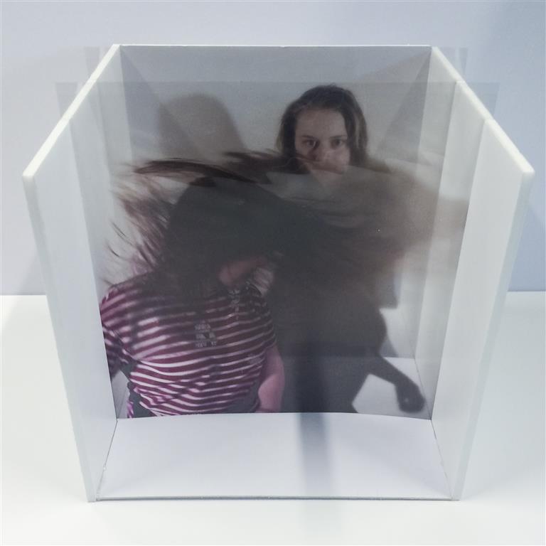
Another area we were asked to investigate is the possibility of layering these images manually – for example on glass or plastic. Entertainingly this was actually my chosen project almost a year ago now for my AS Exam where I made a photo box which would allow images to be inserted after being printed on acetate. The idea behind this presentation was to make an object that could be altered and changed to create different compositions. The original project and posts can be viewed here [X]

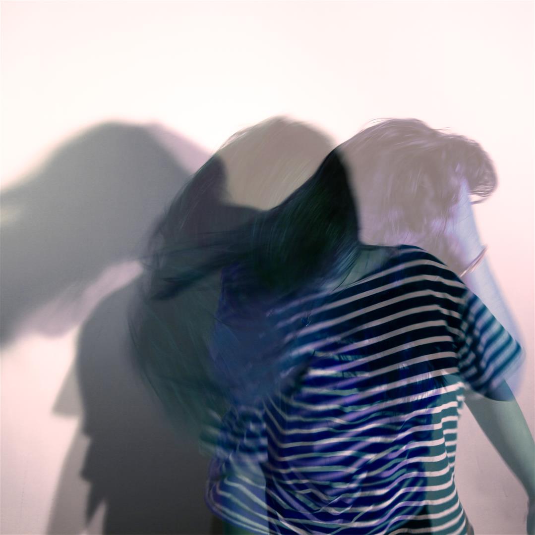
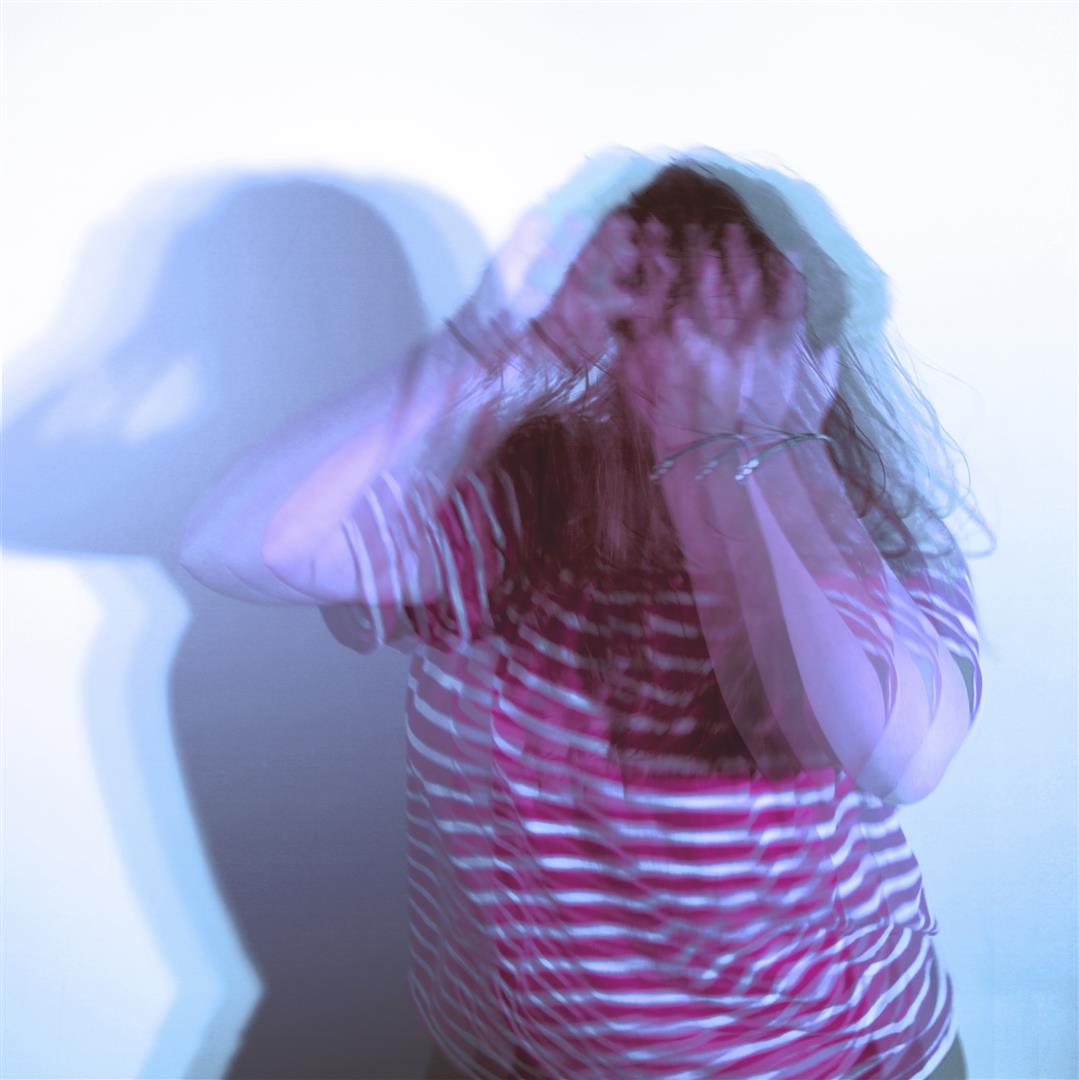
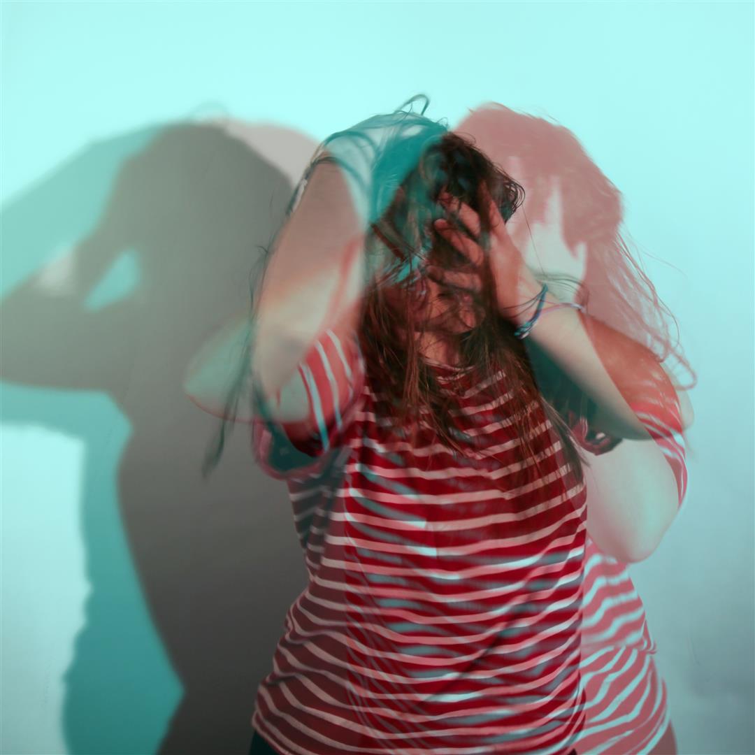
This is the final photobox with the manual compositions showing layering. below is a selection of digital experiments I produced to test the portraits I then printed for this project featuring my friend Charlotte flicking her hair about a lot.

Hopefully this proves that I can use photoshop at this level.


(thanks to Hope and Charlotte)

Environment – Skateboarding Video

The video attached below is one I created, documenting my friend Zac and a trick he had attempted on the day I also did a photo shoot with him. I recorded every attempt that he had tried on the day and edited this in a montage style, that became almost documentary. As if I were filming a day in the life.

Once edited together, I added a voice over of Zac explaining his journey of the trick itself. Ultimately I wanted minimal editing, as I was trying to focus of the battle that Zac encountered trying this trick.

IDRIS KHAN / STEPHANIE JUNG – EXPERIMENTATION

The highly experimental work of Ibris Khan and Stephanie Jung uses overlaying techniques to add a strong energy into their work. The strong use of texture give both artists work a very crowded effect. Their work evokes a very intense form of energy. The huge amount of layers creates a very provocative sense of texture. I have used my own photos to recreate something in the style of their work.

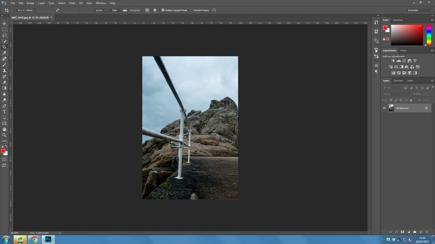
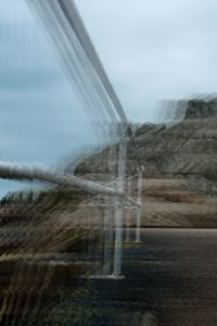
I took a photograph from my AS exam coursework that fitted with the theme of environment, it also incorporates the contrast of man made with natural. The above first image is me working in Photoshop. I first duplicated the layers and re positioned them slightly. over each other. I then brought down the opacity of each photograph. This created this blurred effect. I found I needed to make the above layers opacity lower to let layers underneath show through.

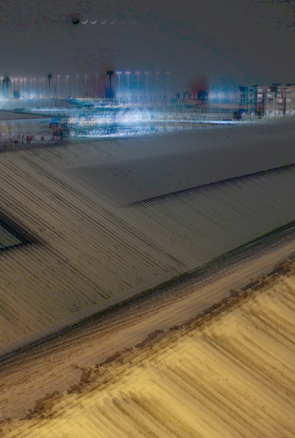
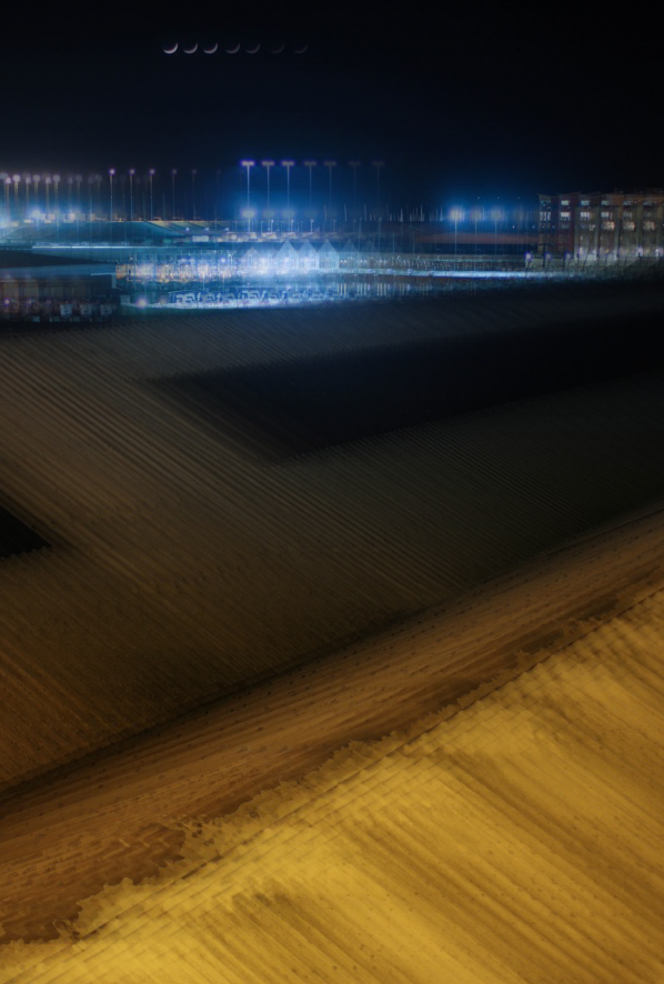
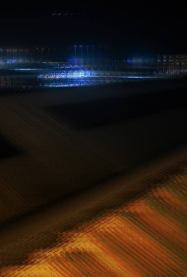
After this is found another image from my AS coursework featuring a long exposure of town overlooking buildings. I started by duplicating the layers and repeating the process for the second. I then cropped the image to hide areas that weren’t covered by another layer. I then changed the layer options such as to ‘subtract’ or ‘overlay’. I made different variations using the layer modes available to give different effects. I also changed the opacity of different layers to make others show through more. For the first one featured below I used the divide feature which created a grey feature over the top of the layer. Colour burn on the last photograph created a very rich red colour as well as darkening the photograph. Underneath these three images is where I used a variation of changed layer modes but in particular exclusion to create an intriguing textured effect. This is probably my favourite out of the selection for its subtle variety of colour in the background and unusually texture from the roofing in the foreground. It is also a lot more disjointed and out of rhythm compared to the first few for example how the moon in the first three all follow one after another and in the last one there is a lot more energy and sense of disruption instead of the neatness of the first few.


Images Inspired by Idris Khan (Photoshop Task 1)

Photoshop Task 1


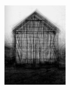
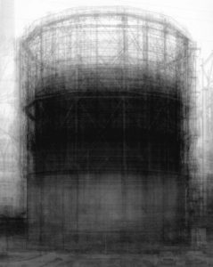
We were set the task of creating an image inspired by Idris Khan’s work with layering and shifting photographs. He does this by taking multiple images of a single object at slightly different positions and then layering them in Photoshop to create these abstract scenes of seemingly inanimate objects. Often photographing industrial buildings like oil or natural gas containers with wire frames when shifted they have a ghost like appearance to them. Incredibly dramatic they explore the environment in the abstract and unusual. it is an odd method but it works well and creates interest within the images that really helps to get viewers to look more in-depth at the images to try to work out what is gong on.

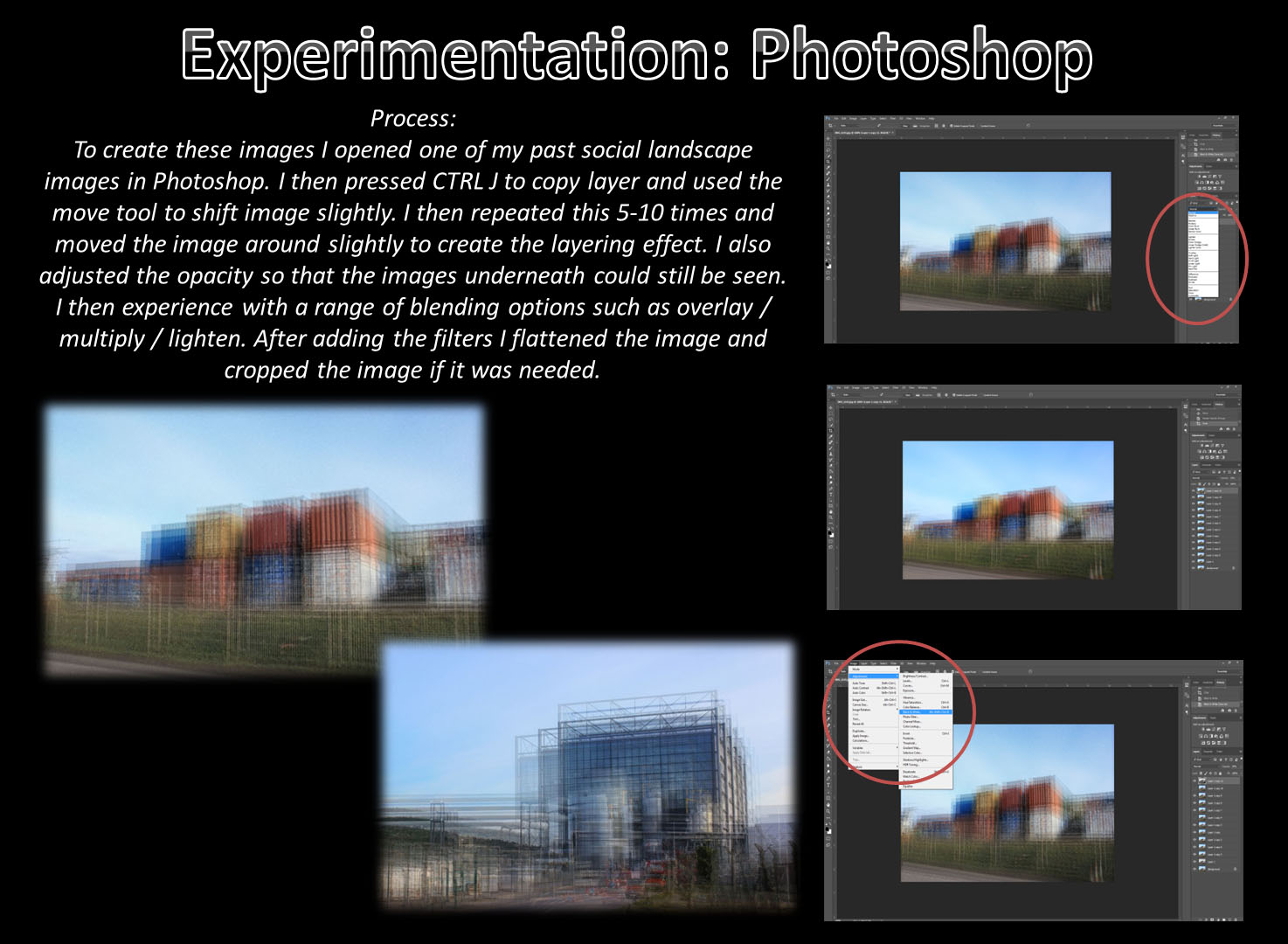
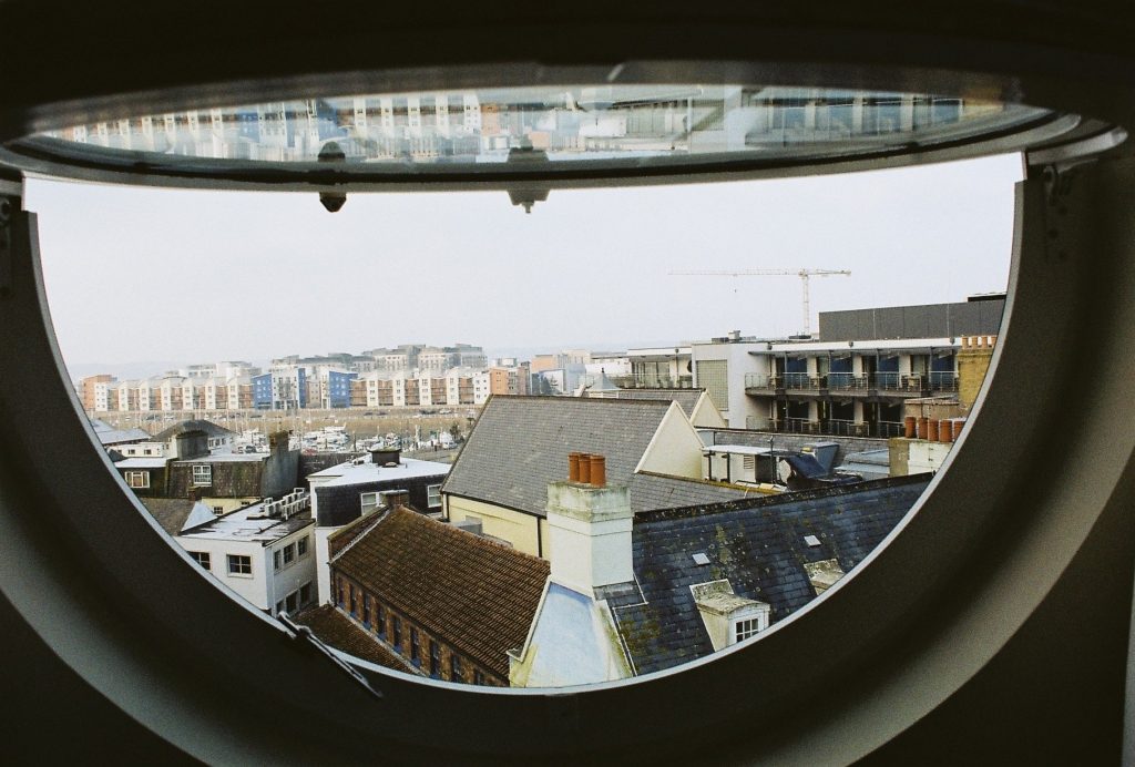
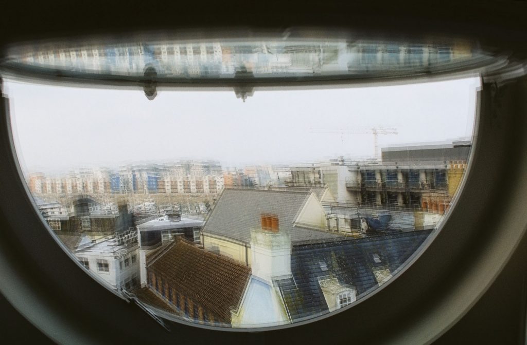
To try and emulate this to make my own image like this I used a digital technique that produces similar results and only requires one photograph to be taken. The method involves:

  1. Opening the selected image in Photoshop. For my attempt I used a photograph that I had taken on 35mm film so the quality is not too great.
  2. Copying the image a number of times. For my attempt I used 10 additional image layers and a black and white layer later.
  3. Once all of the layers are in, each one should be shifted slightly.
  4. Now different blending options can be used to change the visibility of the different layers. For me this mostly involved changing the opacity but some of the images were brightened and I even made some not visible at all because I did not think that they added anything to the image.
  5. I then changed the position of some layers individually to give the image a more “shifted” look.
  6. the last process that I used was to crop the image so that there was a solid edge around the image.

The first edit was the result of following that list of processes, it has the obvious shifting that has been done to it and the different angles also really help to give this its shaken effect. The second edit was done to try to better emulate Khan’s work, I simply added a black and white layer to the image, again in Photoshop. This gave the image a much more desirable look to it, it feels more gothic and more reminiscent of Khan’s work. Although it does not have the same feel because it does not have a framework to shift around it certainly looks similar and has the same general feel to it.

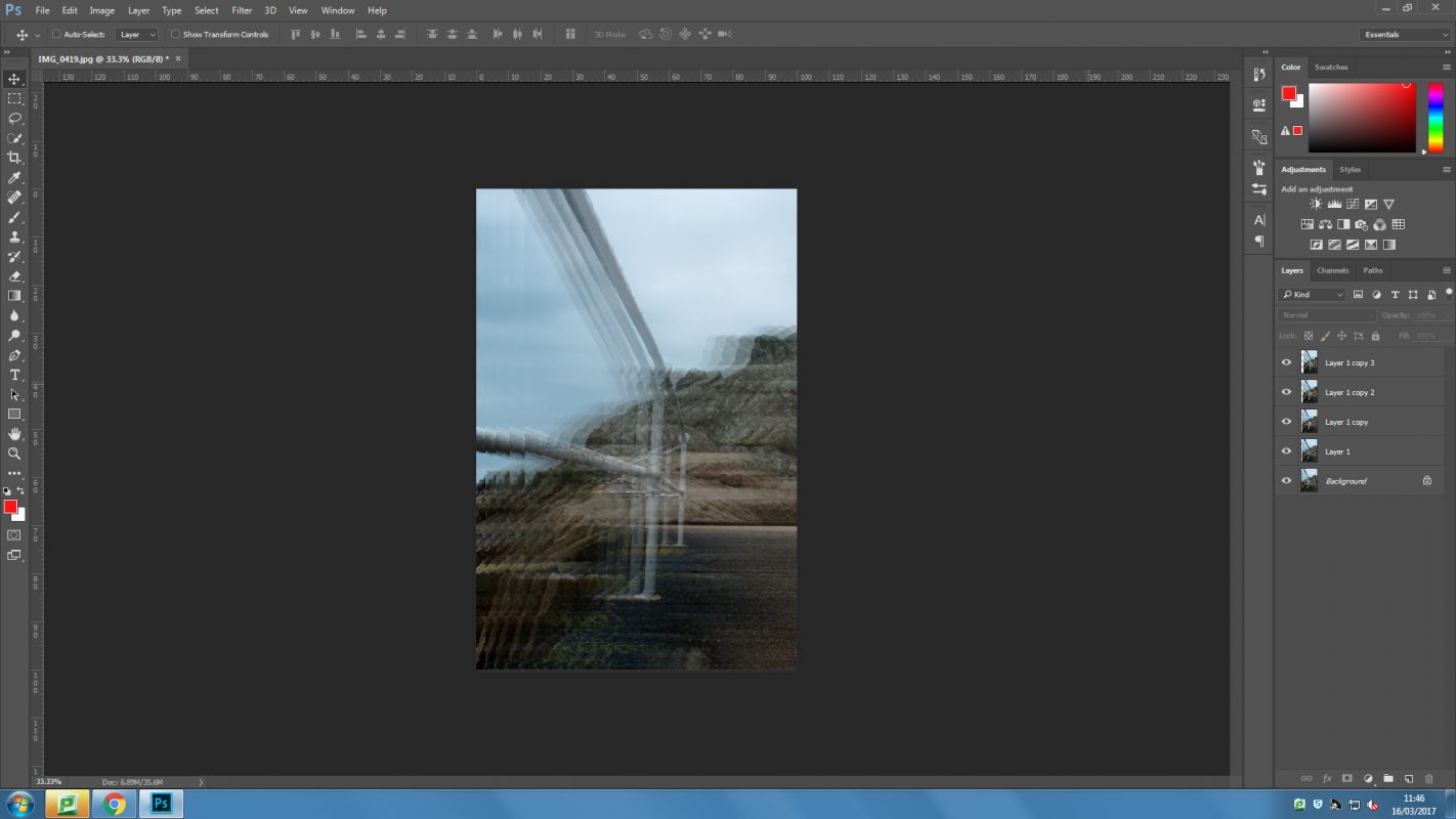
This screen shot shows the different layers and how I went through and adjusted them all individually. In this you can see the B&W layer that has not been set visible until I had the image looking good first. Although the images does not have too much distortion or ghosting to it and so is still more visible than Khan’s work I still like the way that it turned out quite a lot.

Pollution Levels in China

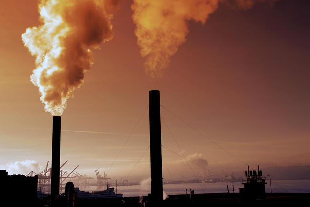
China: The terrible condition of the air in its cities is just one example of how this country, growing at breakneck speed, does not exercise sufficient control over its emissions. Development of this kind must take account of environmental risks, given that in just a few years it has overtaken the United States in terms of tons of COemitted into the atmosphere.

Top 5 worst countries: http://www.activesustainability.com/top-5-most-polluting-countries

Big City Pollution

Air Pollution:

  • Air pollution is the combination of Carbon dioxide and Methane increasing and so increasing the earth’s temperature.
  • It is the most dangerous of all the environmental problems, it kills around 7 million people each year or 1/8 deaths globally.
  • Indoor air pollution is the equivalent to smoking two packets of cigarettes a day if you cook and heat your homes using open fires.
What causes it:
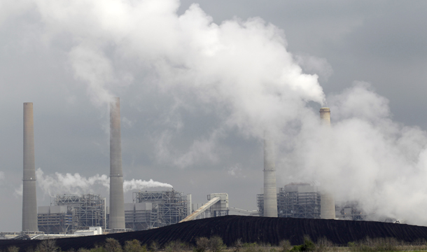
  • Most of our air pollution is from energy use and the production of it, burning fossil fuels releases gases and chemicals into the air.
  • Passenger vehicles is one of the major contributors to our air pollution, they contribute to 75% of our carbon monoxide emissions. In urban areas, it can be up to 50% to 90% of our carbon monoxide emissions.
The effect of Air pollution:
  • Carbon monoxide is a odorless, colourless and is poisonous. It is responsible for over 430 deaths a year and the annual death from carbon monoxide for males is 0.22 per 100,000 and for females it is 0.7 per 100,000. 
  • Air pollution can induce headaches, nausea and allergic reactions. IT can also aggravate other medical conditions such as Asthma and Emphysema.  
  • There are long term effects such as Chronic Respiratory disease, Lung Cancer, Heart disease, and even brain damage. 
  • Apart from health effects, Air Pollution can also lead to a variety of environmental effects such as Acid Rain which precipitation containing harmful amounts of nitric and sulfuric acids. 
Smog and Soot:
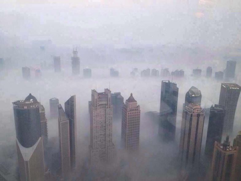
  • Emissions from fossil fuels react with sunlight to produce Smog which is similar to Fog but it thick and stays for days, months or for 365 days a year in places like China.
  • Soot, is made up of tine particles of chemicals, soil, smoke, dust or allergens. 

Air Pollution in China in Real Time: http://aqicn.org/city/shenzhen/

December 21 2016: http://learningenglish.voanews.com/a/china-battles-smog-as-worst-air-pollution-of-the-year-hits-beijing-and-other-cities/3645519.html


Layering experimentation

 “Drawing inspiration from the history of art and music as well as key philosophical and theological texts, Idris Khan investigates memory, creativity and the layering of experience. “

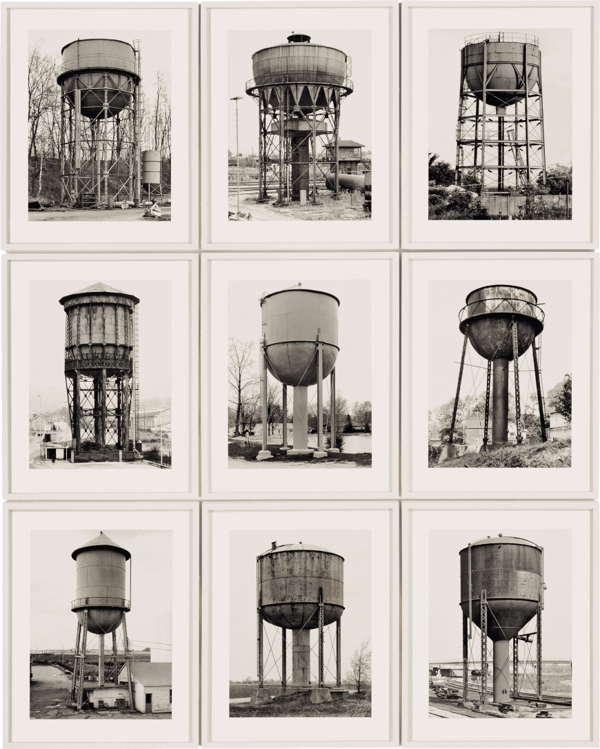
Considering the use of Photo-shop techniques such as layering to explore environmental photography I was inspired by the work of Idris Khan. He is a British artist who is well-known for creating densely layered images that address ideas to do with experience and history by collapsing a single moment.  His layering technique involves adding new layers while keeping traces of what has been before to create something new through repetition and superimposition. His photographs often originate from secondary source material, for example, he has explored the work of Bernd and Hilla Becher. The Bechers  originally set out to document functional architecture in the post-industrial era by using a dead-pan approach, photographing each structure in an objective and uniform way, from different angles and then grouping them in typologies.

Khan has said that he wanted to look at images that had influenced the photographic culture as a whole and see if he could add something new to this work. He achieved this by challenging the cold, dead-pan approach the Bechers took by creating a different atmosphere with his resulting images appearing more like drawings or blurred film stills that have an eerie quality to them. By appropriating the Bechers imagery and compiling their collections into single super-imposed images he makes the viewer think about authorship, time and image-making.  The structures in the Bechers original photographs are almost identical and Khan adjusts the contrast and opacity to ensure each layer can be seen and has presence.  I think that it’s interesting how he has used new methods to explore an iconic collection of photographs and challenge the way that are interpreted . At the same time they also seem to destroy the source materials in that they are almost illegible but they also tribute the labour and time of the original creators. I also like that in this case the use of layering as a technique has a specific meaning and value and isn’t done purely for abstract or aesthetic purposes.

Experimentation 

This is an old image of mine which was taken while exploring the themes of social environment and typologies. I experimented in Photo-Shop with the idea of double-exposures and layering of the same image. I did this by copying the image and then moving the duplicated layer slightly and adjusting the overlay and opacity. I experimented with different variations and settings such as colour burn and soft light. These are some of my outcomes from this:

Environment – Archival Skate Footage

Below documents a series of skateboarding clips, of myself, shot over a period of two weeks, skating within one area of St Helier. This footage was recorded during 2015, on a VCR camera, at a time where I was skating daily.

I decided to leave this footage completely unedited, in order to highlight what a day of skateboarding consisted of for me.

I attempted to replicate the style of video that Ben Gore had filmed for, I focus more on the footage itself, because of the filming, as I believe it really encapsulates the area as well as myself as a skateboarder.