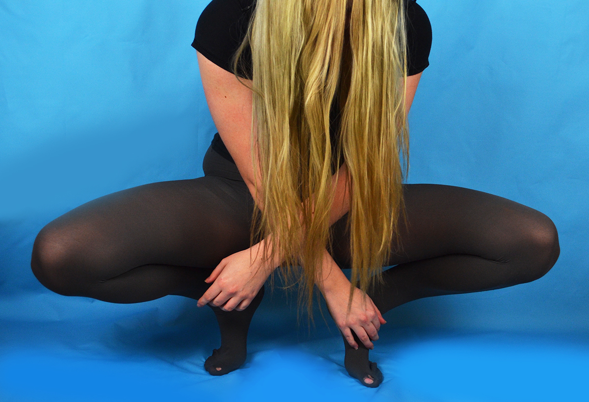
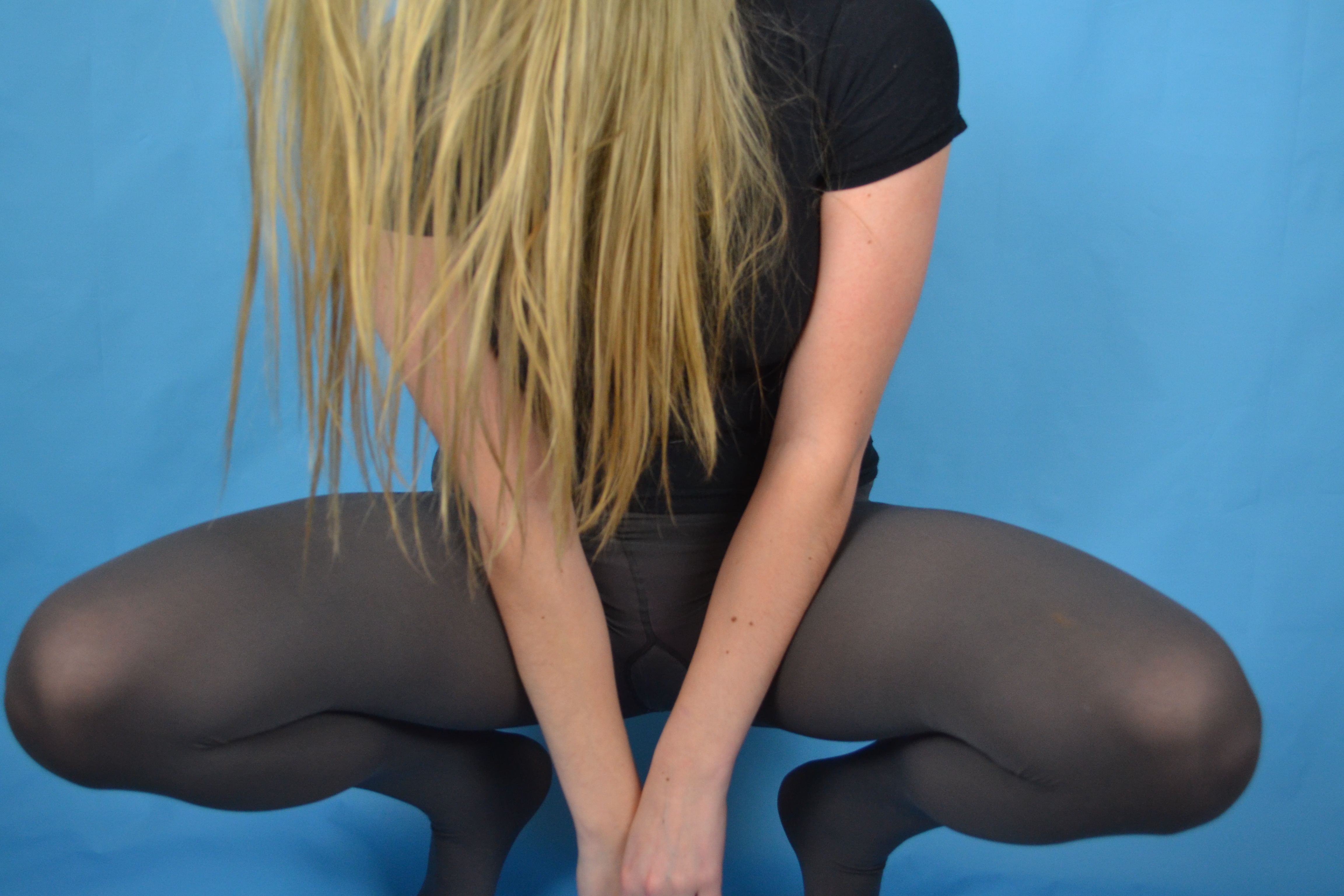
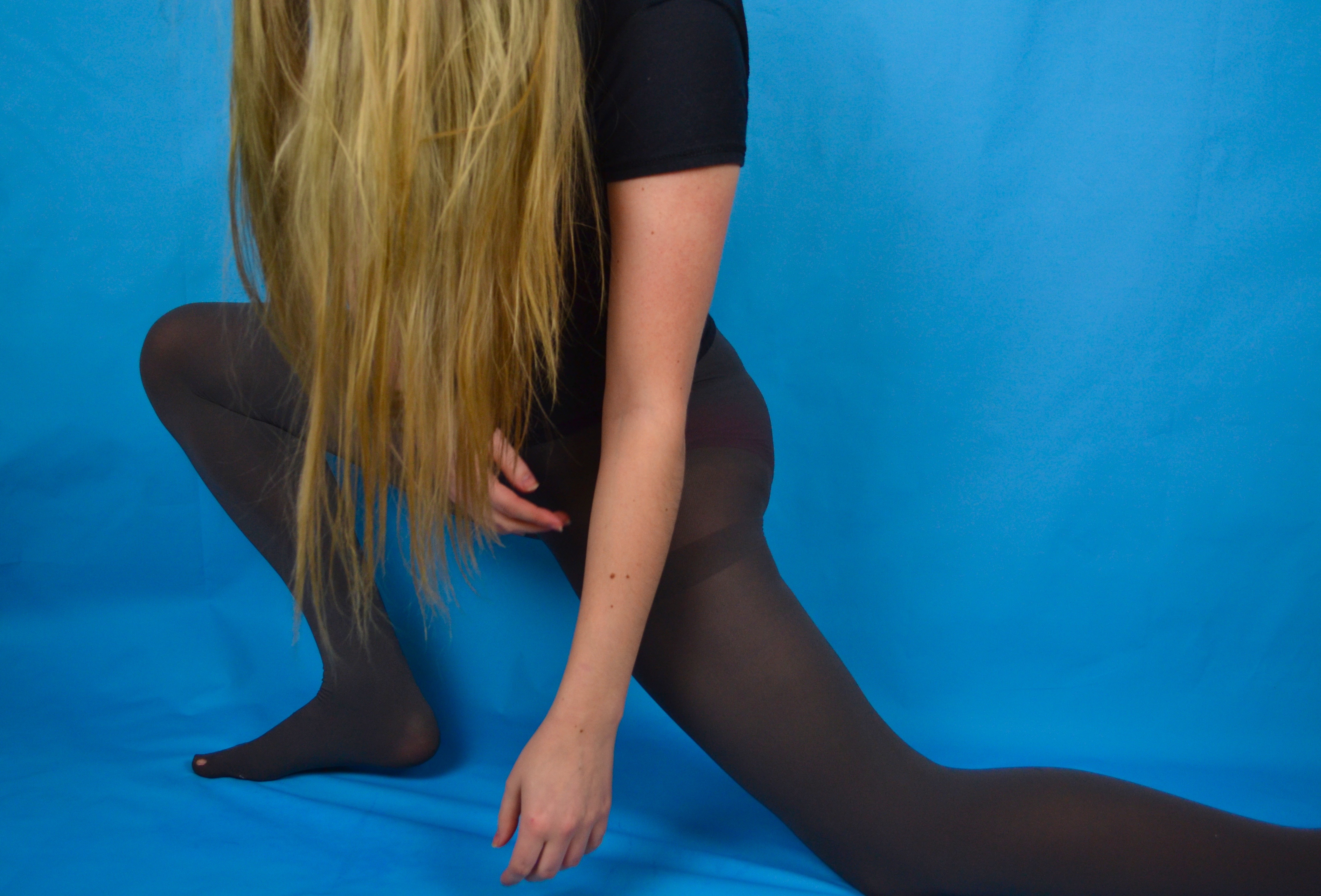
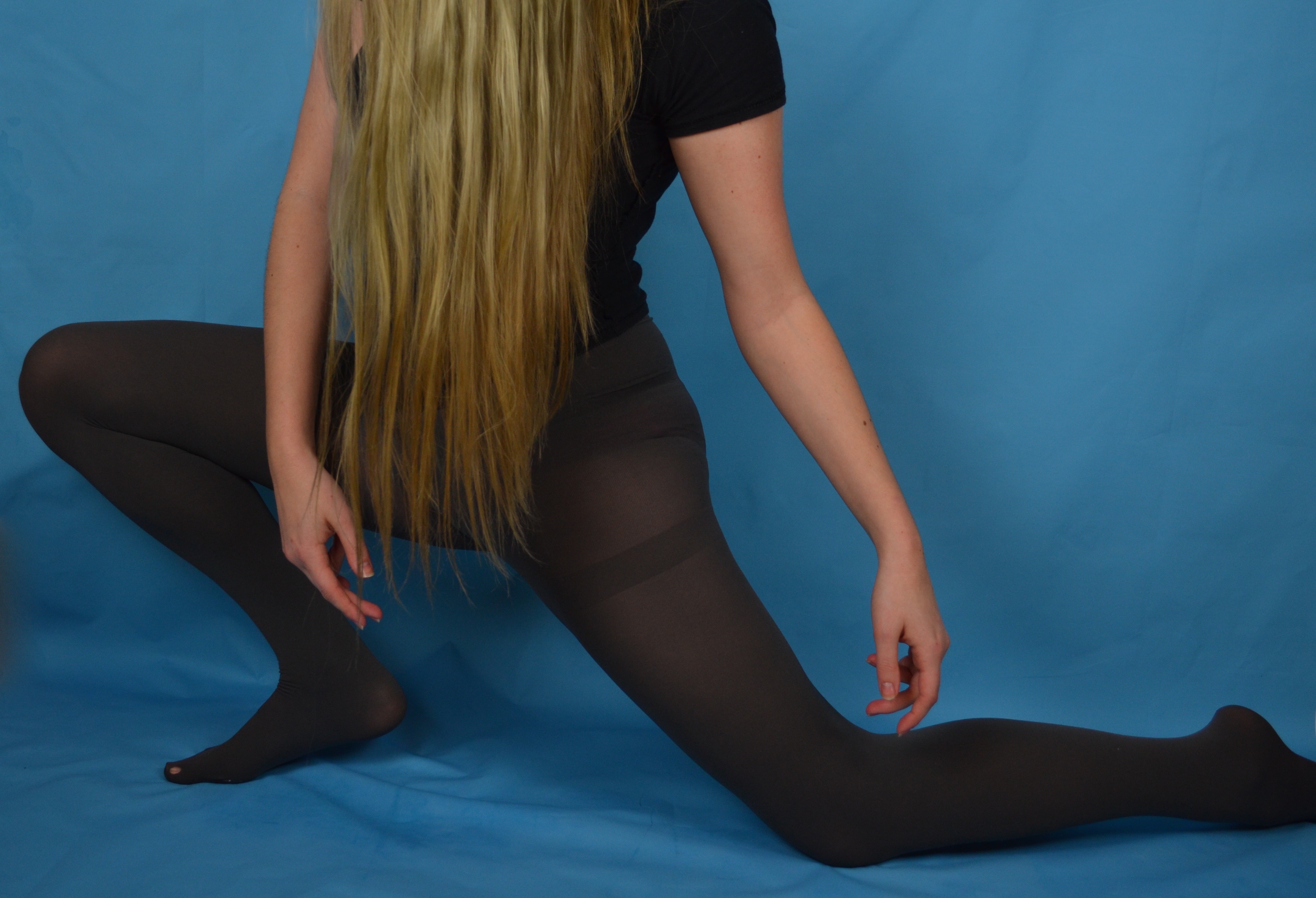
In response to Claire Rae’s work I produced some simple portraits using the blue background I had set up for another shoot. I chose to wear a plain black short sleeved t-shirt and some grey tights, both a nod to Rae’s use of costume in her photography. I also took inspiration from Rae’s workday covering my face with my hair, although I found that the silhouette and overall effect was quite different with my long hair compared to Rae’s short black bob. I experimented with a few similar poses that involved my being close to the ground so I could tilt my head forward easily to conceal my face with my hair. Posing in the way I wanted in the short time it took my to press the shutter and get into position proved quite challenging and in the rush I often didn’t get into the frame in time or in the incorrect place. The grid of images above where the only ones that were potentially salvageable as outcomes.

I selected this image as an outcome because I found the composition of the figure within the frame was rather successful. There is a good session of a diagonal line created by my thigh as well as a string triangular shape reinforced by my arms and my legs and the base. I altered this image by enhancing the brightness, contrast and colour saturation as well as the levels. I also edited out the hole in my tights as I felt it was an unnecessary distraction and softened some of the creases in the backdrop where the vinyl has buckled slightly under my weight being placed mainly on the ball of my foot.

This pose is at first glance similar to the previous but I decided to place my weight on my whole foot as opposed to the ball to avoid the buckling I experienced with the previous pose. I also experimented with extending my arms and placing them in a way that mirror the corresponding legs. The left arm is folded similar to the leg and the right arm is extended in a dancerly fashion mirroring the extended leg underneath it. My body is also angled away from the camera which creates some interesting negative space created between my arms and the curve of my torso and thigh.

I selected this image as an outcome because I feel that I created a completely different shape with my body compared to the other photos. My body is much more compact as I am crouching down with my weight placed on the balls of my feet (mainly because I cannot crouch with the weight placed on my whole foot so I had soften some of the buckling created as a result of this on Photoshop) I also like the seemingly symmetrical nature of the composition at first glance but on closer inspection one hand is closer to the floor than the other and my body is leaning lightly to the right. I also like the column of black created by a parting between strands of hair, which is also a little off centre.


