Clare Rae – Artist Response

In response to Claire Rae’s work I produced some simple portraits using the blue background I had set up for another shoot. I chose to wear a plain black short sleeved t-shirt and some grey tights, both a nod to Rae’s use of costume in her photography. I also took inspiration from Rae’s workday covering my face with my hair, although I found that the silhouette and overall effect was quite different with my long hair compared to Rae’s short black bob. I experimented with  a few similar poses that involved my being close to the ground so I could tilt my head forward easily to conceal my face with my hair. Posing in the way I wanted in the short time it took my to press the shutter and get into position proved quite challenging and in the rush I often didn’t get into the frame in time or in the incorrect place. The grid of images above where the only ones that were potentially salvageable as outcomes.

I selected this image as an outcome because I found the composition of the figure within the frame was rather successful. There is a good session of a diagonal line created by my thigh as well as a string triangular shape reinforced by my arms and my legs and the base. I altered this image by enhancing the brightness, contrast and colour saturation as well as the levels. I also edited out the hole in my tights as I felt it was an unnecessary distraction and softened some of the creases in the backdrop where the vinyl has buckled slightly under my weight being placed mainly on the ball of my foot.

This pose is at first glance similar to the previous but I decided to place my weight on my whole foot as opposed to the ball to avoid the buckling I experienced with the previous pose. I also experimented with extending my arms and placing them in a way that mirror the corresponding legs. The left arm is folded similar to the leg and the right arm is extended in a dancerly fashion mirroring the extended leg underneath it. My body is also angled away from the camera which creates some interesting negative space created between my arms and the curve of my torso and thigh.

I selected this image as an outcome because I feel that I created a completely different shape with my body compared to the other photos. My body is much more compact as I am crouching down with  my weight placed on the balls of my feet (mainly because I cannot crouch with the weight placed on my whole foot so I had soften some of the buckling created as a result of this on Photoshop) I also like the seemingly symmetrical nature of the composition at first glance but on closer inspection one hand is closer to the floor than the other and my body is leaning lightly to the right. I also like the column of black created by a parting between strands of hair, which is also a little off centre.


Hamish Fulton

A huge part of my project is travelling and finding interesting subject matter that inspired me to photograph around Jersey so I wanted to explore a similar artist who’s work is based on travel ad the narrative evoked from this. Hamish Fulton is a British artist and photographer from London who’s photography is inspired by the long walks and treks he has done all over the world, he often does about 30 to 50 miles every day with his camera. Another key part of his work is the use of typography over his photographs who emphasize how he felt and what his experience was while he took the photograph.

His work and use of text over images shows its own sense of aesthetic with its fairly distinctive and easy to read font which boldly expresses the visual elements but in  a more forward way. Much of his work is highly conceptual which often refers to how people view nature and how people connect with their surroundings.

His work also pays close attention to the key theme of ‘journeys’ which I think is an important part of transformations and focuses closely on the idea that ‘life is about the journey, not the destination’.  Hamish Fulton has also made the composition more interesting with the use of text to evoke a more aesthetically pleasing photograph.

A huge part of his work is how it is presented, he has done a variety of exhibitions but most importantly are his books and published work. I personally think his work works very well in a book format especially with the use of simple text and imagery. His work mixed with the use of landscape to portray a sense of connection and journey have inspired me to use text and words over some of my own work to emphasize a sense of meaning.

His work is very focused on the environment and how he fits into this and its influence on him. In comparison to my project, the juxtaposition comes from the effects of him in this environment, this contrast between man and his surroundings and how they change and influence each other. I plan on incorporating how he combines words into his work and how they elevate and add meaning into his work as well as giving context to his photos. I plan on directly responding to his work by creating a selection of text and work based photographs using pictures from my photo-shoots. I also plan on using it in the book I plan on creating featuring my work. This will involve using Photoshop to add text as well as use layers where necessary.

Presentation

// L E P O R E L L O //

As a first glance at presentation techniques and formatting, the ‘Leporello’ book style is an areas I would like to investigate and analyse. This method of presentation includes a concertina fold which zig-zags paper forwards and backwards to create a folded booklet which can be printed on both sides. The book can be read in order as a standard story-book layout, or unfolded like an accordion to create a long project similar to a timeline. There is something aesthetically pleasing about being able to see each of the visual pages in one go which is something I admire in this presentation technique.

Looking at the possibility of using this within my own project, I could investigate the idea of pairing words and photos side by side to create this visual narrative of each character. I could also look at placing one set of images (the internal shoots for example) on one side, with the landscapes on the reverse creating a divide between the different characters.


THOMAS DEMAND

‘The Dailies’ is a project created by Thomas Demand is a book documenting a collection of carefully formed paper and card sculptures which are photographed before being destroyed. Each creation is based on something seen and photographed as part of a street photography project. Highlighting a world that is both familiar but also out of reach.

“The images lure the viewer into a mirror world, a twin universe made only of paper. But the imperfect models are awash with discrepancies from actual things, and as such, they act as small ruptures that complicate the old indexical bond between a photograph and reality. Demand describes the series as Haiku poetry, simple fragments strung together to inspire reflection; they are the stock of our daily lives, but as they trigger deja vu through performed repetition, they ask us to look again, anew, to find in the repertoire an ordinary but redemptive beauty.”

– Taken from ‘The Daileys’ description of Demand’s personal website

The 32-page book can be displayed in a circular layout (as shown above), due to its leporello binding. Each concertina page can be folded and twisted to form a structure and a sculpture in itself. ‘The Dailies‘  book design was actually created and presented by Naomi Mizusaki who has worked with Thomas Demand on a number of projects. The images within this project as less relevant to my work than the binding and structure itself of the final project. Most of the images depict urban street scenes, often with a surreal aspect of colourful isolation hidden within them.

Following the research into this book, I am keen to look into the concertina and leporello formats further and perhaps make a smaller test to try out the style with a few of my own photos. This style could be used to present my ideas on leaving home and the fears associated with it. One side could for example show a ‘traditional’ view of home, the internal photos taken from within the house, while the other highlights a version of home that comes from emotional attachment. The second side for example could show the places where people really feel at home, outside in the landscapes they have come to love with friends rather than family.

Shoots One + Two (plus three ish?)

// M A Y A //

The first person being photographed in this project is Maya, a friend from school and resident of curiosity coffee shop. Maya moved out from her mum’s house a few months ago and has had a mixture of homes since then. Last month Maya moved into a house share in Havre De Pas where she has a single room and bathroom. Visiting this space for the first time, It was hard not to notice how cold it was. Speaking to Maya about her new house, it doesn’t seem like this is home for her. The people are not kind there and she mentioned how when she stays there it feels isolated and lonely. Visitors are allowed 9am – 9pm but i’m told that if you can sneak in before 8 or so, no one will notice if friends stay the night.

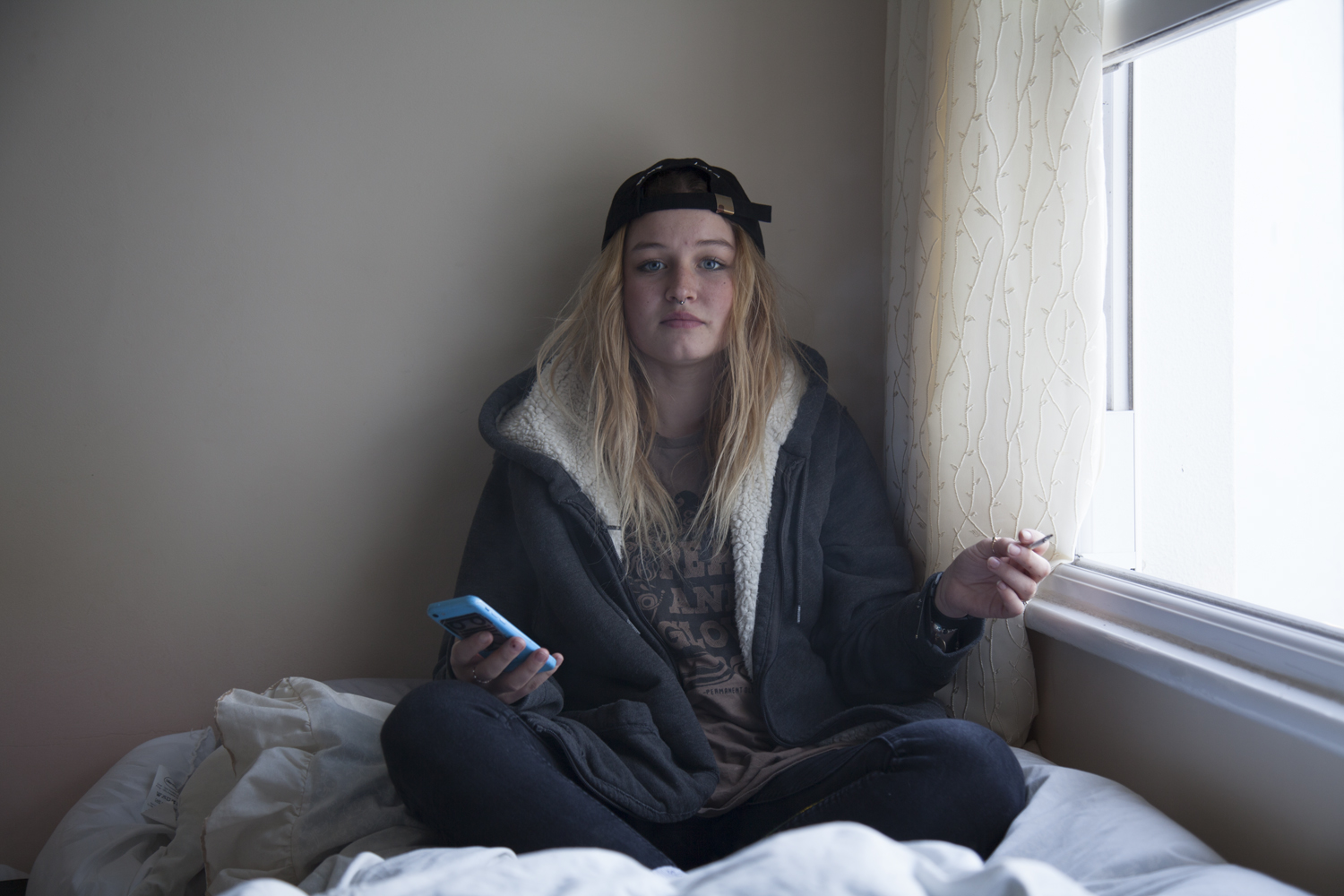
The natural light comes from the window on the right hand side of the room and there is a central light hanging above on the right which adds a yellow-toned luminance to the room. I was keen to mirror a soft kind of aesthetic similar to Sian Davey’s images from her ‘first love’ series for this project. Working both digitally and on 35mm film, I started in the house by setting up the initial image. This first photo is a front facing portrait with the model sat facing forwards towards the camera. On my Canon 5D, I used a relatively high shutter speed to capture a crisp and clean image with the ISO set accordingly. My instructions to the model were to face me and remain as neutral as possible. The point of these first home images are to stay as blank and neutral as each character can. The external environmental shoots will be the characterised ones with light and life in them reflecting the energy of each area.

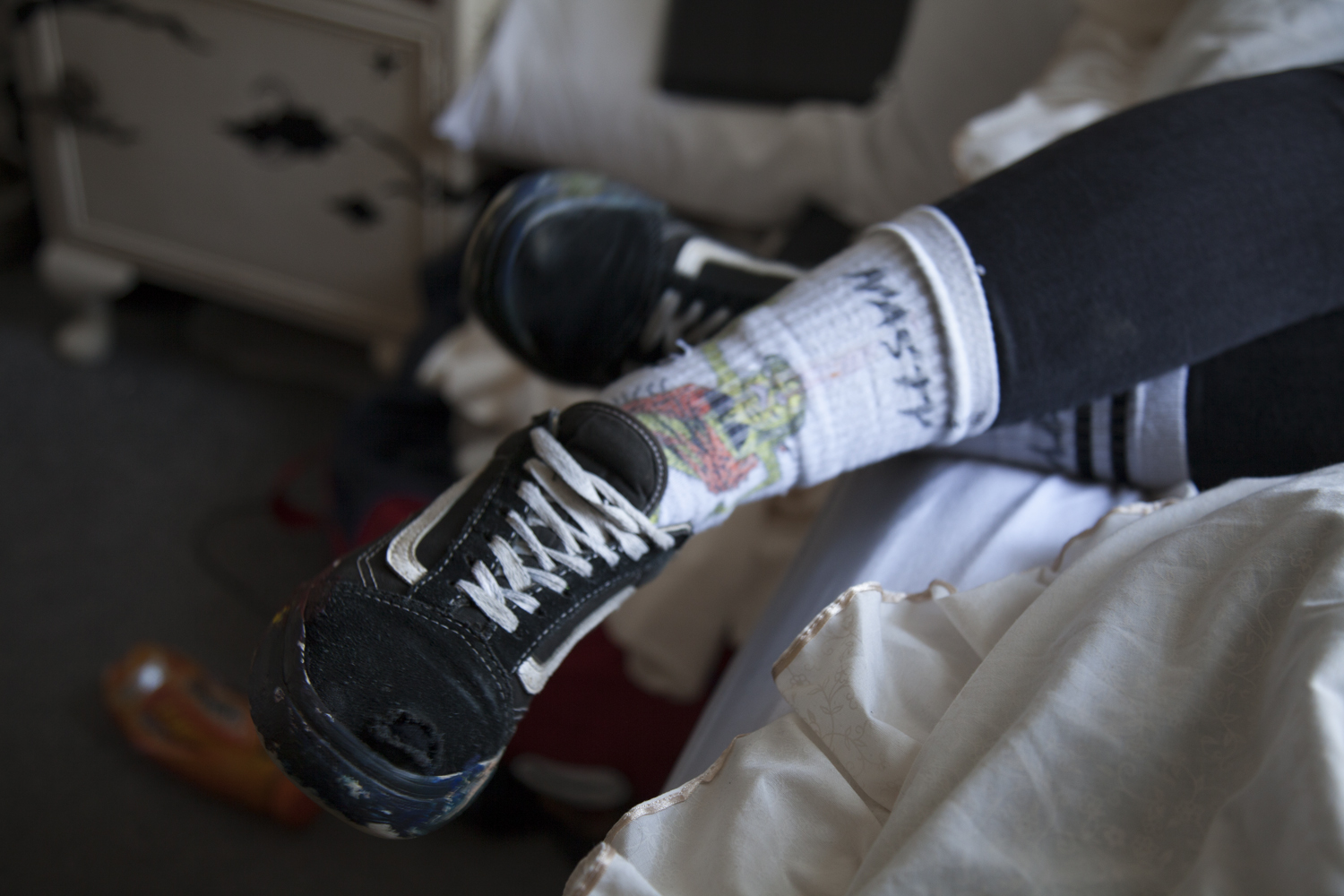
Rather than add an entire contact sheet below, I have chosen five photos which ultimately came up as the strongest images in terms of both colour, lighting and composition. Because I typically shoot in RAW on my Canon, the level of post-shoot editing I can do is much greater than if I was working with a standard JPEG image. I have not however edited the images below yet so these are the originals. The front facing portrait was the image I set out to shoot but it would have been crazy not to take advantage of the room and shoot some of the other details. I watched Maya paint her shoes earlier that morning in art and it felt natural to photograph them as well as the slight rebellion – and arguably destructive nature of her actions – matches her character very well.

This image is one of the strongest photos in terms of composition and link to my specification. The model is facing me on her bed as I instructed. Although she is not allowed to smoke within this house, the window is opened for her to blow out of. editing this image, I increased the brightness slightly and adjusted the colour contrast. The light coming through came up much colder than it felt this day and I edited the image to reflect the brighter warmth that we felt.

The final image I select from this shoot will depend more so on the second set of images for this character. I don’t want to decide on a photo now that may not work with its sister image.


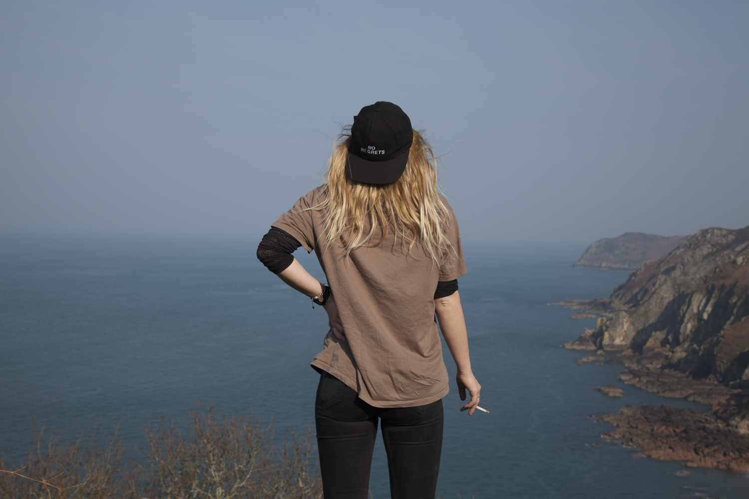
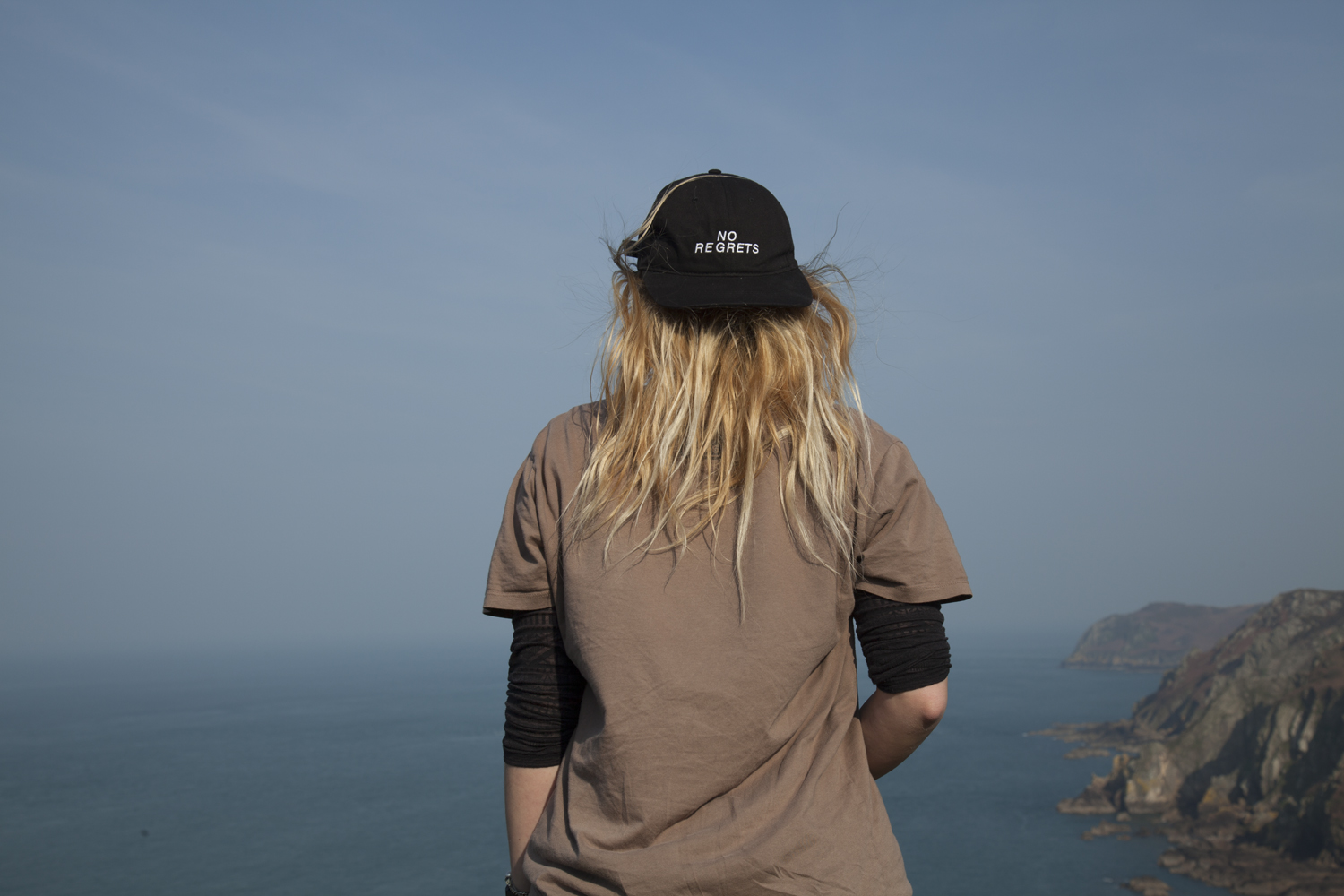
The second shoot with Maya was the external environment which was selected by the model. The point of this was to show each figure in a place of significance to them personal, an environment with a personal attachment.

The images from the first location are shot up high in St Johns. Maya was part of a house share up here called Northwood which is where a lot of our friends ether currently live or have stayed in the past. She tells me how she used to go swimming and surfing at the beaches near there and how she felt happy living there. These images have not yet been edited.

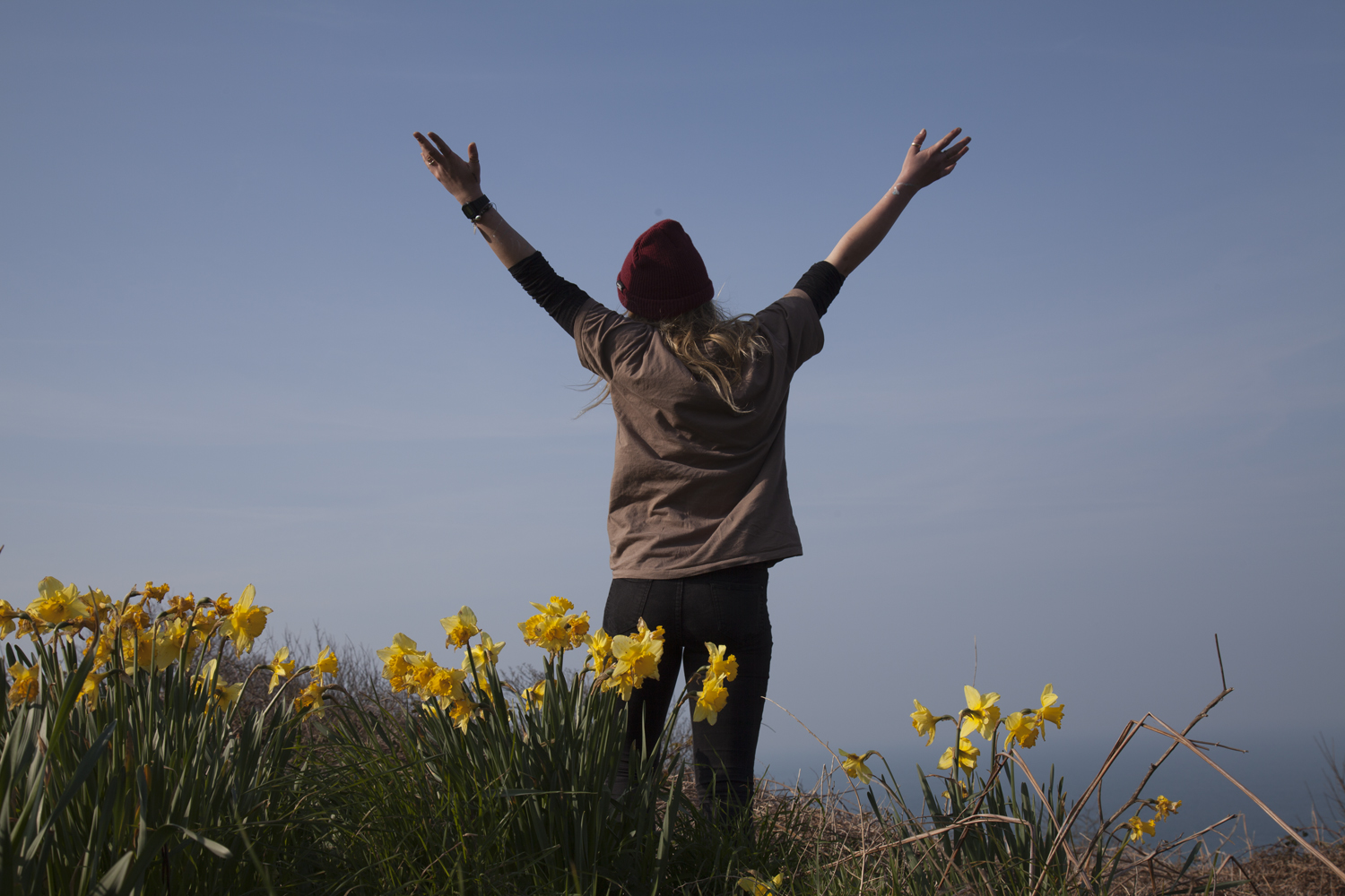
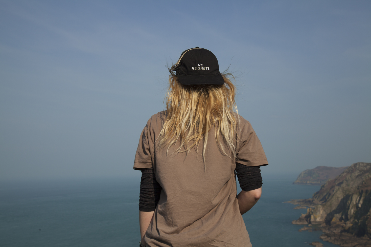
This image is more or less exactly what I was looking for on this shoot. Maya is facing away from me and looking out at the landscape she chose (looking out at the sea in St Johns parish). The colours are bright and the light is warm. I lightened some of the shadows on her shirt and upped the contrast and clarity slightly but the image is relatively natural.


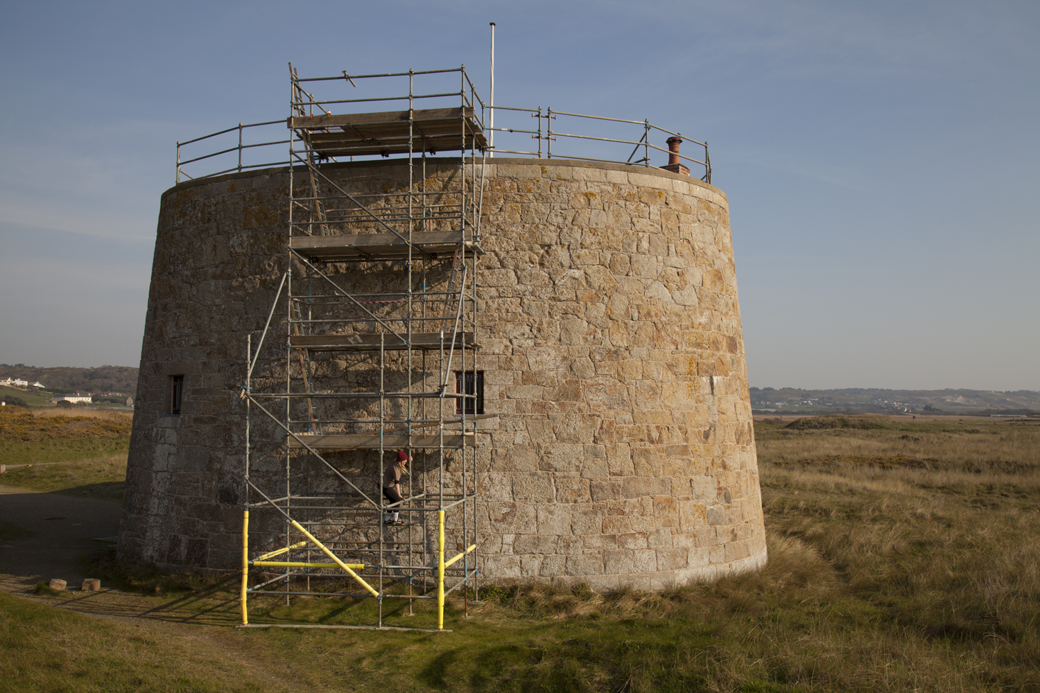
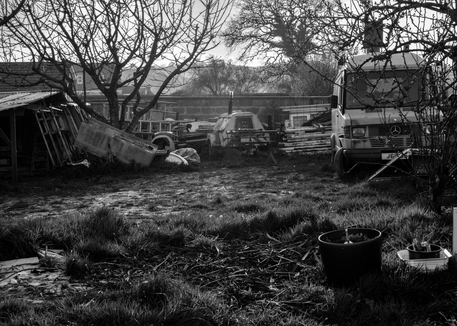
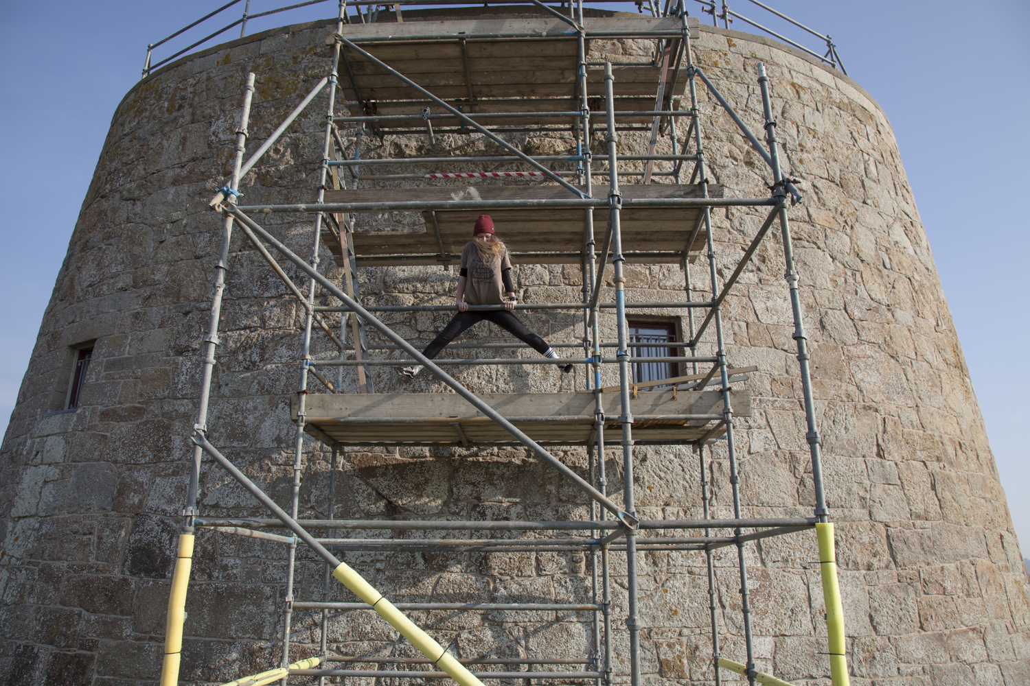
We also went adventuring to St Ouens because the sun was out and we like exploring. I need to make a note that adventures with Maya often involve climbing and cameras are somewhat hazardous when scaling four floors of scaffolding. These images have been adjusted in Camera Raw.


M A Y A 

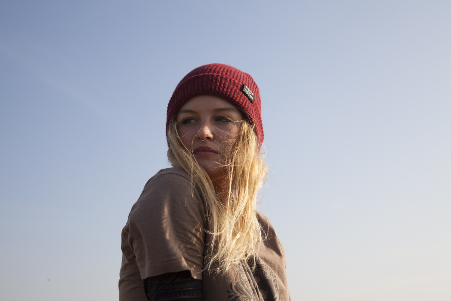
The two images I have ultimately selected for this project share a continued line of similarity across their compositions and photographic structure. The first from the home shoot is exactly what I was looking for. A blank expression that shows the figure in their home environment around the things they have grown up with. Maya’s room is temporary but she has filled it with the things important for her.  There is something surreal about the contrast between the figure and the backdrop. It is more than typical to surround yourself – and in particular your room – with things that mean the most to you. In a way these portraits are reflective not only in the character shown but also in their room which is ultimately a self portrait of their attitude and emotions.

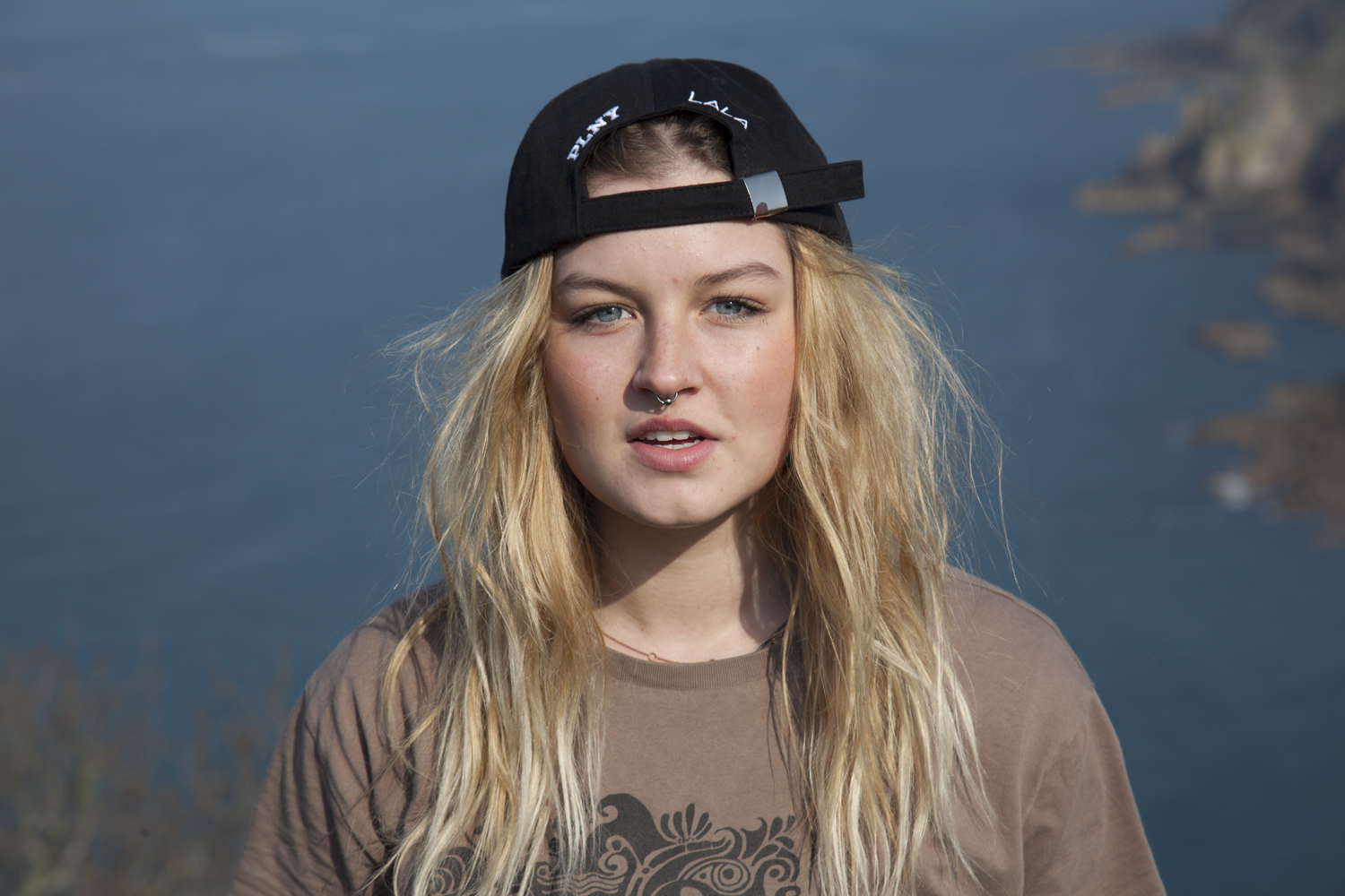
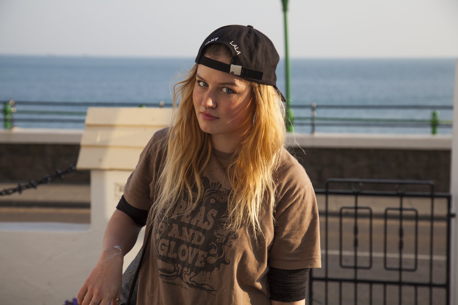
Driving around with Maya to each location, I asked about her home life and her relationship with Jersey. After moving here from Poland only two years ago, school is somewhat optional in her mind. Maya tells me she used to be good at school and always do the work but at some point that changed and she adopted her current care-free attitude which allows her to do as she wants. Her characteristic longboard is easily recognised and represents a large part of her being.

These images have been adjusted in Camera RAW

Dusk Photoshoot 2 HDR

After taking the first set of images which features a very overcast time of day, I wanted to take more of the same area due to how flat and dull the images looked. My intentions for the first set of images was that I wanted to look at the clash between nature and people and the beauty that was evoked from this, but this was not effective in the first set of images which made them flat and similar to that of an informational or documentary style of image. I wanted to explore other times of day and its effects on the ambiance and the narrative of the environment. I knew that taking photographs such as this would be difficult with just a single exposure photograph. In our AS work we practiced photo-manipulation techniques such as HDR where we could combine photographs with different exposures to create a more vivid, compelling photograph.

I went back to where I had previously taken photographs. I used a tripod and took a selection of about 5 different exposure shots for each photograph. I picked features where the light created interesting reflections and shadows. All the photographs feature a 5×7 ratio and are all landscapes.

I was drawn to the scenery in the first photograph where there was a reflection of light off of the painted industrial box as well as the orange light that reflected in between the boats and cars onto the gravel. The second photographs were then because of the light that shone through the tunnel, I also liked the table featuring objects such as a mug and a walking stick, which I feels adds a sense of narrative and character to the photograph.

The above photograph was taken for the interesting texture from light was bounced off the wall, I also liked the contrast between the cool shadows and vivid yellow/orange light. I positioned the window central in the frame to make the viewer also focus on the light that reflects off of it, emphasizing its importance in the photograph.

In the above images, I wanted to look at the more subtle reflections such as from the window in the top right corner in the first photographs and the yellow light that bounces off the wall in the second photograph features centre. I also really liked the white walls and the blue tones in the shadows, this use of colours evokes a romantic effect.

I was really intrigued by the vivid yellow light streaming from the shed and how it reflected off the wall to the left, contrasting with the colors in the sky. I positioned the camera to the viewer could see the streaming light from the building as well as the tractor in the foreground. There is a huge sense of narrative evoked in this image such as how part of the building is left unseen, leaving a sense of mystery to the viewer, raising questions such as why it may be open or who is using it. This mix of natural and unnatural lighting shows the juxtaposition between natural and artificial.Other objects such as the tractor add a sense of mystery and story line to the image. Using HDR techniques to change this image enabled both the sky and light from the building to be seen evenly.

After experimenting with HDR I plan on using this for more of my photo shoots to enable a better more dynamic image. I also plan on exploring the romantic themes within ordinary and everyday subject matter.

In the above photographs the light and sun flared evoked a very atmospheric effect to very mundane subject matter, making them look compelling and scenic. I also experimented with black and white images which leaves more focus on the vivid textures created. This also reflects a more romantic style of photograph similar to that of Ansel Adams. I created a vivid, high contrast image by increasing the contrast and clarity levels whilst decreasing the highlights to create a more intense texture. This worked really well with areas where light reflected or bounced off surfaces such as through the grass in the first photograph and the white wall in the second.

How to Explore and Record

Over Easter it is paramount that you make your principal images needed to produce final outcomes.

When you are photographing and responding to ideas and artist reference you are both exploring and recording. The two go hand in hand. If yo do it well and enough you should be able to achieve 50% of your overall marks!

In the PLANNER for A2 EXAMINATIONS 2017 Hautlieu ENVIRONMENT I have highlighted the importance of a sustained investigation.

Each week you are required to make a photographic response (still-images and/or moving image) that relates to the research and work that you explored in that week. Sustained investigations means taking a lot of time and effort to produce the best you can possibly do – reviewing, modifying and refining your idea and taking more pictures to build up a strong body of work with a clear sense of purpose and direction

Get yourself familiar with the assessment grid here:

AO2 – Explore and select appropriate resources, media, materials, techniques and processes, reviewing and refining their ideas as work develops.

AO3 – Record ideas, observations and insights relevant to intentions, reflecting critically on work and progress.

To achieve an A or A*-grade you must demonstrate an Exceptional ability (Level 6) through sustained and focused investigations achieving 16-18 marks out of 18 in each assessment objective

Lets have a look at previous student, Flora Devenport and her exam work and assess it according to the Assessment Objectives A2 Photography: (Edexcel.) Think about what level the student is working at.

What you are looking for when assessing A02 (Explore) and A03 (Record):

How well have ideas developed?
Are ideas explored and selective appropriate to intentions?
Are they sustained and focused?
Are they reviewed and refined?
How many responses/ shoots?

Command of camera skills/ photographic techniques and processes
Understanding of composition/ considering quality of light
What are the overall quality of the images?
How do they respond to research?
How do they relate to artists references?
How do the interpret exam theme of Environment?

Homework: Based on the evidence of your blog, what level are you working at? Produce a blog post where you reflect on your own progress. Provide targets that you can achieve over Easter and that can improve your work. Upload by Fri 31 March

Classwork: To develop your ideas further from research and analysis of artists references and other inspirations  on the theme ENVIRONMENT you now must be planning a number of photographic responses (at least 3 shoots per idea.)

Follow these steps to success!

  1. Produce a detailed plan of 3 shoots for each idea in your specification that you are intending to do;  how, who, when, where and why?
  2. Think about lighting, are you going to shoot outside in natural light or inside using studio lights? Maybe shoot both inside and outside to make informed choices and experimentation. Remember to try out a variety of shot sizes and angles, pay attention to composition, focussing, scale, perspective, rule of 1/3rds, foreground/ background and creative control of aperture (depth of field) and shutter speed (movement). If appropriate, think about how to convey an emotion, expression or attitude and the colour palette, tone, mood and texture of your pictures. Consider mise-en-scène (everything in the frame) – e.g. in portraiture deliberate use of clothing, posture, choice of subject objects, props, accessories, settings. Make a selection of the best 15- 20 images for further experimentation. Produce 2-3 blog posts from each shoot and analyse and evaluate your photos through annotation showing understanding of basic visual language using specialist terminology.
  3. It is essential that you complete your principal shooting over Easter and return on Tue 18 April with a few hundred images ready for further post-production and editing.
  4. Upload blog post with above planning by Fri 31 March