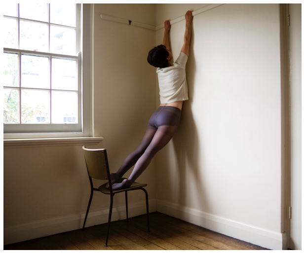
Clare Rae is best known for her self portraiture where she uses her body to create intruiging environmental portraits. The above image is from her collection from 2010 entitled “Testing” where she manipulates her body into different shapes, often hanging off things or performing a feat or strength and flexibility such as the “bridge” pose and holding her body horizontally in a straight line on a chair. The above image is part of a period a Rae’s work where she was exploring the concept of partial nudity with the use of translucent nylon tights. I find the figure holding onto the rail on the wall rather intruiging because it raises the question of some kind of allegory. Is the subject reaching for, reliant on or desperately trying to hang onto something. Another interesting thing about this particular portrait is that it subverts the presentation of women in art. Although the body is in a way accentuated through the pose and the tights can arguably be a garment with sexual connotations, the use of the white t-shirt short hair cut create a gender neutral feel to the image.

Technically Rae’s photographs are very interesting. Above I have separated an image from the “Testing” collection into nine sections, you can see how the image has been composed with the rule of thirds in mind. The figure is clearly placed in the centre three vertical thirds. The window, which acts as the light source for the image is placed in the upper two thirds on the left hand side. The creates a nice curve in the composition that helps the eye to move around the image. The shadow of the figure on the wall also creates a triangle shape between the actual legs of the figure and the shadow cast on the wall. The two converging lines in the top centre third of the image created by the rail the figure is holding onto and the skirting board in the bottom centre third also creates a sense of depth. The use of light and dark in the image is also interesting, Rae mentioned at the talk I attended that in these image she almost always uses natural light from windows as opposed to any form of studio lighting. the natural light from the window also creates a shadow on the wall that it is coming from, creating a darker “L” shape in the composition, allowing for the lighter areas of the image to be the window and the wall on the right side of the image.

The above image is a work from part of Rae’s undergraduate degree in 2007 entitled “Desire and the other” this collection was were Rae first started to use her own body within environments that she had lived in or that had some importance to her, Rae stated in the talk that I attended that at this point she preferred to speak for herself rather than for womankind. These images, in my opinion are quite passive as most photos involve the figure lying on the floor or being partially concealed. Although someone who is familiar with Rae’s work will know that all of the images feature herself as the model, the images from the “Desire and the other” have a sense of anonymity as the face is always obstructed by hair or clothing or simply cropped out. This anonymity could also however, be interpreted as objectification as the body depicted in the image is not given a face or identity. The image above also has a sexual suggestive nature as the jumper of the subject is pulled over the head of the subject, which in turn would expose the subjects breasts or undergarments, however the chest of the subject is obstructed by what appears to be a sofa in the bottom right of the image. The figure also has their hands held above their head, making no attempt to pull the clothing back down to maintain modesty but also appearing as if the jumper was not pulled into its position by the subject. I feel that the image suggests both a sense of submission and passivity and well as some kind of provocative feel which I believe is a fair assumption due to the word “desire” being used in the title as it has very strong sexual connotations.

Similarly to the photograph from Rae’s “Testing” collection, this image has the figure placed in the centre thirds of the image, however in this example the figure is placed horizontally as oboes to vertically. The image is also separated horizontally in terms of light and dark, although not completely evenly, as seen in the gridded image above, into three sections. One being the light section in the top horizontal third provided by the daylight coming through the window, another being the dark middle third containing the dark wall under the window and the third being the light wooden floor in the bottom third of the image, which is reflecting the light from said window. The composition of the image is not this simple however, another point of interest is the vertical third on the right side of the image which contains the sofa which obstructs both the chest of the figure and the window. The arm of the sofa which blocks the light from the window is incredibly dark as it is placed directly against it. The cushions of the sofa do reflect some of the light from the window despite not being very reflective. The use of natural light from above lights the figure in quite a romantic way, interesting shadows are caused by the folds in the fabric.
