Animal Shelter experimentation

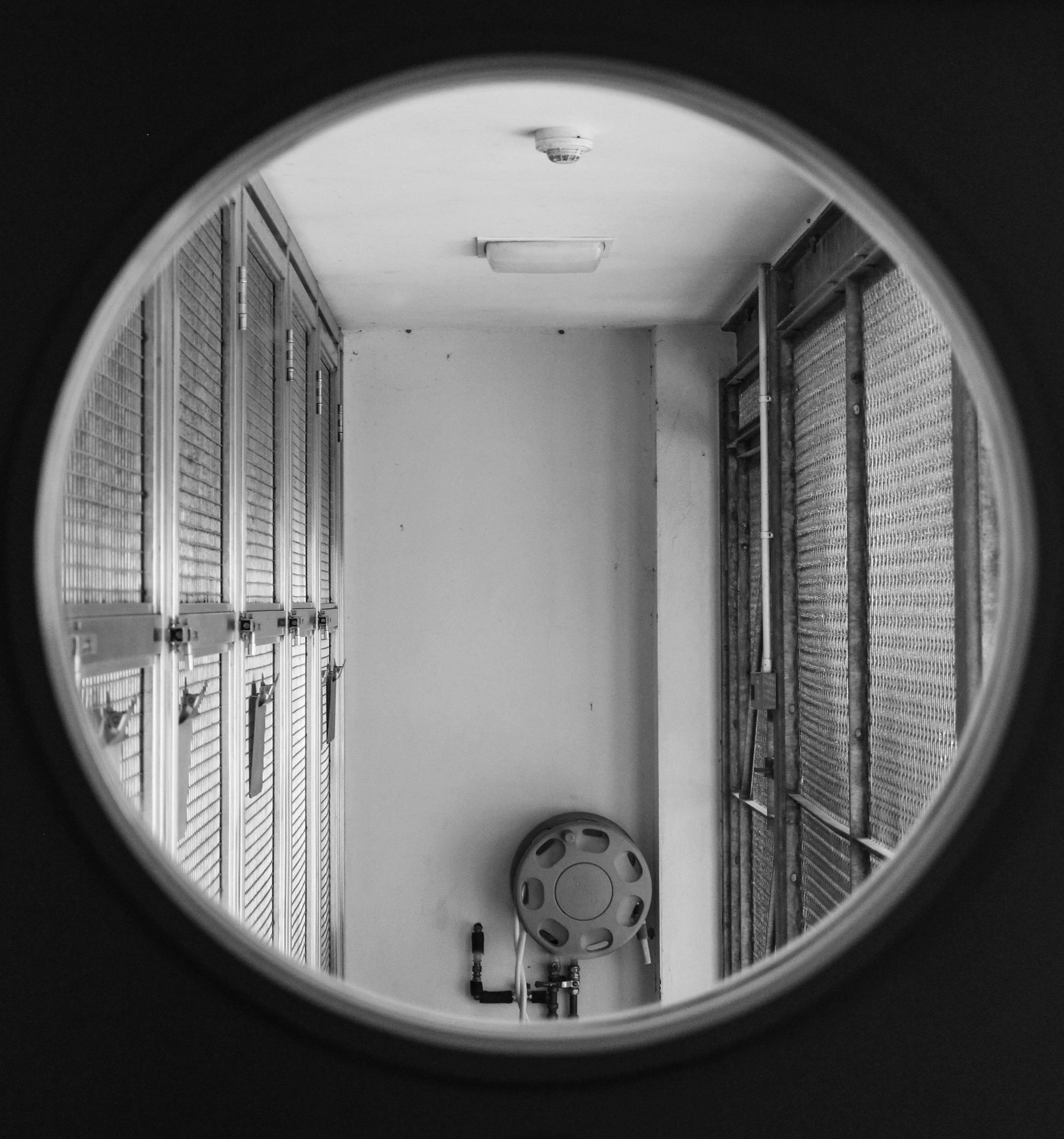
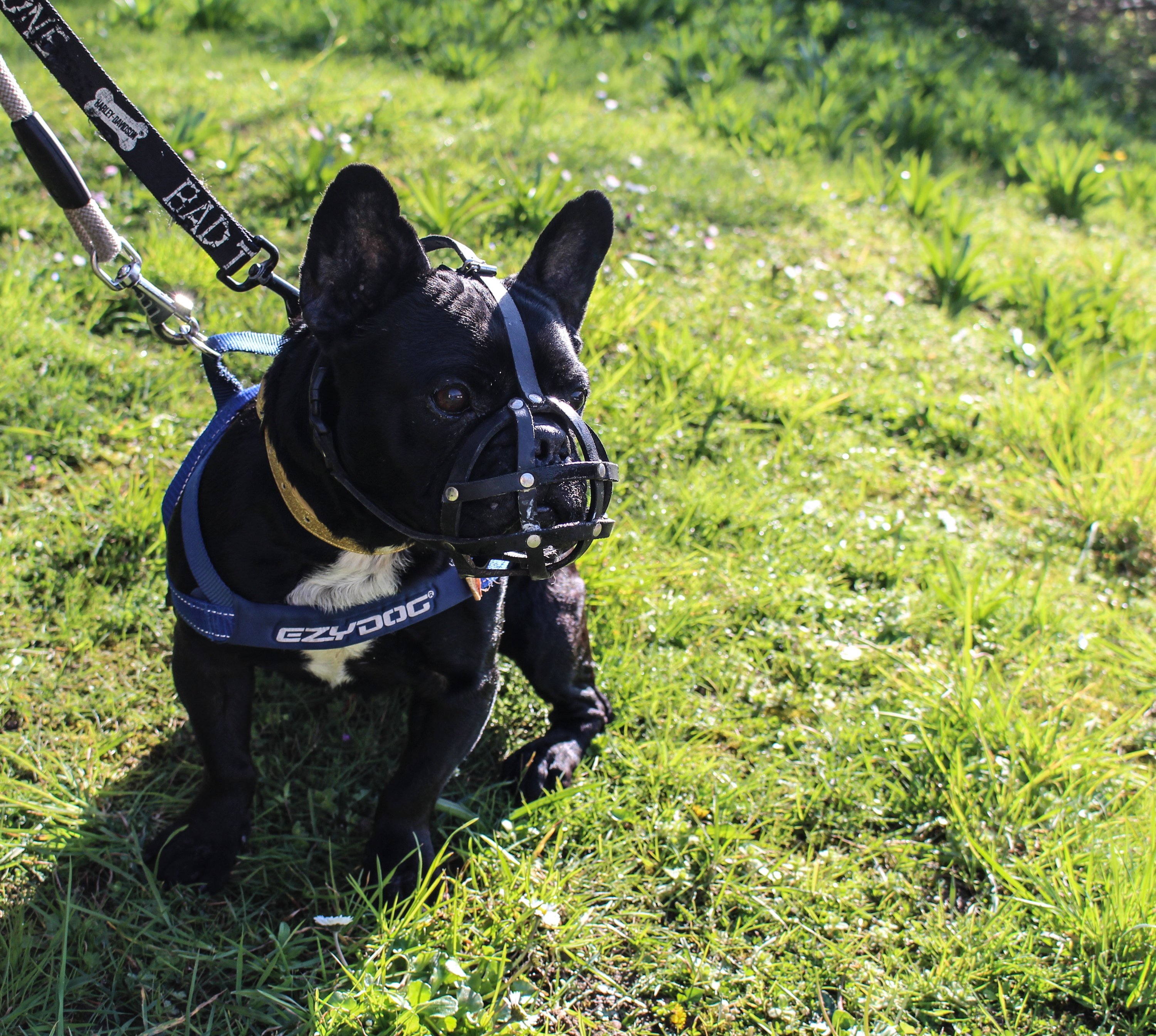
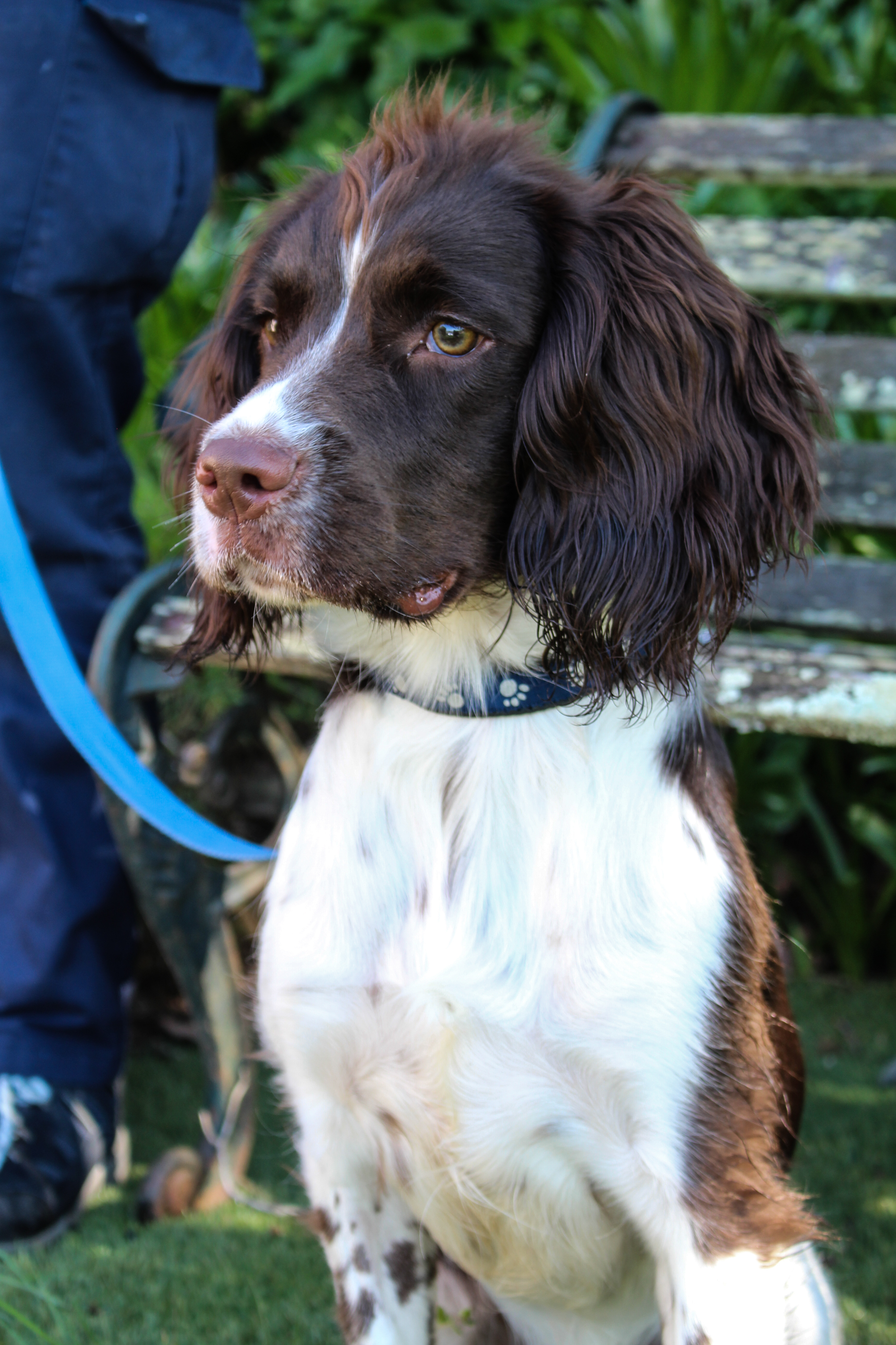
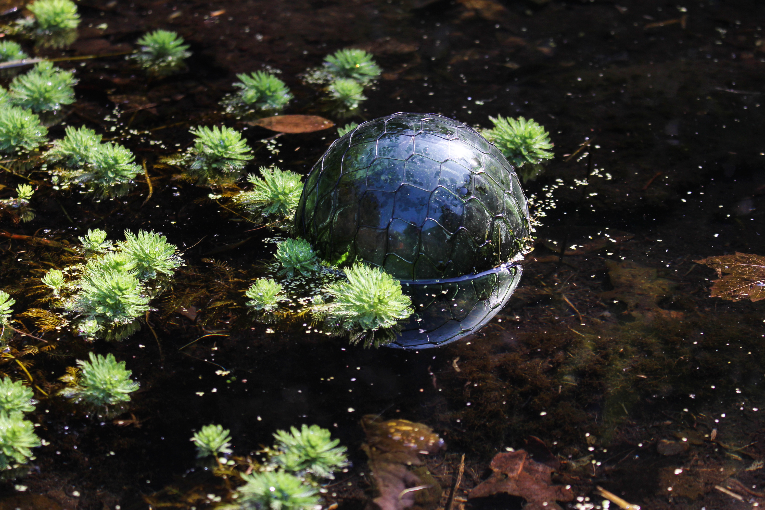
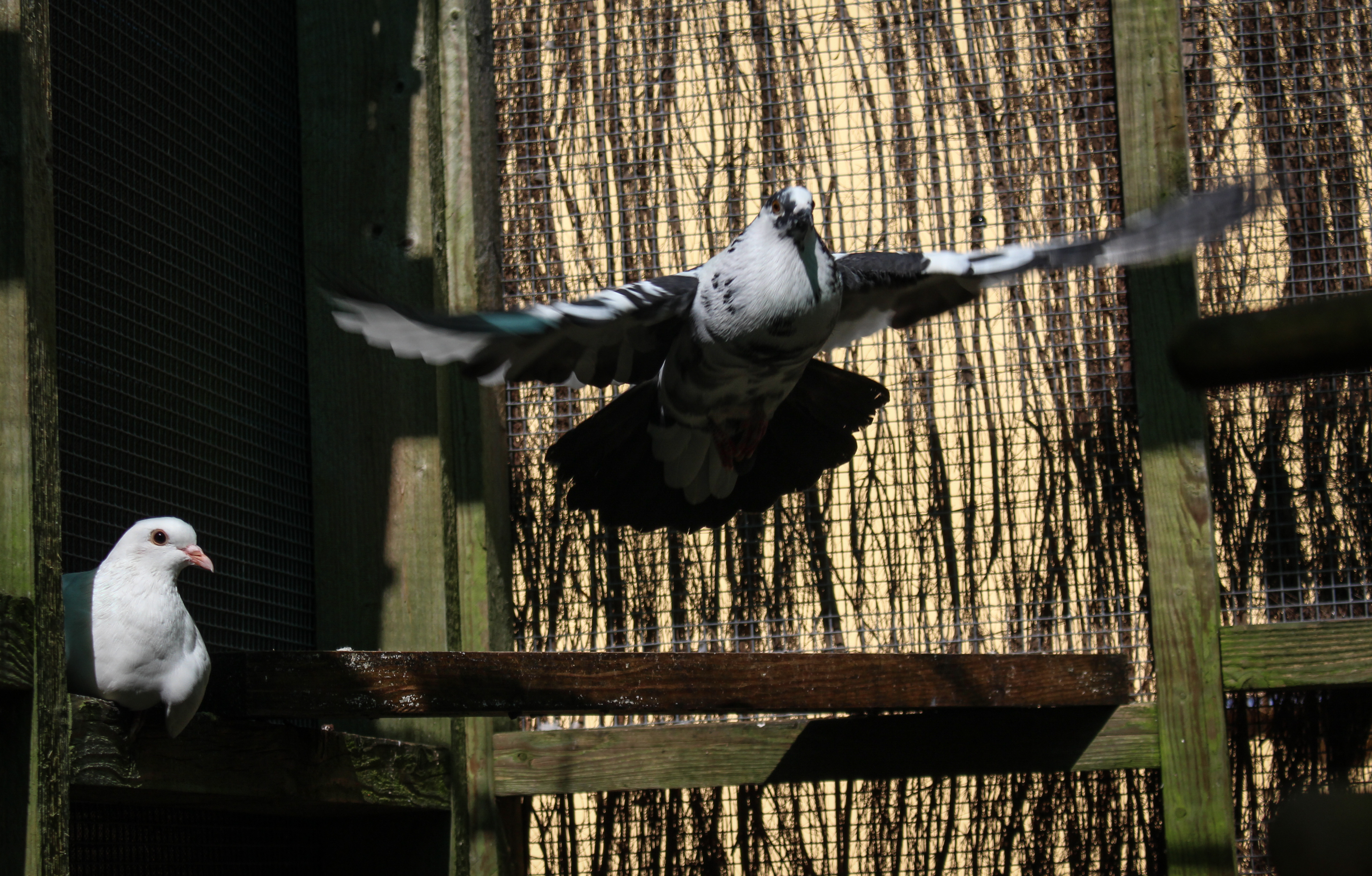
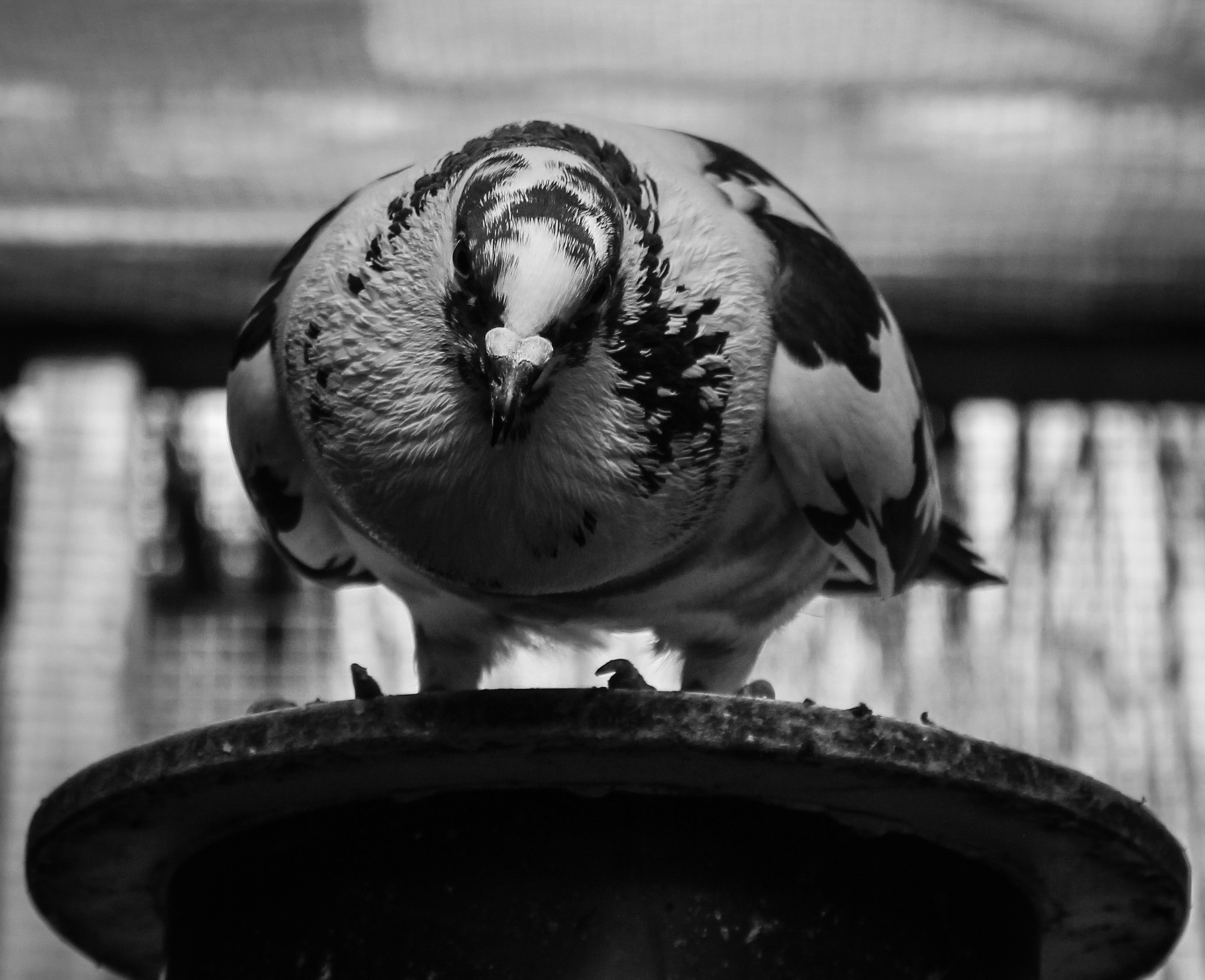
As an initial photographic response inspired by the theme of environment I did a shoot at the Jersey Animals’ Shelter. I haven’t yet decided on the main theme for my project as I have several individual ideas that on their own don’t seem interesting or strong enough so I am planning on developing or finding ways to combine them. In this experimental shoot I wanted to explore the environment of animals outside of the usual domestic environment. I focused mainly on pets which have been disclaimed and are awaiting adoption such as cats and a few dogs but I also looked at the rescued wildlife such as birds. I was trying to avoid the typical appearance of Pet photography and the ‘cuteness’ associated with this and instead adopt a documentary style to explore how the animals interact with their environments and the contrast between the clinical-like nature of their environment compared to how they would often be seen in homes. There is also the idea of waiting and being more restricted which I aimed to represent.

This shoot was partly inspired by the photography of Raymond Meeks. Along with his partner Adrianna Ault (whose father ran an animals shelter and she had grown up in this environment) he did a project which involved photographing four major animals shelters in New Orleans.  The facilities they engaged with housed a variety of domestic animals but they chose to focus on the dogs. Meeks has said that they began the project without a pre-formed agenda and more questions than answers. They were hoping to find out if certain character traits and behavioural patterns suggested a collective phenotype (characteristics resulting from the interaction of an individuals genotype with an environment). They wanted to see if there was a common thread that united the marginalised animals and if this had any parallels to the human population. Mostly they wanted to examine the human treatment of these vulnerable animals. I was drawn to this project because of the elegant and respectful way in which they captured the animals with the use of black and white creating an emotive tone.

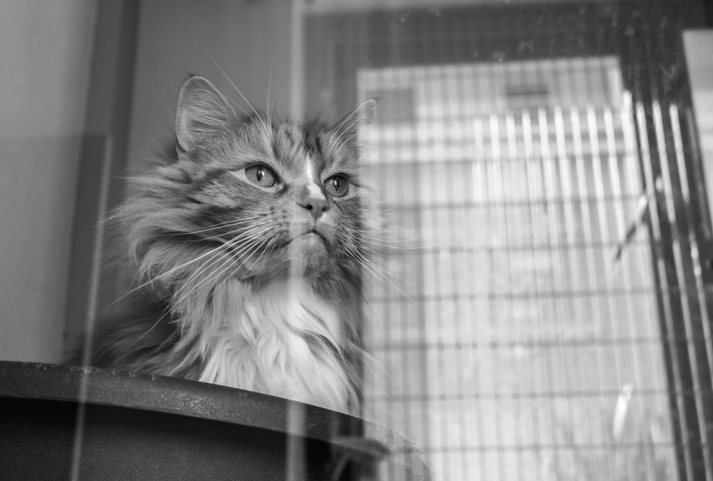
In my shoot I photographed the different animals cared for at the Jersey Shelter but with a focus on the cats. I photographed them as they were released individually from their cages as well as through the glass of these segregated enclosures they are kept in. Below are the edited images from this shoot. I used black and white in reference to the photography of Meeks and because I think it effectively creates a serious atmosphere as well as emphasising the contrasts and shadows.  I think this was quite effective because domestic animals aren’t normally seen behind glass and I purposefully included the reflections to show the bars when you can see the animals looking out of the window which is quite interesting.

 

I think if I was going to develop this particular idea further I could explore in greater depth the role of the shelter as a charity and community service within the Island. I could also look into other institutions or local charities where there is a reliance on people to improve environments of people or animals.

Twilight photography in the magic hour

In class I studied the 2006 photography book Twilight : photography in the magic hour by Kate Best and Martin Barnes. It is a  compilation of 8 photographers and artists who’s work centers around the alluring the transition between night and day.The book was based on the 2006 exhibition hosted at the Victoria & Albert Museum (V&A) in London.

I could go into detail and the logistics of the book as I was lucky enough to see an physical copy. The books orientation is landscape and A4 size, this is a good layout for the photo book as landscape works best for many of the photographs featured in the book which often feature scenery. The first page features a small title in the top left corner in the font Times New Roman which is use thru ought the book. I like how they’ve used the same font thru ought as it adds a sense of consistency, using the same font is something I’d like to incorporate into my own book. After the title on the first page it then jumps into a photograph by American photographer Gregory Crewdson. For the next 30 pages there are four essays by Martin Barnes, Emily Winterburn, Steven Connor and Kate Best which discuss different aspects of art, psychology and literature through history relating to the theme of twilight.

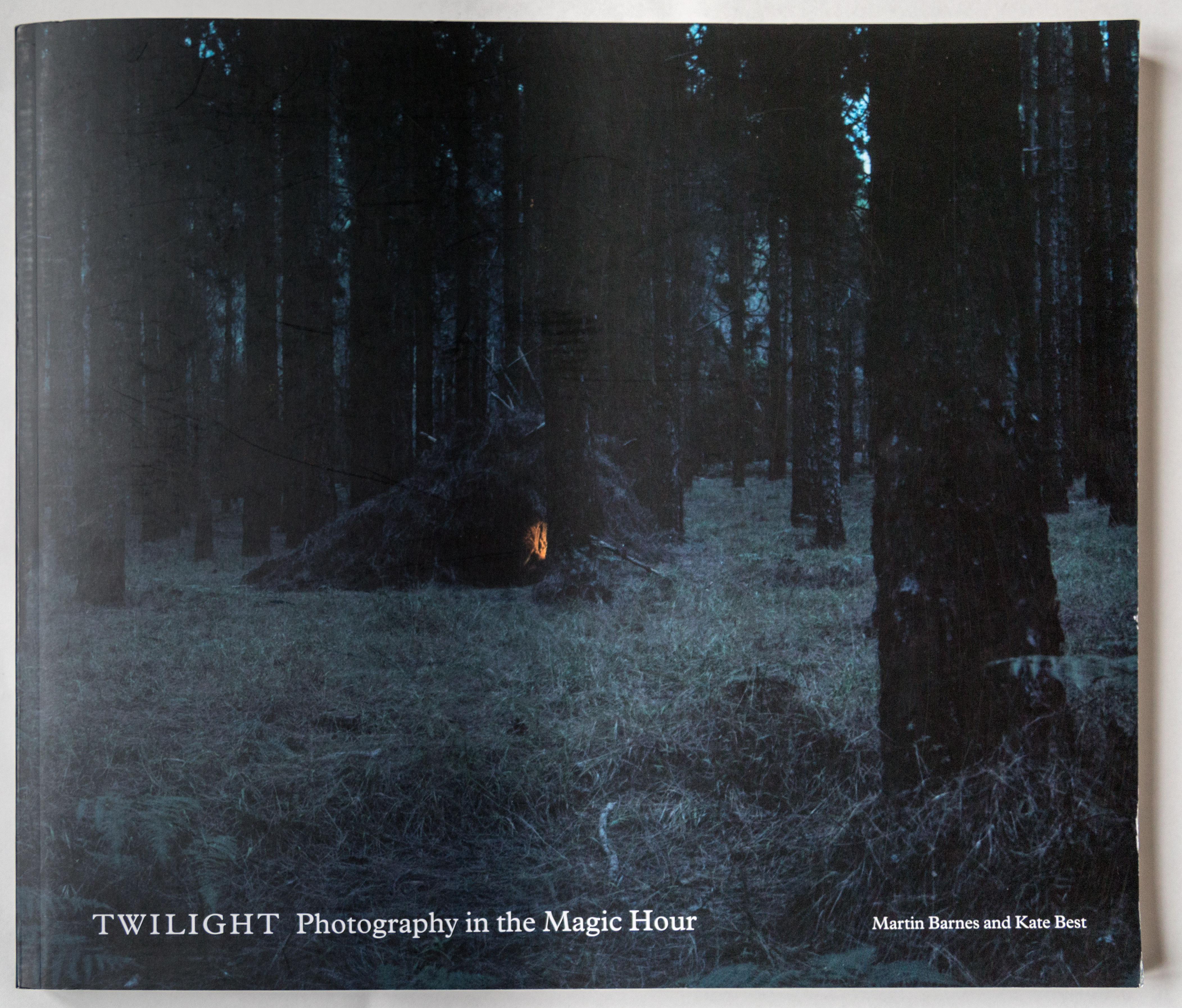
The front cover is an intriguing dark landscape photograph from French born photographer Chrystel Lebas. This photograph fully captures the enigmatic ambiance and sense of mystery that twilight photography can cultivate. The centre of the photograph features a mysterious warm light which evokes an enigma for the audience, drawing them in and making them wonder what is happening within the photograph. The title made in Times New Roman is then places small along the bottom of the cover. The sub title and the names of the authors are smaller then the main title which is a typical convention of a book cover. It is done in a font that matches the wrest of the book cover.

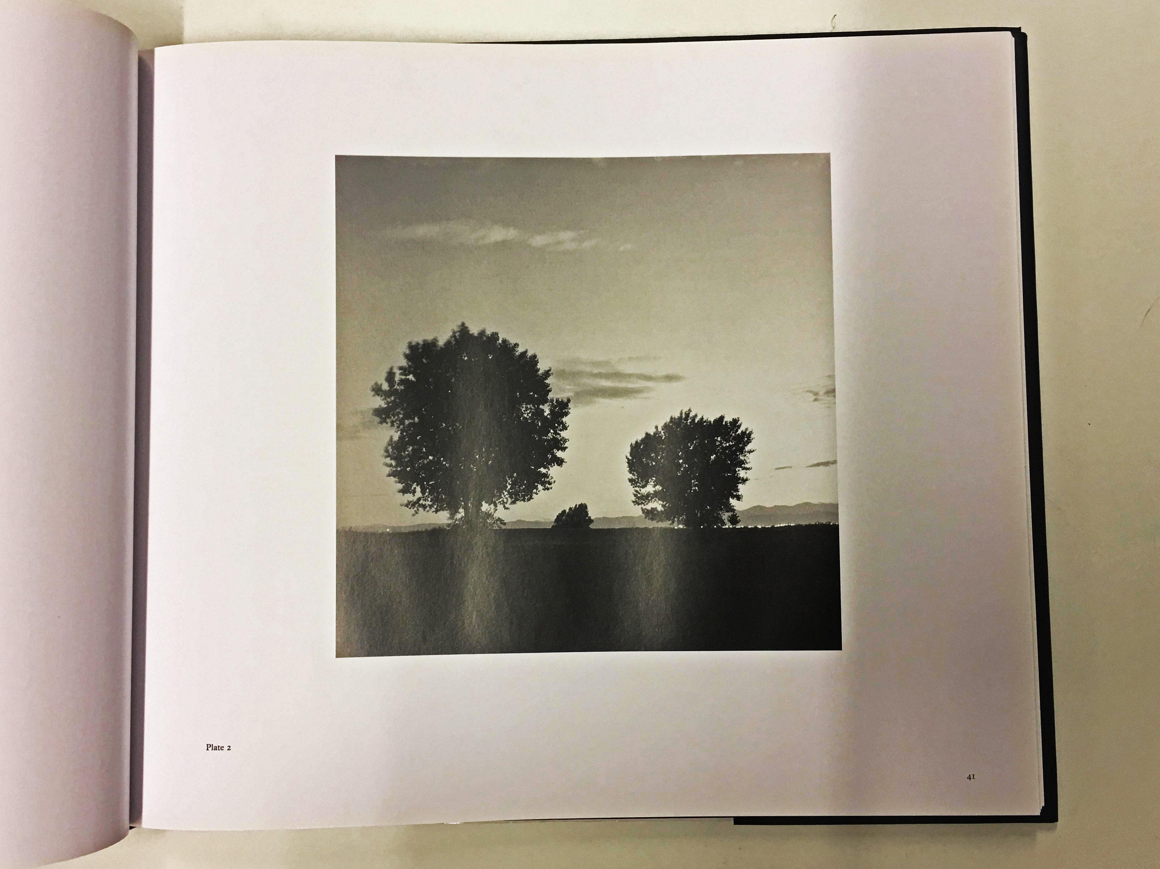
The book is cut into sections with the use of a black left page and white right page. I like this simplicity and this use of juxtaposition is something I plan on using in my own photo book, I also plan on using text in between to add another element to my work. Almost all the images are placed central on the right page and is never opposite a black page. There are a few images which are accompanied with another similar image as a diptych but most are left with a blank page such as Ori Gersht. This creates a sense of simplicity, evoking how the image would be in a contemporary gallery surrounded by white walls, leaving room for the viewer to focus on the context and subject matter of the photograph, this also leaves focus on the narrative. None of the photographs exceed the page, which leaves the photograph in the original ratio.

The photographs are presented in a formal manor with the photographer who created them. The simple style of the book allows the individuality of each artists work to shine through. Often the narrative of the photographs is evoked through the single photographs, a lot of the photos were designed to share their own individual narrative and affect the viewer in different ways. I would like to do something similar in my own book by sectioning off photographs into their own certain style then arrange them into an order which evokes narrative, these sections will tie together to show a more longer more complex narrative, the use of works will also elevate and give more context to the viewer. There was also a use of archived images which was referenced in the essays. This gives context to the reader to help further their understanding of what the writer is talking about.

Each section starts with a black page and a work from the photographer on the left, there is then a contents page to the right explaining details about the images such as name, size, and type of print. This is an easy and beneficial way to catalog each image for the photographer. The minimal layout and classic font type gives the book a very contemporary, formal appearance which is beneficial for leaving the viewer to focus on the photographs themselves.

“The hour of twilight also evokes haunting moods and provides scope for narrative intrigue and psychological depth” p9

The first essay, The Gloaming by Martin Barnes, discusses the history of twilight photography and how it develops and changes as well as the pioneers of this genre of photography. It discusses how technology has developed to create better and more experimental photographs exploring this subject. For example from the early years of early photography it was difficult to take a photographs with the correct exposure, often taking several ours just to take a single exposure. The essay brushed over subjects such as 19th century art, Phenomenalism and scientific observation. He also made reference to classical Romanticist painter Caspar David Friedrich who explored how natural lighting could elevate the landscape. e also discussed photography pioneers Nicéphore Niépce, Louis Daguerre and Henry Fox Talbot.

In summary the book explores themes and concepts evoked from the atmosphere created by the twilight period.The contemporary photographers look at how this period can create a psychologically charged, enigmatic and cinematic narrative. They also explore a sense of human influence and presence on the land.

Astres Noires – Katrin Koenning & Sarker Protick shoot idea

Astres noirs is the debut book for both Katrin Koenning and Sarker Protick, artists who live thousands of miles apart whose peculiar photographic wanderings create a hauntingly beautiful dialogue. This book presents photographs taken on mobile phone cameras, devices used to capture their everyday in an impulsive and almost obsessional way, documenting life from their doorsteps to far afield. This idea of communication through photography to present their living environments interests me since I would like to investigate what the difference between the living environment in Jersey is like compared to that of somewhere so close, London. This is contrasting to Koenning and Protick’s work because they were miles apart, however my idea would use the same idea in a different way.

Social media today, such as facebook, snapchat and instagram are all social medias that allow someone to send or post images that they have taken. This fact would mean that using social media I can contact someone who may live in an urban area in London, where they live. Using this communication and social media they would be able to send me and image of their living environment, including their job or friends/family living, in exchange of an image of our island Jersey. Once these images have been exchanged over a period of time I will be able to present 2 images that contrast to each other side by side. For example I could take an image of someone I know in the middle of a country lane, and the London exchange image could be the same image replicated in the streets of London, a completely different environment.

Image result for astres noirs

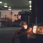
These are the images that Koenning and Protick have made in their collaboration, along with many others. The images present a feeling of paranormal and a sense of the unknown. This is something that is not commonly explored or conceptualised. The image on the left was an image that was sent by Koenning and the image on the right was the response from Protick, which is a pattern continued throughout the book. In my hope this is what I would like to do when i present my work, side by side presenting two responses to two different environments. I plan to make my images high quality and set up rather than spontaneously captured images.


Image result for astres noirs