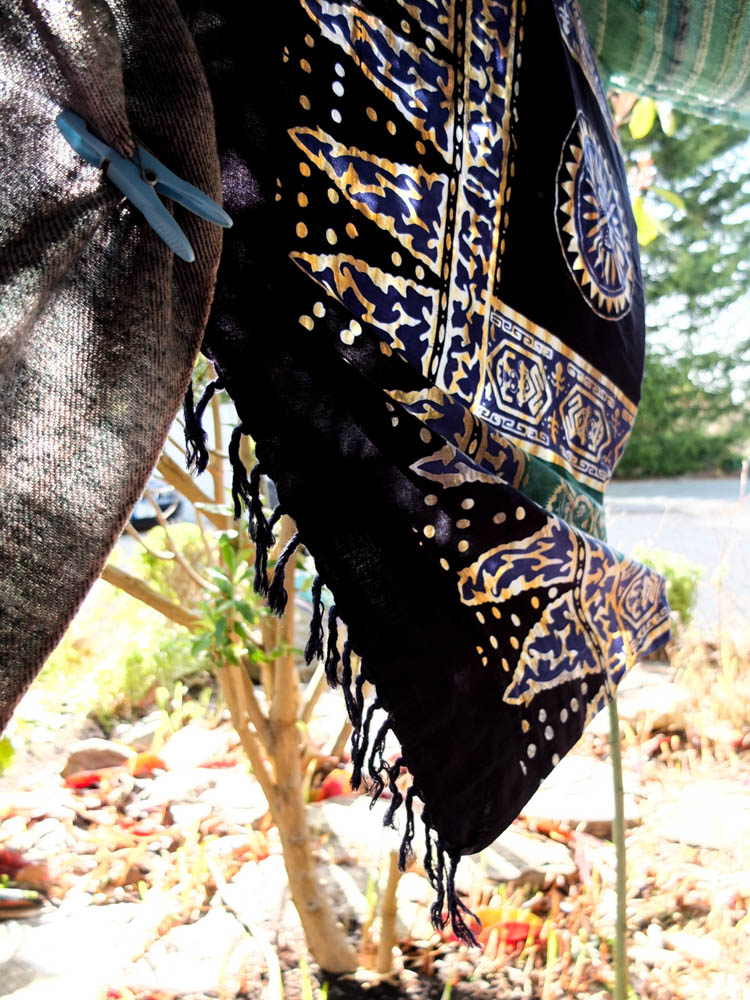
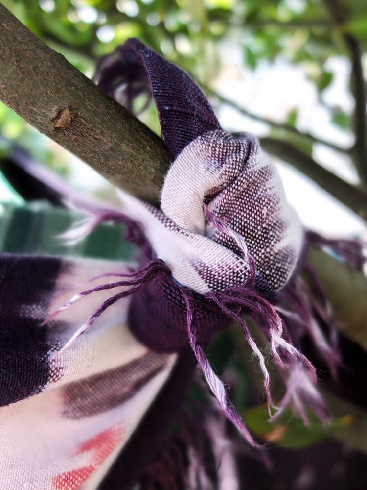
Below are the photographs from my first shoot where i experimented building a den within my garden. Overall i quite like some of my final images and it has made me consider quite a few elements of my dens in order to plan better for my next den project. I did however manage to get the perfect weather as it was sunny but then also slightly windy.
After completing this shoot i have learnt firstly that i need to consider the angle in which i plan to take my process photographs more carefully so as to be able to capture as many elements of the process as possible. I do think this will change depending on the environment as other environments will hide the dens structure less than this first garden environment. I also think it did work really well to have bright colours within the environment as well, the yellow blanket looking the best within the den. I therefore think i’m going to experiment a lot more with using really bright and vivid colours for my dens rather than matching them to the environment. Having a bright sunny day also worked really well within the photographs as the colours of the materials became more intense and created an almost childlike wonder to the den. The close up shots of element’s of the dens also worked really well as a compliment to the process of building the dens. I quite like the focus on these smaller elements of the structure as well as the process photographs of how it all came together.
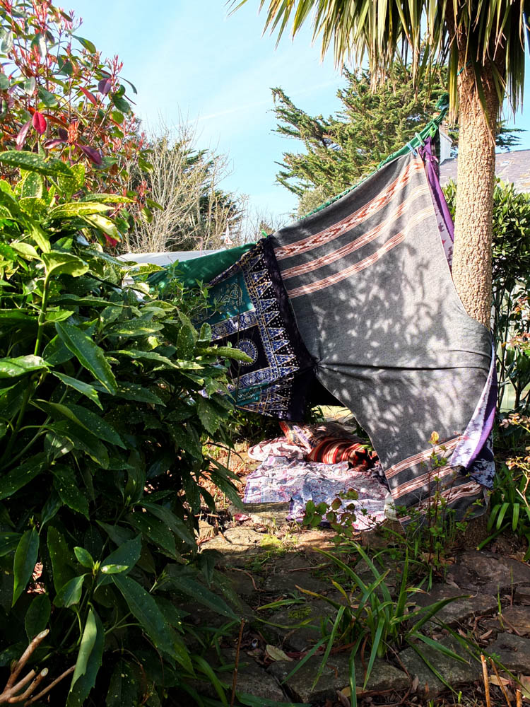
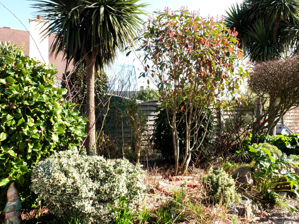
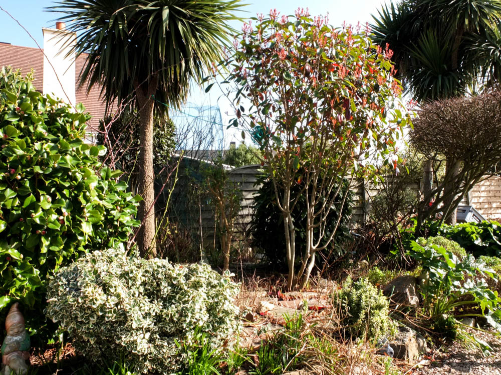
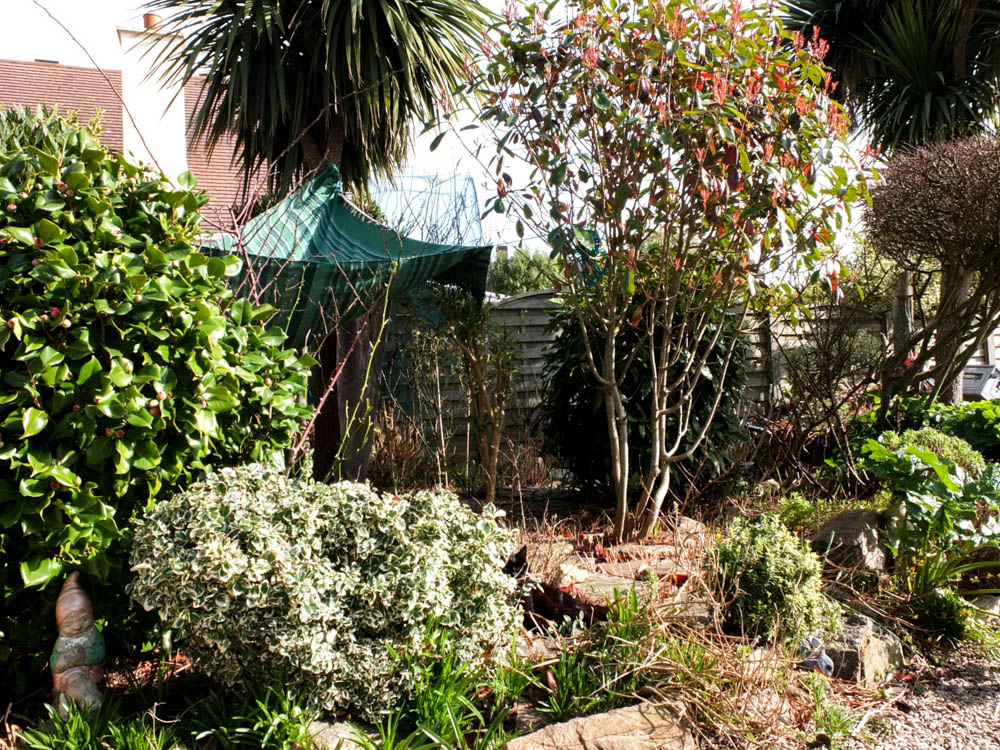
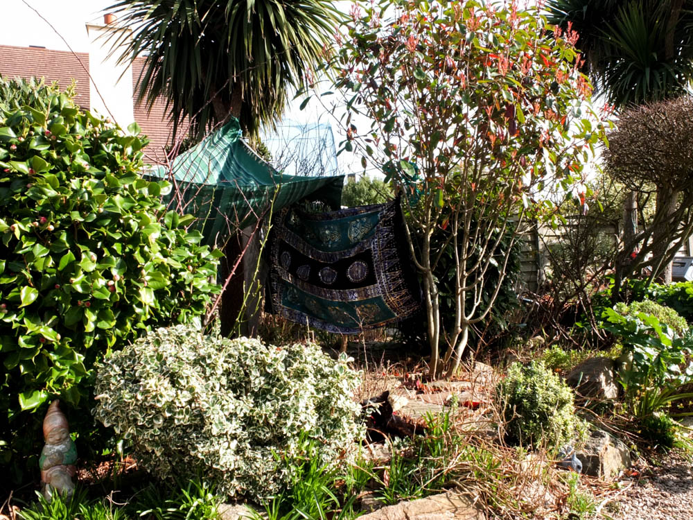
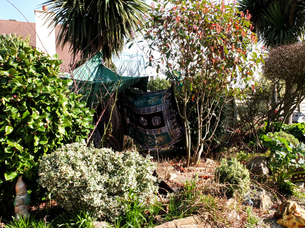
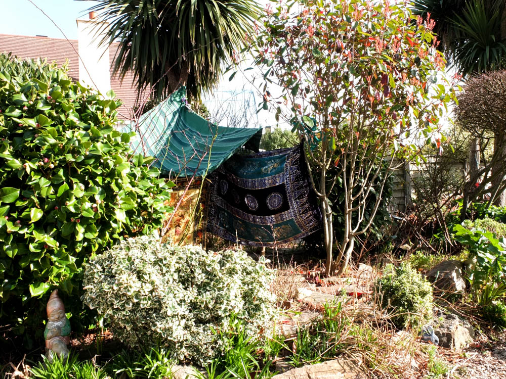
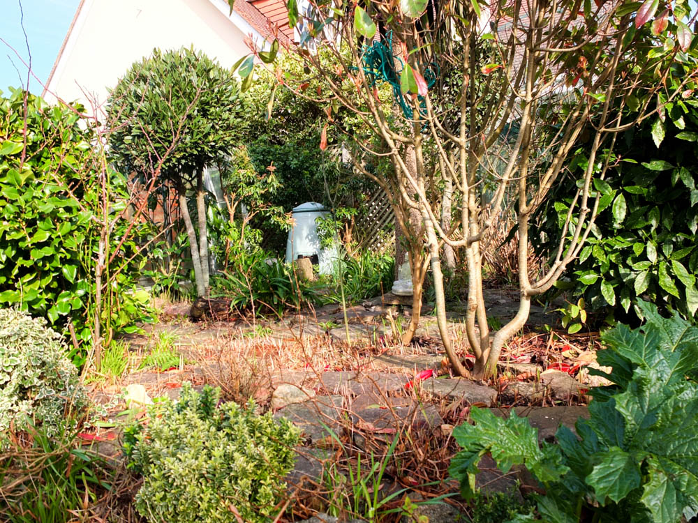
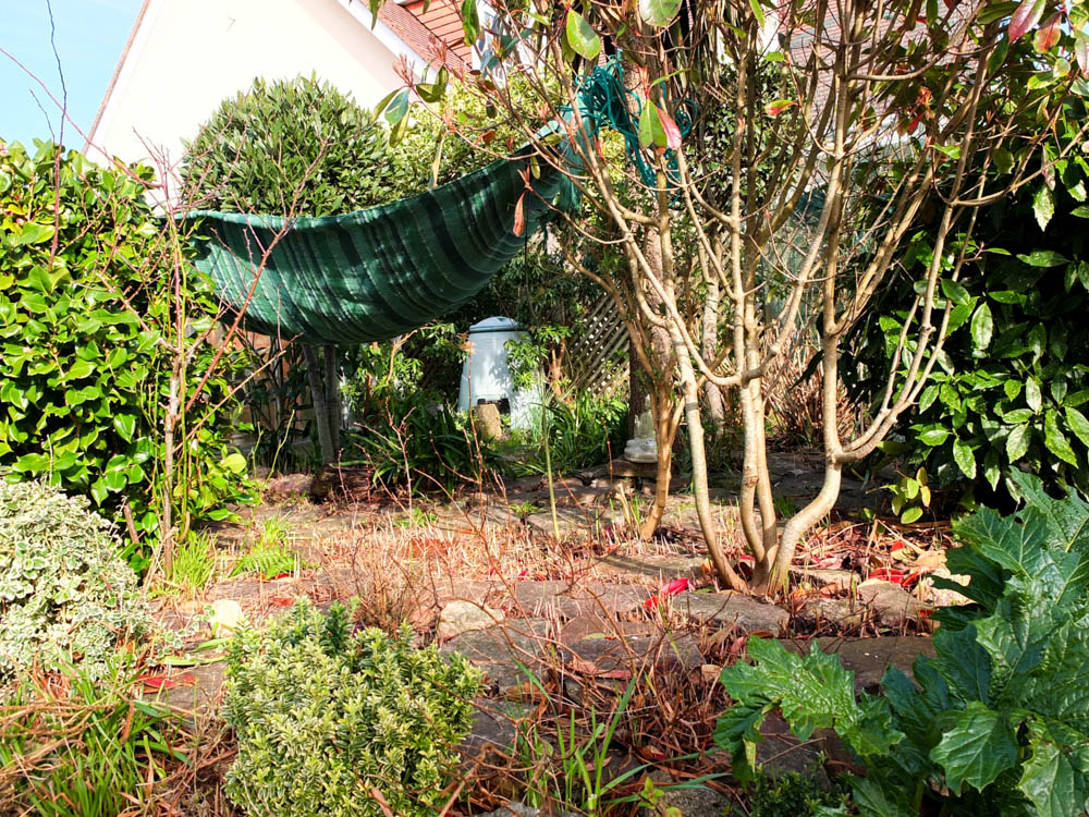
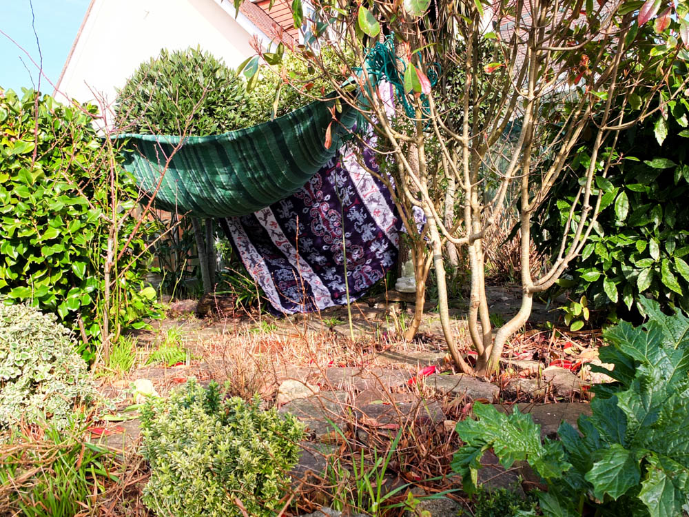
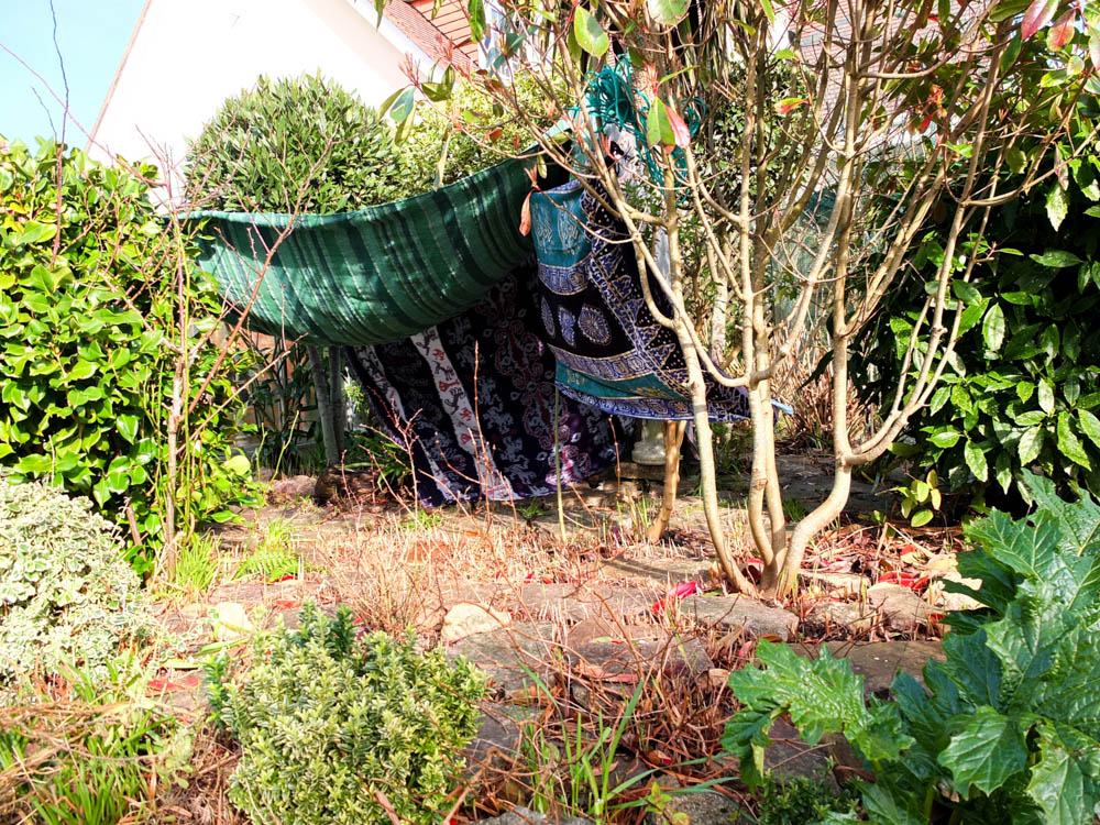
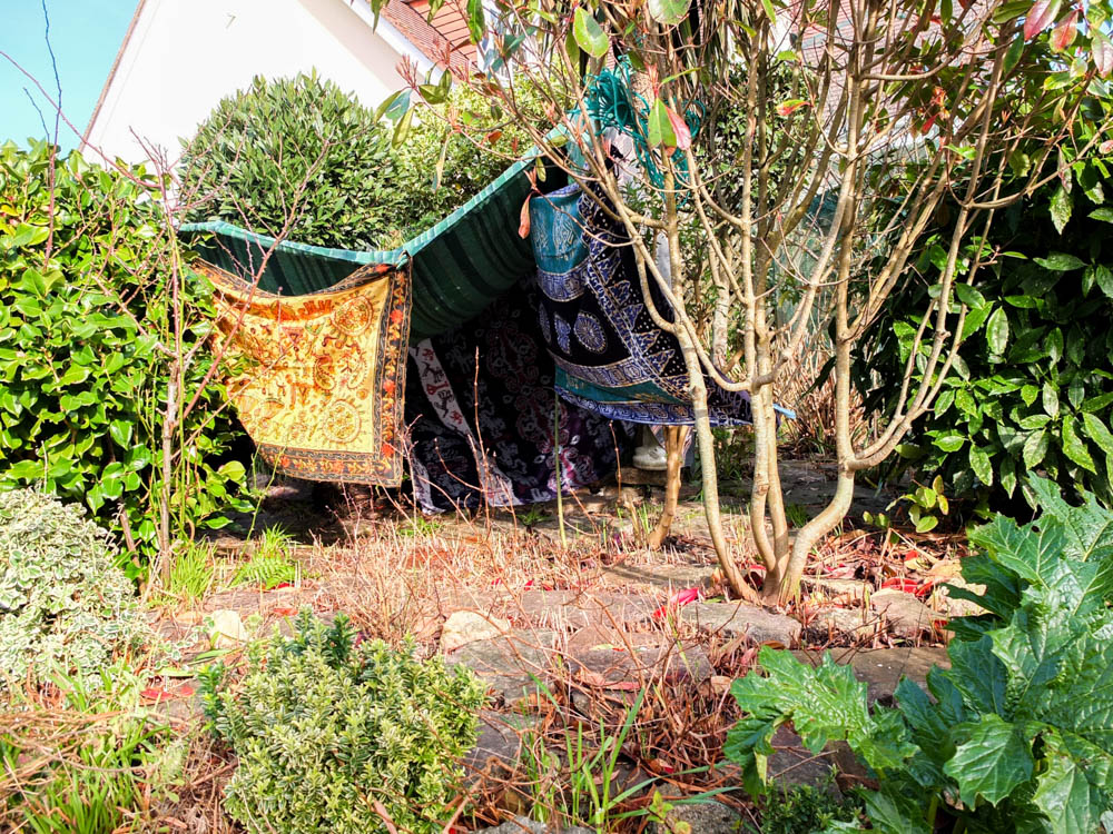
The first two sets of photographs are the process photographs that i took. I composed the process photographs from two different angles because of the first learning curb that i found when building my den. When i composed the tripod so that i could take photographs which would be a little series, i positioned the camera in such a way that it got the bet composition of the environment as a whole. I didn’t really think about how the den might be hidden too much by elements of the environment which is what i found after doing the first progress photographs. While they do work it is very difficult to see all of the different stages as elements which are added are hidden and therefore you can see little change in the photographs. Therefore as i took the den down i moved the camera and took a second set of shots which considered the den and trying to show how all the elements were added within my composition. The second set of images are face on to the entrance of the den and therefore you can see the walls being added in a lot easier then the other composition.
I do really like the composition of my first progress photographs i just think its a shame you cant really see all the different elements being added in. I composed the frame using the rule of thirds so that the den was more to the left side of the frame. I also composed the distance from the den so that the den was in the background of the frame and therefore it gives more of an impression of the den blending into its surroundings.
While i prefer the first composition better the second set of process photographs give a better sense of the den making process. I composed the camera closer to the den but once again used the rule of thirds to an extent to create the photograph. In these second set of photographs there are more elements in the immediate foreground of the photograph which i think adds a different element to it. In the composition of both photographs included in the framing is the house on the other side of the fence as it gives a garden feel to the photographs. I think the cobble stones also add to creating the environment as i haven’t really included any elements heavily associated with gardens within my composition.

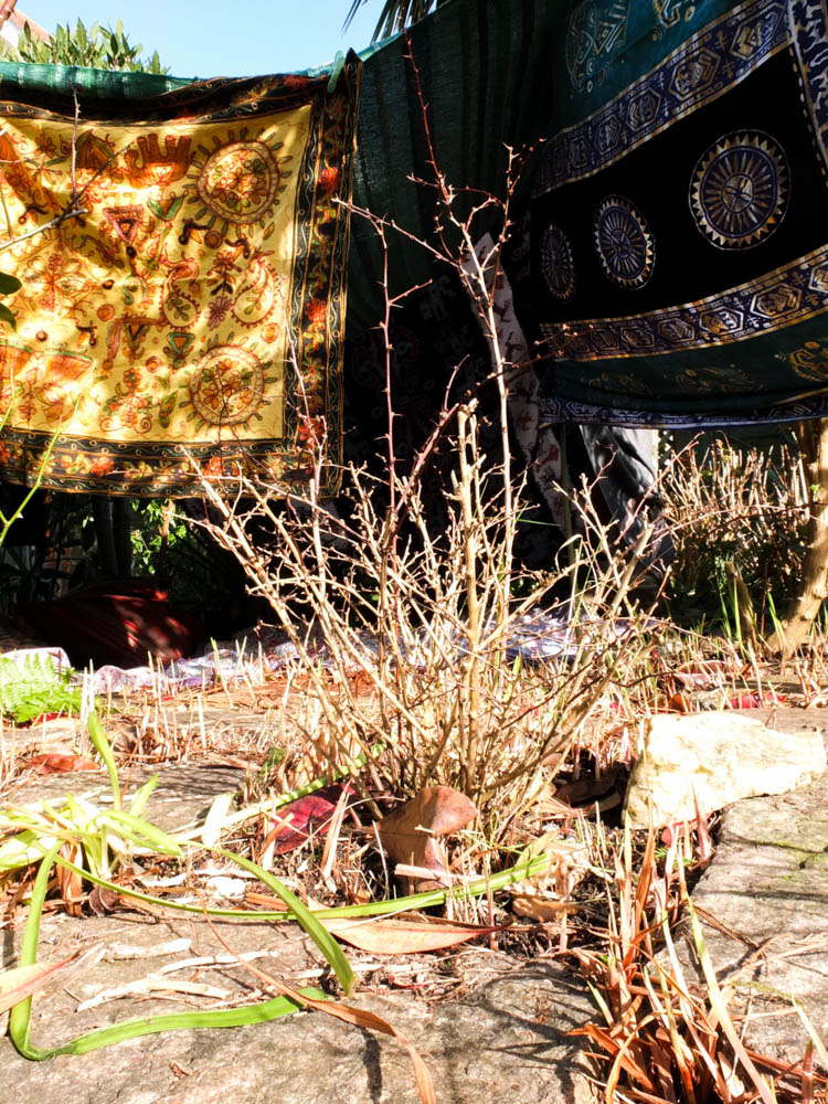
I quite like the composition of the photograph above in giving a general impression of the outside of my den. I took the photograph from below looking up at the den as i wanted to exaggerate the scale and grandeur of the structure. As children when building a den there is always a sense of pride and even awe at what you have created. I felt like by taking the photograph from below i was mimicking both the sight line of a child entering the den as a smaller person then me and also conveying how magical the structure is. I photographed the den from this angle as it is the entrance of the den and you can clearly see the opening. I quite like how the inside of the den is dark and so you can’t see inside completely. I feel like this makes the inside of the den appear more mysterious and therefore creates a snese of intrigue. The inside of the den is the darkest point of the photograph and is in the center of the photograph so the darkness sort of draws you into the den. I also used the really bright yellow blanket at the entrance of the den as i really like how the colours match the leaves. The golden yellow colours of the leaves in the foreground emphasis and bring out further the colours of blankets in the background. I framed the image with the little tree plant right in the center of the photograph as if it is the main subject of the image but then the blankets of the den in the background are what cause the plant to stand out and therefore they become the focus. The colours within the photograph all compliment each together perfectly with the greens, blacks and yellows. The brightest point of the photograph is the middle of the frame in which the light from the sun is hitting the stones. The foreground of the photograph is almost over exposed as the focus of the camera is on the background which is darker. The over exposed foreground works really well with the viewer’s eyes beginning in the foreground and then working back into the background and into the entrance of the den. In this picture you can’t really see the movement of the den but you do get the tension of the material in how its hanging.
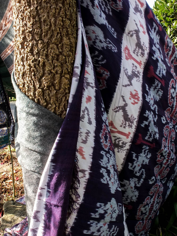
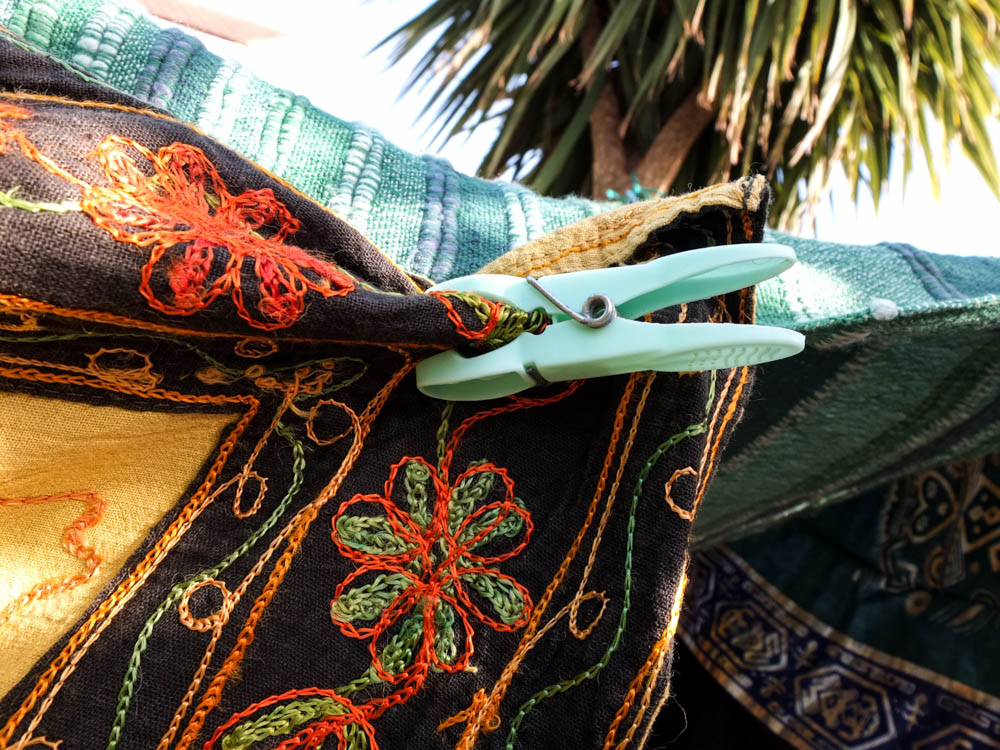
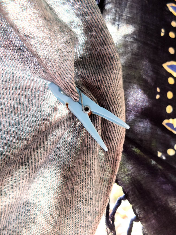
The above photographs are all small details which held together the den. I quite like them as detail shots to go alongside the photographs of the main den. So often with dens people look at the final structure and don’t consider the process. As these photographs in this section of my project are all about process and how the structure comes together, as much as the final product i think these photographs work really well as part of the series. In particular i like the 3rd photograph which suggests the movement and tensions of the material in creating the den. I composed the photograph according to the rule of thirds, the peg which joins the material positioned to the left top corner of the frame. From this point the material billows out at an angle which suggests it is being blown from behind. I quite like how the background is over exposed as the light outside is so bright as it causes the material in the foreground to be more prominent. You can also see to an extent the light shinning through the blanket which adds another dimension to the photograph. Most of the blankets were held up by pegs but i also tied parts of the blankets to trees which is what the last photograph shows. I think the last photograph also works quite well in showing how the structure comes together. I used a very small aperture to blur the background of the photograph to have only the knot itself in focus but the point at which the blanket flowed out the picture as blurry. I quite like the angles within this photograph as you have the angle of the branch going in one direction and then the blanket goes off in another direction but with not such a harsh angle because of the flowing material.
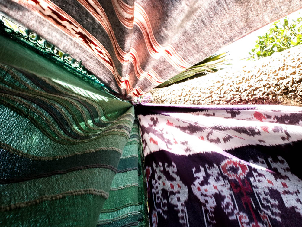
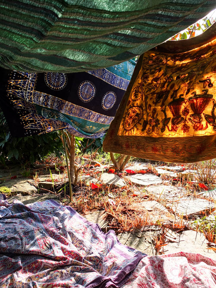
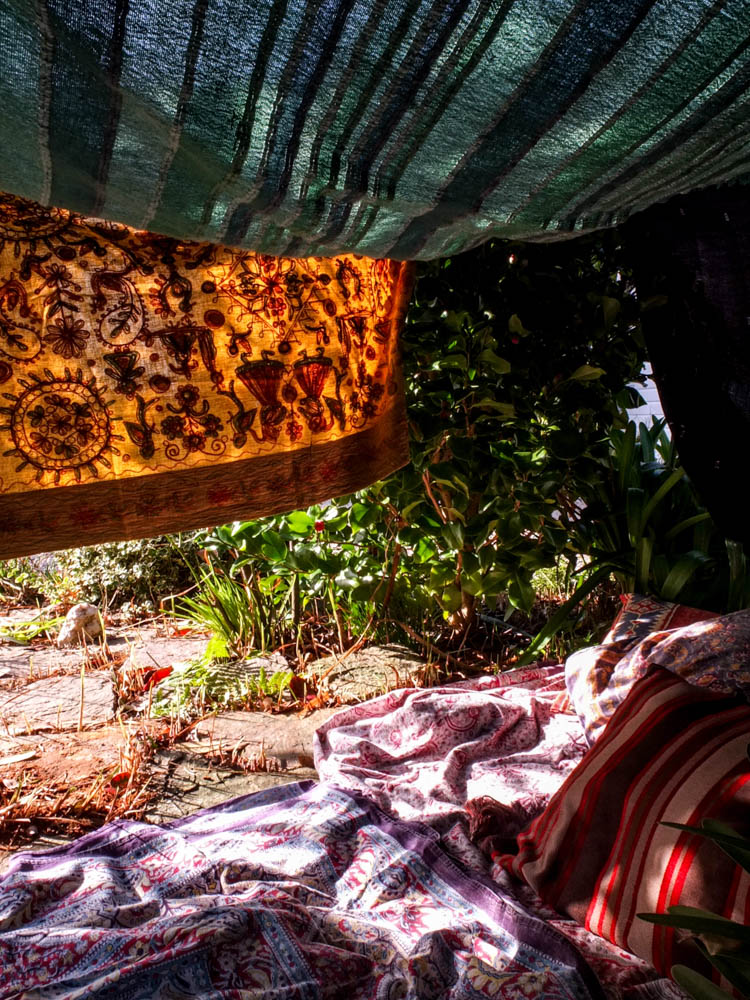
The above and below photographs show the inside of the den looking out. I composed the photographs in this way because i wanted to give an impression of what its like to be inside the den, the whole point of building a den to be inside the space you have created. The light and movement is what makes these pictures really work. The above photograph is composed to look towards the entrance of the den from an angle. The blankets on the floor of the den are in the foreground suggesting that the photographer is in some unseen cosy space further inside the den. I really like how this composition doesn’t remove all the mystery of the inside of the den as you still don’t get to see the entire inside space. I think a big part of the intrigue of these dens is the imagined cosyness and safeness that you feel inside of them. I think this is more an associated feeling rather than a reality you can see in a photograph so i want to keep this element of intrigue. The light in this photograph works really well in creating this magical impression as it shines through the blankets to the inside of the den. The impression of the photograph is that the light is trying to intrude into the space inside the den, both by shining through the materiel and also under it to fall upon the blanket as well. The light shining through the blanket creates an orangy yellow colour which matches the yellows and reds of the leaves on the floor. This works really well in creating a sense of unity of colour throughout the picture as there are these flashes of colour throughout the image. The greens of the blankets then also match the green flashes of colour in the picture throughout as well. The light in the picture is also fairly bright to the point of over exposure in places. The composition of the picture also suggests movement as the blankets are not hanging straight and are instead at odd angles due to the wind. The blankets even cover each other as they blow which give a more snug impression. The picture also has a lot of texture to it as it has the contrast of the soft material with the stones.
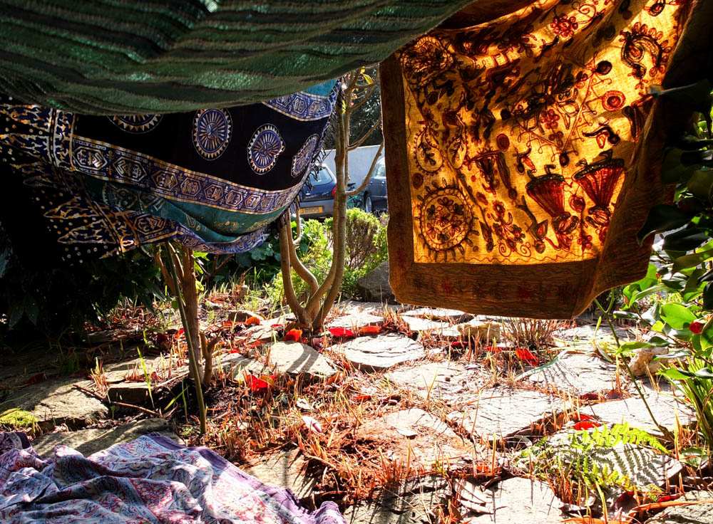
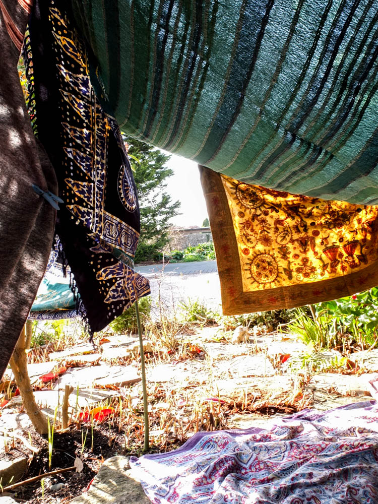
I also really like the above photograph in showing the varying angles of the den. I think the above composition is really interesting as it shows the angles of the material at abstract angles. The main light of the photograph comes from the background. Once again it is an overexposed background as the light is really bright from in the background. The angle of the photograph is really different to my other compositions as it has from the left hand side of the den and therefore gives a slightly different perspective. You can see more clearly through the entrance of the den to the outside space then in my other compositions. The light once again also shines through the material to make it more vivid colours than it normally is. The light is also trying to seep into the den through the entrance which is apparent from the areas of both light and dark shadows. I think the balance of the composition of the material is what works in this picture as the material frames the top half of the photograph through being low hanging and me having photographed the entrance which is obviously created by blankets to either side. The roof of the den billows downward which i like as it suggests the imperfections of dens that not all elements are perfectly structured. I feel like the lower roof also creates a more cosy atmosphere. To the left hand side of the frame there is then the material held together by a peg which you can see is being pulled taught by the gaps and lack of the material matching up perfectly. This creates more interesting shapes as the material is curved where it billows out and the straight sides of the material don’t match up which means the den doesn’t have a rigid feel to it.
