Initial specification and reflection

So far I have thought about various approaches to the theme of environment. I have considered ideas to do with performance, documentary, land art and sculpture. There are elements from each of these that interest me but don’t appear strong enough alone. From reviewing the mark scheme and examples of student exam projects I can see the importance of sustaining and developing focused ideas rather than having many disconnected responses. For this reason I have narrowed my ideas down to several key starting points which I am going to focus on and develop.  I am also planning to do more research around the deeper themes in my work and consider other disciplines as well as looking into some more artist references.

Firstly I am going to explore portraiture and performance photography possibly using a more surreal approach by experimenting with long exposures and some artistic editing techniques such as superimposition. I’m also going to make use of mirrors and reflections which is how I could bring in the idea of the mirror from the Foot buildings if this is a possibility. In my shoots I could consider human relationships and connections to environments as well as the idea of natural vs domestic spaces. I am thinking of taking inspiration from artists such as Clare Rae as well as others such as Francesca Woodman.

As an element in my project I think I am going to consider the concept of abandonment in relation to how humans alter environments. This connects to previous ideas I have explored such as the decay of old buildings and past human traces in them. I am going to explore the idea of abandoned/lost things that don’t belong in certain environments and things that have been given away. I might take inspiration from photographers such as Mark Dion and collect objects from environments and photograph them. This idea could also include photographing environments such as storage spaces and charity/ antique shops and could incorporate the ideas from early shoots I have done at the animals shelter and the idea of institutions/community services.

I would also like to include an element of Earth art in my project possibly by using the materials found in the environments  where I am exploring performance photography. This could also relate to the idea of abandoned objects by showing the human presence in natural landscapes for example at beaches and working with natural and man-made materials. This could also be an opportunity to make use of stop-frame animation and film as I was inspired by the idea of animated land art such as the example below.

Additionally If I was going to use myself in photographs I think it might be easier to use film and then take stills from the video footage. I could possibly experiment with combining performance and stop frame animation using materials from landscapes to further consider the relationship between people and environments.

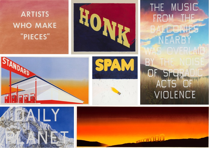
Edward Ruscha

Edward Ruscha is an American artist who explores language and West Coast culture and well as taking inspiration from Hollywood to create compelling yet perplexing pieces of art.

I was inspired to explore his art after wanting to look at artists who use text and language to elevate the meaning of their work. He has also published a lot of books featuring his work which is something I plan on looking at for my final piece.Similar to Todd Hido, his work is about the viewers interpretation and how the viewer builds their own narrative. His work also explores how text and phrases is so overused in today’s society especially with such an over-saturated media world.

I plan on responding to his use of published work and creating my own book as well as referencing his use of abstraction and carefully composed enigmas. Similar to that of Misrach and Hido, his work explores mundane subject matter in a whole new and dymanic light.
https://www.nationalgalleries.org/art-and-artists/features/ed-ruscha?gclid=CLP2ptuivdMCFUeVGwodrAMN5w

http://www.independent.co.uk/arts-entertainment/art/features/ed-ruscha-a-man-of-his-words-1801704.html

http://www.theartstory.org/artist-ruscha-ed.htm


Environment – Jacob Sobol

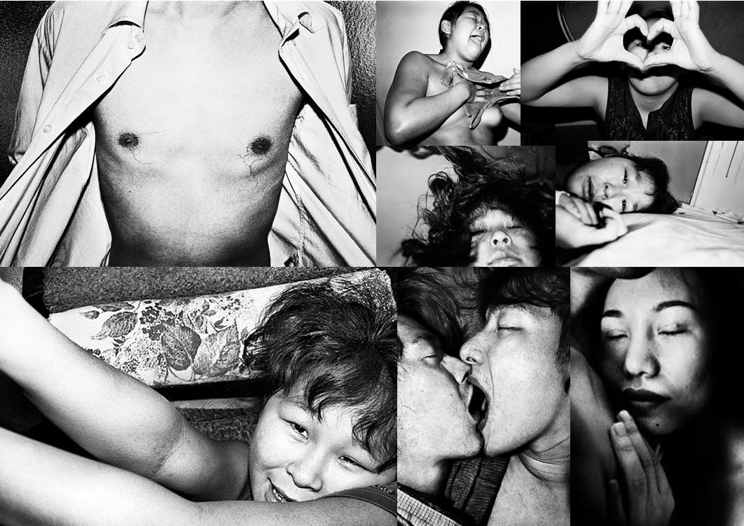
Jacob Aue Sobol’s book reveals a candid account of his intimate relationship with girlfriend Sabine and their life together on the east coast of Greenland. In 1999, Sobol went to live in the settlement of Tiniteqilaaq, Greenland, where he lived the life of a fisherman and hunter with his Greenlandic girlfriend and her family.

Taken over three years Sobol’s book records, in photographs and narratives, his encounter with Sabine and their life on the east coast. This was the starting point of Sobol’s photography and has since in 2012  been declared as a Magnum photographer.

My reasons for choosing Sobol as an artist reference, is due to the fact that he is capturing intimate moments within his natural surroundings, non-staged and unedited moments are captured as they truly are. This is essentially how I wish to photograph my own project, in order to encapsulate my very own environment and surroundings.

Image result for Jacob sobol

The image above features Sobol’s girlfriend, Sabine, whom he captures kissing the camera, before her boyfriend was due to leave for a hunting trip.

This photograph, features a snapshot style, that does not follow any of the conventions that make a good photograph, in relation to photography. Despite this, it does contain a very emotive feel, as Sobol has captured an intimate moment, the act of kissing directly towards a subject, that is often unseen in a general scenario, as we cannot freeze the subject or the moment itself.

I feel that the fact that the camera is out of focus only adds to the rawness of this photograph, as we see Sabine throwing herself at Sobol, in an act of passion, something he himself is only experiencing. Which is essentially what Sobol’s work and in particular this project consists of.

Anna Di Prospero

// A N N A   D I   P R O S P E R O //

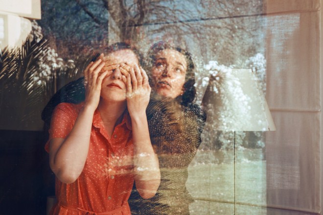
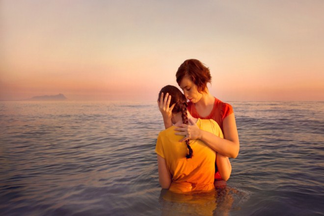
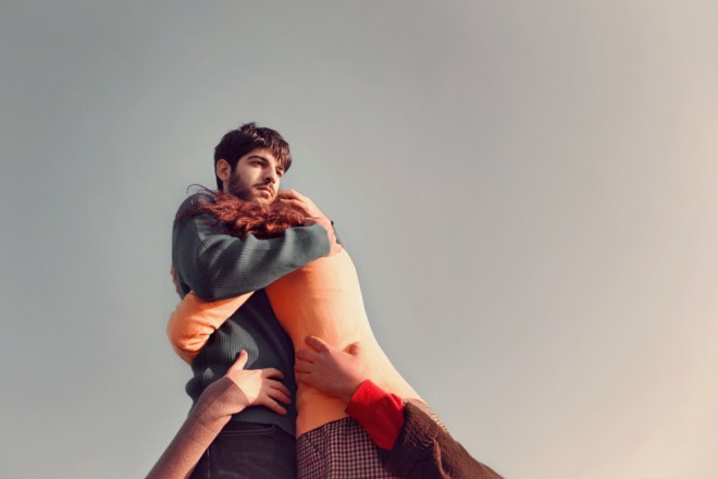
Anna di Prospero is an Italian photographer who has been working on a self-portrait series called With You, where she appears alongside family members and friends. i like that even though it’s a self-portrait series she isn’t necessarily the star of the images – but the focus if rather about her relationship with these important people in her life. however you may interpret it, the images themselves are absolutely beautiful – with an amazing rich colour palette that runs through the entire series.”

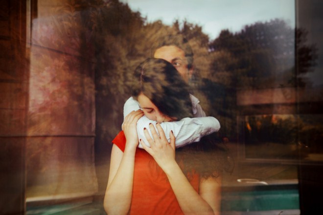
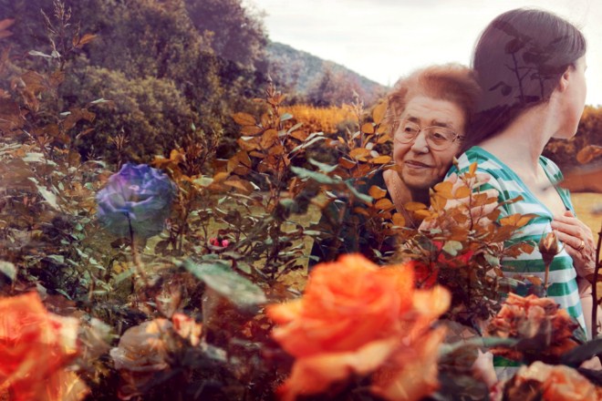
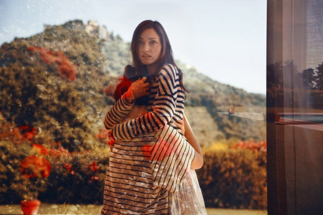
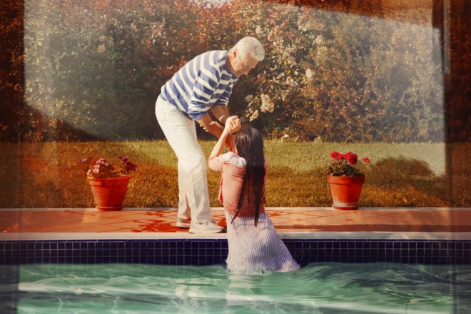
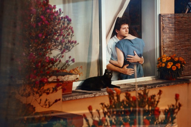
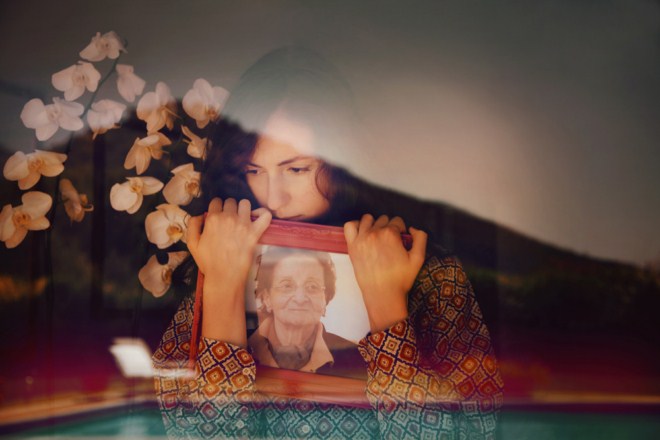
Anna’s images pair rich landscapes with intimate portraits in a bid to form both aesthetically pleasing and contextually thoughtful images. Many of her images make use of the double exposure technique which combines multiple layers of photos to create a final composition. Often this process makes use of landscapes and textures overlaid with forms and figures as seen below in Anna’s own work.

Much of her work is shot though a window such as the above creating a seemingly natural double exposure which makes use of reflections occurring within the image. This photographic technique and style creates a double image within a single frame where two photos can be seen together rather than separately. The landscape above shows an urban garden and swimming poor reflected onto herself and her family member. Perhaps by linking each part of her family to a particular area or setting an emotional link is created between person and place. 

Other examples of Anna’s work feature what could be seen as ordinary double exposure techniques such as digitally – or manually – layering two images over each other with a difference in opacity rather than relying on natural reflections and lighting. In the two photos above, flowers have been overlaid across the figures forming unusual compositions. The muted colour palette in Anna’s work helps to carry her aesthetic and supports her overall theme of identity and confusion within the midst of reality. Using her family as models within each of her tableau images, Anna finds herself in the people who mean the most to her.

Water plays an important role in many of Anna’s images representing a different reality which she tends to be being pulled out of or falling into. The second image here has a strong symbolic reference of the help and support given to her by her family and friends who literally pull her out of the deep water she is trying to escape from.

Itamar Freed

// I T A M A R   F R E E D //

Born in 1987 in Manhattan, Itamar Freed studied at the Bezalel Academy of Arts and Design where he received his B.F.A in 2012. His work has since taken him to London where he is now studying at the Royal College of Arts on the photography program. Freed’s work conjoins reality with the artificial. Staged figures create unusual scenes often with an uncomfortable tension lying behind them. There are three main regions of his photographic work taking him from New York in America to London for his studies and the Israeli wilderness where his home studio lies. Freed’s photographic aesthetic takes much of its style from the techniques of historical painters which draws parallels from his photographs to traditional paintings within art history. His use of colour, natural light and composition blur borders between dreams and reality with open compositions. There is often more than one focus point within each image drawing the eye of the observer to  range of areas within the compositions.

“Freed’s photographic ambience exists as if in a threshold zone, beyond the bounds of specific time and place. Using the photography medium to preserve, to freeze, to grasp life and seize time.”

“My photographic work draws upon a return to the classic paintings of Art History. Through the use of color, natural illumination at its extremes, open composition and multiple vanishing points that simultaneously draw the observer’s eye to different focal points of various events, the borders between dream and wakening are blurred.”

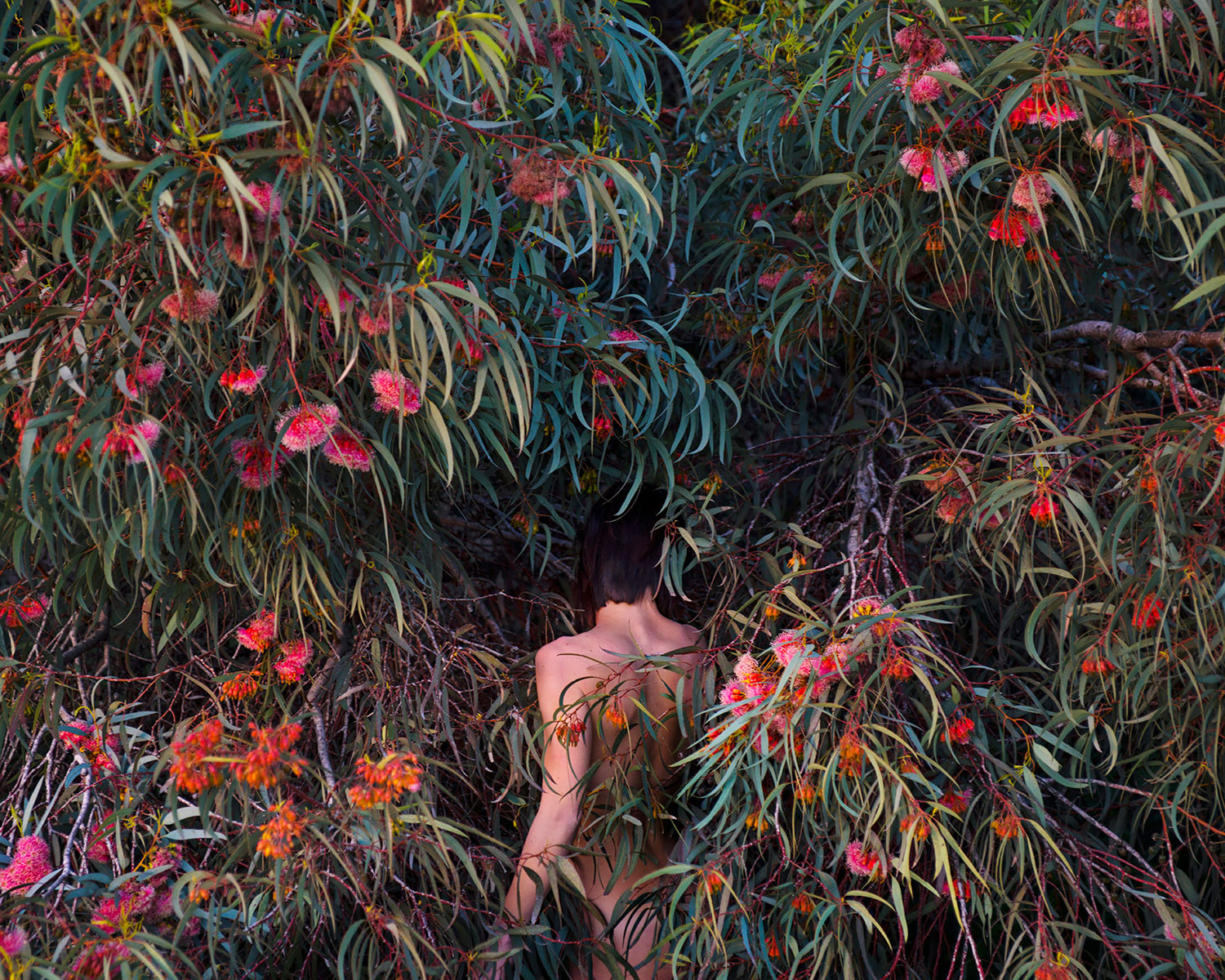
The image below has a number of focal points within its unusual composition. The woman marks a clear part of the photo and creates her own line of sight following the curvature of her body across each of her limbs. There is a sense of fragility about her with a strong sense of vulnerability at her exposed state. Her head starts in a mess of tangled grass and branches but following along her body you arrive at her feet which are immersed in red and orange flowers. There is something to be said about the inclusion of this section of colour, red itself has multiple symbolic readings from lust and passion to danger and poison.  The bird in the background also creates a focal point along with a series of questions. Why is it there? What point is the artist trying to make with its inclusion? The background fades from a  dark, almost blackened tone in the background to a lighter mix of greens and browns in the foreground. This image interested me in particular because of its strange combination of focal points within the strange composition. The collective metaphors and symbolism in the image add a mixture of emotions which support this image and its meaning. 

Clare Rae – Artist Response

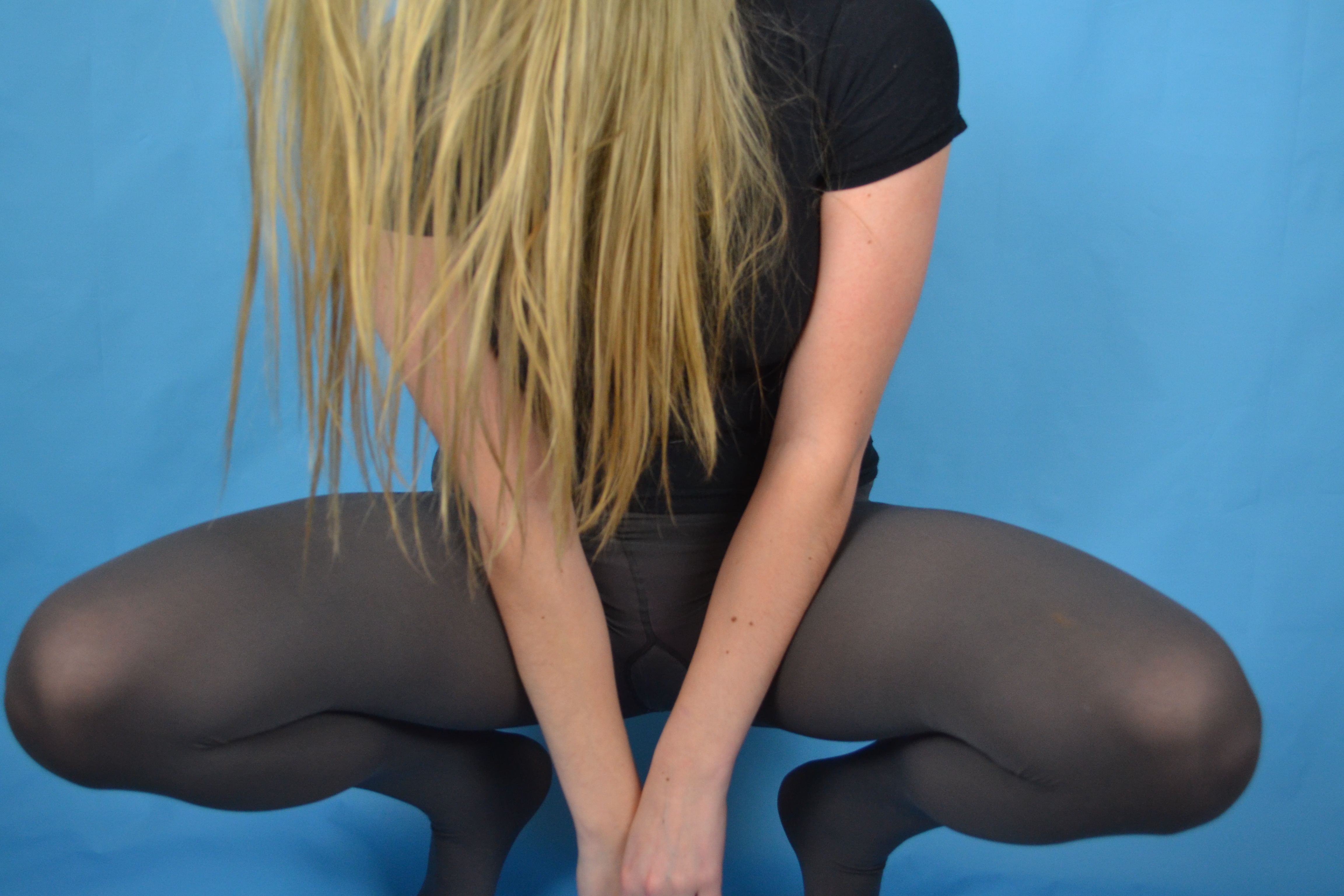
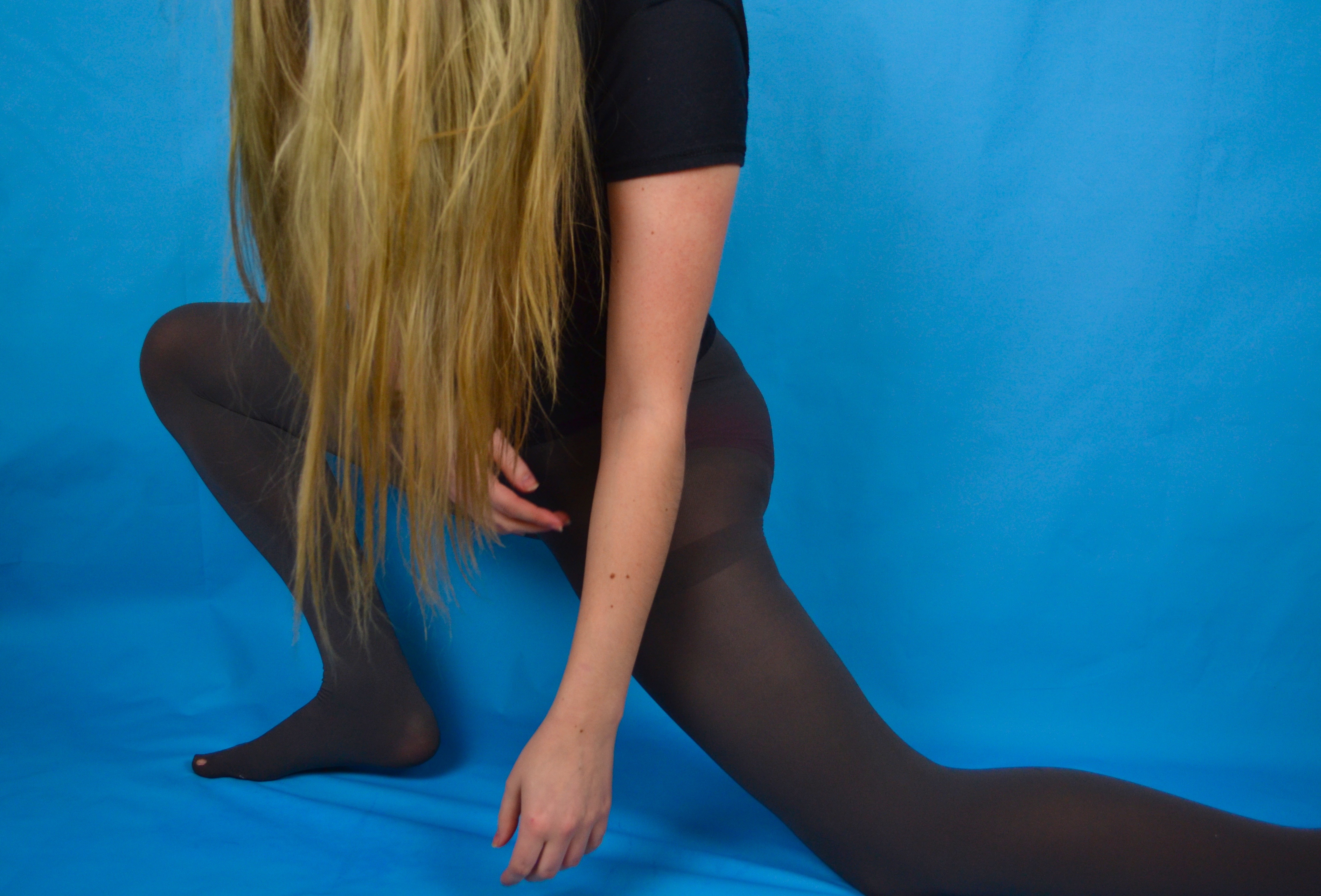
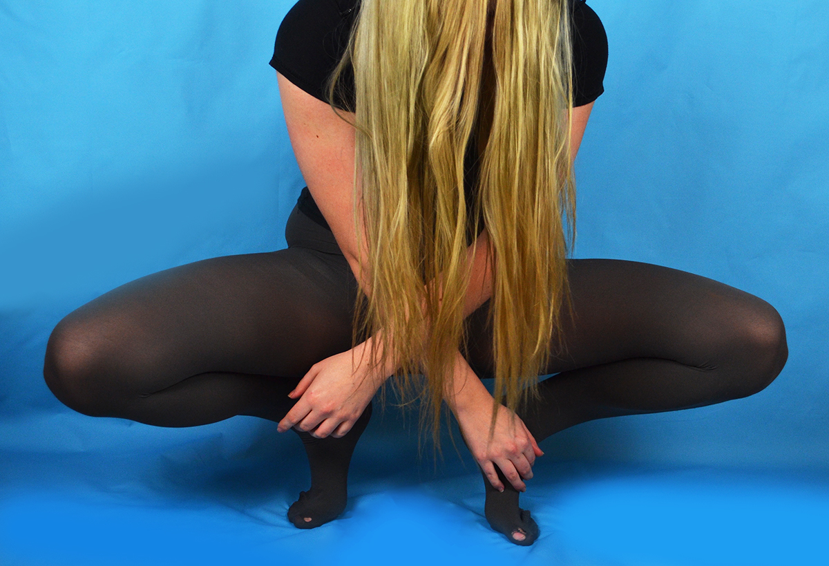
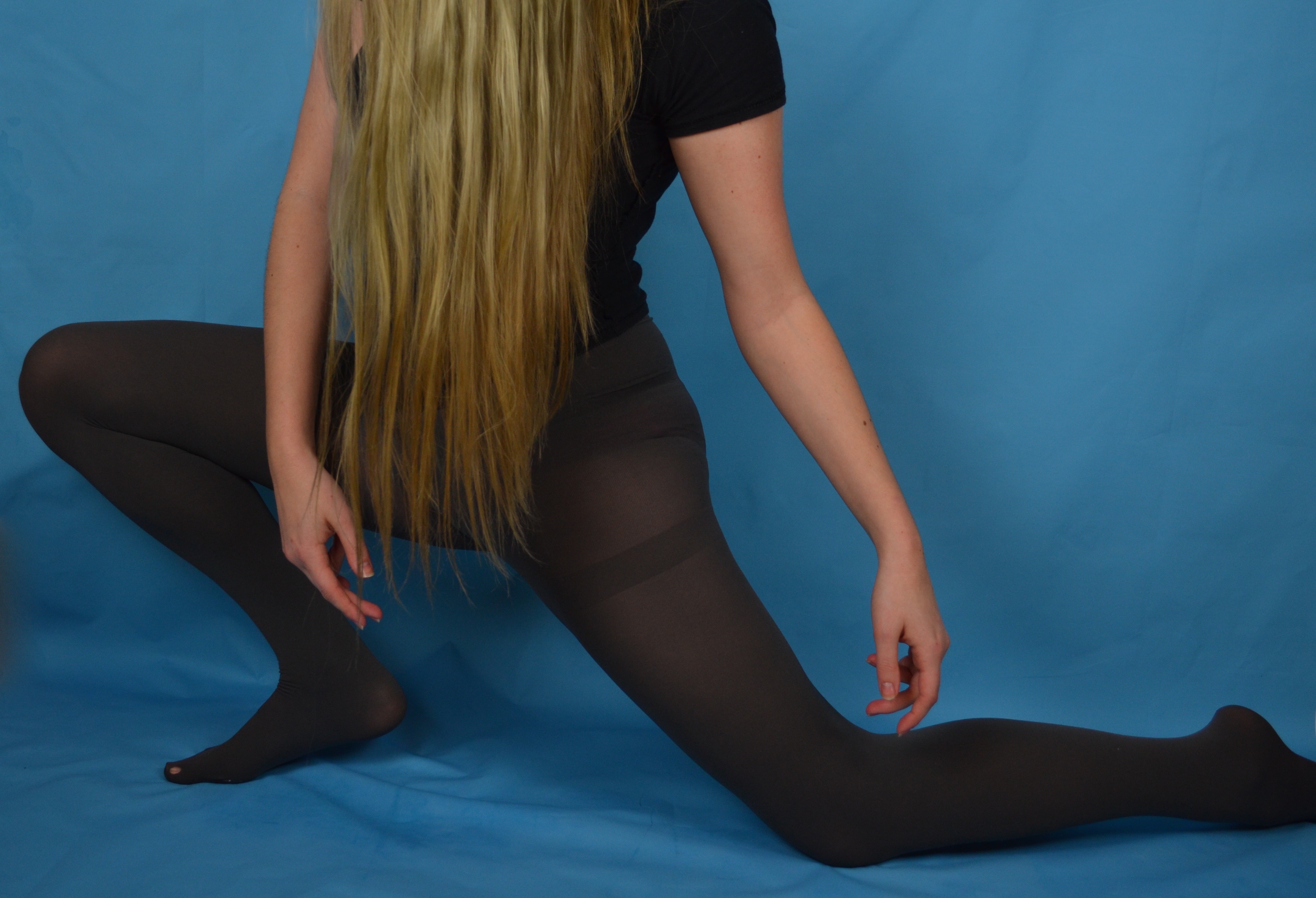
In response to Claire Rae’s work I produced some simple portraits using the blue background I had set up for another shoot. I chose to wear a plain black short sleeved t-shirt and some grey tights, both a nod to Rae’s use of costume in her photography. I also took inspiration from Rae’s workday covering my face with my hair, although I found that the silhouette and overall effect was quite different with my long hair compared to Rae’s short black bob. I experimented with  a few similar poses that involved my being close to the ground so I could tilt my head forward easily to conceal my face with my hair. Posing in the way I wanted in the short time it took my to press the shutter and get into position proved quite challenging and in the rush I often didn’t get into the frame in time or in the incorrect place. The grid of images above where the only ones that were potentially salvageable as outcomes.

I selected this image as an outcome because I found the composition of the figure within the frame was rather successful. There is a good session of a diagonal line created by my thigh as well as a string triangular shape reinforced by my arms and my legs and the base. I altered this image by enhancing the brightness, contrast and colour saturation as well as the levels. I also edited out the hole in my tights as I felt it was an unnecessary distraction and softened some of the creases in the backdrop where the vinyl has buckled slightly under my weight being placed mainly on the ball of my foot.

This pose is at first glance similar to the previous but I decided to place my weight on my whole foot as opposed to the ball to avoid the buckling I experienced with the previous pose. I also experimented with extending my arms and placing them in a way that mirror the corresponding legs. The left arm is folded similar to the leg and the right arm is extended in a dancerly fashion mirroring the extended leg underneath it. My body is also angled away from the camera which creates some interesting negative space created between my arms and the curve of my torso and thigh.

I selected this image as an outcome because I feel that I created a completely different shape with my body compared to the other photos. My body is much more compact as I am crouching down with  my weight placed on the balls of my feet (mainly because I cannot crouch with the weight placed on my whole foot so I had soften some of the buckling created as a result of this on Photoshop) I also like the seemingly symmetrical nature of the composition at first glance but on closer inspection one hand is closer to the floor than the other and my body is leaning lightly to the right. I also like the column of black created by a parting between strands of hair, which is also a little off centre.