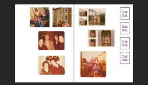
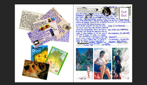
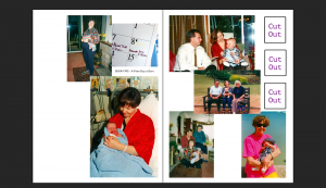
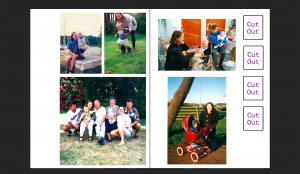
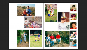
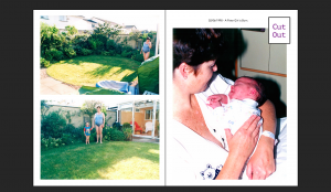
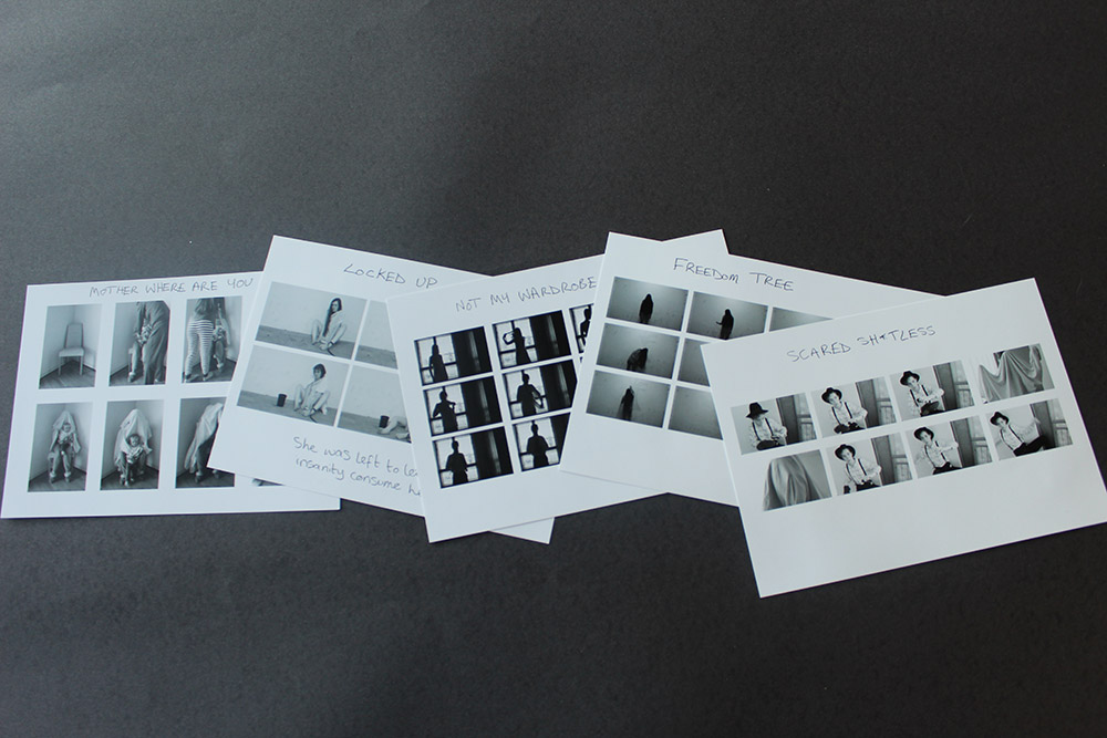
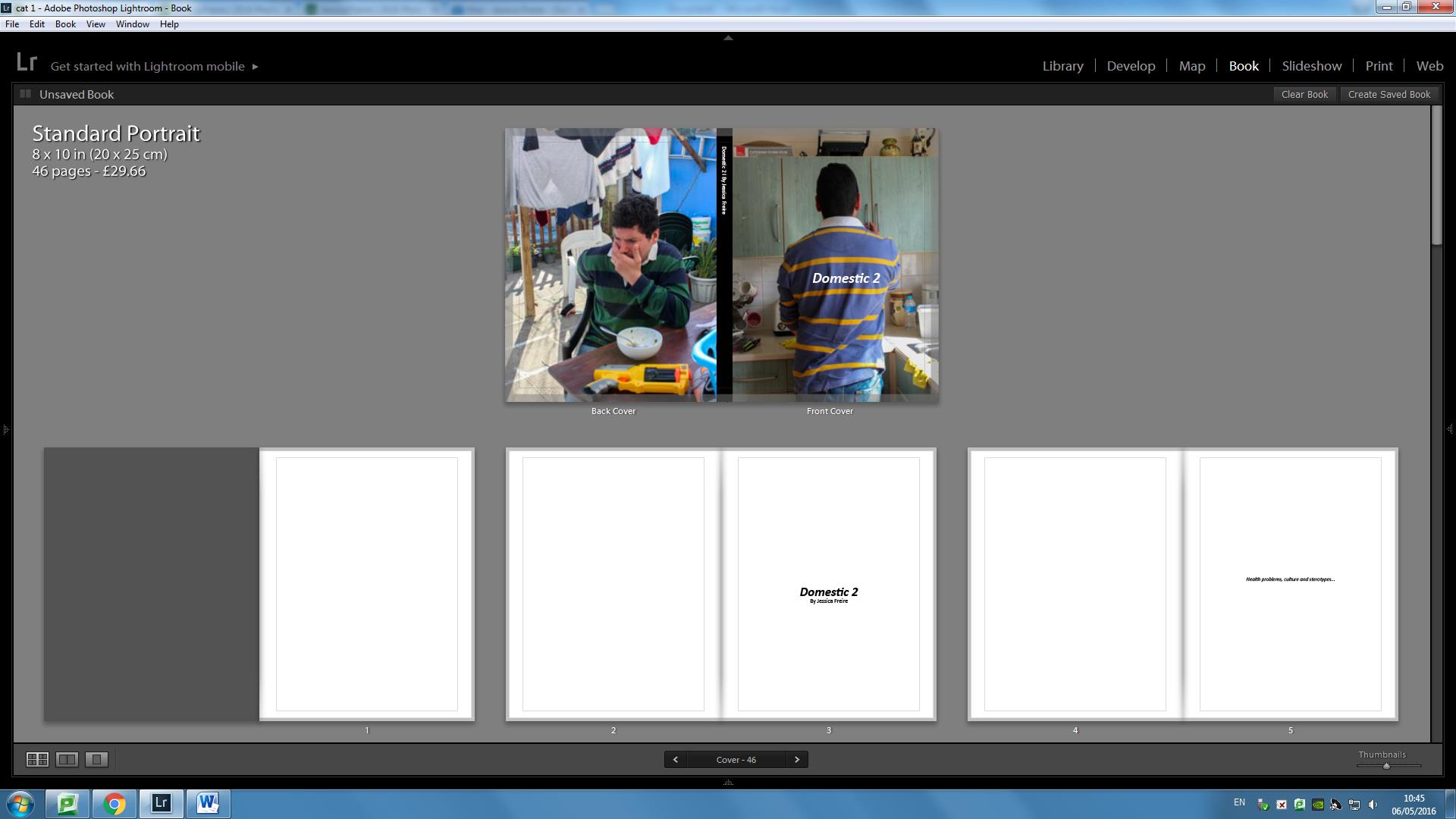
Here is the full layout and detailed evaluation for my completed photo-book.
FRONT AND BACK COVER

I have included these two images as the front and back cover because ….
Front Cover – I have chosen this image of a packet of Jersey butter as my front cover because I feel it is a strong image which effectively captures the essence of the project, directed under the broad theme of local Jersey produce. It is a simple and neutral image which links well to my title: ‘Genuine Jersey…?’, because it actually includes the distinctive ‘Genuine Jersey’ stamp. It therefore creates intrigue for the viewer, without giving too much away.
Back Cover – This is a simple picture of a egg. I have included this image on my back cover for two reasons; firstly because it links to the idea of simply showing Jersey produce to open a broad concept and theme, as similar to the front cover; secondly I have also chosen this image because it is quite unusual and peculiar, thus subverting the expectations of the viewer. This is effective to a large degree in ending the narrative on an obscure question mark, a cliff hanger to leave the viewer questions both before and after they have gone through the narrative.
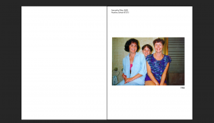
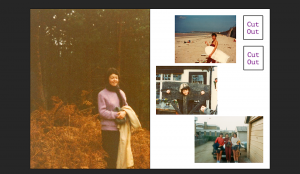
PAGE 1-2

It is a good idea to begin a photo-book on a fresh page. Jumping into the story too early can be quite unsettling because it allows no sense of build-up.
PAGE 3-4

On the right-hand page I have simply included the title. I wanted to include this title before introducing the narrative to remind the viewer of my focus and theme. It also extends the sense of build up and anticipation built up on the first 2 blank pages.
PAGE 4-5

The first image of the narrative is a double page spread of a close-up of the tide coming in. I chose this as the opening of my narrative because it links straight-away to the idea the book is based around an Island. This enables the viewer to simplify their focus towards the theme of an island, implying Jersey in relation to the title.
At the same time it does not give any actual reference to Jersey. This was an important consideration I made because I didn’t want a clichéd or obvious connection, which may serve to undermine the sense of mystery following on from the unusual, ambiguous front cover.
PAGE 5-6

Whilst my first image serves to captivate the specificity of the project, the second image featured on its own on page 5 is a landscape shot of a shed on Colin Roache’s Watercress Farm. This simple landscape image serves to begin the focus of narrative – farming and food production
I felt this image was a good one to begin this theme because it has a very strong and confident presence about it; lively, colourful but well composed and orderly. This gives the narrative a clear opening, enabling the viewer some idea about what the narrative might be about. At the same time it is subtle and does not reveal too much.
PAGE 7-8

The next image is a double page spread of Colin Roache, documenting him walking through a watercress bed.
I like this image because it provides a sense of chaos and energy to the narrative, in contrast to the calm and orderly beginning. It is chromatic because it has been cropped to only show the subject’s body, as well as the fact he is moving in an unusual way with his arms flailing. Having a eccentric character introduced this early on is important in establishing a sense of charm and liveliness, a ‘key’ image which will resonate in the viewers’ mind throughout.
PAGES 9-10
This image now shows Colin watering the watercress beds. It is a formal image.
In contrast to the previous image, I have reverted back to the calm and more traditional feel which is established on pages 4-5. This quick shift in the narrative flow leaves the viewer in anticipation to what might come next, thereby keeping the structure of the narrative unknown and uncertain.
Although it contrasts in terms of style and mood, this image does in many ways also link to the previous image because it reveals more aspects of the subjects character – which in the previous image was a more mysterious representation.
PAGE 11-12

This is a two page spread which depicts a close-up still-life shot of some of the finished water-bed crests on Colin’s farm. This is the first image of the narrative which is directly linked to the ‘Parr-like’ advertising language. Whilst some similarities to Parr can be drawn, such as the fact it is taken of something close-up as well as being highly saturated, there is certain aspects of the style and composition which makes it slightly more orderly.
Nevertheless it is a strong image regardless which provides to a large extent, a definite degree of intensity of which the narrative can build on.
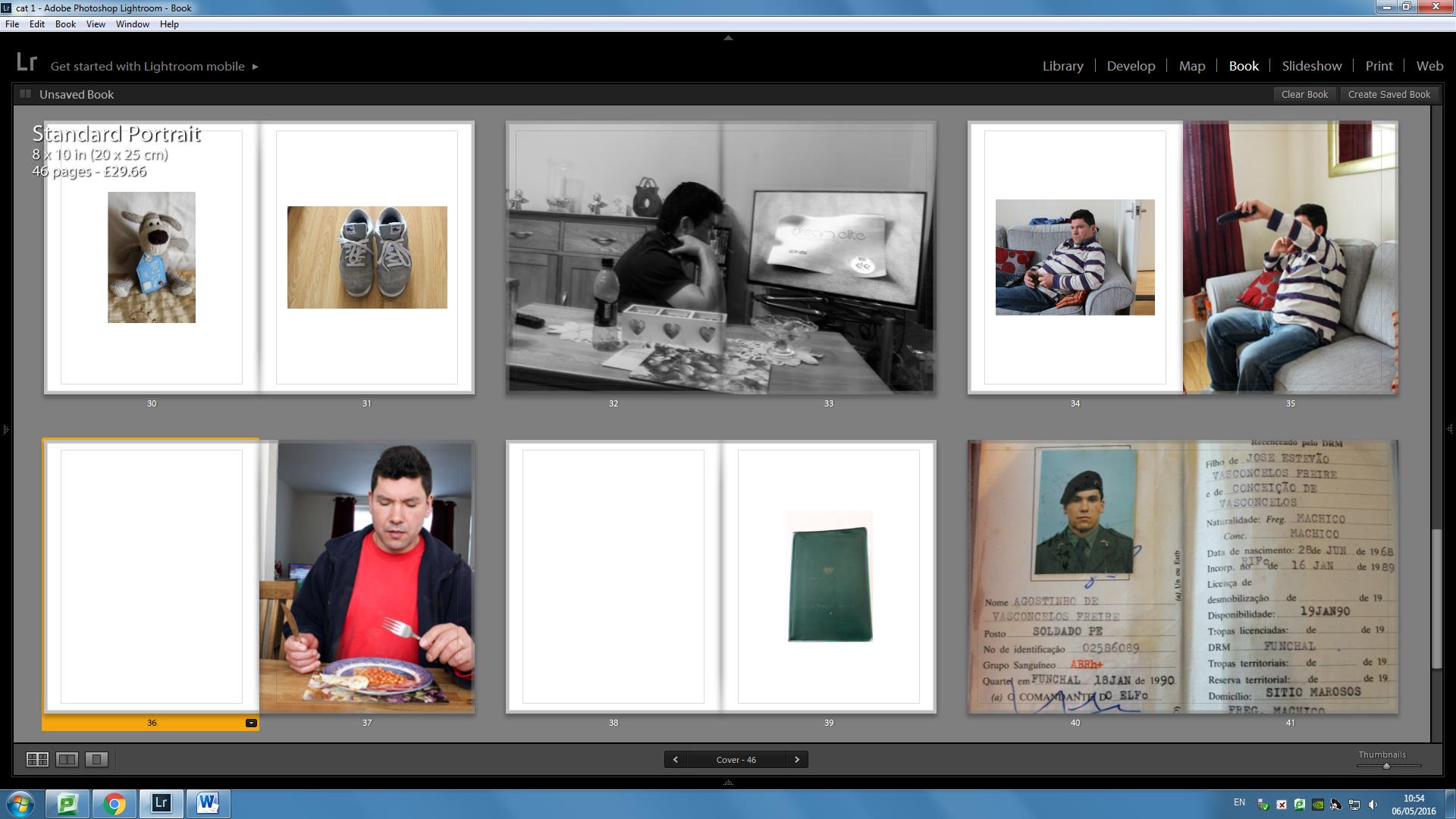
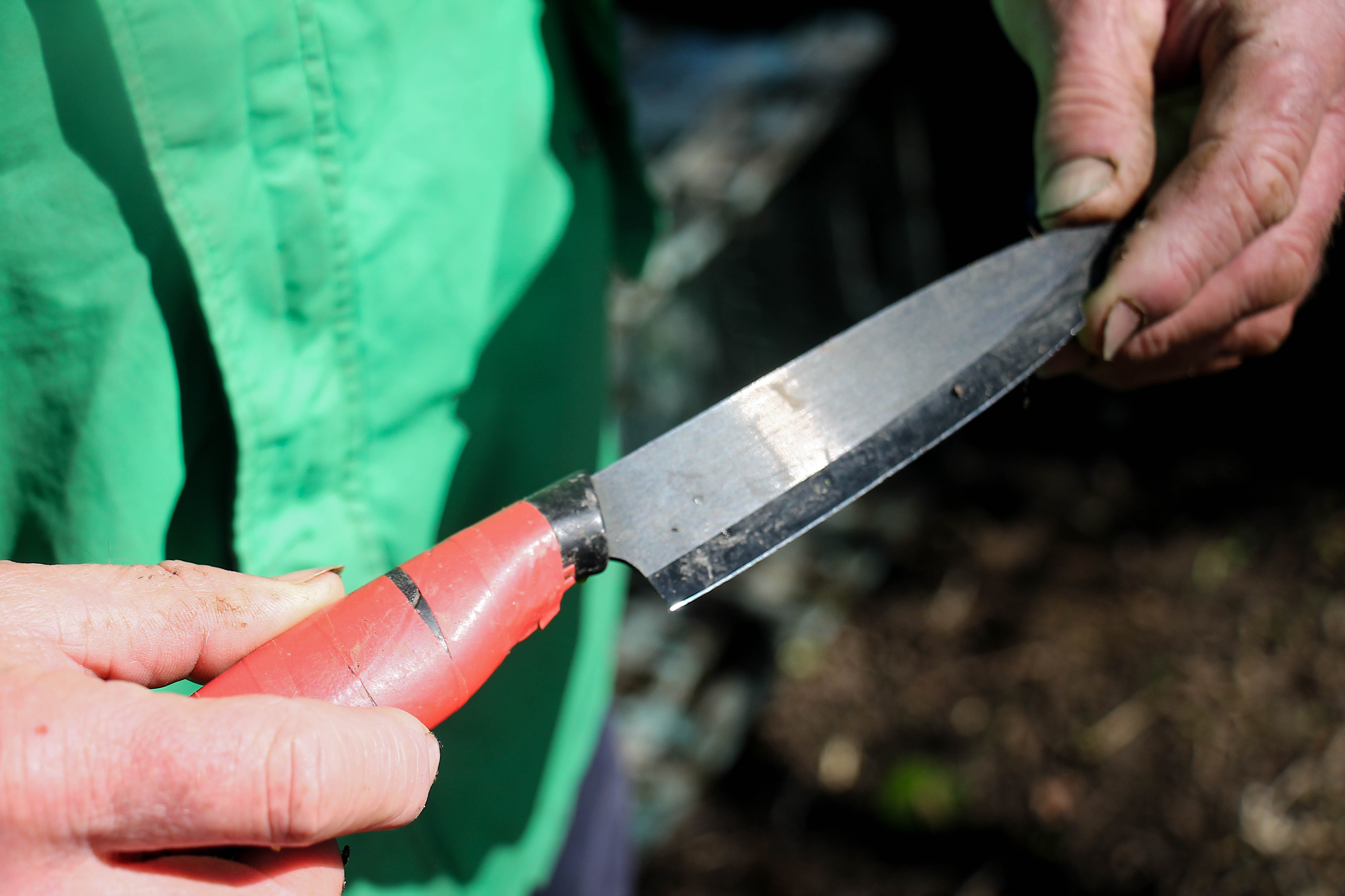
PAGE 13-14
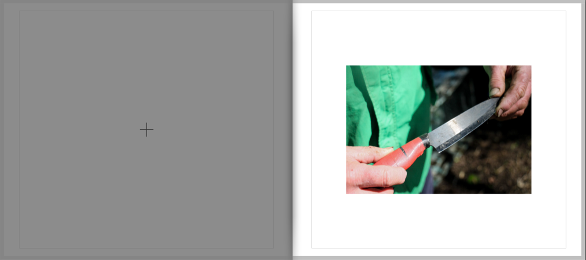
This image – the final of the watercress series, is a close-up of Colin holding a knife. In relation to the previous image, it is linked in the similarities of Parr’s style.
I find that this image is a really strong detail shot which helps to hold the narrative focus together and re-assert a sense of neutrality, which to some degree was lost in the exploration of the general pattern of the watercress theme. It’s simple and ambiguous meaning/representation is fundamental in achieving this objective, because a knife has various meanings.
PAGE 15-16

These two photos are the first of a mini-case study, looking at classic advertising style. These images are strong through their simple but bold representation.
They serve as part of a key study of this project, as the project is effectively centered around exploring local produce. They represent produce in its simplest form and thus serve as a metaphor for broad theme of my investigation.
Therefore it can be considered that this part of the photo-book is key in grounding and directing the overall theme, from which all other images are now bound to.
PAGE 16-17

This is the second part of the case study. It maintains the theme in the previous two pages.
PAGE 18-19

This third part of the case study contrasts directly with the previous two pages. Whilst those images were intended to look as attractive and appealing as possible, thus supporting and responding to the classic advertising style. On the other hand these images are deliberately intended to look grotesque in order to subvert this classic style.
These particular images, very much linked to the influence of Parr more vulgar image in ‘Common Sense’, provides a sense of conflict to the narrative, a sudden and unexpected emergence of hideous unappealing images in the midst of all of the previous images which appeared to evoke a more favourable view of local Jersey produce.
These two image are therefore key because they really start to challenge and question the extent of how Jersey produce is represented, often in a positive and nostalgic light.
PAGE 20-21

These two images continue on the lines of this theme, rugged coarse images which in many ways depicted the chaos and vulgarity often associated with the likes of Richard Billingham.
By continuing this link, the viewer is forced to ask further questions about the link between advertising and consumerism.
PAGE 22-23

After this mini photo-study of food, I returned to the theme of farming, linking directly the previous photograph of a burger to the focus of Tom Perchard’s cattle farm. This first image of the series shows two cows moving from the milking parlor to the barn.
It is a very colourful and powerful image which has an interesting sense of energy and momentum as established through the motion blur, colour and slightly obscured composition. This image is subsequently effective because it serves to resume to intensity established within the previous four pages. The fact it is a two-page spread extends upon such an idea.
PAGE 24-25

This following image is a portrait of Tom Perchard. It is a classically composed images, in contrast to the more spontaneous nature of the previous images. Further it contrasts in the sense it is on the page in a more conventional manner
I included this slightly more conventional image in order to re-assert a sense of structure to the narrative, as well as to slow down the tempo. This is effective in the sense that it not only mixes up the intensity of the narrative, but also re-establishes a clear sense of focus which may have been lost by the chaotic sense of the 4 images between pages 18-21
PAGES 26-27

These two images are candid, informal portraits of the two farmers who work in the milking parlor. The image on the left depicts the transfer of milk into a bucket for transportation, whilst the image on the right shows the actual milking process.
These images a both very grainy, vernacular and coarse in style. My intent in choosing these subsequent images is to attempt to depict the manufacturing process of milk in the simplest and most grounded way as I possibly could, in order to get to the truth behind how Jersey Milk is processed.
By this point in the narrative I am starting to uncover and pick away at the illusion of advertising images. I believe that the content of this images serves to greatly develop and advance this process.
PAGES 28-29

This image moves away from the indoors setting to the outside. It is a double page spread depicting the outside of Tom Perchard’s office.
This image is a strong landscape shot which is very calm and reflective in nature. In this sense the image serves as a break within the developing intensity over the last few pages and returns to a more central focus.
Furthermore, this image serves to change the mood of the narrative, which prior to this was very chaotic and cluttered. This serves to re-establish a much needed sense of order.
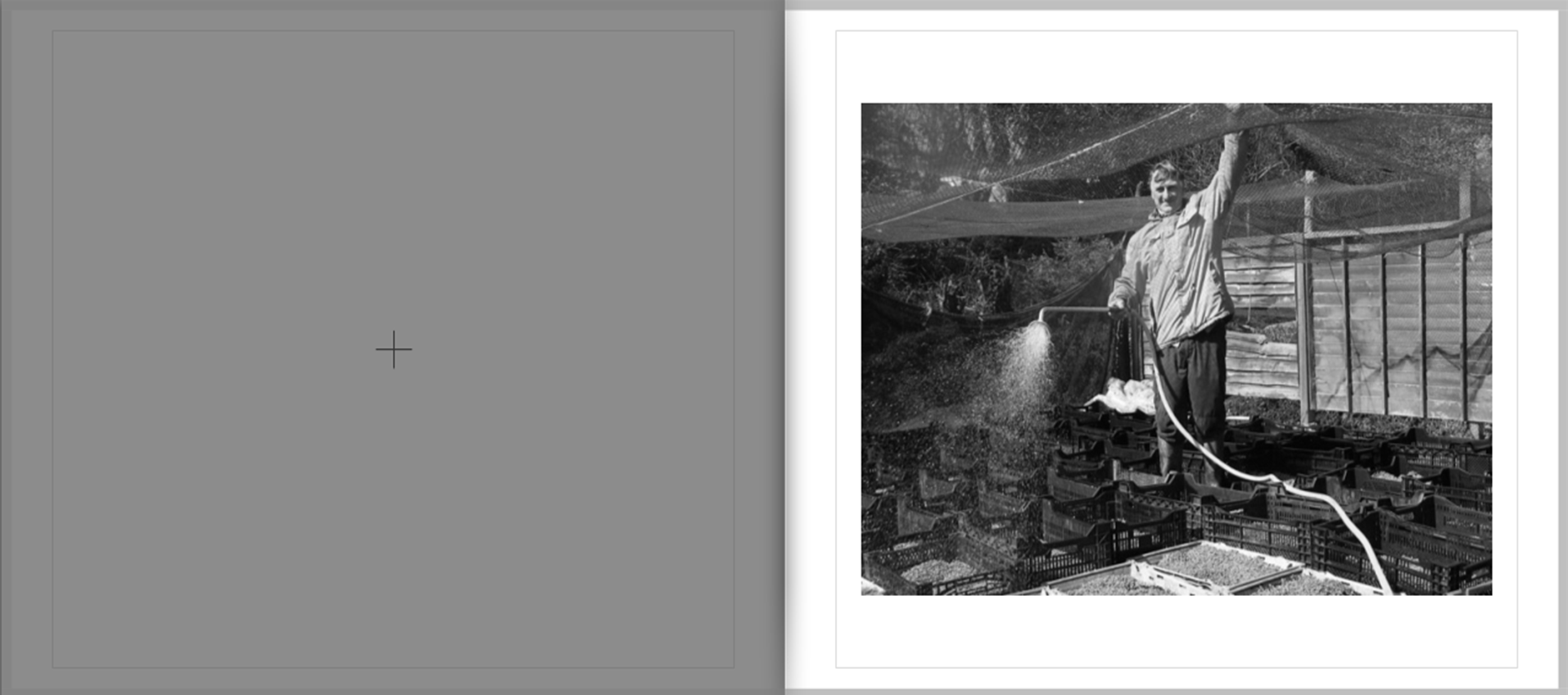
PAGE 30-31

Continuing on this outside setting is two images of equipment used by Tom Perchard on the farm. These images very much reflect the distant and considered approach I noticed frequently when studying the work of Wildschut.
They are very observed images an continue apon the sense of calm associated with the previous image.
I selected these two images together because I found the contrasting blue with red gave this sequence an interesting degree of contrast. Nevertheless, the bold appearance of both of the images mean that they link well and flow naturally together despite this juxtaposition of calm and aggressive colour tones
PAGE 32-33

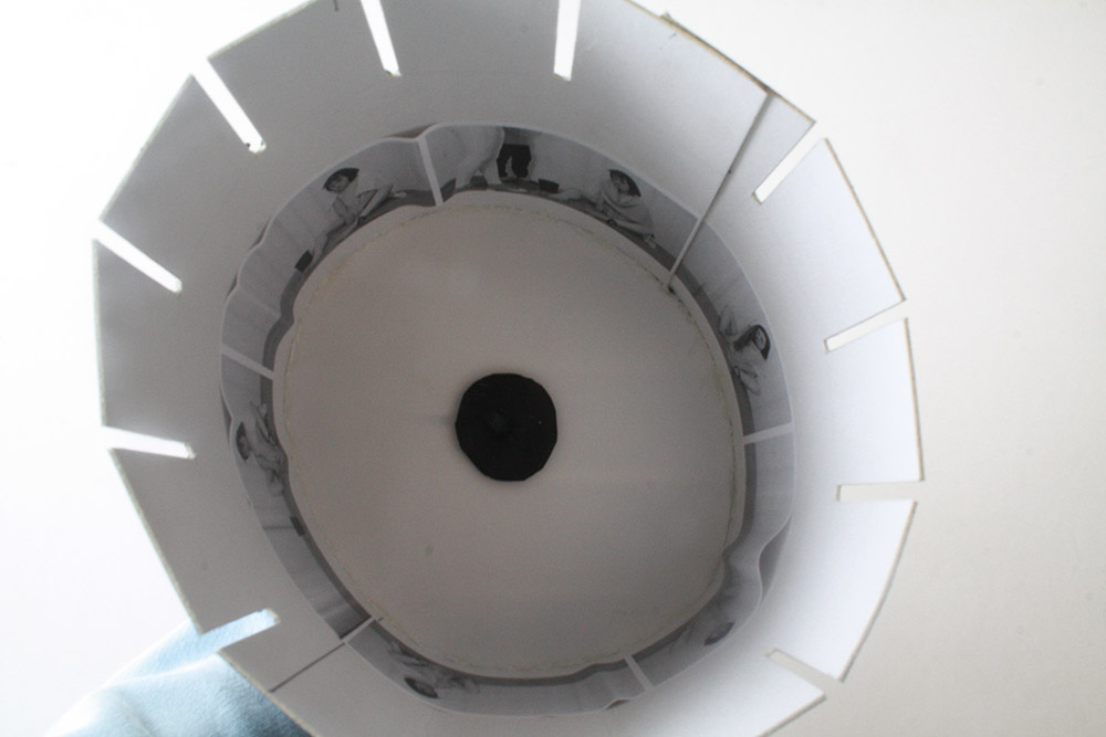
On the next four pages, there is another mini case study , this time exploring a collection of still-life images on Tom Perchard’s farm.
This image of a lamp shade in a barn in a very strong image because it has a well defined visual presence combined with a high level of detail. The image has a very nostalgic feel, linking to some of the previous images in earlier on in the story.
By providing specific focus shots in an image such as this, I am helping to build up a more specific story of different aspects of the farm. This helps to extend the viewers understanding of how local produce is sourced, but in a way which is subtle and poetic, without disrupting the overall flow of the narrative.
PAGE 34-35

Continuing this mini-study is two further still life images. The photograph on the left is an abstract depiction of a pipe. The photograph on the right shows an electricity box.
The two images are very abstract and have no direct meaning. This is fine because the main purpose of these two images is not to display anything in particular but instead to show more of a mood and mindset. The image on the left for example can be considered my own personal reflection of the narrative so far, hence the inclusion of the shadow. The contrast of this image subsequently serves as a metaphor or my conflicting views over the course of this investigation, concerning my views of local produce.
PAGE 36-37

This is a formal portrait of John, who works as a fish monger at the ‘Fresh Fish Company’. This image follows on nicely from the previous because it maintains the stark monochrome contrasts and development of texture.
This image continues the traditional documentary style images which I began to develop in the recent Tom Perchard series of images. This features are evident through the careful composition, black-and-white display, and generally balanced composition. This old-fashioned style maintains a sense of charm similar images of this style have helped to assert and express.
I find this is an effective image in conveying traditional aspects of Jersey culture as it shows John, a Jersey-man, wearing a beret and dressing in typical attire associated with fisher mongers. It therefore re-asserts the local theme of the project.
PAGE 38-39

Continuing the theme of the ‘Fresh Fish Company’ shoot, is these sequence of images, depicting close-up images of some of the display in the shop.
This is just a little extra feature which provides subtle clues about aspects of the shop. It serves as a key factor in gradually winding down the mood of the narrative. At this stage of the story I am making a brief return to the style of Parr, through this quirky close-up documentation, a factor I explore in much greater detail in the following two pages.
PAGE 40-41

This image, which depicts a customer picking up a lobster shell is very ‘Parr-like’ in approach, owing to the fact it is close-up and highly saturated.
The bright, chaotic nature of the image returns a sense of vitality and liveliness into the narrative, which is somewhat lost by the more calm and objective nature of images within Tom Perchard’s shoot. This is key in maintaining interest from the viewer in this late stage.
This is one of the key images in the story because of its intriguing and obscure nature. The ring on the hand, as well the hand’s interesting features in general create a captivating image which embeds greatly within the viewers mind. similar to the effect Parr inevitably achieves in many of his images.
PAGE 42-43

As the previous image sought to lighten the overall mood, I chose this image to maintain this aspect.
This image is a spontaneous picture I took of Vicky talking to a postman, who is one of the regulars at the ‘Fresh Fish Company’. This is a very light-hearted image, depicting a conversation as it takes place. Although it arguably is not relevant directly in terms of looking art Jersey produce, it is instead more an observational image which looks into the dynamics of the relationship between shopkeepers and customers – a interesting development and slight de-tour and addition to the overall basis of the theme, which is effectively in slightly breaking up the narrative and adding something a bit different and unexpected
This image fits well into the story because of the spontaneous sense to the image, created completely through the events as they unfold, a re-occurring theme throughout, in particular when linking back to the images taken on Colin Roche’s farm. I included this image bear the end because I think it helps to round of the image well due to its reflective nature and very open ended meaning.
PAGE 44-45

For the final section of the project I wanted to include 3 images featured as single and double page spreads, over the course of 6 pages. The image I chose for this final section are some of the strongest over the course of this project and define the three different aspects I have been attempting to explore; the produce, people who make the produce and the livestock.
This first image was taken at the Lidster Family Butchers in the market place. Although it is a formal portrait which is classically composed and presented, it nevertheless has a degree of spontaneity combined with a certain free-flowing feel to it.
It is a very simplistic image which serves to show people involved in creating local produce as friendly, positive and helpful, something which I can say from my own experiences over the course of this project is indeed largely accurate.
This image has a very strong visual presence, due to its well-rounded detail and high-level of contrast. It is therefore in my view a strong enough portrait to end this part of the investigation on.
PAGE 46-47
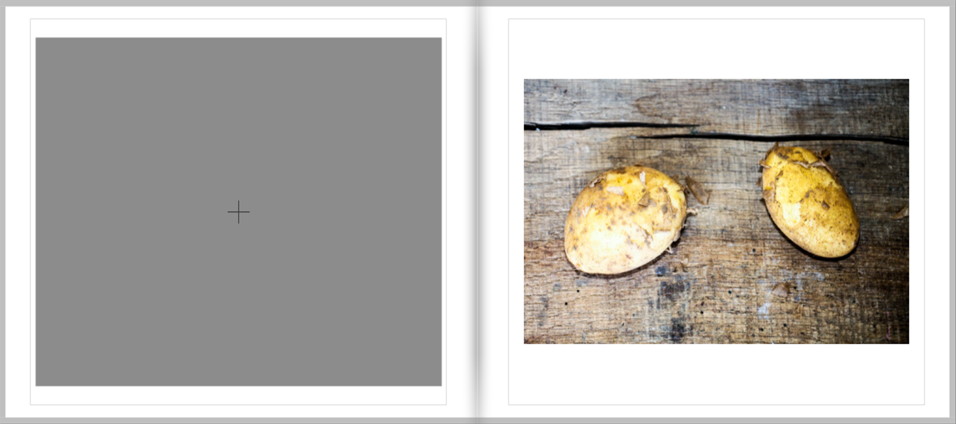
Continuing on the theme of simplicity is this still-life/close-up image of two Jersey Royal potatoes on a wooden background. This image is very simple because I have simply photographed two potatos as they have been freshly dug, which no attempt to change or manipulate lighting.
In many ways, the style of this image is a metaphor for what I wanted to achieve in this project, to bring Jersey produce down to its basics and create an honest, reflective presentation and portrayal of produce. The style of this image a find meets the balance between the over-emphasized nature of Parr’s images with the equally over-the-top nature of traditional ‘advertising language’ which in contrast distorts the view of products to the other effect.
This image explores one of the most famous Jersey products in a way which evokes very little fuss, which in many was is a challenge to the overbearing nature of a degree of advertising language, by documenting it rather than exaggerating or endorsing it.
PAGE 48-49

This final image of the photo-sequence is in my view, one of the strongest of my images have have used throughout the course of this project.
I was taken on Tom Perchard’s farm and shows a cow glaring into the camera in a piercing manner as it is walking away from the milking parlor into the barn.
Such an image works well in ending the narrative because it is quite a strange an to some degree an unsettling image which, without specifically/explicitly stating anything, serves to imply and bring certain questions to the attention of the viewer, a distinctive image which leaves an abrupt and forceful ending leaving the viewer slightly perplexed.
![IMG_1073[1]](https://hautlieucreative.co.uk/photo16a2e/wp-content/uploads/sites/9/2016/05/IMG_10731.jpg)
![IMG_1074[1]](https://hautlieucreative.co.uk/photo16a2e/wp-content/uploads/sites/9/2016/05/IMG_10741.jpg)
![IMG_1078[1]](https://hautlieucreative.co.uk/photo16a2e/wp-content/uploads/sites/9/2016/05/IMG_10781.jpg)