I am going to be creating a Leporello in the style of Lina Hashian and Ed Templeton, to show the dual sides of love from a contemporary and not contemporary perspective. This will include other material such as photographs from my family archive, as well as images I have kept of my friends over tine. I feel this aspect can help level out the narratives presented on this leporello and can depict certain stories that people can relate to or empathise with.
Specification statement and algorithm:
to use Appropriation as a source of manifesting profiles of people usually perceived and associated on Social Media against those considered ‘normal‘ ways of courting love.
Final Images for my Photo-book (Traditional)
These are my final images for the traditional side of my Leporello:
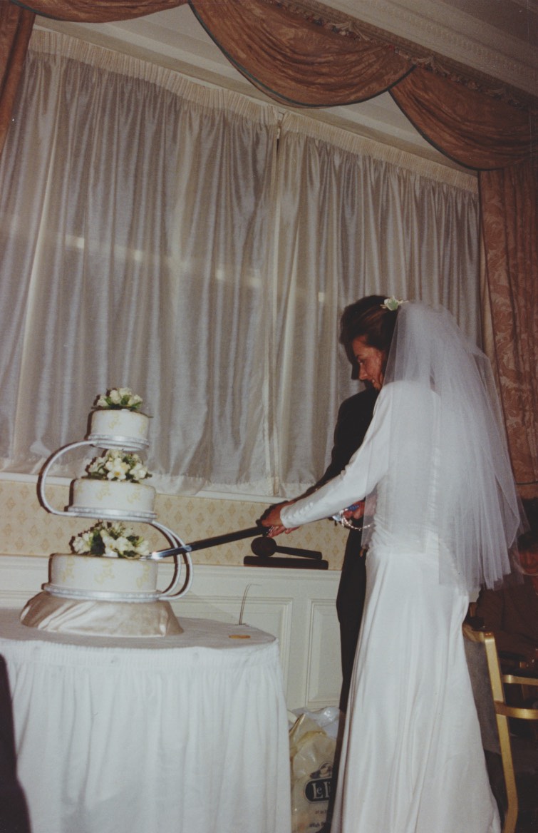
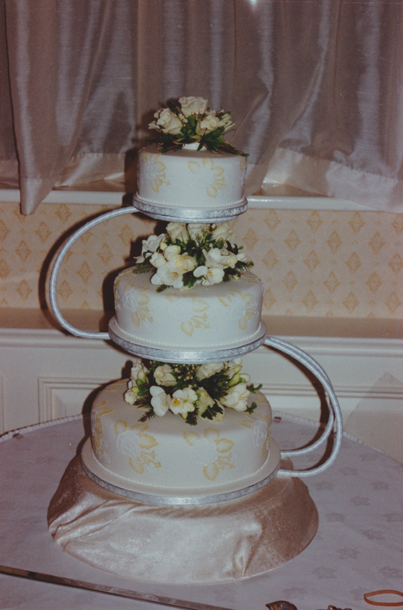
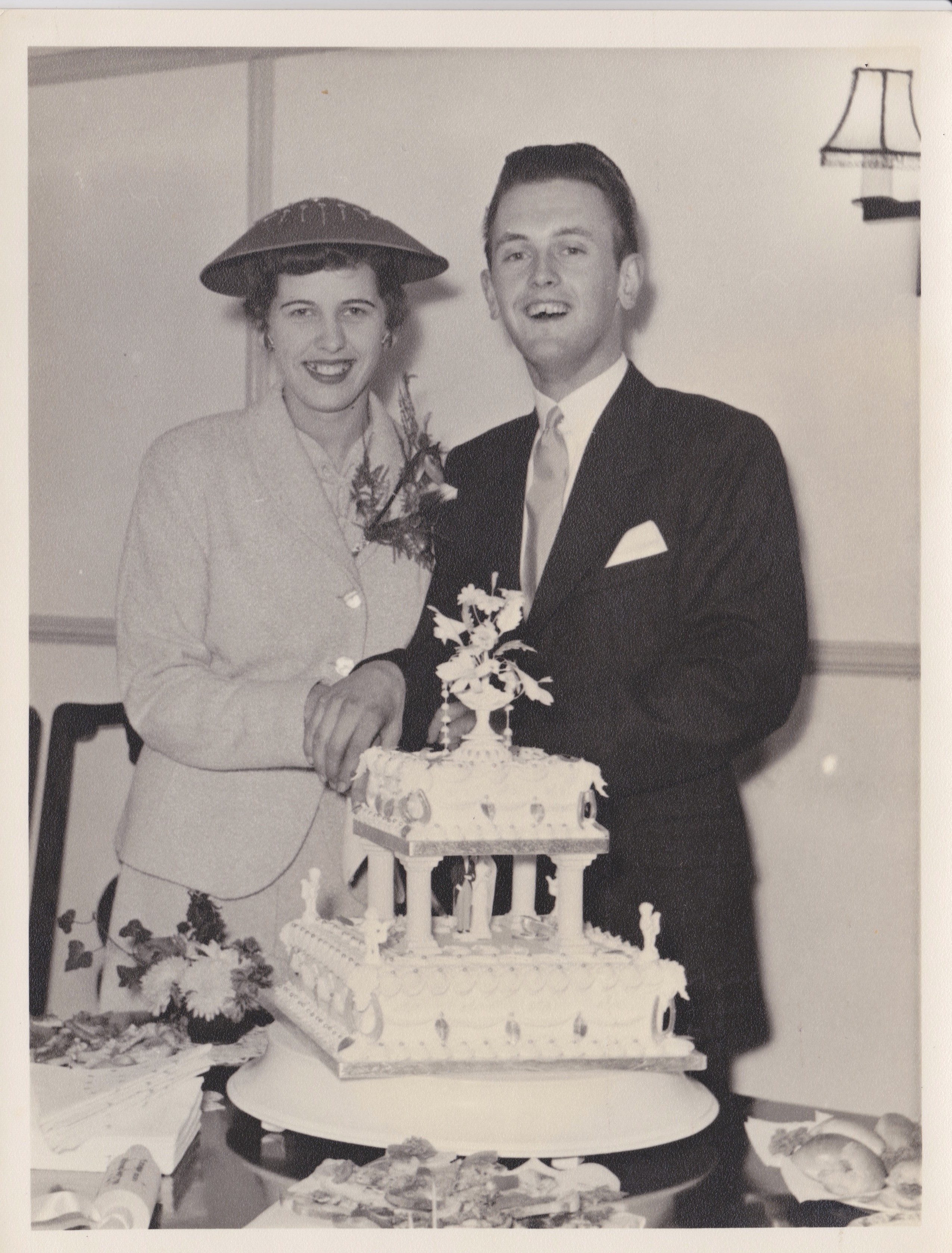
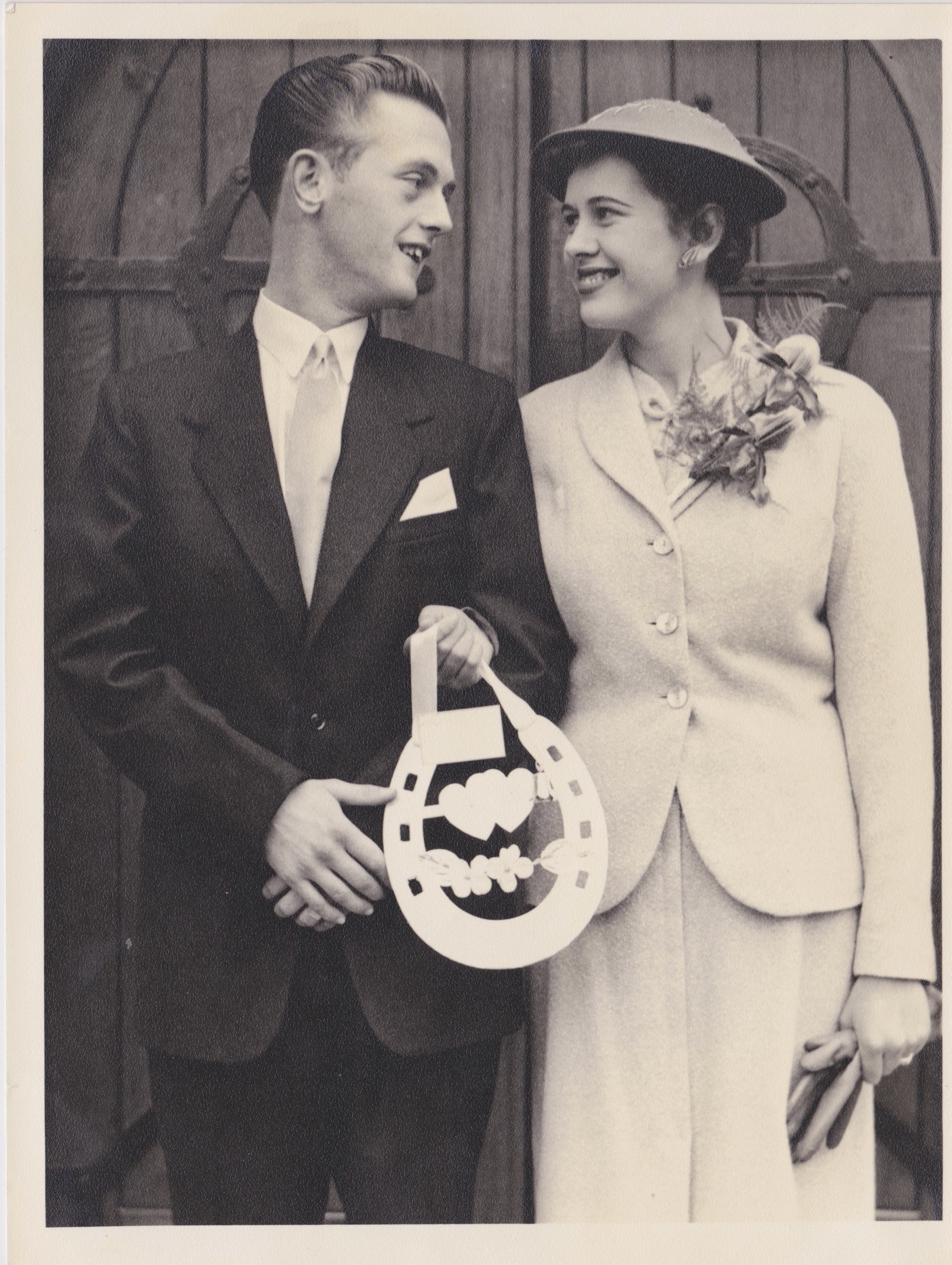
Mum and Dad
The first series I have selected are my family archival photographs. I felt using these was a really important aspect as my project as a reader can follow the journey of their relationship just by giving them a selection of photographs. The first two images inspired me as I felt this could be a good comparison towards the works of KesslesKrammer’s “USEFUL PHOTOGRAPHY 010“. Krammer’s ongoing use of typology has inspired me as repetition is an ongoing theme. With this in mind this is why I have included two images of the wedding cake of my mum and just by itself as I think during a wedding, the cake is one of the most notorious features in a traditional marriage.
The image of my parents above I thought was important as it makes it clear what the celebration is really about. However, I think this image also poses an important argument that even though finding love is alternative in contemporary society, the celebration of your wedding has pretty much always stayed the same.
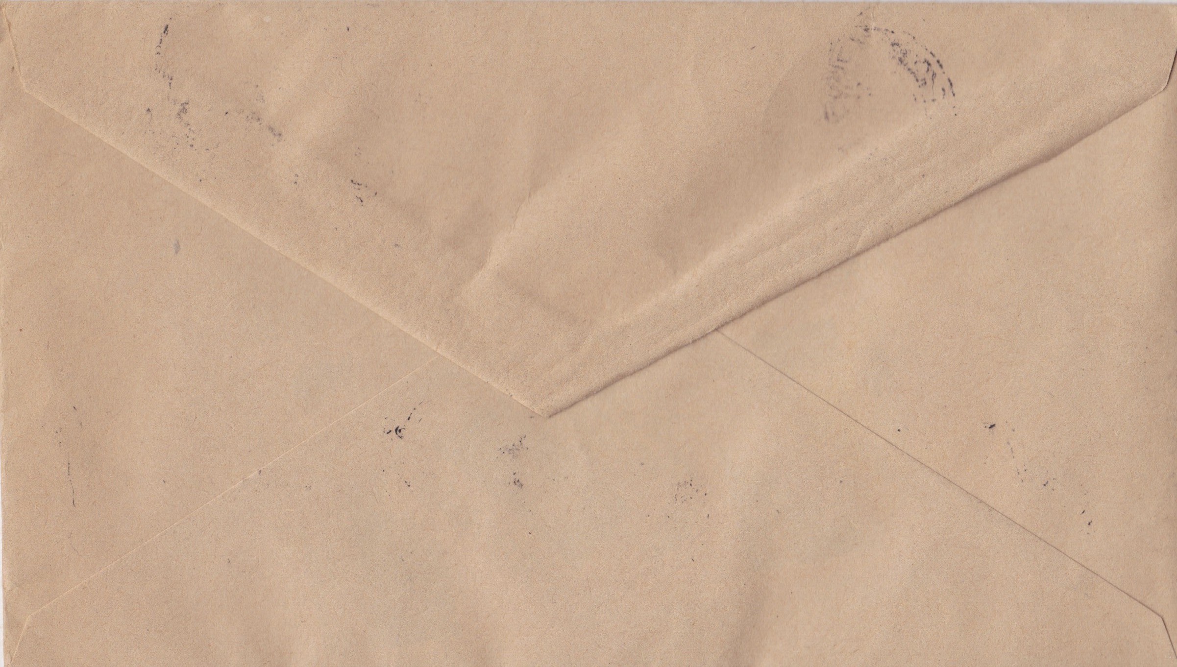
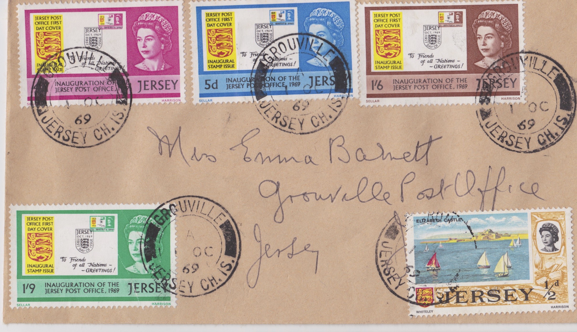
In the style of Ed Templeton, I have included material such as this envelope to make the reader get a more personal response to this project. This letter was written to my mother when she was very young, and indicates the time and the place of production and destination. I felt this was an important feature in order for the reader to feel a sense of background within my family, therefore empathising with the images more easily.
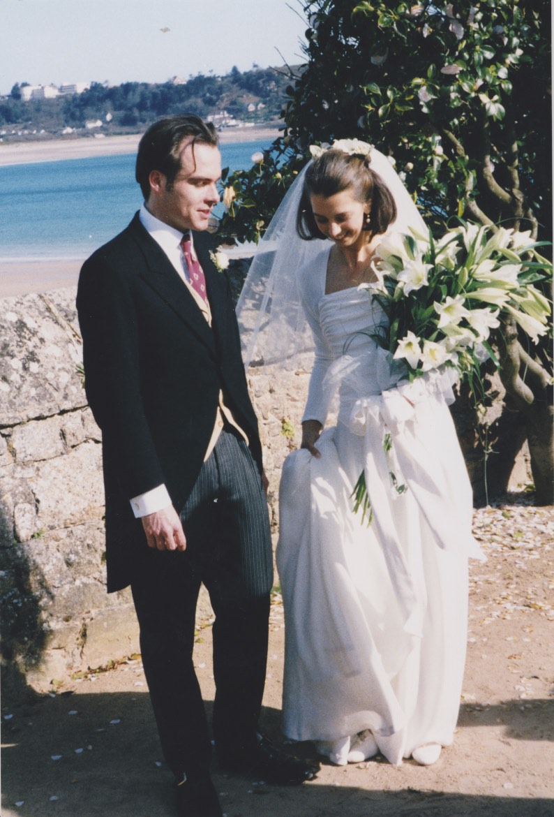
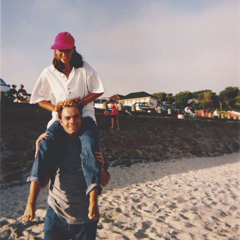
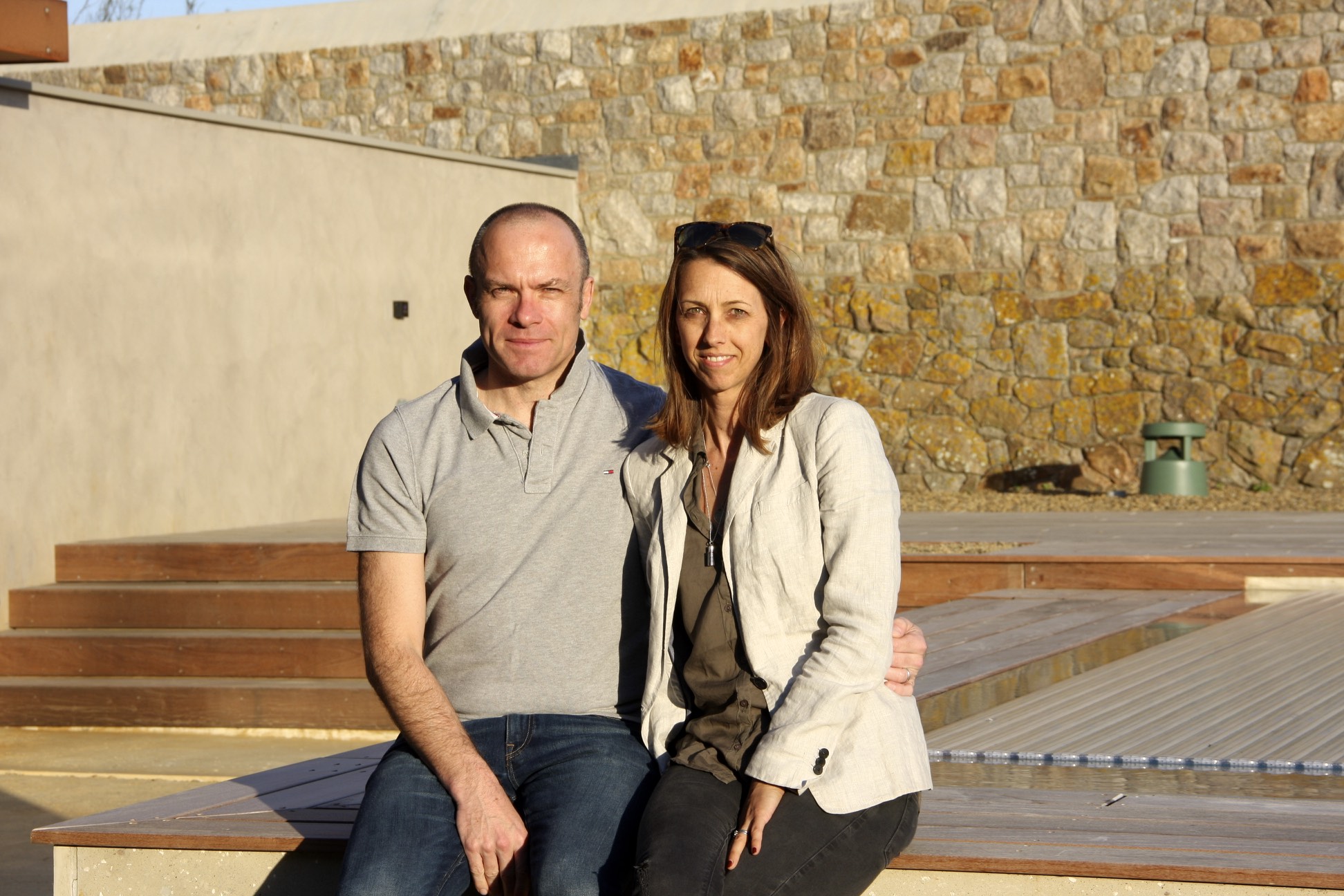
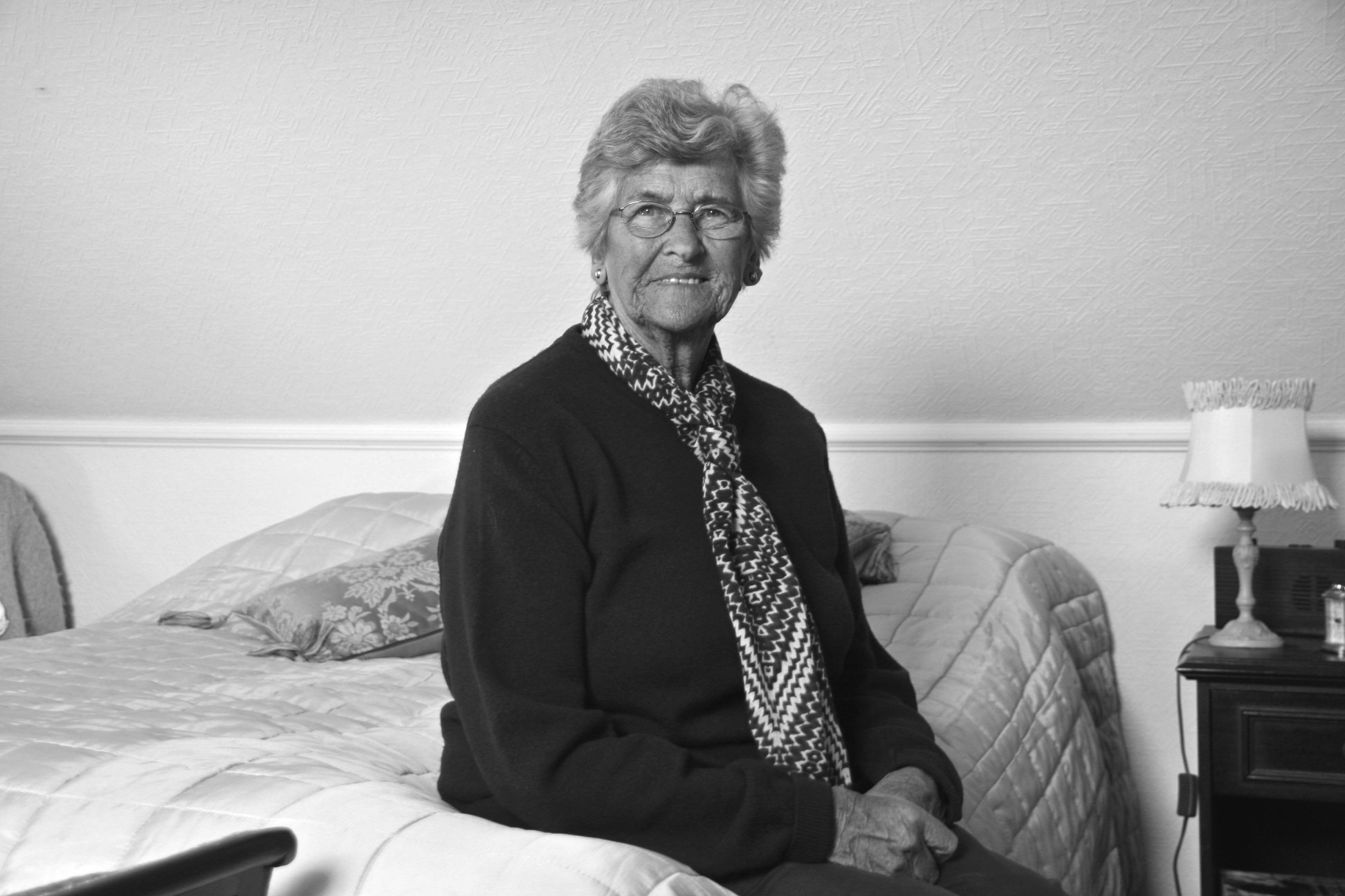
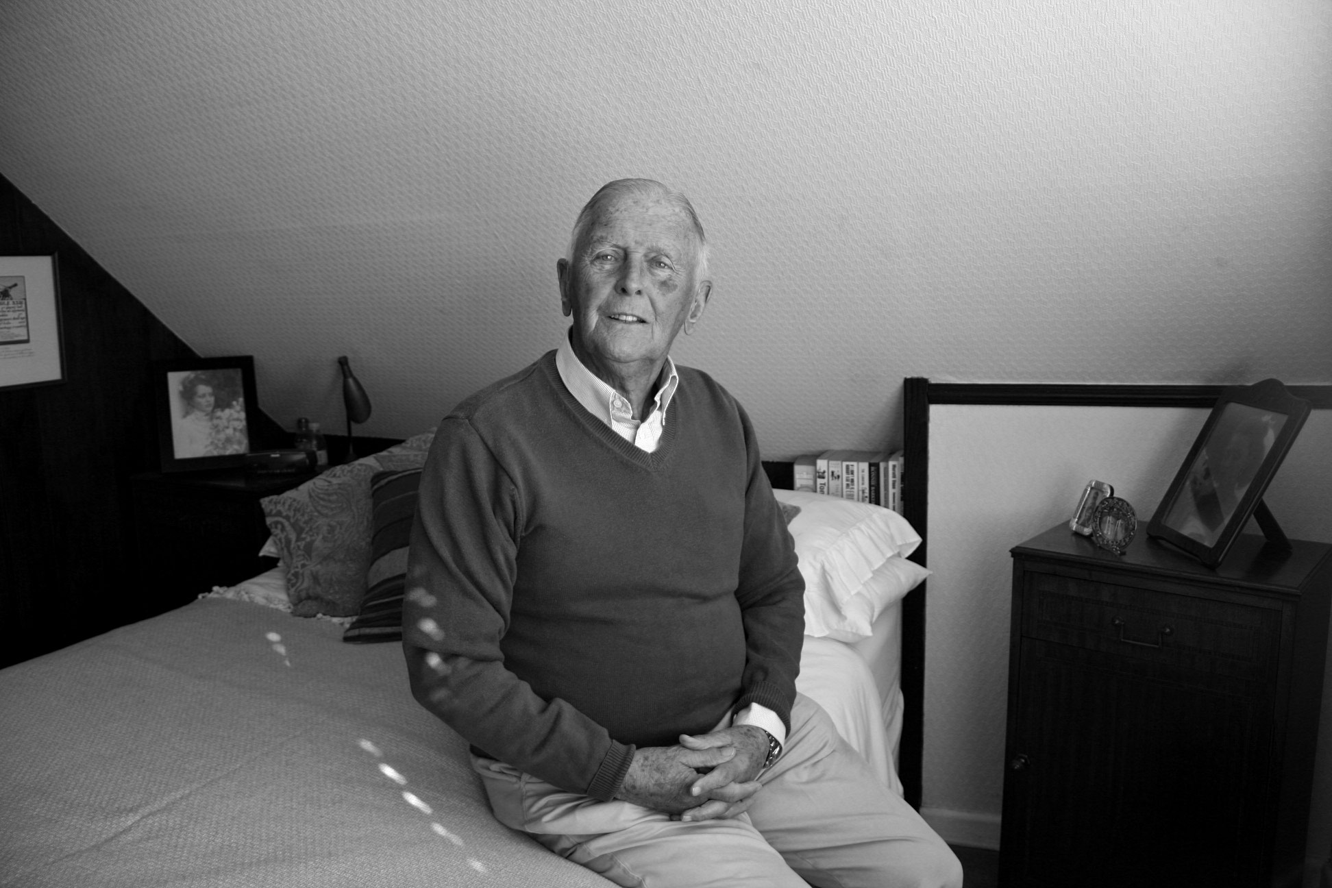
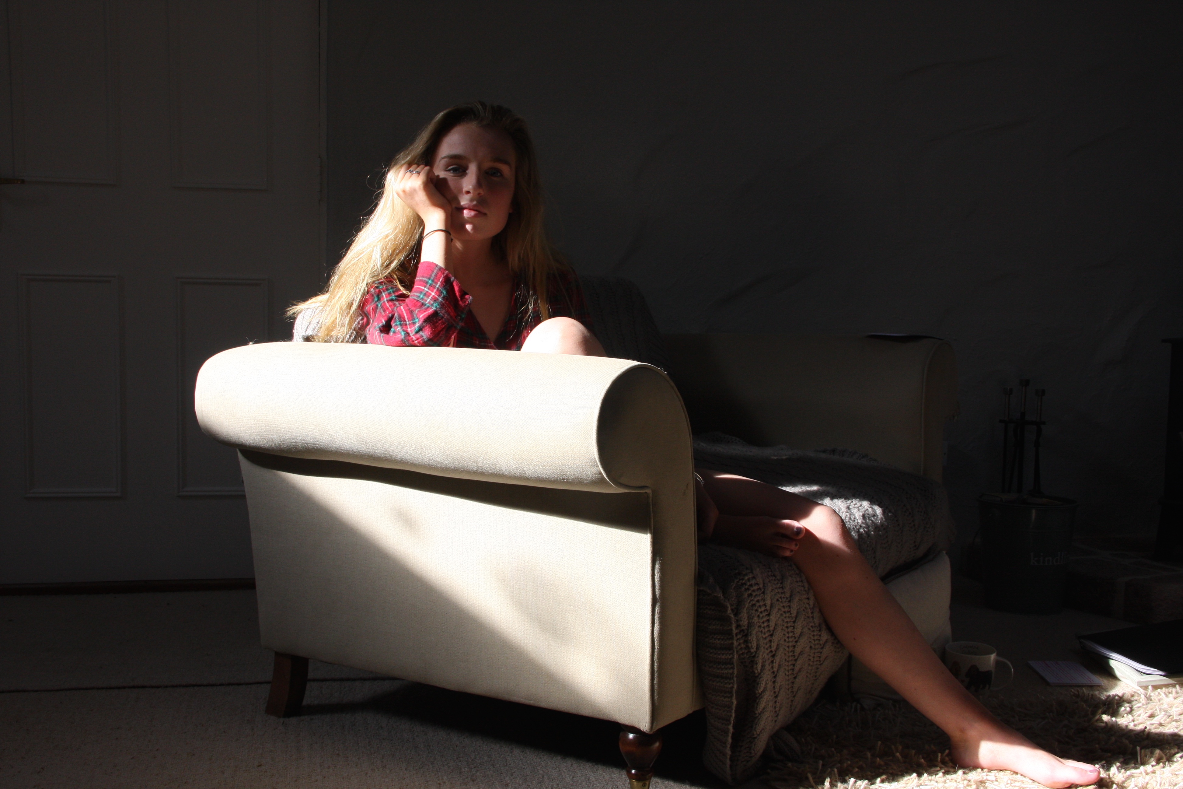
This image which I have captured is a contemporary representation of how my parents are still in a very happy relationship. I want the reader to understand my parents relationship like a story and how it unfolds over time. This is why I have captured an image so recently in order for this narrative to progress.
Nanny and Pops
For my investigation on my grandparents, I have used various recourses in the style of Ed Templeton, in order for the reader to get a better sense of context, and how important it is and has been influenced upon my grandparents.
This image shows the poster our family used during the celebrations of my grandparents diamond wedding anniversary. I felt this aspect was extremely important in a way in which it allows people to get a sense of how long they have been together. The reader, this way, can step back and compare this with contemporary relationships, as 60 years ago was a very different era and time surrounding an allot more diverse and social culture; such as, World War ll.
In conjunction with the images I had used before of my mum and dad, I felt using this photograph alongside the others was important as it can be used as a follow on to KesslesKrammer’s “USEFUL PHOTOGRAPHY 010“. This way, the reader can almost see my leporello as a small typology, as I will fit the images in a grid like form in order to replicate the works of Krammer and how significant it can be.
Including images of my grandparent’s wedding day is also a good way of showing parallels between my parents, as this tradition is shown to have been ‘passed‘ on through generations. Below is also an example of a contemporary photograph of my Nanny as well as my Pops, in order to show how they are very much together. Even though I have captured them in two different frames, I feel like the narrative has flowed by incorporating previously the archival material that I’ve extracted.
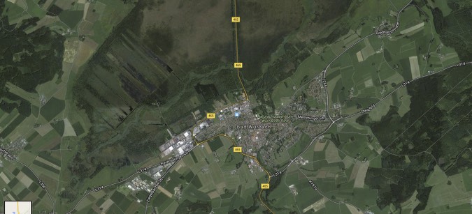
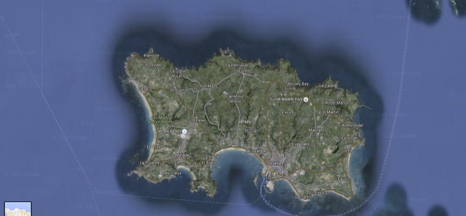
Below shows how I have incorporated images that I have screen-shotted from google maps, in order for the reader to locate and trace back memories just by single images. Alike what I did with my parents, the uses of letters and other sources of material transgress the boundaries of how events over time have seriously effected the relationship of my grandparents, in this case however, for the better. With the deportation of my Grandfather to Bad Wurzach, and my Grandmother remaining in Jersey, this liberation post war shows how their relationship can be too, using these sources of material as a metaphor for how love is ‘united’. This can also be empathised with the works of Templeton, as I’ve used various mediums in order to narrative this passage of time.
Paula
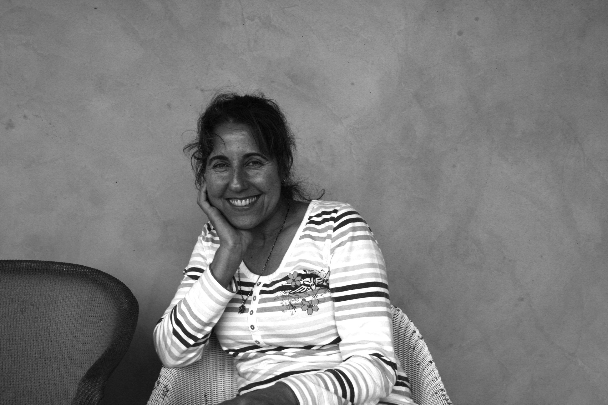
My final reference which I have used for the ‘Traditional‘ side of love is my family friend, Paula. I though it would be nice to get an alternative outlook on relationships that I am not aware of as much, like my grandparents and my parents. Because of Paula’s Portuguese heritage, this dis-farmilularality made me interested into how her relationship with her husband, Joseph, may differ to ours. This in itself, can create a dual between the differentiation of languages and culture, as well as comparing contemporary with the non.
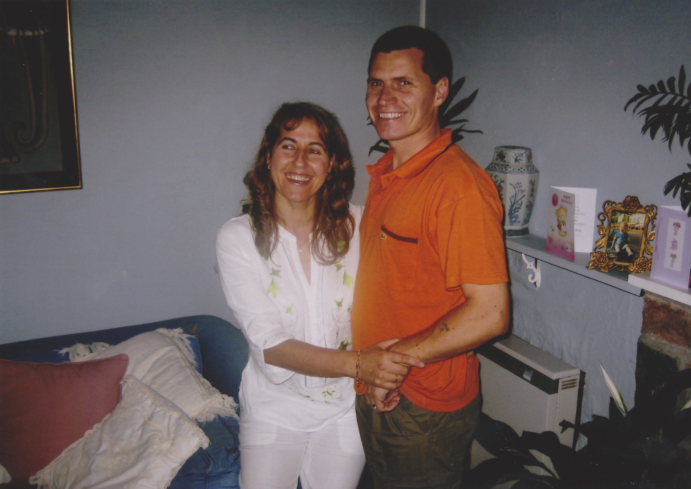
My archival research for Paula was me extracting an image of Paula and Joseph, taken about twenty years ago. This vague and delicate aspect can drive the reader to interpret it for themselves, almost in the style of Lina Hashian.
Final Non-Traditonal Pictures
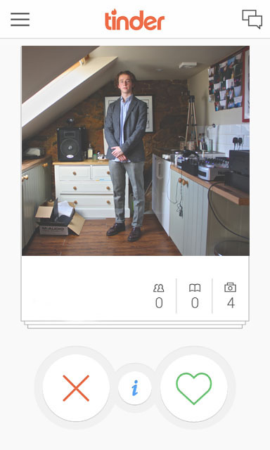
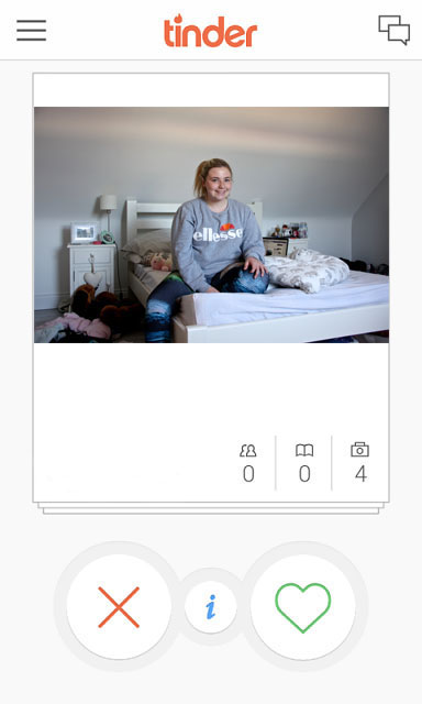
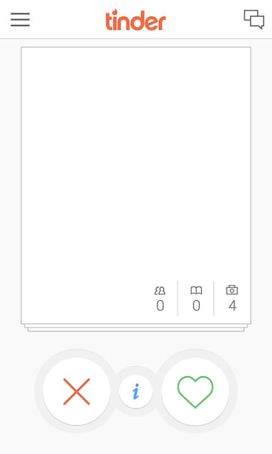
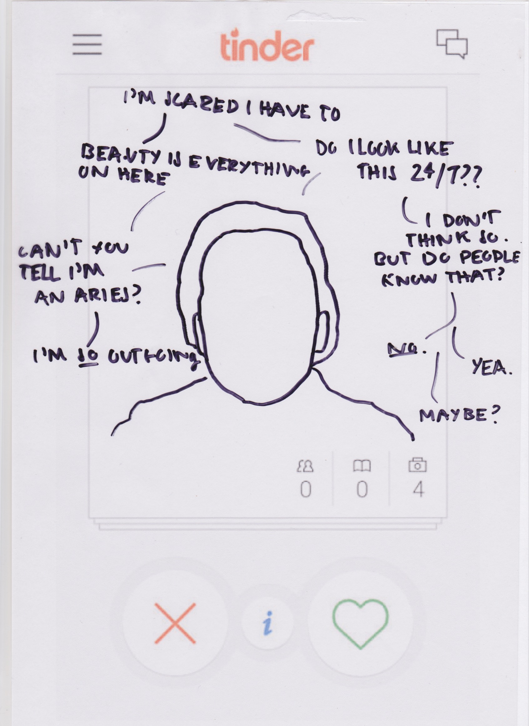
For my final images for the Non-Traditional side of love, for all the images I have included my edit of the ‘Tinder‘ frame. I felt this was a good way to get a modern perspective on how Love in influenced by social media, and in particularly mobile apps and website like Tinder which promote the act of Online Dating.
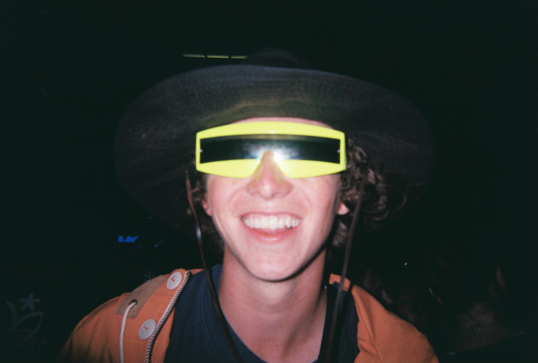
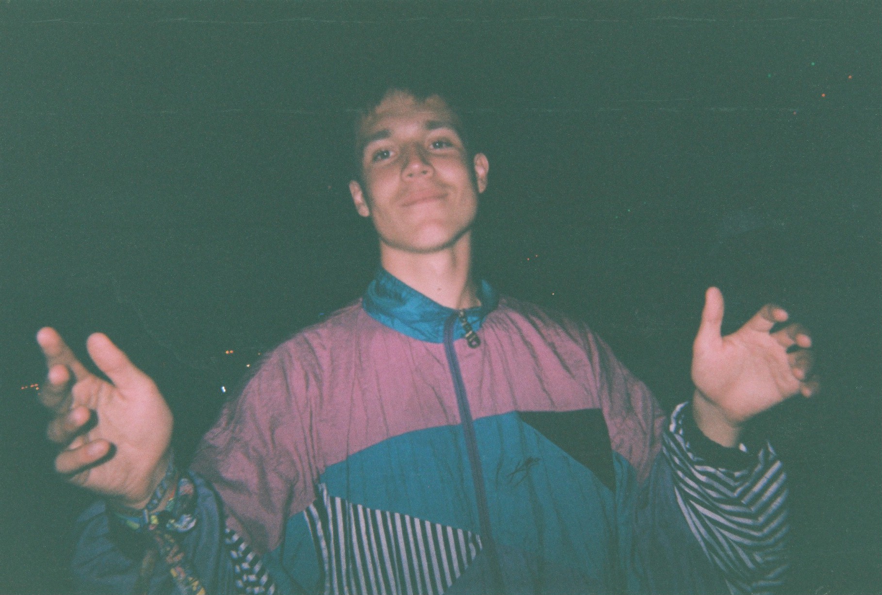
William
This images shows how I have endorsed the image of William into the Tinder Frame. Using only once image per person, I thought this image was most dominating out of the series I took of will because of the overly vibrant, red colour. This aspect can relate to love in a way which overpowers the readers eyes, allowing them to empathise with how the colour of ‘red’ can relate to love.
I have included these portraits of William also, in order for the reader to get a closer, more in-depth insight of his interests and hobbies. These images promote a more realistic side to his character, juxtaposing with the Tinder frame and comparing with the Traditional side of love.
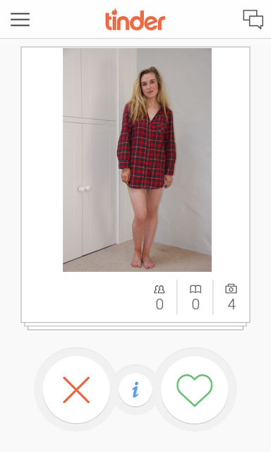
Holly
This is the image of Holly in the Tinder frame. I felt this image I have used is the most strong as it is a full body shot. This image can be seen as truthful as every aspect of Holly is included in this image.
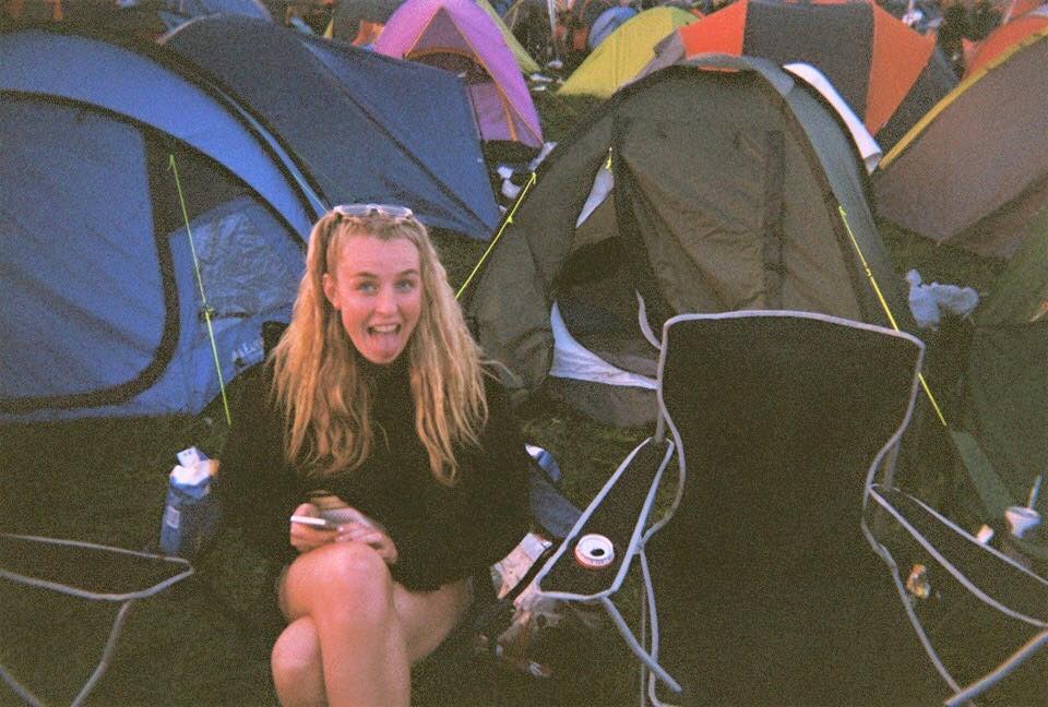
I have also included this image (pictured above) to show Holly’s natural setting. I feel this image contributes importantly to the images flow and journey as the reader gets a closer insight into how Holly is as a person, and how her personality can therefore be interpreted. Below shows a set of images that I have extracted from my own archive. Taken at Reading Festival in 2015, I thought these images juxtapose with the ones previous. This continuously follows the theme of duality, and how this can be metaphorically symbolised throughout my project.
Alex
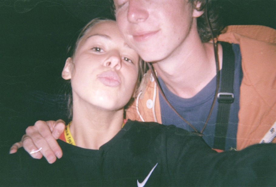
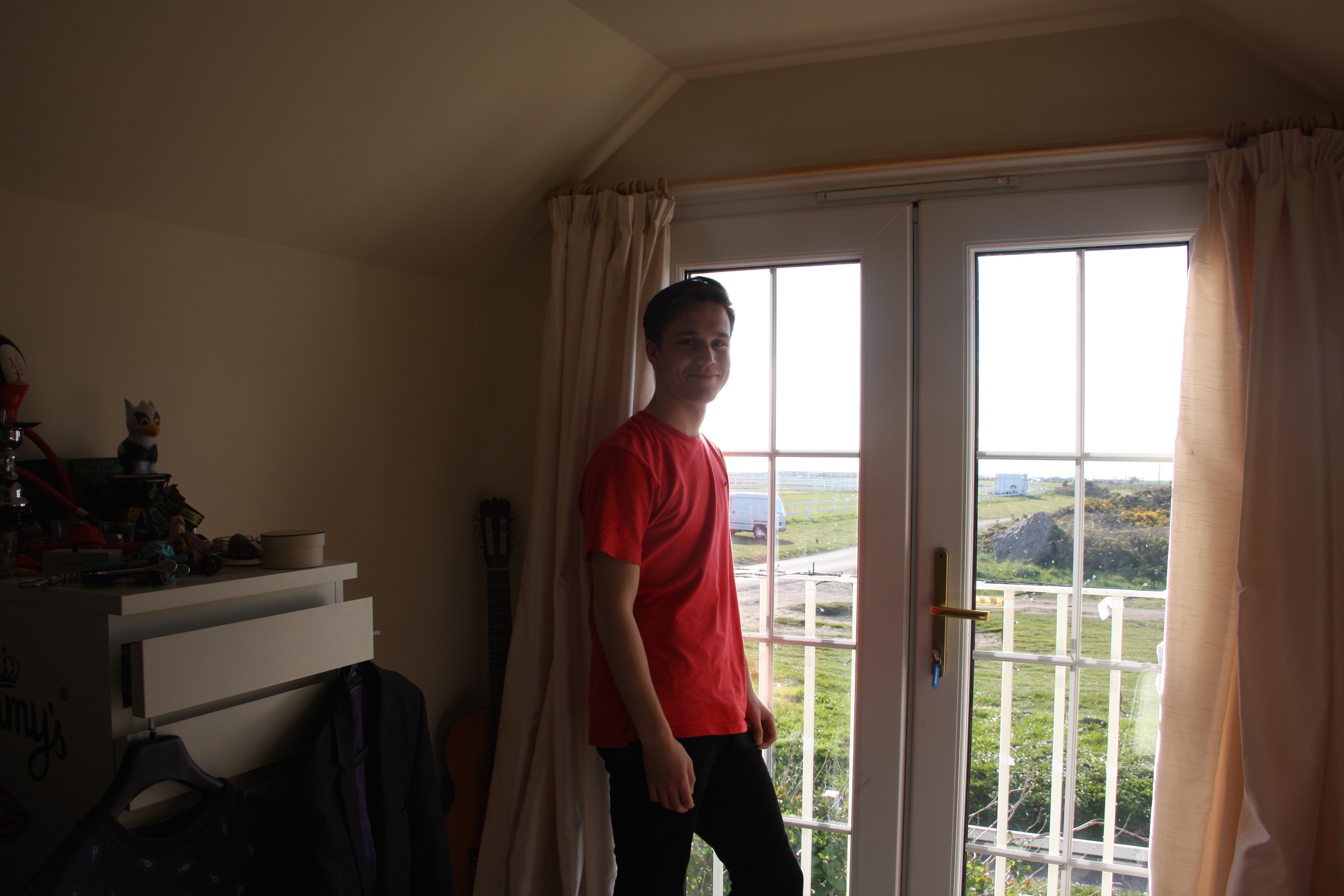
This is the most prominent image of my boyfriend, Alex, whom I captured in order to make my project feel more personal. This image which i have super-imposed into the Tinder frame describes him as himself – in a realistic perspective. The setting around him suggests how he is alike a typical and stereotypical teenager which is something I wish to establish, especially with the comparison with other images in order to maintain a rounded and realistic perspective.
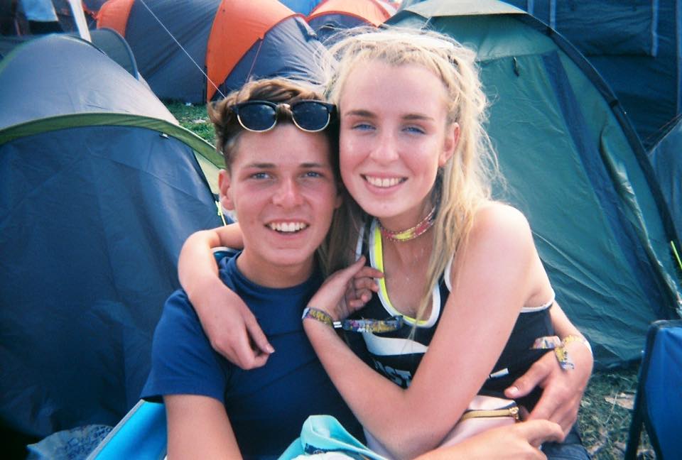
Above are some of the images which I have extracted from my own personal Archive. Taken also at Reading Festival 2015, I wanted to show how Alex’s personality is well rounded. Depicted as someone who is quite timid and shy, to someone who is fun can show that on Tinder profiles, depictions are most usually false.
Myself
Using a blank tinder frame which i will eventually overlap using assotate, and draw on top of it masking its true identity. Because I don’t actually have a Tinder account, I feel like I am manipulating truth by creating my own fake profile, twisting reality as it wouldn’t happen in a real life situation. This is all a response to the MTV TV Show: CatfishThis image shows the overlapping of what my blank Tinder frae will look like on my leporello. I feel this is interesting at the viewer starts to question what the situation is. This could be a response to Lina Hashian as the reader is left to interpret the narrative for themselves.
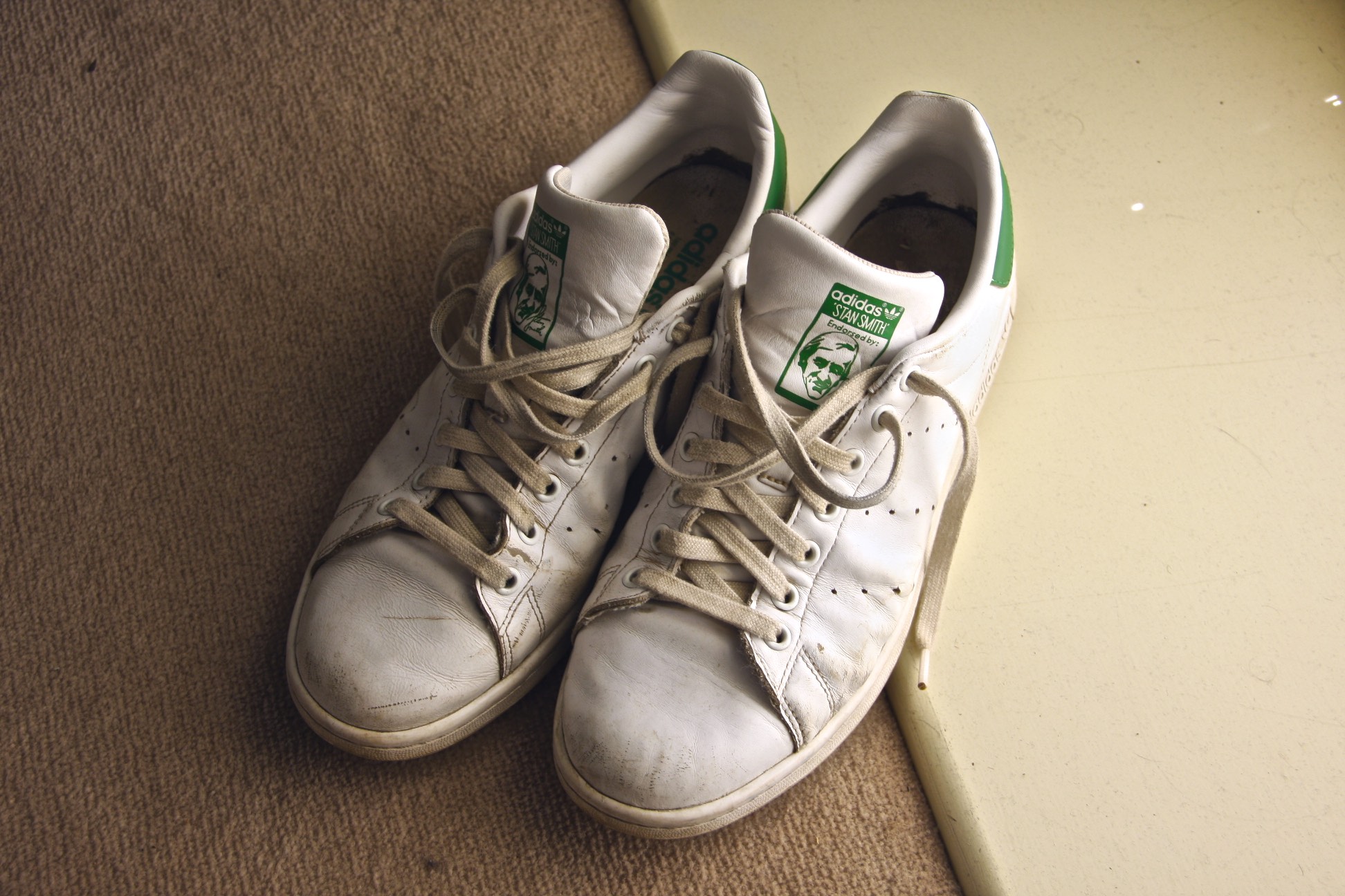
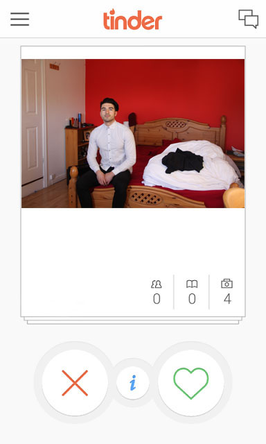
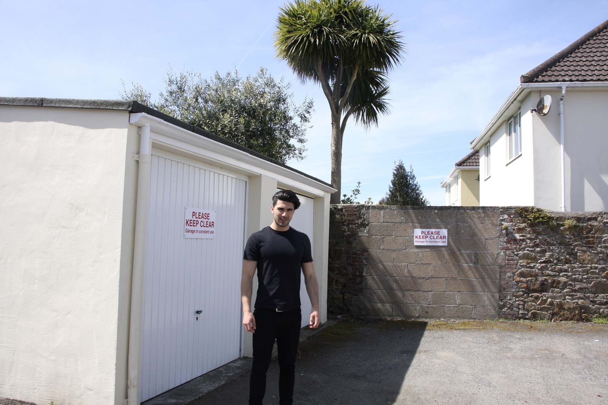
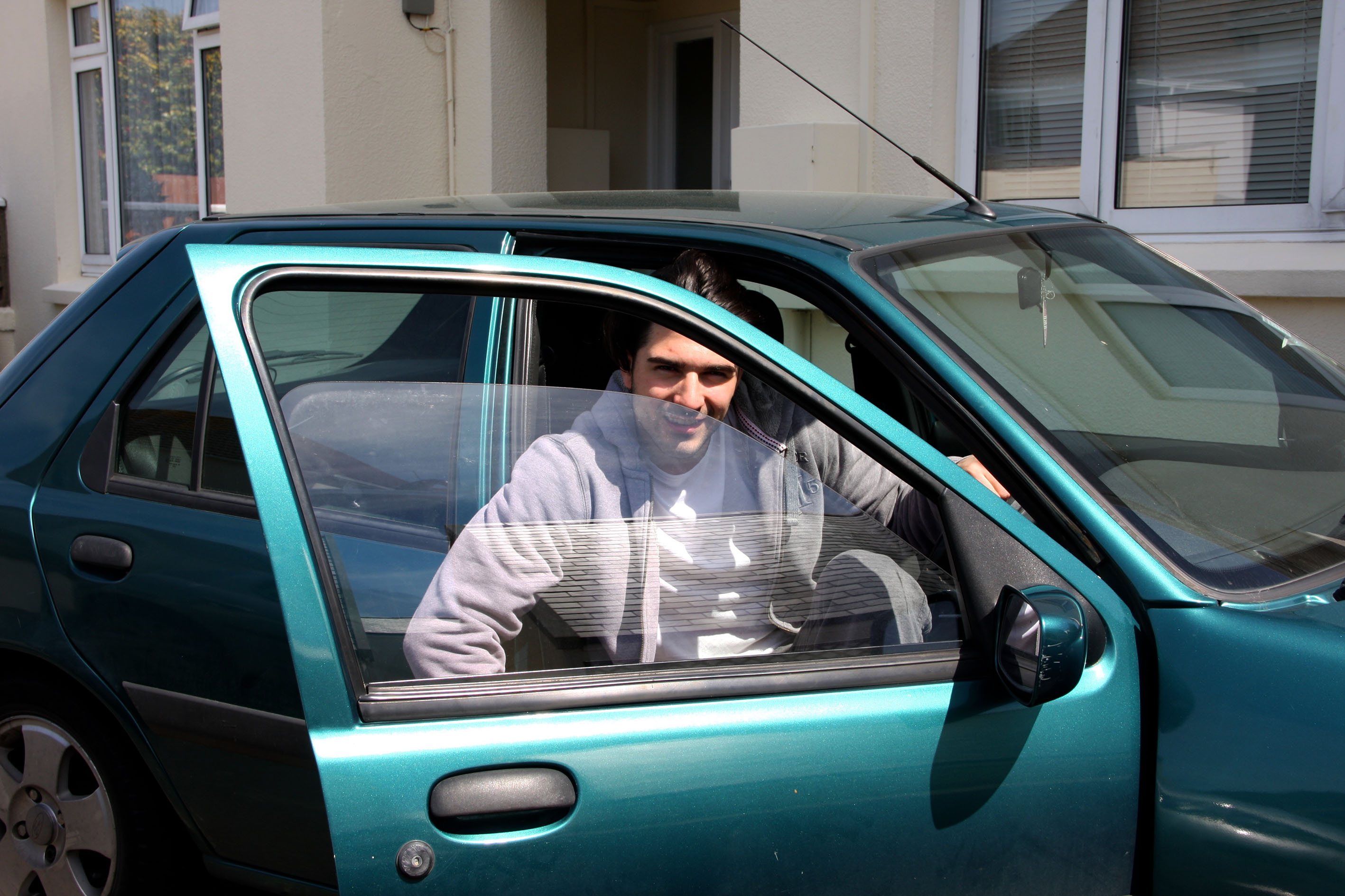
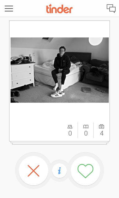
Will
This is my cousin Will’s picture which has been imposed into the Tinder Frame. I feel this image is different to one you’d typically see on an online dating forum which is why i thought it would be significant to use.
Including aspects of Will like his shoes can give response to Ed Templeton, as he has influenced me to show a different side to a character by objectifying certain things.
Freddie
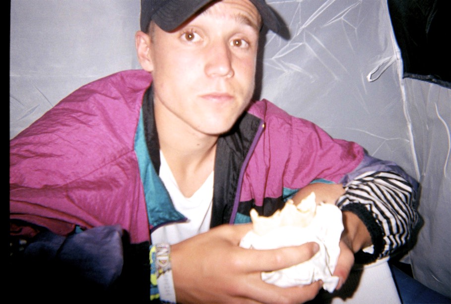
This is my final image of Freddie amidst the Tinder Frame. I Like this image of Freddie as I feel this represents his character. By including his setting, his clothing and his stance, I feel this representation is valid and is truthful, if it was to be used on an online dating Forum.
These images above which I have taken recently I feel represents Freddie’s character further, as it shows his interests in a clearer light. The photographs of his music equipment and the images of him smoking, shows to the reader a more realistic approach to just one single image. This is because Freddie’s picture in the Tinder frame presents him as quite a smart and well-ordered person. So I feel like I’m questioning the truth of Freddie by showing him realistically through photographs.
These images above show my use of archival material. I have references images I feel reflect Freddie’s personality, yet as well including images that me and Freddie are featured. This makes my project more personal to me with the hope people will then empathise with it.
Emma
This is my friend Emma’s picture which I have put in a Tinder frame. I felt this image reflected Emma realistically and shows her interests and personality.
Throughout this exam theme of truth fantasy or fiction, I decided to predominantly on the aspect of truth (more specifically, the truth behind closed doors). My first research point was getting into contact with the women’s refuge in Jersey and seeing if meeting could occurs in which I would be able to learn more about the help that is available in Jersey. After thinking that it was not longer a possibility by not getting a response, I decided to just focus on the stories that I have been told by friends (with their consent), and found the photographer Donna Ferrato, whom I found highly inspiring. I couldn’t believe the work she produced and it encouraged me to produce staged images. I then came across a photographer called Daria and her visual outcomes were really inspiring for me. I responded to her by creating my own body of work which experimented in the style that she used. There was also another photographer (Valerie) who was also very important and influential throughout my work, as I used statements that she had shared to represent the voices that had been heard.
Very close to the exam the women’s refuge contacted me and although there was no time to create anything visual from this, I found out lots of information thanks to the chairman of the organisation Pat. It would have been very beneficial to have spent more time on the topic of the Jersey refuge for women and It would have been interesting to get to know more of the volunteers more personally and explore their roles within the organisation but I am glad that I got a change to know more about the organisation personally.
Overall, I am quite happy with the outcome of this project. At first, I was quite nervous as this is such a touchy and intense subject and I was afraid of doing something that would offend someone somehow, however I think I did okay and I am happy with the experiences and experimentation’s within my body of work. If I could go back and improve this project, I would probably create more shoots to have more of a variety of images to choose from to create a final outcome.
When i first started my project and seen the theme was ‘Truth, Fantasy or Fiction’ my mind went blank, i was so unsure about what i was going to do and it worried me, but after i researched the words a bit more and looked into it i knew that i could think of my own idea and then try and adapt it into one of the three words. The word i was leaning to the most was fantasy as i knew i could try and create my own fantasy world through the use my camera and Photoshop. After i had thought for a while and done a little more research i knew i wanted to something involving the use of colour as my last project was very dark and black and white oriented. This is when i started to research photographers that revolved around colour and came across some nice photos which i knew i wanted to recreate and experiment with.
If i could change anything or if i had more time then i without a doubt i would’ve taken more photos/shoots, my lack of shoots meant i wasn’t able to experiment as much with my photos and show the best of my ability. I’m happy with the shoot that I’ve got but i know if i was to do 1 or 2 more shoots, i could have came out with some better finals and i would have had more photos to try and alter in Photoshop to recreate some of the photographers work that i researched. Another thing i would’ve done if i had more time was reach more into the surrealism side of my project, i attempted a small experiment with the photos i had but it wasn’t really surrealism and it interested me also so i feel i could’ve come out with some good finals for it.
As a project overall it has been mostly successful and i have enjoyed doing it, there was some problems i ran into however i have attempted my best at working around them and finding the best possible solution. I feel i have grown as a photographer and the project has helped me develop my skills and shown me new skill sets that i didn’t know i would have before i started.
I am quite pleased with this shoot considering that it was a very cloudy day and even started to rain at one point but i still managed to give the vibrant and colourful look to each photo like i planned. The shoot was taken at around 7pm so the light wasn’t amazing especially because it was overcast but as the sun started to set it gave that orange glow over the island however i only was able to capture one more photo at that point before my camera ran out of battery which was very unfortunate as i could’ve captured some more warm feeling pictures.
Improvements
If i could improve anything about this shoot i think it would be the time of day that i done it, because of the overcast whether i was limited to the amount of photos that i could’ve edited into coloured photos because Photoshop found it hard to change the hue over a grey background which i had to try and work around. Another thing i would’ve improved if i had more time is maybe explore into the back streets of town instead of down the main high street, this may have lead me into some better photos that i didn’t know i could’ve got.
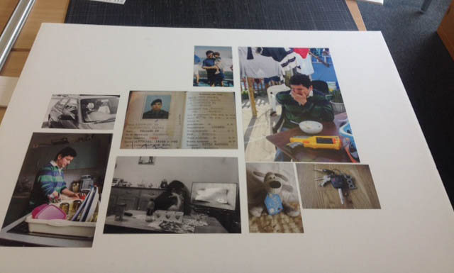
For my finals I have produced a sequel book to my first book ‘Domestic’ which is about my mum who works as a Domestic taking on the role of a breadwinner within my household which has abdicated from her culture’s traditions. This second book is about my dad who in some ways has taken on the stereotypical role of a female which is staying at home and doing household chores, the reason for this is he has a chronic back pain which has inhibited him from working. Both the books combined show the role reversal in my household. For this book I have been photographing him daily doing household activities, I think that these photographs have revealed isolation and a lack of emotion from my dad this may be because he is ‘restricted’ in the things he can do. I have included archive photographs such as the photograph of me and my dad and his army identity card to show his past jobs. I have also included objects which represent my dad and that emphasize him as a dad. With this book I think that I have managed to reach out to my dad because we don’t have a very close relationship, he is closer to my younger brother like I have mentioned previously this may be partly due to cultural preferences. Through out making my book I have observed that there is a strong tendency for females interact with females whilst the males mainly interact with males. Therefore photography has almost given me a ‘passport’ to get to know my dad better. I think this project was much harder for me to do then my first photo book because of gap between me and my dad, l was able to photograph my mum with much more ease and it was more natural to do. However, with this project I think I managed to get personal photographs of my dad although he didn’t agree with it at first. An example of this is I wanted to photograph my dad when he was out with his friends and the Portuguese male culture, however I wasn’t able to go. Overall I think I was able to get a wide variety of photographs and I am happy with my final outcomes. I think my final outcomes turned out to be a lot better then I had expected because I didn’t feel it was easy to take lots of photographs. The book is a good representation of my dad and it shows his true likeness. It links into the exam theme truth, because I think shows ‘ the truth behind closed doors’ by showing that the male isn’t always the breadwinner and take on more female domestic roles.
My starting point for the exam theme ‘ Truth, Fantasy and Fiction’ was looking at each theme individually and brainstorming ideas that I could explore under each heading. I stared off my looking at surrealism and the idea of blurring the lines between reality and fiction because it was something that interested me. However, when I couldn’t think of a good idea to do with surrealism, I began to look at documentary photography under the heading truth. This is when the idea of making a sequel to my first book Domestic came up. I then started exploring this idea by researching documentary photographers.
I think my research on documentary photographers aided my work because I was able to choose what type of documentary photography I wanted to do because I looked at staged vs natural documentary. My research into documentary ethics led to me to avoid taking staged photographs. I also got a better understanding of what I wanted my photographs to look like. Finally, my research gave me inspiration as to what I wanted to achieve and transmit to the viewer through the story telling.
I have also printed out the key images from my book individually, so that I can mount them up to make a smaller sequence which also tells the same story, but the viewer can see it all together rather than having look through like in the book. I like the flow of the mount because your eyes move from one picture to another rather than jump from one to the other. I think these key images work well together and you’re able to see the main story line. Again the photographs were printed to the size of their importance. I placed the photograph of me and my dad at the top of the mount because I think its one of the most important images as I’ve reached out to my dad through this project. I then placed the large image to the side rather than in the middle because although it is a key image its large size would have made it over powering. I placed the similar picture of my dad in the kitchen on the opposite side. I also did this with the picture of my dad in the car and the car keys so that they didn’t cash. Finally, I put the photograph of my dad fixing the TV and or his army identity card in the middle because they are both key images.
The first shoot of this project consisted of a visit to the ‘Fresh Fish Company’ which is run by Vicky Boarder. I went down to the shop, which is a old, re-furbished boat and took a series of images of the shop display, some off the customers, as well as the people who work there. The aim of this shoot was mainly to ‘ease’ into the project. To have a neutral and balanced theme, looking at the retail side, very much a middle-ground between the types of images Parr takes, to that of Wildschut. I intended over the course of this particular shoot to find out a bit more about the types of local produce I could look into. Vicky proved to be very helpful because see gave me a list of a few farms that I could look into to visit. She gave me a very good variety of different places to look into, such as Gordon Blake’s Tomato farm and Colin Roaches’ Water-cress farm. I liked the idea I could look into different Jersey produce that was not just exclusively along the lines of diary or potatoes, but was a bit different and in many ways questioned the status-quo of what really can be defined as ‘Genuine Jersey’ produce.
Shoots 3-5: Visiting Farms
I then proceeded to visit some of the farms which Vicky had recommended. My first visit was to Gordon Blakes’ farm at Three Oaks Vinery. I felt a got some really interesting and strong images on this shoot. However upon accessing the images I only felt there was one image which worked within my narrative. At the same time, this shoot was definitely a worthwhile experience and gave me good practise for which to develop apon.
Next I visited Colin Roaches’ watercress farm. Although it was only a short visit I felt that I got some good images. This shoot, slightly differed away from the restrictions of copying the style of Henk Wildschut, because of the fact the shoot was outside and furthermore, it did not have a huge amount of time and wanted to get as many images done as possible. My subsequent images are in many ways a bit on the boarder of Parr and Wildschut, with images coming across in a style somewhat reminiscent of Parr, whilst hinting at the object approach more so reminiscent in the work of WIldschut. This in many ways found the balance between objectivity and creativity, something which is not always easy to achieve.
My final farm shoot involved visiting the cattle farmer Tom Perchard. Tom has a very large collection of cows, one of the largest in the channel islands. As I visited his farm last year, this shoot was more of a case of expanding on a few of the ideas I explored last year. I spent a couple of hours down at the farm and I was good because I had a degree of freedom to explore the farm on my own. As a result I had a lot of time to carefully structure and compose my images, thus enabling me the opportunity to really explore the theme of Henk Wildschut. I believe some of my resulting images are very powerful and some of the strongest from this series.
Shoots 6-8: Taking images in the style of Martin Parr
These final three shoots were perhaps the most enjoyable. I experimented with trying to take images of fresh Jersey produce in an exclusively Parr like way, close-up and using flash. I enjoyed these shoot because it allowed me a degree of creativity to express with a style which I have been interested in for a while, but have not had the opportunity to explore in its fullest sense.
Shoot 6 involved going into town and visiting the market place. I wanted to get a few ‘Parr-like’ snap-shots of different customers at the market and a few satirical images which looked briefly at the overall theme of the project. For this section I aim to be creative as possible and took photographs of anything I found of interest. I terms of composition, I only got a few images I would consider strong enough to make it in the photo-book. However the main benefit I got from this shoot was to practise and experiment for my next shoot.
Shoot 7 involved taking grotesque close-up shoots of food as a was being eaten. I tried to get the most horrible and vulgar images as possible. I also got a couple of photographs of food as it was being plated up, images which were in no way as vulgar.
Shoot 7 played directly into relevance to Shoot 8, my final and one of the simplest shoots. In this shoot I sought to replicate the classic advertising style of pristine images of local Jersey produce. At first I attempted to set up a mini studio to then photograph the food with. However after attempting this I did not feel that the resulting images were that successful. Therefore I decided simply to photograph the food on a clear table, evoking the same style each time. This in many ways was beneficial because it allowed me use natural lighting to my advantage more, owing to brighter, more colour ‘Parr-like’ images.
Other shoots
As I have a family background in farming I have got a small archive of images I have taken in the past, which have expressed relevance to the overall theme of this project. Subsequently I have used some of these images in the final photo-book.
What have I learned over the course of this project?
I have learned lots of information, ideas and concepts over the course of this Exam Project.
I learned about the ways truth and fiction can be defined and interpreted. Photography and photographs serve in many ways as a boundary/conflict of truth and fiction, because whilst a photograph is technically a recording of something, and therefore always contains a degree of truth, it must nevetheless be recgonised that the intent of the photograph is not always to document in an objective way. Therefore in searching for the truth in photographs I learnt that it is important not to look directly at the photograph but instead try to make links which may direct focus towards the viewers intent
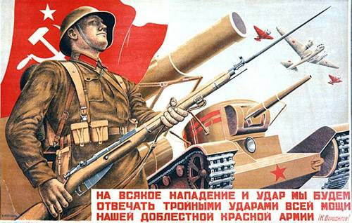
Secondly of all I learned a lot of information about Soviet Propaganda, a period of History I found fascinating in general. It was interesting therefore to look into this period from the perspective of how it shaped and inspired artists, living in the worlds first Communist State. Furthermore, I linked these findings, for example the study of constructivism and experimental propaganda films, to a broader study of commercial advertising which arose greatly into prominence in the 1920s. These two topics linked in the sense they both played on the idea manipulating people in finding a product/concept attractive.
I learned about two photographers in great detail, Henk Wildschut and Martin Parr. It was interesting to find the contrasts between these two styles and how the principles of their respective work focuses on entirely different themes; Wildschut looking at the theme of factory farming in a very intentional and directly expressed manner, whilst Parr’s work is much more symbolic and subtle, using his colourful ‘advertising style’ to hint indirectly along the lines of advertising. I found it was very interesting to take influence from the style of these to photographers. Evoking aspects of Wildschut’s style gave a direct sense of focus to my work, and Parr’s added a sense of subversion and playfulness.
I also expanded my understanding of how to make a photo-book. Knowing I had to make a series of images to then go towards making a narrative meant I took my images in a really directed and concise way. On reflection I found it was better to take a handful and carefully considered images then it was to take hundreds of images simply for the sake of it.
What did I enjoy about this project?
I enjoyed doing this project because my overall intent was very straight-forward. Although a lot of research has had to take place, the main idea was a very simple concept: to photograph and find out as much as I could about local Jersey produce.
In addition, this project involved meeting and working with a variety of different people. I enjoyed this because I at the same time as photographing, I was able to really find out about the view of people concerning farming and the whole idea of ‘Genuine Jersey’, from those involved in local farming, as well as the opinion of ordinary people. This was both helpful for my project as well as being interesting in general.
This project gave me the opportunity to explore a theme I had not looked at before. It was an interesting project because it was related to not just to food and advertisement, but also a critical look at the Island in general, documenting it in a way which both embraces as well as to a degree challenges it i.e. through the vulgar Parr-like close-ups of local produce.
I have enjoyed having another attempt at making a photo-book. The on line light-room method is extremely easy and allows a degree of creativity to experiment with images.
What image best sums up this project?
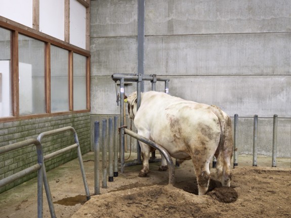
I have selected this image, of a cow at Tom Perchard’s Farm (Shoot 3) in relation to this particular question because I find it works well in various different ways.
Firstly it is has a natural, and slightly vernacular style which links well to the sense of objectivity and rawness I wanted to bring into focus over the course of this project.
Secondly, it also works well in the sense that it brings a slight sense of conflict and tension by representing to a degree, the viewpoint of the cow. It shows the cow walking along a slightly dirty path which would imply the cow is not completely happy. This might to some degree, raise questions within the viewer about their personal opinion of cattle farming.
Thirdly the image is very well composed, making use of soft lighting to give a light and nostalgic mood to the image. In contrast to the slightly vernacular feel of this image, this creates a sense of balance, whereby the image is ‘in-between’ two different styles.
The initial idea I had when began this exam project was to look into the theme of propaganda. I began by looking into the context of Soviet Propaganda in the 1930s, looking at the ‘Contrustivist Movement’, of artists such as Alexannder Rodchenko and Dziga Vertov. Although I enjoyed learning about these art-works and the context behind them, both of which I found fascinating, I decided in the end that exploring Soviet Propaganda as a response would be too difficult in the amount of time I had, the main reason being that the techniques used in the work was extremely complex and would require hours of work to get right, which I simply did not have.
Therefore I branched away from Soviet/Political propaganda, looking more into the theme of consumerism and commercial advertising. In the process I read a few documents looking effectively into how advertising really started to develop in the early 20th Century, fueled greatly by events such as WWI and the social consequences this created for the 1920s. I learned in the process about the clever way advertising is made the effectively persuade a viewer to development an interest in a product through playing on their mindset and emotions, in a very similar way to current and growing political propaganda trends.
In developing upon this research, I then looked into modern advertising, in particular television commercials, researching the different techniques they use. Specifically I looked into the role of photography in such a category , both through how photographs themselves have served as a tool for advertising, as well as on the other side of the coin, looking into how modern photographers such as Martin Parr have attempted to challenge this very role through ironic photographs which mimic and satirize such a theme. The process of this research gave me the core principle of my overall theme.
In doing so I started to reconsider the core principle of this exam theme, looking into ‘Truth, Fantasy or Fiction’. I wrote a few blog posts looking into the view of all of these themes, in particular the many contrasts, and indeed in some cases, links between the themes of truth and fiction. It lead me considering a debate along the lines of two different questions; firstly can the style of photography affect how truthful it is? and secondly, how do you distinguish what is truthful and what is not?
I got the idea to link this concept to the theme of local food produce in Jersey. Jersey produce such as the ‘Jersey Royal’ Potato, Lobster and Milk is not only celebrated within the Island community, but also seen in the UK as classic British produce. Furthermore, the Jersey cow and Potato is celebrated the world over, and Jersey cattle is one of the largest cattle exports in the world. With all of this prestige as so often expressed in advertising campaigns through the likes of ‘Genuine Jersey’, thought it might be a good idea to tackle and perhaps challenge this theme. Although it is clear that Jersey produce is of excellent quality, I thought it might be interesting to question and challenge the extent of this view.
Through this I decided to create a series of images to open the debate over whether local produce is in fact deserving of such a high status, or whether it is just a great deal of over-exaggeration and hype? I thought this topic might be somewhat controversial be Jersey produce, such as an integral part of Jersey’s cultural history, is rarely criticized, even remotely.
As I started to consider both sides of this argument, I was drawn to two different documentary photographers with very different styles of photography and equally different intent of exploring the theme of advertising, these photographers were Henk Wildschut – Food, and Martin Parr – Common Sense. Whilst Wiildschut’s intent in the series Food (set in a mass meat-production factory) is do document in a very candid way the raw details truth behind what goes on close doors to process food, Parr’s ‘Common Sense’ series looks more into the language of advertising, subverting and satirizing this classic style to show food in a far less complimentary light. Effectively both photographs through their work serve to challenge the whole industry of food, Parr commercially, and Wildschut ethically. In direction and style however both photographers are extremely different, and their styles in very ways serve to contradict the other.
I thought it would therefore be interesting to undergo a study whereby I attempt to copy the style of both photographers. I decided to do this through; firstly visiting farms and documenting what I see in a Wildschut-like way; and secondly including a Parr influence by visiting the local market, supermarkets and generally photographing food items close-up, both to make them look attractive as well as vulgar. The resulting images of this series are a mixture of both.
Throughout I have continued to re-evaluate the concepts of ‘Truth, Fantasy and Fiction’ – completely I few blogs posts directly this study in the context of researching Parr and Wildschut, of which the general understanding I got was that Parr’s images were more along the lines of Fantasy/Fiction, whilst Wildschut’s were more along the line of Truth. In addition, I did some evaluation of my own work in comparison to these themes.
Now I have finished taking all of my images, I thought that it would be interesting to compare the images I have taken which resemble that of the style of Martin Parr, with those that resemble the style of Henk Wilschut.
Here are the images I have taken which I believe reflect the style of Henk Wildshut. The criterea I use to judge this was to pick image I felt were either colourful and vibrant, satirical or just had a general feeling to that of Parr, prehaps a detailed close-up image for example.
Here are a few of the images I believe reflect moreso the style of Henk Wildschut. The criteria I had for judging these image was to chose image I felt were documentary-like.
Upon reflection I find it interesting that the image across all of the shoots fit into both categories. This is surprising considering I intended to separate the two styles in different shoots. Whilst this means I have slightly failed in my objective, it isn’t too bad because it merging different aspects of my series together. It also challenges the title of the series quite well because it implies the three themes can in many ways, be drawn all into one.

![will 3]](https://hautlieucreative.co.uk/photo16a2e/wp-content/uploads/sites/9/2016/05/will-3.jpg)