Category Archives: Editing

Filters

Author:
Category:

blurred Edits

With the images I took from this Daria inspired shoot, I decided to merge and blend images together in Photoshop on order to explore the idea of the subject being hit. A friend of mine (different from the other situations I’ve talked about) explained to me how she was once in a situation where her boyfriend came home drunk, and he was already angry because he had been kicked out of the pub he normally visits. He began to hit her and eventually grabbed her neck and he was suffocating her.  Just as she was about to pass out, he let go abruptly and she ended up banging the side of her head on the bedside table, and because of the force she hit her head at, it started to bleed. She tells me how she has this ‘safe place’ at the back of her house where she goes and waits for him to cool off, and on this occasion, on her way to it, she leaned on the wall and saw blood left behind. It was after this she decided to go to the hospital. She explained to the nurse how she fell down the stairs and with the nurse believing her cover up story, she had to get four stitches and she had a concussion.  This body of work pretty much represents this in the style of Daria.

Here is a print screen that shows how I combined two images to create an outcome:

Untitled-1Untitled-2

By using the brush tool in Photoshop, I was able to merge the images together. After editing the blurred hand into the back image of the subject,  I adjusted the levels slightly to created a darker tone throughout the image so that it fits well within the context and within the style of Daria. I also experimented with this images by using different blurred movements from the subject to see which looks the best. Here is a gallery of the edited images from the shoot :


Recent Photos

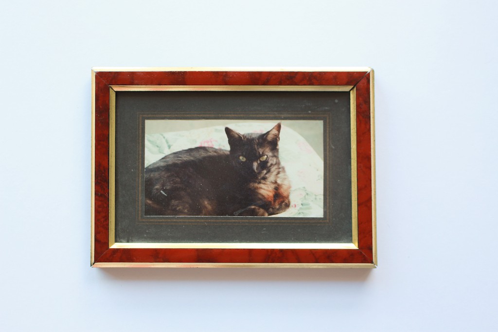
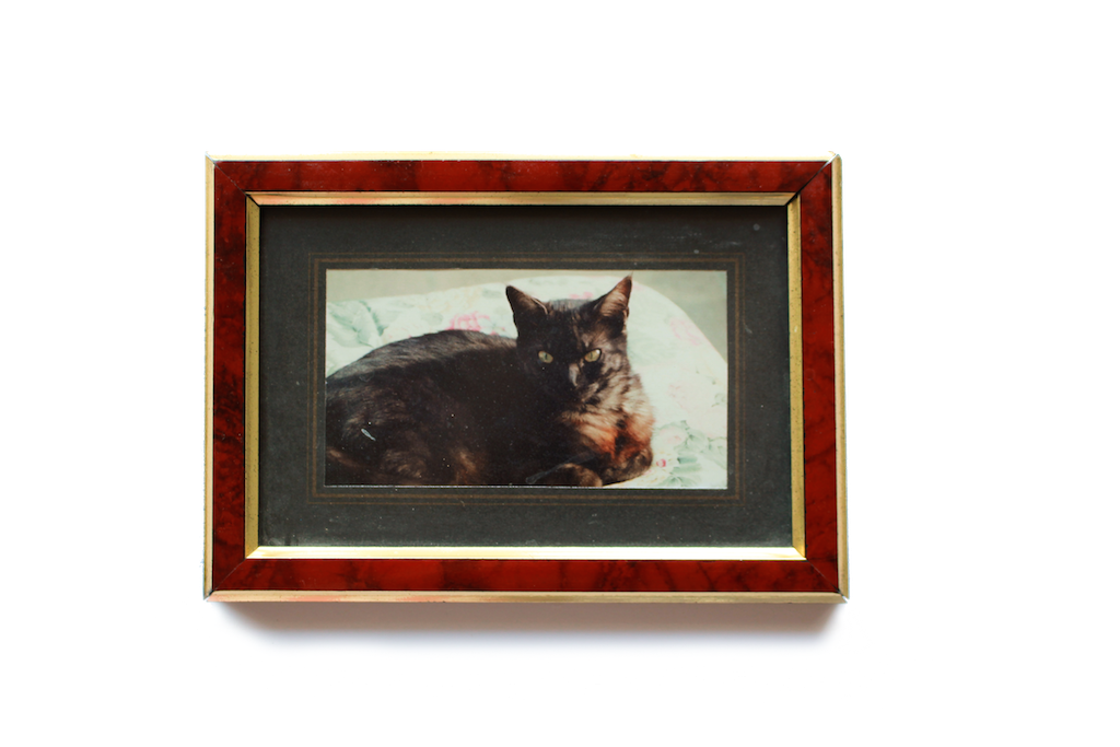
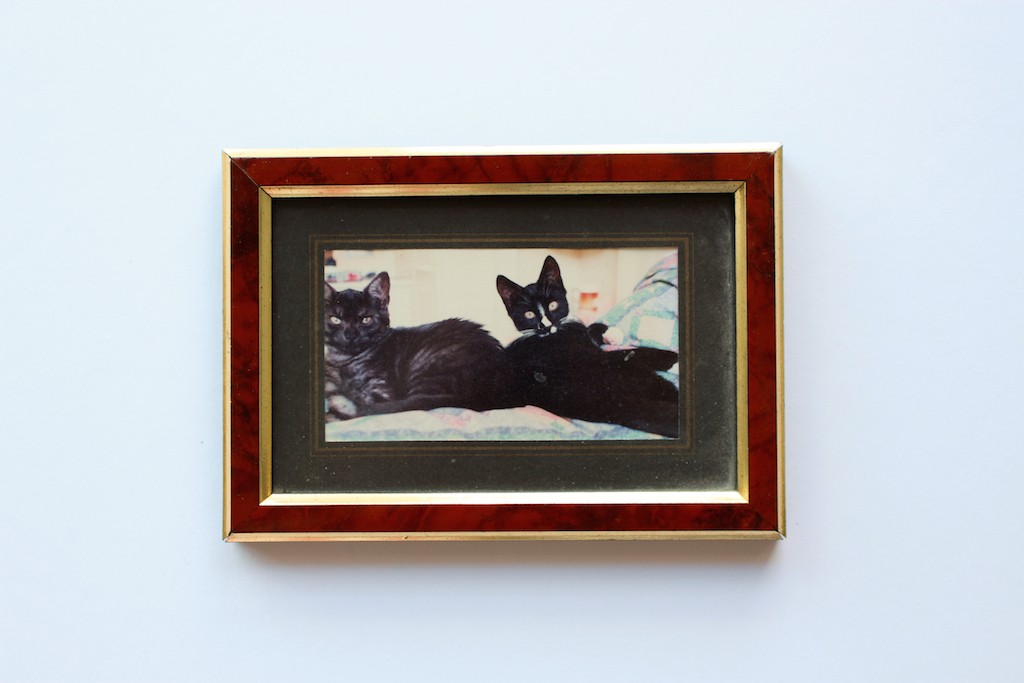
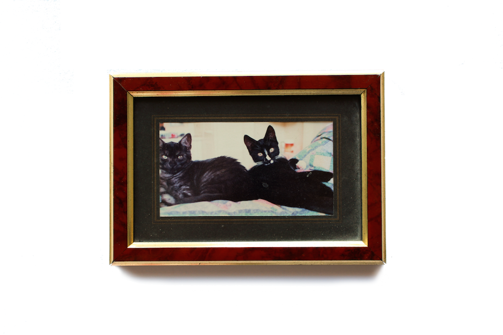
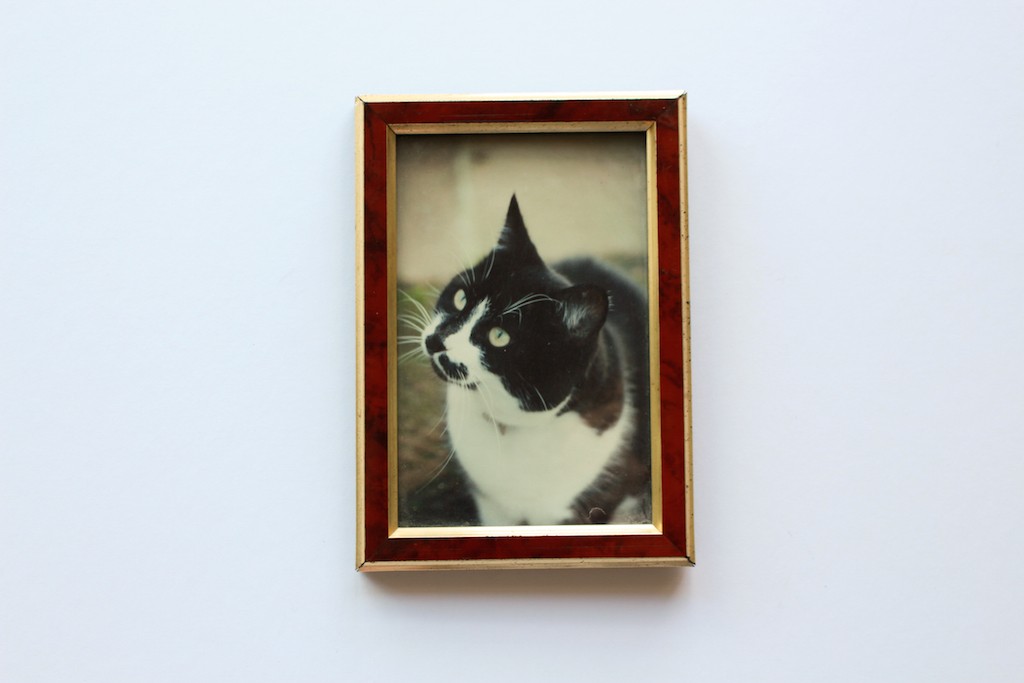
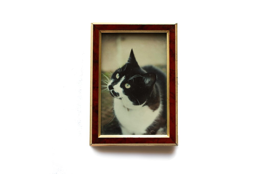
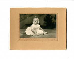
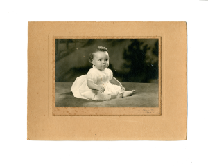
As well as all the old photos I have found, I also found old frames and some other bits which I wanted to photograph and include, as these elements can’t be scanned and i wanted them to appear more 3 dimensional within the book. I then took the images and made them transparent, so they would fit cleanly in the book.

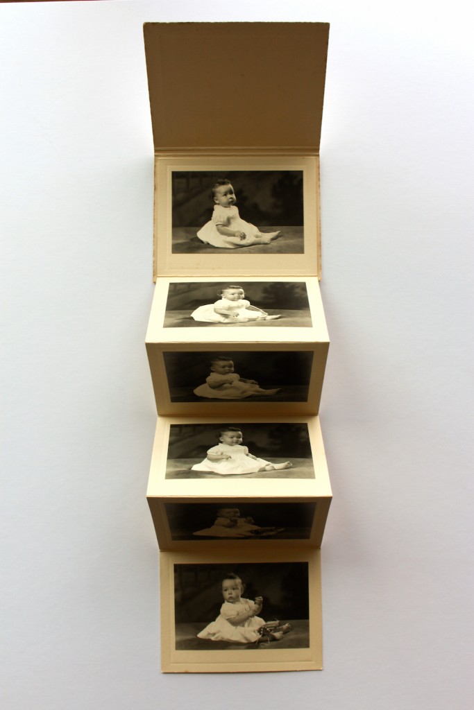
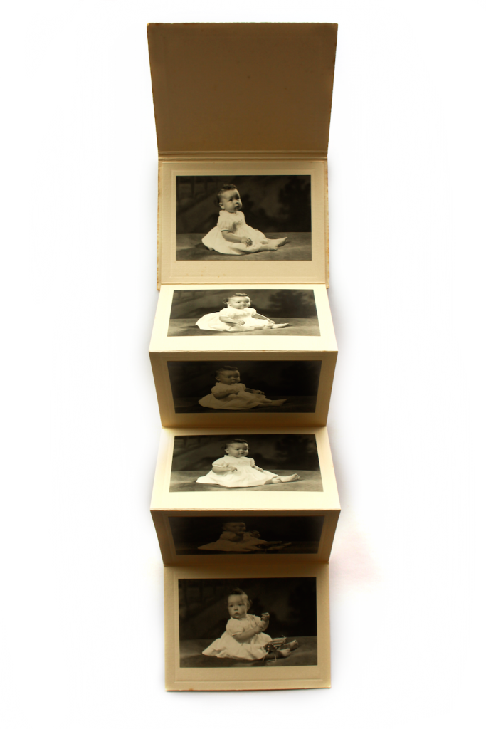
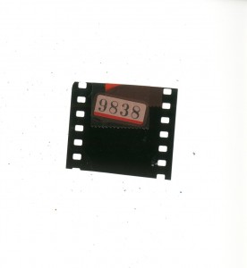
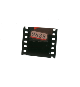
These were also some other extra bits I found, which were scannable that I wanted to include within my photo book. The book was in the box of slides I found, in it was written some of the dates and names of people within the slides, so I wanted to include this, the other bits were little details that I wanted to add into the book to add more detail/variation/texture.

Albelli

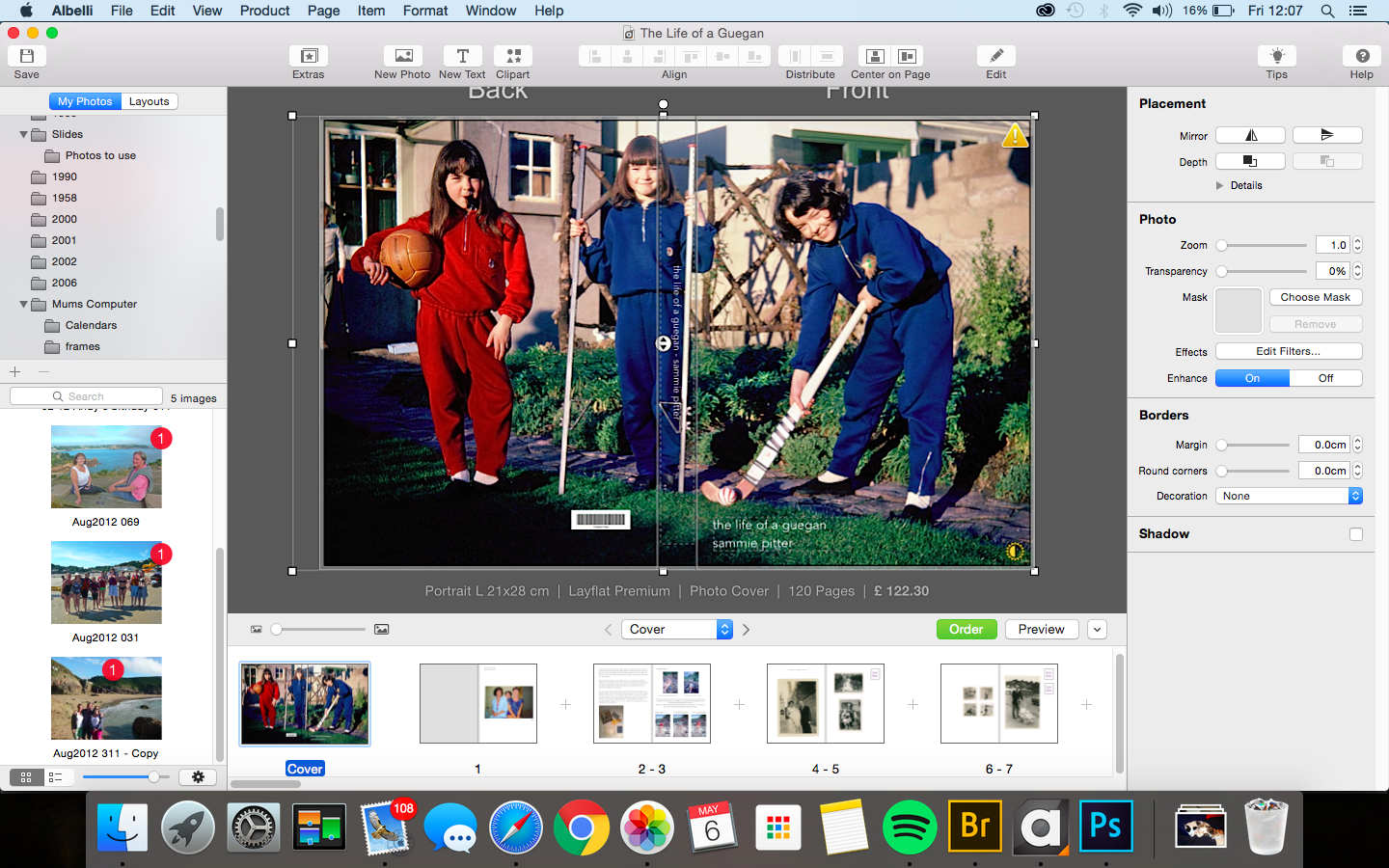
Instead of using Lightroom to make my Photo books, I prefer to use Albelli, as there are more options and more possibilities.

Screen Shot 2016-05-06 at 12.07.53 Screen Shot 2016-05-06 at 12.07.39

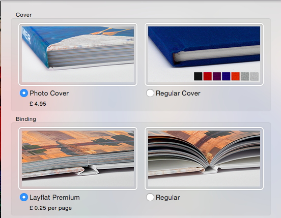
I chose to use a wrap around Photo cover and Layflat Premium, as I have used this for all of my previous Photo Books and I want to keep this continuity throughout all of the books I produce, so they all have similar appearances. The Layflat is also a really good feature, as it allows you to make more out of the pages, as you can see properly the whole page, rather than the centre being less visible due to pages curving. I t also makes the pages much stronger, and makes the book feel a lot nice, in my experience, so even though it costs a lot more, it is well worth it.

Screen Shot 2016-05-06 at 12.09.29

Transparent images

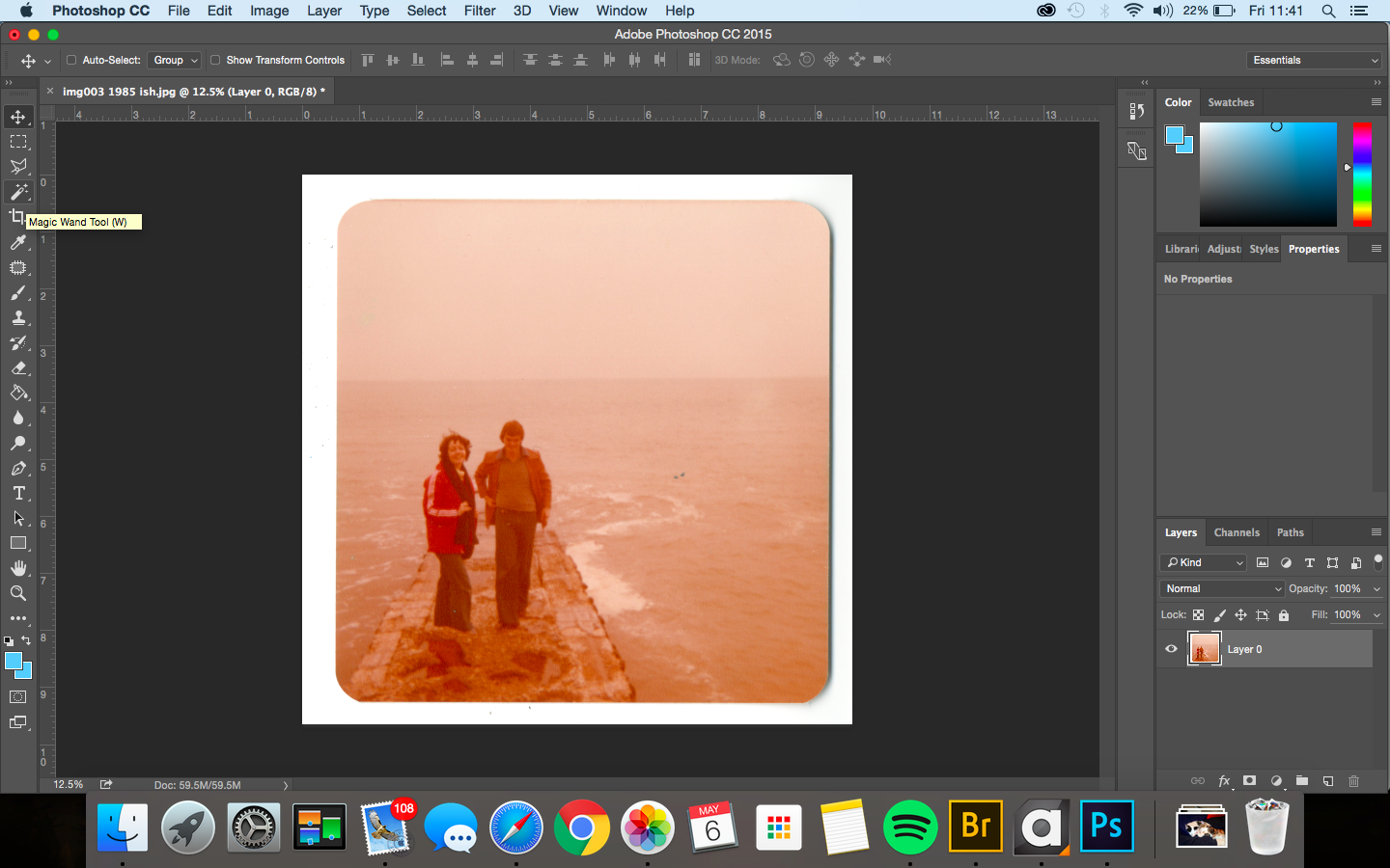
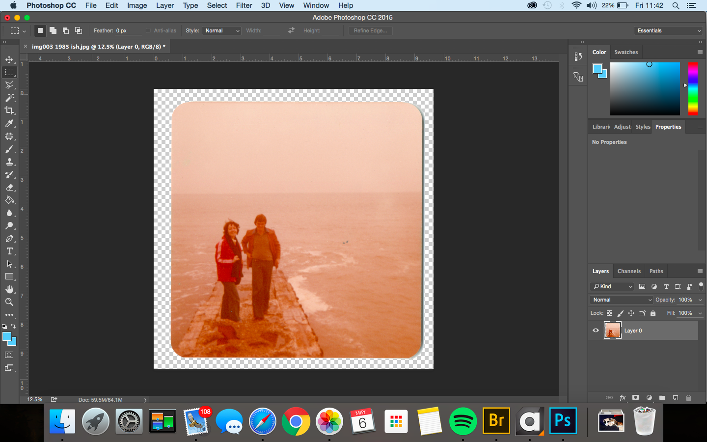
Some of the images I scanned in had rounded corners or edges which I wanted to include in the photo book, as they vary the presentation of the images, and keeps the images as true to the originals as possible.

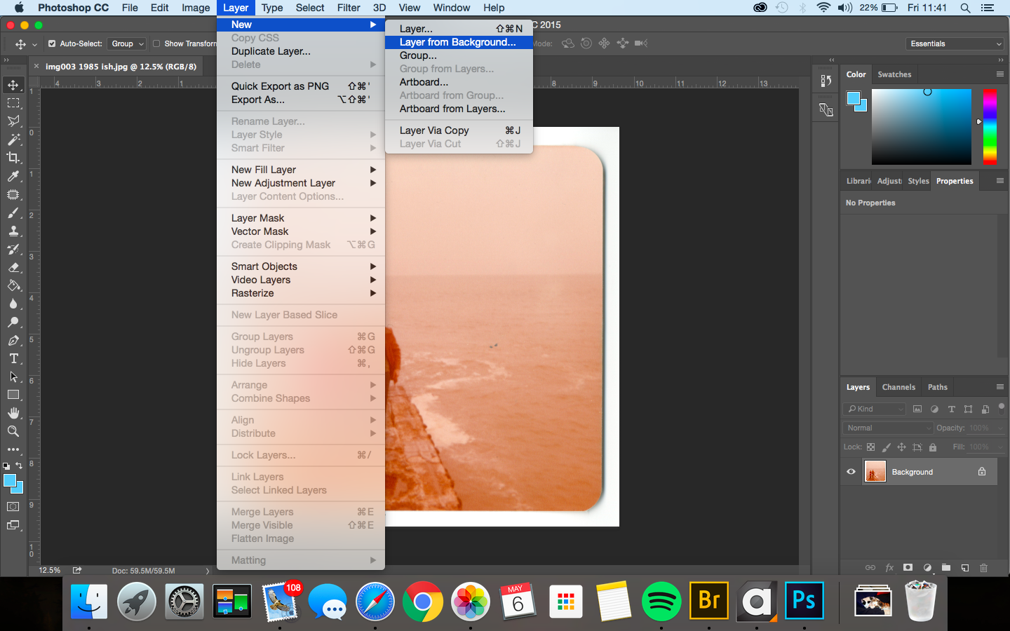
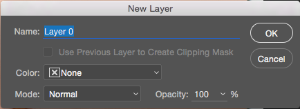
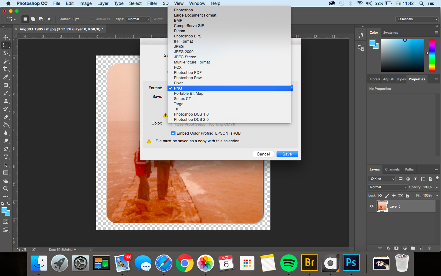
When scanning them in, the background wouldn’t always be completely white, and had lots of little bits of dust and dirt stuck to the back (I used the scanner in DT which probably has something to do with it), and in order to keep the photobook looking as smart and clean as possible not eh inside, I decided to go through and edit all the images with the white background, and make them transparent using photoshop. To then keep them as transparent files I saved them as PNG’s.

Screen Shot 2016-05-06 at 11.41.17 Screen Shot 2016-05-06 at 11.41.24 Screen Shot 2016-05-06 at 11.41.28 Screen Shot 2016-05-06 at 11.41.44 Screen Shot 2016-05-06 at 11.41.52 Screen Shot 2016-05-06 at 11.42.08 Screen Shot 2016-05-06 at 11.42.31

Tape idea – Edits

I decided to pick out images that I conducted containing both black and white background . I feel like with the white background The writing on the tape is more visible. However, I prefer the images with the black background because it’s almost like they are emerging from the darkness and I quite like the brightness from the tape in contrast from the dark background.

When looking a the images lined up next to each other, I am definitely preferring the images with the black background and I feel like they are much more powerful than the ones containing a white background. I quite like this body of work and although it varies from the styles of the  photographers I have looked at, I think I have put my own style within this body of work. The emotionless expressions on their face is something I was going for. I think that if I were to capture scared/sad emotions, it would be too much and it would lose the point it’s proving.


Jerry Uelsmann – Editing

Step 1: Place the picture you are mixing in place on top of the other picture. Change the size and shape to your liking using Ctrl T then select enter.

b1

Step 2: Change the opacity to around 50% so you can see both photos evenly and then select the eraser tool, now you can start rubbing out the bits of the top layer you don’t want, in this case i have rubbed off the bits that didn’t fit on the building.b2b3

Step 3: Once the shaping is done that is pretty much finished, but in my case there was still a bit of blank space on the building so i decided to fill it in by placing the same photo over it again but the other way round so it fit perfectly into the blank space 

b4

Step 4: Finally just do the same thing with the opacity and the eraser to the new layer and it should look something along the lines of the finished photo below

Pink sunset Jerry UELSMANN

Jerry Uelsmann – Experimenting

Jerry Uelsmann has a very abstract thinking in his photos, he usually tends to mix 2 photos together which is what i’ve tried to do here. I have taken one of my photos of glass windows and mixed it into the building , it makes the photo seem like a landscape but also an abstract at the same time. This photo follows both Matt Crump and Jerry Uelsmann because there is still that fantasy coloured theme but then there is that Jerry Uelsmann feel to it with the abstract building.

Pink sunset Jerry UELSMANN

Staged edits

This series of images represent the story on the previous post. I have  decided to edit these images above because I believe that they are the most strongest throughout this body of work. I quite like the fact that some images are blurred, and deliberately selected the blurred images as representation of blurred memories my friend had. With regards to final outcomes, I am unsure whether I would want to present images in a series or as a select few and present them individually. Throughout this shoot I experimented with different compositions and shutter speeds in order to create specific effects. In some of the shots, the exposure seems to be quite dark, and although that was the sort of effect I was going for (to stand as a representation of dark memories); I’m not sure that it worked very well and looking back at them now, I probably should have ignored focusing on exposure as that could have always been adjusted in photoshop. I think that the expression of the subjects face fits accordingly with the topic and specific situation, and definitely think that it connects the contextual factors alongside the visual aspects. The background and setting is in a bedroom, due to the fact that it is where the situation occurred and I wanted to staged images as accurately as I could, including little things like location and clothing. It would have been easy to conduct this shoot in the studio, using chiaroscuro lighting eat, however by doing it in a home environment, it brings forth the fact that these things happen in what is supposed to be a safe place; a home.


Paradise Lost: Filming and Editing

Screen Shot 2016-05-03 at 12.35.22 For my documentary I have been creating the whole video using the editing software Final Cut Pro. This has been the first time I have used this software to edit, but found it to be easy to pick up as I have had experience using editing software before such as Premiere Pro. When starting out making the film, I first went and captured footage of Eddie in the car park as at the time it was raining. For this shoot i used my iPhone camera as it is able to film video in full HD 1080p at 60fps. This allowed me to get high quality video footage, without having to skate while holding a DSLR. I started of by capturing footage of Eddie skateboarding so that I could overlap it with him speaking directly to the camera. Although I captured a number of these action shots, in post production I lost the pen drive with the clips on, so I only had the few I had transferred to the computer. Because of this I sourced videos of Eddie skateboarding on YouTube as he said that I was allowed to use it. I also wanted to source material from YouTube as it shows clips of Eddie from when he was a lot younger, and the progression that he has made with his talent. As well as recording action shots, I also filmed an interview with Eddie where I just asked him to speak from the heart about his life skateboarding in Jersey and the culture around it. This worked out well because Eddie is so passionate about skating that he is able to talk for hours. As well as filming in the carpark, I also went out a number of times to different places across Jersey to film filler shots of the island and shots of Eddie skating the streets. This helped to give more context to my documentary and make it a flowing piece.

Screen Shot 2016-05-03 at 12.35.16

In Final Cut Pro, I started by placing the interview in full and cutting up the parts of which I felt were relevant. This meant watching the whole interview and listening out to things that gave meaning to the whole idea of the documentary, such as Eddie speaking about how the police give skaters grief for just performing their sport. The next thing I did was create an introduction. I started out with using a sound bridge of Eddie skateboarding as it gives the audience an idea of what the documentary is about before actually seeing anything. It also helped with the transition of the title screen to the first shots. I created a short montage of clips for this opening as they show off the beauty of Jersey, but what I am saying in the voice over contrasts what is being shown. After creating the introduction and cutting up the interview, I then began adding footage of Eddie skating and clips I had found on YouTube of him and others skating in Jersey. As I previously mentioned, I featured these clips as they give more context to the narrative of the documentary, but also help to cut up the footage of him speaking which ensures the pace of the film is not too slow. After this, I added the audio of my voice over. The voice over helps to explain what the documentary is about and adds a personal side, as I talk about how I have been friends with Eddie and have watched him grow up as he skates. The other audio that I added at this point was the background music. Both the tracks that were featured in the film were created by me, as it meant they had no copyright, so I would be allowed to upload the film to YouTube without any hassle. Having creating the tracks myself, also meant that they reflected the atmosphere of the documentary in the way I wanted as I created them to suit the film. To finish off the film, I now have to add the title and ending credits so that the film has a definite beginning and ending.

Candy Coloured Photos – Editing

I have been using Photoshop to try and create these candy coloured photos to turn the gloomy town of Jersey into a fantasy colour world, i have put step by step print screens to try and explain how it is done.

Step 1: After editing the photo like you normally would using levels/curves, you need to go to image>adjustments>hue/saturation

1

Step 2: Mess around with the hue bar and you will start to see the photo change colour, you can move it to your preference and also change the saturation to make the colours a bit more intense or lighter.2

Step 3: After this is done you may want to do some fine tweaking to get the colours to come out more in certain parts of the picture, in this case because it was a cloudy day the sky is just grey so to avoid this i have selected the quick selection tool to just have the sky highlighted and then go back and change the hue again, this time i made it a lot more saturated so the blue started to come through, this may not work on every photo.3

Step 4: For the last step it is just finishing up your edit, after changing the colours the building in my photo went slightly darker so i brought the brightness up slightly and also the contrast, this then brought me to my finished image.4