This particular image of hers I think is really interesting. I like how she uses herself as the subject within her images and this is something I plan on doing when responding to her. There is something almost haunting about this image, I like the blurred effect she created and is something I have experimented with throughout my project, and still plan on within the next shoot. The dark tones within the image are quite dark, but alongside the lighter tones of the background it enhances this darkness and adds to the haunting aspect of the image. The way the dark tones have created this shadow around the eyes looks really captivating and it almost represents the darkness of her feelings (that she’d been holding in for years) being finally exposed creating this haunting effect. It looks as if she used natural lighting rather than studio lighting and I think that visually, it fits in with the troubling and sad context.
I like this image and it differentiates with all the other images she has chosen to present throughout her body of work. I really like the harsh lights throughout this image and the shadows creating hard lines and forms from the sun. Most of her other images are quite close up, and here you have the home environment which I think is crucial to include as this is the place where everything happened, the home where both her and her parents lived and is now just where her mothers depression has taken over her life. I like how she used natural light from the door, it definitely contributes to making the piece very interesting.
This image here, is really powerful and I think it represents her emotions getting to her. Her expression looks fed up almost and the different harsh dark tones in the neck compared to the softer darker tones throughout the image works well and is really interesting to view. Her pose of holding her hands to her ears perhaps represent the fact that she is fed up at listening to her mother’s struggles and pain. Yet again, this image looks like it was taken in natural window light and is really interesting in the fact that this image looks quite old due to the darker tones throughout the background of the image.
It started when I first got pregnant.I haven’t told anyone.
These two are my favorite throughout this body of work. Mainly because of the fact that the written statement on the tape is really clear and visible to read. I think the statements as individuals are quite powerful and I think the black and white effect works well. My work prior to this have differentiated greatly in comparison to this shoot because they were taken in a home environment with objects and elements in the background representing that fact. The previous shoot focused more on the situation that was going on and less on the subject, whereas this shoot was intended to focus on the sole aspect of the what the subject has on her face. The tape I used is of a large size and i’m quite glad as I think that anything smaller would have been to small to see anything written on it. The soft lighting and tone within these images replicate aspects of Valarie’s work. Her images are staged and the expression of most of the subjects face are blank (similarly to mine) and I think this was the best approach when this particular context was this intense.
I think that because of the hard lines on the clothes of the subject in the second image, it makes the image as a whole stand out. Because the clothes of the subject in the first image are quite dark and not many lines , shapes or textures are visible, it is softer and she doesn’t stand out as much as the subject in the second image. With regards to final outcomes, I like this body of work and think it is strong in representing victims’s once unheard voices.
This is another photo i believe is one of my best, like the other one it has a large depth of field which helps the viewer scan the photo from left to right as it gets further away. Because of this the photo has the effect that everything is getting smaller as it gets further away, this could portray Jerry Uelsmann’s photos as he uses the same technique in some of his photos, it shows good use of depth of field and allows you to look more into the detailed parts of the photo.
I have created the candy coloured effect again to go with the theme of my project, this time i have decided to make the sky pink as well and i think it goes really well, the dark pink on the gates contrasts well with the bright pink sky. I chose to keep the cars and the road the same to show the variation between the fantasy world of colour and the normal world with the plain colours such as the greys and whites.
I feel like this photo relates to Matt Crump’s because of the candy coloured theme, it makes the photo a lot more vibrant and fantasized, it is also like the work of Jerry Uelsmann because of the use of depth of field and the objects getting smaller, he uses this sometimes in his work but sometimes mixes that with other photos.
If i could change anything about the photo it would be the van in the bottom left, it either needs to be the full van or cut out completely, but the reason i didn’t cut it out is then the photo would be too short and the depth of field effect wouldn’t work as well. Also if i was being picky i would prefer for the grey van to be a smaller car so you could see more of the pink on the main gate, this is out of my control but i feel it would’ve looked better.
This photo in particular is one of favorites from my shoot, it has a very large depth of field which lets you explore all parts of the photo well, you start by seeing the plain coloured wall and then as you scan the picture from left to right you start to notice the candy coloured buildings and signs. This composition layout means that no one will miss any part of the photo as they look at it.
The tones of the photo are very dark closer to the viewer but as you scan backwards they are very bright and colourful, this colour scheme could show the fantasy side of Jersey that people imagine, a world where everything is vibrant colours. I have left the roads and the front building normal colours purposely so the viewer can follow the road down with their eyes and scan the picture.
I also like how the reflection in the windows shows a glare of the green and pink that has been mixed onto the buildings, it shows that whatever is reflecting off the windows is that colour as well and stays with the theme of the candy coloured. The dark shadows behind the taxi rank portray the darkness and cold side of Jersey and then the other side of it portrays the fantasy side that everyone wants, with the sun out and all the vibrant colours shown.
This photo is similair to both Matt Crump and Jerry Uelsmann. It has the Matt Crump feel because of the bright and vibrant colours on the buildings and the sky, it is similair to Uelsmann’s work because of how intricate the photo is when you observe it more closely, a lot of Uelsmann’s work is in black and white but his work mixed with Crump’s would come out something like this photo.
Here is the full layout and detailed evaluation for my completed photo-book.
FRONT AND BACK COVER
I have included these two images as the front and back cover because ….
Front Cover – I have chosen this image of a packet of Jersey butter as my front cover because I feel it is a strong image which effectively captures the essence of the project, directed under the broad theme of local Jersey produce. It is a simple and neutral image which links well to my title: ‘Genuine Jersey…?’, because it actually includes the distinctive ‘Genuine Jersey’ stamp. It therefore creates intrigue for the viewer, without giving too much away.
Back Cover – This is a simple picture of a egg. I have included this image on my back cover for two reasons; firstly because it links to the idea of simply showing Jersey produce to open a broad concept and theme, as similar to the front cover; secondly I have also chosen this image because it is quite unusual and peculiar, thus subverting the expectations of the viewer. This is effective to a large degree in ending the narrative on an obscure question mark, a cliff hanger to leave the viewer questions both before and after they have gone through the narrative.
PAGE 1-2
It is a good idea to begin a photo-book on a fresh page. Jumping into the story too early can be quite unsettling because it allows no sense of build-up.
PAGE 3-4
On the right-hand page I have simply included the title. I wanted to include this title before introducing the narrative to remind the viewer of my focus and theme. It also extends the sense of build up and anticipation built up on the first 2 blank pages.
PAGE 4-5
The first image of the narrative is a double page spread of a close-up of the tide coming in. I chose this as the opening of my narrative because it links straight-away to the idea the book is based around an Island. This enables the viewer to simplify their focus towards the theme of an island, implying Jersey in relation to the title.
At the same time it does not give any actual reference to Jersey. This was an important consideration I made because I didn’t want a clichéd or obvious connection, which may serve to undermine the sense of mystery following on from the unusual, ambiguous front cover.
PAGE 5-6
Whilst my first image serves to captivate the specificity of the project, the second image featured on its own on page 5 is a landscape shot of a shed on Colin Roache’s Watercress Farm. This simple landscape image serves to begin the focus of narrative – farming and food production
I felt this image was a good one to begin this theme because it has a very strong and confident presence about it; lively, colourful but well composed and orderly. This gives the narrative a clear opening, enabling the viewer some idea about what the narrative might be about. At the same time it is subtle and does not reveal too much.
PAGE 7-8
The next image is a double page spread of Colin Roache, documenting him walking through a watercress bed.
I like this image because it provides a sense of chaos and energy to the narrative, in contrast to the calm and orderly beginning. It is chromatic because it has been cropped to only show the subject’s body, as well as the fact he is moving in an unusual way with his arms flailing. Having a eccentric character introduced this early on is important in establishing a sense of charm and liveliness, a ‘key’ image which will resonate in the viewers’ mind throughout.
PAGES 9-10
This image now shows Colin watering the watercress beds. It is a formal image.
In contrast to the previous image, I have reverted back to the calm and more traditional feel which is established on pages 4-5. This quick shift in the narrative flow leaves the viewer in anticipation to what might come next, thereby keeping the structure of the narrative unknown and uncertain.
Although it contrasts in terms of style and mood, this image does in many ways also link to the previous image because it reveals more aspects of the subjects character – which in the previous image was a more mysterious representation.
PAGE 11-12
This is a two page spread which depicts a close-up still-life shot of some of the finished water-bed crests on Colin’s farm. This is the first image of the narrative which is directly linked to the ‘Parr-like’ advertising language. Whilst some similarities to Parr can be drawn, such as the fact it is taken of something close-up as well as being highly saturated, there is certain aspects of the style and composition which makes it slightly more orderly.
Nevertheless it is a strong image regardless which provides to a large extent, a definite degree of intensity of which the narrative can build on.
PAGE 13-14
This image – the final of the watercress series, is a close-up of Colin holding a knife. In relation to the previous image, it is linked in the similarities of Parr’s style.
I find that this image is a really strong detail shot which helps to hold the narrative focus together and re-assert a sense of neutrality, which to some degree was lost in the exploration of the general pattern of the watercress theme. It’s simple and ambiguous meaning/representation is fundamental in achieving this objective, because a knife has various meanings.
PAGE 15-16
These two photos are the first of a mini-case study, looking at classic advertising style. These images are strong through their simple but bold representation.
They serve as part of a key study of this project, as the project is effectively centered around exploring local produce. They represent produce in its simplest form and thus serve as a metaphor for broad theme of my investigation.
Therefore it can be considered that this part of the photo-book is key in grounding and directing the overall theme, from which all other images are now bound to.
PAGE 16-17
This is the second part of the case study. It maintains the theme in the previous two pages.
PAGE 18-19
This third part of the case study contrasts directly with the previous two pages. Whilst those images were intended to look as attractive and appealing as possible, thus supporting and responding to the classic advertising style. On the other hand these images are deliberately intended to look grotesque in order to subvert this classic style.
These particular images, very much linked to the influence of Parr more vulgar image in ‘Common Sense’, provides a sense of conflict to the narrative, a sudden and unexpected emergence of hideous unappealing images in the midst of all of the previous images which appeared to evoke a more favourable view of local Jersey produce.
These two image are therefore key because they really start to challenge and question the extent of how Jersey produce is represented, often in a positive and nostalgic light.
PAGE 20-21
These two images continue on the lines of this theme, rugged coarse images which in many ways depicted the chaos and vulgarity often associated with the likes of Richard Billingham.
By continuing this link, the viewer is forced to ask further questions about the link between advertising and consumerism.
PAGE 22-23
After this mini photo-study of food, I returned to the theme of farming, linking directly the previous photograph of a burger to the focus of Tom Perchard’s cattle farm. This first image of the series shows two cows moving from the milking parlor to the barn.
It is a very colourful and powerful image which has an interesting sense of energy and momentum as established through the motion blur, colour and slightly obscured composition. This image is subsequently effective because it serves to resume to intensity established within the previous four pages. The fact it is a two-page spread extends upon such an idea.
PAGE 24-25
This following image is a portrait of Tom Perchard. It is a classically composed images, in contrast to the more spontaneous nature of the previous images. Further it contrasts in the sense it is on the page in a more conventional manner
I included this slightly more conventional image in order to re-assert a sense of structure to the narrative, as well as to slow down the tempo. This is effective in the sense that it not only mixes up the intensity of the narrative, but also re-establishes a clear sense of focus which may have been lost by the chaotic sense of the 4 images between pages 18-21
PAGES 26-27
These two images are candid, informal portraits of the two farmers who work in the milking parlor. The image on the left depicts the transfer of milk into a bucket for transportation, whilst the image on the right shows the actual milking process.
These images a both very grainy, vernacular and coarse in style. My intent in choosing these subsequent images is to attempt to depict the manufacturing process of milk in the simplest and most grounded way as I possibly could, in order to get to the truth behind how Jersey Milk is processed.
By this point in the narrative I am starting to uncover and pick away at the illusion of advertising images. I believe that the content of this images serves to greatly develop and advance this process.
PAGES 28-29
This image moves away from the indoors setting to the outside. It is a double page spread depicting the outside of Tom Perchard’s office.
This image is a strong landscape shot which is very calm and reflective in nature. In this sense the image serves as a break within the developing intensity over the last few pages and returns to a more central focus.
Furthermore, this image serves to change the mood of the narrative, which prior to this was very chaotic and cluttered. This serves to re-establish a much needed sense of order.
PAGE 30-31
Continuing on this outside setting is two images of equipment used by Tom Perchard on the farm. These images very much reflect the distant and considered approach I noticed frequently when studying the work of Wildschut.
They are very observed images an continue apon the sense of calm associated with the previous image.
I selected these two images together because I found the contrasting blue with red gave this sequence an interesting degree of contrast. Nevertheless, the bold appearance of both of the images mean that they link well and flow naturally together despite this juxtaposition of calm and aggressive colour tones
PAGE 32-33
On the next four pages, there is another mini case study , this time exploring a collection of still-life images on Tom Perchard’s farm.
This image of a lamp shade in a barn in a very strong image because it has a well defined visual presence combined with a high level of detail. The image has a very nostalgic feel, linking to some of the previous images in earlier on in the story.
By providing specific focus shots in an image such as this, I am helping to build up a more specific story of different aspects of the farm. This helps to extend the viewers understanding of how local produce is sourced, but in a way which is subtle and poetic, without disrupting the overall flow of the narrative.
PAGE 34-35
Continuing this mini-study is two further still life images. The photograph on the left is an abstract depiction of a pipe. The photograph on the right shows an electricity box.
The two images are very abstract and have no direct meaning. This is fine because the main purpose of these two images is not to display anything in particular but instead to show more of a mood and mindset. The image on the left for example can be considered my own personal reflection of the narrative so far, hence the inclusion of the shadow. The contrast of this image subsequently serves as a metaphor or my conflicting views over the course of this investigation, concerning my views of local produce.
PAGE 36-37
This is a formal portrait of John, who works as a fish monger at the ‘Fresh Fish Company’. This image follows on nicely from the previous because it maintains the stark monochrome contrasts and development of texture.
This image continues the traditional documentary style images which I began to develop in the recent Tom Perchard series of images. This features are evident through the careful composition, black-and-white display, and generally balanced composition. This old-fashioned style maintains a sense of charm similar images of this style have helped to assert and express.
I find this is an effective image in conveying traditional aspects of Jersey culture as it shows John, a Jersey-man, wearing a beret and dressing in typical attire associated with fisher mongers. It therefore re-asserts the local theme of the project.
PAGE 38-39
Continuing the theme of the ‘Fresh Fish Company’ shoot, is these sequence of images, depicting close-up images of some of the display in the shop.
This is just a little extra feature which provides subtle clues about aspects of the shop. It serves as a key factor in gradually winding down the mood of the narrative. At this stage of the story I am making a brief return to the style of Parr, through this quirky close-up documentation, a factor I explore in much greater detail in the following two pages.
PAGE 40-41
This image, which depicts a customer picking up a lobster shell is very ‘Parr-like’ in approach, owing to the fact it is close-up and highly saturated.
The bright, chaotic nature of the image returns a sense of vitality and liveliness into the narrative, which is somewhat lost by the more calm and objective nature of images within Tom Perchard’s shoot. This is key in maintaining interest from the viewer in this late stage.
This is one of the key images in the story because of its intriguing and obscure nature. The ring on the hand, as well the hand’s interesting features in general create a captivating image which embeds greatly within the viewers mind. similar to the effect Parr inevitably achieves in many of his images.
PAGE 42-43
As the previous image sought to lighten the overall mood, I chose this image to maintain this aspect.
This image is a spontaneous picture I took of Vicky talking to a postman, who is one of the regulars at the ‘Fresh Fish Company’. This is a very light-hearted image, depicting a conversation as it takes place. Although it arguably is not relevant directly in terms of looking art Jersey produce, it is instead more an observational image which looks into the dynamics of the relationship between shopkeepers and customers – a interesting development and slight de-tour and addition to the overall basis of the theme, which is effectively in slightly breaking up the narrative and adding something a bit different and unexpected
This image fits well into the story because of the spontaneous sense to the image, created completely through the events as they unfold, a re-occurring theme throughout, in particular when linking back to the images taken on Colin Roche’s farm. I included this image bear the end because I think it helps to round of the image well due to its reflective nature and very open ended meaning.
PAGE 44-45
For the final section of the project I wanted to include 3 images featured as single and double page spreads, over the course of 6 pages. The image I chose for this final section are some of the strongest over the course of this project and define the three different aspects I have been attempting to explore; the produce, people who make the produce and the livestock.
This first image was taken at the Lidster Family Butchers in the market place. Although it is a formal portrait which is classically composed and presented, it nevertheless has a degree of spontaneity combined with a certain free-flowing feel to it.
It is a very simplistic image which serves to show people involved in creating local produce as friendly, positive and helpful, something which I can say from my own experiences over the course of this project is indeed largely accurate.
This image has a very strong visual presence, due to its well-rounded detail and high-level of contrast. It is therefore in my view a strong enough portrait to end this part of the investigation on.
PAGE 46-47
Continuing on the theme of simplicity is this still-life/close-up image of two Jersey Royal potatoes on a wooden background. This image is very simple because I have simply photographed two potatos as they have been freshly dug, which no attempt to change or manipulate lighting.
In many ways, the style of this image is a metaphor for what I wanted to achieve in this project, to bring Jersey produce down to its basics and create an honest, reflective presentation and portrayal of produce. The style of this image a find meets the balance between the over-emphasized nature of Parr’s images with the equally over-the-top nature of traditional ‘advertising language’ which in contrast distorts the view of products to the other effect.
This image explores one of the most famous Jersey products in a way which evokes very little fuss, which in many was is a challenge to the overbearing nature of a degree of advertising language, by documenting it rather than exaggerating or endorsing it.
PAGE 48-49
This final image of the photo-sequence is in my view, one of the strongest of my images have have used throughout the course of this project.
I was taken on Tom Perchard’s farm and shows a cow glaring into the camera in a piercing manner as it is walking away from the milking parlor into the barn.
Such an image works well in ending the narrative because it is quite a strange an to some degree an unsettling image which, without specifically/explicitly stating anything, serves to imply and bring certain questions to the attention of the viewer, a distinctive image which leaves an abrupt and forceful ending leaving the viewer slightly perplexed.
I took this image as a representation of what this victim was made to do. I really like the expression given off by the subject and I think it really connects to the context. Compared to the other images, the background of this image consists of a plain wall, I like this difference in comparison to the other images in which are taken in a home environment. It allows the view to focus on what the subject is actually doing, instead of focusing on location and distracting objects in the background; the focus is all on the expression and situation the subject is in. When first conducting this shoot, I didn’t want the arms and hands of the subject to be visible within the image, I simply wanted a (close) head and shoulder shot that showed the belt around the mouth. However, I quite like the fact that you can see that she is doing it to herself because that is what this victim actually went through, alongside all the confusing and scared emotions (which I feel are expressed quite well within this image). I feel like when editing this image, I was a bit too focused on creating these dark exposures to co-exist with the dark memories, thus the darker tones within this image are quite strong and I plan on lightening it up a little bit via Photoshop.
These images were produced with the intention of being blurred and slightly out of focus. I conducted this effect due to the fact that when discussing these negative encounters, the victim would constantly say how she didn’t remember a lot and when she did, the memories would tend to be blurry and confusing. Thus, by creating this effect I felt that I was creating this connection visually and contextually. The close up image of the hand holding the belt is quite interesting and goes against the normal/perfectly composed portrait. This image doesn’t actually include the subjects facial features, but embodies other small elements that I felt necessary within this narrative such as the fact that the subject is sat on the floor (behind a door) and the outstretched hand holding the belt. These particular aspects fit in well with what I was told and adds to the suspense of this body of work. The other image I decided to include, consists of the subjects facial features and although blurred (as intended) through the use of a slow shutter speed, it also fits in representing what happened. I like how the shadow over the subjects cheek looks almost fragile and I like how she is looking down from the camera and I think the fact that she is behind the clothing which is hanged up behind the door looks genuine and adds authenticity to the image.
This image is quite similar to the images above, however in this frame, I captured the full body of the subject and I think this image is more visible in representing things like background/location. The angle of this image isn’t directly centered and I positioned myself slightly higher as if someone is slightly looking down at the subject, as if the viewpoint was from the abuser. With regards to rule of third, I positioned the camera so that the subject was not centered and more to the left of the frame (because I thought it wouldn’t look as good if she was directly in the middle due to the clothes hanging on the door behind her). Also, there is some negative space to the right side of the image however I think it looks better than having negative space on both sides, surrounding the subject. Plus, I think it works quite well as you can see that it is a door and it’s quite evident to notice the fact that she is sat (in a scared and shy manner) behind it. I used natural window lighting for this particular image and looking back, I could have improved it by perhaps making the room slightly lighter to create a darker mood.
These images are a collection of responses in which I have tried to copy the style of Martin Parr. I took about 300 images off and on for the course of the week. I am happy with the resulting images and feel I have a good variety of images which credit different aspects of Parr’s unique and distinctive style.
These are 8 images I believe are the strongest I have taken over the course of this Exam Project. I will explain briefly after each image why I have chosen it. I have included images from all of my shoots over the course of this project to show the good range and depth I believe my project has achieved.
I have chosen this image because I believe it captures the personality of the subject very well; focused, energetic and always on the move. Thus there is a clear sense of energy to this image. The subject is frozen in the moment whilst distort and clearly in movement, which makes the frame somewhat abstract. Furthermore, the soft evenly dispersed lighting makes for a somewhat illusionist and silhouette sense about the subject, aided greatly through his free-flowing movement.
I have included this image because I believe it is a powerful and captivating representation of the watercress best. The simplicity of this image works because of the strong presence of rich green which embeds the focus of the frame and thus captivates immediately the intention of the viewer. In many ways it is an abstract image with no direct meaning, but the colourful and interesting visual elements compensate for this slight disadvantage.
This image is very Parr-like in style – abstract and close up. Like the previous image, there is little to suggest that there is much meaning behind the image. However little details are what make this image interesting, for example the three-point focus of the green jacket; knife; and the subjects hands. This provides the image with a sense of visual depth in a very straight forward way. The contrast of red and green add a suitable degree of conflict which strengthens the image, allowing the main feature of the knife to come through clearly within the image.
This is an image of two farmers who are customers at the ‘Fresh Fish Company’. I like this portrait because I believe it is visually strong. There is a clear sense of engagement of the subjects in the frame and their visual expressions and personalities very much come across. As a result this makes for a very bright and upbeat image which captures the clear sense of community.
This is a close-up still life of the hand of one of the customers at the fresh fish company up a lobster. I tried as much as possible to balance detail because the subjects hand, along with the distinctive bruise on the hand and interesting looking ring – whilst maintaining a sharp appearance of the lobster shell with comes across visually as strong to the viewer. As a result I believe that this image has a very strong sense to it, containing all of the right elements for an effective image; detail, lighting, depth, character and visual balance ect. In many ways I would consider this to be definitely one of my strongest images across all of the shoots.
I included one of my Parr-like close-up images in my final selection because I believe they were successful and deserve credit. I went for this close-up image of a tomato because it embodies the style of Martin Parr in the simplest way possible, a clean, straight-forward image which provides complete focus towards the tomato. It is a sharp and saturated image which has a balance between displaying order and control, whilst at the same time, through the red – exploding a sense of intensity and energy. I believe that this image may work well as a front-cover of my photo-book.
This image is a still life image I took of a statue of a chef in a shop window. It is a slightly lighter image which can serve as an interlude to break up some of the different sections of my narrative.
This image, again evoking the style of Parr, represents the other extreme of his style. This image shows a cooked burger on melted cheese. It is an extremely grotesque and vulgar image, which like the style of Parr, makes use of flash lighting to create a high level of saturation and glare. The resulting image is a direct contradiction of the image of the tomato as it subverts the purpose of the close-up advertising language, making the product look the exact opposite of appealing.
This final image is a picture of a cow looking glaringly into the camera, an image a took when I visited Tom Perchard’s farm. This is one of my attempts at Henk Wildschut’s style. I believe that it is a very strong image because the interaction of the cow with the camera gives the image a degree of intensity. Furthermore the black and white contrasts within the image give a sense of gloom and darkness to the, which to some degree can be considered sinister. Whilst many of my images in this series are fairly colourful and upbeat, this image on the other hand is much more serious and sombre in style, and thus its inclusion within the narrative helps to maintain and re-assert a sense of seriousness and focus.
This image is of two cows as they are moving away from the milking parlour, into the barn. I took this image instinctively, at the time giving little consideration for the way in which it was composed. This lack of planning although usually a disadvantage, is in this instance an advantage because it adds a degree of spontaneity and flow to the frame.
The motion blur which has occurred due to the fact the cow is moving, in many ways adds a sense of surprise and energy to the image, adding a sense of conflict for a more exciting and unpredictable edge. Also it is intriguing to the viewer because it leaves a question mark concerning calm and stability in cattle farms, as the movement of the cow can be interpreted as a metaphor for a unsettled and restless nature.
The spontaneous nature of this image is clear due to the fact the composition is slightly off and obscured. This can be considered an advantage in strengthening the image because it gives it a more flowing and natural feel. The viewer is thus more likely to trust the objectivity of the image because it is hard to find evidence that the image could have been staged or manipulated.
Colour in this image is crucial to providing a the image which an absurd, vernacular presence , which makes it so effective. In particular the turquoise blue included enhances the strength of the composition through its bold and assertive presence. In many ways this make the image largely abstract in presence, to the extent the glaring colours can be considered a influence of the inciting impact of advertising images. The inviting presence of the blue has a similar effect, drawing the viewer into the image, despite the conflicting fact that it instead subverts and contradicts many aspects of traditional advertising language.
Image 2
This image is a still-life shot of a lamp bulb present in the barn of Tom Perchard’s farm. This image can be considered a classic documentary-style shot; very organised and structured in terms of its presentation and composition.
The fact I have changed this image to black-and-white presents it with a very nostalgic and timeless feel, whereby it is impossible without context to determine when this image was actually taken. As a result it can be argued that this image evokes more of the traditional style of Wildschut. Nevertheless I have sought to slightly separate it from this associated through changing it to black and white and bringing the contrast up. I have done this is order to give the image a very unique sense within the narrative, an image which is a bit of a anomaly and doesn’t relate that much to many of the other images within the shoot.
The image is strengthened through the fact the background has an interesting presence and feel about it in its own right, in particular the way the light ripples through the fence. The re-occurrence of lines in very apparent. This provides the image with a pattern and degree of texture. In addition to this it also serves to extend the complexity of the image, thus adding a degree of energy to conflict with the calm and structured nature of the way I have photographed.
The black and white display of this image, in addition to the high level of contrast gives the image a slight silhouette feels, thereby creating a degree of mystery and obscurity to the image. This mysterious presence subsequently invites the viewer to question and evaluate its purpose within the narrative.
Image 3
This is an image taken in the milking parlour of one of the farmers beginning the process of milking the cows. I selected this image as a key one because it shows in a very direct way, the process of how a a cow in milked. In relation to the previous image, this one is also largely nostalgic and timeless in its feel, in particular when considering the fact the farmer is very old-fashioned clothing, as well as the fact this is a black-and-white image.
This image is blurred at time due to the fact the farmer was milking the cow. This however is effective because it gives the picture a subtle degree of energy, thus intensifying its presence. The blur also owes to creating a largely spontaneous and vernacular feel, which again removes my images from being considered typical advertising images. This blur is made effective in relation to the grainy feel of the image because these two factors combined make the image very chaotic and abstract.
Again, the darkness of the images serves to give it a slightly silhouette feel in particular in the right-hand of the image where the cow’s leg is largely obscured in shadow. This darkness also serves to intensify the mood, by allowing a greater degree of contrast to be drawn out, thereby strengthening it’s texture. This subsequently creates a far more rugged and authentic presentation to the image than otherwise may exist.
This style can be considered as very objective and documentation because I am simply recording an event as it happens, without having too much control of composition. It is therefore an image which links to the theme of truth to a very high degree, because it is not controlled and manipulated to fit any purpose, but instead is a raw documentation. This is therefore important to include in the narrative because it shows as realistically as possible, how milk (which serves as a major symbol) is produced locally.
This image is a formal portrait of John who is one of the workers at the ‘Fresh Fish Company’. I got him to stand to stand just outside the entrance of the shop in a straightforward manner, facing directly at the camera.
I decided to go for a formal style because I believed I could get a more powerful and effective image this way. Furthermore I wanted to explore the role of traditional aspects of shop keeping, a link to my AS Exam Project , as the resulting image which themselves braced traditional documentary styled photography techniques, and as result had had a sense of charisma and charm which I also wanted this project to somewhat contain a degree of.
I like this images because it is a very classically composed images, which is in many ways nostalgic and traditional in sense. There is a sense of charm to this image, showing John in traditional fish-mongers attire and wearing a old French beret, thus imply both the traditional aspects of his trade as well as the traditional aspects of his Jersey background. In my narrative I believe that this image will serve a s a strong portrait in exporting the farming side.
There is a sense of intensity to the image which makes it visually interesting for the viewer. This intensity occurs as a result of the stark contrast between the subjects’ black coat with the white wall and door. This is one of the advantages I having the image in black and white because it simplifies the images, draws out contrasts and provides it with a greater sense of depth.
IMAGE 2
This image is a close-up shot of two jersey Royal Potatoes. the inspiration to got from this is a combination of the styles of Martin Parr and Henk Wilschut. I have balanced the madness of Parr’s saturated close-up and disorted angle shots with the more calm and reserved approach of Wilschut by photographing at a slightly less obscure angle. Furthermore I have brought the saturation of the image down greatly, as to continue this sense of calmness.
This image is effective because of the sense of rawness it evokes. This rawness can be depicted from the fact I have photographed a potato fresh dug from the ground. The flash photography serves to emphasise this concept, because the illumination of the potato emphasises the dirt on the potato.
In many ways this image is both a challenge as well as a celebration of the portrayal of local Jersey produce. Whilst the potato is indeed dirty and rugged in appearance which can be interpreted as a rejection of the ‘perfection’ of advertising, it is nevertheless a largely nostaglic image which celebrates the fact the potato is freshly dug. This contrast invites the viewer to investigate how a potato is best portrayed, as cooked and clean on a plate, or representative of the nostalgic merits of Jersey farming, a link to the simplicities of a cultural past where dirt was simply a sign of freshness and vitality.
Nevertheless this image in many ways through its casual composition, serves to challenge and subvert the techniques usually associated with advertising, whilst still maintaining this feel to a degree.
IMAGE 3
This image is a close up of one of the customers who goes to the Fresh Fish Company. I caught this shot just as the subject was picking the lobster up.
I find this image to be effective because it is very animated and full of energy. This energy is created to a large extent through the presence of the bright, daring red of the lobster shell. Red, which is often associated with anger and danger gives to image a sense of force and liveliness. Such power that the red brings is effectively contrasted with the inclusion of the lady’s wrinkled and bruised hand, which represents calmer aspects of age and wisdom. This calms the image to a degree and provides a sense of order.
This image is very ‘Parr-like’ in approach, owing to the fact it is close-up and highly saturated. Furthermore, the image is made abstract due to the strong presence of the hand, which distorts the fact that a lobster is present. Instead the viewer is invited to use visual clues to determine that the lobster is presence. This is effective because it invites the viewer to really consider all parts of the image in order to determine is meaning.
The image works to a large degree due to the fact it is very detailed, in particular the subjects hand an lobster shell depicted in the foreground. In addition the image is provided with a degree of depth caused by a low depth-of-field. This is effective in providing the image with a sense of presence because it draws attention to and exaggerates elements of detail by cancelling out focus from the blurred elements.
Here is a selection of images I have taken in my most recent shoot to Tom Perchard’s farm in St Martin’s. In this shoot I have attempted to look carefully into the how Wildschut has approached themes and styles in a sensitive and reflective manner, thus copying this sense of careful and considered objectivity.
I am happy with my resulting images because I have captured a few really key images and strong moments relating to cattle farming. Some of my images are very classic and nostalgic in style, and I have subsequently experimented to enhance this style by changing a few of my images to black and white. I believe that this nostalgic sense serves as an advantage in this particular selection of images, precisely because it supports my intent to create classically composed images, in contrast to the colour and chaos of my Parr-like images.
I met with Colin Roche and he drove us down the road his farm in Maufant. The first thing I had to do was to change my shoes and put on a pair of boots given to me by Colin. The idea of this was to protect my feet from the extremely slippery and swamp like conditions – this also was so my shoes were not damaged in the process. When we were driving down to the farm he asked general questions such as what my project was about and to find out how I would like best his assistance.
We had a general chat before he went on to explain what got him into watercress farming. He revealed why he moved from Liverpool, initially intending to stay in Jersey for a weekend but “never returned” in the last 40 years. His interest in watercress farming developed when he worked for a short period as a gardener for the politician Terry Le Main, who I incidently met in my first shoot – he is a customer at the Fresh Fish Company. After finding enjoyment from this he was introduced to the watercress crop, soon developing the key skills and practise and practise needed to successfully grow the crop, until he purchased his own watercress farm and set up a business with his brother. Ever since Colin has worked as the first and only major watercress grower in Jersey, supplying watercress to all of the main supermarket chains in Jersey, numerous different restaurants, farm-shops and small retailers. Colin extended to give a brief insight into facts about the watercress crop – it is considered a ‘superfood’ because of its high nutritional value – it has more than 15 essential vitamins and minerals: in contains more iron than spinach, more calcium than milk, and more vitamin C than oranges.
When we got to the farm I started straight away to take photograph as I only had a short amount of time to complete the shoot. My photographs at this first part of the shoot were fairly instinctive, and I decided at this point not to copy any particular style but instead to get as many photographs done as possible in a short space of time. Whilst I was photographing Colin gave me a general tour of different aspects of the farm. Firstly we looked at the general preparation, showing the controlled areas where all the watercress is grown, as well as a general talk on how we manages to day-to-day aspects of the business, monitoring what he does and when. Because Colin is effectively a one-man operation since his brother moved back to Liverpool he has to manage everything. He says that his working pattern is very much an early shift, starting at 5-6 in the morning and finishing at aroud about 2. The general day-to-day tasks involve,, judging different beds of watercress and planning in advance when to pick from different stations, according to growth of the crop in addition to other concerns such as predicted whether conditions and planned business arrangements to supply different patches he has promised. Colin says that this is more of a
He says that this pattern is espacially improtant in the winter when it gets dark quicker. Colin also says that years of experience picking Watercress has made him very efficient. After a brief glimpse into the size of the farm and what goes on, Colin gave me 10-15 minutes to go around getting different pictures of whatever I felt would be good for my project.
The second part of the shoot involved actually photographing Colin going about what would be his general day-to-day work, tasks such as monitoring and adjusting the seeding of the watercress (it requires a special chemical added to the water supply to help it grow more efficiently), watering the watercress, getting the depth of the swamp, and picking/stacking the watercress. Colin was happy to pose for a lot of photographs and even offered to take a few pictures of me in the watercress beds, pretending to pick the watercress, of which I have a few. This part of the shoot was more relaxed however I was still required to photograph fairly quickly and it was more of a case of documenting what I saw. I decided I did not need any formal portraits of Colin because I felt I had enough images already which showed him at work -these images I judged were strong enough without the need of any additional portraits.
At the end Colin answered a few general questions I had and said that he was happy to answer in more detail via email. He also kindly gave me a bag of watercress to take home for myself. The shoot overall I found was very enjoyable and I learned a lot about Colin’s experiences in general as well as a bit of information related to the watercress not only as a crop, but also how it is farmed as distributed across the island.
I am happy with my resulting images, as I gave good variety of photographs which explore various different aspects of the farm. However I would have like to have had slightly longer on the farm to explore it, and I have noticed that this lack of depth to my images has limited their ability to tell a collective story. Nevertheless I have 2-3 key images I believe could go towards conveying a narrative of a larger body of work. It is clear however that a short one-off visit to a farm can gather some got images and visual responses, but at the same time such a lack of quantity effects the overall quality of the work.
I went down to see the people down at the Fresh Fish Company on the Thursday of the first week of the Easter holidays. I started off by introducing myself and explaining what I wanted to achieve over the course of the project, and how I felt their assistance could benefit and help the direction of this. They said they were very happy to help me with.
I started off thee shoot by spending a fair bit of time walking around the shop to gain a feel of how it was set up, the sort of lighting I had to work with and generally exploring the different type of local produce on offer. My immediate reaction was to the unusual design to the shop, it is effectively shaped as a wooden arc, resulting I a strange high-low ceiling arrangement. The layout of the from was long and narrow, fit with a very long counter for a variety of fresh on the shelf produce. On this table I was impressed with the variety of food on display, classic Jersey products such as Jersey Royals, lobster and Milk especially the large section dedicated to fresh fish both locally as well as from other channel islands (in particular Alderney) as well as areas of coast of Britain. Another feature I noticed about the shop was the subtle French connection, with various hints such as a few French flags, written slogans and classic old-fashioned French furniture and designs. I think that this is very much in honour to Jersey’s own traditions as much as to modern day France. It is very true to say therefore from first impressions that this place was quirky in many ways, with an unique presence and charm.
I then started to photograph the products on display, weaving up and down the shop various times to get a variation and mixture of the type of images I took. For these specific images I tried as much as possible to keep to the style of Martin Parr, close-up images and the manipulation of lighting to create sharp images of a glossy, advertising language. The resulting images I think are fairly successful, especially my photographs based on the theme of lobsters – the bright, rich colour and interesting shape in general makes for in my view, a visually interesting photograph.
Afterwards I started to look into taking portraits of the staff who work there. There are three main staff, including a chef who prepares the fish of which I was invited into his kitchen. After photographing the chef inside and outside the kitchen I then took a few portraits of the manager, Vicky. I got a few portraits of her in her office, and a few outside, facing the entrance to the shop (which was a good opportunity to makes use of the interesting shape of the shop building to a visual effect). I then photographed the fish monger who worked at the till, both in action as well as more formal controlled images. In these portraits I tried to evoke a less vernacular style, in favour of a more formal style, based somewhat on that of Julian Germain. I felt it made my images somewhat more positive, engaged and lively.
My final section of images involved a series of portraits of a few of the customers. I didn’t initially plan this however a few of the customers were very friendly and were more than happy to help. I got a portrait of two local farmers together, as well as one of prominent former Jersey politician Terry Le Main. This was one of my favourite aspects of the shoot because it was unplanned and very much a spontaneous response. The resulting images are in my view very energetic and lively, incorporating a real sense of interaction.
At the end I asked Vicky a few general questions about the the nature of the business, in particular focusing on the different aspects of buying and selling locally – the advantages and disadvantages. I asked for different farmers it might be a good idea to visit and she gave me a list of different farmers I could get in contact with.
Overall I really enjoyed this shoot and found it to be a very fun and worthwhile experience, which a strong variety of images looking at different aspects of the shop, the people who work there, and a brief observation of a few of the customers. I got a chance to learn more about how local produce is not only sold but the different ways which the product is advertised to any potential customer. The atmosphere I noticed was very lively and friendly , quirky and traditional, and attracting very much regular customer. It is an interesting to explore how this atmosphere may effect the decision any customer has to repeatedly go there as the main supplier of their fresh produce. Maintaining a positive and friendly atmosphere is important for maintaining a viable business leads to more trust and can assure the customer truly is getting the best value of local produce.
My next shoot idea was to capture one of my friends, Freddie in his normal environment. Through imagery and video, I wanted to capture him and his main interests, touching upon the truth behind his character just by single portraits.
Music
One of Freddie’s major hobbies is creating music. I thought this would be a great thing to use when portraying his true self as he states himself:
“I feel if I was to pursue online dating, I would defiantly want someone to be interested in the same things I am. Unlike apps like Tinder, I feel the apps distancing to personality puts me off dating in a sense I’d rather go about it a more traditional way.”
I felt Freddie’s words where very interesting – I didn’t realise as an outsider how online dating can effect someone who would rather pursue relationships in a more traditional way, especially in our contemporary society. In this personal study, I wanted to focus primarily on Freddie’s personality, creating a dual with his appearance and personality, therefore making a perfect ideology of what apps like Tinder should really pursue instead of there ‘false‘ perception.
Composing Freddie in different perspectives such as changing his clothing, made the reader feel a deeper insight into Freddie’s overall character, I wanted this to metaphorically suggest an all round approach to Freddie as a defined ‘product‘, so if he was to impose these images on online dating websites people would feel he is a more truthful person, making him more reliable online.
A Teenager
Freddie, amongst a huge volume of teenagers, wish to look for love in many alternate ways. Defining a ‘person‘ as an ‘individual‘ however, is something completely looked upon by the worldly public. Someone who immediately goes outside the box and against conventional values bestowed with ones ‘individuality‘ is then considered ‘different’ and is never usually celebrated. Apps like Tinder, don’t ever feature any person as necessarily ‘different‘. Knowing Freddie as a close friend, I wanted his personality to be celebrated as I feel in comparison to other friends he is different in many ways. For example, his preference to smoking isn’t considered a negative life choice, but something he likens to and something he isn’t afraid to share with.
Romantic Expectations
Directing Freddie to change characters by his large and vast collection of various styles of clothing, I wanted to pursue him as a character that would suit him to any time of individual. The reason I chose him for this personal study was so I could get an all round and critical view point for the reader. The reader then elopes on a journey of Freddie’s multiple personas and if I was to impose this using the Tinder app, these images would be a more reliable and less restricting way of finding love.
Short Interview Video-Story
I composed Freddie to very casually discuss his opinions of online dating and how he would consider going about the trend. I felt this video questioned truth as he was definitely interested to discover apps like Tinder, yet was unsure and maybe thrown off because of the major want for a similar personality – a debate eager to console with.
After approaching certain elements throughout the story that I was told, I decided to only focus on a few aspects within the story. These two images here stand as representations of the situation where the victim went to the bathroom to clean herself up after what had happened to her. I like how in the first image, the bruise on the eye is quite evident and what she is holding is blood from a busted lip . I also like her expression, it’s quite strong the way she is just looking down at what he did to her (in disbelief almost). I quite like the second image (on the right), the way she is bracing herself using the sink (which is something she told me she did). It’s not that noticeable but there is a bruise on her right arm which adds authenticity to the image, and I quite like the fact that you cant see all of her face, what you can see is the messy hair and it fits in accordance with the story as she was dragged by her hair to the floor by her fiance. With the first image, what I could have done to improve it was to perhaps focus the camera to the left in order to get rid of the negative space that is located on the right side. However, this style reminds me of more of a documentary style which is what Ferrato’s images are inspired by.
I took these images here to show some marks that were left on her body. These images are quite similar and due to this, I will select only one as a possible outcome (and the same will be done to the images above). I like how in the lighting and composition of the first image, I used flash for this and I think it works with this particular image because captures the bruised eye, the messy hair and the fact that she is looking away from the camera represents the fact that not looking at someone in the eye represents weakness, thus suggests the state he put her in, and how he made her feel worthless, unimportant, ugly… all word she used herself. It also reflects and embodies similar qualities to photographers and images that a have previously looked at. The second image differentiates slightly from the first. Flash was not used for this and the image itself is quite blurred, like her memories. When describing this story to me, she mentions a couple of times how some parts were a blur and sometimes she would black out and not remember what happened to her. Compositionally, this image could be better, but I chose this image because I liked how she is looking down at the mark left on her arm. Something I might consider if I am to use one of there images is to perhaps add more bruises on her body via Photoshop. I think it could be an interesting experiment to conduct to see if it works.
Referring back to the exam theme, I am going to compare the images over the course of my shoots which I would consider within the category of ‘truth’ vs. those images I would consider more on the side of ‘fantasy/fiction’.
These are the images I feel reflect the theme of ‘fantasy/fiction’. I chose image I thought looked attractive, bright and colour, as well as image I knew I deliberately staged. They tend to show local Jersey produce in an idealistic light.
On the other hand, these image are the ones I would consider more along the lines of ‘truth’. The criteria for this was to chose images I felt had a distinctive documentary style and were more gritty. I found the less like they that that of Parr, the most ‘truth’ that was in the images. Nevertheless, there are a couple of images I have featured which slightly contradict this viewpoint.
This image here is also one of the images that I personally find interestingly shocking. You can see this women in the hospital who has just had stitches and as a viewer, you wonder what happened to her. When looking a little more into this particular image, I discovered that this woman called Martha was actually stabbed by her boyfriend. I found a statement in which she said that “He didn’t mean it. You have to believe that the person you love wouldn’t intentionally do this kind of things.” I like how this image is it black and white, I feel it adds to the dramatic and horrific context. Her expression also shows her pain and you feel so connected to her and you almost feel her pain and emotion as if you were in the same room. I also like how in this image, you can see the medical items in the back ground, and the disinfectant liquid ect. It sort of brings authenticity and reality to this image.
I really like this image Ferrato captured in a woman’s refuge home. A lot of the time, people forget how domestic violence not only affects the victim, but also negatively effects the children involved in the household and in the situation. This image here is very powerful in the fact that it’s showing what i presume to be the mother with her daughter, and she is teaching her to be strong and brave. This is quite emotive as it could perhaps stand as a representation of something the mother withes she had more of when she was in her situation. Whilst researching more into statistics, It was stated that children involved in a domestic household tend to be more shy/quite and emotionally disconnected, this image here shows a mother trying to change these facts and prove to her daughter that she is strong and brave.
“He fights all the time but it was never this bad before” Karen
In this image, the women sitting in the chair is called Karen and her boyfriend is being arrested by the police. There is a child to the side of her mother and it is almost as if she is hidden away. This is like a representation of how thing are like with many children in domestic situations, they are silent witnesses. As her mother sobs while the abuser is being taken out, she is just sat there observing the shocking events surrounding her and she is watching this unfortunate event occur. I find that the child in this image is just as/ if not more powerful than the mothers distressed expression because the child’s face is almost blank, perhaps because of the fact that this probably isn’t the first time for something like this to happen.
I’ve Lived in East London for 86 1/5 years – Martin Usborne
I like this photograph because of its vibrant colours which is the first thing I noticed when I looked at this photograph I think it attracts the viewers attention. I think that this photograph shows the difference between ages and generations but also how he has adapted to the new youth culture after living in south London for so long. I think this photograph is really interesting because you wouldn’t usually see an older person interacting with people doing graffiti. I like that the photographer taken a wide shot and included the whole painting and even the graffiti artists stuff because I think it adds more to the photograph. Both of the subjects are standing to the side of the graffiti so they are not obstructing it, I think this may have been done on purpose as most of the photographs are staged. Although the main focus point to the photograph is the background I think that Martin Usborne has managed to not fade the subjects into the background. Although the old man is not alone in this photograph I think there is still a barrier which isolates him to a certain extent this photograph, however I don’t know what this is .
This is a photo by Jerry Uelsmann, as you can see its not any ordinary photo, Uelsmann has this strange style of photography and he likes to use layers different editing tools to make his surreal photos. he has mixed possibly 3 or 4 photos in this one as you can see, there is a photo of a hand, of a house, of the clouds and of a person. This is very impressive as he didn’t have software such as Photoshop in his time, he had to use a dark room to create these photos.
Apart from the editing side, the actual photo itself is very impressive, the composition sits well as the figure of a person stands just before the house and lets your eyes follow up from him to the house. I could try and recreate something like this by using layers in Photoshop with whatever i decide to do, which will be something along the lines of fantasy.
Ferrato is an international photojournalist specifically known for her groundbreaking documentation of the hidden world of domestic violence.
Ferraro decided in 1979 to move to New York City, where she began to photograph in sex clubs and nightclubs, solely focusing on documenting the heady nightclub culture of the late 1970s and early 1980s at legendary establishments (an example being Studio 54, Mudd Club, Xenon and many more. Ferraro was then contacted to photograph a prominent swinger couple known as Gareth and Lisa. Following this lead, she immersed herself in Gareth and Lisa’s lives (and she even ended up moving in with the couple).
“As time passed, however, I began to realise that Garth was not the benign, devoted husband he had first appeared to be…” – Ferrato
Ferrato witnessed a horrific scene where Gareth attacked Lisa and beat her mercilessly, which then led her to then his herself in the master bathroom. After witnessing this horrific attack, she stated ‘That night changed me forever.’ This therefore led the direction of this project to altar, and gave her a new drive to reveal and expose the unspeakable things that happen being closed doors. It was evident when when the course of her project changed this work was going to be emotionally difficult as well as dangerous (entering these negative and abusive homes). I read in an article of the New York Times from 2012 that she took pictures because of the fact that she knew that if she did not, people would not believed that it actually happened.
Through the next ten yearn of her photography career, Ferrato travelled across the country with the desire to photograph domestic abuse. This even included situations where she would in fact ride in police cars, sleep in shelters, staying in the homes of battered women and many more. Her work eventually led to the book publication of entitles ‘Living With the Enemy’ alongside an expose of the hidden world of domestic abuse. In the end, her book Living With the Enemy went into four printings and, alongside exhibitions and lectures all across the globe, and thus sparked a national discussion on sexual violence and women’s rights. In 2011, Ferrato launched the I Am Unbeatable campaign, which aims to expose, document, and raise awareness of domestic violence against women and children by creating an archive of stories, photographs, video narratives, and by emphasising the fact that these are real stories of real people.
This is probably of of the most iconic photographs taken by Ferrato. It’s not hard to guess what is going on in this image, contextually this domestic case has led to this image of a couple Ferrato was staying with to capture lust and love and in the end, she captures the man (Gareth) hitting his wife (Lisa) , and when researching more into this specific photograph, I found the statement that Gareth stated when Ferrato questioned his motives and after him throwing Ferrato down to the ground, he stated : ‘I’m not going to hurt her — she’s my wife. I know what my strength is but I have to teach her that she can’t lie to me.’ I find this absolutely shocking and unfortunately, situations like this occur too often. The image itself is visually powerful as you can see her leaned away pose trying to escape the strike of his hand on her face. Even though you can’t see any of their faces, his stance shows his power/status and you can see his anger by his stance, and you can almost see her frightened expression in your own mind and you can sense how scared and powerless she is. This was the image that changed her photojournalistic career as they then solely focused on the hidden aspect of domestic violence.
I found that during my research, I discovered plenty of interesting topics however they differ greatly from one another. From reflections and landscape to domestic abuse, they are topics in which i would like to experiment with however i’m not quite sure as to how i can connect them. Thus, i have decided to predominantly focus on the issue of domestic abuse specifically looking at the photographer… She created staged images representing those who have been victimized by domestic abuse.
I find her work particularly interesting due to the fact that she stages her images and she has full controll of what she is doing and why. She tends to use various staged images in a collaged manner and although rare within the photographic community, i find it particularly powerful when applying it to her work.
—————-
I have found a few inspirational photographers during my study and research of domestic abuse, one of those artists is called Valérie Mesquita .
Her project entitled ‘Just Between Us’, is an independent photography project. She produced this body of work because she was someone who has had enough of hearing stories about women who are victims of violence inside their own homes — stories often about very close and dear people. After she researched the subject and conversations with many women. Conversations about suffering acts of violence and not telling anyone, about suffering and speaking about it about the devastating effect these events have in a person’s life, about seeking help, about fear, about guilt, about feeling impotent, about silence, about all the complexities which this theme englobes — this project was the way Valerie took a stand to say “I don’t agree”.
She stated clearly that her intention wasn’t to offer answers but in stead to distribute and generate discussions on the subject. Thus she therefore stated that her work wasn’t a campaign, but a reflection on theme which isn’t given enough attention in her home town (in Brazil).
Something that i have personally emphasise within on of my first blog posts about domestic violence is the fact that there are also children, elderly people and men who suffer physical abuse at home. However, this particular project emphasises and deals exclusively with domestic abuse against women. It occurs in all social spheres and in all age groups and Valerie states that it is often closer than we can imagine, which i believe to be very true. ‘ The numbers are frightening.’
All women photographed within this body of work are actresses, but they are portraying real life situations. ‘We aren’t talking, therefore, about specific people, specific cases. These characters are a representation of a huge and complex context which affects many people and which must be discussed.’
These images are a form of protest.
This is exactly what values I want to portray throughout my own body of work. Her work and representations fit accordingly to my ideas and plans and Valerie has inspired me greatly when connecting to her work contextually.
On this website, I found some statements that Valerie had obviously heard before and they are all upsetting and just unbelievable. Here are a selection of them :
It’s ok. It was my fault.
I have nowhere else to go.
I’ve waited for him to change. It’s been eleven years now.
Her images are simple portraits of the women who have been victimized, still with injuries noticeable on their faces and bodies. These image I find are very powerful and although they are all portraits, they are portraits in which show the victims story through their expressions, and they are portraits in which show the reality of the aftermath of these domestic situations.
As well as looking into documentary photography, I have decided to look at staged photography. I find that this topic is particularly interesting and when researching into it, I found a photographer called Jeff Wall who’s work I find quite interesting. Although Jeff Walls differentiates contextual from what I would do, there is something about his style of work that captivates me. When considering my own work, I would consider contextually focusing on the issue of domestic abuse an thus create staged images representing particular situations victims have been through/are still going through. The video below is about Jeff Wall explaining further into his style of photography. He states that staged photography is a way in which is expressive and challenges social conventions. It can be conducted in order to analyse or descriptively access an analytical point of view, in order fully comprehend the audacity and severity of specific subjects. I find his work particularly interesting due to the fact that he portrays essences of documentary styled photography in a manner that visually represents that of a documentary style.
“In my time, I’ve been accused of being afraid to go out into the world to take pictures, like a so-called ‘real’ photographer does,”- Jeff Wall
Inspirations for topics to look at through the use of lens culture website:
-an interesting concept could be to produce work representing the fact that society is begging to take over our lives in a negative manner. Could represent the fact that a lot of children don’t actually know what to do with their lives and how most have perhaps forgotten the joys of being and playing outside: https://www.lensculture.com/articles/dan-wood-suicide-machine-is-bridgend-really-the-town-with-no-hope#slide-7 c543d099-5e53-4c5a-978b-80f52ae5fa13.jpg
-I quite like this concept of this is not real life as I find that we all have different views and opinions on what is real life and what isn’t. This idea could be represented in many different manners, from photographing everyday life, to everyday situations. https://www.lensculture.com/articles/dominika-gesicka-this-is-not-real-life …4325244c-29ca-4e2d-a8c3-e734f42a9c77.jpg
After conducting my research, I have found interest in a few different particular topics.
The first being The focus on truth behind relationships, and the truths being hidden in fear of someone. Focusing on domestic abuse is of particular interest for me because I find it such an emotional topic and the fact that many people are being victimised every day is horrifying. I also connect personally to this topic as I have a friend who has opened up and told me about her past abusive relationship, as well as two family members being affected by this issue. I would want to represent things that they have told in the manner of staged photography and for now, I plan on using myself as the subject.
Online, I came across an article which talks about ways to bring awareness to domestic abuse. Although my outcomes would look very different from the ones below, it sort of allows people to see the negative emotional and physical impact of domestic abuse, and this is something I would want to portray throughout my images.
Uploaded by YouTube user fero061982 , the video is titled “One photo a day in the worst year of my life.”
This is an extract from the page that explains what the project is about:
It starts out like all the other photo-a-day projects: we see a woman who apparently faithfully snapped one mug shot each day. As the video progresses, however, we start noticing that something is off. Bruises begin to appear and disappear from the woman’s face, with the injuries becoming progressively more serious. At the end, we discover that the whole thing is actually a Croatian public service announcement that’s meant to draw attention to the widespread problem of domestic violence. The sign held up at the end reads: “Help me, I do not know if I can wait for tomorrow.” No one was actually hurt in the making of the photographs and video (all the injuries you see were created with makeup), and the video is simply one that takes advantage of an online fad/meme to make a powerful point.
The Second topic that I would be interested in looking at would be landscapes. I quite like the simplicity within the images and the geometrical lanes and shapes within the images are quite fascinating and i feel like i could produce/replicate something similar. Jersey is quite known for its spectacular sunsets, however I like how these images are in black and white emphasising the fact that even though the pink and blue skies aren’y visible, it’s still breathtaking.
Lastly, the third topic I find interesting is this idea of reflections. I like this concept, and what is the truth in reflections?This has spiked an interest from me and i plan on experimenting this idea with inspiration from Lee Friedlander. I find his work particularly interesting as he creates imagery with a sense of abstraction, and I also find quite interesting how he decided to include himself in someway , shape or form. This could be something to apply when experimenting with this idea.
“It fascinates me that there is a variety of feeling about what I do. I’m not a premeditative photographer. I see a picture and I make it. If I had a chance, I’d be out shooting all the time. You don’t have to go looking for pictures. The material is generous. You go out and the pictures are staring at you.”
When looking more in depth about the exam booklet, a lot of interesting concepts were addressed. Documentary photography and staged photography could be an interesting way to approach the exam theme and could be concluded in a way that uses representation as well as visual aesthetics to portray them. Focusing specifically on the Documentary aspect within photography, it could be interesting to conclude a project that documents something, whether it be documenting everyday life, to social media and more.
Documentary photography essentially follows a single topic or story, and is conducted in depth. By gaining a deeper understanding and connecting emotionally to particular stories of injustice, documentary photography can capture and sustain public attention, and mobilise people around pressing social and human rights issues. A lot of the time, documentary photography can be emotionally difficult, especially when documenting issues like War and famine. Frequently, the question of whether to help or just photograph what is happening are inquired to many documentary photographers. By putting the camera down and help in whatever situation is occurring, you might help a few people but in the end, there is not really much that they would be able to help with in an overall perspective. However, by photographing and documenting the situation, it’s broadcasting what is happening all over the world and is allowing the world to see what is really happening in the present day. It gives thousands of people the truth about the struggles that many are going through every single day, and is a way that makes people want to help. This way is probably more effective in the fact that it’s bringing awareness to issues people don’t necessarily think about, and emphasises how far we still need to go to stop specific issues.
Why is documentary photography important to an open society?
By telling a story visually, it allows photographers to expose and highlight unseen and ignored realities, and thus is a way in which provides evidence to show people the negative occurrences taking place all over the world everyday, and exemplifies ways in which human rights are being violated. A photograph is such a powerful tool, it has the power to address and emphasise issues that aren’t gaining sufficient attraction and it also amplifies a diverse range of perspectives. By doing this, by producing one image that highlights authentic situations and struggles of life many people face, it brings awareness and encourages people to want to help bring social change.
How do photographers document difficult situations while also respecting the dignity of the people they portray?
Over a certain period of time, photographers build trust with those they are going to photograph and represent. They normally develop strong bonds and relationships with their subjects and by establishing their intentions and effectively engaging with the community and its people, they show a more enthusiastic and authentic attitude towards the issue and build even more trust within the community.
By creating this bond with the community, it allows the photographers to acquire a deeper understanding which enables them to ignore generalisations and stereotypes. Furthermore, this bond between the photographer and the people means that the photographer becomes more sensitive to the cultural and political context in which they work. Good Photographers document people or issues as a whole and do everything in their power that doesn’t risk the safety of those who have allowed him to capture their stories.
A photographer I found particular interest in is Christian Holst. I came across his work on the Open Society Foundation website and found that his work contextually and visually interesting. Here are a selection of his images:
This image produced by Holst is particularly interesting when observing and analysing certain elements within the frame. When focusing on concept and authenticity, it is evident to state that this subject in the image is a monk who is dressing himself in a bright red robe. This body of work that he has produced is entitled “Life Under the Military Regime of Burma” and when doing more research on this particular image, it was stated that there was a protest in 2007, and although the precise number of how many monks were killed are unknown, it was suggested that there were many deaths and that over 250 monks were imprisoned and sentenced(because of their political activism), some for up to 65 years because of their alleged participation in the protects. It is said that many monks have fled and are unlikely to return because of the current political situation.
This image is powerful due tho the fact that considering what has happened, there are still monks who openly practice and continue with everyday life. When conducting a bit more general research about monks, I found that on average, they will study for 10-13 years before they are able to advance and be ordained as monks. The fact that this image shows a young and practicing monk perhaps suggests a refute attitude.
For those of you still haven’t considered the fundamental questions raised in this exam paper between Truth, Fantasy or Fiction, please select one or more of these 4 case-studies and produce an in-depth blog post that illustrates your thinking.
1. In the recent terrorist attacks in Brussels Fox News was reporting from the Place de la Borse. Video footage shows a young photographer posing a woman in front of a makeshift memorial: is it bad journalism ethics, or just the way it’s done?
Read the Guardian newspaper article here and make a blog post that expresses your own thoughts and views.
Following the second explosion, Kardava (the woman who took the image on her phone) fought her urge to run to a safe place. “I also wanted to take pictures. As a journalist, it was my duty to take these photos and show the world what was going on. I knew I was the only one at this spot.”
In this photo provided by Georgian Public Broadcaster and photographed by Ketevan Kardava two women wounded in Brussels Airport in Brussels, Belgium, after explosions were heard Tuesday, March 22, 2016. A developing situation left at least one person and possibly more dead in explosions that ripped through the departure hall at Brussels airport Tuesday, police said. All flights were canceled, arriving planes were being diverted and Belgium’s terror alert level was raised to maximum, officials said. (Ketevan Kardava/ Georgian Public Broadcaster via AP)
Is there a moral dilemma in photographing people injured or dying? As photojournalist should you take the image?
What is your view? How has this image become iconic of the terrorist attacks in Brussels airport?
3. Jeff Wall, Canadian artists known for his large scale tableaux image presented in light-boxes
Today, most of his images resemble reportage and, as such, are likely to incense his detractors, who claim he’s not a “true” photographer. His most contentious new work, called Approach, shows a homeless woman standing by a makeshift cardboard shelter in which we spy the foot of what could be a sleeping vagrant. Wall tells me it was shot under an actual freeway where the homeless congregate and that “it took a month to make, working hands-on” – but he won’t divulge just how staged it is. Is this an actual homeless woman, or an actor? Is the shelter real, or was it built by Wall’s team of assistants to resemble one?
Re-creating images from memory is crucial to Wall’s practice – perhaps because it flies in the face of the tradition of photography as an act of instant witnessing.
“Something lingers in me until I have to remake it from memory to capture why it fascinates me,” he says. “Not photographing gives me imaginative freedom that is crucial to the making of art. That, in fact, is what art is about – the freedom to do what we want.”
In terms of truth or communicating an idea that make references to a real social problem such as homelessness, does it matter if the image is staged or not? Where does authenticity come into the picture?
4. The images of renowned photographer Steve McCurry, who made the famous and iconic image of an Afghan girl for a front cover of National Geography has recently been criticized for making ‘too perfect pictures’ which not only are boring but reinforces a particular idea or stereotype of the exotic other.
Read this article by Teju Cole in the New York Times Magazine which compares McCurry’s representation of India with a native photographer, Raghubir Singh who worked from the late ’60s until his untimely death in 1999, traveling all over India to create a series of powerful books about his homeland.
Taj Mahal and train in Agra, 1983. Credit Steve McCurrySubhas Chandra Bose statue, Kolkata, 1987. Raghubir Singh
Reference to Coldplay’s new video also highlight the idea of cultural appropriation that harks back to Britain’s colonial rule and exploitation of the Orient.
Read this artcicle on Petapixel in In defense of Steve McCurry’s images
What is your view? Back it up with references to article read and include quotes for or against.
Matt Crump is a very simplistic photographer, all of his photos are very vacant however he catches them at the right angles and makes them look very complex. The colour schemes he uses are very vibrant and warming which is what made me want to start researching him and i’m going to try to recreate his photos with my own style.
Crump seems to like using the effect of standing at the bottom of the building and taking the photo from underneath so the building looks like its going inwards as it gets taller, this is something i could try and do in my shoot. He also likes to use the perception of depth of field, which im going to try and recreate as well.
‘For every minute you are angry you lose sixty seconds of happiness’ – Jullian Germain
I think Julian Germian chose to include flowers into this portrait because of Charles’s love for flowers which tells the viewer a bit more about his personality. His wife passed away two years before this photograph had been taken, flower gardening may have been Charles way of keeping in touch with his wife. I think these two flowers were particularly chosen because the colors match the colours of the background. By including the door in the photograph the photo almost becomes ‘3D’ because it’s not on a flat background which gives you the sense that you are included in the photograph. Julian said he was fascinated by Charles house because it was painted bright yellow whilst the other houses on the same street were dull, this may be the meaning behind incorporating a large amount of yellow which known to be a happy colour. The colour yellow is in the background, mid-ground and foreground which may have been a strategic decision.Julian uses natural light for this photograph which I think makes the photograph look a bit more genuine. Finally, I think that Charles is wearing dull coloured clothes so the he doesn’t distract the attention from the vibrant colurs of his home which is something Julian was interested in. When I look at the photograph I find that I am more interested in what is going on the background rather than the man. However I do think it is a very strong portrait.
AO1 – Develop your ideas through sustained and focused investigations informed by contextual and other sources, demonstrating analytical and critical understanding.
To achieve an A or A*-grade you must demonstrate an Exceptional ability (Level 6) through sustained and focused investigations achieving 16-18 marks out of 18.
Get yourself familiar with the assessment grid here:
To develop your ideas further from initial research of mind-maps and mood-boards on the themes Truth, Fantasy or Fiction you need to be looking at the work of others (artists, photographers, filmmakers, writers, theoreticians, historians etc) and write a specification with 2-3 unique ideas that you want to explore further.
Follow these steps to success!
Research and analyse the work of at least 2-3 (or more) photographers/ artist. Produce at least 2-3 blog posts for each artist reference that illustrate your thinking and understanding using pictures and annotation and make a photographic response to your research into the work of others
Produce a mood board with a selection of images.
Provide analysis their work and explain why you have chosen them and how it relates to your idea and the exam theme of Truth, Fantasy or Fiction.
Select at least 2 key images and analyse in depth, FORM (composition, use of light etc), MEANING (interpretation, subject-matter, what is the photographer trying to communicate), JUDGEMENT (evaluation, how good is it?), CONTEXT (history and theory of art/ photography/ visual culture,link to other’s work/ideas/concept)
Incorporate quotes and comments from artist themselves or others (art critics, art historians, curators, writers, journalists etc) using a variety of sources such as Youtube, online articles, reviews, text, books etc.
Make sure you reference sources and embed links to the above sources in your blog post
Plan at least 2-3 shoots as a response to the above where you explore your ideas in-depth.
Edit shoots and show experimentation with different adjustments/ techniques/ processes in Lightroom/ Photoshop
Reflect and evaluate each shoot afterwards with thoughts on how to refine and modify your ideas i.e. experiment with images in Lightroom/Photoshop, re-visit idea, produce a new shoot, what are you going to do differently next time? How are you going to develop your ideas?
To help you get started look at the starting points in the Exam paper on page 7 under Photography. Look also at other disciplines such as, Fine Art, Three-dimensional design, , Textile Design, Graphic Communication or contextual studies – often you will find some interesting ideas here. Also make use of Reference Material on pages 12-18.
However don’t just rely on these pages and starting points in the exam paper. Often those students that achieve the highest marks are those that think outside the box and find their own unique starting points.
USEFUL WEBSITES
Lensculture – great source for new contemporary photography from all over the world
NOOR – a collective uniting a select group of highly accomplished photojournalists and documentary storytellers focusing on contemporary global issues.
Here is a folder EXAM 2016 with a lot of PPTs about varioues genres and approaches to photography: USE IT !!
M:\Departments\Photography\Students\Resources\EXAM 2016
Here are some thoughts from me on different artists whose work makes link and references to the theme of Truth, Fantasy or Fiction.
Documentary vs Staged Photography If we examine documentary truth (camera as witness) versus a staged photograph (tableaux photography) all sorts of questions arise that are pertinent to consider as an image maker. Remember our discussion we had at the beginning of September when we began module of Documentary and Narrative. We discussed a set of images submitted at the World Press Photo competition on 2015.
Link to article about controversial images made by Giovanni Trioli at this years World Press Photo context
Since then the debate surrounding what constitutes ‘documentary’, ‘truth’, ‘veracity’ and how much manipulation is accepted has raged within various bodies representing documentary photography and photojournalism.
Read here the new Code of Ethics, revised rules and detailed guidance to ensure ‘truth’ of entries for the WPP contest 2016 by its Managing Director, Lars Boering. Read further interview with Boering here in an article in the BJP
Case Study: Photography and War
How do you photograph war? Is it possible to represent the horror and complexities of conflict. Here are 4 photographers whose approach and methodology are diverse in depicting war and its effect on people caught up in the crossfire, scarred landscape of destruction and some reflecting on the instruments, weaponry and technology of modern war fare. Which images tell the truth of war?
James Nachtwey a photojournalist who make photographs within a humanist tradition on the frontline of war.
Listen to Nacthwey talk about his work as a war photographer in this TED talk
Simon Norfolk documents the aftermath of war through a set of landscape images that reference the history of painting. Here is a his celebrated work from Chronotopia: Afghanistan.
Simon Norfolk, Balloon seller by a former teahouse from Chronotopia
Giles Duley is a photographer who lost three limbs in an IED explosion in Afghanistan, returned to the country to trace what happens to the thousands of Afghans who lose limbs.
Instead of heading out in the field of war to discover the devastating effects of antipersonnel mines and photographing the maimed, the amputees, Raphael Dallaporta leaves it up to the viewer to evaluate the consequences.
Raphael Dallaporta
Lisa Barnard‘s ambitious and multi-layered new book of photographs, Hyenas of the Battlefield, Machines in the Garden is a complex and thought-provoking set of images of drone weaponry, arms conventions and missile fragments suddenly make the remote seem close to home. Read more here
Lisa Barnard
The term “drone aesthetics” has been used of late to describe the work of several contemporary photographers and artists who have tackled the complex subject of modern technological warfare, in particular the use of missiles fired from unmanned planes at suspected terrorist targets in remote areas of Iran, Afghanistan, Pakistan, Yemen and Somalia. This digitally controlled form of remote killing has changed the face of war, made it, in fact, faceless, detached and disturbingly similar to the virtual violence relentlessly produced by the computer games industry.
Use of Archive and Found images Right now in contemporary photography and in particularly in photographers making photo books the use of archival material is dominating ways that photographers tell stories. We have discussed this earlier during Personal Study and many of you incorporated family archives and photo albums into the narrative and making of your photo book. There is no reason why you can’t explore archives again, both public (Photographic Archive Society Jersiaise, Archive of Modern Conflict) and private (mobile phones, social media, family albums etc.)
Here is a selection of photographers using archives in making new work: Adam Broomberg and Oliver Chanarin (Divine Violence/Holy Bible, War Primer 2, People in Trouble, Spirit is a Bone etc) Christian Patterson (Redhead Peckerwood, Bottom of the Lake), Tommasi Tanini (H. said he loved us), David Fahti (Anecdotal, Wolfgang), Dragana Jurisic (YU: The Lost Country), Anouk Kruithof,Ed Templeton (Adventures in the nearby far way), John Stezaker
Adam Broomberg and Oliver Chanarin Divine Violence/Holy BibleChristian Patterson Redhead Peckerwood
https://vimeo.com/116139900
David Fathi ‘Wolfgang’Dragon JurisicAnouk KruithofEd TempletonJohn Stezaker
Mishka Henner, Trevor Paglen, Doug Rickard, Daniel Mayrit all use found images from the internet, Google earth and other satellites images as a way to ask questions and raise awareness about our environment, state operated security facilities, social and urban neighbour hoods, prostitution, and London’s business leaders of major international financial institutions.
Mishka Henner, Levelland Oil Field- Texas
US oil fields photographed by satellites orbiting Earth.
Mishka Henner Dutch Landscapes
Mishka Henner: I’m not the only one, 2015
Single channel video, 4:34 mins
Photographer Trevor Paglen has long made the advanced technology of global surveillance and military weaponry his subject. This year he has been nominated for the prestigious The Deutsche Börse Photography Foundation Prize which aims to reward a contemporary photographer of any nationality, who has made the most significant contribution (exhibition or publication) to the medium of photography in Europe in the previous year. The Prize showcases new talents and highlights the best of international photography practice. It is one of the most prestigious prizes in the world of photography. Read more here
Trevor Paglen
Doug Rickard is a north American artist / photographer. He uses technologies such as Google Street View and YouTube to find images, which he then photographs on his monitor, to create series of work that have been published in books, exhibited in galleries.
Months after the London Riots in 2008 (at the beginning of the economical crash) the Metropolitan Police handed out leaflets depicting youngsters that presumably took part in riots. Images of very low quality, almost amateur, were embedded with unquestioned authority due both to the device used for taking the photographs and to the institution distributing those images. But in reality, what do we actually know about these people? We have no context or explanation of the facts, but we almost inadvertently assume their guilt because they have been ‘caught on CCTV’.
In his awarding book: You Haven’s Seen the Faces..Daniel Mayrit appropriated the characteristics of surveillance technology using Facebook and Google to collect images of the 100 most powerful people in the City of London (according to the annual report by Square Mile magazine in 2013). The people here featured represent a sector which is arguably regarded in the collective perception as highly responsible for the current economic situation, but nevertheless still live in a comfortable anonymity, away from public scrutiny.
See also this book Looters by Tiane Doan Na Champassak
Photography and Propaganda
Photography has been used as Propaganda for as long time. One of the most iconic images made during the Economic Depression in the 1930s America is Dorothea Lange’s Migrant Mother. It was used by the federal agency FSA (Farm Security Administration) to raise money and awareness has been reproduced for decades on stamps, posters etc. The controversy surrounding the image is an interesting study where the account from Lange and the woman photographed, Florence Thompson differ significantly.
Dorothea Lange ‘Migrant Mother’
Here is a link to a Case Study I have used in the past which will provide you with different ways to ‘read’ the image.
Before migrant mother was made photography was entrenched in producing propaganda material for the Russian Revolution and socialist uprising. See the work of El Lissitzky, Alexander Rodchenko, Kazimir Malevich. These artists and many more were part of the new European avant-garde movements such as Russian Constructivism, Dadaism and later Surrealism. See also the work by some of the pioneers of photo-montages such as John Heartfield, Raoul Hausman, Hannah Hoch.
El LissitzkyAlexander RodchenkoJohn Heartfield
Raoul Hausmann
Hannah Hoch
See my PPT on an extensive overview of development of photomontage here:
Peter Kennard is one Britians most productive artists using photo montage to producing propaganda style images with highly political comments and satire. All forms of advertising is a form of propaganda with material used to promote and sell a particular item, merchandise or lifestyle.
Peter Kennard
Peter Kennard
Most protest groups such as Occupy London (like to website) or even the evil ideology of ISIS uses propaganda disseminated through new media and social media in order to reach a wide audience.
Occupy-London-democracy
Isis propaganda poster
For those of you who studying Media, you should be able to link this with your module on We Media. Make links both to historical and contemporary means of propaganda, visual material produced and forms of communication and dissemination of images/ messages/ ideology/ mechandise etc.
During the Vietnam War, conceptual artist, Marta Rosler made a series of photo montages that were a critique of America’s involvement. in 1981 she wrote one of the key essay on documentary photography and its fraught relationship with its inherent truth, ethics and the politics of representation, In, around, and afterthoughts (on documentary photography.) Read it here.
Martha Rosler collage from the war in VietnamMartha Rosler Photo-op from War in Iraq 2004
Tableaux Photography and the Staged photograph Tableaux photography is a style of photography in which a pictorial narrative is conveyed through a single image as opposed to a series of images which tell a story such as in photojournalism and documentary photography. This style is sometimes also referred to as ‘staged’ or ‘constructed photography’ and tableaux photographs makes references to fables, fairy tales, myths and unreal and real events from a variety of sources such as paintings, film, theatre, literature and the media. Tableaux photographs offer a much more ambiguous and open-ended description of something that are subjective to interpretation by the viewer. Tableaux photographs are mainly exhibited in fine art galleries and museums where they are considered alongside other works of art.
Tom Hunter, Jeff Wall, Gregory Crewdson, Duane Michaels, Sam Taylor Johnson (former Sam Taylor-Wood), Hannah Starkey, Tracy Moffatt, Vibeke Tandberg, William Wegman.
Tom Hunter, Eviction order after VermeerJeff Wall Invisible ManGregory Crewdson Twilight
Watch video behind the scenes of Gregory Crewdson shoot
See my PPT om Tableaux Photography for more details
Stranger than Fiction: Should documentary photographers add fiction to reality?
Documentary photography belongs to the realm of truth, yet some photographers are testing the boundaries between reality and fiction in a bid to reach a public that is accustomed to these narrative forms in the literary and cinematic worlds. In contemporary photography today your have what some people call Fictional Documentary (similar to TV genre such as doc-drama) where you interpret real or historical events through fiction. This is often expressed through a personal and artistic vision which are operating somewhere between fiction and fantasy with some elements of truth or historical data that has been re-imagined.
See the work of: Cristina de Middel (Afronauts, Sharkification, This is What Hatred Did), Max Pinckers (Will They Sing Like Raindrops or Leave Me Thirsty), Vasantha Yogananthan (A Myth of Two Souls), Ron Jude (Lick Creek Line), Eamonn Doyle ( i ) Paul Graham (Does Yellow Run Forever), Yury Toroptsov (Fairyland, House of Baba Yaga, Divine Retribution), Gareth McConnell (Close Your Eyes), Joan Fontcuberta
Cristina de Middel AfronautsMax_Pinckers_from_the_series_Will_They_Sing_Like_Raindrops_or_Leave_Me_ThirstyVasantha Yogananthan ‘A Myth of Two Souls’Ron Jude Lick Creek LinePaul Graham Does Yellow Run ForeverYury Toroptsov House of Baba YagaEamonn DoyleGareth McConnell
Appropriation/ Conceptualism/ Performance What are the connections between Marcel Duchamp‘s gesture of painting a moustache on the iconic painting of Mona Lisa, a photograph of a cup of tea by Martin Parr and Andy Warhol‘s paintings of Campbell’s Soup Cans?
Marcel Duchamp L.H.O.O.Q., 1919Martin Parr, Tea Cup from Common SenseAndy Warhol Campbell Soup Cans, 1962
What is “original” and “unoriginal” art? Does an art object only qualify as authentic if it’s made by the human hand? Does the context in which one sees an image change its meaning? Why is a photograph of a photograph worth less on the market than its original?
How are we to understand the difference between Walker Evans famous portrait of a sharecroppers wife, Alabama Tenant Farmer Wife (Allie Mae Burroughs), 1936 and Sherrie Levine appropriation of that image titled, After Walker Evans made in 1979 when she rephotographed Evans’s photographs from the exhibition catalogue “First and Last’, or when Michael Mandiberg in 2001 scanned these same photographs, and created AfterWalkerEvans.com and AfterSherrieLevine.com to facilitate their dissemination as a comment on how we come to know information in this burgeoning digital age.
Walker Evans ‘Allie Mae Burroughs’ and Sherrie Levine ‘After Walker Evans’
Richard Prince is a New York-based artist famous for appropriation. His work relies heavily on the work of others. Not all of his pieces or projects are appropriated, but his most famous pieces owe their existence to the technique.
Richard Prince ‘Cowboy’ from Marlboro series
Take, for instance, Prince’s “rephotographing” of Marlboro cigarette advertisements, specifically those featuring the Marlboro Man (originally shot by Sam Abell). The series, entitled – and some might say, appropriately – Cowboys, began in the 1980s. A more recent piece from the series (2000) sold for more than $3m (£1.9m) at a 2014 Sotheby’s auction.
Interview with Sam Abell on Richard Prince’s appropriation of his images.
Prince’s work raises a lot of fascinating questions, the most hotly debated of which, at least in recent weeks, has been whether he is infringing others’ copyrights. The discussion follows an exhibition of Prince’s work at New York’s Frieze Art Fair in mid-May. The show consisted of about three dozen photos that were copies of other people’s Instagram posts, a mix of images from celebrities and ordinary people. Prince enlarged them, printed them out on inkjet paper, and added a cryptic comment at the bottom of each. Then he reportedly sold the images for $90,000 a piece. Read more here
One of the photographers of his own instagram image sued Price for infringement of copyright. Read more here
Jemma Stehli’s appropriation of fashion photographer Helmuth Newton‘s famous images of naked models is a critique not only on fashions’ obsession with selling ‘sex’ but the representation, objectification and male gaze on the female nude in art history from Botticelli’s paintings of a naked Venus to nudity and sexual fantasy seen in Pop and Urban music videos, such as Robin Thicke and Miley Cyrus and others.
Jemima Stehli Strip shots with art critics and writers
Read this review of current exhibition at the V&A museum in London: Botticelli Reimagined
Sandro Botticelli The Birth of Venus
Some feminists say Cyrus’ twerks is a way for women to reclaim their own body and sexuality, others say she is reinforcing a female stereotype for the male gaze upon women as sexual objects of desire. What is your view?
Read this article in the Guardian: Miley Cyrus’s twerking routine was cultural appropriation at it worst
For those interested in exploring identities, stereotypes, gender, alter-egos through self-portraiture using varies techniques such slow shutters-speeds, use of dressing up, make-up, props, masks, locations (mine-en-scene) Often these images are questioning ideas around truth, fantasy or fiction.
Francesco Woodman, Cindy Sherman, Claude Cahun, Yasumasa Morimura, Gillian Wearing, Sean Lee (Shauna) Juno Calypso
Francesca Woodman
Cindy Sherman
Claude Cahun
Sean Lee ‘Shauna’
Juno Calypso won the recent BJP International Award 2016 and is currently exhibiting in London at TJ Boulting Gallery. See more here. Read also this article on artists exploring their alter-egos and inner selves in photography.
Juno-Calypso
Photography and Performance Tableaux photography always have an element of performing for the camera and the exam themes lend themselves really well to revisit Performance in Photography and explore fantasy, fiction, parody, alter-ego, identity etc. Read my blog post from last Summer when we were exploring Tom Pope’s practice in Photography and Performance and the themes of Chance, Change and Challenge . You should be able to find some starting points here
For example, write a manifesto with a set of rules (6-10) that provide a framework for your performance related project. Describe in detail how you are planning on developing your work and ideas. Think about what you want to achieve, what you want to communicate, how your ideas relate to the themes of Truth, Fantasy or Fiction and how you are going to approach this task in terms of form, technique and subject-matter.
A list of art movements that you may use as contextual research. Many of them also produced Manifestos:
Dadaism, Futurism, Surrealism, Situationism, Neo-dadaism, Land/Environmental art, Performance art/Live art, Conceptualism, Experimental filmmaking/ Avant-garde cinema (those studying Media make links with your unit on Experimental film)
Here are a list of artists/ photographers that may inspire you:
Vito Acconci, John Baldessari, Yves Klein, Bas Jan Ader, Erwin Wurm, Chris Arnatt, Richard Long, Hamish Fulton, Joseph Beuys, Chris Burden, Francis Alÿs, , Sophie Calle , Nikki S Lee, Claude Cahun, Dennis Oppenheim, Bruce Nauman, Allan Kaprow, Mark Wallinger, Gillian Wearing, Marcel Duchamp and the Readymade, Andy Warhol’s film work, Steve McQueen, Sam Taylor-Johnson, Marina Abramovic, Pipilotti Rist, Luis Bunuel/ Salvatore Dali: , Le Chien Andalou, Dziga Vertov: The Man with a Movie Camera
images
Photography and Sculpture: Images produced through transformation of materials and making things to be photographed. See work by: Lorenzo Vitturi (Dalton Anatomy), Thomas Demand, James Casebere (see Emily Reynolds work), Vik Muniz, Chris Jordan (Midway Atoll), Stephen Gill.
Write a specification with 2-3 ideas about what you are planning to do.Produce at least 2-3 blog posts that illustrate your thinking and understanding. Use pictures and annotation.
Write a paragraph of each idea and provide as much information as possible on how your ideas interpret the theme of Transformation.
Illustrate each idea with images to provide visual context
Produce a detailed plan of 2-3 shoots for each idea that you are intending to do; how, who, when, where and why?
If appropriate, think about locations, lighting and choose a setting or landscape that suits your idea. Take recce shots or experiment with different camera skills/techniques before principal shooting. If appropriate, think about how to convey an emotion, expression or attitude and the colour palette, tone, mood and texture of your pictures. Consider mise-en-scène – deliberate use of clothing, posture, choice of subject objects, props, accessories, settings (people/ portraits etc.)
illustration of a specification from students blog
My first initial ideas surround the two title themes ‘truth‘ and ‘fiction‘. I believe these two opposite topics can relate to many different things surrounding the list of ideas I have thought of. Initially, this beginning idea of ‘opposites’ allows me to use two different subject ideas which juxtapose one another, symbolising a difference between the two and therefore making my topics more interesting due to there becoming a ‘two sided’ story.
Define ‘Truth’:
“A fact or belief that is accepted as true”
or
“That which is true or in accordance with fact or reality.”
Define ‘Fiction’:
“Invention or fabrication as opposed to fact.”
or
“A belief or statement that is false, but that is often held to be true because it is expedient to do so.”
My Main Idea: The Concept of Love
I have decided to focus mainly on the titles ‘fiction‘ and ‘truth‘ to elaborate upon the idea of “Concept of Love”. This idea unfolds within two different segments: religion against science and how human beliefs are indifferent to that of ‘God’s natural creation’ and ‘scientific discoveries’. This idea can lead me to look into how religious ceremonies surrounding ‘love‘ (e.g. marriage, funerals, christenings, holy communions). This idea also of love being a ‘concept’ allows the viewer to perceive ‘love’ as an application to anything rather than an emotion.
Define ‘Love’:
“An intense feeling of deep affection.”
or
“A person or thing that one loves.”
Define ‘Religion’
“The belief in and worship of a superhuman controlling power, especially a personal God or gods.”
or
“A pursuit or interest to which someone ascribes supreme importance.”
Define ‘Science’
“The intellectual and practical activity encompassing the systematic study of the structure and behavior of the physical and natural world through observation and experiment.”
How will this idea develop? Whats the aim to achieve in this project?
I would like to aim to achieve this idea in a way where I promote the idea of love as a different perception towards every human. The idea and concept of love is so dissimilar to anything that it becomes almost an opposite within itself. I would like to touch upon the history and development of love in this day and age to question the ‘truth‘ and reliability of the subject against what can be seen as ‘fiction‘.
What references can I use for the ideas of this project?
Scientific analysis, documentation and Natural creation
The faithful renditions of natural life (fauna, flora, insects) in William Jones and Cath Hodsman’s paintings, for example, demonstrate meticulous observation and sensitivity. Leonardo da Vinci, Rondin and Michelangelo’s studies of human form also demonstrate these qualities of analysis and discovery. This sense of discovery is something I wish to explore within my study, how love is discovered and how scientists perceive the emotion in a biological way. Contemporary artists Danny Quirk and Gunther von Hagens continue to be driven by this fascination for human autonomy.
Culture and Religious Beliefs:
Artsist in many other cultures such as Aboriginal, Inca, Aztec, Polynesian, and religions such as Buddhism, Christianity, Judaism, Catholicism, Muslim, etc, seem to consciously resist trying to produce faithful likeness of their subjects. Their objectives often intend to depict spiritual qualities with a variety of belief (surrounding love especially), perhaps in a response to a fear that any accurate rendering of a living being may somehow capture its soul or spirit.
The Nature of Humans:
Baudelaire suggested that artists must be truly faithful to their own nature. Artists have often been singular in pursuing their personal vision of the world. William Blake argued that he did not want to observe the human figure because that would “get in the way of his own inner vision of how people looked… I will not reason and compare: my business is to create.”
From these ideas I believe all three of these concepts show the idea of love through the following themes:
Human Rights (in religion arranged marriages and ceremonies destroy the ability of humans to gain rights over which person they will share their life with). This is particularly prominent in females as their fathers usually pick their righteous husband for them.
Science against Religion (how beliefs contradict the essence of scientific discovery.
These ideas all contradict the truth and perception of ‘love‘.


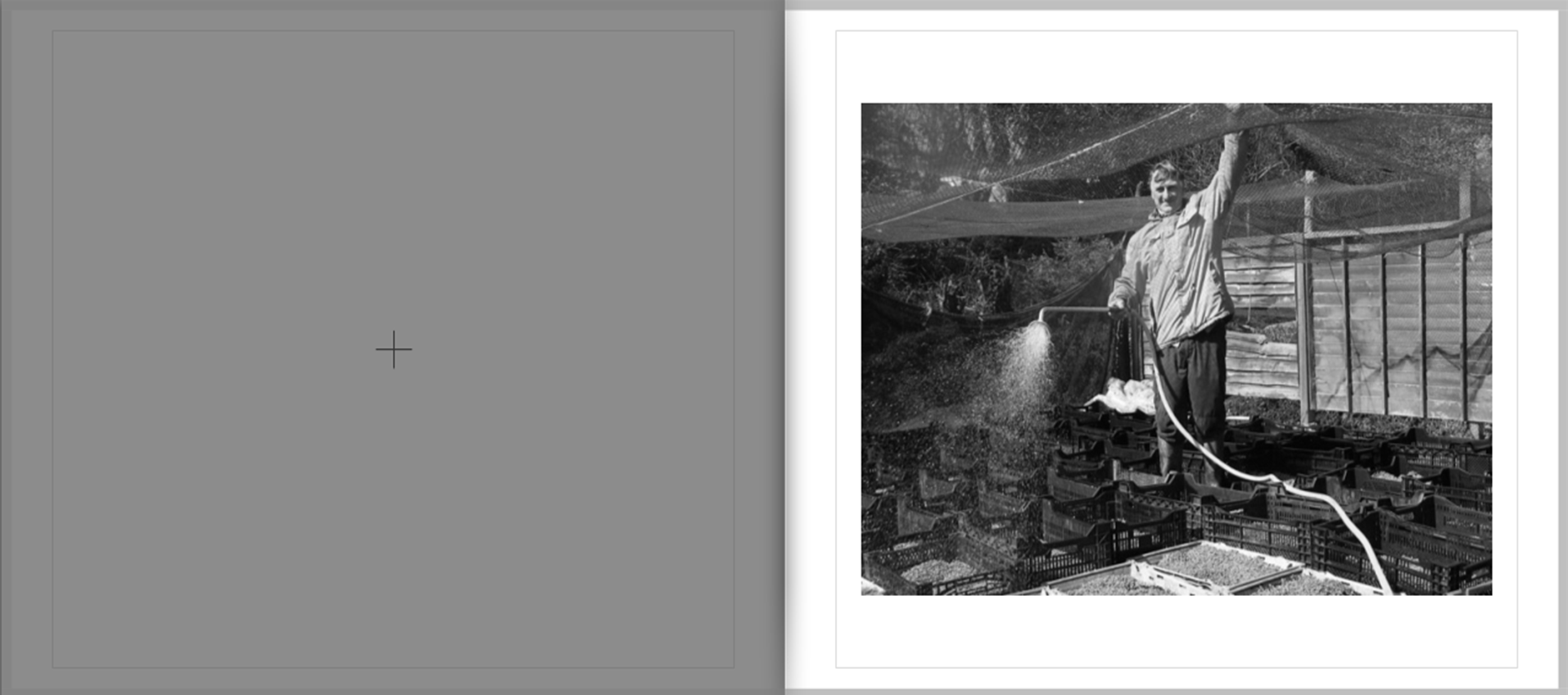

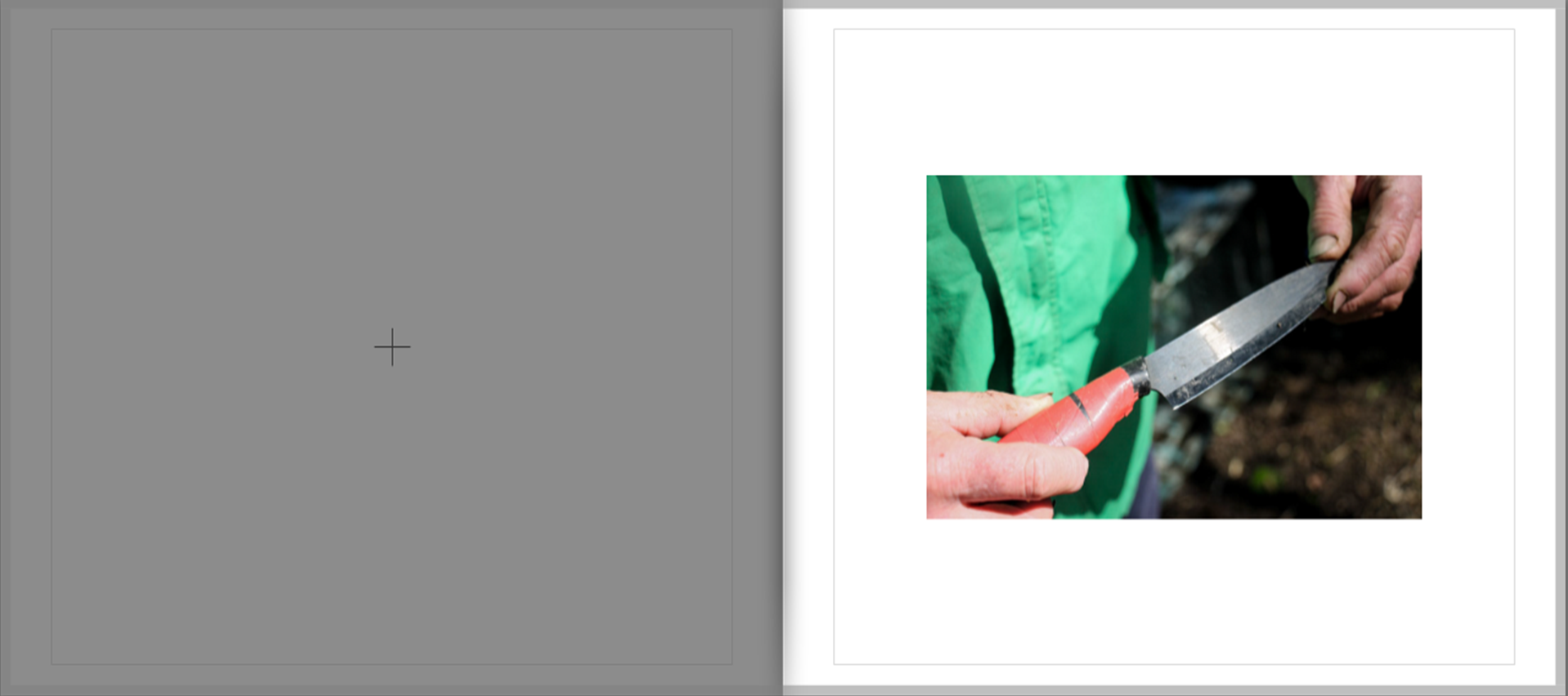


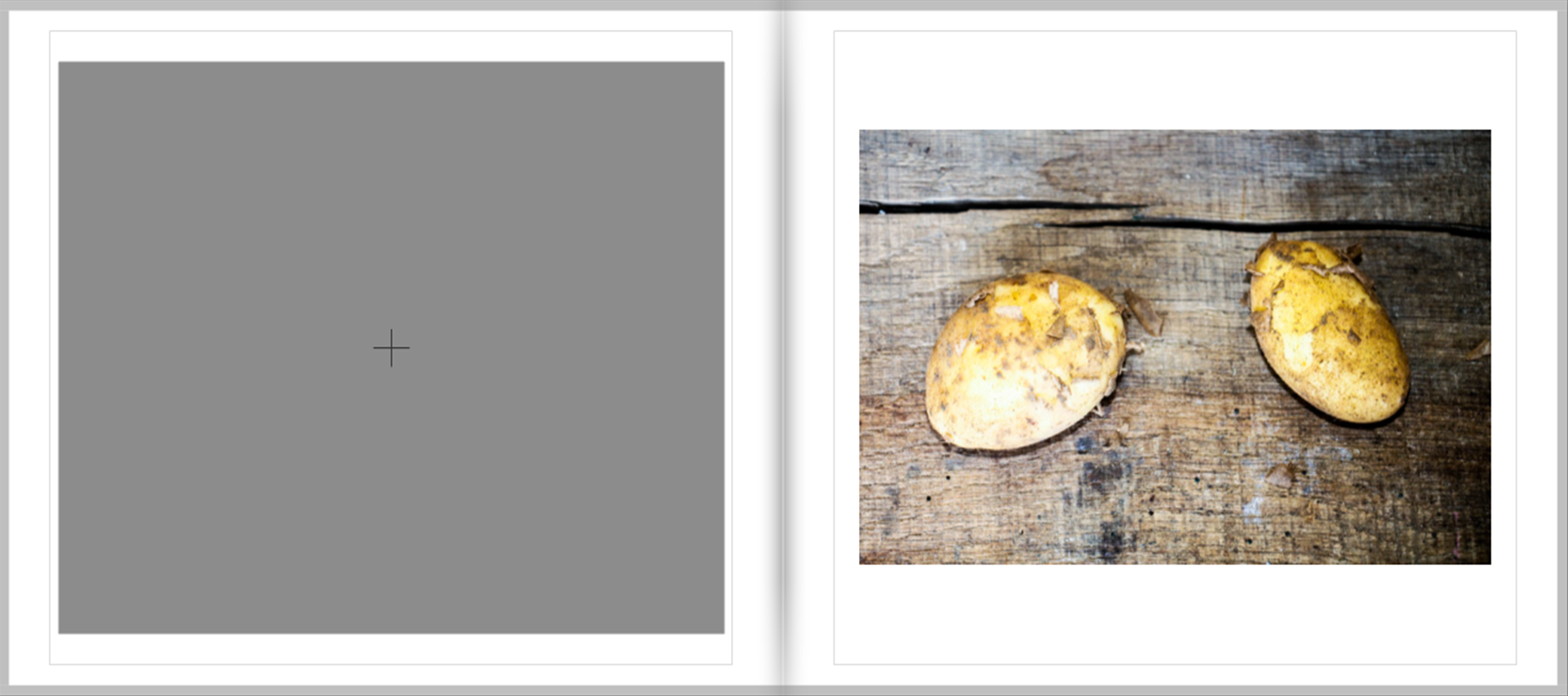


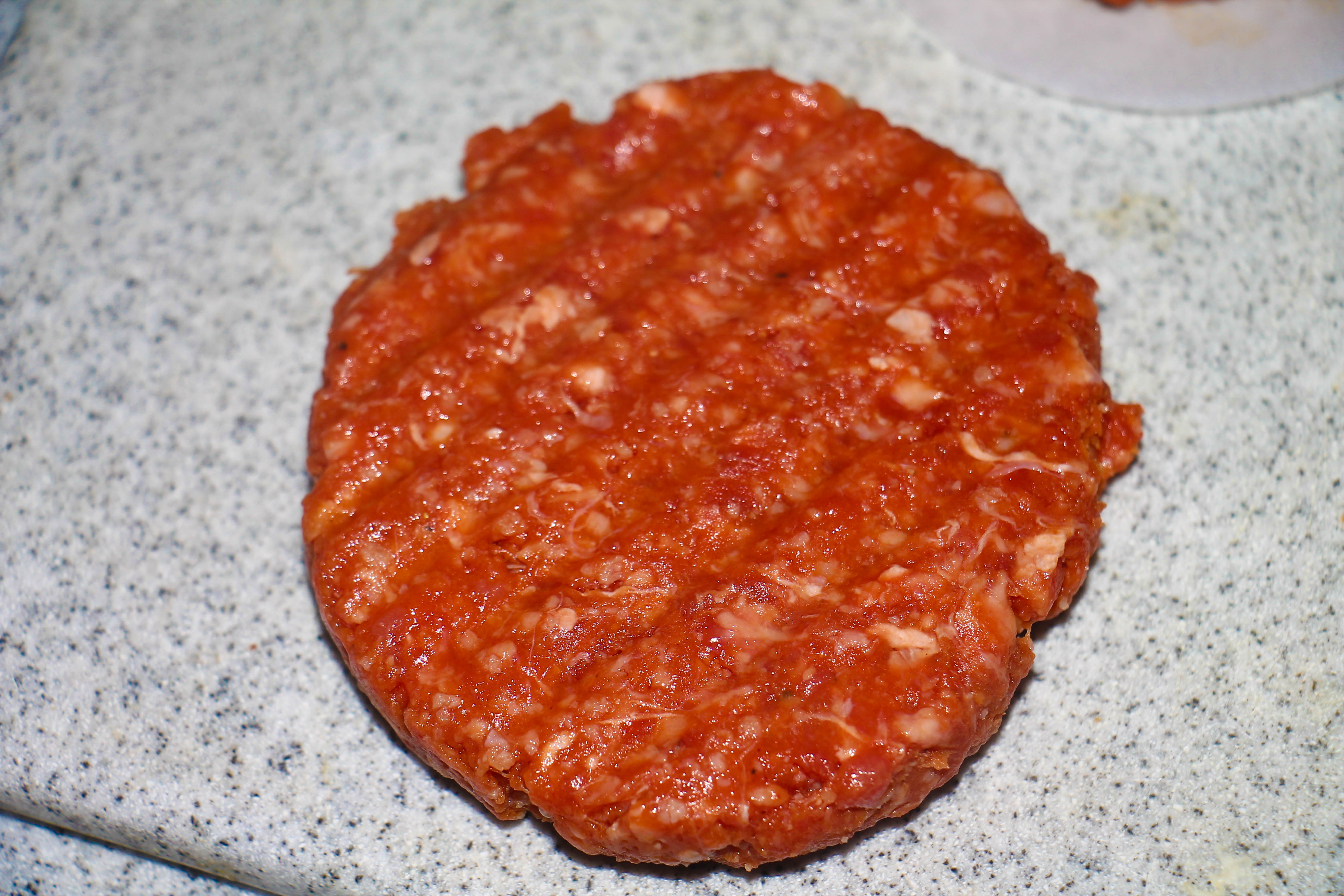
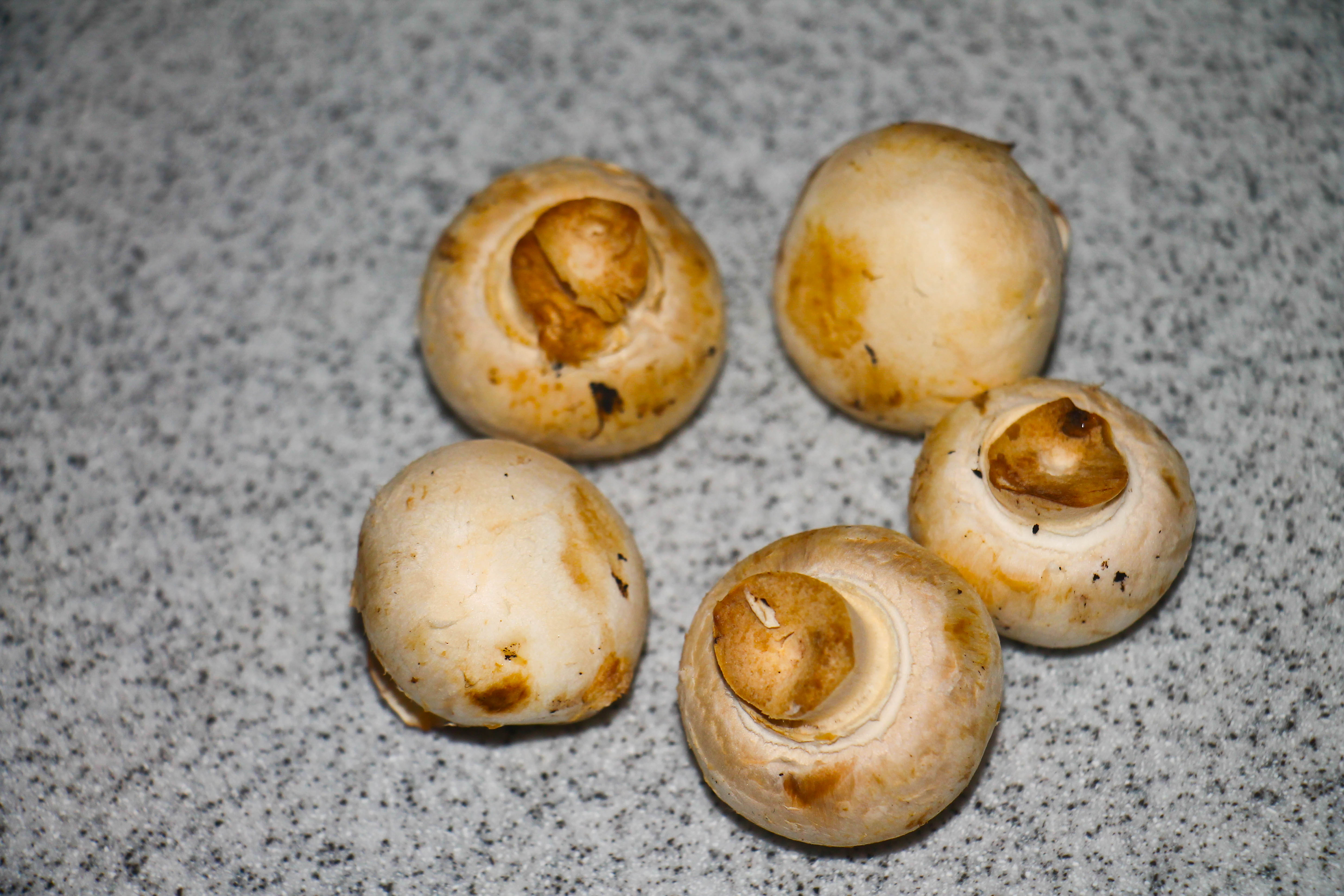


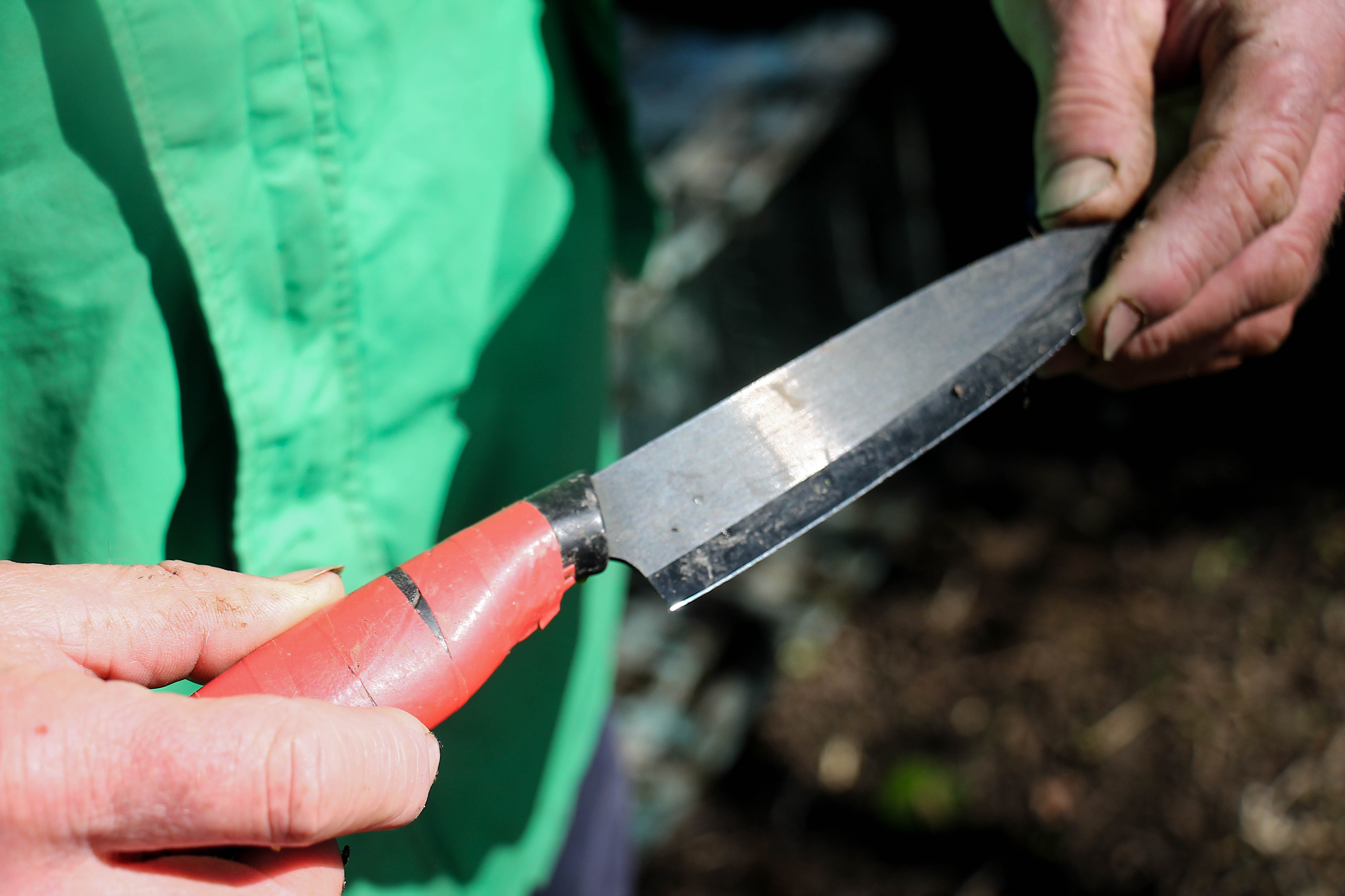


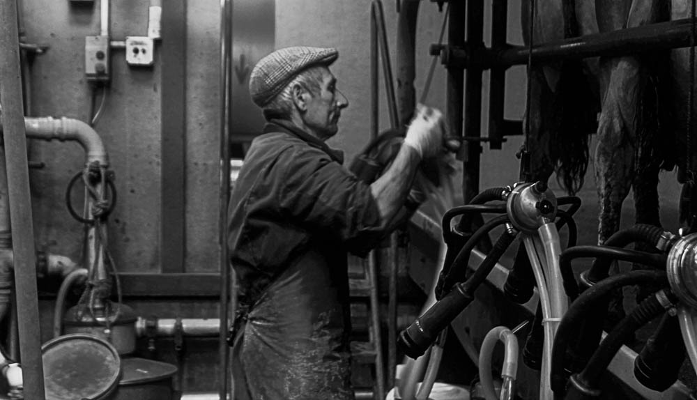


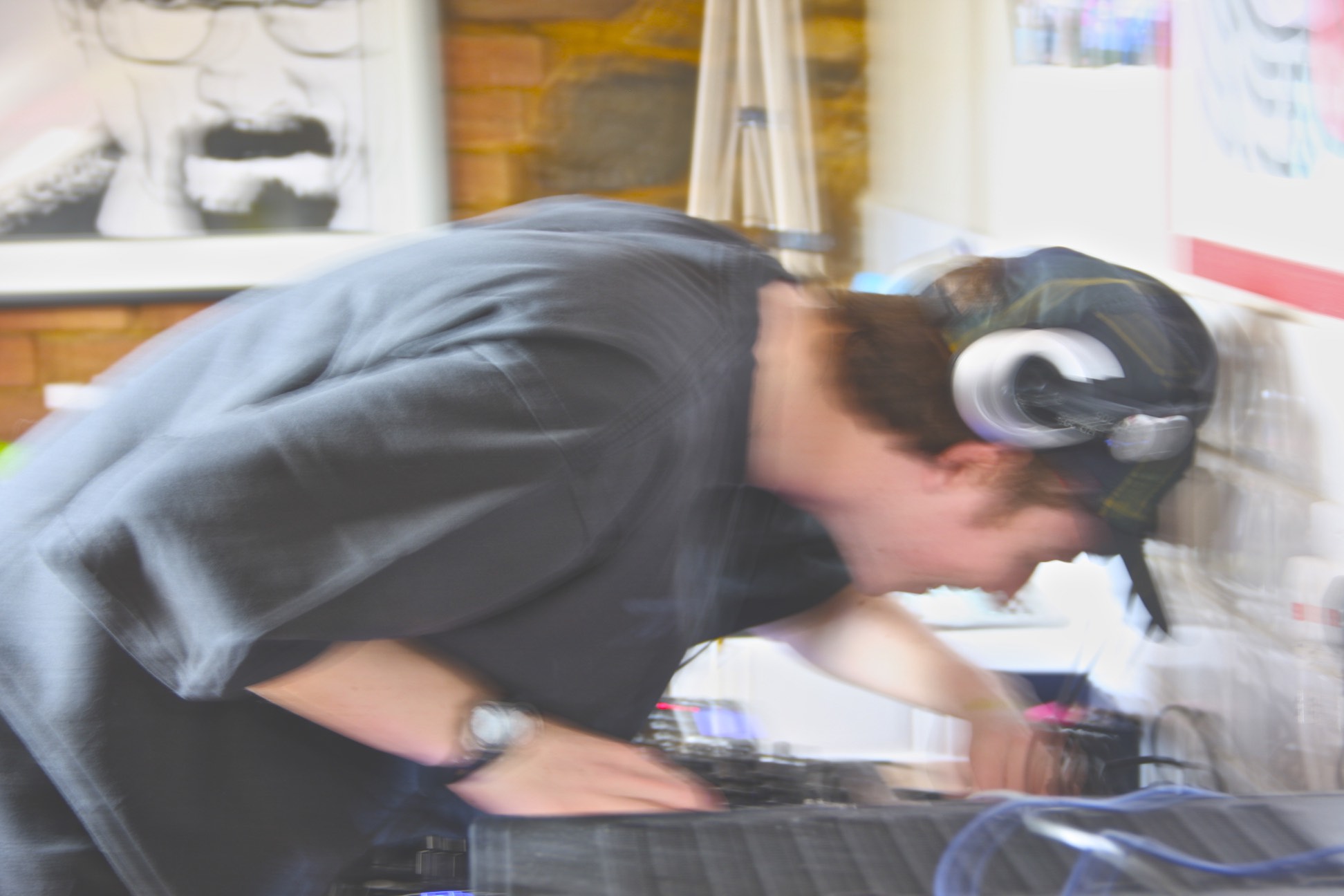


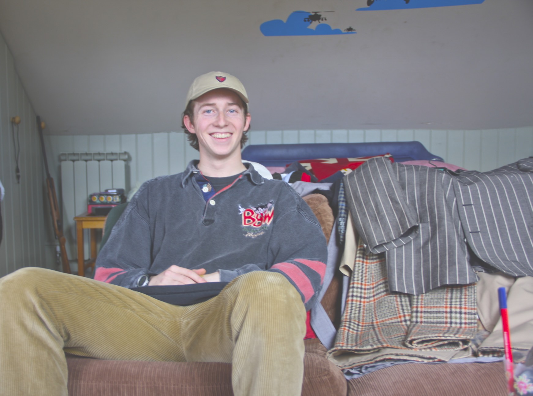


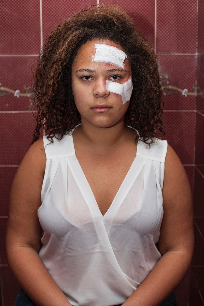


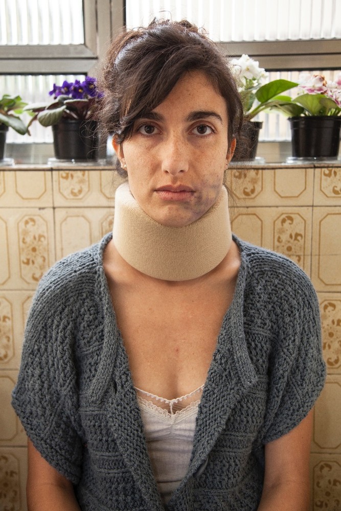
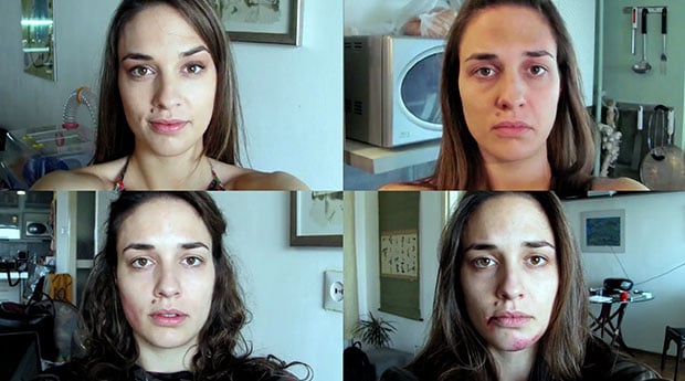


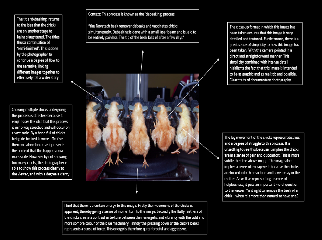


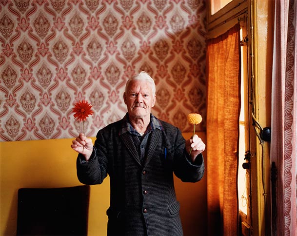


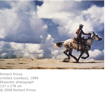
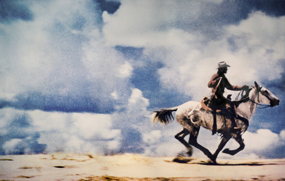