All posts by Bailey Carré

Filters

Author:
Category:

Project Review – Evaluation

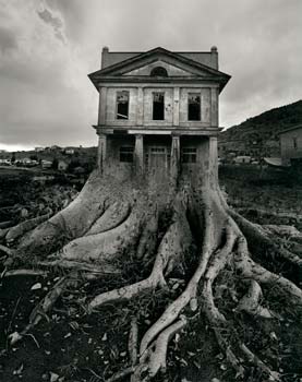
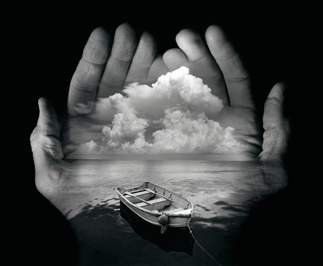
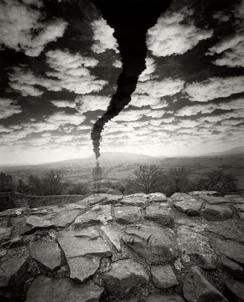
When i first started my project and seen the theme was ‘Truth, Fantasy or Fiction’ my mind went blank, i was so unsure about what i was going to do and it worried me, but after i researched the words a bit more and looked into it i knew that i could think of my own idea and then try and adapt it into one of the three words. The word i was leaning to the most was fantasy as i knew i could try and create my own fantasy world through the use my camera and Photoshop. After i had thought for a while and done a little more research i knew i wanted to something involving the use of colour as my last project was very dark and black and white oriented. This is when i started to research photographers that revolved around colour and came across some nice photos which i knew i wanted to recreate and experiment with. 

If i could change anything or if i had more time then i without a doubt i would’ve taken more photos/shoots, my lack of shoots meant i wasn’t able to experiment as much with my photos and show the best of my ability. I’m happy with the shoot that I’ve got but i know if i was to do 1 or 2 more shoots, i could have came out with some better finals and i would have had more photos to try and alter in Photoshop to recreate some of the photographers work that i researched.  Another thing i would’ve done if i had more time was reach more into the surrealism side of my project, i attempted a small experiment with the photos i had but it wasn’t really surrealism and it interested me also so i feel i could’ve come out with some good finals for it. 

As a project overall it has been mostly successful and i have enjoyed doing it, there was some problems i ran into however i have attempted my best at working around them and finding the best possible solution. I feel i have grown as a photographer and the project has helped me develop my skills and shown me new skill sets that i didn’t know i would have before i started.

Colour Shoot – Evaluation

Conclusion

I am quite pleased with this shoot considering that it was a very cloudy day and even started to rain at one point but i still managed to give the vibrant and colourful look to each photo like i planned. The shoot was taken at around 7pm so the light wasn’t amazing especially because it was overcast but as the sun started to set it gave that orange glow over the island however i only was able to capture one more photo at that point before my camera ran out of battery which was very unfortunate as i could’ve captured some more warm feeling pictures.

Improvements 

If i could improve anything about this shoot i think it would be the time of day that i done it, because of the overcast whether i was limited to the amount of photos that i could’ve edited into coloured photos because Photoshop found it hard to change the hue over a grey background which i had to try and work around. Another thing i would’ve improved if i had more time is maybe explore into the back streets of town instead of down the main high street, this may have lead me into some better photos that i didn’t know i could’ve got.

Jerry Uelsmann – Editing

Step 1: Place the picture you are mixing in place on top of the other picture. Change the size and shape to your liking using Ctrl T then select enter.

b1

Step 2: Change the opacity to around 50% so you can see both photos evenly and then select the eraser tool, now you can start rubbing out the bits of the top layer you don’t want, in this case i have rubbed off the bits that didn’t fit on the building.b2b3

Step 3: Once the shaping is done that is pretty much finished, but in my case there was still a bit of blank space on the building so i decided to fill it in by placing the same photo over it again but the other way round so it fit perfectly into the blank space 

b4

Step 4: Finally just do the same thing with the opacity and the eraser to the new layer and it should look something along the lines of the finished photo below

Pink sunset Jerry UELSMANN

Jerry Uelsmann – Experimenting

Jerry Uelsmann has a very abstract thinking in his photos, he usually tends to mix 2 photos together which is what i’ve tried to do here. I have taken one of my photos of glass windows and mixed it into the building , it makes the photo seem like a landscape but also an abstract at the same time. This photo follows both Matt Crump and Jerry Uelsmann because there is still that fantasy coloured theme but then there is that Jerry Uelsmann feel to it with the abstract building.

Pink sunset Jerry UELSMANN

Photo Analysis

This is another photo i believe is one of my best, like the other one it has a large depth of field which helps the viewer scan the photo from left to right as it gets further away.  Because of this the photo has the effect that everything is getting smaller as it gets further away, this could portray Jerry Uelsmann’s photos as he uses the same technique in some of his photos, it shows good use of depth of field and allows you to look more into the detailed parts of the photo.

I have created the candy coloured effect again to go with the theme of my project, this time i have decided to make the sky pink as well and i think it goes really well, the dark pink on the gates contrasts well with the bright pink sky.  I chose to keep the cars and the road the same to show the variation between the fantasy world of colour and the normal world with the plain colours such as the greys and whites.

Market pink

I feel like this photo relates to Matt Crump’s because of the candy coloured theme, it makes the photo a lot more vibrant and fantasized, it is also like the work of Jerry Uelsmann because of the use of depth of field and the objects getting smaller, he uses this sometimes in his work but sometimes mixes that with other photos.

If i could change anything about the photo it would be the van in the bottom left, it either needs to be the full van or cut out completely, but the reason i didn’t cut it out is then the photo would be too short and the depth of field effect wouldn’t work as well. Also if i was being picky i would prefer for the grey van to be a smaller car so you could see more of the pink on the main gate, this is out of my control but i feel it would’ve looked better.

Photo Anaylsis

This photo in particular is one of favorites from my shoot, it has a very large depth of field which lets you explore all parts of the photo well, you start by seeing the plain coloured wall and then as you scan the picture from left to right you start to notice the candy coloured buildings and signs. This composition layout means that no one will miss any part of the photo as they look at it.

The tones of the photo are very dark closer to the viewer but as you scan backwards they are very bright and colourful, this colour scheme could show the fantasy side of Jersey that people imagine, a world where everything is vibrant colours. I have left the roads and the front building normal colours purposely so the viewer can follow the road down with their eyes and scan the picture.

Taxi Rank candy

I also like how the reflection in the windows shows a glare of the green and pink that has been mixed onto the buildings,  it shows that whatever is reflecting off the windows is that colour as well and stays with the theme of the candy coloured. The dark shadows behind the taxi rank portray the darkness and cold side of Jersey and then the other side of it portrays the fantasy side that everyone wants, with the sun out and all the vibrant colours shown.

This photo is similair to both Matt Crump and Jerry Uelsmann. It has the Matt Crump feel because of the bright and vibrant colours on the buildings and the sky, it is similair to Uelsmann’s work because of how intricate the photo is when you observe it more closely, a lot of Uelsmann’s work is in black and white but his work mixed with Crump’s would come out something like this photo.

Experimenting – Colour

This photo specifically caught my eye because i felt like it had the Matt Crump feel to it with the simplistic colour and use of reflection, much like the one i have taken off his website below.


Matt Crump’s Photo

 I then experimented in Photoshop with the use of different layouts and colour schemes, this is what i came out with below, i like the pattern that the mirrored photo gives however it changes colour when it crosses each border, it makes it look like one big photo.

Reflection colours small

This collage i thought went well together as the colours mix well and the way that the roof of the building flows helps you follow the 4 pictures with your eyes and compliments the photo in a nice manner .

Reflection set

Candy Coloured Photos – Editing

I have been using Photoshop to try and create these candy coloured photos to turn the gloomy town of Jersey into a fantasy colour world, i have put step by step print screens to try and explain how it is done.

Step 1: After editing the photo like you normally would using levels/curves, you need to go to image>adjustments>hue/saturation

1

Step 2: Mess around with the hue bar and you will start to see the photo change colour, you can move it to your preference and also change the saturation to make the colours a bit more intense or lighter.2

Step 3: After this is done you may want to do some fine tweaking to get the colours to come out more in certain parts of the picture, in this case because it was a cloudy day the sky is just grey so to avoid this i have selected the quick selection tool to just have the sky highlighted and then go back and change the hue again, this time i made it a lot more saturated so the blue started to come through, this may not work on every photo.3

Step 4: For the last step it is just finishing up your edit, after changing the colours the building in my photo went slightly darker so i brought the brightness up slightly and also the contrast, this then brought me to my finished image.4


Experimentation – Matt Crump – Candy Photos

The idea behind these photos is that Jersey can be a gloomy place and when i look at Matt Crumps photos they are so eye catching yet so simple, almost like a fantasy world, which made me want to recreate a fantasy feeling in Jersey. The majority of this shoot was taken in cloudy weather which made it a lot harder to edit however they have came out okay.

These are my photos that i have experimented with and tried to give the candy coloured feel that Matt Crump does in all his photos, his photos are very minimal and the composition feels very empty and simple. I have tried in some photos to give the minimal feel to it but others i have given my own twist and tried to experiment with filling some things with bright colours and leaving certain parts such as the road.

Taxi Rank candypink flats

Reflection pink

This photo above in particular i feel looks a lot like the work of  Matt Crump, he usually frames his photos into a square to make them look more minimal. Just like his i have tried to colour the sky and because the windows reflect the windows have been made pink as well, it is a very minimal photo but catches the eye well.

Here are some others that i experimented with, some have worked better than others but they all have the candy coloured effect:

Green flatsColoured Buildings Market pinkPink sunset blue buildings

Shoot Specification

What: For my shoot i am going to take pictures of buildings and the sky to follow the works of Matt Crump and try and get the minimalist look the he gets in his photos, i will also try and integrate Uelsmann’s work and make them landscape and maybe change the normal landscapes into candy coloured photos  to mix a bit of both photographers into my shoot.

Where: I am i going to go to the town center of jersey and take pictures, i feel like this will be a perfect location for the shoot because of all the buildings with different shapes and heights that i can experiment with. Also there are a lot of different coloured buildings which may help in the editing process.

Why: The reason i have chosen to do this shoot is because i think it will be a fun colourful project to do and will be very interesting to see how the pictures come out in the editing stages. Jersey is a very cloudy and rainy place sometimes and with this project its like creating a fantasy world where everything is colourful and its not dark and dull.

When: I am going to do this shoot over the weekend, the weather forecast is okay so hopefully it doesn’t rain, however it is meant to be overcast at some points so i’m going to have to make the best of the weather and try and alter the problems after in Photoshop.


Shoot Planning

Shoot 1: For my first shoot i am going to try and recreate some of Matt Crump’s photos by going through town and taking photos of the top of buildings, signs and other abstract objects that i could try and give the candy minimalistic look

Shoot 2: For my second shoot i am going to try and recreate some of Jerry Uelsmann’s photos by mixing landscape photos and maybe some portrait mixed with landscape, this means that i will have a broad range of photos to try and experiment with.


Jerry Uelsmann – Research

Jerry Uelsmann is a surrealism photographer, he tends to use Photoshop and other editing software to transform his pictures into creations of art. He usually mixes humans and inanimate objects together which creates a surrealistic feel. His photos are questionable and some may find them weird but that it is his aim, in an interview Uelsmann said ‘People ask me, “What does this image mean?” I really like the fact that the viewer completes the image, that they find some personal basis that they can either pass over or they can relate to it’

Jerry Uelsmann – Photo Analysis

This is a photo by Jerry Uelsmann, as you can see its not any ordinary photo, Uelsmann has this strange style of photography and he likes to use layers different editing tools to make his surreal photos. he has mixed possibly 3 or 4 photos in this one as you can see, there is a photo of a hand, of a house, of the clouds and of a person. This is very impressive as he didn’t have software such as Photoshop in his time, he had to use a dark room to create these photos.

Apart from the editing side, the actual photo itself is very impressive, the composition sits well as the figure of a person stands just before the house and lets your eyes follow up from him to the house.  I could try and recreate something like this by using layers in Photoshop with whatever i decide to do, which will be something along the lines of fantasy.

Matt Crump – Research

Matt Crump is a photographer with a very unique style. He changes his photos to give a colourful candy theme. His work intrigues me as it is very bright and vibrant although they are so simple. Matt’s signature use of surreal candy colors, minimalist compositions, iconic subjects, and offbeat humor landed him a spot on TIME Magazine’s Instagram 50. Crump publishes his work through Instagram because he feels it is a much more communal software, he also shares his fans work through the hashtag #candyminimal.

Candy CastleMagical MatterhornCornucopiaLAXLos Santos

I like the fact that Crump’s work is very minimal but is still very aesthetically pleasing to the eye, it is almost like he is creating a fantasy world through the use of minimal composition and colour editing but in the real world, like escapism almost. I feel that i could recreate these photos in my own style to show a fantasy side to the island of Jersey.

Matt Crump – Photo Analysis

Matt Crump is a very simplistic photographer, all of his photos are very vacant however he catches them at the right angles and makes them look very complex. The colour schemes he uses are very vibrant and warming which is what made me want to start researching him and i’m going to try to recreate his photos with my own style.

Crump seems to like using the effect of standing at the bottom of the building and taking the photo from underneath so the building looks like its going inwards as it gets taller, this is something i could try and do in my shoot. He also likes to use the perception of depth of field, which im going to try and recreate as well.

Decision – Fantasy

I have decided to choose fantasy as my path to go down for my project. I am intrigued to go down more of a colourful route for this shoot because my last project was worked around a lot of black and white and i think it would be interesting to delve into a different type of photography and explore new photographers.

I am unsure yet what i exactly want to do i just know i want it to be colourful and as i am going down the route of fantasy i may research some surrealism photographers as well as that does interest me as well.