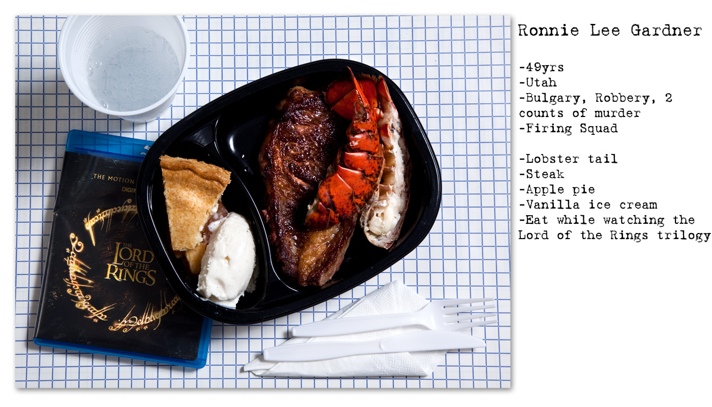
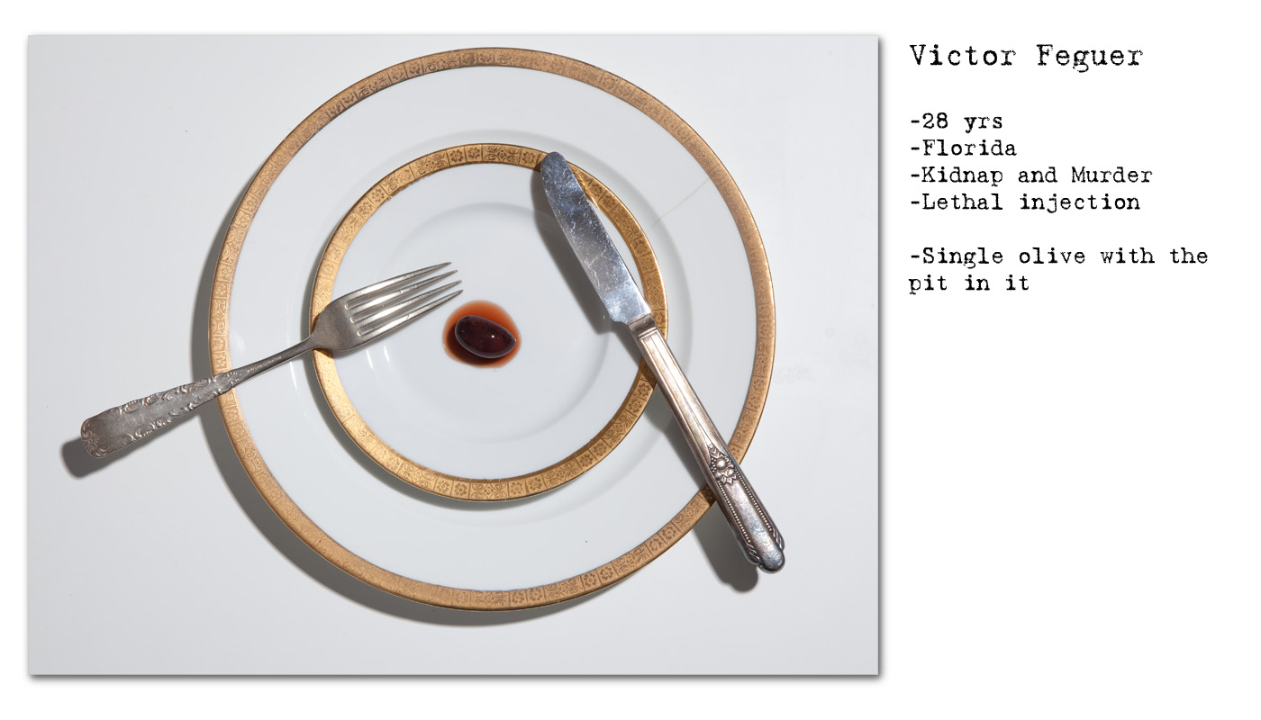
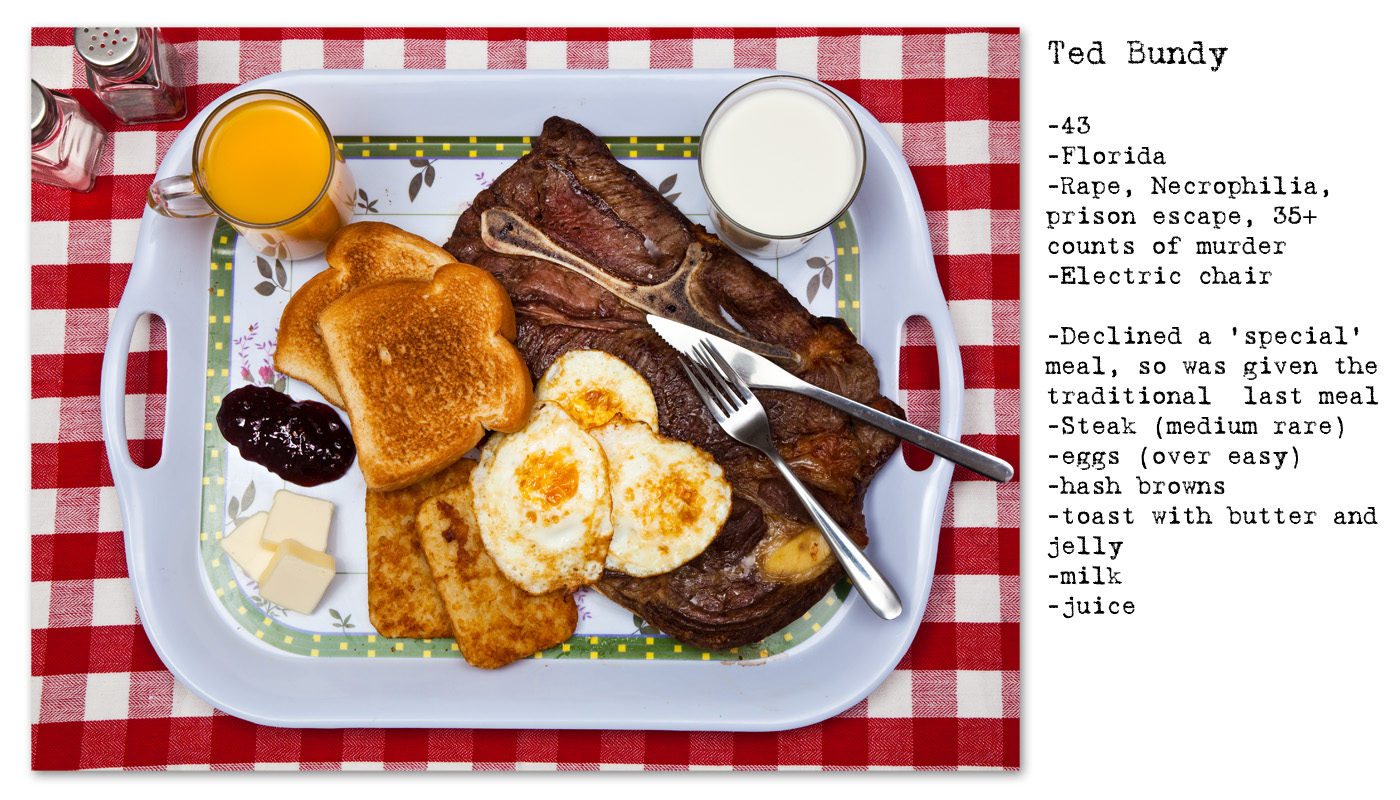
For my attempt at studio style images I am taking inspiration from the series ‘No Seconds’ by Henry Hargreaves. In this series Hargreaves photographs the last meals as requested by death row inmates. The images are all taken in the same composition: a flat, birds-eye perspective.


What does this project shows and highlight?
In this series the photographer Henry Hargreaves re-creates notable last meals of death row inmates; past and present. The meals shown in this series are visually gripping and powerful, showing the meal, a small description of what is included and a brief description of the subject and the crime they were convicted off.
The sense of repetition of the way the image have been framed makes for a common link within all of the images, the most obvious link is that they are all a representation of a person’s last meal. Regardless of how obscure, mad or even simple the meal may be, the viewer is forced to recognize by this pattern that the meals are all ‘last meals’ and that all of the images therefore represent a certain sense of finality. The title ‘No Seconds’ serves to re-establish this idea in a very clear way. In many ways this breaks the complication and chaos of such a controversial topic, examining its key principles and raw details.
Suspense is a key aspect in what makes this series effective. Every one of the images leaves a sense of impending death, especially through the use of notes which clarify the context of the situation and an insight into the method of the execution. This small amount of contextual information, combined with the image is very effective in affirming a mini-narrative within the viewers’ mind.
I find this series to be extremely power because it captures a very serious and controversial subject, the death penalty. Many photographers and documentary makers in the past have touched upon this subject, whether pro and against the idea. Work in this field in often very similar, looking at the facilities of the place, perhaps the subject and few of the staff and the general theme of the impending execution. What Hargreaves has touched on however is a little bit different to what is expected. He has simplified this theme greatly by concentrating on one particular aspects alone – the last meal.
I believe that this simple focus is extremely powerful because it is open to many different interpretations….
- On one hand the topic can be interpreted as a simply the crying personality of the inmates, usually crying out in eccentricity and tortured self-expression as they face their last ever meal on earth.
- On the other hand it perhaps serves as a debate of what rights a death -row inmate has – if they have commit horrific and barbaric crimes should they indeed even have the luxury of choosing, an at times simply absurd and totally chaotic meal.
- Another interpolation may even extend to a poetic look into a ethics of the death penalty, the flip side of the prior argument through which the finite and finality of a last meal is simply an example of humanities cruelty to put to death an individual, regardless of their crimes and what they have done.
In many cases, because of the simplicity of the project, the Hargreaves leaves ideas concerning to the intent behind the project open to the interpretation of the viewer. Regardless of the conclusions the viewer draws from studying this series, the important consideration is that the series invites the viewer to consider and perhaps re-examine their own views of the death penalty.
How might this series help my own work?
Studying this project has been useful because I have gained a greater understanding of the steps and methods to take in order to create a ‘controlled photograph’. Furthermore I have gained a sense of understanding about how simplicity is key to making such images appear powerful because they show the food its rawest detail, thus representing a sens of vulnerability for whatever purpose this may serve, in my case stripping back the hype and glittering nature associated with classic ‘promotional images’ which so often appear in advertising.
Furthermore, this particular series has given me the inspiration to juxtapose my ‘raw’ images on uncooked and freshly sourced Jersey produce done in a Martin Parr style manner, which slightly more attractive an appealing images of cooked and well presented food on a plate, done in exactly the same way as Henry Hargreaves. In such images I will like Hargreaves, include basic background context of the product, supplier, amount and cost. In my photo-book I will include a section by which my Parr like images on the left directly contrast with the style of Hargreaves, thus showing a contrast of interpretation and furthermore highlighting my ability to experiment and alternate with different styles. I hope that this will add an extra dimension to my project and visually will be of interest to the viewer.
