Richard Billingham

Ray’s A Laugh

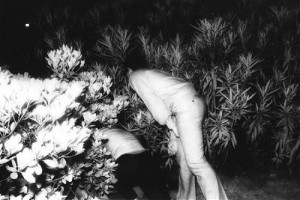
Richard Billingham is an English photographer who is well known for his book ‘Ray’s A Laugh’ which documents the life of his alcoholic father ray and his mother Liz. Born in Birmingham, he studied as a painter at the Bournville College of Art and at the University of Sunderland. He first came into ‘importance’ in the world of photography when he published his book about his family in 1996. The book shows the poverty and deprivation in which he grow up in. He took the photographs on the cheapest film he could find so that the photographs had a bad focus and had brash colours which adds to the authenticity of it. The book is very personal and shows Ray his alcoholic father in a very real way, I think he is portrayed as a vulnerable and troubled person.  In 1997, Billingham also won the Citigroup Photography Prize. He was shortlisted for the 2001 Turner Prize, for his solo show at the Ikon Gallery in Birmingham.  Critic Jillian Stallabrass describes the book as “what is in legend a particularly British stoicism and resilience, in the face of the tempest of modernity”.

After looking at Richard Billingham’s book I noticed that his dad Ray is trapped within the confined space of his home due to his addiction of alcohol. Looking at my photo book, I think that you also get the sense that my dad is trapped within my home although its for a very different reason due to his back problems. I also noticed that this has lead them to look like lonely and almost isolated characters. Both books are very personal, which I think makes it even harder to photograph because it allows you to observe through the lens of a camera which gives you a different perspective.  I think that Richards photographs allows the viewer to imagine what his life would be like, just by looking at a few of his photographs I can picture his home, the smell and the noise. I think he manged to capture a genuine truth in the photos.

“Billingham’s book of the photos Ray’s a Laugh was taken to have invented a squalid realism. His pictures, surreal, claustrophobic, gave meaning to the idea of “too close to home”.

Recently, Richard Billingham did a interview for The Guardian where he talked about growing up in a tower block in the west of Birmingham with his parents and making the book. Richard said that he had never taken a photograph until he was 19 years old, he was going to use the photographs he took to paint them however he never finished any of the paintings as he thought the photographs were more realistic. The article is below:

http://www.theguardian.com/artanddesign/2016/mar/13/richard-billingham-tower-block-white-dee-rays-a-laugh-liz

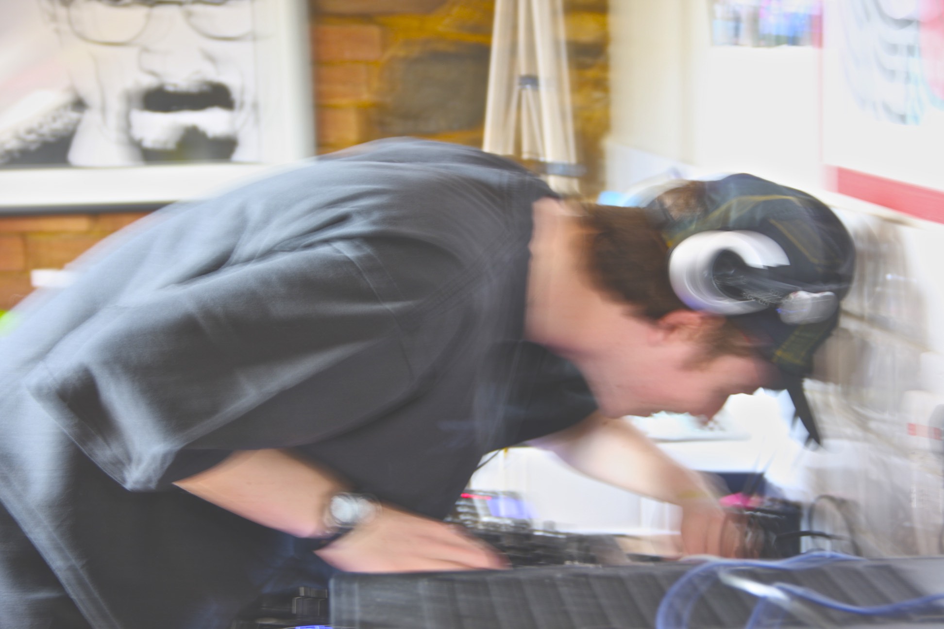
Richard_Billingham_Rays_a_laugh

20101022105141_richard_billingham_untitled2

2012AA43387

Womens Refuge update

I heard from back from the women’s refuge in jersey and although there isn’t enough time to actually produce images from it, I still wanted to go and talk to someone about the work that goes on within this organisation.

These are some notes I made throughout my discussion with the chairman (Pat) of the organisation:

  • it’s run by a management comity
  • 11-12 people volunteer
  • this organisation started about 30 years ago by a women who is still apart of this organisation today – Rosie Sutherland. Inspired by a group of women who decided that something should be done to aid women. That something should be done in order for there to be a place were women can  go and feel safe.
  • 1 out of 4 women will be in an abusive relationship
  •  the fact that getting over an abusive relationship is a long process that women go through  , and in some cases , they go back to the abusive relationship they were in… for many reasons, but mainly because of money problems, housing ect.
  • this organisation allows the victim to be in control of their own lives and control the things they do and why.
  • police are highly involved within this organisation.
  • this refuge is highly confidential and their goal is to make this safe house a home and give women (and children) a safe and happy environment to live in.
  • the organisation employs staff in order to help with day to day care and jobs, these people can look after the staff needs as well as the women’s needs.
  • Volunteers can be anyone from lawyers to accountants and so on, the profession you are in isn’t important, what’s important is having a volunteer who is genuinely passionate about this cause and wants to help.
  • over 1000 people reach out to this organisation every year
  • conducting a training program is vital for each volunteer/staff member and it is all conducted here in Jersey by funding from the states and donations.
  • this safe house contains 7 bedrooms , 2 sitting rooms which are occasionally transitioned into bedrooms if needed, amongst other rooms like laundry rooms, a kitchen ect.
  • there are women who come back after a few years, or people that have previously been in a abusive relationship and want to talk about their past experiences.
  • this organisation is available 24 hours a day (via landline) , having someone that is available during an emergency is vital within the  philosophy of the organisation.
  • they accept anyone and everyone (from any nationality)
  • this organisation / volunteers encourage women to create and form good relationship

-The chairman I met with was a lovely lady named Pat who had been within this organisation for around ten years and she actually became aware of this position because of a friend who had to leave the organisation, thus she took on this Job. She says she had always been involved in some sort of charitable organisation but settled within the women’s refuge in Jersey and is still there today.

-Pat was telling me about her daughters friend who was unfortunately involved in a domestic situation and she would always say she wanted to go back , her sadness was because of the fact that she made a house into a home, all of her memories were there, in that house, and that is is something really sad.”For any woman to leave the house she’s made a home , that is heartbreaking.”- Pat

-I was interested and asked her whether the organisation had ever thought about branching out (because of the fact that there is currently one safe house in jersey). To which she responded that because of our population, something would have to be very wrong for there to be so many people that feel as if they are not safe and need a place to go in order to feel safe. Therefore she doesn’t see it happening anytime to and hopes it doesn’t have to come to that.

-I talked about how the internet is a big part in supporting victims throughout these apps and when I asked about her opinion on this she commented on the fact that it all really depends on the stage that someone is at. In some cases, it may benefit the person in some way or another but from her point of view, she looks at the advantage of having someone there face to face, someone who can empathize and be there in person , and she says that it is a huge difference in comparison to a text or email.

-Because this organisation focuses more on women suffering in a domestic violence situation and less on other issues such as rape, it was interesting to hear that a collaboration of organisations is a possibility for the future.

Overall, this meeting was very insightful and Pat was so kind as to give me a back which held information booklets that they give out at talks and much more that discusses the organisation. She also made me aware of their website online and gave me her contact card if I had anything else to inquire about. Although it is too late to produce images and possible final outcomes, I am really pleased with the amount of information I was given just with one meeting.

Photo Anaylsis

This photo in particular is one of favorites from my shoot, it has a very large depth of field which lets you explore all parts of the photo well, you start by seeing the plain coloured wall and then as you scan the picture from left to right you start to notice the candy coloured buildings and signs. This composition layout means that no one will miss any part of the photo as they look at it.

The tones of the photo are very dark closer to the viewer but as you scan backwards they are very bright and colourful, this colour scheme could show the fantasy side of Jersey that people imagine, a world where everything is vibrant colours. I have left the roads and the front building normal colours purposely so the viewer can follow the road down with their eyes and scan the picture.

Taxi Rank candy

I also like how the reflection in the windows shows a glare of the green and pink that has been mixed onto the buildings,  it shows that whatever is reflecting off the windows is that colour as well and stays with the theme of the candy coloured. The dark shadows behind the taxi rank portray the darkness and cold side of Jersey and then the other side of it portrays the fantasy side that everyone wants, with the sun out and all the vibrant colours shown.

This photo is similair to both Matt Crump and Jerry Uelsmann. It has the Matt Crump feel because of the bright and vibrant colours on the buildings and the sky, it is similair to Uelsmann’s work because of how intricate the photo is when you observe it more closely, a lot of Uelsmann’s work is in black and white but his work mixed with Crump’s would come out something like this photo.

OUTCOME 1 – PHOTO-BOOK

Here is the full layout and detailed evaluation for my completed photo-book.


FRONT AND BACK COVER 

Cover

I have included these two images as the front and back cover because ….

Front Cover – I have chosen this image of a packet of Jersey butter as my front cover because I feel it is a strong image which effectively captures the essence of the project, directed under the broad theme of local Jersey produce. It is a simple and neutral image which links well to my title: ‘Genuine Jersey…?’, because it actually includes the distinctive ‘Genuine Jersey’ stamp. It therefore creates intrigue for the viewer, without giving too much away.

Back Cover – This is a simple picture of a egg. I have included this image on my back cover for two reasons; firstly because it links to the idea of simply showing Jersey produce to open a broad concept and theme, as similar to the front cover; secondly I have also chosen this image because it is quite unusual and peculiar, thus subverting the expectations of the viewer. This is effective to a large degree in ending the narrative on an obscure question mark, a cliff hanger to leave the viewer questions both before and after they have gone through the narrative.


PAGE 1-2

Page 1-2

It is a good idea to begin a photo-book on a fresh page. Jumping into the story too early can be quite unsettling because it allows no sense of build-up.


PAGE 3-4

Page 3-4

On the right-hand page I have simply included the title. I wanted to include this title before introducing the narrative to remind the viewer of my focus and theme. It also extends the sense of build up and anticipation built up on the first 2 blank pages.


PAGE 4-5

Picture1

The first image of the narrative is a double page spread of a close-up of the tide coming in. I chose this as the opening of my narrative because it links straight-away to the idea the book is based around an Island. This enables the viewer to simplify their focus towards the theme of an island, implying Jersey in relation to the title.

At the same time it does not give any actual reference to Jersey. This was an important consideration I made because I didn’t want  a clichéd or obvious connection, which may serve to undermine the sense of mystery following on from the unusual, ambiguous front cover.


PAGE 5-6

Page 6-7


Whilst my first image serves to captivate the specificity of the project, the second image featured on its own on page 5 is a landscape shot of a shed on Colin Roache’s Watercress Farm. This simple landscape image serves to begin the focus of narrative – farming and food production

I felt this image was a good one to begin this theme  because it has a very strong and confident presence about it; lively, colourful but well composed and orderly. This gives the narrative a clear opening, enabling the viewer some idea about what the narrative might be about. At the same time it is subtle and does not reveal too much.


PAGE 7-8

Page 8-9

The next image is a double page spread  of Colin Roache, documenting him walking through a watercress bed.

I like this image because it provides  a sense of chaos and energy to the narrative, in contrast to the calm and orderly beginning. It is chromatic because  it has been cropped to only show the subject’s body, as well as the fact he is moving in an unusual way with his arms flailing. Having a eccentric character introduced this early on is important in establishing a sense of charm and liveliness, a ‘key’ image which will resonate in the viewers’ mind throughout.


PAGES 9-10
Page 10-11

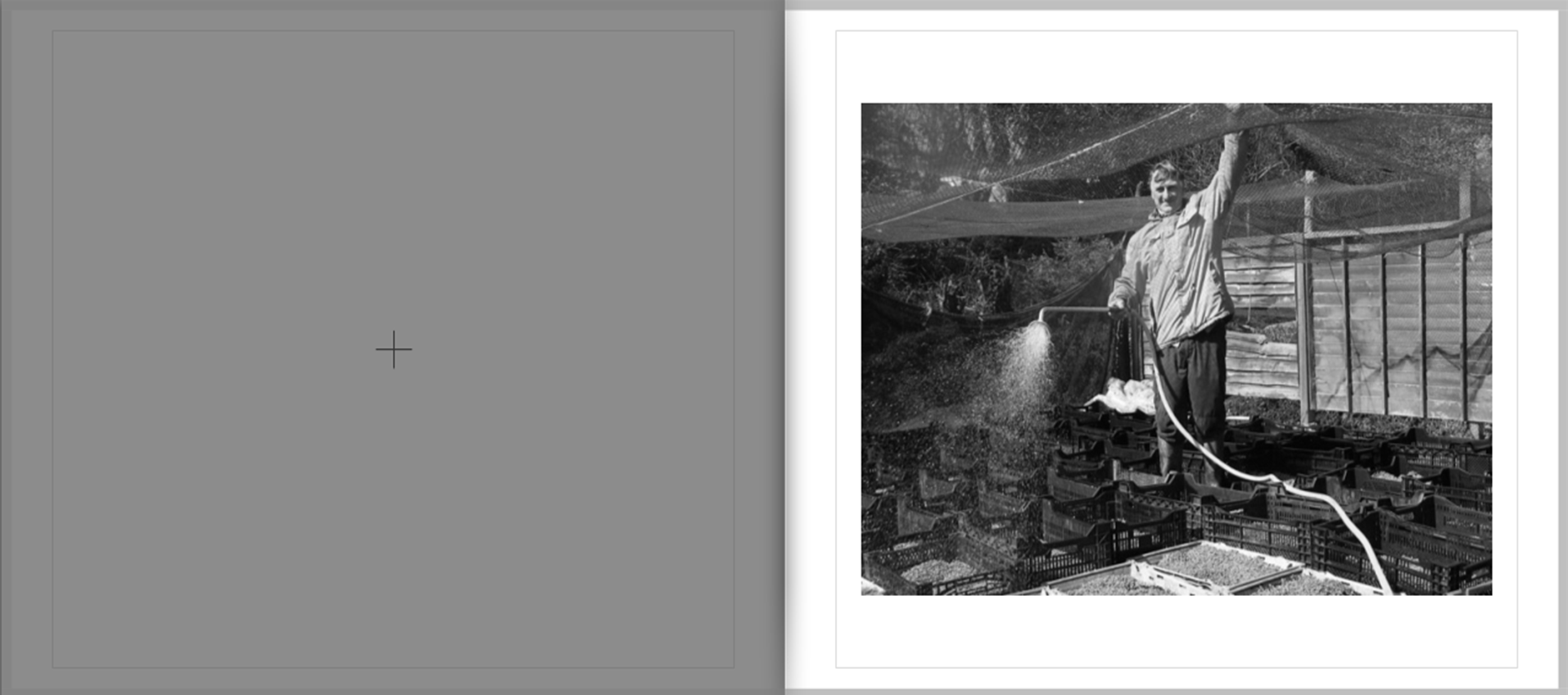
This image now shows Colin watering the watercress beds. It is a formal image.

In contrast to the previous image, I have reverted back to the calm and more traditional feel which is established on pages 4-5. This quick shift in the narrative flow leaves the viewer in anticipation to what might come next, thereby keeping the structure of the narrative unknown and uncertain.

Although it contrasts in terms of style and mood, this image does in many ways also link to the previous image because it reveals more aspects of the subjects character – which in the previous image was  a more mysterious representation.


PAGE 11-12

Page 12-12

This is a two page spread which depicts a close-up still-life shot of some of the finished water-bed crests on Colin’s farm. This is the first image of the narrative which is directly linked to the ‘Parr-like’ advertising language.  Whilst some similarities to Parr can be drawn, such as the fact it is taken of something close-up as well as being highly saturated, there is certain aspects of the style and composition which makes it slightly more orderly.

Nevertheless it is a strong image regardless which provides to a large extent, a definite degree of intensity of which the narrative can build on.


PAGE 13-14
Page 14-15

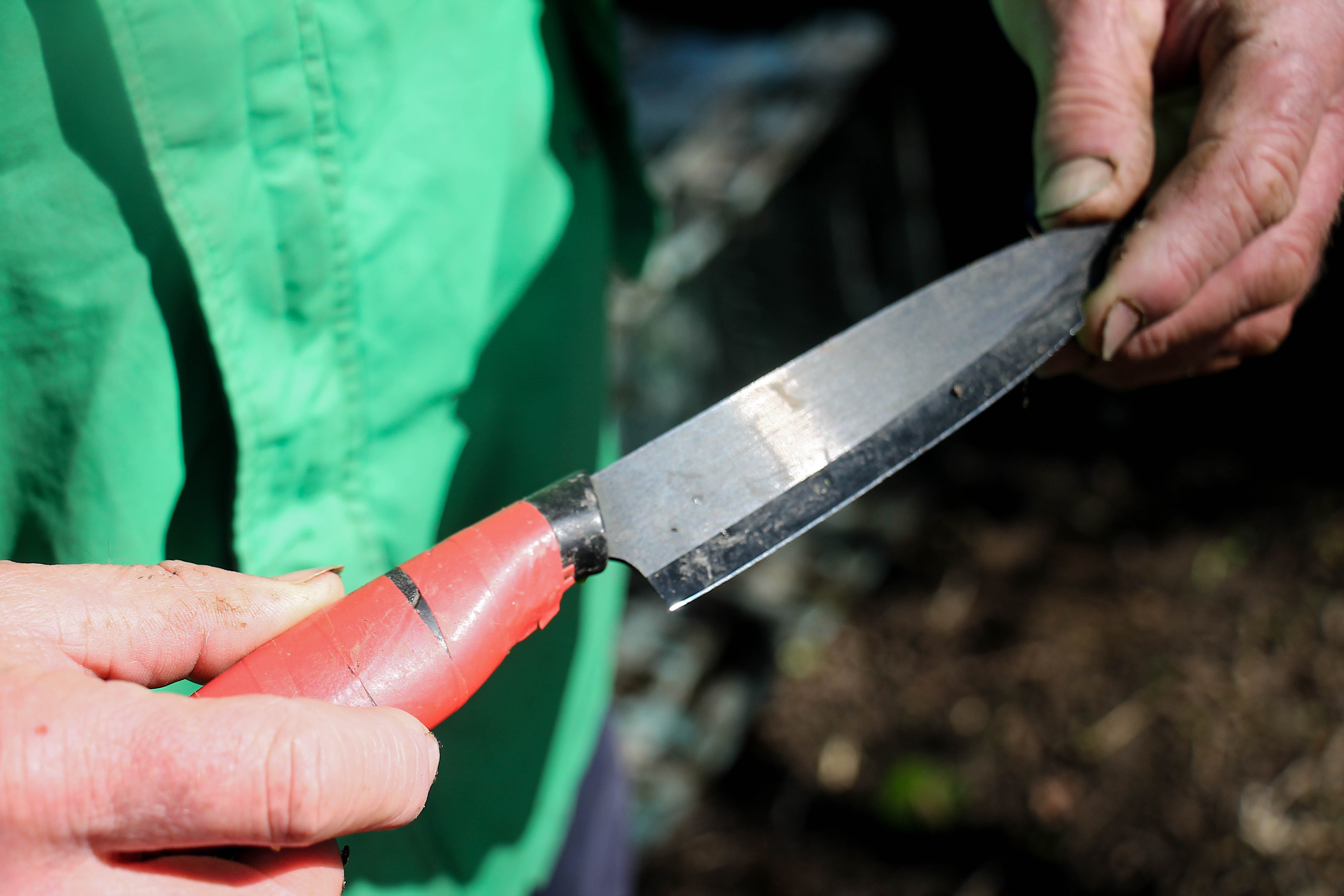
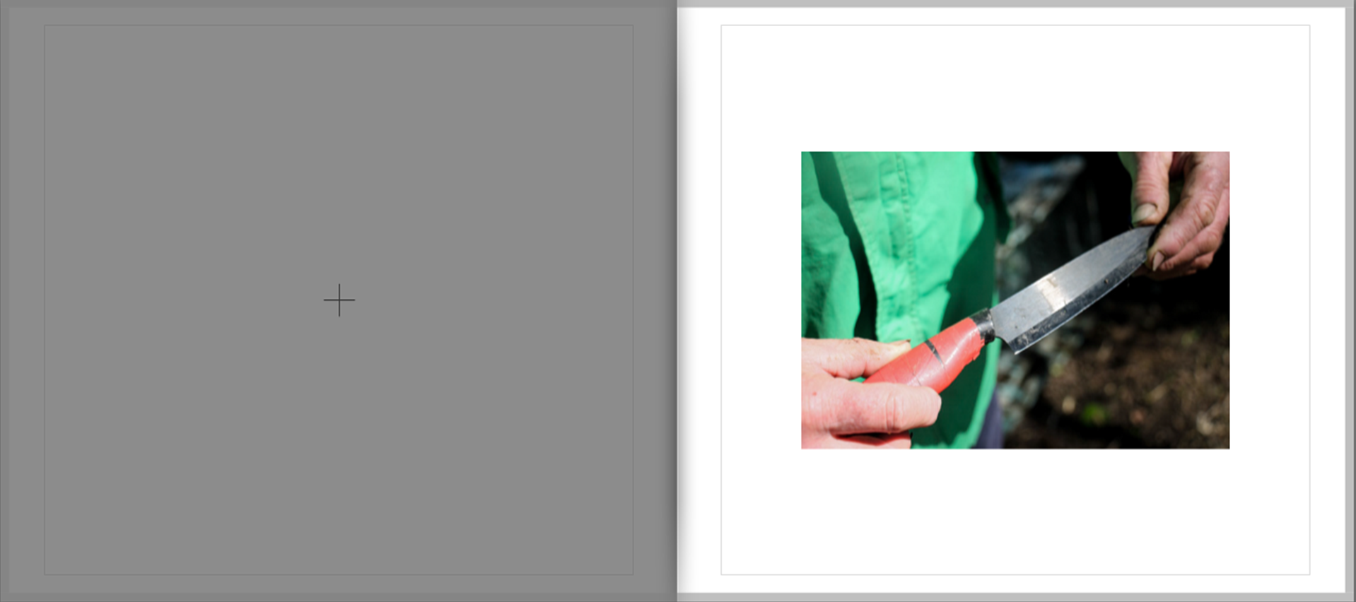
This image – the final of the watercress series, is a close-up of Colin holding a knife. In relation to the previous image, it is linked in the similarities of Parr’s style.

I find that this image is a really strong detail shot which helps to hold the narrative focus together and re-assert a sense of neutrality, which to some degree was lost in the exploration of the general pattern of the watercress theme. It’s simple and ambiguous meaning/representation is fundamental in achieving this objective, because a knife has various meanings.


PAGE 15-16

Page 16-17

These two photos are the first of a mini-case study, looking at classic advertising style. These images are strong through their simple but bold representation.

They serve as part of a key study of this project, as the project is effectively centered around exploring local produce. They represent produce in its simplest form and thus serve as a metaphor for broad theme of my investigation.

Therefore it can be considered that this part of the photo-book is key in grounding and directing the overall theme, from which all other images are now bound to.

PAGE 16-17

Page 18-19

This is the second part of the case study. It maintains the theme in the previous two pages.


PAGE 18-19

Picture3

This third part of the case study contrasts directly with the previous two pages. Whilst those images were intended to look as attractive and appealing as possible, thus supporting and responding to the classic advertising style. On the other hand these images are deliberately intended to look grotesque in order to subvert this classic style.

These particular images, very much linked to the influence of Parr more vulgar image in ‘Common Sense’, provides a sense of conflict to the narrative, a sudden and unexpected emergence of hideous unappealing images in the midst of all of the previous images which appeared to evoke a more favourable view of local Jersey produce.

These two image are therefore key because they really start to challenge and question the extent of  how Jersey produce is represented, often in a positive and nostalgic light.


PAGE 20-21

Page 22-23

These two images continue on the lines of this theme, rugged coarse images which in many ways depicted the chaos and vulgarity often associated with the likes of Richard Billingham.

By continuing this link, the viewer is forced to ask further questions about the link between advertising and consumerism.


PAGE 22-23

Page 24-25

After this mini photo-study of food, I returned to the theme of farming, linking directly the previous photograph of a burger to the focus of Tom Perchard’s cattle farm. This first image of the series shows two cows moving from the milking parlor to the barn.

It is a very colourful and powerful image which has an interesting sense of energy and momentum as established through the motion blur, colour and slightly obscured composition. This image is subsequently effective because it serves to resume to intensity established within the previous four pages. The fact it is a two-page spread extends upon such an idea.


PAGE 24-25

Page 26-27

This following image is a portrait of Tom Perchard. It is a classically composed images, in contrast to the more spontaneous nature of the previous images. Further it contrasts in the sense it is on the page in a more conventional manner

I included this slightly more conventional image in order to re-assert a sense of structure to the narrative, as well as to slow down the tempo. This is effective in the sense that it not only mixes up the intensity of the narrative, but also re-establishes a clear sense of focus which may have been lost by the chaotic sense of the 4 images between pages 18-21


PAGES 26-27

Page 28-29

These two images are candid, informal portraits of the two farmers who work in the milking parlor. The image on the left depicts the transfer of milk into a bucket for transportation, whilst the image on the right shows the actual milking process.

These images a both very grainy, vernacular and coarse in style. My intent in choosing these subsequent images is to attempt to depict the manufacturing process of milk in the simplest and most grounded way as I possibly could, in order to get to the truth behind how Jersey Milk is processed.

By this point in the narrative I am starting to uncover and pick away at the illusion of advertising images. I believe that the content of this images serves to greatly develop and advance this process.


PAGES 28-29

Page 30-31

This image moves away from the indoors setting to the outside. It is a double page spread depicting the outside of Tom Perchard’s office.

This image is a strong landscape shot which is very calm and reflective in nature. In this sense the image serves as a break within the developing intensity over the last few pages and returns to a more central focus.

Furthermore, this image serves to change the mood of the narrative, which prior to this was very chaotic and cluttered. This serves to re-establish a much needed sense of order.


PAGE 30-31

Page 32-33

Continuing on this outside setting is two images of equipment used by Tom Perchard on the farm. These images very much reflect the distant and considered approach I noticed frequently when studying the work of Wildschut.

They are very observed images an continue apon the sense of calm associated with the previous image.

I selected these two images together because I found the contrasting blue with red gave this sequence an interesting degree of contrast. Nevertheless, the bold appearance of both of the images mean that they link well and flow naturally together despite this juxtaposition of calm and aggressive colour tones


PAGE 32-33


Page 34-35

On the next four pages, there is another mini case study , this time exploring a collection of still-life images on Tom Perchard’s farm.

This image of a lamp shade in a barn in a very strong image because it has a well defined visual presence combined with a high level of detail. The image has a very nostalgic feel, linking to some of the previous images in earlier on in the story.

By providing specific focus shots in an image such as this, I am helping to build up a more specific story of different aspects of the farm. This helps to extend the viewers understanding of how local produce is sourced, but in a way which is subtle and poetic, without disrupting the overall flow of the narrative.


PAGE 34-35

Page 36-37

Continuing this mini-study is two further still life images. The photograph on the left is an abstract depiction of a pipe. The photograph on the right shows an electricity box.

The two images are very abstract and have no direct meaning. This is fine because the main purpose of these two images is not to display anything in particular but instead to show more of a mood and mindset. The image on the left for example can be considered my own personal reflection of the narrative so far, hence the inclusion of the shadow. The contrast of this image subsequently serves as a metaphor or my conflicting views over the course of this investigation, concerning my views of local produce.


PAGE 36-37

Page 38-39

This is a formal portrait of John, who works as a fish monger at the ‘Fresh Fish Company’. This image follows on nicely from the previous because it maintains the stark monochrome contrasts and development of texture.

This image continues the traditional documentary style images which I began to develop in the recent Tom Perchard series of images. This features are evident through the careful composition, black-and-white display, and generally balanced composition. This old-fashioned style maintains a sense of charm similar images of this style have helped to assert and express.

I find this is an effective image in conveying traditional aspects of Jersey culture as it shows John, a Jersey-man, wearing a beret and dressing in typical attire associated with fisher mongers. It therefore re-asserts the local theme of the project.


PAGE 38-39

Page 40-41

Continuing the theme of the ‘Fresh Fish Company’ shoot, is these sequence of images, depicting close-up images of some of the display in the shop.

This is just a little extra feature which provides subtle clues about aspects of the shop. It serves as a key factor in gradually winding down the mood of the narrative. At this stage of the story I am making a brief return to the style of Parr, through this quirky close-up documentation, a factor I explore in much greater detail in the following two pages.


PAGE 40-41

Page 42-43

This image, which depicts a customer picking up a lobster shell is very ‘Parr-like’ in approach, owing to the fact it is close-up and highly saturated.

The bright, chaotic nature of the image returns a sense of vitality and liveliness into the narrative, which is somewhat lost by the more calm and objective nature of images within Tom Perchard’s shoot. This is key in maintaining interest from the viewer in this late stage.

This is one of the key images in the story because of its intriguing and obscure nature. The ring on the hand, as well the hand’s interesting features in general create a captivating image which embeds greatly within the viewers mind. similar to the effect Parr inevitably achieves in many of his images.


PAGE 42-43

Page 44-45

As the previous image sought to lighten the overall mood, I chose this image to maintain this aspect.

This image is a spontaneous picture I took of Vicky talking to a postman, who is one of the regulars at the ‘Fresh Fish Company’. This is a very light-hearted image, depicting a conversation as it takes place. Although it arguably is not relevant directly in terms of looking art Jersey produce, it is instead more an observational image which looks into the dynamics of the relationship between shopkeepers and customers – a interesting development and slight de-tour and addition to the overall basis of the theme, which is effectively in slightly breaking up the narrative and adding something a bit different and unexpected

This image fits well into the story because of the spontaneous sense to the image, created completely through the events as they unfold, a re-occurring theme throughout, in particular when linking back to the images taken on Colin Roche’s farm. I included this image bear the end because I think it helps to round of the image well due to its reflective nature and very open ended meaning.


PAGE 44-45

Page 46-47

For the final section of the project I wanted to include 3 images featured as single and double page spreads, over the course of 6 pages. The image I chose for this final section are some of the strongest over the course of this project and define the three different aspects I have been attempting to explore; the produce, people who make the produce and the livestock.

This first image was taken at the Lidster Family Butchers in the market place. Although it is a formal portrait which is classically composed and presented, it nevertheless has a degree of spontaneity combined with a certain free-flowing feel to it.

It is a very simplistic image which serves to show people involved in creating local produce as friendly, positive and helpful, something which I can say from my own experiences over the course of this project is indeed largely accurate.

This image has a very  strong visual presence, due to its well-rounded detail and high-level of contrast. It is therefore in my view a strong enough portrait to end this part of the investigation on.

PAGE 46-47
Page 48-49

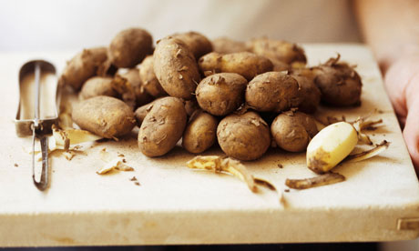
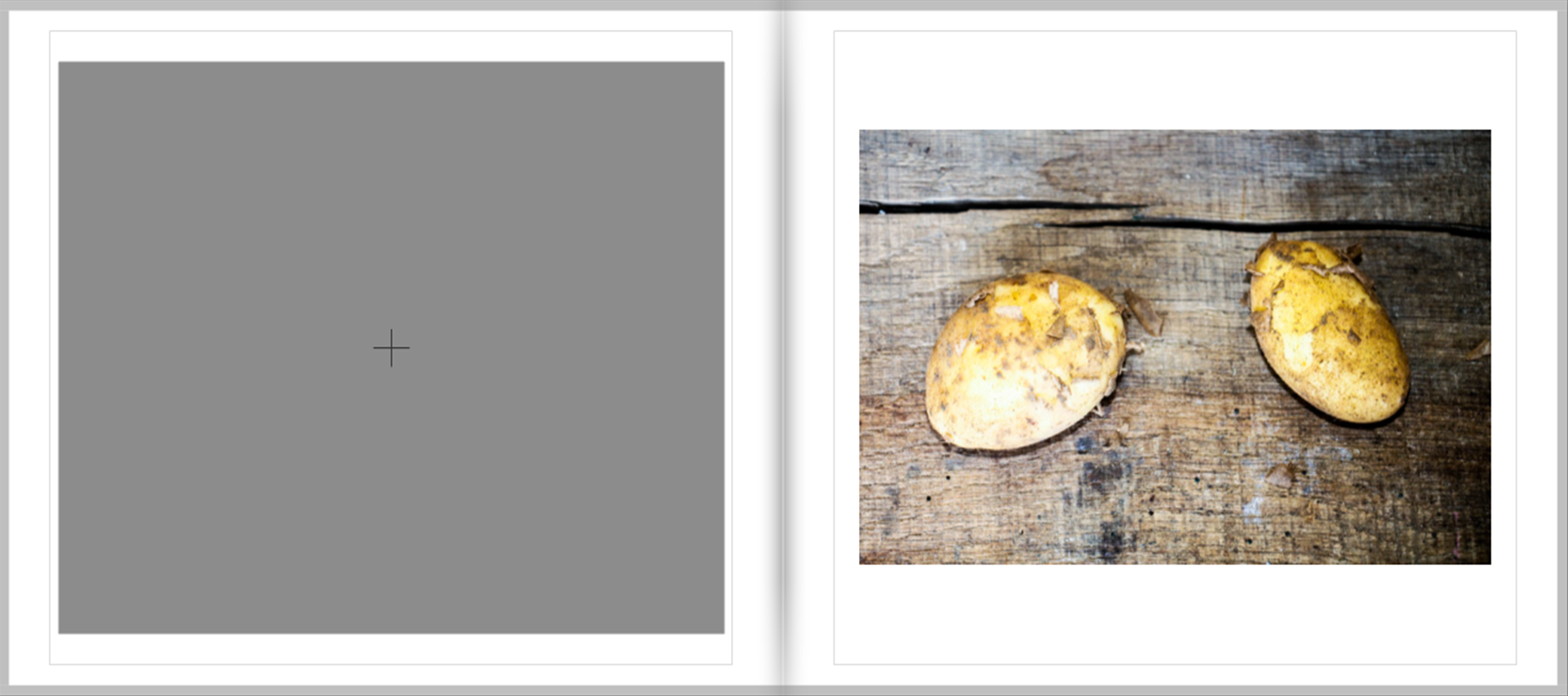
Continuing on the theme of simplicity is this still-life/close-up image of two Jersey Royal potatoes on a wooden background. This image is very simple because I have simply photographed two potatos as they have been freshly dug, which no attempt to change or manipulate lighting.

In many ways, the style of this image is a metaphor for what I wanted  to achieve in this project, to bring Jersey produce down to its basics and create an honest, reflective presentation and portrayal of produce. The style of this image a find meets the balance between the over-emphasized nature of Parr’s images with the equally over-the-top nature of traditional  ‘advertising language’ which in contrast distorts the view of products to the other effect.

This image explores one of the most famous Jersey products in a way which evokes very little fuss, which in many was is a challenge to the overbearing nature of a degree of advertising language, by documenting it rather than exaggerating or endorsing it.


PAGE 48-49

Page 50-51

This final image of the photo-sequence is in my view, one of the strongest of my images have have used throughout the course of this project.

I was taken on Tom Perchard’s farm and shows a cow glaring into the camera in a piercing manner as it is walking away from the milking parlor into the barn.

Such an image works well in ending the narrative because it is quite a strange an to some degree an unsettling image which, without specifically/explicitly stating anything, serves to imply and bring certain questions to the attention of the viewer, a distinctive image which leaves an abrupt and forceful ending leaving the viewer slightly perplexed.


Shoot 4: Investigating the non-traditional side of love part 2: Emma

To carry on my personal investigations, I wanted to capture one of my friends, Emma, who is a regular Tinder user herself. I wanted to capture Emma just like I did with Freddie; for instance, her as her usual self, what she would usually dress in, and what she would make more of an effort for.

Emma in the Morning

The one thing I find most interesting about social media sites, and in this case, Online dating apps, is the fact people not perceived ever as their usual self. Allowing me to work with Emma in a way that does so is really significant as the reader is assured that in this case its a reliable piece of information that is eventually acknowledged.  The first image that I took of her was wearing pyjamas. Emma like to wear pyjamas in her spare ‘chill time’, which is perfectly okay, but do her fellow Tinder users know this? or any of her recent ‘matches’ – the reader is drawn to seek questions about the vulnerability of her current situation. – Is what Emma is posting online projected as her true self? – this is something as an artist  needs to find out through the use of imaging.

IMG_0842

Emma’s Usual Self 

I wanted to capture Emma’s usual self also. I felt this was a good reflection to give the reader a reliable sense that Emma is a truthful person to the overall ‘dating site community’. I composed Emma to be very natural in order for this to happen and used the setting of her room to characterise her even further. Because her room is rather messy, this could suggest that she is not what she say she is on social media, as people may pursue her as someone who is ‘neat’ by her perfectly composed / touched up photographs.

IMG_0850

IMG_0855

Smart Emma

To end this shoot, I dictated what would most likely be featured on Tinder, as if there was an abbreviation to its social ‘guidelines’. I composed Emma wearing her typical sixth-form uniform in order to show that she is part of the Education System, something that is may not mentioned as much on her page.

IMG_0870

Further Ideas

In order to take this further, I plan to appropriate Emma’s character and to manipulate it by producing a Tinder profile for her. I think by having a role reversal between what was the subject  s the art  now becomes that the artist is the art whereby they narrate a false-looking story of someone else, in effect masking their individual persona.


Shoot 4: Investigating traditional relationships through family part 2: Mum and Dad

Looking into the comparisons between non-conventional love against that of traditional love made it easy for me when deciding that I really wanted to use my parents as the forefront to this concept. Because they have been together for nearly 24 years, I thought it was best for me to use their story through images and some text to show the love they have for each other, and to show that there are other means and ways of going about finding love.

IMG_1050

I took this image to show how in a contemporary image there is a truthful relationship. This image is clever in my eyes as I feel it speaks for itself as a metaphor, dictating how there are possibilities like my parents of not having to rely on things which are un-reliable, like Online Dating websites and apps.

Researching with my own Family Archive

Much like my previous shoot featuring my grandparents, I dug into my own family archive to seek some contextual references and links I can make to juxtapose those with contemporary love stories. Continuing on with links to KesslesKrammer, I felt the repetition in these wedding images are still the stereotypical ‘wedding cake pictures‘ and ‘flowers‘ and ‘relatives‘. I felt this really fitted with the theme with how looking back images where truthful because they always seem to create a sort of social pattern, yet because of the recent developments of online dating it is hard for people to empathise with certain patterns fitted by relationships as people are now finding love in various ways.

Scan 81

Scan 82

Scan 86

Scan 87

Scan 78

Scan 83

Other uses of Archival Material

The alternate uses of archival material yet again represent similar works of Ed Templeton, as I feel the uses of writing and stamps present an overlaying narrative in a simplistic and metaphorical way.   If I was to use this idea of following on from Templeton during the exam, I feel it would be a goof idea to overlap the images with text and to also include maybe some stamps over the top to suggest the concepts notion. This letter my Dad sent to my mum I felt was quite ambiguous, and the envelope making it more of an un-written mystery. I think it would be an interesting concept for people to interpret this work for themselves and ask themselves what could of been inside of it. I feel this envelope can represent the era that they were in too. It was more common during the 60s and 70s to write letters instead of sending text messages like people do in our modern society, yet with letters its more detailed as to what could be happening, however, also just as misleading.

Scan 85

Scan 88

Shoot 3: Investigating traditional relationships through Family Part 1- Nanny and Pops

The next shoot I made was of my Grandparents. I felt it was a good idea to make portraits of them to distinguish the relationship they’ve had for the last 60 years. Recently celebrating their Diamond Wedding Anniversary, I thought it would be a great opportunity to show to a viewer that with the new developments  of social media, it is still possibly to withstand such a lasting and traditional relationship. This is also viable to the words of Steven Gill, in particularly “Hackney Kisses“, as my grandparents relationship occurred prior to the effects on World War ll.

I started to compose both images in their bedrooms. My Grandparents use separate bedrooms as my Grandma prefers to sleep without my Granddad, having no particular reason but the fact he snores in his sleep. The first portrait I made was of my Pops, in reflection of Gill, I wanted to use an important feature in their lives in a repetitive way yet somewhat differentiated. Composing either of them in their bedrooms suggested a connection yet also a difference.IMG_0815

My grandparents go against the normal stereotypes and traditional norms of the modern era – couples who are usually considered ‘sleeping in separate rooms‘ are usually considered a couple with differences, ones who are usually in conflict, and ones who are usually unhappy with their relationship. Capturing this feature made me to combine the importance of conflict in a traditional and contemporary mind set – in this case, it would probably be considered a normal thing for couples to opt out of sharing a room with their partners.
IMG_0824

IMG_0007

My Own Archival Research of Nanny & Pop’s Traditional Relationship

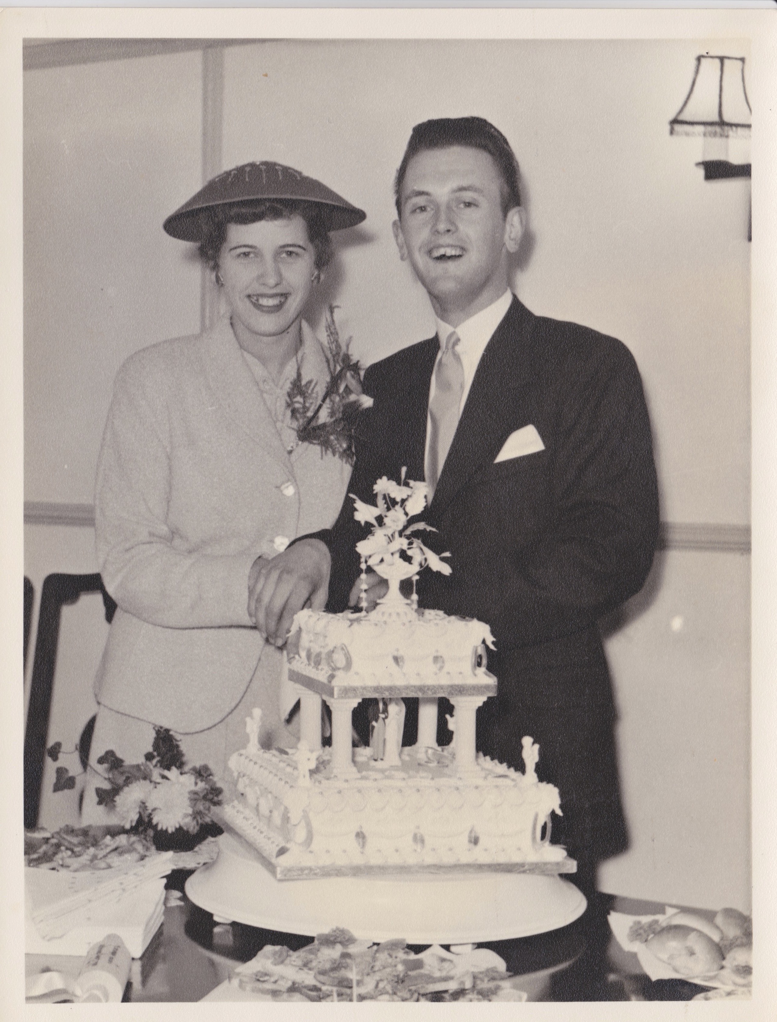
When interviewing my grandparents, I felt it was vital to still make contextual connections between the old and the new, yet still withstanding in the frame of how their relationship can be seen as ‘traditional‘.  These black and white images where taken during my grandparents wedding in Jersey in 1955.

Scan 90

I thought this image above was particularly significant, as it sprung back earlier connections with KessleKrammer’s series “USEFUL PHOTOGRAPHY 010“. Using the possible idea of the form of typology in the exam, this could be a good way to surface the way relationships are ‘celebrated’ and the truth behind that in contemporary and in traditional relationships.

Scan 91

Scan 92

Scan 93

Bad Wurzach and War Imagery 

I felt it would be a good idea to include other archival material such as data response media such as maps. My grandfather was held captive in Germany under the Bad Wurzach Concentration Camp. My Grandmother, was left in Jersey. During my grandfather’s return to Jersey in his late teens, this is when they met and became as they are now. I felt including materials like this it would also give me the opportunity to draw on these maps or annotate them like a sort of ‘sketch-book‘, analytical work piece, allowing the reader to interact with it more and therefore understanding the relevance to its personal foreshadowing. This could be in the style of Ed Templeton, who frequently uses writing as a source of narrative in a different form.

Screen Shot 2016-05-05 at 22.28.57

Screen Shot 2016-05-05 at 22.30.52

Staged analysis

IMG_7277

I took this image as a representation of what this victim was made to do. I really like the expression given off by the subject and I think it really connects to the context. Compared to the other images, the background of this image consists of a plain wall, I like this difference in comparison to the other images in which are taken in a home environment. It allows the view to focus on what the subject is actually doing, instead of focusing on location and distracting objects in the background; the focus is all on the expression and situation the subject is in. When first conducting this shoot, I didn’t want the arms and hands of the subject to be visible within the image, I simply wanted a (close) head and shoulder shot that showed the belt around the mouth. However, I quite like the fact that you can see that she is doing it to herself because that is what this victim actually went through, alongside all the confusing and scared emotions (which I feel are expressed quite well within this image). I feel like when editing this image, I was a bit too focused on creating these dark exposures to co-exist with the dark memories,  thus the darker tones within this image are quite strong and I plan on lightening it up a little bit via Photoshop.

IMG_7334IMG_7314

These images were produced with the intention of being blurred and slightly out of focus. I conducted this effect due to the fact that when discussing these negative encounters, the victim would constantly say how she didn’t remember a lot and when she did, the memories would tend to be blurry and confusing. Thus, by creating this effect I felt that I was creating this connection visually and contextually. The close up image of the hand holding the belt is quite interesting and goes against the normal/perfectly composed portrait. This image doesn’t actually include the subjects facial features, but embodies other small elements that I felt necessary  within this narrative such as the fact that the subject is sat on the floor (behind a door) and the outstretched hand holding the belt. These particular aspects fit in well with what I was told and adds to the suspense of this body of work. The other image I decided to include, consists of the subjects facial features and although blurred (as intended) through the use of a slow shutter speed, it also fits in representing what happened. I like how the shadow over the subjects cheek looks almost fragile and I like how she is looking down from the camera and I think the fact that she is behind the clothing which is hanged up behind the door looks genuine and adds authenticity to the image.


IMG_7339

This image is quite similar to the images above, however in this frame, I captured the full body of the subject and I think this image is more visible in representing things like background/location. The angle of this image isn’t directly centered and I positioned myself slightly higher as if someone is slightly looking down at the subject, as if the viewpoint was from the abuser. With regards to rule of third, I positioned the camera so that the subject was not centered and more to the left of the frame (because I thought it wouldn’t look as good if she was directly in the middle due to the clothes hanging on the door behind her). Also, there is some negative space to the right side of the image however I think it looks better than having negative space on both sides, surrounding the subject. Plus, I think it works quite well as you can see that it is a door and it’s quite evident to notice the fact that she is sat (in a scared and shy manner) behind it. I used natural window lighting  for this particular image and looking back, I could have improved it by perhaps making the room slightly lighter to create a darker mood.


Review: Photo-shoots

Taking Images

Shoot 1-2: Developing a theme

The first shoot of this project consisted of a visit to the ‘Fresh Fish Company’ which is run by Vicky Boarder. I went down to the shop, which is a old, re-furbished boat and took a series of images of the shop display, some off the customers, as well as the people who work there. The aim of this shoot was mainly to ‘ease’ into the project. To have a neutral and balanced theme, looking at the retail side, very much a middle-ground between the types of images Parr takes, to that of Wildschut. I intended over the course of this particular shoot to find out a bit more about the types of local produce I could look into. Vicky proved to be very helpful because see gave me a list of a few farms that I could look into to visit. She gave me a very good variety of different places to look into, such as Gordon Blake’s Tomato farm and Colin Roaches’ Water-cress farm. I liked the idea I could look into different Jersey produce that was not just exclusively along the lines of diary or potatoes, but was a bit different and in many ways questioned the status-quo of what really can be defined as ‘Genuine Jersey’ produce.

IMG_9973

IMG_9968

IMG_9926


Shoots 3-5: Visiting Farms                                     

 I then proceeded to visit some of the farms which Vicky had recommended. My first visit was to Gordon Blakes’ farm at Three Oaks Vinery. I felt a got some really interesting and strong images on this shoot. However upon accessing the images I only felt there was one image which worked within my narrative. At the same time, this shoot was definitely a worthwhile experience and gave me good practise for which to develop apon.

Next I visited Colin Roaches’ watercress farm. Although  it was only a short visit I felt that I got some good images. This shoot, slightly differed away from the restrictions of copying the style of Henk Wildschut, because of the fact the shoot was outside and furthermore, it did not have a huge amount of time and wanted to get as many images done as possible. My subsequent images are in many ways a bit on the boarder of Parr and Wildschut, with images coming across in a style somewhat reminiscent of Parr, whilst hinting at the object approach more so reminiscent in the work of  WIldschut. This in many ways found the balance between objectivity and creativity, something which is not always easy to achieve.

IMG_9303

IMG_9380

IMG_9327

My final farm shoot involved visiting the cattle farmer Tom Perchard. Tom has a very large collection of cows, one of the largest in the channel islands. As I visited his farm last year, this shoot was more of a case of expanding on a few of the ideas I explored last year. I spent a couple of hours down at the farm and I was good because I had a degree of freedom to explore the farm on my own. As a result I had a lot of time to carefully structure and compose my images, thus enabling me the opportunity to really explore the theme of Henk Wildschut. I believe some of my resulting images are very powerful and some of the strongest from this series.

IMG_4344

IMG_4277

IMG_4473

Shoots 6-8: Taking images in the style of Martin Parr

These final three shoots were perhaps the most enjoyable. I experimented with trying to take images of fresh Jersey produce in an exclusively Parr like way, close-up and using flash. I enjoyed these shoot because it allowed me a degree of creativity to express with a style which I have been interested in for a while, but have not had the opportunity to explore in its fullest sense.

Shoot 6 involved going into town and visiting the market place. I wanted to get a few ‘Parr-like’ snap-shots of different customers at the market and a few satirical images which looked briefly at the overall theme of the project. For this section I aim to be creative as possible and took photographs of anything I found of interest. I terms of composition, I only got a few images  I would consider strong enough to make it in the photo-book. However the main benefit I got from this shoot was to practise  and experiment for my next shoot.

IMG_4291

IMG_5298

IMG_4486 (3)

Shoot 7 involved taking grotesque close-up shoots of food as a was being eaten. I tried to get the most horrible and vulgar images as possible. I also got a couple of photographs of food as it was being plated up, images which were in no way as vulgar.


IMG_9530

IMG_9850

IMG_9884

Shoot 7 played directly into relevance to Shoot 8, my final and one of the simplest shoots. In this shoot I sought to replicate the classic advertising style of pristine images of local Jersey produce. At first I attempted to set up a mini studio to then photograph the food with. However after attempting this I did not feel that the resulting images were that successful. Therefore I decided simply to photograph the food on a clear table, evoking the same style each time. This in many ways  was beneficial because it allowed me use natural lighting to my advantage more, owing to brighter, more colour ‘Parr-like’ images.

IMG_9480

IMG_9475

Other shoots

As I have a family background in farming I have got a small archive of images I have taken in the past, which have expressed relevance to the overall theme of this project. Subsequently I have used some of these images in the final photo-book.

Staged edits

This series of images represent the story on the previous post. I have  decided to edit these images above because I believe that they are the most strongest throughout this body of work. I quite like the fact that some images are blurred, and deliberately selected the blurred images as representation of blurred memories my friend had. With regards to final outcomes, I am unsure whether I would want to present images in a series or as a select few and present them individually. Throughout this shoot I experimented with different compositions and shutter speeds in order to create specific effects. In some of the shots, the exposure seems to be quite dark, and although that was the sort of effect I was going for (to stand as a representation of dark memories); I’m not sure that it worked very well and looking back at them now, I probably should have ignored focusing on exposure as that could have always been adjusted in photoshop. I think that the expression of the subjects face fits accordingly with the topic and specific situation, and definitely think that it connects the contextual factors alongside the visual aspects. The background and setting is in a bedroom, due to the fact that it is where the situation occurred and I wanted to staged images as accurately as I could, including little things like location and clothing. It would have been easy to conduct this shoot in the studio, using chiaroscuro lighting eat, however by doing it in a home environment, it brings forth the fact that these things happen in what is supposed to be a safe place; a home.


Freedom Tree | My Experimentation

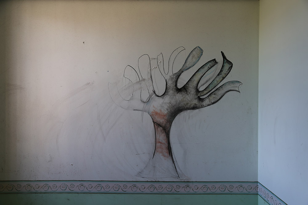
For this shoot I took inspiration from one of Tom Killick’s photographs that he made down at the abandoned Jersey asylum. There was one particular image of a drawing that a patient did of a tree and it really intrigued me and made me wonder what this person must have been doing through at their time in the asylum. I decided to interpret my own story as I would never be able to find out the real story. So I created a troubled persona, one that wants freedom. I know this shoot could come across as cliche but obviously this person had a troubled mind and their only way of expressing themselves in the asylum was to illustrate it, to draw pictures of things that they imaged. To me the tree symbolises freedom and hope as they are always out in the open. I created a story whereby my persona draws a picture of a tree to escape and to sit and look at when she feels lost or lonely. Something that I also found very interesting when looking at the actual image was that the drawing was unfinished which makes me think that this patient was one of the last to be living in the asylum before it was abandoned or that maybe this patient passed away before they could actually finish it. lunacy freedom treeblog

I am not too keen on this shoot. There is just something about it that I don’t like and I am unhappy with how it has turned out. As I am rubbish at drawing the tree didn’t turn out well at all and I just don’t think the chalk came out strong enough in the final images as well as it not really showing the state of mind that my character was in. I have no interest in this series as it is quite boring and basically just someone drawing a rubbish tree on the wall. I feel that I needed to get more into the character and to really show the state of mind that my character was in. I feel that this could have worked out better if I got someone else to be the subject and so I would have creative freedom to walk around and get better shots and different angles of the subject drawing. This shoot is a bit too simple for me and doesn’t really stand out as strong images to me. I’m not really feeling it with this shoot and know that I can do so much better than this but as an experiment it is fine. I just feel that there is a lack of expression and emotion in this series as the spectator isn’t really able to see much of the subjects face or how they are possibly feeling. I made this series from recording myself in the car park of my apartments. A man actually came in a couple of times and asked if we lived here but obviously I do and I explained that to him too. After making these photographs I went and got buckets of water to wash all of the chalk off and I actually cut my finger trying to scrub it all off. This is most likely the cleanest those walls have ever been as even when I was younger my friends and I used to draw along the walls with the dirt that covered the walls and the floor. Anyway, in the end I cleaned everything off the wall and it now looks as good as new.

MVI_4391.00_03_59_20.Still019

This is my favourite still from the shoot as it shows some expression and emotion in it. I like how strange my subject looks in this photograph and her whole body language. She is slightly slumped over, holding the chalk in an odd manner while looking demonically over her shoulder. This part of the photograph shows the most emotion and the possible mind state that my character is in. I like the composition of this photograph too and how my subject is slightly off centred with the tree in the background. I wanted all of my images to be in black and white to represent the time period of the late 1800s in which it would be based as well as it being a bit more poetic than a basic coloured image. I don’t think that this image would look as good in colour as the light wasn’t very good and was more yellow because of the lighting of the car park.

https://youtu.be/EuppGzT-dzU

Freedom Tree | Final series

Scared Sh*tless | My Experimentation

This project is based off of research that I have done into lunacy on the island. I got this story from an article I read on cases of people loosing their minds, lunatics, back in the late 1800s. One case particularly interested me and it was one where an apprentice jumped out in a white sheet at his boss who was so shocked that he never recovered. I found this story to be really strange as you would never think someone could go mad from another person walking up to them in a sheet but then I guess back in the late 1800s people scared easier and there was no CGI or special FX that could create fictional beings, monsters and ghosts which we seem to have become accustomed to in the modern world. I wanted to re-stage this scenario as it intrigued me so much and so I decided to take on a new persona and become this petrified man. I recorded myself reacting to the ghost as well as putting my friend under a sheet and recording her too. I found this shoot fun to do. I decided to add in the video I recorded as I feel it just adds a bit more depth to my project. I made it black and white as well as sped it up a lot so that it wasn’t too long to watch. I think that it has worked well and the stills I got from the video look good together.

scared sillyblog
final series

Here is the final series that I have created for this project. I like how it has turned out as it is simple yet tells the story nicely. The one thing that I don’t like about this series is the location and the right side of the subject surroundings, it doesn’t look as good as I would have hoped but it looks fine for these photographs. I like them all together and think that they mesh well. I wanted to create a kind of story board as I wanted it to look like stills from a film and these particular images look best when they are together as one individual one on its own wouldn’t stand out as much and wouldn’t make much sense compared to the series as a whole. My favourite still is the medium shot of the person in the sheet as I like the detail that the black and white gives, adding shadows. I also like the expression on the subjects face as he sees the sheet come closer and he starts to get really freaked out. I like the simplicity of this shoot too as it is fairly obvious what is going on and why the subject was scared silly. The only thing about this project is that I wanted to title it ‘Scared Sh*tless’ but I feel that it may be slightly inappropriate to have as a series for my exam project. I do think that title flows a lot better but as it is for exam work, don’t think that it would be the best title to have. I will also be writing on the physical copy of this series and will add a caption underneath. I think that I want to caption it Ghosts Aren’t Real. I feel that this could be quite ironic as obviously this man sees what he thinks is a ghost before him when in fact it is just his apprentice. I quite like this caption as it does tie in quite well with the entire project.

https://www.youtube.com/watch?v=yuuB9_CPtyY

Above is the short film that comes with the series of images. This is a behind the scenes look at how I make my images and how I stage them. I have put the video in black and white and sped it up so it isn’t as long to watch but I’ve ended up really liking it as it makes me think of an old black and white silent film comedy as the mannerisms of my subject resemble that of one of those over theatrical and dramatic characters. I also like how the sped up audio sounds as when the ghost (person under a white sheet) appears a high-pitched sound comes out making it seem more scary for the subject and adds a bit more context to the whole thing too. I like this mini series as it is simple to follow and easy to understand without my spectators having to know anything about local lunacy in the island or even without any background knowledge. I enjoyed making this video as it was quick and easy to do. I like that it is straight forward and easy for my spectators to be able to follow.

IMG_4412blog
Scared Sh*tless | Final series

Not My Wardrobe | My Experimentation

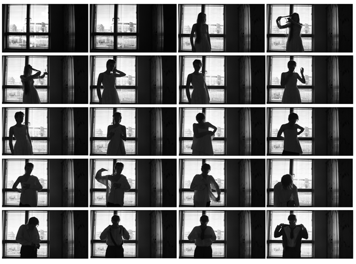
For this mini series I decided to focus in on the research that I have done on local islander Colonel Victor Barker. For this I went back to basics and make my series as simple as possible and so in my images, as my own subject, I stood wearing a dress with my long hair and I then pretended to cut my hair and from there I changed into one of my dad’s suits. I thought that this would be the easiest way to show what I was trying to show and also made it more obvious that this was a transgender transition with the bandage going across my chest area to get rid of my feminine figure. I think that this shoot worked out really well and was successful. I decided to do it with the window in the background so that the spectator isn’t able to fully see my face as I wanted it to be more mysterious and not look obvious. I think that this has worked out well and the exposure of light is just how I wanted it to be. I also only had the side of a wardrobe showing as I wanted this added touch to show where the clothes came from and also just those there wasn’t any dead/empty space. I am unsure what to title this shoot but was thinking of making it a quote from Victor Barker himself as I did read a book all about him entitled Colonel Victor Barker and His Monstrous Regiment. In this book there are accounts from those that were there when Barker was arrested and they said he was saying ‘This is it, I’m done’. He was arrested because he owed money to a shut down restaurant and was only found out to be a woman when he went down to the police station. I think that this is a really amazing story and don’t want to ruin it or turn it into a cliche and so just stuck with the simple changing of the clothes.

vb stills
stills from film

To create these images I literally just set up my tripod in my parents room and had it positioned on their bed with my camera recording on top. I then got myself into a position that looked best in the photographs. After filming this I put the video into Adobe Premier Pro, made the entire thing black and white and took screen shots from there. I am now editing together in Photoshop a small series of images that tell the basic story so there will be one shot of each stage of getting changed into a man. I am pleased with how these images have turned out as I like the entire mise-en-scene of the images and how the silhouette looks. I like that the spectator is able to see part of the subjects face but only larger features and they are unable to completely see everything. I kind of used this as a metaphor as often we look at people but we can’t see everything about them and everyone, not only transgender people, have or have had something to hide. This particular series is a reflection of how Victor Barker was hiding his old identity as a woman to lead a better life as a man, he made up a lie that his bits/manhood was blown off during the war and that was the reason why he couldn’t have sexual relations with his wife. I think that this series of images reflects this idea of mystery and not really being able to see everything about a person.

victor barker experimentblog
final series

For this mini series I decided to make 12 images as it needed just a few extra shots to add more context and detail to the entire project. I like how they have turned out and think that it works much better in black and white than if it was in colour. I like how the natural light isn’t too overpowering but also creates shadows adding more of a sense of mystery to the whole series. I thin that these images are interesting to look at and do look good together. Once I have printed this I need to write a caption/comment onto either the top or bottom half which I have left space for when editing in Photoshop. The caption that I want to add to this is ‘That’s it, I’m done’ as this is something that Barker actually said and I think that this could be a good way of intriguing my spectator into wanting to find out more about the story behind the mini series and possibly look further into the story itself as it is so captivating and interesting. I enjoyed doing this shoot and am happy with how it all turned out. I like the harsh lighting coming in from the window as it makes the images more dramatic and makes my spectators want to look deeper into the images and want to see every detail of them. 

https://youtu.be/jz2UeugFYKA

Not My Wardrobe | Final series

Locked Up | My Experimentation

Here is another behind the scenes video of a shoot that I have done as part of my A2 photography exam. I wanted this shoot to make my spectators slightly uncomfortable and to really get them to wonder what is going on. This particular project is based off of a local case of lunacy. This shoot is based on a story I have read about in an article of a woman named Jane Le Maistre, who was living in the late 1800s. She was deemed insane and locked up in an outhouse where the people that, supposedly, cared for her neglected her. Here she was left tied up and naked with only a small coarse sheet to cover herself with. She was in a state where she was stuck positioned like a monkey and had no use of the bottom half of her body. This obviously meant that she was surrounded by her own faeces and the living conditions were awful and dirty. This particular lunatic became known by the community and so attention started to come her way and people found out about the inhumane conditions she was left in. Inspectors were sent to investigate but upon their arrival Jane had been washed, hair cut, floor cleaned, given blankets over her naked body, a bucket put by her side and her legs moved. Her carers knew that these inspectors were coming and so then they decided that they needed to cover up their acts of neglect. I find this story extraordinary and how someone battling with a mental illness was just locked up and left to rot. She couldn’t use her lower body and so she wouldn’t be able to go to the toilet and she seemed to be lost to the world. I feel that her mental and physical state would not have been as bad or as extreme as it was if she was given the proper care. When people don’t understand something they tend to just lock it up and pretend that it isn’t happening. This is something that I wanted to show in my images. As the spectator goes through the series they can see my subject slowly changing and looking in a better, more clean, condition. I wanted to make sure that there were no other people in the shots as I wanted it to look as if it was being done like magic as is similar to the actual story of how miraculously Jane Le Maistre was clean and in a much better state than people had speculated. It astonishes me that this happened in Jersey as I never really think much happens here but obviously in the late 1800s, and even today, a lot goes on behind closed doors that we may never find out about.

lunacy locked outblog

I do like this series as I have the contextual knowledge behind it and think that it does tell the story well. I wanted this series to stand out and be in a way slightly confusing for my spectators as it is odd. I feel that it looks like a bit of a spot the difference and I like that as I do want my spectators to think about what has changed in each image. I made it all black and white to go along with the theme of the late 1800s where there were only black and white cameras to capture images. I also chose to make myself the subject as this was easiest as I knew exactly how I wanted to position myself and the expression I wanted on my face. I also think it was a good to bring out a new persona in my photography work and become yet another person. The final image in the series is actually two images put together in Photoshop. When recording this I left the camera going, got changed and then went round the other side and stood looking down on the area that my subject had been pretending to be looking at her. The two sets of legs at the end represents the professional inspectors and how they only see her after her carers have changed and altered the reality of her living conditions. This blends in with the theme of truth as those people bent the truth and altered Jane Le Maistre’s reality. I wanted to look into how society treats people with mental illnesses and how lunacy was dealt with on the island before the creation of the Jersey asylum. Although all of my work is staged and as such becomes a form of fiction it is still based on a true story and how an islander was actually treated back in the late 1800s. I feel that this is an extraordinary story that not many people living on the island nowadays would know about. I want to bring the talk about mental illness into the main of society as we still tend to ignore it and not quite understand those struggling and dealing with it.

https://youtu.be/xxO1FINV17s

IMG_4411blog
Locked Up | Final series

Artist Reference | Cindy Sherman

Cindy Sherman is one of my favourite photographer and I have taken a lot of inspiration from her in my past projects. I wanted to look into her work again but not the famous film stills that she created in the 1980s but to look at some of the work that she created during her time as a student in the late 1970’s. One particular set of images is based on a Hollywood-inspired murder mystery story with a vast amount of characters waiting for the bus. Sherman becomes each of the characters and dresses in different clothes based on people that you would typically see in a 1930s movie. The story behind Sherman’s work entitled Murder Mystery People is an imagined crime movies that features 17 different characters inspired by stereotypical figures in 1930s Hollywood films.

Sherman’s early work: http://www.anothermag.com/art-photography/2451/cindy-sherman-early-works

“I feel I’m anonymous in my work. When I look at the pictures, I never see myself. Sometimes I disappear” – Cindy Sherman

The quote above that I have extracted above really interests me as Sherman states that she doesn’t see herself in her images, which is what I feel in my images too. They aren’t self-portraits, Sherman becomes the character and creates a new persona in her work. I like that she creates new personalities and personas in her work becoming new people and changing who she is by her clothing, props, hairstyles and mannerisms and facial expressions. I find Sherman’s photographs really interesting and I like the way she makes her images as I use a similar method. In her images she tends to be in a studio on her own and have a shutter release to make her images, often we are able to see this in her images at the bottom of the image or to the side.

251524-2

This is my favourite out of this series of Sherman’s. I like the composition of this image and how the subject is positioned in the bottom right. I find it interesting to look at how the subject is photographing and the camera with the flash attachment on top as this is what was often used back in the 60s when Sherman made these photographs. I like how Sherman literally becomes her characters and creates new and intriguing characters all the time, something that I like to do in my own work too. I like the added touch of sideburns and other details like the glasses and the hat in this image. I feel that the hat could have been an easy way to hide her hair without having to wear a wig like she often does. In my own images I took some inspiration and have made images wearing a hat and hidden all of my hair inside the hat. I like how Sherman shot all of her characters with the same background and in the same place, this makes it so much easier when shooting to just stick to one location in a studio, where often Sherman would photograph alone. I like that as a spectator you are able to see the shutter release at the foot of this image showing how Sherman would have made this photograph using her foot and I like that it isn’t perfect or that she hasn’t tried to hide it too much but it really manages to blend in well with this image and the character in this image.

251540

I love this image! I just love how dedicated Sherman is to creating her characters and that she went to the extent of making herself a much darker skin tone than she actually is. I like that instead of leaving this character out, she went a step further and actually created this persona and made an effort to try to look like the woman she had imagined. I like how Sherman never seems to be limited with her work, whether a character is black or white, male or female she no character seems to be out of reach for her. I find Sherman becomes unrecognisable in her images and her characters look so distant from what Sherman herself looks like which I really love. I like the expression on the subjects face as she just stares into the camera. I like the simplicity of the composition and how the subject is just directly centred in the middle of the image. I also like that it isn’t perfect and the spectator is able to see in the background the plugs as well as the wire from the shutter release. Something about this image really intrigues me and I like the shadow in the background too as it just adds a little more dimension to the image. In the right hand corner there is a shoe which makes me think that she was possibly changing all of her clothes just off to the side of the camera and this shoe happened to make its way into the corner of the image.

Review: My Best Images

These are 8 images I believe are the strongest I have taken over the course of this Exam Project. I will explain briefly after each image why I have chosen it. I have included images from all of my shoots over the course of this project to show the good range and depth I believe my project has achieved.

IMG_9370

I have chosen this image because I believe it captures the personality of the subject very well; focused, energetic and always on the move. Thus there is a clear sense of energy to this image. The subject is frozen in the moment whilst distort and clearly in movement, which makes the frame somewhat abstract. Furthermore, the soft evenly dispersed lighting makes for a somewhat illusionist and silhouette sense about the subject, aided greatly through his free-flowing movement.

IMG_9303

I have included this image because I believe it is a powerful and captivating representation of the watercress best. The simplicity of this image works because of the strong presence of rich green which embeds the focus of the frame and thus captivates immediately the intention of the viewer. In many ways it is an abstract image with no direct meaning, but the colourful and interesting visual elements compensate for this slight disadvantage.

IMG_9380

This image is very Parr-like in style – abstract and close up. Like the previous image, there is little to suggest that there is much meaning behind the image. However little details are what make this image interesting, for example the three-point focus of the green jacket; knife; and the subjects hands. This provides the image with a sense of visual depth in a very straight forward way. The contrast of red and green add a suitable degree of conflict which strengthens the image, allowing the main feature of the knife to come through clearly within the image.

IMG_9973

This is an image of two farmers who are customers at the ‘Fresh Fish Company’. I like this portrait because I believe it is visually strong. There is a clear sense of engagement of the subjects in the frame and their visual expressions and personalities very much come across. As a result this makes for a very bright and upbeat image which captures the clear sense of community.

IMG_9968

This is a close-up still life of the hand of one of the customers at the fresh fish company up a lobster. I tried as much as possible to balance detail because the subjects hand, along with the distinctive bruise on the hand and interesting looking ring –  whilst maintaining a sharp appearance of the lobster shell with comes across visually as strong to the viewer. As a result I believe that this image has a very strong sense to it, containing all of the right elements for an effective image; detail, lighting, depth, character and visual balance ect. In many ways I would consider this to be definitely one of my strongest images across all of the shoots.

IMG_9437

I included one of my Parr-like close-up images in my final selection because I believe they were successful and deserve credit. I went for this close-up image of a tomato because it embodies the style of Martin Parr in the simplest way possible, a clean, straight-forward image which provides complete focus towards the tomato. It is a sharp and saturated image which has a balance between displaying order and control, whilst at the same time, through the red – exploding a sense of intensity and energy. I believe that this image may work well as a front-cover of my photo-book.

IMG_5254

This image is a still life image I took of a statue of a chef in a shop window. It is a slightly lighter image which can serve as an interlude to break up some of the different sections of my narrative.

IMG_9543

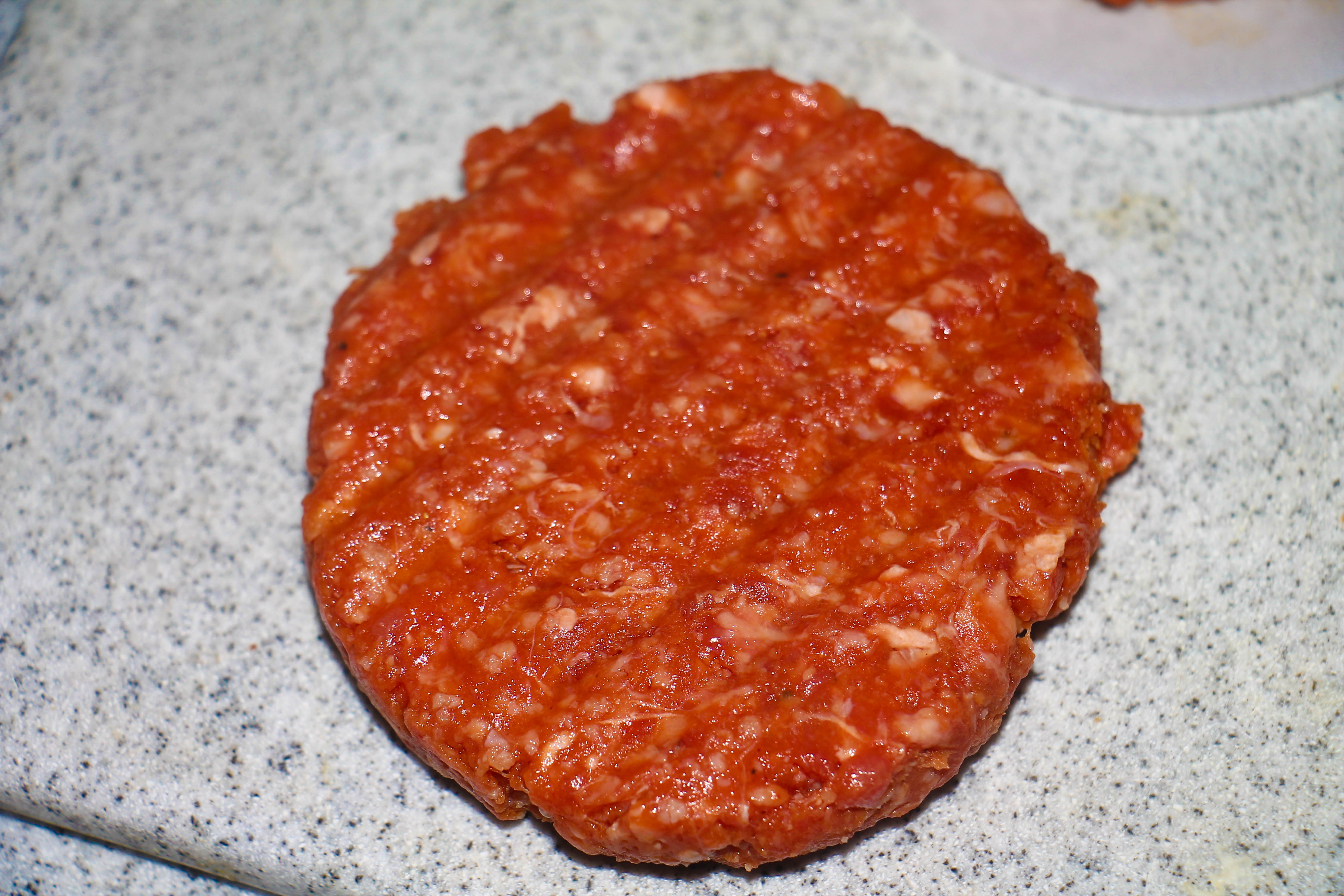
This image, again evoking the style of Parr, represents the other extreme of his style. This image shows a cooked burger on melted cheese. It is an extremely grotesque and vulgar image, which like the style of Parr, makes use of flash lighting to create a high level of saturation and glare. The resulting image is a direct contradiction of the image of the tomato as it subverts the purpose of the close-up advertising language, making the product look the exact opposite of appealing.

IMG_4344

This final image is a picture of a cow looking glaringly into the camera, an image a took when I visited Tom Perchard’s farm. This is one of my attempts at Henk Wildschut’s style. I believe that it is a very strong image because the interaction of the cow with the camera gives the image a degree of intensity. Furthermore the black and white contrasts within the image give a sense of gloom and darkness to the, which to some degree can be considered sinister. Whilst many of my images in this series are fairly colourful and upbeat, this image on the other hand is much more serious and sombre in style, and thus its inclusion within the narrative helps to maintain and re-assert a sense of seriousness and focus.

Shoot 3: Image Analysis

Image 1

IMG_4423

This image is of two  cows as they are moving away from the milking parlour, into the barn. I took this image instinctively, at the time giving little consideration for the way in which it was composed. This lack of planning although usually a disadvantage, is in this instance an advantage because it adds a degree of spontaneity and flow to the frame.

The motion blur which has occurred due to the fact the cow is moving, in many ways adds a sense of surprise and energy to the image, adding a sense of conflict for a more exciting and unpredictable edge. Also it is intriguing to the viewer because it leaves a question mark concerning calm and stability in cattle farms, as the movement of the cow can be interpreted as a metaphor for a unsettled and restless nature.

The spontaneous nature of this image is clear due to the fact the composition is slightly off  and obscured. This can be considered an advantage in strengthening the image because it gives it a more flowing and natural feel. The viewer is thus more likely to trust the objectivity of the image because it is hard to find evidence that the image could have been staged or manipulated.

Colour in this image is crucial to providing a the image which an absurd, vernacular presence , which makes it so effective. In particular the turquoise blue included enhances the strength of the composition through its bold and assertive presence. In many ways this make the image largely abstract in presence, to the extent the glaring colours can be considered a influence of the inciting impact of advertising images. The inviting presence of the blue has a similar effect, drawing the viewer into the image, despite the conflicting fact that it instead subverts and contradicts many aspects of traditional advertising language.


Image 2 

IMG_4357

This image is a still-life shot of a lamp bulb present in the barn of Tom Perchard’s farm. This image can be considered a classic documentary-style shot; very organised and structured in terms of its presentation and composition.

The fact I have changed this image to black-and-white presents it with a very nostalgic and timeless feel, whereby it is impossible without context to determine when this image was actually taken. As a result it can be argued that this image evokes more of the traditional style of Wildschut. Nevertheless I have sought to  slightly separate it from this associated through changing it to black and white and bringing the contrast up. I have done this is order to give the image a very unique sense within the narrative, an image which is a bit of a anomaly and doesn’t relate that much to many of the other images within the shoot.

The image is strengthened through the fact the background has an interesting presence and feel about it in its own right, in particular the way the light ripples through the fence. The re-occurrence of lines in very apparent. This provides the image with a pattern and degree of texture. In addition to this it also serves to extend the complexity of the image, thus adding a degree of energy to conflict with the calm and structured nature of the way I have photographed.

The black and white display of this image, in addition to the high level of contrast gives the image a slight silhouette feels, thereby creating a degree of mystery and obscurity to the image. This mysterious presence subsequently invites the viewer to question and evaluate its purpose within the narrative.


Image 3

IMG_4277

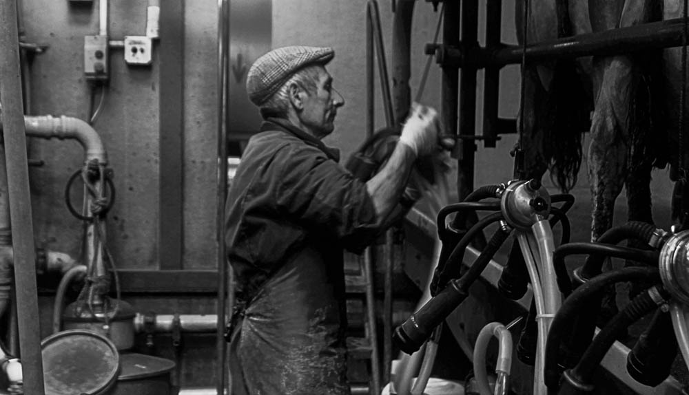
This is an image taken in the milking parlour of one of the farmers beginning the process of milking the cows. I selected this image as a key one because it shows in a very direct way, the process of how a a cow in milked. In relation to the previous image, this one is also largely nostalgic and timeless in its feel, in particular when considering the fact the farmer is very old-fashioned clothing, as well as the fact this is a black-and-white image.

This image is blurred at time due to the fact the farmer was milking the cow. This however is effective because it gives the picture a subtle degree of energy, thus intensifying its presence. The blur also owes to creating a largely spontaneous and vernacular feel, which again removes my images from being considered typical advertising images. This blur is made effective in relation to the grainy feel of the image because these two factors combined make the image very chaotic and abstract.

Again, the darkness of the images serves to give it a slightly silhouette feel in particular in the right-hand of the image where the cow’s leg is largely obscured in shadow. This darkness also serves to intensify the mood, by allowing a greater degree of contrast to be drawn out, thereby strengthening it’s texture. This subsequently creates a far more rugged and authentic presentation to the image than otherwise may exist.

This style can be considered as very objective and documentation because I am simply recording an event as it happens, without having too much control of composition. It is therefore an image which links to the theme of truth to a very high degree, because it is not controlled and manipulated to fit any purpose, but instead is a raw documentation. This is therefore important to include in the narrative because it shows as realistically as possible, how milk (which serves as a major symbol) is produced locally.


Mother Where Are You | My Experimentation

outtakes
outtakes

For this shoot I decided to move a chair into one of the corners of my living room as I found this area to to best the location that didn’t show too much of anything modern. I chose the corner as in the original Victorian portraits of hidden mothers they aren’t perfect and fairly obvious that the mother is there so I didn’t want to try to blend it in too much as the amateur approach jells much better with this project. When making these images I just pressed record to get more of a cinematic feel to them and thought that this would be much easier to edit from as I would be able to get more stills from this than if I had tried to take a load of photos. I enjoyed this experiment and it only took me a couple of minutes and we did it for as long as my niece wanted to stay in my mum’s lap. I think that these worked out well and I much prefer this experiment to the one that I had previously done before this one. There are shots of my sister putting my niece on my mum’s lap as well as a couple of shots of me putting the sheet over my mum’s head. I wanted this shoot and series to act as a kind of behind the scenes of what goes on in making a hidden mothers portrait. I do like this idea and think that it has worked out well.

hidden mother experiment
final series

I first put my video footage into Adobe Premier Pro and took screenshots from this and decided to edit my photos in Photoshop. I made them all black and white as for my entire project I have decided to make all of my images black and white as it makes my spectators focus in on the subject and what they are doing rather than being distracted by anything else. I cropped each of the images a little bit as I feel that they were too panoramic looking. I do like this experiment and want to have it printed as an A5 photo and I also want to write on top of it but I am unsure what to caption it as of now. I also want to age the image so I think that I will soak it in coffee or tea overnight and see how that works out, otherwise I will just caption it and have it looking new. This is my final series for the hidden mother’s shoot. I do really like this series as the main part of this shoot was so that the spectator is unable to see the bare face of the mother. I thought that this added a sense of mystery as well as no one’s faces being shown accept from the babies face (my niece) as this is what it would have been like in all of those Victorian images. I feel that I could do much more with this and want to work on it. I will be adding a caption to the physical copy of this series and write on it myself as well as attempting to age the series in coffee overnight. I think that this series does work well as it is simple and very straight forward.I want to add the caption Mother Where Are You underneath the series image as I think that this could work really well. I think that this could be interpreted well as it is obvious where the mother is but maybe not so much to the baby in the photograph.

MVI_4385.00_00_35_05.Still008editblogThis is my favourite image from the series as the expression on the subjects face is perfect and quite like that of the Victorian children. I also like the outfit of my subject as she is wearing a cute little dress with bows on the front that also slightly reminds me of the Victorian children’s images. On the day I just decided to make these images and hadn’t planned it but it all worked out really well with my subject already wearing this outfit and her being in a better mood than she was in the first time I attempted to photographer her. I do think that this is a good image as the spectator is able to clearly see the mother underneath the sheet with her legs and feet being exposed in the photograph as well as the mother holding the subject in place that the spectator is able to see. I think that this experiment has worked out a lot better than the original one as filming has helped a lot and I have managed to get a lot more stills from this. I think that the composition of these images are good as I decided just to center it all and made everything black and white to ensure the focus is maintained on the subject and what they are doing.

I have decided to make a flip book as part of this experiment as I think that it could work really well and look great if I do it right. In the stills the spectator would be able to see my mum’s face and so I have taken on another idea from the Victorian hidden mother’s photographs and just put a blob of paint over the top of her face. I think that this could work really well and add a sense of mystery to the images. For this experiment I will have to make a short video of the finished flip book itself that I will add to this post. I have put all 312 images into 13 A3 sized Photoshop images and will be printing these, cutting them out and putting them all together with a clip. I feel that this could work out really well and stand out as a final piece, I want it to be strange and different as I feel that this particular project is very much like that. I feel that the flip book will really bring the whole project together and add more detail to the time period it is based on in the late 1800s.

https://youtu.be/Nse7nVrDZ84

Mother Where Are You | Final series

A Note On Mental Health | Short Film

Yesterday I decided that I wanted to make a short film to contextualize the ideas behind my work. Last night I sat down and came up with a short little speech on mental illness that I decided would be good as a voice over on top of the films that I have made for each of my projects. I wanted to do something with my short films and not just have them as behind the scenes looks on how I create my stills so this was the perfect opportunity to do so. It may come out as a bit cheesy but I don’t mind that as I like what I have written and think that all the shots blend well into it bringing the visual aspects to what I am saying. This was just a quick little add on that I have decided to do but I do like it. I also filmed some extra shots of myself in front of the camera just so I have some shots that really correspond to the audio and so my audience aren’t just seeing the same repeated shots over and over again. Something that really intrigued me into basing my project on lunacy was how society tends to outcast them and banish them almost. I started off my project looking on outsiders and those that don’t fit in with the norm of society so I looked into local transgender cases from back in the late 1800s as well as witchcraft in the 16th and 17th centuries. I wanted to look into lunacy as I found so many cases in the late 1800s of neglect and how poorly treated these people were. It really interests me on how people can’t understand mental illness and seem reluctant to find out as I say in the video they can’t see anything physically wrong and so assume everything is ok when obviously it is not. The message that I wrote is quite short and is only about a minute long but that’s long enough as I want to keep it to the point that I am trying to make and I don’t want to drag it out too long as that will bore the audience. I want to use this as a way for my audience to be able to actively engage with my work and get more of an understanding of what my different series of images means.

Audio: 
Mental health. It’s something we don’t tend to talk about and when we do it always seems to be at the expense of those struggling with it. Something that mainstream society doesn’t understand automatically makes you an outsider. We tear a part mental illness and brush it off because we can see no physical scars. We don’t understand what we can’t see. People we don’t understand seem to get shut out, taken away and left to let their sanity consume them. We choose to ignore them because it’s easier than helping. How can you help fix someones mind? Their bones aren’t broken, they aren’t bleeding but the pain is still there. It’s just not as easy to access. 

https://youtu.be/-kFyc4erTMI

Flip Book | Experimentation

Here is a short video of the six flip books that I have created. Originally I wanted to make one flip book but this would have been way too big and wouldn’t really work considering the size of my photos and that it would be too difficult to flip through. When filming I only went through the first flip book and the fifth as these were the most important ones showing the process of the mother sitting in the chair to when the child is sat in her lap and she has been hidden by the white sheet. This process took a while to make and in the end I stitched all of the books together, this took longer but I feel that it made the final outcomes look a lot better and they flow more with the whole theme of it being based around the Victorian period. I am happy with how they have turned out and think that the black and white works really well.

https://youtu.be/H41Y3PdBPlY

Shoot 1: Image Analysis

IMAGE 1 

IMG_9926

This image is a formal portrait of John who is one of the workers at the ‘Fresh Fish Company’. I got him to stand to stand just outside the entrance of the shop in a straightforward manner, facing directly at the camera.

I decided to go for a formal style because I believed I could get a more powerful and effective image this way. Furthermore I wanted to explore the role of traditional aspects of shop keeping, a link to my AS Exam Project , as the resulting image which themselves braced traditional documentary styled photography techniques, and as result had had a sense of charisma and charm which I also wanted this project to somewhat contain a degree of.

I like this images because it is a very classically composed images, which is in many ways nostalgic and traditional in sense. There is a sense of charm to this image, showing John in traditional fish-mongers attire and wearing a old French beret, thus imply both the traditional aspects of his trade as well as the traditional aspects of his Jersey background. In my narrative I believe that this image will serve a s a strong portrait in exporting the farming side.

There is a sense of intensity to the image which makes it visually interesting for the viewer. This intensity occurs as a result of the stark contrast between the subjects’ black coat with the white wall and door. This is one of the advantages I having the image in black and white because it simplifies the images, draws out contrasts and provides it with a greater sense of depth.


IMAGE 2

IMG_9879

This image is a close-up shot of two jersey Royal Potatoes. the inspiration to got from this is a combination of the styles of Martin Parr and Henk Wilschut. I have balanced the madness of Parr’s saturated close-up and disorted angle shots with the more calm and reserved approach of Wilschut by photographing at a slightly less obscure angle. Furthermore I have brought the saturation of the image down greatly, as to continue this sense of calmness.

This image is effective because of the sense of rawness it evokes. This rawness can be depicted from the fact I have photographed a potato fresh dug from the ground. The flash photography serves to emphasise this concept, because the illumination of the potato emphasises the dirt on the potato.

In many ways this image is both a challenge as well as a celebration of the portrayal of local Jersey produce. Whilst the potato is indeed dirty and rugged in appearance which can be interpreted as a rejection of the ‘perfection’ of advertising, it is nevertheless a largely nostaglic image which celebrates the fact the potato is freshly dug. This contrast invites the viewer to investigate how a potato is best portrayed, as cooked and clean on a plate, or representative of the nostalgic merits of Jersey farming, a link to the simplicities of a cultural past where dirt was simply a sign of freshness and vitality.

Nevertheless this image in many ways through its casual composition, serves to challenge and subvert the techniques usually associated with advertising, whilst still maintaining this feel to a degree.

IMAGE 3

IMG_9968

This image is a close up of one of the customers who goes to the Fresh Fish Company. I caught this shot just as the subject was picking the lobster up.

I find this image to be effective because it is very animated and full of energy. This energy is created to a large extent through the presence of the bright, daring red of the lobster shell. Red, which is often associated with anger and danger gives to image a sense of force and liveliness. Such power that the red brings is effectively contrasted with the inclusion of the lady’s wrinkled and bruised hand, which represents calmer aspects of age and wisdom. This calms the image to a degree and provides a sense of order.

This image is very ‘Parr-like’ in approach, owing to the fact it is close-up and highly saturated. Furthermore, the image is made abstract due to the strong presence of the hand, which distorts the fact that a lobster is present. Instead the viewer is invited to use visual clues to determine that the lobster is presence. This is effective because it invites the viewer to really consider all parts of the image in order to determine is meaning.

The image works to a large degree due to the fact it is very detailed, in particular the subjects hand an lobster shell depicted in the foreground. In addition the image is provided with a degree of depth caused by a low depth-of-field. This is effective in providing the image with a sense of presence because it draws attention to and exaggerates elements of detail by cancelling out focus from the blurred elements.


Making A Flipbook

For this project I have decided that I want to create a series of images that will be put together to create one image, looking like story boards. Each series will have a caption either on top or underneath them, I feel that this personalises the images a bit more and adds in some more context to them. I was also considering soaking each of them in coffee overnight to make them look brown and more like film reels from old film cameras but am unsure whether or not this idea would work out and I may not have time to do this. For one of my series I have decided to go a step further and create a flip book. I thought that this would be a good idea to take my love of film and incorporate it into my photography work. I feel that this method is a whole lot more interesting for my spectators to be able to look through and see a match-on-action series. I really like this idea as it brings my story to life and adds more to my final project.

Screen Shot 2016-05-04 at 18.55.43

The first flip book was made back in 1868, a time period in which most of my own photographic series are based so I thought that it fit in quite nicely. This ties in with my work on the hidden mother’s and how the Victorians always seemed to be finding new ways of experiencing images, hence the creation of the praxinoscope and zoetrope. I wanted to bring this flare to my photos and create something that would have been around at the time period that I have focused on. The flip book was invented by John Barnes Linnett and it was given the latin name kineograph which means ‘moving picture’. Simply a flip book is a series of images all stacked on top of one another that slightly vary as they go down making it look as though the images are moving. I really do love this idea and think that it could work out really well if done successfully.

Creating My Own Flip Book

I decided to only make one of my series into a flip book as I had an idea before hand of how time consuming it can be so I decided to focus on my hidden mothers inspired series that I recorded and took stills from. For this I put my film into Adobe Premier Pro and paused and took screenshots at every snap so I ended up with 311 photographs in the end. I then took to Photoshop and lined them all up on A3 sized sheets 5×5. I thought that this would make it easier when it comes to printing and cutting everything up. This took some time to get each and every one at the same size and length. I took these files to Jersey Archisle where I have been doing work experience and printed them all out which took a few hours as they needed to be printed on Matte A3 paper which needed to be put into the printer piece by piece. I think that this process went well and the images have turned out really great. They looked really good and it made me keen to see the end result. I then went back to school and started to guillotine each sheet individually just so I could get the perfect measurements. I have been busy cutting out each photograph individually and want to make them the exact same size. Something that I have realised that I will remember for next time is that I didn’t leave any space at the top for the holder and so I will loose some of my image but I don’t mind so much about this as there is a bit of blank space on the top as the recording gave the shots more of a panoramic feel to them. I do think that this will work out really well in the end and make for some good final outcomes. I have also realised that I am going to have to make a few flip books as they won’t all fit into one, this is fine and I have started to separate them all up into packs of 50 images each with the final series having a few more images as there is an odd number of images. After getting them all together into each series I went and got tiny holes drilled into each one of them but when taking off the masking tape the image on the top and the bottom were ruined and so each set has now got 48 instead of 50 with the final set having 59 as there were extras left over that went best with the final set. I then decided to just feed thread through each hole with a needle and basically went round a few times and made sure that it was all secure and together. This took some time but I do think that it has worked out better than a clamp would have done and it also goes better with my theme of having everything based in the late 1800s.

Zoetrope and Praxinoscope 

When looking into the idea of flip books it was suggested to me to look into zoetropes and I found them really interesting. These were also around in the late Victorian period and would have been a really awesome idea as a possible final piece but I feel that the flip books work so much better for my projects as they are so long and it wouldn’t really work too well. I could however make a zoetrope out of one of my series as a little added experiment. I feel that this could turn out to be a really great little experiment as I could have this to add to my box which could work out really well. I would only make a small one out of card and stick the images around the inside. I am filling an old box with all of my ideas into it and think that this would bring a nice added touch to it and bring it all together.

Screen Shot 2016-05-05 at 17.52.02
zoetrope moodboard

Shoot 3 – EDITS AND REVIEW

Here is a selection of images I have taken in my most recent shoot to Tom Perchard’s farm in St Martin’s. In this shoot I have attempted to look carefully into the how Wildschut has approached themes and styles in a sensitive and reflective manner, thus copying this sense of careful and considered objectivity.

I am happy with my resulting images because I have captured a few really key images and strong moments relating to cattle farming. Some of my images are very classic and nostalgic in style, and I have subsequently experimented to enhance this style by changing a few of my images to black and white. I believe that this nostalgic sense serves as an advantage in this particular selection of images, precisely because it supports my intent to create classically composed images, in contrast to the colour and chaos of my Parr-like images.

IMG_4491

IMG_4272

IMG_4277

IMG_4357

IMG_4423

IMG_4344

Paradise Lost: Filming and Editing

Screen Shot 2016-05-03 at 12.35.22 For my documentary I have been creating the whole video using the editing software Final Cut Pro. This has been the first time I have used this software to edit, but found it to be easy to pick up as I have had experience using editing software before such as Premiere Pro. When starting out making the film, I first went and captured footage of Eddie in the car park as at the time it was raining. For this shoot i used my iPhone camera as it is able to film video in full HD 1080p at 60fps. This allowed me to get high quality video footage, without having to skate while holding a DSLR. I started of by capturing footage of Eddie skateboarding so that I could overlap it with him speaking directly to the camera. Although I captured a number of these action shots, in post production I lost the pen drive with the clips on, so I only had the few I had transferred to the computer. Because of this I sourced videos of Eddie skateboarding on YouTube as he said that I was allowed to use it. I also wanted to source material from YouTube as it shows clips of Eddie from when he was a lot younger, and the progression that he has made with his talent. As well as recording action shots, I also filmed an interview with Eddie where I just asked him to speak from the heart about his life skateboarding in Jersey and the culture around it. This worked out well because Eddie is so passionate about skating that he is able to talk for hours. As well as filming in the carpark, I also went out a number of times to different places across Jersey to film filler shots of the island and shots of Eddie skating the streets. This helped to give more context to my documentary and make it a flowing piece.

Screen Shot 2016-05-03 at 12.35.16

In Final Cut Pro, I started by placing the interview in full and cutting up the parts of which I felt were relevant. This meant watching the whole interview and listening out to things that gave meaning to the whole idea of the documentary, such as Eddie speaking about how the police give skaters grief for just performing their sport. The next thing I did was create an introduction. I started out with using a sound bridge of Eddie skateboarding as it gives the audience an idea of what the documentary is about before actually seeing anything. It also helped with the transition of the title screen to the first shots. I created a short montage of clips for this opening as they show off the beauty of Jersey, but what I am saying in the voice over contrasts what is being shown. After creating the introduction and cutting up the interview, I then began adding footage of Eddie skating and clips I had found on YouTube of him and others skating in Jersey. As I previously mentioned, I featured these clips as they give more context to the narrative of the documentary, but also help to cut up the footage of him speaking which ensures the pace of the film is not too slow. After this, I added the audio of my voice over. The voice over helps to explain what the documentary is about and adds a personal side, as I talk about how I have been friends with Eddie and have watched him grow up as he skates. The other audio that I added at this point was the background music. Both the tracks that were featured in the film were created by me, as it meant they had no copyright, so I would be allowed to upload the film to YouTube without any hassle. Having creating the tracks myself, also meant that they reflected the atmosphere of the documentary in the way I wanted as I created them to suit the film. To finish off the film, I now have to add the title and ending credits so that the film has a definite beginning and ending.

SHOOT 2: EDITS AND REVIEW

Edits

IMG_9280


IMG_9303

IMG_9327


IMG_9343


IMG_9348


IMG_9355


IMG_9359


IMG_9365


IMG_9370


IMG_9373


IMG_9380


IMG_9397


IMG_9424

Review

I met with Colin Roche and he drove us down the road  his farm in Maufant. The first thing I had to do was to change my shoes and put on a pair of boots given to me by Colin. The idea of this was to protect my feet from the extremely slippery and swamp like conditions – this also was so my shoes were not damaged in the process. When we were driving down to the farm he asked general questions such as what my project was about and to find out how I would like best his assistance.

We had a general chat before he went on to explain what got him into watercress farming. He revealed why he moved from Liverpool, initially intending to stay in Jersey for a weekend but “never returned” in the last 40 years. His interest in watercress farming developed when he worked for a short period as a gardener for the politician Terry Le Main, who I incidently met in my first shoot – he is a customer at the Fresh Fish Company. After finding enjoyment from this he was introduced to the watercress crop, soon developing the key skills and practise and practise needed to successfully grow the crop, until he purchased his own watercress farm and set up a business with his brother. Ever since Colin has worked as the first and only major watercress grower in Jersey, supplying watercress to all of the main supermarket chains in Jersey, numerous different restaurants, farm-shops and small retailers. Colin extended to give a brief insight into facts about the watercress crop – it is considered a ‘superfood’ because of its high nutritional value – it has more than 15 essential vitamins and minerals: in contains more iron than spinach, more calcium than milk, and more vitamin C than oranges.

When we got to the farm I started straight away to take photograph as I only had a short amount of time to complete the shoot. My photographs at this first part of the shoot were fairly instinctive, and I decided at this point not to copy any particular style but instead to get as many photographs done as possible in a short space of time. Whilst I was photographing Colin gave me a general tour of different aspects of the farm. Firstly we looked at the general preparation, showing the controlled areas where all the watercress is grown, as well as a general talk on how we manages to day-to-day aspects of the business, monitoring what he does and when. Because Colin is effectively a one-man operation since his brother moved back to Liverpool he has to manage everything. He says that his working pattern is very much an early shift, starting at 5-6 in the morning and finishing at aroud about 2. The general day-to-day tasks involve,, judging different beds of watercress and planning in advance when to pick from different stations, according to growth of the crop in addition to other concerns such as predicted whether conditions and planned business arrangements to supply different patches he has promised. Colin says that this is more of a

He says that this pattern is espacially improtant in the winter when it gets dark quicker. Colin also says that years of experience picking Watercress has made him very efficient. After a brief glimpse into the size of the farm and what goes on, Colin gave me 10-15 minutes to go around getting different pictures of whatever I felt would be good for my project.

The second part of the shoot involved actually photographing Colin going about what would be his general day-to-day work, tasks such as monitoring and adjusting the seeding of the watercress (it requires a special chemical added to the water supply to help it grow more efficiently), watering the watercress, getting the depth of the swamp, and picking/stacking the watercress. Colin was happy to pose for a lot of photographs and even offered to take a few pictures of me in the watercress beds, pretending to pick the watercress, of which I have a few. This part of the shoot was more relaxed however I was still required to photograph fairly quickly and it was more of a case of documenting what I saw. I decided I did not need any formal portraits of Colin because I felt I had enough images already which showed him at work  -these images I judged were strong enough without the need of any additional portraits.

At the end Colin answered a few general questions I had and said that he was happy to answer in more detail via email. He also kindly gave me a bag of watercress to take home for myself. The shoot overall I found was very enjoyable and I learned a lot about Colin’s experiences in general as well as a bit of information related to the watercress not only as a crop, but also how it is farmed as distributed across the island.

I am happy with my resulting images, as I gave good variety of photographs which explore various different aspects of the farm. However I would have like to have had slightly longer on the farm to explore it, and I have noticed that this lack of depth to my images has limited their ability to tell a collective story. Nevertheless I have 2-3 key images I believe could go towards conveying a narrative of a larger body of work. It is clear however that a short one-off visit to a farm can gather some got images and visual responses, but at the same time such a lack of quantity effects the overall quality of the work.

Exit Through The Gift Shop

exitthroughthegiftshop1With my project, I have created a documentary that focuses on the skateboarding culture in Jersey, and how this urban culture is looked at by other members of society. Because of this, I have researched different documentaries that look on urban culture. One of these films is ‘Exit Through The Gift Shop’ which looks at the career of famous graffiti artist Banksy, and how his work made an large impact on society in the UK and worldwide. The film follows Thierry Guetta, a french immigrant living in Los Angeles and his passion with street art and urban culture. Throughout the film Guetta encounters street artists such as his cousin Invader, but mainly on Shepard Fairey and Banksy. We see how Guetta begins to hear stories about Banksy, who is this mysterious and secretive street artist and how his art is impacting the world. When Banksy visits LA, Guetta becomes his guide of the city and the two start to become friends. Continually through the film we see their friendship grow stronger and how Banksy mentors Guetta and lets him see every aspect of how he creates his art. To many people, Banksy’s art is considered a disturbance as it persistently features on public property and he exhibits his art in the view of the public. This always causes the art to gain a reaction as the art is politically driven and sends a message some people do not agree with. An example of this in the film, is when Banksy goes to Disneyland and places a doll dressed up as a Guantanamo Bay detainee inside one of the rides. This caused so much attention that the ride had to be stopped so that the doll could be removed, and Guetta, who was filming at the time was arrested by security guards and taken into interrogation. 12-banksy-guantanemo-prisoner-at-disneyland1

Exit Through The Gift Shop and Banksy’s work in general relates to my project, as they both are representations of a form of expression that the general society doesn’t agree with. Where many of Banky’s pieces have been removed and skateboarders told to leave certain areas as they are not welcome. The urban cultures that exist in our society usually are controversial or challenging to normal life, but they persist in bringing diversity within the way people express themselves.

SHOOT 1: EDITS AND REVIEW

Edits 

IMG_9879


IMG_9868


IMG_9884


IMG_9919


IMG_9968


IMG_9958


IMG_9891


IMG_9973


IMG_9910


IMG_9901


IMG_9871


IMG_9926


IMG_9859


Review

I went down to see the people down at the Fresh Fish Company on the Thursday of the first week of the Easter holidays. I started off by introducing myself and explaining what I wanted to achieve over the course of the project, and how I felt their assistance could benefit and help the direction of this. They said they were very happy to help me with.

I started off thee shoot by spending a fair bit of time walking around the shop to gain a feel of how it was set up, the sort of lighting I had to work with and generally exploring the different type of local produce on offer. My immediate reaction was to the unusual design to the shop, it is effectively shaped as a wooden arc, resulting I a strange high-low ceiling arrangement. The layout of the from was long and narrow, fit with a very long counter for a variety of fresh on the shelf produce. On this table I was impressed with the variety of food on display, classic Jersey products such as Jersey Royals, lobster and Milk especially the large section dedicated to fresh fish both locally as well as from other channel islands (in particular Alderney) as well as areas of coast of Britain. Another feature I noticed about the shop was the subtle French connection, with various hints such as a few French flags, written slogans and classic old-fashioned French furniture and designs. I think that this is very much in honour to Jersey’s own traditions as much as to modern day France. It is very true to say therefore from first impressions that this place was quirky in many ways, with an unique presence and charm.

I then started to photograph the products on display, weaving up and down the shop various times to get a variation and mixture of the type of images I took. For these specific images I tried as much as possible to keep to the style of Martin Parr, close-up images and the manipulation of lighting to create sharp images of a glossy, advertising language. The resulting images I think are fairly successful, especially my photographs based on the theme of lobsters – the bright, rich colour and interesting shape in general makes for in my view, a visually interesting photograph.

Afterwards I started  to look into taking portraits of the staff who work there. There are three main staff, including a chef who prepares the fish of which I was invited into his kitchen. After photographing the chef inside and outside the kitchen I then took a few portraits of the manager, Vicky. I got a few portraits of her in her office, and a few outside, facing the entrance to the shop (which was a good opportunity to makes use of the interesting shape of the shop building to a visual effect). I then photographed the fish monger who worked at the till, both in action as well as more formal controlled images. In these portraits I tried to evoke a less vernacular style, in favour of a more formal style, based somewhat on that of Julian Germain. I felt it made my images somewhat more positive, engaged and lively.

My final section of images involved a series of portraits of a few of the customers. I didn’t initially plan this however a few of the customers were very friendly and were more than happy to help. I got a portrait of two local farmers together, as well as one of prominent former Jersey politician Terry Le Main. This was one of my favourite aspects of the shoot because it was unplanned and very much a spontaneous response. The resulting images are in my view very energetic and lively, incorporating a real sense of interaction.

At the end I asked Vicky a few general questions about the the nature of the business, in particular focusing on the different aspects of buying and selling locally – the advantages and disadvantages. I asked for different farmers it might be a good idea to visit and she gave me a list of different farmers I could get in contact with.

Overall I really enjoyed this shoot and found it to be a very fun and worthwhile experience, which a strong variety of images looking at different aspects of the shop, the people who work there, and a brief observation of a few of the customers. I got a chance to learn more about how local produce is not only sold but the different ways which the product is advertised to any potential customer. The atmosphere I noticed was very lively and friendly , quirky and traditional, and attracting very much regular customer. It is an interesting to explore how this atmosphere may effect the decision any customer has to repeatedly go there as the main supplier of their fresh produce. Maintaining a positive and friendly atmosphere is important for maintaining a viable business leads to more trust and can assure the customer truly is getting the best value of local produce.


Review: Final Evaluation

What have I learned over the course of this project?

I have learned lots of information, ideas and concepts over the course of this Exam Project.

I learned about the ways truth and fiction can be defined and interpreted. Photography and photographs serve in many ways as a boundary/conflict of truth and fiction, because whilst a photograph is technically a recording of something, and therefore always contains a degree of truth, it must nevetheless be recgonised that the intent of the photograph is not always to document in an objective way. Therefore in searching for the truth in photographs I learnt that it is important not to look directly at the photograph but instead try to make links which may direct focus towards the viewers intent

Secondly  of all I learned a lot of information about Soviet Propaganda, a period of History I found fascinating in general. It was interesting therefore to look into this period from the perspective of how it shaped and inspired artists, living in the worlds first Communist State. Furthermore, I linked these findings, for example the study of constructivism and experimental propaganda films, to a broader study of commercial advertising which arose greatly into prominence in the 1920s. These two topics linked in the sense they both played on the idea manipulating people in finding a product/concept attractive.

I learned about two photographers in great detail, Henk Wildschut and Martin Parr. It was interesting to find the contrasts between these two styles and how the principles of their respective work focuses on entirely different themes; Wildschut looking at the theme of factory farming in a very intentional and directly expressed manner, whilst Parr’s work is much more symbolic and subtle, using his colourful ‘advertising style’ to hint indirectly along the lines of advertising. I found it was very interesting to take influence from the style of these to photographers. Evoking aspects of Wildschut’s style gave a direct sense of focus to my work, and Parr’s added a sense of subversion and playfulness.

I also expanded my understanding of how to make a photo-book. Knowing I had to make a series of images to then go towards making a narrative meant I took my images in a really directed and concise way. On reflection I found it was better to take a handful and carefully considered images then it was to take hundreds of images simply for the sake of it.


What did I enjoy about this project?

I enjoyed doing this project because my overall intent was very straight-forward. Although a lot of research has had to take place, the main idea was a very simple concept: to photograph and find out as much as I could about local Jersey produce.

In addition, this project involved meeting and working with a variety of different people. I enjoyed this because I at the same time as photographing, I was able to really find out about the view of people concerning farming and the whole idea of ‘Genuine Jersey’, from those involved in local farming, as well as the opinion of ordinary people. This was both helpful for my project as well as being interesting in general.

This project gave me the opportunity to explore a theme I had not looked at before. It was an interesting project because it was related to not just to food and advertisement, but also a critical look at the Island in general, documenting it in a way which both embraces as well as to a degree challenges it i.e. through the vulgar Parr-like close-ups of local produce.

I have enjoyed having another attempt at making a photo-book. The on line light-room method is extremely easy and allows a degree of creativity to experiment with images.

What image best sums up this project?

IMG_4344

I have selected this image, of a cow at Tom Perchard’s Farm (Shoot 3) in relation to this particular question because I find it works well in various different ways.

Firstly it is has a natural, and slightly vernacular style which links well to the sense of objectivity and rawness I wanted to bring into focus over the course of this project.

Secondly, it also works well in the sense that it brings a slight sense of conflict and tension by representing to a degree, the viewpoint of the cow. It shows the cow walking along a slightly dirty path which would imply the cow is not completely happy. This might to some degree, raise questions within the viewer about their personal opinion of cattle farming.

Thirdly the image is very well composed, making use of soft lighting to give a light and nostalgic mood to the image. In contrast to the slightly vernacular feel of this image, this creates a sense of balance, whereby the image is ‘in-between’ two different styles.

Music and Skateboarding

Within the documentary I have created about the skateboarding culture in Jersey, I have featured music that I have created to use as background music. The music I have created suits the style of the film as they are hip-hop style instrumentals, and this urban genre of music goes hand in hand with skateboarding, as they are both subcultures of our community. Ever since skateboarding first came around, music is something that has played a big part in all aspects of the sports. From featuring in skateboarding edits to skateboarders being in music videos. In many cases, musicians are also skateboarders themselves. One example of this is the rapper Tyler, The Creator.

Tyler, The Creator
Tyler, The Creator

Tyler, The Creator is a rapper who grew up in California, USA, and has been skating and creating music from a young age. He has featured sound effects from skateboarding within his music, and regularly skates in the California and LA area. As a way of bridging the gap between music and skateboarders, Tyler’s music has been a way for different subcultures to connect as they all have things that they can relate to when listening to his music or watching him skate. As well as making music and skateboarding, he also designs his own clothing line that musicians and skateboarders alike wear. I feel the reason why he has been able to connect with all these different groups is that they feel he is a voice for the youth and is saying things that are considered quite controversial. As he has said in interviews, he doesn’t care if people become offended by the things he says as they are just words, and if someone was to use derogatory terms agains him he wouldn’t be offended. tyler skate

With the music I created, I took inspiration for the style of music that Tyler makes as it is something that really reflects the urban society in today’s world. I also wanted to create my own music as its something that came from Jersey, and my whole documentary is about Jersey and its effect on young people.

I created the music for the film using the program Logic Pro X. I started out by using a synthesizer and playing in a chord sequence. I then edited the synthesizer sound until I got something that I was happy with and suited the genre. The next thing I did was write in midi drums to create a beat to go with the chords. I then experimented with dropping the drums in and out for effect. I kept the instrumentals I created quite simple, as the type of hip hop I was going for is usually like this. Screen Shot 2016-05-06 at 11.32.12


Allan Kaprow

Allan Kaprow, was a photographer who pioneered in establishing the concepts of performance art. In this performance art, he also developed the Environment and Happening in the 1950s and 1960S.  Kaprow coined the term ‘Happening’ in 1957 at an art picnic at George Segal’s farm in a way of describing the pieces that were going on. The pieces usually consist of artists performing their art in public spaces, where these performances may be considered out of the ordinary. The performances challenge the normality and regulations of society, by being an unconventional form of expression, which goes against what people believe to be normal. Happenings also regularly involve audience participation as the artists want their art to be something the audience can engage in, which breaks down the boundaries between the artwork and its viewer. The happenings first started out as scripted events, where the audience and performers followed cues to experience the art. Kaprow describes the happenings as “A game, an adventure, a number of activities engaged in by participants for the sake of playing.” The happenings represent what is now called New Media Art, which is participatory and interactive, with the goal of breaking the fourth wall, where the audience becomes part of the art. One of the works by Kaprow was titled “Eighteen Happenings in Six Parts”, which involved an audience moving together to experience elements such as a woman squeezing an orange and a band playing toy instruments. allan_kaprow_at_18_happenings_(1959)_(1)-145425532B53AA9FA3CFrom this, Kaprow’s work evolved and became less scripted, and began to involve more everyday activities. Another happening, was where he brought a number of people into a room containing a large quantity of ice cubes, which the people had to touch, causing the ice cubes to melt.

Kaprow’s work has inspired many performance photographers such as Tom Pope to challenge the normality of society and what people believe to be the truth of what life should be like.  Kaprow’s work directly links with my project as skateboarding is a type of happening, where a group of young people meet up to go and skate. The way they skate the streets challenges what the community believe to be acceptable, so many people such as the police, usually tell the group of skateboarders to stop skating as its not the ‘right’ thing to be doing. Skateboarding and Kaprow’s work are very similar in these instances as they both are a subculture of society, that take their art into the public world, and actively connect with the environment and people around them

Exam – Truth, Fantasy or Fiction:

Exam Criteria:

This has been taken from the exam paper that we have been given for this year’s photography exam. I decided to add this in as it is important to keep coming back to the specification to make sure that we are doing what they are asking of us.

The theme: Truth, Fantasy or Fiction: 

The ability to reproduce a true likeness by hand hands a magical fascination; as testified by the subconscious urge to view the work of any artist caught working ‘en plein air’. Certain artists’ candid honesty create disturbing imagery wether illustrative or political. Jenny Saville’s self – portraits and Otto Dix’s Stormtroopers Advancing Under a Gas Attack are examples. The latter painting exploits abstraction to emphasise the true reality of the horror of war.

The desire to produce a true representation of objects, people and landscapes has been one of the driving forces behind the refinement of a wide range of media available to the contemporary artist / designer. Some of he most notable advances have been oil paint, originally developed from the 15th to the 19th century, and more recently, plastic – based paints and synthetic resins. The photorealist paintings of John Baeder and Ralph Goings, along with the super – realist sculptures of Ron Mueck, demonstrate just how sophisticated these developments have become.

Baudelaire suggested that artists must be truly faithful to their own nature. Artists have often been singular in pursuing their personal vision of the world. William Blake argued that he did not want to observe the human figure because that would get in the way of his own inner vision of how people looked. ‘I will not reason and compare: my business is to create’.

Artists in many other cultures such as Aboriginal, Inca, Aztec and Polynesian seem to consciously resist trying to produce faithful likeness of their subjects. Their objectives often intend to depict spiritual qualities, perhaps in response to a fear that any accurate rendering of a living being may somehow capture its soul or spirit.

Scientific analysis and documentation has resulted in some exquisite studies of both flora and fauna. The faithful rendition of insects in William Jones and Cath’s Hodsman’s paintings, for example, demonstrate meticulous observation and sensitivity. Leonardo Da Vinci, Rodin and Michelangelo’s studies of the human form also demonstrate these qualities of analysis and discovery. Contemporary artists Danny Quirk and Gunther von Hagens continue to be driven by this fascination for human anatomy.

Written propaganda has been used to influence and steer public opinion with many political and religious movements claiming to possess the only true path or philosophy. Each movement has commissioned artists to embellish texts and illustrate their beliefs for public consumption and maximum impact. The communist and fascist posters of the early 20th century exemplify the power of this form of communication.

Here are some further suggestions related to the theme that might inspire your journey:

– life, death, interrogation, torture, war, intolerance.

– discovery, dissection, archeology, astronomy, astrology.

– magnifying glasses, microspes, binoculars, computers.

– mirrors, reflective surfaces, lights.

– love, trust, marriage, divorce, conciliations.

– synagogues, churches, mosques, cathedrals.

– conspiracy, slavery, politics, corruption, money, power.

– detectives, police, law, justice.

– science, maths, theories, measuring instruments, calculators, books.

– folk tales, myths, sagas, poems, tapestries.

Kessel Krammer: Singletown

SINGLE TOWN

Date: 14 September – 23 November 2008
location: Venice Architectural Biennale

Invited by curator Aaron Betsky, artist Droog was asked to participate in the Architectural Biennale in Venice, September 2008. Teaming up with Dutch communication agency KesselsKramer, we developed SINGLETOWN. SINGLETOWN focused on the world of contemporary singles. Its relevance is broad, as all of us are likely to belong to this group at some stage in our lives — and likely more than once. In fact, some sources predict that a third of people in developed countries will be living alone by 2026SINGLETOWN was an exhibition as well as a town, an abstract interpretation of a new kind of urban space.

A_JACKET_FOR_LONELY_PEOPLE

THANKS_FOR_VISITING

BEING_IN_S1NGLETOWN_03

REINRAUS_INSTANT_BALCONY_DESIGN

krant_totaal

Visitors could walk its streets and interact with the products in order to put themselves in a perspective of someone who is single. In some ways this could truthfully represent the perceptions of people who are alone, or isolated – a false presentation of what single people actually are.  I find this exhibition very controversial and  conceptualised as you really have to be the type of ‘single personKesslesKrammer represents.

Kessel Kramer: USEFUL PHOTOGRAPHY #010

KesslesKrammer

KesselsKramer is a company which aspires to do things differently in the field of communications. The publishings are an extension of this restless attitude. In images and words, it finds new ways of expressing creativity through printed matter.  All KesselsKramer Publishing projects are initiated by the creative thinkers of KesselsKramer. Each book or magazine expresses their personal passions, whether that passion is a collection of found photographs, short stories or a celebration of unusual artworks.

p_useful10__1

Useful Photography is the generic name for the millions of diverse photos, which are used daily and with a purpose all of their own; practical photography, that has a clear function and where the makers remain anonymous. In Kessle Krammer’s This tenth edition of Useful Photography is all about celebration, this time the usefulness of an age-old and traditional ritual is explored: marriage. Collected & edited by Hans Aarsman, Claudie de Cleen, Julian Germain, Erik Kessels, Hans van der Meer, this tenth edition of Useful Photography is all about celebration and its means and ways of presenting it. As always, the collection overlooked underwhelming images created for practical purposes. This time, the usefulness of marriage is yet explored. Inside this book, it becomes evident that everyone documents their big day in the same way with a constant repetitive sense: same dresses, same locations, same post-wedding kiss. The cliche use of a ‘wedding day‘ could strip the significance of each of these divided features, or in turn elaborate upon how just important they are to the wedding ‘experience‘. This book is up to definite interpretation.

p__useful10__2

This idea that love falls in some sort of pattern that repeats itself is an interesting idea. Kramer’s use of typology allows the reader to seek these repetitions in a contrasting way. Each page shows images of more or less the same things yet with the juxtaposition of different settings and compositions, it allows the reader to get an all round appeal of the action thats happening inside the photograph.

p_useful__3 p_useful__4

Reviews on KesslesKrammer Wedding Photography

Positive

KesslesKramer has had some very affectionate reviews towards their style of conceptualism. This could show how some customers where happy with the idea of how someone has almost narrated their wedding for them, instead of the customer in this case, taking complete direction in lead in all photo’s composition.

Screen Shot 2016-05-04 at 21.16.30

Screen Shot 2016-05-04 at 21.20.23

Screen Shot 2016-05-04 at 21.20.41

Negative

However, on the other hand some reviews of KesslesKrammer have indefinitely been negative. This could touch upon how important a photograph can be on someones wedding day. This woman, for example was done-founded by the lack of effort the photographer had put in. With relation to conceptualism, this photographer could well have found that where everyone was photographed was a good place, yet considering this review this ideology was proved much awe. This review could well be the answer to KesslesKrammer’s reputation of having a “restless attitude“. The photographers expression of his or her own creativity through printed matter shows how in their own passion, the selflessness to capture the wedding through the photographers eye not the customers, comes across how love can be considered un-truthful or ambiguous.

Screen Shot 2016-05-04 at 21.20.34

VICE Documentaries Research: Skate World England

For my project, I am looking at portraying the youth culture in Jersey, and how in particular skateboarding is an area of society that many people look down upon and don’t see it as a good use of time. I am showing how the government don’t want to fund the sport but are willing to fund other sports heavily such as Football etc. For this I am going to create a documentary that shows how the youth culture in Jersey, especially the skateboarding community live, and speak with people that are a part of this. To research for my documentary, I am looking at a documentary produced by VICE called ‘Skate World:England’.

The documentary looks into the skate culture of England as they speak to numerous members and affiliates of the community. They first look at London and speak to skater Winstan Whitter, who talks about Southbank along the River Thames. He tells us how the park used to be a lot bigger and extended, but since then parts have been taken up with offices and other buildings, which means the park is now only a fraction of what it used to be. He also takes us to parks that have been specially funded by the governemnt and community, but even though they have been building a few parks, the culture is still looked down upon as something negative. We also meet Ben Nordberg, who is a skateboarder from Bath, who talks about how he started out skating the mini ramp, then went on top develop his flat ground skills. Nordberg and his friend Kris Vile tell us that they had to skate street as the skatepark that was built charged a lot of money to enter. This made them more dedicated to skateboarding as it gave them motivation to adapt to the environment around them, and improve their skills. Doing this meant they both gained sponsors, where they would receive free stuff such as skateboard decks, trucks, clothes etc.

From this documentary, the main influence on my project is that it focuses on the same topic. This means I have been able to look at the things that Vice have done in this documentary and take it into my own piece. For example, in the documentary they use a lot of archived footage of people skateboarding, as it adds more background to the story. I will be doing this as well by sourcing videos of Eddie from Youtube, and cutting up different sections to feature in the film. I also have taken the way in which they conduct their interviews, by getting the people to speak directly into the camera as it makes it a more direct conversation with the audience. I will be doing this as well, by interviewing Eddie as he looks and speaks directly into the camera.


Shoot 2: Personal Investigation on Traditional means of Marriage previous to Online Dating: Paula

As part of my planning, I have decided to capture a few series of short-story video clips as well as a series of portraits in order for me to get a deeper insight into love stories of people in modern day society as well as those who have been in relationships in longer periods of time. I have chosen family and friends to be apart of this topic, as I feel I can relate personally as a viewer and a director which allows me to empathise with situations taking place.

My first short-story video is of my nanny, Paula.  In this short video she describes her love life with her and her husband Joseph.

IMG_0717

Scan 94
A personal archival image I came across of Joseph and Paula.

Shoot 1: Investigating Friends Part 1: Freddie – Non-Traditional ideas of approaching love

My next shoot idea was to capture one of my friends, Freddie in his normal environment. Through imagery and video, I wanted to capture him and his main interests,  touching upon the  truth behind his character just by single portraits.

Music

One of Freddie’s major hobbies is creating music. I thought this would be a great thing to use when portraying his true self as he states himself:

“I feel if I was to pursue online dating, I would defiantly want someone to be interested in the same things I am. Unlike apps like Tinder, I feel the apps distancing to personality puts me off dating in a sense I’d rather go about it a more traditional way.”

IMG_0737

IMG_0747

I felt Freddie’s words where very interesting – I didn’t realise as an outsider how online dating can effect someone who would rather pursue relationships in a more traditional way, especially in our contemporary society. In this personal study, I wanted to focus primarily on Freddie’s personality, creating a dual with his appearance and personality, therefore making a perfect ideology of what apps like Tinder should really pursue instead of there ‘false‘ perception.

Composing Freddie in different perspectives such as changing his clothing, made the reader feel a deeper insight into Freddie’s overall character, I wanted this to metaphorically suggest an all round approach to Freddie as a defined ‘product‘, so if he was to impose these images on online dating websites people would feel he is a more truthful person, making him more reliable online.

IMG_0757

IMG_0759

A Teenager

Freddie, amongst a huge volume of teenagers, wish to look for love in many alternate ways. Defining a ‘person‘ as an ‘individual‘ however, is something completely looked upon by the worldly public. Someone who immediately goes outside the box and against conventional values bestowed  with  ones ‘individuality‘ is then considered ‘different’ and is never usually celebrated. Apps like Tinder, don’t ever feature any person as necessarily ‘different‘. Knowing Freddie as a close friend, I wanted his personality to be celebrated as I feel in comparison to other friends he is different in many ways. For example, his preference to smoking isn’t considered a negative life choice, but something he likens to and something he isn’t afraid to share with.

IMG_0779

IMG_0785

IMG_0791

Romantic Expectations

Directing Freddie to change characters by his large and vast collection of various styles of clothing, I wanted to pursue him as a character that would suit him to any time of individual. The reason I chose him for this personal study was so I could get an all round and critical view point for the reader. The reader then elopes on a journey of Freddie’s multiple personas and if I was to impose this using the Tinder app, these images would be a more reliable and less restricting way of finding love.

IMG_0802

IMG_0799

Short Interview Video-Story 

I composed Freddie to very casually discuss his opinions of online dating and how he would consider going about the trend. I felt this video questioned truth as he was definitely interested to discover apps like Tinder, yet was unsure and maybe thrown off because of the major want for a similar personality – a debate eager to console with.

Review: Ideas, Research and Context

The initial idea I had when began this exam project was to look into the theme of propaganda. I began by looking into the context of Soviet Propaganda in the 1930s, looking at the ‘Contrustivist Movement’, of artists such as Alexannder Rodchenko and Dziga Vertov. Although I enjoyed learning about these art-works and the context behind them, both of which I found fascinating, I decided in the end that exploring Soviet Propaganda as a response would be too difficult in the amount of time I had, the main reason being that the techniques used in the work was extremely complex and would require hours of work to get right, which I simply did not have.

Therefore I branched away from Soviet/Political propaganda, looking more into the theme of consumerism and commercial advertising. In the process I read a few documents looking effectively into how advertising really started to develop in the early 20th Century, fueled greatly by events such as WWI and the social consequences this created for the 1920s. I learned in the process about the clever way advertising is made the effectively persuade a viewer to development an interest in a product through playing on their mindset and emotions, in a very similar way to current and growing political propaganda trends.

In developing upon this research, I then looked into modern advertising, in particular television commercials,  researching the different techniques they use. Specifically I looked into the role of photography in such a category , both through how photographs themselves have served as a tool for advertising, as well as on the other side of the coin, looking into how modern photographers such as Martin Parr have attempted to challenge this very role through ironic photographs which mimic and satirize such a theme. The process of this research gave me the core principle of my overall theme.

In doing so I started to reconsider the core principle of this exam theme, looking into ‘Truth, Fantasy or Fiction’. I wrote a few blog posts looking into the view of all of these themes, in particular the many contrasts, and indeed in some cases, links between the themes of truth and fiction. It lead me considering a debate along the lines of two different questions; firstly can the style of photography affect how truthful it is? and secondly, how do you distinguish what is truthful and what is not?

I got the idea to link this concept to the theme of local food produce in Jersey. Jersey produce such as the ‘Jersey Royal’ Potato, Lobster and Milk is not only celebrated within the Island community, but also seen in the UK as classic British produce. Furthermore, the Jersey cow and Potato is celebrated the world over, and Jersey cattle is one of the largest cattle exports in the world. With all of this prestige as so often expressed in advertising campaigns through the likes of ‘Genuine Jersey’,  thought it might be a good idea to tackle and perhaps challenge this theme. Although it is clear that Jersey produce is of excellent quality, I thought it might be interesting to question and challenge the extent of this view.

Through this I decided to create a series of images to open the debate over whether local produce is in fact deserving of such a high status, or whether it is just a great deal of over-exaggeration and hype? I thought this topic might be somewhat controversial be Jersey produce, such as an integral part of  Jersey’s cultural history, is rarely criticized, even remotely.

As I started to consider both sides of this argument, I was drawn to two different documentary photographers with very different styles of photography and equally different intent of exploring the theme of advertising, these photographers were Henk Wildschut – Food, and Martin Parr – Common Sense. Whilst Wiildschut’s intent in the series Food (set in a mass meat-production factory) is do document in a very  candid way the raw details truth behind what goes on close doors to process food, Parr’s ‘Common Sense’ series looks more into the language of advertising, subverting and satirizing this classic style to show food in a far less complimentary light. Effectively both photographs through their work serve to challenge the whole industry of food, Parr commercially, and Wildschut ethically. In direction and style however both photographers are extremely different, and their styles in very ways serve to contradict the other.

I thought it would therefore be interesting to undergo a study whereby I attempt to copy the style of both photographers. I decided to do this through; firstly visiting farms and documenting what I see in a Wildschut-like way; and secondly including a Parr influence by visiting the local market, supermarkets and generally photographing food items close-up, both to make them look attractive as well as vulgar. The resulting images of this series are a mixture of both.

Throughout I have continued to re-evaluate the concepts of ‘Truth, Fantasy and Fiction’ – completely I few blogs posts directly this study in the context of researching Parr and Wildschut, of which the general understanding I got was that Parr’s images were more along the lines of Fantasy/Fiction, whilst Wildschut’s were more along the line of Truth.  In addition, I did some evaluation of my own work in comparison to these themes.

Staged response – Contact sheet

This response was completely inspired by the incident that a friend of mine was involved in. To reiterate, she was essentially made to retrieve objects that her boyfriend would then hit her with. From getting her to tie belts around her mouth to wax being poured on her skin, this series focuses more on the belt situation alongside locations of where she would go after she was beaten. By using a belt, her abuser would often tie her hand to something to stop her from retaliating, and get her to tie it around her own mouth in order to stop any screams or loud cries for help. Here are a selection of images that stand as representation of certain aspects throughout this particular encounter. I deliberately created this series of images to be in black and white as it is an occurring theme within this project. I experimented with different lighting within this body of work as I wanted to see if i could create different effects and styles by adjusting light, composition and the focus of the image. The last quarter of the contact sheet is an idea I had of having a woman with lots of make up, with one piece of her face (eye) edited out so that underneath, you can see the true appearance and state that she is trying so hard to cover up. Looking at the general composition of those images i’m not sure whether I want to use it as a final outcome, nonetheless I still want to experiment and see what it would look like.

one two


Experimenting – Colour

This photo specifically caught my eye because i felt like it had the Matt Crump feel to it with the simplistic colour and use of reflection, much like the one i have taken off his website below.


Matt Crump’s Photo

 I then experimented in Photoshop with the use of different layouts and colour schemes, this is what i came out with below, i like the pattern that the mirrored photo gives however it changes colour when it crosses each border, it makes it look like one big photo.

Reflection colours small

This collage i thought went well together as the colours mix well and the way that the roof of the building flows helps you follow the 4 pictures with your eyes and compliments the photo in a nice manner .

Reflection set

Lina Hashim: Unlawful Meetings

Unlawful Meetings

360;lina_hashim_unlawful_meetings_(signed)

Alike any of the other major religions, Islam seeks to standardize sexual relationships between members of their society or community through moral codes. As laid down in the Quran, any form of sexual behavior – that being: intercourse, oral sex or any action that encourages sexual activity – is strictly forbidden before or outside of marriage. Of course, that doesn’t prevent Muslims engaging in ‘unlawful meetings’, hence the title. In pursuit of romantic love or the sheer fulfilment of mutual desires. Hashim investigates the secret encounters that take place between young Muslim lovers in parks, hidden between trees, or under the cover of the night on beaches and in parking lots. Using night vision cameras, inconspicuous smartphones or digital cameras equipped with long-range telephoto lenses, she captured couples enjoying moments of the greatest intimacy in very public spaces in Sweden swell as in Denmark.

“Those who come from a Muslim background follow strict rules that subsume their individuality, so that the true self is rarely revealed. The public persona and the private life are two distinct zones, creating paradoxes in everyday life that lead to a form of cultural schizophrenia.’”

lina hashim 5

Screen-Shot-2015-03-19-at-09.31.32

Hashin’s build in tension and suspense between the public and the private spheres, which runs more acutely through the lives of these young Muslims than of their non-Muslim peers, is reflected in “Unlawful Meetings”. It lies in the invisibility these lovers enjoy in public; for the most part, passersby turn a discretely blind eye to the privacy they create for themselves in shadows and parked cars at nights. This idea of truthfulness and abiding by the rules and guidelines set out for them bombarded the natural path set out for them by there deliberate ancestors. Hashim ensures the anonymity of her subjects, and thus the lawfulness of her recordings of their acts, by leaving out colors and by never showing more than 25% of their facial features. Yet what cannot be hidden is the passion, which, according to one of the youths she interviewed, is heightened exactly for being so “secretly and so rarely enjoyed”. For Hashim herself, who identifies as a believing, but not a practicing Muslim, the project has led her to revisit the tenets of her faith as laid down in texts written in times so fundamentally different from today. Convinced that the ban on sex before marriage was written to protect women and their offspring, she wants to put up for discussion the question if contemporary women and men can’t find other options – in terms of health, or legal and financial security for themselves and their children – to take care of themselves.

©Lina_Hashim_Unlawful-Meetings-03-1024x768

720;lina_hashim_-_unlawful_meetings_self_published_2014_beispiel

410;lina_hashim_unlawful_meetings_(signed)

f

Hashim uses the form of a fan-fold laporello in order to tell the story from a dual perspective. On one side of the laporello, shows the images taken with a night-vision camera and the other revealing grey-scale images using a long range telephoto lens. I feel this idea is really interesting and if I was to recreate this in terms of my project I’d use the traditional rituals of love on one side and the non-traditional (online dating) in order for the reader to visually the changes which have occurred over time in means of relationship commodities.

Throughout Hashin’s enduring project, she adopts the professional distance of the social anthropologist conducting a field study, yet at the same time there is an inescapable sense of surveillance and ghoulishness parallel to the work of Kohei Yoshiyuki. In the photographic act again we find the two zones of distance and proximity intertwined in a way that many viewers will find disturbing in its ambiguity.

Kohei Yoshiyuki 

GUP Magazine – DOUBLE LIVES: AN INTERVIEW WITH LINA HASHIM

Alike Hashim, the reader can be reminded of Kohei Yoshiyuki’s infrared-lit photographs from the 1970s, which capture Japanese couples engaged in night-time sex, surrounded by spectators hidden in pitch-dark public parks. But Hashim believes Unlawful Meetings is quite different, because of the community it depicts.

“A lot of white Danish people live here,”

Hashim says.

“So whenever I see darker skinned people, I’m already guessing that they meet here secretly, because they know that their families won’t find them here.”

35t

01

Hashim, however, does find them. Hiding in public toilets, behind trees and in cars, photographing the Muslim couples who meet in secret, engaging in forbidden sexual acts in bushes and cars. Hashim’s photos are often blurry, the subjects partially obscured by the leaves of a tree or car doors that cover the people’s faces, though this is intentional: Hashim wants them to remain anonymous.

“The way these people met, the way they felt and the way they touched is still visible in these photos. You don’t always need to capture a face to depict emotions.”

4311_1000

4313_1000

British Journal of Photography: Lina Hashim photographed the secret places young Muslim couples arrange to meet. 

Written by Colin Pantall

Lina Hashim’s photography has its roots in her own childhood, in which the grand themes of family, conflict, exile and migration read like a checklist of documentary topics.

“When the Iraqis came into Kuwait, my father, who had been imprisoned in Iraq for his communist activities, was on the list of people they wanted to take to jail. He was frightened, so he ran,”

Lina tells the British Journal of Photography.


“When I was a teenager, I wasn’t allowed to have boyfriends or intimacy with anyone before getting married, and it was the same thing with my sisters and my brothers and everyone in the community,”

says Hashim.

“But my friends told me about places where they could go to meet their boyfriends, and they said I could go there with them, just to join them, and then I could maybe meet somebody there. It was always in parking lots, or by the sea, or the forest, or the kind of places where you take a dog for a walk. That’s actually how the project started.”

How to Make a photo-book using Blurb/Lightroom

Stage One – Selecting the images

First of all, before you can go about making the book design you need to select the images to be included.

Using light-room, I narrowed the 1000 or so images I had down. I approached this through different shoots at a time, as I believed that this  made it easier to collect my main images from each shoot. The first step I took each time in doing so was to ‘reject’ all of the images which I definitely didn’t want to keep, which is done through holding down (Ctrl + X.) Any other images I considered keeping were ‘flagged’ (Ctrl + P).

Picture1

After completing this first stage I then proceed to select from my narrowed down bunch of images. This is done through an initial number rating system. I had a key, ranging from 3-5; 3 being any image I thought was still acceptable on second review; 4 being any image I believe I strong enough to possibly serve a part in a photo-book; and 5 being an image which is very strong and one I am therefore completely sure about keeping. To rate, all you need to do is press down (Ctrl + 3/4/5). It is a good idea to experiment with the rating system and play around with any of the images if necessary.

Picture4

The final stage of this process is to narrow down the best images, from those rated 4 and 5. Click on the filter on the Library setting One way of doing this is to select a colour, then click on one of these at the bottom right, next to the number rating. One important consideration at this point should be to see how different images might link together in terms of the type of story you are trying to tell. For example, as I am making a photo-book contrasting  loosely the styles of Martin Parr with Henk Wildschut I was therefore wanted to include a balance of each of these to styles, as to have a suitable body of work for each. Other considerations need to be thought of, for example the amount of portraits, still-life’s, landscapes you want your book to include. This can possibly be done by colour coding different images based on what criteria is relevant.

Picture5

Once you are happy with your final images, check the number based on the amount you want to have in your photo-book. It is better to include slightly more in the final selection then not enough because you will then have more images to play with in the actual designing process. For example, if you want to create a 40 page photo-book, then have approximately 70 images in the final, leaving enough to experiment with the designing process

It is better to complete this process in different stages over a slightly longer period of time, whether that means taking anywhere from an hour or a day of each time. Taking time over this process allows ideas to develop subconsciously. It ensures all the appropriate images are included, powerful enough and relevant to creating a well developed narrative.


Making the photo-book

The first step is to make sure you are in the collection of your final images. Then move away from the ‘Library’ seciton onto the ‘Book’ mode, which will  take you to a plain book layout of the cover and a couple of inside pages.

Then select the type of book you want to      use. The choices are

Five different book types of …… small square; stanndard landscape; standard portrait; large landscape; large square

Three different covers …. hard cover image wrap; hard cover dust jacket; soft cover

Four paper types …. Premium Luste; Premium Matte; ProLine Uncoated; ProLine Pearl Photo


To create the layout there are three different types of layout options that you can use;

Manual – this shows the entire book layout as you go along.

Picture7

Single View –  allows you to see one page at a time

Picture8

Page View – seeing two pages at a time, as the viewer would expect to see it

Picture10

All three options have their own advantages and drawbacks. A good idea is to keep alternating the modes you work in. For example when arranging a page it is  a good idea  to work in ‘Single View’, when linking a page together it is better to work in ‘Page View’ and when sequencing the overall narrative together/adding pages it is best to work in ‘Manual’.

There are many different ways of arranging images on the page. One way is to include all images on the right hand page, leaving the left blank. This is considered the classic method. The options however are limitless and you can play around with sequencing using different templates. Another option, which I have gone for, is to mix the sequencing up. Personally I think that this is a good idea to mix up the sequencing because it adds a degree of uncertainty to the narrative progression. Also at times it might be a good idea to have two images across the page to make a link, whilst at other times at might be better to leave a  page black to create a mini-interlude to break the narrative up.

Picture11

Picture13

Another tip is to look for different links in images. Consider the theme of the narrative and decide how relevant to different images are and what they add. There should often be relevance to two images side-by-side, whether that is a similarity or contrast.

Picture14

One of the main advantages of making the photo-book within light-room is the degree of flexibility which it provides. It offers various features to make the book making process as easy as possible such as, dragging the images to different pages, dragging the layout up, and editing images on the go. In contrast to the online blurb feature I used last year this is much better because it it is far easier and quicker. Furthermore, it allows a much greater degree of creativity; the opportunity to play around with different images and sequences.

Once the sequencing process is finished, you now have to order the photo-book. Lightroom is linked to the online photo-book maker, ‘blurb’. To order the book, it needs to be done online. The content of the book and layout will be fully compatible with the official blurb website, which is activated through pressing the ‘send to blurb’ button. There will be an easy step-by-step process  through which to order the book.

Picture15


True Events to stage from

Domestic violence is abuse between two adults who share the same household . Criminal domestic abuse may include physical assault such as slapping, hitting, pushing, shoving, etc, sexual assault/rape, stalking/harassment, or blackmail. Non-criminal domestic violence may include emotional abuse like intimidation, mind-games or financial abuse like controlling money. These latter forms eventually turn into criminal behaviors in 80% of cases. Domestic violence can in fact be perpetrated by and against people of any gender, age, income level, race, religion, or any other demographic area. Perpetrators of domestic violence often try to explain/justify it with circumstances outside of their control: drugs, alcohol, mental illness, troubled childhood, anger problems, hard day at work, etc, in some cases claiming that if only the victim didn’t provoke them, the abuse would not have occurred. The victim adopts this perspective by walks on eggshells, yet seems unable to prevent or even predict the next violent episode. Perhaps due to the fact that they aren’t the one responsible for it.

In accordance to my project, I have spoken to a good friend of mine who has unfortunately been through an abusive relationship and as far as her story goes, one of the most shocking in my opinion is where there was a phase within her relationship where her boyfriend would come home and he would start to beat her  when she said or did something that angered him. However, this differentiates from other stories I’ve heard because of the fact that  he would make her go and find objects that he would then beat her with. For example, she was telling me an incident  where he came home, they had an argument and he told/instructed her to go and get a belt. When she refused, he hit, shoved and kicked her and asked her again. And this would be repeated until she did what he asked of her. So she would then get what he wanted, and he would beat her with whatever object he could get. In some cases she would be instructed to find a belt, and in one extreme case, she was told to bring a lit candle which he then poured boiling hot wax on her body.

Something that I found quite shocking and unfortunate to hear was when she said how easy it is to say ‘I am never going to be in an abusive relationship, i’ll just leave him…’ In my friends case, she wasn’t actually aware that she was in a relationship, and every time it happened, she thought and really believed that ‘he would never do it again.’ She also stated how this was her first relationship and her first real love, she says now how looking back, she wishes she would have done something and not just accepted the way he treated her. She was in this relationship for three years, and during the second year, she went away to university only to find out that his intentions were to follow her there. Fortunately for her, they split up a year later as he was moving  to a different country.

One of the ways in which she was able to fully understand the severity of what she had been through was because she opened up to one of her friends at uni and explained everything that happened to her. Her friend insisted that she call the police but she refused and didn’t in the end. Even as crazy as it sounds, she said that through everything that happened to her, she still felt something (albeit small) for him.

My response to this will be staged, and will contain a woman holding the weapons that were mentioned in the story. Although some portraits will incorporate facial features and expressions, some will focus on specific elements/objects within the image. The two main objects that I wanted to focus on was the belt and the candle/wax element.

Flowers (2015)

I quite like how disturbed this image is and I would like to produce a similar representation as it fits perfectly with what someone told me. It was valentines and her boyfriend bought her some flowers, later that evening they got into an argument about something petty (like usual) she says to me. His first reaction was to go to the flowers, rip them off the  stem and rip them into pieces. He then headed to her as a target and started pulling her hair and shoving her down until she fell on the floor. As that wasn’t enough, he then got the pieces from the flowers and shoved them into her mouth. She told me how whenever he did thing like this, he would have this look in his eyes, like he was looking at her but he wasn’t. “His eyes would look wild” she says and that was probably one of the most scariest things because “you never know what’s going on in his mind”.

http://www.theguardian.com/artanddesign/gallery/2016/mar/28/rubi-lebovitch-photographer-home-sweet-home – image


Candy Coloured Photos – Editing

I have been using Photoshop to try and create these candy coloured photos to turn the gloomy town of Jersey into a fantasy colour world, i have put step by step print screens to try and explain how it is done.

Step 1: After editing the photo like you normally would using levels/curves, you need to go to image>adjustments>hue/saturation

1

Step 2: Mess around with the hue bar and you will start to see the photo change colour, you can move it to your preference and also change the saturation to make the colours a bit more intense or lighter.2

Step 3: After this is done you may want to do some fine tweaking to get the colours to come out more in certain parts of the picture, in this case because it was a cloudy day the sky is just grey so to avoid this i have selected the quick selection tool to just have the sky highlighted and then go back and change the hue again, this time i made it a lot more saturated so the blue started to come through, this may not work on every photo.3

Step 4: For the last step it is just finishing up your edit, after changing the colours the building in my photo went slightly darker so i brought the brightness up slightly and also the contrast, this then brought me to my finished image.4


Lina Hashim: No Wind With Hijab

Lina Hashim

Lina Hashim is a Danish-Iraqi artist who lives and works in Copenhagen. Hashim was born in Kuwait, however later on moved to Denmark with her parents in 1992. Hashim’s primary artistic medium is photography, whereas her methods cross into such fields as anthropology and performance. Hashim as a former student of anthropology  puts the methods of anthropology to use when she investigates, amongst other issues, the Islamic dogma of pre-marital sex. Her research draws thoroughly on her readings of the Quran, consulting imams, her family, and a number of chatrooms and online forums for Muslims.  At the core of Lina Hashim’s artistic project lies an urge to investigate, rationalize and document the arbitrariness of the way the Quran is being interpreted today using what she describes as a method best understood as historical anthropology: Do the words and dogmas of the Quran make sense in a modern context? She firmly states that she is a Muslim as she believes in Islam, but she doesn’t practise.

NO WIND WITH HIJAB 

Hashim began this series in 2012 photographing women’s hair, normally hidden from public view under a hijab, a scarf that covers her head concealing all her hair in the public domain. The hijab is seen as a way to protect these woman, keeping them as a treasure; for Lina to photograph them without this cover – a commandment of God – would be considered a sin in Islamic tradition. Lina’s inspiration came from the memories of how her mother and friends changed when they removed their hijab, filling her with curiosity to photograph women’s hair and chronicle the length of time they had covered it. In order to make the photographs she envisioned, allowing the women to reveal their hair and not break their Islamic beliefs, she consulted a number of Imam, or spiritual leaders, living in Copenhagen.

Med-tørklæde-i-2-år

©-Lina-Hashim_-No-Wind-With-Hijab_18-years-with-hijab-717x1024

“I’m a member of a chatting space that is guided by a young Imam. He was very open, so I asked him: ‘If I go to a hairdresser and I find some hair on the floor that belonged to a Muslim girl; would it be a sin if a man sees the hair? And then he said ‘No it wouldn’t, because no-one can see who the woman is.’ Then I asked him if it would be OK to take a photo in which I don’t reveal any of the skin or any of the characteristics of the woman. And he said that it’s impossible to do that, but it would be OK. So I copy-pasted what he said in a document and showed it to all these girls I asked.”

As a viewer this suggests to how important religion is in Lina’s tradition, as the repercussions behind the truth of these women and revealing their identity to the world is a terrifying and consequential concept. Immediately framing the images to focus on the women as an a objectifying motif draws the reader in and  is immediately asked to question the rate of rights that individual has. This factor can be seen most restricting, as as a women, the allowance and freedom  to show off any hair in any sort of public domain is not tolerated, culturally and religiously. This percussion of Lina’s work is more so celebrated than mourned.

Med-tørklæde-i-16-år

26-years-with-hijab

Inspiration

Lina’s focus on a single motif or symbol to represent an entirety of a subject has given me inspiration as to how I should focus on love. Like Stephen Gill’sHackney Kisses“, a single kiss represents a whole relationship, such as hair represents an entire culture and religion.  In a way I could focus in on this, yet I could also focus on things such as holding of hands or something else to do with or is familiar to a stereotypical relationship.

Experimentation – Matt Crump – Candy Photos

The idea behind these photos is that Jersey can be a gloomy place and when i look at Matt Crumps photos they are so eye catching yet so simple, almost like a fantasy world, which made me want to recreate a fantasy feeling in Jersey. The majority of this shoot was taken in cloudy weather which made it a lot harder to edit however they have came out okay.

These are my photos that i have experimented with and tried to give the candy coloured feel that Matt Crump does in all his photos, his photos are very minimal and the composition feels very empty and simple. I have tried in some photos to give the minimal feel to it but others i have given my own twist and tried to experiment with filling some things with bright colours and leaving certain parts such as the road.

Taxi Rank candypink flats

Reflection pink

This photo above in particular i feel looks a lot like the work of  Matt Crump, he usually frames his photos into a square to make them look more minimal. Just like his i have tried to colour the sky and because the windows reflect the windows have been made pink as well, it is a very minimal photo but catches the eye well.

Here are some others that i experimented with, some have worked better than others but they all have the candy coloured effect:

Green flatsColoured Buildings Market pinkPink sunset blue buildings

Online Research

I find it quite interesting how technology has played such a huge role within the last few years when concerning the issue of domestic violence. For example an online app was created in order to aid those victims who are either afraid or cannot leave to talk to someone. However, victims are able to access help through this online app  in order to alert authorities if they feel as if they are in grave danger, and they can do this without the suspicion of the abuser knowing . There are many perks to this app, one is the fact that there is a button in which you press it to divert the page to a random page, this is done as a precaution if the  abuser suddenly enters the same room or takes an interest of what the victims are doing, they wouldn’t be aware of what the victim would be trying to do. This app is also a help line and directs victims to particular helplines and help centers which are highly dependable. This allows them to talk to a professional and get proper help.


Whilst doing some more online research about online help, I found an article which explains how high school students were asked to create an app for their entrepreneurship class ,  and two students in particular decided to create an app which is called SafeHaven, and allocates a victim  of domestic violence anonymously with a councilor/mentor. This allows victims to receive coaching and support and whether you are the victim or you are a friend of one, this app helps these people to get through some tough times.

These students explained how they did some background research on the topic and this aspect stood as one of their main inspirations for why they wanted to produce an app like SafeHaven. The fact that South Carolina has one of the highest rates in the nation of deadly violence against women played a huge role within this project and they stated that “We wanted to start this because we know there are so many people suffering from domestic violence, and we knew we could do something through this contest.” said Gathings. “We wanted to help them out.”I can only imagine how any lives these app has helped and potentially saved, and it’s a great reinforcement to show people that things are being done and there is help out there for those who need it but are perhaps afraid to go out in person to receive it.

http://www.wyff4.com/news/upstate-students-create-app-to-help-domestic-violence-victims/37751338


I came across this video and this whisper app is quite popular on Facebook and youtube, but I found this one which shares what people have said about being in a domestic relationship, the fact that people are still strongly effected even when they are not currently in this situation really shows the extent of their feelings and fears.

Image Analysis

IMG_5734IMG_5725

After approaching certain elements throughout the story that I was told, I decided to only focus on a few aspects within the story. These two images here stand as representations of the situation where the victim went to the bathroom  to clean herself up after what had happened to her. I like how in the first image, the bruise on the eye is quite evident and what she is holding is blood from a busted lip . I also like her expression, it’s quite strong the way she is just looking down at what he did to her (in disbelief almost). I quite like the second image (on the right), the way she is bracing herself using the sink (which is something she told me she did). It’s not that noticeable but there is a bruise on her right arm which adds authenticity to the image, and I quite like the fact that you cant see all of her face, what you can see is the messy hair and it fits in accordance with the story as she was dragged by her hair to the floor by her fiance. With the first image, what I could have done to improve it was to perhaps focus the camera to the left in order to get rid of the negative space that is located on the right side. However, this style reminds me of more of a documentary style which is what Ferrato’s images are inspired by.


IMG_5642IMG_5698

I took these images here to show some marks that were left on her body. These images are quite similar and due to this, I will select only one as a possible outcome (and the same will be done to the images above). I like how in the lighting and composition of the first image, I used flash for this and I think it works with this particular image because captures the bruised eye, the messy hair and the fact that she is looking away from the camera represents the fact that not looking at someone in the eye represents weakness, thus suggests the state he put her in, and how he made her feel worthless, unimportant, ugly… all word she used herself. It also reflects and embodies similar qualities to photographers and images that a have previously looked at. The second image differentiates slightly from the first. Flash was not used for this and the image itself is quite blurred, like her memories. When describing this story to me, she mentions a couple of times how some parts were a blur and sometimes she would black out and not remember what happened to her. Compositionally,  this image could be better, but I chose this image because I liked how she is looking down at the mark left on her arm. Something I might consider if I am to use one of there images is to perhaps add more bruises on her body via Photoshop. I think it could be an interesting experiment to conduct to see if it works.

Photobook design

Blurb

To create my book I am going to use the website Blurb again as I did for my previous book. Blurb is a website which can be used to help photographers to create, self publish and share their photo book design.  I found this website very useful because it allows me to have more control over the design and layout of my book through using light room I can continue to make amendments to my photographs whilst creating my book. I was also happy with my final book because it was printed in good quality. Once I have finished I can then upload my book to Blurb and order it.

Photo book inspiration

When making the book I didn’t have any main book inspiration which influenced the way which I created the layout, however I tried to make the book similar to my first book by including similar photographs and a similar structure. When creating the first my book my inspiration was ‘Where Mimosa Bloom by Rita Puig – Serra Costa’. l liked how for every portrait of her family members, on the other side there is an object although their is no explanation I assumed there is a connection between the item and the person in the portrait. Often the person in the portrait is wearing the same colour or the photograph included the same colour as the colour of their object this worked well and also made it appealing to the eye. Although it was not planned there is a recurring theme of stripes in my book. When creating my book I also tried to place photographs of similar colours together.  In my book included objects that belong to my dad and close ups of what was happening in the main photograph on the other side of the page.

blurb-1

cover-Where-Mimosa-Bloom

image5 (Custom)


Artist Reference | Sarah Pucill

Sarah Pucill is a filmmaker and photographer who explores a sense of self in her work. The main features of her work look into mortality and the conventional filmmaking process. Pucill makes a lot of her films in simple places/rooms where she creates and enters different and new realms. Her work explores the representation of the feminine, queer or the dead. Her work is very strange and is very much surrealist works but I think this is what makes her work so much more interesting and captivating. Pucill’s first feature length production Magic Mirror explores the work  of Claude Cahun through her images as well as her writing from Cahun’s book Aveux non avenus (Confessions Denied, 1930). I like the idea of this as Pucill has basically taken Cahun’s work, restaged it and added some more context to it from Cahun’s own words in her book. I feel that this is a really great way to learn more about Cahun and to really understand the meaning behind her work as well as possibly getting an insight into the style of Pucill and her methods of film and photography.

Magic Mirror trailer: http://www.sarahpucill.co.uk/films/magic-mirror/

As I didn’t have time to watch the entirety of Pucill’s film Magic Mirror, I just watched the trailer but still found it to be very helpful and intriguing. I also think that the entire film can only be seen in the many exhibitions that it has been shown at. Something about this film really interested me and I really like that Pucill has mixed film with photography, something that I have done in the past and am making a constant link between in my own photographic work. I think that this way of bringing Cahun’s images to life more with her own words has really given me a clearer understanding of the context of her work and her constant thoughts on mortality. I like how strange and surrealist the trailer is, it really captivates me and makes me want to watch on as well as the voiceover from Pucill reciting extracts from Cahun’s book Aveux non avenue. The thing that  I’m struggling with this is that at what point does this become Pucill’s original work as the re-staged positions and images that she has created were Cahun’s and the voiceover was also extracts from Cahun’s own book. I do really like the idea of taking inspiration from other artists work and bringing your own twist to it and Pucill’s work is great but it is just re-staged versions of Cahun’s own images. Obviously no ones images can be as good or as unique as Cahun’s and her work really does stand out to me but I do like Pucill’s interpretation and recreations of it. I like the way Pucill looks in her images and really gets into the characters that Cahun has created, something that I can take inspiration from and work on in my own images.

Appropriating Sherrie Levine’s ‘Mayhem’: A Retrospective of The Original Fake at The Whitney

Carmen Winant opens with four rhetorical questions surrounding the truth behind art and conceptualism as Sherrie Livine’sMayhem‘ retrospective opens in the Witney Museum of American Art. Visitors are bound to contemplate these thought-provoking questions:

  • What is “original” and “unoriginal” art?
  • Does an art object only qualify as authentic if it’s made by the human hand?
  • Does the context in which one sees an image change its meaning?
  • Why is a photograph of a photograph worth less on the market than its original?

In the late 1970s and early 1980s, a collective group of artists including Cindy Sherman, Richard Prince, and Sherrie Levine at the time where considered as ones who dubbed the “Pictures” generation. This cohort began using photography to examine the strategies and codes of representation. In reshooting Marlboro advertisements, B-movie stills, and even classics of Modernist photography, these artists adopted dual roles as director and spectator. In their manipulated appropriations, these artists were not only exposing and dissembling mass-media fictions, but enacting more complicated scenarios of desire, identification, and loss.

“After Walker Evans”

 The show displays Levine’s earlier photographic work in addition to more recent sculptures, photos and collages that date back to the late 1970s. “After Walker Evans” is one of her series of photos on view. To make the works, Levine photographed Walker Evans’s famous pictures of poor Alabama sharecroppers in 1979. Evans took the photos in 1936 while he was working for the United States government.

DP157023
Allie Mae Burroughs, the wife of an Alabama sharecropper

Levine wasn’t using his images for source material, to document America’s Great Depression or the Borroughs family. Rather, her photographs of his photographs were the finished product. Appearing identical to their sources, only this time Levine had declared herself to be their author and the appropriation artist, the original ‘artist’ for that matter.

”The pictures I make are really ghosts of ghosts,”

– Levine said in an interview with Arts Magazine in 1985.

2

This series became a landmark of postmodernism, both praised and attacked as a “feminist hijacking of patriarchal authority“, a critique of the commodification of art, and an elegy on the death of modernism. Far from a high-concept cheap shot, Levine’s works from this series tell the story of our perpetually dashed hopes to create meaning, the inability to recapture the past, and our own lost illusions.

Sherrie_Levine_combo

“It is something artists do all the time unconsciously, working in the style of someone they consider a great master, I just wanted to make that relationship literal.”

WHITNEY MUSEUM OF AMERICAN ART
NOVEMBER 10, 2011 – JANUARY 29, 2012

SHERRIE LEVINE: “Mayhem”

“The Past carries a secret index with it, by which it is referred to its resurrection. Are we not touched by the same breath of air which was among that which came before?”

—Walter Benjamin

The term ‘mayhem‘ hasn’t always meant ‘disorder’. It comes from the word maim, and until the late 19th century was used to denote the “infliction of physical injury on a person, so as to impair or destroy that person’s capacity for self-defense.” The words usage changed around 1870 but it continued to refer to “violent behaviour, esp. physical assault” until quite recently; according to the Oxford English Dictionary its usage did not designate “rowdy confusion, chaos, disorder” until as late as 1976. When Levine began photographing photographs, the word mayhem was not so far removed from its association with bodily harm. And while photographing photographs means that actual bodies are nowhere in sight, the show has far more to do with destruction than may at first be evident.

In Levine’sMayhem‘ the motif of discourse has tended to focus on the problem of authorship and the subversion of the unique art object. Levine’s re-photography and her re-productions of Duchamp’sready-mades‘ have provided important critiques of artistic institutions and practices. However, by 2011, appropriation itself has became so vividly appropriated that it was difficult to view Levine’s work as critical, or even realistic. The ideas put forth by appropriation had been thoroughly diluted by time and repetition, the idea that appropriation subverts the author’s function was a questionable statement in itself.

Duchamp.-Bicycle-Wheel-395x395
Marcel Duchamp: Bicycle Wheel, 1951. Ready-made
Simon Lee 007
Levine’s “Fountain” (prior to Marcel Duchamp: A.P.), 1991

The significance of Mayhem does not dwell on the alleged challenge to the categorised order provided by an author as well as the cultural or monetary value that the author or painter’s name can confer on or to an object. Neither is it a simple matter of order imposed on disorder—artists such as Duchamp, Evans, and Courbet are thoroughly circumscribed entities that do not need to be explained or contained by Levine. Mayhem’s function, therefore, is not so much critical as it is evidentiary: Levine’s construction whereby she uses the repetition of objects and images, – its sterile organization, provides proof of an illness particular to contemporary society—a society overwhelmed by images and reproductive technology and consequently obsessed with the preservation and organization of surrogate records.

Any retrospective is a sort of archive, but in Levine’s work the archival impulse, the “gathering together of signs” into a “single corpus…in which all the elements articulate the unity of an ideal configuration” is particularly apparent. Mayhem is not simply organized, it is mentally deranging—evidence of a deep-seated cultural anxiety of which the copy, the archive, and the list are both symptom and cause.

“Repetition itself,”

writes Derrida,

“The logic of repetition, indeed the repetition compulsion, remains…indissociable from the death drive.”

lossin-web1
Sherrie Levine, “Gottscho-Schleisner Orchids: 2,” 1964–1997.
2011113-LEVINE-slide-Z3AW-jumbo
Levine’s exhibition at the Whitney offers 30 years of appropriation art by Sherrie Levine. On the wall are “Gottscho-Schleisner Orchids: 1 — 10” (1964-97).

My Further Interpretations

Following on from Levine’sMayhem‘ I have learnt the significance of repetition. In this project appropriation is a major motif – reproducing acts of love and manipulating peoples way of finding the emotion is immediately deemed debatable. The destruction of a natural path can definitely succumb to the way we live in modern society and alike Mayhem, the reader see how people change when opportunities to short-cut routes arise.

Edits

This shoot was quite interesting to conduct as this series represents a situation (I was told about) in which this woman would frequently receive beatings from her fiance. On most occasions, she said  it would normally be on the weekend as that was the time he would go out to the pub and come back drunk. When he was drunk, she said that it was always worse because  he would be more ruthless and it was harder to get him to stop because he was just so angry. She said at least when he was sober, he knew when he was going to far and would just walk away, but when he was drunk, he would go to far and this was when she would end up with bruises and marks all over her body. On one occasion (the situation I am representing), her fiance came home, they argued, he hit her a couple of times and walked out, but only to come back hours later completely drunk and “ready for round two”. She said she was asleep on the sofa, and was dragged into the corner of the room by her hair, and he started to smack and pinch her skin, which then led to punching and kicking  her. She would scream for help, but realised too late that it was a bad idea in the long run as instead of using her body as a punching bag, he would use and beat her face to ‘shut her up’ so to speak. This incident, she said was the worst one and she dragged herself into the bathroom – after he passed out on the floor – to clean herself up. She was horrified at the reflection staring back at her. She said the bruise was already evident on her eye and her lip swollen and chin bleeding. When discussing this situation together, I asked her whether she had ever thought about leaving him, to which she responded that she already tried to, but when he figured out what she was doing; he forced her into their bedroom, and explained how if she ever leaved, he would ‘make her pay’. Also, she explained how he had grown quite close to her family and she feared that he would go after them or make them suffer in her place. She said that no matter what, she was not going to marry him and she stuck to her word. In the end, she fortunately got away and moved here to Jersey (her parents where moving house so she didn’t have to worry about her ex-fiance doing anything to them). From old friends, she found out that he had actually got another girlfriend, so that definitely eased her mind and sort of assured herself that he would never go looking for her.

The model I used for this shoot was not the actual person who had been in the abusive situation and I applied make-up in order to replicate a bruise (similarly to how she had described it to be). It was very convenient that she already had a bruise on her arm from an accident at work, thus I used that to my advantage and used it it quite a few of my shots. A way that I could have improved these images was to perhaps include more of the environment around her, she (the victim) explained to me how messy the place would get and how she would spend hours cleaning up. I could have incorporated this to create more of an authentic feel throughout this body of work.


Photobook

1st book draft 

photobook

photobook 2

When creating the photo book I tried to keep the same layout and font type as my first book as much as possible so that it’s easier to compare them both and to emphasize the fact that this book is part 2 of my first one. I also included facts about chronic back pain as I did in my first book but with the Portuguese working culture. I have chosen to mix the photographs of my dad at work with the ones of him at home rather than keep them separate because I think that it shows ‘flashbacks’ of my dads past working life and it closes the bridge between the differences. I think the inclusion of both coloured and black and white photographs works well and increases the diversity.   I have made less important photographs such as objects smaller and key images larger or full bleed to show their importance. For my front cover I am planning to have a photograph of my dads back and write the title ‘ Domestic 2’  on it, like my mums to emphasize that although he is not currently working to a certain extent he is still a domestic because he has taken up my mums traditional role of doing house hold chores. Through out the book there is constancy of stripes although this was not intentional I think it revels more about my dad and his personality/likes.  Although I am not finished I need to add more photographs to my book I think that it coming together well.

Photobook

Facts

  • Twenty-five percent (25%) of young adults age 20-44 reported pain.
  • 7% of people with acute back pain will eventually develop chronic back pain.
  • Experts estimate that as much as 80% of the population will experience a back problem at some time in their lives.
  • Low back pain is the single leading cause of disability worldwide.
  • Almost two-thirds (59%) reported an impact on their overall enjoyment of life.
  • More than half of respondents (51%) felt they had little or no control over their pain.
  • An estimated 20% of adults report that pain or physical discomfort disrupts their sleep a few nights a week or more

Contact sheet

During the Easter holiday, I contacted the jersey women refuge center to ask permission to come over and talk to some of the women. However, I did not get a response and therefore have decided to go with my plan B. This idea consists of taking staged images of situations that certain victims have been through. I know people personally and these people have told me heartbreaking situations that they have been through and therefore plan on using their stories to create representations of their situations through staged imagery. Another idea which could be conducted would be to replicate those of Ferrato’s images and therefore will create images in similar techniques and styles. Although for now, I wanted to focus on this idea of creating a narrative. I knew when conducting this photo shoot that any/all outcomes would be black and white as  I feel  it fits in with the style of some of the photographers I have researched (Ferrato being one of them). When evaluating the overall performance of this photo shoot, I feel like the images created  were okay and represent parts of situations that some women have been through. When looking back at all these image, some appear to be a bit blurry/out of focus however, I think that it sort of fits and can represent the fact that a lot of these horrifying memories can in fact be blurry, either by the fact that they don’t want to remember, or they were injured and literally can’t remember. I don’t think these images are powerful and emotive in the way that Ferrato conducted her images, however her images were of real situation happening in the moment and thus would be quite difficult to create anything on the same emotive level. Here are some of the images from the photo shoot:


one two


BBC Newsbeat Short Documentary: Addicted to Dating

As a part of my research, I have looked at either side of the spectrum with people’s views of online dating. However, I haven’t yet focused on the extremities it takes for people to breach in order to find their one ‘love‘. This video which was produced by the  BBC Newsbeat channel, shows how one man who spends countless hours on social media and in particularly Online Dating blogs. The algorithms of their sites set aside the realism and truth of how dating should happen in the real world, making this individual in-particularly a surrealist of the modern day.

My Images: Parr vs. Wildschut

Now I have finished taking all of my images, I thought that it would be interesting to compare the images I have taken which resemble that of the style of Martin Parr, with those that resemble the style of Henk Wilschut.

Here are the images I have taken which I believe reflect the style of Henk Wildshut. The criterea I use to judge this was to pick image I felt were either colourful and vibrant, satirical or just had a general feeling to that of Parr, prehaps a detailed close-up image for example.

IMG_9968

IMG_0122 - Copy

IMG_1877 - Copy

IMG_2134 (2) - Copy

IMG_9303

Here are a few of the images I believe reflect moreso the style of Henk Wildschut. The criteria I had for judging these image was to chose image I felt were documentary-like.

IMG_9926

IMG_9868

IMG_9327

IMG_9365

Upon reflection I find it interesting that the image across all of the shoots fit into both categories. This is surprising considering I intended to separate the two styles in different shoots. Whilst this means I have slightly failed in my objective, it isn’t too bad because it merging different aspects of my series together. It also challenges the title of the series quite well because it implies the three themes can in many ways, be drawn all into one.


My images: Fantasy/Fiction v.s. Truth

Referring back to the exam theme, I am going to compare the images over the course of my shoots which I would consider within the category of ‘truth’ vs. those images I would consider more on the side of ‘fantasy/fiction’.

These are the images I feel reflect the theme of ‘fantasy/fiction’. I chose image I thought looked attractive, bright and colour, as well as image I knew I deliberately staged. They tend to show local Jersey produce in an idealistic light.

2016-05-02 (5)

On the other hand, these image are the ones I would consider more along the lines of ‘truth’. The criteria for this was to chose images I felt had a distinctive documentary style and were more gritty. I found the less like they that that of Parr, the most ‘truth’ that was in the images. Nevertheless, there are a couple of images I have featured which slightly contradict this viewpoint.

2016-05-02 (6)


BBC2:Horizon – The Algorithms of Online Dating

Mathematician Dr Hannah Fry uses Dr Xand Van Tulleken as her guinea pig to test whether the algorithms that dating sites use to match people actually work.

Define Algorithm:

“a process or set of rules to be followed in calculations or other problem-solving operations, especially by a computer”

You can watch the documentary here:

http://www.bbc.co.uk/iplayer/episode/b0791nhx/horizon-20152016-7-how-to-find-love-online

You can also fill out the questionnaire: Would you get a Date?

Stephen Gill: Hackney Kisses

Stephen Gill was born in Bristol in 1971 and is a British experimental, conceptual and documentary photographer, and is also a artist. He is known for his photographs of East London, his own publication of his books; and his attention to detail of his books as “art objects in themselves“. He works where he lives and includes this place in his books in novel ways other than just the photographic depiction. Gill has worked for many years exploring the culture and environment of Hackney in East London. Some time ago he discovered the work of a lost photographer who had begun to interpret the photo of a kiss in a special and personal way.

hackneykissescover-600x600

“Kissing can be quite like the reverie in a beautiful forest; it can also be end-of-pier theatre. Our Master of the Hackney Kisses knows how these traits combine. His sensibility transcends the profession of wedding photographer – in each kiss you see the future; the past recedes. Reenactment is a pleasure.”

Timothy Prus

hackneykisses1-600x600

In 2012, Gill purchased approximately  9,000 negatives on eBay that were said to contain images of London’s East End in the 1950s. Gill was hoping the negatives would document the area’s vibrant street life but instead, there were thousands and thousands of pictures of East Enders on their wedding days. Gill spoke about his find:

“All the images were made by one photographer, but since the negatives passed from hand to hand, no one is sure who the photographer is. He used a high-quality medium-format camera with flash, which gives you incredible detail in fabric and textures and those overexposed cakes and flowers.”

You could say here how Gill’s perception of love in this instance is stereotyped, as he believes ‘love‘ and ‘marriage‘ is is instantly associated with motifs such as “over exposed cakes and flowers“.  Because these objects are featured in virtually all selected images, it could show how marriage is a ritual partaken in a very mirrored and reflective way of every individual. Even the mention of “cakes and flowers” show their significance and importance in event such as marriage – it is a reoccurring device to show how a marriage can set one apart yet be virtually similar.

“The pictures were probably taken between 1956 and 1959. Some of the couples are a little old, and this is because many people were remarrying around that time after losing their first spouses in the Second World War.

Gill reflects here the importance of the photograph’s context, as well as the significance of marriage, which can be represented strongly throughout all photographs. Men were typically the ones to go and fight for their country and women where considered housewives and care-givers. In all these images, men are the more dominant figures – they’re posed in stances which are passionate and eccentric, possibly condoning the importance of love when they return from major conflicts. As a reader of the modern day its moving to see how relationships are strongly defined by the social structure and norms of the time and in contrast a bigger percentage of relationships are separating without the effects on war in the well recent 21st Century. World War ll can then be seen as a figurative element in the acts of love, a dual that chooses an either good or bad path, for better or for worse.

hackneykisses3-600x600

“Some couples had three or four films from their wedding day and others just six frames. I feel this reflects what the couple or the couple’s parents could afford. But something special always seems to happen when the photographer asks the couple to kiss.”

hackneykisses4-600x600

My Inspiration

The element of a ‘kiss‘ shows Gill’s way of using love as a repetition within his series. The ‘truth‘ element falls under how the photographer is never mentioned or featured in any of the images, defying the boundaries of love by making the reader feel an imminent sense of how love could be staged.  Working towards my final piece and presentation, I think it would be a valuable motif that something like a ‘kiss‘, and other occurring themes in relationships could be masked and repeated simultaneously within various relationships. I could use this in contrast to archival research and how over time the traditional norms of love has changed and evolved yet still holds the repetition of various things.

A Series of Staged Images | Ideas

For my final project I was thinking of creating a couple of series of images for each topic that I have researched. I want to do two separate series for my work on lunacy as this is the one that I have looked at most in depth and is the most interesting to me. I also want to create a mini series influenced by Victor Barker and make it seem like stills from a silent film. I also might do something on witches or on hidden mothers. I have drawn my inspiration mainly from Duane Michals series that he creates, they are very simple but the entire mise-en-scene of his images makes them so intriguing. I have also taken inspiration from other photographers that I have researched for each individual series. I want my work to have a clear narrative and I feel that making mini series of staged images will be the most effective way of presenting my work. I want to make my images black and white as I feel that this will make the images stand out a lot more and they will look a lot better too. I will experiment with colour and black and white to see what looks best in the end. I want to make all of my mini series seem film-like as that is something I have a real interest in and want to incorporate this into my photography work. I feel that this will give an overall better effect to the images and make them more visually pleasing for my spectators to look at.

Series 1 | Lunacy

The first sequence of staged images that I have created is based on a story that I found out about a local lunatic that lived on the island in the late 1800s. The woman’s name was Jane Le Maistre and she was kept chained to an outhouse and neglected by those who were supposed to look after her. She sat in the stance of a monkey and could not use the lower part of her body, meaning that she was in some ways froze in her position and could not go to the toilet for herself. Even with this those who were supposed to care for her left her naked with a small coarse sheet over her. I wanted to recreate this to show the harshness and neglect that this woman faced because people didn’t understand her and they did not understand her illness. I also found out that she became very known by other islanders and professionals were sent round to check on her and when they arrived she miraculously had cut hair and was clean, covered in plenty of blankets with a bucket next to her where she went to the toilet. I wanted to create a series of staged images where my subject starts with nothing and with each photograph a new item appears or something about her appearance changes slightly. I wanted to put emphasis on how suddenly everything was fine and she looked a lot healthier than the actual conditions she had been left in for so long. For this series I took inspiration from Duane Michals and the series he makes as they are so simple yet effective. I also took inspiration from a photograph of Mary Ellen Mark that really stood out to me and helped me to adapt to the persona that I have created.

Series 2 | Lunacy

When I met up with photographer Tom Killick to look at his asylum images I found came across a really interesting on. I also thought that there wouldn’t be much point in trying to go to the asylum to make images as the building is a lot more modern than anticipated and is off limits to the public anyway. The one image that I found really captured my attention was one of a drawing of a tree that a patient had drawn in their room. I found this so intriguing and it really made me wondered what kind of troubled soul lived inside that room. As there would be no way to find out who lived in that room and what their mental illness was I decided to create my own narrative and come up with a story myself. I want to recreate this drawing of the tree in a plain and dirty room. I want to record this process of how this persona has created their art work. I will be staging this and dress as the subject. I think this will work out well and I could even make a little short film from it as well as take stills away too. I find it so interesting how this person felt the need to express themselves and their feelings in some way that they decided it would be best to draw all over the walls. Something about Killick’s image that also interested me was that the drawing wasn’t finished, it was as if the person maybe died or gave up or that could have been the time that the asylum was left and abandoned. I am aware that I could produce something almost cliche or cheesy with this which I do not want to do but again this is what the patient was drawing and I can only try to imagine and express what they must have been feeling. To me this drawing is a sense of freedom, they want to go to a place where their mind can be free. I did notice that the tree has no leaves and doesn’t look particularly bright or uplifting but then again the drawing was never finished so I can’t possibly guess whether or not the patient was going to add that in or not. I really do love this image and want to create a decent body of work to go with it and to really have a great series for a final outcome as well as possibly making a short film.

Tom Killick photography

Series 3 | Lunacy

I wanted to put a lot of focus of my work on lunacy and the research that I have done for this particular subject. I have found it to be the most intriguing and so want to make this series of images. I read about a story of a man whose apprentice appearing in front of him in a white sheet and the man was scared out of his wits and never recovered. I found this to be a really odd situation but I guess it was in the late 1800s and people weren’t really as exposed to horror or anything like that but again it is strange. I wanted to recreate this with myself as the subject as I think that this could work out well. It will be a very simple series taking influence from the simplicity aspect of Duane Michals. This could work out really well, I will be making the images black and white also.

Series 4 | Colonel Victor Barker

For this shoot I am still unsure as what to do but I think that I want to base a mini series on the story of Colonel Victor Barker who lived on the island in the early 1920s. I think that I will make a simple mini series where I am the subject. I will be dressed in more feminine clothing and then change into a suit and put a pillow under my belly to make myself look bigger. I think that this could be an interesting shoot and brings a visual representation of what kind of transition Barker went through as he never actually had the surgery to get the right bits. I want to do this shoot next to a window but have the entire mise-en-scene of the series to be very minimal so that the focus is maintained on the subject and what the subject is doing rather than anything else. I think that this shoot could work out well as I have taken inspiration from Duane Michals and how simple his images and sequences are. I don’t want this shoot to seem like I am taking the mick out of transgender people because I am not. I am trying to create a simple series based on the story of Victor Barker and how the transition of someone in the early 1900s differs from that of modern day. I find that transitions back then were really difficult as less people understood transgender people and so it was more hidden and new identities were made and people had to try and change their own voices and clothing without any kind of medical procedure as there wasn’t anything available for them to go through the full transition.

Series 5 | Hidden Mother

I really like the idea of Hidden Mothers and find it so strange and creepy but it intrigues me. I want to venture into this further but am unsure how I would do so successfully. I don’t want to make rubbish images that aren’t strong enough but think that a series would look good if I figure out what to do. I am unsure how I could stage a series of images for this shoot as often the portraits are just one image but I have just thought that maybe I could make a series of the behind the scenes process of making one of these images and have the whole set up and the before and after making the image. This could be really interesting for the spectator to see as they get a glimpse of what goes on behind the scenes. I feel that this could look really good as a mini series for a final outcome.

Series 6 | Witchcraft

After researching into witchcraft I figured that I could make a mini series on one of the methods that people used to use to be able to tell whether someone is a witch or not. I feel that this could be really interesting to visualise instead of just having it written down or as research. I want to create a mini series of images where my subject is being trialled as a witch. I think that I want to reconstruct a scenario in a woodland area of a with being trialed and attempted to be drowned. I want to make a series of images that tell the story showing one of the ways that people were trialed for witchcraft as I find it so strange. I wanted to focus on one particular method, the drowning one. For this series I want to start off in a woods were a woman’s head is being dunked into a river as her hands are tied behind her back and after a few different shots and images I want to have a shot of a cliff from far away were the spectator can just see the silhouette of the woman and someone holding her at the edge of the cliff as if they are able to push her off.

Photoshoot

I think these two photographs are the best ones from my photo shoot, which are of my dad and the company delivery van and the building where he used work. Unfortunately, the focus on these photographs weren’t very good so in Lightroom I used the clarity option to make the photograph more defined and more in focus. I also lowered the exposure and highlights on the photograph because it was a sunny day it gave the photographs a lighter almost white look. I then also experimented with the different levels of contrast until I was happy with them. I have only picked two photographs from the shoot because although it was an important part of my dads life it doesn’t reflect where he is now.

untitled-1

untitled-1-2

Photoshoot – old job

I visited my dads old workplace where he used to work as a baker. He worked for 25 years for the same company until it closed. I wasn’t able to take many photographs as there were many people around working. However, I took a photograph of the main company building and of the building my dad used to work in. I also took photographs of the delivery vans too both alone and with my dad standing next to them. Below is an article about the conformation of the bakery closure in 2013.

http://jerseyeveningpost.com/news/2013/08/13/c-i-bakerys-to-close/

work contactsheet

Fourth photoshoot

For my final photo shoot I want to include some photographs of my dad and my younger brother. The reason for this is because I feel my dad has a better relationship with my brother, I think that part of the reason for this may be cultural. I also included cultural aspects in my first photo book about my mother.  After observing my dad whilst photographing him for my project I have noticed that within my family the males bond with each other and the females bond separately. I have also noticed this in public places too not just with my family but with people of a Portuguese background. To show this cultural difference which I think has partly lead to my brother being closer to my dad I am going to take photographs of my dad and brother interacting over mutual interests.   Whilst taking these photographs I am going to try and keep my dad as the main focus point. I hope that these photographs will add more to the story that I am trying to tell and will help piece the story together.

dad and son