Review: Ideas, Research and Context

The initial idea I had when began this exam project was to look into the theme of propaganda. I began by looking into the context of Soviet Propaganda in the 1930s, looking at the ‘Contrustivist Movement’, of artists such as Alexannder Rodchenko and Dziga Vertov. Although I enjoyed learning about these art-works and the context behind them, both of which I found fascinating, I decided in the end that exploring Soviet Propaganda as a response would be too difficult in the amount of time I had, the main reason being that the techniques used in the work was extremely complex and would require hours of work to get right, which I simply did not have.

Therefore I branched away from Soviet/Political propaganda, looking more into the theme of consumerism and commercial advertising. In the process I read a few documents looking effectively into how advertising really started to develop in the early 20th Century, fueled greatly by events such as WWI and the social consequences this created for the 1920s. I learned in the process about the clever way advertising is made the effectively persuade a viewer to development an interest in a product through playing on their mindset and emotions, in a very similar way to current and growing political propaganda trends.

In developing upon this research, I then looked into modern advertising, in particular television commercials,  researching the different techniques they use. Specifically I looked into the role of photography in such a category , both through how photographs themselves have served as a tool for advertising, as well as on the other side of the coin, looking into how modern photographers such as Martin Parr have attempted to challenge this very role through ironic photographs which mimic and satirize such a theme. The process of this research gave me the core principle of my overall theme.

In doing so I started to reconsider the core principle of this exam theme, looking into ‘Truth, Fantasy or Fiction’. I wrote a few blog posts looking into the view of all of these themes, in particular the many contrasts, and indeed in some cases, links between the themes of truth and fiction. It lead me considering a debate along the lines of two different questions; firstly can the style of photography affect how truthful it is? and secondly, how do you distinguish what is truthful and what is not?

I got the idea to link this concept to the theme of local food produce in Jersey. Jersey produce such as the ‘Jersey Royal’ Potato, Lobster and Milk is not only celebrated within the Island community, but also seen in the UK as classic British produce. Furthermore, the Jersey cow and Potato is celebrated the world over, and Jersey cattle is one of the largest cattle exports in the world. With all of this prestige as so often expressed in advertising campaigns through the likes of ‘Genuine Jersey’,  thought it might be a good idea to tackle and perhaps challenge this theme. Although it is clear that Jersey produce is of excellent quality, I thought it might be interesting to question and challenge the extent of this view.

Through this I decided to create a series of images to open the debate over whether local produce is in fact deserving of such a high status, or whether it is just a great deal of over-exaggeration and hype? I thought this topic might be somewhat controversial be Jersey produce, such as an integral part of  Jersey’s cultural history, is rarely criticized, even remotely.

As I started to consider both sides of this argument, I was drawn to two different documentary photographers with very different styles of photography and equally different intent of exploring the theme of advertising, these photographers were Henk Wildschut – Food, and Martin Parr – Common Sense. Whilst Wiildschut’s intent in the series Food (set in a mass meat-production factory) is do document in a very  candid way the raw details truth behind what goes on close doors to process food, Parr’s ‘Common Sense’ series looks more into the language of advertising, subverting and satirizing this classic style to show food in a far less complimentary light. Effectively both photographs through their work serve to challenge the whole industry of food, Parr commercially, and Wildschut ethically. In direction and style however both photographers are extremely different, and their styles in very ways serve to contradict the other.

I thought it would therefore be interesting to undergo a study whereby I attempt to copy the style of both photographers. I decided to do this through; firstly visiting farms and documenting what I see in a Wildschut-like way; and secondly including a Parr influence by visiting the local market, supermarkets and generally photographing food items close-up, both to make them look attractive as well as vulgar. The resulting images of this series are a mixture of both.

Throughout I have continued to re-evaluate the concepts of ‘Truth, Fantasy and Fiction’ – completely I few blogs posts directly this study in the context of researching Parr and Wildschut, of which the general understanding I got was that Parr’s images were more along the lines of Fantasy/Fiction, whilst Wildschut’s were more along the line of Truth.  In addition, I did some evaluation of my own work in comparison to these themes.

Staged response – Contact sheet

This response was completely inspired by the incident that a friend of mine was involved in. To reiterate, she was essentially made to retrieve objects that her boyfriend would then hit her with. From getting her to tie belts around her mouth to wax being poured on her skin, this series focuses more on the belt situation alongside locations of where she would go after she was beaten. By using a belt, her abuser would often tie her hand to something to stop her from retaliating, and get her to tie it around her own mouth in order to stop any screams or loud cries for help. Here are a selection of images that stand as representation of certain aspects throughout this particular encounter. I deliberately created this series of images to be in black and white as it is an occurring theme within this project. I experimented with different lighting within this body of work as I wanted to see if i could create different effects and styles by adjusting light, composition and the focus of the image. The last quarter of the contact sheet is an idea I had of having a woman with lots of make up, with one piece of her face (eye) edited out so that underneath, you can see the true appearance and state that she is trying so hard to cover up. Looking at the general composition of those images i’m not sure whether I want to use it as a final outcome, nonetheless I still want to experiment and see what it would look like.

one two


Experimenting – Colour

This photo specifically caught my eye because i felt like it had the Matt Crump feel to it with the simplistic colour and use of reflection, much like the one i have taken off his website below.


Matt Crump’s Photo

 I then experimented in Photoshop with the use of different layouts and colour schemes, this is what i came out with below, i like the pattern that the mirrored photo gives however it changes colour when it crosses each border, it makes it look like one big photo.

Reflection colours small

This collage i thought went well together as the colours mix well and the way that the roof of the building flows helps you follow the 4 pictures with your eyes and compliments the photo in a nice manner .

Reflection set

Lina Hashim: Unlawful Meetings

Unlawful Meetings

360;lina_hashim_unlawful_meetings_(signed)

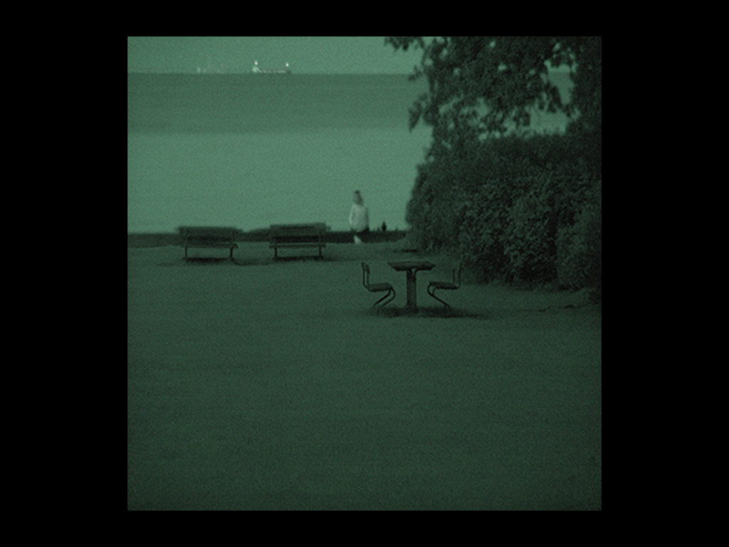
Alike any of the other major religions, Islam seeks to standardize sexual relationships between members of their society or community through moral codes. As laid down in the Quran, any form of sexual behavior – that being: intercourse, oral sex or any action that encourages sexual activity – is strictly forbidden before or outside of marriage. Of course, that doesn’t prevent Muslims engaging in ‘unlawful meetings’, hence the title. In pursuit of romantic love or the sheer fulfilment of mutual desires. Hashim investigates the secret encounters that take place between young Muslim lovers in parks, hidden between trees, or under the cover of the night on beaches and in parking lots. Using night vision cameras, inconspicuous smartphones or digital cameras equipped with long-range telephoto lenses, she captured couples enjoying moments of the greatest intimacy in very public spaces in Sweden swell as in Denmark.

“Those who come from a Muslim background follow strict rules that subsume their individuality, so that the true self is rarely revealed. The public persona and the private life are two distinct zones, creating paradoxes in everyday life that lead to a form of cultural schizophrenia.’”

lina hashim 5

Screen-Shot-2015-03-19-at-09.31.32

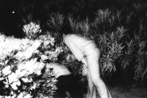
Hashin’s build in tension and suspense between the public and the private spheres, which runs more acutely through the lives of these young Muslims than of their non-Muslim peers, is reflected in “Unlawful Meetings”. It lies in the invisibility these lovers enjoy in public; for the most part, passersby turn a discretely blind eye to the privacy they create for themselves in shadows and parked cars at nights. This idea of truthfulness and abiding by the rules and guidelines set out for them bombarded the natural path set out for them by there deliberate ancestors. Hashim ensures the anonymity of her subjects, and thus the lawfulness of her recordings of their acts, by leaving out colors and by never showing more than 25% of their facial features. Yet what cannot be hidden is the passion, which, according to one of the youths she interviewed, is heightened exactly for being so “secretly and so rarely enjoyed”. For Hashim herself, who identifies as a believing, but not a practicing Muslim, the project has led her to revisit the tenets of her faith as laid down in texts written in times so fundamentally different from today. Convinced that the ban on sex before marriage was written to protect women and their offspring, she wants to put up for discussion the question if contemporary women and men can’t find other options – in terms of health, or legal and financial security for themselves and their children – to take care of themselves.

©Lina_Hashim_Unlawful-Meetings-03-1024x768

720;lina_hashim_-_unlawful_meetings_self_published_2014_beispiel

410;lina_hashim_unlawful_meetings_(signed)

f

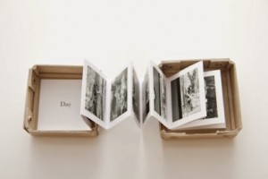
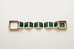
Hashim uses the form of a fan-fold laporello in order to tell the story from a dual perspective. On one side of the laporello, shows the images taken with a night-vision camera and the other revealing grey-scale images using a long range telephoto lens. I feel this idea is really interesting and if I was to recreate this in terms of my project I’d use the traditional rituals of love on one side and the non-traditional (online dating) in order for the reader to visually the changes which have occurred over time in means of relationship commodities.

Throughout Hashin’s enduring project, she adopts the professional distance of the social anthropologist conducting a field study, yet at the same time there is an inescapable sense of surveillance and ghoulishness parallel to the work of Kohei Yoshiyuki. In the photographic act again we find the two zones of distance and proximity intertwined in a way that many viewers will find disturbing in its ambiguity.

Kohei Yoshiyuki 

GUP Magazine – DOUBLE LIVES: AN INTERVIEW WITH LINA HASHIM

Alike Hashim, the reader can be reminded of Kohei Yoshiyuki’s infrared-lit photographs from the 1970s, which capture Japanese couples engaged in night-time sex, surrounded by spectators hidden in pitch-dark public parks. But Hashim believes Unlawful Meetings is quite different, because of the community it depicts.

“A lot of white Danish people live here,”

Hashim says.

“So whenever I see darker skinned people, I’m already guessing that they meet here secretly, because they know that their families won’t find them here.”

35t

01

Hashim, however, does find them. Hiding in public toilets, behind trees and in cars, photographing the Muslim couples who meet in secret, engaging in forbidden sexual acts in bushes and cars. Hashim’s photos are often blurry, the subjects partially obscured by the leaves of a tree or car doors that cover the people’s faces, though this is intentional: Hashim wants them to remain anonymous.

“The way these people met, the way they felt and the way they touched is still visible in these photos. You don’t always need to capture a face to depict emotions.”

4311_1000

4313_1000

British Journal of Photography: Lina Hashim photographed the secret places young Muslim couples arrange to meet. 

Written by Colin Pantall

Lina Hashim’s photography has its roots in her own childhood, in which the grand themes of family, conflict, exile and migration read like a checklist of documentary topics.

“When the Iraqis came into Kuwait, my father, who had been imprisoned in Iraq for his communist activities, was on the list of people they wanted to take to jail. He was frightened, so he ran,”

Lina tells the British Journal of Photography.


“When I was a teenager, I wasn’t allowed to have boyfriends or intimacy with anyone before getting married, and it was the same thing with my sisters and my brothers and everyone in the community,”

says Hashim.

“But my friends told me about places where they could go to meet their boyfriends, and they said I could go there with them, just to join them, and then I could maybe meet somebody there. It was always in parking lots, or by the sea, or the forest, or the kind of places where you take a dog for a walk. That’s actually how the project started.”

How to Make a photo-book using Blurb/Lightroom

Stage One – Selecting the images

First of all, before you can go about making the book design you need to select the images to be included.

Using light-room, I narrowed the 1000 or so images I had down. I approached this through different shoots at a time, as I believed that this  made it easier to collect my main images from each shoot. The first step I took each time in doing so was to ‘reject’ all of the images which I definitely didn’t want to keep, which is done through holding down (Ctrl + X.) Any other images I considered keeping were ‘flagged’ (Ctrl + P).

Picture1

After completing this first stage I then proceed to select from my narrowed down bunch of images. This is done through an initial number rating system. I had a key, ranging from 3-5; 3 being any image I thought was still acceptable on second review; 4 being any image I believe I strong enough to possibly serve a part in a photo-book; and 5 being an image which is very strong and one I am therefore completely sure about keeping. To rate, all you need to do is press down (Ctrl + 3/4/5). It is a good idea to experiment with the rating system and play around with any of the images if necessary.

Picture4

The final stage of this process is to narrow down the best images, from those rated 4 and 5. Click on the filter on the Library setting One way of doing this is to select a colour, then click on one of these at the bottom right, next to the number rating. One important consideration at this point should be to see how different images might link together in terms of the type of story you are trying to tell. For example, as I am making a photo-book contrasting  loosely the styles of Martin Parr with Henk Wildschut I was therefore wanted to include a balance of each of these to styles, as to have a suitable body of work for each. Other considerations need to be thought of, for example the amount of portraits, still-life’s, landscapes you want your book to include. This can possibly be done by colour coding different images based on what criteria is relevant.

Picture5

Once you are happy with your final images, check the number based on the amount you want to have in your photo-book. It is better to include slightly more in the final selection then not enough because you will then have more images to play with in the actual designing process. For example, if you want to create a 40 page photo-book, then have approximately 70 images in the final, leaving enough to experiment with the designing process

It is better to complete this process in different stages over a slightly longer period of time, whether that means taking anywhere from an hour or a day of each time. Taking time over this process allows ideas to develop subconsciously. It ensures all the appropriate images are included, powerful enough and relevant to creating a well developed narrative.


Making the photo-book

The first step is to make sure you are in the collection of your final images. Then move away from the ‘Library’ seciton onto the ‘Book’ mode, which will  take you to a plain book layout of the cover and a couple of inside pages.

Then select the type of book you want to      use. The choices are

Five different book types of …… small square; stanndard landscape; standard portrait; large landscape; large square

Three different covers …. hard cover image wrap; hard cover dust jacket; soft cover

Four paper types …. Premium Luste; Premium Matte; ProLine Uncoated; ProLine Pearl Photo


To create the layout there are three different types of layout options that you can use;

Manual – this shows the entire book layout as you go along.

Picture7

Single View –  allows you to see one page at a time

Picture8

Page View – seeing two pages at a time, as the viewer would expect to see it

Picture10

All three options have their own advantages and drawbacks. A good idea is to keep alternating the modes you work in. For example when arranging a page it is  a good idea  to work in ‘Single View’, when linking a page together it is better to work in ‘Page View’ and when sequencing the overall narrative together/adding pages it is best to work in ‘Manual’.

There are many different ways of arranging images on the page. One way is to include all images on the right hand page, leaving the left blank. This is considered the classic method. The options however are limitless and you can play around with sequencing using different templates. Another option, which I have gone for, is to mix the sequencing up. Personally I think that this is a good idea to mix up the sequencing because it adds a degree of uncertainty to the narrative progression. Also at times it might be a good idea to have two images across the page to make a link, whilst at other times at might be better to leave a  page black to create a mini-interlude to break the narrative up.

Picture11

Picture13

Another tip is to look for different links in images. Consider the theme of the narrative and decide how relevant to different images are and what they add. There should often be relevance to two images side-by-side, whether that is a similarity or contrast.

Picture14

One of the main advantages of making the photo-book within light-room is the degree of flexibility which it provides. It offers various features to make the book making process as easy as possible such as, dragging the images to different pages, dragging the layout up, and editing images on the go. In contrast to the online blurb feature I used last year this is much better because it it is far easier and quicker. Furthermore, it allows a much greater degree of creativity; the opportunity to play around with different images and sequences.

Once the sequencing process is finished, you now have to order the photo-book. Lightroom is linked to the online photo-book maker, ‘blurb’. To order the book, it needs to be done online. The content of the book and layout will be fully compatible with the official blurb website, which is activated through pressing the ‘send to blurb’ button. There will be an easy step-by-step process  through which to order the book.

Picture15


True Events to stage from

Domestic violence is abuse between two adults who share the same household . Criminal domestic abuse may include physical assault such as slapping, hitting, pushing, shoving, etc, sexual assault/rape, stalking/harassment, or blackmail. Non-criminal domestic violence may include emotional abuse like intimidation, mind-games or financial abuse like controlling money. These latter forms eventually turn into criminal behaviors in 80% of cases. Domestic violence can in fact be perpetrated by and against people of any gender, age, income level, race, religion, or any other demographic area. Perpetrators of domestic violence often try to explain/justify it with circumstances outside of their control: drugs, alcohol, mental illness, troubled childhood, anger problems, hard day at work, etc, in some cases claiming that if only the victim didn’t provoke them, the abuse would not have occurred. The victim adopts this perspective by walks on eggshells, yet seems unable to prevent or even predict the next violent episode. Perhaps due to the fact that they aren’t the one responsible for it.

In accordance to my project, I have spoken to a good friend of mine who has unfortunately been through an abusive relationship and as far as her story goes, one of the most shocking in my opinion is where there was a phase within her relationship where her boyfriend would come home and he would start to beat her  when she said or did something that angered him. However, this differentiates from other stories I’ve heard because of the fact that  he would make her go and find objects that he would then beat her with. For example, she was telling me an incident  where he came home, they had an argument and he told/instructed her to go and get a belt. When she refused, he hit, shoved and kicked her and asked her again. And this would be repeated until she did what he asked of her. So she would then get what he wanted, and he would beat her with whatever object he could get. In some cases she would be instructed to find a belt, and in one extreme case, she was told to bring a lit candle which he then poured boiling hot wax on her body.

Something that I found quite shocking and unfortunate to hear was when she said how easy it is to say ‘I am never going to be in an abusive relationship, i’ll just leave him…’ In my friends case, she wasn’t actually aware that she was in a relationship, and every time it happened, she thought and really believed that ‘he would never do it again.’ She also stated how this was her first relationship and her first real love, she says now how looking back, she wishes she would have done something and not just accepted the way he treated her. She was in this relationship for three years, and during the second year, she went away to university only to find out that his intentions were to follow her there. Fortunately for her, they split up a year later as he was moving  to a different country.

One of the ways in which she was able to fully understand the severity of what she had been through was because she opened up to one of her friends at uni and explained everything that happened to her. Her friend insisted that she call the police but she refused and didn’t in the end. Even as crazy as it sounds, she said that through everything that happened to her, she still felt something (albeit small) for him.

My response to this will be staged, and will contain a woman holding the weapons that were mentioned in the story. Although some portraits will incorporate facial features and expressions, some will focus on specific elements/objects within the image. The two main objects that I wanted to focus on was the belt and the candle/wax element.

Flowers (2015)

I quite like how disturbed this image is and I would like to produce a similar representation as it fits perfectly with what someone told me. It was valentines and her boyfriend bought her some flowers, later that evening they got into an argument about something petty (like usual) she says to me. His first reaction was to go to the flowers, rip them off the  stem and rip them into pieces. He then headed to her as a target and started pulling her hair and shoving her down until she fell on the floor. As that wasn’t enough, he then got the pieces from the flowers and shoved them into her mouth. She told me how whenever he did thing like this, he would have this look in his eyes, like he was looking at her but he wasn’t. “His eyes would look wild” she says and that was probably one of the most scariest things because “you never know what’s going on in his mind”.

http://www.theguardian.com/artanddesign/gallery/2016/mar/28/rubi-lebovitch-photographer-home-sweet-home – image


Candy Coloured Photos – Editing

I have been using Photoshop to try and create these candy coloured photos to turn the gloomy town of Jersey into a fantasy colour world, i have put step by step print screens to try and explain how it is done.

Step 1: After editing the photo like you normally would using levels/curves, you need to go to image>adjustments>hue/saturation

1

Step 2: Mess around with the hue bar and you will start to see the photo change colour, you can move it to your preference and also change the saturation to make the colours a bit more intense or lighter.2

Step 3: After this is done you may want to do some fine tweaking to get the colours to come out more in certain parts of the picture, in this case because it was a cloudy day the sky is just grey so to avoid this i have selected the quick selection tool to just have the sky highlighted and then go back and change the hue again, this time i made it a lot more saturated so the blue started to come through, this may not work on every photo.3

Step 4: For the last step it is just finishing up your edit, after changing the colours the building in my photo went slightly darker so i brought the brightness up slightly and also the contrast, this then brought me to my finished image.4


Lina Hashim: No Wind With Hijab

Lina Hashim

Lina Hashim is a Danish-Iraqi artist who lives and works in Copenhagen. Hashim was born in Kuwait, however later on moved to Denmark with her parents in 1992. Hashim’s primary artistic medium is photography, whereas her methods cross into such fields as anthropology and performance. Hashim as a former student of anthropology  puts the methods of anthropology to use when she investigates, amongst other issues, the Islamic dogma of pre-marital sex. Her research draws thoroughly on her readings of the Quran, consulting imams, her family, and a number of chatrooms and online forums for Muslims.  At the core of Lina Hashim’s artistic project lies an urge to investigate, rationalize and document the arbitrariness of the way the Quran is being interpreted today using what she describes as a method best understood as historical anthropology: Do the words and dogmas of the Quran make sense in a modern context? She firmly states that she is a Muslim as she believes in Islam, but she doesn’t practise.

NO WIND WITH HIJAB 

Hashim began this series in 2012 photographing women’s hair, normally hidden from public view under a hijab, a scarf that covers her head concealing all her hair in the public domain. The hijab is seen as a way to protect these woman, keeping them as a treasure; for Lina to photograph them without this cover – a commandment of God – would be considered a sin in Islamic tradition. Lina’s inspiration came from the memories of how her mother and friends changed when they removed their hijab, filling her with curiosity to photograph women’s hair and chronicle the length of time they had covered it. In order to make the photographs she envisioned, allowing the women to reveal their hair and not break their Islamic beliefs, she consulted a number of Imam, or spiritual leaders, living in Copenhagen.

Med-tørklæde-i-2-år

©-Lina-Hashim_-No-Wind-With-Hijab_18-years-with-hijab-717x1024

“I’m a member of a chatting space that is guided by a young Imam. He was very open, so I asked him: ‘If I go to a hairdresser and I find some hair on the floor that belonged to a Muslim girl; would it be a sin if a man sees the hair? And then he said ‘No it wouldn’t, because no-one can see who the woman is.’ Then I asked him if it would be OK to take a photo in which I don’t reveal any of the skin or any of the characteristics of the woman. And he said that it’s impossible to do that, but it would be OK. So I copy-pasted what he said in a document and showed it to all these girls I asked.”

As a viewer this suggests to how important religion is in Lina’s tradition, as the repercussions behind the truth of these women and revealing their identity to the world is a terrifying and consequential concept. Immediately framing the images to focus on the women as an a objectifying motif draws the reader in and  is immediately asked to question the rate of rights that individual has. This factor can be seen most restricting, as as a women, the allowance and freedom  to show off any hair in any sort of public domain is not tolerated, culturally and religiously. This percussion of Lina’s work is more so celebrated than mourned.

Med-tørklæde-i-16-år

26-years-with-hijab

Inspiration

Lina’s focus on a single motif or symbol to represent an entirety of a subject has given me inspiration as to how I should focus on love. Like Stephen Gill’sHackney Kisses“, a single kiss represents a whole relationship, such as hair represents an entire culture and religion.  In a way I could focus in on this, yet I could also focus on things such as holding of hands or something else to do with or is familiar to a stereotypical relationship.

Experimentation – Matt Crump – Candy Photos

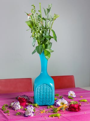
The idea behind these photos is that Jersey can be a gloomy place and when i look at Matt Crumps photos they are so eye catching yet so simple, almost like a fantasy world, which made me want to recreate a fantasy feeling in Jersey. The majority of this shoot was taken in cloudy weather which made it a lot harder to edit however they have came out okay.

These are my photos that i have experimented with and tried to give the candy coloured feel that Matt Crump does in all his photos, his photos are very minimal and the composition feels very empty and simple. I have tried in some photos to give the minimal feel to it but others i have given my own twist and tried to experiment with filling some things with bright colours and leaving certain parts such as the road.

Taxi Rank candypink flats

Reflection pink

This photo above in particular i feel looks a lot like the work of  Matt Crump, he usually frames his photos into a square to make them look more minimal. Just like his i have tried to colour the sky and because the windows reflect the windows have been made pink as well, it is a very minimal photo but catches the eye well.

Here are some others that i experimented with, some have worked better than others but they all have the candy coloured effect:

Green flatsColoured Buildings Market pinkPink sunset blue buildings

Online Research

I find it quite interesting how technology has played such a huge role within the last few years when concerning the issue of domestic violence. For example an online app was created in order to aid those victims who are either afraid or cannot leave to talk to someone. However, victims are able to access help through this online app  in order to alert authorities if they feel as if they are in grave danger, and they can do this without the suspicion of the abuser knowing . There are many perks to this app, one is the fact that there is a button in which you press it to divert the page to a random page, this is done as a precaution if the  abuser suddenly enters the same room or takes an interest of what the victims are doing, they wouldn’t be aware of what the victim would be trying to do. This app is also a help line and directs victims to particular helplines and help centers which are highly dependable. This allows them to talk to a professional and get proper help.


Whilst doing some more online research about online help, I found an article which explains how high school students were asked to create an app for their entrepreneurship class ,  and two students in particular decided to create an app which is called SafeHaven, and allocates a victim  of domestic violence anonymously with a councilor/mentor. This allows victims to receive coaching and support and whether you are the victim or you are a friend of one, this app helps these people to get through some tough times.

These students explained how they did some background research on the topic and this aspect stood as one of their main inspirations for why they wanted to produce an app like SafeHaven. The fact that South Carolina has one of the highest rates in the nation of deadly violence against women played a huge role within this project and they stated that “We wanted to start this because we know there are so many people suffering from domestic violence, and we knew we could do something through this contest.” said Gathings. “We wanted to help them out.”I can only imagine how any lives these app has helped and potentially saved, and it’s a great reinforcement to show people that things are being done and there is help out there for those who need it but are perhaps afraid to go out in person to receive it.

http://www.wyff4.com/news/upstate-students-create-app-to-help-domestic-violence-victims/37751338


I came across this video and this whisper app is quite popular on Facebook and youtube, but I found this one which shares what people have said about being in a domestic relationship, the fact that people are still strongly effected even when they are not currently in this situation really shows the extent of their feelings and fears.

Image Analysis

IMG_5734IMG_5725

After approaching certain elements throughout the story that I was told, I decided to only focus on a few aspects within the story. These two images here stand as representations of the situation where the victim went to the bathroom  to clean herself up after what had happened to her. I like how in the first image, the bruise on the eye is quite evident and what she is holding is blood from a busted lip . I also like her expression, it’s quite strong the way she is just looking down at what he did to her (in disbelief almost). I quite like the second image (on the right), the way she is bracing herself using the sink (which is something she told me she did). It’s not that noticeable but there is a bruise on her right arm which adds authenticity to the image, and I quite like the fact that you cant see all of her face, what you can see is the messy hair and it fits in accordance with the story as she was dragged by her hair to the floor by her fiance. With the first image, what I could have done to improve it was to perhaps focus the camera to the left in order to get rid of the negative space that is located on the right side. However, this style reminds me of more of a documentary style which is what Ferrato’s images are inspired by.


IMG_5642IMG_5698

I took these images here to show some marks that were left on her body. These images are quite similar and due to this, I will select only one as a possible outcome (and the same will be done to the images above). I like how in the lighting and composition of the first image, I used flash for this and I think it works with this particular image because captures the bruised eye, the messy hair and the fact that she is looking away from the camera represents the fact that not looking at someone in the eye represents weakness, thus suggests the state he put her in, and how he made her feel worthless, unimportant, ugly… all word she used herself. It also reflects and embodies similar qualities to photographers and images that a have previously looked at. The second image differentiates slightly from the first. Flash was not used for this and the image itself is quite blurred, like her memories. When describing this story to me, she mentions a couple of times how some parts were a blur and sometimes she would black out and not remember what happened to her. Compositionally,  this image could be better, but I chose this image because I liked how she is looking down at the mark left on her arm. Something I might consider if I am to use one of there images is to perhaps add more bruises on her body via Photoshop. I think it could be an interesting experiment to conduct to see if it works.

Photobook design

Blurb

To create my book I am going to use the website Blurb again as I did for my previous book. Blurb is a website which can be used to help photographers to create, self publish and share their photo book design.  I found this website very useful because it allows me to have more control over the design and layout of my book through using light room I can continue to make amendments to my photographs whilst creating my book. I was also happy with my final book because it was printed in good quality. Once I have finished I can then upload my book to Blurb and order it.

Photo book inspiration

When making the book I didn’t have any main book inspiration which influenced the way which I created the layout, however I tried to make the book similar to my first book by including similar photographs and a similar structure. When creating the first my book my inspiration was ‘Where Mimosa Bloom by Rita Puig – Serra Costa’. l liked how for every portrait of her family members, on the other side there is an object although their is no explanation I assumed there is a connection between the item and the person in the portrait. Often the person in the portrait is wearing the same colour or the photograph included the same colour as the colour of their object this worked well and also made it appealing to the eye. Although it was not planned there is a recurring theme of stripes in my book. When creating my book I also tried to place photographs of similar colours together.  In my book included objects that belong to my dad and close ups of what was happening in the main photograph on the other side of the page.

blurb-1

cover-Where-Mimosa-Bloom

image5 (Custom)


Artist Reference | Sarah Pucill

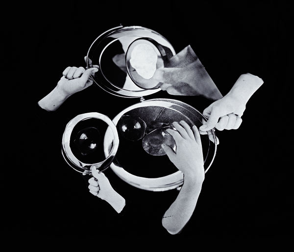
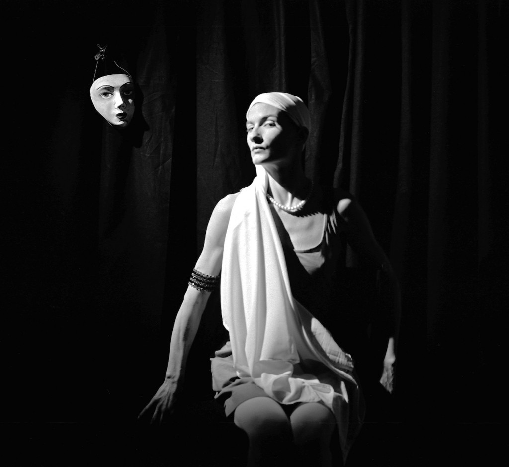
Sarah Pucill is a filmmaker and photographer who explores a sense of self in her work. The main features of her work look into mortality and the conventional filmmaking process. Pucill makes a lot of her films in simple places/rooms where she creates and enters different and new realms. Her work explores the representation of the feminine, queer or the dead. Her work is very strange and is very much surrealist works but I think this is what makes her work so much more interesting and captivating. Pucill’s first feature length production Magic Mirror explores the work  of Claude Cahun through her images as well as her writing from Cahun’s book Aveux non avenus (Confessions Denied, 1930). I like the idea of this as Pucill has basically taken Cahun’s work, restaged it and added some more context to it from Cahun’s own words in her book. I feel that this is a really great way to learn more about Cahun and to really understand the meaning behind her work as well as possibly getting an insight into the style of Pucill and her methods of film and photography.

Magic Mirror trailer: http://www.sarahpucill.co.uk/films/magic-mirror/

As I didn’t have time to watch the entirety of Pucill’s film Magic Mirror, I just watched the trailer but still found it to be very helpful and intriguing. I also think that the entire film can only be seen in the many exhibitions that it has been shown at. Something about this film really interested me and I really like that Pucill has mixed film with photography, something that I have done in the past and am making a constant link between in my own photographic work. I think that this way of bringing Cahun’s images to life more with her own words has really given me a clearer understanding of the context of her work and her constant thoughts on mortality. I like how strange and surrealist the trailer is, it really captivates me and makes me want to watch on as well as the voiceover from Pucill reciting extracts from Cahun’s book Aveux non avenue. The thing that  I’m struggling with this is that at what point does this become Pucill’s original work as the re-staged positions and images that she has created were Cahun’s and the voiceover was also extracts from Cahun’s own book. I do really like the idea of taking inspiration from other artists work and bringing your own twist to it and Pucill’s work is great but it is just re-staged versions of Cahun’s own images. Obviously no ones images can be as good or as unique as Cahun’s and her work really does stand out to me but I do like Pucill’s interpretation and recreations of it. I like the way Pucill looks in her images and really gets into the characters that Cahun has created, something that I can take inspiration from and work on in my own images.

Appropriating Sherrie Levine’s ‘Mayhem’: A Retrospective of The Original Fake at The Whitney

Carmen Winant opens with four rhetorical questions surrounding the truth behind art and conceptualism as Sherrie Livine’sMayhem‘ retrospective opens in the Witney Museum of American Art. Visitors are bound to contemplate these thought-provoking questions:

  • What is “original” and “unoriginal” art?
  • Does an art object only qualify as authentic if it’s made by the human hand?
  • Does the context in which one sees an image change its meaning?
  • Why is a photograph of a photograph worth less on the market than its original?

In the late 1970s and early 1980s, a collective group of artists including Cindy Sherman, Richard Prince, and Sherrie Levine at the time where considered as ones who dubbed the “Pictures” generation. This cohort began using photography to examine the strategies and codes of representation. In reshooting Marlboro advertisements, B-movie stills, and even classics of Modernist photography, these artists adopted dual roles as director and spectator. In their manipulated appropriations, these artists were not only exposing and dissembling mass-media fictions, but enacting more complicated scenarios of desire, identification, and loss.

“After Walker Evans”

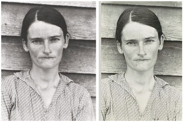
 The show displays Levine’s earlier photographic work in addition to more recent sculptures, photos and collages that date back to the late 1970s. “After Walker Evans” is one of her series of photos on view. To make the works, Levine photographed Walker Evans’s famous pictures of poor Alabama sharecroppers in 1979. Evans took the photos in 1936 while he was working for the United States government.

DP157023
Allie Mae Burroughs, the wife of an Alabama sharecropper

Levine wasn’t using his images for source material, to document America’s Great Depression or the Borroughs family. Rather, her photographs of his photographs were the finished product. Appearing identical to their sources, only this time Levine had declared herself to be their author and the appropriation artist, the original ‘artist’ for that matter.

”The pictures I make are really ghosts of ghosts,”

– Levine said in an interview with Arts Magazine in 1985.

2

This series became a landmark of postmodernism, both praised and attacked as a “feminist hijacking of patriarchal authority“, a critique of the commodification of art, and an elegy on the death of modernism. Far from a high-concept cheap shot, Levine’s works from this series tell the story of our perpetually dashed hopes to create meaning, the inability to recapture the past, and our own lost illusions.

Sherrie_Levine_combo

“It is something artists do all the time unconsciously, working in the style of someone they consider a great master, I just wanted to make that relationship literal.”

WHITNEY MUSEUM OF AMERICAN ART
NOVEMBER 10, 2011 – JANUARY 29, 2012

SHERRIE LEVINE: “Mayhem”

“The Past carries a secret index with it, by which it is referred to its resurrection. Are we not touched by the same breath of air which was among that which came before?”

—Walter Benjamin

The term ‘mayhem‘ hasn’t always meant ‘disorder’. It comes from the word maim, and until the late 19th century was used to denote the “infliction of physical injury on a person, so as to impair or destroy that person’s capacity for self-defense.” The words usage changed around 1870 but it continued to refer to “violent behaviour, esp. physical assault” until quite recently; according to the Oxford English Dictionary its usage did not designate “rowdy confusion, chaos, disorder” until as late as 1976. When Levine began photographing photographs, the word mayhem was not so far removed from its association with bodily harm. And while photographing photographs means that actual bodies are nowhere in sight, the show has far more to do with destruction than may at first be evident.

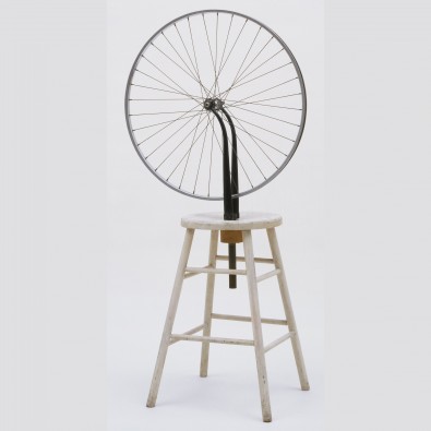
In Levine’sMayhem‘ the motif of discourse has tended to focus on the problem of authorship and the subversion of the unique art object. Levine’s re-photography and her re-productions of Duchamp’sready-mades‘ have provided important critiques of artistic institutions and practices. However, by 2011, appropriation itself has became so vividly appropriated that it was difficult to view Levine’s work as critical, or even realistic. The ideas put forth by appropriation had been thoroughly diluted by time and repetition, the idea that appropriation subverts the author’s function was a questionable statement in itself.

Duchamp.-Bicycle-Wheel-395x395
Marcel Duchamp: Bicycle Wheel, 1951. Ready-made
Simon Lee 007
Levine’s “Fountain” (prior to Marcel Duchamp: A.P.), 1991

The significance of Mayhem does not dwell on the alleged challenge to the categorised order provided by an author as well as the cultural or monetary value that the author or painter’s name can confer on or to an object. Neither is it a simple matter of order imposed on disorder—artists such as Duchamp, Evans, and Courbet are thoroughly circumscribed entities that do not need to be explained or contained by Levine. Mayhem’s function, therefore, is not so much critical as it is evidentiary: Levine’s construction whereby she uses the repetition of objects and images, – its sterile organization, provides proof of an illness particular to contemporary society—a society overwhelmed by images and reproductive technology and consequently obsessed with the preservation and organization of surrogate records.

Any retrospective is a sort of archive, but in Levine’s work the archival impulse, the “gathering together of signs” into a “single corpus…in which all the elements articulate the unity of an ideal configuration” is particularly apparent. Mayhem is not simply organized, it is mentally deranging—evidence of a deep-seated cultural anxiety of which the copy, the archive, and the list are both symptom and cause.

“Repetition itself,”

writes Derrida,

“The logic of repetition, indeed the repetition compulsion, remains…indissociable from the death drive.”

lossin-web1
Sherrie Levine, “Gottscho-Schleisner Orchids: 2,” 1964–1997.
2011113-LEVINE-slide-Z3AW-jumbo
Levine’s exhibition at the Whitney offers 30 years of appropriation art by Sherrie Levine. On the wall are “Gottscho-Schleisner Orchids: 1 — 10” (1964-97).

My Further Interpretations

Following on from Levine’sMayhem‘ I have learnt the significance of repetition. In this project appropriation is a major motif – reproducing acts of love and manipulating peoples way of finding the emotion is immediately deemed debatable. The destruction of a natural path can definitely succumb to the way we live in modern society and alike Mayhem, the reader see how people change when opportunities to short-cut routes arise.

Edits

This shoot was quite interesting to conduct as this series represents a situation (I was told about) in which this woman would frequently receive beatings from her fiance. On most occasions, she said  it would normally be on the weekend as that was the time he would go out to the pub and come back drunk. When he was drunk, she said that it was always worse because  he would be more ruthless and it was harder to get him to stop because he was just so angry. She said at least when he was sober, he knew when he was going to far and would just walk away, but when he was drunk, he would go to far and this was when she would end up with bruises and marks all over her body. On one occasion (the situation I am representing), her fiance came home, they argued, he hit her a couple of times and walked out, but only to come back hours later completely drunk and “ready for round two”. She said she was asleep on the sofa, and was dragged into the corner of the room by her hair, and he started to smack and pinch her skin, which then led to punching and kicking  her. She would scream for help, but realised too late that it was a bad idea in the long run as instead of using her body as a punching bag, he would use and beat her face to ‘shut her up’ so to speak. This incident, she said was the worst one and she dragged herself into the bathroom – after he passed out on the floor – to clean herself up. She was horrified at the reflection staring back at her. She said the bruise was already evident on her eye and her lip swollen and chin bleeding. When discussing this situation together, I asked her whether she had ever thought about leaving him, to which she responded that she already tried to, but when he figured out what she was doing; he forced her into their bedroom, and explained how if she ever leaved, he would ‘make her pay’. Also, she explained how he had grown quite close to her family and she feared that he would go after them or make them suffer in her place. She said that no matter what, she was not going to marry him and she stuck to her word. In the end, she fortunately got away and moved here to Jersey (her parents where moving house so she didn’t have to worry about her ex-fiance doing anything to them). From old friends, she found out that he had actually got another girlfriend, so that definitely eased her mind and sort of assured herself that he would never go looking for her.

The model I used for this shoot was not the actual person who had been in the abusive situation and I applied make-up in order to replicate a bruise (similarly to how she had described it to be). It was very convenient that she already had a bruise on her arm from an accident at work, thus I used that to my advantage and used it it quite a few of my shots. A way that I could have improved these images was to perhaps include more of the environment around her, she (the victim) explained to me how messy the place would get and how she would spend hours cleaning up. I could have incorporated this to create more of an authentic feel throughout this body of work.


Photobook

1st book draft 

photobook

photobook 2

When creating the photo book I tried to keep the same layout and font type as my first book as much as possible so that it’s easier to compare them both and to emphasize the fact that this book is part 2 of my first one. I also included facts about chronic back pain as I did in my first book but with the Portuguese working culture. I have chosen to mix the photographs of my dad at work with the ones of him at home rather than keep them separate because I think that it shows ‘flashbacks’ of my dads past working life and it closes the bridge between the differences. I think the inclusion of both coloured and black and white photographs works well and increases the diversity.   I have made less important photographs such as objects smaller and key images larger or full bleed to show their importance. For my front cover I am planning to have a photograph of my dads back and write the title ‘ Domestic 2’  on it, like my mums to emphasize that although he is not currently working to a certain extent he is still a domestic because he has taken up my mums traditional role of doing house hold chores. Through out the book there is constancy of stripes although this was not intentional I think it revels more about my dad and his personality/likes.  Although I am not finished I need to add more photographs to my book I think that it coming together well.

Photobook

Facts

  • Twenty-five percent (25%) of young adults age 20-44 reported pain.
  • 7% of people with acute back pain will eventually develop chronic back pain.
  • Experts estimate that as much as 80% of the population will experience a back problem at some time in their lives.
  • Low back pain is the single leading cause of disability worldwide.
  • Almost two-thirds (59%) reported an impact on their overall enjoyment of life.
  • More than half of respondents (51%) felt they had little or no control over their pain.
  • An estimated 20% of adults report that pain or physical discomfort disrupts their sleep a few nights a week or more

Contact sheet

During the Easter holiday, I contacted the jersey women refuge center to ask permission to come over and talk to some of the women. However, I did not get a response and therefore have decided to go with my plan B. This idea consists of taking staged images of situations that certain victims have been through. I know people personally and these people have told me heartbreaking situations that they have been through and therefore plan on using their stories to create representations of their situations through staged imagery. Another idea which could be conducted would be to replicate those of Ferrato’s images and therefore will create images in similar techniques and styles. Although for now, I wanted to focus on this idea of creating a narrative. I knew when conducting this photo shoot that any/all outcomes would be black and white as  I feel  it fits in with the style of some of the photographers I have researched (Ferrato being one of them). When evaluating the overall performance of this photo shoot, I feel like the images created  were okay and represent parts of situations that some women have been through. When looking back at all these image, some appear to be a bit blurry/out of focus however, I think that it sort of fits and can represent the fact that a lot of these horrifying memories can in fact be blurry, either by the fact that they don’t want to remember, or they were injured and literally can’t remember. I don’t think these images are powerful and emotive in the way that Ferrato conducted her images, however her images were of real situation happening in the moment and thus would be quite difficult to create anything on the same emotive level. Here are some of the images from the photo shoot:


one two


BBC Newsbeat Short Documentary: Addicted to Dating

As a part of my research, I have looked at either side of the spectrum with people’s views of online dating. However, I haven’t yet focused on the extremities it takes for people to breach in order to find their one ‘love‘. This video which was produced by the  BBC Newsbeat channel, shows how one man who spends countless hours on social media and in particularly Online Dating blogs. The algorithms of their sites set aside the realism and truth of how dating should happen in the real world, making this individual in-particularly a surrealist of the modern day.